Lighting & Positioning Abstract Art: The Ultimate Display Guide by an Artist
Unlock the true impact of your abstract art. An artist's personal guide to ideal lighting, strategic placement, and framing for maximum emotional resonance.
The Art of Display: How to Light and Position Abstract Art for Maximum Impact
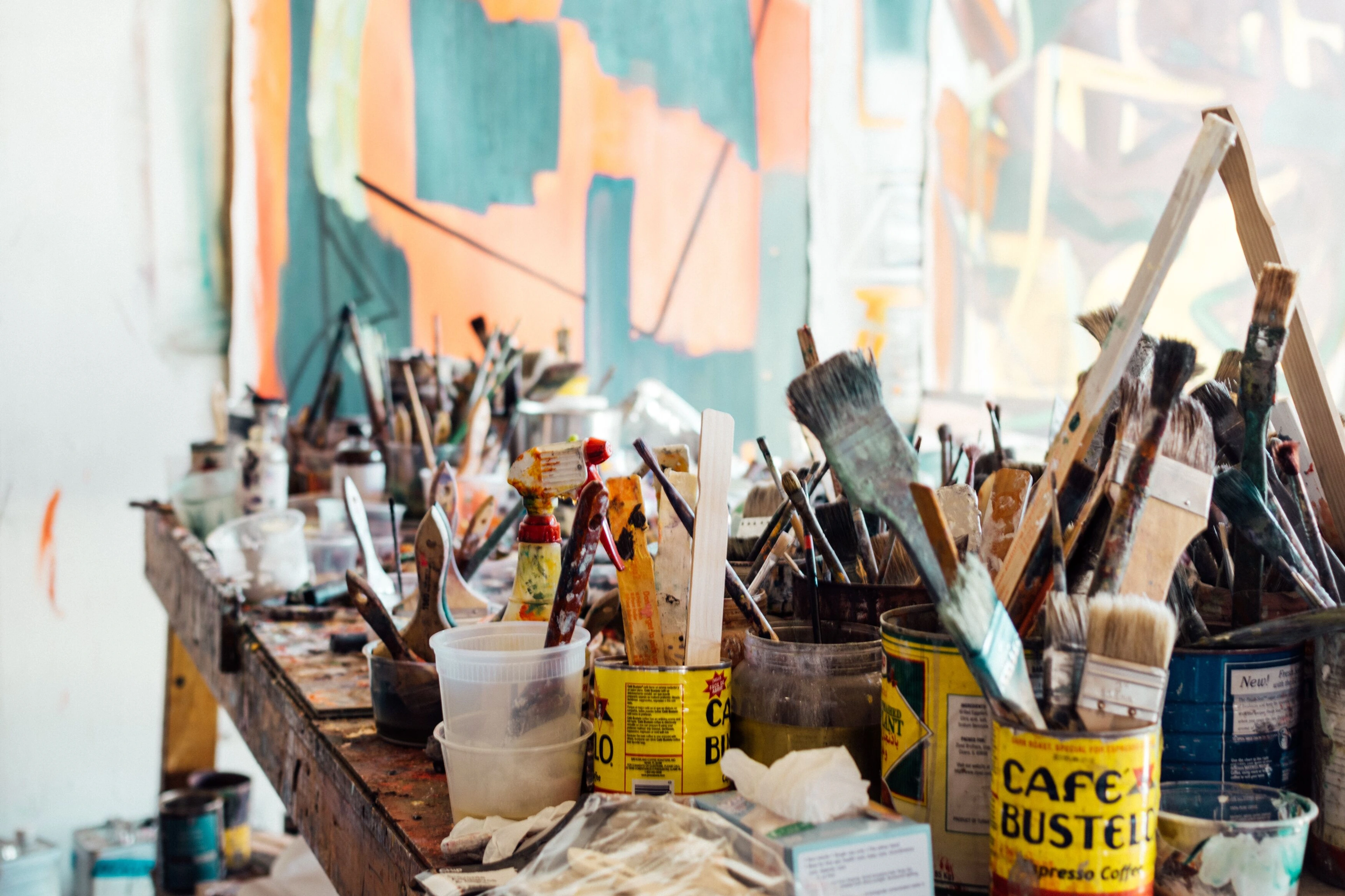
I’ve always felt that creating a painting is only half the story. The other, equally vital half, is how it lives in your space. For me, the moment a piece leaves my studio, it embarks on its own journey. And honestly, for a long time, I was a little… hands-off. I figured, “It’s art! It’ll speak for itself!” Oh, how wonderfully naïve I was. Part of it was the artist's natural inclination to focus purely on creation; once the brushstrokes were laid, my work was 'done.' The idea of micromanaging its presentation felt almost secondary, a task for the owner, not the maker. Perhaps it was a subtle fear of losing control, or maybe just a deep-seated belief that art, true art, possesses an inherent power that transcends its surroundings. I was wrong. The truth is, that detachment I felt, that belief in the art's independent voice, was also a subtle avoidance of the next stage of its life—the stage where it truly connects with another human in their own environment. It was a step I hadn't fully embraced, much like how a book isn't truly 'read' until it leaves the author's desk and lands in a reader's hands.
It was a rainy Tuesday afternoon, probably the kind where I’d normally be questioning my life choices or debating whether to make another cup of tea (the answer is always yes, by the way). I was at a friend’s new place, admiring a piece I had sold her months ago. She had it tucked away in a dimly lit corner, almost like it was shy. And it struck me: it wasn’t singing. It was whispering, maybe mumbling, definitely not belting out its truth. It felt muted, its vibrant story trapped, unable to fully reach out and connect.
That was my 'aha!' moment. My art can speak for itself, but I realised it needs the right stage, the perfect spotlight, and a little spatial choreography to truly resonate with you. It’s not just about hanging something on a wall; it’s about creating an experience, a dialogue, a little piece of joy that unfolds every time you look at it. This guide is my way of sharing what I’ve learned about giving your abstract art the moment it deserves, ensuring it not only speaks but sings in your home. It’s a journey to unlock the maximum impact of every stroke and hue, covering both ideal lighting and strategic placement.
The Unsung Hero: Lighting Your Abstract Masterpiece
Think about a performer on a stage. Without light, they’re just a silhouette. Your abstract art is no different. Light is what reveals its textures, its vibrant colors, its subtle shifts. It’s the difference between seeing a painting and feeling it.
Natural Light: The Ethereal Dance
Ah, natural light. It’s often touted as the best, and for good reason. There’s something inherently beautiful about how the sun's gentle caress changes a painting throughout the day. It brings a dynamic, living quality to the art, revealing new nuances with every passing hour.
But here’s the rub: natural light is also a fickle friend. Direct sunlight is the arch-nemesis of art, fading colors and damaging canvases over time. Beyond just fading pigments, prolonged exposure to direct UV rays can cause the canvas to become brittle, leading to cracks in the paint layers, the yellowing of varnish, and even the degradation of the stretcher bars themselves. It's like inviting a vampire to a sunbathing party – lovely thought, terrible outcome. So, if you’re placing art near a window, ensure it’s indirect light. North-facing windows are often ideal, providing consistent, soft illumination without the harsh glare.
- Window Treatments: To further protect your art while still inviting natural light, consider sheer curtains or blinds that can diffuse harsh direct sun. UV-filtering films applied directly to windows offer excellent protection without obscuring the view, acting as an invisible shield for your precious pieces. Beyond UV protection, remember that the type of glass in your windows (standard vs. low-iron glass) can also subtly affect how natural light renders colors, with low-iron glass offering truer color transmission.
Artificial Light: Crafting the Mood
This is where we become lighting designers! Artificial light gives us control, allowing us to highlight specific features and set the mood. It’s like having a magic wand for your wall. When I'm thinking about how to frame my creations, I always consider the play of light. If you're looking to acquire a piece, remember that understanding how art interacts with its environment is key; you can explore more about that on topics like how to buy art or the journey of a painting. For a truly nuanced display, think about layering your lighting – combining general ambient light with more focused task lighting (like a reading lamp) and accent lighting specifically for your art to create depth and visual interest.
Light Type | Primary Use Case | Considerations |
|---|---|---|
| Spotlights | Dramatic emphasis, highlighting specific features. | Aim for beam angle that illuminates entire piece without spillover. Avoid harsh glare. |
| Track Lighting | Flexible, versatile, adjustable for changing displays. | Ideal for growing collections or rearranging spaces. |
| Picture Lights | Focused, even illumination directly above artwork. | Be mindful of glare on glossy surfaces. Can feel a bit old-school, but sometimes classic is just... classic. |
- Color Temperature: This is often overlooked! Warm light (2700K-3000K) can make colors feel richer and more inviting, great for creating a cozy atmosphere. Think of how a warm light might make a dominant red or yellow abstract pop, intensifying its warmth, or bring out the inviting warmth in earthy tones. Cool light (3500K-5000K) offers a crisper, more modern look, often revealing subtle blues and greens more vibrantly. A cool light can bring out the cool undertones in a seemingly neutral grey abstract or give a sharp edge to geometric shapes, making precise lines feel even sharper. Experiment to see what brings out the best in your piece.
- Color Rendering Index (CRI): Beyond temperature, look for bulbs with a high CRI (90+ is excellent). CRI measures how accurately a light source renders colors compared to natural light. A high CRI ensures that the subtle nuances, textures, and vibrancy of your abstract art are seen as the artist intended, without colors appearing dull or distorted. It's the difference between merely illuminating and truly revealing.
Emphasizing Texture with Light
Abstract art often thrives on texture – impasto, drips, layering, or subtle canvas weave. Lighting angles can dramatically emphasize or flatten these elements. While direct front lighting is common, experimenting with side lighting or even subtle top-down grazing light can cast delicate shadows that highlight the physical topography of the paint, bringing a whole new dimension to the piece. It's about letting the light dance across the surface, revealing every ridge and valley, making the artwork feel more sculptural and alive.
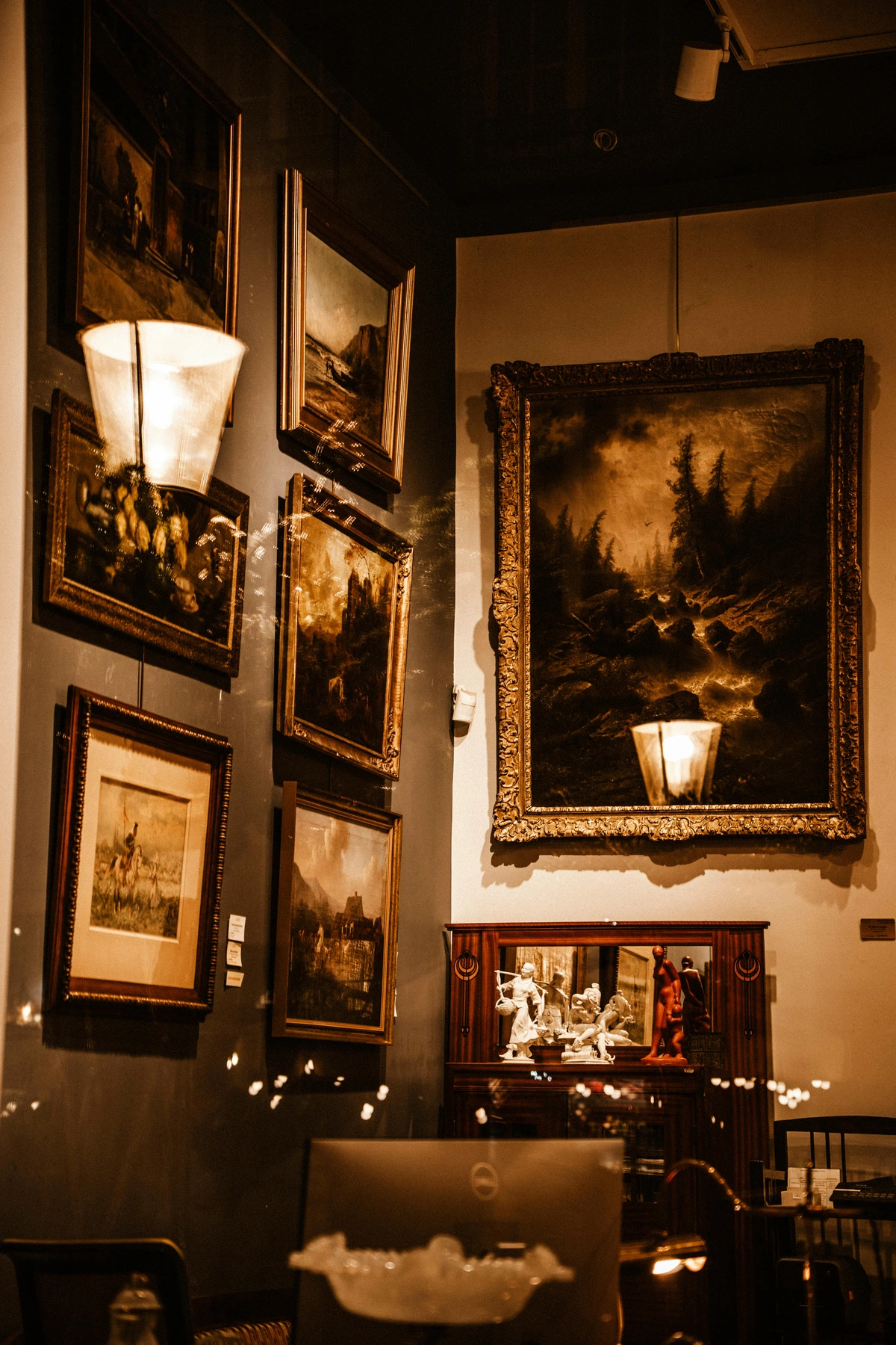
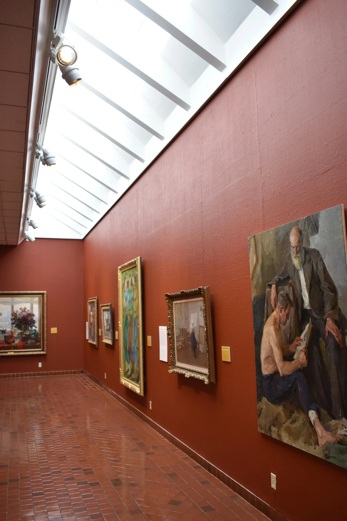
The Frame: An Extension of the Art
What truly makes a piece yours once it leaves the studio? While the art speaks, the frame listens, responds, and defines. Before we move on to placement, let's talk about the silent partner that bridges the gap between your artwork and your wall: the frame. It's not merely a border; it's an integral part of the presentation, influencing how light interacts with the piece and how the art is perceived in its environment. A frame can define the artwork's space, draw the eye in, and even become part of its narrative.
Frame Type | Description | Ideal For |
|---|---|---|
| Floating Frames | Creates a subtle shadow gap around the artwork, giving the illusion that the canvas is 'floating' within the frame. Minimizes reflections. | Canvas paintings, abstract pieces where the edge is part of the composition. |
| Deep Rebate Frames | Features a deeper inner lip, creating a sense of enclosure and drawing the eye into the artwork. The depth can help reduce glare from overhead lighting. | Artworks with significant texture or depth. |
| Standard Glazed Frames | Utilizes glass or acrylic for protection. Often includes matting for visual appeal and protection. | Works on paper, prints. Opt for anti-reflective or museum-grade glazing. |
For works on paper or prints, glazing (glass or acrylic) is essential for protection. Opt for anti-reflective or museum-grade glazing to minimize glare and protect against UV damage. For an extra layer of protection and visual appeal, consider using acid-free matting. A mat provides crucial breathing room between the artwork and the glass, preventing adherence and damage, while its color and width can significantly influence the artwork's perceived size and emphasis. The frame's material (e.g., natural wood, sleek metal, classic gold leaf) and color can either blend seamlessly with your wall or create a deliberate contrast, subtly guiding the viewer's eye. A simple black or white frame can provide a strong visual boundary for a vibrant abstract, while a natural wood frame might soften its edges and integrate it into a warmer, organic space. Pay attention to the frame's depth; a shallow frame can allow a highly textured piece to protrude, creating dynamic shadows, while a deeper frame can create a sense of enclosed contemplation. For long-term preservation of valuable pieces, always consider conservation-grade materials like archival backing boards and UV-filtering acrylic.

The Choreography of Placement: Positioning for Presence
Once you’ve mastered the light and chosen the perfect frame, where does your art truly belong? It’s not just about filling a blank space; it’s about enhancing the entire room, creating a visual flow, and drawing the viewer in. For more on overall room aesthetics, you might find my thoughts on decorating your home or abstract art for every room helpful.
- Eye-Level is the Goal (Mostly): This is the golden rule for galleries, and it generally applies to homes too. The center of your artwork should ideally be at average eye-level, which is typically around 57-60 inches (145-152 cm) from the floor. This makes viewing comfortable and natural, preventing neck craning or stooping. Unless, of course, you're hanging it for a professional basketball team – then you might need to adjust!
- Room Dynamics & Flow: Consider the furniture and architectural elements in the room. Your art shouldn’t float aimlessly. If it’s above a sofa or console table, ensure there’s a harmonious relationship. The bottom of the frame should ideally be 6-8 inches (15-20 cm) above the top of the furniture. This creates a cohesive vignette rather than a disjointed display.
- Wall Color as a Partner: And don't forget the wall itself: the color of your wall can dramatically impact how your art is perceived. A vibrant abstract might sing against a neutral backdrop, or a subtle piece could gain depth against a rich, contrasting hue. It's like finding the perfect stage curtain for your star performer.
- Scale: A small painting on a vast wall can look lost, while a huge piece in a tiny space can feel overwhelming. Consider the scale of your abstract art in relation to the wall space and the room itself. You can find specific tips for compact areas in abstract art for small spaces. The emotional impact of scale is profound; a commanding large piece can evoke awe and dominance, while a collection of smaller works might invite intimacy and closer inspection.
- Viewing Distance & Perspective: The optimal distance for viewing abstract art varies greatly. Some abstract pieces, particularly those with intricate details or subtle color shifts, demand a closer look to appreciate their nuances. Others, like large-scale expressionist works, are meant to be experienced from a distance, allowing the overall composition and emotional impact to fully register. Experiment by stepping back and forth to find the "sweet spot" for each piece, and consider how the art looks from different vantage points within the room – from the doorway, from your favorite chair, or across the room. The way an artwork feels as you approach it or move past it can be just as important as how it looks head-on.
- Negative Space: Don't underestimate the power of the empty space around your artwork. Just as in a composition, negative space on your wall can provide visual breathing room, allowing the abstract piece to stand out and command attention without feeling crowded. It's about letting the art have its moment, framed by quietude.
- Balance & Visual Weight: Even in abstract art, there’s a visual weight. This isn't literal weight, but the perceived 'heaviness' or 'lightness' of a piece based on its colors (darker, more saturated colors often feel heavier), forms (dense, compact forms versus sparse, open ones), and textures (heavily textured pieces can feel more grounded). For example, a large, dark, impasto stroke might feel significantly heavier than a thin, light wash. Balance your display. If you have multiple pieces, think about their sizes, colors, and overall visual density to create a harmonious arrangement. Sometimes, a single bold statement piece is all you need.
- Storytelling & Psychological Impact: Each piece, especially abstract art, tells a unique story. Sometimes it's about the emotional language of color, other times it's about exploring texture. When you position it, think about what story you want it to tell in that particular spot and how its placement can amplify its psychological effect. For instance, an abstract piece dominated by soft blues and flowing forms could be placed in a bedroom or reading nook to enhance feelings of calm and introspection. Conversely, a vibrant, energetic piece with sharp angles and bold reds could be perfect for a living room or entryway, stimulating conversation and uplifting the mood. It's about matching the art's inherent energy with the room's desired atmosphere. The specific style of abstract art – whether it's geometric and precise, or gestural and expressive – can also guide your placement choices. A clean, minimalist abstract might thrive in a similarly uncluttered space, while a bold, chaotic piece could act as a dynamic focal point in a more eclectic setting. I remember trying to place a particularly vibrant, almost aggressive abstract piece in my quiet reading nook; it felt like a rock concert in a library! Moving it to my living room, where it could ignite conversation, was the obvious, yet initially overlooked, solution.
- Considering Room Function: The purpose of a room should influence how you light and position your art. In a quiet study or bedroom, softer, more diffused lighting might be preferred to create a contemplative mood, and placement might be more intimate. In a dining room or entertaining space, bolder statements and more dramatic lighting might be desirable to spark conversation and energy. Your art should complement the room's function, not compete with it.
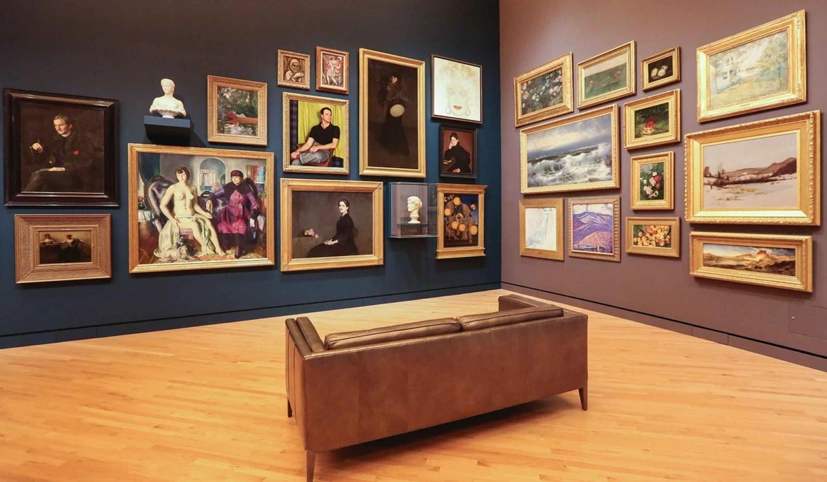
Gallery Walls & Groupings
Oh, the glorious gallery wall! This is where you can truly let your personality shine. Instead of thinking of individual pieces, think of the entire wall as one large canvas. When creating a gallery wall with abstract art, aim for a cohesive feel through a shared color palette, frame style, or thematic connection, even if the individual pieces vary wildly in style. Consider the density of your arrangement: some prefer a tightly packed, maximalist look, while others opt for more negative space between pieces, allowing each artwork a bit more room to breathe. Balancing different sizes and styles can be achieved by using a consistent element, such as all black frames, or by curating pieces that share a dominant color, even if their forms are diverse. For instance, a gallery wall of abstract art could successfully combine small, detailed textural works with large, sweeping color fields if they all feature a recurring shade of blue or a unified type of frame. The key is to make it feel deliberate and harmonious. You can get more detailed advice on curating a gallery wall with abstract art: tips for a dynamic display.
- Visual Rhythm: Just like a piece of music, your gallery wall can have a visual rhythm. This isn't just about static placement but about how your eye moves across the composition. Varying sizes, shapes, and orientations (portrait vs. landscape) can create a dynamic flow, leading the viewer's eye from one piece to the next. Think of it as a carefully choreographed dance for your gaze, preventing the wall from feeling monotonous and inviting prolonged engagement.
Care and Longevity: Protecting Your Investment
Now that your art is perfectly lit and positioned, how do you ensure it stays that way? Once your abstract masterpiece is perfectly lit and positioned, it's worth considering its long-term care. After all, you've curated an experience; now let's ensure it lasts.
- Environmental Control: Extreme fluctuations in temperature and humidity are art's quiet enemies. Avoid hanging art directly above radiators, fireplaces, or in bathrooms where humidity levels can swing dramatically. Stable environments prolong the life of your artwork.
- Gentle Cleaning & Handling: Dust is inevitable. For unglazed paintings, use a soft, dry brush designed for art or a microfiber cloth to gently remove surface dust. Always avoid direct contact with the artwork's surface, even with a soft brush; glide lightly. Never use water or cleaning solutions on unglazed canvases. For framed art with glass, a gentle glass cleaner applied to the cloth (not directly to the glass) will suffice. When handling artwork, always hold it by the frame or stretcher bars, never by the canvas or painted surface, to prevent damage from oils or pressure. Remember, less is more when it comes to cleaning art, and care is key to its lasting beauty.
- Secure Installation: Beyond environmental factors, ensuring your artwork is securely mounted is crucial. Use appropriate hanging hardware for the size and weight of your piece and the type of wall. Always double-check that fixtures are firmly installed to prevent accidental falls and potential damage.
Beyond the Basics: My Personal Touches & The Intuitive Dance
After all the technicalities of lumens and inches, it really comes down to this: what feels right? My creative process, from my studio to your wall, is deeply intuitive, and so is my approach to displaying art. It's a continuous exploration, much like my artistic journey outlined in my journey as an artist.
Connecting with Your Space
Sometimes, I’ll hold a piece up in a few different spots, almost like I'm asking it, 'Is this where you belong? Where do you feel most vibrant?' I recall one time I had a very intense, deeply textured abstract piece that I was convinced belonged in my study. But every time I put it there, it felt... heavy, almost oppressive. On a whim, I moved it to a brightly lit, minimalist hallway, thinking it would be too much. Instead, the stark contrast and the abundance of natural light transformed it from something foreboding into a powerful, almost meditative focal point. It was a reminder that the art often knows where it wants to be, if you just listen.

It’s less about rigid rules and more about an intuitive dance between the art, the space, and your own eye. It’s about creating an emotional resonance, a feeling that truly lights up a room and sparks joy within you. Ultimately, the goal is to make your space uniquely yours, and the art you choose and how you display it are powerful tools in that expression. Perhaps you'll find the next piece to complete your story among my art for sale, or even visit my museum in 's-Hertogenbosch to see how art truly comes alive when given the stage it deserves. What truly makes abstract art compelling, in my view, is its ability to transform a space and evoke a personal connection. Trust your intuition, experiment, and let your art speak its loudest, most beautiful truth.


