Maximizing Impact: Choosing Art for High Ceilings
A comprehensive guide to selecting and placing art that thrives in high-ceilinged spaces, transforming intimidation into inspiration.
Maximizing Impact: Choosing Art for High Ceilings
Oh, high ceilings. Aren't they just… grand? And sometimes, a little bit intimidating? I remember the first time I walked into a space with towering walls, my initial thought wasn't "Wow, what possibilities!" but more like, "How on earth do I make this feel like home and not a glorified airport lounge?" It’s a common dilemma, one I’ve pondered quite a bit in my own artistic journey and while observing how people engage with art in various environments. The truth is, high ceilings are a gift, a canvas begging for bold strokes – and with the right approach, you can transform that initial awe into a deeply personal, captivating space. This article is your comprehensive guide to choosing and placing art that truly thrives in these magnificent vertical expanses, turning intimidation into inspiration, and quite possibly, a profound source of joy. What story will your soaring walls tell?
The High Ceiling Challenge: Your Secret Weapon
A high ceiling isn't merely an extension of the wall; it's an entirely different dimension – a vertical expanse that can either swallow your carefully chosen décor or elevate it to new, breathtaking heights. And trust me, after years of wrestling with these glorious, intimidating expanses – both in my own studio, where canvases often felt like they were battling gravity, and in countless client spaces where the same dance played out – I've come to realize that this 'challenge' is actually your secret weapon. It’s an invitation to think bigger, to dream vertically, and to connect with the very soul of the space.
I've certainly had my share of art whispering when the room was shouting. I remember one early piece, a lovely, delicate watercolor, that I naively thought would 'add a touch of sophistication' to a vast, open-plan living room. It was swallowed whole, its visual presence utterly dwarfed, leaving me muttering to myself about visual gravity and spatial dynamics. I often chuckle thinking about it – imagine a delicate feather attempting to anchor a hot-air balloon; that's the feeling when a tiny artwork gets lost on a monumental wall. I've come to understand visual gravity as the perceived heaviness of an object, its magnetic pull on the eye, commanding attention not just through physical size but also through things like color saturation and stark contrasts. Spatial dynamics, on the other hand, refers to the invisible currents in a room, the way elements interact and lead the eye, ensuring a harmonious flow. You want your art to ride those currents, to become a silent conductor of a room's energy, transforming a mere space into an experience. The key? Understanding the unique language of vertical space. It's about scale, yes, but it’s also about how the art connects, flows, and ultimately converses with the room as a whole. You definitely don't want your art whispering when the room is shouting.
Understanding Vertical Presence: Scale, Space, and Impact
When you're dealing with immense height, your perspective needs to shift. We're often conditioned to think horizontally, arranging furniture and art at eye level. But with high ceilings, you're granted the freedom to draw the eye upwards, to create a visual journey that explores the full grandeur of the space.
Scale and the Art of Proportion
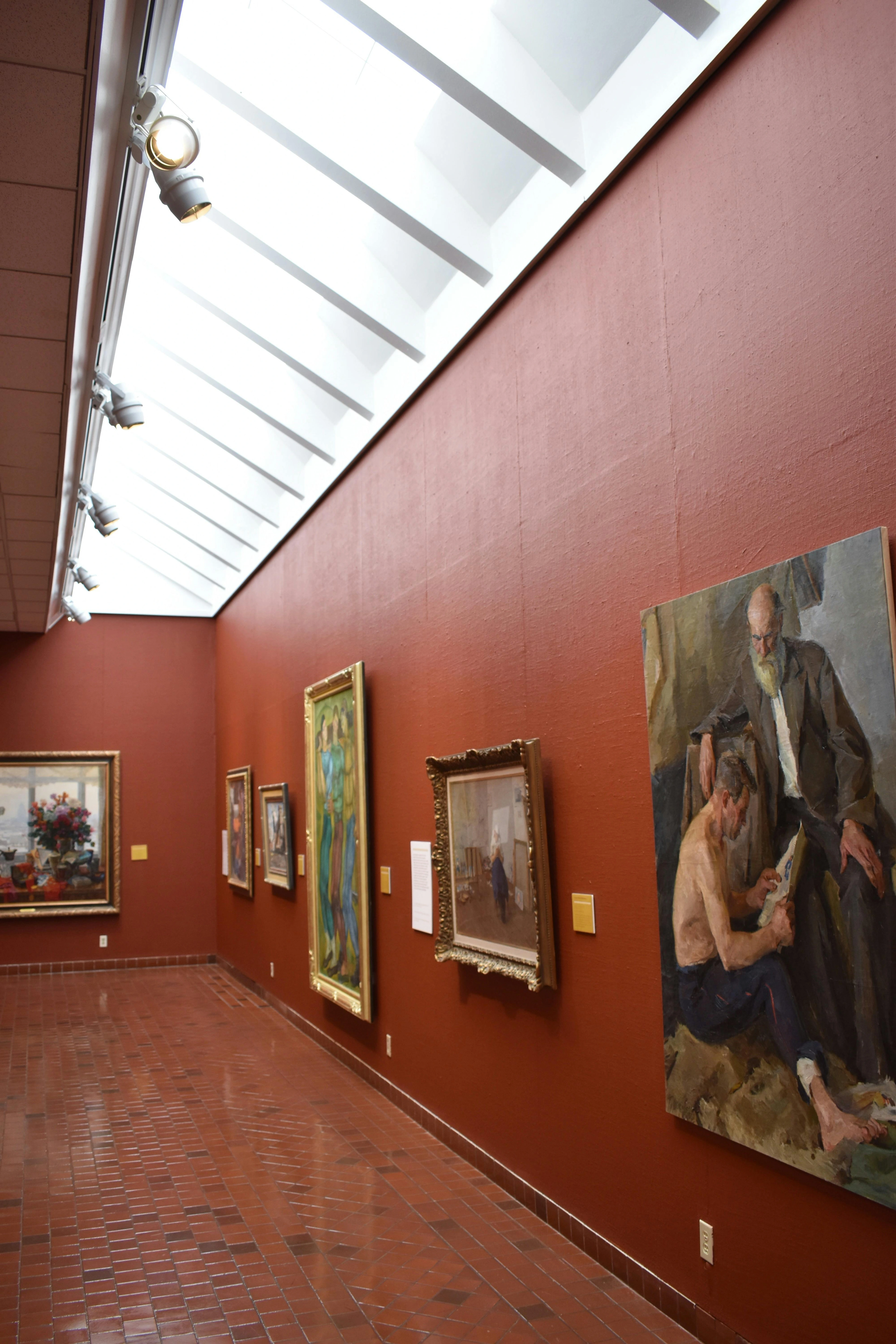
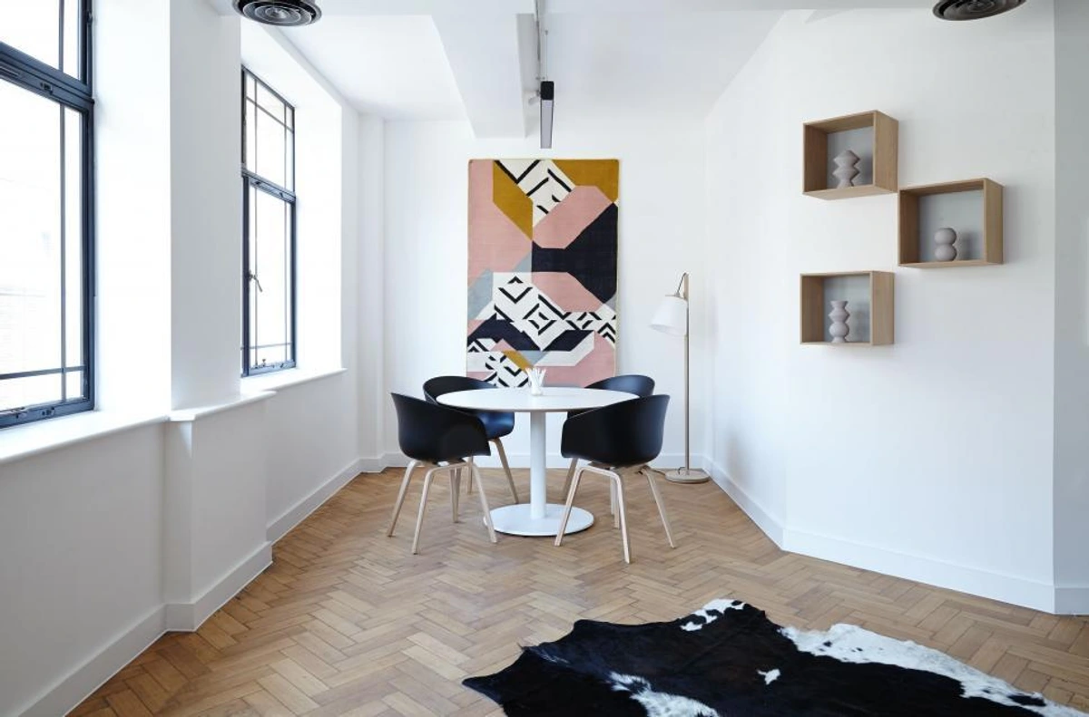
This might sound obvious, but it's where many of us (myself included, in my early, more timid days of fearing the blank expanse) falter. A small piece, no matter how exquisitely detailed or emotionally resonant, will likely shrink into oblivion, looking like a forgotten postage stamp on a cathedral wall. I've definitely been there, staring at a tiny piece and wondering if it was a mistake or just a very ambitious thumbtack – it's like trying to fill a vast ballroom with a single throw rug; it just doesn't command the space. You need art that can hold its own, that has enough visual weight to anchor itself in that vastness. Visual weight isn't just about physical size; it's about the perceived heaviness of an object within a composition, often achieved through dark, saturated colors, strong contrasts, dense textures (like impasto), intricate patterns, bold linework, strong chiaroscuro, or complex forms that powerfully draw the eye and create a sense of groundedness. While my heart beats for abstract art, a monumental, compelling figurative piece or a grand landscape can also make a powerful statement, provided its scale and composition are appropriate. Even carefully curated collections of smaller pieces from various genres can work, if grouped cohesively to act as a single, powerful unit, rather than disparate elements.
Think big. Really big. One large, commanding piece can often be more effective than a dozen smaller ones scattered haphazardly. It creates a powerful focal point that grounds the room, like a conductor leading an orchestra. Overly filling a vast wall can feel like trying to silence a busy street by shouting louder – it simply adds to the chaos. It's not just about filling the void; it's about intelligent, intentional placement.
Zen Dageraad, licence
A thoughtfully curated gallery wall can also work wonders, provided the individual pieces are substantial enough and the collection is cohesive, essentially acting as one large artwork. It's a tricky balance, a bit like assembling a complex puzzle where each piece has its own gravitational pull. The pitfall? If the pieces are too small or too spread out, your 'gallery' will just look like a collection of lonely islands in a vast sea. To make it cohesive and impactful, maintain a consistent gap of no more than 2-4 inches between frames to create a unified visual block that reads as a single, powerful statement. Consider combining different textures, frames, and even incorporating mirrors or sculptural elements to add depth and intrigue. For example, a mixture of bold abstract prints and perhaps a small, tactile mixed-media piece can create a dynamic visual narrative that encourages closer inspection, even from afar. For a grand effect, consider a central dominant artwork flanked by smaller, complementary pieces, or a tiered arrangement that gradually draws the eye upwards.
What about the ratio? While there’s no strict formula, a common guideline is for the artwork to occupy approximately two-thirds to three-quarters of the available vertical wall space (accounting for the area above furniture or the full wall height for standalone pieces). This guideline isn't rigid dogma, but it's a fantastic starting point, ensuring the art feels substantial without consuming the entire wall and leaving enough negative space for visual 'breathing room.' Straying too far risks either the 'postage stamp' effect (art too small for the wall) or an overwhelming mural that shrinks the room's perceived size and character (art too large or consuming). Ultimately, the measure is how it feels.
Beyond Canvas: Different Mediums and Their Presence
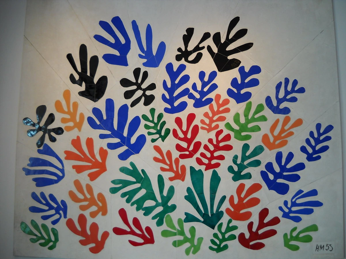
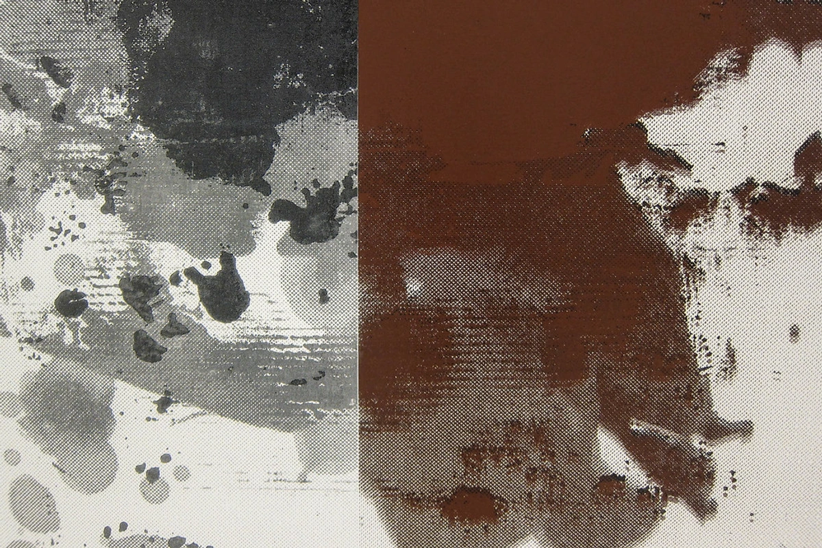
While paintings are a natural fit, don't overlook other mediums. A large-scale sculptural element, for instance, can reach upwards, drawing the eye skyward and engaging the verticality of the space in a three-dimensional way, creating dynamic shadows and shifting forms throughout the day. Monumental photography, especially abstract compositions or vast landscapes printed on large formats, can create immersive portals on a grand wall. Even large, textured tapestries, textile art, or kinetic sculptures can offer a unique softness, sound-absorbing quality, and intricate detail that reads beautifully from a distance, adding dynamic movement or warmth. Each medium brings its own inherent weight and visual language, inviting different approaches to scale and interaction within the grand vertical expanse.
The Frame: An Unsung Hero of Visual Weight
And while we're on the subject of scale, let's not forget the unsung hero: the frame. In a high-ceilinged room, a delicate, thin frame can make even a sizable artwork feel insubstantial. A substantial, well-chosen frame – perhaps a wide, deep profile, or one with a rich texture or finish – can significantly enhance the artwork's visual weight and presence, acting as a crucial boundary that holds the composition together within the vastness. It's an extension of the art itself, helping it stand its ground against the towering walls.
Negative Space: The Silence that Amplifies
After grappling with the sheer size of the art, here's a concept I often find myself pondering: negative space. This is the art of strategic emptiness. In a high-ceilinged room, the empty wall around a magnificent piece of art isn't just 'empty'; it's an active part of the composition. It allows the artwork to breathe, to truly command its presence without competing for attention. Think of it as the dramatic, held breath in a symphony – it amplifies the impact of the notes that follow, making them resonate deeper. Without that pause, the music would just be noise. For instance, imagine a colossal, vibrant abstract painting centered on a vast, plain wall. The expanse of white or neutral wall surrounding it isn't just 'nothing'; it actively frames the artwork, pushing it forward, allowing its colors and forms to sing without distraction. It’s in this eloquent silence that the art truly finds its most resonant voice, fostering a profound dialogue between form and emptiness. To truly master the unseen, you might delve into the power of negative space: sculpting the unseen in my abstract compositions.
When considering how to display art, don't forget the practicalities. Poorly managed direct sunlight can cause fading over time. For a deeper dive into how light can transform your artwork in these grand spaces, my thoughts on how to light and position abstract art for maximum impact might prove quite illuminating (pun absolutely intended).
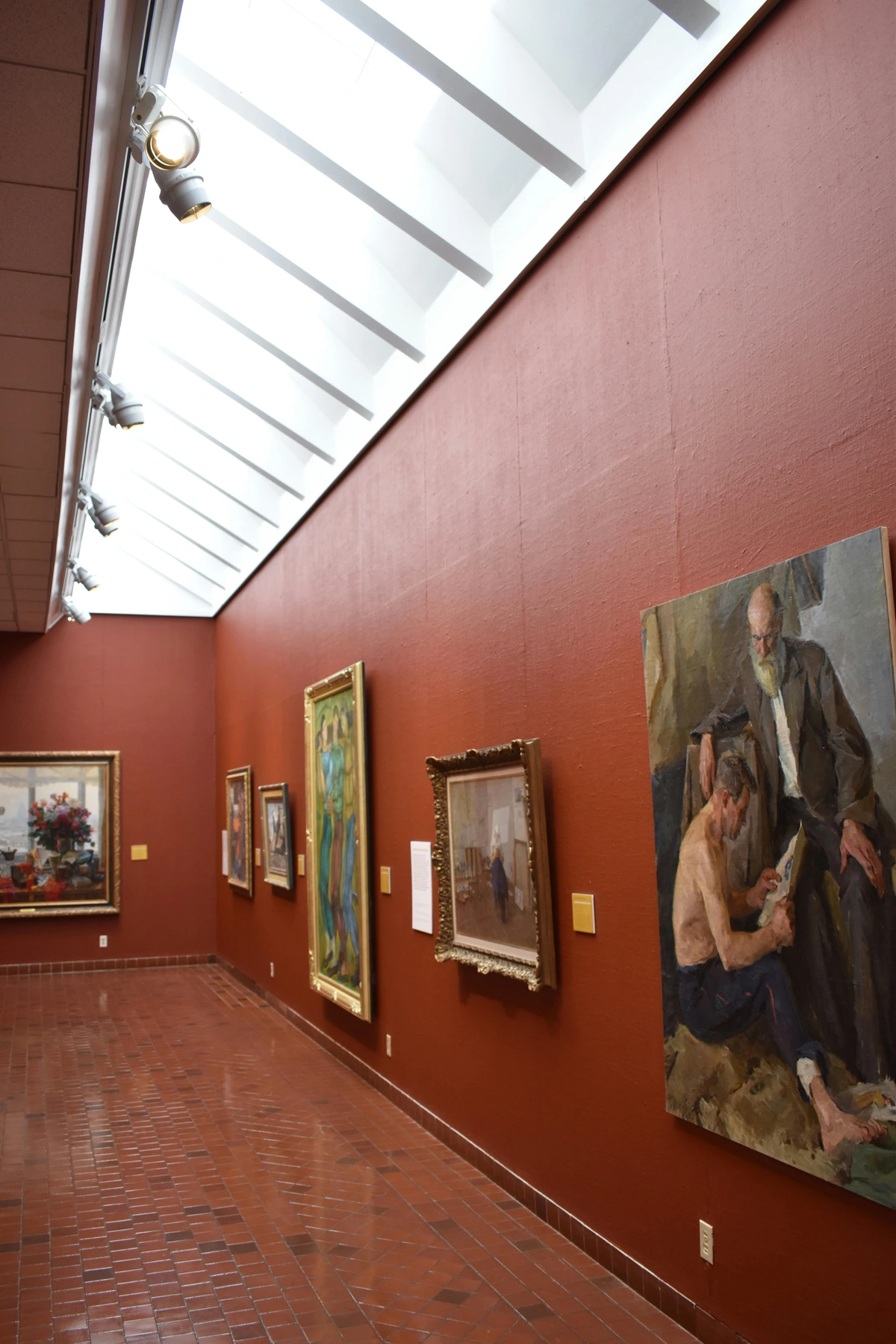
The Legacy of Verticality: Historical Inspiration
This dance with verticality isn't new; it's a conversation that has echoed through grand spaces for centuries. Throughout history, grand spaces with high ceilings have been intentionally adorned to evoke awe and convey meaning. From the soaring naves of Gothic cathedrals that directed eyes and souls skyward to the grand halls of palaces designed to impress and declare power, high ceilings have always been synonymous with awe and aspiration. Think of the opulent frescoes of Renaissance palaces, the dramatic, heaven-reaching altarpieces in Baroque churches, or the intricate, gilded ceilings of Art Nouveau grand halls – art in these spaces wasn't just decoration; it was an integral part of the narrative, a visual sermon or a testament to wealth and influence, often designed to draw the eye ever upwards, towards the divine or the powerful. This historical context reminds us that when we choose art for a tall room today, we're tapping into a long lineage of using verticality to evoke powerful emotions and make profound statements. From the classical symmetry of Neoclassical manors and the stately proportions of Palladian villas, to the intricate details of Gothic Revival libraries, the monumental scale of Beaux-Arts public buildings, the awe-inspiring forms of Romanesque churches, the grandeur of ancient Roman public works, or the opulent estates of the Gilded Age – high ceilings have consistently served as a canvas for elevating human experience. It’s a legacy of grandeur, waiting for our modern interpretation. What historical echoes do you wish to invite into your home?
Harmonizing with the Foundations: Furniture and Decor Scale
When contemplating art for a high-ceilinged room, it's easy to fixate solely on the walls. However, the existing furniture and overall room layout are just as crucial in anchoring the space and guiding your artistic choices. High ceilings can sometimes make furniture feel small or disconnected, almost floating in a vast expanse. To counteract this, consider larger, more substantial pieces of furniture, like a grand sectional sofa, a substantial dining table, or tall, imposing bookshelves. Arrange them in cohesive groupings to create visual weight and anchor the space. Your art should then relate to these anchors. For example, a large artwork positioned above a key piece of furniture creates a cohesive visual zone, preventing the room from feeling like disparate elements floating in a void. Similarly, other decor elements like tall plants, floor-to-ceiling curtains, or large-scale lighting fixtures should be chosen to complement the height, ensuring everything feels proportional and intentional rather than lost in the grandeur. Think about how the art, furniture, and other decor elements create a complete narrative for the room, rather than just isolated statements on the walls. It’s a delicate dance of visual weights and balances, ensuring every element feels intentional and harmonious within the grand verticality. How do your foundational pieces guide your artistic vision?
Making a Statement: What Art Works Best?
So, you've embraced the scale. Now, what kind of art should you actually choose? If you know me at all, you know my soul sings in the language of abstract art, and for high ceilings, it's an absolute revelation.
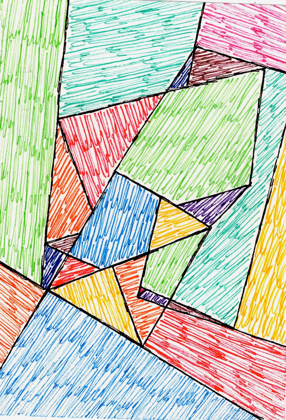
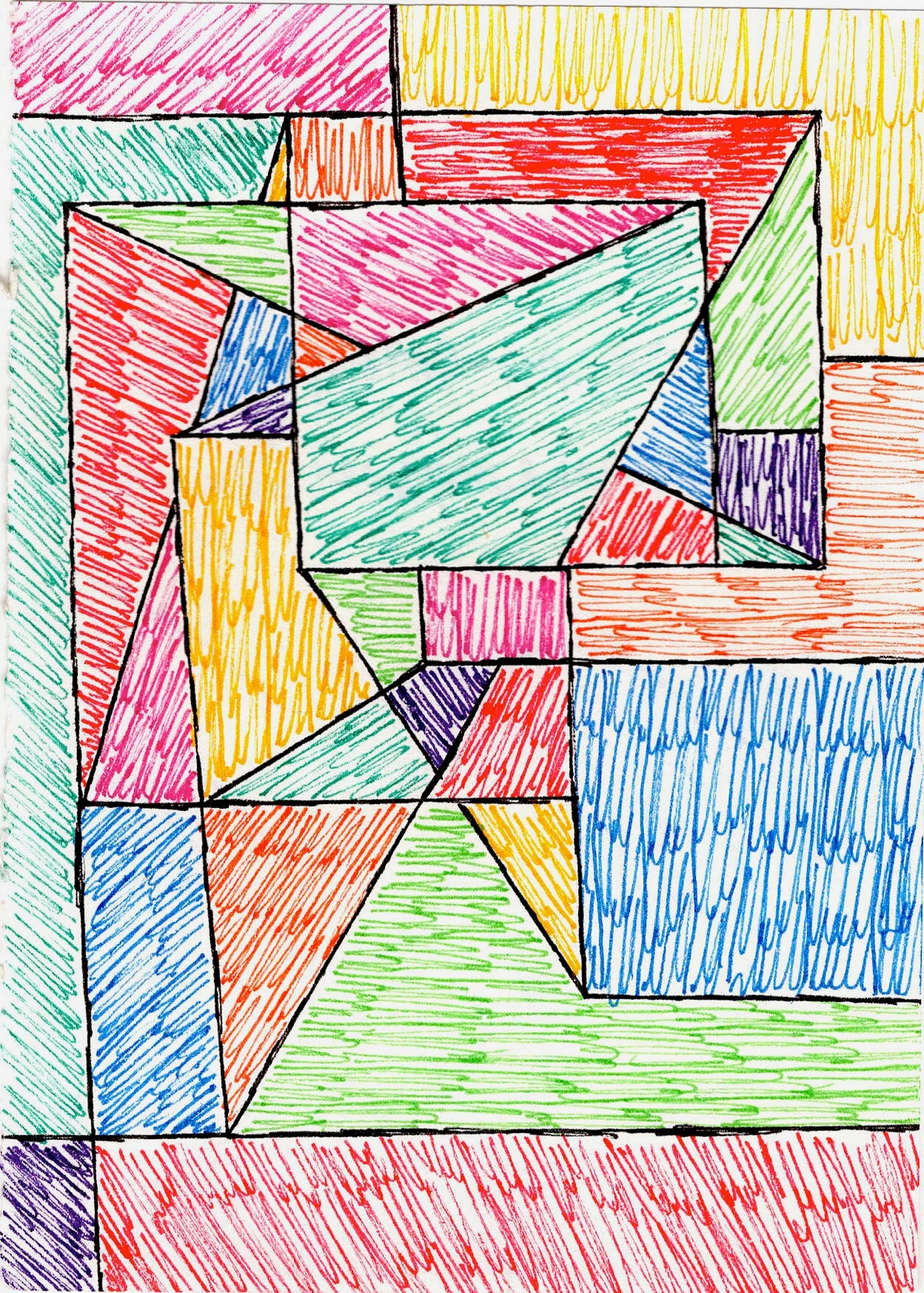
Abstract Art: The Vertical Powerhouse
Abstract pieces, free from the constraints of literal representation, command attention purely through their interplay of form, color, and composition. This makes them incredibly versatile and uniquely impactful in grand spaces. They don't just fill a wall; they engage the imagination, encouraging the viewer's gaze to wander, to explore, and naturally, to ascend across the expanse. Whether it's the raw energy of gestural abstraction, the serene balance of minimalist forms, or the captivating precision of geometric abstraction, each style offers unique ways to interact with verticality. For a deeper understanding of these concepts, explore the definitive guide to understanding form and space in abstract art and the definitive guide to understanding composition in abstract art.
Consider how a powerful vertical line in an abstract work can visually extend the ceiling, creating an illusion of boundless height, drawing the eye up towards the heavens like a silent prayer. Or how a carefully applied gradient of color, moving from deep earth tones to lighter, airy hues, can create an illusion of upward movement and infinite space, almost as if the wall itself is breathing. Intersecting lines, swirling forms, and expansive brushstrokes become silent guides, celebrating the height rather than fighting against it. They whisper stories of ascent, of freedom, of boundless possibility, almost daring you to look away.
Zen Dageraad, licence
Bold Colors, Dynamic Compositions, and the Psychology of Hue
In a tall room, subtlety can get lost. This is your chance to go bold. Vibrant colors, strong contrasts, and dynamic compositions truly shine. Think about pieces that have a sense of upward movement or expansive energy. A piece with intersecting lines or swirling forms can guide the eye upwards, celebrating the height rather than fighting against it.
Beyond mere vibrancy, consider the psychology of color in these grand spaces. Warm colors (reds, oranges, yellows) can sometimes visually 'bring down' the ceiling, fostering a sense of intimacy and coziness within a vast expanse. Conversely, cool colors (blues, greens, purples) can enhance the feeling of spaciousness and calm, making the high ceilings feel even more expansive. But the palette extends beyond just warm and cool. A meticulously crafted monochromatic scheme, for instance, can evoke deep serenity and sophistication, while a highly saturated, multi-color piece can inject exhilarating energy and playfulness into the room. It's a delicate dance; for deeper insights into this subtle art of influence, explore my thoughts on the psychology of color in abstract art.
Zen Dageraad, licence
Art and Architectural Harmony: A Dialogue with the Space
Once you've embraced the scale and chosen your artistic language, the next crucial step is ensuring your art harmonizes with the very architecture of your space. High ceilings often come with distinct architectural personalities – be it the exposed beams of an industrial loft, the ornate plasterwork of a Victorian home, the clean lines of a modern minimalist space, or the intricate details of an Art Deco apartment. Your art choice can either clash or create a beautiful dialogue with these elements. For industrial spaces, large-scale abstract works with raw textures or metallic accents can feel perfectly at home, like a bold statement against exposed brick or concrete. For more inspiration, explore decorating with abstract art in industrial chic interiors.
Meanwhile, a minimalist interior might benefit from a singular, powerful abstract piece that offers a punch of color without clutter, creating a serene yet impactful focal point. You can find more ideas in decorating with abstract art in modern minimalist homes. In a more traditional setting, such as a grand Victorian home, an abstract piece can provide a refreshing contemporary contrast, preventing the room from feeling too staid while respecting its heritage. For an Art Deco interior, consider bold, geometric abstracts with strong lines and perhaps metallic or jewel-toned accents that echo the era's sophisticated glamour. A Mediterranean villa, with its earthy textures and sun-drenched palette, might call for abstract art with organic forms, flowing lines, and a warm, natural color scheme that complements its rustic elegance. Even features like dormer windows or skylights can influence art placement, acting as natural light sources that create shifting plays of light and shadow, or as architectural elements that need to be harmonized with, not ignored. What architectural personality does your space embody?
Art Materials & Architectural Dialogue
Beyond style, consider how the materials of the artwork itself can engage with the architectural context. The raw, tactile qualities of a deeply textured abstract canvas can beautifully contrast with the sleek, polished surfaces of a modern apartment, creating a compelling dialogue between old and new, soft and hard. A piece incorporating metal or glass might echo the industrial sheen of an exposed concrete wall or the elegant lines of a steel staircase, while artwork made with organic fibers or natural pigments could resonate with a rustic, beamed ceiling. It’s about creating a conversation between the art and its environment, where both elements elevate each other.
Considering Specific Ceiling Forms
The form of your high ceiling also plays a role. A vaulted ceiling, with its graceful curves, might inspire art that has a sculptural quality or follows the upward sweep of the architecture, perhaps an abstract with flowing, organic forms. A coffered ceiling, with its geometric patterns, could be complemented by abstract pieces that play with strong forms and lines, echoing the ceiling's inherent structure. Even a simply very tall, flat ceiling offers a vast, uninterrupted canvas, allowing for truly expansive, singular works that draw the eye up.
Placement Perfection: Where to Hang the Magic?
So, after you've mused over the perfect scale and the ideal artistic language, the next crucial step is placement. This is where the "art" of hanging truly comes in – it’s not just about getting it on the wall; it's about making it sing within its grand setting. How will your art engage with the architecture, and what story will it tell as your eye travels upwards?
Here are some strategies to consider when placing art in these magnificent vertical expanses:
- Embrace the Center: Don't be afraid to hang a large piece higher than you typically would in a standard room. For a very tall wall, the visual center of the art (or gallery grouping) might be considerably above eye level, especially if you're trying to unite two floors or a mezzanine. Let it command attention, drawing the eye naturally upwards.
- Define Your Zone: If the high ceiling is part of a larger, open-plan space, use the art to define a specific area, like a dining nook or a seating arrangement. A monumental piece can anchor a primary zone, while a collection of complementary, perhaps slightly smaller, abstracts could subtly delineate a secondary, more intimate area. The art can serve as a visual anchor, creating intimacy within grandeur.
- Consider the Flow: How do your eyes naturally move through the room? The art should enhance this flow, leading your gaze rather than halting it abruptly. Remember, we're building a visual symphony, not a series of disconnected notes. The goal is to create a seamless visual journey.
- Mind the Viewpoint: Don't forget the multiple perspectives! How does it look from the bottom of the stairs, from a mezzanine, or from that comfy armchair across the room? High ceilings invite a constant visual journey, and your art should reward every step of it. Test out different viewing angles before making a final decision.
- Tailor to Function: The room's primary function should also guide your placement. In a grand foyer meant to impress, a soaring piece placed centrally makes a statement. In a more intimate living space, art might be placed slightly lower or as part of a multi-panel arrangement to create a more grounded, embracing feel, even with high ceilings. The art should serve the purpose of the space, not just exist within it.
- Irregular Ceilings: For spaces with angled, sloped, or multi-level ceilings, consider following the architectural lines. A series of artworks could step up a sloped wall, or a singular piece could be positioned to fill the largest, most coherent vertical segment. Sometimes, the 'negative space' created by an unusual ceiling line can become an active part of the composition, framing the art in an unexpected way. Don't fight the angles; work with them.
Freerange Stock, licence
Beyond Aesthetics: Art, Ambiance, and Practicalities
Crafting Ambience: Abstract Styles for Every Mood
Beyond simply filling a wall, the right artwork profoundly influences how a high-ceilinged space feels. Consider the unique language of abstract art to sculpt your desired ambiance. For a grand foyer meant to impress and inspire awe, a monumental gestural abstract, with its sweeping lines and raw energy, might be perfect, immediately drawing the eye upwards and setting a tone of architectural ambition. In a cozy living area where you want to foster conversation and intimacy, even with high ceilings, a serene minimalist abstract with soft hues and clean forms can create a calming, embracing atmosphere without sacrificing grandeur. For a quiet study or home office, a series of smaller, contemplative geometric abstracts arranged cohesively can foster a sense of groundedness and personal connection, aiding focus. Even a narrow, tall space like a stairwell presents unique opportunities: consider a singular, very tall and slender piece that emphasizes the ascent, or a series of vertically stacked smaller pieces that form a cohesive column. Abstract art with strong vertical lines or a clear upward flow can be particularly effective in guiding the eye gracefully up the stairwell, celebrating the height without overwhelming the narrowness. The art should serve the purpose of the space, not just exist within it, designing an emotional landscape that supports its intended use. What ambiance do you seek to create?
The Psychological Resonance of Height: Acoustics and Ambiance
While art won't change the actual thermostat setting, it can certainly influence how a room feels! Warm colors (reds, oranges, yellows) can visually 'bring down' the ceiling, making a vast, cool space feel cozier and more intimate, almost wrapping you in a visual embrace. For a cozy, inviting feel, consider a large abstract with warm ochres, deep reds, and burnt oranges. Cool colors (blues, greens, purples), on the other hand, can enhance the feeling of expansive airiness, reinforcing the cool grandeur of a tall room. For an airy, serene atmosphere, a piece with soft blues, muted greens, and hints of lavender would be ideal. It’s a subtle trick of the eye, but potent for shaping the psychological comfort of a space. Moreover, larger, textured pieces can absolutely make a subtle difference in mitigating echo in vast, high-ceilinged rooms. Soft, fibrous materials, deeply textured abstract canvases, or even large tapestries can absorb sound waves, making the space feel a little less cavernous and a lot more inviting. Beyond the materials, strategic placement, such as positioning a large, sound-absorbing piece on a particularly reflective wall, can also contribute to a more balanced acoustic environment. It's a bonus, really – your stunning artwork might also be doing a little bit of sound engineering on the side!
Longevity and Maintenance: Preserving Your Vertical Masterpiece
Placing art high up introduces unique considerations for its long-term care. Direct sunlight, often abundant in high-ceilinged spaces, can cause significant fading over time, especially for sensitive pigments. Consider UV-protective glazing for framed works, or strategically place art away from direct sun exposure. Dust accumulation is another practical challenge; pieces hung at great heights can gather dust unnoticed. For deeply textured or mixed-media works, regular, gentle dusting with a soft, long-handled brush or a low-suction vacuum attachment is essential. For more substantial cleaning, or for pieces with delicate elements, always consult the artist’s recommendations or a professional conservator. Investing in proper care ensures your vertical masterpiece retains its vibrancy for years to come. How will you safeguard your artistic investment?
Lighting Fixtures: Rivals or Companions?
Finally, don't overlook the impact of your lighting fixtures themselves in high-ceilinged spaces. A dramatic, oversized chandelier or a series of pendant lights can be a magnificent statement piece, but it can also compete with or cast unwanted shadows on your artwork. Consider how light fixtures complement the art, both in style and in their illumination capabilities. Recessed lighting or track lighting can be adjusted to highlight artworks without becoming a visual distraction, while a grand chandelier can anchor the room from above, allowing the wall art to take center stage. The key is to design a cohesive lighting plan where all elements work in harmony, rather than vying for attention. How do your light fixtures illuminate your artistic choices?
The Practicalities of Hanging Giants
Hanging very large or heavy artworks in high-ceilinged rooms isn't just a matter of aesthetics; it's a significant logistical and safety consideration. This is where the initial joy can quickly turn into a headache if not planned correctly. For substantial pieces, I often recommend consulting with professional art installers. They have the specialized equipment, experience, and insurance to ensure your artwork is securely and precisely placed without damage to the piece or your walls. Think specialized ladders, scaffolding, and museum-grade hanging systems.
Here are key considerations for hanging large art:
- Hanging Systems: Explore options like French cleats (ideal for heavy, flush-mount pieces), heavy-duty D-rings with appropriate picture wire, or discreet cable systems for maximum flexibility and weight distribution across the wall structure.
- Wall Structure: Always assess the wall structure beforehand – is it drywall, plaster, brick, or concrete? This will dictate the appropriate anchors and hardware needed. For instance, toggle bolts are great for drywall, while masonry anchors are essential for brick or concrete.
- Professional Help: Never underestimate the importance of robust hardware and a keen eye for safety. If in doubt, a professional installer is worth every penny – your art, and your back, will thank you.
And a little aside: if you're ever feeling overwhelmed by the sheer size of a high-ceilinged room, perhaps you're also wondering about the opposite problem. You might find my thoughts on collecting art for small apartments: maximizing impact in limited spaces interesting, as the principles of impact shift dramatically with space constraints. It’s all about context, isn't it?
FAQ: Elevating Your Art Game
Navigating the unique challenges of high-ceilinged spaces can sometimes feel like an endless quest. Here are some frequently asked questions that might just illuminate your path to artistic triumph:
Q: How high should I hang the art?
A: This is less about a hard-and-fast rule and more about relation and how you want the art to interact with the space. If it's a single piece above furniture, ensure it's visually connected to that furniture (typically 6-8 inches above). For a standalone wall, especially one that spans multiple stories, consider the visual center not just of the artwork itself, but how it relates to the entire vertical expanse. A good rule of thumb I often lean on is to aim for the center of the artwork to be roughly at two-thirds up the wall from the floor – this often feels most harmonious and allows the art to command presence without feeling isolated. But don't be afraid to go higher if the art is truly meant to draw the eye up a multi-story space, making a bold statement. The key is to experiment, to stand back, and trust your gut!
Q: Can I use multiple small pieces on a high wall?
A: You absolutely can, but with caution. Group them together tightly to form a single, larger visual unit. Think of it as creating one big "mega-piece" from smaller components. Avoid scattering them too far apart, or they'll look lost and disconnected, like lonely islands. A well-composed gallery wall can be incredibly impactful, adding layers of interest as the eye travels upwards. To make it cohesive and impactful, maintain a consistent gap of no more than 2-4 inches between frames to create a unified visual block that reads as a single, powerful statement. Consider a grid pattern for a modern, organized look, or a more organic, staggered arrangement around a central anchor piece for dynamic interest.
Q: What about texture or mixed media?
A: Oh, yes! Texture can add another layer of depth and interest, especially in a large space where details can sometimes be overlooked. Textured works, perhaps even incorporating textiles or other materials (my own journey with mixed media: blending materials for abstract expression is testament to this), or those with tactile elements can invite closer inspection, adding an intimate contrast to the grandeur of the high ceiling. It's like a secret handshake between the art and the viewer, inviting them to engage on a deeper, sensory level. You can delve deeper into this topic in the role of texture in abstract art: a sensory exploration.
Zen Dageraad, licence
Q: How does lighting (natural vs. artificial) affect art in high-ceilinged rooms?
A: Oh, this is a crucial one! Natural light, especially from large windows or skylights often found in high-ceilinged spaces, can be wonderfully dynamic but also challenging. It changes throughout the day, altering how colors and textures are perceived, sometimes even creating unwanted glare. Poorly managed direct sunlight can also cause fading over time. Artificial lighting, particularly directional spotlights, can be your best friend, allowing you to highlight the artwork and prevent it from getting lost in the shadows. For abstract art, good lighting can emphasize brushstrokes, texture, and the interplay of colors, bringing the piece to life. Poor lighting, however, can flatten a piece or create unwanted glare. Think of it as an invisible frame, guiding the viewer's eye. And always consider how the light source itself interacts with the high ceilings – is it creating interesting shadows or just a general wash of light?
Unknown, licence
Q: Can art in high-ceilinged rooms impact the room's acoustics?
A: While art isn't typically the primary solution for acoustic issues, larger, textured pieces can absolutely make a subtle difference in mitigating echo in vast, high-ceilinged rooms. Soft, fibrous materials, deeply textured abstract canvases, or even large tapestries can absorb sound waves, making the space feel a little less cavernous and a lot more inviting. Beyond the materials, strategic placement, such as positioning a large, sound-absorbing piece on a particularly reflective wall, can also contribute to a more balanced acoustic environment. It's a bonus, really – your stunning artwork might also be doing a little bit of sound engineering on the side!
Q: Can art impact the perceived temperature of a high-ceilinged room?
A: While art won't change the actual thermostat setting, it can certainly influence how a room feels! Warm colors (reds, oranges, yellows) can visually 'bring down' the ceiling, making a vast, cool space feel cozier and more intimate, almost wrapping you in a visual embrace. For a cozy, inviting feel, consider a large abstract with warm ochres, deep reds, and burnt oranges. Cool colors (blues, greens, purples), on the other hand, can enhance the feeling of expansive airiness, reinforcing the cool grandeur of a tall room. For an airy, serene atmosphere, a piece with soft blues, muted greens, and hints of lavender would be ideal. It’s a subtle trick of the eye, but potent for shaping the psychological comfort of a space.
Q: How do I choose art for a narrow, tall space, like a stairwell?
A: Narrow, tall spaces present their own unique challenges and opportunities! Here, verticality is paramount. Consider a singular, very tall and slender piece that emphasizes the ascent, or a series of vertically stacked smaller pieces that form a cohesive column. The key is to celebrate the height without overwhelming the narrowness. Abstract art with strong vertical lines or a clear upward flow can be particularly effective in guiding the eye gracefully up the stairwell, creating a continuous visual story.
Q: Should the room's function influence my art choice for high ceilings?
A: Absolutely, yes! The room's purpose should always be a guiding principle. In a grand entrance hall or living room meant for entertaining, you might opt for a truly monumental piece that serves as a dramatic focal point and conversation starter. For a more intimate bedroom or a quiet study, even with high ceilings, you might prefer a series of smaller, calming abstracts arranged to create a sense of groundedness and personal connection, rather than purely emphasizing height. The art should enhance the intended atmosphere and use of the space.
Q: How does ceiling height impact the perceived scale of furniture and other decor elements?
A: High ceilings can dramatically alter how furniture and other decorative elements are perceived. A vast vertical expanse can make standard-sized furniture feel dwarfed and disconnected, almost floating in space. To counteract this, consider larger, more substantial pieces of furniture or arrange them in cohesive groupings to create visual weight and anchor the space. Similarly, other decor elements like tall plants, floor-to-ceiling curtains, or large-scale lighting fixtures should be chosen to complement the height, ensuring everything feels proportional and intentional rather than lost in the grandeur.
Q: What if I have multiple high-ceilinged areas or a very open-plan layout to decorate?
A: This is where strategic zoning becomes your best friend. In a very open-plan space with multiple high-ceilinged zones, use distinct, yet complementary, artworks to delineate each area. A monumental abstract might anchor a primary living zone, while a cohesive gallery wall of smaller, related pieces could define a dining area. The key is to ensure visual continuity through a shared color palette or artistic style, preventing the space from feeling disjointed, while still allowing each zone to have its own unique artistic identity. Think of it as composing a symphony with different movements that all share an overarching theme.
The Sky's the Limit (Quite Literally)
Decorating with art in high-ceilinged rooms isn't about simply filling empty space; it's about amplifying the inherent drama and elegance, turning an architectural feature into an artistic triumph. It's an opportunity to create breathtaking focal points, to tell a grand story, and to make a lasting impression that echoes the very aspiration of the space. Don't let the height intimidate you; let it inspire you, inviting you to think beyond conventional boundaries and transform that vastness into your personal masterpiece.
I remember working on a commission for a client who had this incredible, cavernous living room – a true testament to architectural ambition, and honestly, a little bit terrifying. My initial thought wasn't "Wow, what possibilities!" but more like, "How do I create something that doesn't just hang there, but lives there? How do I ensure it has enough visual weight to hold its own, or that its colors don't get swallowed by the immense light?" It pushed me to think beyond the canvas, to consider how my work would interact with the ambient light, the shifting shadows, and the sheer volume of the space. It was exhilarating, terrifying, and utterly rewarding. The piece I created, a sprawling abstract, became a visual anchor, a silent conductor of the room's energy, proving that even the most daunting spaces are just invitations to innovate, to stretch the boundaries of what art can do. This experience profoundly shaped my creative path, reminding me that every blank canvas, no matter how vast, is an invitation to innovate. So, go forth and paint your vertical story; the only limit is your imagination and, well, maybe the ceiling itself (but even then, we can stretch it!). If you're looking for something that speaks to this kind of ambition, perhaps take a peek at my collection of art for sale – you might just find a piece that sparks an idea for your own grand space. Or, if you're ever near my museum in 's-Hertogenbosch, you can see how some larger works fill my own high-ceilinged studio! Embrace the challenge, trust your instincts, and perhaps, just perhaps, you'll discover a new dimension of artistic expression, just like I did on my own artistic timeline. What grand vision will you bring to life?


