Form & Space in Abstract Art: The Unseen Architects of Emotion
Explore the fundamental elements of form and space in abstract art. Understand how artists manipulate these core concepts to evoke emotion, create depth, and guide the viewer's experience.
Form & Space in Abstract Art: The Unseen Architects of Emotion
Sometimes, when I'm staring at a blank canvas, cup of lukewarm coffee beside me, the sheer audacity of creating something new hits me. How do you even begin to conjure a world from nothing? For me, it often comes down to two seemingly simple, yet profoundly complex, concepts: form and space. They're the silent architects of emotion in abstract art, the invisible forces that dictate whether a piece feels open or claustrophobic, calm or chaotic. This guide aims to demystify these core elements for both aspiring artists and enthusiastic viewers, uncovering the secret language that makes abstract art so profoundly resonant. We'll dive into what form and space truly are, how artists skillfully manipulate them, and how you, the viewer, can deepen your appreciation.
I remember years ago, early in my artistic explorations, I'd wrestle with my compositions, wondering why some felt flat, lifeless, or just… off. It was like trying to tell a story without understanding grammar. Then, I had one of those "aha!" moments, probably while trying to rearrange my perpetually messy studio – the same principles I intuitively used to make my small space feel larger, or to group objects meaningfully, were at play on the canvas. It wasn't just about what I painted, but how those elements related to each other, and the emptiness around them.
This guide is my attempt to unpack those revelations for you, to peel back the layers of what makes abstract art 'breathe' or 'suffocate,' to share my own triumphs and fumbles in mastering (or at least befriending) form and space, ultimately helping both aspiring artists and enthusiastic viewers to decode the profound visual language at play. It’s a journey that touches upon the very fabric of visual language, delving into how these elements sculpt our emotional responses. So, let's dive in, shall we? What feelings are waiting to be uncovered in the interplay of presence and absence?
What Even Are Form and Space in Abstract Art? (And Why Do I Obsess Over Them?)
Before we get too philosophical, let's nail down the basics. These aren't just fancy art school terms; they're the bread and butter of visual language, the fundamental elements and principles of art at play.
Demystifying Form: More Than Just "Shape"
Think of form in abstract art not just as a distinct visual unit, but as the individual elements that make up the composition, or even the overall structure and arrangement of those elements. While a shape is a two-dimensional outline (like a square drawn on paper), form goes beyond that, implying three-dimensionality, volume, and presence, even if it's only suggested on a flat surface. It's the 'presence' that occupies an area – a splash of color, a bold line, a geometric figure, an organic blob, or even a gestural brushstroke. The deliberate choice of texture, from thick impasto to smooth glazes, can also imply form and volume, even in a purely abstract context.
For me, grappling with form was initially confusing. I'd think, "It's just a shape, right?" But form is more than an outline; it has implied volume, weight, and presence. It's about how that shape feels – does it feel heavy or light? Sharp or soft? Stationary or dynamic? When I push a thick smear of paint across the canvas, I'm not just making a shape; I'm creating a presence, an almost tangible mass that asserts itself against the void. It’s a negotiation, a quiet assertion of existence.
Consider the sharp, assertive geometry of a Cubist painting, demanding intellectual engagement, versus the fluid, emotional smears of an Abstract Expressionist, pulling at your gut. Or the biomorphic, organic shapes of an artist like Joan Miró, which evoke a dreamlike, almost living presence. Each type of form, from the precisely engineered geometric to the spontaneously gestural, carries its own unique psychological weight and emotional resonance. A sharp, angular form might convey tension or precision, feeling almost aggressive or demanding attention, while a soft, rounded one might evoke calm, warmth, or a gentle embrace. Even the edges of a form play a role: hard, sharp edges define forms more strongly, making them pop forward, while soft, blurred, or blended edges make forms recede or merge with the background, creating atmosphere or distance.
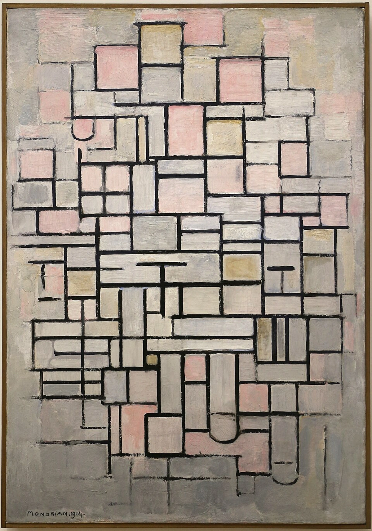
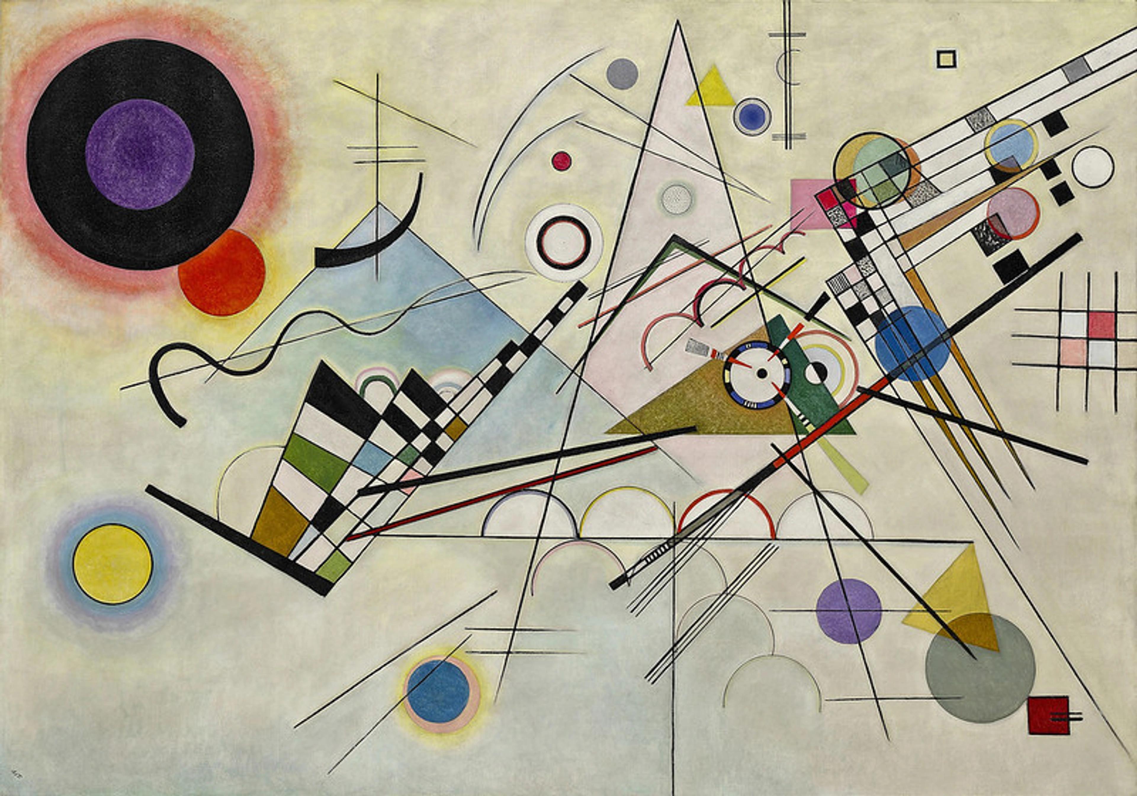
Think of the clean, almost architectural forms in some of Mondrian's work, a hallmark of the De Stijl movement. Each rectangle and line is a distinct form, asserting its presence with deliberate clarity. Then compare that to the spontaneous, gestural forms of an Abstract Expressionist – smears and drips that still hold a specific, albeit more fluid, identity. The contrast is immense, but both artists are consciously (or intuitively) manipulating form. If you're keen to explore the symbolism of geometric shapes in abstract art, there's a whole world there to uncover!
Navigating Space: The Invisible Architect of Feeling
And then there's space. Oh, space! This is where things get really interesting, and frankly, sometimes a little mind-bending. Space is the area around and between the forms. It's the emptiness, the void, the background, but it's far from passive. In abstract art, space can be:
- Flat (Two-Dimensional): Like a wall, where everything seems to exist on the same plane, emphasizing the literal surface of the canvas. This choice often forces the viewer to confront the painting as an object itself, rather than a window into another world.
- Deep (Three-Dimensional): Creating an illusion of distance, recession, or projection, inviting the eye to wander into a pictorial world beyond the surface, drawing you in.
- Ambiguous: Where you're not quite sure if something is in front or behind, near or far. It keeps your eye guessing, which is delightful chaos for some of us! This ambiguity can evoke a sense of mystery or an unsettling, dreamlike quality, playing with our ingrained need for visual certainty. This delicious uncertainty is often achieved through conflicting overlaps (where elements seem to both cover and be covered by each other), subtle shifts in color temperature that blur the line between foreground and background, the deliberate absence of clear focal points, the use of forms that seem to dissolve into their surroundings, or even a subtle application of atmospheric perspective where elements appear hazier or less defined in the implied distance. Unconventional light sources or conflicting shadow cues can also heighten this spatial confusion, creating a visual puzzle designed to keep your mind active, refusing simple solutions.
- Positive and Negative: Positive space is occupied by forms, negative space is the 'empty' area surrounding them. Often, the negative space is just as important, if not more so, in defining the positive. It's the breath between the notes, the silence that makes the music resonate. A true artist understands that the 'empty' areas are just as crucial to the composition as the 'filled' ones.
I often think of space as the breathing room of a painting. Too little, and it feels cramped, suffocating. Too much, and it can feel empty, disconnected. Finding that sweet spot, that perfect balance, is a constant dance. It's like deciding how many pieces of furniture to put in a room – you want enough to be functional and inviting, but not so much that you can't walk through it without bumping into something. Or, for me, it’s often wondering if I’ve created a cozy nook or a vast, lonely plain.
The Artist's Choice: Embracing Flatness or Illusion (or the Tension Between Them)
One of the most conscious decisions an abstract artist makes is whether to emphasize the two-dimensional reality of the canvas or to create the illusion of three-dimensional depth. This choice is a powerful tool for dictating how the viewer experiences the work. Some artists, like the Minimalists or Color Field painters (think Barnett Newman's 'zip' paintings or the vast, monochromatic fields of Brice Marden), embrace flatness, making the painting an object that sits on the wall, forcing a direct confrontation with its surface, color, and scale. Others, like many Abstract Expressionists (Mark Rothko’s immersive color fields, for example, which invite contemplation of vast, internal spaces) or even more geometric abstractionists, aim for a profound sense of recession, inviting the viewer into a deep, often tumultuous, pictorial space. There’s no right or wrong, only intention. It's about what story the artist wants the space to tell, and sometimes, a little self-aware cheekiness from the artist wondering if they've made a door or a window. Interestingly, some artists, like Picasso in his journey through Cubism, deliberately shifted between emphasizing flatness and creating the illusion of broken, multi-faceted space within the same body of work, constantly redefining the viewer's spatial perception. He challenged the singular viewpoint, presenting multiple perspectives simultaneously to create a new kind of fragmented, yet deeply spatial, reality. Ellsworth Kelly, too, explored this dichotomy, often presenting forms that could be read as both flat shapes and implied volumes depending on the viewer's focus. The tension created by playing with both flatness and illusionistic depth within the same composition can be incredibly compelling, keeping the viewer's eye constantly engaged, questioning what is real and what is perceived.
The Figure-Ground Relationship: Where Forms Emerge
This might sound technical, but it's fundamentally how our brains make sense of what we see. The figure-ground relationship refers to the way we perceive forms (the "figure") as distinct from their background (the "ground"). In abstract art, this relationship is fluid and often intentionally blurred. Sometimes, a form might pop out vigorously, demanding attention. Other times, it might merge subtly with its background, creating a more ethereal or mysterious effect. It's a dance, a constant push and pull, and an artist's strategic manipulation of this relationship can profoundly alter perception. Think of Josef Albers' 'Homage to the Square' series, where simple squares nested within each other profoundly shift their perceived position and depth based on their color relationship to the ground. Or imagine a dark, aggressive form suddenly appearing buoyant and light when surrounded by an even darker, heavier background. While not strictly abstract, artists like M.C. Escher masterfully demonstrate figure-ground reversal. In pure abstraction, artists like Bridget Riley or Victor Vasarely in their Op Art, actively exploit this relationship, creating dazzling optical illusions where forms oscillate between foreground and background, challenging the eye's certainty. In abstract expressionism, a vibrant, gestural mark might initially appear as a clear figure, but on closer inspection, the surrounding 'ground' of pooled color might assert its own form, making the distinction melt away. Mastering this interplay, recognizing that the "empty" space is actively shaping the "full" space, is a profound revelation for any artist. It's about sculpting the unseen, a concept I've explored extensively in my approach to the power of negative space.
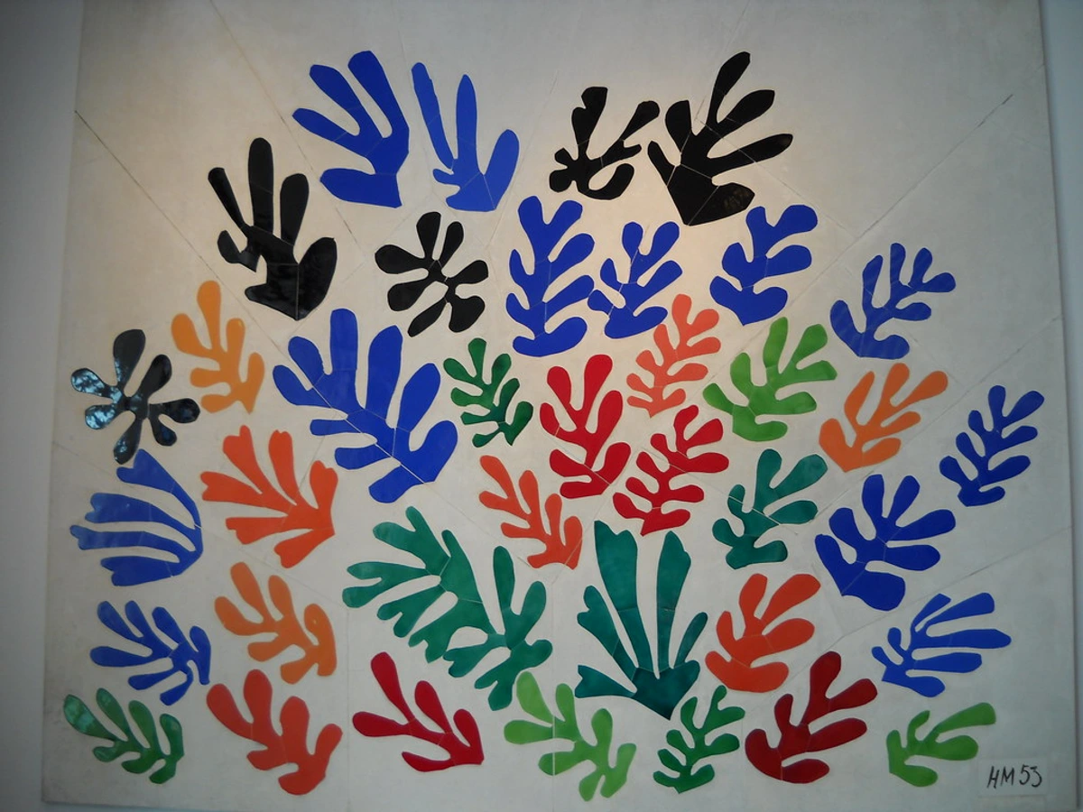
Think of Matisse's cut-outs, like "La Gerbe." The vibrant, organic shapes are the figures, but the white paper around them isn't merely background; it's an active, positive space that defines the contours and movement of the colorful forms. It's a beautiful dance between presence and absence.
The Role of the Frame: Defining the World Within
Before we dive into how artists manipulate elements within the canvas, it's worth a moment to consider the boundary that defines the entire experience: the frame. While external to the painted surface, the frame plays a surprisingly significant role in how we perceive the forms and spaces within an abstract artwork. A frame acts as a boundary, a window, or sometimes even a barrier, defining the extent of the pictorial world. A thick, ornate frame might contain the space more formally, inviting a sense of gravitas, while a simple, thin strip or a frameless canvas (gallery wrap) can extend the artwork's implied space into the room, making it feel more integrated with its surroundings. The choice of frame material – be it a heavy, dark wood that grounds the piece, a sleek metal that suggests modern precision, or a subtle linen that softens its edges – further influences this perception. The frame's color, too, can either complement or contrast with the artwork, subtly shaping the viewer's initial interaction and setting the stage for the spatial narrative unfolding on the canvas. It's the silent witness, always there, subtly influencing the conversation between viewer and artwork, sometimes a gentle embrace, sometimes a firm declaration.
The Principles: How Artists Play with Form and Space
Abstract artists don't just throw paint at a canvas (well, sometimes we do, but there's usually an intention behind it!). We consciously, or unconsciously, apply certain principles to manipulate form and space.
Composition: The Grand Choreography
At the heart of how forms and spaces interact is composition. This is the arrangement of all the visual elements in a painting. Good composition guides your eye, creates balance, and establishes a hierarchy of importance. In abstract art, forms might be arranged in a grid, a radiating pattern, or a chaotic explosion, each choice profoundly altering the perceived space and the feeling it evokes. While some might think of the Golden Ratio or rule of thirds as tools for representational art, their underlying principles of visual harmony and dynamic balance often intuitively guide abstract artists too, even if we're not actively measuring. These principles work by creating predictable visual pathways or pleasing proportions that our brains are naturally drawn to, making the composition feel stable yet dynamic. I sometimes think of myself as a choreographer, directing a silent ballet of shapes and voids, trying to find that perfect moment where every element feels both inevitable and surprising. Composition defines the visual grammar through which forms and spaces communicate. It’s where the unspoken conversations between elements begin.
Overlap and Layering: The Illusion of Depth
One of the most straightforward ways to suggest depth and create space is through overlap and layering. When one form partially covers another, the viewer's brain automatically assumes the partially covered form is behind the other, creating an illusion of depth. This simple technique is remarkably powerful, as it instantly disrupts the flatness of the canvas and hints at a world receding into the distance or projecting forward. It's an intuitive shortcut our minds use to interpret three-dimensional reality from a two-dimensional surface.

I use layering extensively in my work, building depth in abstract acrylics to invite the viewer's eye to wander, to discover hidden nuances. It's a bit like archaeology, digging through strata of color and texture to reveal the painting's history. When a transparent blue layer is applied over a solid red form, the red might appear to recede, creating a sense of depth, but if the blue is very opaque, it might push the red forward, creating a complex spatial push-and-pull. This delicate dance is crucial for my process in creating abstract layers, allowing me to create those ambiguous spaces where the eye isn't sure what's in front and what's behind, fostering a sense of continuous discovery. Overlap and layering are essential for creating spatial recession and complexity.
Color and Value: Shifting Perspectives
Color is a powerful tool for manipulating form and space. Warm colors (reds, yellows, oranges) tend to advance, appearing closer to the viewer, while cool colors (blues, greens, violets) tend to recede. Light values also tend to advance, while dark values recede. Furthermore, the saturation (intensity) of a color also plays a critical role: highly saturated, vibrant colors tend to advance and grab attention, while desaturated or muted colors recede, creating a sense of distance or subtlety. By strategically placing colors and varying their intensity, an artist can create incredible depth or flatten a composition entirely. This is where the psychology of color really comes into play, creating a dynamic visual experience. Furthermore, the edges of a colored form can play a huge role: hard, sharp edges tend to define forms more strongly and can make them pop forward, while soft, blurred, or blended edges can make forms recede or blend into the background, creating a sense of atmosphere or distance, much like in traditional atmospheric perspective. And then there's the fascinating phenomenon of simultaneous contrast, where the perception of a color is altered by the colors surrounding it. For example, a muted gray square will appear cooler and recede slightly when placed next to a vibrant warm red, but will appear warmer and advance when placed against a cool blue. This isn't just theory; it's a daily conversation I have with my palette, wondering how each hue will 'behave' in the company of others, influencing not just the form but the entire spatial dynamic. The careful interplay of hues and their intensity, a deep dive into color theory, is essential for this dance of perception. Color and value are masterful illusionists, pushing and pulling forms across the canvas.
Line and Texture: Defining Boundaries and Surfaces
Lines are fundamental in defining forms and carving out space. They can be thin and delicate, suggesting fragility, or thick and bold, asserting dominance. The direction of a line can also create movement, leading the eye through the space. A frantic, broken line, a series of dotted marks, or even an implied connection can make a space feel chaotic and unsettling, while a long, sweeping curve can create a sense of calm and expansiveness. A sharp, geometric line might define a precise boundary, making a form feel contained and static, whereas a loose, gestural line can suggest freedom, energy, or an incomplete, evolving form, often implying movement. This is the very language of line at work. Moreover, gestural abstraction, where the artist's physical movement is directly translated onto the canvas, imbues the lines and forms with palpable energy, turning paint into a record of dynamic motion and immediate presence.
Texture, whether real (impasto, collage elements) or implied (through brushwork), also plays a huge role. A heavily textured impasto surface, perhaps with thick strokes of paint that almost physically protrude from the canvas, can make a form feel rough, substantial, and physically closer, demanding attention. Conversely, a smooth, flat surface or subtle glazes can make a form recede, feel ethereal, or create an illusion of infinite depth. The deliberate absence of texture can itself be a powerful choice, emphasizing flatness or creating a serene, uninterrupted expanse. Smooth, polished surfaces can convey a sense of calm or introspection, while jagged, raw textures might evoke tension or rawness. And when I incorporate collage elements, the real-world texture they bring instantly creates a tangible, often playful, dialogue with the painted surfaces around them, adding another layer to the spatial conversation. Exploring texture has been a constant fascination for me, as it adds a tactile dimension to the visual experience, inviting not just the eye, but an imagined touch. Lines define; textures embody, both shaping perceived forms and their spatial relationships.

Scale and Proportion: Making Giants or Miniatures
The relative size of forms within a painting, and their proportion to each other, dramatically affects the perceived space. A small form next to a large one can create a sense of vastness or intimacy, or make the smaller form appear fragile and vulnerable. Playing with scale can disorient the viewer, making familiar forms seem alien or making abstract elements feel monumentally important. When forms are of similar size, it can create a sense of equality or rhythmic repetition; when they vary wildly, it introduces drama and a strong sense of depth. It's a subtle game of visual trickery that I absolutely adore. Beyond the internal scale of the forms, the actual physical size of the artwork itself also dictates how a viewer interacts with its space. A monumental canvas, like those found in a grand museum hall, can envelop the viewer, making them feel within the space, almost a part of the painting. Conversely, a small, intimate piece might invite close contemplation, drawing the viewer's eye into a contained world, a secret universe unfolding before them. Scale and proportion are powerful tools for dictating visual hierarchy and perceived spatial dimensions.
Balance and Tension: The Rhythmic Dance
When I arrange forms on a canvas, I'm not just placing them; I'm orchestrating their relationships, seeking a delicate equilibrium between visual harmony and compelling discord. Balance in abstract art refers to the distribution of visual weight. Forms and spaces can be arranged symmetrically (formal balance, often creating a sense of calm, order, and stability, like a mirror image) or asymmetrically (informal balance, leading to dynamic compositions that still feel stable, albeit with more energy and visual interest, often achieved by balancing a large, bold form on one side with a cluster of smaller, lighter forms on the other). Symmetrical balance, with its predictable repetition, often generates a sense of calm and order, while asymmetrical balance offers a more dynamic, energetic spatial experience. But sometimes, I crave a different kind of energy, a frisson of tension. By intentionally unsettling the balance, by crowding forms, or creating sharp, unexpected juxtapositions of space, an artist can evoke feelings of unease, excitement, or profound psychological depth. It’s like a dissonant chord in music – jarring at first, but ultimately creating a richer, more complex emotional landscape. I've often played with this, enjoying the slight discomfort it can create, knowing it means the viewer is truly feeling the work. It's about finding that sweet spot where chaos has a purpose, where the push and pull of forms create a compelling visual rhythm. Balance creates harmony or stability; tension introduces dynamic intrigue.
Rhythm and Repetition: The Echoes of Movement
Beyond static balance, abstract art often hums with rhythm and repetition. When forms or marks are repeated, varied, or echo each other across the canvas, they create a visual beat, guiding the eye through the composition. This rhythmic interplay can establish a sense of movement, depth, and even time. Think of a series of overlapping lines or shapes that progressively get smaller or shift in hue – they don't just exist; they move, they dance, they recede or advance, creating a palpable sense of spatial progression. A repeating motif that gradually fades into the background, for instance, implies distance, drawing the viewer deeper into the canvas. This silent drumming of the visual world turns a flat surface into a dynamic arena where forms play out their own unfolding drama. It’s a core component of my creative flow to let these rhythms emerge naturally. Rhythm and repetition imbue abstract art with dynamism and a sense of unfolding space.
Unknown
Light and Shadow: Sculpting the Invisible
Even in abstract art, the concept of light and shadow (or more accurately, value contrast) is paramount in defining forms and creating depth. While not always representational light from a specific source, the interplay of lighter and darker areas can sculpt implied volume, create dramatic focal points, and suggest sources of illumination or deep pockets of darkness. A sharp contrast between a bright form and a dark background will make that form leap forward, asserting its presence, much like a stage light picks out an actor. Conversely, subtle shifts in value can create a soft, ethereal glow or a hazy sense of distance, making forms feel as if they are emerging from or dissolving into the very atmosphere of the painting. It's about harnessing contrast to give abstract elements a tangible, almost theatrical, presence, defining their perceived existence within the canvas. For instance, a light, almost translucent form against a dark, opaque background will feel as though it's hovering or glowing. Light and shadow, as value contrasts, are fundamental to sculpting implied forms and creating spatial depth.
Visual Weight: The Gravitas of Presence
Every element in an abstract painting – a splash of color, a thick line, a dense texture, its placement, its complexity – carries a certain visual weight. This isn't literal weight, of course, but rather its perceived dominance or impact on the eye. Larger forms, darker colors, saturated hues, complex textures, or elements placed centrally tend to feel 'heavier,' drawing more attention and creating a sense of gravitas. Conversely, smaller forms, lighter colors, desaturated tones, smoother textures, or elements placed at the periphery often feel 'lighter.' An artist strategically distributes this visual weight across the canvas to achieve balance, create focal points, or intentionally introduce tension. For example, a large, dark, textured form in a corner might be balanced by a small, bright, centrally placed element. It's like a silent tug-of-war, where each element asserts its presence, contributing to the overall stability or dynamic energy of the composition. Understanding this allows me to make a tiny, vibrant mark feel as monumental as a sprawling canvas. Visual weight dictates the perceived importance and stability of forms within a composition.
Historical Echoes: Pioneers of Form and Space
But how did we get here? Who were the trailblazers who first dared to paint without painting anything recognizable? The exploration of form and space is as old as abstraction itself, evolving through the minds of visionary artists who dared to reimagine visual reality.
Cubism: Fracturing and Rebuilding Space
Before pure abstraction, Cubism (pioneered by Picasso and Braque) fundamentally reshaped how artists approached form and space. They rejected traditional single-point perspective, instead presenting objects from multiple viewpoints simultaneously, fragmenting forms into geometric planes. This created a revolutionary kind of fragmented, shallow, yet deeply complex pictorial space where forms interpenetrated and dissolved into each other, forcing the viewer to actively reconstruct the image in their mind. Cubism laid crucial groundwork for later abstract artists in understanding how to manipulate perceived space without traditional illusionism.
Kandinsky and the Spiritual Space
Wassily Kandinsky, often credited with painting one of the first purely abstract works, was deeply invested in the spiritual dimensions of art. For him, forms and colors weren't mere optical phenomena but carriers of profound inner meaning. Kandinsky, deeply influenced by Theosophy and its mystical exploration of spiritual truths, believed that certain colors and geometric forms had inherent spiritual vibrations, and by arranging them in specific ways, he could create a composition that resonated with the viewer's soul, creating a spiritual or emotional space rather than a literal one. His early works, with their swirling, vibrant forms, were an attempt to create a visual language divorced from the material world, pushing forms into a dynamic, often ethereal, space.

Malevich and the Supremacy of Pure Feeling
Kazimir Malevich, the founder of Suprematism, pushed abstraction to its absolute limit with his iconic "Black Square." For Malevich, the square was not a shape but a symbol of pure artistic feeling, stripped of all objective representation. His compositions, often featuring simple geometric forms (squares, circles, rectangles) floating on vast, uninflected white backgrounds, were an attempt to evoke an infinite, cosmic space. This "white void" was not empty but pregnant with possibility, a realm where pure artistic sensation could thrive. It was a radical redefinition of both form and space, reducing them to their most essential, powerful state.
Constructivism and Dynamic Structures
Emerging in Russia, Constructivism took a more utilitarian, architecturally-inspired approach to abstract form and space. Artists like Alexander Rodchenko and Vladimir Tatlin focused on geometric forms, lines, and planes arranged in dynamic, often overlapping compositions. Their aim was not to create illusions of depth as much as to suggest real, three-dimensional structures and their interrelationships, often with an emphasis on engineering and functionality. The space in their work often feels like a blueprint for a dynamic, utopian future, where forms are carefully constructed and interconnected.
Other Influential Movements
Beyond these pioneers, many other movements critically explored form and space. De Stijl, with artists like Piet Mondrian, advocated for pure geometric abstraction using primary colors and orthogonal lines, emphasizing flatness and a universal, harmonious order in space. Abstract Expressionists, such as Jackson Pollock with his all-over drip paintings, created immersive, boundless spaces where gestural forms extended beyond the canvas edges, inviting the viewer into a vast, energetic realm. Mark Rothko, another Abstract Expressionist, used vast, shimmering color fields to create a sense of deep, contemplative, and almost spiritual space that enveloped the viewer. Minimalism, on the other hand, reduced art to its bare essentials, often using simple, industrial forms and emphasizing the literal objecthood of the work and its relationship to the architectural space it inhabited, challenging the very notion of a separate pictorial space. Artists like Donald Judd or Frank Stella, through their precisely crafted objects and paintings, highlighted the physical presence of the artwork within the actual gallery space.
The Perception: How You Experience It
Here's the beautiful part: it's not just about what the artist does; it's about what you experience. Abstract art is a dialogue, not a monologue.
The Dynamic Viewer: It's Not Passive Staring
When you look at an abstract painting, your eye isn't static. It travels, jumps, rests, and explores. The artist, through their manipulation of form and space, is guiding that journey. Are forms clustered together, creating a focal point? Or are they scattered, inviting your gaze to wander across the canvas? Beyond the obvious marks, actively look for the implied lines created by the edges of forms, the direction of brushstrokes, or even the visual connections your brain makes between separate elements. These invisible lines often lead your gaze through the space, creating movement and narrative, like following breadcrumbs the artist has left for you. This active engagement is key to decoding abstract art. You're not just looking at it; you're looking into it, and through it, allowing your own mind to fill in the unspoken narratives. Moreover, your own internal state – your mood, your memories, your personal experiences – can profoundly influence how you perceive and interpret the spaces and forms presented. A busy composition might feel exciting on one day, and overwhelming on another. What visual paths are you being invited to take?
Emotional Resonance: When Space Feels Like a Hug (or a Cage)
The most profound impact of form and space is often emotional. It's a silent language that speaks directly to our gut.
- Open, expansive spaces can evoke feelings of freedom, tranquility, or possibility, much like looking at a vast, empty landscape or sky. A single, isolated form in a large, open space might convey solitude or serenity, inviting quiet contemplation.
- Dense, tightly packed forms can create tension, chaos, or intimacy. They can feel claustrophobic or intensely focused, like a crowded city street or a highly detailed, complex composition. A cluster of forms, conversely, might suggest community, conflict, or a vibrant energy that demands attention.
- Ambiguous spaces can lead to contemplation, mystery, or even a delightful sense of unease. They keep the mind engaged, constantly seeking resolution that may never come, creating a sustained sense of intrigue.
I've often found myself drawn to creating spaces that feel both dynamic and meditative. It's like trying to capture the feeling of a bustling city street where you can still find a quiet moment of reflection. The push and pull of forms and the dance of positive and negative space are my tools for conveying these complex feelings, for giving form to the ineffable. How do these visual orchestrations resonate with your own inner landscape?
The Personal Lens: Culture, Memory, and Interpretation
It’s crucial to remember that your perception of form and space in abstract art isn't just a universal response; it's filtered through your own unique cultural background and individual experiences. The bold, angular forms that might evoke order for one viewer could feel aggressive to another. An expansive, empty space might be seen as serene by some, while others might perceive it as lonely or desolate. For instance, in some Eastern aesthetic traditions, empty space (Ma in Japanese art) is not void but full of potential and meaning, whereas in certain Western historical contexts, a lack of detailed representation might have been seen as incomplete. Our memories, our learned visual languages (e.g., how we interpret certain symbols or compositions from our cultural traditions), and even our current emotional state all play a role in how we interpret the artist's intentions. It's why abstract art is such a powerful mirror: it reflects not just the artist's world, but also the rich, complex inner world of the viewer, making each interaction a uniquely personal journey, a delightful and sometimes frustrating game of visual 'telephone' across time and space. Beyond interpretation, this interplay of form and space is also how movement and energy are conveyed. A cascade of repeating forms, or an explosion of lines, creates a palpable sense of dynamism, guiding your eye and making the canvas feel alive, a silent symphony in motion.
Putting It Into Practice: For Artists and Art Lovers Alike
Whether you're holding a brush or just admiring one, understanding form and space enriches the experience. It unlocks a deeper appreciation for the artist's decisions and the visual language they employ.
For the Aspiring Artist: Experiment and Explore
If you're an artist, or just dabbling, my advice is to play. Don't overthink it initially. Let your intuition guide you, but also learn to recognize the underlying principles at work. It’s a journey of discovery, sometimes joyful, sometimes frustrating, much like trying to get a cat to do what you want – but far more rewarding! There are so many ways to abstract art, and playing with form and space is a fantastic entry point to developing your unique artistic style.
- Start Simple: Try creating abstract compositions with just two or three simple forms (squares, circles, triangles). Experiment with overlapping them, varying their size, and changing their color. See how these small changes dramatically alter the sense of space and the interaction between figures and ground.
- Focus on Negative Space: Consciously paint the spaces around your forms. You'll be surprised how powerful this can be in defining the forms themselves. Try creating a silhouette of a simple, recognizable object – maybe a hand, a chair, or a leaf. Now, instead of focusing on the object itself, consciously fill the space around it with colors, textures, or lines, allowing the negative space to become the dominant subject. You'll quickly discover how the 'empty' areas actively define and give power to the 'full' ones.
- Embrace Intuition: My intuitive approach to starting an abstract painting often begins with a spontaneous mark, allowing the forms and spaces to emerge organically. Don't be afraid to embrace spontaneity.
- Experiment with Limited Palettes: Restrict yourself to just two or three colors (plus black and white) to better understand how value and color temperature alone can create convincing spatial illusions, forcing you to focus on form and space without the distraction of a full rainbow.
- Break the Rules (Intentionally): Once you understand the principles, try to deliberately disrupt them. Crowding forms, creating extreme asymmetry, or using conflicting spatial cues can intentionally generate tension, unease, or visual excitement. This practice can lead to unexpected and powerful results.
For the Enthusiastic Viewer: Ask Questions, Feel It Out
When you stand before an abstract piece, shift from passive looking to active engagement. Think like a detective of visual language:
- Identify the Forms: What shapes or elements do you see? Are they geometric, organic, or something else entirely? Do they have hard, sharp edges or soft, blurred ones, and how does that affect their presence?
- Perceive the Space: Does the painting feel flat or deep? Does anything seem to recede or come forward? Where is the "empty" space (the negative space), and how does it relate to the forms? Does it feel expansive or claustrophobic?
- Notice the Movement: Where does your eye travel? Does it move quickly, or linger? Is there a clear path, or does it feel chaotic? Beyond the obvious marks, actively look for the implied lines created by the edges of forms, the direction of brushstrokes, or even the visual connections your brain makes between separate elements. These invisible lines often lead your gaze through the space, creating movement and narrative.
- Connect to Feeling: How does the combination of forms and space make you feel? Calm, excited, anxious, intrigued? Don't dismiss your gut reaction – it's valid! Understanding the elements and principles of art helps you articulate these feelings, but the feeling itself comes first.
It's all part of the rewarding process of decoding abstract art.
My Own Dance with Form and Space
In my own art for sale, you'll often see me playing with these concepts quite deliberately, sometimes with a mischievous grin. I love the push and pull of forms, creating illusions of depth that invite you to step into the painting, even if just for a moment, and perhaps get a little lost. For example, in my "Urban Echoes" series, I often use strong, geometric forms that initially feel quite flat and assertive, almost like architectural blueprints. But then, through subtle layering of transparent glazes and shifts in color temperature – perhaps a warm pink retreating behind a cool blue – I create pockets of ambiguous space behind them, hinting at hidden layers of meaning and history, much like the unexpected quiet moments you find in a bustling city, or the forgotten alleyways filled with untold stories. I remember one specific piece where I intentionally used a stark red form against a muted grey background to create an initial sense of aggressive tension, only to soften the edges with a thin blue glaze, allowing it to recede and create a profound sense of melancholic space. It felt like shouting, then whispering a secret.
Whether it's the carefully balanced compositions I create, trying to find that perfect, almost impossible, equilibrium, or the spontaneous layering that emerges from my creative flow, allowing forms to find their own space, form and space are always at the forefront of my mind. They aren't rigid rules, but fluid companions, sometimes collaborators, sometimes sparring partners, in the creative journey. My studio in 's-Hertogenbosch is filled with these experiments, inviting visitors to experience the spatial dynamics firsthand, and perhaps find their own quiet rebellion against visual certainty. It's a personal journey that never truly ends, a constant exploration of how to make the invisible visible, and the empty resonant. Sometimes I wonder if I'm building a labyrinth or simply opening a window for the viewer – hopefully, it's a bit of both.
FAQ: Your Burning Questions About Form and Space
Q1: Is form just another word for shape in abstract art?
Not exactly! While a shape is a two-dimensional outline (like a square drawn on paper), form goes beyond that. It implies three-dimensionality, volume, and presence, even if only suggested on a flat surface. In abstract art, form can refer to individual elements – a splash of color, a line, an organic blob – but also to the overall structure and arrangement of those elements within the composition, encompassing their collective visual presence and implied weight. So, while a shape is purely flat, a form suggests more tangible existence within the artwork.
Q2: Can abstract art have "real" space or is it always flat?
Abstract art can absolutely create a powerful illusion of three-dimensional space! Through techniques like overlap, perspective (even abstract perspective), color temperature, layering, and careful figure-ground relationships, artists can make forms appear to advance, recede, or float in a deep pictorial space. While some abstract art intentionally embraces the flatness of the canvas, many artists skillfully evoke a profound sense of depth and dimension, inviting the viewer into a perceived "real" space within the artwork – a space that feels as tangible as a memory.
Q3: How do I know if an artist used form and space well?
"Well" is subjective, but generally, if the forms and spaces in an abstract piece feel intentional, contribute to a cohesive composition, evoke a specific mood or movement, and engage your eye without feeling chaotic or unresolved (unless chaos is the intention!), then the artist has likely used them effectively. It often boils down to whether the piece feels balanced, dynamic, or harmonious to you, and whether it holds your attention and invites contemplation. Trust your gut reaction; it's usually the most honest critique.
Q4: What's the difference between positive and negative space?
Positive space refers to the areas in an artwork that are occupied by the main subjects or forms. Negative space is the empty area around and between those forms. Both are crucial! For example, the empty wall around a painting is negative space. On the canvas, the painted figures or shapes are positive space, and the unpainted or background areas are negative space. In abstract art, the mastery of their interplay is key to dynamic compositions, often making the negative space just as (if not more) compelling than the positive. It's the breath that gives the forms their definition.
Q5: How does the choice of medium affect form and space in abstract art?
The medium an artist chooses profoundly impacts how they can manipulate form and space. Oil paints, with their slow drying time, allow for seamless blending and subtle gradations, perfect for creating soft, atmospheric, or ambiguous spaces where forms gently emerge or recede. Acrylics, drying faster, are excellent for sharp, defined forms, crisp overlaps, and dynamic layering that builds physical depth. Watercolors excel at creating transparent layers and fluid, expansive washes that evoke light and ethereal spaces. Beyond traditional paints, digital art offers unique tools for manipulating perspective, light, and layered forms with precision and instant iteration, allowing for unprecedented exploration of spatial dynamics. Sculpture, of course, directly engages with actual three-dimensional form and physical space, altering how we move around and through it, often literally inviting us into its presence. Each medium has its own inherent language, its quirks and charms, offering different ways to sculpt the unseen and give presence to the abstract.
Q6: How can artists intentionally create visual disruption or unease with form and space?
Artists often intentionally create visual disruption or unease by challenging our innate desire for harmony and balance. They might use sharp, angular forms that clash violently with soft, organic ones, or employ jarring color contrasts that vibrate against each other, preventing the eye from resting. Crowding a composition with too many forms, creating a lack of clear negative space, or using conflicting perspectives or wildly inconsistent scales can evoke a sense of claustrophobia or disorientation. Purposefully unsettling the figure-ground relationship so that forms are hard to distinguish from their background can also create ambiguity and unease, forcing the viewer into a more active, and sometimes uncomfortable, state of perception. The goal isn't always beauty; sometimes, it's to provoke thought or feeling through deliberate discord, like a perfectly orchestrated chaotic symphony.
Key Takeaways: Your Map to Form and Space in Abstraction
- Form vs. Shape: Form implies volume and presence, extending beyond a mere 2D outline, and encompasses the overall structure of elements.
- The Power of Space: Empty space (negative space) is an active, crucial participant, defining forms and profoundly influencing mood and visual balance.
- Depth is an Illusion (and a Choice): Artists intentionally create flatness or profound depth using various principles, guiding the viewer's perception.
- Principles as Tools: Composition, overlap, color, value, line, texture, scale, rhythm, light, and visual weight are all meticulously used to sculpt the visual experience.
- The Frame's Influence: Even the external frame plays a subtle yet significant role in defining and presenting the artwork's internal space.
- Historical Roots: Pioneers like Cubists, Kandinsky, Malevich, and movements like De Stijl, Abstract Expressionism, Color Field painting, and Minimalism, reshaped our understanding of spatial dynamics.
- Active Viewing: Your engagement and personal lens, influenced by mood and memories, are vital to decoding and truly feeling abstract art.
- It's a Dialogue: The art initiates a conversation, but you, the viewer, complete it with your own emotions and interpretations.
Conclusion: The Unseen Language of Abstraction
Understanding form and space in abstract art is like learning a secret language. Once you grasp its grammar, a whole new world of meaning and emotion opens up. It’s not just about what you see, but what you feel – the quiet tension of an angular form against an expansive void, the playful dance of overlapping shapes, the unsettling ambiguity of a shifting plane.
These are the fundamental building blocks, the invisible forces that give abstract art its power to move us, challenge us, and even offer a moment of quiet reflection amidst the chaos of life.
So, the next time you encounter an abstract piece, don't just look at it; step in, explore its forms, navigate its spaces, and let it speak to you. You might be surprised at what stories it has to tell, and how profoundly it resonates within your own personal landscape. And who knows, maybe it will inspire you to create your own!


