The Unseen Architect: A Masterclass in Abstract Art Composition
Unlock the secrets of abstract composition! Join my personal journey exploring how balance, rhythm, contrast, and space secretly structure non-representational art, and learn to truly 'see' the invisible architect behind the beauty.
The Unseen Architect: A Masterclass in Composition in Abstract Art
It's funny, when I first started truly seeing abstract art, I'll admit, composition felt like a secret handshake I wasn't privy to. It was all splashes and colors, a beautiful chaos, but chaos nonetheless... or so I thought. I mean, where was the golden ratio? The rule of thirds? It felt like abstract artists just threw paint at a canvas and called it a day. But oh, how wonderfully wrong I was. My initial confusion, I've come to realize, stemmed from looking for rules where a deeper, more intuitive understanding was needed.
What I've learned through countless hours in my studio – often with more paint on my clothes than on the canvas, I might add – is that composition is the silent architect of all art, abstract or otherwise. It's the invisible force that organizes the visual chaos, guides your eye, and makes a piece feel 'right,' even if you can't articulate why. It's the quiet melody beneath the loudest notes, the sturdy framework beneath the vibrant facade. If you're new to this world, you might find my guide to understanding non-representational art helpful as a primer.
Why Structure Matters When There Are No Rules (Or So It Seems)
It's a delightful paradox, isn't it? Abstract art often celebrates freedom, breaking away from conventional representation. Yet, the most compelling abstract pieces, the ones that truly resonate, are often underpinned by incredibly sophisticated compositional choices. It's not about replicating reality, but creating a new one, a new visual order, and sometimes, a captivating visual tension. Even without explicit subjects, principles like the Fibonacci sequence can subtly guide the artist's hand, creating an inherent harmony.
Think about it: you could dump a box of LEGOs on the floor (my own studio sometimes resembles this after a particularly energetic session). It's just a collection of colorful blocks. But arrange those same blocks into a castle or a spaceship, and suddenly, they have purpose, balance, and visual appeal. That's composition. It's the difference between visual noise and a visual symphony. This underlying structure is what gives abstract art its power, allowing it to move beyond mere decoration. For a broader perspective on this, explore what design means in art. What might appear as 'chaos' at first glance is often a meticulously crafted, intentional chaos, guided by these principles to create a unique visual experience. It's also where visual hierarchy comes into play, as the architect decides which elements demand attention first, guiding your journey through the piece.
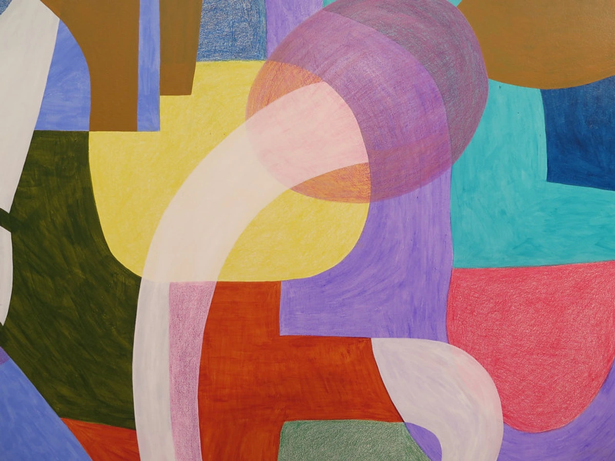
Historical Echoes: Composition Through the Abstract Ages
It's easy to think abstract art burst onto the scene without a past, but even in its rebellious youth, composition was a fundamental consideration, albeit reinterpreted. The early 20th century saw artists actively dismantling traditional modes of representation, but not structure. They were, in essence, our earliest unseen architects of abstraction.
Cubism, for example, with pioneers like Picasso and Braque, broke down objects into geometric forms and reassembled them, creating multiple perspectives within a single canvas. While often representational, it fundamentally challenged classical composition and paved the way for pure abstraction by focusing on the spatial relationships of forms, directly influencing later abstract concepts of balance and unity through fragmentation. You can delve deeper into this revolutionary movement with our ultimate guide to Cubism.
Early pioneers like Wassily Kandinsky theorized extensively on how colors and forms could evoke emotion and spiritual states, essentially creating new compositional rules for an abstract language. He used lines, shapes, and colors to orchestrate a visual symphony that resonated with his spiritual theories, prefiguring later discussions on rhythm and movement.
Later, movements like Suprematism, with artists such as Kazimir Malevich and El Lissitzky, explored pure geometric forms and their spatial relationships, seeking universal harmonies through minimal means. Their compositions were often stark, yet incredibly precise, focusing on the dynamic interaction of simple shapes within a white void, a clear exploration of space and emphasis.
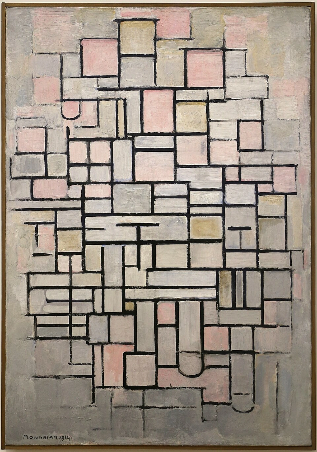
De Stijl artists like Piet Mondrian pushed this further, using strict geometric grids and primary colors to achieve perfect balance and unity, proving that abstract forms could evoke profound aesthetic experiences through meticulous arrangement. His work is a masterclass in how rigid structure can still feel dynamic.
Abstract Expressionists like Jackson Pollock, while seeming to abandon traditional composition with their 'all-over' painting technique – where paint is distributed evenly across the canvas without a central focus – were, in fact, creating new, dynamic structures of raw energy. Their gestural marks created unprecedented rhythm and movement, guided by an intuitive sense of balance that often rejected conventional focal points. Artists like Mark Rothko and Barnett Newman used vast, layered fields of color in their Color Field paintings to create monumental, emotionally resonant compositions, where scale and the subtle interplay of hues became paramount, often relying on the viewer's proximity and emotional response to complete the piece.
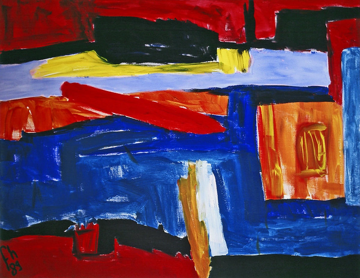
The common thread across these diverse movements? A profound engagement with how visual elements interact and influence the viewer, regardless of representation. It's a continuous dialogue between tradition and rebellion, all orchestrated by the unseen architect of composition.
The Silent Principles: My Abstract Toolbox
While I often work intuitively, beneath the surface of every brushstroke and every layer, these fundamental principles are at play. They are the scaffolding for my abstract art, the silent grammar of my visual language. It’s like having a secret recipe for magic, even when the magic looks utterly spontaneous. For me, these are not rigid rules, but trusted companions in the creative journey.
1. Balance: The Visual Weightlifter
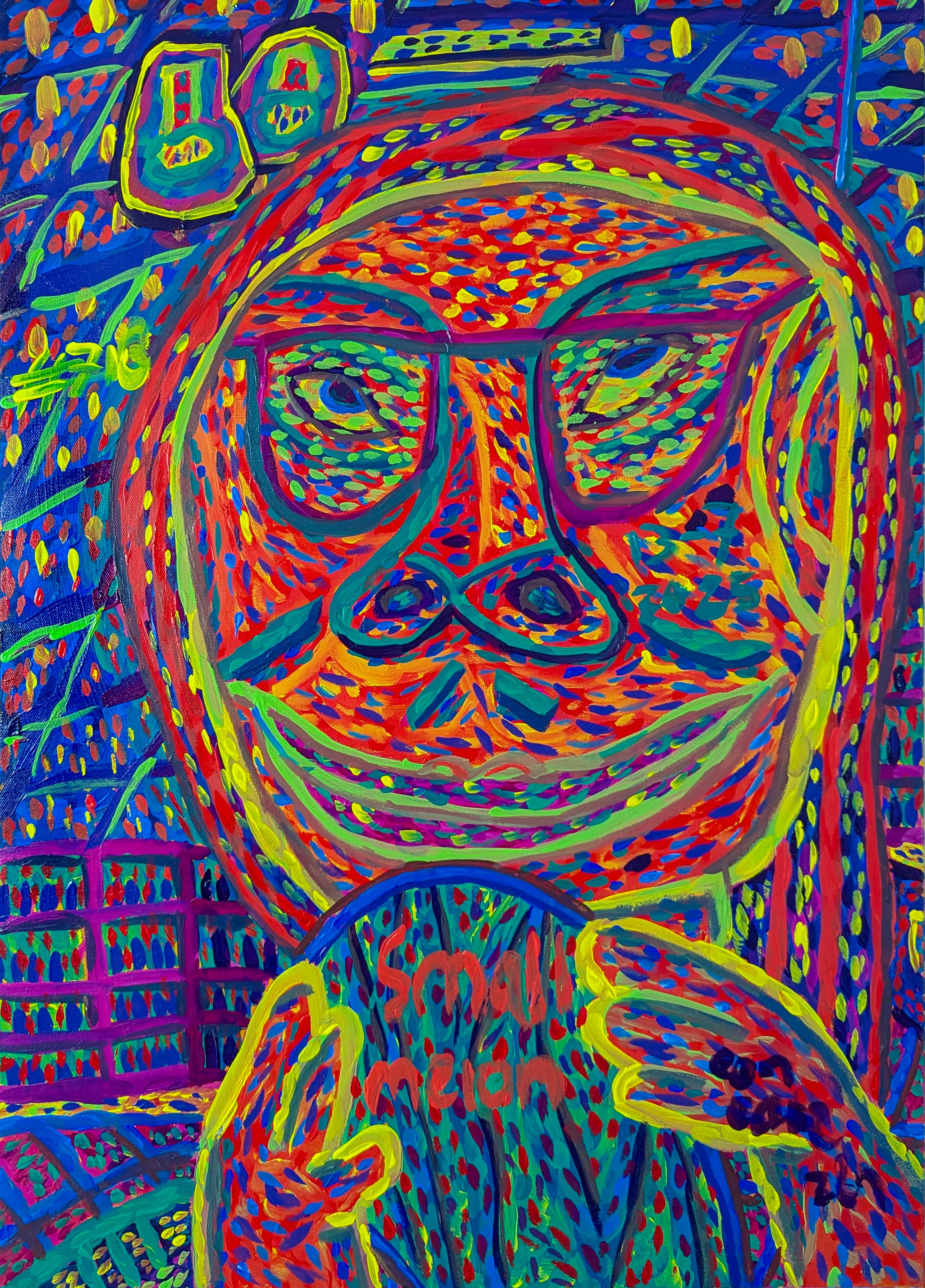
Balance in abstract art isn't about rigid symmetry, though it can certainly employ it. It's about distributing visual weight – the perceived heaviness or lightness of an element – so the piece feels stable and harmonious, not like it's about to awkwardly tip over. Think of it like a visual scale: a large, dark shape on one side might be balanced by several smaller, brighter, more textured elements on the other. This visual weight can be achieved with contrasting colors (a large, muted area versus a small, vibrant burst), large vs. small shapes, areas of intense texture against calmer spaces, or the strategic placement of elements. Asymmetrical balance, which uses dissimilar elements of equal visual weight to create equilibrium, is a particular favorite of mine – it feels more dynamic, like a perfectly weighted seesaw that's not quite even. Sometimes I feel like I'm a visual accountant, just trying to make sure both sides of the canvas don't become visually heavy and tip the whole composition into an awkward somersault! Finding that elusive sweet spot gives the artwork its inner calm.
- My Tip: To gauge balance, try squinting at your piece or looking at it in a mirror. This often helps to blur details and reveal the underlying distribution of visual weight.

2. Rhythm & Repetition: The Visual Beat
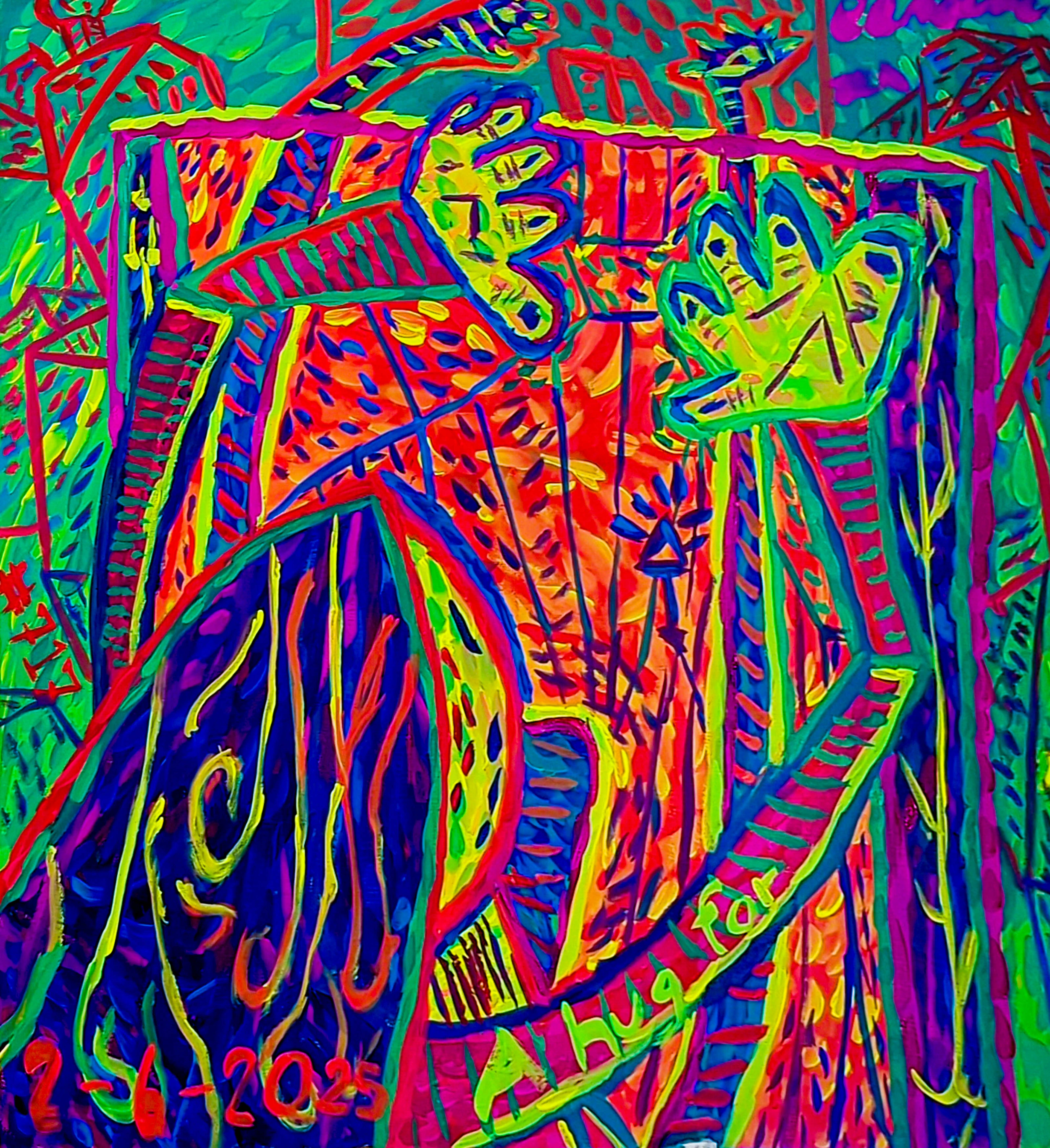
Rhythm is created through the repetition of elements – lines, shapes, colors, or textures – that guide the viewer's eye across the canvas. It's the visual equivalent of a drumbeat, a steady pulse that moves you through the artwork, creating a sense of unfolding time. Imagine a series of painted circles: if they are all identical, it might feel static. But if they gradually increase in size, shift in hue, or vary in transparency, they create a compelling visual flow. Varying that repetition, perhaps by changing the scale, color, or texture of a repeated element, can add immense dynamism and interest, preventing monotony. This is where the language of line truly shines, as the ebb and flow of gestural marks creates a natural cadence. It’s the visual echo that makes a piece sing, a recurring motif in the unseen architecture.
- My Tip: Experiment with repeating a single mark or shape, but subtly alter one aspect each time – its size, angle, or color. Observe how this creates a sense of movement.
3. Unity & Variety: The Harmonious Duo
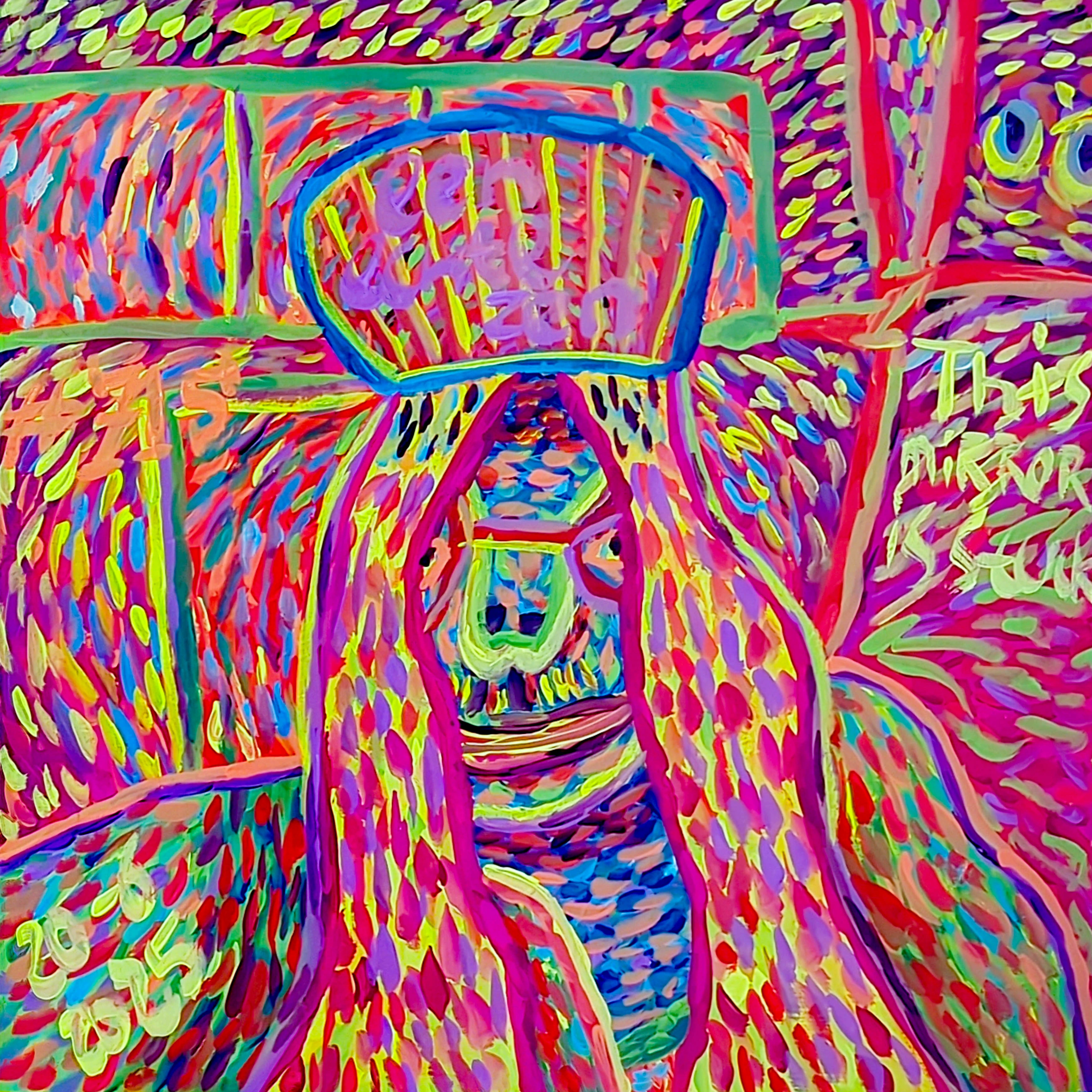
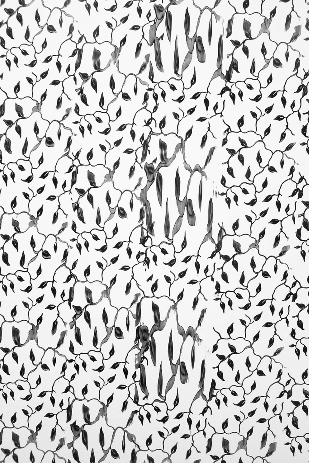
Unity ensures that all parts of the artwork feel connected and belong together, speaking the same visual language. It's the feeling that the unseen architect had a clear vision for the whole structure. Variety, on the other hand, keeps things interesting, preventing monotony and sparking curiosity. It's like a good dinner party: you want everyone to get along (unity), but a few interesting characters keep things lively (variety). You might achieve variety within unity by using a consistent color palette but varying brushstroke textures, the transparency of layers, or the types of marks (e.g., sharp lines, soft washes, impasto textures). Finding this sweet spot is key to developing your unique artistic style and creating a compelling visual narrative. It's the glue that holds the interesting bits together, giving the 'architect' a coherent vision.
- My Tip: Try starting with a limited color palette (unity) but then challenge yourself to create as many different textures and marks as possible (variety) within that constraint.
4. Emphasis (The Eyecatcher): What Demands Your Gaze
Even in abstract art, there's often a focal point – an area that naturally draws the eye due to a strong contrast in color, a particularly bold shape, a rich texture, or even the strategic use of negative space around an element. This use of negative space can frame an element, making it stand out more profoundly. It's where the eye rests, perhaps for a moment, before exploring the rest of the piece. This is where a deep understanding of how artists use color comes into play, as color can be a powerful tool for emphasis, shouting or whispering to the viewer. It's the moment of quiet drama, the visual exclamation point in the grand design – the one feature the architect truly wants you to notice.
- My Tip: Try isolating one small area in your abstract painting and giving it a high degree of contrast or a unique texture. See how this changes the viewer's initial interaction.
5. Contrast: The Dynamic Tension
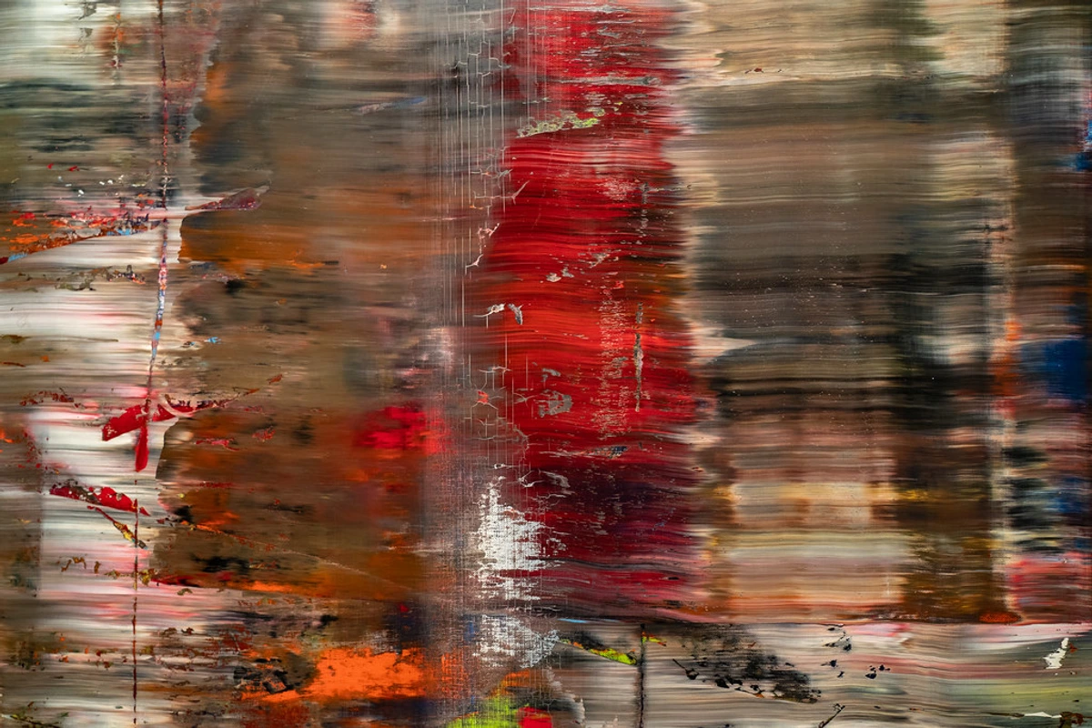
Contrast is the difference between elements in a work of art, and it's a powerful tool for creating visual interest and emphasis. This can manifest as differences in color (light vs. dark, warm vs. cool), value (the lightness or darkness of a hue), texture (smooth vs. rough), size (large vs. small), or shape (geometric vs. organic). High contrast areas tend to draw the eye, while low contrast areas recede, guiding the viewer through the composition. It's the push and pull, the argument and resolution that gives a piece its visual energy. Without contrast, a composition can feel flat; with it, it sings with dynamic tension, like the architect deliberately placing a rough stone wall next to a polished glass facade to create a striking effect.
- My Tip: Create a simple abstract study focusing solely on two contrasting elements – perhaps a rough texture next to a smooth one, or a bright color against a dark background. Notice the immediate visual punch.
6. Movement & Flow: The Guided Tour
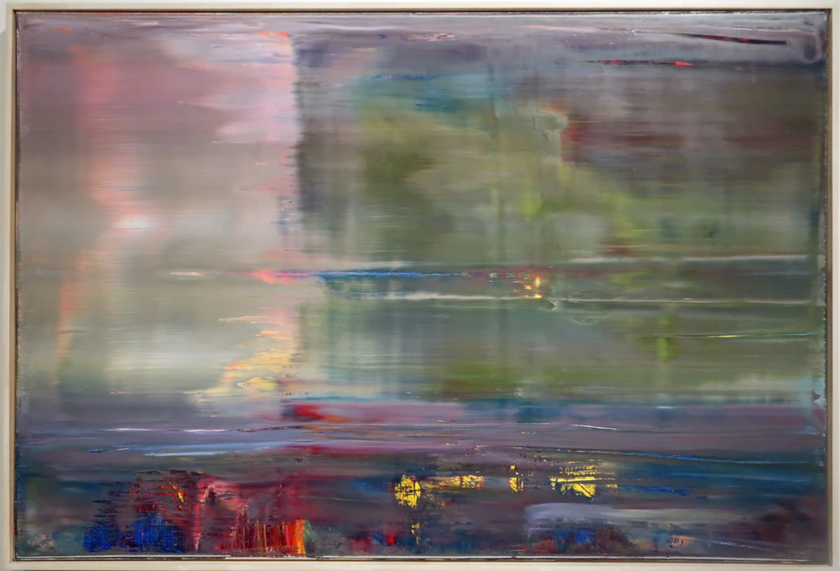
Movement is the path your eye takes through the artwork, often guided by implied lines (created by the alignment of shapes or edges), the repetition of shapes, or subtle color transitions. It's about creating a visual journey, a dynamic energy that pulls you from one area to another. Sometimes it's a gentle meander, sometimes a swift rush, and sometimes it's the restless energy of visual tension that keeps your gaze searching. It's the silent invitation to explore every corner, a carefully orchestrated visual dance across the canvas, courtesy of our unseen architect, ensuring no part of the building is left unobserved.
- My Tip: Consciously use a series of dots or small marks to create an implied line that leads the eye from one side of your canvas to another. Observe how this simple technique dictates movement.
7. Space (Positive & Negative): The Breathing Room
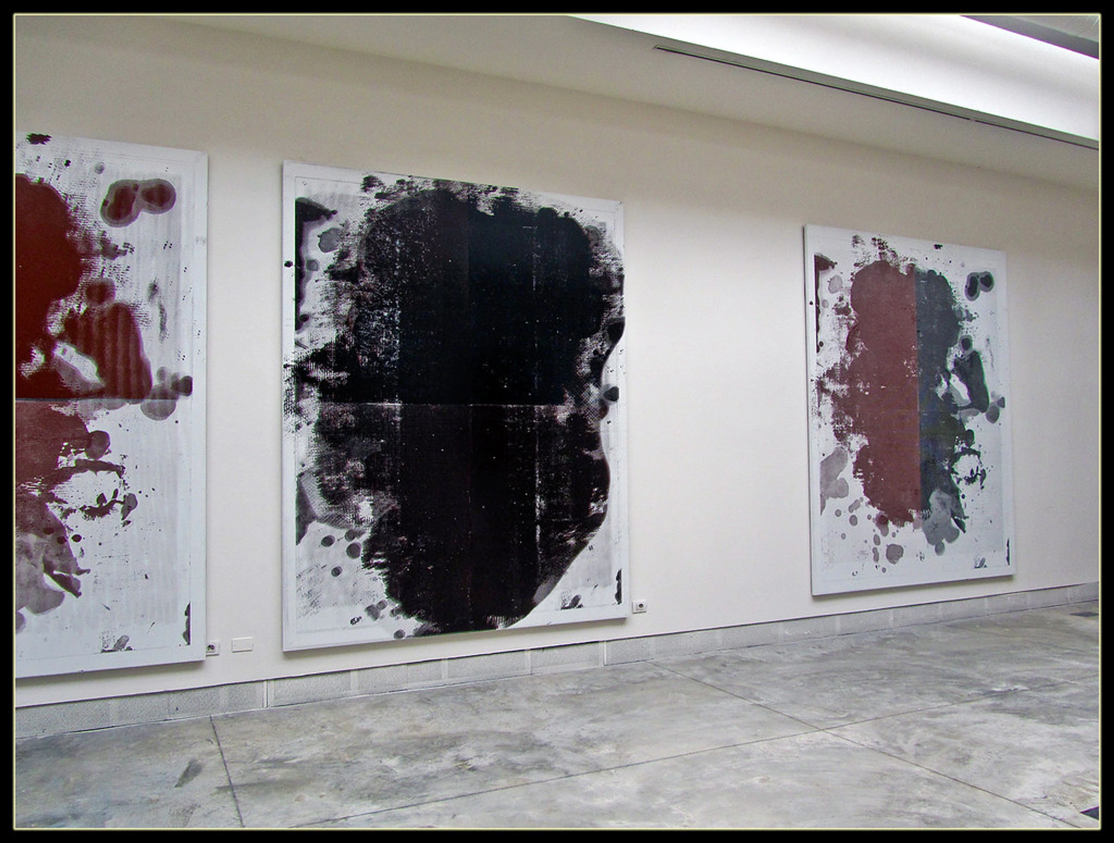
Space isn't just the empty bits; it's an active, intentional component of composition. Positive space is occupied by forms, colors, or textures, while negative space is the area around and between these elements. Both play a crucial role in composition, providing context, creating visual hierarchy, and allowing the elements to breathe. Sometimes, the 'empty' space speaks loudest, framing an element or creating a profound sense of quiet. It’s the pauses in the symphony, as essential as the notes themselves, allowing the viewer's eye to rest and process what it's seeing – just like an architect designs an open plaza to complement a grand structure.
- My Tip: When composing, pay as much attention to the shapes created between your elements as you do to the elements themselves. Often, the negative space is the most compelling compositional decision.
8. Scale and Proportion: The Relative Relationship
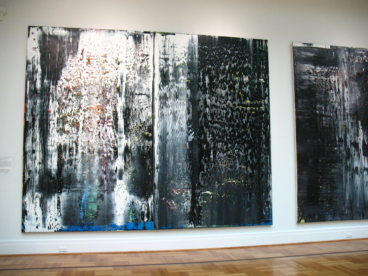
Scale refers to the size of an object or element relative to its actual size, while proportion refers to the size of parts of an object in relation to each other. In abstract art, these principles define the perceived relationship between different visual elements and the overall canvas. A massive splash of color next to a tiny, intricate line creates a dramatic difference in scale, affecting how the viewer perceives distance and importance. Playful manipulation of scale can create surprise, intimacy, or monumentality, guiding the eye and the emotional response by making certain elements feel dominant or subservient. It's the architect deciding which parts of the building draw the most attention due to their sheer presence, making a grand entrance feel grand and a hidden nook feel intimate.
- My Tip: Experiment with one dominant large shape and several very small, delicate marks on a single canvas. Observe how the contrast in scale immediately creates a sense of depth and hierarchy.
My Intuitive Dance with These Principles
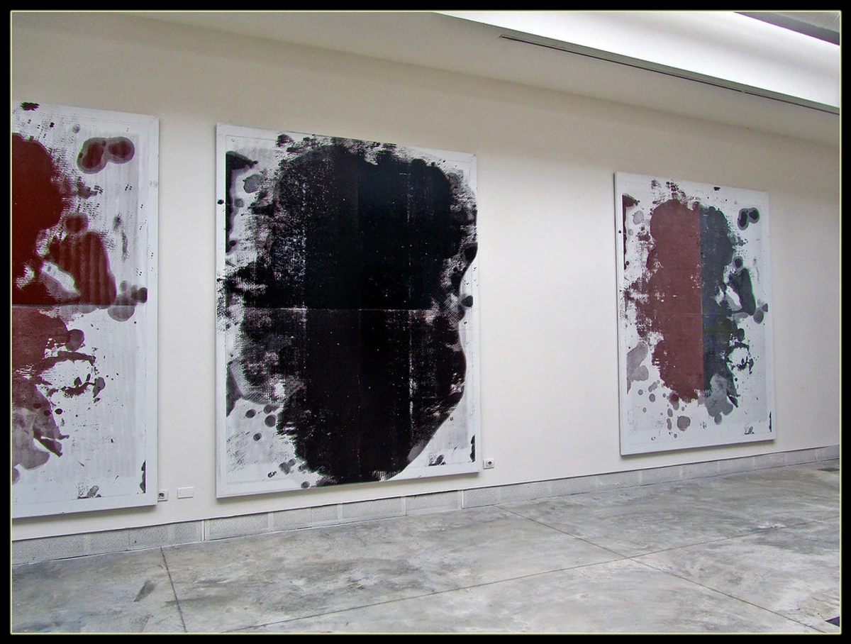
Honestly, sometimes it feels less like applying rules and more like a dance. I'll lay down a wash, then a line, and my gut tells me, "Nope, too heavy here," or "Needs a burst of something there." It's a constant dialogue between intention and intuition, a process I've discussed in my article on embracing spontaneity in abstract creation. There were times I felt completely lost, staring at a canvas that felt 'off,' and it was only by stepping back and asking myself, "What is this piece doing? Where is it trying to lead the eye?" that I could begin to see the underlying structure that needed adjusting. I remember one particularly stubborn piece where I had beautiful, intricate details, but the whole thing felt disjointed. It wasn't until I added a large, sweeping stroke of a contrasting color over some of those details that the entire composition snapped into place, finally achieving the balance it needed.
Often, my best compositions emerge from layers – building up, subtracting, pushing back, pulling forward. This layering process is key to building depth in abstract acrylics and refining the visual relationships. Sometimes the best composition comes from covering up something I thought was brilliant moments before. It's all part of the creative journey of crafting my abstract art, a testament to the fact that even for the artist, the unseen architect is often a guide rather than a dictator.
It's a lot like life, isn't it? You start with an idea, you add experiences, make adjustments, and sometimes, you have to let go of what isn't working to create something truly harmonious. And just like a loyal companion, an artwork with strong composition feels reliable, intriguing, and gives you something new to discover every time you look. This interplay between deliberate choice and accidental beauty is, for me, where the magic happens, guiding the viewer without them ever knowing the full story of its creation, like a whispered secret from the architect to the viewer.
The Unspoken Dialogue: How Composition Affects You
When you stand before a piece, and you find yourself lingering, moving your eyes across the canvas without even realizing it, that's composition at play. It's not just about what you see, but how it makes you feel. A well-composed abstract piece, expertly guided by its unseen architect, can evoke calm, excitement, tension, or wonder, guiding your emotional experience as much as your visual one. It's the underlying structure that enables the artwork to resonate, to whisper its story directly to your subconscious.
It's the reason some pieces just 'click' with you, and others, despite vibrant colors or intriguing textures, feel a little off. It's the silent force that elevates paint on a canvas to art that speaks directly to your soul. This profound connection is often why people choose to buy art – they're not just acquiring an object, but an experience and a feeling, a piece of someone else's visual journey that somehow mirrors their own. Understanding these principles enhances not just your appreciation, but also your ability to articulate why a piece resonates.
FAQ: Demystifying Abstract Composition
Let's tackle some of the most common questions about abstract composition, shedding light on the invisible forces at play.
Do abstract artists use traditional composition rules?
Yes, absolutely! While they might not be rigidly adhering to grids or academic guidelines like the golden ratio or rule of thirds, the underlying principles of balance, rhythm, unity, emphasis, contrast, movement, space, and scale/proportion are almost always at play, consciously or subconsciously. Many abstract artists, myself included, started with classical training before breaking free, so these principles are deeply ingrained in our creative DNA. It's less about breaking rules and more about reimagining them for a non-representational world, giving the unseen architect new tools to build with.
How can I "see" composition in abstract art?
It's a wonderful skill to develop! Try stepping back from the piece and squinting your eyes slightly. This helps to blur the details and allows you to focus on the large shapes, lines, and areas of color, revealing the underlying structure. Ask yourself: Where does my eye go first? How does it move around the canvas? Does it feel stable or dynamic? What elements are repeated or contrasted? Compare it to other pieces, even representational ones, and you'll start to train your eye. It's about feeling the visual weight and flow, almost like conducting an orchestra.
Practical Exercise: Next time you're looking at an abstract piece, try tracing the dominant lines or shapes with your finger (or eye). Then, cover one part of the artwork and notice if the balance shifts. Experiment with mentally rearranging elements – what feels better or worse? This active engagement helps you tune into the architect's blueprint.
Is there a "wrong" composition in abstract art?
"Wrong" is a strong word in art, as true artistic expression is subjective. However, a composition that feels unbalanced, chaotic without clear intent, or simply doesn't guide the viewer's eye can be less impactful or harder to connect with. The goal is usually to create a cohesive and engaging visual experience, and a 'bad' composition might fail to do that, leading to a sense of discomfort or confusion rather than intrigue. It's all part of the emotional language of color and form; when the grammar is off, the message can get lost, and the architect's vision falters.
How do different mediums influence abstract composition?
Great question! The medium profoundly shapes compositional choices. For instance, in painting, layers, transparency, and brushstroke textures are key to building depth and movement. In sculpture, composition is three-dimensional, dealing with mass, void, and how the piece interacts with its physical space. Digital art offers infinite possibilities for layering, animation, and dynamic shifts in composition over time. Each medium presents unique challenges and opportunities for creating visual order and impact, giving the unseen architect a different set of materials to work with.
How can I appreciate abstract art if I don't "understand" the artist's intent?
Don't worry about the artist's intent! Abstract art often thrives on the viewer's subjective experience. Instead of trying to 'understand' a narrative, focus on your response to the composition. How do the colors make you feel? Where does your eye travel? Does the balance evoke calm or tension? Allow the shapes, lines, and textures to simply exist and interact within your perception. The composition itself is a language, and you don't need a dictionary to feel its rhythm or its embrace. Your emotional connection is the only 'understanding' you need, a direct communication from the unseen architect to your soul.
How do I critique the composition of an abstract artwork?
Critiquing abstract composition involves a blend of objective observation and subjective feeling. Start by assessing the overall balance – does the piece feel stable? Then, trace the movement your eye makes, looking for paths created by lines, shapes, or colors. Identify any areas of emphasis (focal points) and how contrast is used to create energy or interest. Observe the interplay of positive and negative space and how unity and variety contribute to both cohesion and intrigue. Ultimately, ask yourself: Does the composition feel intentional? Does it create a compelling visual experience? Does it evoke a particular mood or feeling? The more you practice, the more attuned you'll become to the unseen architect's masterful planning.
A Final Thought: The Art of Perception
Understanding composition in abstract art isn't about rigid rules; it's about developing a keen eye for visual relationships and trusting your gut feeling. It's about recognizing that even the most spontaneous-looking artwork has an underlying order, an unseen hand guiding its creation. For me, it's a lifelong conversation with the canvas, a continuous discovery of how elements conspire to create meaning without literal representation.
So, the next time you encounter an abstract piece, don't overthink it. Just feel it. Let your eyes wander, follow the lines, observe the balance, and notice where your gaze naturally rests. You might be surprised at the silent conversation unfolding on the canvas, a dialogue between the artist's subtle choices and your own evolving perception. Perhaps even a visit to a museum, like the Den Bosch Museum, could offer new perspectives on these fascinating visual principles. Happy viewing, my friend, and may your eyes always find the hidden architecture.


