
How to Paint a Still Life: A Beginner's Guide to Finding Beauty on Your Tabletop
A personal, comprehensive guide to painting a still life. Learn how to choose objects, master composition and lighting, and find your artistic voice in the everyday.

How to Paint a Still Life: A Beginner's Guide to Finding Beauty on Your Tabletop
Let's be honest. When you first hear "still life," you probably picture a dusty bowl of plastic fruit in a high school art class. I know I did. For years, I thought still life was the artistic equivalent of eating your vegetables—something you should do, but not something you'd ever be excited about. I was wrong. So, so wrong. What I've discovered, and what I hope you'll discover too, is that a still life isn't just about painting an apple or a vase of flowers. It's about seeing—truly seeing—the world around you with fresh eyes, breaking down complex forms into simple shapes, and noticing the subtle dance of light and shadow on everyday objects. It’s a profound act of observation that, once you start, you can’t easily turn off. It transforms the mundane into the magnificent, revealing hidden narratives in the everyday.
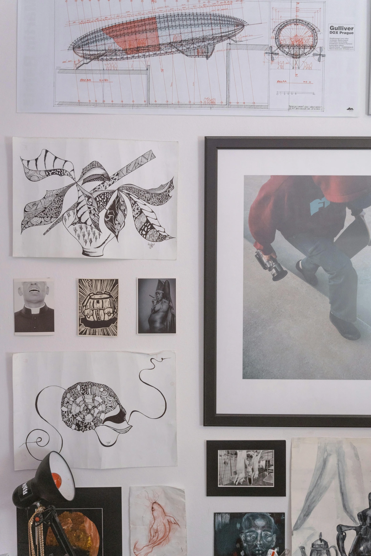
Turns out, painting a still life is less about the objects themselves and more about creating a universe in miniature. It’s your own private laboratory where you are the director, the lighting technician, and the lead actor. You control everything. This isn't just about painting an apple; it's about understanding light, mastering color, and learning how to tell a story without a single word. It's the secret training ground for almost every other kind of painting, quietly building the foundational skills you need for landscapes, portraits, or even abstract expression. In fact, many master painters honed their skills by diligently working on still life compositions before tackling grander narratives or portraits. It’s a quiet rebellion against the fast pace of modern life, a dedicated moment to truly observe and render the beauty in the ordinary – a skill that profoundly enriches your perception of the entire world around you. This intense focus isn't just for your still life painting; it's a skill that spills over into every aspect of your life, making you a more observant and appreciative individual. Plus, the foundational skills you build here—understanding light, color, and composition—are directly transferable to portraiture, landscape, or any other genre you might explore.
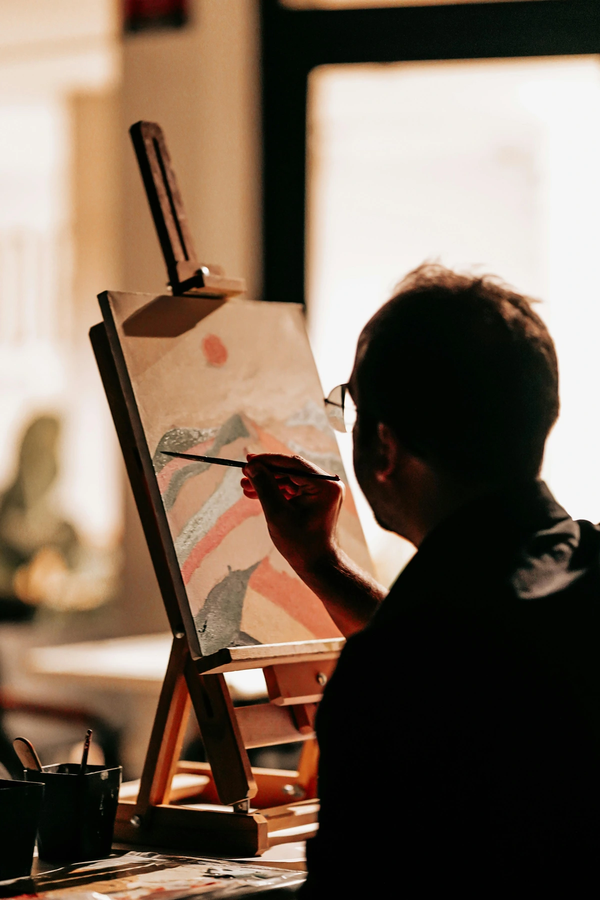
The Enduring Appeal of Still Life: Beyond the Dusty Fruit Bowl
Before we dive into the nitty-gritty of brushes and palettes, let's talk about why still life matters. I get it, sometimes it feels like a relic from art history, a warm-up exercise rather than a destination. But I've come to see it as something far more profound. It's an opportunity to create a world where every object, every shadow, and every highlight holds a piece of your artistic soul. It’s a chance to slow down, to really look at the world around you, and to imbue everyday items with a sense of wonder. Plus, it's the ultimate low-pressure environment for experimentation. Want to try a new color palette? Go for it. Obsessed with how light hits glass? This is your playground. It's a space where you can fail gloriously without consequence, learning at every turn. For me, it's been a journey of constant revelation, proving that the deepest truths can often be found in the simplest things. It's a genre that demands an intimate dance between observation and interpretation, building a foundation for all other artistic pursuits. It’s also a powerful bridge across history, connecting us to artists throughout time who found meaning in the arrangement of everyday things. Think about it: a fruit bowl from the 17th century speaks to the same human desire to find order and beauty as a contemporary assemblage of found objects.
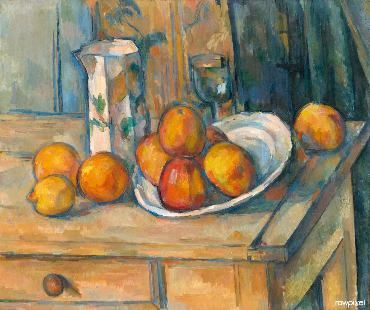
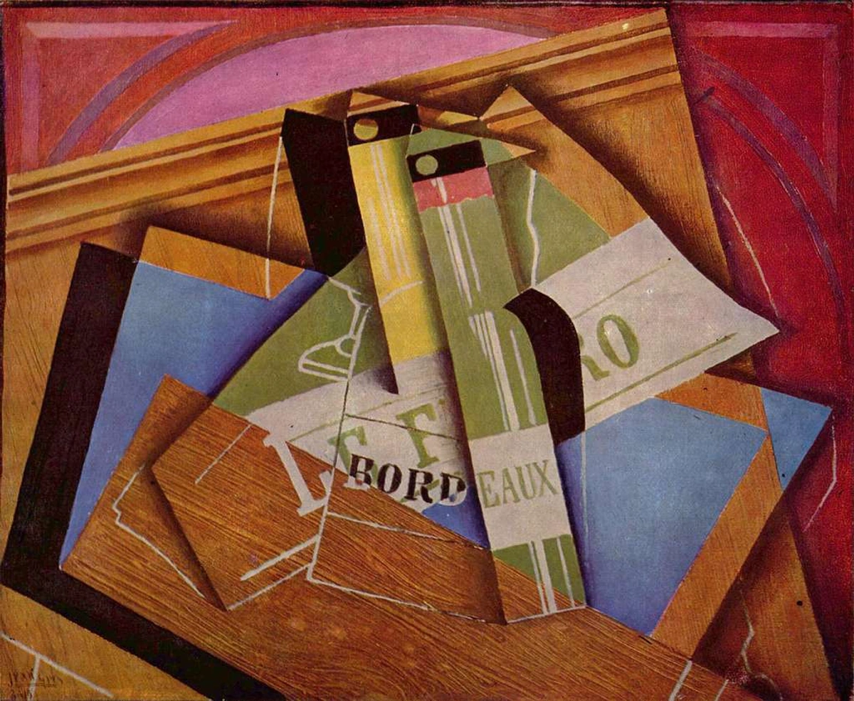
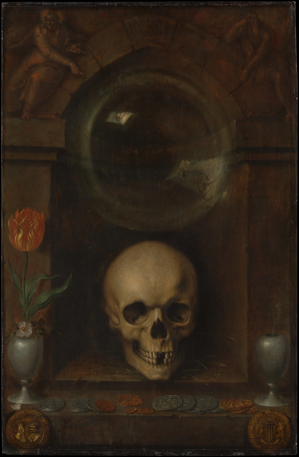
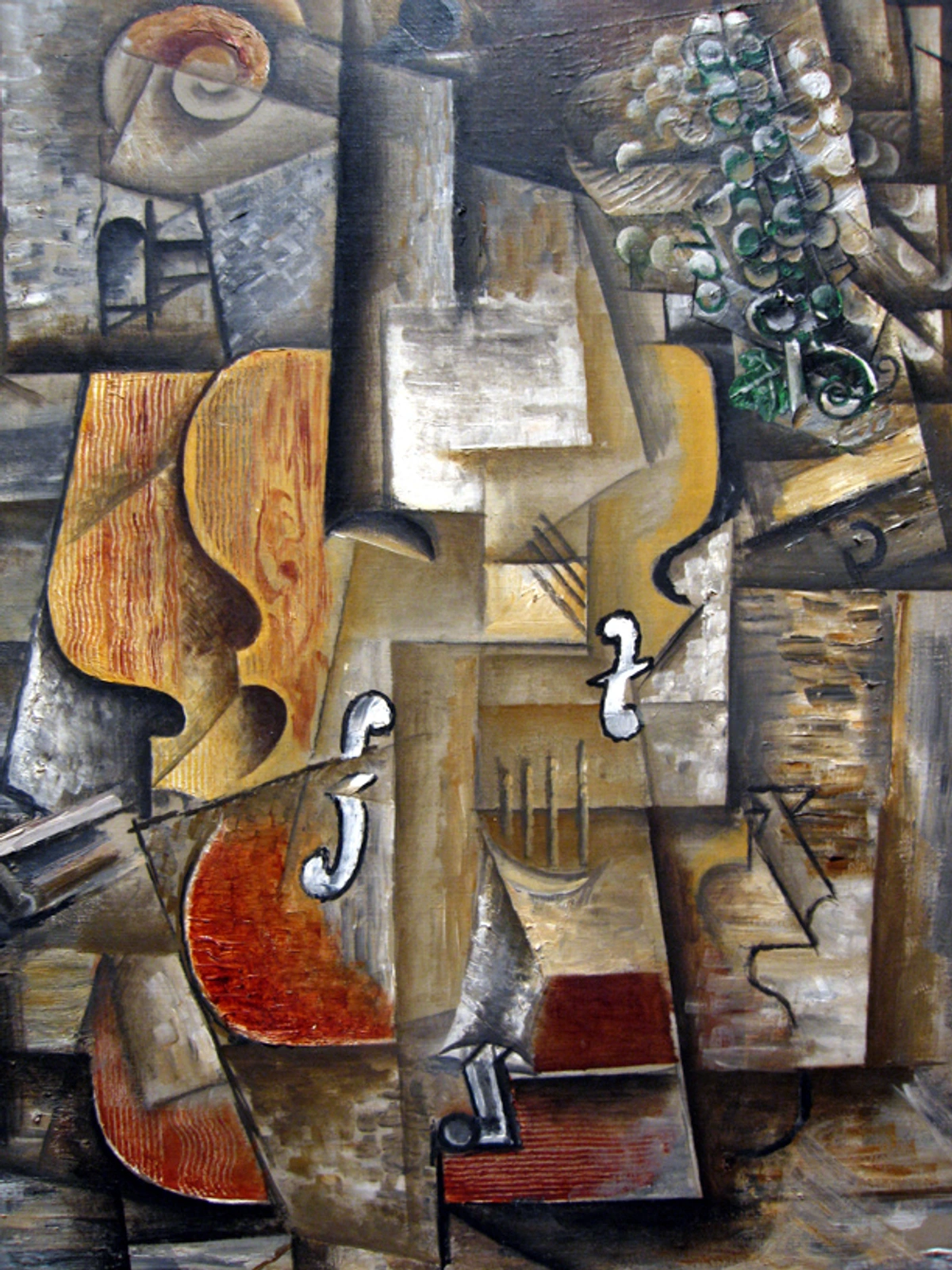
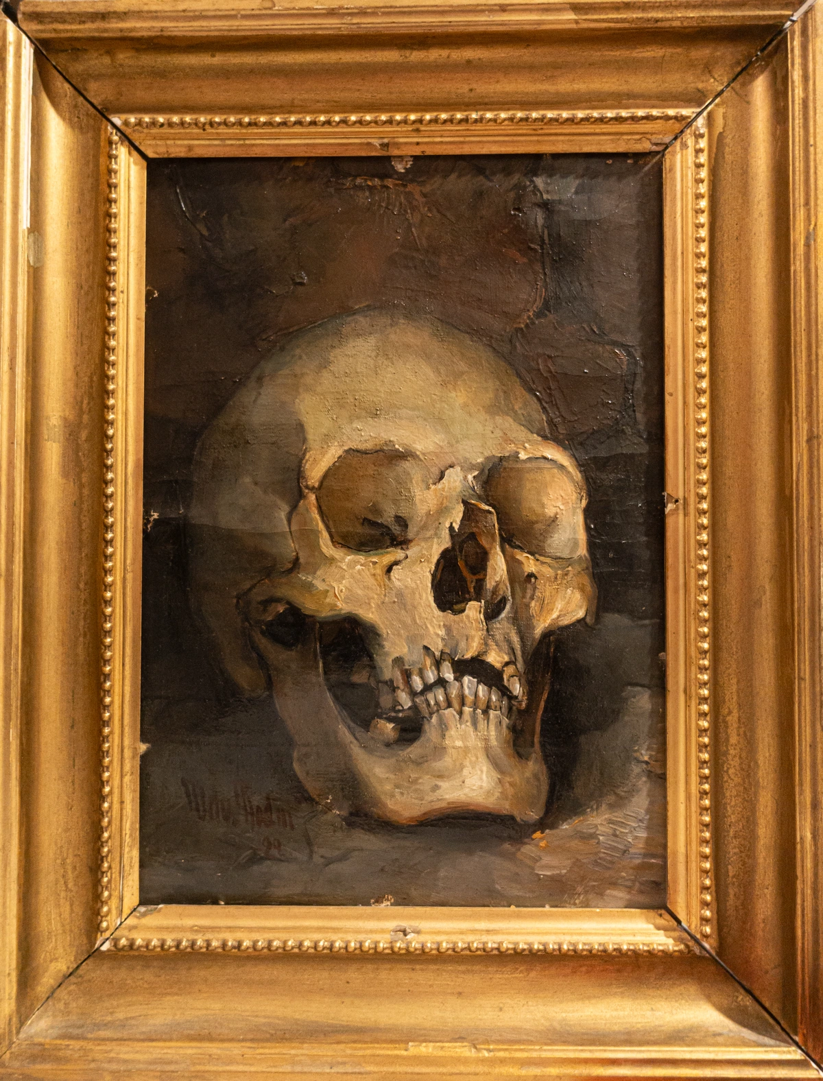
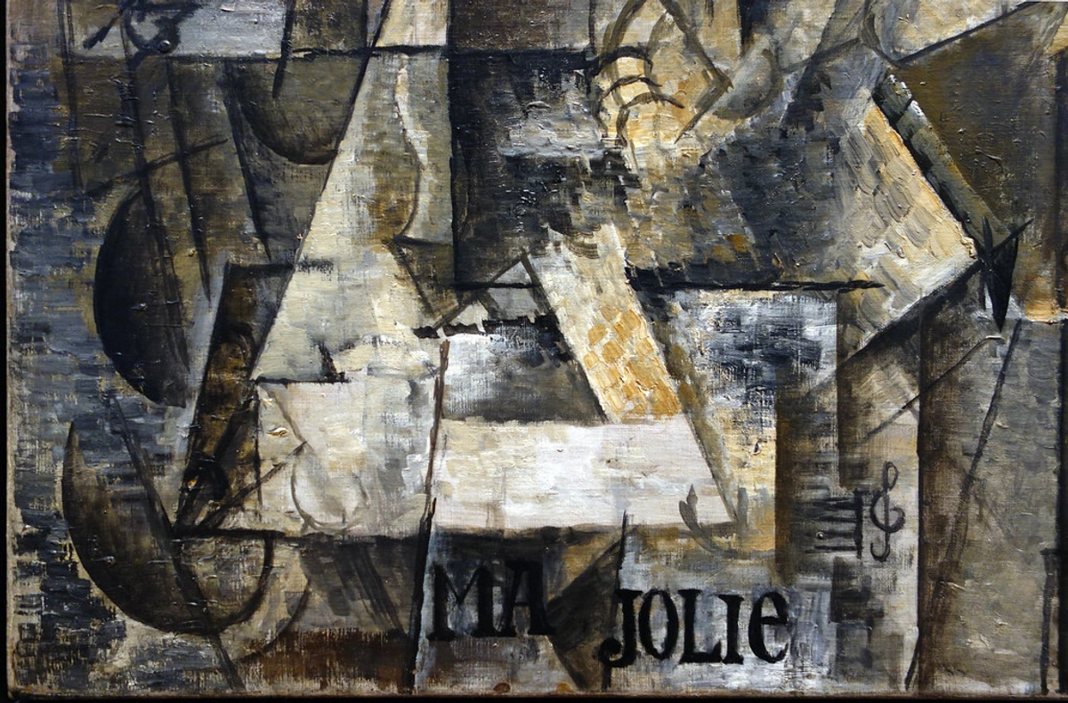
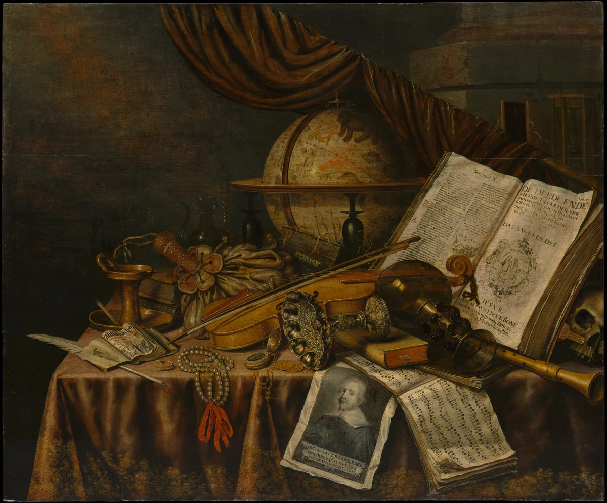
From the symbolic Dutch Golden Age vanitas paintings reminding us of life's fleeting nature, with their skulls and decaying fruit, to the Cubist explorations of form by Picasso and Braque, challenging traditional perspectives, still life has always been a powerful vehicle for artistic expression. It's truly fascinating how this genre has adapted through the centuries, offering a silent canvas for artists to reflect their times, challenge perceptions, and explore universal themes. It’s a quiet testament to humanity’s enduring fascination with the material world and our desire to find meaning within it. This adaptability makes it not just a historical curiosity, but a living, breathing genre that continues to push boundaries and reflect our ever-changing world. It's truly a constant in the artistic conversation.
The Silent Storytellers: Symbolism in Still Life
Beyond mere representation, still life often serves as a powerful vehicle for symbolism. Throughout history, artists have imbued everyday objects with deeper meanings, transforming a simple arrangement into a narrative-rich tableau. The Dutch Golden Age masters, for example, frequently used objects like skulls, snuffed candles, or wilting flowers in their vanitas paintings to subtly (or not-so-subtly) remind viewers of life's brevity and the transient nature of worldly pleasures. A lemon might symbolize the bitterness of life, while a butterfly could represent the soul, or even a book could represent knowledge. Even in contemporary still life, artists continue this tradition, using modern objects to comment on consumerism, identity, or environmental concerns. Understanding this layer of symbolism adds immense richness to your appreciation and creation of still life, allowing your silent protagonists to speak volumes without a single word. It's like finding a hidden language within the visual feast. Modern artists might use discarded plastic, electronic waste, or even digital images to comment on our throwaway culture or the digital age, proving that the language of symbolism is ever-evolving and deeply relevant to our current experience. Think of a smartphone in a still life – it could symbolize connection, isolation, or the rapid pace of technological advancement, depending on its context.
Historical Periods and Key Characteristics of Still Life
Period/Movement  | Key Characteristics | Key Artists (Still Life Focus) | Example Themes | Key Innovations/Techniques |
|---|---|---|---|---|
| Ancient to Classical | Primarily decorative; food, floral elements for everyday life or funerary contexts. Found in frescoes, mosaics, and tomb paintings. | Ancient Roman frescoes, Egyptian tomb paintings | Feasting, abundance, rituals, offerings to deities | Early forms of illusionism, integration into larger narratives |
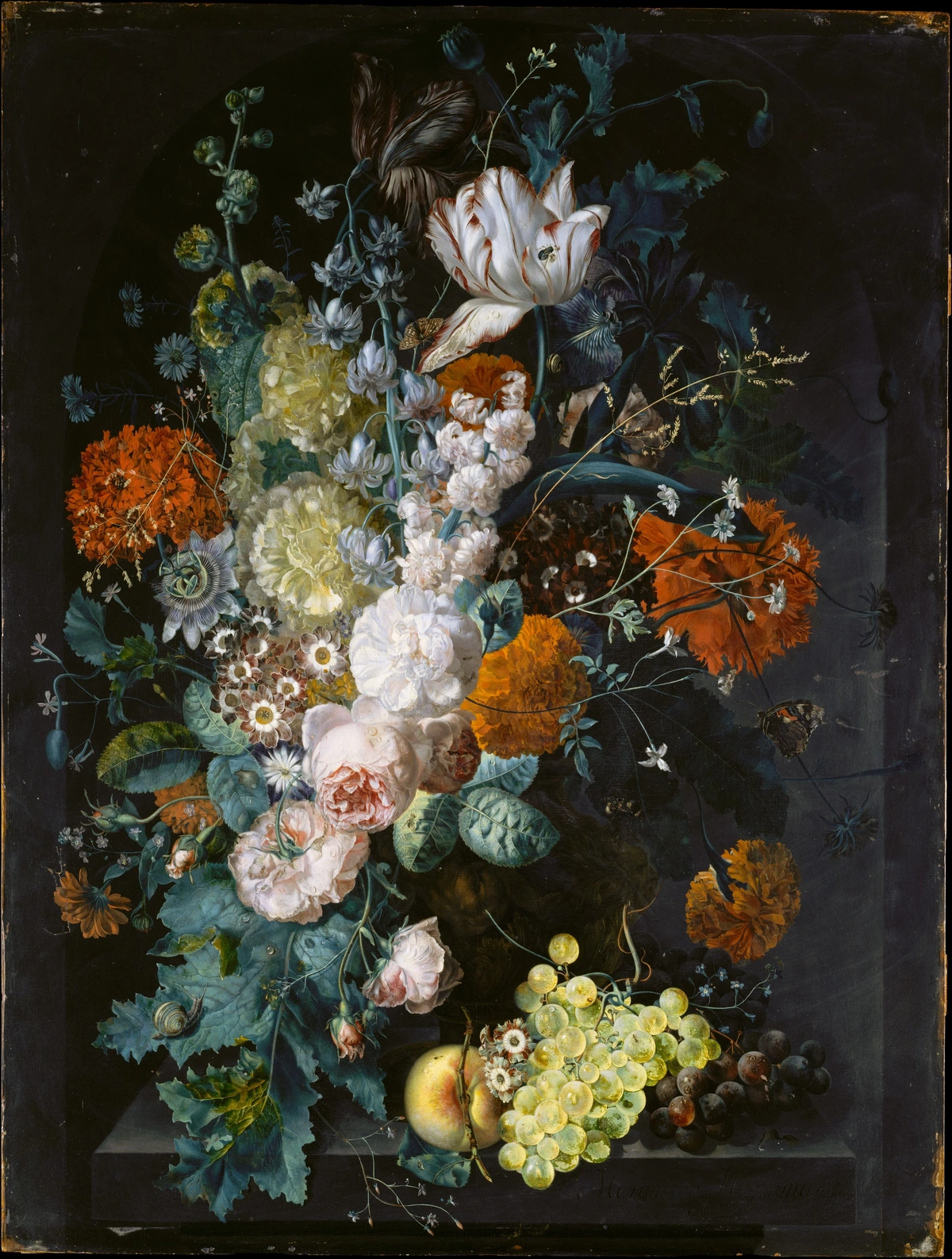
| Dutch Golden Age | Rich symbolism, vanitas (memento mori), exquisite detail, dramatic chiaroscuro lighting, moralizing undertones. | Willem Kalf, Jan Davidsz. de Heem, Rachel Ruysch | Fleeting life, wealth, knowledge, mortality, vanity, beauty | Chiaroscuro, meticulous detail, oil glazing, symbolic narratives |
| 18th Century Chardin | Focus on humble, everyday objects; subtle light, soft textures, quiet intimacy, masterful rendering of ordinary household items. | Jean-Baptiste-Siméon Chardin | Domesticity, simplicity, honesty of observation, quiet contemplation | Soft, diffused lighting, textured brushwork, subtle color harmonies |
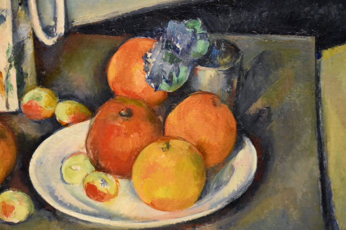
| 19th Century Post-Impressionism | Experimentation with color, form, and perspective; emotional expression, breaking from strict realism, emphasis on subjective experience. | Paul Cézanne (structural analysis, exploring form through color), Vincent van Gogh (expressive flowers, emotional intensity) | Structure, emotion, inner vision, perception, light effects | Structural analysis of form, expressive color, broken brushstrokes |
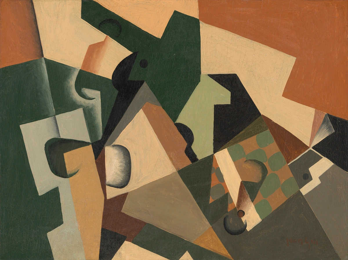
| Early 20th Century Cubism | Deconstruction of objects into geometric forms; multiple viewpoints, limited palette, challenging traditional representation. | Pablo Picasso, Georges Braque | Form, space, perception, abstraction of reality, multiple perspectives | Multiple perspectives, geometric fragmentation, collage elements |
| 20th Century Surrealism | Juxtaposition of unrelated objects, dreamlike imagery, symbolic narratives, exploring the subconscious and the absurd. | Salvador Dalí, René Magritte (who you can learn more about in who is rene magritte) | Unconscious mind, fantasy, psychological states, irrationality | Juxtaposition, illogical arrangements, dream imagery |
| Mid-20th Century Pop Art | Elevation of consumer goods, mass-produced items, and popular culture into fine art; bold colors, graphic imagery. | Andy Warhol, Roy Lichtenstein | Consumerism, celebrity, advertising, popular culture | Mass production techniques (screen printing), bold graphics, appropriation |
| Late 20th Century Photorealism / Hyperrealism | Meticulous, hyper-detailed depictions of objects, often from photographs, aiming for an illusion of reality that transcends the photographic source. | Audrey Flack, Chuck Close | Illusion, reality, consumer goods, everyday scenes | Technical precision, airbrushing, photographic accuracy |
| Contemporary Art (21st Century) | Reinterpretation using modern objects, abstract approaches, mixed media; often socio-political commentary, exploring identity, environment, and technology. | Various contemporary artists, often incorporating digital elements | Consumerism, identity, environmental concerns, abstraction, social critique | Digital art, mixed media, installation art, conceptual approaches |
Today, contemporary artists continue to reinterpret the genre, using modern objects and abstract approaches, proving its timeless relevance and versatility. It's not just about what you paint; it's about how you paint, and the story you choose to tell with the silent protagonists on your table. It's where you learn the language of art, brushstroke by brushstroke, uncovering hidden narratives in the everyday. Ultimately, it’s a journey of perception, transforming the mundane into the magnificent. If you want to dive deeper into the historical context, check out this overview of the art of still life painting, from classical to contemporary.
Still Life as a Bridge: Connecting Eras and Ideas
What truly fascinates me about still life is its enduring ability to act as a bridge across time and artistic movements. From the meticulously rendered bowls of fruit by the Dutch masters, laden with symbolic meaning, to the fragmented forms of Cubist compositions that challenged traditional perspective, the genre has consistently adapted. It's a testament to our innate human desire to find meaning in the material world. Even when I delve into abstract pieces, the principles I learned from still life—like understanding light, shadow, and composition—are foundational. It's like a universal language that transcends style, allowing artists to communicate across centuries. This ongoing dialogue makes the still life not just a historical relic, but a vibrant, ever-evolving space for artistic inquiry.
Modern & Contemporary Still Life: Pushing Boundaries
While the roots of still life are ancient, the genre continues to evolve dramatically in modern and contemporary art. Artists are constantly reinterpreting the traditional tabletop arrangement, incorporating new materials, abstract approaches, and often a hefty dose of socio-political commentary. From Pop Art's elevation of consumer goods to photorealism's hyper-detailed depictions of everyday objects, still life remains a vibrant and relevant mode of expression. Contemporary artists might use digital elements, mixed media, found objects, or unconventional subject matter like discarded tech or environmental waste to challenge perceptions and reflect on our rapidly changing world. It's proof that the quiet observation of objects is a timeless act, continually adapting to new artistic voices and cultural landscapes. The essence remains: finding meaning and beauty in the objects around us, however they may be presented. I've seen artists create powerful still lives using just digital pixels or even by curating performance pieces around objects, blurring the lines of what 'painting' a still life truly means.
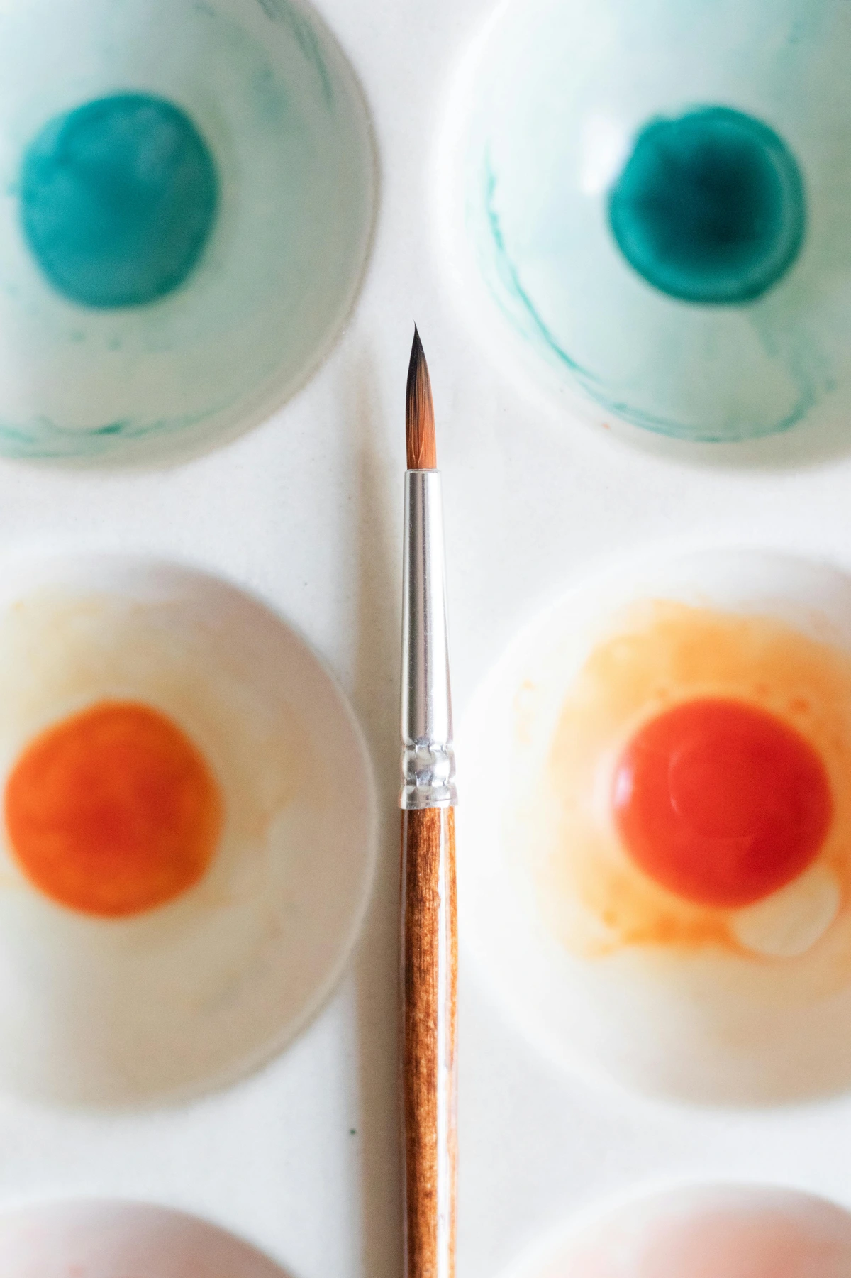
Still Life and Abstract Art: A Hidden Connection
You might be thinking, "What does all this still life talk have to do with abstract art?" For me, the connection is profound. While my abstract pieces don't depict apples or vases, the fundamental principles of composition, light, shadow, and color relationships—all honed through still life practice—are the very backbone of my abstract work. It's like learning the alphabet before writing a poem; the rules of observation give you the freedom to break them creatively. A still life teaches you to see shapes, values, and colors as pure elements, which is precisely what abstract art often explores. It's the silent training ground for seeing the world in its most basic, beautiful forms, allowing you to then reconstruct or deconstruct it as you wish. This is why I often recommend still life to aspiring abstract artists; it builds that crucial visual literacy.
The Still Life as a Personal Journey and Meditative Practice: A Quiet Rebellion
For many artists, including myself, still life isn't just an exercise in observation; it's a profoundly personal journey and a powerful meditative practice. It’s a way to explore your own inner world, your relationship with objects, and the quiet narratives that unfold in everyday life. My own abstract art, while often not explicitly still life, draws heavily on the principles of composition, light, and color learned through these focused studies. I’ve found that the discipline of truly seeing a simple apple on a table translates directly into how I perceive and translate more complex emotions and ideas into my abstract canvases. It’s a universal language, spoken through shape and shadow. This intense focus forces you to slow down, to quiet the internal noise, and to truly be present with the objects before you. The act of intense observation—noticing every subtle shift in light, every nuanced color, every intricate texture—becomes a form of mindfulness. It's a deliberate pause in our fast-paced world, an opportunity to engage deeply with the ordinary and transform it into something extraordinary through focused attention. This contemplative aspect is, for me, one of the deepest rewards of still life, fostering a sense of calm and a heightened appreciation for the beauty in everyday life. It's a quiet rebellion against distraction, a celebration of the now. In a world constantly vying for our attention, the focused, intentional act of rendering a still life is a powerful counter-cultural statement. It trains not just your hand and eye, but your mind, to be more present and perceptive in all aspects of life. It truly is a form of active meditation, bringing a profound sense of calm and clarity.
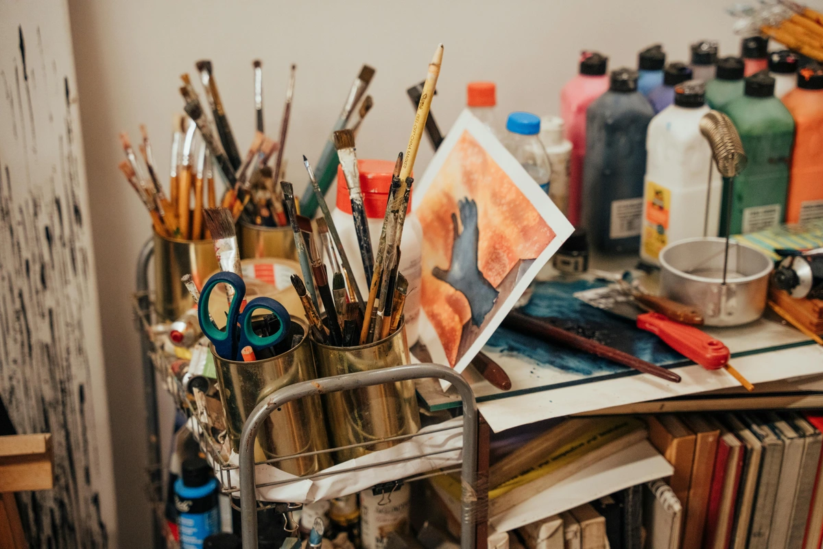
It’s a deeply rewarding experience that hones your artistic eye and calms your spirit, proving that the profound can indeed be found in the mundane.
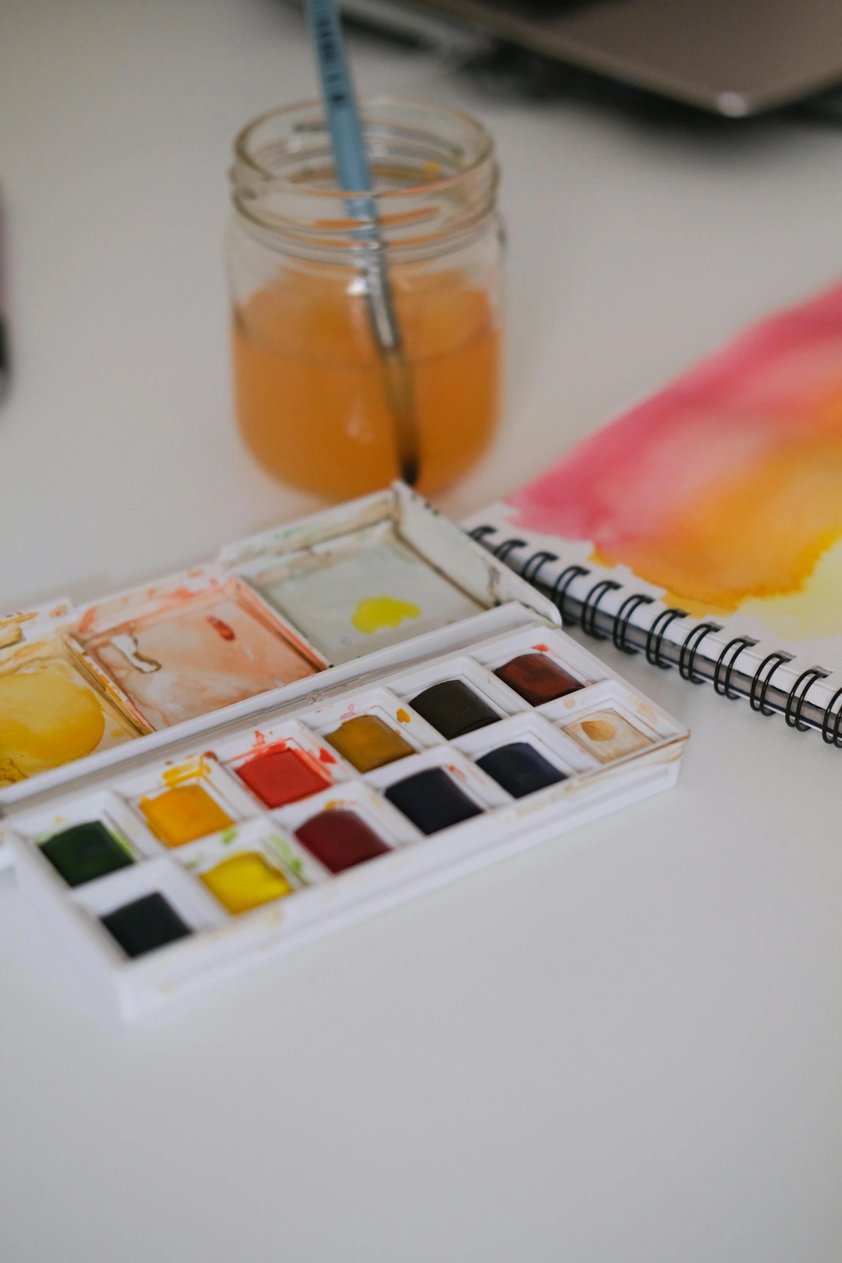
Still Life as a Microcosm: Universal Principles in Miniature
I often think of a still life as a microcosm – a tiny universe on your tabletop where all the grand principles of art can be explored and mastered. The play of light and shadow, the relationships of color, the dynamics of composition, the rendering of texture, the suggestion of narrative – they are all present, distilled into a manageable, intimate scene. It's a low-stakes environment to experiment with complex ideas that translate directly to larger, more ambitious works, whether they be portraits, landscapes, or even vast abstract canvases. If you can accurately capture the form of a simple ceramic mug, you’ve learned fundamental lessons that apply to the curve of a human face or the undulation of a distant mountain range. This universality is part of its enduring appeal and its profound educational value.
Step 1: The Setup - Curating Your Little World
Setting Up Your Creative Sanctuary: Optimizing Your Painting Environment
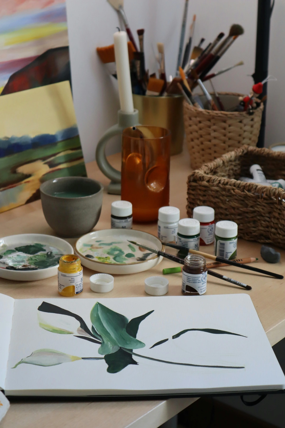
First, before we even think about objects, let’s consider your workspace. You don't need a grand studio (though if you have one, lucky you!). A corner of a room, a sturdy table, and good light are all you really need. I’ve painted some of my favorite pieces propping a canvas against a stack of books, so don’t let a lack of fancy gear stop you. The key is to create a consistent and comfortable setup that you can return to, allowing your still life to remain unchanged between painting sessions. An easel can be a great investment if you're serious, and there are many best easels for painting at home options available. Or, for those who love to wander with their art, perhaps even a portable easel. Consider investing in opaque curtains or blinds if your natural light source is inconsistent, allowing you to control the light for extended painting sessions. Diffusers can also soften harsh direct light, creating those beautiful, subtle transitions you’ll want to capture. Think about light-blocking curtains or even a simple cardboard box with one side cut out to create a makeshift light box. Consistency in light is your secret weapon for capturing accurate values and colors. Beyond light, consider the ergonomics of your space: is your chair comfortable? Is your easel at the right height? Little discomforts can quickly become big distractions when you're deeply engrossed in observation. You can also explore options like a portable easel if you enjoy painting outdoors.
credit, licence Maintaining a consistent ambient temperature and humidity in your workspace, especially for longer projects, can also help preserve your setup and prevent changes in perishable objects. And don't underestimate the power of a comfortable chair! You'll be spending a lot of time observing, so make sure you're well-supported. I've found that a simple ergonomic adjustment can make hours at the easel feel like minutes. For long-term projects, investing in a stable, well-built easel (like some of the options discussed in best easels for painting) can also make a huge difference in consistency and comfort.
Consider adding a small side table or cart for your palette and brushes to keep your main setup clear. Organization, I've found, leads to mental clarity, which is crucial for focused observation. Keeping your workspace tidy allows your mind to focus solely on the visual information before you, rather than searching for a misplaced brush or a specific tube of paint. Think of your studio as a cockpit; everything should be within easy reach and its proper place.
Essential Materials & Tools (Beyond the Canvas)
Before we dive into the specifics of surfaces and objects, let's take a quick look at the foundational tools you'll need. Think of these as your artistic toolkit, each piece playing a vital role in bringing your still life to life. We’ve already mentioned easels, but what about the smaller, yet equally crucial, items? I often think of these as the supporting cast – they might not be the stars, but the show can't go on without them!
Basic Art Supplies Checklist
When starting out, it's easy to get overwhelmed by the sheer volume of art supplies available. My advice is to begin with quality essentials rather than a mountain of cheap gear. A few good brushes and a reliable set of paints will serve you far better than dozens of subpar items.
- Brushes: A variety of shapes and sizes (flats, rounds, filberts) suitable for your chosen medium. Don't go overboard, but a few good quality brushes make a huge difference in paint application and control. Consider exploring best oil painting brushes for artists or best acrylic paint brushes for artists for specific recommendations.
- Paints: Your chosen medium (oils, acrylics, watercolors, gouache) in a basic set of primary colors plus white and a dark neutral. You can always expand later. For more on paint types, consult this definitive guide to paint types for artists.
- Palette: Something to mix your paints on. A simple ceramic plate, a sheet of glass, or a dedicated wooden or plastic palette all work. A neutral colored palette helps in judging true color mixes.
- Solvents/Mediums: Depending on your paint type (water for acrylics/watercolors, odorless mineral spirits or alternative solvents for oils). Painting mediums to adjust paint consistency and drying time are also invaluable. See what are painting mediums a beginners guide for more.
- Rags/Paper Towels: Essential for cleaning brushes, wiping excess paint, and correcting mistakes. Old cotton t-shirts work wonderfully.
- Containers for Water/Solvent: Two, if possible: one for initial cleaning, one for a final rinse. This keeps your clean rinse water clearer for longer.
- Pencils/Charcoal: For your preliminary sketches and value studies. A range of hardness for pencils is useful.
- Erasers: Both kneaded (for lifting charcoal/graphite without smudging) and traditional (for precise erasing) for different needs.
- Sketchbook/Paper: For practice, thumbnails, and value studies. Don't be precious with this; fill it up!
- Gesso: If you're preparing your own surfaces, or for giving pre-primed canvases an extra coat. A good ground makes all the difference.
This basic toolkit will get you started without overwhelming you. Remember, expensive supplies don't make you a better artist; consistent practice and focused observation do! I've often seen beginners get bogged down in acquiring every tool imaginable, only to realize that mastery comes from understanding a few fundamental ones deeply.
Choosing Your Painting Surface: Texture, Absorbency, and Longevity
Beyond the easel, the surface you choose is critical. Are you going for canvas, wood panel, or paper? Each has its own characteristics and can dramatically influence your painting process. For oils and acrylics, a pre-primed stretched canvas is often the easiest starting point for beginners, offering a good balance of texture and stability. You can also work on rigid wood panels or specially prepared paper, which can range from smooth bristol to heavily textured watercolor paper (though watercolor paper usually requires less traditional priming). Each offers a different tactile experience and can affect how your paint behaves; a smoother surface lends itself to fine detail and subtle blending, while a textured canvas might inspire bolder brushwork and impasto effects. It's a fundamental decision that sets the stage for your entire painting. Always make sure your surface is properly primed with gesso to ensure paint adhesion and longevity. Knowing how to choose the right canvas for acrylic vs oil will also save you headaches down the line. Don't be afraid to experiment with other supports too, like metal sheets for a smooth, non-absorbent surface, or even found objects if your artistic vision calls for it. The absorbency of your surface, for instance, dramatically affects how paint flows and dries; a highly absorbent surface might dull your colors, while a less absorbent one can make them appear more vibrant. It's all part of the dance between your materials and your vision.
Preparing Your Own Surfaces: Customizing Your Artistic Foundation
While pre-primed surfaces are convenient, preparing your own canvas or panels can be a rewarding experience that gives you greater control over your surface. If you're feeling adventurous, you might even try how to stretch canvas for painting yourself! This not only allows you to choose specific dimensions and tensions but also to customize the priming with multiple layers of gesso to achieve your desired smoothness or tooth. For instance, a very smooth, multiple-coated panel might be ideal for detailed, realistic still life, while a single-primed, textured canvas could be perfect for a more expressive, impasto approach. For hyper-realistic detail, a smoothly primed wood panel might be your preference, while for expressive, thick impasto, a coarse-weave canvas offers wonderful tooth. The surface is truly an an extension of your artistic intention. Knowing how to prepare a canvas for acrylic painting or how to prepare a canvas for oil painting properly beforehand will ensure your underpainting goes on smoothly, providing a strong base that will show through subtly in your final layers. You can even tint your gesso with a little paint to create a colored ground, which can profoundly impact the luminosity and overall color harmony of your painting. I've often used a warm toned gesso (a touch of burnt sienna) to create a glowing undercurrent for subsequent layers, making the colors sing more vibrantly. This seemingly small step can make a world of difference in the final atmosphere of your painting.
Canvas Versus Panel: Choosing Your Foundation for Longevity and Expression
The choice between stretched canvas and rigid wood panel is a fundamental one that impacts the feel and longevity of your still life painting. Stretched canvas offers a slight flexibility and texture, often preferred for its classic feel and suitability for larger works. It’s lighter and easier to transport, making it a favorite for those who move their art frequently or participate in many exhibitions. Wood panels, on the other hand, provide an unyielding, rigid surface that is excellent for fine detail and smooth blending, especially with oils. They are less prone to damage from impacts and can be more archival, offering a stable support that resists warping over time. Some artists even opt for specially prepared paper mounted on a board for smaller studies or when working with certain mediums like gouache or watercolor. Each has its unique characteristics, and experimenting with both can help you discover which surface best supports your artistic vision and the specific demands of your still life subject. Consider also the grain and weave of your canvas – a finer weave for delicate detail, a coarser one for a more painterly, expressive approach. I often choose a fine linen canvas for portraits to capture subtle skin tones, but a more open-weave cotton canvas for a still life where I want bold, visible brushstrokes. Your surface is truly a silent partner in your creative process.

Before you even think about picking up a brush, you have to build your scene. This is my favorite part because it’s pure play, a moment of unbridled creative design before the more technical work begins. You're not just grabbing random junk from around the house; you're casting characters for a tiny play, orchestrating a silent drama on your tabletop. It's a chance to engage your imagination and foresight, considering how each element will contribute to the whole. This intentional pre-visualization is a secret weapon in still life painting. It's where you transform a collection of objects into a cohesive visual story. Think of yourself as a director, carefully arranging your actors on stage, each with their own costume (texture) and personality (form), ready to tell a tale. This deliberate act of arrangement is where the artistry truly begins, even before the paint touches the canvas.
Choosing Your Cast of Objects: Beyond Mere Aesthetics
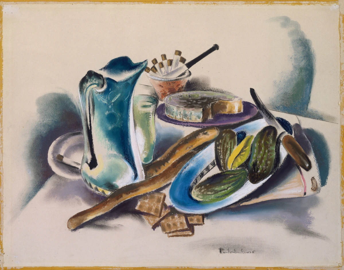
Think about texture, shape, and meaning. An old, crinkled book next to a smooth, shiny lemon. A transparent glass of water next to an opaque ceramic mug. Each object tells a different story and reflects light in its own unique way. Don't just grab things at random (unless that's your specific artistic goal!). Consider how objects interact, what mood they evoke, and what narrative, however subtle, they might convey. As I always tell my students, every object you place in your still life is a silent character in a story you're about to tell. Do they get along? Do they contrast? What happens when you put something rough next to something smooth? These are the questions that bring your tabletop world to life. This intentional curation elevates your still life from a mere arrangement of items to a thoughtful composition. Don't be afraid to combine elements from different categories—a smooth ceramic vase with crinkled leaves, or a polished metal object next to a rough piece of wood. The interplay of these varied textures and forms is what creates visual richness and keeps the eye engaged. I often find inspiration in unexpected places: a forgotten trinket from a flea market, a weathered piece of driftwood from a beach walk, or even the remnants of a meal. The key is to see them as potential storytellers, not just things.
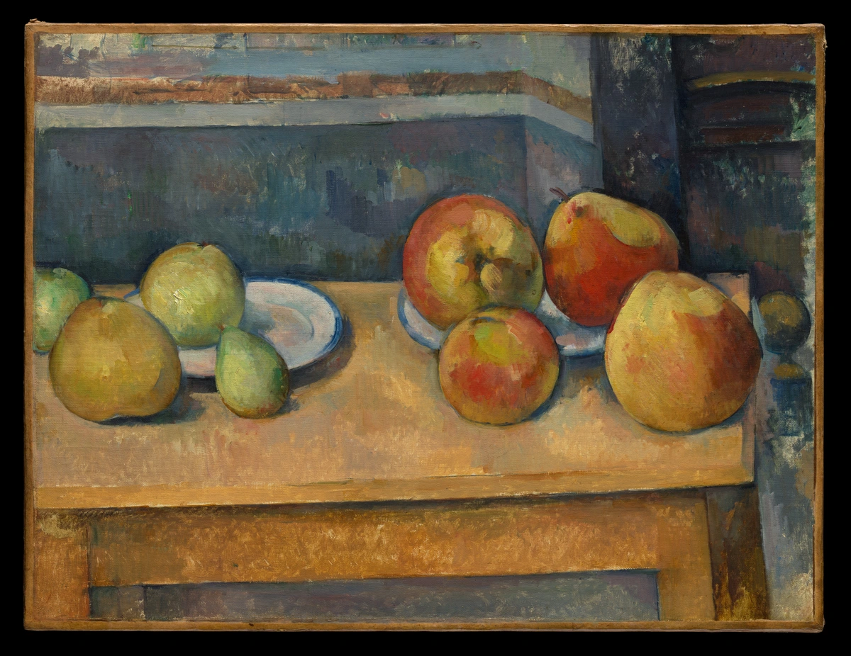
Developing Your Still Life Collection
Over time, you might find yourself building a personal collection of still life objects. These aren't just random items; they become your personal cast of characters, ready to be called upon for your next artistic narrative. Keep an eye out for interesting shapes, unique textures, and items with a story—old books, quirky ceramics, natural elements like unusually shaped stones or dried flowers. This collection becomes a wellspring of inspiration, a tangible representation of your evolving artistic interests. I have a shelf dedicated to my 'still life props,' and sometimes I just gaze at them, waiting for a conversation to spark between a chipped teacup and a smooth, river-worn pebble. It's like having a costume department for your artistic plays.
Considering Reflective and Transparent Objects: Mastering the Illusion
While challenging, incorporating reflective (like polished metal or mirrors) and transparent (like glass bottles or water-filled vases) objects can add immense visual interest and push your observational skills to new heights. They teach you to see not just the object itself, but also its environment reflected within it, and how light passes through or bounces off surfaces. Don't shy away from these; they are advanced lessons packed into everyday items. Painting glass, for instance, isn't about painting the 'glass' itself, but the distortions, reflections, and refractions of light passing through it and the objects behind it. Similarly, capturing the sheen of polished metal requires careful observation of how light bounces off its curved surfaces, creating sharp highlights and complex reflections. These elements, though daunting, are incredibly rewarding to master, adding a professional polish to your work.
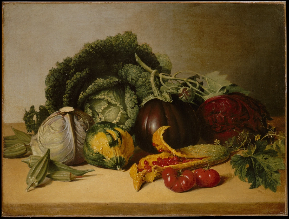
| Object Category | Example Objects | Why They Work | Key Learning | Pro Tip | | :--- | :--- | :--- | :--- | | Organic Forms | Fruit (apples, pears, grapes), vegetables (peppers, squash), flowers, leaves, driftwood, dried seed pods | Irregular shapes, varied textures, natural color shifts, inherent impermanence adds narrative depth. | Form, subtle color transitions, organic contours, the dance of life and decay, capturing fragility. | Look for imperfections; a bruised apple tells a better story than a perfect one. Consider flowers at different stages of bloom. | | Man-Made Forms | Ceramics (cups, bowls, plates), glass (bottles, vases, tumblers), polished metal objects (spoons, teapots), books, draped fabric, worn tools | Geometric shapes, reflective surfaces, defined edges, interplay of light and shadow on various materials, drapery creating soft folds. | Reflections, transparency, hard edges, drapery, material rendering, capturing highlights and deep shadows. | Group similar textures, or intentionally contrast them. A crumpled cloth can add immense visual interest and complex shadow play. Experiment with matte vs. glossy finishes. | | Personal Items | Old keys, eyeglasses, antique trinkets, jewelry, worn tools, letters, photographs | Emotional resonance, unique shapes, signs of age/use, evoking nostalgia, intimacy, or a sense of history. | Storytelling, capturing character, intimate details, depicting wear and tear, conveying a sense of time. | Choose items with a personal connection; your affection for them will shine through. These objects often provide a built-in narrative. | | Found Objects | Pebbles, feathers, seed pods, interesting leaves, discarded items (e.g., rusted metal, broken pottery) | Unexpected textures, natural patterns, unique silhouettes, connection to nature, environmental commentary. | Detail, natural light interaction, subtle color variations, organic complexity, capturing the beauty of the overlooked. | Don't underestimate the beauty of a simple, naturally occurring object. Sometimes the most compelling pieces come from the least expected finds. | | Food Items | Bread, cheese, olives, wine, cakes, raw fish, game | Rich textures, varied forms, cultural symbolism, often representing abundance, feasts, or the passage of time. | Rendering different food textures, capturing culinary narratives, understanding perishability as a theme. | Be mindful of their fleeting nature; photograph your setup or work quickly for fresh items. Often used to evoke a sense of home or celebration. |
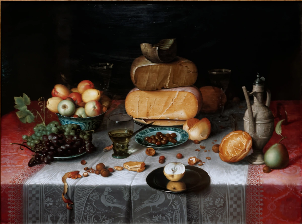
Remember, your goal isn't just to paint what is there, but to convey its essence. This also extends to your background selection, which should complement and support your objects without distracting. Think of it as the quiet backdrop to your story. The background, often overlooked, is a powerful compositional tool. It sets the mood, defines the edges of your objects, and can either enhance or detract from your focal point. I often use a simple, plain cloth, but sometimes a textured wall or a subtle pattern can add a layer of intrigue without overwhelming the main subjects.
Crafting a Theme or Narrative
This isn't always necessary, especially when you're starting, but a theme can add a layer of depth to your still life. Are you exploring abundance, solitude, the passage of time, or the beauty of everyday objects? For instance, a half-eaten apple and a wilting flower can speak to impermanence, while vibrant, fresh produce might celebrate vitality. Even a simple arrangement can gain profound meaning when you approach it with an intention, however small. Sometimes, I just pick objects that make me happy, and that’s a theme in itself, isn’t it? I often think of it as giving your still life a quiet voice, a subtle narrative that unfolds as the viewer engages with it. This intentionality, even if only for yourself, imbues your work with greater resonance. I’ve found that even a loose concept – like "morning routine," "forgotten treasures," "a moment of pause," or "the remnants of a meal" – can subtly guide your object selection and arrangement, leading to a more cohesive and resonant painting. It allows your viewer to connect with your piece on a deeper, more emotional level, transforming a simple arrangement into a poetic statement.
Every object you choose carries a history, a texture, a potential narrative. Placing a well-worn leather-bound book next to a delicate teacup can evoke a sense of quiet contemplation or a moment stolen from daily life. A handful of autumn leaves and a single fading flower can speak volumes about the passage of time. Don't just arrange; choreograph. What conversation are your objects having? What memory are they sparking? This intentional storytelling, even if only implied, elevates your still life from a mere arrangement to a poignant reflection. I often think of my still life arrangements as silent films, where the objects are the actors, and I'm the director, trying to convey a specific mood or message. For example, fruit and vegetables are great for learning form and color, especially those with interesting textures like a bumpy orange peel or the sheen of a bell pepper. Ceramics and glass teach you to handle reflections, highlights, and transparency; don't be afraid to squint your eyes to simplify complex reflections into basic shapes. Books and fabric create excellent opportunities for studying texture, folds, and how light creates soft shadows; try draping fabric to create leading lines. And personal items like an old watch or a favorite coffee cup add a human story, making your emotional connection to the object shine through. Remember that the negative space around your objects is just as crucial as the objects themselves in defining your composition and overall mood.
Composition is King
How you arrange your objects is everything. It's the difference between a random pile of stuff and a compelling scene. The goal is to guide the viewer's eye through the painting, to tell a story with silent elements. I highly recommend diving deep into the principles of still life composition, but here are a few quick pointers to get you started. Think of composition as the invisible hand guiding your viewer's eye, creating harmony and impact. It’s where you truly become the director of your miniature universe, arranging your silent actors for maximum effect. I like to imagine my composition as a stage, and each object has its marked position to create the most compelling visual drama. It's the underlying structure that holds the entire painting together, dictating not just what is seen, but how it is perceived and felt. It’s the silent architecture of your visual story.
Let's explore some key compositional ideas that can transform your still life from a collection of objects into a compelling narrative, ensuring every element has its purpose and place. These aren't rigid rules, but rather guiding principles, tools to help you create visual harmony and impact. I often think of them as the unspoken grammar of visual art; once you understand them, you can speak volumes with your arrangements.
Compositional Principle | Description | Why It Works | Practical Application | Key Benefit |
|---|---|---|---|---|
| Rule of Thirds | Imagine your canvas divided into nine equal sections by two horizontal and two vertical lines. Place your focal point where these lines intersect. | Creates natural balance and visual interest, avoids static, centered compositions. | Place a key object (e.g., your most vibrant fruit) on one of the intersecting points. | Guides the eye naturally and creates dynamic tension. |
| Golden Ratio / Golden Spiral | A more advanced compositional guide, often seen in nature, that suggests harmonious proportions. | Creates a sense of organic flow and aesthetic pleasure. | Arrange objects along the curve of a spiral, with the focal point at the tightest part. | Achieves inherent visual harmony and organic flow. |
| Leading Lines | Use actual or implied lines (e.g., the edge of a book, a draped fabric) to draw the viewer's eye into and around the painting. | Guides the viewer's journey through the composition, creating depth and movement. | Drape a cloth from a higher object down to a lower one, creating a diagonal line. | Creates visual movement and directs focus. |
| Symmetry & Asymmetry | Symmetrical compositions offer balance and formality, while asymmetrical ones provide dynamic tension. | Each creates a distinct mood; symmetry feels calm, asymmetry feels energetic. | Try a central, symmetrical arrangement for a formal feel, or offset objects for a more playful, informal look. | Evokes distinct moods and creates visual interest. |
| Repetition with Variation | Repeat certain shapes, colors, or textures, but introduce slight differences. | Creates rhythm and unity without becoming monotonous. | Use three apples of slightly different sizes and shades of red. | Builds visual rhythm and strengthens unity. |
| The Rule of Odds | Arranging objects in odd numbers (e.g., three, five) rather than even groups. | Naturally more visually dynamic and pleasing than even groups, avoiding static pairings. | Place a central object with two smaller ones flanking it, or a group of five varied elements. | Enhances visual dynamism and avoids stiffness. |
| Creating Triangles | Arranging objects to form subtle, implied triangular shapes within the composition. | Triangles provide inherent stability and direction, guiding the viewer's eye through the scene. | Place your tallest object as the apex, with two other objects forming the base of a visual triangle. | Provides stability and directs the viewer's gaze. |
| Overlap for Depth | Allowing objects to partially obscure one another, rather than lining them up side-by-side. | Creates a powerful illusion of depth and space, making the arrangement feel more natural and less like a lineup. | Let a vase stand slightly in front of a book, or a piece of fruit partially hide another. | Creates a convincing illusion of three-dimensional space. |
| Varying Heights | Incorporating objects of different heights and sizes within your arrangement. | Adds visual interest and rhythm, preventing the composition from feeling monotonous or flat. | Use tall bottles, medium-sized fruits, and smaller trinkets to create a dynamic silhouette. | Prevents monotony and adds visual rhythm. |
| Negative Space Matters | Actively considering and shaping the empty spaces around and between your objects. | These 'negative shapes' are as crucial as the objects themselves, contributing to overall balance and defining forms. | Focus on the interesting shapes created by the gaps between your objects; sometimes, they're more compelling than the objects themselves. For more on this, you might find understanding balance in art composition helpful. I've often seen beginners so focused on the objects that they forget to see the air around them, and that's where a lot of the magic happens, creating a sense of three-dimensionality and visual rhythm. | Enhances balance and defines object forms. |
| Focal Point | Designating one primary area that immediately captures and draws the viewer's eye. | Provides an anchor for the composition, grounding the entire piece and guiding the viewer's visual journey. | This could be the brightest highlight, the sharpest edge, or a splash of contrasting color; everything else supports it. | Grounds the composition and directs immediate attention. |
| Cropping | Intentionally cutting off parts of objects at the edges of the canvas. | Creates a sense of immediacy, suggests a larger world beyond the frame, and adds visual tension. | Position objects so they extend beyond the canvas edge, implying continuation. | Adds immediacy and implies a larger narrative. |
| Diagonal Balance | Using diagonal lines or arrangements to create dynamic tension and movement. | Adds energy and visual interest, breaking the monotony of horizontal or vertical lines. | Arrange objects along an implied diagonal, or use a draped fabric to create a strong diagonal element. | Introduces energy and visual dynamism. |
| Visual Hierarchy | Arranging elements so that some appear more important than others, guiding the viewer's eye through a clear path. | Prevents a chaotic or overwhelming composition, ensures the message is clear, and establishes points of interest. | Emphasize your focal point with stronger contrast, sharper edges, and brighter colors, allowing other elements to recede subtly. | Clarifies the narrative and guides the viewer's journey. |
| Proximity | Grouping related objects close together to form a cohesive unit. | Creates a sense of unity and reduces visual clutter, making the composition easier to read. | Arrange a few related items (e.g., a cup, saucer, and spoon) tightly together to create a mini-composition within the larger one. | Establishes unity and reduces visual fragmentation. |
| Dynamic vs. Static Balance | Dynamic balance uses asymmetrical arrangements to create tension and movement, while static balance uses symmetrical elements for a sense of calm. | Allows the artist to control the energy and emotional impact of the composition. | For dynamic, offset a large object with several smaller ones; for static, mirror elements around a central axis. | Controls the energy and emotional feel of the artwork. |
Lighting Your Stage: The Sculptor of Form and Mood
Simple is best here, especially when starting out. A single, strong light source from the side is your best friend. It creates clear highlights and dramatic cast shadows, which are essential for defining the form of your objects. A window with natural light is beautiful, but a simple desk lamp works just as well and gives you more control. The direction of your light source fundamentally changes the mood and drama of your painting. A top-down light might flatten forms, while a strong side light emphasizes contours and texture. Consider also the quality of light – soft, diffused light from a cloudy day creates subtle transitions, while direct sunlight yields crisp, hard-edged shadows. I've found that understanding light is perhaps the single most important skill a painter can develop, so if you're curious to dive deeper, I highly recommend exploring a definitive guide to understanding light in art. Experiment with angling your light source from different positions to see how it sculpts the forms and creates different narratives. Just a slight shift can drastically alter the mood of your entire composition. I often spend as much time adjusting my light source as I do arranging the objects, because light truly is the subject in many still life paintings. It’s the invisible hand that defines everything you see.
Understanding Light Qualities: Beyond Direction
Beyond just the direction of your light source, the quality of light plays a monumental role. Is it a harsh, direct beam, or a soft, diffused glow? Direct sunlight, for instance, will create crisp, sharply defined shadows and intense highlights, lending itself to high-contrast, dramatic compositions. Conversely, diffused light, perhaps from an overcast sky or filtered through a sheer curtain, will produce softer edges, gentler transitions, and a more subtle mood. Experiment with these different qualities to see how they transform your objects and the emotional resonance of your still life. The interplay of light and shadow is, in essence, the language of three-dimensionality.
Types of Lighting for Still Life: Choosing Your Illuminator
Light Type | Characteristics | Mood Evoked | Best For | Challenges/Considerations |
|---|---|---|---|---|
| Natural Window Light | Soft, diffused, changes throughout the day, often indirect, providing subtle transitions. | Serene, classic, observational, intimate, quiet. | Capturing subtle nuances, traditional still life, subjects with delicate textures, long painting sessions (if consistent). | Inconsistent; requires quick work or consistent return to setup; weather dependent. |
| Single Directional Light (e.g., Desk Lamp) | Strong highlights, dramatic cast shadows, clear forms, defines edges and planes with intensity. | Dramatic, focused, high contrast, sculptural, intense, moody. | Learning form and value, creating strong focal points, emphasizing texture and volume, chiaroscuro effects. | Can be harsh if not diffused; shadows can be too dominant; requires careful positioning. |
| Backlighting | Creates a rim of light around objects, strong silhouettes, can make objects appear to glow. | Mysterious, ethereal, highlights edges, dramatic, atmospheric, abstract. | Emphasizing contours, creating depth and drama, separating objects from the background, conveying a sense of atmosphere. | Can obscure internal details; requires strong compositional sense to avoid flatness. |
| Front Lighting | Illuminates the front of objects directly, often flattening forms and reducing shadows. | Bright, direct, less dramatic, can reveal intricate details but lacks depth. | Detail studies, capturing accurate local colors, minimizing dramatic shadows, documentary approach. | Can lead to a flat, uninteresting look; diminishes sense of form and volume. |
| Multiple Light Sources | Complex shadows, can flatten forms if not controlled, often creates a more 'lit' rather than 'shadowed' look. | Lively, complex, challenging, can be confusing or create a sense of artificiality. | Experienced artists, specific artistic effects, illuminating every facet of a complex arrangement, creating a stage-like ambiance. | Very difficult to manage; can create confusing shadows and flatten forms; risk of over-lighting. |
| Top Lighting | Light comes from directly above, creating strong shadows directly beneath objects. | Sober, formal, can feel dramatic or oppressive depending on intensity. | Sculptural forms, highlighting vertical elements, creating deep, grounding shadows. | Can flatten upper surfaces; often creates heavy, less interesting shadows directly below objects. |
My personal preference usually leans towards a single, strong light source from the side. It’s like a spotlight on your main characters, really bringing out their personality and sculptural qualities. This type of lighting also simplifies the shadow shapes, making them easier to observe and paint, which is a huge bonus when you're starting out. I've found that this directness forces me to truly understand the form of the object, as there's no ambiguity in the light's embrace or the shadow's retreat. It’s a foundational lesson in seeing and translating three-dimensional reality onto a two-dimensional surface. While a single light source is ideal for learning, don't be afraid to experiment once you're comfortable. However, be wary of introducing too many competing light sources, as this can lead to confusing and flattened shadows, making it harder to define your forms.

Step 2: The Sketch - Your Roadmap to Success
I know, you're eager to start painting. But trust me, a quick preliminary sketch will save you a world of pain later. This isn't about creating a perfect drawing; it's about solving problems. Think of it as a basic still life drawing to map out your composition and make sure everything fits. It's your blueprint, your rehearsal before the grand performance, and it's where you can make all your compositional mistakes without wasting precious paint. I always tell myself it’s cheaper to make a mistake with charcoal than with oil paint! It’s also an opportunity to build intimacy with your subject, really studying its contours and relationships before committing to color. This initial mapping isn't just about placement; it's about conceptualizing the entire piece, understanding the relationships between elements before color enters the equation. It's the moment to step back and look at the 'big picture,' before getting lost in the seductive details of color. This initial mapping isn't just about placement; it's about conceptualizing the entire piece, understanding the relationships between elements before color enters the equation.
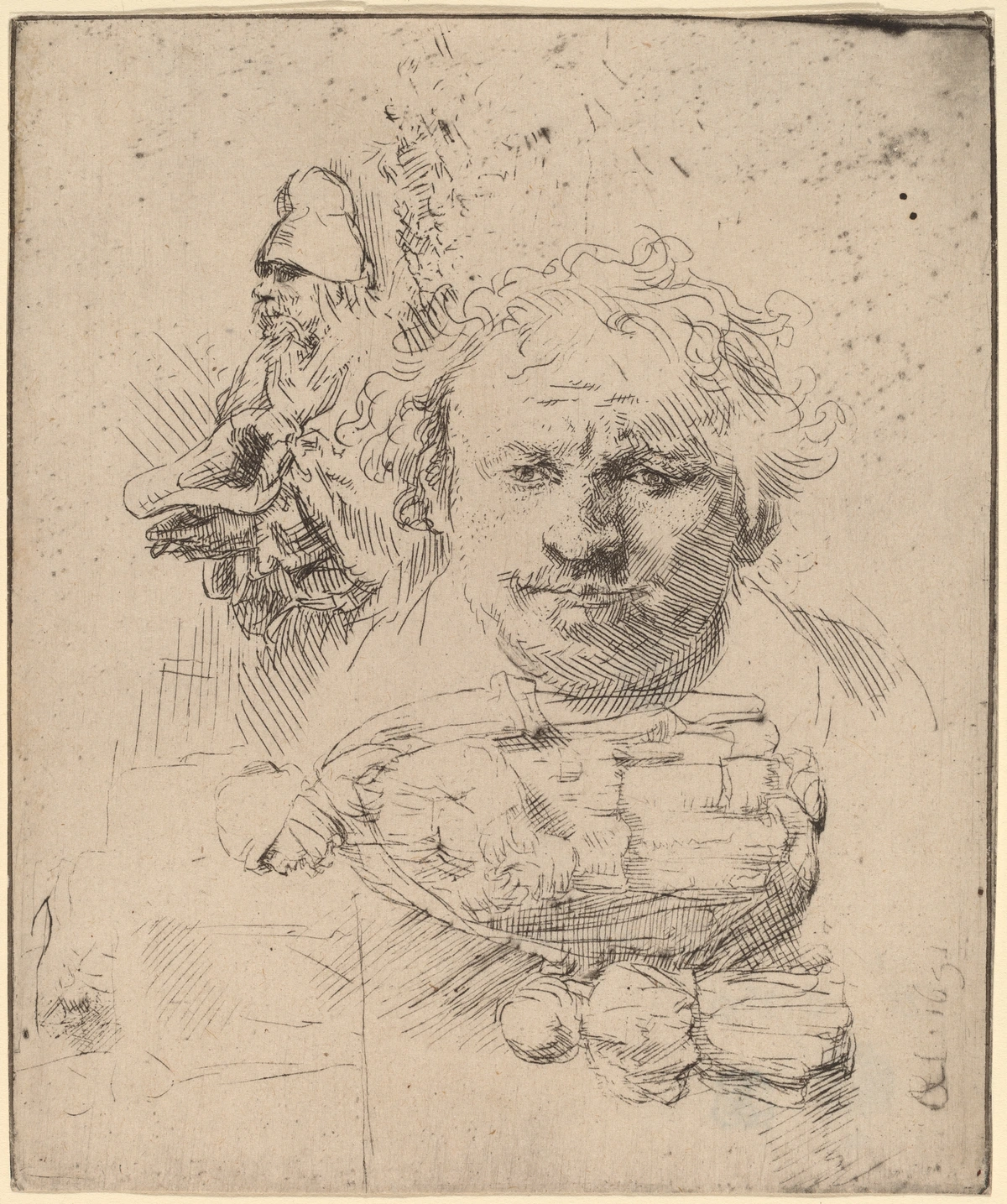
Focus on the big, simple shapes. Where are the major darks and lights? How do the objects relate to each other in space? This is also a great moment to consider the foundational elements of art like line and shape. Don't get bogged down in detail at this stage; think about the overall gesture and placement. I often do several small thumbnail sketches before committing to a larger drawing, just to explore different angles and arrangements. These quick, small studies are invaluable for solving compositional problems quickly, almost like speed dating with your ideas!
Achieving Accuracy: Sight-Size and Comparative Measurement
For accurate proportions, two common methods are sight-size and comparative measurement. Sight-size involves placing your canvas directly next to your setup and drawing what you see at a 1:1 scale, allowing for direct comparison. This method is fantastic for training your eye to see exactly what is there, without mental interference. Comparative measurement uses a measuring tool (like a plumb line or a knitting needle) held at arm's length to gauge the relative sizes and angles of objects, then transferring those relationships to your canvas. This allows you to break down complex forms into simpler measurable ratios. Neither is a shortcut, but both are powerful tools for training your eye to see proportions accurately. I often find myself switching between the two, using sight-size for initial placement and comparative measurements for refining tricky relationships. Remember, getting your proportions right in the sketch saves you immense frustration later on with paint! A well-proportioned drawing is the backbone of a convincing painting, regardless of the level of realism you're aiming for. It's the silent architecture that holds everything together.
Types of Still Life Sketches: Your Arsenal of Observational Tools
Sketch Type | Focus | Purpose | Tools | Key Benefit/Skill Developed |
|---|---|---|---|---|
| Thumbnail Sketch | Overall composition, big shapes, light/dark patterns, broad strokes of value. | Quickly explore multiple arrangements, identify focal point, test out cropping and dramatic angles. | Small notepad, any pencil or pen, even a marker to force simplification. | Rapid ideation, problem-solving, broad compositional understanding. |
| Contour Drawing | Outline of objects, edges, how forms connect, the continuous line defining the object. | Develop observational skills, understand negative space, train the eye to follow edges slowly and deliberately. | Pencil, pen, charcoal on paper (often without lifting the drawing tool). | Enhanced visual perception, understanding of form and negative space. |
| Blind Contour Drawing | Pure observation of the object without looking at the paper, focusing solely on the object's edges. | Enhances eye-hand coordination, forces intense observation, loosens up drawing style, creates unexpected and expressive lines. | Any drawing tool and paper. | Improved eye-hand coordination, intense focus, freeing up drawing style. |
| Gesture Drawing | Movement, flow, essence of the form, quick study, capturing the energy and overall rhythm of the arrangement. | Capture the dynamic quality, loosen up, convey a sense of life and spontaneity, understand the underlying structure. | Large paper, charcoal, soft pencil, pastels (for quick color notes). | Capturing vitality and underlying structure quickly. |
| Detailed Line Drawing | Accurate proportions, specific forms, preparatory drawing, precise outlines and structural details. | Establish precise placement for painting, define the exact boundaries of objects, ensure anatomical correctness (if applicable). | Pencil, eraser, ruler (optional), precise drawing tools on canvas or paper. | Precision, foundational accuracy for painting, detailed structural understanding. |
| Value Study | Focus on lights and darks (values), ignoring color, often monochrome. | Establish strong tonal structure, identify key light and shadow patterns, prevent paintings from looking flat. | Charcoal, graphite pencils (various hardness), single neutral-colored paint wash (e.g., burnt umber) on paper or primed surface. | Mastery of light and shadow, foundational for three-dimensionality, prevents flat paintings. |
| Perspective Sketch | Understanding how objects recede in space, using vanishing points and horizon lines. | Ensures a believable illusion of depth, especially with geometric objects or complex arrangements. | Pencil, ruler, sketchbook, knowledge of definitive guide to perspective in art. | Creates a convincing sense of depth and realism in space. |
The Power of Value Studies: The Unsung Hero of Painting
Before color, there is value. Value refers to how light or dark something is, and it's the backbone of any strong painting. A value study is essentially a monochrome sketch, often in charcoal or a single paint color (like burnt umber), where you focus only on the lights and darks. It helps you see the world in simplified terms, eliminating the distraction of color. Where are the brightest highlights? The darkest shadows? The mid-tones? Getting this right in your sketch will make adding color infinitely easier and more impactful. Trust me, I've skipped this step more times than I care to admit, and almost always regretted it when my painting ended up looking flat. You can use simple drawing pencils for this, or even sketching pencils if you want a wider range of graphite hardness. The magic of a value study is that it forces you to simplify, to see the world in broad strokes of light and dark. It builds the skeletal structure of your painting before you put on the vibrant skin of color. I often find it helpful to squint my eyes to reduce the visual information, making it easier to see these crucial value relationships. It's like turning the world into a black and white photograph, where only the essential forms and their relationships to light remain. This step is non-negotiable for a compelling still life, laying the groundwork for true three-dimensionality.
Seeing in Abstraction: The Power of Simplification
A value study isn't just about getting lights and darks right; it's a profound exercise in artistic abstraction. By stripping away color, you're forced to confront the fundamental relationships of form and space. This simplification allows you to identify patterns, unify disparate elements, and establish a strong underlying structure that will support your entire painting. It's a key step in learning to interpret reality rather than just copy it, giving you the power to manipulate light and shadow for dramatic effect. For me, it’s where the abstract truth of a composition truly reveals itself.
Once your sketch and value study are complete, you’ve got your map. Now, it's time to embark on the journey of color. But remember, color can sometimes mislead the eye if the underlying value structure isn't sound. So trust your values first, and then let color be the beautiful storyteller it is.
Step 3: Let's Get Painting - The Fun (and Terrifying) Part
Okay, canvas is ready, sketch is done. Time to paint.
Palette Preparation and Setup: Your Mixing Command Center
Before you even touch your brush to the canvas, take a moment to set up your palette. Lay out your chosen colors in a logical order – I often arrange mine from light to dark, or by warm and cool tones. Leave plenty of mixing space in the center. Having your colors consistently arranged will save you time and frustration during your painting session, allowing your focus to remain on your subject. This little act of organization can make a huge difference in your painting flow. Remember, a well-organized palette is the first step towards a well-organized painting. Consider the type of palette you use: a wooden palette for oils (seasoned with linseed oil to prevent paint absorption), a glass palette for easy cleanup with acrylics (as dried acrylic peels right off), or a disposable paper palette for convenience, especially when traveling or for quick studies. Each has its pros and cons, but consistency in your setup will significantly improve your workflow. I also like to have a dedicated area for mixing neutrals and grays, separate from my vibrant colors, to keep things clean and prevent accidental muddiness. A good palette is not just a surface; it's an extension of your creative mind, where colors begin their conversation before they even reach the canvas.

Choosing Your Medium: Finding Your Artistic Voice
Any paint will do, honestly. Each has its own personality, its own way of speaking. If you're not sure what to pick, check out this definitive guide to paint types for artists. The choice of medium can profoundly impact the look and feel of your still life, influencing everything from drying time to the vibrancy of colors and the texture you can achieve. I’ve dabbled in all of them, and each brings its own joy and its own frustrations. It’s like choosing your dance partner – some are fast and energetic, others slow and graceful. The medium you choose will dictate your approach, your techniques, and even the final emotional resonance of your piece. Here’s my quick take, along with some brand thoughts if you're looking to dive deeper into specific options, and a guide on which might be best suited for beginners:
Paint Type | Pros for Still Life | Cons for Still Life | Brand Recommendations | Best for Beginners? |
|---|---|---|---|---|
| Oils | Rich, luminous colors; long drying time allows for extensive blending and subtle transitions; excellent for traditional realism and depth; archival quality. | Longer cleanup, requires solvents (though solvent-free options exist); slow drying can mean longer projects; can have strong fumes. | Winsor & Newton Artists' Oil Colour, Holbein Oil Paints, Gamblin Artist's Oils | Intermediate, due to drying time and cleanup. |
| Acrylics | Dries fast, easy cleanup with water, vibrant colors; versatile for various techniques from thin washes to thick impasto; non-toxic. | Fast drying time can make blending tricky; colors can dry slightly darker than when wet; less natural luminosity than oils for some. | Liquitex Basics Acrylic Paint, Golden Heavy Body Acrylics, Basic Brushstrokes for Acrylic Painting, Winsor & Newton Professional Acrylics | Excellent, easy cleanup and quick drying for experimentation. |
| Gouache | Opaque, matte finish with vibrant colors; can be re-wetted to make changes; great for graphic, illustrative styles, and flat color areas. | Can dry a different color than when wet; less suitable for transparent layering effects; can be prone to cracking if applied too thickly. | Winsor & Newton Designers' Gouache, Holbein Acryla Gouache, Reviewing the Best Gouache Sets for Beginners, M. Graham Gouache | Good, offers opaque control like acrylics with re-wetting ability. |
| Watercolor | Luminous and transparent washes; excellent for delicate subjects, light effects, and spontaneous expressions; portable. | Less forgiving; hard to cover up mistakes; requires specific paper and careful planning; transparency means white comes from the paper. | Winsor & Newton Professional Watercolors, Sennelier Watercolors, Best Watercolor Paper for Artists Review, Daniel Smith Watercolors | Challenging, but rewarding for light effects and transparency. |
| Pastels (Oil & Soft) | Direct application of vibrant color; excellent for rich textures and blending directly on the surface; no drying time. | Can be messy; requires fixative to prevent smudging; delicate finished surface for soft pastels. | Sennelier Oil Pastels, Rembrandt Soft Pastels, Faber-Castell Pitt Pastel Pencils | Good for tactile artists who enjoy direct color application. |
| Ink (India Ink, Acrylic Ink) | Intense, permanent colors; excellent for line work, washes, and creating strong contrasts. | Dries very fast; less blendable once dry; mistakes are harder to correct; can stain. | Dr. Ph. Martin's Bombay India Inks, Liquitex Acrylic Inks, Winsor & Newton Drawing Inks | Advanced, but great for dynamic black and white studies or detailed line work. |
My advice? Don't get too hung up on the "right" medium. Pick one, get comfortable, and then experiment! You might even want to try less conventional options like oil sticks for expressive mark-making, as explored in exploring oil sticks for expressive mark-making, or perhaps even encaustic, which uses heated wax to create incredible texture and luminosity. The journey of what are painting mediums a beginners guide is a fascinating one, and your personal connection to a medium will often dictate your success more than any technical
Exploring Painting Mediums (Additives): Beyond Just Paint – Controlling Your Narrative
Beyond the paint itself, "mediums" (the additives you mix with your paint) can drastically alter its properties, from drying time to texture and transparency. For oils, linseed oil can increase fluidity and gloss, while alkyd mediums can speed drying. For acrylics, gel mediums add body for impasto, fluid mediums increase flow for washes, and retarders slow drying time, giving you more blending opportunities. Don't be afraid to experiment with these; they are powerful tools for achieving specific effects and expanding your artistic vocabulary. I always keep a few different mediums on hand, as they allow for incredible versatility within a single painting session. For instance, a glazing medium can make your colors more transparent and luminous, allowing you to build up incredible depth in your oil paintings, while a heavy gel medium can let you create sculptural, three-dimensional textures with acrylics. It's like having a whole new set of tools to play with, beyond just the brushes and paints themselves. For acrylic artists, I particularly recommend exploring best acrylic mediums for abstract artists, as many of the principles of texture and flow apply beautifully to still life work.
Blocking In Your Shapes: The Underpainting Foundation
Don't start with the tiny details. Start big. I like to do an underpainting—a thin, monochrome layer (often with watered-down Burnt Sienna acrylic or a transparent oil wash) that establishes the main shapes and value structure (the lights and darks). This kills the intimidating white of the canvas and gives you a solid foundation to build upon. It's like laying the foundation for a house; you wouldn't start with the wallpaper, would you? This stage is about establishing the big relationships – where are the darkest darks, the lightest lights, and the general placement of your forms. One trick I often use is to start with a limited palette for my underpainting, maybe just a single earth tone like burnt umber. This forces me to focus purely on value and form without the distraction of color, creating a robust structural base. Learning how to prepare a canvas for acrylic painting or how to prepare a canvas for oil painting properly beforehand will ensure your underpainting goes on smoothly, providing a strong base that will show through subtly in your final layers. You could also explore traditional underpainting techniques like grisaille (a monochrome underpainting in grays, establishing values before color) or verdaccio (a monochrome underpainting in greenish tones, traditionally used for flesh tones but adaptable for other subjects), which can add a beautiful luminosity to your final layers. These techniques are centuries old for a reason – they work!
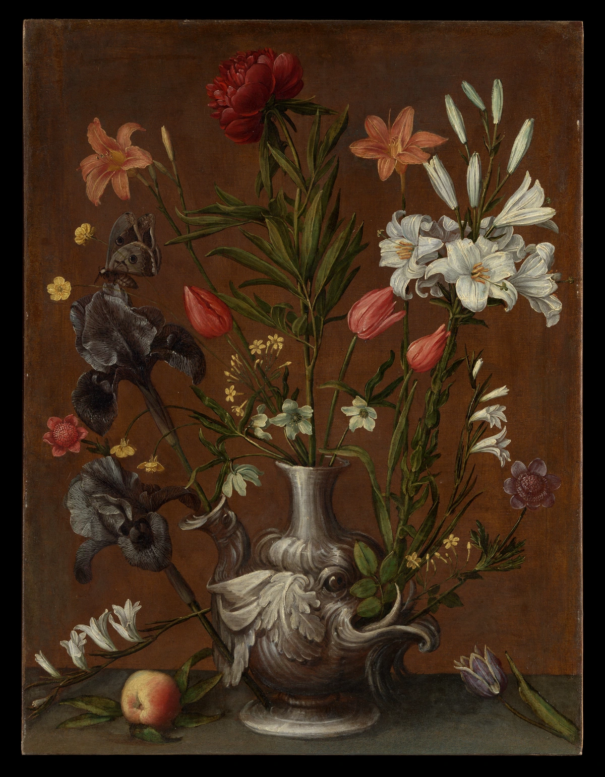
Once that's dry, you can start blocking in the local color of each object. Don't worry about getting it perfect. Just get the big shapes of color down. This is about building the painting in layers, slowly bringing your vision to life. Think of it as painting a blurry photograph; you're just getting the general feel and color notes. We'll refine it later. This initial color block-in should be a simplified version of what you see, focusing on the average color of each area. Resist the urge to dive into detail at this stage; patience here pays off later, allowing you to gradually build complexity. For acrylics, this stage can move quickly due to fast drying times, while with oils, you have more time to blend and adjust. The key is to establish the 'big picture' of color before getting lost in the minutiae. This is where your value study truly shines, guiding your color choices to maintain that strong underlying structure.
Understanding Color: It's More Than Just Red, Yellow, and Blue – The Soul of Your Painting
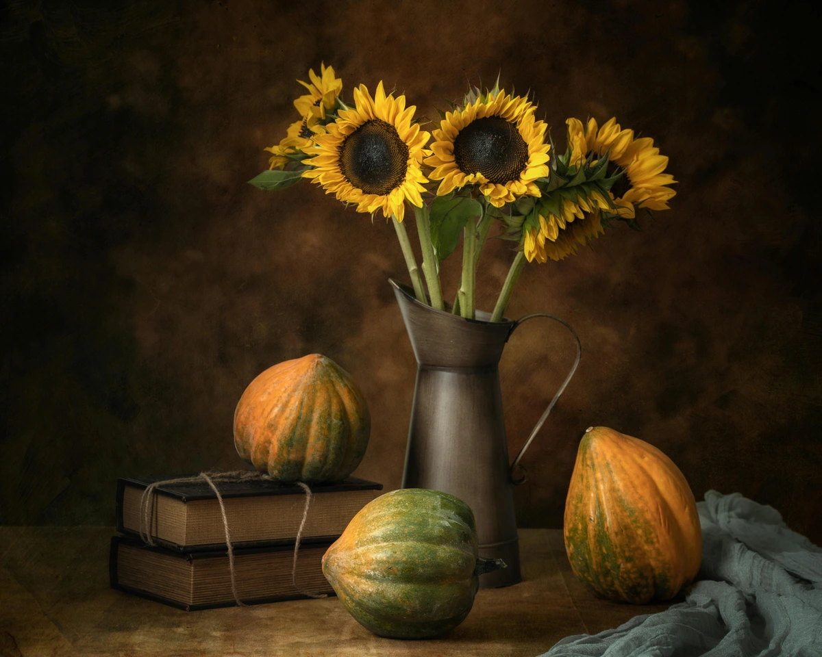
Color is a vast and fascinating subject, and in still life, you have total control over your palette. Beyond just identifying the local color of an object (that an apple is red, for example), think about its temperature (warm or cool), its saturation (how intense or dull it is), and how it shifts in different lighting conditions. Those shadows on the lemon? They're rarely just gray; they might be a rich purple or a cool blue, reflecting the ambient light. This is where a color study can be incredibly insightful. Learning how artists use color is a lifelong journey, and still life is an excellent training ground. You might even find yourself delving into the psychology of color in abstract art as you explore the emotional impact of your choices. Every color is influenced by the colors around it, so learning to see these relationships is far more important than memorizing color theory rules. I like to think of color as the emotional core of a painting; it's what truly brings a still life to life, infusing it with mood and personality.
Color Temperature in Shadows: The Hidden Depths of Form
One of the most surprising discoveries for many beginners is that shadows are rarely just gray or black. Instead, they are often filled with subtle colors, reflecting the ambient light and the local colors of surrounding objects. For example, a shadow on a yellow lemon might appear cool and purplish, picking up hues from a blue background, while a shadow on a red apple might lean towards a cooler green if placed near green leaves. Paying attention to these shifts in color temperature – whether a color leans warm (red, orange, yellow) or cool (blue, green, purple) – will add immense depth and vibrancy to your shadows, making your forms truly three-dimensional. It's about seeing the full spectrum, not just the absence of light. Understanding how to mix acrylic paint or even how to mix realistic skin tones in oil paint (the principles translate!) will become second nature as you observe and practice. I often find myself getting lost in the subtle shifts of color within a single shadow – it’s a universe in itself, full of unexpected hues. It's a journey of continuous observation, where every shadow becomes a new puzzle to solve with your palette. These subtle color changes within shadows are crucial for giving objects weight and presence, making them feel truly grounded in space rather than floating on the canvas.
Practical Color Mixing Tips
Concept | Description | Application in Still Life | |
|---|---|---|---|
| Limited Palette | Using only a few carefully selected colors (e.g., three primaries + white, or a specific set of warm and cool primaries) to mix all your hues. This approach often uses 'primary' colors that lean either warm or cool, giving you a broad mixing range from a small set. | Teaches profound color relationships, forces you to understand how colors interact, creates inherent harmony throughout your painting, and simplifies overwhelming decision-making. It's a fantastic exercise for developing a sensitive eye for subtle shifts. | |
| Complementary Colors | Colors opposite each other on the color wheel (e.g., red/green, blue/orange, yellow/purple). | Used for vibrant contrasts and to make colors pop; mixing them creates neutral tones and can be used for harmonious grays or browns. | |
| Analogous Colors | Colors next to each other on the color wheel (e.g., blue, blue-green, green, yellow-green). | Creates harmonious, soothing compositions with subtle transitions and a unified, calm mood. | |
| Warm vs. Cool | Warm colors (reds, oranges, yellows) tend to advance and feel energetic; cool colors (blues, greens, purples) tend to recede and feel calm. | Use to create depth, guide the eye through the composition, evoke mood, and create visual tension or harmony. | |
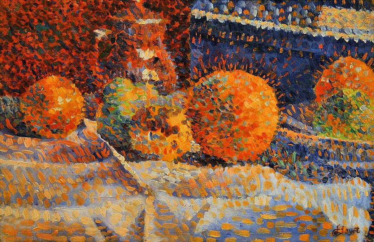
| Broken Color | Applying small strokes of different, unmixed colors next to each other, allowing the eye to mix them optically from a distance. | Creates vibrancy, optical mixing, a lively surface texture, and captures the shimmering effect of light, often associated with Impressionism. | |
| Glazing | Applying thin, transparent layers of paint (often mixed with a glazing medium) over a dry underpainting. | Creates luminosity, subtle color shifts, and deep, rich tones, especially in oil painting, building complexity and glow. (See: mastering glazing techniques in oil painting) | |
| Scumbling | Applying a thin, broken layer of opaque or semi-opaque paint over a dry layer, allowing the underpainting to show through and creating a hazy effect. | Creates soft, diffused textures, atmospheric effects, can lighten or unify colors, and adds a delicate veil of color. | |
| Impasto | Applying paint thickly so that it stands out from the surface, often with visible brushstrokes or palette knife marks. | Adds tactile texture, emphasizes movement and energy, creates sculptural forms, and catches light in interesting ways. | |
| Tonal Harmony | Using colors that share similar underlying values (lightness or darkness), even if their hues are different. | Creates a sense of unity and cohesion within the painting, making it feel balanced and aesthetically pleasing. | Choose objects and background elements that fall within a similar value range, allowing the composition to 'breathe' together. |
| Monochromatic Scheme | Using various shades, tints, and tones of a single color. | Creates a sophisticated, unified, and often moody aesthetic, emphasizing form and value over hue diversity. | Paint an entire still life using only blues, from darkest indigo to lightest sky blue, perhaps adding black and white for value range. |
| Alla Prima (Wet-on-Wet) | Completing a painting in a single session, before the paint has had a chance to dry, allowing for spontaneous blending and fresh color. | Captures immediacy and freshness, maintains vibrant, un-muddy colors, and develops quick decision-making skills. (See: alla prima painting technique guide) | Work quickly and decisively, allowing colors to blend on the canvas rather than exclusively on the palette. |
| Color Vibration | Placing complementary colors next to each other without blending them. | Creates a shimmering, energetic effect that can make colors appear more intense and lively to the eye. | A small stroke of red next to a small stroke of green, or vibrant orange next to strong blue, will create optical mixing. |
My biggest piece of advice for color is to always mix more than you think you’ll need! There's nothing more frustrating than running out of that perfect shade mid-brushstroke. And don't be afraid of mud; sometimes the most beautiful neutrals come from mixing your complements.
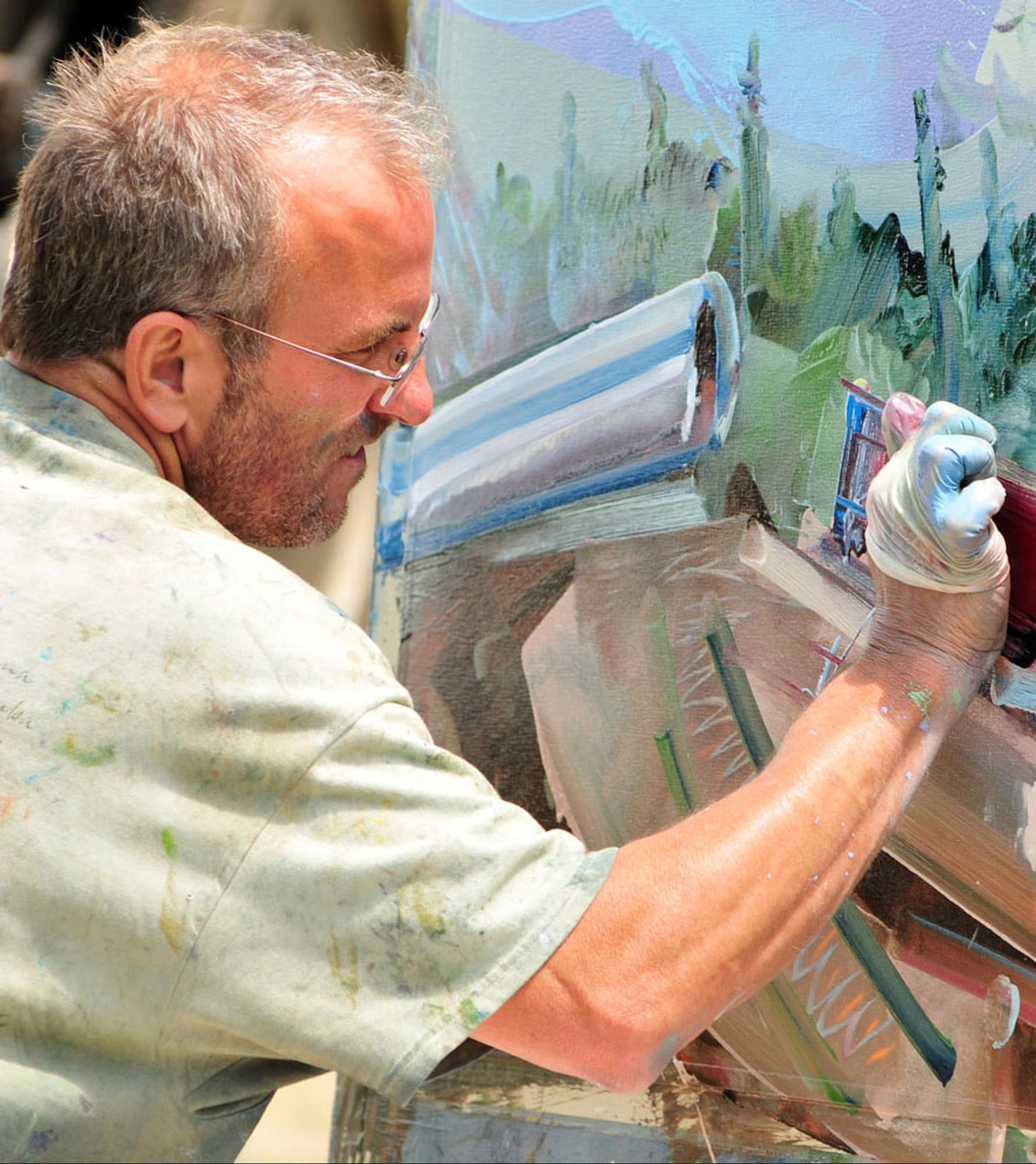
It’s amazing how much information our eyes can take in, isn’t it?
Building Form and Embracing the Ugly Stage
Now you refine. You start to model the forms, adding darker shadows and brighter highlights. You work on the transitions between colors. This is where you begin to give your objects a sense of three-dimensionality, using the interplay of light and shadow—a technique often called chiaroscuro (dramatic contrasts between light and dark). Pay attention to both form shadows (the shadows on the object itself, defining its curve and volume) and cast shadows (the shadows an object throws onto another surface, anchoring it in space). These are crucial for creating depth and grounding your objects in space. Another key element is edges. Are they sharp and crisp (like the edge of a ceramic mug against a distant background), or soft and diffused (like a shadow falling on draped fabric)? Varying your edges helps create a sense of atmospheric depth, making some elements come forward and others recede. I've found that beginners often overlook the nuances in shadows, painting them as flat gray areas when they are, in fact, full of subtle color and reflected light from surrounding objects or the environment. It’s a common trap, but once you start looking for those hidden colors, your shadows will sing! This meticulous attention to detail in rendering light and shadow is what elevates a painting from flat representation to a truly immersive experience, inviting the viewer into the illusion of space. You'll begin to see the subtle shifts in reflected light, the way a red apple might cast a faint reddish glow onto a white tablecloth, or how a blue vase subtly cools the shadow beneath it. It's a universe of tiny observations. This is also the stage where you truly learn to render different materials. Think about the soft, absorbent quality of fabric versus the hard, reflective surface of metal, or the translucent nature of glass. Each demands a different approach to brushwork and color mixing, pushing you to observe the unique way light interacts with every object. It’s a challenge, yes, but it’s precisely these challenges that sculpt you into a more sensitive and skilled painter. Mastering the subtleties of edges, for example, is what creates the illusion of air and distance around your objects.
And at some point... your painting will probably look terrible.
This is what I call the "ugly stage." Every single painting goes through it. It’s that awkward middle phase where nothing looks right and you're convinced you've ruined it. The key is to not panic. Push through it. This is where the magic happens. Keep refining, keep observing, and trust the process. I've learned that pushing through this stage is where the real growth happens. Take a break, look at your setup again, or even try flipping your canvas upside down to see it with fresh eyes. It's a rite of passage, really, and a testament to your perseverance. I’ve thrown my hands up in exasperation more times than I can count, only to return with fresh eyes and see exactly what needed to be done. It's amazing what a little distance can do! Remember, every artist, even the masters, faced this moment; it’s part of the creative struggle and ultimately, the triumph. Embracing this stage, and understanding it's a natural part of the creative cycle, is a huge step in developing resilience as an artist. It's often right after this perceived failure that breakthroughs occur. This is also where you truly learn to render different materials. Think about the soft, absorbent quality of fabric versus the hard, reflective surface of metal, or the translucent nature of glass. Each demands a different approach to brushwork and color mixing, pushing you to observe the unique way light interacts with every object. It’s a challenge, yes, but it’s precisely these challenges that sculpt you into a more sensitive and skilled painter.
Brushwork and Texture: Adding Personality to Your Painting
The way you apply paint – your brushwork – is like your artistic signature. Do you prefer smooth, seamless blends, or do you love the expressive texture of visible strokes? Still life offers ample opportunity to explore both. Different brushes will create different effects; a large flat brush might be great for blocking in, while a fine round brush is perfect for delicate details. Don't forget about palette knives! These tools aren't just for mixing paint; they can be used to apply thick, expressive impasto (paint applied thickly), create sharp edges, or scrape away paint for interesting textures. It's a technique that can truly bring your still life to life, adding a tangible quality to your painted surfaces. For more on this, check out basic brushstrokes for acrylic painting or learn what a palette knife is and how to use it. You can also explore subtle effects like scumbling (applying a thin, broken layer of opaque paint over a dry layer) or glazing (applying transparent layers of paint to alter tone or color), both of which can add immense richness and depth, especially in oil painting, as detailed in mastering glazing techniques in oil painting. You can also explore specific brushes like the best brushes for acrylic painting or, if you're working with oils, the best oil painting brushes for artists. Experimenting with brushwork is how you find your unique artistic voice; it's the fingerprints of your creative process. I love how a chunky impasto mark can capture the roughness of a stone, while a smooth blend can convey the delicate sheen of glass. Beyond palette knives, consider the myriad of brush types: flats for bold strokes, rounds for detail, filberts for soft edges, and even fan brushes for blending or creating foliage effects. Each brush is a tool with its own personality, and discovering how they interact with your chosen medium is a continuous journey of artistic exploration. Don't be afraid to leave some of your brushstrokes visible; they add character and tell the story of your artistic process. You can also explore exploring texture: my favorite techniques for adding depth to abstract paintings, as many of the principles for creating tactile interest translate beautifully to still life.
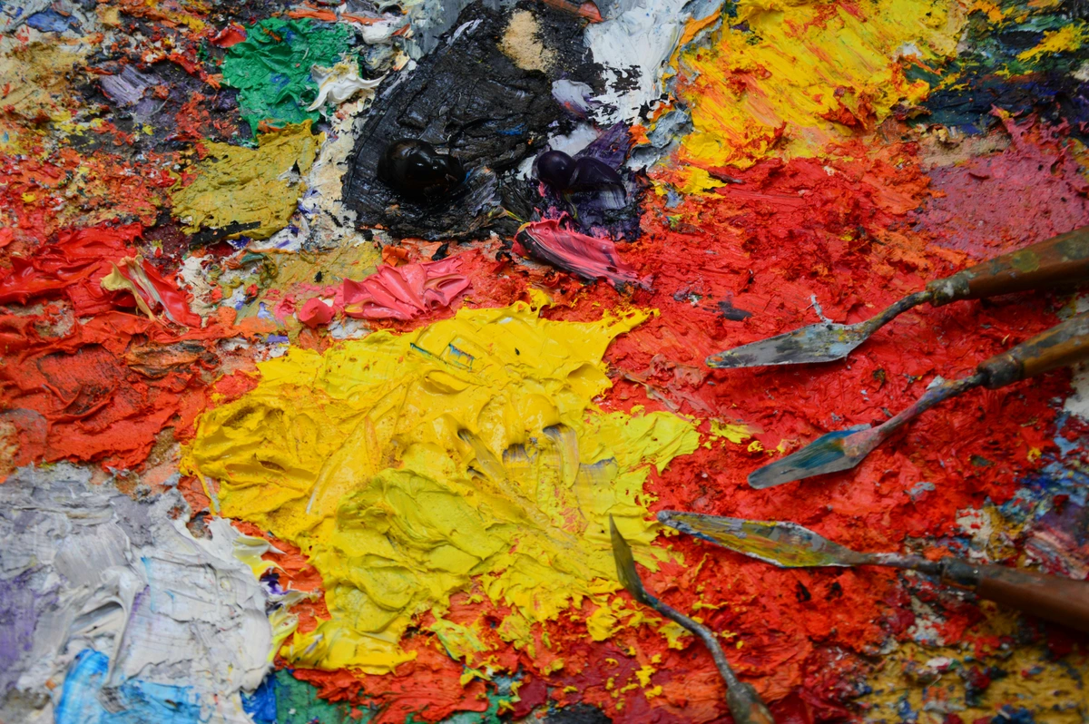
Exploring Specific Brush Types and Their Uses: Your Orchestra of Tools
To truly unlock the expressive potential of your brushwork, it helps to understand the purpose of different brush shapes. Flat brushes are excellent for bold strokes, blocking in large areas of color, and creating sharp, straight edges. Round brushes, with their pointed tips, are ideal for fine details, delicate lines, and controlled strokes. Filbert brushes, with their flattened oval shape, offer a softer edge than flats, making them perfect for blending and creating smooth transitions. Fan brushes can be used for subtle blending, creating textural effects like foliage, or even for dry brushing. And don't forget liner brushes for ultra-fine details and signatures. Each brush is a specific tool, designed to achieve a particular effect, and building a versatile collection will significantly expand your artistic vocabulary. It's like having a full orchestra at your command, rather than just a single instrument. I've often found that a specific brush, almost by magic, will unlock a new way of seeing and rendering a particular texture or light effect. Don't be afraid to experiment with brushes from different disciplines – a calligraphy brush might offer a unique line quality, or a stiff bristle brush intended for oils might create surprising texture with acrylics.

Step 4: Finishing Touches and Knowing When to Stop
This is maybe the hardest skill to learn in painting. When is it done? You could noodle away at a painting forever, chasing perfection that doesn't exist. I usually stop when adding one more brushstroke feels like it might take away from the whole rather than add to it. It's a delicate balance, knowing when to declare a piece complete, and it often comes with experience. Sometimes, the best thing you can do for a painting is to simply walk away, put it out of sight for a day or two, and return with fresh eyes. You’ll be surprised at what you see (or don’t see) after a break. Trust your gut feeling on this; overworking can often kill the spontaneity and freshness of a piece. It’s a lesson I’m still learning, honestly. The challenge lies in distinguishing between necessary refinement and unnecessary fussing. Learn to value the imperfections, the raw energy, and the story that a painting tells even before it's deemed 'perfect'. Remember, perfection is often the enemy of the good, and the most compelling artworks often retain a sense of the artist's hand. I've found that sometimes, the most 'perfect' paintings are those that still hint at the process, allowing the viewer to glimpse the journey of its creation.
Documenting and Archiving Your Work: Preserving Your Artistic Legacy
Before your still life leaves your easel or studio, take the time to properly document it. High-quality photographs are essential for your portfolio, for sharing online, and for creating prints. Ensure your lighting is even, colors are accurate, and your image is sharp. This often means using natural, diffused light, or setting up a simple, consistent studio lighting setup. Keep a record of the title, date, medium, and size of each piece. This isn't just for business; it's a way to track your artistic journey and see your progress over time. It's like building your own visual diary, marking each step along the way. I often take progress photos as well, which can be incredibly insightful for understanding how a piece evolved, and for sharing your process with others. Think of it as creating a lasting record, a timestamp of your creative process that can be revisited and appreciated years later.
Step back from the canvas. Look at it from across the room. Are the main forms reading clearly? Does it have the mood you wanted? Add your final, brightest highlights, maybe sharpen a few key edges, and then... stop. Seriously. Put the brush down. And don't forget to sign your painting! You've earned it. This final act of signing isn't just a mark of completion; it's an affirmation of your creative journey and a declaration of ownership over your unique vision. I've heard stories of artists who continued painting a masterpiece for years, only to regret overworking it. Trust your initial vision, and know when to step away and let the artwork breathe on its own.
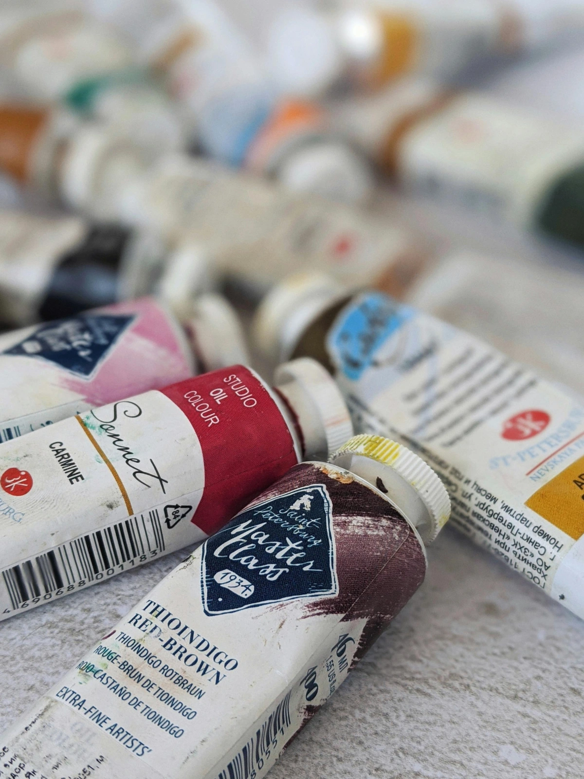
Varnishing Your Artwork: Protection, Polish, and Preservation
One more crucial finishing touch, especially for oil and acrylic paintings, is varnishing. Varnish protects your painting from dust, UV light, and environmental damage, and it can also unify the sheen of your piece, making the colors pop and deepening the saturation of your hues. There are different types of varnish (gloss, satin, matte), and choosing the right one can subtly alter the final presentation, from a high-shine contemporary feel to a soft, traditional glow. Learning how to varnish an acrylic painting or how to varnish an oil painting is an essential part of an artist's practice, ensuring your work stands the test of time. It’s like putting a protective, glowing shield over your hard work, bringing out the depth of the colors in a way you might not have expected. Always make sure your painting is completely dry before varnishing – patience here is key to avoiding disaster! For oils, this can mean waiting several months, or even a year, depending on the thickness of your paint layers. This protective layer is not just functional; it's the final act of presenting your art, influencing how light interacts with its surface and how the colors are perceived.
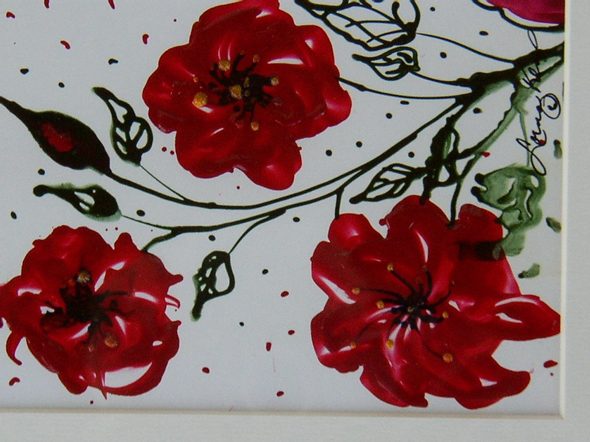
The Importance of Archival Quality: Preserving Your Legacy
Beyond just varnish, consider the archival quality of all your materials, from your paints to your canvas. Using artist-grade paints with high lightfastness ratings ensures your colors won't fade or shift over time. Acid-free canvases and papers prevent yellowing and deterioration. Even how you store and frame your work contributes to its longevity. As artists, we're not just creating for today; we're creating for tomorrow, for future generations to experience and appreciate. Investing in archival materials is an investment in your artistic legacy, ensuring your still life endures as a testament to your vision and skill. It’s a quiet promise that your art will stand the test of time, a whispered conversation across centuries. Think of it as leaving a lasting mark, a piece of your observation and emotion preserved for the future.
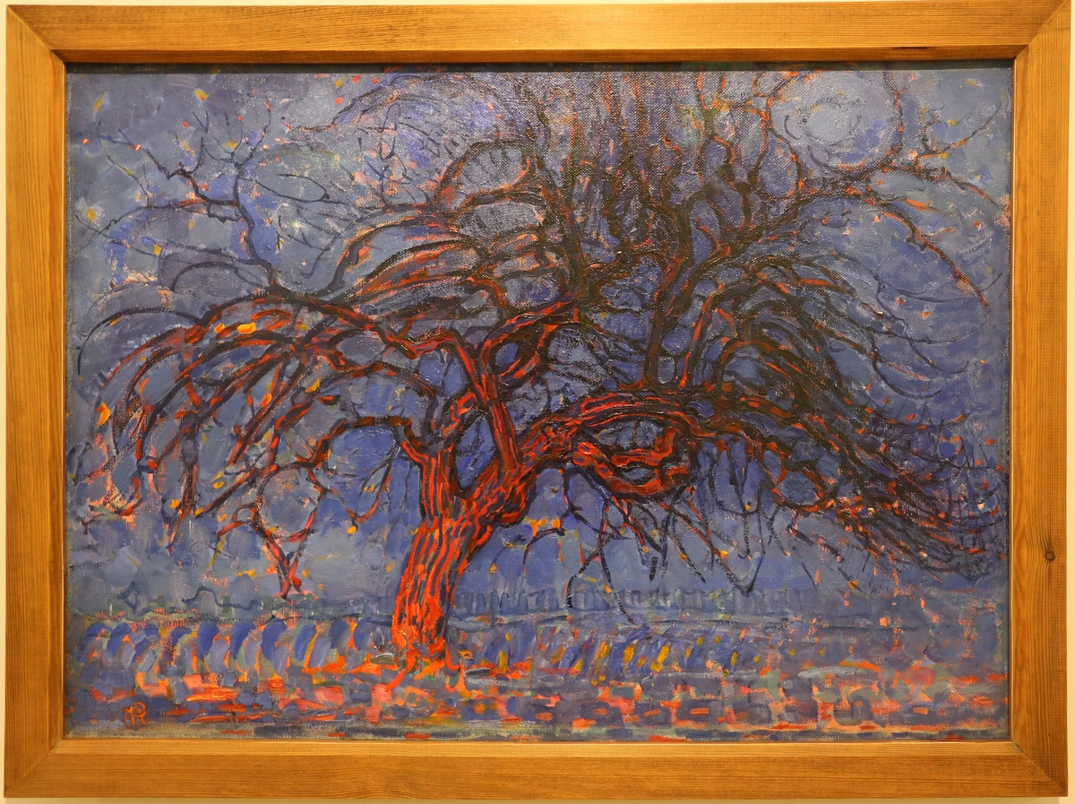
Displaying Your Masterpiece: The Final Presentation
Once your painting is completely dry and varnished, it's time to consider how you'll present it to the world (or just to your living room wall). Framing can dramatically enhance a still life, providing a border that separates the artwork from its surroundings and draws the viewer's eye in. Think about the style of your painting when choosing a frame – a simple modern frame for a contemporary piece, or something more ornate for a traditional still life. Also consider the lighting where the painting will be displayed; proper art lighting can dramatically enhance its presence and reveal subtle details, bringing out the depth and vibrancy of your colors. But don't let framing be a barrier; even unframed, a well-executed still life can be a powerful statement. You might find resources like how to choose art for a dining room, how to choose art for a home gym, how to choose art for a bathroom, how to choose art for a room with low light, how to choose art for japandi style home, or the art of display: how to light and position abstract art for maximum impact helpful in this regard, as the principles translate seamlessly to still life. Good lighting can truly bring a painting to life, revealing nuances that might otherwise go unnoticed. I've often seen a beautifully painted piece diminished by poor framing or lighting, so give this final step the attention it deserves. It’s the handshake between your art and its audience.
Choosing the Right Frame: An Extension of Your Art
Framing is more than just protecting your artwork; it’s an integral part of its presentation, acting as a bridge between your painting and its environment. A well-chosen frame can enhance the mood, complement the colors, and even guide the viewer's eye. For a minimalist or contemporary still life, a sleek, simple frame might be perfect, allowing the artwork to speak for itself. For a more traditional piece, an ornate, gilded frame can add a sense of history and gravitas. Consider the color and texture of the frame; a dark frame can make colors pop, while a light frame can create a softer feel. The mat board (the border between the artwork and the frame) also plays a crucial role, providing breathing room for the image. It’s a final compositional choice, subtly influencing how your masterpiece is perceived. I often see the frame as the final brushstroke, completing the conversation between the art and the world.
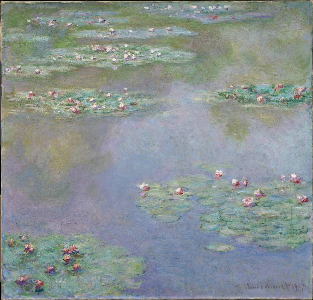
FAQ: Your Still Life Questions, Answered
How important is drawing in still life painting?
Drawing is incredibly important; it's the skeletal structure upon which your painting is built. Strong drawing skills allow you to accurately capture proportions, understand form, and establish a solid composition before you even touch a brush. Even if your final painting is very loose or abstract, the underlying drawing provides a foundation that makes the piece feel grounded and intentional. Think of it as your roadmap – you can deviate from it, but having it there ensures you know where you're going. It's the silent dialogue between your eye, hand, and brain that truly sets the stage for your painting. For a more detailed guide, consider how to draw a still life.
What's the best way to develop my artistic eye?
Developing your artistic eye is a lifelong practice, but still life is arguably the best training ground. Start by simply looking at everyday objects with fresh curiosity. Break them down into basic shapes, observe how light hits them, notice the subtle color shifts in shadows. Try quick sketching exercises, focusing on contour or value, rather than perfect representation. Regular practice and focused observation are far more impactful than any single tool or technique. It's about learning to see the world as an artist, constantly searching for interesting compositions, colors, and narratives in the mundane. I like to imagine I’m a detective, uncovering hidden visual clues in plain sight. This keen observation is the foundation for understanding the elements of art like line and shape and translating the three-dimensional world onto a two-dimensional surface.
Should I use a limited palette?
Absolutely, especially when you're starting out! A limited palette (using only a few carefully chosen colors) forces you to truly understand color mixing and relationships. It teaches you how to achieve a wide range of hues, values, and temperatures from a small set of pigments, creating an inherent harmony throughout your painting. It removes the overwhelm of too many choices and allows you to focus on form, value, and composition without getting distracted by a rainbow of tubes. It’s a masterclass in economy and intentionality, and honestly, some of the most stunning artworks are created with just a few colors. It’s a bit like learning to cook with a few core ingredients before attempting a gourmet feast – you learn the fundamentals that make every dish delicious.
How can I find inspiration for still life compositions?
Inspiration is everywhere! Start by looking around your own home – a collection of spices, a stack of books, a discarded tea cup. Visit antique shops, thrift stores, or even your local grocery store for interesting fruits and vegetables. Consider objects that tell a story or have personal meaning. Don't be afraid to combine unexpected items, or to create themed arrangements (e.g., "morning routine," "artist's tools"). The key is to approach everyday items with a sense of wonder and curiosity, asking yourself: "What story can these objects tell together?" Sometimes, the most powerful compositions come from the simplest, most overlooked items. I often challenge myself to find beauty in something I'd normally ignore, like a crumpled piece of paper or a tangled ball of yarn. Remember, the goal is not to copy reality, but to interpret it, to find your unique voice in the arrangement of the ordinary.
What are some common mistakes with color mixing?
One of the most common mistakes is trying to match colors precisely from your setup instead of understanding the relationships between colors. Beginners often overmix, leading to muddy colors, or use too much white to lighten colors, which can desaturate them. Forgetting about color temperature in shadows (painting them as just gray instead of cool purples or blues) is another frequent pitfall. The best way to avoid these is to start with a limited palette, focus on getting the value of the color right first, and constantly compare the color you're mixing to the colors around it in your still life. Patience and thoughtful observation will drastically improve your color mixing. It’s not about perfect copies, but perfect harmonies. For a deeper dive into how to achieve vibrant and harmonious colors, exploring the definitive guide to color theory in abstract art can offer invaluable insights, as many principles translate directly to still life.
How do I overcome creative blocks in still life?
Creative blocks are a natural part of the artistic process. When they strike, try stepping away from your current piece and doing some quick, low-pressure exercises. This could be a series of five-minute gesture drawings of your objects, a monochromatic value study, or even just arranging new objects without the intention to paint them. Sometimes, changing your environment (painting outdoors, or in a different room) can help. Revisit the work of masters for inspiration, or simply experiment with a new medium or color palette. The goal is to reignite curiosity and play, rather than forcing a predetermined outcome. Remember, consistency in practice, even small acts of creativity, can often dislodge a block. I also find it helpful to simply look at my art supplies and imagine what they want to do, rather than what I want them to do. It's a reminder that sometimes, the art wants to lead, and we just need to listen.
What are the best objects for a beginner still life? Start simple! An apple, a mug, and a book. They have simple forms, different textures, and are easy to find. Avoid overly complex or reflective things like chrome or intricate patterns at first, as these can be incredibly frustrating. I always recommend picking objects that genuinely interest you, even if they're simple. Your enthusiasm will translate into your work. A simple sphere, cube, and cylinder are also fantastic for learning basic form and light and understanding the definitive guide to understanding form in abstract art which applies directly to still life objects.
How do I choose the right size canvas? Choosing the right canvas size depends on your subject, your desired level of detail, and your artistic intentions. For beginners, a medium size (e.g., 11x14 or 16x20 inches) offers enough space to work without being overwhelming. Smaller canvases are great for quick studies, while larger canvases allow for grander statements and more expressive brushwork. Consider the scale of your objects relative to the canvas – a single apple on a huge canvas can be powerful, just as a dense arrangement on a small surface can feel intimate. Don't be afraid to experiment with different proportions (square, rectangular, elongated) to see how they impact your composition. Ultimately, the best size is one that feels comfortable for the story you want to tell and the time you have to invest. I've found that sometimes, working small allows for more freedom to experiment.
How long should a still life painting take? It can take 30 minutes or 30 hours. There are no rules. An alla prima (wet-on-wet) painting might be done in one session, capturing a spontaneous moment. A layered oil painting could take weeks, allowing for deep exploration of color and form. The goal is to learn, not to be fast. Don’t rush the process, and don’t compare your pace to anyone else's. Some of my most rewarding pieces have been those that demanded patience and multiple sessions. It’s about the journey, not the speed limit. The time you dedicate is an investment in your observational skills and artistic growth.
Can I paint a still life from a photograph? Absolutely, but I highly recommend painting from life if you can. A camera flattens space and distorts colors and values in ways your eye doesn't. Your eyes see the world with a richness and depth that a photo just can't capture. Painting from life is the best training you can get, forcing you to interpret and simplify what you see, rather than just copying. However, reference photos can be invaluable if you're painting something perishable, or if you want to work on a piece over a long period. Just be aware of the camera's limitations and try to correct for them with your artistic knowledge. I often use photos for elements that might wilt or move, but the core composition and lighting I always try to set up from life first. It’s a helpful tool, but not a replacement for direct observation. Think of a photograph as a flat map; painting from life is exploring the actual terrain.
What's the most common mistake beginners make? Probably not looking hard enough. We tend to paint what we think an object looks like, not what's actually there. The shadows on a lemon aren't gray; they might be a muted purple or green. The highlight on a red apple isn't white; it's a very light pink. Slow down and really see. This is a constant battle, even for experienced artists. Our brains love to take shortcuts, so consciously override that tendency and engage your eyes with fresh curiosity. It's like your brain has a file cabinet of generic apples, and it wants to pull out the "red apple" file instead of actually observing this specific apple in this specific light. Learning to override that default setting is key. Trust your eyes, not your assumptions. This applies to the definitive guide to understanding line in abstract art as well, seeing the line of an object as it truly exists.
What's the best way to clean my brushes and palette? Proper cleanup is crucial for the longevity of your tools. For acrylics and watercolors, simply wash brushes thoroughly with soap and water until all paint is removed. For oils, first wipe off as much excess paint as possible with a rag or paper towel, then rinse in a solvent (like mineral spirits or odorless turpentine) or use a brush cleaner, followed by a soap-and-water wash. Always reshape your brush bristles and store them upright to dry. For palettes, scrape off excess wet paint with a palette knife. For dried acrylics, a scraper can often lift them. For oils, wipe clean with a rag and solvent. A clean palette is a happy palette! For a deep dive, check out how to clean an oil painting palette. Treat your tools well, and they'll serve you faithfully. A well-maintained brush is an extension of your hand, while a neglected one can quickly become a source of frustration.
How do I choose a background for my still life? Keep it simple and complementary to your objects. A draped piece of plain fabric (like linen or velvet) often works beautifully, creating soft folds and shadows without distracting. Avoid busy patterns or strong contrasting colors unless that's a deliberate artistic choice – and if it is, be intentional! The background should support your main subject, not compete with it. A smooth, solid color wall or a piece of poster board can also be very effective for a minimalist look. I often use a piece of black velvet; it creates incredibly deep, rich shadows that make the objects in the foreground really pop. Think of it as a quiet stage for your actors. Sometimes, even a slightly textured wall can add subtle interest without overwhelming the scene. The background is not just an empty space; it's an active participant in your composition, defining the mood and providing context for your subjects. It's a crucial element in creating the definitive guide to abstract art composition that applies to still life as well.
What are some common compositional errors to avoid? Beginners often fall into a few traps. Tangents, where two objects just barely touch at their edges, can create visual awkwardness. Kissing objects, where objects are arranged in a perfect line or appear to be 'standing at attention,' can make a composition feel stiff. Placing your main subject dead center can lead to a static and less interesting arrangement. And equal spacing between elements, while seemingly balanced, can actually create monotony. The key is to introduce variation, overlap, and dynamic arrangements that guide the eye naturally through the scene. Remember, a composition should feel intentional, but not rigidly posed. Embrace asymmetry and visual rhythm to keep things lively. For a deeper understanding of these concepts, review the principles of still life composition.
What's the role of light and shadow in still life? Light and shadow are everything! They define form, create depth, establish mood, and direct the viewer's eye. Without clear light and shadow, your objects will look flat, like cardboard cutouts. Remember, light isn't just bright areas, and shadow isn't just dark areas; both contain a spectrum of values and often subtle colors – those reflected lights, for instance, that bounce from one object into the shadow of another. Understanding how light interacts with different surfaces is key to making your still life look realistic and vibrant. It’s the sculptor of your forms, carving out dimension from a flat surface, giving life to inert objects. I often think of myself as painting the light, and the objects are just there to catch it. It's the silent language that communicates three-dimensionality. This understanding is foundational for any artist, much like the definitive guide to understanding abstraction in contemporary art provides a framework for modern art.
Should I use reference photos or paint from life? This is a classic question! My strong recommendation is to paint from life whenever possible. A camera, wonderful as it is, inherently flattens space and subtly distorts colors and values. Your eyes, with their incredible ability to perceive depth, nuance, and true color, offer a richness that a photo simply can't capture. Painting from life is the best training you can get, forcing you to interpret and simplify what you see, rather than just copying. However, reference photos can be invaluable if you're painting something perishable, or if you want to work on a piece over a long period. Just be aware of the camera's limitations and try to correct for them with your artistic knowledge. I often use photos as a backup, or for specific details that might be too fleeting to capture in person, but the initial setup and color notes are always from life. It’s a tool to augment, not replace, direct observation. Ultimately, the more you train your eye from life, the better you’ll be at interpreting and improving upon photographic references when you do use them.
How do I create a sense of depth in my still life? Depth is created through a combination of techniques: overlapping objects (the one in front partially obscures the one behind), atmospheric perspective (objects further away appear lighter, bluer, and less detailed), linear perspective (converging lines creating the illusion of distance), and strong value contrast in the foreground receding to softer contrasts in the background. Varying the size and detail of objects also helps – larger, more detailed objects in the foreground, smaller, less distinct ones further back. I always think of it as building a stage set; you want elements in the front, middle, and back to create a convincing illusion of space. Without depth, your still life can feel flat, almost like a collection of stickers on a page. The spaces you leave, the distances you imply, are just as active as the objects themselves in constructing a believable, inviting world on your canvas. It’s a bit like framing a shot in photography – what you leave out is often as important as what you include. For more on this, you might find understanding balance in art composition helpful. I've often seen beginners so focused on the objects that they forget to see the air around them, and that's where a lot of the magic happens, creating a sense of three-dimensionality and visual rhythm. Another key is the strategic use of color temperature: warm colors tend to advance, while cool colors tend to recede, helping to push elements backward or pull them forward in your composition. This creates a powerful, subtle illusion of space.
What is a Focal Point in Still Life?
While a still life has multiple elements, aim for one primary area that naturally draws the eye first. This could be the brightest highlight, the sharpest edge, or a splash of contrasting color. Once the viewer's eye lands there, your other compositional elements should lead them gently around the rest of the painting. Think of it as the star of your tiny stage, the anchor that grounds your entire composition. I usually decide on my focal point early on, and then arrange everything else to support it. It's the visual exclamation mark of your artwork.
What is a Focal Point in Still Life?
While a still life has multiple elements, aim for one primary area that naturally draws the eye first. This could be the brightest highlight, the sharpest edge, or a splash of contrasting color. Once the viewer's eye lands there, your other compositional elements should lead them gently around the rest of the painting. Think of it as the star of your tiny stage, the anchor that grounds your entire composition. I usually decide on my focal point early on, and then arrange everything else to support it. It's the visual exclamation mark of your artwork. Your focal point is where you want the conversation to begin.
How to Overcome Creative Block? We've all been there—staring at a blank canvas or a half-finished piece, feeling completely devoid of ideas or motivation. Creative block is a natural part of the artistic process. When it strikes, try changing your environment, experimenting with a new medium, working on quick, low-pressure studies, or simply taking a break. Sometimes, the best way to move forward is to step away and allow your subconscious to work its magic. I often find inspiration in the most unexpected places when I'm not actively looking for it, like a walk in nature or browsing through an art book. Remember, the goal isn't always to produce a finished masterpiece during a block, but to simply keep the creative engine turning, however slowly. Even small, seemingly insignificant exercises can kickstart your inspiration again. Sometimes, I find the definitive guide to understanding abstract art styles sparks new ways of looking at my subject, even in a still life.
What is a Limited Palette? A limited palette involves restricting yourself to a small, carefully chosen selection of colors (often just two or three primaries plus white, or a few earth tones). This might sound restrictive, but it's an incredibly powerful exercise. It forces you to truly understand color mixing, to extract the maximum range of hues and values from a minimal set, and to create inherent color harmony throughout your painting. Many masters used limited palettes to achieve stunning results, relying on subtle shifts in value and temperature rather than a rainbow of colors. It's a fantastic way to deepen your understanding of color relationships. This approach, by simplifying your choices, paradoxically opens up a world of nuanced color mixing possibilities.
What is trompe l'oeil in still life? Trompe l'oeil (French for "deceive the eye") is an art technique that creates the illusion that objects depicted in a painting are three-dimensional, not flat. In still life, this means painting objects with such extreme realism and meticulous detail that they appear to pop off the canvas, almost as if you could reach out and touch them. It's a masterful display of technical skill, often employing hyper-realistic rendering, precise lighting, and careful perspective to fool the viewer. Think of a fly painted on a canvas that looks so real you try to swat it! While challenging, it's a fascinating avenue for artists who love precision and pushing the boundaries of realism. This technique truly tests your observational skills and your ability to mimic reality on a two-dimensional surface.
What are some advanced still life techniques I can explore later? Once you're comfortable with the basics, the world of still life opens up even further! You could try alla prima (wet-on-wet painting) for a fresh, spontaneous look, which is beautifully described in this alla prima painting technique guide. Or delve into glazing techniques in oil painting, building up luminous layers of transparent color, a technique I adore for its subtle effects. I often refer to mastering glazing techniques in oil painting for inspiration. You could experiment with dry brush techniques for interesting textures, or explore using different mediums like oil sticks for expressive mark-making, as detailed in exploring oil sticks for expressive mark-making. The possibilities are truly endless, and each technique will teach you something new about your materials and your artistic vision. I’ve also enjoyed experimenting with exploring texture: my favorite techniques for adding depth to abstract paintings, and many of those principles apply beautifully to still life for added tactile interest. You might even explore incorporating conceptual art approaches, where the idea behind the arrangement is as important as its visual representation, drawing inspiration from the definitive guide to understanding abstraction in contemporary art.
What famous still life artists should I study? The history of still life is rich with incredible artists! Beyond the symbolic Dutch masters like Willem Kalf and Jan Davidsz. de Heem, who practically invented the genre as we know it, explore the dramatic compositions and humble subjects of Chardin, the vibrant, structurally analytical fruit bowls of Cézanne, the surreal arrangements of Salvador Dalí that challenge reality, or the expressive, almost explosive flowers of Vincent van Gogh. Contemporary artists also offer fresh perspectives, pushing the boundaries of what a still life can be, often incorporating everyday objects in unexpected ways. Dive into the art of still life painting, from classical to contemporary to discover more inspiration. Studying these masters is like taking a masterclass in seeing, composition, and storytelling. Don't forget the more abstract leanings of artists like Georgia O'Keeffe, whose close-up floral paintings blurred the lines between still life and abstraction, or the subtle, contemplative arrangements of Giorgio Morandi, which elevated everyday bottles and boxes to profound studies of form and light. These diverse artists demonstrate the endless expressive possibilities within the still life genre.
How do I know when my still life painting is finished? Ah, the eternal question! Knowing when to stop is perhaps the hardest skill to master. I usually stop when adding one more brushstroke feels like it might take away from the whole rather than add to it. It's a delicate balance, and it often comes with experience. Sometimes, the best thing you can do is to simply walk away, put your painting out of sight for a day or two, and return with fresh eyes. You’ll be surprised at what you see (or don’t see) after a break. Trust your gut feeling on this; overworking can often kill the spontaneity and freshness of a piece. It’s a lesson I’m still learning, honestly. Ultimately, a painting is finished when you've expressed what you set out to say, even if it's not "perfect." It's about finding that sweet spot where the intention is clear, the composition holds, and the energy of the piece is still alive. It's a subtle intuition that develops over time, a quiet voice that tells you, "It is done."
The Role of Intention: What Story Are You Telling?
Before you even begin to paint, take a moment to consider your intention. What feeling or message do you want to convey with your still life? Are you exploring impermanence, celebrating abundance, reflecting on a personal memory, or simply reveling in the beauty of light on a simple form? Having a clear intention, however subtle, will guide your choices in composition, color, and lighting, imbuing your work with a deeper resonance. It’s the invisible thread that ties all the elements together, transforming a collection of objects into a thoughtful statement. Your intention is your quiet voice, speaking through the silent protagonists on your canvas.
Do I need a fancy easel? Nope. Absolutely not. You can prop your canvas or paper against a stack of books on a table, or even use a cardboard box. Anything that holds your surface at a comfortable, slightly upright angle will work. Don't let a lack of fancy gear stop you from starting. I've seen incredible work created on kitchen tables with minimal equipment. The most important tools are your eyes and your desire to create, not the price tag on your easel. For a deeper dive into choosing the right easel for various needs, check out best easels for painting at home and reviewing the best portable easels for plein air painting.
A Final Thought
A still life is more than a technical exercise. It’s a form of meditation, a quiet rebellion against the rush of modern life. It teaches you to find the extraordinary in the ordinary. After you spend hours painting a simple orange, really seeing it, you will never look at an orange the same way again. You'll notice the subtle shifts in color, the way the light catches its textured skin, the deep, rich color of its shadow – a whole universe contained within one piece of fruit.
You learn to see. And that, really, is the whole point. It's a journey, a conversation between you and your subject, and every still life you paint will teach you something new about art, about observation, and perhaps even about yourself. So gather your objects, set up your stage, and let your unique artistic voice shine through. Don't be afraid to experiment, to make mistakes, and to find your own path. The beauty of still life is its endless possibilities for personal expression.
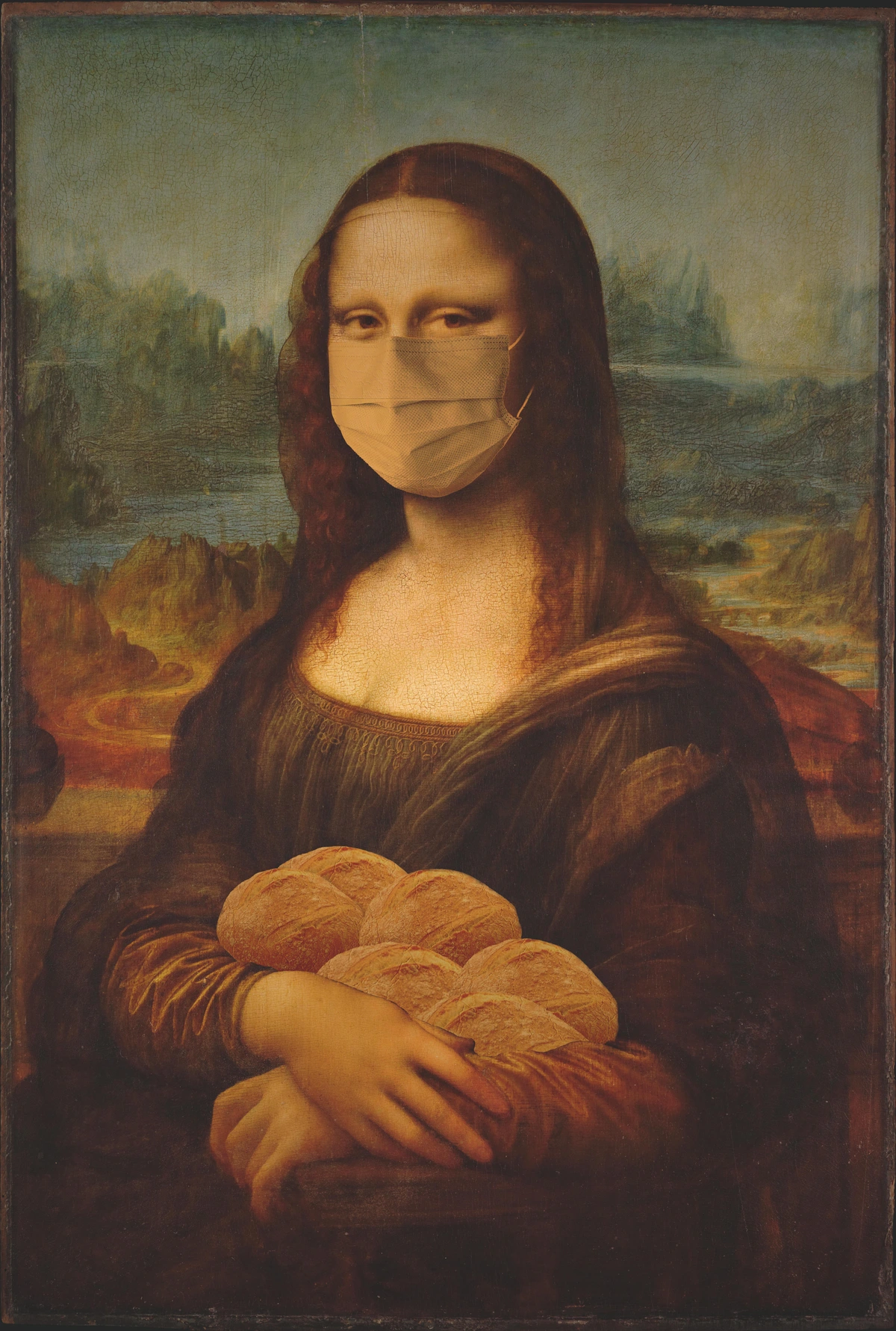
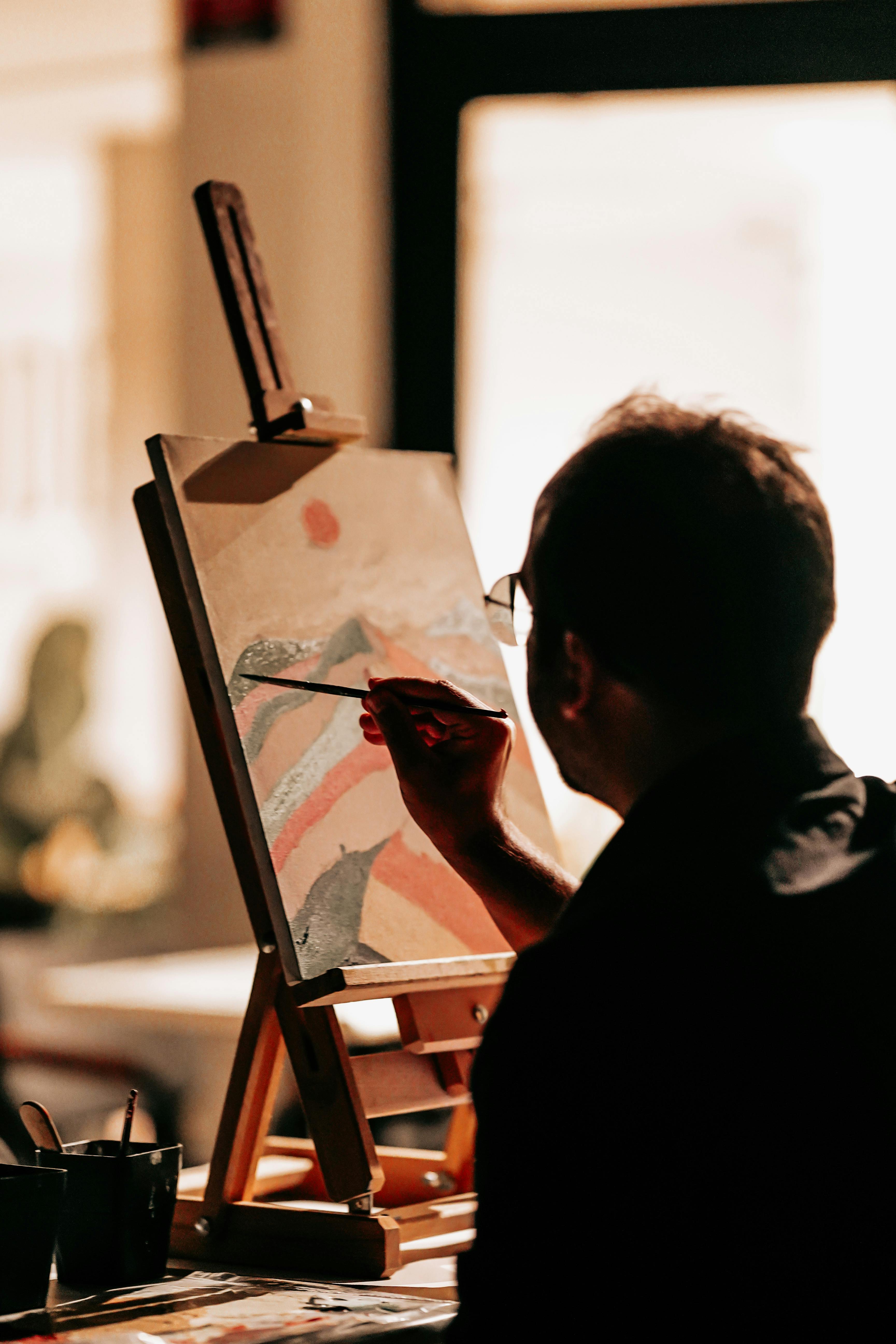
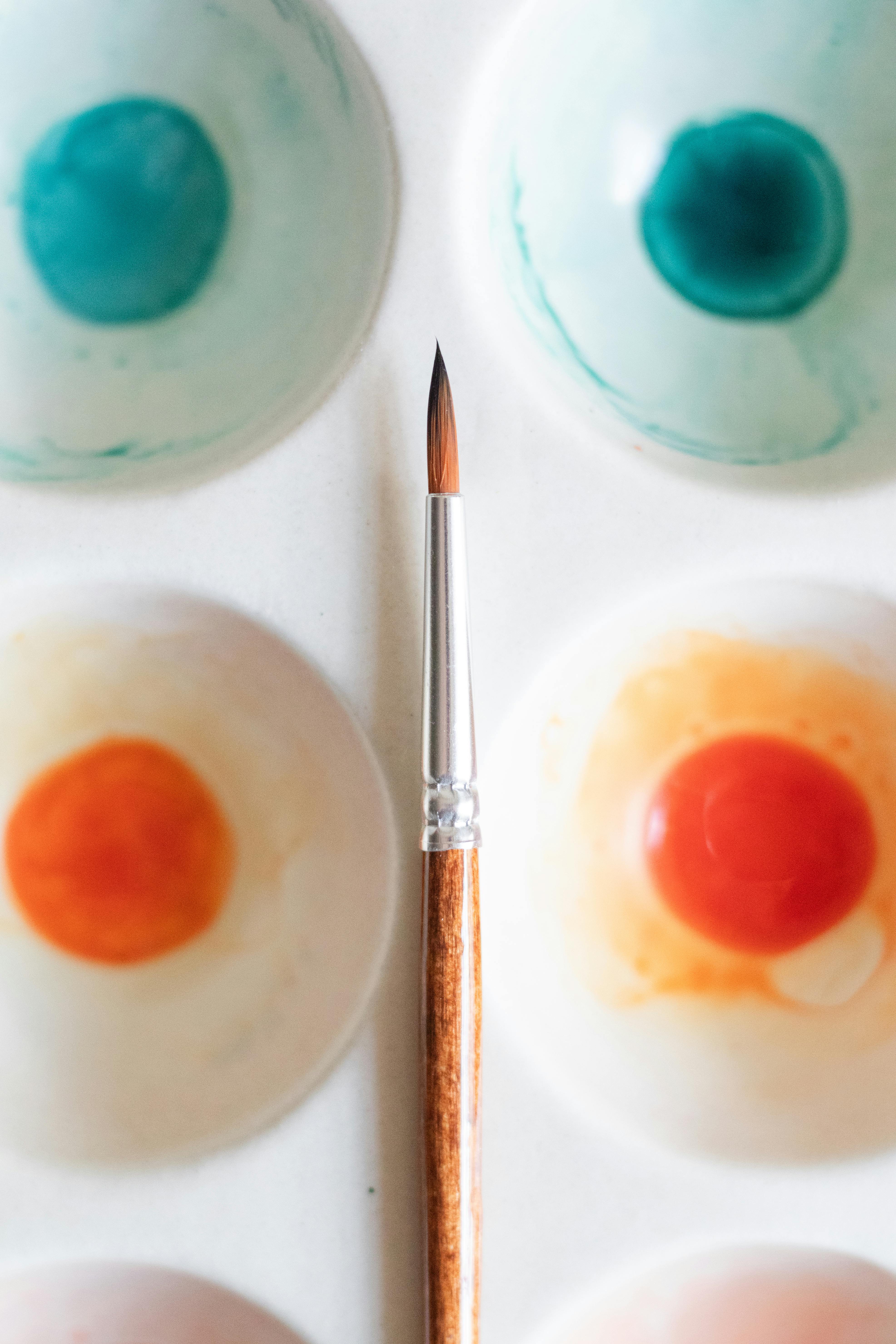


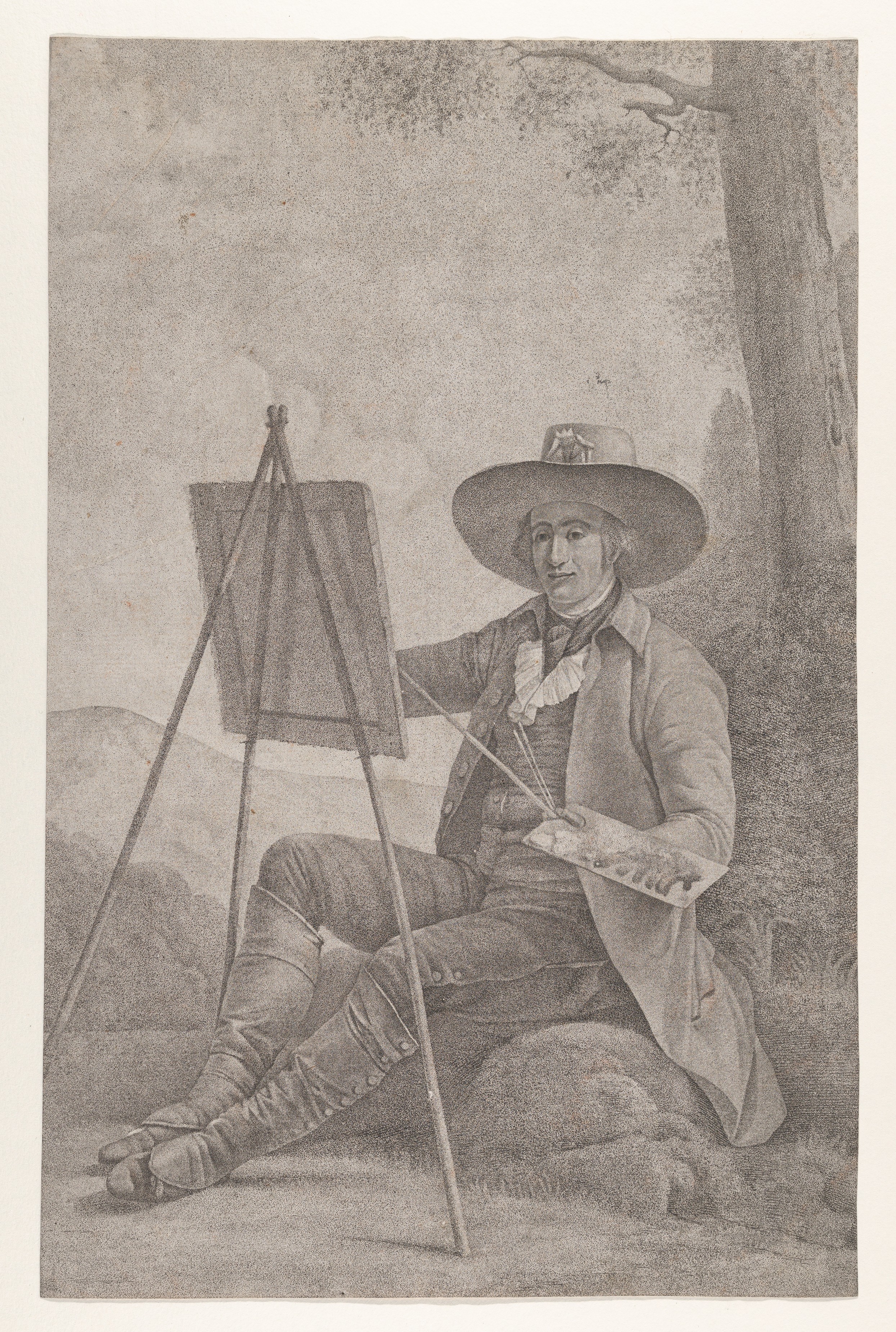


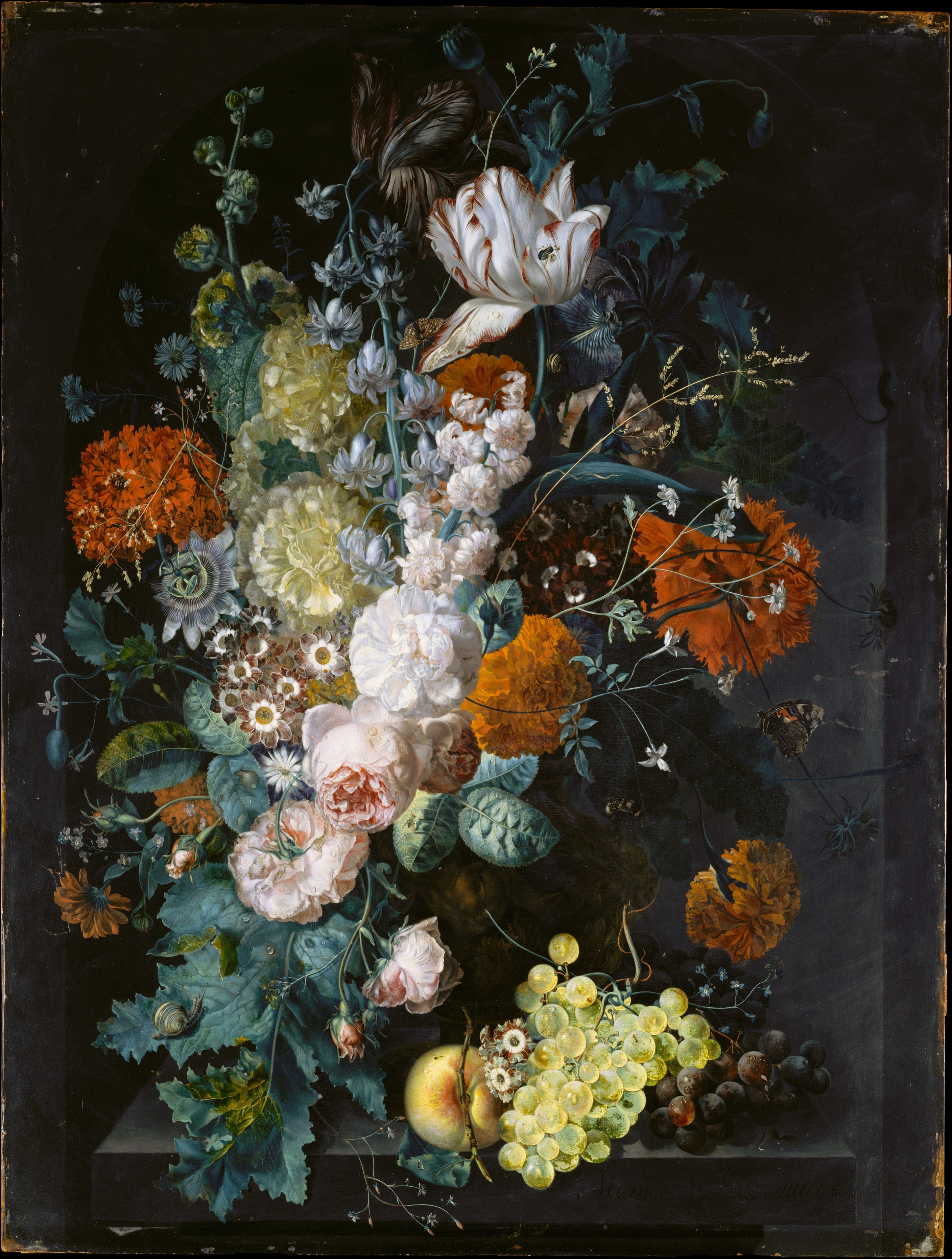




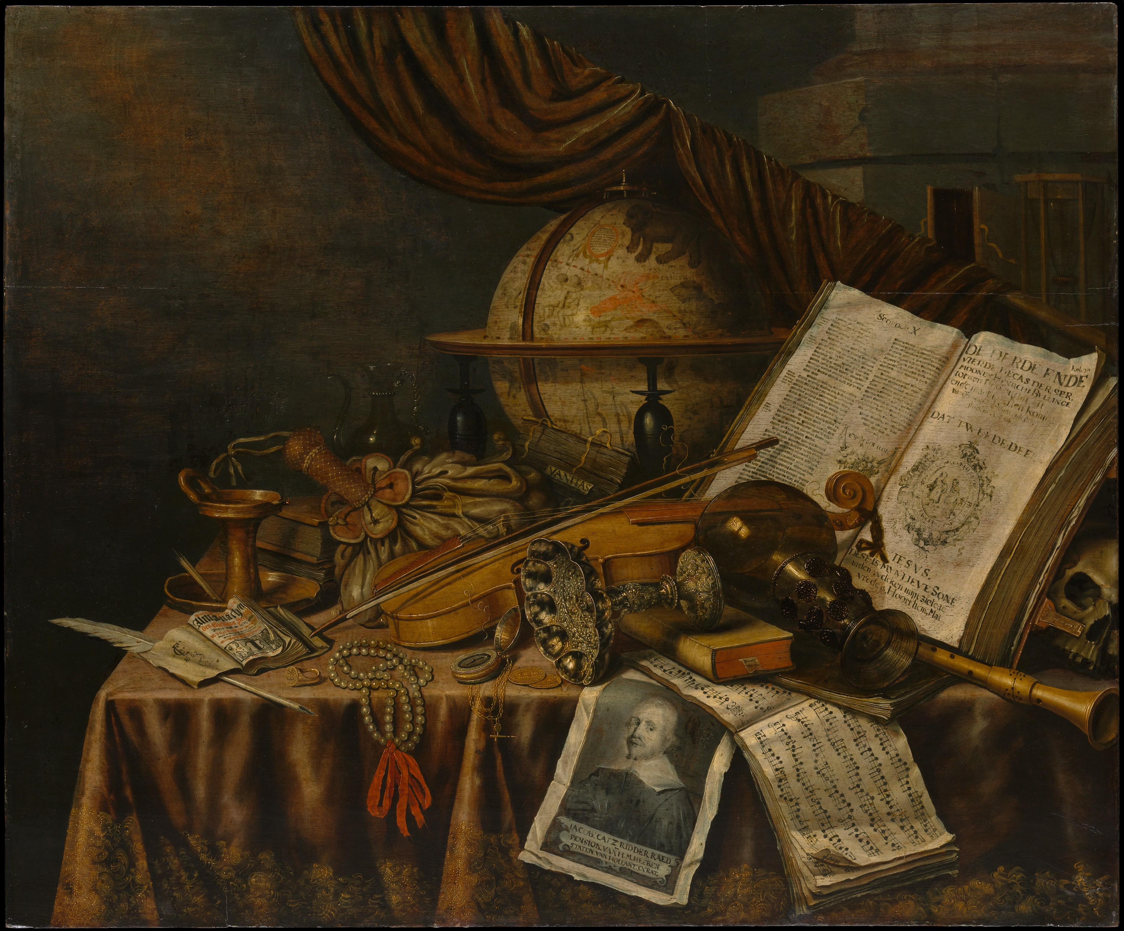


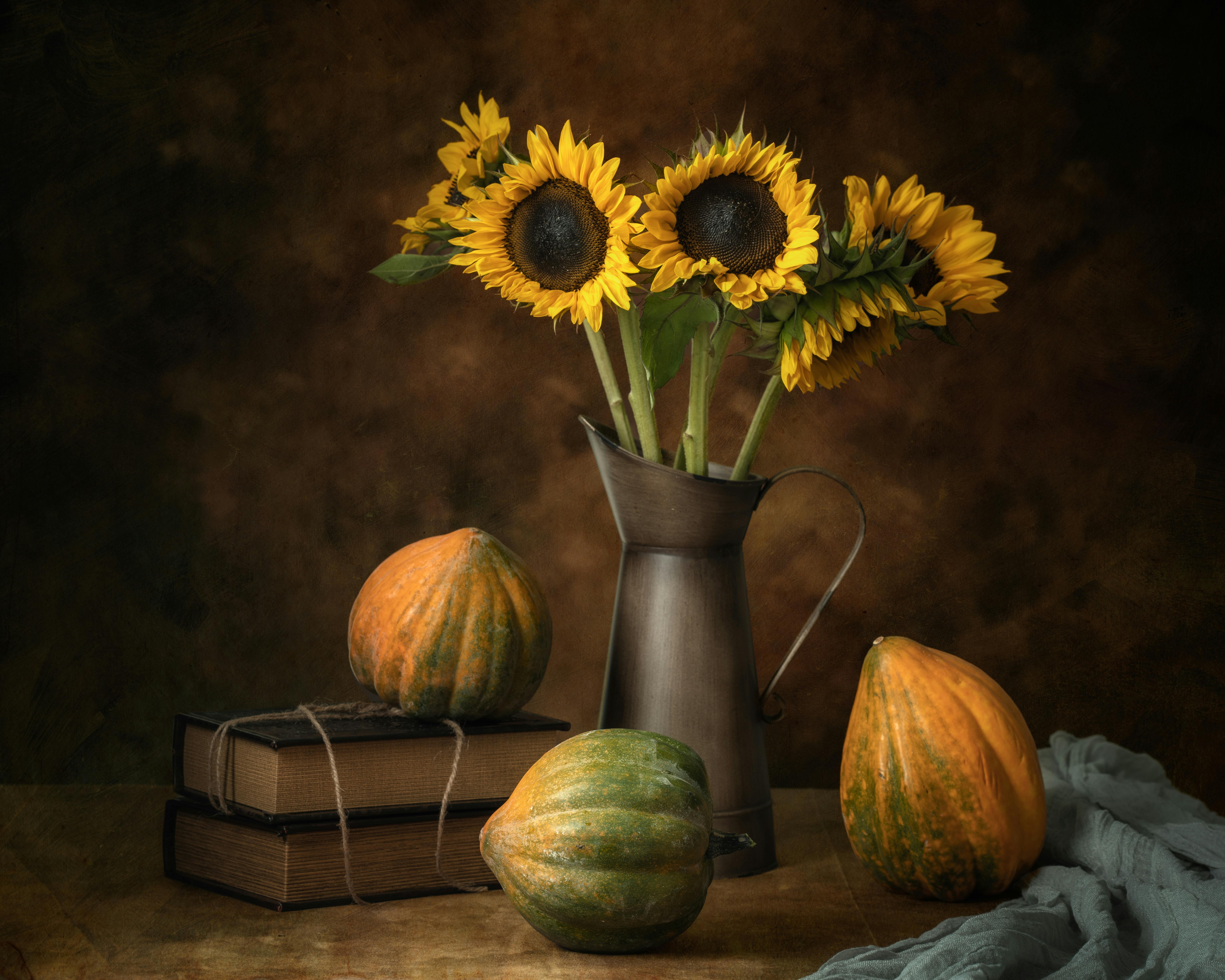


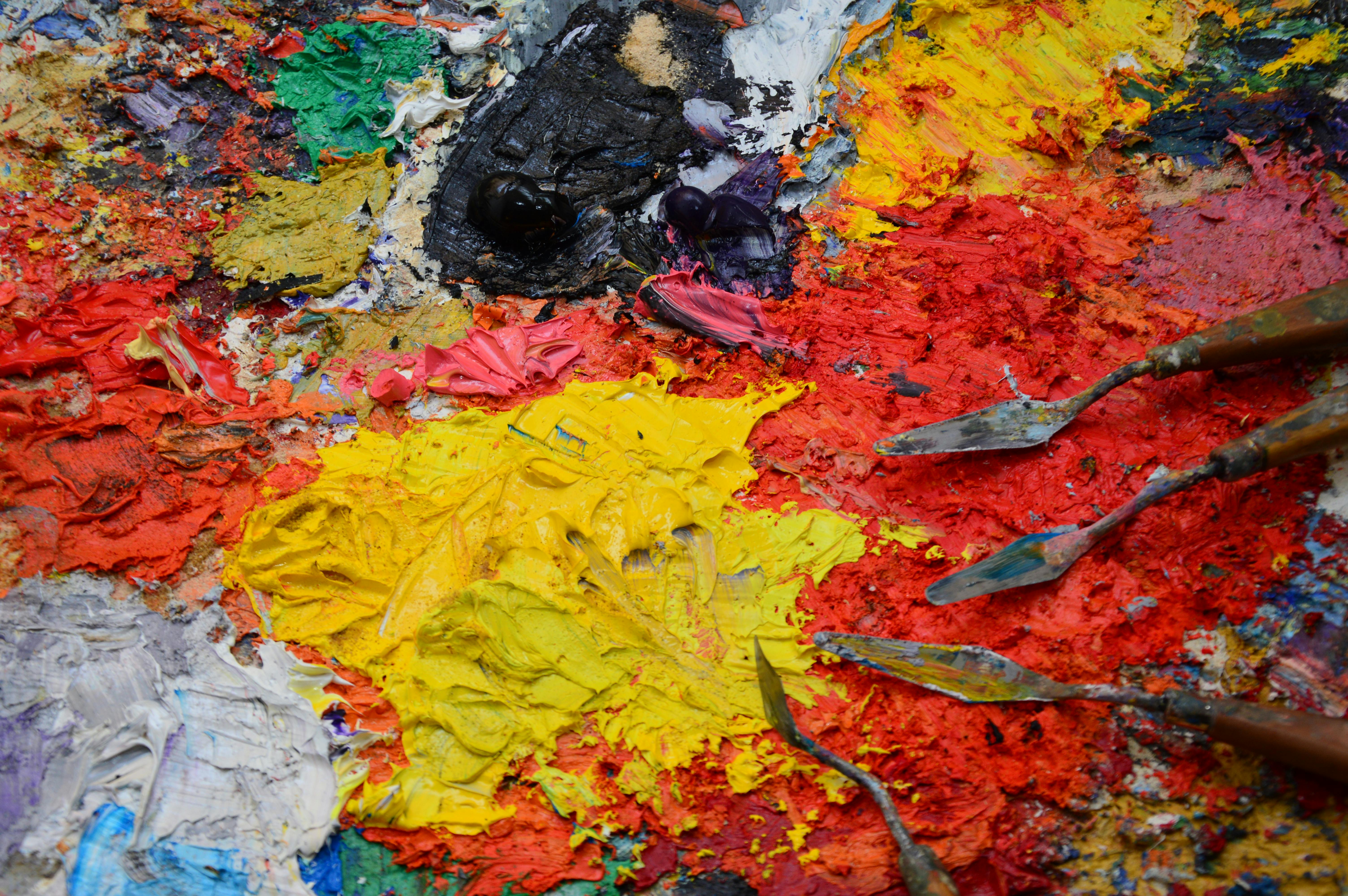

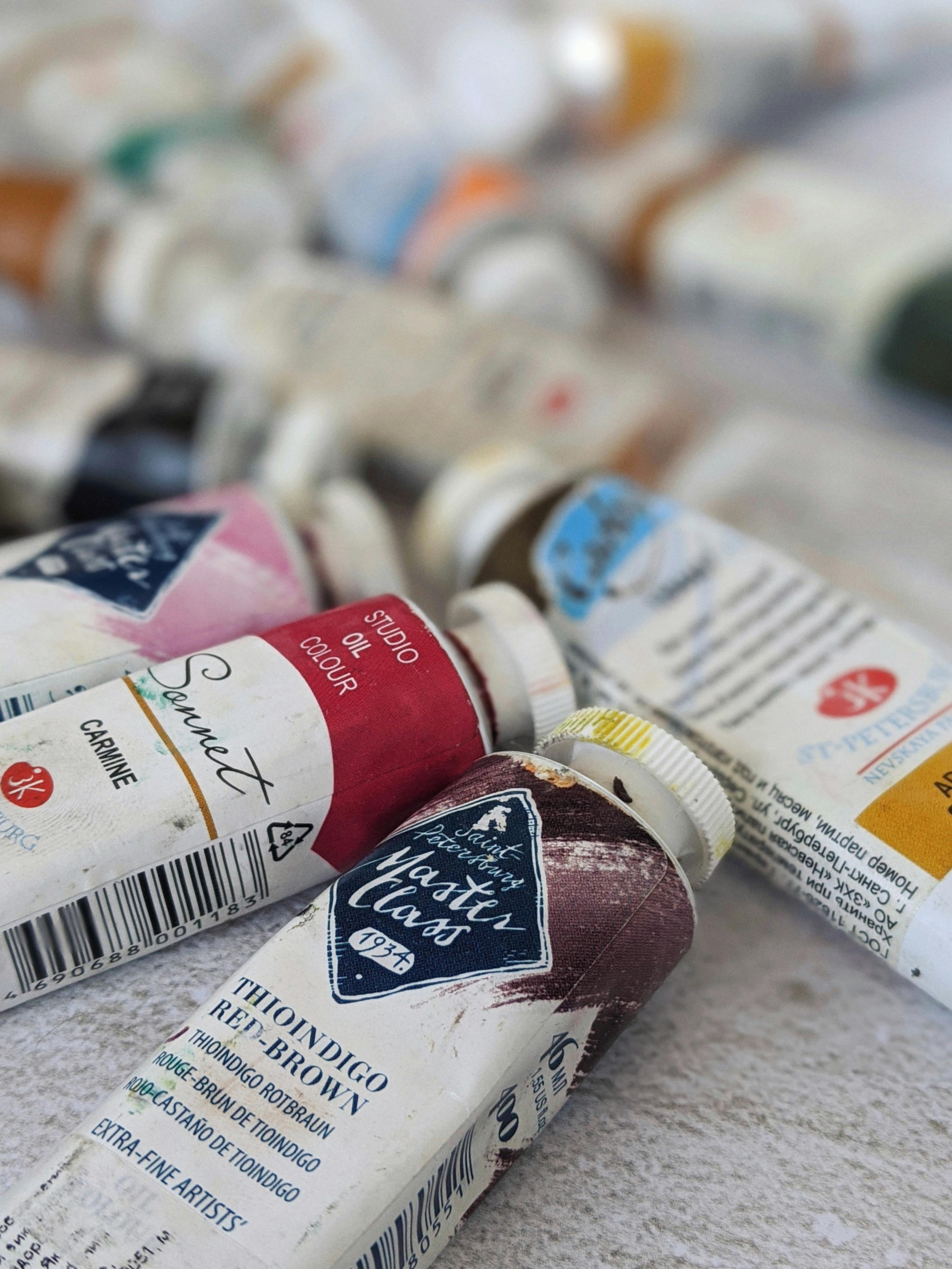



If you're interested in my own abstract and colorful approach to art, feel free to visit my gallery in Den Bosch, explore my timeline, or even buy a piece that resonates with you. Happy painting! May your table be filled with beauty and your canvas with discovery.