
# Mastering Acrylic Brushstrokes: Finding Your Artistic Voice
Unlock the secrets of acrylic brushstrokes! This artist's ultimate guide covers essential techniques, paint consistency, brushes, surfaces, managing drying time, layering, unconventional tools, troubleshooting, and practice tips to help you find your unique artistic voice.
Mastering Acrylic Brushstrokes: Finding Your Artistic Voice
Okay, let's really talk brushstrokes. For the longest time, I felt like I was just... wrestling with the paint, trying to force it into submission. Anyone else? You see these incredible acrylic paintings, full of life and texture, and you think, "How? How do they make the paint do that? How do they get that smooth blend, that sharp line, that incredible texture?" It turns out, it's not magic (mostly). It's about understanding the basic building blocks – the brushstrokes – and how they interact with the unique properties of acrylics. I remember one particularly frustrating afternoon trying to paint a simple sky, and it just looked like a muddy, streaky mess, completely lacking any sense of movement or light. I just couldn't get the blend right before the paint dried. It felt less like painting and more like a slightly panicked race against the clock. That's when I realized I needed to go back to basics, to learn the language. Brushstrokes are your vocabulary, the words you use to tell your story on the canvas. But they're more than just words; they carry the energy of your hand, the emotion of the moment, the very life you breathe into the paint. They are your artistic handwriting, unique to you. It's a signature that evolves with every mark you make.
Think of brushstrokes like words. You can know all the colors in the world, have the fanciest paints, but without knowing how to form sentences, you're just making noise. Brushstrokes are your vocabulary. And acrylics, bless their fast-drying hearts, offer a fantastic, albeit sometimes challenging, playground to learn this language. It can feel less like a leisurely waltz and more like a slightly frantic sprint against the clock, a dance between brush and paint that demands quick decisions. But that challenge is also where the versatility lies.
This isn't about being perfect from day one. Trust me, my early attempts were... expressive, if you're being generous. More like a toddler's enthusiastic mud pie. But by focusing on a few fundamental strokes, you start gaining control, and that's where the real fun begins. It's like learning to dance – awkward at first, but eventually, you find your rhythm and can express yourself freely. It's about finding your hand's unique way of moving the paint, your artistic handwriting. It's a journey, and sometimes the first steps feel like tripping over your own feet, but that's okay. This guide is here to demystify those fundamental strokes and empower you to start speaking your own artistic language. As you practice, pay attention to how your hand naturally moves the brush – this is part of your unique voice emerging.
Your Toolkit: Paint, Brushes, Surfaces, and Patience
Before we even touch the canvas, let's look at what we're working with. Your paint is your voice, your brush is an extension of your hand, your surface is your stage, and patience... well, patience is the silent partner you desperately need when acrylics dry faster than you can say "oops." And maybe a spray bottle of water. These tools, when understood, become extensions of your intention.
Paint Consistency: The Secret Sauce
Acrylics are incredibly versatile because you can use them straight from the tube or thin them dramatically. The consistency of your paint dramatically affects your brushstroke and the effects you can achieve. Experimenting with how much water or medium to add is key. It's a feel thing, and it takes practice. Don't be afraid to make a mess! That's part of the process. Feel the difference as you mix – the buttery thickness, the creamy flow, the watery transparency. There's a physical resistance or glide that changes, and understanding that tactile feedback is part of mastering the medium. It's also worth noting that even within categories like 'heavy body,' consistency can vary slightly between brands or even colors; some pigments are naturally thicker or thinner than others, which can affect opacity and flow even at the same dilution. For instance, Cadmium Yellow might feel different than Ultramarine Blue straight from the tube.
It's also important to understand that not all acrylic paints are created equal. Student-grade paints are more affordable and great for practice, but they often have a lower pigment load and use more fillers. Artist-grade paints have a higher concentration of pigment, resulting in richer, more vibrant colors and better lightfastness (resistance to fading). They also tend to have a more consistent binder, which is what holds the pigment together and makes the paint adhere to the surface. The binder is crucial; it's the glue that makes the paint stick. Using too much water without a medium can break down this binder, leading to poor adhesion, a chalky or dull finish, and even paint lifting or peeling later. For learning strokes, student-grade is perfectly fine, but be aware of the difference as you progress.
- Thick (Impasto): Straight from the tube or with a heavy gel medium. Like toothpaste or soft butter. This consistency holds brushstrokes and creates texture you can feel. It's great for bold, visible marks and adding dimension. This is ideal for techniques like Impasto and Dry Brush where you want the paint to hold its shape or skip over the surface. We'll touch on this later, but if you're curious, I have a whole article on what is impasto painting. I found thinning my paint to a 'milk' consistency was the only way I could get the background wash I wanted for my 'Ocean Depths' series, while a thick, buttery mix was perfect for the textured foreground.
- Medium: Like thick cream or yogurt. This is your versatile, go-to consistency for general coverage, smooth application, and blending. It offers good opacity and control, making it suitable for Flat Washes, general application, and initial layers.
- Thin (Wash): Like milk or even water. Great for transparent layers, washes, and staining the canvas. It behaves a bit like watercolor, allowing underlying layers to show through. This consistency is essential for Flat Washes (especially large ones), Gradient Washes, and Glazing. It feels like colored water gliding across the surface.
Acrylic paints also come in different formulations that affect consistency straight from the container:
- Heavy Body Acrylics: Thick, buttery consistency, ideal for impasto and retaining brushstrokes. Perfect for Impasto, Dry Brush, and techniques where you want strong texture.
- Soft Body Acrylics: Smooth, creamy consistency, like thick yogurt. Easier to mix and thin than heavy body, but still holds some brushstroke definition. Versatile for general painting, blending, and smoother applications than heavy body.
- Fluid Acrylics: More liquid, like heavy cream, good for smooth application, pouring, and fine details when not heavily diluted. Works well for smoother Flat Washes, controlled Glazing, and fine lines.
- Acrylic Inks: Very thin, highly pigmented liquids, perfect for staining, washes, and detailed line work. Excellent for very thin Washes and detailed Stippling or fine lines.
Acrylic mediums can also change consistency and drying time. Flow improvers make paint more fluid for washes and staining without breaking down the binder. Glazing mediums thin paint for transparent layers while maintaining luminosity and adhesion, crucial when building up thin, vibrant layers. Texture or gel mediums thicken paint for impasto effects. Drying Retarders are specifically designed only to slow drying without affecting consistency or transparency as much as other mediums; use them sparingly, as too much can prevent the paint from drying properly at all. Using a medium instead of just water often helps maintain the paint's binder, ensuring better adhesion and durability, especially when thinning significantly. Remember, too much plain water can weaken the paint film and cause issues like cracking or poor adhesion over time.

Here's a summary of paint consistencies and types and how they relate to strokes:
Consistency/Type | Analogy | Effect | Feel/Behavior | Common Use / Relevant Strokes |
|---|---|---|---|---|
| Thick (Impasto) | Toothpaste/Butter | Visible texture, opaque coverage, holds shape | Buttery push, strong resistance | Bold strokes, adding dimension, palette knife work, Impasto, Dry Brush |
| Medium | Thick Cream/Yogurt | Smooth coverage, good opacity, controlled flow | Creamy glide, balanced control | General painting, blending, base layers, Flat Wash, general application |
| Thin (Wash) | Milk/Water | Transparent, staining effect, flows easily | Watery flow, minimal resistance | Washes, underpainting, creating luminosity, Flat Wash, Gradient Wash, Glazing, Washing |
| Heavy Body | Butter | Retains brushstrokes, thick application | Thick, sculptural | Impasto, texture, traditional painting, Dry Brush, Palette Knife Application |
| Soft Body | Thick Yogurt | Smooth, creamy, holds some shape | Smooth, easy flow | General painting, blending, versatile |
| Fluid | Heavy Cream | Smooth, even coverage, less texture | Liquid glide, pours easily | Pouring, staining, fine lines, airbrushing, smoother Flat Washes, controlled Glazing |
| Acrylic Ink | Water/Ink | Intense color, very fluid, transparent/translucent | Very watery, stains | Very thin Washes, detailed Stippling or fine lines |
Brushes: More Than Just Hairs on a Stick
Seriously, the brush aisle can be overwhelming. Flats, rounds, filberts, brights, fans... it's a jungle! For beginners, I'd recommend starting simple. A few rounds (like a pointed pencil tip, good for lines and details), a couple of flats or brights (square-ended, great for blocking in color and straight edges), a filbert (an oval-shaped tip, a nice in-between, versatile shape), maybe a fan brush for textures, and perhaps a rigger or liner for fine lines. Don't break the bank initially. Synthetic brushes work great with acrylics and are usually more affordable than natural hair brushes, which tend to be better suited for oils or watercolors. Synthetics are also generally more durable and easier to clean with acrylics, which is a huge plus given how fast the paint dries. Synthetic bristles are often made from nylon or polyester, and their stiffness can vary, affecting how much paint they hold and how they release it. Consider purchasing a beginner's set; they often provide a good variety of shapes and sizes to get you started. Also, consider the size of your brush relative to the size of your painting and the detail you want to achieve – a tiny brush on a huge canvas will take forever and might feel frustrating, while a large brush on a small piece will lack control. Finding the right size is key.
Beyond the shape, the material and stiffness of the bristles affect the brush's "snap" or "spring" – how quickly it returns to its original shape after pressure is applied. A brush with good snap offers more control for techniques like impasto or dry brush, while a softer brush with less snap is better for smooth blending and washes. Pay attention to how the brush feels as you move it through paint and across the surface.
Remember to take care of them! A good brush is a happy brush, and a happy brush makes better strokes. Always rinse your brushes immediately after use – never let paint dry in the ferrule (that's the metal part connecting the bristles to the handle!). I learned this the hard way, leaving brushes to dry with paint on them and ruining them. Don't be like past-me. Clean them properly! (Speaking of which, you might find my guide on cleaning and caring for your paint brushes helpful). Even during a painting session, especially with fast-drying acrylics, keep a jar of water nearby for quick rinses when switching colors or taking a short break. Periodically clean paint buildup near the ferrule with brush soap during a longer session.
Beyond the shape, how you load the brush and the pressure and angle you apply make a huge difference in the mark you make. Mastering these fundamentals is key before you even attempt specific strokes.
- Brush Loading: Loading just the tip gives you fine lines or controlled dots. Loading the belly (the fuller part) is for broader strokes and filling areas. Loading just one edge (with a flat or bright) is great for sharp lines or edge-based textures. Too much paint can lead to muddying or loss of detail, while too little might result in a dry brush effect when you didn't intend it. Pay attention to how the paint sits on the bristles – is it just on the very tip, halfway up, or fully loaded into the belly? For a smooth Flat Wash, you'll want the brush fully loaded, but for Dry Brush, you'll wipe almost all the paint off.
- Pressure: Light pressure uses only the tip or the edge of the bristles, creating thin, delicate marks. More pressure spreads the bristles, creating wider, bolder strokes. Varying pressure within a single stroke (especially with a round brush) can create beautiful calligraphic lines that go from thin to thick. This is crucial for expressive strokes and controlling line weight. Pay attention to the sound the brush makes on the surface – a light whisper for delicate lines, a slight drag or scratch for texture.
- Angle: The angle at which you hold the brush relative to the surface changes the mark dramatically. A flat brush held perpendicular to the surface makes a thin line; held parallel, it makes a broad stroke. A round brush held upright makes a dot; angled, it makes a line. Experiment with tilting your brush! I remember the moment I realized holding a flat brush almost parallel to the canvas and dragging it lightly could create the most incredible wood grain texture – it felt like unlocking a secret code.

Here's a quick look at some beginner-friendly brushes and their uses, keeping brush control in mind:
Brush Type | Shape Description | Primary Use with Acrylics / Relevant Strokes | Feel/Action | My Personal Take |
|---|---|---|---|---|
| Round | Rounded tip, full belly | Lines, details, controlled strokes, filling small areas, Stippling, fine lines in Sgraffito, Washing | Precise control, varied line weight with pressure | My go-to for signing my finished pieces and adding small details. |
| Flat | Square-ended, flat ferrule | Blocking in color, straight edges, bold strokes, washes, Flat Wash, creating hard edges, Glazing, Washing | Broad sweep, sharp edge | Essential for covering large areas quickly and getting those crisp edges. |
| Bright | Shorter bristles than flat, square-ended | Short, controlled strokes, impasto, blending, Impasto, controlled Scumbling, Dabbing/Sponging | Choppy push, firm control | Great for pushing thick paint around and creating choppy textures. |
| Filbert | Oval-shaped tip | Versatile; blending, curved strokes, soft edges, Blending, general application, Glazing | Soft glide, versatile mark | A nice all-rounder when I'm not sure what I need, good for softer marks. |
| Fan | Spread-out bristles | Soft blending, creating textures like grass or leaves, Dry Brush, Scumbling, Dabbing/Sponging | Feathery sweep, broken texture | Indispensable for feathery textures like grass or distant trees. |
| Angle | Flat with angled tip | Creating sharp lines, filling corners, controlled blending along edges | Sharp edge, angled control | Perfect for getting into tight corners or making angled marks. |
| Mop | Large, soft, rounded head | Soft blending, large washes, absorbing excess water | Gentle diffusion, broad coverage | My secret weapon for really soft blends or soaking up accidental puddles, or applying smooth washes over large areas. |
| Rigger/Liner | Very long, thin bristles | Very fine lines, lettering, details | Delicate drag, consistent thin line | Essential for delicate lines, like branches or fine details in abstract work. |
| Dagger Striper | Angled tip, long bristles | Varied line thickness with pressure, curved strokes | Expressive sweep, calligraphic | Fun for expressive, calligraphic lines that change width easily. |
| Hake | Wide, flat, soft bristles (often goat hair) | Large washes, soft blending, applying gesso | Wide, soft sweep | Fantastic for quickly covering large backgrounds or applying thin, even washes. |
Surfaces and Brushstrokes
Different painting surfaces also interact uniquely with brushstrokes. A smooth panel will give you crisp lines and blends, while a textured canvas will grab the paint differently, enhancing techniques like dry brush and scumbling. It's another variable to play with!
- Smooth Surfaces (e.g., Gessoed Panel, Illustration Board, Gessoed Paper): Ideal for techniques requiring smooth transitions and fine detail like Flat Washes, Gradient Washes, Blending, and precise lines in Sgraffito. Paint glides easily. Gesso is a primer that prepares the surface, making it less absorbent and providing a consistent surface texture (or lack thereof), which is crucial for controlling paint flow, brushwork, and ensuring good paint adhesion and longevity. A smooth gessoed surface allows for effortless gliding. It seals the surface so the paint sits on top rather than soaking in, giving you more working time and control.
- Textured Surfaces (e.g., Stretched Canvas, Canvas Board): Excellent for techniques that exploit the 'tooth' of the surface, such as Dry Brush, Scumbling, and Impasto, where you want the paint to skip or build texture. The tooth refers to the slight roughness or weave of the surface that catches the paint. The texture helps hold thicker paint and creates broken marks. I was amazed how much easier dry brush became when I switched from smooth paper to a textured canvas panel – the paint just grabbed the surface in all the right ways. The texture provides resistance and catches the paint.
- Non-Porous Surfaces (e.g., Wood Panels, Metal, Glass - properly prepared): These surfaces are non-absorbent, meaning paint sits entirely on the surface. This can make blending easier as the paint stays wet longer, but also means adhesion is critical. Gesso or a suitable primer is essential for acrylics to adhere properly and prevent peeling. Paint sits on top, allowing for longer wet-edge time but requiring good adhesion.
- Other Surfaces (e.g., Fabric, Plastic, Stone): Acrylics are incredibly versatile and can adhere to many surfaces with proper preparation. For fabric, you might mix the paint with a fabric medium. For smooth, non-porous surfaces like plastic or metal, a specialized primer is often necessary to ensure the paint doesn't peel. The brushstroke behavior will vary greatly depending on the surface's absorbency and texture – a wash on raw wood will stain deeply, while the same wash on primed metal will just sit on top.
Oh, and don't forget palette knives! While great for mixing, they're also fantastic tools for applying paint thickly, creating sharp edges, or scraping back paint for texture. They can be used for a form of Impasto or even Sgraffito. We'll look at specific palette knife techniques later.
Dealing with Acrylic's Fast Drying Time
Working with acrylics requires a certain kind of patience – not the slow, contemplative kind you might associate with oils, but a quick, adaptable patience. It's the patience to accept that your perfect blend might dry before you're ready, the patience to wait for a layer to dry completely before adding the next, and the patience to keep practicing even when things don't go as planned. I've definitely had moments where I've wanted to throw a painting across the room because the acrylics dried just as I was about to make that final, crucial blend. But learning to breathe, adapt, or simply walk away and come back later is part of the process. It's a dance with the medium's nature.
Here are a few ways to manage the drying time, especially for strokes like washes and blends:
- Stay-Wet Palette: This is a game-changer. It keeps your paint moist for much longer because it uses a special paper over a damp sponge to maintain humidity. It's like giving your paint a little spa day.
- Mist with Water: Keep a spray bottle of water handy and lightly mist your palette and even the painting surface (if appropriate for the technique) to slow drying. For large washes or blends, try misting above the canvas so a fine mist falls gently onto the surface, rather than spraying directly which can cause drips or uneven dilution.
- Use Mediums: As mentioned, blending or glazing mediums extend drying time significantly. Drying Retarders are another option, specifically designed only to slow drying without affecting consistency or transparency as much as other mediums. Use them sparingly, as too much can prevent the paint from drying properly at all.
- Work in Sections: For large areas requiring smooth transitions (like a Flat Wash or Gradient Wash), work in smaller, manageable sections to maintain a wet edge.
- Keep a Damp Brush for Blending: Have a separate, clean brush that is just slightly damp (not wet!) ready to feather edges immediately after applying paint for Blending or Gradient Washes. This allows you to manipulate the paint without adding more color or water, preventing muddying. This is key because adding more water can dilute the pigment and the binder, weakening the paint film. To use it, gently brush back and forth along the edge you want to soften, using minimal pressure.
- Let Layers Dry Completely: For techniques like glazing or building texture, ensure the underlying layer is completely dry before applying the next. This prevents lifting, muddying, and ensures the new layer adheres properly. Acrylics dry darker than they appear wet, so waiting for a layer to dry also helps you accurately judge the color before adding the next.
- Embrace Wet-into-Wet: Sometimes, instead of fighting the drying time, you can use it to your advantage by intentionally working wet paint into wet paint to create soft, diffused effects. This is different from trying to blend a large, smooth area, and can lead to beautiful, spontaneous results.
The Essential Acrylic Brushstrokes: Your First Words on Canvas
Alright, you've got your tools and a basic understanding of how they interact with the paint and surface, and how to manage that speedy drying time. Now, let's get to the action! Grab some paint, a brush, and a surface (even just some thick paper or cardboard will do). We're going to try some fundamental strokes. Remember, the brush you choose, how you load it, the pressure and angle you use, the paint consistency, and the surface will dramatically change the outcome, so experiment! These are your basic vocabulary – learn them, and you can start forming sentences. Ready to make some magic? And yes, you'll probably get paint on yourself. Embrace the beautiful mess!
Here's a quick reference table for the strokes we'll cover:
Stroke Name | Primary Effect | Recommended Consistency | Recommended Brush/Tool |
|---|---|---|---|
| Flat Wash | Even color coverage | Medium to Thin | Flat, Large Flat, Mop, Hake |
| Gradient Wash | Smooth color transition | Thin (with medium) | Flat, Filbert, Mop, Hake |
| Dry Brush | Broken, textured lines | Thick (Heavy Body) | Flat, Bright, Fan |
| Stippling | Textured dots, gradual value | Medium | Round, Small Round |
| Scumbling | Soft, irregular texture | Medium to Thick | Bright, Fan |
| Blending | Smooth color transitions | Medium (with medium) | Soft Flat, Filbert, Mop, Hake |
| Wet-on-Wet | Soft, diffused edges, spontaneous effects | Medium to Thin | Any soft brush |
| Wet-on-Dry | Crisp edges, opaque layers | Any | Any |
| Impasto (Brush) | Thick, visible texture with brush marks | Thick (Heavy Body/Medium) | Bright, Stiff Flat |
| Impasto (Palette Knife) | Thick, visible texture with knife marks | Thick (Heavy Body/Medium) | Palette Knife |
| Glazing | Transparent, luminous layers | Thin (with glazing medium) | Soft Flat, Filbert |
| Lifting/Subtracting | Removing wet paint for highlights/corrections | Any (while wet) | Clean Damp Brush, Cloth |
| Sgraffito | Scratching through wet paint for lines/texture | Medium to Thick | Sgraffito Tool (end of brush, knife, etc.) |
| Dabbing/Sponging | Irregular textured impressions | Medium to Thick | Round, Fan, Sponge |
| Washing | Transparent staining, pooling | Very Thin (Water/Flow Improver) | Round, Flat, Mop, Hake |
| Palette Knife Application | Thick texture, sharp edges, scraping | Thick (Heavy Body/Medium) | Palette Knife |
| Wiping/Ragging | Removing paint for texture/highlights | Wet (any consistency) | Rag, Paper Towel |
| Flicking/Splattering | Random dots/lines, energetic effect | Thin to Medium | Stiff Round, Fan, Old Toothbrush |
| Impressing/Stamping | Textured patterns from objects | Medium to Thick | Various objects (sponge, bubble wrap, leaf, cardboard edge) |
1. The Flat Wash: Smooth Operator
First up, the Flat Wash – your go-to for smooth, even color. This is your basic fill, aiming for an even layer of color across an area. Load your brush with paint (medium consistency usually works best for this). Start at the top of your area and make horizontal strokes, slightly overlapping each one as you move down. The key here is to keep a wet edge – this means making sure the paint you're applying meets paint that's still wet, preventing harsh lines and streaks. For larger areas, this can be tricky with fast-drying acrylics, feeling like you're chasing the drying paint across the surface, but practice helps! I remember the first time I got a perfectly smooth flat wash on a background; it felt like a small victory. It's a smooth glide across the surface, laying down calm, even color, perfect for setting the mood or creating a base layer. I use flat washes extensively for the initial layers of my abstract backgrounds or for underpainting.
- Why it works: It lays down a consistent, even layer, perfect as a base or for smooth areas like skies or walls.
- Common mistake: Letting sections dry before overlapping, resulting in visible lines.
- Try it with: Medium or thin consistency paint, a flat or large flat brush (or a hake for really big areas), on a smooth surface. This stroke is the foundation for many paintings.
2. The Gradient Wash: Fading Away
Want a smooth transition from one color to another, or from dark to light? That's a gradient wash. Start with your darkest or most intense color at one end. As you move across or down, gradually add a lighter color or just water (or blending medium) to your brush, blending the edges as you go. You need to work relatively quickly here to keep the paint wet enough to blend. Using a blending medium can extend the drying time and make this easier. It's a delicate balance, sometimes feeling like trying to herd cats, but when it works, it's beautiful. Understanding how artists use color and the color wheel is super helpful here. I still find gradients challenging sometimes, but the payoff is worth it. The feel is a gradual softening, creating depth or atmosphere, like a sunset or the curve of a form. I often use gradient washes for skies or to create a sense of light falling across a surface.
- Why it works: It creates a sense of depth, form, or atmospheric effect by smoothly shifting hue or value. Useful for skies, water, or creating form on objects.
- Common mistake: Working too slowly, leading to choppy, unblended transitions.
- Try it with: Thin consistency paint or paint mixed with blending medium, a flat, filbert, or mop brush (or hake), on a smooth surface. You can blend by adding lighter paint/medium to your brush as you go, or by using a separate clean, damp brush to feather the wet edges. Patience and speed are your friends here.
3. Dry Brush: Texture King
This is one of my favorites for adding texture quickly. Load your brush with very little paint, and make sure the paint is relatively dry (not watery – heavy body paint works well here). Drag the brush lightly across the surface. The paint will only catch on the raised parts of the canvas or paper tooth, creating a broken, textured effect. The direction you drag the brush matters – dragging horizontally across the weave can create a wood grain effect, while dragging vertically can suggest grass or hair. Dragging with the weave will create a different, often more linear, texture than dragging across it. I rely on dry brush heavily for the textured foregrounds and abstract elements in many of my pieces. It's surprisingly versatile! I remember discovering how effective this was on a textured canvas – suddenly, painting rough surfaces felt easy. The sound is a distinct scratchy skip, creating rugged, broken surfaces that add visual interest. I use dry brush for grass, weathered wood, or adding a rough texture to abstract shapes.

- Why it works: It mimics the irregular, broken surfaces found in nature or weathered objects. Great for suggesting grass, hair, weathered wood, rough stone, or distant foliage.
- Common mistake: Using too much paint, which results in a solid, streaky line instead of a broken texture.
- Try it with: Thick (heavy body) paint, a flat, bright, or fan brush, especially effective on a textured surface. This stroke adds instant character.
4. Stippling: Dot by Dot Detail
Simple, but effective for texture and shading. Use the tip of your brush (a round brush works well) to make dots. More dots closer together create darker or denser areas; fewer dots further apart create lighter or sparser areas. It's like pointillism, but maybe less... intense. Varying the color slightly between dots can add depth and vibrancy, not just value through density. I sometimes use stippling to build up subtle tonal variations or suggest fine textures in my abstract work. (Though if you're into that, check out my guide to Pointillism). Stippling is great for building up texture gradually, unlike the more immediate effect of dry brush or scumbling. The feel is a series of light taps, building texture and value through density, adding a delicate layer of detail. I use stippling for subtle shading, foliage, or creating a granular texture.
- Why it works: Builds texture and value gradually through density. Useful for foliage, shadows, or creating a textured surface.
- Common mistake: Inconsistent dot size or spacing, leading to uneven texture or shading.
- Try it with: Medium consistency paint, a round brush (a small round is great for fine stippling), works on any surface. Varying the pressure slightly can also affect the dot size and density, adding another layer of control. It's a patient, meditative stroke.
5. Scumbling: Controlled Chaos
Another texture builder. Load your brush with a small amount of paint, but this time, use a circular or random scrubbing motion. Like dry brush, the paint will skip, creating a broken, textured layer. It's less about precision and more about creating a lively, uneven surface. The color used for scumbling can significantly alter the underlying layer – scumbling a lighter color over a dark one creates a hazy effect, while a darker color over a light one adds shadow and depth. I find scumbling great for adding a sense of movement or atmospheric haze in my abstract pieces. While stippling is about distinct dots, scumbling is more about a broken, blended texture created by motion. The sound is a soft scrub or rustle, creating soft, irregular textures that feel organic and dynamic. I use scumbling for clouds, distant foliage, or adding a soft, textured layer over another color.
- Why it works: Creates a soft, irregular texture that suggests randomness or atmosphere. Great for foliage, clouds, or atmospheric effects.
- Common mistake: Using too much paint or too much pressure, resulting in solid coverage instead of broken texture.
- Try it with: Medium or thick consistency paint, a bright or fan brush, works well on textured surfaces. The motion is key – think random, circular, or back-and-forth scrubbing rather than linear dragging. Embrace the beautiful mess.
6. Blending: Smooth Operator, Part Two
Achieving smooth transitions between colors is a cornerstone for many styles. With acrylics, this can be tricky due to the fast drying time. You need to work quickly! Apply two colors next to each other and quickly feather the edge where they meet with a clean, damp brush. Using a blending medium can extend the drying time and make this easier. It often feels like a race against the clock, a slightly panicked dance between brush and drying paint. Understanding how artists use color and the color wheel is super helpful here. I use blending when I want soft, ethereal transitions in my backgrounds. Unlike a gradient wash which might cover a large area, blending often focuses on the meeting point of two distinct color areas. The feel is a gentle feathering, creating smooth color transitions that guide the eye. I use blending for soft backgrounds, skin tones, or smooth transitions on objects.
credit, licence
- Why it works: Creates smooth transitions in hue or value between adjacent areas.
- Common mistake: Working too slowly, leading to choppy, unblended transitions.
- Try it with: Medium consistency paint, a soft flat, filbert, or mop brush (or hake), on a smooth surface. Keep a separate damp brush ready for feathering – for larger areas, you might even need a couple! The damp brush allows you to manipulate the paint without adding more color or water, preventing muddying and preserving color intensity. It's a test of speed and touch.
7. Wet-on-Wet: Embracing Diffusion
This technique involves applying wet paint onto a surface where the previous layer of paint is still wet. With acrylics, this requires working quickly or using mediums to extend drying time. The wet paints will bleed and blend softly into each other, creating diffused edges and spontaneous color mixing. It's less about controlled blending and more about allowing the colors to interact organically on the surface. The feel is a fluid interaction, creating soft, hazy areas and unexpected color blends. I sometimes use wet-on-wet for soft backgrounds or atmospheric effects in my abstract work.
- Why it works: Creates soft, diffused edges and spontaneous color interactions.
- Common mistake: Paint drying too fast, preventing the wet interaction.
- Try it with: Medium to thin consistency paint, any soft brush, on a surface kept wet with water or medium. Work quickly and embrace the unpredictable results.
8. Wet-on-Dry: Building Layers
This is the most common way to work with acrylics. You apply a layer of paint and let it dry completely before applying the next layer on top. Because acrylics dry quickly and are permanent when dry, this allows you to build up opaque layers, create crisp edges, and add details without disturbing the underlying colors. It's the foundation for techniques like glazing and building opaque forms. The feel is a clean application over a stable base, allowing for precision and layering. I use wet-on-dry for building up forms, adding details, and creating sharp lines in my paintings.
- Why it works: Allows for building opaque layers, creating crisp edges, and adding details without disturbing previous work.
- Common mistake: Applying a new layer before the previous one is completely dry, leading to lifting or muddying.
- Try it with: Any consistency paint, any brush, on a completely dry surface. Patience is key here – wait for each layer to dry!
9. Impasto (Brush): Thick and Bold with Bristles
Remember that buttery paint? This is where it shines when using a brush. Apply paint thickly, letting the brushstrokes remain visible. Using a stiff brush like a bright or a firm flat allows you to push the paint around and create distinct ridges and textures that follow the movement of your hand. It adds a sculptural quality to your painting. It's a fantastic way to add energy and dimension. Impasto can also be used to create sharp, defined edges or shapes, not just general texture. I often use brush impasto for focal points or to add a sense of raw energy to my abstract work. My article on what is impasto painting goes into more detail. It's the opposite of a thin wash! The feel is a thick, buttery push, creating strong, visible texture that demands attention. I use brush impasto for expressive marks and building up textured areas where I want the brushwork to be evident.
- Why it works: Creates strong texture, adds dimension, and makes brushstrokes a prominent visual element.
- Common mistake: Applying thick paint too thinly in areas, resulting in uneven texture.
- Try it with: Thick (heavy body) paint or paint mixed with a gel/texture medium, a bright or stiff flat brush, works well on sturdy surfaces that can support the weight. This stroke is all about making a statement.
10. Impasto (Palette Knife): Sculpting with Metal
While related to brush impasto, using a palette knife offers a distinct set of possibilities. Instead of bristles, you use the flat side, edge, or tip of the knife to apply paint thickly. This allows for even bolder, flatter areas of texture, sharp, clean edges, and unique scraping or spreading marks that are difficult to achieve with a brush. It feels more like sculpting with paint. The feel is a push, scrape, or spread, creating thick texture, sharp edges, and unique marks that feel raw and immediate. I often use a palette knife to add very thick, defined areas of paint or sharp edges that contrast with softer brushwork.
- Why it works: Creates distinct, often flatter or sharper, textures and edges than brush impasto. Allows for unique scraping and spreading effects.
- Common mistake: Using too little paint, which results in scraping the surface rather than applying paint.
- Try it with: Thick (heavy body) paint or paint mixed with a gel/texture medium, a palette knife, works well on sturdy surfaces like canvas or board. Don't be afraid to get messy!
11. Glazing: Transparent Layers of Light
This involves thinning your acrylic paint significantly with a glazing medium (or lots of water, though medium is better for control and adhesion). You apply thin, transparent layers over dried paint. This allows the underlying colors to show through, creating depth and rich, luminous effects. It's like looking through colored glass. Glazing mediums often add transparency without significantly reducing the paint's viscosity, allowing for controlled application of thin layers that maintain luminosity and adhesion. I use glazing to build up complex color relationships and add subtle shifts in tone in my abstract pieces. It's a patient process of building up color gradually. The feel is a smooth, translucent glide, building depth and luminosity layer by layer. I use glazing for creating luminous effects, deepening shadows, or subtly shifting the hue of an area.
- Why it works: Builds depth and luminosity through transparent layers.
- Common mistake: Applying the next layer before the previous one is completely dry, leading to muddying. Crucially, the underlying layer must be completely dry before applying a glaze. Glazing is about building color, not blending wet paint.
- Try it with: Paint thinned with glazing medium (or lots of water), a soft flat or filbert brush, works on any surface but is most effective over dried, opaque layers. This stroke rewards patience.
12. Lifting/Subtracting: The Eraser Stroke
Unlike oils or watercolors, acrylics dry quickly and become permanent. But while they are still wet, you can lift or subtract paint. Use a clean, damp brush or a cloth to remove areas of wet paint, revealing the layer underneath or the canvas itself. This is great for creating highlights, soft edges, or correcting small mistakes. It feels a bit like using an eraser, but with paint! The type of paint (e.g., staining vs. opaque pigments) can affect how easily it lifts – some colors stain the surface more readily than others. I sometimes use this to create sharp lines or subtract areas for highlights in wet-on-wet techniques. This works best on less absorbent surfaces or surfaces that have been sealed. The feel is a gentle wipe or dab, removing wet paint for highlights or corrections, a chance to refine or reveal. I use lifting for creating highlights in wet paint or softening edges.
- Why it works: Allows for highlights, soft edges, and corrections in wet paint.
- Common mistake: Waiting too long, after the paint has dried and become permanent.
- Try it with: Wet paint (any consistency), a clean damp brush or cloth, works best on sealed surfaces. Effectiveness can depend on the absorbency of the surface and the specific paint used. Act fast!
13. Sgraffito: Scratching Through
This technique involves applying a layer of paint (usually thick or medium consistency) and then scratching into it with a tool – often the non-brush end of your paintbrush, a palette knife, or even a toothpick, skewer, or comb – while the paint is still wet. This reveals the color or surface underneath, creating lines and texture. Fun for adding details like hair, grass blades, or patterns. Experiment with the shape of the tool tip (pointed, flat, serrated) to create different line qualities and textures. Also, vary the pressure you apply – light pressure creates fine lines, while more pressure creates wider, deeper marks. I've used sgraffito to add fine linear details or textures that contrast with thicker paint. It's a subtractive method, unlike most strokes which are additive. The sound is a scratch or scrape, creating sharp lines and textures that add definition and contrast. I use sgraffito for adding fine lines, hair, grass, or creating patterned textures.
- Why it works: Creates sharp lines and textures by revealing underlying layers.
- Common mistake: Waiting too long for the paint to dry, making it difficult to scratch through cleanly.
- Try it with: Medium or thick paint applied over a dried layer of a different color or the canvas itself, a sgraffito tool (like the end of a brush). Experiment with different tools (combs, skewers, palette knife edges) to create varied line qualities and textures. It's surprisingly satisfying.
14. Dabbing/Sponging: Textured Impressions
While stippling uses the brush tip for dots, dabbing or sponging uses a brush (like a round or fan) or a sponge in a pressing or tapping motion to create textured areas. This is different from scumbling's scrubbing motion. It's fantastic for creating the look of leaves on trees, rough stone, or dappled light. Using a sponge gives a more random, organic texture. Experiment with different types of sponges (natural sea sponge, synthetic sponge, even crumpled paper or fabric) for varied textures. I use dabbing with a sponge to build up organic textures or suggest foliage in my more representational abstract pieces. It creates a softer, more irregular texture than stippling. The feel is a series of presses or taps, creating irregular textured impressions that build up organic forms. I use dabbing or sponging for foliage, clouds, or creating irregular textures.
- Why it works: Creates varied, irregular textures quickly.
- Common mistake: Using too much paint, which fills in the texture instead of creating broken marks.
- Try it with: Medium or thick paint, a round brush, fan brush, or sponge, works on any surface. This stroke is great for natural textures.
15. Washing: Atmospheric Flow
Distinct from a flat or gradient wash which aims for smooth coverage, washing involves applying very thin, watery paint that pools and settles into the texture of the surface. This technique is often used for underpainting, staining the canvas, or creating soft, atmospheric effects where the texture of the surface remains visible and influences the paint's flow. It's less about control and more about letting the paint find its own path, creating subtle variations in tone and intensity. Using a flow improver can help the paint spread more evenly and prevent tide marks. The feel is a watery flow, creating transparent staining and pooling effects that add depth and atmosphere. I use washing for underpainting, staining the canvas, or creating soft, hazy backgrounds.
- Why it works: Creates subtle tonal variations, stains the surface, and enhances surface texture.
- Common mistake: Using too much paint or not enough water/flow improver, resulting in a streaky wash instead of a staining effect. Remember, this is about staining, not covering.
- Try it with: Very thin paint (thinned with lots of water or a flow improver), a large soft brush (like a flat, mop, or hake), works well on textured or absorbent surfaces. Let the paint do the work.
16. Palette Knife Application: Spreading and Shaping
Beyond just mixing or applying thick impasto, the palette knife is a versatile tool for applying paint. You can use the flat side to spread large areas of color quickly, creating a smooth or slightly textured surface depending on the pressure and angle. You can use the edge to create sharp, defined lines or shapes, or even scrape back wet paint for subtractive effects. It allows for bold, graphic marks and a different kind of control than a brush. The feel is a push, scrape, or spread, creating thick texture, sharp edges, and unique marks that feel raw and immediate. I use palette knife application for blocking in large areas, creating sharp edges, or adding bold, graphic elements.
- Why it works: Creates bold, graphic marks, sharp edges, and unique textures not easily achieved with brushes.
- Common mistake: Using too little paint, which results in scraping the surface rather than applying paint.
- Try it with: Thick (heavy body) paint or paint mixed with a gel/texture medium, a palette knife, works well on sturdy surfaces like canvas or board. Don't be afraid to get messy!
17. Wiping/Ragging: The Subtractive Texture
Similar to lifting with a brush, this technique specifically uses a rag, paper towel, or even crumpled newspaper to remove wet paint from the surface. It's fantastic for creating irregular textures, suggesting clouds, foliage, or distressed surfaces. The type of material you use will create different effects – a smooth rag will lift paint more evenly, while crumpled paper will create more random, broken marks. I often use a paper towel to quickly lift highlights or create a hazy texture in wet backgrounds. It's a simple but effective way to add texture and variation. The feel is a press and lift, creating irregular textures by removing paint. I use wiping or ragging for creating clouds, soft textures, or lifting highlights in wet areas.
- Why it works: Creates unique textures and highlights by removing wet paint.
- Common mistake: Waiting too long for the paint to dry, or using a material that leaves lint or residue.
- Try it with: Wet paint (any consistency), a clean rag, paper towel, or other absorbent material, works on any surface. Experiment with different materials for different effects.
18. Flicking/Splattering: Adding Energy
Want to add a sense of energy, movement, or random texture? Flicking or splattering is your friend. Load a brush (a stiff round or fan works well, or even an old toothbrush) with paint thinned to a medium or thin consistency. Hold the brush over your surface and tap it against your other hand or a stick, or use your finger to pull back the bristles and release them. This sends droplets or fine lines of paint onto the surface. The size and density of the splatters depend on the paint consistency, the brush type, and how you flick it. It's great for stars in a sky, texture on a rough surface, or adding abstract energy. Just be warned: this is a messy technique! Cover everything you don't want paint on. The feel is a quick, sharp release, creating unpredictable bursts of paint that add dynamism. I use flicking for stars, adding texture to abstract pieces, or suggesting spray from water.
- Why it works: Creates spontaneous, energetic marks and textures.
- Common mistake: Not covering surrounding areas, resulting in unwanted paint spots.
- Try it with: Thin to medium paint, a stiff brush (round, fan, toothbrush), works on any surface. Practice the motion on scrap paper first to control the effect.
19. Impressing/Stamping: Found Textures
This technique involves using various objects to press or stamp textures into wet paint. Think beyond traditional tools! You can use bubble wrap, leaves, crumpled paper, cardboard edges, sponges (beyond just dabbing), or even textured fabric. Apply a layer of medium to thick paint, then press the object into the paint and lift it away, leaving an impression of the object's texture. This is fantastic for creating unique patterns, organic textures, or abstract effects. The feel is a firm press and lift, transferring the texture of an object onto the painted surface. I use impressing with bubble wrap for abstract textures or with leaves to create natural patterns.
- Why it works: Creates unique, often organic or geometric textures and patterns from everyday objects.
- Common mistake: Using too little paint (no impression) or too much paint (texture gets filled in).
- Try it with: Medium to thick paint, various textured objects, works on any surface. Look around your studio or home for interesting textures to try!
Layering Techniques: Building Depth and Complexity
One of the greatest strengths of acrylics is their ability to be layered quickly and effectively. Because they dry fast and become permanent, you can build up complex effects by applying new layers over dry ones. This isn't just about adding more color; it's about creating depth, texture, and visual interest.
Opaque Layers
Applying opaque layers is straightforward – use paint with good coverage (medium to thick consistency, or artist-grade paint with high pigment load) over a completely dry layer. This is how you block in shapes, add highlights, or make corrections. The key is ensuring the underlying layer is fully dry to prevent lifting or muddying. Think of this as building solid forms or covering mistakes decisively.
Transparent Layers (Glazing)
As discussed with the Glazing stroke, applying thin, transparent layers over dry paint allows underlying colors to show through. This is how you build luminosity, create subtle color shifts, or unify disparate areas with a transparent veil of color. Each glaze adds a new dimension without completely hiding what's beneath. It's a patient process, but the resulting depth and richness are worth it.
Textured Layers
Layering isn't just flat. You can apply textured strokes like Impasto, Dry Brush, or Scumbling over dried flat washes or opaque layers. This adds physical dimension and visual complexity. You can also apply thin washes or glazes over textured layers, allowing the transparent paint to settle into the crevices and highlight the texture. This interplay between smooth and textured layers is a powerful way to create dynamic surfaces.
Consider the concept of "fat over lean," which is crucial in oil painting but also has relevance in acrylics. While acrylics are more flexible, applying very thin, watery layers over very thick, rigid ones can potentially lead to cracking over time, especially if the thick layer isn't fully cured. Generally, it's safer to build from thinner, more fluid layers to thicker, more textured ones, or use mediums to ensure flexibility in all layers.
Mark-Making: Beyond the Brushstroke
While brushstrokes are fundamental, the broader concept of mark-making encompasses any way you apply or manipulate paint (or other media) to create a mark on the surface. This includes brushstrokes, yes, but also drips, splatters, scraping, pouring, stamping, using unconventional tools, or even just your fingers. In abstract art, mark-making is often just as important, if not more so, than recognizable forms. It's about the gesture, the energy, the trace of the artist's action. Thinking about mark-making expands your possibilities beyond traditional brush techniques and encourages experimentation with how you interact with the paint. I've experimented with using old credit cards to scrape paint, a comb to create parallel lines, and even just letting thinned paint drip down the canvas to see what happens. It's all part of the conversation between you and the medium. Ultimately, exploring different ways of mark-making is a direct path to discovering and refining your unique artistic handwriting.
Using Unconventional Tools
Don't limit yourself to just brushes and palette knives! The world is full of potential mark-making tools. Try dipping the edge of a piece of cardboard into paint and dragging it across the surface for straight, textured lines. Use crumpled paper or fabric to dab on paint for irregular textures. A comb can create parallel lines in wet paint. Even your fingers can be used to smudge, spread, or dab paint, creating unique, organic marks. Experimenting with these tools can lead to unexpected and exciting results, pushing the boundaries of your artistic voice.
Putting it all Together & Finding Your Voice
Once you have these basic strokes in your toolkit, you can start combining them, modifying them, and using them to express your vision. A painting isn't just a collection of shapes and colors; it's a collection of marks, each one carrying energy and intention. The way you apply paint – your brushwork – is as unique as your handwriting. My own brushwork has definitely evolved over the years, becoming looser and more gestural as I've gained confidence and focused more on the feeling of the paint. You can see some of my own explorations on my timeline. It's a bit like learning to speak a new language; you start with basic words, then sentences, and eventually, you're telling your own stories, maybe even inventing a few words along the way. It's okay if your voice feels a bit shaky or uncertain at first; mine certainly did! Mastering each stroke, like learning a new word, adds to your ability to articulate your unique perspective.
Combining Strokes and Techniques
Combining strokes is where the magic really happens – maybe a Flat Wash background with Dry Brush texture for grass, Stippling for distant trees, and Impasto highlights on a focal point. Consider how the energy of a bold Impasto stroke contrasts with the calm of a smooth Gradient Wash, or how the broken texture of Scumbling can add atmosphere over a solid color block. Layering a transparent Glaze over a textured Impasto area can create fascinating depth and luminosity. For example, try applying a thin Wash over a dried Dry Brush layer to soften the texture and unify colors, or combine Impasto highlights with Stippling shadows to create dramatic form on a textured object.
Combining Tools
Don't feel limited to just one tool at a time. Brushes and palette knives can work beautifully together. You might lay down a base with a brush, then add thick texture with a knife. Or use a knife to scrape back into wet brushwork. The interplay between the smooth glide of bristles and the sharp push of metal can create fascinating contrasts in texture and mark-making. I often start a piece with broad brushstrokes and then introduce a palette knife to add sharper, more defined marks or areas of thick paint.
Brushwork in Art History
Brushwork has been a defining characteristic in many art movements throughout history. Think of the visible, energetic marks of Impressionism and Expressionism, the controlled dots of Pointillism, or the bold applications in Abstract Expressionism. Looking at artists from these movements, like Van Gogh, Monet, or Rothko, you can often clearly see how they used specific techniques, even if they weren't using acrylics. Can you spot their dry brush? How do they use impasto? Think of Van Gogh's thick, swirling Impasto in 'Starry Night' (Van Gogh The Starry Night
credit, licence) where the thick, visible strokes convey the energy of the sky, Monet's visible Dabs of color capturing the fleeting light (Monet_Woman_with_a_Parasol
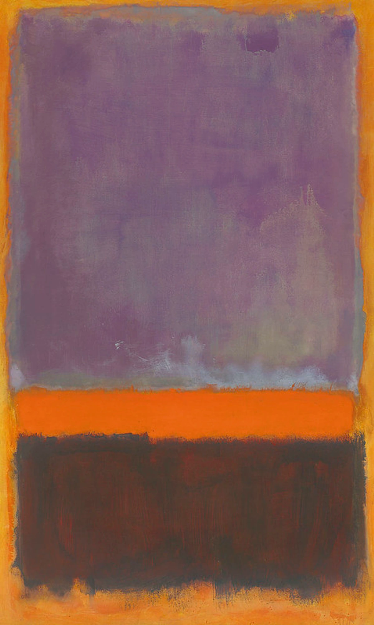
credit, licence) or the soft, layered Washes creating luminous color fields in Rothko's work (Rothko_Purple_Orange_Brown
credit, licence). Understanding the techniques behind the art can deepen your appreciation, whether you're making your own or looking to buy art for your home.
Acrylics, being a relatively modern medium compared to oils or watercolors, have enabled artists to explore new textures and speeds of application. While traditional techniques translate, the fast drying time and versatility with mediums allow for unique layering and textural effects that are distinctly acrylic. The ability to layer quickly without disturbing underlying layers (Wet-on-Dry), or to build thick texture that dries relatively fast (Impasto), opens up possibilities that weren't as readily available with slower-drying mediums. Contemporary artists today heavily rely on expressive acrylic brushwork and mark-making to convey energy and emotion. Think of artists who use bold, gestural strokes or build up incredible textures with acrylics – their work is a testament to the medium's potential.
Putting it into Practice
Moving from practicing individual strokes to creating a finished piece can feel daunting. Start small. Choose a simple subject or even just an abstract idea focused on texture or color. Try to limit yourself to just two or three strokes initially. How can you represent a tree using only Dry Brush and Stippling? Can you create a sense of depth using only Flat Washes and Glazing? This focused approach helps you understand the expressive potential of each stroke and how they interact. Don't aim for perfection, aim for exploration.
These strokes are just the beginning. There are countless variations and combinations. The real journey is discovering how you want to use them to tell your story on the canvas. It's a lifelong exploration, and honestly, that's the most exciting part. This is part of developing your unique artistic style. Your brushstrokes are your signature.
Practice, Practice, Practice (and Permission to Play)
Learning these strokes isn't about getting them perfect on your first try. Or your tenth. Or maybe even your hundredth. It's about building muscle memory and understanding how the paint and brush interact. Dedicate some time just to practicing strokes on scrap paper or canvas. Fill pages with Flat Washes, Gradients, Stippling. See how different brushes change the effect. See how adding more or less water changes things. Observe how the paint behaves, how the brush feels, and the sounds it makes on the surface.
I remember one practice session where I just filled a whole sheet of paper with nothing but Dry Brush strokes, trying different brushes and colors. It felt a bit silly at first, but by the end, I had discovered so many subtle variations I hadn't expected. It was a reminder that sometimes you just need to give yourself permission to play and see what happens, without the pressure of making a finished piece. If your first attempts look like a hot mess, don't worry, mine did too! That's part of the process. And honestly, getting paint on your hands and clothes is part of the fun.
Here are a few simple practice exercises I recommend:
- Pressure & Angle Exploration: Take a single round or flat brush and one color. On a practice surface, make lines and shapes varying only the pressure you apply. Then, make lines and shapes varying only the angle you hold the brush. See the wide range of marks possible with just one tool!
- Texture Grid: Divide a page into squares. In each square, practice a different stroke (Flat Wash, Dry Brush, Stippling, Scumbling, Dabbing/Sponging, Washing, Palette Knife Application, Wiping/Ragging, Flicking/Splattering, Impressing/Stamping) using the same color and brush/tool to see the variety of textures you can create.
- Gradient Strips: Practice blending two colors into a smooth gradient across narrow strips of paper or canvas board. Try it horizontally and vertically. Focus on keeping that wet edge!
- Wet-on-Wet vs. Wet-on-Dry: Take two small areas. In one, keep the surface wet and practice applying paint Wet-on-Wet. In the other, let the first layer dry completely before adding the second (Wet-on-Dry). Observe the distinct differences in how the paint behaves and the edges that form.
- Simple Forms: Paint basic shapes like circles or squares and try to give them dimension using only one or two strokes, like Stippling for shading or Impasto for highlights.
- Quick Sketches: Do quick, small landscape or object sketches focusing only on using specific strokes to represent different textures (e.g., Dry Brush for grass, Flat Wash for sky, Impasto for rocks, Washing for atmospheric haze).
- Combine Strokes: Choose two or three strokes and practice using them together on a small area. How does a Dry Brush layer look over a Flat Wash? What happens when you Stipple over a Scumbled area? How does Palette Knife Application interact with a Washing layer?
- Black and White Focus: Practice all the strokes using only black and white paint. This helps you focus purely on value, texture, and mark-making without the distraction of color. It's a great way to understand how density and pressure create form.
- Limited Palette Practice: Choose just two or three colors (plus white) and practice all the strokes and combinations using only those colors. This helps you focus on technique without getting overwhelmed by color mixing decisions.
Give yourself permission to play. Don't worry about making a masterpiece. Worry about making marks. Explore. Get messy. Find what feels good and what creates the effects you like. This is part of developing your unique artistic style. It's about the journey, not just the destination.
Challenge Yourself
Once you feel comfortable with the basic strokes, try painting a simple subject (like an apple, a rock, or a cloud) using only one or two specific strokes. Can you paint an apple using only Stippling? A rock using only Dry Brush and Impasto? This forces you to think creatively about how each stroke can represent form, light, and texture, pushing your understanding and control.
Troubleshooting Common Acrylic Brushstroke Issues
Even with the right tools and techniques, acrylics can be tricky. Here are a few common problems and how to tackle them:
- Streaky Washes: This is almost always due to the paint drying too fast before you can maintain a wet edge. Solution: Work faster, use a stay-wet palette, mist your surface (or mist above it), or add a flow improver or glazing medium to your paint. Work in smaller sections if necessary.
- Visible Brush Marks (where you don't want them): This happens when paint is applied too thickly for the desired smooth effect, or the brush isn't loaded correctly. Solution: Thin your paint slightly (with water or medium), ensure your brush is fully loaded for smooth coverage, or use a softer brush. For large areas, try a larger brush to cover more ground quickly, or use a Mop brush with thinned paint.
- Impasto Not Holding Shape: The paint might be too thin, or you're not using heavy body acrylics or a texture medium. Solution: Use paint straight from the tube (heavy body) or mix in a gel or texture medium. Apply with a palette knife or a stiff bristle brush (like a bright) for maximum texture.
- Blending Looks Choppy: Again, drying time is the culprit. Solution: Work faster, use a blending medium, keep a separate damp brush specifically for feathering edges, or try blending on a less absorbent surface. The damp brush allows you to manipulate the paint without adding more color or water, preventing muddying. Remember, it's a race, but you can win!
- Dry Brush Looks Like Streaks: You're using too much paint or too much pressure. Solution: Wipe almost all the paint off your brush before applying. Use a very light touch, letting the brush skip over the surface texture.
- Sgraffito Isn't Scratching Cleanly: The paint has dried too much. Solution: Work while the paint is still wet. If it's already dry, you'll need to wait for it to cure completely and then paint a new layer to scratch into, or accept the less clean line.
- Paint Drying on the Brush: This is a classic acrylic problem! Solution: Keep a jar of water nearby for quick rinses while you work, especially when switching colors or taking a short break. Periodically clean your brush more thoroughly with brush soap during a longer session if paint starts building up near the ferrule. Having multiple brushes can also speed this up.
- Paint Not Adhering Well (especially thin washes): Using too much water without a medium can break down the binder. Solution: For significant thinning, especially for washes or staining, it's much better to use an acrylic medium like a flow improver or glazing medium, as these maintain the binder and ensure the paint adheres properly. Also, ensure your surface is properly prepared with gesso or a suitable primer, especially for non-porous surfaces.
- Paint Lifting or Peeling: This can happen if the underlying layer wasn't completely dry, if too much water was used in a previous layer (weakening the binder), or if the surface wasn't properly prepared. Solution: Ensure each layer is fully dry before applying the next. Use mediums instead of excessive water for thinning. Always prime your surface appropriately with gesso or a suitable primer.
- Colors Looking Dull or Chalky: This is often a sign that the binder has been diluted too much by excessive water, or you might be using student-grade paints with more fillers. Solution: Use mediums for thinning instead of just water. Consider investing in artist-grade paints for richer pigment load and better binder consistency.
These are common hurdles, but with practice and understanding the medium, you'll learn to navigate them. Don't get discouraged!
FAQ: Quick Answers for Budding Brushstroke Masters
What's the best brush for beginners?
Start with a few synthetic rounds and flats in various sizes (say, a small round for details, a medium round, a medium flat, and a larger flat). Adding a filbert and a fan brush later will give you even more versatility without overwhelming you. Consider a beginner's set for a good starting variety. Remember to choose brush sizes appropriate for the scale of your painting.
How do I choose the right brush size?
Consider the size of your painting and the level of detail you want. Use larger brushes for blocking in large areas of color or creating broad strokes, and smaller brushes for details, fine lines, or small textures like Stippling. Make sure to keep the structure of the article intact.
How do I keep acrylics from drying too fast?
Use a stay-wet palette, mist your palette and painting with water (or a drying retarder), or use acrylic mediums specifically designed to extend drying time (like blending or glazing mediums). Working in smaller sections helps too.
Can I mix water and medium?
Yes! You can mix water with acrylic paint, and you can mix various acrylic mediums with paint. You can also mix water and some mediums, but always check the specific medium's instructions. Using a medium is often better than just water for thinning, as it helps maintain the paint's binder and ensures better adhesion, especially for techniques like Glazing or Washing. Be mindful that too much plain water can weaken the paint film.
Can I mix acrylics with other types of mediums like pouring mediums or texture pastes?
Absolutely! Acrylics are incredibly versatile and designed to be mixed with a wide range of acrylic mediums. Pouring mediums create fluid, self-leveling effects. Texture pastes add grit, thickness, or sculptural qualities. Always check the product labels to ensure compatibility, but generally, acrylic paints mix well with acrylic-based mediums to expand your creative possibilities.
How do I get smooth blends with acrylics?
Work quickly, keep your brush damp (but not soaking wet), and consider using a blending medium. Practice on scrap paper first to get the feel for it. Having a separate damp brush just for feathering the edges is a great tip – it allows you to manipulate the paint without adding more color or water, preventing muddying.
Is it okay if my brushstrokes show?
Absolutely! Visible brushstrokes add texture, energy, and character to a painting. It's a stylistic choice. Impasto painting, for example, is all about showing off those thick strokes. Embrace the mark-making! It's part of your unique artistic voice.
What surfaces are good for practicing acrylic brushstrokes?
Canvas panels, stretched canvas, acrylic paper, gessoed paper, or even just thick watercolor paper or cardboard are all good options. Choose something affordable for practice sessions! Remember that smooth surfaces are better for washes and blends, while textured surfaces enhance dry brush and scumbling. Ensure the surface is properly primed with gesso for best adhesion and longevity.
What's the difference between a wash and a glaze?
A Wash typically uses paint thinned significantly with water (or flow improver) and is often used for initial layers, staining, or creating atmospheric effects where the paint might pool and settle into the surface texture. It's applied over wet or dry paint. A Glaze uses paint thinned with a glazing medium and is applied in thin, transparent layers over dried paint to build depth and luminosity while maintaining the paint's binder and vibrant color. Glazing is specifically about building transparent color over a dry layer.
Can I mix different brands of acrylic paints?
Generally, yes. Most artist-grade acrylics are compatible with each other, as are most student-grade acrylics. However, mixing artist-grade and student-grade might affect pigment load and finish. Always test a small amount first if you're unsure.
How do I clean my brush when switching colors during a painting session?
Keep a jar of water handy. Swish your brush thoroughly in the water, wiping excess paint on a paper towel or rag. For stubborn paint, especially near the ferrule, use a brush soap or cleaner and rinse well before dipping into your next color. Having multiple brushes can also speed this up.
How do I clean dried acrylic paint from brushes?
Dried acrylic is tough! For small amounts, try soaking the brush in hot water with brush cleaner or soap for a while, then gently working the paint out with your fingers or a brush comb. For larger amounts or paint dried deep in the ferrule, commercial acrylic removers or brush restorers might be necessary, but be aware they can be harsh on bristles. Prevention is key – clean immediately after use! (Speaking of which, you might find my guide on cleaning and caring for your paint brushes helpful).
How do I fix a mistake with acrylics?
If the paint is still wet, you can often lift or wipe it away with a damp cloth or brush (see the Lifting/Subtracting stroke!). Once acrylics are dry, they are permanent. The best way to fix a mistake on a dry layer is usually to simply paint over it once the paint is completely dry.
Can I mix colors directly on the canvas?
Yes, absolutely! Mixing colors directly on the canvas is a fantastic way to create soft blends and spontaneous effects, especially with techniques like Wet-on-Wet blending or Scumbling. Just be mindful of the fast drying time – work quickly and have your blending tools (like a damp brush or medium) ready.
How much water is too much when thinning acrylics?
While you can thin acrylics with water, using too much can break down the paint's binder, leading to poor adhesion, a chalky finish, and reduced durability. A general rule of thumb is not to exceed a 1:1 ratio of water to paint for most applications. For significant thinning, especially for washes or staining, it's much better to use an acrylic medium like a flow improver or glazing medium, as these maintain the binder and ensure the paint adheres properly.
Why do acrylics dry darker?
Acrylics contain a binder that is milky white when wet. As the water evaporates and the paint dries, this binder becomes clear, allowing the true pigment color to show through more intensely. This often results in the dried color appearing slightly darker or more saturated than when it was wet. It's something you get used to anticipating with practice.
What's the difference between student and artist grade paint?
Student-grade paints are more affordable and contain more fillers and less pigment. They are great for practice and learning techniques. Artist-grade paints have a higher pigment concentration, resulting in more vibrant colors, better coverage, and superior lightfastness (resistance to fading). They also generally have a more consistent binder. While student paints are fine for learning strokes, artist-grade paints will give you better results for finished pieces, especially when it comes to color intensity and longevity.
Can I paint acrylics over oils?
No, you should never paint acrylics over oils. Oils dry by oxidation, forming a flexible film, while acrylics dry by evaporation, forming a less flexible film. Acrylics painted over oils will not adhere properly and will likely crack and peel over time as the oil layer continues to cure underneath.
Can I paint oils over acrylics?
Yes, you can paint oils over acrylics. Acrylics provide a stable, flexible, and non-absorbent base that oil paint can adhere to. Many artists use acrylics for underpainting or blocking in colors before working on top with oils. Just ensure the acrylic layer is completely dry before applying oils.
How does the color of the surface affect my brushstrokes?
Painting on a colored surface (a 'ground') can significantly impact your work. Thin strokes like Washes or Glazes will allow the ground color to show through, influencing the perceived color of the layer. Techniques like Dry Brush or Scumbling will allow the ground color to peek through the gaps in the texture. A colored ground can also help unify a painting or set a specific mood from the start. It's a great way to add depth and complexity without extra layers of opaque paint.
What's the difference between a stiff brush and a soft brush?
The stiffness of a brush's bristles affects how much paint it holds and how it releases it, as well as how it interacts with the surface. Stiff brushes (like hog bristle or some synthetics) are good for pushing thick paint, creating texture, and techniques like Impasto, Dry Brush, and Scumbling. They leave more visible brush marks and have more "snap." Soft brushes (like sable or softer synthetics) hold more liquid and are better for smooth application, Washes, Glazing, and Blending. They leave fewer visible brush marks and glide more easily.
Should I varnish my acrylic painting?
Varnishing is an optional final step that protects your painting from UV light, dust, and dirt, and can unify the finish (matte, satin, or gloss). It's generally recommended for longevity and presentation. Ensure the painting is completely dry and cured (this can take several days or weeks for thick acrylics) before applying varnish. Always use a varnish specifically designed for acrylics.
Learning basic brushstrokes is a fundamental step in acrylic painting. It gives you control, allows you to create different textures and effects, and ultimately helps you express yourself more effectively. It transforms that initial feeling of wrestling with the paint into a confident dance. So grab those brushes, load up some paint, and start making marks. Your artistic voice is waiting to be heard, one stroke at a time. And hey, maybe one day you'll be creating pieces that someone else is reading about, wondering how you made the paint do that! If you're interested in seeing where my own artistic journey has taken me, you can check out my timeline or even explore some of my art for sale.
Happy painting!


