My Secret Sauce: Mastering Intuitive Color Mixing for Expressive Abstract Art
Unlock your unique artistic voice! I share my personal journey and unconventional techniques for intuitive color mixing, achieving vibrant hues and deep emotional resonance in abstract art.
My Secret Sauce: Mastering Intuitive Color Mixing for Expressive Abstract Art
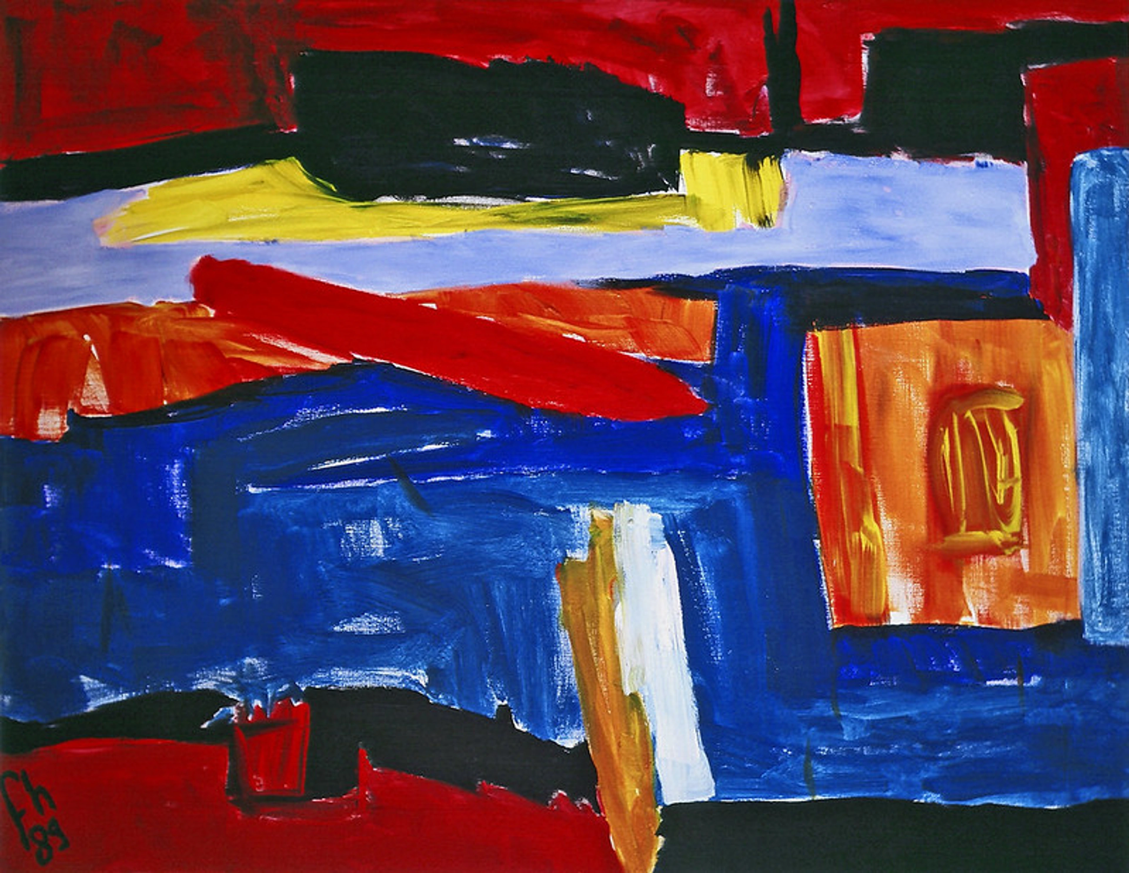
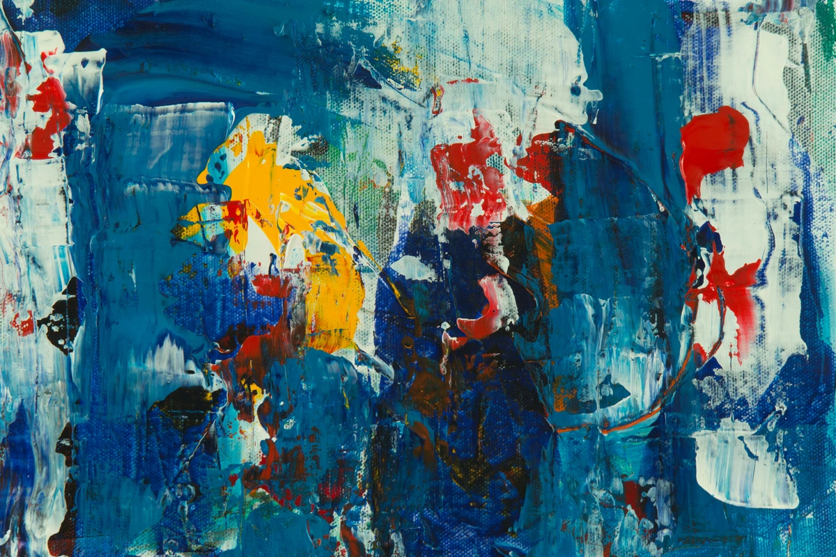
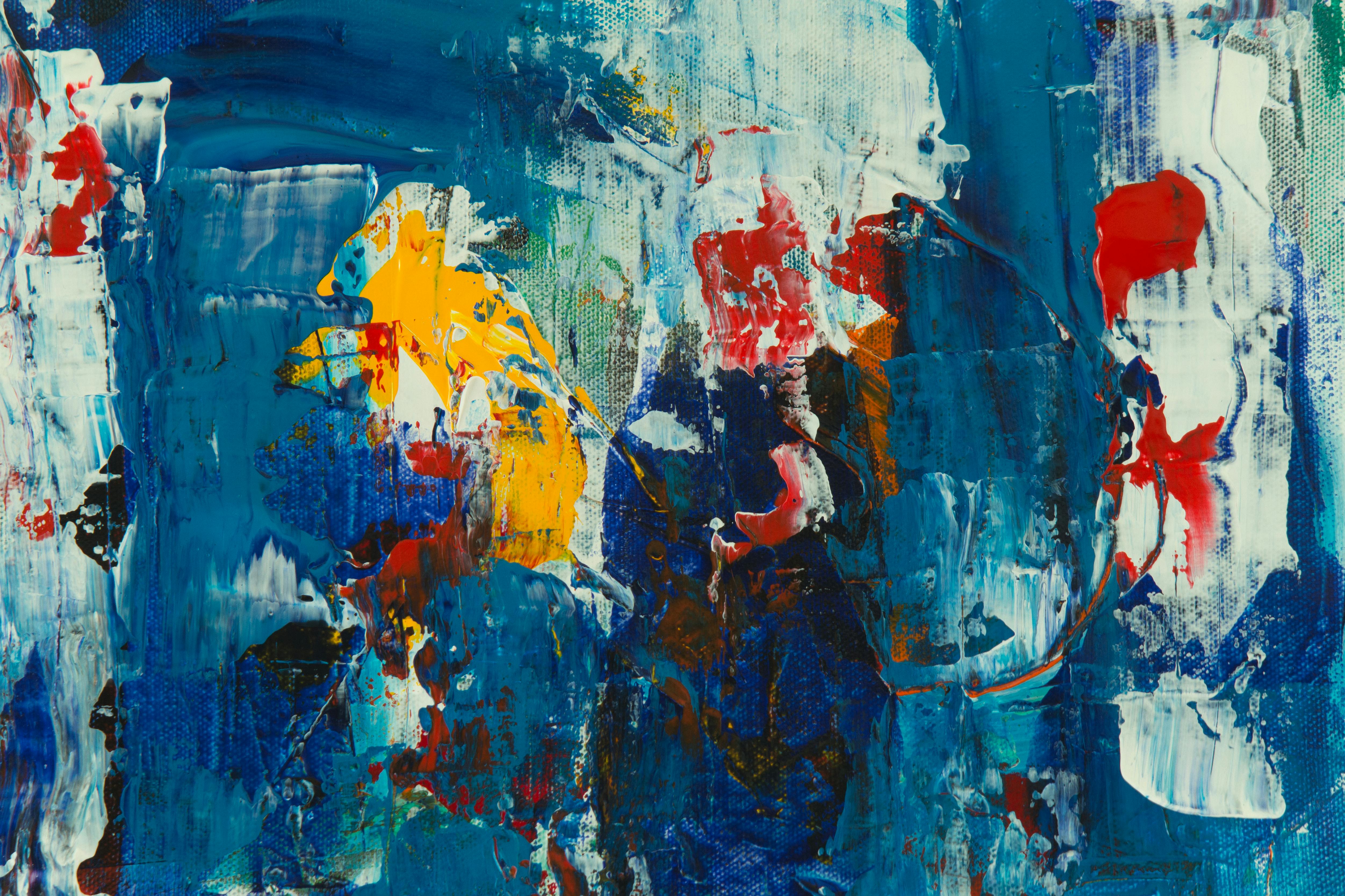
Look, if there’s one thing I’ve learned on this winding journey of abstract art, it's that color isn't just paint. It’s a language, a whisper, a scream, a quiet hum that speaks directly to the soul. I still remember the exact moment this clicked for me: I was working on a piece, struggling to convey a sense of quiet longing, and a seemingly accidental blend of deep indigo and a touch of raw sienna suddenly created this incredible, melancholic harmony. It wasn't in any textbook. It was a feeling made visible. If you’re anything like me, you probably started with the basics, right? Red, yellow, blue… a bit of mixing, maybe a muddy brown, and then a shrug. "Close enough," I'd tell myself. But true expressive abstract art? That demands a deeper dive, a more intimate conversation with your palette, and a bit of practical know-how I've picked up along the way. This isn't just about color theory (though we'll touch on it, briefly, because even rebels need a rulebook to break). This is about feeling your way through the spectrum, about finding your unique voice in the endless dance of pigments.
Beyond the Primary: My Personal Philosophy of Hue
Years ago, early in my career, I was so focused on composition and form. Color felt… secondary, almost an afterthought. Big mistake. Huge. It took me a while to really understand that color isn't just filling in the lines; it is the line, the form, the emotion itself. When I say color is the line, imagine a bold swipe of crimson not just outlining a shape, but defining its energy, its heat, its very presence. It’s what grabs you by the collar and says, "Look closer." What led me to this realization? It was often the viewer's reaction. Someone once looked at a painting of mine, a swirl of blues and grays, and told me it perfectly captured the feeling of a rainy morning. I hadn't explicitly tried to paint rain, but the colors had spoken. That's when I truly grasped that color holds its own narrative, independent of literal representation. For me, connecting with a color palette is like revisiting a powerful memory or emotion—a deep emerald might recall the stillness of a forest, while a searing orange could ignite the memory of a passionate argument. These internal dialogues guide my choices.
My philosophy really boils down to this: every color has a story, and when you mix them, you're not just blending pigments, you're combining narratives. Think of it like a conversation between two very different personalities. Sometimes they clash beautifully, sometimes they blend into something entirely new and harmonious. Sometimes it's a messy argument, and that's okay too. It's all part of the process. If you're interested in how color truly impacts the viewer, I've written a bit about the psychology of color in abstract art before. What stories do your colors tell?
My Unconventional Approach to the Color Wheel
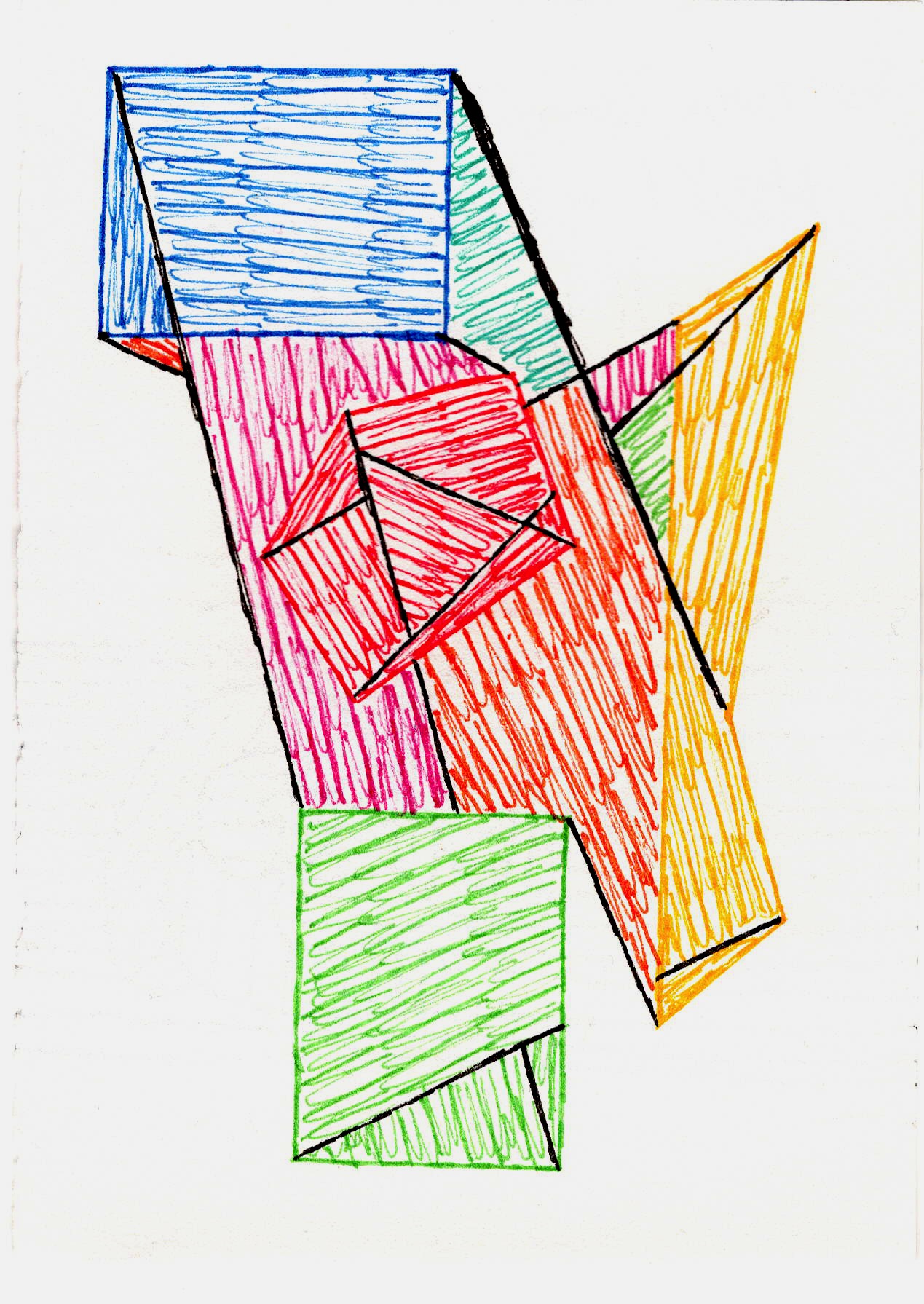
Now, don't get me wrong, I know the color wheel exists. I respect it. But I don't always obey it. For me, the color wheel is less a set of strict instructions and more a suggestion box. While rules can be a starting point, I find true freedom comes from understanding them well enough to bend or even break them. Who wants to be told exactly what to do when it comes to creativity, anyway? I mean, where's the fun in that?
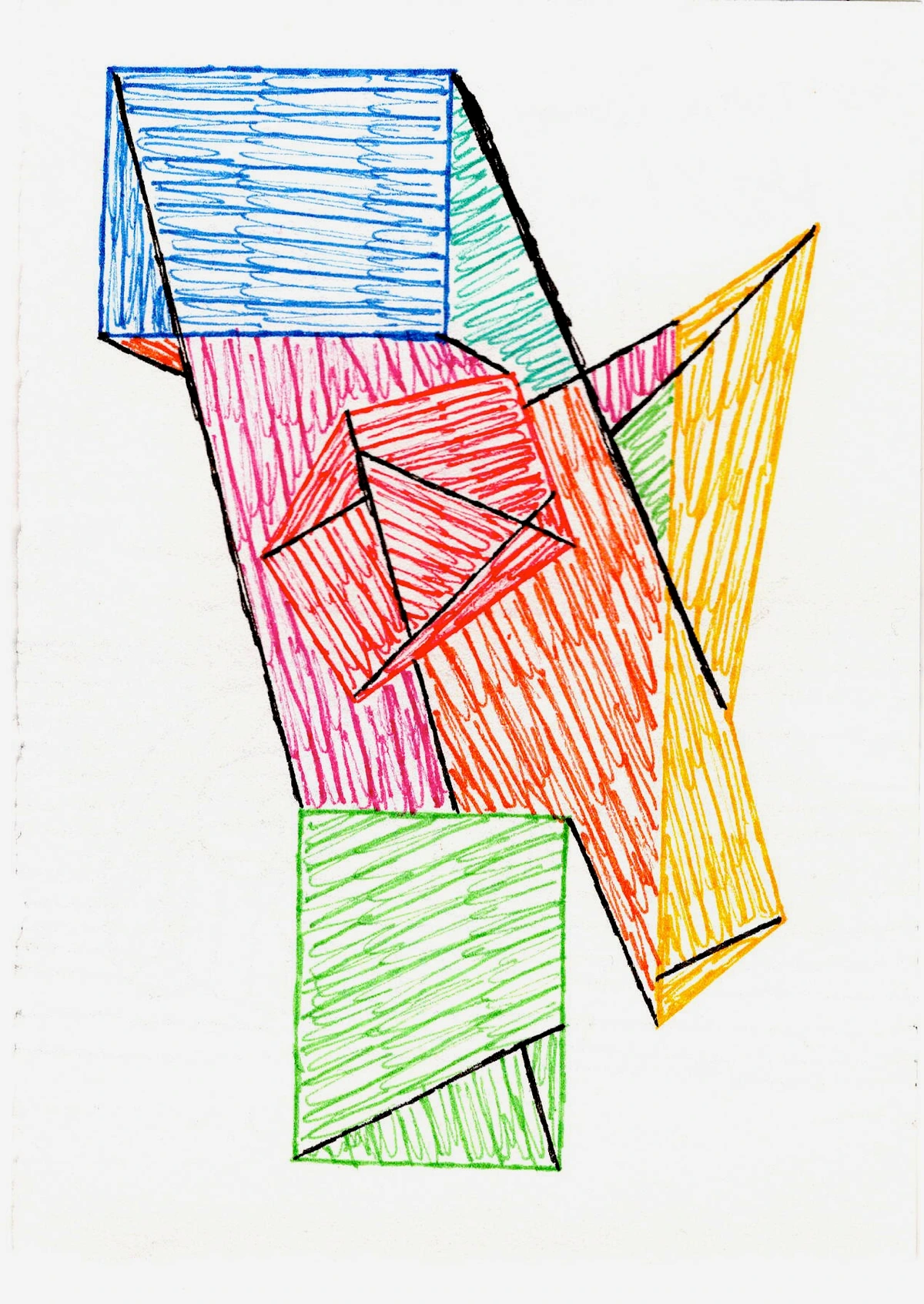
Instead of strict primary/secondary/tertiary rules, I often think in terms of relationships. What happens when a fiery red (a warm color, full of energy) meets a calming blue (a cool, introspective hue)? The contrast between warm and cool colors is a dynamic I intuitively explore. Sometimes, a vibrant, almost artificial pink next to a muted, earthy olive green can create an unexpected tension that’s far more engaging than a straightforward harmony. This is where the real exploration happens. I find myself constantly pushing the boundaries of what I 'should' be doing, not by completely ignoring principles, but by understanding them well enough to subvert them. For instance, color theory suggests that blue and orange are complementary, creating a vibrant contrast. But what if you push a desaturated, almost dusty orange against a vibrant, electric blue? The tension, the unexpected harmony, can be far more intriguing than a straightforward pairing. It’s about exploring the nuances, the quiet whispers between hues, rather than just shouting their primary differences. I'm always exploring how artists use color in unexpected ways, and diving deep into beyond the primary: how i use secondary and tertiary colors to create complex abstract worlds to discover new dimensions. What color relationships are you curious to explore?
The Messy Magic of Mixing: Embracing the Process
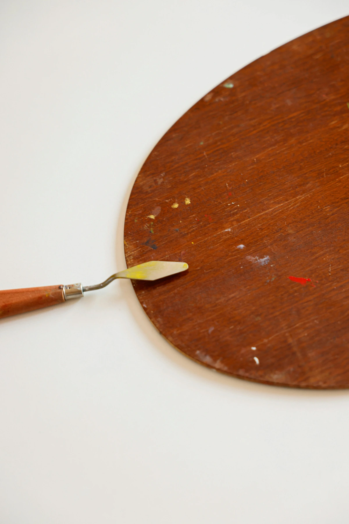
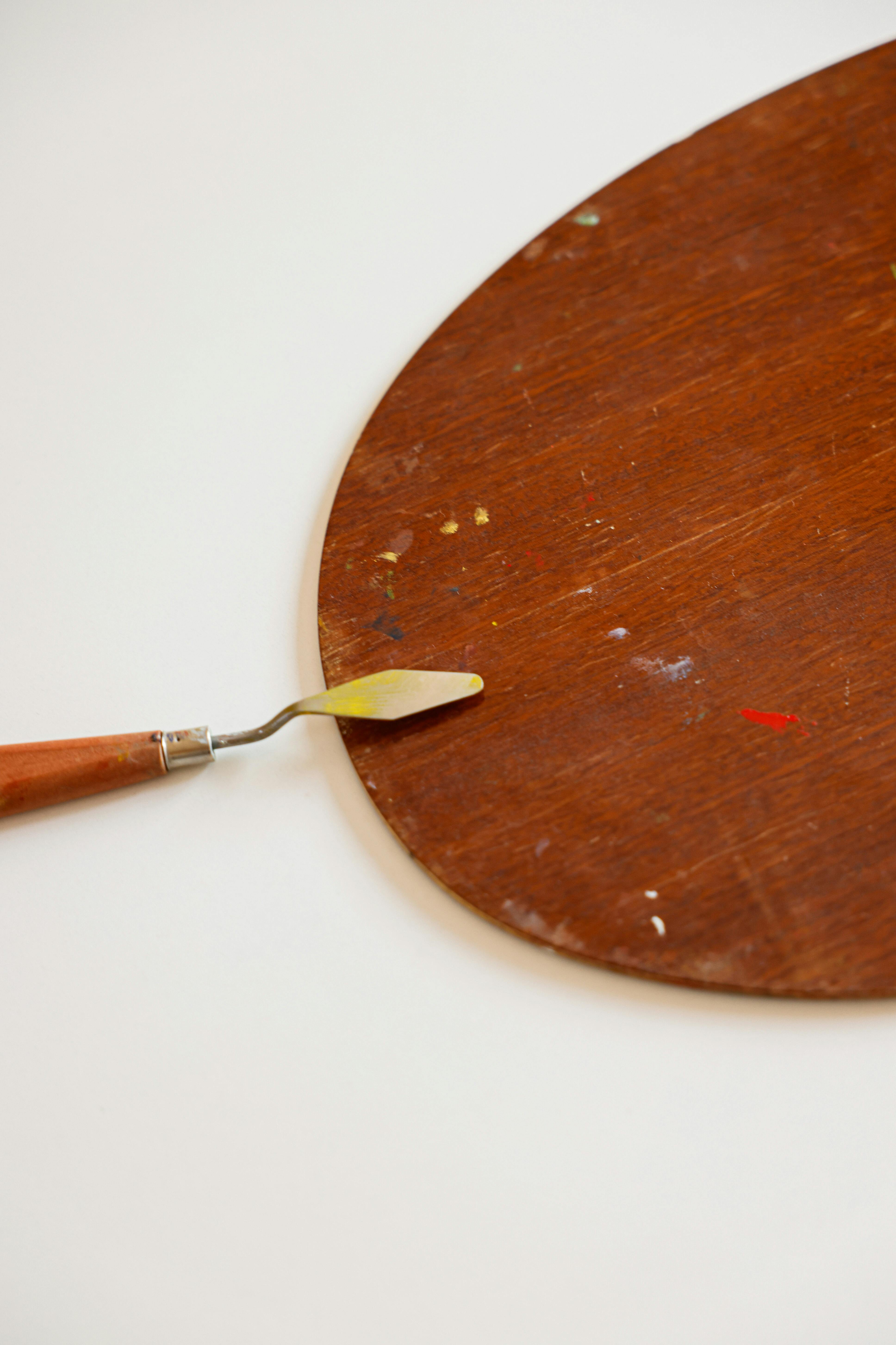
This is where the rubber meets the road, or rather, where the paint meets the palette. And let me tell you, my palette is usually a beautiful, chaotic mess. Streaks of cerulean bleeding into cadmium yellow, a smear of alizarin crimson mingling with viridian – it’s a living testament to the painting's journey itself, a visual diary of choices made, colors explored, and happy accidents embraced. I've heard some artists keep their palettes pristine, separating every color, but honestly, that's just not me. My palette is a testament to my creative flow: embracing intuition in abstract painting. It’s where the unexpected happens, where happy accidents are born.

Tools of the Trade (and the happy accident)
I mostly use a palette knife for mixing. While brushes or even my fingers can blend colors beautifully, the palette knife offers a distinct advantage: it keeps the colors from getting too blended. I love seeing the subtle streaks of unmixed pigment, the way one color still peeks through another. It adds a vibrancy and depth that a thoroughly mixed color just can't achieve. Think of it as controlled chaos. I prefer a flexible, diamond-shaped palette knife for general mixing, but sometimes a small, rounded knife is perfect for delicate blends, or a large, rectangular one for bold, sweeping textures directly on the canvas. These different tools encourage different 'accidents.' Sometimes I'll get a perfect blend, other times a truly awful sludge. And those sludges? Sometimes, with a bit of water or another color, they transform into the most interesting muted tones. I remember one particular moment: I was cleaning off my palette and mixed some leftover Payne's Gray and a stubborn streak of cadmium yellow, expecting a dull, greenish-brown. Instead, the way they partially blended created a soft, almost luminous olive green that had incredible depth. It became the anchor for an entire new series of paintings. It’s all a learning curve. I even have a specific article dedicated to my approach to color mixing: creating vibrant palettes in abstract painting if you want a deeper dive.
The Science of Pigment (intuitively understood)
Beyond just the hues, I've learned that understanding the intrinsic qualities of your pigments makes a huge difference. You don't need to be a chemist, but paying attention to things like opacity (how much light it blocks) versus translucency (how much light it lets through) is vital. A transparent phthalo blue will behave very differently when layered over yellow than an opaque cerulean. For example, a transparent red over a layer of bright yellow might create a luminous, glowing orange, whereas an opaque red mixed directly with that yellow might yield a flatter, more uniform orange. Then there's granulation, where some pigments settle into tiny clumps, creating a beautiful, textured effect (think Payne's Gray or Ultramarine Blue in watercolors), and drying time, which can impact how you layer. Oils dry slowly, allowing for extended blending, while acrylics dry fast, demanding quick decisions but enabling rapid layering. I mostly learn this through experimentation – watching how my paints behave on the canvas, almost having a conversation with them about their nature. It's less about memorizing data sheets and more about developing a tactile, intuitive understanding of each pigment's personality. This also applies to fundamental mixers like white and black. White (often Titanium White) increases opacity and lightens, while black (like Ivory Black) can deepen and sometimes dull a color. Knowing when to use a pure black for drama or a mixed 'chromatic black' for nuance is part of the intuitive dance. This plays a significant role in how I later approach layering and building depth.
Layering and Translucency: Building Worlds
One technique I adore is working with layers and varying degrees of translucency. It’s like building a world, piece by piece, allowing glimpses of what lies beneath. If you apply a very thin, translucent wash of blue over a warm yellow, you don't get green right away. You get a luminous, almost iridescent effect, where the underlying yellow still glows through the blue, creating incredible depth. This interplay is also where the role of light becomes paramount: how the light hits the surface, passes through translucent layers, and bounces off the underlying paint can dramatically alter the perceived color and mood. Furthermore, the very surface you paint on – be it smooth canvas, textured paper, or raw wood – will influence how the pigment absorbs and reflects light, impacting both saturation and perceived texture, adding another dimension to the color experience. This creates complex visual narratives, often far richer than a single, flat color could achieve. And let's not forget how texture itself, often created through layering or impasto techniques, can dramatically alter how light interacts with color, adding another dimension to its perception by creating shadows and highlights within the color itself. For more on this, check out exploring texture: my favorite techniques for adding depth to abstract paintings. What hidden depths can you reveal with layers?
The Emotional Pulse of Color
Ultimately, for me, color mixing isn't just a technical skill; it's an act of emotional translation. I want my art to resonate, to evoke something without explicitly telling you what to feel. This is where my intuitive understanding of color comes into play. I often start a piece with a feeling or a memory, and then I let the colors guide me. If I'm feeling a sense of quiet introspection, I might lean into blues and grays, perhaps with a surprising pop of coral to disrupt the stillness. If it’s pure exhilaration, then vibrant yellows, oranges, and bold reds take center stage. These emotional connections are the bedrock upon which my intuition is built, deeply influencing every choice, every brushstroke, every blend. Sometimes the deepest harmonies emerge from seemingly discordant pairings, mirroring the complexities of human emotion itself. The goal isn't just to make pretty colors, but to make colors that feel something.
This process is deeply personal, almost like the emotional language of color in abstract art. But what's truly magical is how the viewer connects with it through their own lens, finding their own echoes within the hues. It’s a beautiful, shared experience, really. What emotions do you seek to convey through your palette?

Cultivating Intuition: My Non-Linear Path
You know, there's no textbook for intuition. It's something you cultivate through practice, through failure, and through paying attention. For me, it involves a lot of trial and error. I don't always know what I'm going for when I start. Sometimes, I just pick two colors that feel right in the moment and see what happens. It's a bit like the art of intuitive painting: embracing spontaneity in abstract creation.
To develop this intuition, I don't just paint. I pay attention to the colors around me every day – the subtle shift in the sky at dusk, the unexpected pairing of colors in a discarded piece of packaging, the way light plays on a leaf. I keep a journal of color mixes – not a super organized one, mind you, more like scribbles and notes about "that time cerulean blue and raw sienna made something magical." It's a way of remembering those happy accidents and building a mental library of possibilities. Don't be afraid to just play. Seriously, some of my best discoveries came from just messing around with paint, no agenda whatsoever. I remember once just smearing leftover paint from a previous session on a separate scrap of paper, and the combination of an almost dry cadmium yellow and a thin wash of Payne's Gray created a muted olive that became the anchor for a whole new series. This kind of playful, observational practice is what truly hones that gut feeling. What daily observations inspire your palette?
Common Color Conundrums (and how I tackle them)
I get it. Color mixing can be daunting. We've all been there, staring at a muddy canvas, wondering where it all went wrong. Here are a couple of things I've learned from my own misadventures.
Avoiding the Dreaded Mud
Ah, mud. The bane of every artist's existence. My top tips:
- Limit your palette: Sometimes less is more. Stick to a few core colors and explore their variations. Too many colors can quickly lead to chaos.
- Clean your brush/knife: Obvious, right? But seriously, a tiny bit of residual color can quickly spoil a fresh mix. I'm terrible at this, honestly, but I try!
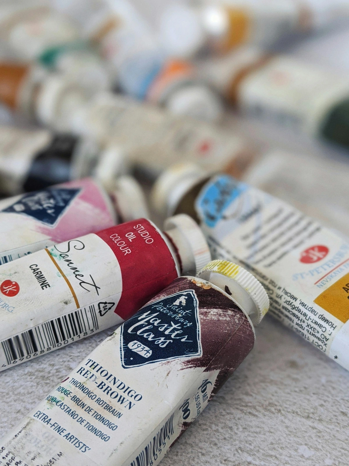
- Know your pigments: Some pigments are inherently more opaque or granulating than others. Understanding this helps predict how they'll behave when mixed. A good way to learn? Read the pigment information on your paint tubes – look for the Pigment Index Number (e.g., PB29 for Ultramarine Blue), lightfastness ratings, and transparency/opacity indicators. Better yet, create a personal "pigment cheat sheet" – small swatches showing how each of your go-to pigments looks alone, and then mixed with a standard white and black, and perhaps a primary red, yellow, and blue. This creates a quick visual reference for how each behaves.
- Embrace layers: If a color starts looking dull, don't stir it into oblivion. Let it dry and consider layering a vibrant, translucent color over it. This allows the dullness to recede while the new color provides luminosity.

Finding Harmony in Chaos
Abstract art can be chaotic, but it still needs harmony. For me, harmony isn't about perfect matching, but about a conversation where all voices can be heard. I often introduce a "bridge color" – a color that shares characteristics with two disparate hues in the painting, helping them feel connected. For example, if I have a painting with dominant fiery reds and cool, deep blues, I might introduce a muted violet or a desaturated crimson that carries echoes of both – perhaps a touch of blue in the violet and red in the crimson – helping to soften the transition and create visual flow. Or, I might rely on dominant and subordinate colors, allowing one color family to lead while others provide support and interest, like a bold yellow taking center stage with softer grays and blues creating a quiet backdrop. Sometimes, true harmony comes from an unexpected jolt, a jarring contrast that, paradoxically, makes the surrounding colors sing. It’s a delicate balance, a constant pushing and pulling. How do you find your unique harmony?
Frequently Asked Questions About My Color Mixing
Alright, let's dive into some of the questions I often get asked (or ask myself!) about color, as these are some of the challenges I've learned to navigate.
How do you keep your abstract colors so vibrant?
It's a combination of things! Firstly, quality pigments matter – cheap paint rarely delivers. Secondly, knowing when not to overmix is key – I love those subtle transitions where colors still retain their individual punch. Thirdly, sometimes it’s about contrast; a vibrant color next to a muted tone feels even more alive. And finally, layering translucent colors can create a glow that pure, opaque color sometimes misses, almost like light from within. Also, sometimes I intentionally desaturate a vibrant color by mixing in a tiny bit of its complementary color, just enough to soften its edge without killing its life, which can make other vibrant colors pop even more. It’s all about context and relationship.
Is color theory essential for abstract art?
"Essential" is a strong word, and frankly, I'm not a fan of absolutes in art. I'd say it's beneficial. Knowing the basics of complementary, analogous, and triadic schemes gives you a starting point or a framework to intentionally break. For instance, understanding complementary colors like blue and orange allows you to deliberately choose a desaturated orange with an electric blue to create tension, rather than a predictable pop. But don't let theory stifle your intuition! Experiment first, then read the book, if you feel like it. Sometimes the most exciting discoveries happen when you're completely ignorant of the 'rules.' After all, many of the greatest abstract artists broke every rule in the book to find their unique voice. The key is to understand the rules well enough to know how and why you're breaking them. For more on this, I often revisit the definitive guide to understanding color harmonies in abstract art for fresh perspectives on traditional concepts.
How do you choose your initial palette for a new piece?
Honestly, it varies! Sometimes it's a gut feeling, a response to a mood or a sound I've heard. Other times, I might look at a photograph or even a discarded bit of packaging and be inspired by a color combination. I might even just pick three random tubes of paint and see what happens. I remember once seeing a faded, rust-colored car next to a vibrant green bush, and that became the unexpected starting point for a whole new series. The key is to be open to inspiration from anywhere. It's truly a journey, much like my own timeline as an artist.

My Colorful Conclusion
So, there you have it. My somewhat rambling, intensely personal take on mastering color mixing for expressive abstract art. It's not about formulas or perfect ratios; it's about a conversation, an exploration, a willingness to get messy and to listen to what the paint tells you. It’s about finding your unique language in the infinite world of color. Don't be afraid to experiment, to fail, to create something truly ugly, because sometimes, those are the moments before the breakthrough. After all, the canvas is just a playground, right? I encourage you to grab some paints and just start – pay attention to what happens, what you feel, and what new stories your colors begin to tell.
And if all this talk about color has inspired you, perhaps you'd like to see some of the worlds I've built with it, where these principles of color conversation are brought to life. You can always explore my art for sale or delve deeper into my process. Who knows, maybe you'll find a piece that speaks to your soul, a testament to the beautiful, messy magic of color. Perhaps you’ll even visit my work in person at the museum in 's-Hertogenbosch!


