Mastering Oil Glazing: Achieve Luminous Depth & Inner Glow
Dive into oil glazing! Discover my journey, essential tools, step-by-step methods, and common mistakes to create vibrant, glowing art. This comprehensive guide unveils pigment transparency, historical secrets, and practical tips for luminous depth.
Mastering Oil Painting Glazing: My Luminous Journey & Techniques for Deep Glow
Okay, let's talk about glazing. For the longest time, the very word 'glazing' in oil painting felt like a secret handshake among old masters, something shrouded in mystery and reserved for hyper-realistic portraiture I frankly wasn't interested in making. My artistic world was all about bold strokes, thick textures, and the immediate gratification of abstract expression. But then, a funny thing happened on my journey (as they often do, don't they?). Even amidst the freedom of abstraction, I started craving something… more. More depth, more luminosity, a whisper of complexity that I knew would elevate my pieces beyond surface impact. That's when I finally, reluctantly, dipped my toe into the shimmering waters of oil glazing. And oh boy, was it a game-changer. It felt like uncovering a secret superpower for my colors, allowing me to build incredible visual richness and a glowing quality that pulls viewers in. This guide is about how I found that superpower, and how you can too. We'll dive into what glazing truly is, why it's so powerful, the essential tools, my personal step-by-step ritual, and how this age-old technique has become a cornerstone of my contemporary abstract work. So, if you're ready to unlock this secret power for your own colors, let's dive into the why and, more importantly, the how, of achieving that coveted inner glow. Consider this your roadmap to luminous depth, covering the what, why, how, and practical application of glazing. Ready to peel back the layers and see what lies beneath?
What Even Is Glazing, Anyway? (It's All About Light)
At its core, glazing is essentially applying thin, transparent layers of paint over a dried underpainting or previous paint layer. Think of it like looking through colored cellophane – each layer adds to the color and depth without completely obscuring what's beneath. It's not about making a new color on your palette; it's about creating an optical mix on the canvas as light passes through multiple translucent layers and bounces back to your eye. This phenomenon, where light penetrates and reflects off lower layers, is the source of glazing's unique luminosity.
What makes a paint transparent? Well, it all comes down to the pigment itself. Opaque paints, with their denser, often irregularly shaped pigment particles and sometimes, the addition of fillers, simply reflect light from their surface, blocking its passage. Transparent pigments, however, are characterized by finer, more evenly dispersed particles and a specific chemical composition that allows light to travel through them. This transparency is fundamentally influenced by things like their crystalline structure, the refractive index of the individual pigment particles, and even their particle size and shape. A coarser, more irregular particle scatters light diffusely, reducing transparency, while fine, uniform particles allow light to pass through more directly, almost like tiny panes of stained glass. It's also about the absence of light-scattering fillers that can dull a pigment's natural translucence.
This technique isn't new; it's a timeless method used by Renaissance and Baroque masters like Vermeer, Rembrandt, Titian, and Rubens to achieve incredible light and dimension. Think of Vermeer's luminous pearls or the subtle, glowing skin tones in his portraits – often built up with countless thin glazes. Rembrandt's profound, velvety shadows, too, frequently owe their depth and warmth to deep, transparent layers of color. Titian, for example, built up his rich, jewel-like hues through numerous glazes, creating a visual richness that still captivates today. The "why" behind its enduring power lies in how light interacts with the pigments. Transparent pigments allow light to pass through them, scatter off the layers below, and then reflect back to the viewer's eye. This creates a vibrancy and luminosity that's simply impossible with opaque paint alone, which merely reflects light from its surface. Colors seem to glow from within, shadows gain a profound depth, and transitions become unbelievably subtle.
Now, why go through all that effort when you could just mix the color directly? Ah, my friend, that's where the magic lives. Glazing allows for an incredible richness and luminosity. Imagine glazing a thin, translucent layer of Cadmium Yellow over a deep Ultramarine Blue underpainting. The result isn't a muddy brown from mixing; it's a vibrant, shimmering green that appears to glow, unlike any green you could mix directly on your palette. This optical mixing creates effects that simply can't be replicated with direct mixing. For my abstract work, it's become a way to create atmospheric layers and give my pieces a sense of space and evolving depth that I just adore. It's not just for rendering realistic skin tones or metallic sheens either; it can create breathtaking atmospheric perspective in any genre. If you're looking to literally add depth to your work, whether abstract or otherwise, it's a technique worth exploring. Sometimes, adding depth isn't just about texture; it's about light, which is something I also talk about when exploring texture: my favorite techniques for adding depth to abstract paintings. Oh, and a little heads-up: if your underpainting isn't prepared correctly, you might encounter 'sinkage' – dull, lifeless patches. We'll get to that, but it's something to keep in mind.
While we're talking about layering for luminous effects, it's worth a quick mention of scumbling. Think of scumbling as the slightly more opaque cousin of glazing. Instead of thin, transparent layers, scumbling involves applying a very thin, semi-opaque or opaque layer of paint (often lighter in value) dryly over a darker underpainting, allowing some of the underpainting to show through. This creates a soft, misty, or textured effect, where light seems to catch on the surface rather than pass through. While different in application, both glazing and scumbling are powerful tools for building optical depth and enhancing luminosity in different ways. Glazing works by revealing; scumbling often works by obscuring just enough to create a new visual texture.

The Essential Ingredients: My Go-To Glazing Toolkit
Now that we've unravelled the optical magic behind glazing and understood its profound impact, let's gather the trusty tools that make this luminous journey possible.
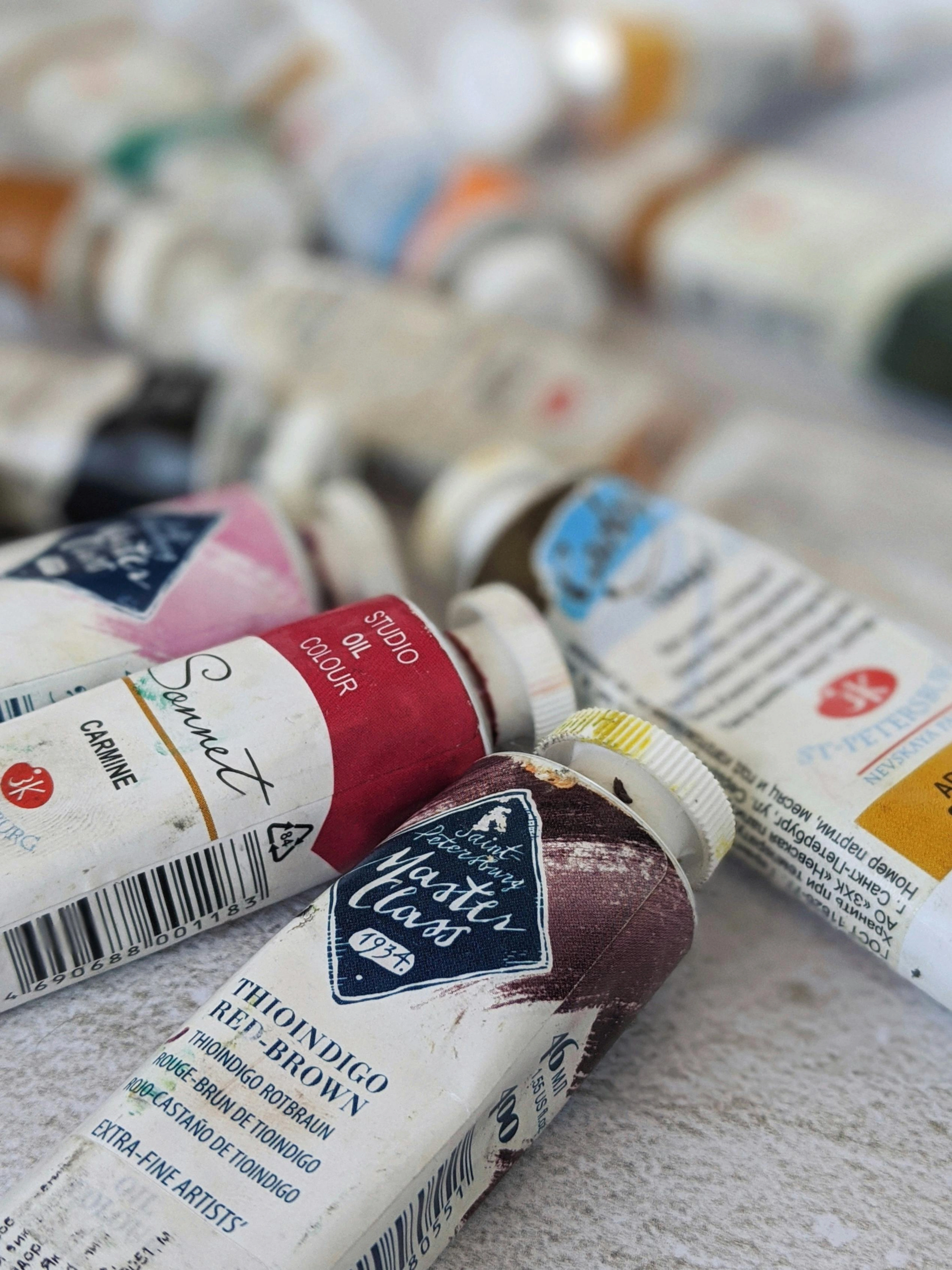
Before you dive headfirst into this luminous world, let's gather our supplies. You don't need a fortune, but good quality materials make a world of difference. Trust me, I've tried to cheap out – once with a bargain-bin linseed oil that turned my glazes a sickly yellow and slowed drying to a crawl (a mistake I won't soon repeat!), and then there was that 'artist grade' paint that was more filler than pigment, leaving my glazes looking strangely chalky. Lesson learned: invest wisely.

- Oil Paints: The stars of the show! You'll want to lean towards paints with good transparency. Brands usually indicate this on the tube with a symbol (often an empty square for transparent, half-filled for semi-transparent, full for opaque). Think Cadmium Yellow (often semi-transparent, but can be used for glowing glazes), Alizarin Crimson, Phthalo Blue, Burnt Sienna, or Quinacridone colors – these are naturally transparent or semi-transparent pigments, often rated as such. The chemical structure and crystal lattice of a pigment, alongside its particle size, are what primarily determine its transparency. In simpler terms, the very nature of how the pigment's molecules are arranged and how small its particles are dictates whether light can pass through them easily without much scattering. The way these microscopic particles absorb, reflect, and transmit light is key to their translucent nature. Beyond this, pigment load is crucial; professional-grade paints typically have a higher pigment load, meaning more pigment and less filler. This results in richer, more vibrant, and more transparent glazes even if the pigment itself isn't inherently the most transparent, because there's simply more of the light-transmitting pigment present. Opaque colors like Titanium White are great for underpainting but will kill your glaze's luminosity if used in the glazing layer itself because they reflect light from their surface. Different pigments also have varying drying times (e.g., earth tones tend to dry faster than cadmiums or alizarins), which can subtly impact your layering schedule. I tend to stick with a limited palette abstract art for my underpaintings, which makes the glazing colors really sing by ensuring inherent color harmony from the start.
- Glazing Medium: This is crucial. It thins your paint, makes it more transparent, and improves its flow. My favorites include:
Medium | Primary Benefit | Drying Time Affect | Finish | Brushstroke Effect |
|---|---|---|---|---|
| Linseed Oil | Classic transparency, gloss | Slows | Glossy | Smooth, but can leave marks |
| Liquin (Alkyd) | Speeds drying, flexible | Speeds | Satin/Glossy | Very smooth, levels |
| Stand Oil | Thick, enamel-like finish | Slows | High Gloss | Levels, minimal strokes |
- My personal preference? A mix of about 50/50 refined linseed oil and Gamsol (odorless mineral spirits) for general glazes, or Liquin when I'm in a hurry. Understanding how different mediums affect drying time is key to successful layering. The history of these mediums is fascinating, tracing back to master recipes in the Renaissance involving natural resins like copal or damar, mixed with various oils and solvents. These ancient formulations were often complex, requiring careful preparation. Modern advancements, particularly the development of alkyd resins like those found in Liquin, have offered artists incredible convenience, durability, and accelerated drying times, making the glazing process more accessible and forgiving than historical formulations.
My Glazing Ritual: Step-by-Step (or, How I Make it Work)
Alright, let's get down to the actual doing. Here's how I typically approach glazing in my studio, a ritual that has evolved over time. Remember, this isn't a rigid dogma; it's more of a flexible dance, a patient conversation with your canvas, a slow reveal. Feel free to find your own rhythm as we go through these steps.
- The Foundation is Key: A Dry Canvas with 'Tooth'. Start with a completely dry underpainting. And I mean completely dry. If it's even a little tacky, your glaze will lift or muddy. This base layer can be monochromatic or a full-color block-in, but ensure it has the values and general color scheme you want to influence. Crucially, the color of your underpainting will profoundly affect your glazes – a warm underpainting (e.g., yellows, reds) will lend a different glow to cool glazes than a cool underpainting (e.g., blues, greens) would. For best results, I prefer a smooth, non-absorbent surface like gessoed panel or finely primed canvas. The smoother the surface, the more evenly your glaze will spread, and the less pigment will get caught in textural valleys, ensuring maximum luminosity. A too-absorbent surface can 'drink up' your glaze, dulling its intensity and potentially leading to uneven drying, while a heavily textured surface can create an inconsistent film, diminishing the optical effect. Beyond just smoothness, aim for a surface with a slight tooth – that subtle, microscopic texture that helps the glaze adhere without becoming trapped or overly slick, allowing light to truly pass through the transparent layers. For some of my abstract paintings for sale, I spend ages just on the underpainting, creating interesting textures and foundational colors that will shine through later. Let your canvas whisper its readiness beneath your fingertips.
- Mixing the Magic (Transparency is Your Mantra): On your palette, mix a small amount of your transparent oil paint with a generous amount of your chosen glazing medium. The ratio depends on the paint's inherent transparency and the effect you want, but generally, it should be thin, like colored ink. Test it on a scrap piece of canvas or paper first. It should be transparent enough to see through clearly but still deposit color. This is where all those hours spent wrestling with my approach to color mixing: creating vibrant palettes in abstract painting really start to pay off. Witness the pigment bloom into a translucent veil.
- Application: Thin, Even, and Deliberate. Load your soft brush with the prepared glaze. Apply it gently and evenly over the desired area. Avoid thick patches or streaks. You're not painting; you're staining the canvas. If you see obvious brushstrokes, you're probably using too much paint or not enough medium, or your brush isn't soft enough. Sometimes I even use a soft cloth to gently wipe back excess or blend edges. Be aware that colors can shift slightly in unexpected ways when layered transparently – for instance, glazing a cool green over a warm red might produce a surprising neutral rather than a vivid new hue. Always test or proceed with an open mind! Allow the color to softly embrace the surface, like a second skin.
- Drying Time: The Patience Game. This is where many eager artists (myself included, initially) falter. Each glaze layer must be completely dry before the next one is applied. Depending on your paint, medium, and atmospheric conditions, this can take anywhere from a day to several days. If you rush, you'll blend wet layers, creating mud instead of luminous depth. Honestly, the waiting game for glazes to dry can sometimes feel like an existential dread, like watching paint dry, literally! But trust me, it's worth every painstaking minute! I once tried to cheat, thinking "just a little touch-up couldn't hurt," only to find my perfect violet glaze instantly turn into a smudgy mess. Never again. For me, it's often a matter of working on several pieces simultaneously, so one can dry while I attend to another. Grant your art the gift of time; let the magic truly set.
- Building Up: Layers and Layers of Love. Once dry, you can apply another glaze layer. This is where the real magic happens. Each subsequent layer modifies the color and value of the layers beneath, creating a complexity that feels alive. You can apply the same color glaze for deeper saturation or different colors for optical blending. It's like watching a subtle magic unfold, layer by luminous layer. This layering technique is also something I use when building depth in abstract acrylics, though the drying times are mercifully shorter! Observe the evolving symphony of light and color as it deepens.
- The "Aha!" Moment: Step Back and Observe. After a few layers, take a step back – far back. The optical effects of glazing are best appreciated from a distance. You'll start to see colors shift, form emerge, and that beautiful, glowing depth appear. It's truly a rewarding moment. Bask in the newfound, radiant glow that emerges from patience.

Little Secrets and Hard-Learned Lessons (So You Don't Make My Mistakes)
So, what pitfalls did I stumble into so you don't have to? After years of experimenting (and, let's be honest, making a glorious mess), I've collected a few hard-won lessons I'd love to pass on. My inner perfectionist still has to fight some of these urges daily, but trust me, these really make a difference! I remember one particularly disastrous attempt: I was so excited by a new crimson glaze, I just slapped it over a still-tacky turquoise. The result? A muddy, instantly dull brown-grey that made my heart sink. It taught me patience the hard way!
Think "Fat Over Lean"
This is an old oil painting adage that applies strongly to glazing, and it's less a rule and more a law of physics for oil paints. Your initial layers (lean, meaning less oil/medium) should always be applied before subsequent layers (fat, meaning more oil/medium). Why? Because oil-rich layers remain flexible longer than leaner ones. This difference in flexibility comes down to the chemical process of polymerization (the hardening of the oil film), which occurs at different rates depending on the oil content. Leaner layers (less oil) polymerize faster and become rigid sooner. Imagine painting a rigid layer on top of a still-flexible one – as the bottom layer continues to cure and contract, the less flexible top layer will inevitably crack. This creates immense stress. Generally, glazes are inherently fat layers because of the medium added to increase transparency and flow, so ensure your underpainting is lean. It’s like building a house: you want the foundation to be solid and unmoving before you build flexible walls on top.
Test, Test, Test
Always test your glaze mixtures on a scrap surface or a discreet area of your painting. Colors can change dramatically when applied transparently, and a quick test saves a lot of heartache. I've learned this the hard way more times than I care to admit.
Don't Overwork It
Once applied, leave it alone! This is probably my hardest lesson. I remember once, convinced I could 'just smooth out' a tiny brush mark on a perfectly glowing blue glaze. I kept nudging, then rubbing, then furiously trying to erase, until the vibrant blue dissolved into a dismal, muddy grey smear, taking all my patience (and several layers) with it. Less is more, truly. Excessive brushing can disturb the previous layer, especially if it's not bone dry, leading to streaks or muddiness. Learn to let go and trust the process, even if it feels imperfect: embracing accidents and evolution in my abstract art.
Common Glazing Missteps
Beyond overworking, watch out for these common issues:
- Using opaque paints: Even a tiny bit of opaque pigment in your glaze will significantly reduce its transparency and luminosity. Why? Because opaque pigments contain larger, irregularly shaped particles, and often fillers like chalk or talc, which scatter and reflect light from their surface. This blocks light from penetrating to the layers below, effectively killing that inner glow. Always check your paint labels!
- Too much paint, not enough medium: This results in streaky, heavy applications that look like regular paint, not a luminous veil. Your mix should be like colored water.
- Wrong brushes: Stiff brushes will lift previous layers or leave obvious marks. Opt for soft, natural or synthetic brushes.
- Ignoring pigment drying times: Some pigments inherently dry slower. Factor this into your patience game. Drying times can also be uneven due to varying film thicknesses or environmental factors.
- Poor adhesion/uneven drying: If your glaze isn't adhering well or is drying in patchy ways, your underpainting might be too slick (not enough 'tooth') or too absorbent. Ensure your surface is properly prepared and has a slight tooth for the glaze to grip onto.
- Sinkage (Dull Patches): Ever notice parts of your glaze suddenly look dull or desaturated after drying? That's often 'sinkage,' where the oil from your glaze is absorbed into a porous or unsealed underpainting, leaving the pigment film looking dry and lifeless. To combat this, ensure your underpainting is fully dry and, ideally, has a consistent, non-absorbent surface. You can also 'oil out' the area by lightly brushing a thin layer of refined linseed oil or a linseed oil/OMS mix (like my preferred 50/50 mix) over the dry underpainting before applying the glaze. This creates a less absorbent base, bringing back some of that lost vibrancy and allowing your next glaze layer to shine.
Cleanliness is Godliness
Keep your palette and brushes spotless. A speck of opaque paint can ruin a transparent glaze. It sounds obvious, but it's often overlooked in the heat of creation.
Ventilation is Your Friend
Oil painting mediums can be strong. Always work in a well-ventilated area. Your lungs will thank you. Also, be mindful of environmental factors like high humidity, which can significantly extend drying times, or low humidity and high temperatures, which can speed them up (but also lead to more rapid surface drying that can trap solvents).
Embrace the Journey
Glazing is a slow process, a meditation almost. Don't expect instant results. It's about building, waiting, observing, and then building again. It's part of the creative journey: from concept to canvas in abstract art that brings true satisfaction.
These lessons have been instrumental in refining how I approach my art, especially when applying glazing to my abstract creations.
Glazing in My Abstract World (It's Not Just for Old Masters)
While the mechanics of glazing are straightforward, its true power, for me, lies in how it transforms the expressive potential of abstract art. It's not just about technique; it's about infusing my work with a soul, a nuanced depth that speaks volumes without ever being literal. Glazing provides the subtle voice that whispers beneath the bold strokes, a core aspect of my abstract art: from Cubism to Contemporary Expression. I remember the first time I truly saw this potential – a simple, thin blue glaze over a vibrant orange underpainting transformed what felt like a flat, energetic clash into a pulsating, mysterious depth. It was a revelation! I literally gasped. It felt like I'd found a secret chamber in my own painting, where light played hide-and-seek with color.
I use glazes to:
- Create Atmospheric Effects: Imagine misty layers of cool blues and violets glazed thinly over warm, earthy underpaintings, creating a sense of infinite, receding space. It's like seeing through a subtle fog, guiding the eye deep into the canvas.
- Harmonize Colors: A unifying glaze over disparate colors can pull them together, creating a cohesive, sophisticated palette. This is a subtle yet profound way to adjust color harmonies in abstract art.
- Deepen Shadows: Transparent dark glazes can make shadows richer and more mysterious without making them opaque or muddy.
- Shift Hues Subtly: A thin blue glaze over a warm yellow can create a luminous green without mixing a green paint. This happens because the blue pigments filter the light, allowing only certain wavelengths to pass through, which then interact with the light reflected from the yellow underpainting, creating the optical illusion of green to the viewer's eye. Or, picture a deep ultramarine glaze applied over a warm cadmium orange underpainting – the result isn't mud, but a vibrant, deep aubergine or a rich, earthy crimson that shimmers with internal light. Or, even more subtly, glazing a thin layer of Alizarin Crimson over a deep Phthalo Blue can create a rich, velvety violet that feels deeper than any directly mixed violet. It's like magic!
- Create Illusions of Texture: Even on a smooth surface, successive layers of glaze can create a remarkable illusion of depth and subtle textural variation, inviting the eye to explore the painting's history.
For example, in one of my recent abstract pieces, let's call it 'Echoes of the Cosmos,' I started with a highly textured underpainting in bold reds and oranges, focusing on dynamic brushstrokes that mimicked cosmic dust clouds. Once dry (and oh, the patience required!), I applied a series of very thin, cool blue glazes over certain areas. Slowly, layer by layer, these blues didn't cover the warm tones; instead, they interacted optically, transforming the fiery oranges into luminous purples and creating deep, receding pockets where the underlying reds seemed to glow from beneath a cool, ethereal veil. This interplay of warm and cool through transparent layers gave 'Echoes of the Cosmos' a vibrant energy coupled with an almost ethereal depth, something I absolutely couldn't achieve with opaque paint alone, turning a flat burst of color into a breathing, multi-dimensional vista.

This approach to layering and light has become a signature element in many of my pieces, visible in exhibitions and in the collection at my museum in 's-Hertogenbosch, where the intricate depth achieved through glazing often draws particular attention.
Frequently Asked Questions (Because You're Probably Wondering About These Too)
Q: Can I glaze with acrylics?
A: Absolutely! The principle is the same – thin, transparent layers – but the experience is quite different. Acrylics use a polymer emulsion as a binder, while oils use drying oils, which results in distinct optical properties and a less 'buttery' feel. Handling acrylic glazes often feels more like working with watercolors, whereas oil glazes have a unique richness, longer open working time for blending, and often a smoother, more continuous film. The faster drying of acrylics, while convenient for speed, means less open working time for blending and manipulating the glaze on the canvas, a stark contrast to the leisurely pace oils allow. I actually have an article where I discuss the art of glazing: adding luminous depth to my abstract acrylics.
Q: How many layers can I do?
A: As many as you like, as long as each layer is completely dry! Some old masters used dozens of layers to build incredible depth. The more layers, the richer and more complex the effect will be. Just remember the 'fat over lean' rule. However, a small limitation to remember is that glazing isn't typically suited for achieving sharp, opaque details or for artists who prefer a very immediate, highly textural application straight from the tube. For those effects, other techniques like impasto or direct painting are usually more appropriate.
Q: What if my glaze looks muddy or streaky?
A: Ah, the classic frustrations! This usually means one of two things: either your previous layer wasn't completely dry, and you've disturbed it, or your glaze mixture wasn't transparent enough/applied too thickly. Go back to basics: ensure bone-dryness, use a very thin mix that truly feels like colored water, and apply with a light, confident touch. Also, check your brush softness and ensure your medium itself isn't too thick or oily for the effect you want, as that can also contribute to streaking.
Q: Can I glaze with student-grade paints?
A: You can certainly try, but I find professional-grade paints yield far superior results. Student-grade paints often contain more filler and less pure pigment, making them inherently less transparent and vibrant. While you can still thin them with medium, their optical quality for glazing might not be as luminous or rich as higher-quality, pigment-dense transparent paints. It's a bit like trying to make a gourmet meal with budget ingredients – it'll be fine, but maybe not extraordinary. You'll likely use more paint to achieve a less vibrant effect.
Q: My glaze dried cloudy or uneven. What went wrong?
A: This can happen for a few reasons. If it's cloudy or milky, it might be due to too much solvent in your mix or applying the glaze too thickly, which can trap moisture or solvent as it dries. Uneven sheen usually points to inconsistent application, uneven absorption by the underpainting (leading to sinkage in some spots), or applying a lean glaze over a fat layer (violating the fat over lean rule). Ensure your surface is prepared uniformly, your glaze mix has the correct medium-to-solvent ratio, and you apply it thinly and evenly. Sometimes a thin, even coat of varnish later can help unify the sheen.
Q: How long does an oil glaze take to dry?
A: Ah, the million-dollar question for anyone embarking on this journey! The drying time for an oil glaze varies significantly, influenced by the specific pigment, your chosen medium (alkyds like Liquin can dry in 12-24 hours, while linseed oil glazes typically take 2-4 days), and environmental factors like humidity and temperature. While thin glazes might be touch-dry in 1-3 days, I usually wait a full 4-7 days for optimal layering and to prevent any lifting or muddiness. Patience really is a fundamental requirement for success here, but the wait is always worth it!
Q: What solvents should I use in my glazing medium?
A: This often comes down to personal preference and working conditions. Turpentine (distilled from pine resin) is a traditional choice, offering good thinning properties and a natural scent for some, but it can be quite strong and requires excellent ventilation. It tends to evaporate relatively quickly. Odorless mineral spirits (OMS) like Gamsol are a popular modern alternative, providing similar thinning power with significantly reduced odor, making them ideal for studio work where ventilation is a concern. OMS typically evaporates a bit slower than turpentine, offering a slightly longer open working time. Both will thin your oil paint and medium effectively, with subtle impacts on drying time and, more importantly, your studio environment and personal comfort. If you're concerned about toxicity, always research the specific product's safety data sheet and prioritize good ventilation, regardless of the solvent type.
Q: Should I varnish my glazed paintings?
A: Absolutely! Varnishing is a crucial final step that not only protects your finished painting from dirt and UV light but also dramatically enhances the luminosity and depth achieved through glazing. A final coat of varnish (applied after the painting is thoroughly dry, usually 6-12 months for oils) unifies the sheen of the surface, saturates colors, and brings out the full optical brilliance of your glazes. You can choose from gloss, satin, or matte varnishes to control the final surface sheen, with gloss often enhancing the wet, rich look of glazes most dramatically. Just be mindful of applying varnish too thickly or in very humid conditions, as this can sometimes lead to 'blooming' (a hazy, cloudy appearance) which can be avoided by applying thin, even coats in a dry environment. It's like adding a final layer of crystal-clear water over a shallow pond, allowing the viewer to see the vibrant life beneath with pristine clarity.
A Final Thought on Luminous Depth
Glazing might seem daunting at first, a slow dance in a fast-paced world. But trust me, the rewards are immense. It transforms paint from a flat surface into a living, breathing entity, full of light and subtle shifts. It teaches patience, observation, and a deeper respect for the materials. You can even combine glazes with other techniques, using thick impasto for textural contrast while glazes build subtle atmosphere. So, grab your transparent oils, mix up some medium, and let light become your co-creator. You might just find, as I did, that this old technique opens up entirely new dimensions in your artistic expression. It's certainly a pivotal shift in my artist timeline, profoundly influencing how I approach every canvas. Give it a try; your art might just thank you for it with a newfound, breathtaking glow that whispers stories from within.


