
Unlocking Depth: My Journey with Limited Palette Abstract Art & Creative Freedom
Explore how embracing a limited color palette transforms abstract art, leading to profound expression. Discover personal insights, practical techniques, and how to overcome challenges for deeper artistic connection.
Unlocking Depth: My Journey with Limited Palette Abstract Art
You know that feeling, right? Standing in front of a canvas, tube after tube of glorious color laid out before you, and… absolute paralysis. It's like being in a candy store, told you can have anything, and suddenly you want nothing because the sheer volume of choice is suffocating. For years, my abstract art was a riot of color, a vibrant (sometimes chaotic) explosion. I reveled in the unrestrained energy, seeking to capture every fleeting emotion, every burst of inspiration with a corresponding splash of color. It was exhilarating, a dance with chaos, but I often felt like I was chasing fleeting sensations, not truly mastering anything. My art felt loud, but sometimes, I yearned for a whisper, a deeper resonance that wasn wasn't just about immediate visual impact. Perhaps I was trying to say too much, too loudly. It was in this whirlwind of options that I often felt lost, wondering if there was a way to find more profound expression, a clearer artistic voice. This article isn't just a guide; it's an invitation to explore how embracing creative constraints can actually expand your artistic universe, guiding you through my journey and offering practical takeaways for your own. What transformative shifts might lie ahead for your own creative path?
This quest for a deeper, more resonant voice led me down a path that initially felt counter-intuitive: embracing a limited palette. That's when I stumbled, almost by accident, into the world of limited palette abstract art. It wasn't a grand revelation; more like a gentle nudge from the universe (or maybe just my inner critic politely suggesting, "Perhaps, simplify?"). It felt daunting at first. Only three colors? Four? What will I do with myself? The thought was almost comically restrictive, like being told to solve a complex puzzle with half the pieces missing. But what started as an artistic self-imposed challenge soon became one of the most profound shifts in my creative journey, a transformation I hadn't dared to imagine. It taught me that sometimes, to find your loudest voice, you first need to embrace a little silence. In the following sections, I'll delve into the philosophy of less-is-more, my approach to selecting a limited palette, the techniques that unlock its potential, and how I've learned to embrace the unexpected 'mud' along the way.
Why Less is Often More: The Philosophy Behind a Limited Palette
I used to think that more colors equaled more expression, more emotion, more art. Oh, how naive I was! It’s like believing that adding more ingredients to a dish automatically makes it taste better. Often, you just end up with a culinary cacophony. I vividly remember one early piece, a commission for a friend, where I threw every vibrant hue I owned onto the canvas, trying to convey "joy." The result? A visual scream, a jumble of conflicting energies that left both me and my friend feeling, well, a little stressed. My friend, bless her heart, still refers to that piece as 'the headache commission.' It felt less like joy and more like a headache. It became clear that I was trying to shout, when a quiet conversation could have been far more impactful.
For me, a limited palette was the artistic equivalent of finding a clear, strong melody amidst a wall of sound. Or, to put it another way, it's like trying to navigate a dense forest in a blinding fog versus having a carefully curated, well-lit path. Think of the serene, meditative color fields of Mark Rothko, whose subtle, vibrating blocks of color often evoke profound spiritual experiences precisely because of their limited, carefully chosen hues, creating an immersive, contemplative atmosphere. Or consider the stark, impactful palettes of some Minimalist artists like Agnes Martin – they achieve immense emotional depth with deliberate restraint, using specific color relationships to evoke a sense of infinity or peace.
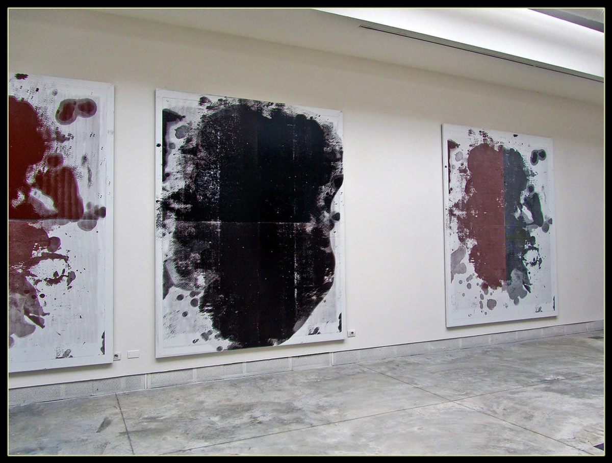
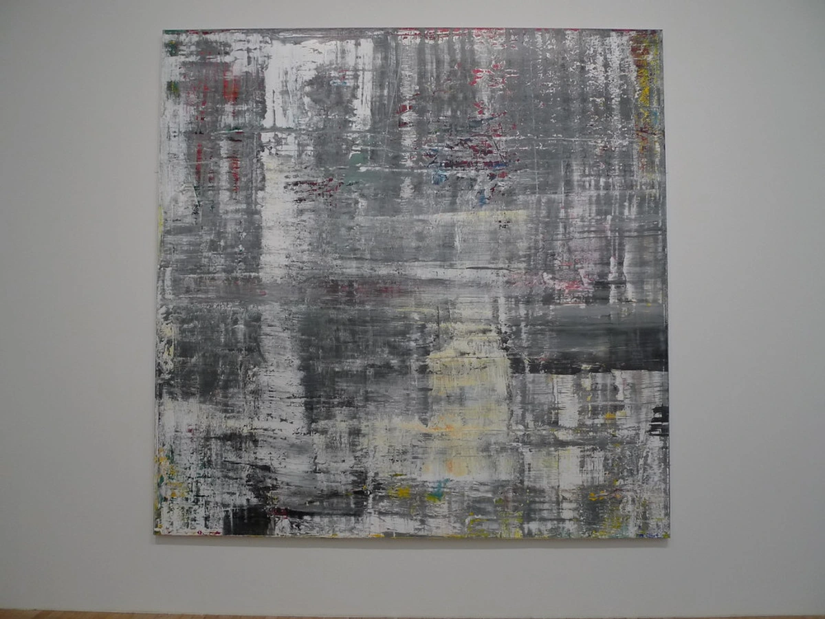
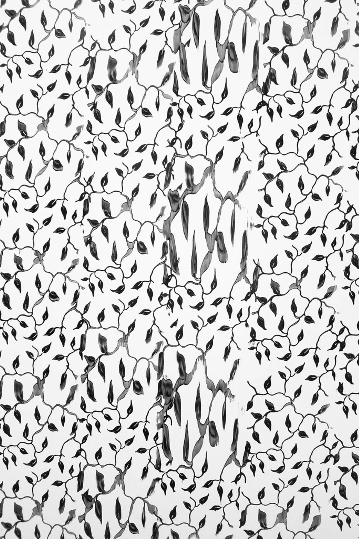
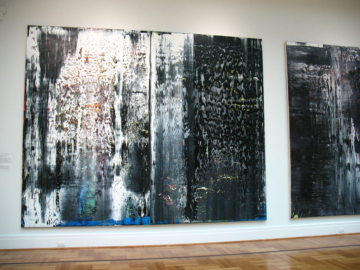
This isn't a new concept; artists throughout history have leveraged limited palettes to achieve specific effects. Consider the subtle tones and careful value shifts of old masters like Rembrandt, who used a restricted palette to focus on chiaroscuro and human emotion, emphasizing dramatic contrasts between light and shadow. Or the deliberate investigations into color relationships by Modernists like Josef Albers, whose rigorous "Interaction of Color" studies demonstrated the profound illusions and effects achievable with just a few hues, showing how color is always perceived in relation to other colors through careful, scientific exploration. Contemporary artists like Ellsworth Kelly, known for his bold, singular color panels, used a limited palette to reduce form to its essential elements, making color and shape the singular focus, stripping away the superfluous to highlight pure visual experience. Barnett Newman, with his 'zip' paintings, used stark, limited colors to explore the sublime and monumental, where the choice of a single hue often carried immense symbolic weight and spiritual aspiration. For artists like Kelly, the limited palette isn't just a choice; it's integral to their artistic brand, a signature of their aesthetic, proving that less can indeed be more when wielded with intention. Even a contemporary giant like Christopher Wool, whose work often explores text and abstraction through a stark, almost monochromatic lens, demonstrates the power of restraint. His large-scale, often black-and-white or subtly colored paintings, like those seen in his abstract series, use limited hues to create immense graphic impact and emotional weight, forcing the viewer to focus on texture, gesture, and composition rather than a riot of color.
Our brains are constantly processing visual information, and in today's visually saturated digital world, a riot of color can lead to immediate cognitive overload and visual fatigue. This makes it harder for viewers to discern forms, textures, or the core emotional message, often leading to a fleeting glance rather than deep engagement. A limited palette, conversely, reduces this visual noise. It allows the viewer's eye to rest, to delve into the subtle interactions of the chosen few colors, and to find meaning in their nuanced relationships, leading to a deeper, more profound connection. Beyond this, a focused palette can evoke specific, powerful moods—a deeply contemplative atmosphere with muted blues and greys, or a raw, primal energy with earth tones and stark blacks—because the absence of competing hues allows the emotional message to resonate unimpeded. It's like a quiet, intimate conversation that invites deep listening, rather than a crowded party where everyone is shouting. This reduction also profoundly resonates with philosophical movements throughout art history. Early 20th-century avant-garde movements like De Stijl or Suprematism, for instance, embraced reduction to its core, seeking not merely aesthetic purity but universal truths and a new visual language for a modern age, through simplified forms and a strictly limited color scheme. They believed that by stripping away the superfluous, they could arrive at a purer, more profound form of expression.
It forces you to be deliberate, to think about every single hue and how it interacts with its companions. There’s no hiding behind a rainbow; every stroke, every shade, every mix carries significant weight. This constraint, surprisingly, doesn't diminish creativity; it amplifies it. It's like being given a small, powerful flashlight in a dark room instead of a giant, unwieldy floodlight. You learn to focus, to appreciate the subtleties, and to make every beam count. But this philosophical shift wasn't just an intellectual exercise; it began to manifest in tangible, surprising ways, transforming my entire approach. And with these changes came a series of unexpected gifts, unwrapped one by one, that profoundly altered my artistic path, whispering promises of a deeper artistic connection. What treasures might you find by looking beyond the obvious?
The Unexpected Gifts of Constraint
Initially, the idea of limiting myself felt like punishment. My inner child threw a tantrum, stomping its feet and demanding all the shiny colors. Why couldn't I just have everything? I remember staring at just three tubes – a blue, a red, and an ochre – and feeling a wave of genuine artistic panic. It felt like being asked to write a symphony with only three notes. But then, slowly, tentatively, the magic started to happen, revealing depths I hadn't imagined.
- Clarity of Vision: With fewer colors to manage, my mind wasn't flitting between possibilities. It settled, allowing me to focus intensely on compositional principles, form, and the emotional impact of the chosen few. This newfound focus helps make clear decisions about the overall structure, like ensuring a harmonious balance between positive and negative space. Without the competition of many colors, the eye is forced to interpret lines, shapes, and their arrangement with greater precision and intention, revealing the underlying strength of the composition rather than camouflaging it with a multitude of hues.
- Enhanced Focus on Other Elements: When color takes a backseat, texture, line, shape, and value (lightness/darkness) step into the spotlight. I found myself paying far more attention to the viscosity of the paint, the texture of the brushstrokes, and how light played across the canvas. A bold, impasto stroke of thick paint, even in a muted tone like raw umber, can command attention and convey profound feeling in a way that a thin wash of a bright color might not, especially when surrounded by other muted hues. It was a revelation, making my work richer in unexpected ways. This intensified focus also pushed me to explore the language of line and the power of negative space in new dimensions, as these elements, unburdened by a riot of hues, became the primary carriers of meaning.
- Emotional Resonance Through Subtlety: You might think a limited palette means limited emotion, but it’s quite the opposite. When you're not overwhelmed by a spectrum, the nuances within a few colors become incredibly powerful. A shift in value, a slight adjustment in saturation, can convey deep feelings, making the viewer lean in closer, inviting them to understand abstract art styles for themselves. It’s like a quiet conversation that leaves a lasting impression, revealing the true emotional language of color.
- Improved Technical Understanding: Working with a limited palette forces an intimate understanding of each pigment. You learn their mixing properties, their transparency, their drying times, and how they react with each other in various ratios. This deep dive into the technical aspects of color not only improves your mixing skills but also builds a more profound, almost alchemical, relationship with your materials. You begin to grasp the subtle undertones of each color – the faint yellow in a seemingly pure red, or the hint of green in a blue – which become crucial for predicting and controlling your mixes. Additionally, understanding how different brands of the same pigment can have slightly varied undertones due to their unique formulations becomes a crucial piece of this puzzle.
Embracing these gifts of constraint was like learning a new language – one of profound, understated expression. What unexpected expressive tools might you uncover by simplifying your palette and embracing the quiet power of a chosen few? It truly is a transformative journey.
Choosing My Confidantes: Selecting Your Limited Palette
Understanding the 'why' behind a limited palette is crucial, but the 'how' is where the real magic unfolds. So, how do you begin to select these trusted companions for your artistic journey? It's not about randomly picking three tubes and hoping for the best – though I certainly had my share of disastrous "experiments" in the early days, leading to what I affectionately called my "mud-on-canvas" period. And let me tell you, some of those early attempts looked less like art and more like a particularly unfortunate spill from a toddler's art class, with hues that seemed to actively revolt against each other. For me, selecting a limited palette became an almost sacred ritual, like casting characters for a complex play. Each color had to contribute meaningfully to the narrative I wanted to create, carrying its own weight and collaborating harmoniously with its companions. I vividly recall one early experiment where I attempted to create a vibrant green with a specific blue and yellow. The result? A murky, desaturated swamp-like tone that looked more like pond scum than art. That was definitely a 'mud-on-canvas' day, and a stark reminder that even with few colors, intention is everything. A crucial early lesson was that the quality of your pigments also matters immensely; artist-grade paints, with their higher pigment load, will offer far more vibrant and predictable mixing results even in a limited palette compared to student-grade options. Another subtle, yet significant, factor to consider is the sheen or finish of your chosen pigments – a matte black next to a glossy white can create textural interplay as compelling as any chromatic contrast, especially in mediums like acrylics or oils. Additionally, consider pigment properties such as opacity versus transparency (some pigments are naturally more opaque, covering underlying layers, while others are translucent and allow light to pass through), and staining versus non-staining characteristics (how deeply a color penetrates the surface or whether it can be easily lifted), as these attributes greatly influence layering and mixing outcomes within a limited set. Transparent pigments, for instance, are fantastic for luminous glazes, while opaque ones offer strong coverage for bold statements.
I often gravitate towards what I call "power trios" – a primary color (or a dominant hue), a complementary or analogous partner to create harmony or tension, and a neutral (white, black, or a muted earth tone) to provide breathing room and modulate the others. The concept of color dominance is also important here; often, one color in your limited palette will serve as the primary hue, taking up more visual space or having a stronger presence to anchor the composition, while others act as accents or modifiers. This often aligns with the specific mood I want to convey, for instance, a dominant deep blue for introspection or a vibrant yellow for joy. Here are a few example palettes and the moods they can evoke:
Palette Example | Dominant Mood/Effect |
|---|---|
| Cadmium Red Light, Ultramarine Blue, Raw Umber | Moody, grounded, rich, warm, earthy tones with vivid contrasts. |
| Phthalo Blue, Muted Sap Green, Titanium White | Serene, atmospheric, cool, harmonious, gentle abstractions. |
| Cadmium Yellow Light, Cerulean Blue, Titanium White | Bright, airy, cheerful, luminous blends, almost childlike wonder. |
| Deep Violet, Burnt Sienna, Payne's Grey | Introspective, melancholic, sophisticated, subtle, with dramatic depth. |
| Black, White, Cadmium Red | Bold, graphic, striking, minimalist, with powerful statements and high contrast. |
Sometimes it's a split-complementary scheme, or perhaps just two colors and their tints/shades. The key is deliberation and understanding how artists use color effectively. Remember, the ratio of colors in your chosen palette can also profoundly influence the mood; a palette dominated by serene blues with a small, strategic accent of a warm red will feel very different from one with equal parts, even if the colors are the same.
Understanding Color Harmony and Discord
While strict color theory isn't the only guide, understanding the basics is invaluable. Knowing about color temperature (warm vs. cool), how complementary colors create intensity or neutralize each other, and how analogous colors provide harmony allows for incredibly nuanced choices within a limited set. It’s less about strict rules and more about feeling – what emotional landscape do you want to explore? Perhaps even trying a palette that includes a color you dislike can challenge your preconceptions and lead to unexpected discoveries!
Within a limited palette, understanding color harmony (how colors work together pleasingly) and color discord (intentional clashing for impact) becomes even more critical. Harmonious palettes, often using analogous colors or specific triadic schemes, can evoke serenity, balance, or subtle emotional shifts. Conversely, a limited palette can be powerfully used to create discord – for instance, by juxtaposing two highly saturated complementary colors with a neutral, the friction between them can generate intense visual energy and emotional tension, making a bold statement with very few elements. Don’t be afraid to experiment, to get a little messy, and yes, to occasionally create some mud. Your palette should feel like a trusted friend, one that understands your artistic language and challenges you to speak it more eloquently, helping you grasp the psychology of color.
Beyond the aesthetic, there's a quiet satisfaction, even a practical benefit, to a limited palette. Fewer tubes mean less waste, a smaller footprint, and surprisingly, a deeper connection to each precious pigment. It's an ecological and economical win, but more importantly, it reinforces the deliberate nature of every choice.
Once your trusted color companions are chosen, the real dance begins on the canvas, demanding a more intricate choreography between brush, paint, and canvas, turning constraint into a powerful tool for building depth and narrative.
My Brush with Restraint: Techniques and Revelations
Working with a limited palette isn't just about choosing fewer colors; it's about how you use them. It requires a different kind of dance, a more intricate choreography between brush, paint, and canvas, turning constraint into a powerful tool for building depth and narrative.
Mediums & Their Influence
The choice of paint medium also subtly influences your palette selection and how you approach it, especially concerning the opacity or transparency of your chosen pigments, as well as the unique properties of the binder itself. This is key because certain types of limited palettes naturally lend themselves better to specific mediums.
Oils, with their long drying times, allow for extended blending, making them ideal for nuanced shifts within a limited palette and achieving optical mixing through glazes. Their inherent transparency allows for luminous layering, making subtle shifts in hue and value incredibly rich. The slow-drying oil binder allows colors to merge seamlessly on the canvas, creating soft gradations and a deep, internal glow that makes a limited palette feel expansive. Often, a more transparent selection of pigments shines in oils.
Acrylics, drying faster, demand a more immediate and decisive approach, focusing on layering and building opacity quickly. This means pre-mixing your desired shades or working in distinct, deliberate layers, as blending on the canvas is limited but can yield bold, graphic results with fewer colors, especially leveraging the fast drying time for crisp edges and clear, defined shapes. The acrylic binder, a polymer emulsion, provides a fast-drying, often matte or satin finish that can give a limited palette a sharp, contemporary feel, excellent for strong, clear statements with a limited, often more opaque, palette.
Watercolors excel at transparency and washes, perfect for exploring delicate tonal variations and luminosity from a restricted set of hues, where layers build depth without becoming opaque. The water-soluble binder allows for breathtaking ethereal effects, where a limited palette with highly transparent pigments can create nuanced washes and vibrant, glowing color interactions that seem to emerge from within the paper.
Even though my core principles apply across mediums, understanding these inherent characteristics and the specific properties (opacity/transparency) of your limited color choices helps me select companions that will truly shine in their chosen environment. It’s like choosing the right instrument for a specific piece of music – each brings out a different quality in the melody.
Layering and Transparency: The Unseen Depths
One of my biggest revelations was the power of layering. With a limited palette, you can achieve incredible depth and complexity by building up translucent washes. For example, a thin wash of ultramarine blue glazed over a warm cadmium yellow creates a nuanced green that feels far richer and more alive than if you’d just squeezed green from a tube. This is a prime example of optical mixing, where individual layers of color are seen through each other, and the viewer's eye mixes them visually, resulting in a more vibrant and luminous effect. Each layer acts as a recipe for the viewer's eye, allowing colors to blend optically for richer, more complex hues than direct mixing. It's like watching a magic trick unfold right before your eyes, and you're the magician! This method allows for subtle color harmonies to emerge from unexpected interactions, or even carefully controlled color discord where layers create an intentional visual tension.
Another powerful technique is scumbling, where you lightly drag a dry brush with a small amount of opaque paint over a dry underlayer. This creates a broken, textural effect that allows the underlying colors to peek through, adding visual interest and another layer of complexity to your limited palette. If you're looking for more hands-on advice, I often share tips on how to approach abstract art in broader strokes.
This approach also invites experimentation with various paint types, as mentioned before. The scale of the artwork, too, benefits from this intentionality. For intimate pieces, subtle layering can create delicate narratives. For large-scale works, a limited palette ensures visual coherence and impact, preventing the canvas from becoming overwhelming, as each chosen color works harder to define vast spaces and bold gestures. How might this layering technique unlock new depths in your own work?
Intentionality in Mixing: Beyond "Mud"
With fewer tubes, every mix becomes a conscious decision. This might sound daunting, but it's where the true mastery lies. I learned to mix secondary and tertiary colors not by instinct, but by intention, understanding how slight variations in ratios affect the final hue and its value (lightness/darkness). To avoid the dreaded "muddy" outcomes, I quickly learned a few tricks: always cleaning my brushes or palette knives thoroughly between different color groups, and working from lighter to darker values (this is key because lighter pigments are often less opaque and can be easily contaminated or dulled by heavier, darker pigments, making it harder to lighten a dark mix than to darken a light one). I also found it invaluable to create small color charts to truly understand the potential of my chosen pigments; a "limited palette mixing chart" is a fantastic exercise to truly map out the full spectrum of possibilities from your chosen few. I still chuckle thinking about an early attempt to mix a vivid purple, only to end up with a brownish-grey blob that looked suspiciously like something I'd find on the bottom of my shoe. Yet, even those "mistakes" became lessons, showing me the subtle nuances of pigment interaction. Even creating what some might call "muddy" colors became an intentional act. A carefully mixed muted grey-green or a rich, dark brown, derived from my limited primary choices, can provide essential grounding and emotional weight to a piece, offering a quiet counterpoint to more vibrant passages. It's about knowing your colors intimately, understanding their lineage and potential, rather than relying on pre-mixed convenience. Practice creating a full range of tints (adding white) and shades (adding black or a dark complementary color) from your limited palette to truly expand its possibilities.
Texture and Mark-Making: Beyond Color
When the focus isn't solely on the 'wow' factor of a thousand colors, your hands become freer to explore other tactile dimensions. I started experimenting more with impasto painting, scraping, scratching, and bold brushstrokes. I also found that utilizing different tools – from traditional brushes to palette knives, sponges, or even my fingers, squeegees, rollers, and found objects – could create distinct textures that become more noticeable and expressive with a limited palette, each mark speaking volumes even in monochromatic tones. I found that the feel of the paint under my hand, the way it built up on the canvas, became as expressive as any color choice. These physical interactions with the paint add another layer of expression, a raw honesty that I sometimes felt got lost in a more complex color scheme. The texture itself becomes a language, speaking volumes even in monochromatic tones, turning every mark into an expressive gesture.
The Power of Negative Space and Composition
A limited palette naturally draws attention to the structural elements of your artwork. The empty spaces, the lines, the shapes – they all become more prominent because there isn't a multitude of colors distracting the eye. You learn to appreciate the silence between the notes, the pause that makes the music more impactful. This emphasis on composition helps create pieces that are not only visually striking but also incredibly balanced and harmonious, guiding the viewer's eye through the narrative you've carefully constructed. It’s about crafting a profound visual narrative, rather than simply decorating a surface, and understanding abstract art styles certainly helps in this regard.
Through these techniques, a limited palette transforms from a restriction into a wellspring of deliberate, profound expression. What unexpected expressive tools might you uncover by simplifying your palette? Perhaps a new way to tell your story, or an entirely new technique born from necessity. This deep dive into technique truly allows for creative freedom within self-imposed boundaries.
Overcoming the "Mud" and Embracing Discovery
Let's be real: it's not always sunshine and rainbows. Embracing a limited palette, while transformative, comes with its own set of practical challenges and learning moments, particularly when you're first navigating the boundaries of your chosen hues. There were (and still are) days when my limited palette feels too limited, when I crave that burst of a new color. I recall one particular frustrating afternoon, attempting to achieve a vibrant orange from a limited red and yellow, only to end up with a muddy, dull ochre. I nearly threw the brush across the studio. I remember thinking, this is it, I've officially painted myself into a corner, literally. But in that moment of defeat, I wiped the canvas clean, not with frustration, but with a new perspective. What if that "mud" wasn't a mistake, but a starting point for a different kind of beauty? I embraced the unexpected tone, layering subtle glazes of transparent blue and a touch of white over it, allowing it to become a rich, earthy undercurrent in a piece that ultimately became one of my most compelling works. That 'mud,' born of frustration, somehow carried more emotional weight than any 'perfect' orange ever could, proving that a carefully mixed complex neutral can be profoundly beautiful. It's also worth noting that some color combinations are inherently prone to creating muted tones – for instance, mixing a complementary red and green without careful control can easily result in a brown or grey. Understanding these tendencies allows you to anticipate and either lean into them or adjust your approach rather than fighting them. Another trick I learned for rescuing a muddy mix, if it’s not intentional, is to try adding a tiny amount of its complementary color to neutralize the dullness, or a touch of white to lighten and clarify.
Another time, I was trying to mix a specific, muted teal, but kept ending up with a murky, uninspiring grey-green. Instead of fighting it, I leaned into the grey, adding just a touch more white and a hint of yellow, and suddenly, I had a beautiful, atmospheric fog color I hadn't intended but instantly loved. It found its place in a minimalist landscape, providing a serene counterpoint to a bold indigo. On yet another occasion, my attempt at a smooth gradient with limited colors resulted in a jagged, unexpected texture. Instead of trying to smooth it out, I leaned into it, exaggerating the texture with a palette knife, creating a new, dynamic visual effect that I now intentionally employ. Those moments of frustration are part of the journey; they force me to dig deeper, to find a solution within the constraints, which ultimately leads to more innovative and personal expressions.
My advice? Don't be afraid to fail. Some of my most interesting discoveries have come from "mistakes" – an accidental mix, a brushstroke I initially regretted. This journey is about unlearning what you thought you knew about color and embracing a more intuitive, thoughtful approach. Give it a try. Pick three colors you love (or even three you think might hate each other, or one you actively dislike!) and see what conversation they start on your canvas. You might just surprise yourself and uncover a deeper connection to your creative process. What hidden potential might lie in your own 'mistakes'? This embrace of the unexpected is where true artistic growth flourishes.
Frequently Asked Questions (FAQ)
As I've shared my journey, many have asked about the practicalities of working with a limited palette. Here are some common questions I often receive, alongside my personal insights:
How many colors are typically in a limited palette?
That's a great question! While there's no strict rule, a common limited palette might consist of 2-5 primary or secondary colors, plus white and/or black. Some artists, however, push these boundaries even further, challenging themselves with purely monochromatic palettes (various shades of one color) to explore subtle value and texture changes. It truly depends on the artist's intention and the desired effect, but the beauty lies in making every color count.
What defines a "limited palette" in abstract art?
When we talk about a limited palette, it refers to the intentional use of a small, curated number of colors (typically 2-5, sometimes including black and white) to create an entire artwork. It's a deliberate artistic choice to maximize the expressive potential of these few hues through thoughtful mixing, layering, and varied application. For me, it became a way to force clarity, like honing in on a single, resonant note in a symphony.
It's important to distinguish a "limited" palette from a "restricted" palette. A limited palette implies an intentional artistic choice, a strategic constraint to explore deeper possibilities. A "restricted" palette, on the other hand, might imply a lack of available colors or a deficiency in skill, which is certainly not the spirit of this approach. For example, if an artist only had access to red, yellow, and blue due to wartime rationing or remote location, that would be a restricted palette borne of circumstance, not a deliberate artistic choice. It's about empowering your art through focus.
While a limited palette involves few colors, it's distinct from:
- Monochromatic palettes: Here, you use various shades and tints of a single color (e.g., a painting solely in blues from light to dark), focusing purely on value and intensity within one hue.
- Analogous palettes: These feature colors that are next to each other on the color wheel (e.g., blues and greens), creating natural harmony and smooth transitions.
- Complementary palettes: These use colors directly opposite each other on the color wheel (e.g., red and green) for high contrast and vibrancy.
A limited palette can include elements of these, but its core principle is the deliberate restriction and intense exploration of a chosen few, potentially contrasting, hues. This nuanced understanding helps clarify the intentionality of the approach.
Can I still achieve vibrancy and depth with a limited palette?
Absolutely! Vibrancy isn't solely about the number of colors; it's about their interaction and how they're applied. Through careful mixing, layering, and understanding color temperature and value, you can create astonishing depth, contrast, and visual energy even with just a few colors. In fact, the strong contrast between even a few well-chosen hues (whether in value, temperature, or saturation) can often create a more powerful and resonant vibrancy than a chaotic explosion of many colors. Think about the concept of color vibration or simultaneous contrast, where two colors placed next to each other intensify each other, creating a dynamic, almost shimmering effect – a powerful phenomenon achievable with a carefully chosen, limited set. It’s a testament to the fact that expressive power often comes from strategic choices, not sheer volume. I've often found my most vibrant pieces were born from these thoughtful limitations.
Is working with a limited palette harder than using a full one?
In some ways, yes, because it demands more intentionality and a deeper understanding of color relationships and compositional principles. The challenge shifts from the overwhelming choice of a full palette to the mastery and innovative problem-solving within the constraints of a limited one. It's like learning to play a complex piece with just a few keys. However, in other ways, it can be incredibly liberating, as it removes the burden of endless options and allows you to focus intensely on other artistic elements, which has been a profound relief for my often overthinking mind.
How do I select a limited palette to evoke a specific mood or theme?
This is where the magic truly happens! Start by considering the emotional qualities you associate with certain colors. For a calm, meditative mood, think muted blues, soft greys, and perhaps a touch of desaturated green or warm beige – colors that evoke tranquility and introspection. For a dramatic or energetic piece, you might choose a strong complementary pair like a deep red and a rich green, or a vibrant primary triad, using varying values and saturation to build tension or excitement. Understanding the psychology of color is invaluable here. Experiment with one dominant color that sets the tone, then select one or two others to support or contrast it. Don't be afraid to create small studies or color swatches to see how your chosen colors interact and resonate with your intended theme before committing to a larger canvas.
How do I transition from a full palette to a limited one without feeling restricted?
Start small. Instead of a drastic cut, try reducing your usual palette by half, or pick two colors you love and add white/black. Focus on understanding the relationships between these few colors, how they mix, and how they react when layered. Embrace the feeling of restriction as a creative prompt, a puzzle to solve. The discomfort often leads to unexpected freedom and innovative solutions. Think of it as a creative adventure, not a punishment – that's certainly how I've come to see it. Perhaps even try a palette that includes a color you actively dislike to truly challenge your artistic comfort zone!
Are there any practical benefits to using a limited palette beyond the artistic ones?
Absolutely! Beyond the aesthetic and creative advantages, a limited palette can be surprisingly practical. It often means less paint waste, as you become more intentional with every drop and mix. This can lead to cost savings over time and a more environmentally conscious practice, which is something I personally value. It's a win-win: creative growth and a lighter footprint.
Where can I see examples of your limited palette work?
You can explore a selection of my abstract pieces, some of which feature a limited color palette, right here in my art for sale section. I often experiment with various approaches, and you'll find examples of how I've applied these principles there.
Conclusion: The Endless Possibilities of Few
Stepping into the world of limited palette abstract art was less about finding restrictions and more about discovering boundless new frontiers. It's a journey that continually teaches me about patience, intention, and the profound beauty that can emerge from thoughtful restraint. It’s a testament to the idea that true strength often lies not in having everything, but in knowing how to wield the few things you have with mastery and grace. This transformative approach has truly deepened my connection to my artistic practice. Beyond painting, embracing a limited palette can also serve as a gateway to exploring other artistic constraints, such as focused brushwork (e.g., using only flat brushes), specific compositional limitations (e.g., only horizontal and vertical lines, or a predetermined grid), or even a restricted range of materials (e.g., using only natural pigments or recycled elements), further deepening your creative practice. This principle extends beyond painting, finding application in digital art (think limited color grading or pixel art), photography (monochromatic studies or selective color), or even sculpture (using only natural materials or a single type of metal), proving its universal power in artistic expression.
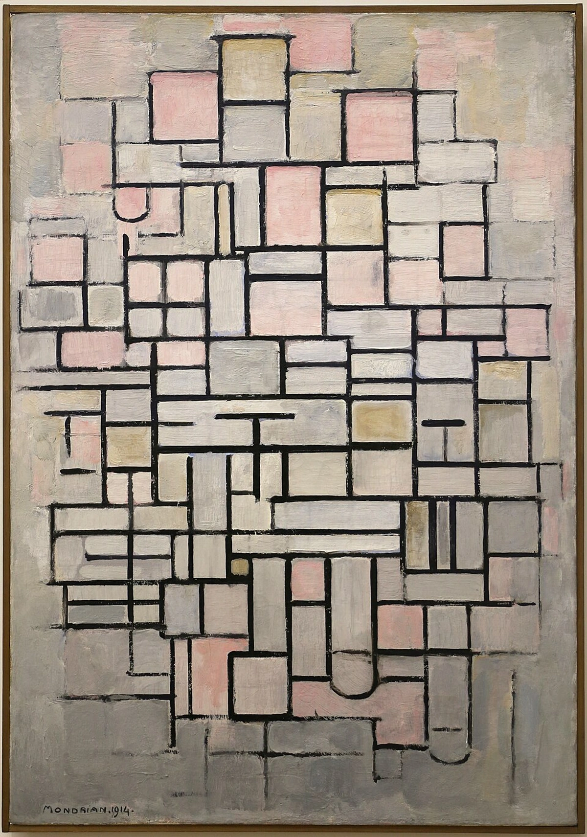
If you’re an artist feeling overwhelmed by choice, or simply curious about pushing your boundaries, I wholeheartedly recommend giving a limited palette a try. Consider picking up just three tubes of paint this week and see what conversation they start on your canvas. It might just be the quiet revolution your art needs. My own artistic journey has been shaped by these kinds of explorations, as you can see by tracing my timeline of work and evolution. And perhaps, one day, you might even see some of these limited palette explorations exhibited at a place that celebrates artistic inquiry, like the museum in 's-Hertogenbosch. Whatever your path, remember that every limitation can become a springboard for innovation. I'd love to hear your thoughts or experiences with limited palettes – what have you discovered? Until then, happy creating, and remember: sometimes, the most powerful statements are made with a whisper, not a shout. What whispers will your palette create?


