The Ultimate Guide to Professional Watercolor Sets: Unlock Brilliance
My personal journey and guide to professional watercolor sets. Discover pigment purity, lightfastness, and handling, plus top brands like Daniel Smith, Schmincke, and Sennelier. Find tips for lasting, vibrant art.
The Ultimate Guide to Professional Watercolor Sets: Unlock Artistic Brilliance!A Personal Journey into Pigment, Flow, and Lasting Art
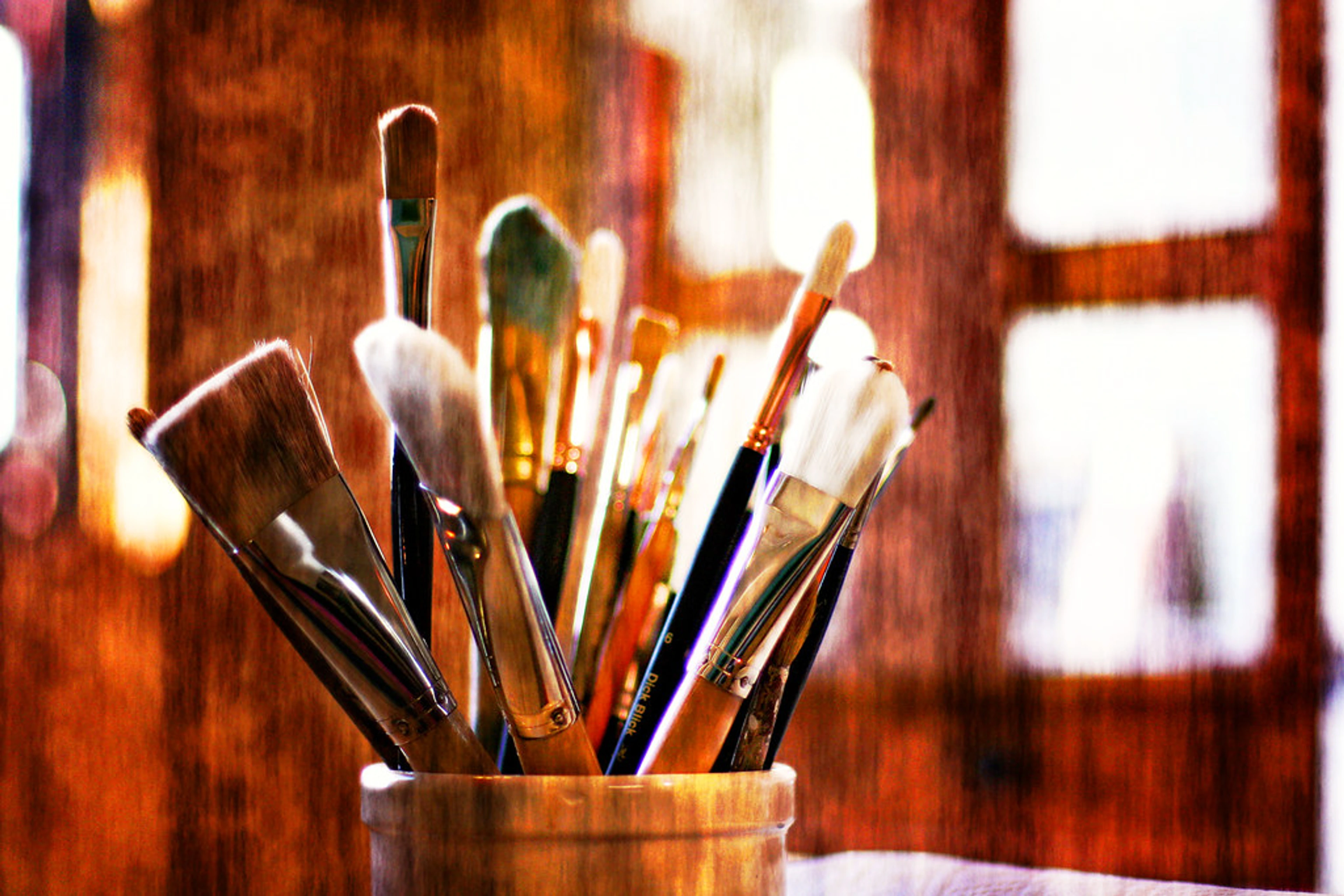
Alright, let’s talk about watercolor. Specifically, let’s talk about choosing the professional sets that truly make a difference in your art, because frankly, life's too short for muddy colors or fleeting vibrancy. If you're anything like me, you've probably stood in an art supply store, slightly overwhelmed, wondering if the extra investment for a 'professional' label is actually worth it. I once spent an hour staring at rows of blues, convinced I needed a PhD in indigo to tell them apart – a bit embarrassing, but true! Or perhaps you're already deeply in love with the medium and just hunting for that next perfect pigment. This article is my very personal journey and curated guide, drawing from countless hours of testing, comparing, and getting my hands gloriously stained, all to help you navigate the shimmering, sometimes frustrating, world of high-quality watercolor paints. We'll explore history, the nitty-gritty of what makes a paint 'professional,' my own quirky criteria, and then dive into some of my favorite brands. So, grab a cup of coffee (or tea!), and let's unravel the secrets to truly brilliant watercolor together.
You know, there’s something almost magical about watercolor. It’s fluid, unpredictable, and yet, in the right hands (or even in mine, on a good day!), it can create the most exquisite, luminous effects. I’ve had a love-hate relationship with it over the years, often preferring the boldness of acrylics or the depth of oils. But lately, I’ve found myself drawn back to its delicate charm, especially when I’m trying to capture a fleeting moment or an abstract idea with a whisper rather than a shout. This journey back to the brush led me to a rather intense obsession: figuring out which professional watercolor sets truly stand out. It’s a bit like deciding which path to take on your artistic timeline, a choice that subtly shapes everything that comes after. You want the tools to cooperate, right? No one wants muddy colors or pigments that fade faster than a summer tan. Consider this less a dry review and more a chat over coffee about what truly excites me in a palette, especially when I think about the vibrant art I create and even display at my modest museum in 's-Hertogenbosch.

A Brief History: Why Watercolor Endures and Evolves
Before we dive into the juicy details of modern professional sets, let’s pause for a moment to appreciate the humble origins and enduring legacy of watercolor. It’s a medium with a surprisingly rich history, dating back to ancient Egypt for papyrus decoration and finding particular prominence in European art during the Renaissance for manuscript illumination. Later, masters like J.M.W. Turner elevated it to a fine art form, demonstrating its incredible versatility from delicate landscapes to powerful seascapes, often using its quick-drying nature for on-the-spot studies. Think of Albrecht Dürer, whose intricate naturalistic studies from the 15th century showcased its precision, or Paul Sandby, often called the "father of English watercolor," who helped establish it as a distinct and respected medium. In America, Winslow Homer's powerful, expressive watercolors captured the raw beauty of the coast, often utilizing the medium's portability for his plein air works. During the Romantic and Impressionist periods, artists embraced its spontaneity and luminosity, capturing fleeting moments with an immediacy that other mediums couldn't quite match, making it a favorite for rapid sketches and atmospheric effects. Even the Pre-Raphaelite Brotherhood in 19th-century England made extensive use of watercolor for their highly detailed and symbolic works. And don't forget its indispensable role in scientific illustration, from intricate botanical plates to precise zoological drawings. This legacy of expressive freedom, combined with its practical adaptability, is, I think, part of its enduring appeal even today.
My Personal Criteria: What I Look For in a Professional Palette
Okay, so we'll get to the technical stuff, but first, let's talk about what truly matters to me when I’m actually sitting down with a new set. Because let’s face it, art supplies are a very personal thing, and what works for my slightly eccentric painting style might not be your absolute holy grail. It's the difference between textbook knowledge and hands-on experience, where the paint meets the paper – and often, my impatience!
- Rewettability (The Lazy Artist's Dream): This is huge for me. I often paint in short bursts, or I might walk away from my palette for an hour (or a day) and come back. If the pans are a struggle to reactivate, it breaks my flow. I want that vibrant color to leap onto my brush with just a spritz of water. I once ruined a perfectly good morning coffee trying to coax a stubborn, dried-up student pan back to life – never again, I declared to my cat, who mostly just blinked at me.
- Color Saturation & Transparency: I love rich, intense colors, but I also adore the luminosity and transparency that watercolor is famous for. The best sets offer both – colors that can be built up to intense hues or thinned down for delicate, transparent washes. This duality is achieved through finely ground, pure pigments that disperse evenly and allow light to pass through them, reflecting off the white paper beneath. It’s what gives watercolor its unique glow, a quality I often seek in my own abstract pieces, exploring the emotional language of color in abstract art.
- Mixing Prowess & Color Theory: A limited palette of high-quality colors that mix beautifully is far more valuable than a huge set of mediocre ones. I'm always thinking about my approach to color mixing: creating vibrant palettes in abstract painting and how well individual pigments interact. Do they create vibrant secondary and tertiary colors, or do they quickly turn to mud? Single-pigment colors are often prized for their clean mixing properties. When selecting colors, I consider principles of color theory – thinking about warm and cool primaries, complementary colors, and how they build harmonious (or intentionally discordant) palettes. A well-chosen professional set makes implementing these theories a joy, even for my sometimes haphazard approach.
- Granulation (Oh, the Texture!): This is a personal preference, but I absolutely adore granulation – the effect where pigments settle into the paper's tooth, creating a beautiful, subtle texture. Some pigments granulate more than others, and I often seek out sets with good granulating options, especially for abstract work or landscapes. It adds so much character, almost like the whispered secrets of the paint. I once used a granulating blue in a sky and it looked like tiny stars, without me even trying! It was a happy accident turned intentional technique.
- Handling and Flow: Beyond just rewetting, how does the paint behave on paper? Does it glide or does it resist? Does it pool beautifully or create frustrating back-runs? These are the subtle dances that make or break a painting session.
- Brush Responsiveness: How easily does the paint load onto the brush and flow off it onto the paper? Is it smooth, or does it feel sticky? Does it release pigment evenly?
- Wash Characteristics: Can it create beautiful, soft, even washes? Or does it tend to bloom and back-run excessively (though sometimes these effects are desirable, it's good to have control!).
- Lifting & Layering: How well can you lift color if you make a mistake or want to create highlights? Can you layer transparent washes without disturbing previous, dried layers? Different brands have unique handling characteristics due to their binders and pigment loads, influencing everything from wet-on-wet techniques to precise detailing.
- Viscosity & Body: This refers to the paint's thickness and how it feels on the brush. Some paints are very fluid, others have a creamier, more substantial 'body.' This affects how much pigment you can load, how it releases, and the textural marks you can make. It's a subtle but significant factor in the overall painting experience.
- Permanence Beyond Lightfastness: While lightfastness is crucial (we'll dive into that in a moment), I also think about the overall permanence of a paint. Does it resist mold growth in humid conditions? Are there any known issues with chemical degradation or interactions with other mediums over very long periods? For truly archival work, these subtle factors contribute to the longevity and stability of your art. It’s an extra layer of peace of mind.
- Pan vs. Tube: While I love the intensity of tubes for studio work and filling my own pans, for reviewing a "set," I'm primarily focusing on pre-filled pans for convenience and portability. However, it's worth noting that tubes generally offer a higher pigment load because they are a concentrated paste with less evaporated water. This allows for more intense color straight from the tube and is often the source for filling dried pans. The drying process in pans can subtly alter the paint's texture and handling compared to its direct tube form, making tube paints feel slightly creamier or more vibrant when first squeezed.

What Makes a Watercolor Set "Professional" Anyway?
Now that we've covered my personal wish list, let’s get on the same page about what "professional" really means when it comes to watercolors. Because, let’s be honest, marketing claims can sometimes stretch the truth thinner than a very diluted wash – and I've fallen for those shiny labels more times than I care to admit! For me, it boils down to a few critical factors that elevate a set from student-grade fun to serious artistic tool.
- Pigment Purity and Concentration: This is the big one. Professional paints use high concentrations of pure, finely ground pigments. What does that mean for you? Brighter, more vibrant colors that retain their intensity even when diluted. Student paints often use more fillers (like chalk or clay), which can lead to duller, chalkier results. This is sometimes misleadingly called "over-pigmentation" – where the color seems strong but lacks transparency and vibrancy due to these inert fillers, not actual pigment load. True professional paints have a high pigment load, meaning more pure color and less filler, leading to a much richer, cleaner painting experience. It's like comparing a concentrated fruit juice to a lightly flavored water – both offer taste, but one delivers far more punch per drop. Professional pigments also come in various types – earth pigments (ochres, siennas), inorganic pigments (cadmiums, cobalts), and synthetic organic pigments (quinacridones, phthalos), each with unique properties affecting transparency, staining, and granulation.
- Understanding Pigment Names and Numbers (CI Numbers): This might sound like a deep cut, but for serious artists, understanding the Colour Index (CI) name and number (e.g., PB29 for Ultramarine Blue) is invaluable. Think of it as a secret code for pigment nerds – these codes denote the actual pigment used, not just the marketing name. They help you understand a paint's properties (like lightfastness or transparency), predict mixing behavior, and ensure consistency across brands or when refilling. This detail reveals a brand's commitment to quality and transparency. Also, watch out for "hue" paints (e.g., Cadmium Red Hue). While some professional brands offer them to mimic expensive or toxic pigments (reducing cost or enhancing safety), they typically use different, often less vibrant, pigments and won't behave identically to the genuine article. For pure artistic expression, genuine single-pigment colors are usually preferred for their clean mixing and predictability, though hues can be a viable, safer alternative for practice or when working with younger artists.
- Lightfastness: Ever seen a beautiful painting that’s faded over time? It’s heartbreaking. Professional paints are rigorously tested for lightfastness, meaning their pigments are resistant to fading when exposed to light over long periods. Look for ASTM ratings (I, II, III) or similar ratings on the tubes or pans. The ASTM (American Society for Testing and Materials) provides standardized ratings:
- ASTM I (Excellent Lightfastness): This is archival quality, meaning your artwork should last 100+ years without noticeable fading under museum conditions. This is what you're aiming for if you plan to sell your art or create lasting pieces.
- ASTM II (Very Good Lightfastness): While still professional grade, these pigments may show very slight fading over extended periods (50-100 years). Still excellent for most professional work.
- ASTM III (Fair Lightfastness): These pigments are likely to fade significantly in just a few years, even under indirect light. Best avoided for artwork intended to last. Beyond simple fading, pigments with poor lightfastness can also experience subtle hue shifts or changes in transparency/opacity over time, subtly altering your original artistic intent. This is especially important if you plan to sell your art, ensuring your investment as a seller and a collector is protected.
- Binder Quality & Sizing: Most watercolors use Gum Arabic as a binder. Professional sets use high-quality binders that ensure the pigment flows smoothly, adheres well to the paper, and rewets easily without becoming gummy or brittle. Sometimes, they even add a touch of honey or glycerin for extra moisture and rewetting properties, which I absolutely adore! The quality of the binder also influences how the paint "handles" on paper. Interestingly, not all gum arabic is created equal; Kordofan Gum Arabic, often sourced from acacia trees in Sudan, is highly prized for its purity and consistent performance, leading to smooth flow and easy rewetting, while other grades (like Senegal Gum) might vary. Some brands even use more modern, synthetic binders that offer specific handling characteristics, like enhanced transparency or flow. Furthermore, the paper itself is often treated with sizing (internal sizing within the pulp, external sizing on the surface) to control absorbency, and a good binder works in harmony with this sizing to prevent colors from sinking in too quickly or looking dull.
- Minimal Fillers: As mentioned, student paints often contain fillers to reduce cost. Professional paints keep these to a minimum, ensuring you're paying for pure pigment, not inert chalk. This directly impacts the paint's vibrancy and transparency.
The Paper: An Unsung Hero of Watercolor
Before we jump into the brands, we must talk about paper. It’s often overlooked, but the right paper is as crucial as the paint itself, especially with watercolor. Think of it as the foundation for your artistic house – without a good one, even the most beautiful paint can't shine. The quality, texture, and absorbency of your paper will profoundly affect how your watercolors behave, how vibrant they appear, and how well your techniques work. For a much deeper dive, check out my thoughts on the best watercolor paper for artists: a review.
- Material Matters: Look for paper that is 100% cotton (also called rag paper). It’s more expensive but holds water beautifully, allows for multiple washes without buckling or pilling, and ensures your colors retain their vibrancy. Wood pulp papers are fine for practice but can buckle, pill, and absorb paint unevenly.
- Weight is Key: Watercolor paper is measured in pounds (lb) or grams per square meter (gsm). I typically recommend at least 140lb (300gsm). Lighter papers will buckle excessively, while heavier papers (200lb, 300lb) offer superior flatness and absorbency, perfect for very wet techniques.
- Texture (Surface Finish): This is a personal preference and a big factor in how your paint behaves:
- Cold Press (NOT): This is the most popular choice. It has a medium texture, offering some tooth for granulation but still smooth enough for details. It's versatile and forgiving.
- Hot Press: Very smooth, almost like drawing paper. Ideal for fine details, botanical illustrations, and smooth washes where granulation is undesired. Colors can appear more intense due to the lack of texture.
- Rough: As the name suggests, it has a pronounced texture. Fantastic for expressive landscapes, adding drama and allowing pigments to settle into deep valleys for maximum granulation. It's less forgiving for fine detail.
- Water Quality: A quick note on an often-forgotten detail: even the quality of your water can subtly impact your painting. Hard water with high mineral content can sometimes affect pigment dispersion or leave slight mineral deposits upon drying. While not usually a deal-breaker for most, if you find your paints behaving oddly, especially in very clean washes, try distilled water as a minor optimization for perfectionists.

Tackling Common Watercolor Challenges
Even with professional-grade paints and paper, watercolor can be a tricky beast. I've certainly had my share of frustrating moments, learning through many happy (and not-so-happy) accidents. But I've also learned that many common issues can be mitigated by understanding your materials and a few simple techniques.
- Avoiding "Muddy" Colors: This is perhaps the most common complaint, even with pure pigments. Mud often happens when you over-mix too many pigments, especially those that are opaque or have different specific gravities and settle unevenly. It can also occur when you simply keep fussing with a wet area for too long. To prevent this, stick to a limited palette of single-pigment colors, understand how your chosen pigments mix (test them on a scrap first!), and avoid overworking wet areas. Transparent pigments tend to mix cleaner than opaque ones, which can quickly dull a blend. And remember, sometimes less is more in the delicate dance of watercolor.
- Controlling Blooms and Back-runs: These are those unwanted cauliflower-like patterns that appear when clean water or a lighter wash hits a semi-wet wash, pushing the pigment aside. While sometimes used intentionally for effect, they can be frustrating. The best defense is to ensure your paper is consistently wet (or completely dry) before applying the next layer, or to work quickly and decisively. High-quality paper helps by allowing for more even drying, giving you a slightly longer working time.
- Achieving Smooth Washes: For large, even washes, tilt your paper slightly and apply a generous, consistent amount of paint. Don't go back into an area that's started to dry, as this can create streaks. Again, good quality, sized paper helps immensely by slowing down drying and allowing the pigment to settle evenly, letting the water do its job without interference.
- Handling Staining Colors: Ah, the dreaded staining pigments! These colors, like Phthalo Blue or Alizarin Crimson, deeply bond with the paper fibers, making them notoriously difficult to lift once dry. It's not a flaw, just a characteristic to be aware of. To manage them, try to be confident in your placement and use a lighter hand initially. If you need to lift, do it while the paint is still wet or very recently dried, using a clean, damp brush and blotting. Consider using masking fluid to protect areas you absolutely want to remain white before applying staining colors nearby.
The Contenders: My Honest Thoughts on Top Professional Watercolor Sets
Alright, let’s get to the fun part. Over the past few months, I’ve spent quality time with several renowned professional watercolor sets. Here’s what I’ve observed, felt, and mused about. Please keep in mind, these are my subjective opinions based on my experience, and every artist's journey is unique! What might sing to me might whisper to you, but hopefully, my notes give you a good starting point.
1. Daniel Smith Extra Fine Watercolors
Ah, Daniel Smith. Often held up as the gold standard, and honestly, they live up to a lot of the hype. Their range is just staggering, with unique colors you won't find anywhere else, like their Primatek series made from actual minerals – a true delight for granulation lovers. It's enough to make a grown artist weep with joy (and maybe a little bit of existential overwhelm at the sheer choice).
- Pros: The pigmentation is incredible – rich, vibrant, and a joy to work with. They rewet beautifully, even after drying completely, which is a huge plus for my sporadic painting style (my studio time often involves more interruptions than painting!). The granulation in many of their colors is just chef's kiss – so much texture and depth, consistently producing those beautiful, subtle effects I adore! Their mixing properties are top-notch, allowing for an endless array of harmonious blends. Their range of unique single-pigment colors is unparalleled, offering artists truly distinct options, like their stunning quinacridones known for their intensity and glow. I remember using their Lapis Lazuli pigment for a starry night sky, and the natural sparkle it created was simply magical. The feel on the brush is generally smooth and inviting, allowing for both delicate washes and concentrated strokes.
- Cons: Price, naturally. They're an investment, sometimes feeling like you're buying tiny jewels. Also, their pan sets can be a bit limited in terms of color selection compared to their tubes, but you can always buy individual half-pans to customize. Some find the sheer number of options overwhelming, a delightful problem to have, if you ask me.
- My Take: Despite the cost and vastness, if you’re serious about professional watercolors and want unparalleled choice and quality, Daniel Smith is a fantastic starting point. It’s where I often direct artists curious about a definitive guide to paint types for artists and want to understand the best. Dive in for depth and discovery.
2. Schmincke Horadam Aquarell
My heart has a soft spot for German engineering, and Schmincke Horadam is no exception. These are another top-tier choice, often praised for their incredible brilliance and superb rewetting properties, thanks in part to their use of Kordofan Gum Arabic and ox gall.
- Pros: The colors are incredibly brilliant and clean, almost singing on the paper. They rewet almost instantly, even with just a whisper of moisture, which makes them a dream for quick studies or when you just need to jump straight into painting (no more coffee-related pan-revival incidents!). Their pans feel very concentrated, and a little goes a long way. I particularly love their strong, clear blues and greens, which maintain their clarity even in complex mixes. The handling is exceptionally smooth, gliding effortlessly. Their granulation is refined and predictable, adding subtle texture without being overpowering, which is perfect for more traditional landscapes or portraits. I once used their deep greens to paint a forest, and the way the colors layered and settled was just exquisite. The brush feel is consistently creamy and responsive, almost like the paint anticipates your next move.
- Cons: Again, the price point is definitely in the professional bracket. The pan shapes can sometimes feel a bit small if you have a big brush and an even bigger idea, but that's a minor quibble for the sheer quality you're getting.
- My Take: For artists who prioritize intense, pure colors and effortless rewetting, Schmincke Horadam is a strong contender. They offer a reliable, consistent experience, almost like a perfectly tuned instrument, delivering beautiful results every time. For pristine brilliance and effortless flow.
3. Winsor & Newton Professional Water Colour
This is a classic. Winsor & Newton have been around forever, and there’s a reason for their enduring popularity. Their professional line is what many artists cut their teeth on, and it’s a solid, dependable choice.
- Pros: They have a really broad, well-balanced palette of colors, many of which are single-pigment for clean mixing. Their transparency is excellent, allowing for beautiful layering without muddiness – a true workhorse for delicate glazes. They're widely available, which is a practical consideration for refilling or expanding your palette quickly. Their granulation is generally moderate and refined, providing a gentle texture that complements both detailed and broader wash applications. It's a dependable studio staple, always ready to perform, making them a safe and satisfying choice. I've used their Payne's Gray for years for shadows and moody skies, and it always performs reliably. On the brush, they offer a familiar, predictable feel that makes them highly versatile for various techniques.
- Cons: While excellent, I sometimes find their colors a touch less vibrant or granulating than Daniel Smith's, depending on the pigment. But this is splitting hairs at a professional level; they're still incredibly high quality.
- My Take: A fantastic all-rounder. If you're looking for a dependable, high-quality professional set from a brand with a long history and consistent performance, you can't go wrong with Winsor & Newton. The reliable workhorse of professional palettes.
4. Sennelier L'Aquarelle French Artists' Watercolors
Oh, Sennelier. There’s something so luxurious and unique about these paints, largely due to their signature binder: honey. This isn't just a marketing gimmick; the honey makes them incredibly creamy, vibrant, and unique in their rewetting – almost buttery on the brush.
- Pros: The honey binder keeps the paints moist and vibrant, even in dry climates. They rewet like a dream, almost creamy on the brush, feeling incredibly luscious. The colors are incredibly luminous and intense, with a beautiful flow. I find their reds and yellows particularly gorgeous, offering a truly distinctive feel that makes them a joy to use for vibrant abstract work. Their granulation tends to be subtle, contributing to smooth, even washes, but certain pigments still offer lovely texture when allowed to settle. I once used their Opera Pink for a floral piece, and the sheer vibrancy and delicate flow made the petals practically glow. The feel is unmistakably smooth and buttery, offering a unique tactile experience that I absolutely adore.
- Cons: Because of the honey, they can be a bit stickier in humid conditions, and yes, they can attract tiny ants if left open (ask me how I know – it was a tiny, sticky disaster, and my cat got very curious!). Also, the initial cost is on the higher side.
- My Take: If you love a creamy, intense watercolor that stays moist and rewets beautifully, Sennelier is an experience. It’s a bit different, but in a very good way. It reminds me a bit of the emotional language of color in abstract art – they just feel different, almost like they have a personality. Indulge in a sweet, luminous painting experience.
5. M. Graham Watercolors
M. Graham is a bit of a hidden gem for some, but once you try them, you understand the devotion. They also use a honey-based binder, similar to Sennelier, which contributes to their incredible workability and rich consistency.
- Pros: Super vibrant, rich colors that rewet beautifully and retain their intensity. Their consistency is smooth and creamy, making them a pleasure to work with from the first brushstroke. They also offer a good range of single-pigment colors for clean mixing. I find their earthy tones particularly beautiful and nuanced, often with lovely granulation that adds natural depth and texture, perfect for natural landscapes or textured abstract pieces. They possess excellent handling characteristics, allowing for subtle transitions and vibrant layers. Their Sap Green, for instance, has a gorgeous depth and lovely granulating quality that brings life to foliage. The creamy feel on the brush is a standout feature, making them incredibly intuitive and responsive.
- Cons: Their availability might be slightly less widespread than the larger brands, but they're easily found online. Like Sennelier, they can be a bit stickier due to the honey, so keep them covered unless you want unexpected studio visitors (or curious cats!).
- My Take: M. Graham offers exceptional quality and a beautiful painting experience. If you enjoy the properties of a honey-based paint but want to explore beyond Sennelier, these are definitely worth checking out. They offer a unique depth that sets them apart. Discover nuanced vibrancy with a creamy touch.
Professional Watercolor Sets: At A Glance
To help you visualize the differences, here's a quick comparison of the brands I've reviewed. Remember, these are generalizations, and individual pigments within each brand will vary! What might be a pro for one artist could be a quirky challenge for another.
Feature | Daniel Smith | Schmincke Horadam | Winsor & Newton Prof. | Sennelier L'Aquarelle | M. Graham |
|---|---|---|---|---|---|
| Rewettability | Excellent | Instant | Very Good | Creamy, instant | Excellent, creamy |
| Vibrancy | Outstanding (Primatek unique) | Exceptional, clean | Very Good, balanced | Luminous, intense | Super vibrant, rich |
| Granulation | Many excellent granulators | Good, refined & predictable | Moderate, refined | Subtle, but present | Good, especially earth tones |
| Binder | Gum Arabic | Kordofan Gum Arabic + Ox Gall | Gum Arabic | Honey + Gum Arabic | Honey + Gum Arabic |
| Brush Feel | Smooth, inviting | Creamy, responsive | Familiar, predictable | Buttery, luxurious | Creamy, intuitive |
| Price Point | High | High | Mid-High | High | Mid-High |
| Best For | Texture, variety, unique pigments | Brilliance, effortless flow | Dependability, classic choice | Luminous flow, creamy texture | Nuanced vibrancy, rich earth tones |
| Notes | Vast range of unique pigments | Consistently pure & intense | Widely available, reliable | Distinctive honey feel | Excellent handling, earthy hues |
Choosing Your Own Professional Path: A Few Thoughts
So, how do you pick your perfect set from this glittering array? It's like choosing a favorite song – it's deeply personal, and what moves me might just be background noise to you. There’s no single answer, only the answer that resonates with your artistic soul and your unique developing your unique artistic style.
- Consider Your Budget: Let's be real, professional sets are an investment. Start with a smaller set (6-12 colors) from a reputable brand if you're unsure. You can always expand later. Think of it as investing in your artistic journey. Don't feel pressured to buy the most expensive set right away; even a small, high-quality palette can teach you volumes.
- Budget-Friendly Professional Choices: "Professional" doesn't always mean the most expensive. Sometimes it means the best value for quality. Brands like Holbein or Da Vinci can offer excellent professional-grade paints at a slightly lower price point than the very top tier. Also, remember that buying individual pans or tubes and building your own palette can be more cost-effective in the long run than pre-assembled large sets, especially if you know your favorite pigments. This allows you to curate a palette perfectly suited to your needs without breaking the bank. For beginners wanting to invest in quality, starting with a well-curated primary set (a warm and cool red, yellow, blue) from Winsor & Newton or M. Graham is often a safe bet, as they offer excellent quality at a slightly more accessible price point than some ultra-premium brands.
- Building a Foundation: My Recommended Starter Palette (6-12 Colors): If you're ready to invest but unsure where to begin with specific hues, a carefully selected foundational palette will serve you well. Here are some personal favorites that offer excellent mixing capabilities and versatility:
- Cool Yellow: Lemon Yellow (PY3, PY175, or PY184) – for clean greens.
- Warm Yellow: Cadmium Yellow Light (PY35) or Hansa Yellow Medium (PY97) – for vibrant oranges.
- Warm Red: Cadmium Red Light (PR108) or Pyrrol Red (PR254) – for fiery oranges and rich neutrals.
- Cool Red: Quinacridone Rose (PV19) or Permanent Alizarin Crimson (PR N/A, often PR177/PV19/PR122 mix) – for clean purples and gentle washes.
- Cool Blue: Phthalo Blue (PB15) or Prussian Blue (PB27) – for intense greens and deep shadows.
- Warm Blue: Ultramarine Blue (PB29) – for rich purples and lovely granulating skies.
- Earth Tones: Burnt Sienna (PBr7), Raw Umber (PBr7), or Transparent Red Oxide (PR101) – for natural landscapes, toning, and mixing darks.
- Neutral Dark: Payne's Gray (PBk9/PB29) or Neutral Tint (PBk6/PV19/PB15) – for deep values and neutralizing colors. This kind of palette gives you a fantastic range to explore understanding the elements of design in art: a comprehensive guide and expand your artistic repertoire.
- Think About Your Style: Do you love bold, intense washes? Are you a fan of granulation and texture? Do you need super transparent layers? Different brands excel in different areas. Reflect on your artistic voice and the kind of work you want to create. This is crucial for understanding what properties will best serve your vision.
- Portability: Are you painting in the studio or frequently taking your paints on the go? Pan sets are usually best for travel. Many artists also enjoy creating custom palettes by buying individual tube paints and squeezing them into empty pans, allowing for a perfectly curated selection unique to their needs.
- Test Them Out: If possible, try to find single pans or small sample sets to test before committing to a larger, more expensive set. See how they feel under your brush, how they mix, and how they dry. Your local art store might have open stock pans, or perhaps you could attend a workshop where different brands are demonstrated. When swatching, always note the pigment name/number, lightfastness rating, and any unique characteristics like granulation or staining. You can even do a simple home lightfastness test by painting swatches, covering half of each, and exposing them to sunlight for a few weeks to see how they hold up.

Ethical Considerations and Pigment Sourcing
As artists, our choices extend beyond just color and flow. The environmental and ethical impact of our materials is an increasingly important consideration. Many professional brands are becoming more transparent about their sourcing and manufacturing, and it's worth taking a moment to look into this.
- Toxic Pigments & Safety: Some traditional pigments, particularly heavy metal ones like cadmiums, cobalts, and lead whites, require careful handling and disposal due to their toxicity. While many brands offer "hue" alternatives (which are generally safer), if you work with genuine heavy metal pigments, always use them in a well-ventilated area, avoid ingesting them, and dispose of rinse water responsibly. Look for brands that clearly label potential hazards and provide Material Safety Data Sheets (MSDS) on their websites.
- Vegan Options: Not all watercolors are vegan. Some brands use ox gall (a bile derivative) as a wetting agent or traditional animal products (like bone black) in their binders. If you follow a vegan lifestyle or prefer animal-free products, many brands now explicitly offer vegan-friendly watercolor lines. It's always worth checking the ingredient list or the manufacturer's website for specific certifications or statements about their vegan commitments. A quick search for "[Brand Name] vegan watercolors" can often yield clear results.
- Environmental Impact & Sourcing: The production of pigments, especially those derived from minerals or synthetic processes, can have an environmental footprint. Some brands are exploring more sustainable manufacturing processes, using responsibly sourced earth pigments, or offering mineral-based pigments that are collected rather than extensively mined. Supporting brands committed to sustainability and transparency helps drive positive change in the industry. Look for brands that discuss their environmental policies on their 'About Us' pages or in dedicated sustainability reports.
Filling Your Own Pans: The Art of Customization
While pre-filled pan sets are convenient, many professional artists swear by creating their own custom palettes by filling empty watercolor pans with paint from tubes. This offers unparalleled control over your color selection and can often be more economical in the long run, giving you the best of both worlds – the intense pigment load of tubes with the portability of pans.
- The Process: Simply squeeze a desired amount of tube paint into an empty half-pan or full pan. Don't overfill it initially, as it will shrink as it dries. You might think, "More paint, more art!" but trust me, it's easier to add than to clean up a sticky mess.
- Drying Time: Allow the paint to dry slowly over several days, or even a week, depending on humidity and paint brand. Honey-based paints, like Sennelier or M. Graham, will remain softer and take longer to fully cure. You might need to add more paint in layers as it dries and shrinks, building up a nice, full pan.
- Potential Cracking: Some pigments, especially those with less binder, might crack as they dry. This is usually cosmetic and doesn't affect performance, though it might look a little dramatic. A tiny drop of pure gum arabic can sometimes help prevent it if it's a persistent issue, but don't fret too much if it happens – it just means your paint has character!
- Benefits: You get the higher pigment load and intensity of tube paints, the exact colors you want, and the portability of pans. Plus, it's incredibly satisfying to curate your own perfect palette, a unique reflection of your artistic preferences, much like curating a gallery for understanding the elements of design in art: a comprehensive guide.
Caring for Your Professional Treasures
Even the best tools need a little love to ensure they last and perform their best. This goes beyond just the paints themselves; it's about your entire creative ecosystem. A well-maintained kit feels good, and a well-maintained kit makes better art.
- Keep Them Clean: Wipe down your palette after each use to prevent colors from muddying when you rewet them. A clean palette is a happy palette, and it means your next session starts with pristine color, not a surprising brown smudge.
- Protect from Dust: Keep your pans covered when not in use. Dust can contaminate your paints, leading to dull or gritty results. Think of it as giving your precious pigments a cozy, clean bed to sleep in.
- Store Properly: Store your watercolor sets flat and in a cool, dry place. Avoid excessive heat, cold, or extreme temperature fluctuations, as these can affect the binder's integrity and paint consistency over time. For example, direct sunlight can cause honey-based paints to become extra sticky – and potentially attract those curious ants again!
- Brush Care: And speaking of care, don't forget your brushes! A good set of professional watercolors deserves equally good brushes, and knowing about cleaning and caring for your paint brushes is essential for extending their life and maintaining their performance. After all, a sad brush makes for a sad painting.

Beyond Pans: Exploring Other Professional Watercolor Formats & Additives
While this deep dive focuses on traditional pan and tube sets, it's worth briefly mentioning a few other formats and specialized mediums that professional artists sometimes use or incorporate into their practice. These offer different expressive possibilities and can really expand your artistic toolkit, especially for mixed-media exploration.
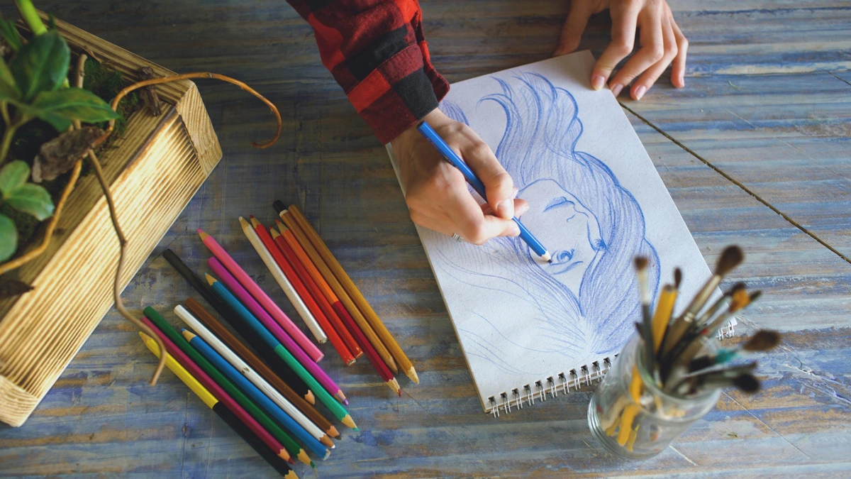
- Watercolor Pencils: These are pencils with water-soluble pigment cores. They're fantastic for detailed line work, adding dry texture, or laying down initial washes that can be activated with a wet brush. I often use them for initial sketches that disappear seamlessly into the paint, for crisp details in my abstract pieces, or to add subtle shading before a wash. They blend beautifully with traditional watercolors but offer more control for intricate elements, almost like a drawing and painting hybrid.
- Watercolor Markers: Similar to alcohol markers in form, these contain liquid watercolor pigment. They're excellent for vibrant, intense color application, especially for graphic styles, quick sketches, or when you want precise bursts of color without the need for a water pot. They can be blended with water just like traditional watercolors but dry much faster, which can be both a blessing and a curse!

- Watercolor Mediums & Additives: Don't forget the magic that can happen with specialized mediums! These aren't just for advanced artists; many can significantly enhance your painting process.
- Masking Fluid: Indispensable for preserving white areas or crisp edges, like tiny highlights or intricate details you don't want to paint over. Applying it requires a steady hand, and removing it can be strangely satisfying!
- Granulation Medium: If you love texture as much as I do, this medium enhances the natural granulating properties of pigments that already have some texture, or even adds a subtle granulating effect to smoother pigments. It's like adding a secret sparkle to your washes.
- Lifting Preparation: For those moments when you know you'll want to lift color (perhaps for clouds or highlights), a lifting preparation can make even staining colors easier to remove, giving you more control and less frustration.
- Iridescent Medium: Adds a shimmering, pearlescent quality to your colors, perfect for celestial scenes, magical effects, or just adding a touch of subtle glow to your abstract work.
- Flow Improver/Wetting Agent: These liquids reduce the surface tension of water, allowing paints to flow more smoothly, spread further, and create more even washes, especially on less absorbent papers.
- Ox Gall Liquid: A traditional wetting agent that helps pigments disperse more evenly, particularly useful for creating smooth, flat washes or minimizing blooming on certain papers.
These tools aren't a replacement for pans or tubes but can be wonderful additions, expanding your toolkit and allowing for mixed-media exploration, giving you even more expressive freedom, as discussed in acrylic vs. oil vs. watercolor: choosing paint medium.
Frequently Asked Questions About Professional Watercolor Sets
Q: Are professional watercolors really worth the extra cost? A: Absolutely, if you're serious about your art. The difference in pigment quality, lightfastness, and overall handling is significant. You get more vibrant, longer-lasting results, and a much more enjoyable painting experience. It's often debated in acrylic vs. oil vs. watercolor: choosing paint medium, but for watercolor, quality truly shines through, offering expressive freedom you won't find with student-grade paints.
Q: Can I mix professional and student-grade watercolors? A: You can, and many artists do for practice or non-archival studies. However, it's generally not recommended for finished, archival work. The fillers in student paints can dull professional colors, and their inferior lightfastness will likely compromise the longevity and vibrancy of your piece over time. If you want your art to last, stick to professional-grade paints for your final layers; think of it as a quality control measure for your legacy.
Q: How do I choose a basic professional palette if I'm just starting? A: Look for a set of 6-12 colors that includes primaries (a warm and cool red, yellow, blue), a couple of essential earth tones (like Burnt Sienna, Raw Umber), and perhaps a neutral tint or Payne's Gray. Many reputable brands offer well-curated starter sets. My recommended starter palette, detailed above, provides a solid foundation for clean mixing and versatility. Think about the principles of understanding the elements of design in art: a comprehensive guide even in your palette choice – a balanced palette is a versatile one!
Q: What's the difference between pans and tubes? A: Pans are dried, solid blocks of paint that are activated with water; great for portability and quick studies. Tubes are concentrated liquid paint (a paste with less evaporated water) that you squeeze out; excellent for intense washes, large areas, or refilling pans. Tubes generally offer a higher wet pigment load and are often preferred for studio work, while pans excel for plein air or travel. Many professional artists buy tubes to fill their own pans, getting the best of both worlds.
Q: What about the environmental and ethical impact of watercolor pigments? A: This is an increasingly important consideration. Many professional brands are becoming more transparent about their sourcing and manufacturing. Look for brands that offer non-toxic options, disclose their pigment ingredients (using CI numbers), and provide information on their vegan-friendly lines. Some pigments, particularly heavy metal ones like cadmium, require careful handling and disposal due to their toxicity. Additionally, the ethical sourcing of earth pigments (mined minerals) and the environmental footprint of synthetic alternatives is gaining attention. As artists, we can support brands committed to sustainability and responsible practices, aligning our art with our values.
Q: What are the best professional watercolor brands for beginners who want to invest in quality? A: For beginners looking to step up to professional quality without feeling overwhelmed, brands like Winsor & Newton Professional and M. Graham are excellent choices. They offer fantastic quality, consistent performance, and a slightly more accessible price point compared to some ultra-premium options. Their paints rewet beautifully and mix cleanly, making the learning curve smoother. Starting with a basic set of 6-12 colors from these brands will give you a solid foundation for exploring the medium without compromising on quality.
Final Brushstrokes
Picking a professional watercolor set is a deeply personal adventure, a bit like finding your artistic soulmate. There’s no single "best" set for everyone, only the one that resonates most with your style, your process, and the way you want to express yourself. I hope my rambling thoughts and observations have given you a clearer path, or at least a few fun ideas to explore. I remember one particular moment, struggling with a delicate sky wash, when switching to a highly rewetting professional paint made all the difference, transforming a frustrating mess into a luminous triumph. Ultimately, the "best" set is the one that inspires you to create, to experiment, and to find that quiet joy in the dance of pigment and water. Investing in professional watercolors isn't just about buying paint; it's an investment in your artistic expression and the longevity of your unique vision. So, which of these shimmering palettes is calling to your artistic spirit? Which hue will be your next companion on this vibrant journey? Go forth and make some beautiful art – and maybe send me a postcard of your favorite discovery!


