
The Artist's Ultimate Paint Guide: Choosing Your Perfect Medium & Beyond
Dive deep into paint types, their history, quirks, and practicalities, from fast-drying acrylics to luminous oils and delicate watercolors. This personal guide helps you find your artistic soulmate, explore mixed media, and embrace the joy of creating.
The Artist's Ultimate Guide to Paint Types: Uncover Your Perfect Medium, Quirks, and All
I remember walking into an art store for the first time, feeling like I'd stumbled into a wizard's apothecary – tubes, pots, and jars brimming with vibrant potential, yet completely indecipherable to my beginner's eye. Acrylics, oils, watercolors, gouache, tempera... it felt less like a selection of tools and more like a secret society's cryptic handshake. If you've ever felt that dizzying mix of excitement and sheer terror when faced with a paint selection, then trust me, you, my friend, are in remarkably good company. My own journey through paint types has been less a logical progression and more a series of happy accidents, frustrating detours, and sudden, intense crushes. This isn't your average dry technical manual; it’s a deeply personal dive into understanding the spirit and practicalities of each medium, and how to choose one that truly resonates with your artistic soul. It’s about finding not just what paint does, but why it calls to you, exploring its history, its handling quirks, and the surfaces it loves most. Maybe someday, you'll even visit my museum in 's-Hertogenbosch and see the results of my own paint explorations, or perhaps even a piece of art you've created yourself.
Understanding the Foundation: Beyond Just "Paint"
Before we dive into the specific personalities of each paint, let's talk about the unsung heroes that give them their unique character. First up is the binder. Think of the binder as the ultimate matchmaker – it's the glue that holds the pigment particles together and helps them adhere to your surface. It’s the fundamental difference between, say, an oil paint and an acrylic, and the choice of binder impacts absolutely everything: drying time, flexibility, finish, and even how you clean up (trust me, that last one is a big deal!). Together with the solvent (like water or mineral spirits), the binder forms the vehicle – the liquid component that carries the pigment and allows it to be applied.
For example, acrylics use an acrylic polymer emulsion – essentially a type of plastic – which is why they dry so fast and are happily water-soluble. Oils, on the other hand, employ a drying oil like linseed oil, which explains why they stay wet for ages, allowing for endless blending, and offer that incredible luminosity. Watercolors and gouache typically rely on gum arabic for their binder. Each has its own distinct personality, dictated largely by this fundamental choice.
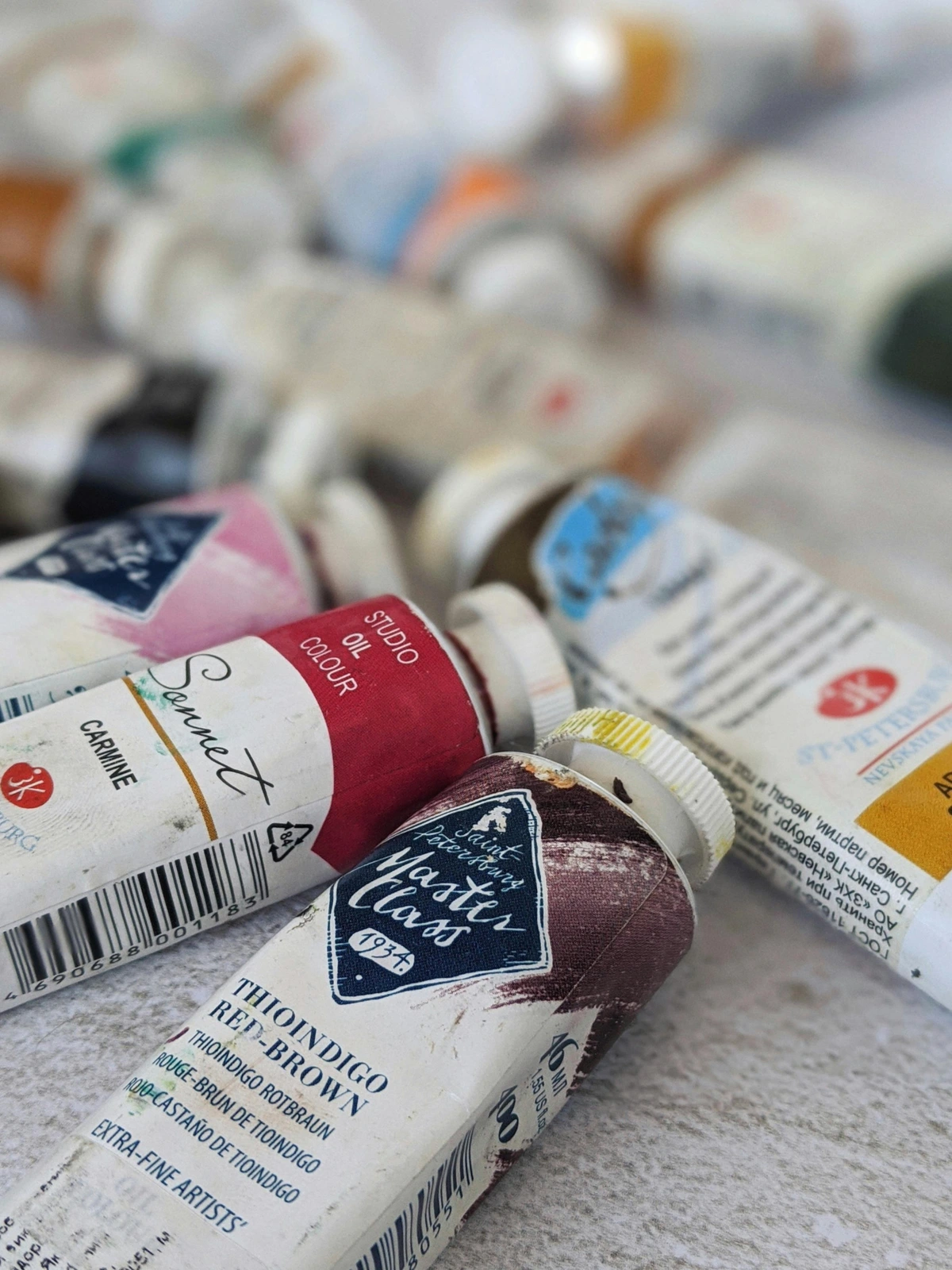
Beyond the binder, pigment load and lightfastness are also absolutely crucial. Pigment load refers to how much pure color is packed into the paint. Imagine a student-grade crimson versus a professional-grade Cadmium Red Medium; the professional version, with its higher pigment load, will offer a far more vibrant, intense, and opaque hue, often requiring just one or two layers to achieve full coverage where the student grade might need four or five. This higher pigment load also often contributes to better archival quality, meaning your artwork will last longer. Archival quality encompasses more than just lightfastness; it also refers to the long-term stability of the binder and pigments over time. A superior binder ensures better adhesion and prevents cracking or flaking, while stable pigments resist degradation, preventing unwanted color shifts or fading that could otherwise diminish your art's longevity. This is also where the quality of the binder comes into play; artist-grade paints often use superior binders that ensure better adhesion and longevity. Lightfastness, on the other hand, is about how resistant the pigment is to fading over time when exposed to light. If you're ever selling your work, this becomes paramount! Professional-grade paints often carry an ASTM (American Society for Testing and Materials) rating – look for "ASTM I" or "ASTM II" which indicate excellent or very good lightfastness, ensuring your art lasts for generations. Then there's viscosity and consistency, which simply describe how thick or thin the paint is, influencing how it moves and feels under your brush and how it builds texture. The cost also varies significantly; student-grade paints are a great starting point for practice, but professional artist paints, with their superior pigment load, binder quality, and lightfastness, are an investment in the longevity and vibrancy of your serious work. Don't forget that pigment types, whether organic (derived from carbon compounds, often vibrant, transparent, and prone to staining) or inorganic (derived from minerals or metals, typically more opaque, muted, and very lightfast), also influence transparency, lightfastness, and opacity, offering a subtle layer of complexity to your choices.
Okay, so that's the science bit out of the way! To give you a quick cheat sheet before we dive into the specifics, here’s a peek at how these foundations manifest in the most common paint types:

https://www.publicdomainpictures.net/pictures/250000/nahled/messy-colorful-artists-palette.jpg, https://creativecommons.org/publicdomain/zero/1.0/
Paint Type | Primary Binder | Key Characteristics | Common Solvents/Clean-up | Key Tools Beyond Brushes | Typical Surfaces |
|---|---|---|---|---|---|
| Acrylics | Acrylic Polymer Emulsion | Fast-drying, versatile, flexible, opaque to transparent | Water | Palette knives, sponges, texture tools, stencils | Canvas, wood, paper, fabric, metal, glass (with primer) |
| Oils | Drying Oils (e.g., Linseed) | Slow-drying, luminous, rich color, allows wet-on-wet | Mineral spirits, turpentine (or solvent-free alternatives) | Palette knives, rags, blenders | Canvas, linen, gessoed wood panels |
| Watercolors | Gum Arabic | Transparent, delicate washes, vibrant, relies on paper white | Water | Sponges, lifting brushes, masking fluid | Watercolor paper, illustration board |
| Gouache | Gum Arabic (with opacifiers) | Opaque, matte finish, vibrant, water-soluble, buildable | Water | Small brushes for detail, palette knives, ruling pens | Paper, illustration board |
| Tempera (Egg) | Egg Yolk | Fast-drying, luminous, opaque, fine detail, jewel-like | Water | Fine brushes, rigid tools for scraping, styluses | Gessoed wood panels, rigid absorbent surfaces |
| Encaustic | Heated Beeswax | Textured, deep, luminous, unique tactile quality | Heat (no solvents for cleaning paint) | Heated palette, heat gun/torch, carving tools, styluses | Rigid, absorbent panels (wood, MDF) |
| Pastels (Soft/Oil) | Minimal binder (e.g., gum tragacanth for soft) | Dry pigment, blendable, vibrant, textural, no solvents | Fixative (soft), blending stumps, fingers, tortillons | Textured paper, sanded paper, pastel board | |
| Ink (Drawing) | Shellac, Acrylic, Pigment-based | Fluid, transparent to opaque, quick-drying, often permanent | Water (some inks), specialized cleaners | Dip pens, brushes, airbrushes, refillable markers | Paper, board, sometimes primed canvas |
| Spray Paint | Acrylic/Synthetic Resins | Fast-drying, opaque, broad coverage, vibrant, aerosol | Acetone, mineral spirits | Stencils, caps (nozzles) for varying spray patterns | Walls, canvas, wood, metal, mixed media |
Now, let's meet the vibrant characters of the paint world, one by one...
Acrylics: The Speedy Chameleon of My Studio
So, craving instant gratification and a medium that won't judge your impatience? Oh, acrylics! Where do I even begin? For many artists, myself included, acrylics are often the gateway drug to a lifelong addiction to painting. Developed in the mid-20th century, emerging as a popular alternative to oils, their quick-drying, water-soluble nature made them an instant hit. Their versatility is truly astounding, too, adapting beautifully to almost any surface – canvas, wood panels, paper, even fabric, metal, or glass with the right primer. Priming ensures better adhesion, prevents absorption, and creates a consistent surface for your paint, making a big difference in how your artwork lasts. Want to paint thick impasto with a palette knife? Go for it. Want thin, transparent washes with a sponge? Absolutely. Feeling like a mixed media artist today? Acrylics play well with almost everyone.
I love them for their immediacy. I'm not always the most patient person (ask anyone who's seen me try to assemble IKEA furniture), and acrylics cater beautifully to that need for instant gratification. The feel of acrylics can range from buttery and thick to fluid and inky, making them incredibly adaptable to different artistic gestures. They're wonderfully forgiving, too. Made a mistake? Just paint right over it once it's dry. No biggie. The downside? Sometimes that very quick drying time can be a challenge, especially if you're trying to blend colors seamlessly or keep edges soft. I once tried to blend a sunset on a humid day, and it was less 'beautiful gradient' and more 'streaky frustration' – talk about a race against the clock! But hey, that's where acrylic mediums come into play – they're like little magic potions that can significantly extend drying time, thin the paint for glazing without losing color strength, or add incredible texture. From flow improvers that help create beautiful washes to heavy gel mediums and texture pastes for building three-dimensional surfaces, the options are endless. If you're into abstract art, acrylics are often a fantastic starting point for bold, dynamic compositions, allowing for rapid layering and experimentation. They offer a directness, a vibrant, modern energy that just begs you to create. In essence, acrylics are your go-to for speed, versatility, and immediate creative expression. So, does that immediate, versatile energy call to you?

Zen Dageraad, https://creativecommons.org/licenses/by-sa/4.0
Oils: The Slow Burn, The Rich Reward
But if the speedy chameleon of acrylics feels a bit too restless, perhaps you crave that deep, luminous glow that only time and patience can truly build? Now, oils are a different beast entirely. Think of acrylics as a quick, exhilarating sprint; oils are a marathon. They dry slowly. Like, really slowly. Which, depending on your temperament, is either a blessing or a meditative blessing. For some, it's maddening. For others, it's pure bliss, allowing for endless blending, subtle shifts in tone, and the kind of luminous depth that makes your heart sing. This characteristic is precisely why oil painting, which gained prominence during the Northern Renaissance and famously flourished during the Dutch Golden Age with masters like Rembrandt and Vermeer, revolutionized art, allowing them to achieve unprecedented realism, detail, and atmospheric effects through layered glazing techniques and sfumato.
I admit, my own foray into oils was initially intimidating. The solvents, the longer drying times, the almost mythical status they hold in art history... it felt like stepping into a grand tradition with very big shoes to fill. I even had one early impasto painting become a temporary dust-bunny magnet because I underestimated just how long "slow-drying" could mean! But once you get past that initial hurdle, the richness of color, the beautiful texture achieved with brushes or even a palette knife, and the sheer feel of the paint (that luxurious, buttery drag!) can be incredibly rewarding. Just remember, patience is key, and good ventilation is your friend! It's also worth noting that some traditional solvents (like turpentine and mineral spirits) can be quite toxic and have an environmental impact, so if personal health or sustainability is a concern, consider exploring solvent-free oil paints or natural alternatives like walnut oil, safflower oil, or specialized solvent-free cleaners. These can also be used to clean your brushes and tools.
You'll also quickly encounter the infamous "fat over lean" rule, which is crucial for oil painting longevity. I learned this the hard way with a few early cracks in my impasto experiments – it was like watching a beautiful painting develop an unwanted roadmap of fissures! Simply put, always apply a layer with more oil (fatter, more flexible) on top of a layer with less oil (leaner, less flexible). This ensures that the faster-drying, less flexible lean layers dry before the fatter, more flexible layers, preventing cracking over time and maintaining your artwork's archival integrity. This rule also extends to the use of oil painting mediums and varnishes – generally, a final varnish should be glossier (more oil/resin) than the paint layers beneath it. Oils thrive on properly primed canvas, linen, or rigid wood panels, offering a truly archival surface. It’s a medium that demands respect, but rewards you with a timeless, deep beauty. Oil paints are for those who savor the process, allowing time and light to build unparalleled luminosity and depth. Could this patient, luminous journey be for you?
https://images.pexels.com/photos/4139739/pexels-photo-4139739.jpeg, https://creativecommons.org/public-domain/
Watercolors & Gouache: Transparent Whispers and Opaque Dreams
But if the slow, deliberate build-up of oils feels too demanding, perhaps you're drawn to the more fluid, responsive nature of water-based mediums? Do you find yourself drawn to delicate washes and the unpredictable dance of water? Ah, watercolors! The medium that demands precision and surrender in equal measure. Watercolors are all about transparency, about letting the white of the paper shine through, about delicate washes and layered hues. This concept of using the "paper white" as your brightest highlight is fundamental to watercolor's luminosity, as you build up color from light to dark. They have a certain ethereal quality, a lightness that acrylics and oils often struggle to achieve. Flourishing in the Romantic era, they were favored for their ability to capture light and atmosphere, making them perfect for landscape studies and expressive compositions. It's truly a dance with water, where sometimes the water leads, and you just have to go with the flow, using brushes and sometimes sponges to create effects. Their fluid nature allows pigments to mingle and bleed in delightful, often surprising ways. I've had many a happy accident (and a few frustrated ones!) watching colors blossom on the paper, creating effects I never could have planned.
Then there's gouache, watercolor's bolder, more opaque cousin. Think of it as watercolor that decided it wanted to be a bit more assertive, a bit more like poster paint, but still with that beautiful matte finish. The key difference lies in the addition of opacifiers, such as chalk or titanium dioxide, which give gouache its inherent opacity and velvety matte look. You can use it thin and transparent, or build it up thick and vibrant with smaller brushes for fine detail or even a palette knife for texture. It's a fantastic bridge for artists who love the ease of water-based paints but crave a bit more coverage. The pigment concentration often plays a huge role here; professional grades will offer much richer, more vibrant colors due to a higher load of pigment, requiring less paint for more impact. Beyond opacity, watercolors are known for phenomena like granulation, where pigments settle into the paper's texture creating a speckled effect, and settling, where heavier pigments fall out of suspension, giving unique visual textures.
The Art of Handling: Pigment Personalities
Beyond their basic characteristics, the handling of watercolors and gouache is a world unto itself. Some pigments are staining, meaning they deeply penetrate the paper fibers and are difficult to lift once dry (think Phthalo Blue), while others are non-staining and can be easily re-wet and manipulated. This affects everything from glazing to correction. I've certainly had my share of unexpected "happy accidents" (and some not-so-happy ones, like trying to lift a staining color I desperately needed gone!) when I first started ignoring these nuances. Then there's granulation, where pigments visibly separate and clump, creating beautiful textural effects (like Ultramarine Blue often does). And of course, transparency variations mean some colors are naturally more translucent than others, even within the same brand. Learning these pigment personalities helps you predict how your washes will behave. And of course, choosing the right paper is absolutely crucial for both of these, because paper isn't just a passive surface; it's an active participant in your painting. Different paper weights and textures – from smooth hot press to textured cold press or rough – will dramatically influence how the paint behaves, bleeds, and dries. Surfaces for these are almost exclusively paper, though specialized watercolor boards (often paper mounted to a rigid support) can also be used for extra stability and less buckling. Be mindful that, like any organic material, watercolors can be susceptible to mold if stored in damp conditions, so proper ventilation and dry storage are key for longevity. These mediums offer a delicate intimacy, a quiet conversation between pigment and water, demanding both control and a willingness to surrender. Are you ready for that delicate dance?

Zen Dageraad, https://creativecommons.org/licenses/by-sa/4.0
Tempera: History's Hidden Gem, A Luminous Secret of the Masters
Moving from the fluidity of water to the meticulous craft of history, have you ever wondered what painting felt like before oils dominated the scene? While not as common today, especially among beginners, I find tempera (most famously egg tempera) absolutely fascinating – it's truly a hidden gem from art history. It's a medium that whispers tales of the masters, and I find myself constantly drawn to its quiet power. This was the dominant painting medium before oil paints took over, particularly during the early Italian Renaissance, gracing countless religious icons and masterpieces by artists like Giotto, Botticelli, and Fra Angelico. Its historical significance extends even further, often being employed for vibrant and durable illustrations in medieval illuminated manuscripts before evolving to adorn large panel paintings. The name "tempera" broadly refers to any paint where the pigment is bound by an emulsion, but egg tempera, using egg yolk as its binder, is the most celebrated form. It gives it a fast-drying nature, much like acrylics, but with a distinctly different, luminous, and often opaque finish. Tempera allows for incredible detail and builds up in thin, precise layers using fine brushes, creating a vibrant, almost jewel-like quality where light refracts through the numerous thin layers of paint, giving it a unique inner glow. It dries quickly to a durable finish that doesn't darken over time, a common issue with early oil paints. Its crisp, linear feel demands precise, deliberate strokes, requiring meticulous brushwork and immense patience. While it dries fast, tempera is not as flexible as modern acrylics; this is why it demands rigid, absorbent surfaces like gessoed wood panels, to prevent cracking as the artwork ages.
It's a demanding medium, unforgiving of mistakes as it doesn't blend well on the surface. My own experiments with it have been limited – let's just say my patience is more geared towards immediate results than centuries of tradition! – but the historical significance and the sheer beauty of well-executed tempera work are undeniable. If you're looking for a medium with a rich history and a unique aesthetic challenge, tempera might just pique your interest, offering a connection to the past for the truly dedicated. Does this meticulous, luminous craft call to your inner historian?
Zen Dageraad, https://creativecommons.org/licenses/by-sa/4.0
Encaustic: Ancient Magic, Modern Mystery, And A World of Waxen Wonder
From the delicate layers of tempera to something profoundly textural, are you ready for something truly ancient, tactile, and perhaps a little bit dangerous? This one is a wild card for many, and honestly, it utterly fascinates me. Encaustic painting involves heated beeswax, usually mixed with colored pigments. Its origins trace back to ancient Egypt and Greece, famously used for the incredibly preserved Fayum mummy portraits, proving its remarkable archival quality. You apply it hot using specialized tools – think a heated palette, natural bristle brushes (used to carry and apply the molten wax, not clean paint!), and then fuse it with a heat gun or torch. This fusing process is paramount because it melts each applied layer of wax into the layer below, removing brushstrokes, creating a unified, durable surface with incredible depth, and most importantly, preventing cracking and ensuring the longevity of the artwork. Different fusing tools, from small torches to heat guns, allow for varying levels of control and texture. The result? Incredible texture, profound depth, and a unique luminous quality that you just can't get with other mediums. The feel is unlike any other paint, with a sculptural, almost living quality. It's ancient, remarkably archival, and offers a unique tactile appeal that draws viewers in, making them want to reach out and touch the surface (don't, though, that's not good museum etiquette!). Special carving tools can also be used to manipulate the wax when it cools.
I haven't delved deeply into encaustic myself – my studio isn't quite set up for wax and torches just yet, and the initial investment for specialized equipment can be significant – but I've admired work created with it from afar. It offers a totally different sensory experience, both for the artist and the viewer, and the studio setup is very much a part of the adventure. Be mindful that proper ventilation is absolutely crucial when working with heated wax, as fumes can be an issue. If you're feeling exceptionally adventurous and want to really get your hands (and studio) into something truly unique, it might be worth exploring. Just do your research on safety first, okay? Encaustic requires rigid, absorbent panels, typically wood or MDF, to prevent cracking as the wax cools and contracts. This medium invites you into a world of molten color and sculpted light, a truly immersive experience. Does this ancient, tactile mystery pique your adventurous side?
Zen Dageraad, https://creativecommons.org/licenses/by-sa/4.0
Pastels, Inks, and Spray Paint: Directness, Fluidity, and Impact
Leaving the heat of encaustic for something equally tactile but completely dry, what if you love the directness of drawing but crave the rich color of paint? Welcome to the wonderful, somewhat dusty world of pastels. Often overlooked in discussions of paint types, pastels are essentially pure pigment held together with a minimal binder, allowing for incredibly vibrant, direct color application. They bridge the gap beautifully between drawing and painting.
There are two main types: soft pastels and oil pastels. Soft pastels, with binders like gum tragacanth (a natural gum), use a minimal amount of binder, which is key to their powdery texture and incredible blendability. This allows for rich layering, atmospheric effects, and a velvety smooth finish. Their feel is soft and velvety, almost like drawing with pure color. However, due to their minimal binder, soft pastels are very delicate and prone to smudging, requiring a fixative spray to protect the finished artwork. They are best used on textured paper, which grips the pigment. Oil pastels, on the other hand, use an oil and wax binder, giving them a creamy, buttery consistency and a strong, vibrant line. They are more permanent and less prone to smudging than soft pastels, generally not requiring a fixative, and can be layered and blended with surprising intensity, even dissolved with solvents for painterly effects. Both types offer a unique textural quality that's hard to achieve with other mediums. My personal experiments with them often involve adding expressive lines or subtle color shifts over dried acrylics, a testament to their versatility. Be prepared for a bit of a dusty studio with soft pastels, but the vibrant results are often worth the clean-up! Do you seek that immediate, direct connection to color and texture?
Speaking of lines and expressive marks, a close cousin to traditional paints, and an indispensable tool for many mixed media artists, are inks. Often overlooked as a "paint," inks are intensely pigmented liquids that offer incredible fluidity, permanence (depending on the type), and transparency or opacity. Whether shellac-based, acrylic-based, or pigment-based, they can be applied with dip pens for fine, precise lines, brushes for dynamic washes, or even airbrushes for smooth gradients. Their quick-drying nature and ability to create sharp, crisp edges make them fantastic for adding detail or defining forms over dried paint layers. They interact beautifully with water for ethereal washes or can be layered for intense color. Just like other art materials, inks vary in their lightfastness and permanence, so it's always wise to check the label if archival quality is a concern. It’s a medium that truly bridges drawing and painting, offering both graphic strength and painterly grace. Could this fluidity and precision be your next artistic exploration?
And for those who seek an entirely different kind of immediacy, with a bold, urban edge, there’s spray paint. This modern medium, essentially pigment in an aerosol can, offers fast-drying, opaque, and incredibly vibrant color. Primarily associated with street art and graffiti, it has increasingly found its way into fine art, especially abstract and mixed media work. The control offered by various caps (nozzles) allows for everything from wide, expressive coverage to fine lines and intricate stencils, fundamentally changing the spray pattern. It’s a powerful tool for adding quick, decisive layers, creating sharp graphic elements, or building atmospheric backgrounds with speed and impact. While it demands different safety precautions (always good ventilation and a respirator mask!), its unique application and dynamic potential are undeniable for contemporary artists. Be mindful of its environmental impact; many brands are working on low-VOC (Volatile Organic Compound) options. Are you ready for some instant impact and a modern edge?

Zen Dageraad, https://creativecommons.org/licenses/by-sa/4.0
Beyond Boundaries: Mixed Media & The Symphony of Surfaces
Now that we've explored the individual personalities of these fascinating mediums, what if you don't want to pick just one? The true beauty of being an artist today is that rules are pretty much made to be broken. Why limit yourself to just one type of paint when you can combine the best of several worlds? Many of my own pieces, the ones you can often find for sale here, heartily embrace a mixed media approach. It’s not just about using multiple materials; it's about understanding how different mediums interact and complement each other, creating a richer, more complex visual language.
Acrylics often form the foundational base for many artists, allowing for quick layers and experimentation. From there, the possibilities explode! Imagine starting with a vibrant acrylic underpainting, providing a rich color field. Once that's dry, you could build incredible texture with a heavy gel medium, adding expressive marks with oil pastels over the dry acrylic for a completely different surface feel (perhaps blending the pastels with a solvent to integrate them more deeply), or perhaps delicate lines with drawing inks that beautifully bleed and interact with a wet watercolor wash (if you're brave enough to go back to wet after dry!). For luminous depth, a few carefully placed oil glazes could go on top (remembering that crucial fat-over-lean rule!). Even opaque details can be added with gouache layered over dried acrylics. The interplay of soft pastels for atmospheric haze, rich oil pastels for creamy marks, and sharp inks for graphic precision can create a symphony of surfaces and depths. It’s all about exploring not just through paint, but through the dialogue of diverse materials, finding what feels right for your unique expression. My own journey, much like the path to a finished piece, has been a series of explorations and happy accidents, a winding timeline of discovery.

https://www.pexels.com/photo/artist-brush-mix-color-oil-painting-8382705/, https://creativecommons.org/public-domain/cc0/
Your Artistic Compass: Embracing the Messy, Wonderful Choice
Ultimately, choosing a paint type isn't a science; it's an intensely personal decision, much like finding your favorite coffee. It’s about what resonates with your workflow, your patience, your desired aesthetic, and yes, even your cleaning habits. Do you crave instant gratification and versatile experimentation? Acrylics might be your soulmate. Do you dream of luminous blends and a meditative, slow process? Oils could be your grand passion. Do you love delicate washes and the delicate dance of water? Watercolors await. Or perhaps you're like me, a bit of a rebel who prefers to mix and match, embracing the best of all worlds in a mixed media approach.
There's no single "right" answer, just the one that feels right for you at this moment in your artistic journey. For beginners looking for a concrete starting point, I'd suggest grabbing a small canvas, a few basic acrylic colors (like a red, blue, yellow, and white), and a palette knife to simply explore how the paint moves and builds texture. Embrace the glorious mess, experiment wildly, and let your intuition be your truest guide. The most important thing is to pick up a brush, make some marks, and discover the sheer joy of creating. The world of art materials is constantly evolving, with new innovations appearing all the time, so stay curious and keep exploring what inspires you. You've got this, and the possibilities are truly endless, just like that first time walking into the wizard's apothecary. Go explore, and let the colors lead the way!


