The 8 Elements of Design in Art: Master Visual Language & Creation
Unlock art's secret language! Explore the 8 essential elements of design: line, shape, form, space, value, color, texture, & pattern. A personal guide to deeply appreciate & create art, from an artist's perspective.
Unlocking the Visual Language: Your Personal Guide to the Elements of Design in Art
You know that feeling, right? You walk into a gallery, or scroll past a striking piece of art online, and you think, "Wow, that's incredible!" But then someone asks why it's incredible, or how it achieves that effect, and suddenly you're fumbling for words. I've been there, more times than I care to admit. For a long time, art felt like this exclusive club, and I was perpetually outside, admiring the façade but not understanding the secret handshake. Honestly, I still feel a bit like that on Mondays, but then the coffee kicks in.
But then, an "aha!" moment, like a lightbulb flickering on in a dimly lit room: art, no matter how complex or abstract, is built from fundamental parts. It turns out, the secret isn't some arcane knowledge, but rather a set of foundational building blocks that artists use every day to communicate visually. Think of them as the alphabet, the grammar, the very DNA of visual expression. These are the elements of design – specifically, line, shape, form, space, value, color, texture, and pattern. And once you start to recognise them, it's like suddenly understanding a language you never knew you were fluent in. Seriously, it's a game-changer for appreciating not just fine art, but also design in photography, architecture, graphic design, and even the objects around us. It's the first step from passive observer to active participant in the visual world.

What Even Are These Elements, Anyway? And Why Should You Care?
So, what exactly am I talking about? When I say "elements of design," I'm referring to the basic building blocks that artists manipulate to create their work. They're the tangible components, the raw materials of visual communication. And here's a crucial distinction I often found confusing when I was starting out: the elements are not the same as the principles of design. The elements are what you use (the individual notes); the principles are how you use them (the rules of harmony and composition that turn those notes into a symphony). Things like understanding balance in art composition or the definitive guide to proportion in art? Those are principles. They dictate how the elements are arranged for impact. But today, we're zooming in on the individual ingredients.
To put it another way, imagine you're baking a cake. Your ingredients—flour, sugar, eggs, butter—are your elements. They are the things you put in. The recipe, however, with instructions on how much of each ingredient to use, when to mix them, and for how long to bake, that's your principles. You can have all the best ingredients, but without a good recipe (principles like harmony or balance), you might just end up with a mess. Conversely, a genius recipe needs quality ingredients to truly shine. They're inextricably linked, but distinctly different.
Why should you care? Well, understanding these eight elements—line, shape, form, space, value, color, texture, and pattern—empowers you. It moves you from passively observing to actively interpreting. It gives you a vocabulary to describe what you see and even helps you understand what you feel when you look at a piece. For me, it was like unlocking a cheat code for art appreciation, and honestly, for creating my own stuff too. It's that foundational. I mean, my entire artistic journey, from those clumsy early sketches to the art for sale in my studio today, has been a constant conversation with these elements.


Diving Into the Nitty-Gritty: The Elements Unpacked
Alright, let's roll up our sleeves and dig into each element. If you want an even more foundational dive into some of these, I've got a beginner's guide to line, shape, color, and texture that might be a good companion read. Think of this as our main course, and those guides as delightful side dishes.
Line: The Foundation of Everything
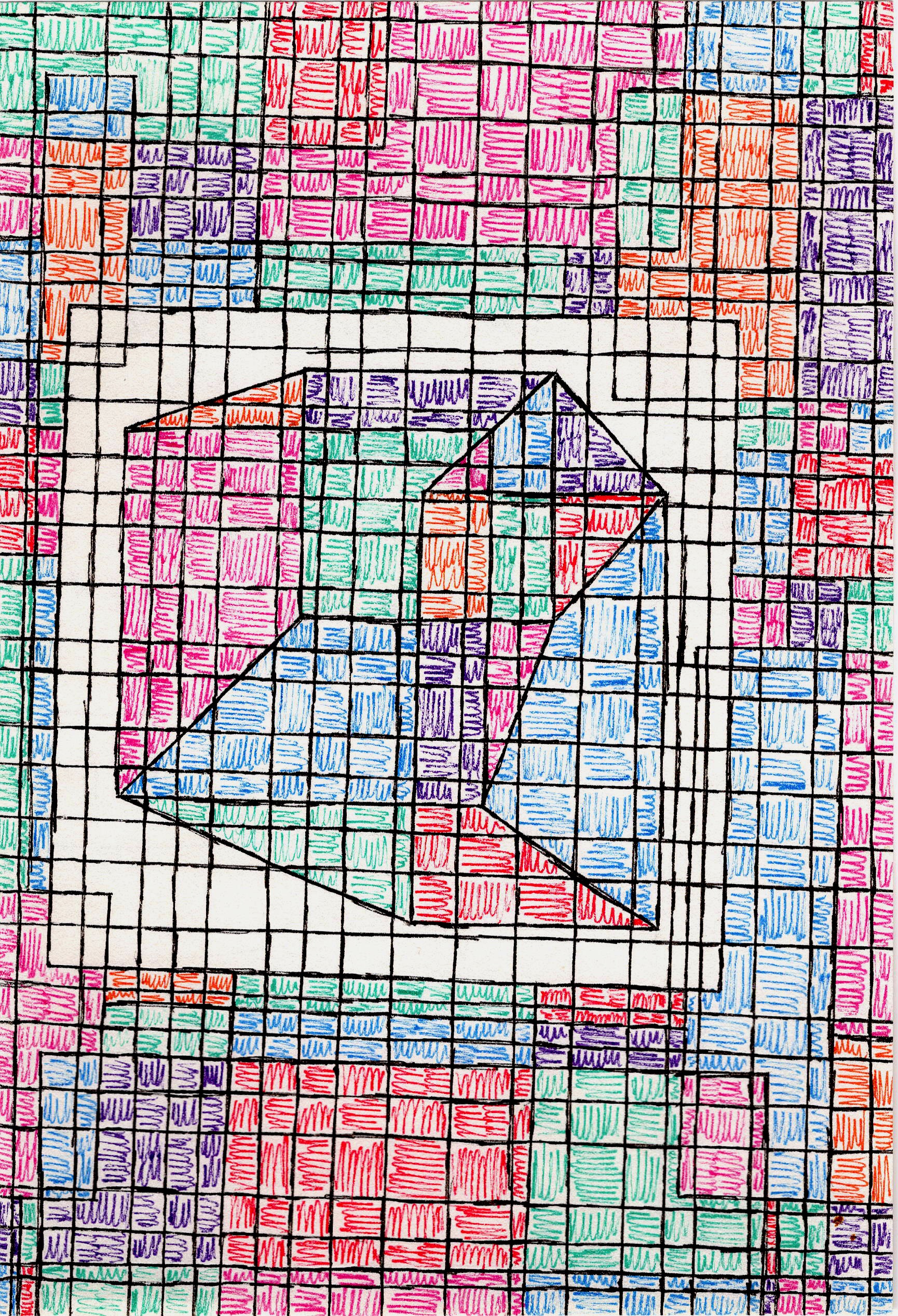
If you ask me, line is where it all begins. Think about it: every doodle, every sketch, every boundary. A line is simply a mark with length and direction. But oh, the stories it can tell! It can be thick and bold, screaming confidence and stability; thin and delicate, whispering fragility or movement. Beyond just thickness, line weight – how a line transitions in pressure or intensity – can convey so much. A heavy, unwavering line often implies solidity and permanence, like the strong outline of a mountain. A lighter, varied line, however, can suggest movement, delicacy, or even hesitancy, much like a charcoal sketch. I often find myself just tracing lines in my mind when I look at art, following the artist's hand. It's surprisingly meditative, a quiet conversation between the creator and me. I remember once struggling with a composition, feeling utterly lost, and it was only by focusing solely on the implied lines—the unseen pathways guiding the eye, or the strong contour lines defining a subject—that I found the natural flow it was begging for. Understanding how artists use lines to create paths, boundaries, and even a sense of rhythm is a game-changer for appreciating a piece's underlying structure. Next time you look at a piece, try to follow the lines and see where they lead you; you might be surprised at the hidden messages. Want to try a quick exercise? Grab a pen and paper and just draw a single, unbroken line without lifting your pen. See how many different emotions or directions you can convey just by varying pressure and speed. For a much deeper exploration, check out the definitive guide to understanding line in abstract art.
Once you've mastered the journey of a single line, what happens when it closes upon itself? That's where we meet our next element.
Shape: Giving Form to Ideas
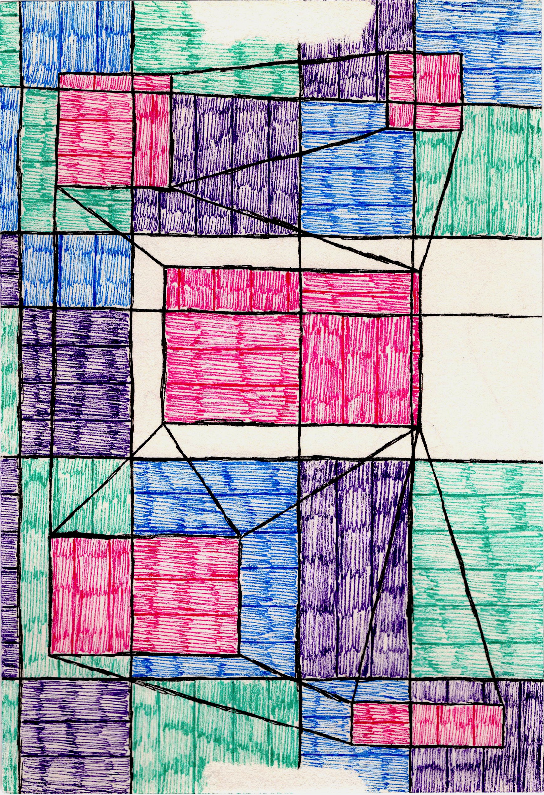
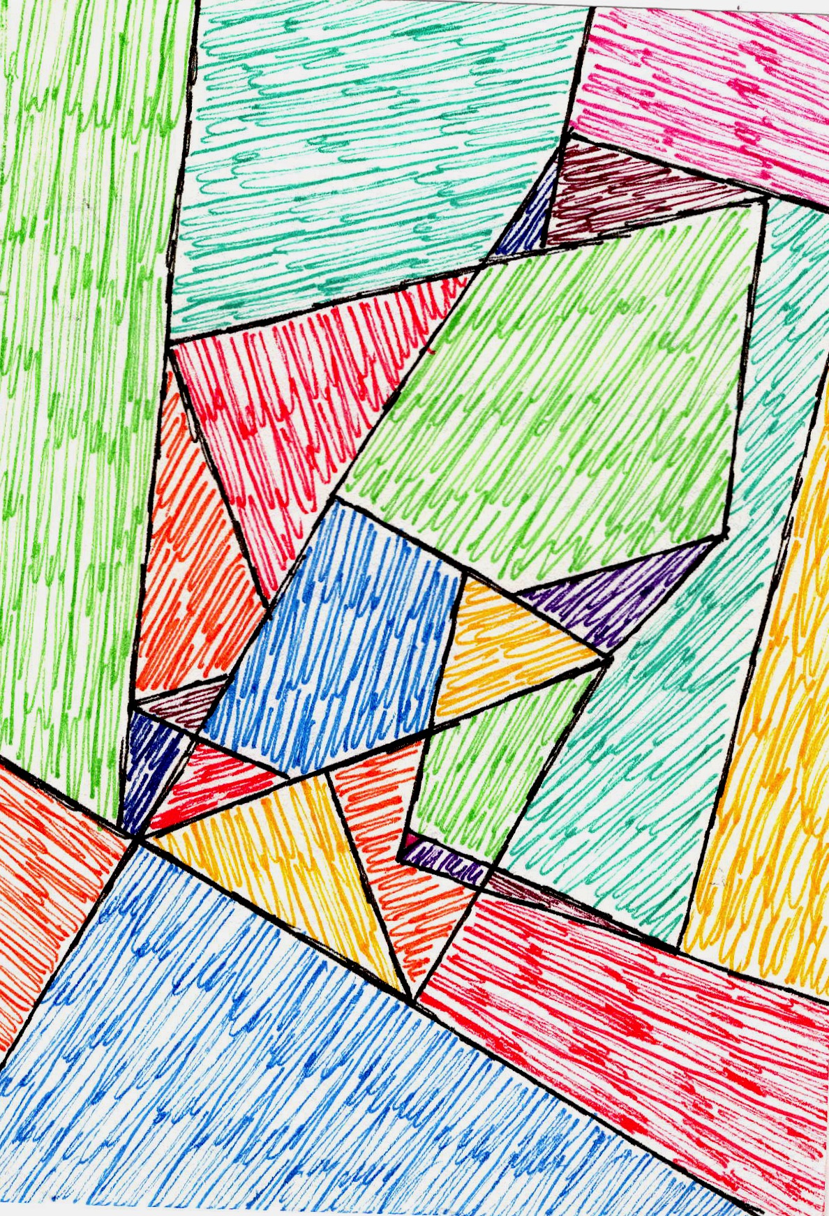
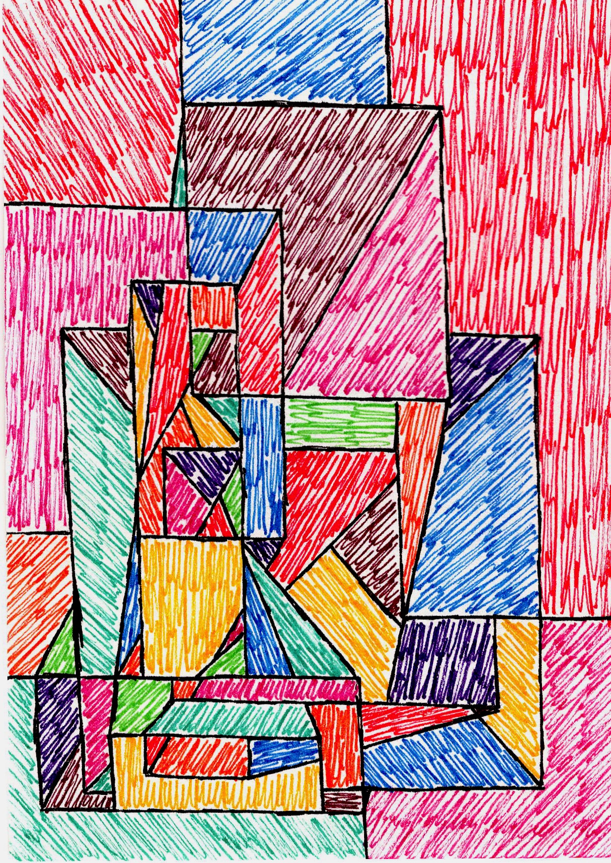
Now, connect the ends of a line, or overlap a few, and what do you get? A shape! Shapes are two-dimensional areas defined by lines, colors, or textures. They are flat, having only height and width. We categorize them broadly into:
Shape Type | Characteristics | Examples in Art |
|---|---|---|
| Geometric | Precise, man-made, often convey order, structure, and control. | Squares, circles, triangles, rectangles, often seen in Cubism or Minimalism. |
| Organic | Irregular, free-form, natural, often convey fluidity, softness, or spontaneity. | Clouds, puddles, outlines of leaves, human figures, often seen in Surrealism or Abstract Expressionism. |
| Abstract | Simplified or stylized forms derived from reality, or entirely non-representational forms used for their intrinsic aesthetic quality. They might hint at an object but aren't explicitly depicting it, or they might be completely invented. | The fragmented shapes in Cubism (like a guitar broken into geometric facets), or pure geometric/organic forms used for their aesthetic quality alone. |
The interplay between these types of shapes—a rigid rectangle next to a flowing blob, for instance—can create dynamic tension or serene harmony. It's like a visual dialogue; I often wonder if they're fighting for attention or dancing together in the composition. Also, pay attention to positive shapes (the actual subjects) and negative shapes (the areas around and between them), as they constantly define each other. Even more powerfully, negative space isn't just "empty"; it can create intriguing shapes itself, often forming hidden images or guiding the eye subtly. It's a bit like the spaces between words giving meaning to the text. I used to just see blobs or empty canvas, but then I realized the 'nothing' was actually doing a whole lot of 'something'!
From the flat plane of a shape, our perception can trick us into seeing something far more substantial.
Form: Stepping into Three Dimensions
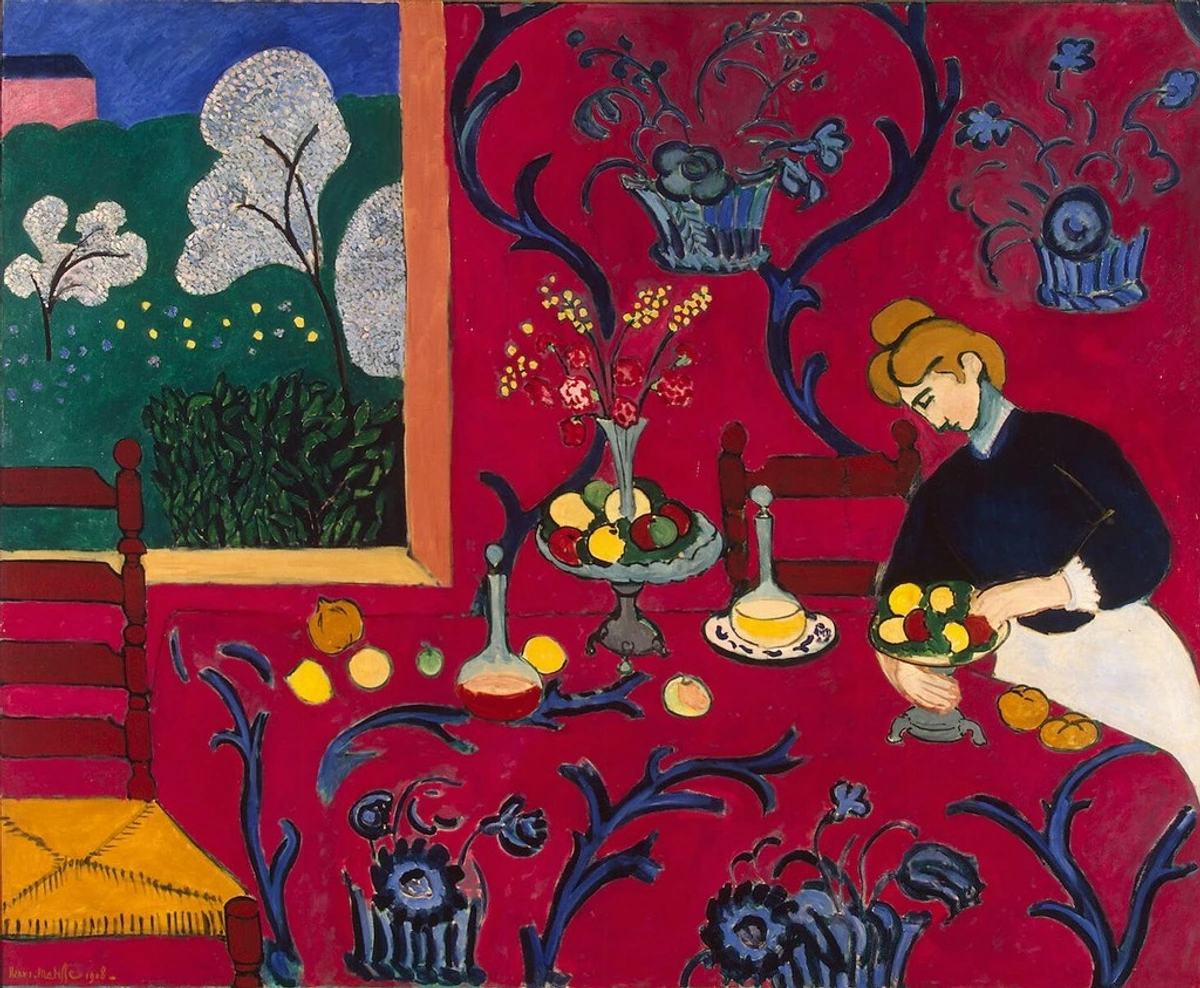
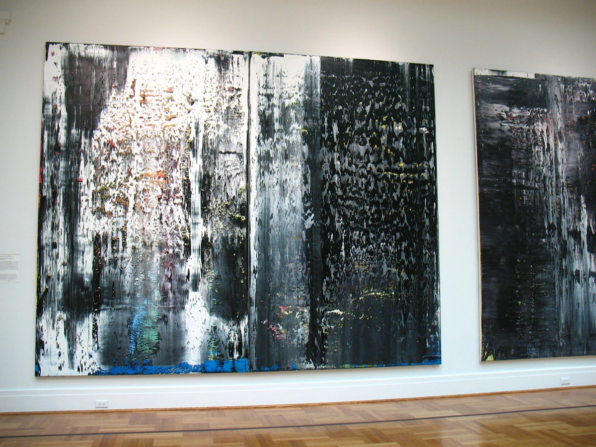
If shape is 2D, then form is its 3D cousin. Form has height, width, and depth, occupying actual space. A sphere, a cube, a cylinder—these are forms. In painting and drawing, artists use techniques like shading, highlights, perspective (how artists use space and form), line weight, and overlapping elements to imply form on a flat surface, tricking our eyes into seeing depth where there isn't any. It's a clever bit of visual magic, really, like using chiaroscuro to make a simple apple look utterly real and weighty. Or how Henri Matisse, in his 'The Red Room,' creates the illusion of a dining room receding into space, with solid objects on a table, all on a flat canvas. Another master, Leonardo da Vinci, famously used sfumato – a technique of subtle gradation from light to dark areas, often with no harsh outlines – to create a soft, hazy appearance that gives figures, like the Mona Lisa, a truly lifelike and volumetric quality. I always marvel at how a few strokes of dark and light can transform a flat canvas into a world with tangible objects, making them feel solid and present. Next time you see a two-dimensional artwork, try to identify the implied forms – how does the artist fool your eye into perceiving mass and volume? In sculpture, of course, form is literal, demanding physical interaction. For a deeper dive, check out the definitive guide to understanding form in abstract art.
And just as objects occupy space, the space around them becomes an element in itself.
Space: The Unseen Player
Ah, space. This one can be a bit elusive, but it's incredibly powerful. Space refers to the area around, between, or within components of a piece. It's not just the empty bits; it's an active element, defining the boundaries and relationships of everything else.
- Positive Space: The area occupied by the subject or elements, the 'stuff' of the artwork.
- Negative Space: The area around and between the elements. This is where things truly get compelling! Clever use of negative space can define positive space, create hidden images, or simply give the eye a place to rest. More profoundly, it can create depth, imply movement, and even subtly guide the viewer's eye through the composition, becoming a powerful compositional tool. I love when negative space actively contributes to the composition, almost becoming a shape itself—like the famous 'face-vase' optical illusions. It’s a bit like silence in music; it defines the notes.
Artists also manipulate deep space (creating an illusion of vast distance, like a landscape receding into the horizon, often enhanced by atmospheric perspective where distant objects appear less saturated and detailed) and shallow space (where elements appear close to the viewer, often creating a more intimate or immediate feeling, common in abstract work). Sometimes, an artist might even deliberately employ flat space, rejecting the illusion of depth entirely to emphasize the two-dimensionality of the canvas, a common characteristic in certain abstract and decorative styles. Next time you view a piece, let your eyes wander to the 'empty' areas. What shapes do they form? What do they communicate? How deep does the world within the canvas feel? For more on this, check out the definitive guide to space and form in abstract art.
And as space gives context to form, so too does light give context to color.
Value: The Light and Dark of It All
Before we dive into the glorious world of color, let's talk about value. This is the lightness or darkness of a color, or even a shade of gray. It's independent of hue but utterly critical for creating contrast, mood, and the illusion of form. Think of a black and white photograph; all the impact comes from the interplay of values, from pure white to absolute black, and all the grays in between. This entire spectrum is often called the value scale or tonal range. High contrast values (very light next to very dark) create drama and energy, like a spotlight cutting through a dark stage, while low contrast values (shades that are very similar) evoke calmness and subtlety, much like a foggy morning. I sometimes start a painting in grayscale just to nail the values before I even think about specific hues, because if the values aren't right, the color won't save it. It's the skeleton beneath the skin, giving everything structure. Importantly, value isn't just for black and white; it profoundly affects how we perceive colors, too. A highly saturated yellow will feel different at a light value (like lemon yellow) compared to a low value (like mustard yellow). Pay attention to how light or dark elements are in a piece—it tells you a lot about the artist's intention and the feeling they want to convey. If you're keen to explore this further, the definitive guide to understanding value in art is a great resource.
Now, let's inject some serious emotion into our canvas.
Color: The Emotional Language
If line is the foundation, then color is the heart and soul. It's impossible to overstate its impact. Color can evoke strong emotions, define mood, and create emphasis. When I'm working, choosing a palette is often one of the most challenging—and rewarding—parts of the process. I remember once spending days on a piece, feeling it was 'off,' only to realize I needed to shift one primary hue just slightly to achieve the vibrant energy I was after. It's a fine line between a science and an intuition, really, a dance between rules and feeling. Cultural context also plays a huge role; a color that signifies mourning in one culture might represent celebration in another. And sometimes, even within a culture, different demographics or individuals might have varied perceptions – something for artists to consider, especially concerning color blindness and ensuring their message translates broadly.
We talk about color in terms of:
- Hue: The pure color (red, blue, yellow)—what we typically mean when we say "color." Hue often carries immediate emotional associations: red for passion or anger, blue for calm or sadness.
- Saturation: The intensity or purity of the color (a fiery, vibrant red vs. a muted, dull red). High saturation grabs attention, while low saturation can create a sense of subtlety or age.
- Value: How light or dark a color is (pink is a light value of red)—which we just discussed!
Colors also have temperature. Warm colors (reds, yellows, oranges) tend to advance and evoke feelings of energy, passion, or comfort, like a cozy fire. Cool colors (blues, greens, purples) tend to recede and suggest calmness, serenity, or even sadness, like a vast ocean. Knowing how they interact is crucial. Beyond that, artists also think about color harmony (complementary, analogous, monochromatic schemes). These relationships dictate how colors psychologically affect us and how they interact visually. A fascinating aspect is simultaneous contrast, where two colors placed next to each other affect each other's apparent hue, saturation, and lightness, making greens appear greener next to red, for instance. We also distinguish between local color (the natural color of an object, like a green apple) and optical color (how light affects perceived color, or how colors are perceived to blend in the viewer's eye). Think of Impressionist paintings where dots of pure color placed side-by-side create a new, blended color when viewed from a distance—this is optical color in action, a vibrant trick of light and perception. What mood does the color palette of a piece evoke in you? Does it feel warm or cool, vibrant or subdued? For more depth, explore the definitive guide to understanding color harmonies.

With color engaging our emotions, let's consider how a piece can engage our sense of touch.
Texture: The Sense of Touch
Next up, texture. This refers to the perceived surface quality of a work of art. It can be:
- Actual Texture: The physical feel of the surface. Think thick impasto paint that you could literally touch, rough canvas, the smoothness of polished marble, or the gritty surface of sand. I love adding layers of paint, or even mixed media like sand, fabric, or collage elements, to create actual texture; it's like a secret language for the fingertips, inviting touch and adding a tangible dimension.
- Implied Texture: How an artist makes you believe a surface has a certain feel, even if it's flat. A painting of a fluffy cloud might look soft, even though the canvas is smooth. Artists achieve this through visual cues like specific brushstrokes, cross-hatching to suggest the roughness of stone, or smooth blending to imply the sheen of silk.
- Simulated Texture: This is a specific type of implied texture where an artwork reproduces the look of a texture so realistically that it mimics the appearance of real-world materials. For example, a photograph of a rough brick wall perfectly captures its apparent roughness, even though the photograph's surface is smooth. It's about imitation for visual realism.
Together, implied and simulated texture can be grouped under the broader term of visual texture, referring to any texture that is seen rather than felt. I often aim for implied texture in my geometric pieces, using lines and patterns to suggest depth or a certain tactile quality, inviting the viewer to imagine the touch. Texture is powerful for conveying realism, mood, or even purely abstract sensory experiences. Think about exploring texture next time you see a sculpture or a painting – does it make you want to reach out and touch it, or does your eye do the feeling for you? For a truly in-depth look, see the definitive guide to understanding texture in art.

Finally, how do we create visual rhythm and order with these elements?
Pattern: Repetition and Rhythm
Last but not least, let's talk about pattern. While repetition (the act of repeating elements) is a fundamental principle of design, the recurring motif or unit itself that is repeated can also be considered a fundamental element. Why? Because this specific arrangement of lines, shapes, or colors acts as a foundational building block for visual rhythm and interest within a piece, establishing a distinct visual language. It's essentially a repeated decorative design. Think of a tiled floor, a woven fabric, the mesmerizing repetitive brushstrokes in a piece by an artist like Yayoi Kusama or the rhythmic dots of Christopher Wool. Patterns can be found everywhere, from the cellular structures in plants and the fractal designs in snowflakes to the deliberate arrangement in human-made art and architecture. It's a powerful tool for guiding the eye, establishing a visual beat, and conveying order or chaos within an artwork. Cultural patterns, too, carry deep meanings and traditions. In my abstract work, I often experiment with subtle patterns, repeating a particular angle or color combination to give the piece a subtle, underlying pulse, even if it's not immediately obvious. Next time you look at something, see if you can spot the hidden (or not-so-hidden) patterns at play.

Elements and Principles: Working in Concert
So, you've got the lowdown on line, shape, form, space, value, color, texture, and pattern. Now, let's talk about how these ingredients come together, because the real magic happens when they're used in concert, often orchestrated by the principles of design. The principles are like the recipe, dictating how you combine your ingredients (elements) to create a harmonious and impactful visual experience. They tell you how much of each, when to mix them, and how long to "bake."
A balanced composition, a sense of movement, or a focal point are all achieved by thoughtfully applying principles to these fundamental elements. For instance:
- Contrast (a principle) is achieved by juxtaposing very light values and intensely saturated colors (elements), immediately drawing the eye and creating a dramatic focal point.
- Rhythm (a principle) is built through the strategic repetition of lines, shapes, or patterns (elements), guiding the viewer's eye smoothly through the artwork.
- Movement (a principle) can be created by the strategic arrangement of elements, perhaps through a progression of increasingly smaller shapes or a series of diagonal lines that lead the eye across the canvas.
- Emphasis (a principle) can be created by making one form larger, or giving a particular texture more prominence, making it stand out from the rest.
- Unity (a principle) ties everything together, often by using a consistent color palette or repeating similar shapes throughout the composition.
It's a constant, deliberate conversation between an artist's vision and the tools they have at hand. Historically, artists like those of the Renaissance mastered form and space to create realistic depth, while Impressionists revolutionized the use of color and value to capture fleeting light, often relying on optical mixing of hues. Movements like Fauvism, for example, exemplified by artists such as Henri Matisse and André Derain, deliberately used intense, non-naturalistic colors not for realism but for their pure emotional impact and expressive power, pushing the boundaries of color as an element. Cubists, for example, daringly manipulated form and space to show multiple perspectives and fragmentation, pushing the boundaries of what art could be. Each era, each movement, often finds its unique voice by emphasizing certain elements over others, defining its entire aesthetic.

Why Bother With All This, Anyway? My Take on Appreciation and Creation
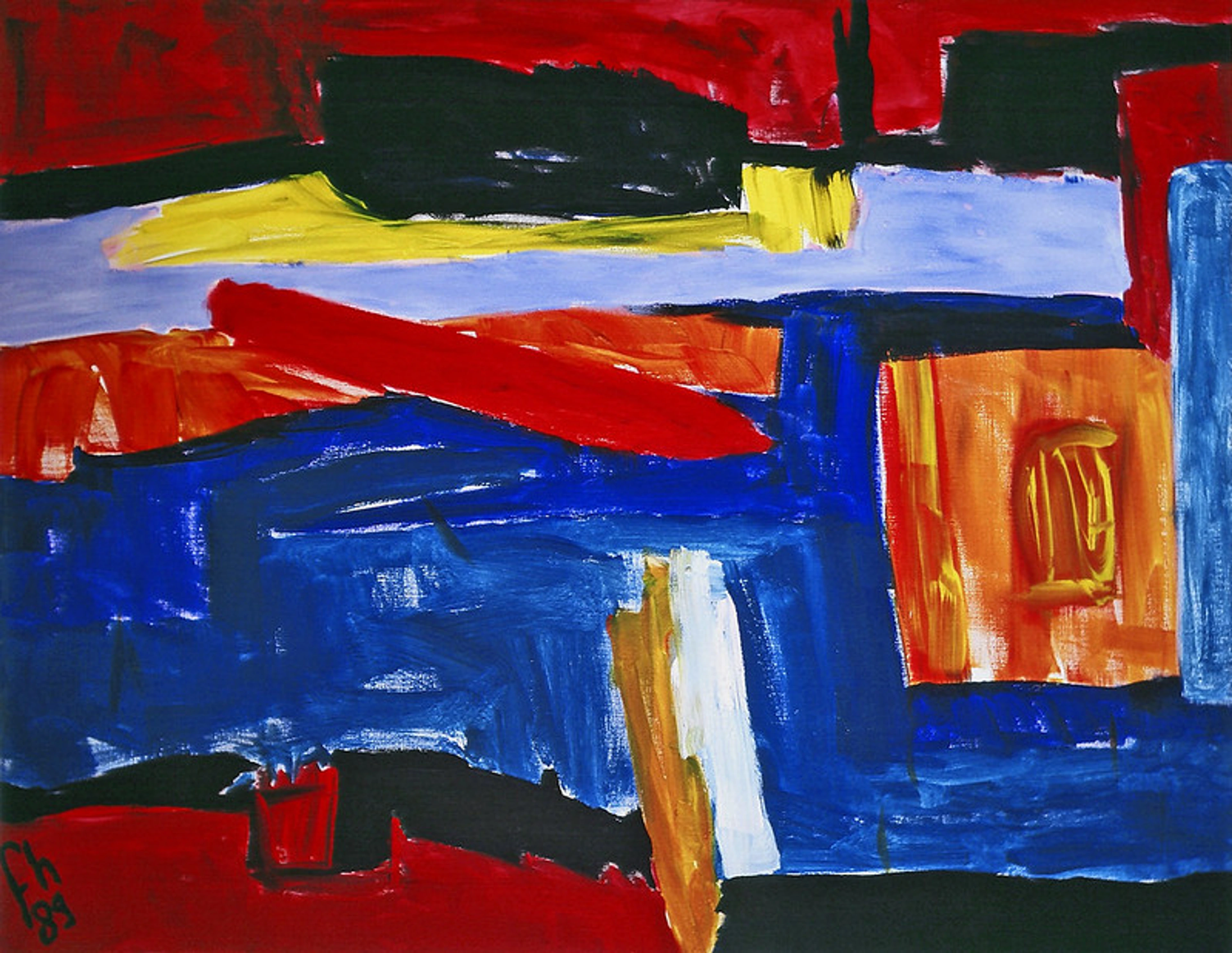
For me, understanding the elements is about developing a deeper, richer relationship with art. It's about moving beyond that initial "Wow!" to an informed appreciation. When you understand these elements, you stop just seeing art and start reading it. You can deconstruct a piece, understand the artist's choices, and even articulate why a certain piece resonates (or doesn't!) with you. It truly grants you entry into that once-exclusive art club. I remember one particular abstract painting of mine where I deliberately chose strong, angular lines and a muted, high-contrast value palette to evoke a feeling of dynamic tension, hoping to draw the viewer into a specific emotional space. Knowing these building blocks gave me that conscious toolkit, helping me overcome creative blocks and hone my artistic voice. When I found myself stuck recently, the simple act of focusing on the underlying shapes and the directional pull of lines helped me reorganize a chaotic composition into something cohesive and impactful. In my own art for sale, especially the abstract art prints, I often find myself consciously manipulating these very elements to achieve a particular feeling or visual flow – it's a constant, joyful puzzle.
It's empowering. It's also incredibly useful if you, like me, enjoy creating. Knowing these building blocks gives you a conscious toolkit to express your own ideas. You can deliberately choose to use bold lines for energy, cool colors for calm, or ample negative space for drama. Maybe you'll even be inspired to create something yourself? If so, consider picking up a pen or brush and experimenting with just one element. How much expression can you get from a single line? How many feelings can a simple shape evoke? Sometimes, seeing how these elements play out in a finished piece, like the abstract art prints I sell, can spark your own creativity. Or perhaps you'd like to see these elements in action in a more tangible setting? My work is sometimes showcased at my museum in 's-Hertogenbosch, where you can experience them firsthand.
FAQ: Quick Bites on Elements of Design
Here are a few questions I often hear when discussing these foundational ideas:
Q: Are elements of art and elements of design the same thing? A: Largely, yes! The terms are often used interchangeably, especially in the context of visual arts. Both refer to the fundamental components used to create an artwork. Don't sweat the distinction too much; focus on the concepts themselves. (What is design in art?)
Q: Which element is the most important? A: This is like asking which instrument in an orchestra is most important. They all contribute! A skilled artist knows how to combine and emphasize different elements to achieve their desired effect. Sometimes line dominates, sometimes color, but they're always working in concert. It's a symphony, really, and each element plays a vital role in conveying the artist's message or emotion.
Q: How can I critique a piece of art using these elements? A: Start by isolating each element. What kind of lines do you see? Are the shapes geometric, organic, or abstract? How is space used (positive/negative, deep/shallow)? What role do value and color play in the mood? How about texture (actual/implied/simulated) and pattern? Then, consider how these elements work together, perhaps guided by principles like contrast, rhythm, or balance, to create the overall effect. It gives you a structured way to articulate your observations.
Q: How can I practice seeing these elements in everyday life? A: Great question! Start small. Look at a coffee cup: what are its lines (rim, handle)? What's its shape (cylinder)? What color is it, and what's its value? What texture does it have (smooth, rough, implied)? Do you see any patterns? Do this with everything around you—a tree, a building, a piece of clothing. It's like a mental exercise that sharpens your artistic eye, revealing the hidden language all around us.
Q: How are these elements applied in different art mediums? A: Ah, this is fascinating! Each medium offers unique ways to emphasize and play with these core elements.
- Painting: Artists imply form, space, and texture with brushstrokes, color layering, and perspective. Color and value are paramount for mood and light. The expressive power of line can be immense.
- Sculpture: Here, actual form, space (both positive and negative), and texture are inherent and tangible, inviting physical interaction. Line can be implied by edges and contours. The emotional impact often comes from mass and volume.
- Digital Art: All elements can be manipulated with incredible precision and fluidity. Lines can be vector-perfect or gestural. Colors are limitless, and forms and textures can be rendered with hyper-realism or abstractly with powerful software tools, allowing for experimentation beyond physical limitations.
- Photography: Harnesses light and shadow to define value, shape, and space. The composition relies heavily on how lines, forms, and patterns are captured within the frame. Texture can be incredibly detailed or soft-focused, directly capturing the world's surface qualities.
- Architecture: Focuses heavily on form, space, and line to create functional and aesthetic structures. Patterns might appear in facades or tiling.
- Printmaking: This medium thrives on line, texture, and value. Techniques like etching use varying line weights to create depth and shadow, while woodcuts and linocuts often emphasize strong shapes and patterns. The physical act of pressing also inherently creates unique textures.
It's truly something else how universal and adaptable these building blocks are across creative fields.
Final Thoughts: Keep Looking, Keep Learning
Understanding the elements of design isn't about memorizing a list; it's about learning to see. It's about developing an active, inquisitive eye that finds beauty and meaning in the deliberate choices an artist makes. It's a journey, not a destination, and honestly, a pretty fun one. My own artistic journey has certainly been a constant process of discovering new ways to play with these very same elements. Just last week, I found myself re-evaluating an older piece, realizing a subtle shift in pattern—changing a repeating grid from squares to slightly offset rectangles—could give it a whole new rhythm and unexpected dynamism, proving you never stop learning. So keep looking, keep questioning, and above all, keep enjoying the incredible world of art. And maybe, just maybe, you'll feel that "aha!" moment too. What have you discovered about art through these elements? Share your own "aha!" moments in the comments below – I'd truly love to hear about it!


