
Finding Your Center: My Personal Journey with Balance in Abstract Art Composition
Ever wondered why some abstract art just 'feels right'? I'm sharing my personal journey with understanding visual balance, from symmetrical serenity to the thrill of asymmetrical dynamics, and how it shapes my work.
Finding Your Center: My Personal Journey with Balance in Abstract Art Composition
I’ve been making art for a good while now, and if there’s one thing that consistently makes or breaks a piece, it’s balance. Seriously. It’s that invisible hand, the whispered logic that tells your eyes where to go and why to stay. Early in my journey, I used to think balance was just a fancy word for symmetry, and honestly, that thought bored me to tears. Who wants perfect mirrors when you can have a lively dance? But it's so much more than that, and understanding it has completely transformed how I approach my own abstract pieces. I remember years ago, staring at a canvas that just felt 'off,' no matter what I added. It was only when I started thinking about the weight of each color and shape, not just its placement, that the piece finally clicked. That was my first real lesson in balance.
What Even Is Balance in Art, Anyway?
So, what are we actually talking about when we say balance in art composition? For me, it boils down to visual weight. Imagine you’re holding a tray of drinks. If all the glasses are piled on one side, it feels precarious, right? You’re anticipating a spill. Art is the same. It’s about distributing elements—colors, shapes, textures, lines—across the canvas (or sculpture, or design) in a way that feels stable, harmonious, or intentionally unsettling. The human brain instinctively seeks order, even in chaos. When a piece feels balanced, there's a subconscious sigh of relief, a sense of visual rightness that allows the viewer to comfortably engage. This also relates to what artists call "visual hierarchy," where elements are arranged to guide your eye through the story of the piece. This whole idea of how elements are arranged is what we generally call composition, and balance is a huge part of its secret sauce.
And underlying all of this are principles like Gestalt psychology, which explain how our brains naturally group elements, finding patterns and unity. It's not always about making things 'pretty'; sometimes, a deliberate imbalance can create tension and narrative, which is utterly fascinating. It’s about creating a visual equilibrium, a sense of rightness, even if that 'rightness' is a dynamic one – a precarious but perfectly held pose, rather than a static one.
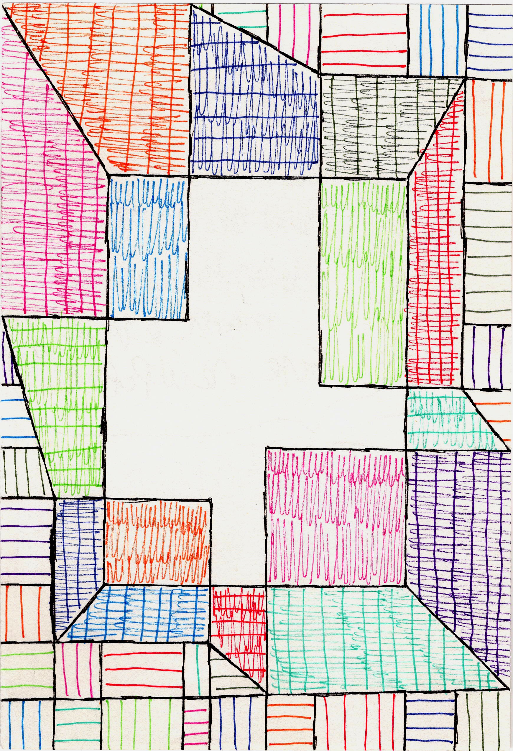
The Three Flavors of Balance I Play With
While there are endless ways to think about distributing visual weight, most artists talk about three main types: symmetrical, asymmetrical, and radial balance. Each brings its own unique energy to a piece, and I’ve certainly had my moments wrestling with each of them in my own work.
1. Symmetrical Balance: The Predictable Pal
This is the easiest to grasp because it’s everywhere in our world: our own faces (mostly!), butterflies, ancient temples, even your living room if you’re particularly neat. Symmetrical balance occurs when elements on one side of a central axis are mirrored or nearly mirrored on the other side. It creates a sense of formality, stability, and often, serenity. Think calm. Think grand. Think serious.
Now, for my abstract pieces, pure symmetry can sometimes feel a bit... rigid. Like everything's standing at attention, perhaps even a touch stifling, especially for the fluidity I often chase in abstract work. But I still adore the discipline of it. Sometimes I’ll start with a symmetrical framework and then intentionally break it, just to see what happens. It's a great way to ground a piece before letting the chaos take over (or so I tell myself). If you want to dive deeper into how elements like shape and form contribute to this, check out my thoughts on understanding form in abstract art.
2. Asymmetrical Balance: My Wild Card!
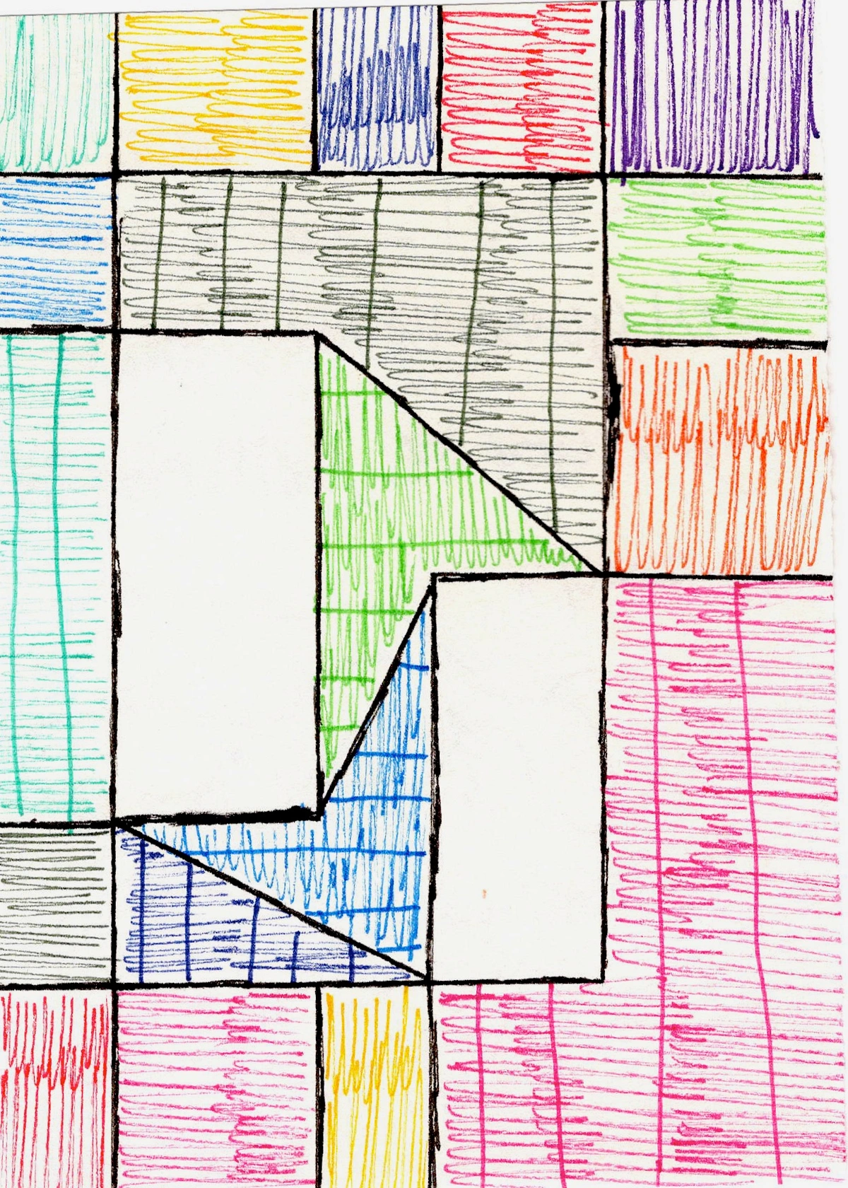
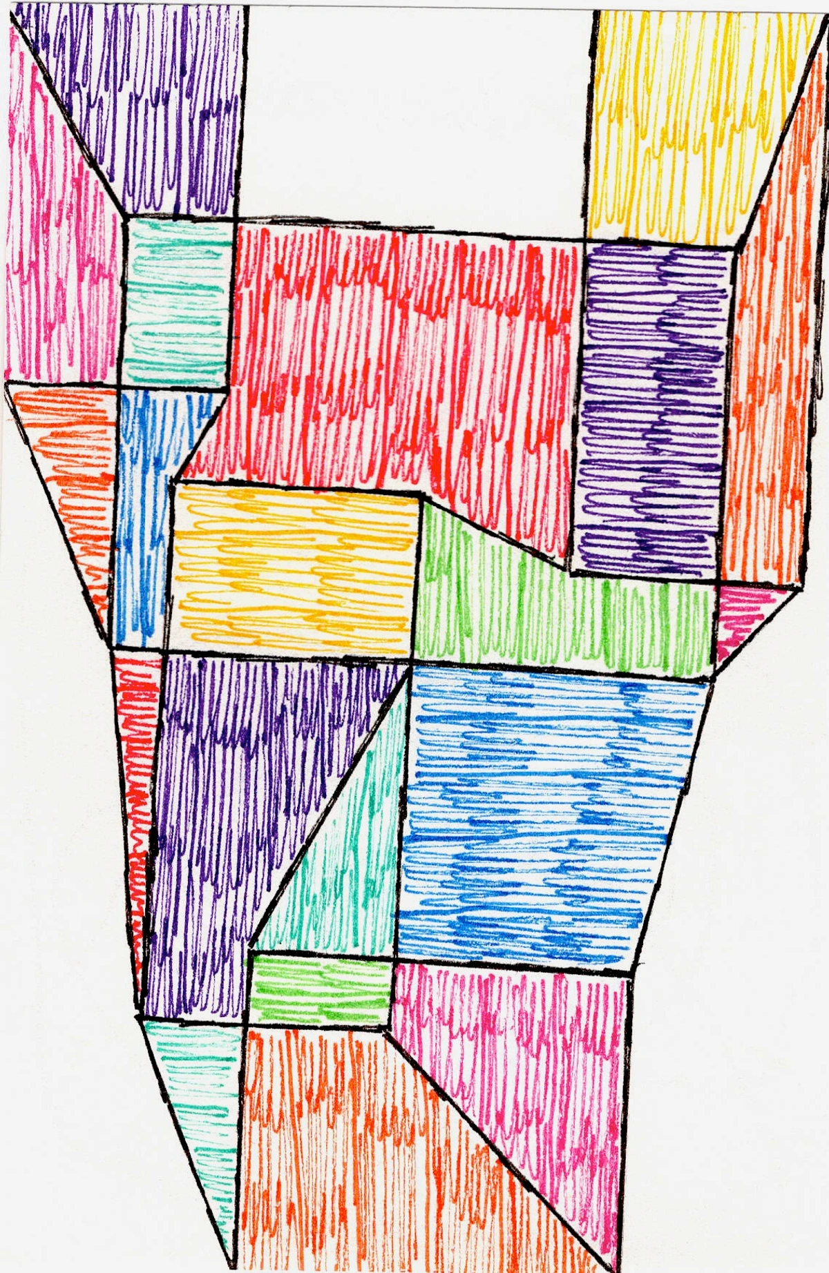
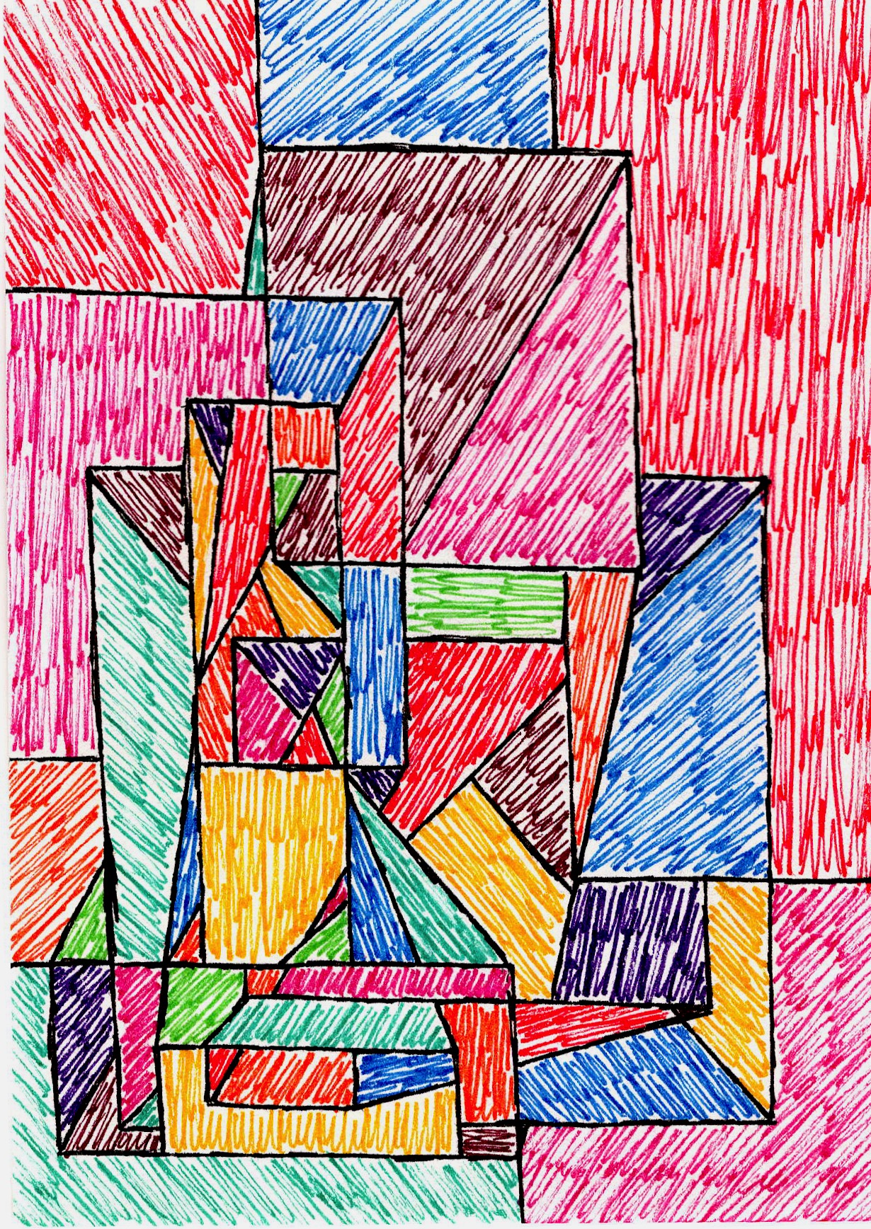
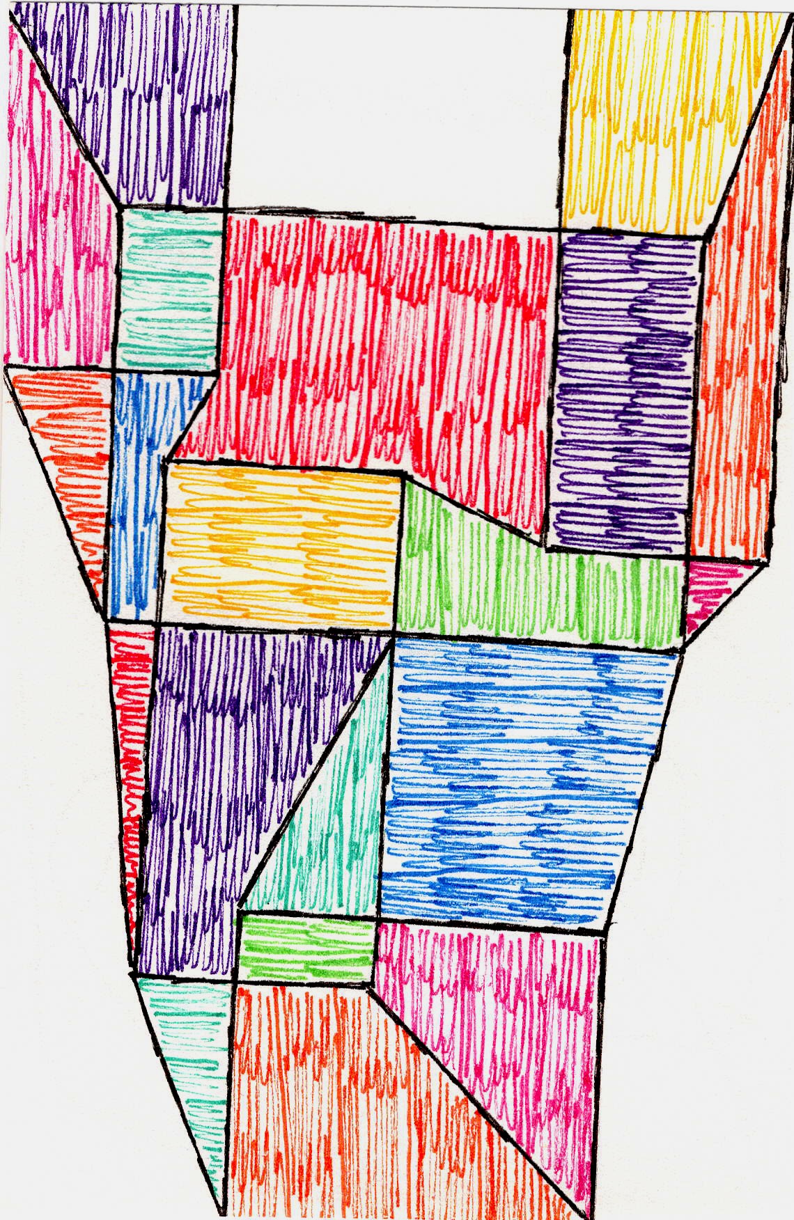
Ah, asymmetrical balance—this is where things get exciting for me. Instead of mirroring, you’re balancing dissimilar elements that have equal visual weight. Think of it like a seesaw where a large person on one side is balanced by two smaller children on the other. For instance, a large, dark, imposing shape on one side might be balanced by a cluster of smaller, intensely bright, intricately textured elements on the other. It's like a visual tug-of-war where both sides feel equally strong, but completely different. It's dynamic, informal, and often more intriguing because the eye has to work a little harder to find that equilibrium. This type of balance feels alive and energetic.
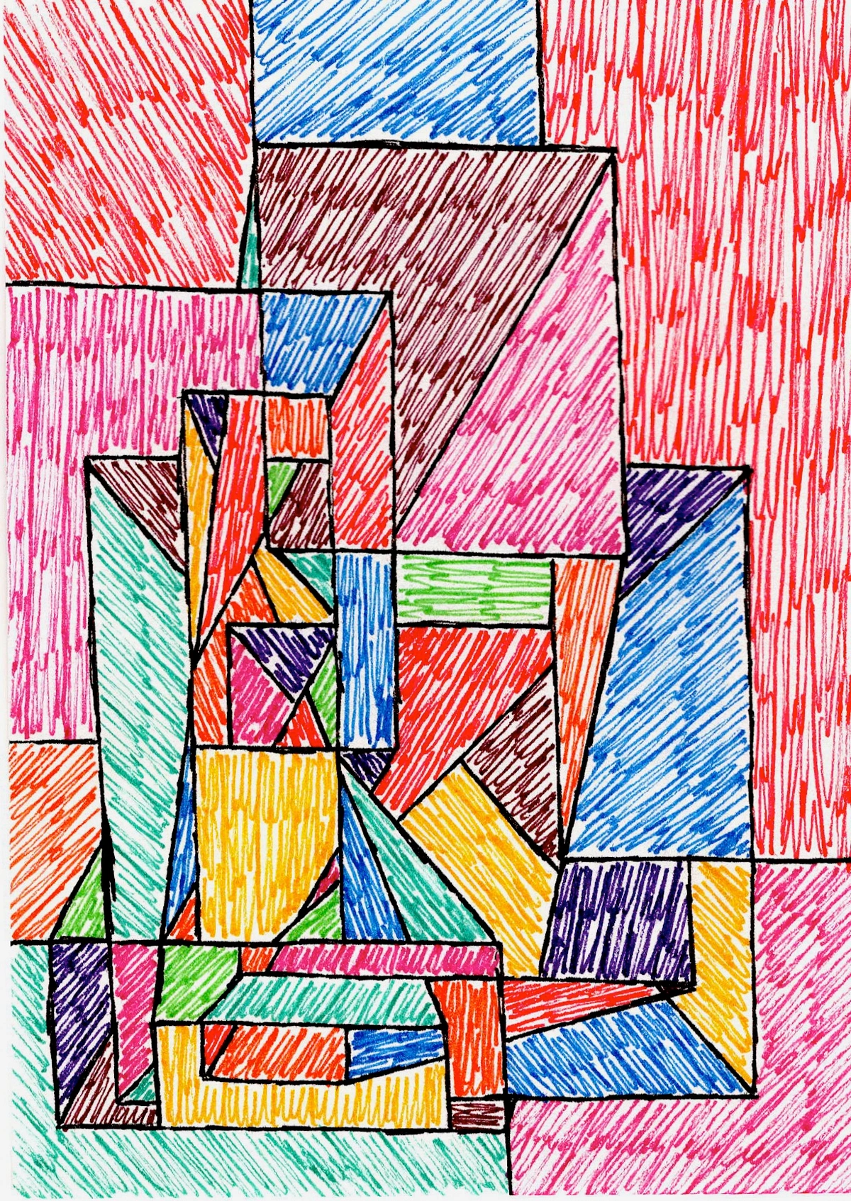
I find myself gravitating towards asymmetrical compositions in my abstract work a lot. It allows for so much freedom—a big, bold shape on one side can be balanced by a cluster of smaller, intensely colored elements, or a vast empty space. It creates tension and interest without making the viewer feel off-kilter. It's about a conversation between elements rather than a perfect echo. It's how I often build the unseen structure in my own paintings.
3. Radial Balance: The Spiraling Story
Radial balance is less common in my abstract work, but it’s utterly captivating. Here, all elements radiate outwards from a central point, like spokes on a wheel or ripples in a pond. Think mandalas, rose windows in cathedrals, the radiating lines from a bursting star, the intricate patterns of a snowflake, or even the intense glow emanating from a single light source. It draws the eye directly to the center and then guides it outwards. It creates a powerful focal point and a sense of movement.
While I don't often do strict radial compositions, I definitely use the idea of a central pull. Sometimes, a focal point in my work will radiate energy outwards, even if the overall balance is asymmetrical. It’s like a little sun in the middle of a bustling abstract galaxy. It’s one of those subtle ways I try to guide the viewer's eye.
Why Does Balance Actually Matter?
So, why do we even bother with all this talk of visual weight and equilibrium? Because balance, whether symmetrical, asymmetrical, or radial, directly impacts how a piece communicates. It’s not just an academic exercise; it's fundamental to the emotional and intellectual experience of art. When a piece is well-balanced, it feels complete. It feels resolved (or intentionally unresolved in a compelling way). It allows the viewer to absorb the message without feeling uneasy. It's a principle artists have wrestled with through the ages, from the rigorous symmetry of Renaissance compositions to the dynamic counterpoints of Impressionism and the deliberate fragmentation of Cubism, each era finding its own 'rightness'.
For me, in abstract art, where there's no recognizable subject, balance becomes even more crucial. It’s the framework that holds the abstraction together, preventing it from devolving into mere chaos. It’s the backbone. In abstract art, where there's no obvious story, balance becomes the silent narrator, dictating the mood. A heavy bottom might ground it in solemnity, while lightness at the top could suggest aspiration or fleeting joy. Without it, even the most vibrant colors or compelling mark-making can feel haphazard and uninviting. It’s how the art creates a language that speaks to you, even if you can’t quite put your finger on what it’s saying.
But here's a secret: sometimes, the most profound balance comes from intentional imbalance. This isn't a mistake; it's a deliberate choice to create tension, a dynamic unease that pulls the viewer in, challenging their perception. Think of a jazz solo that purposely veers off-key before resolving into harmony – it's unsettling, yes, but undeniably captivating. Knowing the 'rules' allows you to break them with purpose, creating a powerful, unsettling beauty. This deliberate play can evoke strong emotional responses, pushing the viewer beyond comfortable aesthetics to a deeper, more challenging engagement.
And I'll be honest, sometimes I get it wrong. Sometimes a piece just doesn't feel right, and I'll stare at it for hours, turning it, propping it up, walking away and coming back. Nine times out of ten, the problem is balance. A color is too heavy here, a shape too dominant there. It’s a constant dance of adjustment, a subtle conversation between me and the canvas. But when it clicks, oh, the relief! It’s like a sigh of visual satisfaction. That's when I know a piece is ready to find its home, perhaps even in your collection. So, if balance is this fundamental language, how do we learn to speak it, or at least, understand its whispers?
How to Train Your Eye to See Balance
Okay, so you understand the concepts, but how do you feel it? This isn’t something you learn by rote; it’s something you develop with practice, much like learning to ride a bike. Here are a few things I do, and that you might find helpful:
- Flip It: Turn a painting upside down (or sideways!). This tricks your brain into seeing shapes and colors purely as elements of composition, stripping away any narrative bias. Suddenly, imbalances jump out.
- Squint: Seriously, squint your eyes. This blurs the details and allows you to see the overall masses and their distribution more clearly. Heavy areas become apparent.
- Step Back: Don't just look at art up close. Give it space. Walk across the room. How does it feel from a distance? Sometimes a subtle imbalance is only noticeable from afar.
- Cover Parts: Use your hands or a piece of paper to cover sections of a painting. Does removing an element make the rest feel more or less balanced? This helps you understand the contribution of each part.
- Critique Others (Kindly!): When you look at art you love, try to articulate why it feels balanced. When you see something that doesn't quite work, try to pinpoint where the imbalance lies. The more you analyze, the sharper your eye becomes.
- Sketch Studies: And for those who get their hands dirty like I do, try small sketching exercises. Create quick studies where your only goal is to balance two or three disparate shapes or colors. It’s a wonderful way to internalize the feeling, to truly understand visual weight by creating it yourself.
It’s a lifelong journey, this pursuit of visual harmony. Sometimes I think about my entire artist's timeline as a series of experiments in finding new kinds of balance.
Frequently Asked Questions About Balance in Art
Q: Is balance always necessary in art?
A: Not always in the traditional sense! While most successful art demonstrates a form of balance, it’s crucial to understand that 'balance' isn't always about neat equilibrium. Intentional imbalance can be a powerful artistic choice to create tension, discomfort, or a sense of unease. It's about knowing the 'rules' so you can break them effectively and with purpose, like a jazz musician playing a dissonant chord on purpose to heighten the eventual resolution.
Q: Can a piece have more than one type of balance?
A: Absolutely! A large abstract work might use asymmetrical balance overall but have small symmetrical details, or elements that radiate outwards (radial) from a particular focal point, creating complex visual interest. It's rarely a one-size-fits-all scenario, especially in contemporary art.
Q: How do I know if my own artwork is balanced?
A: This is the million-dollar question! It often comes down to intuition and practice. Use the techniques mentioned above (flipping, squinting, stepping back). Ask for honest feedback from trusted peers. Ultimately, if it feels right to you, after careful consideration, you're probably on the right track. Trust your gut; it's often more knowledgeable than your conscious mind when it comes to aesthetics.
My Final Thoughts on This Ever-Elusive Equilibrium
Balance in art composition isn't some dry, academic concept. It's the pulsating heart of how art communicates, how it holds your attention, and how it makes you feel. It’s a dance between elements, a silent conversation between artist and viewer. For me, it’s a constant challenge and a perennial joy to chase that feeling of visual rightness in my abstract worlds. It's about finding harmony in the unexpected, about making every visual element sing together, even if they're singing a slightly off-key, wonderfully chaotic song. And this pursuit, this finding of order within life's beautiful, overwhelming chaos, that's a balance worth striving for, both on canvas and off.


