
Art's DNA: The Ultimate Guide to Elements, Principles & Composition
Unlock the universal language of art. This ultimate guide explores the essential elements (line, color, form), design principles (balance, contrast, movement), and composition, with personal insights and examples from abstract art. See art with new eyes and discover its DNA.
Art's DNA: My Intimate Guide to Elements & Principles of Visual Language
Let's be honest, sometimes art can feel a bit... intimidating, right? All those fancy words, the deep stares in galleries, the hushed reverence. It's enough to make you just nod vaguely and pretend you understand, silently fearing you'll reveal your secret: that you sometimes feel like you're missing the memo. Trust me, I've been there. More times than I'd like to admit. For years, I approached art like a complex puzzle I hadn't been given the instruction manual for. Then, one day, staring at a canvas that seemed to defy all logic, it clicked. It wasn't about 'getting it' in the traditional sense; it was about understanding its fundamental language. What if that manual, that elusive 'memo,' was actually a foundational vocabulary, a kind of Art's DNA that makes every artwork tick? What if we could demystify the core components, the very building blocks, and then understand how artists arrange them to create meaning and emotion? This isn't just about understanding art; it's about seeing the world, and perhaps even yourself, a little differently. It's about pulling back the curtain on the universal language of visual expression, laying bare its fundamental elements, exploring how they interact through crucial principles of design, and finally, how they all come together in a masterful composition.
This isn't some dry, academic lecture, though. Think of this as our little secret handshake, a candid conversation about the bedrock of visual expression. While my own journey often leads me through the vibrant world of abstract art, these foundational concepts are the universal language, equally vital to a traditional landscape, a striking portrait, or the wildest abstract piece. My aim is to pull back the curtain on what I affectionately call "Art's DNA": the elements of art and the principles of design. These aren't just technical terms; they're the ingredients and the recipes, the basic building blocks that artists use to create everything you see, and the guidelines for how they put them together. Understanding them isn't about becoming an art historian; it's about enriching your own experience, seeing the world a little differently, and perhaps, even finding a piece of art that truly speaks to your soul, and maybe even exploring my own art collection along the way.
The Fundamental Building Blocks: Deconstructing Art's DNA – The Elements
So, what exactly are these mysterious elements? They are line, shape, form, space, color, texture, and value. Think of them as the alphabet of visual language. You can use them to write a simple note or an epic novel. The beauty, especially in contemporary and abstract art, is how artists push and pull these elements, often stripping them down to their raw essence or exaggerating them to create entirely new dialogues. Crucially, these elements are rarely used in isolation; their interplay is what creates a rich and dynamic visual experience.
To make things easier, here's a quick overview of the elements we'll be diving into:
Element | Core Definition |
|---|---|
| Line | A mark with length and direction; a moving point. |
| Shape | A 2D enclosed area, defined by lines or color. |
| Form | A 3D object with height, width, and depth. |
| Space | The area around, between, and within elements. |
| Color | The property of light, with hue, intensity, and value. |
| Texture | The perceived surface quality of an artwork. |
| Value | The lightness or darkness of a color. |
Now, let's explore each of these ingredients in detail, starting with the most fundamental:
1. Line: The Humble Path of a Point
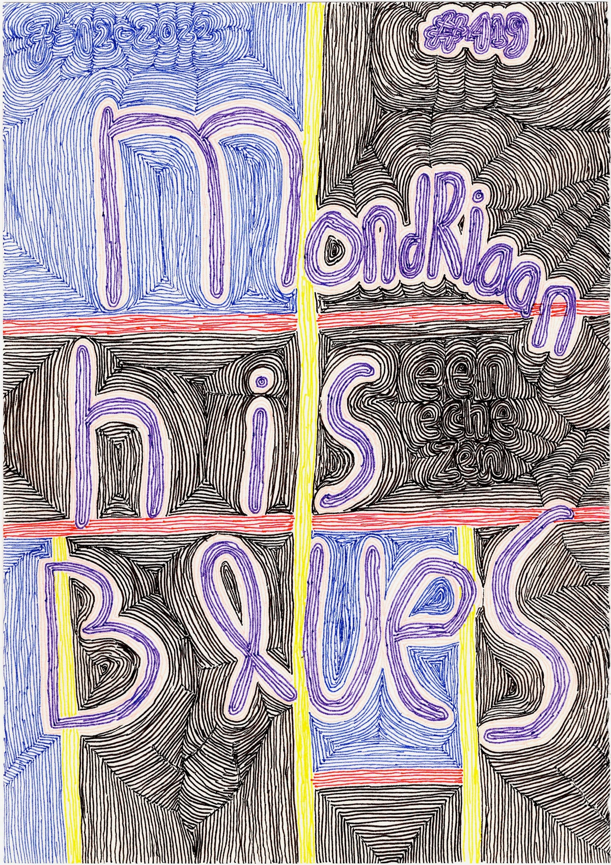
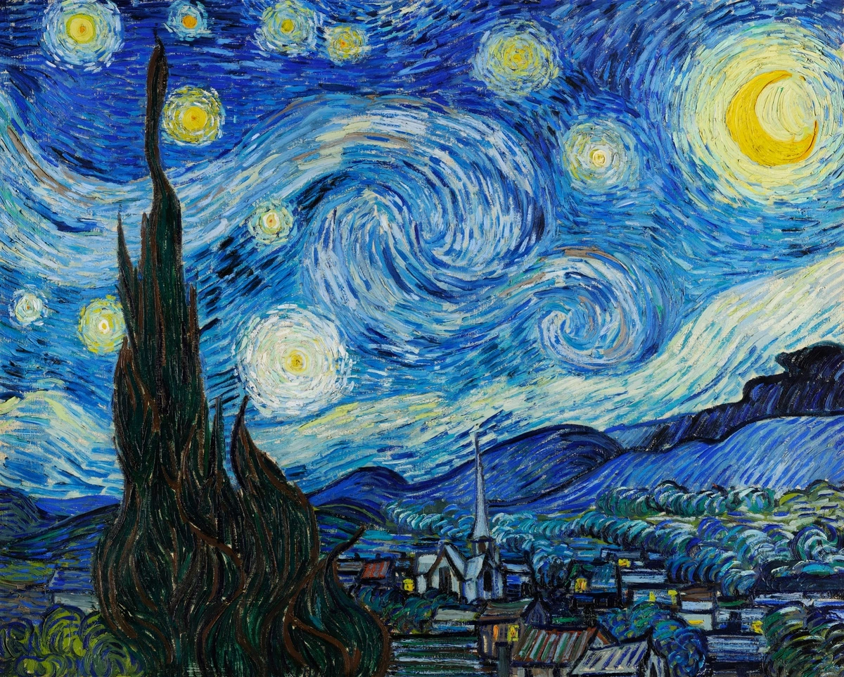
Ah, line. It feels so basic, doesn't it? A simple mark, a dot that decided to go for a walk. But oh, the stories a line can tell! It can be bold and assertive, delicate and hesitant, jagged and anxious, or smooth and serene. Beyond mere definition, lines carry emotional weight; a strong vertical line might evoke stability, while a chaotic, broken line could suggest anxiety. We also talk about line weight – the thickness or thinness of a line – which profoundly impacts its visual presence and expressive quality. Think of the delicate lines of a charcoal sketch versus the heavy, assertive lines of a woodcut print. In abstract art, lines often break free from defining objects and become subjects in themselves. They create rhythm, direct your eye, or even evoke emotion without depicting anything recognizable, especially through gestural marks that capture the artist's spontaneous movement and energy. Think of the bold, dynamic lines in Futurist paintings like those of Umberto Boccioni, conveying speed and movement, or the precise, defining lines of Piet Mondrian's abstract compositions. Contemporary artists like Sol LeWitt elevate lines into complex, systematic wall drawings, where the line's conceptual purity and infinite permutations become the artwork itself, inviting us to contemplate structure and order. For a more raw, visceral use of line, consider the energetic scrawls of Cy Twombly or Willem de Kooning's agitated brushstrokes, where line itself embodies intense emotion and movement.
In a way, a line is both the simplest and most profound act of creation – a single stroke, and suddenly, there is direction. I remember one of my earliest abstract pieces – a chaotic mess of overlapping lines. At first, I thought it was a failure. "Too busy," I muttered. But then I looked again, and I saw movement, a frantic energy, a sort of controlled madness. It was an accidental self-portrait of my mental state at the time. Sometimes, the simplest element reveals the most complex truths. If you're as fascinated by this foundational element as I am, you might delve deeper into the definitive guide to understanding line in abstract art.
Printerval.com, https://creativecommons.org/licenses/by-nc/4.0/
From the boundless journey of a line, we arrive at its conclusion – where lines meet to define an area.
2. Shape: Where Lines Meet
When a line encloses an area, a shape emerges. Shapes are two-dimensional – flat. They can be geometric (squares, circles, triangles, my personal favorites for their stark simplicity and intellectual purity) or organic (free-form, natural, flowing, evoking the spontaneity of nature). Shapes are often the silent protagonists of a composition, defining space and creating visual interest. They can also be categorized as positive shapes (the actual objects or subjects within the artwork) or negative shapes (the empty spaces surrounding them, which are equally important in defining the composition). In abstract art, shapes are often the main event, playing off each other, creating balance or tension, and inviting your imagination to fill in the blanks. Cubist masters like Picasso and Braque, for instance, revolutionized art by fragmenting and reassembling forms into geometric shapes, challenging traditional perspective and inviting the viewer to perceive multiple viewpoints simultaneously. Building on this, contemporary artists like Frank Stella often explore monumental geometric shapes, pushing the boundaries of the canvas itself, creating shaped canvases that blur the line between painting and sculpture, making the shape an undeniable physical presence. Similarly, Ellsworth Kelly's hard-edged, flat color shapes emphasize pure form and color, reducing imagery to its most essential geometric components, creating works that both stark and profoundly impactful.
I've spent countless hours in my studio, just moving colored shapes around, like a child with building blocks, only the blocks are digital and I'm trying to articulate an emotion. There's a particular joy in finding the exact right triangle to complement a sprawling circle, almost like solving a visual riddle. It's less about depicting reality and more about creating a new one, a self-contained universe of form and feeling.
From flat shapes, we now leap into the tangible realm of three dimensions.
3. Form: Stepping into 3D
If shapes are flat, then form is where things get interesting and tactile. Form is three-dimensional; it has height, width, and depth. Think of a sphere, a cube, a cylinder. In painting, artists create the illusion of form through techniques like shading, chiaroscuro (the dramatic use of strong contrasts between light and dark to create the illusion of volume by emphasizing highlights and shadows), foreshortening (a visual effect that causes an object or distance to appear shorter than it actually is because it is angled toward the viewer, manipulating perspective to suggest depth), and sfumato (a painting technique for softening the transition between colors, creating a soft, hazy, almost smoky effect that suggests depth and form). These methods primarily rely heavily on value shifts to suggest volume and solidity, making a flat surface convincingly three-dimensional through careful manipulation of light and shadow. Sculptors, of course, work with actual forms, manipulating material to create tangible volume and mass in physical space. However, in abstract art, there's also a fascinating counter-movement: artists might intentionally flatten forms, using hard-edged planes or uniform color fields to challenge traditional perceptions of depth and emphasize the two-dimensionality of the canvas itself, inviting a different kind of visual engagement and a more direct encounter with color and shape.
For me, in abstract painting, creating form is a fascinating trick. It's about convincing your eye that something flat has weight and volume. It’s a delightful deception that sometimes feels like a magic trick I’m still perfecting. A slight shift in color value or the way lines converge can make a flat surface bulge or recede, transforming a mere surface into a perceived mass. It's a playful negotiation with the viewer's perception, sculpting intangible mass with light and shadow, even without a clear light source.

https://www.flickr.com/photos/42803050@N00/31171785864, https://creativecommons.org/licenses/by-nd/2.0/
Yet, even the most profound forms need room to breathe, leading us to the often-underestimated element of space.
4. Space: The Breath Between Forms
Space is often overlooked, but it's utterly vital. It's the area around, between, and within components of an artwork. It can be positive space (the subject itself, the solid forms, or the areas occupied by objects) or negative space (the empty areas surrounding and permeating the subject, often acting as a silhouette or a compositional device), with both playing equally crucial roles. Space creates depth, illusion, and breathes life into a composition. Without it, everything would be a chaotic, jumbled mess. Consider how artists utilize foreground, middle ground, and background to create a sense of depth and narrative even in two-dimensional works. Manipulating space can also evoke psychological responses; vast open spaces can feel liberating, while constricted spaces might feel claustrophobic. A key aspect of how space is perceived is the figure-ground relationship, where the brain organizes visual information into distinct objects (figure) that stand out from a less important background (ground), dynamically influencing how we interpret a composition. This interplay can also contribute to the visual weight of elements, making certain areas feel heavier or lighter by virtue of the space around them. In abstract art, artists often deliberately manipulate this relationship to create ambiguity, making it unclear what is foreground and what is background, or even generating optical illusions that challenge our perception of depth and dimension, forcing us to actively engage with the visual puzzle.
I sometimes think of negative space as the art of not painting. It's where I consciously decide to let things be. It's the quiet moments, the pauses in a conversation that give meaning to the words. In abstract art, manipulating space can create a sense of vastness or claustrophobia, inviting you to step into the canvas or pushing you back. It's where the viewer's eye gets to rest, wander, or get lost. To truly appreciate how artists manipulate perception, exploring the definitive guide to space and form in abstract art is highly recommended.
But what breathes ultimate life and emotion into these forms and spaces? The vibrant, undeniable force of color.
5. Color: The Emotional Powerhouse
Oh, color! The show-stopper, the attention-grabber, the element that makes our hearts sing (or sometimes wince). It's a glorious, messy, deeply personal quest. Color has three main properties: hue (the name of the color, like red or blue), intensity (how bright or dull it is – also called saturation), and value (how light or dark it is – more on that in a moment). Colors evoke emotions, create moods, and can even carry symbolic meanings. Beyond mere emotional evocation, color psychology delves into how colors influence human behavior and perception; vast studies show how reds can increase appetite, blues can foster tranquility, and yellows can trigger feelings of optimism or anxiety, demonstrating its profound multi-layered language. Think of the calming blues or the energizing reds that permeate our visual world, or how different cultures associate specific colors with joy, mourning, or wealth. Physiologically, certain colors can even affect our heart rate or perceived temperature. It's a profound, multi-layered language that even impacts how those with color blindness perceive the world, reminding us that visual experience is deeply subjective and varied. In abstract art, artists wield color not just to represent, but to create emotional states, building narratives purely through chromatic relationships – a searing red might express anger, while a delicate gradient of blues and greens could evoke a meditative calm. My own work often starts with a single color that dictates the entire emotional trajectory of a piece.
Beyond these properties, color theory delves into how colors interact. It's a rich field, but understanding the color wheel is a great start. This circular diagram organizes colors based on their relationships. Primary colors (red, yellow, blue) are the foundational hues. Mixing two primaries gives us secondary colors (orange, green, purple), and combining a primary with a secondary yields tertiary colors. The magic truly happens in their interactions: Complementary colors (like red and green) create intense vibrancy when placed next to each other, making each pop. Analogous colors (like blue and green) foster harmony and a sense of unity. Monochromatic schemes (variations of a single hue) evoke subtlety, while Triadic schemes (three colors equally spaced on the wheel) offer strong visual contrast and dynamism. Generally, warm colors (reds, yellows, oranges) tend to advance and energize, while cool colors (blues, greens, violets) often recede and soothe, influencing perceived temperature and space – an important consideration for creating depth. It's also worth a quick mention that color can be understood through two models: additive color, where light is mixed (like on a screen, combining red, green, and blue light to create white), and subtractive color, where pigments are mixed (like paint, combining colors absorbs light, eventually leading to black). This distinction is crucial for artists as it dictates how colors behave when mixed in different mediums – light mixes differently than paint!
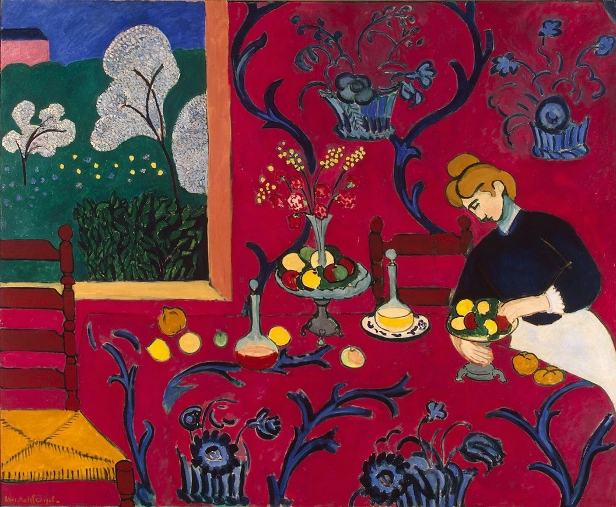
It's a conversation between hues, a symphony of shades, capable of both subtle whispers and grand pronouncements. As an artist working with colorful abstract art, color is my playground, my obsession, my endless experiment. I often don't consciously choose colors; they choose me. Or rather, they emerge from an intuitive dialogue with the canvas. Sometimes a specific color just feels right, like hitting a perfect chord in music. Then again, sometimes it feels like a terrible, garish mistake, like when I once tried to mix 'calming teal' and ended up with 'muddy swamp monster' – promptly painted over, of course. The journey of finding the right combination can feel like a mad scientist's quest – a glorious, messy, deeply personal quest. For a powerful example of color's interplay in a non-abstract context, consider Henri Matisse's "The Red Room," where bold primary reds and blues create a vibrant, immersive space without traditional perspective, demonstrating how color alone can define atmosphere and composition.
https://live.staticflickr.com/4073/4811188791_e528d37dae_b.jpg, https://creativecommons.org/licenses/by-sa/2.0/
If you're curious about how these elements intertwine with the grand sweep of art history, you might enjoy exploring the definitive guide to the history of abstract art.

Printerval.com, https://creativecommons.org/licenses/by-nc/4.0/
But art isn't just seen; it's also felt, which brings us to the tangible (or implied) dimension of texture.
6. Texture: The Feel of the Surface
Texture refers to the perceived surface quality of an artwork – how it feels or would feel if you touched it. It can be actual texture (physically rough, smooth, bumpy, soft, created through techniques like impasto – thick application of paint – collage, or sculptural materials) or implied texture (when an artist uses visual techniques like brushstrokes, patterns, or rendering to make a flat surface look textured, even if it's perfectly smooth). Think of the thick, swirling impasto of a Van Gogh painting, creating a palpable sense of movement and energy, versus the glassy smoothness of a classical portrait where every strand of hair is rendered with illusionistic detail. Texture adds a sensory dimension, inviting tactile engagement even from a distance. Beyond direct visual representation, artists can also simulate texture by manipulating other elements – for example, using sharp, jagged lines to imply a rough surface, or soft, blended values to suggest a smooth, velvety finish. In contemporary art, the use of digital tools and mixed media further expands the possibilities, allowing artists to create virtual textures or combine diverse physical materials for complex tactile experiences, blurring the lines between painting and sculpture, as seen in the work of artists like Robert Rauschenberg or Anselm Kiefer.
For me, texture is the quiet whisper of the canvas, the story told not just by color and line, but by the very materiality of the paint. I love the accidental textures that emerge from layers, drips, and brushstrokes. It's like the wrinkles on a favorite shirt – they tell a story of wear, of life lived, of hands at work. Sometimes I find myself staring at a tiny patch of paint, marveling at the mini-landscape of peaks and valleys. It's in these subtle details that the work truly lives, inviting a closer, more intimate look. I find great inspiration in the works of artists like Christopher Wool or Gerhard Richter, whose abstract work often showcases incredible tactile qualities, making you want to reach out and touch the canvas (please don't, unless you're the curator!). And then there's Sam Gilliam, whose draped and suspended canvases introduce actual, three-dimensional texture into the gallery space, making the very fabric of the art a textural event. If you want to dive deeper into the basics, check out this guide to art elements. For a deeper dive into the tactile world of art, consider the definitive guide to texture in abstract art.
https://live.staticflickr.com/2880/13401878023_7625a4270b_b.jpg, https://creativecommons.org/licenses/by/2.0/
Finally, to bring all these elements into sharp focus, to give them form and drama, we turn to the fundamental interplay of light and shadow – value.
7. Value: The Dance of Light and Shadow
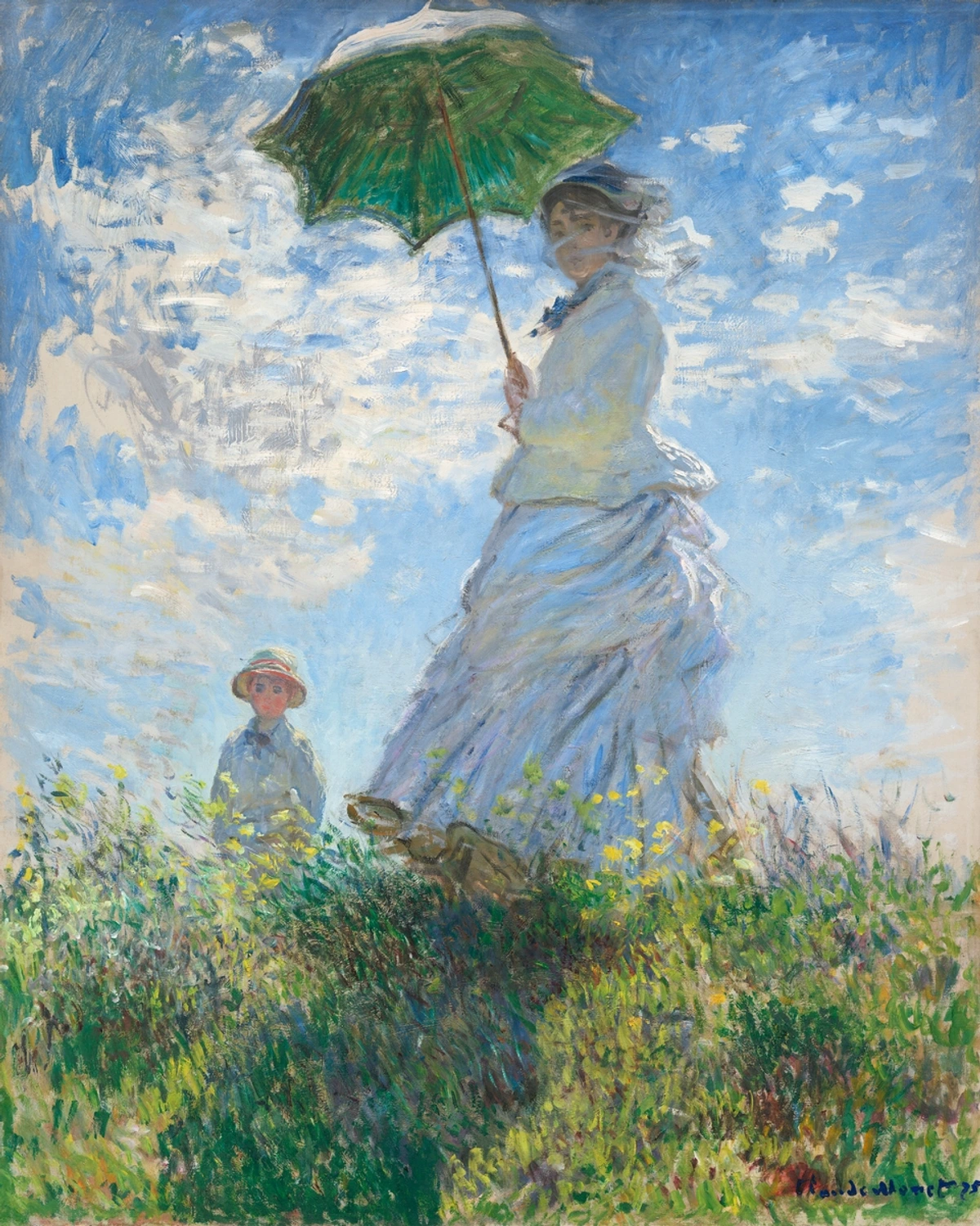
Finally, value! This refers to the lightness or darkness of a color, ranging from pure white to absolute black, and all the shades of gray in between. It's often misunderstood, but it's what gives a painting its sense of drama, depth, and contrast, and is crucial for creating emphasis and contrast within a composition. High contrast (very light next to very dark) creates energy and excitement; low contrast creates a more subtle, harmonious mood. In representational art, value is crucial for creating the illusion of three-dimensional form (explicitly linking to our earlier discussion of form), giving objects weight, establishing a sense of light source, and often contributing to atmospheric perspective where distant objects appear lighter and less distinct. Historically, masters of chiaroscuro like Caravaggio, Rembrandt, and Vermeer used dramatic value contrasts to create intense emotional impact and a heightened sense of realism, demonstrating value's power. For example, in many Impressionist landscapes, such as Claude Monet's works, subtle value shifts create the illusion of light, atmosphere, and form without harsh outlines, capturing the fleeting quality of a moment. In contemporary abstract art, artists like Barnett Newman use precise value shifts within vast color fields to create a profound sense of scale and psychological depth, where the subtle interplay of light and dark can feel almost spiritual. Crucially, value also plays a significant role in establishing visual weight and hierarchy within a composition, guiding the viewer's eye and making certain elements feel more prominent or recessive.
Working with value in abstract art, however, is less about accurately depicting light from a specific source and more about choreographing a ballet of light and dark within the composition itself. It's about creating visual weight and balance, a kind of internal glow or shadow that guides the eye and defines implied masses. Sometimes, I'll squint at a painting, stripping away the color, just to see its underlying value structure. It's a revealing exercise, like X-raying the artwork's skeleton, often surprising me with what truly holds the piece together. It's fascinating how different artists approach this, from the stark contrasts of a Christopher Wool to the nuanced shifts in a Rothko. It's all part of the definitive guide to understanding abstract art styles. If you're curious to unlock the secrets of light and shadow, exploring the definitive guide to understanding value in art can be incredibly illuminating.
https://www.rawpixel.com/image/547292, https://creativecommons.org/publicdomain/zero/1.0/

https://live.staticflickr.com/65535/53064827119_1b7c27cd96_b.jpg, https://creativecommons.org/licenses/by-nc-nd/2.0/
Key Takeaways: The Elements of Art
Here’s a quick recap of the foundational building blocks we’ve just explored:
- Line: The most basic mark, conveying direction, emotion, and visual weight through variations in thickness (line weight) and spontaneity (gestural marks). It can be precise or expressive.
- Shape: 2D enclosed areas, geometric or organic, defining space and acting as either positive (subject) or negative (background) elements. Fundamental for composition.
- Form: 3D objects, or their illusions created on a 2D surface primarily through value shifts and techniques like chiaroscuro, foreshortening, or sfumato, giving objects volume and depth.
- Space: The area around and within objects, equally defined by positive space (occupied by objects) and negative space (empty areas), crucial for depth, perception, and visual weight. The figure-ground relationship is key to its interpretation.
- Color: Defined by hue, intensity (saturation), and value; profoundly impacts mood and meaning, influenced by color theory, color psychology, and color temperature. It functions through both additive (light) and subtractive (pigment) models.
- Texture: The perceived surface quality, actual (e.g., impasto, mixed media, collage) or implied, adding sensory depth and visual interest and inviting tactile engagement.
- Value: Lightness or darkness of a color, crucial for depth, contrast, and drama, and essential for creating the illusion of form and emphasis. It also establishes visual weight and hierarchy.
These elements are the building blocks, the vocabulary of visual language. But what brings them to life, what allows them to tell a story? That's where the principles of design come in. But first, here are the key takeaways from our exploration of the elements:
The Art of Arrangement: How Elements Interact – The Principles
So, we've got the building blocks – the words. But how do artists actually write with them? How do they arrange these elements to create something that truly resonates? Having deconstructed the fundamental ingredients – the elements – we now turn our attention to how artists combine and arrange them. If the elements are the words of visual language, then the principles of design are the grammar, dictating how those words are strung together to form meaningful and impactful sentences, paragraphs, and even epic visual narratives. They are the guidelines, the 'recipes' that transform raw materials into a cohesive experience. They dictate how the elements are organized and arranged, creating cohesion or intentional discord. Understanding them is understanding the how and why behind a piece's impact, a topic deeply explored in what is design in art.
Let's unpack a few of these essential principles, delving into how they sculpt our visual experience.
1. Balance: The Art of Visual Equilibrium
Ever feel like a composition is about to tip over, or conversely, perfectly grounded? That's Balance. It refers to the visual weight of an artwork, creating a sense of equilibrium so that no single area overwhelms another. It's about how elements are distributed, and this visual weight is influenced by factors like size, color saturation, complexity, and placement. It can be:
- Symmetrical: Elements are evenly distributed on either side of a central axis, creating a formal, stable, and often classical feel, like a perfectly centered portrait or a mandala. Artists choose this when they want to convey order, permanence, or a sense of ceremonial importance, as seen in many Renaissance religious paintings.
- Asymmetrical: Elements are unevenly distributed but still create a sense of equilibrium, often more dynamic, informal, and visually intriguing. An abstract painting might feature a large, dark shape on one side balanced by several smaller, more vibrant, and texturally rich shapes on the other, creating dynamic tension without feeling unstable. It's like finding harmony in an unexpected arrangement, used to inject energy and avoid rigid formality. Indeed, asymmetrical balance is often favored in contemporary abstract art for its inherent dynamism and ability to create visual tension without feeling unstable.
- Radial: Elements radiate outwards from a central point, like a spiral, a sunburst, or a rose window, creating a strong sense of movement and focus.
For me, achieving balance in an abstract piece is often a delicate dance. It's less about literal symmetry and more about intuitive weighting. I'll often step back, squint, and imagine the canvas as a seesaw. Does it feel heavy on one side? Is there an empty void that pulls the eye away? Sometimes the solution is a tiny splash of a contrasting color, sometimes it's shifting an entire form. It’s a constant calibration, a quest for that elusive 'just right' feeling.
But true visual intrigue often emerges not from perfect harmony, but from deliberate opposition.
2. Contrast: The Spice of Visual Life
What makes an artwork pop? It's often Contrast, the juxtaposition of opposing elements – light and dark (value contrast), rough and smooth (texture contrast), large and small (scale contrast), or warm and cool colors (color contrast) – to create visual interest, excitement, or drama. Without contrast, an artwork risks becoming monotonous or visually flat. It's the spice that makes things pop. Think of the dramatic interplay between the bright highlights and deep shadows in a film noir scene, or the vivid clash of complementary colors in a Fauvist painting. Contrast is how an artist grabs your attention and directs it, creating focal points and guiding the viewer's eye through a piece. In abstract art, this might manifest as sharp, angular geometric lines cutting across soft, blended organic shapes, or a dense cluster of intricate detail against a vast, empty field of color.
In my studio, contrast is my secret weapon. Sometimes, a piece feels too bland, too homogenous. It's like a meal without seasoning. I'll experiment with adding a bold, aggressive line against a soft, blended background, or a brilliant primary color next to a muted earth tone. The sudden spark of difference can entirely transform the mood, creating a necessary tension that makes the harmonious parts even more appreciated. It’s a powerful tool for visual storytelling, even without a literal story.
With the stage set by contrast, the artist then decides where to direct your gaze, making certain elements sing louder than others.
3. Emphasis: Guiding the Gaze
Where do you want the viewer's eye to go first? Emphasis is about drawing attention to a particular area or element within the artwork, often creating a focal point that guides the viewer's eye and highlights what the artist wants you to notice first. A focal point is crucial because it gives the viewer an entry point and a central idea to engage with. This can be achieved through contrast (a bright spot in a dark area), isolation (an object set apart from others), placement (center stage, or strategically off-center), color (a single red element in a blue composition), or even scale (a disproportionately large or small object can immediately grab attention). It's the artist whispering, "Look here!" even in a subtle way. Think of the central figure in a classical portrait, or a single, glowing orb in a minimalist abstract. In abstract art, emphasis might be created not by a recognizable object, but by a sudden burst of highly saturated color (a small, vibrant red dot, for instance) against a muted field, or a sharp, intricate detail contrasting with broad, smooth strokes, compelling the viewer's eye to a specific, emotionally charged zone. The choice of emphasis is crucial for narrative, emotional impact, or simply directing the flow of appreciation.
I often find myself struggling with emphasis. Do I want a clear focal point, or do I want the eye to wander freely? There's a delicate balance. Sometimes, I'll deliberately obscure a potential focal point, creating a sense of mystery. Other times, I'll use a burst of saturated color or a particularly intricate detail to ensure the viewer's gaze lands precisely where I intend. It's about orchestrating the viewing experience, a subtle act of persuasion.
Once an artist has captured your attention, they then guide your journey through the artwork, creating a dynamic path for your eye to follow.
4. Movement: The Visual Journey
How does your eye travel through the artwork? Movement is the path the viewer's eye takes through the artwork, often guided by lines, shapes, or implied motion, creating a dynamic narrative. Diagonal lines naturally suggest speed or instability, while repeating shapes or a progression of values can all contribute to a sense of visual journey, leading the eye from one point to the next. Even in still art, artists can imply motion, like the swirling brushstrokes in a Van Gogh sky, the dynamic composition of a Futurist work that conveys velocity and change, or the rhythmic flow of a Japanese woodblock print. This can also be achieved through implied lines – lines that aren't explicitly drawn but are suggested by the arrangement of forms, guiding the viewer's eye through the composition, as seen in the subtle, repetitive grids of Agnes Martin that invite a meditative, slow 'movement' across the canvas. Contemporary abstract artists, such as Jackson Pollock, revolutionized movement by creating dynamic fields of flung and dripped paint, where the very act of creation imbued the canvas with an overwhelming sense of kinetic energy and visual flow. Movement can be fast and chaotic, or slow and contemplative, entirely shaping the viewer's engagement.
When a painting feels static, I know I need to introduce more movement. It's about creating a flow, a visual current. Sometimes it's a series of overlapping forms that lead the eye across the canvas; other times, it's the subtle rhythm of repeating brushstrokes or the strategic placement of light and shadow. I want the viewer's eye to dance, to explore, to never feel stuck. It's like choreographing a silent film, where the eye is the camera, and the artwork is the evolving scene.
https://www.rawpixel.com/image/547292, https://creativecommons.org/publicdomain/zero/1.0/
Sometimes, this movement is created through deliberate repetition, forming predictable structures that ground the visual experience.
5. Pattern: Predictable Repetition
What creates visual regularity? Pattern provides a recognizable, predictable order through repetition, think of it as the recurring motif or beat. It adds rhythm, visual texture, and can create a sense of order or decorative quality. Patterns can be geometric (like a checkerboard, which can also create the illusion of depth through perspective) or organic (like repeating leaf shapes), offering diverse visual effects. Think of the repetitive geometric forms in Islamic art, the recurring motifs in textiles, or the structured grids often found in minimalist abstract art. Contemporary abstract artists like Bridget Riley famously use optical patterns to create dazzling illusions of movement and depth, making the viewer's perception an active part of the artwork. Patterns can be simple or complex, providing a visual anchor and a sense of unity to an artwork. It offers a sense of comfort in familiarity and can be used to organize vast spaces or provide visual interest on surfaces.
I often find myself gravitating towards subtle patterns in my abstract work – a recurring curve, a series of dots, or a consistent layering technique. It’s not always about overt decoration, but rather about creating an underlying order, a quiet hum that brings a sense of cohesion to the visual chaos. It's the comfort of the familiar, subtly woven into the unexpected, grounding the more spontaneous gestures.
While pattern offers predictable repetition, it's the flow and tempo of those repetitions that truly give an artwork its pulse.
6. Rhythm: The Musicality of Visual Art
How does pattern evolve into a beat? Rhythm, however, is less about the predictable repetition of a specific motif and more about the flow and tempo that repetition creates, much like a musical beat. While pattern is about what is repeated, rhythm is about how those repetitions are perceived over time, establishing a sense of movement and guiding the eye. It can be regular (consistent repetition, like a heartbeat), flowing (smooth, organic repetition, like waves on a shore), or progressive (elements change slightly with each repetition, building to a crescendo). For instance, an abstract piece might feature a series of expanding circles, each slightly larger or a different hue, creating a progressive rhythm that implies growth or a journey outwards. Crucially, visual rhythm, unlike musical rhythm, is perceived spatially, guiding the eye's movement across the artwork rather than through time in an auditory sequence. Rhythm is the visual pulse of the artwork, establishing a harmonious or energetic feel, and profoundly impacting the viewer's experience of time within the piece.
To me, rhythm is the heartbeat of a painting. Does it feel calm and meditative, or frenetic and energetic? I play with the spacing of forms, the interval between colors, the direction of lines, much like a composer arranges notes. Sometimes, I want a slow, meandering rhythm, a visual stroll. Other times, I crave a staccato burst, a rapid succession of visual events. It's an intuitive process of listening to the canvas and responding to its inherent cadence.
But beyond the beat, the relative sizes of these elements also shape our perception, dictating harmony or dissonance.
7. Proportion & Scale: The Relative Harmony
Beyond just arrangement, how do sizes relate? Proportion refers to the relative size of elements within a composition, and their relationship to each other and to the whole. It's about how parts fit together, creating a sense of harmony or discord. Correct proportion can create realism and believability, while intentional disproportion can create emphasis, caricature, or a sense of the surreal, as often seen in Expressionist works. Related to this is scale, which refers to the size of an object relative to other objects in its environment, or relative to a human observer. Think of the elongated figures in Mannerist paintings or the monumental scale of ancient Egyptian sculptures. Contemporary abstract artists, such as Mark Rothko, used monumental scale in his color field paintings to create an immersive, almost spiritual experience, where the sheer size of the canvases enveloped the viewer, making the proportion of the color fields to the human observer a key part of the artwork's impact. Manipulating scale can also evoke specific emotions: a colossal artwork might inspire awe, while a miniature piece could invite intimacy and delicate contemplation. The careful manipulation of proportion and scale can profoundly influence the emotional impact and visual stability of an artwork.
I often play with proportion and scale in my abstract pieces, making one element surprisingly dominant or another almost hidden. It's a way to subvert expectations, to create a subtle unease or a surprising sense of intimacy. It's less about anatomical correctness and more about visual storytelling – making a small detail feel monumental, or a vast space feel contained, a playful trick of the eye that reshapes perception.
Ultimately, the artist's greatest challenge is bringing all these individual elements and principles into a cohesive whole, while still keeping things interesting.
8. Unity & Variety: The Harmonious Duo
How do all these pieces come together? Unity brings a sense of wholeness, coherence, and belonging to an artwork, making all parts feel like they belong together. It ensures the piece doesn't feel disjointed or random. Artists might achieve unity through a consistent color palette, recurring shapes, a dominant texture, or even a unity of theme or concept that ties all visual choices together. Variety adds visual interest, excitement, and avoids monotony by introducing differences in elements or principles. It’s the unexpected twist, the contrasting element that prevents the artwork from becoming boring. For example, a painting might use a harmonious scheme of analogous colors (unity) but introduce a contrasting texture or a single, stark geometric shape (variety) to prevent flatness. Alternatively, an artist might use a limited palette for unity, but a wide range of expressive textures or brushstroke techniques for variety, as seen in some abstract expressionist works. The delicate interplay between these two ensures an artwork is both harmonious and engaging, offering enough cohesion to feel complete, but enough difference to remain captivating. It's the art of controlled tension, where commonality holds the piece together, but difference keeps it vibrant and alive.
I used to be so focused on individual elements, I completely missed the bigger picture – how they all played together. It was like learning individual musical notes but never understanding harmony. For me, the principles are where the real magic happens, where intuition meets intention. They transformed those initial 'random acts of creation' into intentional dialogues. It's a constant recalibration, nudging a line here, shifting a color there, until the whole piece sings.
Key Takeaways: Principles in Action
Here’s a summary of how artists arrange the elements to create meaning and impact:
- Balance: Visual equilibrium in an artwork, achieved through symmetrical, asymmetrical, or radial distribution of visual weight.
- Contrast: Juxtaposition of opposing elements (light/dark, rough/smooth, large/small, warm/cool) to create visual interest and emphasis.
- Emphasis: Drawing attention to a focal point within an artwork, achieved through contrast, isolation, placement, color, or scale, to guide the viewer's eye.
- Movement: The visual path the eye takes through the artwork, guided by lines, shapes, or implied lines, creating a dynamic narrative and conveying speed or emotion.
- Pattern: Predictable repetition of a motif (geometric or organic) for order, rhythm, visual texture, and sometimes the illusion of depth.
- Rhythm: The flow and tempo created by repetition, perceived spatially across the artwork (regular, flowing, or progressive), profoundly impacting the viewer's experience of time and movement within the piece, distinct from simple pattern.
- Proportion & Scale: The relative size of elements to each other and the whole (proportion), and their size relative to the environment or observer (scale); intentional disproportion can create specific effects and evoke emotional responses.
- Unity & Variety: Unity brings a sense of wholeness (e.g., consistent palette, unity of theme), while variety adds engaging differences to prevent monotony, ensuring the artwork is both cohesive and captivating through controlled tension.
These principles are the grammar that brings the elements to life, transforming raw ingredients into a compelling visual narrative. But how do we tie all of this together into a single, overarching statement? That's where composition comes in.
Composition: The Grand Orchestration
So, if the elements are the words and the principles are the grammar, what is the complete, expressive statement? That's composition. Composition is the overall arrangement and organization of all the elements and principles within an artwork. It's the grand orchestration, the thoughtful design that brings everything together into a cohesive and impactful whole. A strong composition guides the viewer's eye, establishes mood, and communicates the artist's message effectively. It's not just about what is included, but how it's all put together – the deliberate choices about placement, scale, and the interplay of all the concepts we've just explored. This overarching framework is crucial for any artist, from a traditional landscape painter (perhaps using the rule of thirds – a guideline that divides an image into nine equal parts by two equally spaced horizontal lines and two equally spaced vertical lines, suggesting placing key compositional elements along these lines or at their intersections for more dynamic and engaging layouts – though I often find myself bending or even breaking such rules in abstract work, relying instead on intuitive balance and flow) to an abstract expressionist. It also involves the careful consideration of negative space as a deliberate compositional tool, shaping the viewer's perception of the main subject and giving the artwork 'room to breathe.' For me, orchestrating a composition feels like conducting a symphony, where each element and principle is an instrument, and the final piece is the unique melody I’m trying to create. It dictates the underlying structure and ultimate success of a piece, always serving the artist's intent – whether that's to create harmony, provoke thought, or challenge perception. For a comprehensive exploration of how these organizational tools shape an artwork, consider the definitive guide to composition in abstract art.
Perceiving the Whole: Historical and Psychological Context
Understanding art isn't just about dissecting its components; it's also about recognizing the larger frameworks that shape our perception. Historically, artists and theorists have continuously re-evaluated and reinterpreted these elements and principles. From the rigid academic rules of the Renaissance, which emphasized realistic perspective and human anatomy, to the expressive freedom of Modernism, which saw artists like the Impressionists break down form into color and light, or the Cubists fragment objects into multiple viewpoints, and Abstract Expressionists focus purely on line, color, and gesture for emotional impact. Movements like Fauvism and Expressionism deliberately pushed color and form to their expressive limits, often distorting reality to evoke intense emotional responses, showcasing how artists intentionally manipulate elements for specific psychological effects. This evolution reflects changing cultural values and technological advancements, broadening what is considered 'art.' Furthermore, our individual cultural backgrounds and personal experiences profoundly influence how we interpret and utilize these elements and principles, making art a deeply subjective yet universally resonant language. On a psychological level, our brains are wired to find order in chaos. Concepts like Gestalt principles (e.g., proximity – elements close together are perceived as a group; similarity – elements that look alike are grouped; closure – we fill in gaps to perceive a complete image) explain how we group visual information, perceive whole forms, and make sense of complex compositions. These principles aren't rules to follow, but rather insights into how the human eye and mind naturally engage with visual information, whether it's a classical masterpiece or a contemporary abstract puzzle.
This pursuit of unity with just enough variety is the ultimate challenge and the most rewarding aspect of my artistic process. Whether I'm creating a new piece for my collection or reflecting on my artistic timeline, these concepts are the bedrock of my practice. But how do you put this knowledge into action? Try to:
- Deconstruct: Pick an artwork you love (or don't!) and consciously identify each element and principle at play. Where are the lines? What shapes do you see? How is balance achieved?
- Observe: Notice the lines in a cityscape, the shapes in a cloud, the rhythm in a forest, the colors in an everyday object. The world is a canvas waiting for your analysis.
- Experiment: If you're feeling brave, grab some paper and pens. Try to create a piece focusing on just one element, like line, or one principle, like contrast. You might surprise yourself!
So, I invite you to join this journey. Take this foundational vocabulary, this Art's DNA, and start seeing the world with new eyes. Deconstruct the art you love, and even the art you don't. These aren't just art terms; they're lenses through which to appreciate the intricate visual symphony of existence. And who knows? Perhaps you'll even find yourself inspired to create, to speak your own visual language, or to visit a museum like the one in my hometown, 's-Hertogenbosch, with a renewed sense of wonder, seeing old masters and contemporary works through this fresh, insightful lens. The manual, it turns out, was inside us all along, just waiting to be read, to help us unlock the visual mysteries that surround us. How will you use this newfound understanding to perceive the world differently, or even to inspire your own journey into creating art – perhaps even discovering a piece in my collection that speaks to you?
https://live.staticflickr.com/2875/8866942510_439379d853_b.jpg, https://creativecommons.org/licenses/by/2.0/


