The Tactile Soul of Abstract Art: Techniques, Materials, & Sensory Impact
Dive deep into texture in abstract art. Explore its history, distinct types (visual, implied, tactile illusion), and how materials and techniques create profound sensory and emotional impact. An artist's personal journey into the felt experience of art.
The Tactile Soul of Abstract Art: Techniques, Materials, and Sensory Impact
There's this whisper, almost a primal hum, that sometimes emanates from an abstract painting, isn't there? It’s not just the colours, not just the shapes, but something else entirely – a secret invitation to a sense we often leave at the door of the art gallery: touch. I remember once, my fingers practically vibrating with that forbidden urge to trace the rough, almost volcanic surface of an Antoni Tàpies piece. It wasn’t just seeing, but almost feeling the ancient, scarred skin of the canvas that pulled the two-dimensional into a deeper, more embodied reality. For me, texture in abstract art isn't just an afterthought; it’s a vital language, a silent, deeply personal conversation between the canvas, the artist (yes, me, wrestling with materials!), and you, the viewer. It’s where a flat surface leaps into something more, something demanding a deeper engagement than just a casual glance. This, my friend, is the tactile soul of the piece, an open invitation not just to observe, but to physically interact, even if only in your mind’s eye. And honestly, it’s often the most satisfying part of this wonderfully messy endeavor. In this article, we'll dive deep into the multifaceted role of texture in abstract art, from its historical roots and diverse applications to its profound sensory impact and practical considerations.
A Brief History of Touch: Texture Through Abstract Art Movements
While texture has always been a part of art – think of the meticulously rendered drapery in a Renaissance painting, the dramatic chiaroscuro of Baroque works using light and shadow to create a sense of tactile depth, or the expressive, almost palpable brushstrokes of a Romantic landscape emphasizing nature's raw, tangible beauty (like a Van Gogh impasto, years before abstraction took hold) – its elevation to a primary expressive element really took off with the advent of abstraction. Early 20th-century movements like Fauvism and German Expressionism, with their bold colours and raw emotional intensity, hinted at a departure from purely representational finishes, laying groundwork for later tactile explorations. Cubism fragmented forms and played with planes that suggested different surfaces. But it was in the tumultuous aftermath of World War II, with the rise of Abstract Expressionism and movements like Art Informel (a European counterpart to Abstract Expressionism, emphasizing spontaneity and raw materiality) and Tachisme (focused on brushstrokes and splotches), that texture truly became a language in itself, a raw testament to the human condition and the evolving ways we decode abstract art: a guide to finding meaning in non-representational works.
https://upload.wikimedia.org/wikipedia/commons/8/87/Henri_matisse,_la_danse.jpg, https://creativecommons.org/licenses/by-sa/4.0
Artists, perhaps reacting against the perceived intellectualism or detachment of earlier styles, sought a more raw, visceral, and immediate form of expression. They wanted the artwork to be a direct physical manifestation of emotion, a record of the artist's struggle and presence. Figures like Jackson Pollock, with his revolutionary dripping and splattering, built up canvases with dense, dynamic layers of tactile paint. His work wasn't just about gesture; it was gesture, physically embedded in the surface. And then there were the stark, powerful gestures of Franz Kline, whose bold, black and white strokes were practically sculptural, demanding a physical response. Others, such as Jean Dubuffet, famed for his Art Brut (raw art, often by untrained artists, rejecting conventional aesthetics), and Antoni Tàpies, consciously incorporated coarse materials like sand, tar, crushed stone, and even straw, creating visceral, almost corroded surfaces like those seen in the early works of Wols. The American artist Clyfford Still also carved out dense, craggy textures with his palette knife, creating monumental works that felt geological. They made the very surface of the painting a landscape of its own, turning the canvas into a wall, a scarred skin. These pioneers understood that art could be more than a window; it could be a tangible, almost confrontational presence, demanding a physical response. This rich history is something I find endlessly fascinating, a true testament to the evolving ways we approach the ultimate guide to abstract art movements: from early pioneers to contemporary trends.
This journey through history reveals how artists progressively embraced texture, moving it from a descriptive element to a foundational expressive language. Now, let’s explore what texture truly means in the context of abstract art today.
What is Texture in Abstract Art, Really?
So, after that whirlwind tour, what exactly are we talking about when we say "texture" in abstract art? It’s a bit like asking what "flavor" is: there's the actual taste (what you literally feel on your tongue) and then there's the suggestion of taste (the aroma, the visual appeal). In art, we often get both, playing a sophisticated game with our senses that I find utterly captivating.
1. Tactile Texture: This is the stuff you could literally feel if, perhaps, a rogue museum guard wasn't watching: the bumps, the grooves, the rough patches, the smooth glides. It's the physical presence of the material, creating real peaks and valleys that interact with light and shadow in ever-changing ways. Think of Antoni Tàpies's canvases again, those magnificent, almost archaeological surfaces that just beg to be explored by your fingertips. This is genuine three-dimensionality on the surface of the artwork.
2. Visual Texture: On the other hand, this is the clever illusion of texture, created through specific mark-making techniques. A painter, with a mischievous glint in their eye, might use specific brushstrokes, color variations, or intricate patterns to suggest that a surface is rough, smooth, grainy, or silky, even if it's perfectly flat to the touch. Techniques like scumbling, where thin, opaque layers of paint are scrubbed over a dry underlayer to create a broken, uneven appearance, or dry brushing, where a brush with minimal paint is dragged across the surface, leaving a streaky, broken mark, are masterful ways to create this optical trick. It's like seeing a photograph of tree bark; you see the texture, you believe its roughness, but your finger finds only a smooth print.
https://live.staticflickr.com/3731/13402193294_7e67ffc22a_b.jpg, https://creativecommons.org/licenses/by/2.0/
3. Tactile Illusion: This is when a smooth, often glossy or highly manipulated medium, is applied in a way that visually suggests a specific, often unexpected, tactile sensation that isn't actually present. It tricks your brain into anticipating a certain feel. Imagine a thick, clear resin that mimics the undulations of water, appearing wet and fluid, but when you look closely, its surface is glass-smooth and hard. Or perhaps a careful application of thick, glossy paint with a palette knife, creating the appearance of deeply scored, rough grit or dry, cracked mud, yet upon closer inspection, it's merely smooth, shiny paint on a flat plane. Another trick I love is using a highly reflective medium, like metallic paint or a high-gloss glaze, in an uneven pattern that suggests the crinkled surface of foil or the soft, yielding folds of fabric, only for your eye to discover it's smooth and hard. It creates a delightful sensory disconnect.
4. Implied Texture: This is the visual suggestion of a known, real-world texture without any actual physical variation, achieved purely through rendering, mark-making, and often, highly realistic depiction. For example, painting a perfectly smooth, flat surface to look exactly like distressed wood grain, woven burlap, crinkled paper, or polished marble. Your eye interprets the visual cues (color shifts, patterns, highlights, shadows) as a specific texture you've encountered in reality, even though you know the canvas is entirely flat. It’s different from visual texture in that it aims for a more direct visual representation of a specific texture, rather than simply suggesting a general quality of roughness or smoothness. I once saw a hyper-realistic painting of crumpled paper, and my brain just knew it was rough and crinkly, even though the canvas was utterly smooth – a fascinating trick of the eye that taps into our memory of physical objects!
Why does this matter so much in abstract art, where there are no trees or bark to explicitly represent? Because it adds depth, intrigue, and a narrative that isn't told through traditional imagery. It can evoke emotion, suggest movement, or simply make you want to linger longer, studying the way light dances across those peaks and valleys. When decoding abstract art: a guide to finding meaning in non-representational works, texture can be a direct path to understanding, giving weight and form to an artist's intention, suggesting themes of resilience, fragility, or strength without needing a recognizable subject. It gives the painting a pulse, a quiet hum that resonates beyond mere sight. Which type of texture do you find most compelling, and why?
The Alchemist's Pantry: Materials for Texture
Beyond paint itself, there's a whole, wondrous world of substances I love to play with to achieve different textural effects. It's truly like being a mad scientist in my studio, mixing and experimenting, sometimes with glorious, unexpected results, and sometimes with... well, let's just say 'learning opportunities' that might involve a lot of scraping off! The key is understanding how different materials behave, their particle size, density, and how they interact with binders. Before diving into a large piece, I always advocate for testing materials on small samples – it saves so much heartache!
Here are some of my go-to ingredients for textural alchemy:
- Heavy Body Acrylics and Oils: These are your bread and butter for impasto. Their inherent viscosity means they hold peaks and valleys beautifully, allowing for direct, expressive application that retains its sculptural quality once dry. Acrylics dry faster, offering quick layering, while oils provide a longer working time for more nuanced blending of texture. The archival quality of artist-grade heavy body paints is generally excellent, ensuring longevity.
- Modeling Paste and Gel Mediums: These are fantastic for building serious height, structure, and even creating strong form in abstract art. Modeling paste, often a thick, opaque acrylic paste, can be applied thickly, sculpted with tools, and dries hard, retaining its form. Gel mediums (available in various viscosities and finishes like gloss or matte) can extend paint, add transparency, or create distinct textural effects without adding opacity. I use them a lot when I want a really pronounced, almost sculptural, effect or to prepare a surface for collage. These acrylic-based mediums are designed for artists and boast strong archival properties.
- Sand, Sawdust, Coffee Grounds, and Other Granular Materials: Yes, you read that right! When mixed into paint or medium, these ordinary materials can create gritty, earthy, or wonderfully unexpected surfaces. Sand, with its fine, abrasive particle size, offers a delicate, granular texture, while coffee grounds provide a rougher, more organic, sometimes even aromatic, feel. I once used some leftover coffee grounds from my morning brew and was utterly delighted with the rough, organic feel it imparted – a happy accident turned technique that ended up becoming a staple for certain earth-toned pieces! When using organic materials, it's crucial to ensure they are thoroughly dry and mixed with archival mediums to prevent degradation or mold over time. I’m also mindful of sourcing these materials sustainably where possible, embracing found objects that might otherwise go to waste.
- Fabric, Paper, String, and Other Found Objects: These can be glued directly onto the canvas, then painted over, or left partially exposed. They introduce pre-existing textures and forms into the artwork, creating layers of history and meaning. This is where the true mixed media magic begins, something I explore further in the unseen layers: my process of building depth and narrative in abstract mixed media. Again, archival-quality adhesives and thoughtful sealing are key for these elements.
And let's not forget the Substrate. The surface you paint on plays a crucial role, a foundational decision subtly dictating how the paint will truly 'sit' and express itself. A flexible canvas will behave differently under heavy impasto than a rigid wooden panel or metal sheet. The very weave of a raw, unprimed canvas, with its subtle irregularities, can absorb paint differently, leading to a softer, more integrated texture, while a smooth, heavily gessoed panel might encourage sharper, more distinct textural applications. Consider how a delicate, thinly applied texture on paper might be easily damaged, while the same application on a rigid panel gains resilience. The substrate is not just a support; it's an active participant in the textural conversation.
My Studio: The Joy of Getting Messy – Techniques for Bringing Texture to Life
Oh, the joy of getting messy! My studio often looks like a delightful disaster zone, a testament to the myriad ways I try to coax texture out of unsuspecting materials. It's a journey of discovery, and sometimes, glorious failure. If you're curious about my own dive into this, I often share snippets of my process and discoveries on my timeline.
1. Impasto and Building Up Layers
This is perhaps the most straightforward way to add tangible texture: use lots of paint. Impasto (from the Italian for 'paste' or 'to paste') refers to paint applied so thickly that it stands out from a surface. Think thick, glorious dollops applied directly with a palette knife, a robust brush, or even squeezed straight from the tube. The paint stands proud on the canvas, creating literal hills and valleys, casting dynamic shadows. It's a technique that screams presence and physicality, often associated with a bold, expressive style. I love how the light catches these raised surfaces, creating dynamic shadows that shift with your viewing angle, making the piece feel alive – a technique that still feels like a personal conversation between my hand and the canvas.
If you've ever wondered about the nitty-gritty of this, I've dived deeper into what is impasto painting before. And speaking of layers, building them up isn't just about color; it's fundamentally about dimension. I've also shared insights on the language of layers: building depth in abstract acrylics, which goes hand-in-hand with texture.
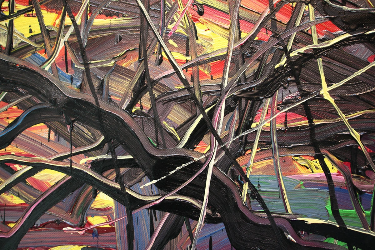
https://live.staticflickr.com/2875/8866942510_439379d853_b.jpg, https://creativecommons.org/licenses/by/2.0/
Zeng Fanzhi's work always mesmerizes me with its dense, almost sculptural lines, often overlaying vibrant abstract fields, drawing the viewer in with their tactile intensity – a masterclass in expressive impasto.
2. Scraping, Sgraffito, and Subtracting
But texture isn't always about building up; sometimes, the most compelling surfaces are created by subtraction. Sgraffito (from the Italian "to scratch") involves scratching into wet paint to reveal underlying layers. It’s a bit like an archaeological dig, revealing hidden histories. Beyond sgraffito, you can also scrape paint away with a palette knife, a squeegee, a rubber tool, or even a comb, creating incredibly dynamic streaks, ridges, and fractured surfaces. I discovered the power of scraping quite by accident when a rebellious smear of wet paint unexpectedly revealed a raw, energetic history beneath – a technique I now actively seek. This often leaves a visual record of the artwork's creation, a palpable history of the process, showing the force and direction of my hand. I find immense satisfaction in the unexpected patterns that emerge from this reductive dance – it’s a constant surprise, a push and pull between intention and accident. The rigidity of a wooden panel, for instance, allows for cleaner, sharper scrapes than a flexible canvas, where the surface might give way under pressure, creating softer, more diffused marks.

https://live.staticflickr.com/65535/53064827119_1b7c27cd96_b.jpg, https://creativecommons.org/licenses/by-nc-nd/2.0/
Gerhard Richter's abstract works often feature large, sweeping scrapes that reveal complex underlayers, creating a sense of both destruction and creation, and a rich textural surface that keeps my eye exploring.
3. Collage and Mixed Media Magic
Why stick to just paint when the world is full of fascinating surfaces? Incorporating paper, fabric, sand, wood scraps, or even found objects directly onto the canvas opens up a universe of textural possibilities. This is where abstract art truly embraces its freedom, allowing everyday items to become part of a larger, non-representational narrative. I've had moments where a crumpled piece of tissue paper or an old receipt sparked an entire textural composition, adding a new dimension and unexpected depth to the piece. It’s a truly fascinating process, one I delve into more deeply in articles like the unseen layers: my process of building depth and narrative in abstract mixed media.
https://live.staticflickr.com/65535/52529201318_09ba7c1e83_b.jpg, https://creativecommons.org/licenses/by-nc-sa/2.0/
Anselm Kiefer is renowned for his monumental, heavily textured mixed-media works, often incorporating straw, ash, sand, and lead, which add profound material and symbolic weight to his canvases – a practice that always reminds me of the rich history materials can carry.
4. Stippling, Dabbing, and the Gentle Touch
Sometimes texture isn't about grand gestures but a thousand tiny ones. Using the end of a brush, a sponge, a textured roller, a toothbrush, bubble wrap, stencils, or even just pressing a textured cloth onto wet paint can create subtle, intricate patterns. Stippling uses small dots or flecks to build up an image or surface, while dabbing typically involves broader, softer impressions. These can build up to a fascinating overall surface without being overtly sculptural, giving the illusion of a rough or smooth surface without significant physical height. I often find myself lost in the meditative rhythm of these small, repetitive actions, watching a flat surface slowly come alive with a nuanced skin of dots or impressions. I once spent an entire afternoon creating a subtle, almost shimmering surface this way with the end of a bamboo stick, utterly captivated by the slow transformation. It’s a quiet magic, often overlooked, but profoundly effective.
https://live.staticflickr.com/3731/13402193294_7e67ffc22a_b.jpg, https://creativecommons.org/licenses/by/2.0/
5. Experimenting with Tools Beyond the Brush
Honestly, anything can be a tool! My studio has seen me use everything from credit cards to sponges, old combs, crumpled paper, palette knives (of course!), and even my fingers. Each unconventional tool leaves its unique mark, contributing to a truly personal and dynamic surface. Don't be afraid to rummage through your kitchen drawer or recycling bin – you might find your next favorite textural implement! The unexpected often yields the most interesting results, a truth I embrace wholeheartedly in my creative process from idea to finished abstract painting. I once created an entire series with just old packing cardboard, delighted by the corrugated patterns it left. If you want to know more about my preferred tools and techniques for creating textures, you can check out beyond the brushstroke: my favorite tools and techniques for creating dynamic abstract textures.

https://www.pexels.com/photo/artist-brush-mix-color-oil-painting-8382705/, https://creativecommons.org/public-domain/cc0/
These are the hands that get to play with all these wonderful textures – a constant reminder of the physical connection to my art.
The Sensory Symphony: How Texture Impacts Us
This is where texture truly shines for me. It's not just a visual trick or a material exploration; it's a profound way to engage the viewer on multiple levels, almost bypassing the intellect and speaking directly to the gut. It's the art of the felt experience, a silent concerto for your senses. How does texture resonate with your inner world?
Visual Weight and Dimension
Even if you're not allowed to touch it, a highly textured surface has a certain presence. It feels heavier, more substantial, almost as if it's breathing. It casts shadows, catches light, and creates a sense of three-dimensionality that a flat painting simply can't achieve. This visual weight can guide your eye, creating focal points or leading you across the canvas, much like composition in abstract art does. The interplay of light and shadow over raised surfaces can make a piece feel alive, shifting and changing as you move around it. A heavily impastoed surface, with its deep shadows, can feel like a brooding presence, while a finely stippled area might evoke a sense of quiet contemplation. It becomes a small, self-contained world, inviting closer inspection.
Emotional Resonance
Texture can be incredibly evocative, a direct line to our feelings. For me, a rough, jagged, or granular surface might feel chaotic, intense, or even aggressive, reflecting inner turmoil or raw energy – like sandpaper on your skin, or the sharp edges of a forgotten memory. Imagine a sharp, broken texture evoking a sense of anxiety or conflict, much like a fragmented moment. Conversely, a smooth, undulating, or velvety one might convey calm, serenity, or a gentle flow, inviting contemplation and quiet comfort – like silk against your cheek, or the reassuring rhythm of the sea. A glossy, pristine surface might speak of sophistication or detachment, while a bubbly, porous texture could hint at fragility or organic growth. Our brains automatically associate these tactile sensations with emotions and qualities, and abstract art leverages this beautifully, creating a shortcut to feeling. It’s part of the broader emotional language of color in abstract art, but for touch, adding layers of psychological depth.
Texture, Light, and Color Interaction
Texture doesn't exist in a vacuum; it deeply interacts with light and color. The peaks and valleys of a textured surface scatter light in complex ways, enhancing highlights and deepening shadows, which can make colors appear more vibrant and dynamic, or conversely, more muted and earthy, depending on the angle and intensity of the light. Imagine how a heavily textured white surface might shimmer under direct light, while a dark, deeply ridged surface can absorb light, creating a sense of profound depth. Furthermore, the choice of color can emphasize or soften texture. A monochromatic palette often highlights the pure form and texture, making the surface quality the star. Highly contrasting colors, on the other hand, can create visual vibrations that enhance the sense of surface movement and depth. This dance between texture, light, and color adds another layer of visual complexity, making the artwork feel alive and responsive to its environment. It's an often-underestimated aspect of how we perceive abstract works.
Narrative and History
The way paint is applied, scraped, or built up tells a story of its own. It's a tangible record of the artist's gestures, their decisions, and the passage of time. You can see the force behind a brushstroke, the drag of a tool, the deliberate placement of a material, or even the accidental splatters that became part of the finished piece. This sense of process adds a deep layer of meaning, inviting you to ponder the journey of the artwork's creation, much like reading the lines on an old map. It reveals the hand of the artist, creating a more intimate connection to the work and its history. It’s a fundamental part of my creative process from idea to finished abstract painting.
The Irresistible Urge to Touch: A Primal Connection
Let's be honest, we've all felt it. That powerful, almost irresistible desire to reach out and touch a particularly intriguing textured artwork. I know I have, standing inches from a canvas, my hand just twitching. It’s a testament to texture’s profound power – it activates a sense beyond sight, a part of our brain wired for haptic exploration. From a psychological standpoint, this urge taps into our innate need for haptic perception – the way we explore the world through touch, gathering information about an object's properties. It’s a fundamental part of how we understand reality, a behavior that starts in infancy as we reach out to feel and understand our surroundings. Of course, for the sake of preserving the art (and avoiding stern museum guards!), we usually resist. But that unfulfilled desire creates a tension, an even deeper, more frustrated, but ultimately more potent engagement with the piece. It's a beautiful, frustrating dance, isn't it?
Texture and Scale
The role of texture can shift dramatically with the scale of the artwork. In smaller pieces, fine, intricate textures might draw the viewer in for an intimate, close-up examination, creating a miniature landscape of detail. On a monumental scale, however, texture can become grander, more sculptural, contributing to the overall presence and physical impact of the work, almost transforming the canvas into an architectural element. A large, heavily textured piece can command a space, influencing how the viewer moves around it and perceives its immense physicality. It’s a consideration that deeply influences my approach, ensuring the texture resonates with the intended impact of the piece, regardless of its size.
The Artist's Hand: When Texture Becomes the Subject
For me, texture is inextricably linked to the artist's hand – the unique, physical imprint of my interaction with the materials. Every drag of a palette knife, every deliberate dab of paint, every accidental splatter, every sculptural peak of impasto, speaks of a moment in time, a decision made, a feeling expressed. It’s a record of energy, an echo of my physical presence in the studio, a direct link to my unique creative process.
Sometimes, this embodied imprint transcends its role as a supporting element and becomes the undisputed star of the show, essentially becoming the subject itself. In these instances, the artist's intention is for the viewer to engage primarily with the surface quality itself, or how that surface breaks down traditional representation. The texture isn't just part of the image; it is the image, or at least its dominant narrative. This can be achieved through extreme impasto, the meticulous arrangement of found objects into a compelling surface, or by creating a canvas that mimics natural, weathered surfaces like ancient walls or geological formations. The monumental textural works of artists like Anselm Kiefer, for example, often use the very materiality and surface to convey profound historical or emotional narratives, where the texture is the story. Julian Schnabel, known for his "plate paintings," also famously uses broken ceramic plates directly on his canvases, making the aggressive, sharp, and reflective texture the undeniable focal point and subject. When texture becomes the primary subject, it challenges our traditional notions of representation and invites a purely sensory, non-intellectual response. It’s a bold statement, celebrating the raw materiality of art, and often serves as a powerful tool for profound abstraction, allowing the work to exist purely as a tactile experience. This shift in focus is truly fascinating in understanding abstract art styles.

https://images.zenmuseum.com/art/508/scan.jpeg?version=2-6-2023-19:42, https://creativecommons.org/publicdomain/zero/1.0/
Even in a self-portrait, texture can define the very essence of the subject, adding layers of meaning and an immediate sensory connection, making the surface itself an expressive feature, almost as if you could feel the story behind the face.
Navigating Texture: Common Challenges and My Hard-Earned Wisdom
While the pursuit of texture is immensely rewarding, it's also a path paved with a few potential pitfalls – lessons I've learned the hard way, and am happy to share! Trust me, I've had my share of 'learning opportunities' over the years – often involving frantic Googling and a fair bit of head-scratching. Here’s a bit of my hard-earned wisdom and some best practices to keep in mind, especially when you're pushing the boundaries of what a canvas can endure. And remember, always test your materials on small samples before committing to a larger piece; this simple step can save you so much grief and wasted effort!
1. Cracking and Flaking
Nothing quite as soul-crushing as seeing your beautiful, meticulously built-up texture start to betray you. This usually happens when materials aren't compatible or layers dry too quickly, causing differential expansion and contraction. My best advice? Always ensure your mediums and paints are compatible (acrylics with acrylics, oils with oils or appropriate oil mediums). Apply thick layers gradually, allowing each to dry thoroughly before adding the next. For really substantial applications, lean on flexible mediums like heavy gel mediums, which maintain elasticity even when dry, preventing those heartbreaking cracks.
2. Poor Adhesion
Especially with collage elements or unconventional materials, imagine gluing a perfect piece of fabric, only to find it curling up or peeling off days later. The culprit? Inadequate surface preparation or weak adhesive. Always prepare your surface properly – sometimes roughening a smooth surface with sandpaper can create the 'tooth' needed for better grip. And for heaven's sake, use strong, archival-quality adhesives specifically designed for art, like heavy gel medium, PVA glue, or professional fabric glues, depending on the material. Your future self (and your art!) will thank you.
3. Overwhelming the Composition
In my early days, I was so excited by texture that I'd sometimes throw everything at a piece, and the result was visual chaos. It’s like a chef using every spice in the cabinet – sometimes less is truly more. Use texture purposefully. Balance highly textured areas with smoother, quieter ones to give the eye a place to rest. Consider using texture as an accent in one or two areas to draw the eye, rather than across the entire canvas, ensuring the texture serves the overall vision of the piece, not just exists for its own sake. This is crucial for maintaining composition in abstract art.
4. Drying Times and Weight
Thick applications of paint, modeling paste, or mixed media elements can take a surprisingly long time to dry – sometimes days or even weeks for very heavy layers. Patience is crucial; rushing can lead to cracking, adhesion issues, or even mold. Additionally, incorporating heavy materials can significantly increase the weight of the artwork, which impacts framing, hanging, and shipping. Always consider the structural integrity of your chosen substrate and framing options when planning a heavily textured piece.
5. Degradation and Discoloration
This is particularly relevant if you're incorporating organic found objects. While I love experimenting, I've learned to be mindful of the archival quality of my materials. Artist-grade paints and mediums are formulated for longevity. If you're using unconventional elements, consider sealing them with an archival medium or researching their stability over time. You don't want your beautiful, gritty coffee ground texture to suddenly become a home for mold or to disintegrate in a few years, leaving a sad, empty space on your canvas.
6. Difficulty Cleaning
Heavily textured surfaces are dust magnets, pure and simple. Once dry, protect your work with a good quality varnish or sealant to create a barrier and make light dusting easier. For display, consider shadow box framing to minimize dust accumulation and protect delicate surfaces from accidental bumps or curious fingers. Museum glass also offers fantastic UV protection and clarity, really making those textures sing without glare. It’s a bit of extra effort, but worth it for the longevity of your tactile treasures.
Practical Advice for the Aspiring Tactile Artist
If you're an aspiring artist, or just someone looking to deepen your appreciation for abstract art, I urge you: don't just look. Imagine what it would feel like. Experiment! Don't be afraid to get your hands dirty, to mix strange concoctions, to try tools that aren't brushes. The most exciting textures often emerge from unexpected places, from happy accidents that turn into intentional techniques. And remember, the journey of discovering your unique textural voice is half the fun!
Here are some quick tips to get you started on your own textural adventure:
- Start Small: Begin with small canvases or boards to experiment with different materials and techniques without feeling overwhelmed. Think of them as your personal texture swatch book. Even better, create a 'texture journal' or a 'material sample board' where you dedicate pages or sections to exploring one material or technique at a time, documenting your process and results.
- Embrace Imperfection: Texture thrives on irregularity. Don't strive for perfect smoothness or evenness; celebrate the bumps, the drags, and the unexpected marks. These are the signatures of your hand. This idea is something I explore further in the power of imperfection: embracing accidents and evolution in my abstract art.
- Layer Mindfully: Think about the order of your materials. Heaviest elements usually go down first, or in layers that can support them. And remember to let each layer dry sufficiently.
- Pay Attention to Drying Times: Patience is a virtue, especially with thick applications. Rushing can lead to cracking or adhesion issues – a lesson I've learned many times!
- Document Your Experiments: Keep notes on what materials you used, how you applied them, and the results. This will be invaluable for replicating successes (and avoiding glorious failures!). Consider creating a physical swatch book with material samples and notes for future reference.
For more concrete techniques, you can always check out exploring texture: my favorite techniques for adding depth to abstract paintings.

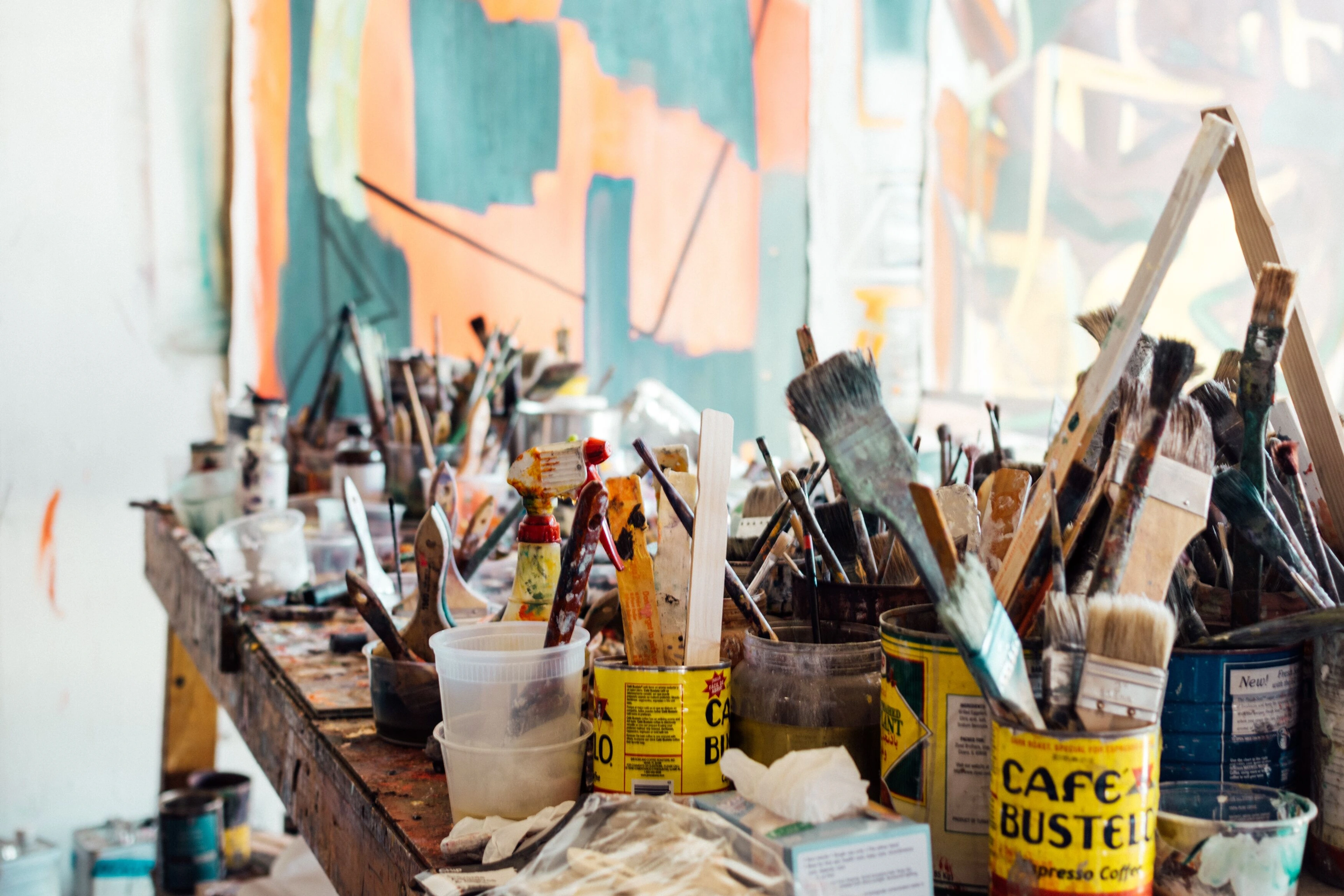
https://freerangestock.com/photos/177284/artists-workspace-filled-with-paint-brushes-and-supplies.html, https://creativecommons.org/public-domain/cc0/
This is what my creative workspace often looks like – a testament to the joy of getting hands-on with materials to bring textures to life.
Frequently Asked Questions about Texture in Abstract Art
Here are a few common questions I get about texture, hopefully providing a bit more clarity on this fascinating topic:
Is texture only for abstract art?
Oh, absolutely not! Texture is used in all forms of art, from realistic landscapes to portraits. Think of the visible brushstrokes in an Impressionist painting, or the tactile qualities of a sculpted figure. However, in abstract art, where there often isn't a recognizable subject, texture becomes an even more prominent and primary element, taking on a leading role in conveying meaning and engaging the viewer. It's elevated from a descriptive tool to an expressive one, often becoming the very essence of the piece.
How do you protect textured art?
Textured art, especially pieces with significant impasto or mixed media elements, can be more delicate. I always recommend a good quality varnish or sealant to protect the surface from dust, UV light, and minor abrasions. For very sculptural pieces, framing with a shadow box can also offer excellent protection, keeping the delicate surfaces away from accidental bumps and dust. You can even consider museum glass for added UV protection and clarity, enhancing the visual experience while safeguarding the artwork. This also ties into the definitive guide to composition in abstract art for optimal viewing and preservation.
Can texture be "too much"?
Like any artistic element, balance is key. While some artists embrace maximalist texture (and do it brilliantly!), sometimes too much can overwhelm the composition or detract from other elements like color or form. It's a subjective call, but a good rule of thumb is to ensure the texture serves the overall vision of the piece rather than existing purely for its own sake. Think of it as a spice – a little can enhance, too much can overpower the entire dish. It's about intentionality and harmony within the overall work.
Wrapping It Up: A Touch of the Abstract
Texture is a silent narrator, a physical manifestation of emotion, and a primal bridge between the artwork and our most fundamental sense – touch. It invites us to move beyond passive observation and into a deeper, more embodied experience of abstract art. It's the glorious imperfection, the palpable history, the undeniable presence that makes a piece truly sing.
Here are the key takeaways about texture in abstract art:
- It's a foundational expressive language, not just a visual trick.
- It encompasses tactile, visual, tactile illusion, and implied textures.
- A vast "Alchemist's Pantry" of materials and techniques allows for endless exploration.
- It profoundly impacts us through visual weight, emotional resonance, light interaction, color, and narrative depth.
- It presents unique challenges (cracking, adhesion) but offers immense rewards.
So, the next time you encounter an abstract painting, don't just look. Lean in a little. Imagine the artist's hand, the drag of the tool, the layers beneath. You might just find a whole new world opening up to your senses, a tactile whisper inviting you to connect on a profound level. And who knows, maybe it will even inspire a visit to a gallery to experience art firsthand, or to my own studio in 's-Hertogenbosch, or finding that tactile invitation in one of my abstract art prints and paintings for sale! Happy exploring, and perhaps, happy touching (even if just in your mind’s eye!). What will you feel in the next abstract piece you encounter?


