Mastering Value in Art: Sculpting Form, Depth, and Emotion in Abstract & Representational Art
Unlock the silent power of value in art. This guide explores how light, shadow, and tonal contrast sculpt form, evoke emotion, and define depth across all art forms, including abstract. Featuring historical insights, practical tips, and personal reflections from an artist.
Mastering Value in Art: The Unseen Sculptor of Form and Emotion
I have a confession to make: for years, I saw art in a rather flat, almost two-dimensional way. It wasn't that I didn't appreciate color or composition, but something always felt missing in my own attempts, a certain oomph that I couldn't quite put my finger on. It was like I was looking at a beautiful melody, but without any dynamics – just notes, all at the same volume. Then, I truly started to grasp value in art, and it was like someone finally turned on the lights in a dimly lit room, revealing the depth and drama I'd been missing. This wasn't just a personal artistic revelation; it was a fundamental shift in how I understood all visual art. It transformed my perception, not just of what I created, but of the masterpieces I admired. This isn't just about dark and light; it's about the very soul of visual perception, the language through which we understand three dimensions on a two-dimensional surface. And trust me, once you start truly seeing it, you can't unsee it; it changes everything. This journey from flatness to profound depth is one I'm excited to share, offering you a map to harness value's silent power in your own artistic journey.
What Exactly Is Value in Art? (Beyond Just 'Dark' and 'Light')
Let's get down to basics, shall we? In art, value refers to the lightness or darkness of a color. Think of it as a grayscale, running from pure white to pure black, with an infinite spectrum of grays in between. Every color, no matter how vibrant, has an inherent value. A bright yellow might have a light value, while a deep purple might have a dark value. Simple enough, right? But here's the kicker: the contrast between different values is what truly gives art its visual information, creating separation, depth, and drama. Even though hue (the color itself, like red or blue) and saturation (its intensity) are distinct, they are deeply intertwined with value. A highly saturated red might have a medium-dark value, but if you desaturate it, its underlying value often becomes more apparent, perhaps revealing it's actually quite light. Think of it like a beautiful singer: their voice (hue) might be powerful and full (saturation), but its volume (value) can still range from a whispered lullaby to a booming crescendo, fundamentally altering its impact.
Before we dive deeper, it's important to differentiate between an object's local value – its inherent lightness or darkness in neutral light (think of a pure white ball or a matte black cube under even, shadowless illumination) – and its perceived value – how it actually appears to our eyes under specific lighting conditions. This distinction is crucial because a brightly colored object can appear quite dark in shadow, and vice versa. For example, a fire engine's vibrant red (high local value) might appear a dull, dark gray in deep twilight (low perceived value). It's this nuanced understanding that truly separates merely illustrative renderings from those that are deeply convincing.
But understanding this basic definition was just the first step; my real breakthrough came when I realized value wasn't just an attribute of color, but its very architect. My initial mistake was thinking value was merely an attribute of color, rather than a fundamental building block of form. I'd slap some color down, decide if it was 'light' or 'dark,' and move on. What I missed was how value sculpts. It's not just describing; it's actively shaping the perception of depth and reality.
Historically, artists like those of the Renaissance mastered chiaroscuro – the strong contrast between light and dark values – to create the illusion of three-dimensional forms on a flat canvas, essentially using value as their primary tool for conveying realism. Think of Caravaggio's dramatic use of light and shadow, where figures emerge from deep darkness, defined purely by their tonal shifts, creating a powerful sense of volume and dramatic focus. While Caravaggio's chiaroscuro is famous, earlier Renaissance masters like Masaccio and Leonardo da Vinci revolutionized painting by creating believable space and mass through subtle value shifts, a technique famously known as sfumato, where transitions from light to dark are so gradual that forms emerge softly as if veiled in smoke, directly stemming from his deep studies of light and anatomy to create an ethereal, three-dimensional quality. Later artists like Rembrandt pushed the expressive power of light and shadow to new emotional depths. Even before widespread oil painting, the monochromatic nature of early printmaking, like woodcuts and etchings, forced artists to rely entirely on value to define form, texture, and depth. The advent of lithography in the late 18th century further democratized the exploration of value, allowing artists to reproduce incredibly subtle tonal gradations and textural effects with unprecedented precision, making value a foundational element across diverse artistic practices. For a deeper dive into art history's rich tapestry, explore resources like The Definitive Guide to Understanding Art History: Key Periods, Styles, and Masterpieces Explained.
Without value, everything would appear flat, like a cartoon drawing without any shading. It's the contrast between different values that tells our eyes how far away something is, what its texture is, and most importantly, what its form is. To truly master this, many artists create or use a value scale (or tonal scale), a strip of grays from white to black, to help train their eye to see and reproduce these subtle differences. Before even thinking about color, many artists perform value mapping or tonal studies, where they sketch out the scene or object using only shades of gray to establish the foundational light and shadow structure. It's like building the skeleton before putting on the skin. And in our modern world, even digital artists leverage tools like grayscale conversion filters in software like Photoshop to perform these vital tonal studies, proving that the principles are timeless, even if the tools evolve.
https://www.flickr.com/photos/vintage_illustration/51913390730, https://creativecommons.org/licenses/by/2.0/
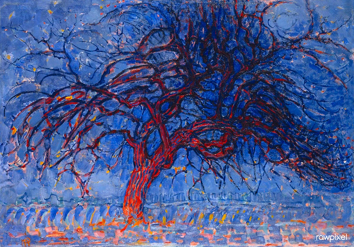
Take a look at Mondrian's 'Evening; The Red Tree' above. Even with its expressive colors, notice how the varying dark values in the tree's branches and trunk, contrasted against the lighter values of the sky and landscape, give it a palpable sense of volume and presence. You can almost feel the gnarliness of the bark and the depth of the forest. That's value at play, even in an early, less abstract piece from an artist who would later become a pioneer of abstraction. What details do you notice when you focus only on the lightness and darkness here?
Value in My Abstract World: Orchestrating Emotion and Space
While value is the bedrock of representational art, its principles are just as vital, if not more so, in the realm of abstraction, where it becomes the silent orchestrator of visual experience, creating order and emotion without explicit forms. "But wait," you might think, "you paint abstract art! How does value apply there? Isn't it all about color?" And this is where it gets really fun for me, and often surprisingly counter-intuitive. I remember struggling with this early on, thinking my vibrant colors would just do the work. It felt almost like a betrayal of color to strip it down to mere light and dark. Yet, the moment I truly understood that even in abstract art, where there might be no discernible 'object' or 'figure,' value is absolutely paramount, everything changed. It’s just expressed differently, often through the inherent lightness or darkness of the colors themselves, creating a silent language beneath the hues.
In my contemporary, colorful and often abstract art prints and paintings, I use value to create depth, guide the eye, and establish a mood. Different values of color can push some shapes forward and pull others back, creating a sense of layered space even without traditional perspective. Consider the nuanced, often subtle, value shifts in Mark Rothko's color field paintings – these subtle contrasts create immense emotional depth and spatial illusion, making his large color blocks seem to breathe and expand, inviting quiet contemplation. Similarly, think of Agnes Martin's grid paintings, where incredibly delicate shifts in value between her pencil lines and fields create a meditative, vibrating optical effect, emphasizing a subtle, ethereal light. Even artists like James McNeill Whistler, known for his subtle, often near-monochromatic 'Nocturnes,' relied almost entirely on minute value shifts to evoke deep mood and atmosphere. This interplay creates visual rhythm and movement, ensuring the painting feels alive, not stagnant – a principle that extends to even the most simplified geometric abstractions, where the balance of light and dark shapes can evoke a sense of monumental stability or dynamic tension, much like Malevich's bold, value-driven compositions or Josef Albers's meticulous studies in his 'Homage to the Square' series, demonstrating how subtle value changes in color can create illusions of depth and shifting planes. These artists understood that while color speaks loudly, value whispers profound truths about space and feeling.
This is why, even in abstract compositions focused on color, understanding value contrast is paramount for achieving true color harmony and visual impact; colors with similar values, no matter how different their hues, can blend into a flat expanse, sometimes referred to as 'muddying' a composition, while carefully chosen value differences create distinct visual anchors and a sense of dynamic balance. This careful arrangement of light and dark shapes across the canvas is what artists often refer to as value patterns – the overarching design of tonal areas that gives a composition its underlying structure, guiding the eye and establishing a sense of visual unity and rhythm, a key element explored in depth in our definitive guide to understanding composition in abstract art.
https://commons.wikimedia.org/wiki/File:Piet_mondrian,_composizione_n._IV-composizione_n._6,_1914,_01.jpg, https://creativecommons.org/licenses/by/3.0
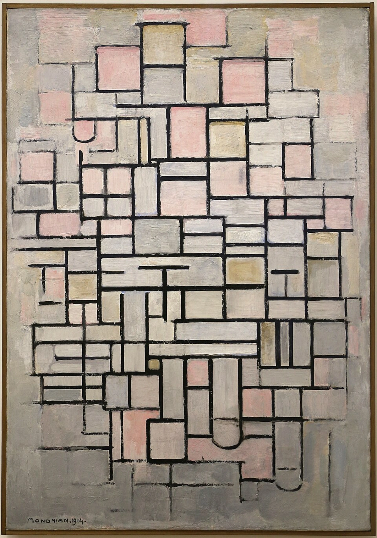
Look at Mondrian's 'Composition No. IV.' Even without specific objects, the varying values of the colored rectangles and lines create a sense of movement and depth. The lighter grays and off-whites, contrasted with the slightly darker pinks and black lines, make some areas appear to recede while others advance, purely based on their lightness or darkness relative to their neighbors. It's a subtle but powerful effect that prevents the painting from feeling flat and creates a dynamic rhythm. Comparing this to his earlier 'Red Tree,' you can see a fascinating evolution: in the latter, value delineates recognizable form; in the former, it orchestrates pure abstract spatial relationships. It shows how an artist's understanding of value can adapt and deepen across different stylistic periods.

https://live.staticflickr.com/65535/53064827119_1b7c27cd96_b.jpg, https://creativecommons.org/licenses/by-nc-nd/2.0/
Consider Gerhard Richter's abstract works. While seemingly chaotic, the interplay of light and dark values within his scraped and layered colors is crucial for creating visual depth, energy, and a sense of movement across the canvas. Without these underlying value shifts, the vibrant hues would appear flat and unengaging. It's value acting as the bedrock, allowing the expressive color to truly resonate.

https://live.staticflickr.com/65535/51907566658_1100dbeb2a_b.jpg, https://creativecommons.org/licenses/by-nc-sa/2.0/
This is a principle that extends across all forms of visual art, from the hyper-realistic to the purely conceptual. If you're interested in exploring how different movements approached these fundamentals, you'll find a lot to learn in art history – perhaps even some pieces housed at my local museum in 's-Hertogenbosch. For a deeper dive into abstract art's evolution and various forms, consider articles like The Definitive Guide to Abstract Art: Key Movements, Artists, and Evolution or The Definitive Guide to Understanding Form in Abstract Art: Beyond Two Dimensions. What abstract artworks have surprised you with their sophisticated use of value?
The Dance of Light & Embrace of Shadow: Sculpting Form and Emotion
This fundamental understanding of value as a sculptor of form leads us directly to how light itself interacts with surfaces. Light is a magician. It doesn't just illuminate; it defines. When light hits an object, it creates a highlight – the brightest point where the light source directly reflects. As the surface curves away from the light, the value gradually darkens, creating what artists often call a form shadow – the area on the object itself that is turned away from the direct light. The crisp line where light transitions into shadow is often called the terminator, and observing its sharpness or softness reveals much about both the object's form and the light's quality. A sharp terminator suggests a hard, direct light source, while a soft, blurry one indicates diffused light, like on an overcast day. This gradual shift in value is what convinces our brains that we're looking at a three-dimensional object, not a flat shape. Beyond these, we also have mid-tones – the transitional values between the highlight and the form shadow, depicting the surface planes most directly illuminated but not experiencing direct reflection. And finally, the cast shadow is the dark shape an object projects onto another surface, revealing the direction and intensity of the light source. It's the visual grammar that allows us to perceive reality, because values dictate how light bends around a form, how surfaces meet, and how objects occupy space.
Think of a sphere. The area facing the light source will be brightest, but as the curve moves away, the light diminishes, creating a smooth transition of values from light to dark. If you've ever tried to draw a perfect sphere, you know this gradual shading is key. Without it, it just looks like a circle. (Trust me, I've drawn many a flat 'circle' trying to be a sphere in my early days!) Remember too, that the nature of the light source matters immensely; harsh, direct sunlight will create sharp, defined highlights and shadows, while diffused light from a window or an overcast sky will lead to softer, more gradual value transitions.
If light is the sculptor, then shadow is its indispensable partner, bringing depth, drama, and definition. Shadows aren't just 'the absence of light'; they are an integral part of an object's form and its environment. There are a few types we need to acknowledge, because frankly, I used to ignore most of them to my detriment, often resulting in flat, lifeless forms:
Shadow Type | Description | Key Characteristics |
|---|---|---|
| Core Shadow | The darkest part of the object itself, where light can't reach. | Usually a softer edge than the highlight, fading gradually. |
| Cast Shadow | The shadow an object projects onto another surface. | Tells us about the light source's direction and intensity; often sharper closer to the object, diffusing with distance. |
| Reflected Light | Light bouncing off surrounding surfaces subtly illuminates the shadow side of an object. | Prevents pure black shadows, subtly lightens and often warms shadow values, connecting the object to its environment. |
| Ambient Occlusion | Subtle darkening in crevices or where objects touch surfaces due to less ambient light. | Creates a soft, grounding shade beneath objects, adds nuanced depth in folds and contact points. |
Crucially, reflected light exists within the form shadow, subtly lightening and often warming its value, adding realism and connecting the object to its environment. Imagine a red apple on a white tablecloth. The white cloth reflects light back onto the apple's shadowed side, giving that shadow a warmer, slightly lighter tone instead of a flat, dead black. Or think of the underside of a leaf reflecting the green of other leaves. This is where a lot of amateur art goes wrong – shadows are rarely pure black holes. I remember one early painting where I made all my shadows pure black, and the objects just looked like they were floating in a void, completely detached from their environment – like a bad Photoshop cutout! It was a real 'aha!' moment when I realized shadows, like friends, borrow a little light from their surroundings. Lesson learned: shadows, far from being flat voids, are dynamic, complex areas enriched by their environment.
Understanding these different aspects of shadow, and how their values interact, elevates a drawing or painting from merely descriptive to truly immersive. They ground the object, creating a sense of weight and space. Without proper shadows, objects float aimlessly. And who wants their beautiful art to look like a collection of aimless floaters? Not me! What's the most challenging type of shadow for you to observe and render accurately?
The medium you're working with also plays a huge role in how you render these light and shadow effects. Oil paints allow for smooth, blended transitions, making it easier to depict subtle gradations of form. Watercolor, with its transparency, requires a different approach, often building up values in layers. Charcoal, on the other hand, excels at rich, deep blacks and expressive, textured shadows. This principle extends to photography and digital art as well; photographers manipulate exposure, aperture, and lighting to control values and create depth, while digital artists utilize layers, blending modes, and tonal adjustments to sculpt forms and establish mood with light and shadow, proving value's universal applicability across all visual mediums. I often think of light as a sculptor, gently carving out the contours and planes of whatever it touches. It whispers secrets about the object's texture and orientation. A glossy surface will have sharper, more defined highlights and shadows, while a matte surface will have softer, more diffused transitions. It's all in the value. How does the quality of light in your own surroundings change the way you perceive form, and what details does it reveal you hadn't noticed before?
This principle of value extends beyond two-dimensional art into sculpture and architecture. In sculpture, value manifests as the physical play of light and shadow over three-dimensional forms, defining the contours, textures, and depth of the material. Think of how Rodin's figures emerge from rough marble, their muscularity defined by the way light catches the peaks and falls into the valleys. In architecture, value is crucial for creating spatial experience; the interplay of sunlight and shadow on a building's facade reveals its geometry and texture, while the varying light levels within a space can guide movement, evoke grandeur, or foster intimacy. From the deep shadows of a Gothic cathedral to the bright, open spaces of modernist design, value is the silent force shaping our perception of built environments.
Value Contrast: The Engine of Visual Interest, Depth, and Harmony
Beyond just creating form, the degree of value difference – value contrast – is the engine of visual interest. Extreme contrast, like a bright highlight next to a deep shadow, creates drama, focus, and a powerful sense of energy, often guiding the viewer's eye to a specific focal point. Think of a spotlight illuminating a figure in a dark room. This high contrast can also evoke strong emotions like tension or excitement. Subtle shifts in value, on the other hand, create softness, mystery, and a quiet ambiance, often seen in foggy landscapes or delicate portraits, evoking feelings of serenity or melancholy. Furthermore, a limited range of values, where everything is either light-gray or dark-gray with little in between, can create a sense of compression or even claustrophobia, a feeling of being hemmed in, or a surreal, unsettling flatness.
Value contrast also plays a crucial role in color harmony. Colors with similar values, no matter how different their hues, can often blend into a flat expanse, making a composition feel 'muddy' or lacking definition. By ensuring sufficient value differences between colors, you create distinct visual anchors and a dynamic balance that allows each hue to 'pop' and contribute to an overall harmonious impression, preventing your colors from becoming dull or indistinguishable. This 'visual weight' is key: darker values tend to feel heavier and draw the eye more, while lighter values feel lighter. Artists manipulate this to balance a composition, ensuring their artworks don't feel lopsided or unbalanced, a key principle also explored in our definitive guide to understanding composition in abstract art.
Value contrast also plays a crucial role in atmospheric perspective, the way artists create the illusion of depth in landscapes. As objects recede into the distance, their values become lighter and closer together, and their contrasts diminish. Distant mountains appear hazy and soft, not because they've lost their form, but because the atmosphere desaturates their colors and reduces their value contrast. Value is a subtle tool that artists use to exploit this visual phenomenon, creating a believable sense of vastness and distance. This dynamic interplay of values also contributes to visual rhythm and movement, as the eye naturally follows the shifting patterns of light and dark across a canvas, creating an engaging viewing experience.

https://live.staticflickr.com/4073/4811188791_e528d37dae_b.jpg, https://creativecommons.org/licenses/by-sa/2.0/
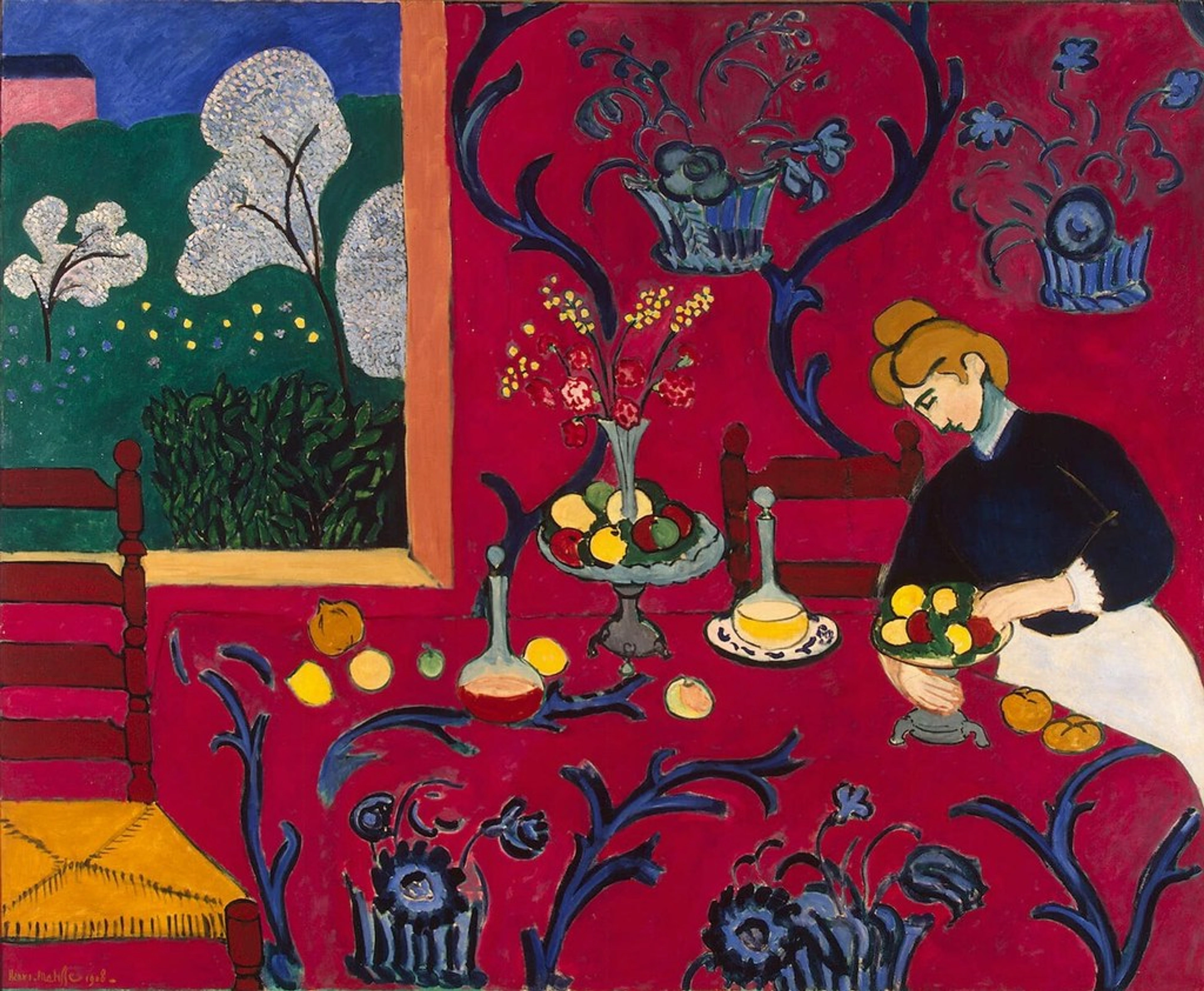
Even in abstract compositions, value contrast is paramount. Look at a painting like Henri Matisse's 'The Red Room.' While the colors are vibrant and often of similar intensity, subtle value differences between the red walls, the patterned table, and the objects still define space and create visual interest. For instance, the slightly darker value of the patterned table against the main red of the wall, and the variations in the fruit, prevent the entire scene from collapsing into a flat, undifferentiated field of red. It's this dynamic interplay that prevents art from becoming merely a flat collection of colors. How does varying value contrast affect the emotional impact of the art you encounter, or even the emotions evoked by the daily scenes around you?
Practical Tips for Understanding and Using Value
So, how do you start seeing and using value more effectively? Here are a few things I've learned that have genuinely helped me, often through trial and error (mostly error, in my early days):
- Observe the Everyday: Look at how light hits your coffee mug, the shadows cast by your books, the subtle gradations on a piece of fruit. The world is a masterclass in value. What unnoticed value shifts are happening around you right now?
- Squint Your Eyes: Seriously, try it! I used to think squinting was just for people who forgot their glasses, but it's actually a secret artist superpower. Squinting reduces your perception of color and detail, allowing you to see objects as masses of light and dark. It's incredibly effective for simplifying a scene into its core values.
- Use a Viewfinder or Value Isolator: A simple black card with a small rectangular cutout can help you isolate a specific area of your reference, making it easier to perceive its value without the distraction of surrounding colors and details.
- Use a Value Scale: Create your own grayscale from pure white to pure black with several distinct steps in between. Practice matching the values you see in a reference photo or real-life object to your scale. This trains your eye to differentiate subtle shifts.
- Work in Grayscale First (Tonal Studies): Before adding color, try sketching or painting in pure black and white. This process, often called 'tonal study' or 'value mapping,' forces you to master the values. It helps you focus solely on the underlying structure of light and shadow, which is the backbone of any strong composition. You'll be amazed at the solid foundation it provides once you introduce color later.
- Create a Color Value Chart: Take the specific colors you frequently use in your palette and mix them with varying amounts of white and black (or a neutral gray) to create a personal value chart. This helps you understand the inherent value of each hue and how it changes when lightened or darkened. It's an invaluable reference when planning your next colorful composition, allowing you to predict how different colors will interact tonally to create desired contrast or harmony. It might sound tedious, but it saves so much 'muddy color' frustration later!
- Leverage Digital Tools & Color Picking: If you work digitally, use a 'color picker' or eyedropper tool to sample colors from a reference and then check their grayscale values. Many digital art programs also have a 'desaturate' or 'grayscale' view mode that simplifies your canvas to pure values, a fantastic way to check your work. It's like squinting, but for your computer screen!
- Practice, Practice, Practice: Like any skill, discerning and rendering value takes time and repetition. Don't get discouraged if it doesn't click immediately. It's a journey, not a destination. This holistic approach, where value acts as a fundamental element, is crucial to mastering the elements and principles of art itself.
Ready to put these tips into action? Pick one, just one, from this list and try it today. You might be surprised by what you 'see' for the first time! And be warned: once you start seeing value, you can't unsee it. You'll find yourself analyzing the light and shadow on everything from your cat to the clouds, forever seeing the world with an artist's eye. It's a delightful, slightly obsessive, side effect. What's one practical tip you're excited to try out first, or a value mistake you're finally ready to overcome?
FAQ: Your Value Questions Answered
To address some common questions that arise when exploring the nuanced world of value in art, here are a few more insights:
Q1: Can I use strong colors and still have good value?
Absolutely! This was one of my hang-ups. You can use incredibly vibrant colors, but each color still has an inherent value (how light or dark it is). The key is to ensure there's enough contrast in value between your colors to create form and separation. A bright red and a bright blue might both have similar medium values, making them appear flat next to each other, even if they're different hues. For example, a neon pink and a fluorescent green might be wildly different in hue but very similar in lightness, making them blend together if you rely only on color difference.
Q2: Is value more important than color?
This is like asking if the skeleton is more important than the skin, or if rhythm is more important than melody in music. They're both crucial! However, many artists argue that value does the work, and color gets the credit. A strong value structure provides the 'bones' or 'architecture' of a painting, making it powerful even if the colors are muted or limited. Consider a powerful charcoal drawing or a black-and-white photograph – their impact comes entirely from value. Without good value, even the most beautiful colors can fall flat and lifeless. I'd lean towards value being the indispensable backbone, allowing color to truly sing.
Q3: How do artists determine the correct values to use?
Primarily through observation! Artists often use reference photos, real-life setups, or their imagination. Tools like value scales, grayscale filters on photos, squinting, and specific techniques like 'value mapping' or 'tonal studies' help simplify the scene. Moreover, through extensive practice, artists develop a strong 'visual memory' for values, allowing them to intuitively recall and apply appropriate light-dark relationships, even without direct references. It's about translating what the eye perceives into a visual language of light and dark.
Q4: How does value relate to color theory and harmony?
Value is intrinsically linked to color theory. Understanding the value of each hue is crucial for creating color harmony and balance. Colors with similar values can create a soft, harmonious feel, but might lack definition. Colors with contrasting values, even if clashing in hue, can provide visual interest and separation. For example, a painting might feature vibrant reds and blues, but if the red is a dark value (like a deep crimson) and the blue is a light value (like a pale sky blue), that strong contrast creates visual tension and dynamism, preventing the composition from feeling bland, even as the hues themselves might be complementary or analogous. Often, artists achieve color harmony by ensuring a pleasing distribution of values across their composition, regardless of the specific hues used. It's the underlying scaffolding that supports the vibrancy and emotion of your color choices, preventing your colors from becoming flat or dull.
Q5: How can value convey emotion in art?
Value can powerfully convey emotion. High contrast, with dramatic shifts from dark to light (e.g., a spotlight on a figure in a dark room), often creates a sense of tension, excitement, or mystery – think of a film noir scene. Low contrast, with subtle, close values (e.g., predominantly light grays or predominantly dark grays), tends to evoke serenity, melancholy, or a sense of quietude, like a misty morning landscape or a subdued, introspective portrait. A deliberate lack of strong value contrast across an entire piece can even create a feeling of compression, claustrophobia, or a surreal, unsettling flatness, making a scene feel artificial or disorienting. It’s a direct conduit to the viewer’s emotional landscape.
Q6: Can value influence the perceived temperature of colors?
Absolutely! While hue is the primary driver of warm (reds, yellows) and cool (blues, greens) colors, value plays a subtle but significant supporting role. Darker values generally make colors feel cooler and heavier, even for inherently warm hues, while lighter values tend to make them feel warmer and more expansive. For instance, a very dark, desaturated red might feel dramatically cooler than a bright, highly saturated red. Artists can manipulate value to shift the perceived temperature of a scene, creating a sense of a cold winter's night with deep, dark blues and grays, or a warm summer afternoon with bright, light yellows and oranges, even if the actual hues are quite similar. It's a fantastic way to add another layer of atmospheric depth and emotional resonance, a subtle trick I often employ.
Q7: How can value be used to create atmosphere and mood?
Beyond depicting form, value is an incredibly potent tool for setting the atmosphere and mood of an artwork. High contrast, with dramatic shifts from dark to light, often creates a sense of tension, excitement, or mystery – think of a dramatic film noir scene, or a spotlight illuminating a figure on a dark stage, suggesting drama or intrigue. Conversely, low contrast, with subtle, close values (e.g., predominantly light grays or predominantly dark grays), tends to evoke serenity, quietude, melancholy, or a sense of peace, much like a misty morning landscape (all light values) or a somber, intimate interior scene (all dark values). A deliberate lack of strong value contrast across an entire piece can even create a feeling of compression, claustrophobia, or a surreal, unsettling flatness. By orchestrating the overall value distribution, artists can transport viewers into different emotional landscapes, guiding their feelings as much as their eyes.
The Silent Language of Light and Dark
Understanding value has been a transformative journey for me, both as an artist and as someone who simply appreciates the world around me. It's the unseen sculptor, the silent narrator, that gives form to light and substance to shadow. It allows us to feel the weight of an apple, the vastness of a landscape, or the subtle emotion in a portrait. It's truly the unsung hero of visual art, doing the heavy lifting while color often gets all the glory. My own artistic journey has been profoundly shaped by these insights, and I continue to explore this silent language in my contemporary art prints and paintings.
It's a subtle magic, often overshadowed by the flashier appeal of color, but once you tune your eyes to it, you'll uncover a whole new dimension in every piece of art you encounter – and indeed, in the everyday world around you. So go on, squint a little, observe closely, and let value reveal its secrets to you. Experiment with grayscale studies, play with high and low contrast, and see how you can transform flat surfaces into vibrant, living forms. I'd love to hear about what you discover. What will you create or see differently now, armed with this deeper understanding? Share your 'aha!' moments in the comments, or simply enjoy seeing the world with an artist's eye, and perhaps even as a tool for understanding the subtle interplay of light and shadow in life itself.


