
The Silent Architect Speaks: My Personal Journey Through Abstract Art Composition
Dive into the unseen world of abstract art composition with a personal guide. Discover how balance, rhythm, and emphasis transform chaos into powerful emotional experiences, alongside practical insights for artists and curious viewers.
The Silent Architect Speaks: My Personal Journey Through Abstract Art Composition
There's a secret language embedded in every artwork, a silent whisper that guides your eye and shapes your experience. In abstract art, this language, often invisible at first glance, is composition. I remember my early days, standing before a blank canvas, brimming with the conviction that abstraction meant pure freedom – just throw paint and see what happens, right? Oh, the glorious, chaotic mess! The canvas would erupt with vibrant hues and wild textures, a veritable explosion of artistic intent. But then I'd step back, often with a faint smell of turpentine clinging to the air, and something would just feel... off. Like a joke without a punchline, or a song without a melody that just dissolves into noise. That's when I truly started to understand that even chaos needs an architect, a subtle underlying structure to make it sing. This article aims to demystify composition in abstract art, offering insights for both fellow creators and curious viewers, all seen through my own, often messy, creative lens.
For me, composition isn't a rigid set of rules; it's more like a deep conversation with the canvas itself, a constant negotiation. It’s about feeling out the relationships between shapes, colors, lines, and textures, allowing them to lead the viewer on an intentional, even if subconscious, journey. It’s the art of making sure that every element, no matter how wild or spontaneous, has a reason to be exactly where it is. If you've ever found yourself truly drawn into an abstract piece, feeling a profound sense of calm, unsettling tension, or pure exhilaration, even if you can't articulate why – you've felt the profound power of good composition. It’s the hidden magic that transforms mere paint into an experience, much like an unseen architect constructing a resonant space.
Why Composition Matters (Even When You Don't See It)
Let's be honest, for many, abstract art can seem a bit... random. And believe me, there are days in the studio when my process feels utterly random! A splatter here, a swipe there, a moment of pure, unadulterated instinct. But the crucial difference between a spontaneous splash of paint and a compelling abstract artwork often lies in the invisible scaffolding of composition. It’s the difference between a collection of beautiful words and a meaningful, soul-stirring poem; between scattered noise and a deliberate, powerful message. Composition elevates raw expression into a profound statement, capable of evoking specific emotional or psychological responses like stability, disorientation, dynamism, profound calm, or even a visceral unease that keeps you looking. It’s the silent force that can make you feel joy, tension, or wonder without a single recognizable object.
Composition, in essence, is the thoughtful and deliberate arrangement of visual elements within a space. It’s about how those elements interact, how they create balance, movement, and focus. Without it, even the most vibrant colors or intriguing textures can fall flat, resulting in a piece that feels disjointed, unsettling in a bad way, or simply unfinished. It's a foundational principle in all art, guiding the eye and shaping interpretation. If you want to understand the broader concept of how foundational principles shape art, you can dive deeper by checking out my article on what is design in art.
Consider it the bones of the painting. You don't always see the bones, but you certainly notice when they're missing or broken. For me, mastering composition in abstract art was less about following textbooks and more about developing an intuitive sense of visual harmony. It's a journey, much like my entire artistic timeline. It's a constant negotiation, a dance between instinct and intellect, aiming to create a silent narrative that resonates with anyone who takes the time to truly see.

The Dance Between Instinct and Intellect: My Creative Process
While abstract art is often seen as a realm of pure intuition and unbridled emotion, the truth for me is more nuanced. It’s a captivating dance between spontaneous bursts of creative energy and a subtle, often subconscious, application of compositional principles. My process usually begins with an outpouring, a moment where I just feel the need to make marks, to lay down color, to explore texture without a predefined plan. This is where the magic of intuition takes over, where I embrace the spirit of my creative flow: embracing intuition in abstract painting.
But then comes the moment of quiet reflection, the subtle whisper of the architect. I step back, perhaps squint my eyes, and ask: Does this wildness have a pulse? Does it lead the eye somewhere? Does anything feel... unresolved? This is where intellect, informed by years of practice, begins to nudge and guide. It's not about forcing rules onto the chaos, but rather about listening to the painting itself, understanding what it needs to become a cohesive, compelling statement. It’s a dynamic conversation, a push and pull, until the disparate elements find their harmonious rhythm and the painting begins to sing its silent song.
The Pillars of My Abstract World: Unpacking the Hidden Structure
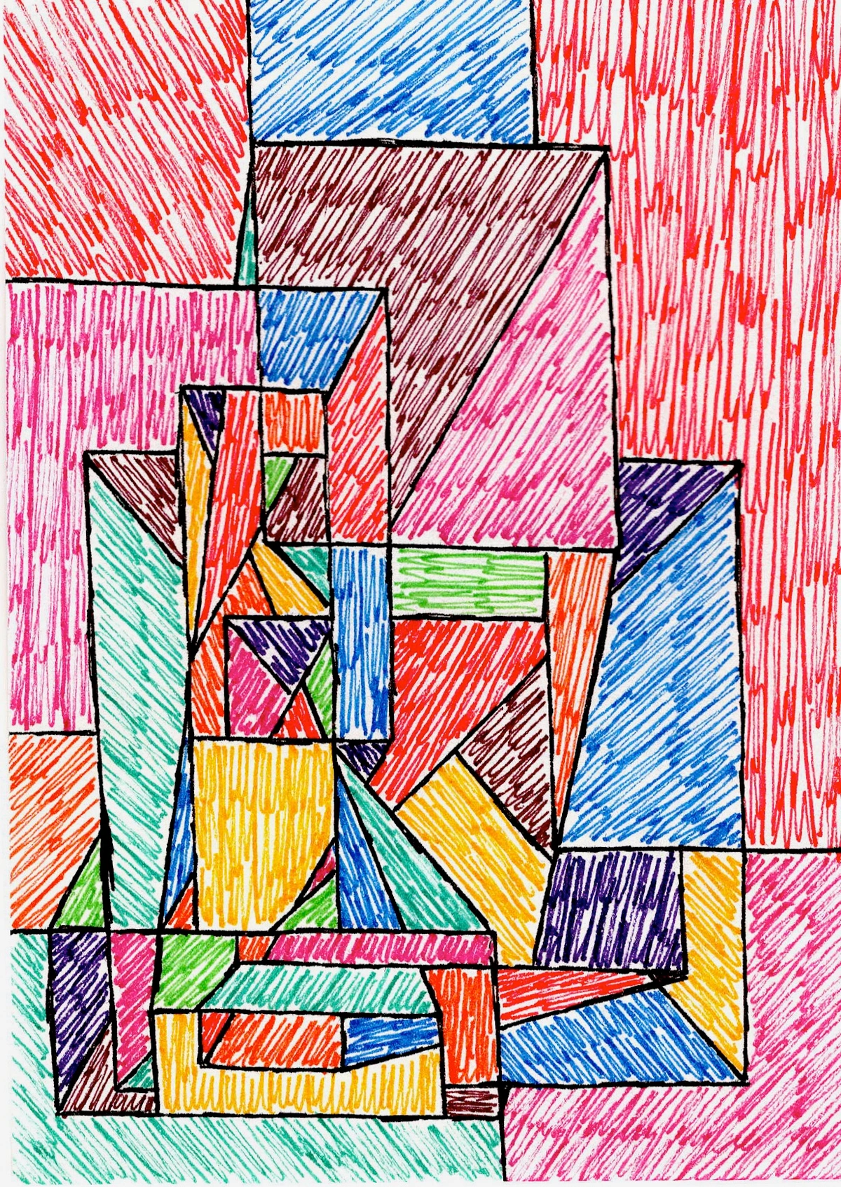
But what are the building blocks of this silent language? While abstract art revels in breaking conventions and celebrating the unconstrained, the core principles of composition remain surprisingly relevant. They simply take on new, often more fluid, and wonderfully unexpected interpretations. For me, these aren't rigid rules to be obeyed, but rather intuitive tools, whispers in the creative process, that help build that unseen architecture. Here's how I approach some of the big ones in my own work, often without even consciously realizing it until later reflection, a bit like a chef instinctively knowing when a dish needs more 'zing' or 'balance.'
Balance: Finding Equilibrium Beyond Symmetry
When I think of balance, I'm not necessarily thinking about perfect symmetry. That can be a bit... predictable, especially for abstract art, which often thrives on the unexpected. Symmetrical balance, where elements are mirrored or repeated equally on either side of a central axis, can feel static and too orderly for the spontaneous nature of abstraction. Instead, I strive for a visual equilibrium, a feeling that no part of the canvas is overwhelmingly heavy or empty. It’s like carrying too many groceries in one hand – uncomfortable and unsettling. In abstract art, this almost always means asymmetrical balance, where different elements with varying visual weights are arranged to feel stable and harmonious.
Visual weight is a fascinating beast in abstraction; it’s essentially how much an element “draws the eye” or “demands attention.” Think of it like this: a small, intensely vibrant splash of crimson can hold the same visual weight as a large, muted field of grey simply because its intensity demands attention. A complex cluster of tangled lines might balance a single, stark geometric form due to its intricate detail. Factors contributing to visual weight include:
- Color saturation: Brighter, purer colors tend to be heavier.
- Size: Larger elements generally have more weight.
- Texture: Highly textured areas can feel heavier than smooth ones.
- Complexity/Density: More intricate or dense forms draw the eye more.
- Contrast: High contrast with the background increases weight.
- Implied directionality: Lines that lead the eye can create a sense of pull.
The trick is to feel it out – does it feel right? Does your eye move comfortably across the surface, or does it get stuck or feel pulled too strongly in one direction? It’s a constant dance of push and pull until everything settles into a resolved tension. This "resolved tension" isn't about everything being perfectly calm; it's a dynamic equilibrium, where opposing visual forces are held in a stable, yet energetic, relationship, preventing the piece from feeling either static or chaotic.
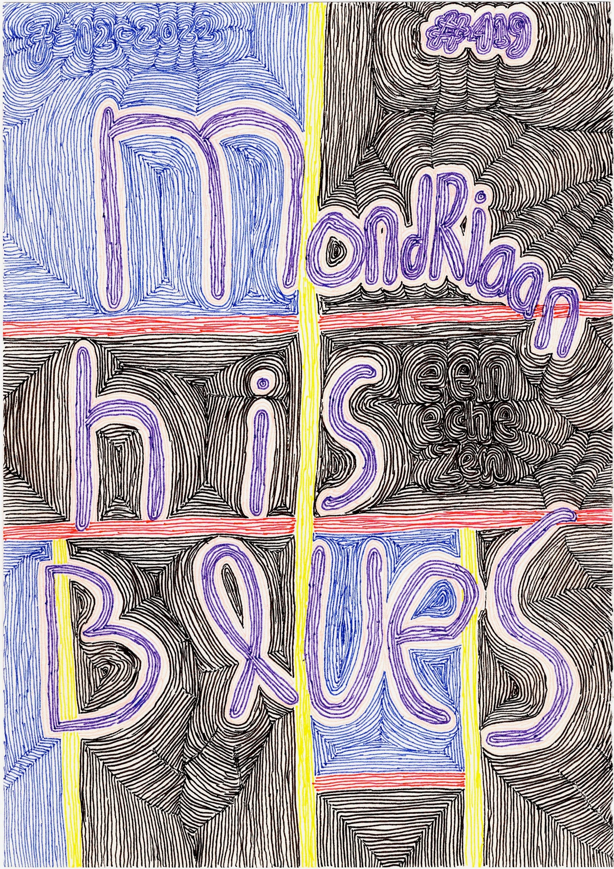
Take, for instance, a work like Piet Mondrian's geometric abstractions. While his compositions appear simple, they are masterclasses in asymmetrical balance, where bold lines and primary colors, though distinct, hold their own weight, contributing to an overall feeling of profound equilibrium without being rigidly symmetrical.
Sometimes, it's a large, muted area counteracting a small, vibrant burst of color. Other times, it's a complex cluster of shapes balanced by a single, elongated line. The goal isn't necessarily calm, but a resolved tension – a state where opposing forces feel held in a dynamic, yet stable, relationship. If you're an artist, try this: create a small study focusing solely on balancing a large, muted shape with a small, vibrant one. You'll be amazed at the delicate interplay.
Emphasis & Focal Point: Where the Eye Dares to Linger
Every good story has a main character, a moment where everything converges. In abstract art, this is emphasis, or the creation of a focal point. It's that magnetic pull, the area where your eye first lands and where it's encouraged to return. The funny thing is, in abstraction, this isn't always a clearly defined object or person. It can be a sudden burst of intense color against a muted background, a complex tangle of lines amidst simpler forms, or even an area of stark contrast. This also ties into the hierarchy of elements, where certain visual components are given more prominence than others, guiding the viewer's perception of importance. This hierarchy is created by manipulating visual weight, making some elements 'shout' louder than others, while others 'whisper' in the background. Sometimes, a composition might even feature multiple points of emphasis, creating a visual journey where the eye dances between several areas of interest, like a visual conversation with multiple lively speakers.
For me, creating emphasis is often an intuitive process, a gentle nudge rather than a forceful command. It might emerge from a particularly bold brushstroke, a unique textural element, or a sudden shift in scale. I find myself asking: "What part of this painting needs to speak the loudest right now?" Sometimes it’s a tiny, vibrant dot that anchors a vast, airy space. Other times, it's the edge where two contrasting colors meet with unexpected force. It's about orchestrating visual hierarchy, deciding what gets the starring role, even if for just a fleeting moment. Without some form of emphasis, a painting can feel diffuse, like trying to listen to ten conversations at once – interesting, perhaps, but ultimately overwhelming, and frankly, a bit exhausting.
Rhythm & Movement: The Dance of Shapes and Colors
If balance is the static foundation, rhythm is the heartbeat of the painting, the silent pulse that guides the viewer's journey. It’s about creating a visual flow, guiding your eye through the artwork, almost like a path or a choreographed dance. This can be achieved through the repetition of shapes, lines (both explicit and implied by the arrangement of forms), or colors, or through the progression from one element to another – sometimes a gentle current, sometimes a staccato burst. Rhythm injects energy and narrative into the piece, inviting the viewer's gaze to wander and explore.
While rhythm implies a repetition or progression, movement specifically refers to how the artist directs the viewer's eye across the composition. It’s the visual journey, the path your gaze takes. In my abstract pieces, I often use rhythmic elements to create a sense of energy or calm. A series of curving, flowing lines might suggest a gentle current, a meandering river of thought, while sharp, intersecting angles can evoke a more frenetic, urgent pace, like a jolt of electricity. Color theory also plays a huge role here; how artists use vibrant, warm colors to advance elements, or cool, receding colors to create depth, directly impacts the visual path and tempo. If you're interested in how artists use color to create these effects, you might find my article on how artists use color insightful. And speaking of flow, my creative flow: embracing intuition in abstract painting talks about how I lean into this intuition, letting the painting dictate its own beat. You can also explore the language of line: how gestural marks define emotion in my abstract art for more on how lines create emotion.
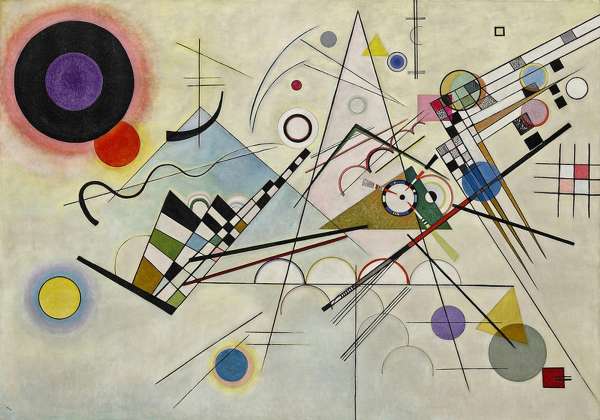
Think about how Wassily Kandinsky achieved such dynamic compositions. His "Composition VIII" is a prime example of a symphony of forms, where geometric shapes, lines, and vibrant colors are arranged to create a powerful sense of movement and rhythm, leading the eye on an energetic visual exploration.
It's not about making a literal path, but about creating an experience where your eye can't help but move, lingering here, jumping there, always propelled forward by the visual beats. Consider Robert Delaunay's vibrant, overlapping forms in his Orphism works, which create a dizzying, circular rhythm that pulls the viewer into a dynamic, kaleidoscopic experience.

Unity & Harmony: Bringing the Chaos into Concert
After all this talk of breaking things down, it might seem contradictory to talk about unity and harmony. But for me, these are the threads that weave all the disparate elements of an abstract painting into a cohesive, believable whole. Unity is the sense that all elements belong together, that they contribute to a singular, overarching idea or feeling. Harmony, often working hand-in-hand with unity, is the pleasing and agreeable relationship between those elements, creating a sense of visual "rightness." It’s the feeling of cohesion, even if the individual parts are wild. Beyond this, I often aim for a unity of effect, where even contrasting or discordant elements collectively contribute to a single, dominant mood or emotional impact, much like an orchestra playing a tense chord that still serves the overall narrative of the symphony.
I often think of it like a symphony where different instruments play distinct melodies, but together, they create a resonant, beautiful piece. In my work, I achieve unity through various means: the repetition of a certain shape or color motif, even subtly; the consistent application of texture; or a dominant color palette that ties everything together. It's about creating visual echoes and variations on a theme. Sometimes, I step back and squint, trying to see if any element feels like an outsider, a rogue note. If it does, it's either an intentional dissonance for effect – a jarring note meant to provoke thought or emotion – or it needs to be integrated, softened, or even removed. Intentional dissonance is a powerful tool, a deliberate disruption that, paradoxically, can strengthen the overall unity by creating a focal point of tension or surprise, preventing the piece from becoming bland. It’s a constant negotiation between individuality and belonging, ensuring that even the most rebellious strokes serve the greater purpose.
Contrast: The Spice of Visual Life
If unity is about bringing things together, then contrast is about creating exhilarating differences. It’s the spice of visual life, the element that prevents an abstract painting from becoming monotonous or bland. Contrast can manifest in countless ways: light against dark (value contrast), rough against smooth (texture contrast), thick lines against thin (line contrast), warm colors against cool (color temperature contrast), or geometric shapes against organic forms (shape contrast). Beyond dramatic differences, subtle contrast – slight variations in hue, value, or texture – can also create depth and interest without overt drama, preventing a piece from feeling flat. It's the visual tension that adds drama and energy, preventing a painting from becoming a visual lullaby.
For me, contrast is a deliberate tool to ignite interest and guide the eye. I might pair a soft, ethereal wash of color with a sharp, aggressive line. A densely textured area might abut a perfectly smooth, serene expanse. It's about asking, "How can I make this element pop? How can I create a compelling dialogue between these two forms?" Without contrast, everything can blend into an undifferentiated sameness, losing its impact. But too much contrast, haphazardly applied, can lead to visual chaos – a cacophony rather than a conversation. It’s a delicate balance, much like choosing the right ingredients for a compelling dish. It's the moment a splash of vibrant orange truly sings against a deep indigo.
Negative Space: The Unsung Hero
Here's a concept that often gets overlooked, especially in abstract art, but it's an absolute game-changer: negative space. This isn't just the "empty" background; it's the shapes and forms created around and between the positive elements (your colors, lines, and textures). In abstraction, negative space often becomes as important, if not more important, than the painted areas themselves. It’s the breath that allows the painting to expand, to truly live. It can also subtly influence a viewer's perception of scale and proportion, by defining how much 'room' other elements have. It’s the silent architect’s blueprint, allowing the forms to breathe and interact.
I confess, in my early days, I saw negative space as merely the absence of paint. I remember once creating a piece so dense with marks and colors, it felt like a visual brick wall. My friend, a fellow artist, looked at it and simply said, "Where's the air?" It was a humbling moment, almost like being caught holding my breath. Now, I see negative space as an active participant, a silent partner in the composition. It defines and enhances the positive shapes. The way two lines meet, the gap between two forms – these create their own powerful, unpainted shapes. Sometimes, when a painting feels "off," I’ll cover up the positive elements with my hands and just look at the negative spaces. Often, the solution to a compositional problem reveals itself there, in the unpainted areas. It's a humbling reminder that what you don't paint is often as crucial as what you do. It's the silent witness that shapes everything else. For a deeper dive into this often-ignored element, you might want to explore the role of negative space in abstract art: finding balance and focus.
Scale & Proportion: The Dance of Relative Sizes
Finally, let's talk about scale and proportion. These principles deal with the size of elements relative to each other and to the overall canvas. It’s about how big or small something feels, and how those relative sizes impact the viewer’s perception and the painting's overall presence. A tiny element in a vast field can feel isolated and vulnerable, drawing the viewer in for an intimate moment; a colossal form can feel dominant and powerful, establishing immediate gravitas.
In my abstract process, playing with scale is a constant source of discovery. I might intentionally place a minuscule, intricate detail within a sweeping, monochromatic expanse to draw the eye in for a closer, more intimate look. Conversely, a large, simplified shape might ground a composition, providing a sense of stability against more fragmented elements. It’s not just about literal size, but about perceived size – how the visual weight and surrounding elements make something feel bigger or smaller. The relationship between a small, intense element and a large, passive one can create a captivating tension, inviting the viewer to contemplate their relationship. It's like a story told through relative sizes, each playing its part in the visual narrative, creating unexpected dialogues across the canvas.
Common Pitfalls in Abstract Composition (And How to Side-Step Them)
Even with an intuitive approach, navigating the abstract landscape can present challenges. Here are a few common compositional pitfalls I've learned to watch out for, and how the principles above help to avoid them. More importantly, this is how these pitfalls might feel to a viewer, because ultimately, it's about the experience we create:
- Overcrowding: A canvas crammed with too many equally weighted elements without clear emphasis or negative space can feel chaotic and overwhelming, like a room full of people all shouting at once. As a viewer, this can feel exhausting, leaving you with nowhere to rest your eye, and ultimately, you might just walk away.
- Solution: Embrace negative space and establish clear hierarchy.
- Lack of Focal Point: Without emphasis, the eye has nowhere to land, leaving the viewer feeling lost or uninterested. The painting becomes a visual murmur rather than a clear statement. For the viewer, it's like listening to a story without a protagonist – you don't know who or what to care about.
- Solution: Deliberately create contrast or a unique element to draw the eye.
- Muddled Balance: A composition that feels heavy on one side (e.g., a large, dense area of texture on the left with very little visual weight on the right) or lopsided creates unease, unintentionally. It pulls the viewer's eye out of the painting. This can make a viewer feel subtly uncomfortable or restless, sensing something is "off" without knowing why.
- Solution: Consciously distribute visual weight, seeking asymmetrical equilibrium.
- Monotony: A lack of contrast in line, color, or texture can make a painting feel flat and unengaging, failing to create the visual energy that abstract art thrives on. From a viewer's perspective, this piece might simply be forgotten – it doesn't leave a lasting impression or spark curiosity.
- Solution: Introduce deliberate contrasting elements to add drama and interest.

Reading the Unseen: A Viewer's Guide to Abstract Composition
As a viewer, you don't need to be an artist to appreciate the power of composition. In fact, learning to "read" the silent language of abstract art can unlock a much richer, more personal experience. Instead of trying to find a recognizable object, try these prompts:
- Follow Your Eye: Where does your gaze naturally land first? Where does it go next? What path does it trace across the canvas? This is the artist's rhythm and emphasis at play.
- Feel the Balance: Does the painting feel stable, even if dynamic? Or does it feel heavy, light, or lopsided in certain areas? How does this make you feel?
- Notice the Breathing Room: Look at the unpainted (or less detailed) spaces. How do these negative shapes define and interact with the painted forms? Do they create tension or calm?
- Sense the Tension and Release: Where do contrasting elements meet? Where do colors clash or harmonize? What emotions do these relationships evoke?
- Perceive the Scale: How do the sizes of elements make you feel about their relationship to each other and the overall piece? Does a small detail draw you in, or does a large form dominate the space? How does this impact your overall perception?
By engaging with these questions, you move beyond merely seeing an abstract painting to truly experiencing its unseen architecture, allowing its silent language to speak directly to your emotions and intuition.
Key Takeaways: The Architect's Blueprint
Before we conclude, let's distill the essence of our journey into the silent world of abstract composition. Remember, these aren't rigid rules, but rather intuitive guides for the unseen architect within:
- Composition is the invisible force that transforms random marks into meaningful experiences, evoking specific emotions and guiding the viewer's eye.
- Balance (especially asymmetrical) creates visual stability, preventing a piece from feeling lopsided or uncomfortable.
- Emphasis acts as a magnetic pull, directing the viewer's gaze and establishing a clear hierarchy of elements.
- Rhythm and Movement guide the eye through the artwork, creating visual flow and tempo.
- Unity and Harmony weave disparate elements into a cohesive whole, even allowing for intentional dissonance to add depth.
- Contrast injects drama and energy, preventing monotony through differences in value, texture, or color.
- Negative Space is an active, vital element, providing 'air' and defining positive forms.
- Scale and Proportion play with relative sizes to create narrative and emotional impact.
The Unseen Architect Within You
Composition in abstract art isn't about rigid rules or right and wrong answers. It's a deeply personal journey, an intuitive conversation between the artist and the canvas, culminating in a silent language that speaks directly to the viewer's soul. It's the unseen architect, shaping chaos into compelling beauty, transforming raw expression into a profound experience. It's also, frankly, a constant learning curve, full of happy accidents and frustrating revelations, a bit like trying to teach a cat to fetch – sometimes it just does its own thing, and you learn to appreciate its independent spirit.
I've shared my personal approach to these fundamental principles – balance, emphasis, rhythm, unity, contrast, negative space, and scale – not as commandments, but as a lens through which you might begin to decode the hidden structures in abstract art, both your own and others'. When I'm in my studio, creating the pieces that will eventually find their way to my art for sale page or be displayed in my museum in 's-Hertogenbosch, these principles are almost always at play, even if I'm not consciously ticking them off a list. They are deeply embedded in my intuition, part of the fabric of my creative flow: embracing intuition in abstract painting.
So, the next time you encounter an abstract painting, instead of asking "What is it?", try asking: "How does it move my eye? What feels balanced, or intentionally unbalanced? Where does my gaze linger? What are the unpainted spaces doing?" By engaging with this unseen architecture, you unlock a richer, more profound appreciation for the silent, powerful language of abstraction. I encourage you to explore your own canvases or observations with these ideas in mind, and perhaps share your discoveries – it's a journey best shared, even if it often feels solitary. It's a language we all inherently understand, once we learn to listen for its whisper.
Quick Guide to Abstract Composition Principles
Principle | Definition | How it Manifests in Abstract Art |
|---|---|---|
| Balance | The visual distribution of weight in an artwork, creating stability. | Achieved often through asymmetrical balance, where varied elements (e.g., small intense color vs. large muted area, complex texture vs. simple form) create equilibrium. Symmetrical balance is less common due to its predictability. Involves visual weight (how much an element draws the eye based on color, size, texture, contrast). It’s about resolved tension and visual stability. |
| Emphasis | Drawing attention to a specific area or element. | A focal point that isn't necessarily an object, but a magnetic pull created by intense color, unique texture, strong contrast, or a cluster of activity. Establishes a hierarchy of elements by manipulating visual weight, directing where the eye should linger, potentially with multiple points of interest. |
| Rhythm & Movement | A visual flow or journey created by recurring elements and eye direction. | Rhythm is created by repetition or progression of lines (explicit or implied), shapes, colors, or textures, establishing a tempo or pulse (e.g., flowing lines for calm, sharp angles for energy). Movement is how the artist directs the viewer's eye across the composition, often influenced by color theory. |
| Unity & Harmony | The sense that all elements belong together and form a cohesive whole. | Achieved through repetition of motifs (shape, color), consistent texture, or a dominant color palette. Ensures disparate parts contribute to an overarching idea or feeling. Includes unity of effect, where elements collectively contribute to a single mood. Harmony is the pleasing relationship between these unified elements, even with intentional dissonance for effect. |
| Contrast | The arrangement of opposing elements. | Creates visual interest and energy through differences in value (light/dark), texture (rough/smooth), line (thick/thin), color temperature (warm/cool), or shape (geometric/organic). Subtle contrast also adds depth. Prevents monotony and adds drama. |
| Negative Space | The empty or unpainted areas around and between positive forms. | An active compositional element that defines and enhances positive shapes. Crucial for giving the artwork room to breathe, influencing scale, and often revealing solutions to compositional problems; it's what's not there that shapes what is. The "silent architect's blueprint." |
| Scale & Proportion | The relative size of elements to each other and to the whole. | Plays with perceived size and visual weight to create narrative and impact. A tiny detail can draw intimacy, while a large form creates dominance, influencing the viewer's perception and emotional response to the work. |


