
The Definitive Guide to Space & Form in Abstract Art
Explore abstract art's profound language of space & form. This artist's guide covers explicit, implied, and gestural forms, illusory space, visual weight, Gestalt principles, and practical creative approaches.
The Definitive Guide to Space and Form in Abstract Art: Principles, Perception, and Practice
Alright, let's talk about something that used to make my brain do a little loop-de-loop: space and form in abstract art. For the longest time, I'd look at a canvas with no trees, no faces, no obvious horizons, and think, "Where's the space? What form are we even talking about?" It felt like trying to read a map of a place that didn't exist, a bit like trying to plan a holiday to the moon without knowing if there's an atmosphere (there isn't, in case you were wondering, but my point stands!).
But here's the thing about abstract art – it invites you, and me, to redefine our understanding. It’s less about literally seeing what is there, and more about feeling what could be there, or even what isn't there, and how that very absence creates a compelling presence. Honestly, diving into this has transformed not just how I view art, but how I approach creating it myself. It's a bit like learning a new secret language, and I'm here to share some of my scribbled notes with you on how these elusive forms inhabit, and create, the abstract world.
Understanding Form in Abstract Art: The Core Building Blocks
If we're going to talk about abstract worlds, we first need to understand their inhabitants. For me, coming from a world of literal representation, form initially meant recognizable objects. But in abstract art, form gets a glorious makeover. It's not just about a square or a circle; it’s about the underlying structure, the three-dimensional qualities (or the illusion of them), the mass, volume, and the way visual elements are organized. It's the inherent visual presence of an abstract element, whether it's a blob of paint, a sharp line, a blurred edge, or even an empty area. It’s the sense of weight, density, or transparency that an abstract shape conveys, stripped of conventional labels but still carrying immense visual power.
Explicit and Implied Forms: Seen and Suggested
Often, we encounter explicit forms – the bold blocks of color, the crisp lines, the clearly defined shapes that assert their presence on the canvas. These are the obvious 'stars' of the composition. But abstract art also thrives on implied forms. These are shapes or structures suggested by the arrangement of lines, colors, or edges, even if they aren't fully rendered. It's like a visual whisper, inviting your mind to complete the picture, or to sense a boundary where none is strictly drawn. This often happens through the clever use of negative space (which we'll get to soon!).
The Feel of Form: Texture's Subtle Influence
And then there's texture, the often-unsung hero that profoundly shapes our perception of form. Whether it's the rough impasto of thick paint, the smooth sheen of a glazed surface, or the subtle grain of the canvas itself, texture gives form a physical presence. It can make a form feel heavy and grounded, or light and ethereal. A heavily textured area might push forward, demanding attention, while a smooth, flat one might recede, inviting a closer, quieter look. It’s how the painting feels, even if you can’t touch it, that adds another layer to its 'thing-ness.'
Geometric, Organic, and Gestural Forms
Abstract art often plays with different types of forms, each bringing its own energy:
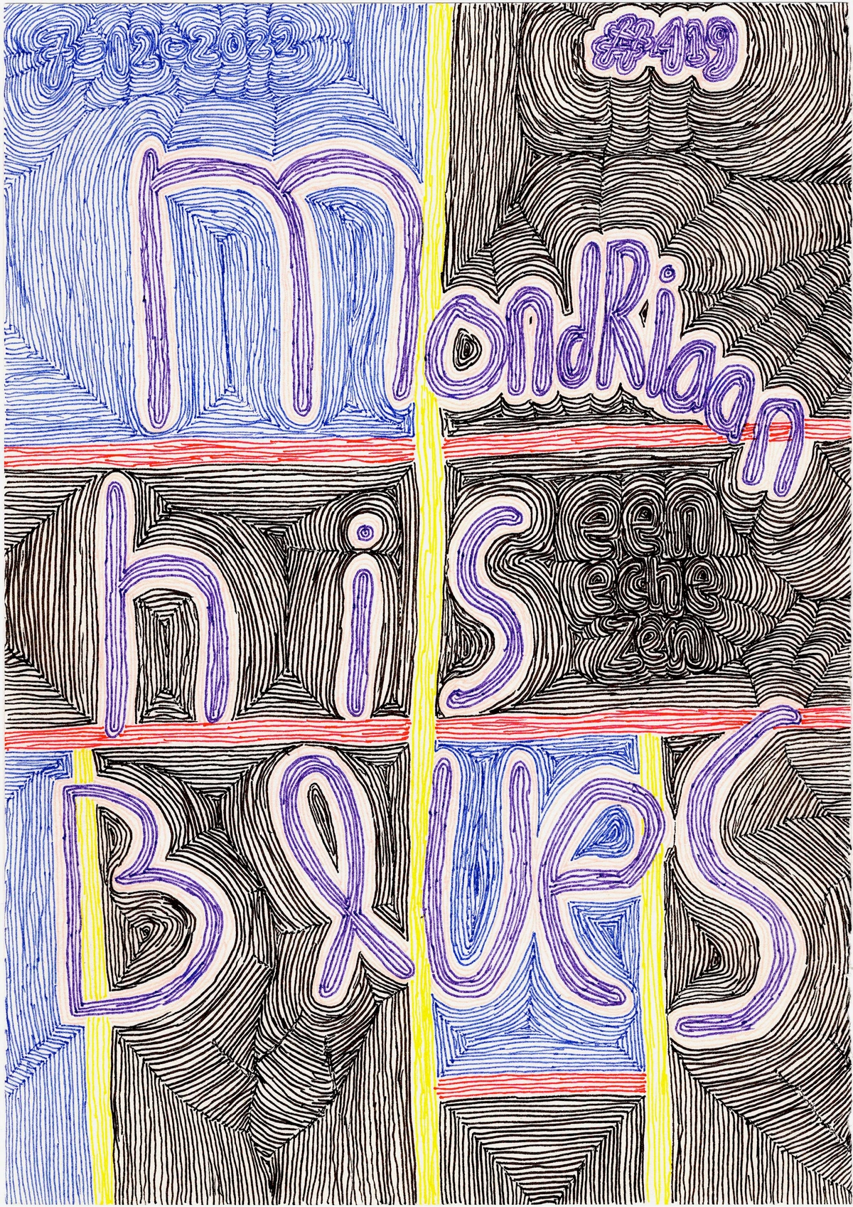
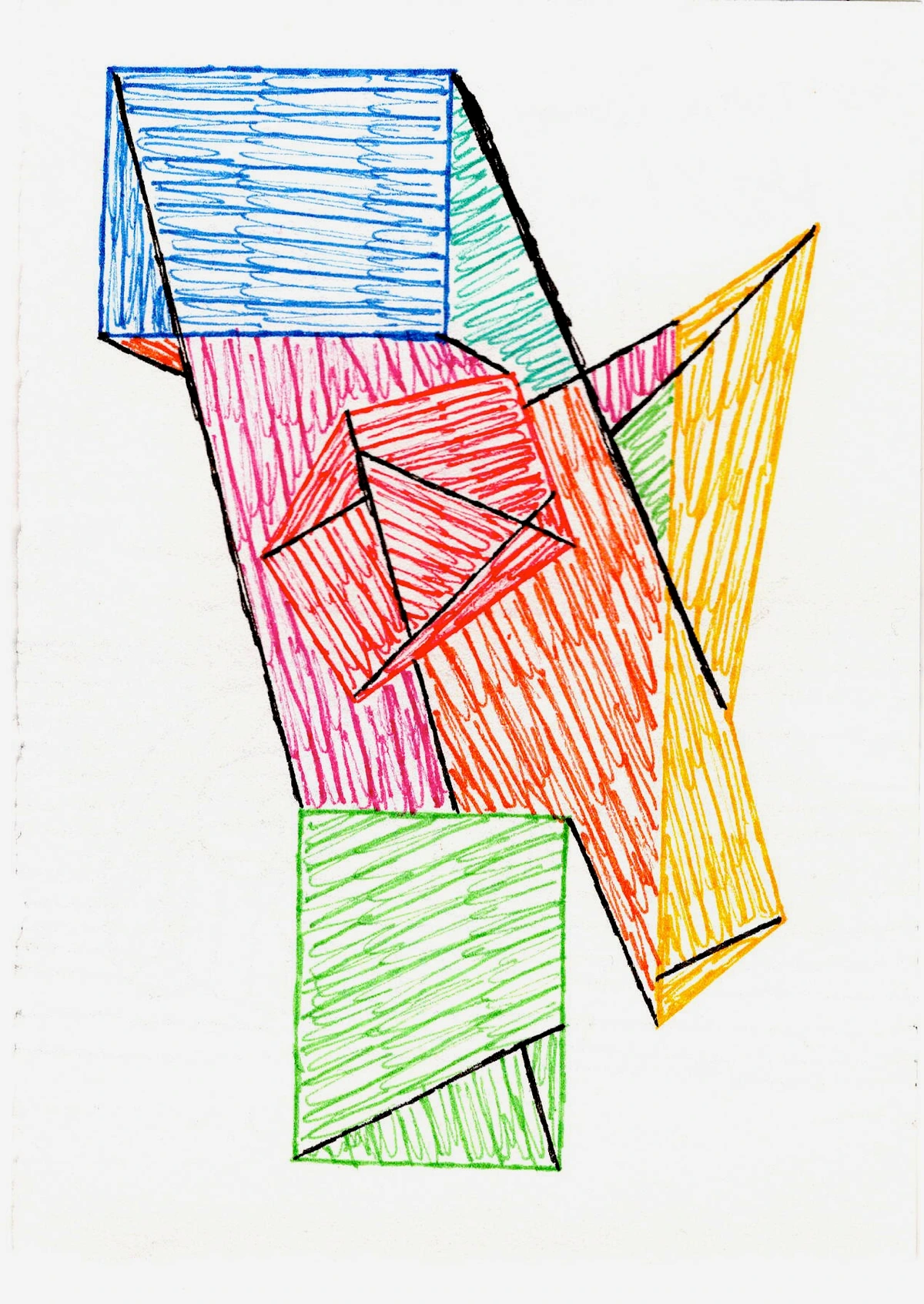
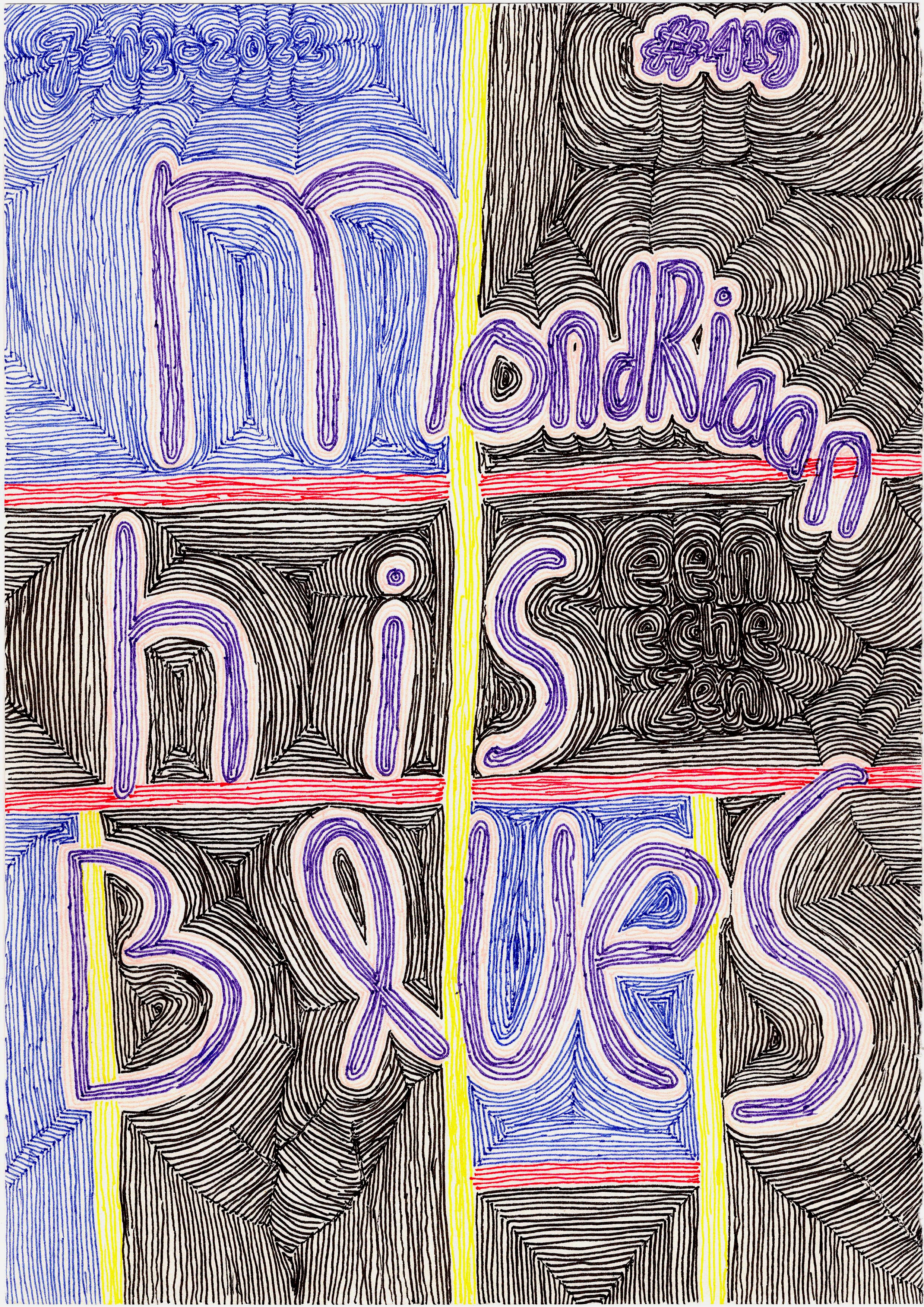
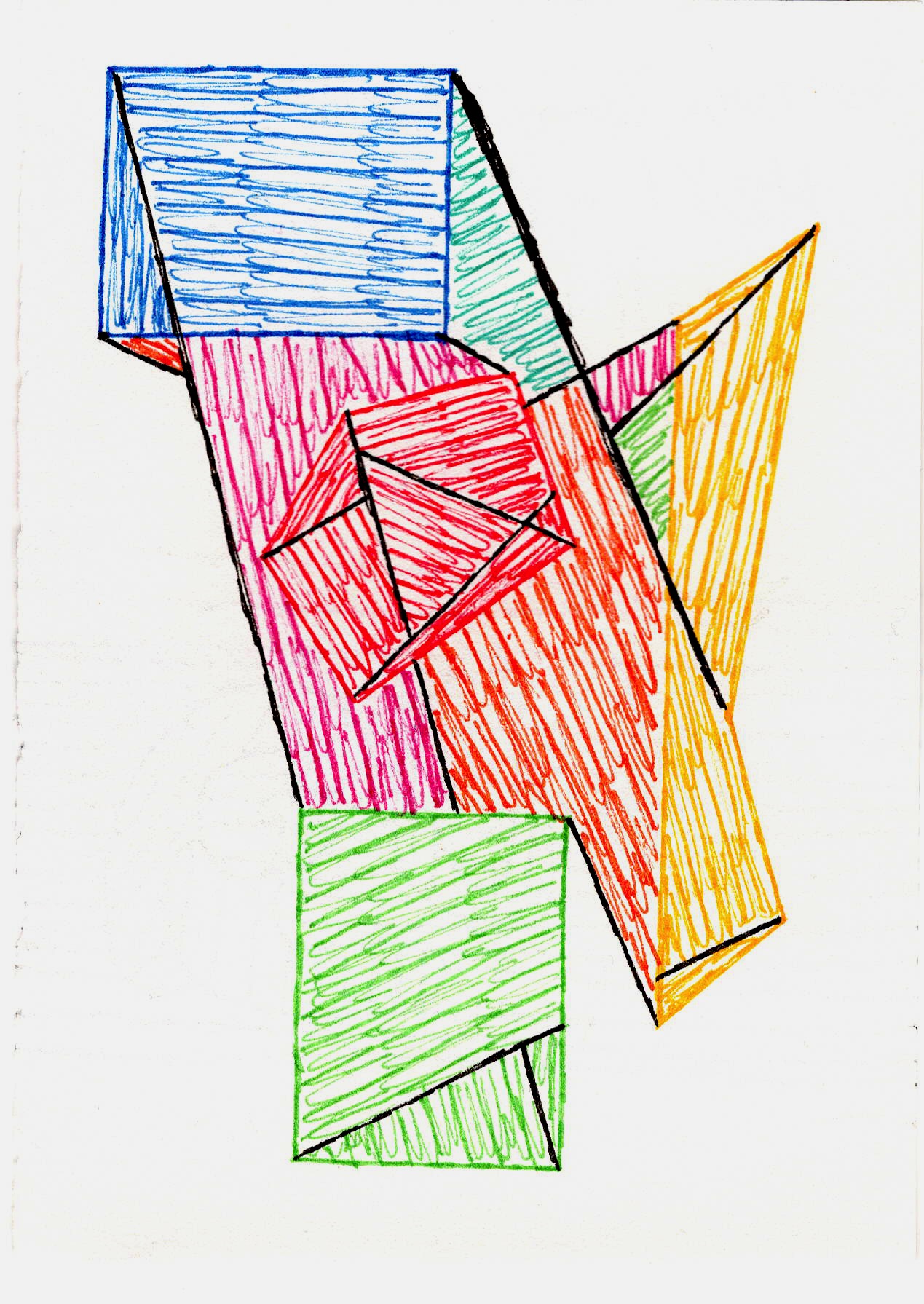
- Geometric Forms: These are the crisp, precise shapes you might expect – squares, circles, triangles, rectangles. They evoke order, structure, and often a sense of logic or mathematical purity. Artists like Piet Mondrian masterfully used geometric forms to create complex visual rhythms and a sense of calm, structured space.
- Organic Forms: On the other hand, organic forms are irregular, flowing, and often curvilinear. They feel more natural, spontaneous, and can suggest movement, growth, or biological shapes. Think of the swirling brushstrokes of Abstract Expressionism or the biomorphic shapes of an artist like Joan Miró. They bring a different kind of energy, a more visceral connection.
- Gestural Forms: These are forms created through the dynamic, expressive movement of the artist's hand or body. They're less about a defined outline and more about the trace of an action, conveying raw emotion, spontaneity, and energy. Think of the drips and splatters of Jackson Pollock or the powerful, sweeping brushstrokes of Willem de Kooning – these forms are a direct record of the artist's process and inner state.

For more on this, I often find myself revisiting the definitive guide to understanding form in abstract art.
Defining Space: Beyond the Literal, Into the Felt
Now that we have our forms, where do they reside? For me, space in abstract art isn't always about literal distance; it's about relationships between elements, and how they make your eye travel and your mind wander. I remember staring at a Rothko, that vast expanse of color, feeling a profound sense of… well, space. But it wasn't a room, or a landscape. It was an emotional space, an expanse that felt internal, almost like I could step into the canvas and wander around in my own thoughts. That's when it clicked. It's less like a hallway and more like a feeling of expansiveness or confinement.
Crucially, in abstract art, the very absence of recognizable subject matter forces us to engage with space on a more fundamental, visceral level. Without a horizon line or a figure to anchor our perception, our minds are free to interpret the push and pull of color, line, and shape as purely spatial experiences.
Illusory Space vs. Actual Space on the Canvas
One of the most mind-bending aspects is distinguishing between illusory space and actual space. Illusory space is the suggestion of depth, distance, and dimension within the two-dimensional surface of the painting. It’s the feeling that you could reach into the canvas, that elements exist behind others, or recede into the distance. Actual space, on the other hand, refers to the literal flat surface of the canvas itself and any physical textures or projections from it. Abstract artists are masters at playing with this duality, often flattening forms to emphasize the actual surface while simultaneously creating deep, enveloping illusions of space. It’s like a visual magic trick, making you believe in depths that aren't physically there.
Negative Space: The Unsung Hero
Think about it: the spaces between things are just as important as the things themselves. In my studio, if I leave a paint tube just lying around, it creates a specific kind of negative space around it – usually a chaotic one that hints at my current state of mind (which, let's be honest, is often a glorious mess). But if I purposefully arrange objects, the empty areas suddenly gain purpose. That's negative space in a nutshell: the background, the areas around and between the forms, defining them just as much as the forms define it. It’s the silence that makes the music meaningful. For a deeper dive, check out my thoughts on the role of negative space in abstract art.
Positive Space: The Obvious Stars
Then you have positive space – the shapes, lines, and colors that grab your attention. These are the elements that claim the foreground, the 'things' in the painting. In a figurative work, it would be the person, the tree, the house. In abstract art, it's those bold blocks of color, the energetic lines, the textured masses that assert their presence. Sometimes they feel like they're pushing forward, demanding attention, while other times they recede, inviting a closer look.
Visual Weight: The Unseen Force
However, these two concepts (positive and negative space) are far from isolated; they exist in a constant, delicate dance. Their interplay is what gives an abstract composition its breathing room, its tension, its very dynamism. It’s like a conversation where both the speaker and the listener are equally vital. And in this dance, visual weight plays a crucial, often subconscious, role. At its core, visual weight refers to how much a particular element draws the eye or feels 'heavier' than its surroundings. Certain colors, especially warm, saturated ones like a fiery red or a bright yellow, can feel heavier and demand more attention, thus claiming more 'visual space.' Conversely, cooler, desaturated blues or soft grays often feel lighter and recede. Similarly, large, dense forms carry more weight than small, light ones, and complex, detailed textures feel heavier than smooth, flat surfaces. It’s a subtle force, but one that artists manipulate to guide your gaze and evoke a particular sensation of balance or imbalance.
So, how do these various forms and defined spaces then come together to create a cohesive whole, or perhaps, a beautifully fractured one?
The Interplay: When Space Meets Form, A Dynamic Dance
This is where the magic truly happens. Space and form aren't just roommates; they're dance partners in a constant, intricate ballet. How an artist places forms within a given space, and how that space then reacts to those forms, is the essence of composition. It's about visual weight, balance, tension, and release. A small form in a large space can feel isolated and vulnerable, while the same form in a cramped space might feel aggressive or contained. Sometimes, when I’m trying to make a composition work, it feels less like a dance and more like trying to herd cats – each element has its own stubborn will, and getting them to cooperate is a glorious, frustrating challenge. I remember one time, I tried to force a vibrant red form into a quiet blue field, thinking it would create dynamic tension. Instead, it just looked like a cherry dropped in a swimming pool. Total compositional flop. Live and learn, right?
Consider these crucial interactions:
- Creating Depth (Depth Perception): Even on a flat canvas, artists skillfully manipulate size, overlap, and color to create the illusion of depth. This plays directly into our innate depth perception. Larger forms often appear closer, while smaller, overlapping forms suggest recession. Cool colors tend to recede, warm colors advance. It's a subtle game of visual push and pull, a carefully orchestrated illusion that can make a two-dimensional surface feel boundless.
- Negative Space Actively Creating Form: Here’s a delicious paradox: negative space doesn't just define existing forms; it can actively create them. By shaping the empty areas around positive forms, an artist can suggest entirely new shapes or figures that aren't explicitly drawn. It’s like seeing an animal in the clouds, or a face in the empty space between two figures – your mind completes a form out of an absence, proving that what's not there can be just as potent as what is.
- Establishing Movement: Repeating forms, diagonal lines, or a progression of sizes can subtly guide the viewer's eye through the composition, creating a sense of rhythm and motion. The spaces between these forms then become pathways, almost like silent directions for your gaze.
- Generating Emotion: The way forms are arranged in space can evoke strong feelings. Open, expansive spaces with flowing forms might feel peaceful or free, while tightly packed, angular forms could convey chaos or anxiety. It’s less about telling a story and more about setting a mood, a deep, resonant hum within the viewer.
- Achieving Balance: Balance is fundamental to how we perceive a composition, dictating whether it feels stable and harmonious, or unsettling and dynamic.
- Symmetrical Balance offers a sense of formality and calm, where elements on one side mirror the other.
- Asymmetrical Balance, more common in abstract art, achieves equilibrium through contrasting elements (e.g., a large, simple form balanced by several small, complex ones). It often feels more dynamic and spontaneous.
- Radial Balance (less common but present) occurs when elements radiate from a central point. The choices an artist makes regarding balance directly influence the perceived stability and energy of the forms within their defined spaces.
- The Impact of Scale: Scale, the overall size of the artwork, profoundly influences how we perceive both forms and space. A tiny abstract piece might feel intimate, drawing you close to explore its contained universe. A monumental canvas, however, can be utterly immersive, enveloping your field of vision and making you feel as though you could step directly into its expansive, abstract world. The same forms can feel entirely different when presented on vastly different scales, altering their perceived weight, importance, and the feeling of the space they occupy.
- Medium's Influence on Perception: The choice of medium itself acts as a silent collaborator in shaping space and form. Thick impasto oil paint creates forms with actual physical depth and a tangible presence, pushing them forward into the viewer's space. Watercolor, with its translucent washes, creates fluid, ethereal forms that dissolve into the paper, suggesting layered, indeterminate spaces. Mixed media can combine these effects, allowing artists to build complex realities where different materials interact to define their own unique spatial properties.
It's a delicate balancing act, and I often wrestle with this in my own work. Sometimes I feel like I'm directing an orchestra, trying to get all the elements to play in harmony, or sometimes, delightfully, in controlled dissonance. My journey from concept to canvas is very much about this dynamic.
What historical movements truly dared to shatter and redefine our understanding of these fundamental elements?
Historical Echoes: Pioneers of Abstract Space and Form
Understanding how artists have grappled with space and form through history can be incredibly illuminating. While this article can't be a full historical treatise (for that, you might enjoy The Definitive Guide to the History of Abstract Art), let's glance at a few key players who utterly reshaped our perception of forms in space:
- Wassily Kandinsky (Early Abstraction): Often credited with creating one of the first purely abstract works, Kandinsky believed in the spiritual and emotional power of color and form. His early abstract paintings, with their vibrant, often biomorphic shapes and swirling lines, created dynamic, non-objective spaces that were meant to evoke internal states rather than external realities. He saw colors and forms as having their own 'inner sound,' creating a symphonic experience of space and movement.
- Cubism (Picasso, Braque): Though not purely abstract, Cubism utterly revolutionized the depiction of space and form. Objects were broken down into geometric facets and presented from multiple viewpoints simultaneously, creating a fragmented, shallow space where forms were intertwined with the background. It was a radical rethinking of how objects exist in space.
- Suprematism (Malevich): Kazimir Malevich's Black Square is perhaps the most iconic example of pure form in a pure, infinite space. His works aimed for spiritual purity, using basic geometric forms (squares, circles, crosses) against stark, often white, backgrounds to evoke a sense of boundless, non-objective space, almost as if he was stripping away all earthly distractions.
- De Stijl (Mondrian): Piet Mondrian, a true master of geometric abstraction, used primary colors and black lines to divide space into a rigid grid. His forms (rectangles of color) and the spaces between them are equally important, creating a dynamic equilibrium and a sense of universal harmony. It’s a precision that speaks volumes without a single literal depiction.
- Abstract Expressionism (Rothko, Pollock): In contrast to the precise geometry, Abstract Expressionists often explored vast, indeterminate spaces and gestural forms. Rothko's color fields create immersive, emotional spaces that seem to breathe and expand, drawing the viewer in with their sheer, enveloping presence. I've often found myself lost in the ultimate guide to Rothko for this very reason – it’s a masterclass in felt space.

How does our own internal wiring actively participate in this complex visual dialogue?
Perception and Psychology: How Your Brain Actively Engages
Our brains are magnificently wired to make sense of the world, even when confronted with the seemingly nonsensical. When we look at abstract art, our minds are still trying to find patterns, connections, and meaning, and this is where the psychology of perception comes into play. Beyond merely seeing, our brains are actively constructing. Sometimes I think my brain is just making it up as it goes along, a bit like my to-do list, but that's the beauty of it, isn't it?
The Illusion of Depth and Distance
One fascinating aspect is how our brains interpret depth perception in abstract works. Without traditional vanishing points or perspective, artists still manipulate cues to create a sense of receding or advancing space. Think of it as an abstract form of atmospheric perspective – not literal fog, but subtle shifts in color intensity, value, or form clarity that trick the eye into perceiving layers and distances. Cooler, desaturated colors often appear to recede, while warmer, more saturated hues seem to advance, creating a vibrant push and pull on the canvas that feels remarkably spatial.
The Role of Memory and Personal Experience
Beyond universal perceptual cues, our individual memories and life experiences play a profound role in how we interpret abstract space and form. A swirling blue form might evoke the ocean for one person, a stormy sky for another, or simply a feeling of calm. The stark contrast of black and white might recall a specific memory or an emotional state. We don't come to abstract art as blank slates; we bring our entire history, our stored visual lexicon, and our emotional landscape, which actively shapes the meaning and sensation we derive from the artwork. It's a deeply personal, almost co-creative act.
Gestalt Principles: Making Sense of the Unseen
Concepts like Gestalt principles offer a fascinating lens through which to view this active construction of meaning:
- Figure-Ground: Our innate tendency to perceive certain elements as distinct 'figures' against a less defined 'ground' is crucial. In abstract art, the artist can deliberately blur this distinction, making it ambiguous which is positive and which is negative space, creating visual tension and encouraging deeper engagement. It's like a visual riddle, where what you see depends on what you focus on.
- Proximity: Elements placed close together are often perceived as a group. An artist can use this to create clusters of forms that define smaller, contained spaces within a larger composition, guiding your eye to specific areas.
- Similarity: Similar elements (in color, shape, texture) tend to be grouped together. This can create visual pathways or suggest connections between disparate parts of a painting, forming an invisible thread that weaves the composition together.
- Closure: Our brains tend to complete incomplete forms or see a whole where parts are missing. An abstract artist might suggest a form without fully rendering it, inviting the viewer to mentally 'fill in the blanks' and actively participate in the creation of meaning. It's an invitation to finish the sentence, to complete the puzzle, and in doing so, become a co-creator of the artwork's reality.
These psychological underpinnings mean that your interaction with abstract space and form isn't just passive viewing; it's an active, interpretive dance between your visual system and the artist's intent (or lack thereof!). It’s a constant, delightful dialogue.

So, how does all this theory actually translate into the mess, magic, and methodical madness of an artist's studio?
Putting It Into Practice: My Creative Approach to Space and Form
As an artist, understanding space and form isn't just theoretical; it's the bedrock of my creative process. It's about making conscious choices, even when I'm embracing intuition and spontaneity. Here's how I think about it in my studio, and how these principles become tangible:
- Compositional Intent: Before I even pick up a brush, I often have a vague idea of the 'spatial narrative' I want to create. Do I want a feeling of expansive calm or dynamic tension? This guides my initial mark-making and the placement of early forms. For instance, I once aimed to create a piece that felt both contained and endlessly deep. My solution was to use a strong central, slightly textured form (positive space) surrounded by cooler, smooth, receding colors (negative space), with subtle diagonal lines intersecting to create a sense of movement into the canvas rather than across it. This allowed the central form to anchor the composition while the surrounding space invited contemplation of infinite depth. For a more detailed look, check out the definitive guide to composition in abstract art.
- Layering for Depth: I use translucent layers to build up a sense of illusory depth. Each layer interacts with the one beneath it, creating new forms and shifting the perception of space. It’s like looking through different panes of colored glass, each adding to the complexity of the view, allowing forms to emerge and recede through veils of color.
- Color as a Spatial Tool: Color isn't just about aesthetics; it's a powerful tool for manipulating space. Warm colors tend to jump forward, while cool colors recede. By juxtaposing these, I can create a vibrant push and pull, making the surface of the canvas feel alive and multidimensional. It's like playing with proximity, but with hue.
- Texture's Role in Defining: As mentioned earlier, texture is paramount. I often employ varying textures – from thick impasto to smooth washes – to give forms distinct visual weight and to differentiate them spatially. A rough, jagged form will naturally feel closer and more assertive than a smooth, blurred one, even if they're the same color. It’s another way to define boundaries and create presence without literal representation.
- Embracing Ambiguity: Sometimes, I intentionally blur the lines between positive and negative space, or make forms less defined. This ambiguity invites the viewer to lean in, to spend more time with the piece, and to find their own meaning within the evolving spatial relationships. It's a bit like giving someone a riddle, encouraging them to find their own answer, and truly fostering an active engagement with the artwork.
An Artist's Dilemma: From Cherry to Cosmos (a hypothetical solution)
Remember that compositional flop where my vibrant red form just looked like a cherry dropped in a swimming pool? It was meant to be a dynamic tension, but it just felt… disconnected. My dilemma was this: how do I make a bold form feel integrated yet still assertive, and how can the surrounding space amplify, rather than diminish, its presence?
My solution came from rethinking the relationship. Instead of just "dropping" the form, I decided to make it emerge from the space. I started by blurring the edges of the "swimming pool" blue, letting it bleed into softer greens and yellows, creating a more ambiguous, atmospheric background. Then, instead of a single, isolated red form, I introduced several smaller, varied red shapes, some sharper, some more organic, almost like satellites orbiting a central, slightly larger red mass. I used subtle diagonal lines, almost imperceptible, to connect these elements, creating a sense of invisible gravitational pull. The red forms still asserted themselves, but they were now part of a larger, evolving cosmic dance within the blue expanse, creating depth and movement. It wasn't a cherry anymore; it was a nebula, a contained universe. This small shift transformed the piece from a flop into a fascinating spatial dialogue. It’s a constant dance of intention and intuition, of carefully planned marks and spontaneous gestures. Each piece becomes a dialogue between the forms I create and the spaces they inhabit. If you're curious about my work and how these principles manifest, you can always explore my art for sale or follow my artist's journey.

Conclusion: The Unseen Language of Abstract Space and Form
So, what began as a baffling puzzle – how to find space and form in a world without trees or faces – has become one of the most exciting aspects of abstract art for me. It's a profound language that speaks not of literal objects, but of relationships, emotions, and pure visual energy. Understanding these principles doesn't diminish the mystery; it deepens it, giving us new ways to appreciate the silent conversations happening on the canvas.
Next time you encounter an abstract piece, don't just ask "What is it?" Instead, ask "How does this space feel?" and "How do these forms interact?" You might find, as I did, that the answers reveal a whole new universe within the canvas, and perhaps, within yourself. And if you ever find yourself near 's-Hertogenbosch, do stop by my museum to experience these spatial dialogues firsthand.


