The Definitive Guide to Composition in Art
Explore the fundamental principles of composition in art, from visual harmony to emotional impact. Learn practical techniques to master this essential artistic skill and amplify your unique artistic voice.
The Definitive Guide to Composition in Art: Mastering Visual Harmony and Emotional Impact
Sometimes, I look at a cluttered desk and feel a mild panic. Other times, it's a perfectly organized workspace, and I feel a strange calm. It's not just about neatness; it's about how things are arranged, the visual flow, the composition. In art, it's the invisible hand that guides your eye, the silent conductor of a visual symphony. And honestly, it's often the difference between a piece that merely exists and one that truly sings. This immediate, almost primal response to visual order (or lack thereof) is at the heart of why composition matters, not just in our daily lives, but profoundly in the realm of art. This guide will break down the fundamental principles of composition, offering practical techniques and personal reflections to help you master this essential artistic skill and amplify your unique artistic voice.

For years, I dabbled, creating what I thought were interesting shapes and colors. But something was missing. My art felt... a bit like that cluttered desk, full of potential but lacking intentional grace. It took me a while, and a fair bit of head-scratching, to realize I was missing the fundamental ingredient: composition. This feeling of intentional arrangement, or lack thereof, is precisely what artists grapple with. It's a universal concept, rooted in our innate human desire for order, narrative, and aesthetic pleasure, stretching back to the earliest cave paintings and manifesting in the grandest cathedrals. It's almost as if our brains are hardwired to seek patterns and meaning in visual information, and composition taps directly into that. It's not just a fancy art school term; it's the very backbone of visual communication, the quiet genius that turns a mere image into a masterpiece or a jarring experience. So, come along as I share my journey through understanding composition, from the technical bits to the intuitive magic.
What Even Is Composition, Anyway? (And Why Should You Care?)
At its core, composition is simply the arrangement of visual elements within a work of art. Think of it as the blueprint, the strategic placement of every line, shape, color, and texture. It's the deliberate decision of where elements are placed, how they interact, and how they choreograph the viewer's journey through the piece, whether it's a painting, a photograph, a sculpture, or a graphic design. This strategic placement masterfully unifies individual parts, transforming them into a cohesive, impactful whole.
You see it everywhere, even if you don't call it "composition." The way a barista arranges foam on your latte, the layout of a magazine page, the sprawling city skyline, or even how you arrange your dinner plate – it's all about making sense, creating balance, and telling a story without words. This drive for visual order is ancient; from the Golden Ratio in Greek architecture to the precise perspective systems developed by Renaissance masters like Filippo Brunelleschi and Leon Battista Alberti, artists and thinkers have long sought to codify the principles that make art resonate. The advent of photography also profoundly influenced compositional theory; pioneers like Alfred Stieglitz and Edward Weston, with their stark framing and innovative use of light and shadow, pushed boundaries and redefined how we perceive visual balance and emphasis.
Modern psychology even gives us Gestalt principles – a set of theories explaining how our brains instinctively organize visual information into meaningful wholes, like perceiving individual dots as a line or separate shapes as a unified figure. These aren't rules to follow, but rather insights into how our minds already process composition. Beyond Gestalt, concepts like visual hierarchy (directing the eye to elements of importance), cognitive load (how much visual information our brain can process effectively), and even perceptual constancy (how we perceive objects as stable despite changes in light, distance, or angle) also inform compositional choices, ensuring clarity and impact. This interplay of perception and arrangement even extends to ideas like affordances, where the design of an object or space implicitly suggests its use, or ecological psychology, which considers how our perception is directly tied to our environment and actions within it. It's a fascinating rabbit hole, I know, but understanding how we see can fundamentally change what we choose to show. Some compositional choices, like sharp, angular forms or extreme asymmetry, can subconsciously trigger feelings of unease or tension, while gentle curves and balanced arrangements often evoke comfort and calm. If you're curious about how composition fits into the bigger picture of visual design, this article on what is design in art might be helpful.
Why should you care? Because good composition elevates a piece from a mere collection of elements to a cohesive, impactful experience. It can evoke emotion, create tension, lead the eye, or simply make a piece feel "right." It's the difference between a haphazard collection of notes and a beautiful melody. Without it, even the most vibrant colors or intricate details can fall flat, leaving the viewer's eye wandering aimlessly, like a lost tourist in a bustling city with no map.
A Quick Look Back: How Compositional Rules Evolved
It’s easy to think of compositional rules as static, unchanging decrees, but really, they’ve always been in flux, reflecting the prevailing philosophies and artistic desires of different eras. Ancient Egyptian art, for instance, used strict hierarchical scaling and grid systems to convey social status and religious order, focusing on clarity over realism. The Greeks and Romans embraced mathematical harmony, prominently featuring the Golden Ratio in their architecture and sculpture, aiming for ideal beauty and balance.
The Renaissance saw a revolution with the development of linear perspective, giving artists unprecedented tools to create illusions of depth and realism, fundamentally altering how space was composed. Later, Baroque artists broke from this rigid order, using dramatic diagonals and intense chiaroscuro to create dynamic, emotional, and often unsettling compositions.
The 19th and 20th centuries brought even greater upheaval. Impressionists deliberately cropped scenes and focused on fleeting moments, challenging traditional notions of a singular focal point. Cubists fragmented reality, forcing viewers to reconstruct an image from multiple perspectives, intentionally disrupting classical balance and unity. And for artists like me, working in abstract expressionism, the very idea of a "subject" to arrange disappears, making the interplay of color, line, and form the sole compositional challenge – a dance where the "rules" are constantly invented and reinvented. It’s a wonderfully messy history, always pushing the boundaries of what feels "right" to the eye.
The Unseen Architects: Principles of Composition
These aren't rigid rules etched in stone by ancient art gods (though some feel pretty darn close, and sometimes I wonder if they're quietly judging my latest work), but rather guiding principles, like helpful suggestions from an elder artist who's seen it all. They're the tools in your compositional toolbox, honed over centuries by artists trying to make sense of the visual world. For a broader look at all the building blocks, I've also written about the elements and principles of art.
Balance: The Art of Not Toppling Over
Imagine trying to carry a week's worth of groceries in one tiny bag, or worse, unevenly distributed in two bags. Disaster, right? You'd be wobbling, feeling strained, perhaps even dropping everything. That visceral feeling of instability is precisely what a lack of balance evokes visually. Balance in art refers to the distribution of visual weight in a composition. It makes a piece feel stable and harmonious, or intentionally unsettling if disrupted – a deliberate artistic choice rather than an accident. How does your eye feel when looking at a perfectly balanced image versus one that feels like it might topple over? Good balance creates visual calm, while deliberate imbalance can create tension, unease, or a sense of dynamic energy. Sometimes, as an artist, you want to create that feeling of unease or dynamic disquiet to reflect a particular emotion or message, pushing against the comfort of equilibrium. What mood does a perfectly centered image evoke compared to one where elements lean or shift?
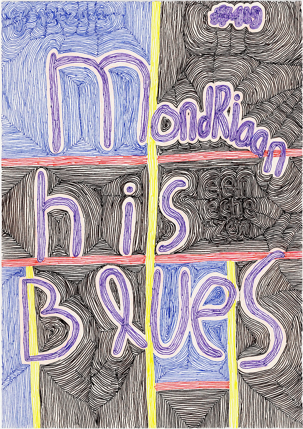
- Symmetrical Balance: Like a mirror image, elements are evenly distributed on either side of a central axis. It often creates a sense of formality, order, and calm. My Mondrian-inspired pieces often play with this kind of equilibrium, seeking that perfect, almost meditative stillness.
- Asymmetrical Balance: Achieved by balancing dissimilar elements that have equal visual weight. Think a large, dark shape on one side being counterbalanced by a cluster of smaller, brighter elements on the other. It's more dynamic, often more interesting, and definitely harder to pull off! Like trying to balance a toddler on one hip while holding a bag of groceries – it requires finesse, a bit of improvisation, and sometimes, a quiet prayer it won't all come crashing down. I remember one time I was trying to balance a huge, dark brushstroke with a flurry of small, almost frantic light lines, and for ages, it just felt... heavy on one side. It took a tiny splash of unexpected bright color on the lighter side to finally make it click – the visual scales finally settled, a subtle sigh of relief from my artistic brain. The subtle manipulation of visual weight – how much an element draws the eye based on size, color, density, or contrast – is key to achieving both symmetrical and asymmetrical balance. Ultimately, balance for me is about finding that sweet spot where the artwork feels grounded, whether in tranquil harmony or deliberate disquiet.
Emphasis & Focal Point: Guiding the Gaze
Every good story has a main character. In art, that's the focal point – the area that first captures the viewer's attention and holds it. Emphasis is the principle of making certain elements stand out, drawing the eye to this focal point. Without it, everything competes for attention, and nothing truly registers, leading to visual confusion – a cacophony instead of a clear message. I often use bold color contrasts or unique shapes to create this effect in my own work. Beyond obvious contrasts, emphasis can be achieved through:
- Isolation: Placing an element apart from others, making it naturally stand out. Even by carefully shaping the negative space around an element, you can isolate and emphasize it.
- Convergence: Using lines, shapes, or even implied gazes that lead the eye towards a specific point.
- Unusual Detail: Making one area significantly more detailed, textured, or intricate than its surroundings.
- Stark Contrast: Employing significant differences in color (complementary colors) , value (light vs. dark), or size.
- Scale or Placement: A larger element or one strategically placed (often off-center, like with the Rule of Thirds) naturally draws attention.
Techniques like the Rule of Thirds (placing key elements at the intersections of a mentally divided nine-part grid) or using strong tonal contrast are classic ways to establish emphasis. Another helpful guideline is the Rule of Odds, which suggests that compositions with an odd number of elements are often more dynamic and visually appealing than those with an even number. This subtle imbalance tends to create more natural visual tension and intrigue. Interestingly, sometimes an artist might employ anti-focal points – areas designed to deliberately not draw attention, effectively pushing the viewer's gaze towards the true intended focal point, enhancing its impact. What is the very first thing your eye goes to in your favorite painting, and how did the artist make sure of that? In a portrait, the eyes are almost always the focal point, achieved through careful lighting, detail, and placement; in a landscape, a distant mountain peak might be emphasized by converging lines of a road or river, and by being the brightest or darkest element. For me, emphasis is about crafting a clear visual whisper or a shout, making sure the viewer hears what I want them to hear first.
Movement & Rhythm: The Visual Journey
Your eye is like a little explorer, eager to travel through a piece of art. Movement is the path it takes, guided by visual cues, ensuring no part of the artwork feels like a dead end. This journey is often facilitated by leading lines – actual or implied lines that direct the viewer's eye from one point to another. These aren't always literal lines; they can be the gaze of a figure, the direction of a shadow, a progression of shapes, or even the flow of brushstrokes. Rhythm is the repetition of elements that creates a sense of flow, like a visual beat, encouraging the eye to move in a predictable, yet dynamic, progression. Think of a winding road, the waves crashing on a shore, or a series of dancers in motion – there's an underlying pulse that guides your perception. Even negative space can contribute to movement, creating channels or pathways that lead the eye around and through a composition. How does an artwork make your eye dance, and does it ever feel like a smooth waltz or a frantic jig? Artists can also intentionally disrupt rhythm or movement to create a sense of unease or chaos, reflecting the subject matter or an emotional state. My aim with movement and rhythm is to always invite the viewer on a journey, never leaving them stranded in a visual cul-de-sac.

https://www.flickr.com/photos/42803050@N00/31171785864, https://creativecommons.org/licenses/by-nd/2.0/
This abstract piece by Delaunay masterfully uses overlapping shapes and vibrant colors to create a sense of rhythm and continuous movement, guiding the eye through its circular forms. Where do your eyes naturally travel first, and what visual cues guide that journey?
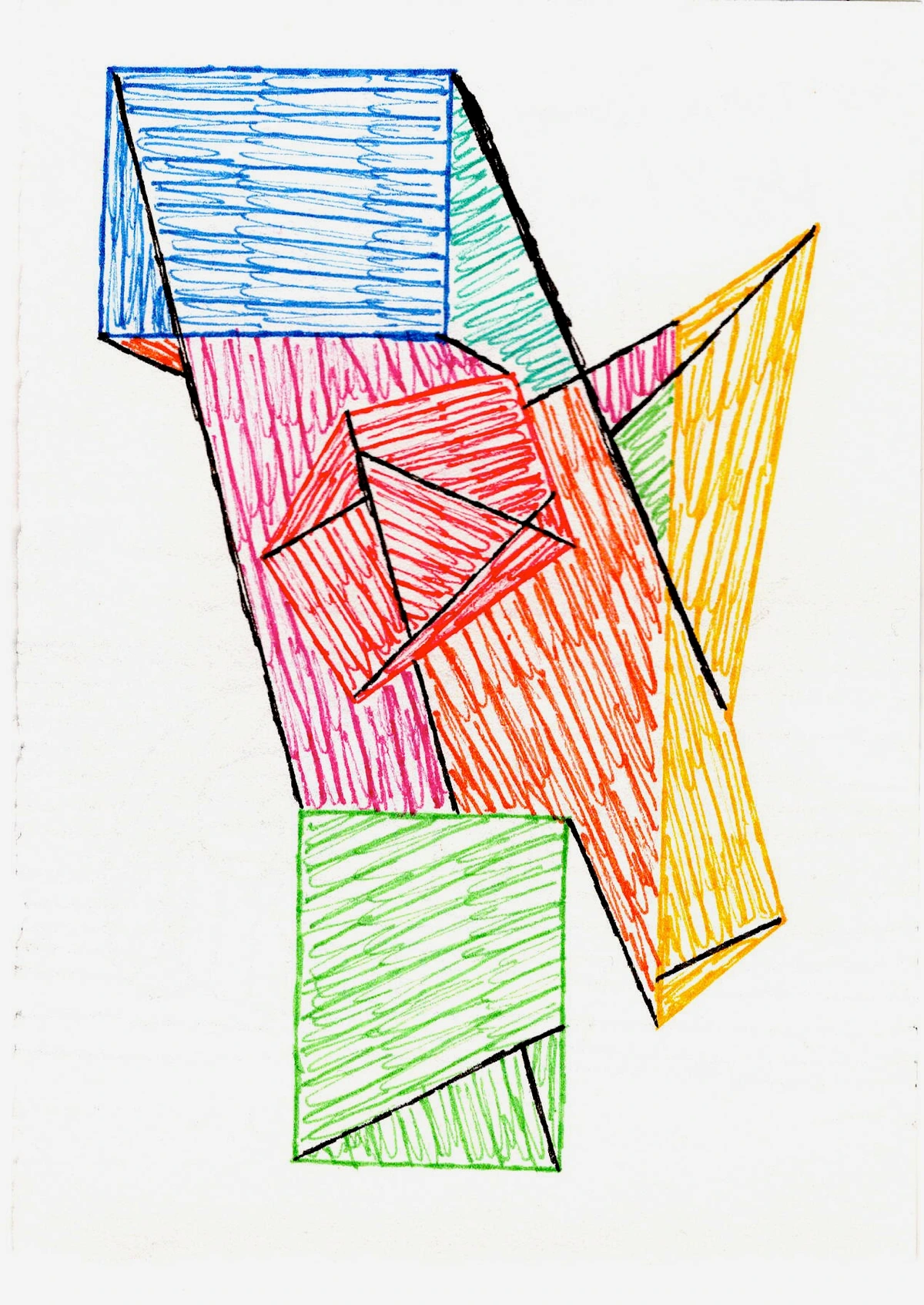
Unity & Variety: The Harmonious Paradox
How do you make a thousand disparate elements feel like they're all part of the same conversation, yet still keep things interesting? Unity ensures that all parts of the artwork feel like they belong together, forming a coherent whole. Think of it as the invisible glue. Closely related is Harmony, which ensures that all elements work together cohesively, creating a pleasing and consistent aesthetic that feels right to the eye, like all instruments playing in tune. Variety introduces differences in shape, size, color, or texture to keep the viewer engaged, preventing monotony. It's like a delicious meal: all the ingredients work together (unity), but each brings its own unique flavor and texture (variety). Too much unity leads to boredom, a visual hum that never changes; too much variety leads to chaos, a confusing jumble. It's a delicate dance between connection and contrast, and frankly, sometimes I just end up doing a clumsy shuffle, hoping no one notices! I've spent hours trying to introduce enough variety to keep an abstract piece vibrant, only to realize I'd sacrificed its overall unity, making it feel like a collection of noisy disagreements rather than a cohesive statement. An artist might even intentionally embrace a lack of unity to evoke chaos, fragmentation, or discord. Finding that sweet spot is always the challenge – how does an artist make disparate parts sing in chorus rather than competing for attention? My personal quest here is always for that perfect visual conversation, where every element contributes without shouting over its neighbor.
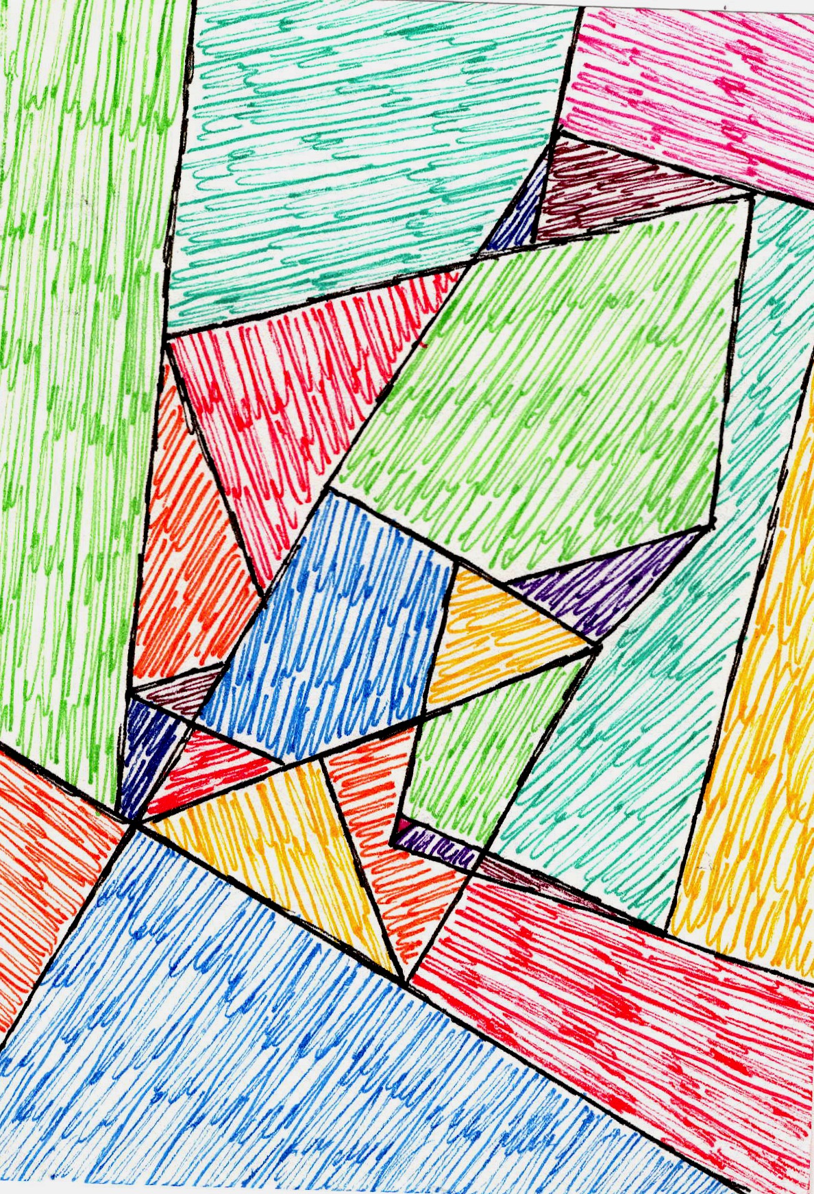
https://images.zenmuseum.com/art/281/scan.jpeg, https://images.zenmuseum.com/art/281/scan.jpeg
This piece, with its fragmented, overlapping shapes and bold outlines, demonstrates a beautiful interplay of unity and variety. The diverse elements create visual interest, while the consistent style and color palette bring a sense of belonging.
Proportion & Scale: Relative Relationships
How big is that tree compared to that tiny person? That's proportion and scale. Proportion refers to the relative size of parts within a whole (e.g., the length of an arm compared to a body). Scale relates the size of elements to a standard, like human size or the size of other objects in the work, or even to the viewer's perceived reality. When proportion and scale are off, the artwork can feel jarring, unbelievable, or simply "wrong," even if the subject matter is fantastical. Techniques like foreshortening deliberately manipulate proportion to create the illusion of depth or recession. Artists might also deliberately distort proportion for emotional effect, making a figure impossibly tall to evoke grandeur or tiny to express vulnerability. I remember once painting a series of figures with exaggeratedly long limbs, not to imply grandiosity, but to evoke a sense of almost painful reaching, of longing. This also intrinsically ties into the concept of visual weight, where larger, darker, or more textured elements naturally draw more attention and feel 'heavier' than smaller, lighter, or simpler ones. Understanding visual weight is crucial because it directly impacts balance and how your eye moves through a composition. And it also ties into the figure-ground relationship, where our perception of an object (figure) is heavily influenced by the background or surrounding space (ground). A strong figure-ground relationship clarifies what is important and how elements relate in size and position. It's worth noting that cultural perceptions of ideal proportions (think the classical Greek ideals versus elongated figures in Mannerist painting) can also heavily influence compositional choices and how they're received by different audiences. Have you ever seen an artwork where something just felt off in its size or relation to everything else, creating a subtle (or not so subtle) sense of unease? For me, playing with proportion is often about stretching reality to fit an emotion, making the familiar feel strangely poignant.
Pattern & Repetition: Order and Predictability
Humans love patterns. From the rhythm of our breath to the tiles on a floor, patterns provide comfort and predictability. Pattern is the regular arrangement of repeated elements. Repetition is simply the act of using an element more than once. It can create rhythm, reinforce unity, add texture, or establish a visual beat, helping to tie disparate elements together into a harmonious whole. A recurring motif can be deeply satisfying, like the refrain in a favorite song, providing both a sense of order and connection throughout the piece. How do repetitive elements in an artwork bring you comfort or direct your focus, perhaps creating a meditative pulse? Of course, an artist might also disrupt a pattern or repetition to introduce tension, surprise, or a sense of breaking free. In my own work, I often lean into repetition to build a foundational rhythm, then introduce a subtle variation to keep things from becoming too predictable.

https://images.zenmuseum.com/art/262/scan.jpeg, https://images.zenmuseum.com/art/262/scan.jpeg
This abstract geometric piece uses repetition of lines and squares to create a calming, ordered pattern. It demonstrates how simple elements, when repeated thoughtfully, can form a cohesive composition.
Contrast: The Power of Difference
Life is full of contrasts – light and shadow, quiet and loud, smooth and rough. In art, contrast refers to the arrangement of opposing elements. This could be light vs. dark (value contrast) , large vs. small (size contrast) , rough vs. smooth (texture contrast) , geometric vs. organic (form contrast) , or complementary colors . Contrast is a powerful tool for creating visual interest, emphasis, and dramatic effect. For example, strong value contrast can create drama and highlight a focal point, while subtle color shifts might evoke a sense of calm or mystery. Without contrast, a piece can feel flat and unengaging, like a monotone hum that fades into the background. Conversely, a deliberate lack of strong contrast, such as in a monochromatic painting or a low-key photograph, can create a sense of softness, mystery, or melancholy, serving its own powerful compositional purpose. What kind of visual "spark" does strong contrast ignite in your perception, or what mood does its absence evoke? It's a principle I find myself constantly playing with, seeking that spark that makes an artwork truly come alive.
Negative Space: The Unseen Player
It might seem counterintuitive, but the empty areas around and between the subjects of an artwork are just as important as the subjects themselves. This is negative space. It helps define the positive shapes, allows elements to breathe, and can even form compelling shapes of its own, often revealing a hidden secondary composition. Negative space can also be used to create a sense of depth or vastness, drawing the eye into an expansive scene. Ignoring negative space can lead to a cramped or unbalanced composition where elements feel suffocated. Often, the most striking compositions masterfully integrate both positive and negative elements, creating a dynamic interplay. I vividly recall a moment in my studio, working on an abstract piece, when I suddenly saw a new, unexpected shape emerge from the negative space between two brushstrokes – it completely transformed the feeling of the artwork, adding a quiet tension I hadn't intended but instantly embraced. Sometimes, deliberately filling what would traditionally be negative space, or making it visually chaotic, can challenge viewer expectations and create a sense of discomfort. Have you ever noticed how the empty space in a logo or painting contributes just as much to its impact as the filled space? For a deeper dive, check out this article on the role of negative space in abstract art.
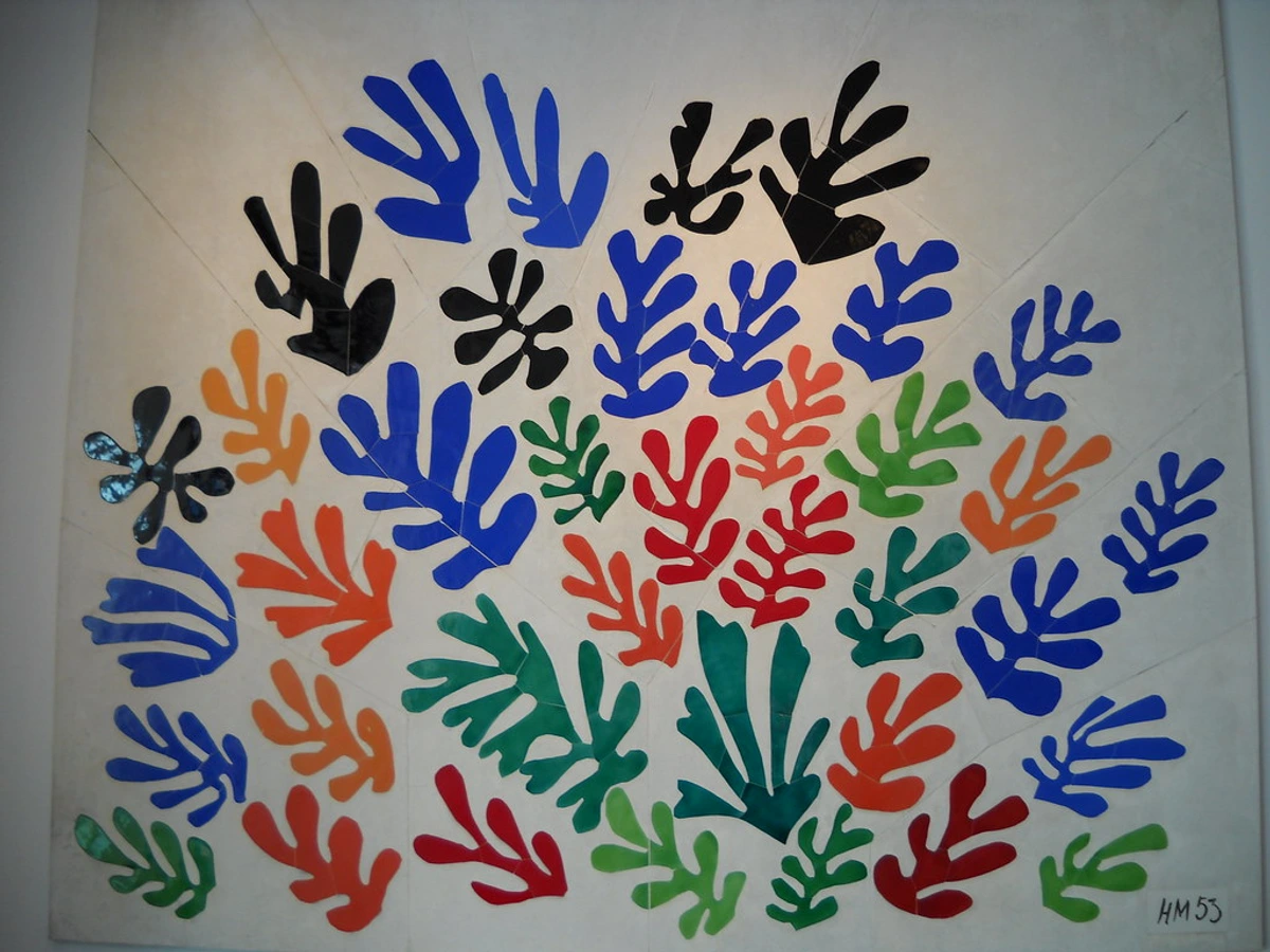
https://live.staticflickr.com/6090/6059309027_476779f1de_b.jpg, https://creativecommons.org/licenses/by-sa/2.0/
In Matisse's "La Gerbe," the vibrant, organic shapes (positive space) are expertly balanced by the surrounding white areas (negative space), allowing each element to sing while contributing to a harmonious whole.
Hierarchy: Guiding Importance
Just like in a well-structured document, some elements in an artwork are more important than others. Hierarchy in composition refers to arranging elements to indicate their relative importance to the viewer, ensuring a clear visual roadmap. This can be achieved through size, color, contrast, placement, or detail. A clear hierarchy helps the viewer quickly grasp the main message or focal point, preventing visual confusion. It can also be used to tell a story or guide the viewer through a narrative, emphasizing key moments or characters. It's the visual equivalent of bolded headlines and carefully organized paragraphs, telling your eye exactly where to focus its precious attention. For example, in a classic portrait, the detailed, brightly lit face establishes clear hierarchy, while in a sweeping landscape painting, the largest, most vibrant mountain range might dominate, guiding your eye to its grandeur first. Conversely, an artist might intentionally flatten hierarchy, making all elements equally prominent (or subtle), to evoke a sense of overwhelming detail, visual democracy, or a lack of clear direction. What is the artist telling you is most important in this visual story, and how do they achieve it? For me, establishing hierarchy is about leading the viewer on a purposeful journey, ensuring they don't get lost in the noise.
These principles, while seemingly technical, are the very tools that have shaped my own artistic evolution.
Things I've Learned to Keep in My Compositional Compass
Before diving deeper into my personal journey and practical tools, let's quickly recap the core ideas that form your compositional compass, in a way that feels a bit more like a chat between friends:
- It's all about intentional arrangement: Every line, shape, and color is a strategic decision, influencing not just how pretty something looks, but what it means.
- It's more than just a pretty face: Composition deeply impacts emotion, tells a silent story, and speaks to our subconscious – it's art's secret handshake.
- Think of principles as flexible guides, not strict rules: Balance, emphasis, movement, unity, proportion, pattern, contrast, negative space, and hierarchy are powerful tools. Don't be afraid to bend them, or even break them, when your artistic voice demands it.
- Becoming a visual detective is key: Start "seeing" composition in everything around you – a cityscape, a magazine layout, even how your cat arranges itself on the sofa. It's the first step to truly mastering it in your art.
My Compositional Journey: From Chaos to Conscious Creation
My own journey with composition has been a slow burn, punctuated by a few delightful "aha!" moments and far more head-desking frustrations. Initially, I just painted. I poured emotion onto the canvas, hoping it would magically arrange itself into something coherent. Spoiler: it rarely did. There was a lot of "happy accident" reliance, which, while sometimes fruitful, isn't a sustainable strategy for consistent impact. I remember one particularly busy abstract piece, a frantic flurry of overlapping, clashing reds and blues. I'd added a thick, bold line, then tried to "balance" it by adding another equally bold line nearby, only for them to clash. I kept piling on layers, convinced a sense of order would somehow emerge from the sheer volume of paint. Instead, it became a visual muddle, a frantic scream where nothing stood out – a prime example of lacking hierarchy and excessive variety without unity. It taught me the hard way that more isn't always more; sometimes, it's just more visual noise. The experience was like trying to solve a puzzle by adding more pieces instead of arranging the ones I already had.
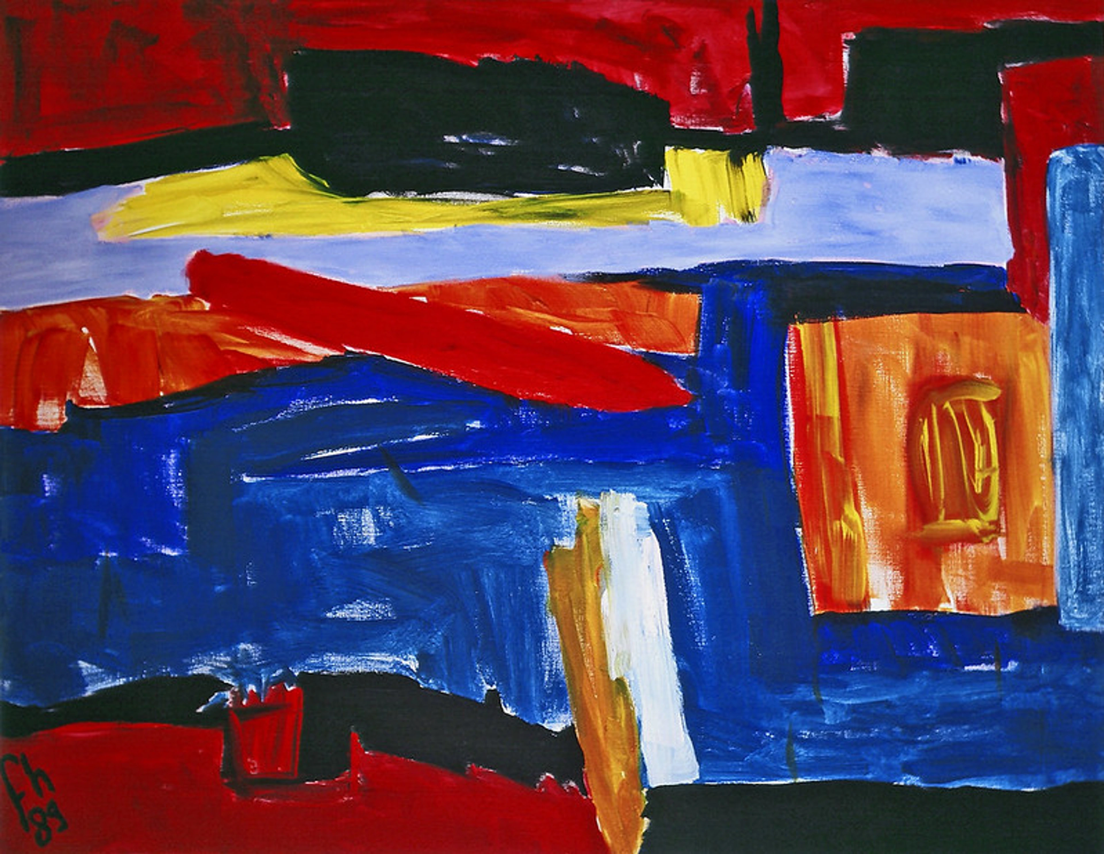
One specific turning point came when I was struggling with a large canvas, a riot of gestural marks that felt completely unbalanced. I'd been trying to force a central focal point, but it kept feeling heavy and stagnant. Then, I saw a reproduction of one of Piet Mondrian's later works – not his classic grid, but one where a single, bold yellow square was placed far off-center, perfectly counterbalancing a series of thinner black lines and smaller color blocks. It wasn't about perfect symmetry, but about visual weight. It hit me: I didn't need to put my heaviest element in the middle. By taking my large, dark gestural shape and shifting it towards one edge, then introducing a cluster of smaller, lighter, but equally vibrant elements on the opposing diagonal, the entire piece found a dynamic equilibrium. It was a revelation, a moment where theory clicked with my intuitive struggle. I've often looked to masters like Rembrandt, whose use of chiaroscuro to create dramatic focal points in his portraits, helped me understand that sometimes, less is indeed more, and strategic use of light and shadow can do the heavy lifting in composition. For abstract insights, artists like Mark Rothko with his vast, meditative fields, or Hilma af Klint's intricate spiritual geometries have profoundly influenced my understanding of how non-representational elements can achieve profound compositional harmony.
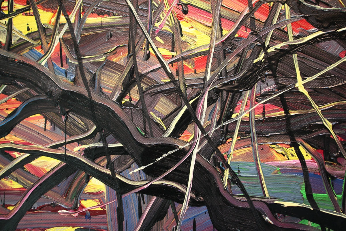
https://live.staticflickr.com/2875/8866942510_439379d853_b.jpg, https://creativecommons.org/licenses/by/2.0/
Over time, through studying the masters and, more importantly, through countless hours of trial and error in my studio, I started to feel it. I began to understand that composition wasn't about restricting my creativity, but empowering it. It was about having a deeper vocabulary to express what I truly wanted to say, guiding the raw emotion into a coherent visual statement. One particularly satisfying moment was when I managed to resolve a painting that felt hopelessly lopsided. By shifting a small, bright element to a different quadrant and darkening a background area, the entire piece suddenly clicked into an unexpected, dynamic balance, and the previous tension transformed into a powerful, deliberate focal point. It helped me move past the initial burst of inspiration to craft something lasting, something that truly resonated beyond the first glance. Looking back at my artist's timeline, you can almost see the shift from more spontaneous pieces to those with a deliberate, underlying structure. It's a journey, always evolving, always teaching me that while inspiration lights the fuse, composition provides the rocket's trajectory. And honestly, it’s a huge part of why I love what I do – it’s the quiet satisfaction of taming the visual chaos into compelling beauty.
How to 'See' Composition: Training Your Artistic Eye
It might sound daunting, but "seeing" composition is a skill you can absolutely develop. It's less about memorizing rigid rules and more about cultivating an awareness, a conscious connection to the visual world around you – almost like learning a new language for your eyes. It starts by simply noticing. Look at a magazine cover, an advertisement, or even how objects are arranged on a shelf – composition is everywhere, subtly influencing your perception.
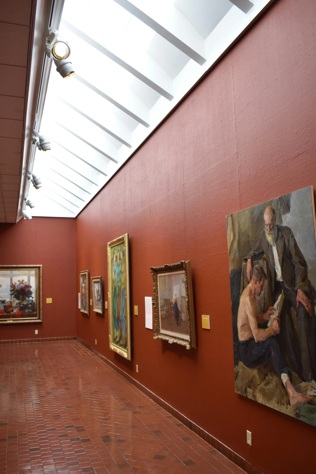
https://www.pexels.com/photo/photo-of-a-room-full-of-paintings-in-an-art-gallery-14595876/, https://creativecommons.org/public-domain/cc0/
Here are some practical ways to train your artistic eye and delve into the why behind what you see:
- Squint Your Eyes: Seriously, try it. When you squint at an artwork, the details blur, and you're left with the large shapes, values (light and dark), and overall arrangement. This helps you see the fundamental composition without getting lost in minutiae, revealing the underlying structure and its immediate emotional impact. What kind of feelings emerge when the distractions fade?
- Look for the Flow: Where does your eye go first? How does it travel through the piece? Does it get stuck anywhere, or is there a natural, engaging path? Try tracing it with your finger (gently, please, if it's an actual artwork!). Pay close attention to how leading lines, repeated elements, or areas of contrast guide your gaze. Consider why the artist wants your eye to move that way – what story or feeling are they trying to convey through that journey? And what happens when the flow is intentionally broken?
- Identify Key Elements: Can you spot the focal point, the main "star" of the show? Are there clear leading lines or implied paths? How are the colors distributed to create balance or emphasis? Where is the negative space most impactful, and what shapes does it form? More importantly, ask yourself: how do these elements work together to evoke a specific mood or message? It's like dissecting a visual poem.
- Imagine the Grid: Mentally superimpose compositional guides like the Rule of Thirds (dividing your canvas into nine equal parts with two horizontal and two vertical lines, placing key elements at their intersections) or the Golden Ratio (a more complex mathematical proportion found in nature and art) over an artwork. Do they align? These principles often work because they tap into our innate preference for slightly off-center, dynamic arrangements rather than perfect symmetry, creating a subconscious sense of order and harmony. Sometimes, great compositions implicitly follow these principles without the artist even explicitly thinking about them in the moment of creation. It's almost like a secret language our eyes understand.
- Flip It Upside Down: Another old trick! Flipping an image removes the narrative content and allows you to focus purely on shapes, lines, and balance. It's a fantastic way to bypass your brain's tendency to focus on recognizable objects and instead analyze the pure visual forces at play. You might be surprised by what hidden imbalances or harmonies emerge.
- Sketch or Diagram Compositions: Actively sketching simplified versions of compositions you admire (or struggle with) helps internalize how elements are arranged. Draw basic shapes, lines, and blocks of tone to represent the main visual components, stripping away detail to reveal the underlying compositional skeleton. This makes the invisible architecture visible, and trust me, it’s a game-changer.
- Study the Masters: Analyze how artists like Rembrandt used light and shadow to create focal points, or how Hokusai employed strong diagonal lines for dynamic movement. Look beyond the subject matter and deconstruct how they arranged their elements. You can learn an immense amount by reverse-engineering masterpieces. It’s like learning from the best teachers, without the tuition fees.
- Use a Viewfinder or Cropping Tool: For traditional artists, a simple cardboard viewfinder can help isolate compositions within a larger scene. Digitally, cropping tools allow you to experiment with different frames and aspect ratios, revealing how a slight shift can entirely change the feeling of a piece. It’s amazing how a few millimeters can transform a mood.
Be warned: once you start seeing composition everywhere, you might never look at a billboard or even a neatly arranged plate of food the same way again! Now, why not try one of these techniques on an artwork you admire, or even your own latest creation?
Beyond Principles: Practical Tools for Compositional Mastery
Understanding the principles is one thing; putting them into practice is another glorious, sometimes messy, adventure. While a lot of composition eventually becomes intuitive, there are concrete tools and techniques I (and countless other artists) use to plan and refine visual arrangements. These aren't magic bullets, but rather helpful guides for taming the creative chaos. They are the practical extensions of your artistic eye.
- Thumbnail Sketching: Before committing to a large canvas or a final shot, create dozens of tiny, rough sketches (thumbnails). These aren't about detail, but about quickly exploring different arrangements of major shapes, values, and focal points. It's like brainstorming for your composition, allowing you to quickly discard weak ideas and find strong ones without wasting time or materials. I often find the best compositions emerge from the simplest, quickest thumbnail ideas. For example, a recent abstract piece, now part of my art for sale collection, began as a series of three tiny thumbnails, one of which had an unexpectedly strong diagonal thrust that I developed into the final work.
- Value Studies: Create monochrome sketches or paintings, focusing only on the light and dark areas (values). This helps clarify the visual weight and hierarchy of your composition, ensuring strong contrast and a clear focal point, without the distraction of color. It's surprising how often a piece fails not because of bad color, but because of a weak value structure. It's like getting the bones right before adding the flesh.
- Digital Overlays and Grids: In digital art, or even for planning traditional work, software allows you to overlay compositional grids (like the Rule of Thirds or Golden Spiral) directly onto your canvas. This provides immediate visual feedback, helping you make informed decisions about placement. It's like having a helpful art professor whispering suggestions in your ear, but without the judgment.
- Cropping and Reframing: Don't be afraid to experiment with different crops, whether in photography or painting. A slight shift in the frame can dramatically alter the composition, emphasizing different elements or creating new narratives. Sometimes the best composition is simply finding the perfect slice of an imperfect whole, much like discovering a compelling detail in an otherwise chaotic scene.
- Color Harmony: While color theory is a deep dive on its own, understanding color harmony is crucial for composition. Harmonious color palettes (monochromatic, analogous, complementary, triadic) contribute directly to unity and can guide the eye and evoke specific emotions, making disparate elements feel connected and visually pleasing. It’s the sweet music that binds the visual elements together.
These tools are less about rigid rules and more about giving you a structured way to play and explore, ultimately strengthening your compositional muscle. Often, the most powerful results come from combining these tools – perhaps a thumbnail sketch guiding a value study, which then informs your digital grid setup. It's about intentionality, about moving beyond hopeful accidents to deliberate, impactful design.
My Abstract Take: Composition Beyond the Obvious
Now, you might be thinking, "This is all well and good for a still life or a landscape, but what about abstract art, where there's no 'subject' to arrange?" Ah, this is where the magic truly happens for me! In abstract art, composition becomes even more crucial. It's not about arranging recognizable objects; it's about arranging pure visual forces – colors, lines, shapes, and textures themselves. It's like choreographing a dance with elements, without a literal dancer. Pioneering abstract artists like Wassily Kandinsky, with his dynamic interplay of contrasting colors and bold, expressive lines, sought to evoke spiritual feelings through meticulously arranged non-representational elements. Mark Rothko composed with vast, pulsating color fields, where the subtle shifts in scale and placement of his rectangular forms created meditative, immersive experiences. And Jackson Pollock, in his seemingly chaotic drip paintings, still employed an intuitive yet powerful sense of overall balance and rhythm across his canvases, guiding the viewer's eye through a web of energetic lines. Other artists whose structured yet spiritual compositions resonate with me include Hilma af Klint, who masterfully used geometric forms and symbolic colors to create complex visual narratives, and Agnes Martin, whose minimalist grids and subtle tonal variations demonstrated profound compositional depth through quiet repetition, or Helen Frankenthaler, who used expansive color washes and carefully considered spills to create compositions that felt both spontaneous and balanced.
When I create my abstract pieces, I'm not thinking about a tree or a house. My process often starts with an intuitive burst – perhaps a particular color palette calls to me, or a wild brushstroke demands attention. Then, the compositional "conversation" begins. I'll place a bold, dark shape, feeling its visual weight. Immediately, I'm thinking: How does this heavy shape need to be balanced? Maybe a cluster of lighter, more energetic lines in another corner, or a large, transparent wash of a complementary color nearby. I might also introduce a dominant diagonal line, then counter it with a contrasting circular form to create tension and guide the eye. I consider the tension between a sharp, angular line and a soft, organic blob, or the push and pull of vibrant hues against muted tones. It's an intuitive dance, a constant back-and-forth between me and the canvas, guided by these very principles. I ensure the overall visual experience feels both dynamic and anchored by a strong, internal logic. The way balance might be achieved through color masses rather than literal objects, or how rhythm can be created by the repetition of a brushstroke or a recurring texture rather than a receding landscape. You can read more about this specific challenge in the definitive guide to understanding composition in abstract art.

https://live.staticflickr.com/65535/53064827119_1b7c27cd96_b.jpg, https://creativecommons.org/licenses/by-nc-nd/2.0/
My goal is always to create a visual journey, a piece that feels complete and balanced, even if it's vibrant and energetic. It's about letting the colors and shapes breathe, allowing them to interact in a way that feels organic and compelling, drawing the viewer's eye in and around the composition without getting lost. What compositional challenges do you find most intriguing or frustrating in abstract art, and how do you approach them? If you're curious, you can see how these principles play out in my art for sale.
The Emotional Punch: Why Composition Matters Beyond Aesthetics
Beyond making things look "nice," composition is a powerful emotional tool, a silent language spoken directly to your subconscious. A tightly packed, chaotic composition, like the dense, overlapping forms in a Cubist painting or the frenetic energy of a Francis Bacon portrait, can evoke feelings of anxiety, tension (psychological tension), or claustrophobia, mirroring the fragmented reality it depicts. An expansive, symmetrical arrangement, reminiscent of a grand Renaissance fresco or the serene, minimalist fields of Agnes Martin, might induce calm, majesty, or a sense of divine order. A strong diagonal leading the eye can create drama and dynamic tension, while soft, rounded forms might foster a sense of intimacy or connection. Think about the feeling a vast, open landscape gives you versus a cramped, busy street. The composition alone dictates much of that internal response.
Composition also plays a critical role in establishing depth, whether through linear perspective, atmospheric perspective (where distant objects appear less distinct and bluer), or layering of forms. This illusion of three-dimensional space profoundly impacts emotional engagement, inviting the viewer into the artwork rather than simply observing it. When elements are layered thoughtfully, it can create a sense of mystery, a desire to explore what lies beneath, fostering a deeper, more participatory experience. For instance, the deliberate off-center composition and upward-stretching vertical elements of Van Gogh's The Starry Night (while not strictly abstract) contribute to its swirling, almost spiritual intensity, evoking both awe and a sense of restless energy. I've often felt a profound calm from a symmetrically balanced landscape, or a prickle of unease from a fragmented, off-kilter abstract piece, almost as if the artwork itself is mirroring a state of mind I know. The absence of composition, or an intentional chaotic arrangement (like in some German Expressionist works such as Ernst Ludwig Kirchner's street scenes), can be just as powerful, evoking feelings of turmoil, confusion, or rebellion – a deliberate subversion of visual harmony to make a statement. It's all about guiding the viewer's experience, often creating a narrative or inviting a sense of interaction where they piece together the story or explore the scene themselves.

https://www.flickr.com/photos/abstract-art-fons/30634352376, https://creativecommons.org/licenses/by/2.0/
It’s all about guiding the viewer's experience. Artists use composition to manipulate mood, create drama, or even tell a story without explicitly showing it. The careful placement of elements can make us feel uncomfortable, intrigued, or at peace. It speaks to our subconscious, tapping into universal human responses to order, disorder, and visual harmony. Just as color theory affects our mood, so too does the arrangement of shapes and forms, orchestrating a profound internal resonance. Can you recall a specific artwork where the composition alone triggered a strong emotional response in you, and what elements contributed to that feeling?
Frequently Asked Questions about Composition in Art
Q: What's the difference between composition and design?
A: Design is a broader term encompassing the entire plan and organization of an artwork, including the selection of elements (like color, line, texture) and principles (like balance, emphasis). Composition specifically refers to the arrangement of those elements within the chosen format. You could say composition is a key part of good design, acting as its structural backbone. Think of design as the full blueprint for a house, and composition as the specific layout of rooms and furniture inside – essential for making it livable! It's the difference between having all the ingredients for a meal and arranging them on the plate to make it truly appetizing.
Q: How does composition apply to different art forms?
A: Composition is fundamental to all visual art forms, extending far beyond traditional painting. In photography, it dictates framing and subject placement, often through the lens of a viewfinder. For sculpture, it's about how forms interact in three-dimensional space and from various viewing angles, emphasizing volume and negative space. In architecture, composition influences the flow, balance, and visual impact of buildings, from the facade to the internal spaces, often dictating how we experience a space emotionally. Even in digital art and graphic design, the arrangement of text, images, and negative space on a screen is crucial for effective communication and aesthetic appeal, taking into account user experience. In film and animation, composition is dynamic, guiding the viewer's eye through a sequence of moving images, using framing, depth, and character placement to tell a story. If it's something you look at, its arrangement affects how you perceive it and the emotional response it evokes – it's truly universal!
Q: Can "bad" composition ever be good?
A: Intentionally breaking the rules of composition can be incredibly effective! Some artists deliberately create jarring, unbalanced, or chaotic compositions to evoke specific feelings like discomfort, confusion, or a sense of rebellion. A prime example is the German Expressionists, who often used distorted figures and unsettling compositions to reflect inner turmoil or societal critique. This is where understanding the rules first becomes crucial – you have to know what you're breaking to break it effectively and with purpose, like a jazz musician deliberately playing a dissonant chord. I recall a period in my own work where I was experimenting with deliberate visual discord, trying to capture a feeling of internal conflict. It felt "wrong" at first, but the discomfort it evoked was exactly the message I wanted to convey. It's about knowing why you're going against the grain, rather than doing it accidentally. Sometimes, a little visual chaos is exactly what the piece needs to scream its truth.
Q: What is the role of intuition versus conscious application in composition?
A: This is a fantastic question that many artists grapple with! Initially, composition might feel like a conscious checklist: "Rule of Thirds? Check. Balance? Check." But as you gain experience, these principles become deeply ingrained. Many experienced artists describe composition as an intuitive "feeling" – they know when something looks "right" or "wrong" without explicitly naming the principle. However, even that intuition is built upon years of conscious practice and study. It's a beautiful dance: intuition provides the initial spark and flow, while conscious knowledge allows for refinement, problem-solving, and a deeper understanding of why something works (or doesn't). I often start with intuition, then bring in my conscious knowledge to refine and strengthen the initial impulse – it's a constant feedback loop that propels your art forward.
Q: How does viewer perception or cultural background influence composition?
A: Absolutely! While some principles like balance and rhythm tap into universal human psychology (think Gestalt principles), our individual experiences, cultural backgrounds, and even personal moods heavily influence how we interpret and respond to a composition. For example, traditional Western art often favors a single focal point and central perspective, whereas some Eastern art forms, like Japanese scroll paintings, might encourage a sequential reading of elements, or multiple points of interest. A composition that feels harmonious to one person might feel dynamic to another, or even slightly off-balance to someone from a different cultural context where visual conventions differ. It's a fascinating layer to the silent conversation art has with its audience, reminding us that art is always interpreted through a unique lens. It's why I find it so compelling to explore how my own cultural lens shapes what I perceive as harmonious.
Q: What are some common compositional mistakes beginners make?
A: A few common pitfalls include:
- Centering everything: This can lead to a static, uninteresting image. Experiment with the Rule of Thirds or off-center arrangements to introduce dynamism.
- Too much clutter: Overloading the canvas with too many elements can create visual noise and lack of a clear focal point, making the viewer's eye feel overwhelmed – like trying to listen to ten conversations at once.
- Ignoring negative space: Forgetting about the areas around your subject can make a piece feel cramped or unbalanced. Those empty spaces are just as vital!
- Lack of variety / Too much similarity: Too much repetition without variation, or elements that are too similar, can lead to a monotonous image. Introduce different sizes, shapes, or textures to keep things engaging.
- Poor visual flow: The viewer's eye gets stuck or doesn't know where to go next, breaking the visual narrative, or elements might lead the eye off the page without resolution. Use leading lines, contrast, and emphasis to guide the gaze gracefully.
Q: How can I overcome creative blocks related to composition?
A: Creative blocks are frustrating, but often a sign that you need a fresh approach! Try these:
- Change your medium: If you're painting, try sketching. If you're sculpting, try photography. A new tool can unlock new compositional ideas.
- Impose constraints: Give yourself a strict compositional challenge, like "only use diagonals" or "create a piece with no focal point." Sometimes limits spark creativity.
- Deconstruct a masterwork: Pick an artist you admire and try to copy their compositional structure, not their subject. This can reveal unexpected insights.
- Take a break and observe: Step away from your work and just look at the world – how are clouds arranged? How does light fall on a building? Inspiration is everywhere if you train your eye.
- Thumbnail sketching: As mentioned earlier, quick, low-stakes sketches allow for rapid exploration without commitment, often breaking through mental barriers. Sometimes, the answer is just a tiny, rough drawing away.
Q: How do I balance compositional principles with spontaneous creative expression?
A: This is the eternal dance of art! Think of compositional principles not as rigid chains, but as a strong scaffolding. They give your spontaneous expression a framework within which to shine. Start with intuition, letting your raw emotion flow onto the canvas. Then, step back and apply the principles consciously, not to suppress the spontaneity, but to enhance it. Use balance to anchor a wild gesture, emphasis to highlight a crucial emotional mark, or rhythm to give flow to an energetic burst. It's a dialogue between your expressive self and your analytical self, allowing the spontaneous to be understood and felt more deeply by the viewer. The goal isn't to erase the initial spark, but to give it the loudest, clearest voice possible.
Q: How do I develop a personal compositional style?
A: Developing a personal compositional style is a journey of self-discovery. It begins by understanding the established principles deeply, then consciously experimenting with breaking or bending them in ways that resonate with your unique artistic vision. Pay attention to what kinds of arrangements feel most natural or expressive to you. Do you gravitate towards stark contrasts, meditative symmetry, or dynamic asymmetry? What stories or emotions do you want your compositions to tell? Regularly analyzing your own work, and that of artists you admire, through a compositional lens, will help you identify recurring patterns and preferences. Don't be afraid to allow your inner voice to dictate the arrangement – sometimes the most authentic compositions emerge when you stop overthinking and start feeling the visual balance that best conveys your message. It's a continuous conversation between your innate aesthetic and your learned expertise, always evolving, always pushing you to find your visual signature.
Conclusion: The Quiet Language of Art
Composition is truly the quiet language of art, speaking to us on a subconscious level, shaping our emotional and visual experience. It's not about stifling creativity with rigid rules, but about giving your artistic voice the structure it needs to be heard clearly, powerfully, and beautifully. It's the difference between a random collection of words and a profound poem, a chaotic jumble of notes and a stirring symphony.
So, the next time you look at a piece of art (or even a beautifully arranged plate of food!), take a moment to consider not just what you're seeing, but how it's arranged. You might be surprised by the subtle magic at play. Even better, challenge yourself to apply these principles. Experiment with placing elements differently in your own sketches, photos, or digital art. Play with balance, test focal points, and observe how rhythm guides the eye. Like me, you'll likely start to see your own world, and your own art, with a newfound sense of intentionality and appreciation. For me, it's this mastery of arrangement that allows my abstract visions to truly resonate, inviting you into a world of vibrant, intentional beauty. It’s a journey that reveals the hidden architecture of beauty all around us, waiting for you to discover and master its silent language, and ultimately, to amplify your own artistic voice. Perhaps a visit to my museum in 's-Hertogenbosch could offer a different perspective on how these principles unfold in physical space and through diverse collections.


