Art's Secret Language: An Artist's Deep Dive into Elements & Principles
Go beyond theory. An artist's personal, in-depth journey into the elements and principles of art—line, color, balance, unity—revealing how they shape vibrant abstract art and connect with your intuition.
Unlocking Art's Secret Language: Elements and Principles Through an Artist's Eyes
For me, art has always been a conversation, a silent dialogue between the creator and the observer. But like any profound exchange, it demands a shared language, a set of unspoken rules that guide our understanding. For us artists, these are the elements and principles of art. They're not just academic concepts; they're the very pulse of creation in my studio, the fundamental building blocks and the invisible hand that shapes every brushstroke, especially in my abstract work. For a truly comprehensive look at this visual language, check out the definitive guide to the elements and principles of art. In this guide, we'll peel back the layers on these essential ingredients – like line, shape, color, and texture – and the sophisticated recipes – like balance, contrast, and rhythm – that give art its powerful voice, particularly in the wild, wonderful world of abstraction.
Consider this less a formal lecture and more of a candid chat over coffee. I’ll ramble (charmingly, I hope) about how these ideas instinctively weave their way into my paintings, how they influence your perception, and frankly, how I often navigate through a delightful mess before stumbling upon something truly magical. It’s all about embracing that journey, isn't it? As an artist deeply immersed in abstraction, I've found these tools to be both my anchors and my wings, allowing me to speak without words and invite you into a world of pure feeling.
Part 1: The Elements of Art – My Basic Toolkit (The Nouns of Art)
So, let's dive into the fundamental building blocks, the very 'stuff' of art – the Elements. For a broader exploration of these foundational concepts, you might also find this comprehensive guide to understanding elements of art insightful. These aren't mere modern concepts; they've been the bedrock of artistic expression for centuries, forming the grammar that movements from Cubism to Abstract Expressionism built upon. Think of the bold, fragmented forms of Picasso, or the explosive, emotional drips of Pollock – all are rooted in a masterful manipulation of these very elements. Imagine you're in the kitchen, preparing to bake. You gather your flour, sugar, eggs – these are your ingredients. In art, the elements are precisely that: our raw ingredients. They’re the 'what' of a piece, the tangible components we literally see, and often, instinctively feel.
Line: The First Stroke of Thought and Emotion
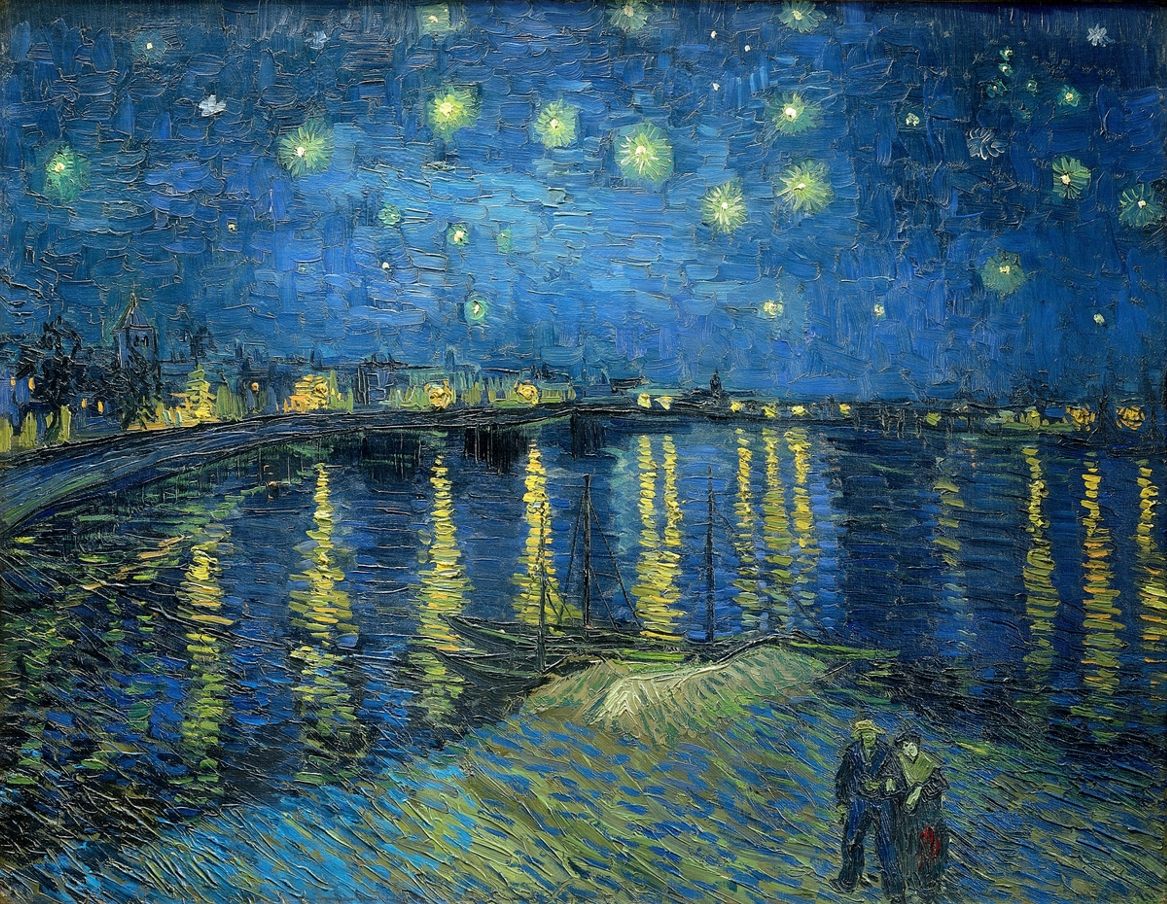
What's the very first mark that whispers an idea onto the canvas? For me, it's almost always line. It might start as a hesitant scratch, blossom into a bold declaration, or fade to a gentle whisper across the canvas. Sometimes it’s a frantic scribble reflecting a momentary chaos in my mind, other times a precise, almost architectural boundary. I vividly remember one instance where a line I initially considered a mistake, a complete wild goose chase across the canvas, ended up being the very element that broke the visual tension and made the entire piece sing. It’s funny how those serendipitous moments often hold the most profound truths, isn't it? Line can define a shape, create dynamic movement, or simply exist as a pure expression of energy. In my abstract work, lines frequently tell a story long before any other element takes shape; they’re the pathways your eyes instinctively follow, mapping the emotional currents of the piece, a visual heartbeat. Even in the wild gestures of an Abstract Expressionist, the line, however uninhibited, carries immense communicative power.

Learn more about how I use lines in my work: The Language of Line: How Gestural Marks Define Emotion in My Abstract Art and The Definitive Guide to Understanding Line in Abstract Art.
Shape & Form: Flat Friends and 3D Dreams
What happens when a line closes in on itself, or an area is defined by a distinct color or texture? You get a shape – a two-dimensional area with height and width. Think of simple squares, comforting circles, aggressive triangles, or those wonderfully wobbly, organic blobs I sometimes conjure up, which often feel like they're trying to escape the canvas. They’re like personality traits in my work, even without a literal face.
But then, we introduce form, which is a shape that has moved into three dimensions. It possesses height, width, and depth. On a flat canvas, I'm constantly playing with the illusion of form, making something feel solid, expansive, or receding into the distance – almost daring you to step into the painting itself. It's a delightful magic trick, isn't it? We achieve this illusion through clever techniques, for instance:
- Chiaroscuro: For me, this is about sculpting with light and dark, using strong contrasts to suggest volume, as if a spotlight is revealing a sculpted surface within the painting.
- Foreshortening: It's a visual trick that makes an object appear shorter than it truly is because it's angled sharply towards the viewer, creating an almost cinematic sense of depth that draws you in.
- Atmospheric Perspective: I use this to evoke distance, muting colors, softening details, and lessening contrasts for elements I want to feel further away, mimicking how the atmosphere itself affects our perception of distant landscapes.
- Layering and Glazing: Building up translucent layers of paint or applying glazes can create a sense of deep space and subtle volumetric shifts, allowing forms to emerge gradually or recede into the background.
Sometimes I wonder if it's the paint playing tricks on me instead! These elements, while foundational for realistic scenes, truly become a language unto themselves in abstraction, independent of literal representation.
If you want to dive deeper into making flat surfaces feel alive, explore my thoughts on understanding form in abstract art and the definitive guide to understanding form and space in abstract art.
Texture: The Touch You Can See and Feel
What makes you want to reach out and touch a painting, even when you know you shouldn't? That's the magic of texture. It's how a surface feels, or crucially, how it appears to feel. I've always been a bit obsessed with texture – the rough scrape of a palette knife, the smooth, almost liquid glide of a glaze, the gritty interference of sand mixed directly into paint. I remember one time, a spontaneous decision to add ground coffee to a dark brown section gave it an unexpected, earthy depth that transformed the entire mood of the piece. Another time, I found myself pressing an old lace doily into wet paint, creating a delicate, ghostly pattern that added a layer of historical whisper to a vibrant abstract field. It adds another profound layer to that silent conversation, a whisper of physicality that invites you to lean in closer, to almost reach out and touch. Sometimes I build it up thick, creating an impasto surface that catches the light and tells a story of its own – a tiny landscape of peaks and valleys, or perhaps a history of happy (and many unhappy) accidents on the canvas. Other times, I keep it meticulously smooth, letting the color and form do all the talking. It's truly about making the painting feel something, not just be seen.
The medium I choose is intrinsically linked to texture. Oil paints can be built up thickly for rich impasto, while watercolors lend themselves to delicate, transparent washes. Acrylics offer incredible versatility, from thin stains to thick sculptural applications. Even within digital art, artists evoke texture through simulated brushes and effects, carefully crafting visual richness without physical touch. Each medium brings its own inherent tactile quality, influencing the final feel and expression of a piece.

For a journey through the sensory world of my work, delve into the definitive guide to texture in abstract art. You can also explore what is impasto painting to understand a specific textural technique.
Color, Value, and Space: The Unseen Chorus of Emotion and Depth
How do we convey the full spectrum of human emotion, or conjure boundless universes, on a mere flat surface? This is where color, value, and space unite as an unseen chorus, giving every piece its profound resonance and influencing every decision in my studio.
- Color: For me, color is raw emotion, the loud laugh, the quiet sigh, the vibrant burst of joy, or the somber weight of introspection on the canvas – a symphony all its own. Different color combinations don't just exist; they interact, creating specific emotional temperatures and even physical sensations. A warm palette of reds and oranges can evoke passion, urgency, or a feeling of closeness, while cool blues and greens might invite calm contemplation, distance, or a sense of melancholy. It's not just about what colors they are, but their inherent temperature. In abstract art, color becomes liberated from its descriptive role, acting as a direct conduit for feeling, sometimes speaking more loudly than any recognizable object ever could. To truly immerse yourself, read about the psychology of color in abstract art or explore the emotional language of color in abstract art.
- Value: This refers to the lightness or darkness of a color, and it’s how I sculpt with light and shadow on a flat plane. Shifts in value create drama, defining form, emphasizing certain areas, and creating a sense of three-dimensionality. It's not just about light and dark, but about the mood they create – a high contrast between light and dark can feel stark and powerful, perhaps even unsettling, while a subtle range of values can evoke softness, mystery, and nuance, guiding the eye gently through the composition. Value can dramatically alter the atmosphere of a piece, making it feel bright and airy or dark and brooding. Explore the definitive guide to understanding value in art for a deeper dive.
- Space: More than just the actual area an artist uses, space is the illusion of depth created within that area – the perceived environment where everything exists and interacts, sometimes getting delightfully lost. Through careful manipulation of elements, I can evoke a sense of claustrophobia with tightly packed forms, or boundless expansiveness with receding planes and open fields of color. Overlapping forms, diminishing scale, and atmospheric perspective are all tools I use to create this illusion, pulling you into the painting itself. Consider too, negative space – the empty areas around and between forms. This "unpainted" or "empty" space is just as crucial as the positive forms, acting as a silent partner that defines shapes, creates visual tension, and contributes significantly to balance and composition. Understanding this is key to perceiving the 'world' within an abstract piece. For more, see the definitive guide to space and form in abstract art.
Together, these three elements form a powerful triad that allows artists to build intricate worlds of emotion and depth, even without literal representation.
To immerse yourself in the emotional world of color, read about how artists use color or the psychology of color in abstract art. For a comprehensive understanding of how these visual elements work, consider the definitive guide to color theory in abstract art.
These elements are the individual notes, each with its own character and potential. But how do we arrange these notes into a melody, a symphony, something that truly resonates? That's where the Principles of Art come in. They are the 'how,' the invisible orchestration that brings the raw elements to life.
Part 2: The Principles of Art – My Invisible Hand (The Verbs of Art)
If the elements are the nouns – the concrete things in the painting – then the principles are most certainly the verbs. They are the action, the relationships, the invisible hand that arranges everything into something meaningful, something that speaks to you. They dictate how I put those ingredients together, whether I'm aiming for a quiet whisper or a roaring shout, a serene composition or a vibrant chaos. This is where the magic truly begins to take shape, often when I'm least expecting it, by playing with harmony and tension.
Want to understand more about this guiding hand? Explore the definitive guide to understanding composition in abstract art or the definitive guide to composition in abstract art.
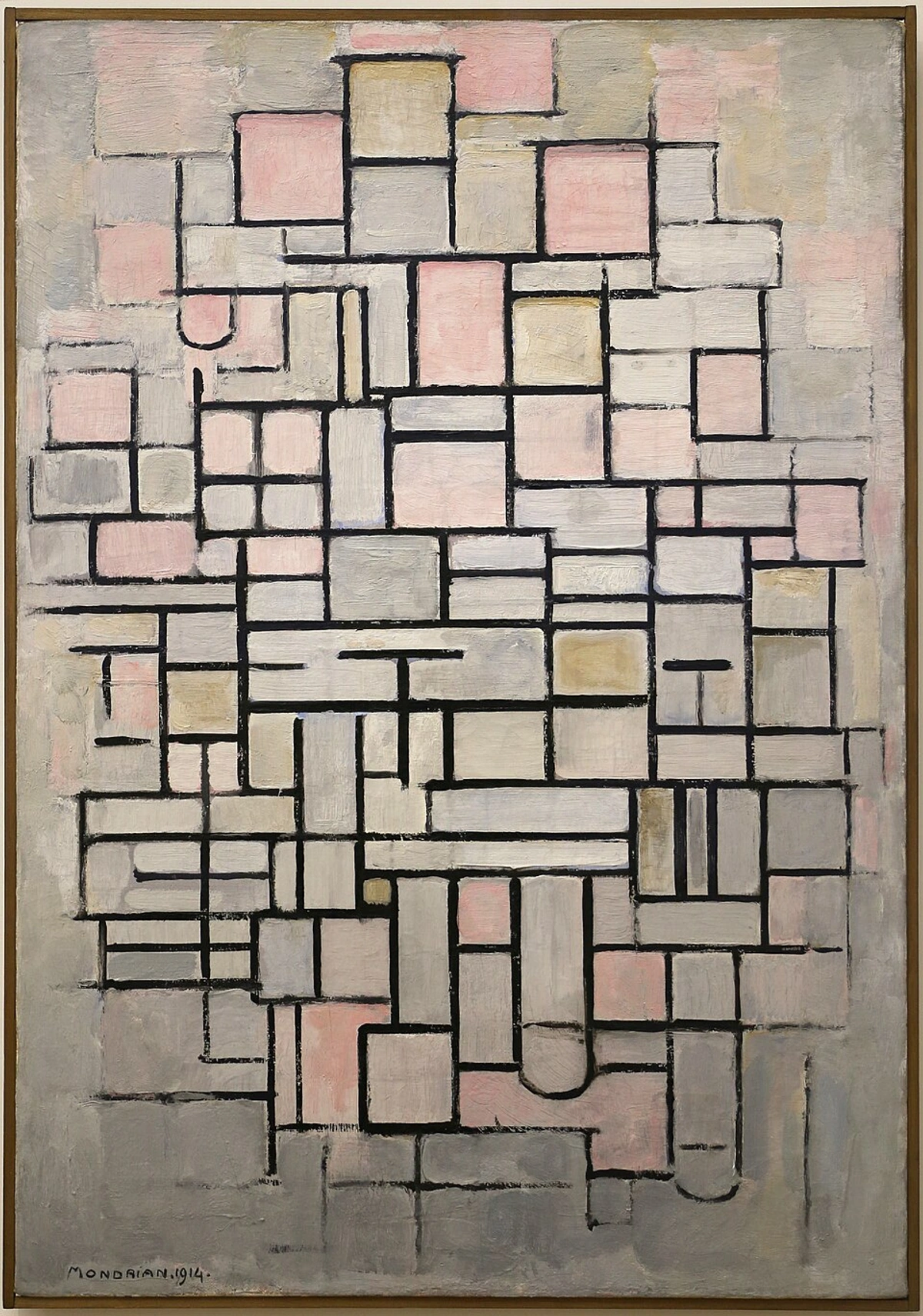
Balance: Finding My Footing and Visual Equilibrium
How do you make a canvas feel stable, even when it's teeming with wild energy? That's the challenge and reward of balance. It isn't always about perfectly equal halves, unless I'm feeling particularly orderly, which, let's be honest, is rare! It's about distributing the visual weight of the elements so the entire piece feels grounded and resolved, even if the composition is wildly chaotic. This also includes proportion and scale – how elements relate in size to each other and to the whole, which greatly influences perceived balance.
There’s symmetrical balance, which feels formal and often a bit stiff for my taste, like a perfect mirror image. Then there's asymmetrical balance, which is my preferred playground. It’s where different elements, unequal in size or shape, are arranged to create a dynamic equilibrium. A large, dark mass on one side might be balanced by a cluster of smaller, brighter shapes on the other. I often lean towards asymmetrical balance because it mirrors the complexities and dynamism of life itself more effectively than strict symmetry; it feels more organic, more alive, keeping the eye moving but never feeling lost. I remember one painting where a huge, dominant blue shape felt utterly overwhelming until I added a tiny, intense red dot in the far corner – suddenly, the whole piece breathed, the visual tension resolved into a surprising harmony. Sometimes, I even play with radial balance, where elements spiral out from a central point, creating a mesmerizing, almost hypnotic effect, like a dance floor where everyone is swirling around a single beat.
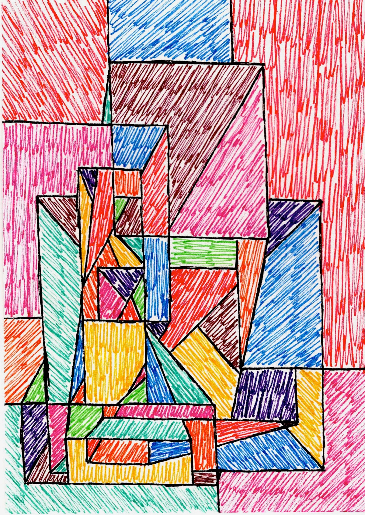
Contrast: The Spice of Visual Life
What truly makes elements pop, creating undeniable visual excitement? Contrast – the spice of life, the unexpected twist in the tale! It's about differences, often stark ones, that inject drama and vitality into a piece. Think light next to dark, rough next to smooth, geometric next to organic, or a burst of hot color against a cool expanse. It’s through contrast that a sharp, angular line set against a soft, organic shape can evoke palpable tension or serene harmony, giving voice to unspoken emotions. It's what makes elements stand out, creating an undeniable focal point or guiding your eye through the piece with an almost magnetic pull. Without contrast, everything would just blend into a monotonous hum, and who wants a hum when you can have a symphony? I actively seek out those moments of tension, knowing that a little bit of jarring difference can make the harmonies sing even louder. It’s truly where the unexpected beauty often lies. Sometimes, I deliberately push contrasts to an uncomfortable edge, only to then soften them slightly, creating a vibrating tension that keeps the viewer engaged.
Emphasis: Where My Eye Lingers and the Story Begins
In every engaging conversation, there's a peak, a most important word or phrase – and in art, this is emphasis, or the focal point. It’s the part of the artwork that immediately grabs your attention, acting as a visual magnet that pulls you in. It could be the brightest color, the most intricate detail, a particularly striking line, or an unexpected shape. I don't always consciously plan for an area of emphasis; sometimes it emerges organically from the chaos of creation, a delightful surprise. Other times, I subtly guide your eye there, perhaps by placing contrasting elements nearby, using converging lines that act like visual arrows pointing towards a specific area, or isolating a form to give it prominence. I recall one abstract piece where a solitary, perfectly circular form against a backdrop of frantic lines and textures became the unquestionable heart of the painting, simply because of its isolation and pristine geometry. It's where I want you to start your journey, before you wander off and discover the rest of the story.
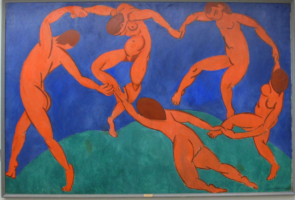
Movement & Rhythm: The Dance on the Canvas and the Beat of the Brush
What makes your eye journey effortlessly through a painting, or pause and linger in a fascinating cadence? That's the interplay of movement and rhythm. Movement is the path your eye takes through the artwork, often guided by the arrangement of elements – perhaps a series of diagonal lines leading across the canvas, or repeating shapes creating a visual current that directs your gaze towards areas of emphasis. It's the visual flow, the dance on the canvas. And rhythm? That's the repetition of elements that creates a sense of organized movement, like a visual beat. Think of it like music – a repeating pattern of shapes, colors, or lines can establish a tempo, a pulse that moves you through the piece. Sometimes it’s a gentle, flowing rhythm, a lullaby for the eyes. Other times, it’s a jagged, staccato beat that keeps you on edge, pushing you to explore every corner. I often find myself building these rhythms instinctively, like a drummer finding their groove, letting the brushstrokes follow an inner cadence. The way a series of forms might echo each other across the canvas, or how a recurring color pops up, creates a powerful, almost visceral beat that I feel as I paint, hoping you'll feel it too.
Pattern & Unity: The Cohesive Whisper and the Gestalt Whole
How do all these disparate elements and guiding forces come together to form a coherent, meaningful whole? This is the domain of pattern and unity. Pattern is the regular repetition of an element, a design that occurs over and over again. It can be calming, predictable, or create a hypnotic, meditative effect. But it’s not just about repetition; it’s about how those repetitions contribute to unity.
Unity, or harmony, is the overarching principle that ensures all the elements and principles work together to create a cohesive, complete whole. It's the magical moment when even the most contrasting elements find a way to coexist, feeling purposefully placed rather than chaotic, like a well-composed symphony where every instrument, every note, contributes to the overall masterpiece. This phenomenon is often understood through Gestalt principles, which describe how the human brain instinctively organizes visual information into a meaningful whole – grouping similar elements, finding continuity, and closing incomplete forms. Sometimes, I struggle to find this unity, wrestling with disparate elements like clashing colors or forms that refuse to sit together harmoniously. I recall a painting where an overly busy pattern initially overwhelmed the piece until I simplified it, allowing the overall composition to breathe and finally cohere. The artist's skill lies in integrating these elements so seamlessly that the piece finally breathes as one, and I know I've found its secret language. The ultimate goal is for the piece to feel inevitable, as if it could be no other way.
The Alchemy of Intuition and Interpretation
It's easy to talk about these elements and principles as if they’re a rigid checklist, but in my studio, the creative process is rarely that linear. Often, these ideas sneak into my paintings intuitively, emerging from a gut feeling or a delightful 'happy accident.' I might start with a frantic scribble (a line!), then find a compelling shape within it, add layers of texture, experiment with colors, and only then step back to assess if the visual weight feels balanced, if there’s a compelling rhythm. It’s a constant, exhilarating dance between conscious decision and subconscious flow.
Crucially, artists don't just wait for accidents; we learn to recognize and harness them. Through years of practice and a deep understanding of these very elements and principles, often solidified through formal training and countless hours of experimentation, we develop the intuition to see potential in an unintended mark or an unexpected color blend, transforming what could be a 'mistake' into a breakthrough. It’s about being present, observing, and knowing enough of the 'rules' to know when and how to beautifully break them, guided by a deep-seated artistic intent that, even in abstraction, seeks to convey something essential.
And that's the profound beauty of it: while artists meticulously wield these tools, you, the observer, don't need to be an art historian to feel their impact. Your own intuition will guide you through the conversation, decoding the secret language in your own unique way. Your personal experiences, cultural background, and current emotional state will inevitably influence your interpretation, making each encounter with art a uniquely personal dialogue. This subjective lens is not a flaw; it's precisely what makes art so universally resonant and endlessly fascinating. To understand more about the mysteries of abstract art, explore decoding abstract art: a guide to finding meaning in non-representational works and decoding abstraction: a beginner's guide to understanding non-representational art.
Concluding Thoughts: My Journey Continues
So, there you have it: a peek into my chaotic, colorful mind as I grapple with the fundamental building blocks and guiding forces of art. The elements and principles aren't just academic concepts; they're the very pulse of creation, the unspoken grammar that allows me to express what words cannot. They’re the reason a piece can make you feel something, even if you can't quite articulate why. I find immense joy in playing with these ideas, pushing their boundaries, and sometimes, quite frankly, ignoring them altogether when a new, unexpected vision takes hold. I encourage you to look at art with these lenses in mind, to let your own intuition guide you, and to discover the endless, vibrant conversations waiting on every canvas.
This ongoing exploration fuels my creations daily, whether it's a vibrant abstract print you can discover among my art for sale or the quiet, monumental paintings that fill my museum in 's-Hertogenbosch – you can plan your visit to my museum here. It's a journey, much like my own artist's timeline, filled with learning, unlearning, and continually rediscovering the endless possibilities of art's secret language.
Understanding Art's Secret Language: Elements vs. Principles
To quickly recap, here are the essential elements and principles that give art its powerful and often unspoken voice, and how they relate:
Category | Name | Description (What it IS) | Impact (How it's USED) |
|---|---|---|---|
| Elements | Line | The initial stroke, path, or mark. | Defines boundaries, creates movement, expresses raw energy and emotion. |
| Shape | A two-dimensional area defined by lines, colors, or textures. | Embody personality, creates visual forms. | |
| Form | A three-dimensional object or the illusion of depth/volume on a flat surface. | Creates illusions of depth and volume, makes objects feel tangible. | |
| Texture | The perceived surface quality. | Invites a tactile response, adds physical presence and sensory richness. | |
| Color | The hue, intensity, and temperature of light reflected from a surface. | Raw emotion, creates mood, temperature, and specific psychological impact. | |
| Value | The lightness or darkness of a color. | Sculpting with light and shadow, creates mood, drama, and defines form. | |
| Space | The area an artist uses, and the illusion of depth created within that area. | Creates environments, evokes claustrophobia or expansiveness, defines relationships. | |
| Principles | Balance | The distribution of visual weight in an artwork. | Ensures stability, grounding the piece, whether symmetrical or asymmetrical. |
| Contrast | Differences between elements. | Ignites visual excitement, creates drama, draws the eye to focal points. | |
| Emphasis | The focal point or area of greatest visual interest. | Grabs attention, guides the viewer's journey, tells where the story begins. | |
| Movement | The path the viewer's eye takes through the artwork. | Creates visual flow, guides the eye, a dance on the canvas. | |
| Rhythm | The repetition of elements to create a sense of organized movement. | Establishes a tempo or pulse, moves the viewer through the piece. | |
| Pattern | The regular repetition of an element or design. | Creates order, calming effects, or hypnotic rhythm, contributes to unity. | |
| Unity | The cohesive quality that makes all elements and principles work together. | Ensures all parts cohere as one complete whole, making the artwork feel inevitable. |


