
Unlocking Art's Secret Language: A Personal Guide to Elements & Principles
Unlock art's secret language with my personal guide to its elements and principles. Discover how line, color, and balance shape every masterpiece, making abstract art accessible for all.
The Definitive Guide to the Elements and Principles of Art: A Visual Language for All
Sometimes, I look at a complex painting – abstract or classical – and my mind just gets it. Other times, I stare blankly, wondering if I'm missing something profound or if it's just a fancy canvas. Sound familiar? For years, I felt like art was this secret club with a whispered language I wasn't privy to. Then, I discovered the Elements and Principles of Art, and it was like someone handed me the decoder ring. Suddenly, a whole new world of understanding opened up.
This isn't about memorizing rules; it's about learning to see. It’s about understanding the very DNA of visual creation, whether you're admiring a Renaissance portrait, a bold abstract piece from my collection, or even just the composition of your morning coffee foam (yes, really!). Join me as we peel back the layers and learn the fundamental visual language that artists, including myself, use every single day.

More Than Just Pretty Pictures: Decoding Art's DNA
Before I truly understood these concepts, art appreciation felt a bit like guessing. "Oh, that's nice," I'd say, without really knowing why it was nice, or what the artist was actually doing. It's like trying to understand a captivating speech when you only know a handful of words and no grammar. You might catch a vibe, but you miss the nuance, the power, the intention.
The Elements of Art are essentially your vocabulary – the basic building blocks available to any artist. Think of them as the individual notes in a piece of music, or the words in a sentence. They are: Line, Shape, Form, Color, Value, Texture, and Space.
The Principles of Art are the grammar and syntax – how those elements are organized and arranged within a composition to create meaning, impact, and a cohesive whole. These are: Balance, Contrast, Emphasis, Movement, Pattern, Rhythm, and Unity/Variety.
Together, they form a universal visual language. And once you speak it, you don't just see art; you read it.
The Seven Elements of Art: Your Visual Vocabulary
Let's break down the basic components. These are the tools in our artistic toolbox, the raw materials we manipulate.
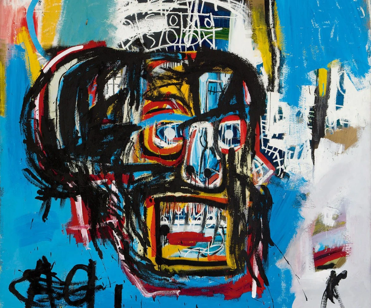
Line: The Path of a Point
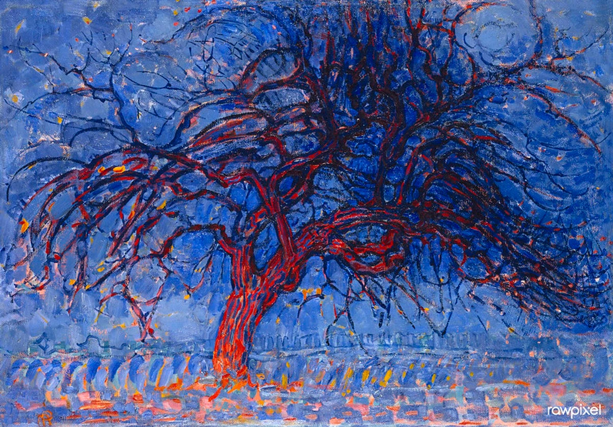
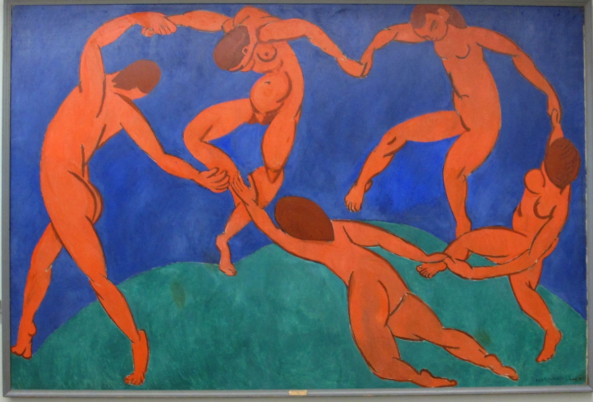
At its simplest, a line is a point moving through space. But oh, the stories a line can tell! It can be thick or thin, straight or curved, jagged or smooth. Lines define shapes, create movement, and even convey emotion. A sharp, diagonal line might suggest energy or aggression, while a soft, flowing curve could evoke calm or grace.
I often think of lines as the artist's first whisper on the canvas, the initial spark of an idea taking tangible form. Even in the most chaotic abstract work, there's often an underlying structure of lines guiding the eye, creating tension or release. It's truly fascinating how something so simple can carry such a heavy emotional weight.
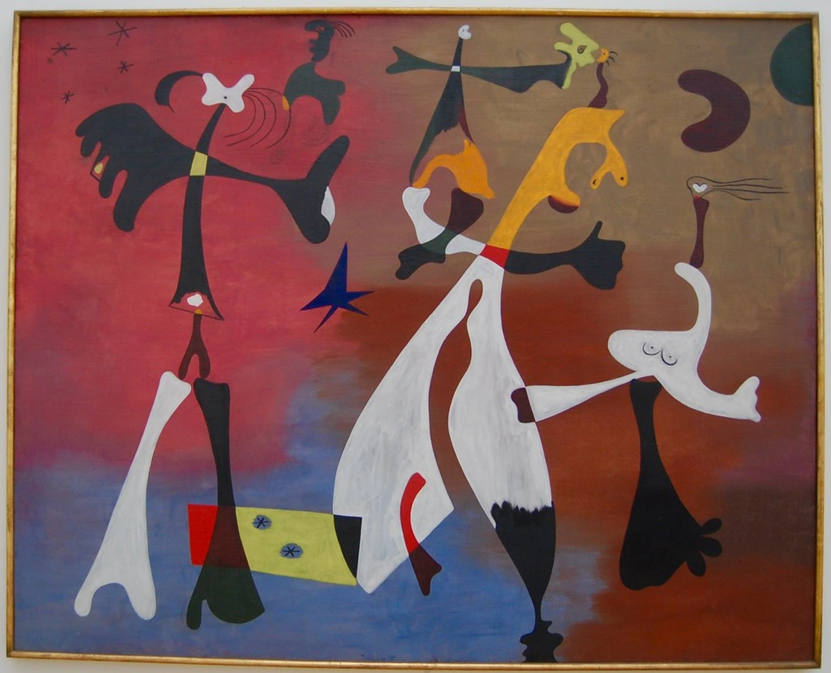
Shape & Form: Flat or Three-Dimensional
Shape is a two-dimensional area defined by lines or color. Think squares, circles, triangles, or even organic, irregular blobs. They have height and width.
Form, on the other hand, is three-dimensional, possessing height, width, and depth. Cubes, spheres, pyramids, or a sculpture you can walk around. They occupy real space, or at least appear to in a painting.
For a long time, I struggled to differentiate these, feeling a bit silly. But the distinction is crucial for understanding how an artist creates depth on a flat surface. When I'm working, I'm often thinking about how a certain arrangement of shapes will imply form, guiding the viewer's eye to perceive depth where there is none. If you're curious about how specific shapes can convey meaning, you might enjoy my thoughts on the symbolism of geometric shapes in abstract art: a deeper look.
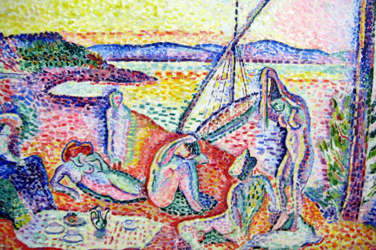
Color: The Soul of the Palette
Ah, color! My great love affair. It's probably the most emotionally resonant element. It has three main properties:
- Hue: The pure color itself (red, blue, yellow).
- Saturation: The intensity or purity of the color (how vivid or dull it is).
- Value: How light or dark the color is (often confused with the element 'value,' which applies to all tones).
Color evokes feelings, creates mood, and draws the eye. Red can be passionate or angry, blue can be calm or melancholic. Artists manipulate these properties to create vibrant scenes or subtle shifts in emotion. I've spent countless hours exploring this, and if you want to dive deeper, check out how artists use color or even the psychology of color in abstract art beyond basic hues.
Value: Light and Shadow
Not to be confused with color's value, this element refers to the lightness or darkness of tones. It's how we create the illusion of light, shadow, and depth in a two-dimensional work. High contrast in value (very light next to very dark) creates drama and emphasis, while subtle shifts create softness and a sense of volume. Think of a black and white photograph – all its impact relies on value.
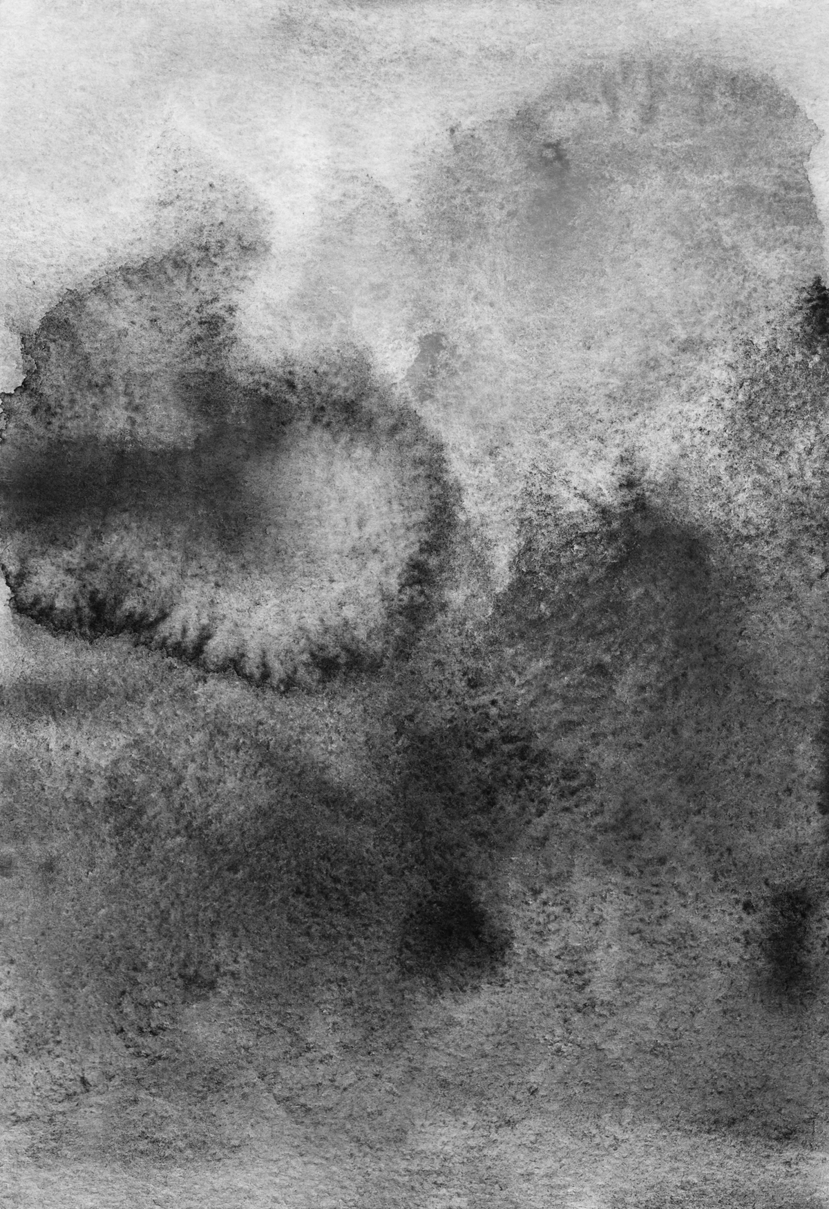
I find value particularly crucial in abstract art, where there aren't always recognizable forms to define space. The interplay of light and dark can carve out a sense of depth or bring certain elements forward, even in a swirl of color. It's the quiet workhorse of composition.
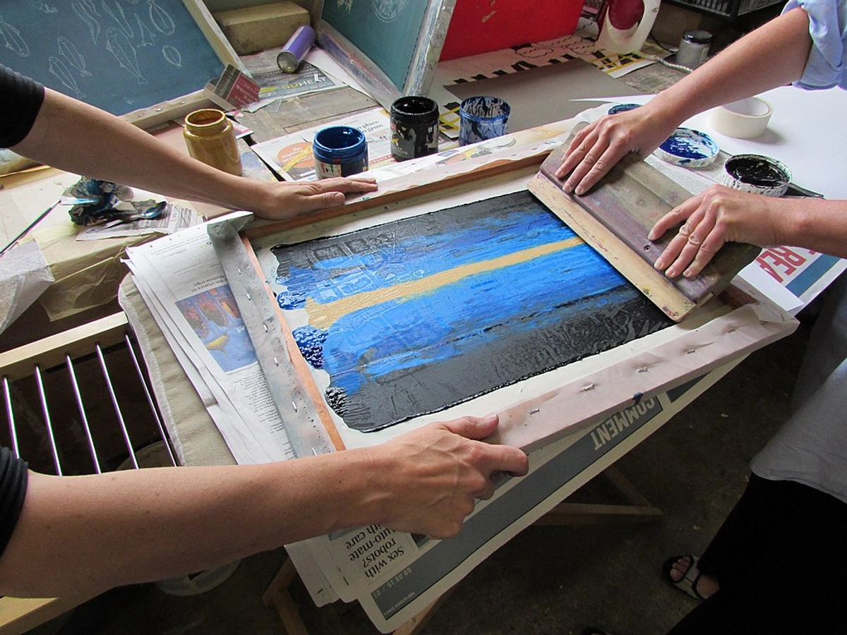
Texture: The Feel of the Surface
Texture refers to the perceived surface quality of a work of art. It can be actual (you can feel the rough brushstrokes or embedded materials) or implied (the artist creates the illusion of a certain texture through visual means). Think of the rich impasto of a Van Gogh versus the smooth, polished surface of a classical portrait.
As an abstract artist, texture is one of my favorite elements to play with. It adds another sensory layer, inviting you to imagine the touch of the canvas. I've explored many ways to add depth, and you can learn more in exploring texture: my favorite techniques for adding depth to abstract paintings.
Space: The Air We Breathe in Art
Space is the area an artist provides for a specific purpose. It can be positive (the subject itself) or negative (the empty areas around the subject). Space creates a sense of depth and perspective. How an artist uses space can make a painting feel expansive and open, or cramped and claustrophobic.
I often think of negative space as the silent partner in a composition. It's not empty; it's active. It gives the eye a place to rest, guides it around the positive space, and can even create hidden shapes. It's a reminder that sometimes, what you don't include is just as important as what you do.
The Principles of Art: The Grammar That Brings It All Together
Now that we have our vocabulary, how do we arrange these elements to create a compelling visual statement? That's where the principles come in. They are the rules (or, more accurately, guidelines) for organizing the elements.
Balance: Visual Weight
Balance refers to the distribution of the visual weight of elements in a work of art. It can be:
- Symmetrical: Identical elements on either side of a central axis (think a mirror image).
- Asymmetrical: Different elements on either side, but with equal visual weight, creating a more dynamic feel.
- Radial: Elements arranged around a central point, like spokes on a wheel.
I'm always chasing balance in my own work. Sometimes, I find myself shifting a splash of color or a bold line just a fraction of an inch, trying to get that 'just right' feeling where the composition feels stable and harmonious, even if it's not perfectly symmetrical. It's an intuitive dance.
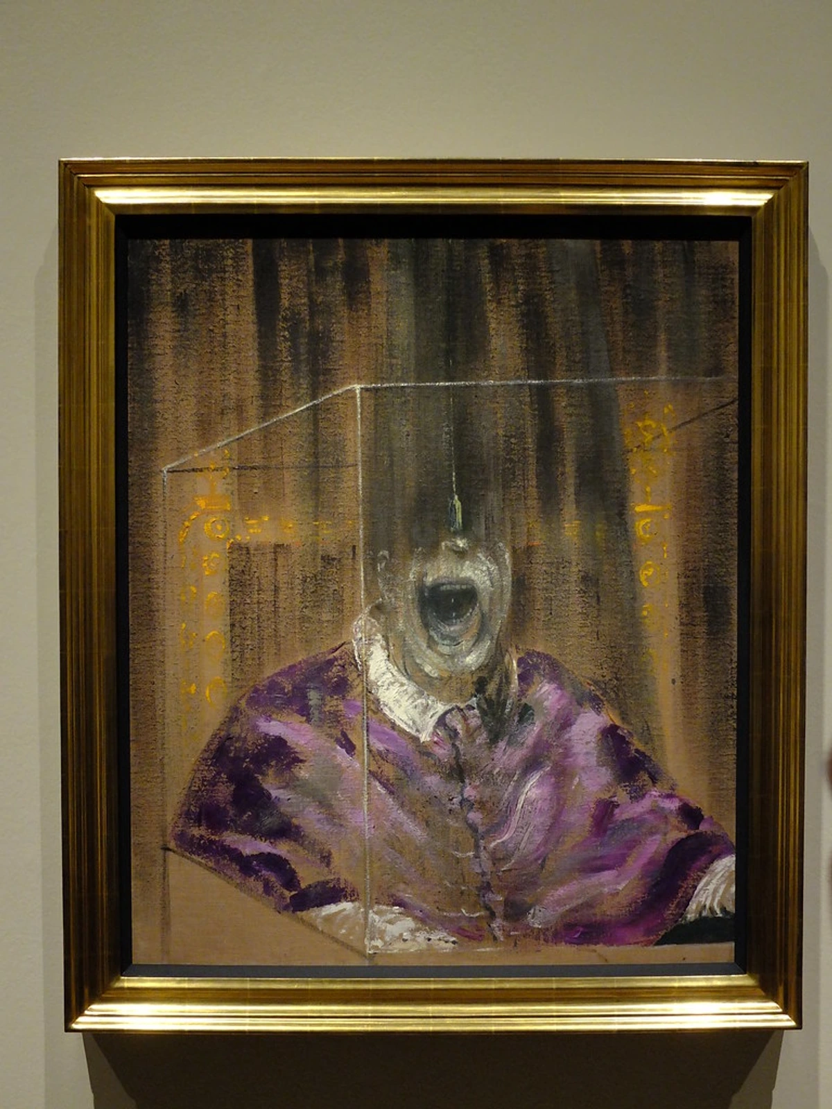
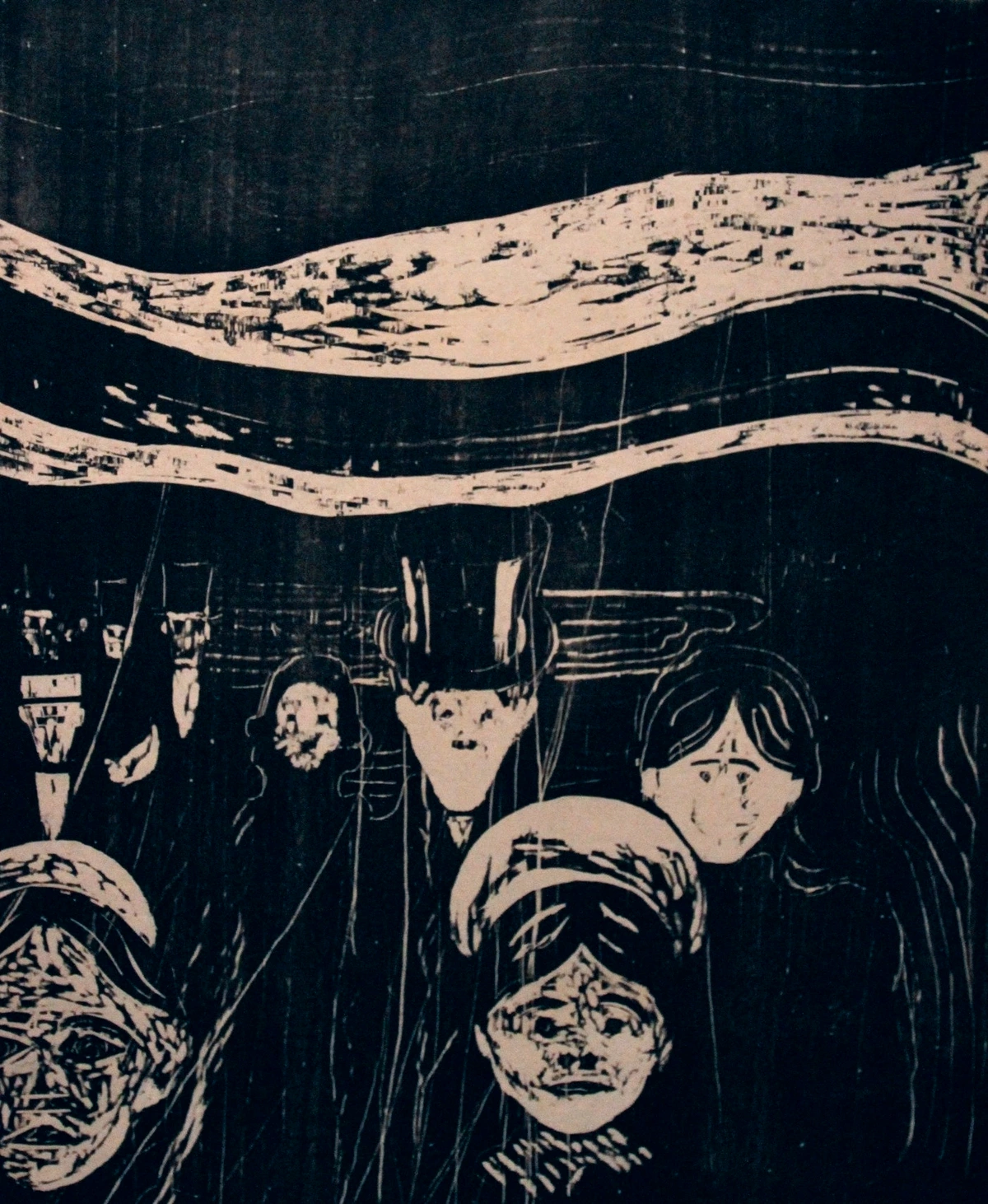
Contrast: The Spice of Life (and Art)
Contrast is the arrangement of opposite elements (light vs. dark, rough vs. smooth, large vs. small). It creates visual interest, drama, and helps to define elements. Without contrast, art can feel flat and monotonous.
Think of a black dot on a white page – maximum contrast, immediate attention. I love using contrast to make certain parts of my paintings pop, to create a dialogue between different textures or colors. It's the visual equivalent of a good plot twist.

Emphasis: The Star of the Show
Emphasis is what artists use to create a focal point – the part of the artwork that draws the viewer's eye first. This can be achieved through contrast, size, color, or placement. It's how the artist says, "Look here! This is important."
Sometimes, in my abstract pieces, the emphasis isn't a single 'thing' but a burst of energy, a particularly intense color interaction, or a convergence of lines. It’s about guiding your gaze, even subconsciously, through the visual narrative. It's also closely related to the unseen structure: how composition guides my abstract art.
Movement: Guiding the Eye
Movement is the path the viewer's eye takes through the artwork, often to focal areas. It can be directed by lines, shapes, colors, or repetition. Artists create implied movement to suggest action, guide the narrative, or create a sense of rhythm.
I find this principle particularly exciting, especially in abstract work where there's no literal subject moving. It's about the dance of the brushstrokes, the flow of colors, the subtle pull from one area to another. It's pure visual energy. This often plays into my creative process, embracing intuition in abstract painting, as I discuss in my creative flow: embracing intuition in abstract painting.
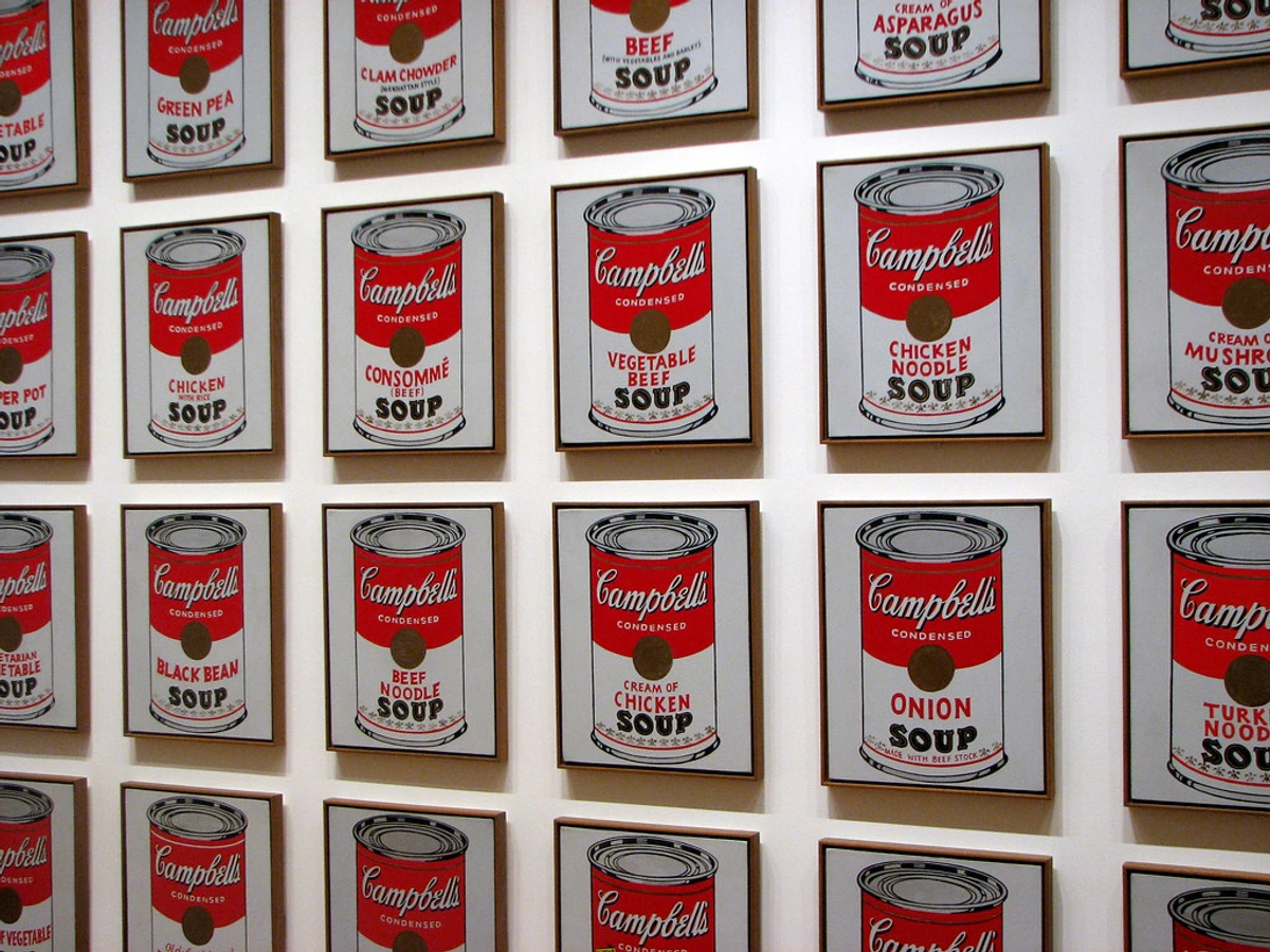
Pattern & Repetition: The Rhythm of Visuals
Pattern is the repetition of an element or elements in a recognizable organization. Repetition is simply using the same element multiple times. These principles create visual interest, unity, and a sense of rhythm within a composition.
Sometimes, a subtle pattern can emerge in my work without conscious planning – a series of similar brushstrokes, a recurring color motif. It's like a visual echo, reinforcing a theme or just making the composition feel more cohesive and intentional, even in its apparent chaos.
Rhythm: Visual Flow
Rhythm is created when one or more elements of art are used repeatedly to create a feeling of organized movement. It's like the beat in music, guiding the eye from one point to the next, creating a visual tempo. It's closely linked to pattern and movement.
Unity & Variety: Harmony and Interest
Unity is the feeling that all the elements in a work of art belong together and make up a coherent whole. Everything feels connected. But too much unity can be boring, which is where Variety comes in – the use of different elements to create visual interest and break monotony.
It's a delicate balance, this unity and variety. Too much unity and it's dull; too much variety and it's chaos. The goal is to have enough commonality that it feels cohesive, but enough difference to keep the eye engaged. It's the ultimate goal of composition, as I explore further in the unseen structure: how composition guides my abstract art.
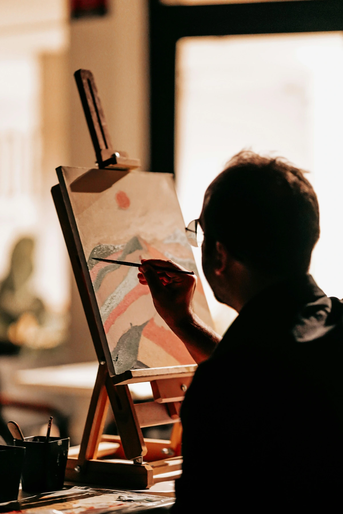
Putting It All Together: My Creative Philosophy
As an artist, I don't always sit down with a checklist, ticking off each element and principle. Much of it becomes intuitive over time, a second language I speak without thinking. However, consciously understanding them allows me to troubleshoot a piece that isn't working, or to push a composition in a new, exciting direction.
When I create my abstract pieces, I'm often thinking about how lines can convey energy, how colors can create harmony or discord, and how negative space can give the eye room to breathe. The principles of balance and movement are constantly at play, even if the forms are non-representational.
My work often explores the interplay of these foundational concepts, creating a dialogue between vibrant hues and bold structures. If you're curious to see these elements and principles in action, I invite you to browse my art for sale or explore some of the pieces at my den bosch museum. You can also learn more about my journey and how my style evolved over time on my artist timeline.
FAQ: Your Burning Questions Answered (Probably)
Still pondering some things? Let's tackle a few common questions:
Question | My (Personal) Answer |
|---|---|
| Are these rules or guidelines? | Definitely guidelines. Think of them as tools in a toolbox, not rigid commandments. The greatest artists often break them, but they do so knowingly, to achieve a specific effect. You have to know the rules before you can break them effectively. |
| Do I need to know these to appreciate art? | No! You can absolutely enjoy art on an emotional, visceral level without ever naming a single element or principle. However, understanding them can deepen your appreciation, allowing you to articulate why you like something or to see the artist's skill and intent more clearly. |
| How do these apply to abstract art? | Oh, they're essential for abstract art! Without recognizable subjects, abstract artists rely entirely on the elements and principles to create meaning, emotion, and structure. They are the scaffolding. I talk more about this in decoding abstract art: a guide to finding meaning in non-representational works. |
| Can I learn to use them in my own art? | Absolutely! The best way is to observe. Look at art, analyze it using these terms, and then experiment. Try a piece focusing just on line, or one primarily on color contrast. It's incredibly freeing! If you're thinking of trying your hand at it, check out my guide on how to abstract art. |
My Final Thoughts: The Joy of Seeing Anew
Learning about the elements and principles of art wasn't just an academic exercise for me; it was a revelation. It transformed my relationship with art, making it feel less intimidating and far more engaging. It gave me the vocabulary to articulate the unspoken, to understand the subtle choices that turn a canvas into a conversation.
I encourage you to carry this newfound visual language with you. Look at the world differently. See the lines in a cityscape, the balance in a photograph, the rhythm in a bustling street. And when you look at art – any art – try to pick out a few elements or principles at play. You might be surprised by how much more you see, and how much richer the experience becomes.
Because ultimately, art is for everyone. And with these tools, you're not just a viewer anymore; you're a reader, a participant, fluent in the beautiful visual language that connects us all.


