Abstract Composition: Intuition, Principles & Guiding the Viewer's Eye
Unlock the secrets of abstract art composition with an artist's personal insights. Explore how line, shape, color, and texture intuitively guide the viewer's gaze, transforming chaos into compelling visual narratives and evoking deep feeling. Learn to see, feel, and create with purpose.
The Intuitive Art of Abstract Composition: Guiding the Viewer's Eye Through Feeling
Confession time: sometimes, when I'm walking through a bustling city or scrolling through a gallery of images online, my eyes just sort of... wander. They dart from one thing to another, picking up bits and pieces, but rarely settling, rarely understanding the full picture. It's like my brain is trying to make sense of a thousand stimuli at once, and honestly, it can be a little exhausting. It's a visual cacophony, a jumble of elements fighting for attention, much like a poorly composed artwork that leaves you feeling adrift, unsure where to look or what to feel. Not quite the immersive, thought-provoking experience we hope for, is it?
This feeling of scattered attention is precisely what the art of composition in abstract art aims to resolve. It's the silent maestro directing our gaze, a gentle hand guiding us through the visual narrative. For me, as an abstract artist, it's not just about aesthetics; it's about creating a conversation, an unspoken dialogue between my canvas and your eyes. It’s the difference between a random collection of marks and a piece that truly resonates, inviting you to stay, explore, and feel. This article aims to demystify abstract composition, offering insights for both aspiring artists grappling with their own creations and curious collectors seeking to understand the 'why' behind the art they love. Join me as I pull back the curtain on this often-misunderstood aspect of abstract art, exploring how I blend foundational principles with raw intuition to transform mere paint into a purposeful visual experience.
Why Composition Matters (More Than Just "Looks Nice")
I used to think composition was some kind of arcane art theory, reserved for academics and traditional painters. My younger self, armed with a fresh tube of paint and an abundance of raw emotion, just wanted to express. "Who cares where the lines go?" I'd think, "It's about the feeling!" Oh, sweet, naive past self.
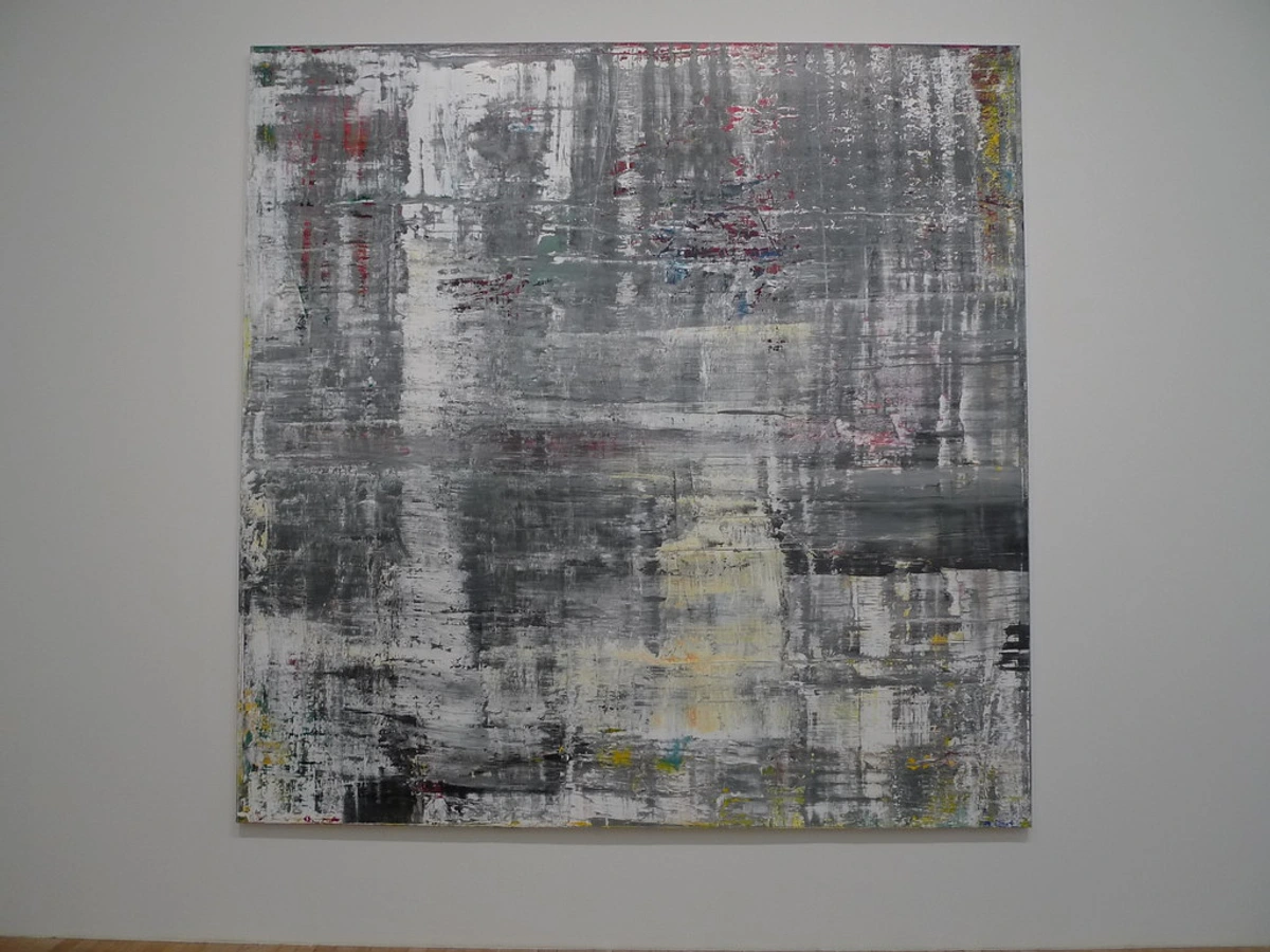
What I eventually realized, often after staring at a painting for hours, wondering why it felt... off, was that even the most fervent emotion needs a vessel. A chaotic canvas, despite its genuine intent, can inadvertently push the viewer away, making them feel overwhelmed or confused, rather than engaged. It's like telling a thrilling story but mumbling all the punchlines. The impact is lost. Composition, in essence, is the language through which an artist communicates visually – a silent narrative woven from lines, shapes, colors, and textures. Sometimes, it aims to create harmony and calm, other times, to deliberately evoke tension or unease, challenging the viewer and inviting deeper contemplation. It can even orchestrate an entire emotional arc within the viewing experience, guiding you from initial curiosity to profound reflection. It's also the element that significantly influences an artwork's perceived value and longevity, determining if it's merely 'nice to look at' or truly captivating, ultimately creating a more profound and memorable experience for the viewer. For me, composition became less about rigid rules and more about empathy. It's about respecting the viewer's experience, actively anticipating how their eyes will move, and subtly orchestrating that journey. It's the unseen structure that transforms a collection of elements into a cohesive, impactful piece, influencing not just what you see, but how you feel about it. A well-composed abstract piece can evoke calm, excitement, tension, or wonder, weaving a non-linear narrative that resonates deep within. It's the difference between a random splash of color and a purposeful visual invitation. If you're curious about the broader strokes of this topic, I've delved into more detail in The Definitive Guide to Composition in Abstract Art: Principles, Techniques, and Impact.
My Guiding Principles: The Unseen Choreography
These principles, for me, aren't rigid rules to be blindly followed, but rather a deeply understood language—a set of powerful tools that support and amplify my intuition, allowing me to speak more clearly through my art. They are the scaffolding upon which my spontaneous expressions are built, guiding the viewer's eye even when my hand feels entirely free. Pioneers like Wassily Kandinsky revolutionized abstract art by meticulously exploring the spiritual impact of lines, shapes, and colors. He famously pursued a synesthetic approach, aiming to translate inner spiritual states and musical harmonies into visual forms through his compositions, directly guiding the viewer to feel rather than merely see. Similarly, Jackson Pollock's 'all-over' compositions broke from traditional focal points, inviting the eye to endlessly wander across the canvas, creating immersive, uncontainable experiences that challenged conventional viewing by eliminating the traditional hierarchy of foreground and background. Mastering this visual language has always been central to abstract art, even when seemingly breaking free from tradition. It's about understanding the rules, then knowing when and how to bend them, or sometimes, break them entirely. These are some of the principles I find myself wrestling with, or embracing, almost every time I pick up a brush:
Line & Direction: The First Invitation
What's the first thing your eye latches onto in a painting? Often, it's a line. Lines are, perhaps, the most straightforward guides, yet endlessly versatile. They pull, they push, they lead. Think of a winding path through a forest or the soaring lines of a skyscraper; your eye naturally follows their trajectory. In my abstract work, lines can be bold and deliberate, or delicate and suggestive, but their role is often the same: to create a visual current, drawing the eye into and around the canvas. Their quality dictates the emotional current: a sharp, jagged line evokes energy or tension, while a soft, flowing curve suggests calm or movement. Sometimes I use gestural, almost frantic lines to convey raw emotion, other times mechanical, crisp lines to establish order. Beyond explicit strokes, implied lines – formed by the alignment of elements, the direction of a gaze, or a series of dots that suggest a path – can also subtly guide the eye, creating a sense of anticipation and inviting the viewer to complete the connection. Imagine a series of brushstrokes, each pointing slightly to the right; collectively, they create an unseen diagonal line that pulls your gaze across the canvas. The texture of a line, whether a thick impasto ridge or a delicate watercolor trace, can also add to its tactile invitation, further engaging the viewer. My own eye instinctively follows a strong line to its conclusion, or to where it intersects with something else, like a subtle invitation to a visual journey. In essence, lines are the initial whispers that draw us into the artwork, dictating its flow and emotional rhythm.
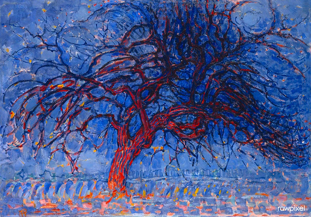
Even in his early, more expressionistic work, like "Evening; Red Tree," Mondrian uses the strong, angular lines of the branches to direct your gaze upwards, then across the canvas. Later, in his abstract pieces, lines become the very grid of his universe, creating a precise, almost architectural order. If you're fascinated by how lines tell a story, I've explored it more deeply in The Definitive Guide to Understanding Line in Abstract Art: From Gestural Marks to Geometric Forms.
Shape & Form: Anchors and Islands
How do elements assert their presence? Through shape and form. After lines, shapes (the two-dimensional outlines) and forms (their three-dimensional, implied counterparts) are the next big players, acting as anchors and islands in the visual sea. They create areas of interest, places where the eye can rest, or points from which it can launch into another part of the canvas. Crucially, shapes and forms carry visual weight – the perceived lightness or heaviness of an element. Imagine a dense, dark boulder versus a light, airy cloud. This weight is influenced not just by size, but also by color (a vibrant red shape will feel heavier than a muted grey one of the same size), value (a dark shape on a light background will dominate), complexity, and even its density (a shape tightly packed with texture or intricate details will feel heavier and more dominant). A large, dark, dense shape, tightly packed with texture or intricate details, will feel heavier and more dominant than a small, light, airy one, drawing the eye and commanding attention. This also contributes to visual hierarchy, telling the eye what to focus on first, establishing a clear figure-ground relationship where certain shapes emerge as central figures against a backdrop. Sometimes I'll deliberately create a dominant shape with significant visual weight, knowing it will be the anchor of the piece, around which everything else orbits. Other times, smaller, scattered shapes create a sense of movement or fragmentation, carefully distributed to maintain overall balance. The interplay of geometric (sharp, ordered, often feeling aggressive or stable) and organic (fluid, natural, often feeling soothing or dynamic) shapes, or their repetition, can establish a powerful rhythm and a unique visual language. Ultimately, shapes and forms are the anchors and islands, defining zones of interest and guiding the eye's journey through the visual landscape.
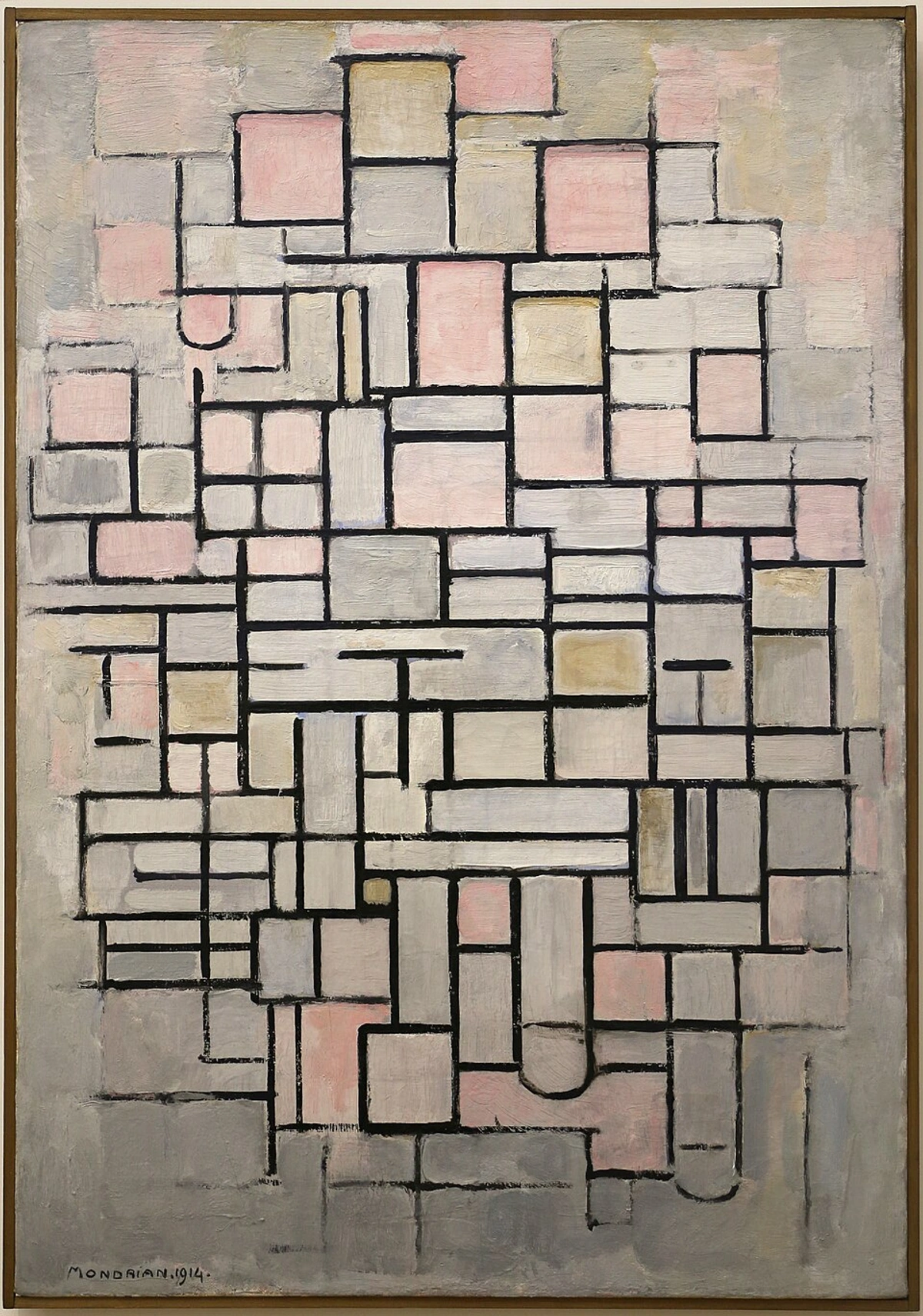
Mondrian’s "Composition No. IV" is a masterclass in this, with carefully placed rectangles guiding your eye through a precise, balanced journey. It's a testament to the power of deliberate placement. Understanding how space and form interact is crucial, and I've touched upon it in The Definitive Guide to Understanding Space and Form in Abstract Art: Principles, Perception, and Practice.
Negative Space: The Unseen Architect
What happens in the quiet corners of a painting? This one often gets overlooked, but it's a quiet powerhouse. Negative space isn't just the empty bits around shapes; it's an active participant, shaping and defining the positive forms. It can create tension when tightly confined, provide breathing room when expansive, or even form its own hidden shapes that emerge only after a deeper look – inviting the viewer's mind to actively 'complete' the image. The way I manipulate negative space can also dictate the sense of depth or flatness. A tightly integrated, dark negative space might push elements forward, while a vast, light, uninterrupted expanse can create a sense of airiness and distance. It's like the pauses in a dance, or the silence between musical notes that allows the melody to truly resonate – essential for the overall experience. I often find myself adjusting the negative space as much as the painted elements, realizing that sometimes what you don't paint is just as impactful as what you do. It's about seeing the whole canvas as a dynamic interplay, recognizing that the negative space actively participates in defining the positive forms, creating a crucial figure-ground relationship where certain shapes emerge as central figures against a backdrop. Ultimately, negative space is the unseen architect, defining, balancing, and breathing life into the positive forms of a composition, making the 'empty' feel full of purpose. If you're intrigued by this often-underestimated element, you might enjoy The Power of the Unseen: Exploring Negative Space in My Abstract Compositions.
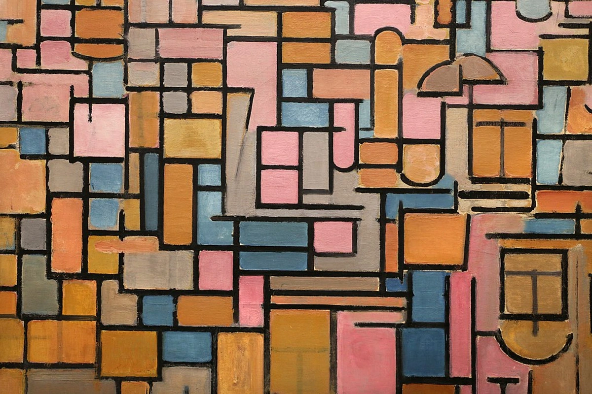
Mondrian, again, excels at this. In pieces like "Tableau III: Composition in Oval," the white and grey areas between the colored blocks are not mere background; they are integral to the composition, creating rhythm and balance, defining the structure as much as the lines and colored shapes themselves.
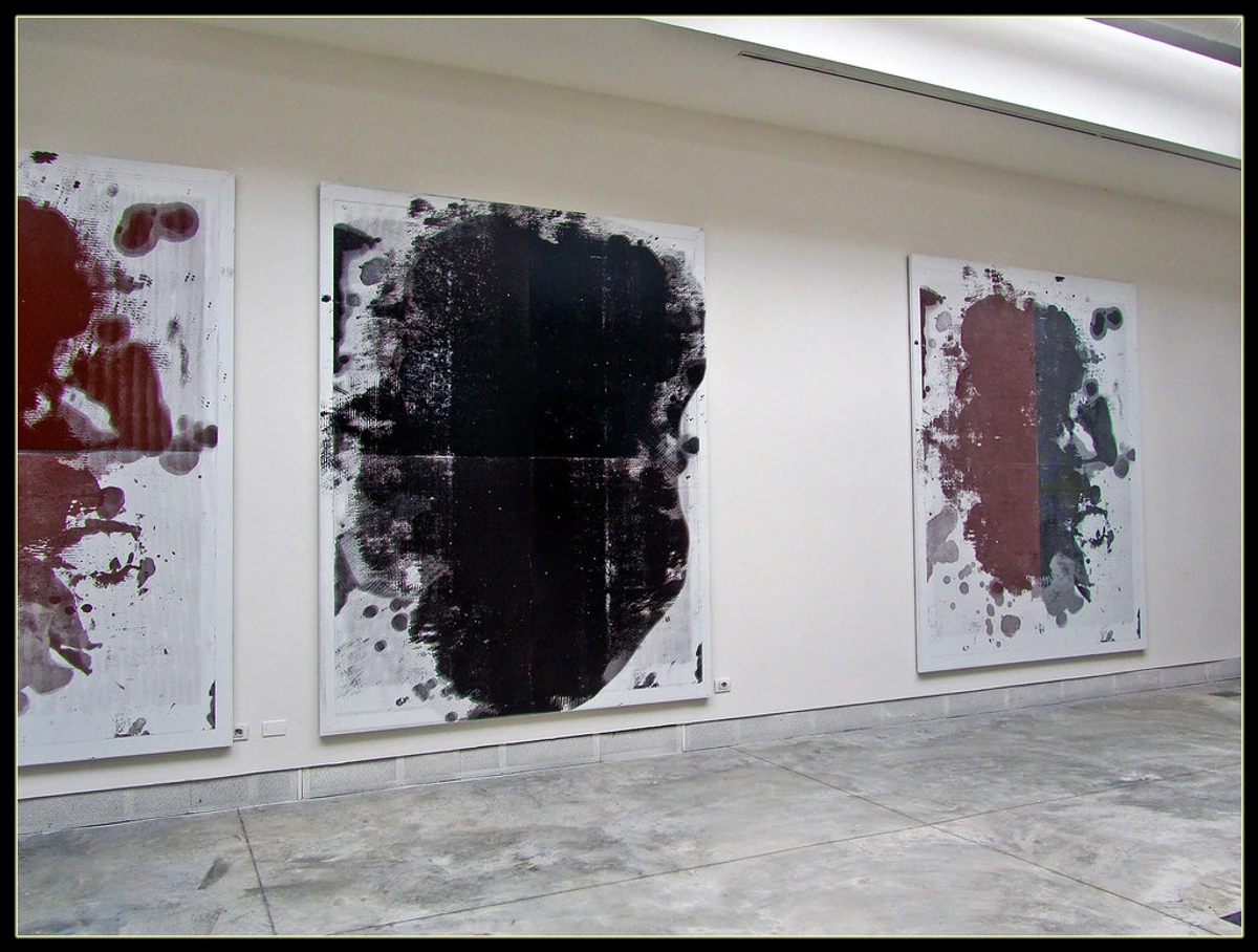
Color & Contrast: The Emotional Spotlight and Focal Point
What truly grabs your attention first? Ah, color! My great love and my greatest challenge. Color is an undeniable magnet for the eye, an instant focal point. A splash of vivid red amidst muted blues will always seize attention. But it's not just about brightness; it's about contrast – the interplay of light and dark (value), warm and cool, saturated and desaturated hues. Sometimes, I'll lean into the basic tenets of The Emotional Language of Color in Abstract Art – placing a vibrant complementary color next to another to create intense visual energy, a phenomenon often enhanced by simultaneous contrast. This is where two colors placed side-by-side optically affect each other, making them appear more vibrant or different than they actually are (e.g., a small patch of bright yellow next to a deep purple can make the yellow seem even more luminous). It's incredibly powerful in abstract art because it can create optical illusions and heighten emotional impact without relying on literal representation, directly stimulating a visceral response. Or I might use analogous colors for a more harmonious, flowing feel. Beyond these, understanding color temperature (the warmth of reds/yellows vs. the coolness of blues/greens) allows me to create illusions of depth or flatness, pulling warm tones forward and letting cool tones recede, or conversely, making an entire piece feel close and immediate. Other times, I'll deliberately break those 'rules' to create jarring tension or a unique emotional resonance. I often find myself playing with color to create immediate focal points, then using more subdued tones to allow the eye to wander and discover the broader narrative. Color has this incredible power to evoke immediate emotional responses, directing the viewer’s gaze not just physically, but emotionally. It's more than just what you see; it's what you feel.
I remember one particularly frustrating painting where everything felt... flat. I kept adding layers, changing colors, but it still lacked a spark. Then, almost by accident, I added a tiny, intense burst of orange in one corner. Suddenly, the whole piece came alive. My eye, and later the eyes of others, gravitated towards that spot, then happily explored the rest. It was a humble reminder of color's undeniable power to create a dynamic focal point. In short, color is the emotional spotlight, pulling the eye and evoking an immediate, visceral response. For more on this, check out The Emotional Language of Color in Abstract Art.

Balance & Rhythm: The Dance of Elements, Unity & Variety
How do all the pieces sing in harmony (or deliberate dissonance)? Think of a piece of music. It has moments of tension and release, fast rhythms and slow ones, a sense of overall harmony or deliberate dissonance. Art composition is similar. Balance ensures that no single part of the painting feels too heavy or too light, too dominant or too insignificant, unless that's the deliberate intent. While symmetrical balance (mirroring elements for a formal, static feel) can exist and be intentionally employed in abstract art to evoke order, stillness, or even irony, I find asymmetrical balance far more dynamic and engaging. This is where the visual weight (that perceived lightness or heaviness of an element we discussed earlier) is distributed unevenly but harmoniously, creating a tension that keeps the eye moving and discovering. Imagine a large, bold shape on one side perfectly balanced by a cluster of smaller, energetic elements on the other, much like a well-choreographed dance where individual movements are distinct but form a cohesive, dynamic whole. And rhythm? That's the repetition of elements, lines, or colors, or even the spacing between them, that creates a sense of movement, leading the eye in a continuous, flowing dance, often through implied paths and visual echoes. It's the visual beat, the subtle pulse that keeps the viewer engaged, sometimes gentle, sometimes erratic. It's about creating a dynamic visual conversation, a push and pull that keeps the eye engaged, rather than letting it settle too quickly. Ultimately, balance and rhythm transform static elements into a living, breathing visual dance. These concepts are underpinned by the overarching principles of unity and variety, where unity provides a sense of cohesion and belonging, while variety introduces interest and prevents monotony. The most compelling compositions achieve a delicate equilibrium between these two, creating a whole that is both harmonious and engaging.
Scale & Proportion: The Dance of Dimension
How do we perceive magnitude and relationship within the artwork? This is scale and proportion at play. How big is that shape compared to its neighbor? How does the canvas size itself impact the viewer? Manipulating the relative size of elements can create a sense of depth, emphasize importance, or evoke specific feelings. But it's more than just individual sizes; it's the relationship or ratio between them that tells a story. A vast, empty space next to a tiny, intricate detail creates a sense of vulnerability or discovery, a dramatically different narrative than a canvas filled with similarly sized forms, which might feel more harmonious but less dramatic. I often use this to create a sense of intimacy or grandeur, guiding the viewer's perception of the artwork's emotional weight and physical presence. For instance, a monumental, sweeping gesture might suddenly feel intimate when a viewer leans in and discovers a miniature, delicate mark within its expanse, or a tiny, isolated element can evoke a sense of vastness around it. The careful orchestration of big and small, near and far, can pull you into the piece, making you feel a part of its world, particularly when viewed up close, where the monumental can feel intimate, and the minute, expansive. The viewer's distance from the artwork can also significantly alter the perception of scale, making what feels vast up close, appear contained from afar. In essence, scale and proportion are the orchestrators of dimension, shaping perception and narrative through relative size.
Texture: The Tactile Invitation
What adds a physical, tangible dimension to the abstract? If I'm honest, texture is often the unsung hero of abstract composition. It’s what gives a piece its physical presence, its material story. Beyond just visual cues, texture creates a tactile invitation, influencing how light interacts with the surface and how our eyes perceive depth and movement. A rough, impasto surface catches light differently than a smooth, glazed area, creating natural focal points or leading the eye through varying degrees of reflectivity. Different mediums, too, offer their own textural palettes—thick oils creating a buttery, sculptural surface, while fluid acrylics might lend themselves to transparent washes or delicate drips. Each medium's inherent qualities influence compositional choices and the tactile experience, allowing for varied visual journeys. A heavily textured surface (like gritty sand or thick impasto) can feel warmer, more grounded and dense, slowing the eye down, inviting a closer, more prolonged look, conveying stillness. Conversely, a smooth, slick surface (like polished resin or thin washes) might appear cooler, allowing the eye to glide quickly across, suggesting fluidity or emptiness, conveying movement. I sometimes build up thick layers of paint, or incorporate unexpected materials, not just for the aesthetic, but to literally shape the viewer's journey. It's about creating a landscape not just of color and form, but of touch and shadow, inviting a multi-sensory engagement. It's an element I often find myself tweaking late in the process, realizing that the 'feel' of the surface is just as vital as the colors I've chosen. Ultimately, texture is the tactile invitation, adding a physical dimension that guides the eye and deepens the sensory experience. For a deeper dive into how I build these layers, you might find my thoughts on The Unseen Layers: My Process of Building Depth and Narrative in Abstract Mixed Media interesting.
Summary of Compositional Principles
Principle | How it Guides the Eye | My Intuitive Use |
|---|---|---|
| Line | Creates visual paths, directs flow, evokes energy/calm. | Expressive vs. geometric, broken/implied lines for anticipation, leading around the canvas, guiding the emotional current. |
| Shape & Form | Establishes areas of interest, provides anchors, creates visual hierarchy & figure-ground. | Manipulating visual weight (size, color, value, density), interplay of organic and geometric shapes, creating focal islands. |
| Negative Space | Defines positive forms, creates depth, tension/rest; crucial for figure-ground. | Sculpting empty areas, influencing depth, allowing elements to breathe, inviting implied shapes, using silence for impact. |
| Color & Contrast | Draws immediate attention, evokes emotion, creates depth & focal points. | Using vivid focal points, interplay of hues, lights/darks (value), warm/cool for mood and dimension, leveraging simultaneous contrast for visceral effect. |
| Balance & Rhythm | Ensures visual harmony/tension, creates movement; underpinned by unity & variety. | Asymmetrical balance for dynamism, repetition and spacing for flow and engagement, mindful of symmetrical effects, balancing unity with engaging variety. |
| Scale & Proportion | Establishes depth, emphasizes importance, tells stories through relative size and ratio. | Creating intimacy or grandeur, leveraging relationships between elements, considering viewer distance to shift perception. |
| Texture | Creates tactile invitation, influences light/depth, conveys movement/stillness, affects perceived temperature. | Building physical presence, guiding eye through varied surfaces, evoking sensory responses (dense/airy, warm/cool), considering medium's influence for multi-sensory engagement. |
Beyond the Rules: My Intuitive Approach to Guiding the Eye
While understanding these principles is invaluable, my actual process in the studio is rarely a checklist. It's more of a conversation, a continuous feedback loop between my hand and the canvas, often tapping into something deeper, something subconscious. I start, often intuitively, making marks, layering colors, building textures. The composition begins to emerge organically, sometimes from a fleeting emotion, a vivid dream, or even just the raw impulse of a brushstroke. It’s a bit like building a sandcastle without a blueprint – you know you want a strong foundation and interesting turrets, but the exact shape evolves with each handful of sand, often revealing unexpected formations. These happy accidents – perhaps a spontaneous drip forming a perfect, unplanned line, or an unexpected color interaction creating a new focal point – aren't failures; they're gifts, nudging the artwork in directions I hadn't consciously planned, and I learn to recognize and embrace them. Much like improvisational jazz, where a deep understanding of musical structure allows for truly free, yet purposeful, expression, or like the fluid storytelling in improvisational theater, I find myself dancing between control and serendipity. Sometimes I feel like I'm just scribbling, and then a line just happens to lead the eye exactly where I wanted it to go – pure luck, or the subconscious at work?
This intuitive dance, blending deliberate structuring with subconscious flow, isn't just about aesthetics; it's about mirroring the complexities of human perception and emotion. Abstract composition, when successful, bypasses the literal and speaks directly to our limbic system, evoking feelings and associations before the conscious mind can even process specific forms. It's why a certain arrangement of colors and shapes can feel calming, or exhilarating, without depicting anything recognizable. It respects the viewer's inherent capacity for non-verbal understanding, actively anticipating how their eyes will move and subtly orchestrating that journey, creating an empathetic dialogue. This is the essence of The Art of Intuitive Painting: Embracing Spontaneity in Abstract Creation, where the raw emotion meets a refined, empathetic visual language.
Navigating Compositional Challenges: My Personal Battleground
Even with a deep understanding of principles, I frequently stumble. It's a continuous learning curve, a humbling reminder that theory and practice are often two different beasts. Here are a few common compositional pitfalls I encounter and how I try to navigate them, often with a groan and a fresh cup of coffee:
- Visual Chaos (The 'Everything All at Once' Syndrome): This is when a piece feels like a thousand little voices shouting over each other, with no one taking the lead. It's overwhelming, and the viewer's eye just doesn't know where to land. When I find myself in this chaotic space, I often try to simplify. Can I remove an element that doesn't serve the overall flow or emotional intent? Can I mute a color? Can I create a stronger hierarchy of elements by giving one area more visual weight and allowing others to recede into the background, perhaps by consolidating smaller, scattered elements into a more cohesive mass, or by introducing a clear, dominant form and establishing a distinct foreground/background relationship? Sometimes, I even mentally overlay a basic rule of thirds grid, not to rigidly follow it as a rule, but to use it as an analytical tool to identify areas that feel overwhelmingly cluttered versus those that could benefit from clearer definition. Sometimes it means literally wiping a section clean and starting anew, which, if I'm honest, often feels like a mini-defeat – the artistic equivalent of hitting the reset button, usually accompanied by a dramatic sigh and a strong desire for more coffee – but usually leads to a breakthrough.
- The 'Muddy Middle' (Lack of a Clear Focal Point): This is the opposite of chaos, almost worse. Everything is just... there. No particular area draws you in, no initial spark. It's like a perfectly pleasant conversation that never quite gets to the point. My solution? I start searching for that spark. Can I introduce a burst of intense color? A sharp line against a soft background? A dramatic shift in texture? Often, creating a strong contrast in one specific area – whether it's color, light, or crucially, value (lightness/darkness) – is enough to awaken the piece and give the eye a starting point, a place to return to before exploring the rest. A quick value study (reducing the painting to just black, white, and grays) can immediately highlight where the contrast is lacking, stripping away color distractions to reveal the underlying structure of light and dark, making it easier to see where a focal point is needed, or where visual tension could be introduced through unexpected juxtapositions. Other times, it's not a single focal point, but about creating clear visual pathways – how lines, shapes, or color transitions subtly lead the eye from one area to another, inviting a continuous journey rather than a single destination, much like a series of stepping stones across a river.
- Over-reliance on One Element (The 'Monotony Trap'): Sometimes I get so enamored with a particular shape or line quality that I repeat it too much, and the piece loses its dynamism. It's like a song with only one note, played over and over. While repetition can create rhythm and a sense of visual harmony, too much can stifle visual interest and create boredom. I then challenge myself to introduce variation: different sizes of that shape, a contrasting line, or a new texture to break the pattern. It's about finding secondary rhythms, visual counterpoints that add interest without completely disrupting the dominant theme. For instance, a dominant series of vertical lines could be countered by a subtle, unexpected horizontal element, or a bold geometric shape could be balanced by a soft, organic counterpart. I might also try juxtaposing contrasting elements – placing something rough next to something smooth, or a sharp angle near a soft curve – to create immediate visual interest. It's about knowing when to whisper and when to shout, even if it’s just with a different shade of blue, to maintain engagement.
- The 'Too Busy' Canvas (Overwhelm): This often happens when I'm trying to say too much, or when I'm afraid of empty space. The canvas becomes packed with detail, leaving no room for the eye to breathe or for the mind to process. It's like a room crammed with too much furniture; you can't appreciate any single piece. My fix for this is often brutal: ruthless editing. I force myself to step back, cover parts of the painting, and ask: "Does this need to be here?" More often than not, the answer is no. Removing elements, simplifying areas, or deliberately introducing more negative space—treating 'empty' areas as crucial 'breathing room' for the eye and for the mind's cognitive processing—almost always brings clarity and strength to the piece. This intentional simplification is a painful but necessary act of strategic subtraction, a kind of visual sculpting, sometimes feeling like saying goodbye to a beloved, albeit distracting, friend.
The Viewer's Role: An Unscripted Dialogue
While I, as the artist, meticulously orchestrate the visual journey, the ultimate experience of an abstract composition is profoundly personal. Each viewer brings their own history, emotions, and perceptions to the canvas, engaging in an unscripted dialogue with the artwork. My guiding principles are simply an invitation, a framework within which individual interpretations can flourish. The artist's intention is to provoke a response, but the artwork actively invites the viewer to bring their experiences to the interpretation, making the viewer's understanding the ultimate validation of its success. The beauty of abstract art lies in this collaborative act of meaning-making, where the artist proposes, and the viewer discovers, feels, and ultimately, co-creates the narrative within their own mind.
The Journey Continues: Embracing Intuition and Intent
Ultimately, composition in abstract art is less about rigid adherence to rules and more about cultivating a deep, empathetic connection with both your artwork and your audience. It's about learning the language, then speaking from the heart. My artistic journey, much like life, is a continuous ebb and flow between intuitive bursts of creation and moments of deliberate, compositional adjustment. It’s about being present, observing, and constantly asking, "What does this piece need to tell its story?" These compositional principles are not static; they evolve with each artist's unique practice and with the broader cultural shifts in art itself. Just as artists like Mark Rothko used simplified color fields to evoke profound emotional responses through composition, and Agnes Martin created subtle, rhythmic patterns that invite quiet contemplation, the possibilities are endless.
Whether you're creating your own art, or simply appreciating it, understanding these unseen forces at play will undoubtedly deepen your experience. Don't be afraid to experiment, to break the rules, and to trust your own eye. After all, the most compelling compositions are often those that surprise us, those that speak directly to our soul through a meticulously, yet intuitively, guided gaze, creating an unforgettable visual symphony.
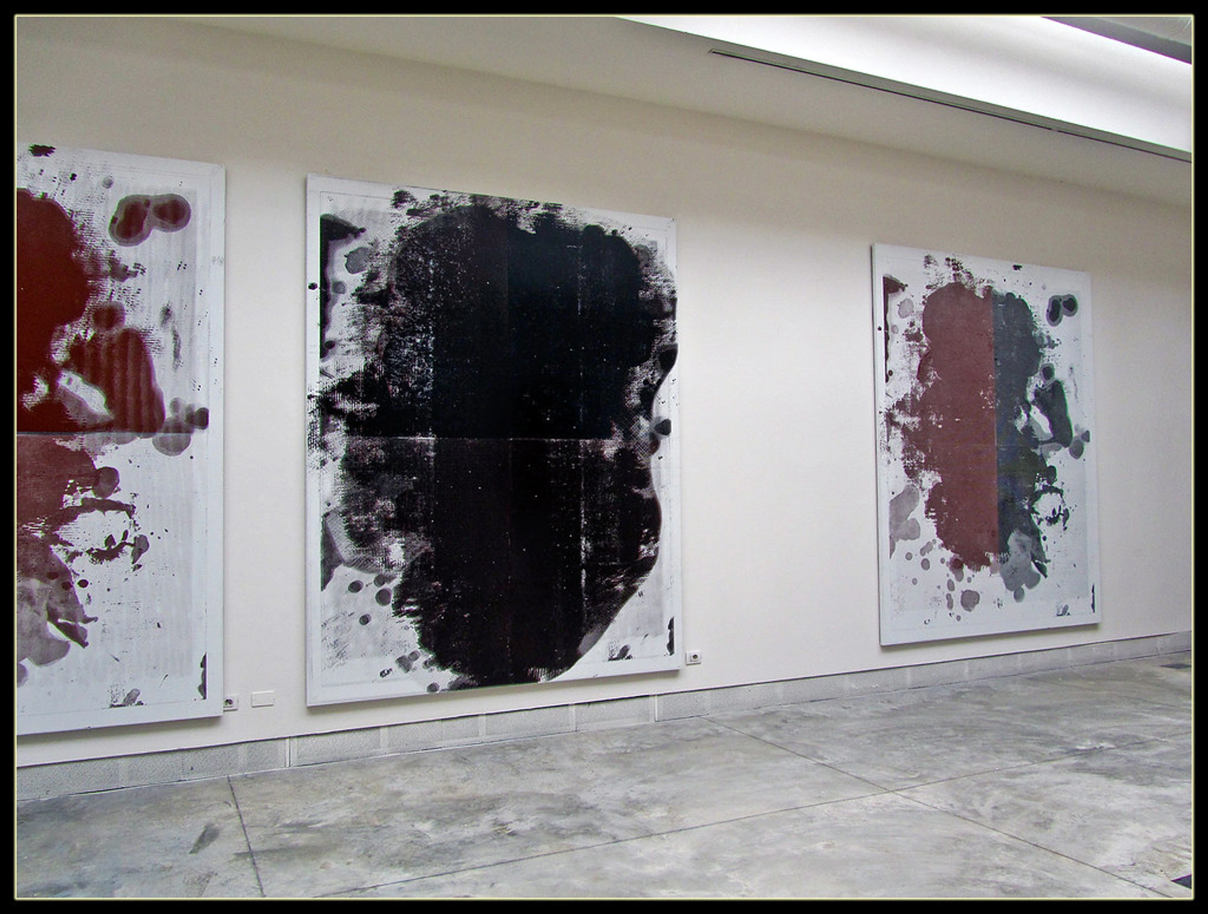
And if you're ever looking to bring a piece of this thoughtful, intuitive abstraction into your own space, feel free to explore my latest abstract art prints and paintings for sale, or perhaps visit my museum in 's-Hertogenbosch, NL to see these principles in action. My journey as an artist is ever-evolving, and you can delve deeper into it on my artist journey timeline.


