The 7 Elements of Art: Master Visual Language & Unlock Appreciation
Demystify art with this definitive guide to Line, Shape, Form, Space, Color, Value, and Texture. Empower your perception, understand any artwork from ancient masterpieces to digital design, and enrich your visual journey.
The 7 Elements of Art: Master Visual Language & Unlock Appreciation
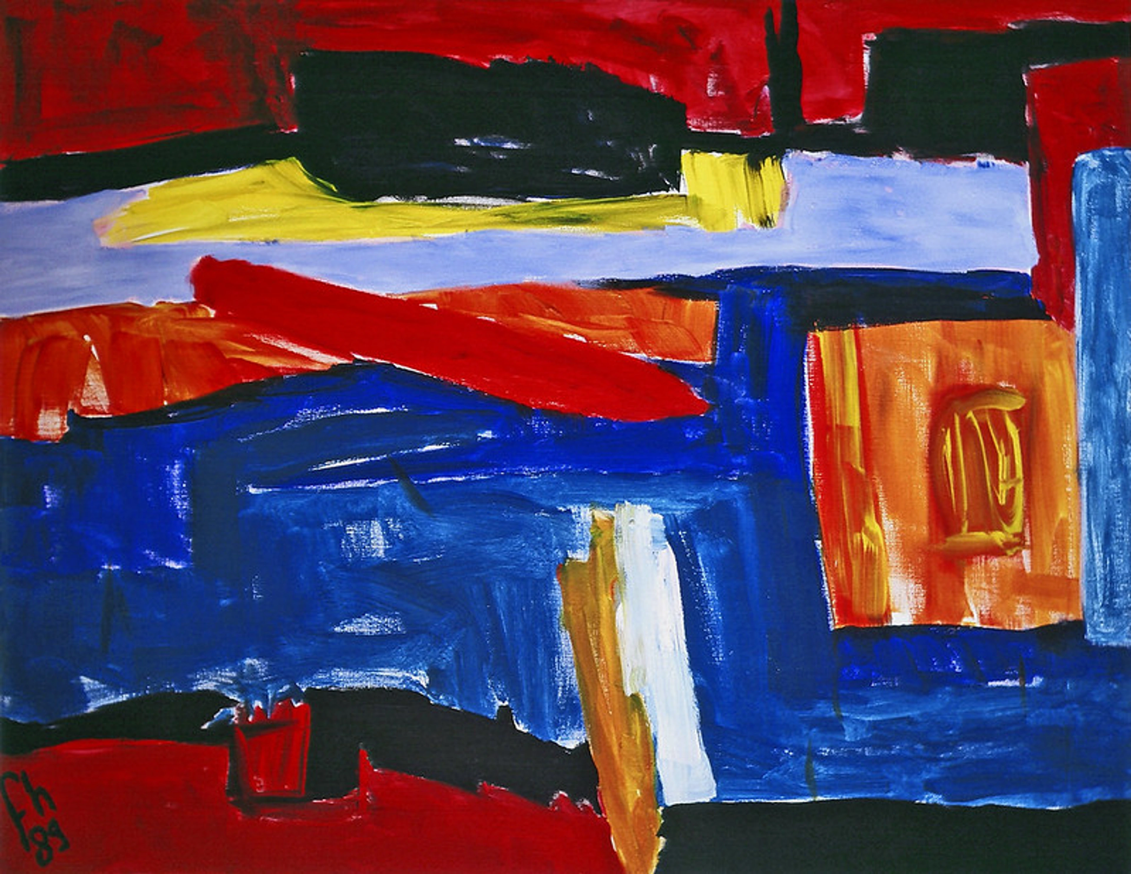
You know that feeling when you walk into a gallery, or scroll past an image online, and something just resonates? You're drawn in, thinking, "Okay, this looks compelling, but what am I truly supposed to be seeing here? What's the artist trying to tell me?" Trust me, I’ve been there. For years, art felt like this exclusive, secret club with its own arcane language. My art teacher, bless her heart, would say profound things like, "Notice the dynamic tension in that composition!" and I'd just nod sagely, my mind quietly insisting, "It's just... paint on a canvas, isn't it?" I remember staring at a Mark Rothko painting once, convinced it was just big rectangles of color, only for my teacher to patiently explain the subtle value shifts creating a sense of infinite depth. I just saw... paint. It took me a long, personal journey—filled with trial and error in my studio and more than a few blank stares at canvases—to realize those 'stuffs' weren't random at all.
Each was a carefully considered choice, a fundamental ingredient contributing to the artist's intended message, emotion, or feeling. Learning about the elements of art wasn't just about making my own art; it was about appreciating everyone else's too. It’s like the moment you finally distinguish the separate instruments in a complex symphony, or identify the individual spices in a gourmet dish. Suddenly, the entire experience isn't just happening to you; you're an active part of it. It just... opens up.
But here’s the wonderful truth: it really isn't an exclusive club. It’s simply about understanding the foundational building blocks, the very DNA of visual expression. And once you do, trust me, a whole new world of perception opens up. Today, I want to demystify some of those core ingredients. We're going to peel back the layers, one by one, focusing on the seven fundamental elements of art: Line, Shape, Form, Space, Color, Value, and Texture. This guide will unlock how they work together to create compelling visuals. Think of this as your friendly, no-pressure introduction to seeing art with new eyes. It transforms you from a passive observer into an active participant in the visual conversation, whether you're looking at a Renaissance masterpiece, a contemporary sculpture, or even a compelling website design.
A Humble Beginning: What Are the Elements of Art?
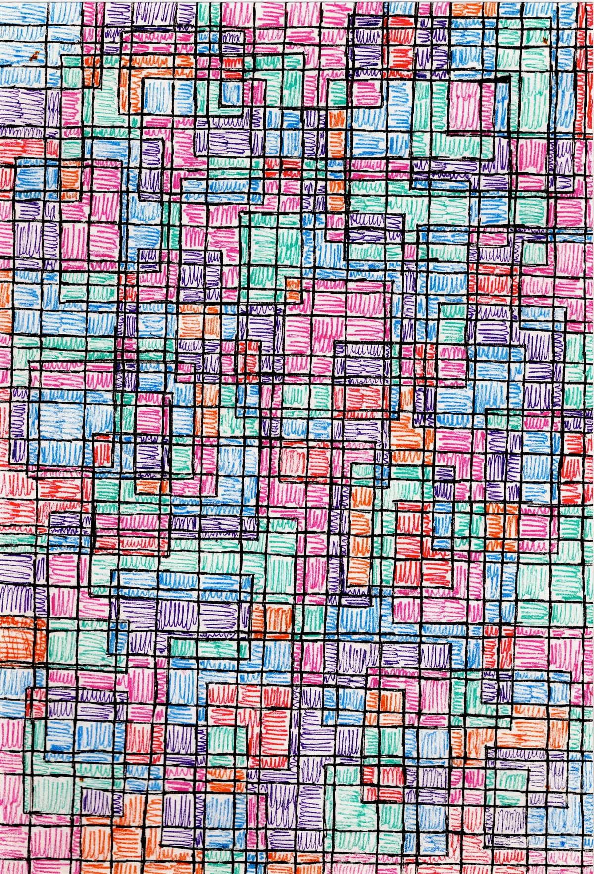
Before we dive into the specifics, let's frame this a bit. The elements of art are, essentially, the fundamental components or tools an artist uses to create a work of art. They are the visual grammar, the atomic structure from which all visual expressions are built. Historically, these elements weren't always formally categorized as they are today. Ancient Greek art, for instance, often emphasized form and proportion for ideal beauty, while early decorative arts frequently celebrated line and color. It's fascinating how our understanding has evolved over centuries! The commonly accepted framework in art education today, recognizing the full breadth of visual creation, includes seven: line, shape, form, space, color, value, and texture. These aren't new discoveries; artists have been intuitively working with them for centuries, from the earliest cave paintings to Renaissance masterpieces and cutting-edge contemporary installations. What has evolved is our formal understanding and articulation of their individual powers and how they intertwine to create a complete visual experience.
Once you grasp these, the way you look at a canvas, a sculpture, a photograph, or even a building will fundamentally change. They provide a vocabulary, a common ground for understanding creative intent and impact. Think of them as the basic ingredients in a chef's pantry – flour, sugar, eggs, butter. Individually, they have properties, but combined, they can create an infinite array of dishes. Similarly, artists combine these elements to craft unique visual narratives across all mediums.
Why These Seven? The Elements vs. Principles
These particular seven elements are considered foundational because they represent the most basic visual components we perceive. They cover everything from the simplest mark (line) to the light that reveals it (value) and the surface it occupies (texture). They allow for both two-dimensional representation and the illusion of three-dimensional reality, making them comprehensive tools for any visual artist. These elements are the 'what' – the fundamental building blocks. The principles of art (like balance, contrast, unity, rhythm, emphasis, and movement) are the 'how' – the methods an artist uses to arrange and organize those elements into a cohesive and impactful composition. Think of the elements as the individual notes on a musical scale (C, D, E, etc.), and the principles as the melody, harmony, and rhythm that turn those notes into a beautiful, evocative song. Learning to recognize them allows us to understand not just the art of the past, but also the visual language of graphic design, photography, film, digital interfaces, and even the everyday world around us. But these elements don't exist in a vacuum; they are guided by something else entirely. Let's explore the difference between the 'what' and the 'how'.
The Path We Follow: Line, More Than Just a Mark
I often think of line as the starting point, the primal mark, isn't it? Think about the first cave paintings, a child's excited scribble, or even just the path your eye follows across a landscape. A line is simply a mark made by a moving point, a path traced across a surface, but oh, the stories it can tell! It defines edges, suggests movement, and creates outlines. It can be thin and delicate, thick and bold, straight and rigid, or curved and flowing. Each quality evokes a different feeling. A jagged, broken line might convey anxiety, tension, or a sense of abruptness, while a smooth, continuous one speaks of calm, gentle flow, or even timelessness.
Historically, lines have been imbued with different significance. Consider the precise, almost sacred lines of Egyptian hieroglyphs, or the flowing, expressive brushstrokes in East Asian calligraphy, where each stroke tells a story of intention and inner spirit. Then you have the difference between a precise, architectural line (think of a Leonardo da Vinci anatomical drawing or a Bauhaus design) and a loose, gestural one (like a rapid sketch by an Abstract Expressionist). Both are lines, but with vastly different intentions and impacts. An artist might use a crisp, clean line to convey order and precision, as seen in the architectural drawings of the Bauhaus movement or the stark simplicity of minimalist art. Conversely, a frenetic, broken line can express chaos and intense emotion, much like Egon Schiele's raw self-portraits or the energetic strokes in a Cy Twombly piece. It’s all about intention. In graphic design and UI/UX, a simple line can define a brand’s elegance, its edgy modernity, or guide a user's eye across a digital interface.
I once tried to sketch a bustling market scene using only lines, without lifting my pen. It was, I admit, a glorious mess – less like a market and more like a startled spider had a very bad day – but it taught me so much about how lines can capture the energy of a place, not just its physical form. It was a good lesson in letting go of perfection and focusing on expression. Even a master like Vincent van Gogh used expressive, swirling lines in works like The Starry Night to convey intense emotion and movement, almost as if the canvas itself was trembling with his feeling. In my own abstract work, I often use sweeping, dynamic lines to direct the viewer's eye, creating a sense of journey or a controlled burst of energy, much like the lines I explore in The Definitive Guide to Understanding Line in Abstract Art. So, next time you look at art, see if you can trace the stories told by the lines!
Quick Tip: Next time you're sketching, try to draw an object using only continuous lines, without lifting your pen. Focus on the flow and character of the line itself. What surprising details emerge when you're forced to maintain an unbroken connection?
Reflection: How do different types of lines in your everyday environment (e.g., the strong lines of a skyscraper, the delicate lines of a spiderweb, the flowing lines of a river) evoke different feelings or direct your attention?
Enclosing Ideas: Shape Up! Understanding Forms on a Flat Surface
Alright, so you've got lines. What happens when a line connects to itself or intersects with others to enclose an area? You get a shape! Shapes are two-dimensional areas defined by lines, colors, or textures. Think of shapes as the fundamental building blocks of composition, dictating how the eye moves and rests within a piece. They are flat, having only height and width.
There are generally two types of shapes:
- Geometric Shapes: These are the ones you learned in math class – squares, circles, triangles, rectangles. They're precise, orderly, and often man-made or conceptual. They can evoke stability, structure, rationality, or even a sense of the abstract. Think of them as the neat, tidy soldiers of the art world, as famously seen in Piet Mondrian's grid compositions, which use geometric precision to explore universal harmony and balance. Their controlled nature can give a sense of calm, rigid order, or dynamic tension when juxtaposed, like the bold cut-out shapes in Henri Matisse's later work. Geometric shapes can also feel cold or alienating, as seen in the stark forms of Brutalist architecture, or convey certainty and power in corporate logos.
- Organic Shapes: These are irregular, natural, and free-flowing. Think of leaves, puddles, cloud formations, or the silhouette of a human body. They tend to be more fluid, softer, and appear frequently in nature-inspired art. These are the free-spirited dancers, bringing a sense of movement, unpredictability, and natural grace. Think of the swirling, biomorphic forms in the work of Joan Miró, evoking a dreamlike, playful quality, or the flowing figures in a Botticelli painting. Organic shapes can also evoke comfort, sensuality, or even chaos and raw emotion, depending on their execution, as seen in the expressive forms of Abstract Expressionism.
I find it fascinating how different artists use shapes to create distinct moods. A strict grid of squares can feel very different from a swirling cluster of organic forms. Each choice dictates the narrative and affects the overall composition. I remember trying to paint a landscape and realizing I was just drawing things, not thinking about the shapes they created. Once I started consciously composing with the underlying shapes – seeing trees as triangles and hills as curves – the whole piece gained a new sense of depth and intentionality. It's truly transformative, that shift in perspective, moving from merely depicting objects to consciously composing with their underlying shapes. In my own abstract work, I often play with the tension between sharp geometric shapes and softer, more ambiguous forms to create visual interest and rhythm, much like the designs you might find in architecture or textile patterns. So, what stories are the shapes around you trying to tell?
Quick Tip: Look around your room right now. Can you identify three distinct geometric shapes and three distinct organic shapes? How do they make you feel? Consider how they interact to define the space.
Reflection: How do shapes in logos or product designs influence your perception of a brand or object? Do sharp angles convey something different than soft curves?
Stepping into Three Dimensions: Form
So, if shape is two-dimensional – the flat blueprint – what happens when it gains depth and occupies real space? That's when we enter the realm of form. Form refers to objects that are three-dimensional, possessing height, width, and depth. In sculpture, architecture, or ceramics, form is literal – you can walk around it, touch it, feel its volume. Think of a sphere, a cube, or the human body in a bronze statue like Michelangelo's David. Just like shapes, forms can be:
- Geometric Forms: Precise, mathematical forms like cubes, cylinders, pyramids, and spheres. These often convey a sense of order, monumentality, or industrial design. Think of the minimalist sculptures of Donald Judd, which emphasize simple geometric forms and their presence in space, creating a dialogue between the object and its environment. Or consider the imposing geometric forms of ancient Egyptian pyramids, or the striking structures of Cubist sculptures by artists like Picasso, which dissect and reassemble forms to show multiple viewpoints simultaneously.
- Organic Forms: Regular or irregular, natural forms often found in nature, like a rock, a gnarled tree trunk, or the flowing contours of a body in motion. These tend to feel more alive, fluid, and relatable. Auguste Rodin's sculptures, for example, often capture emotional intensity through the raw, organic forms of the human figure, making the stone feel almost alive. Think also of the biomorphic sculptures of Henry Moore, whose reclining figures mimic natural landscapes.
In painting or drawing, artists create the illusion of form on a two-dimensional surface through techniques like shading, perspective, highlighting, and foreshortening (a technique used to create the illusion of an object receding strongly into the distance or foreground, making a limb appear to extend directly towards the viewer, seemingly shorter than its actual length). This illusion is primarily achieved through the careful manipulation of value (lightness and darkness) and color. It's the interplay of light and shadow, highlights and deep tones, that sculpts a flat surface into something that appears to have volume, making a canvas appear to hold a rounded apple or a massive mountain range. Henri Matisse's La Danse for instance, uses the human figure's organic forms, simplified yet still conveying volume and movement within the painting's flattened space. In my own abstract works, even though they exist on a flat canvas, I often use overlapping planes, shifts in value, and subtle textural cues to hint at a three-dimensional depth, inviting the viewer's eye to navigate imagined spaces within the composition, much like exploring The Definitive Guide to Understanding Form in Abstract Art. So, next time you see a 2D image, can you spot how the artist creates the illusion of form?

https://upload.wikimedia.org/wikipedia/commons/8/87/Henri_matisse,_la_danse.jpg, licence
Quick Tip: Pick a simple object near you, like a mug or a book. Try to draw it using only lines and shading to create the illusion of its three-dimensional form on a flat piece of paper. Notice how light and shadow define its volume.
Reflection: Think of a building you admire. How does its use of geometric or organic forms contribute to its overall feeling or purpose, from monumental solidity to fluid grace?
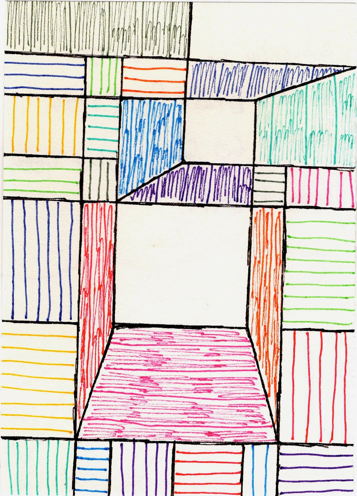
The Unseen Canvas: Space
Speaking of creating illusions and occupying volume, let's talk about space. Space is perhaps the most elusive of the elements because it's not always a tangible "thing"; it's the area around, between, and within objects in a work of art. It's the breathing room, the depth, the sense of distance or closeness, the emptiness that holds everything else. We often talk about two types:
- Positive Space: This is the actual object or subject itself. The figures in a portrait, the buildings in a cityscape, or the bold shapes in one of my abstract paintings for sale. It’s the occupied area.
- Negative Space: This is the empty area surrounding the positive space. Think of the sky behind a mountain, or the gaps between tree branches. Artists can manipulate negative space to create visual interest, define the positive elements, and even tell a story through what isn't there. Sometimes, the negative space can be just as compelling as the positive, turning the 'nothing' into 'something.' Consider M.C. Escher's impossible constructions where negative space becomes positive, or traditional Japanese ink paintings where vast empty spaces hold profound meaning and tranquility, often used to evoke a sense of emptiness, isolation, or even profound calm. In photography, film, and installation art, negative space is crucial for framing subjects, conveying isolation or scale, and creating immersive environments, or even generating a feeling of tension or unease when used deliberately.
Artists also create the illusion of depth in two-dimensional art to mimic the three-dimensional world. This can be achieved through:
- Linear Perspective: Using converging lines to suggest distance, where objects appear smaller as they recede into the distance. Famously developed during the Renaissance (e.g., Masaccio's Holy Trinity), it creates a powerful illusion of deep space.
- Atmospheric Perspective: Making distant objects appear hazy, less detailed, and often bluer, as if seen through a veil of air, due to atmospheric haze. Think of how mountains in the distance appear bluish and faint, a technique often seen in Romantic landscape paintings by Turner or Constable.
- Overlapping: Simply placing one object in front of another to imply depth.
- Placement on the Picture Plane: Objects placed lower on the canvas often appear closer to the viewer.
- Scale: Larger objects often appear closer than smaller ones.
While deep space is often the goal, some modern artists, like those in Cubism or certain Fauvist works, intentionally flatten space to emphasize the two-dimensional nature of the canvas itself, creating a compressed, intense experience – often called shallow space. Robert Delaunay, in his "Rhythm, Color, Joie de Vivre" series, used overlapping, translucent geometric shapes to create a dynamic sense of shallow, rhythmic space, playing with how forms advance and recede without relying on traditional perspective. This flattening can evoke a sense of claustrophobia or energetic tension, challenging traditional notions of reality. In my own work, I love playing with the interplay of overlapping forms and subtle shifts in value to create a sense of expansive, layered space that draws the viewer in. It's a journey, much like the one I describe in Understanding Form and Space in Abstract Art. So, next time you look at a composition, consider what the empty spaces are telling you.

https://www.flickr.com/photos/42803050@N00/31171785864, licence
Quick Tip: Next time you look at a painting or a photograph, try focusing on the empty spaces – the negative space. What do they tell you? Do they frame the positive space, or do they become a subject in themselves, guiding your eye or creating a sense of balance?
Reflection: How is space used in advertisements or web design to guide your eye, create a sense of simplicity versus clutter, or establish a visual hierarchy?
The Heart's Palette: Diving into Color
Ah, color! Now we're getting into the truly evocative stuff. Color is probably the first thing that grabs your attention in any artwork, isn't it? It's powerful, emotional, and incredibly complex. It's the silent language that speaks directly to your soul, often before your brain has even had a chance to process anything else.
We break down color into three main properties:
- Hue: This is the pure color itself – what we commonly refer to as red, blue, green, yellow, etc. It's the name of the color on the color wheel.
- Saturation (or Chroma): This refers to the intensity or purity of a color. A highly saturated color is vivid and bright, while a desaturated color is duller, closer to gray. Think of a vibrant primary red versus a muted, dusty red. It's the difference between a scream and a whisper.
- Value: This is the lightness or darkness of a color. How much white or black is mixed into a color. A light blue has a high value, a dark blue has a low value. We'll delve into value more deeply next, but it's critical for understanding how colors interact and create form.
The interplay of these aspects is what creates the magic. A simple shift from a vibrant, high-saturation red to a muted, desaturated one can completely alter the feeling of a piece. Artists like the Fauves (e.g., Henri Matisse, André Derain) famously used bold, non-naturalistic colors to express emotion rather than to describe reality, proving color's immense expressive power. Impressionists like Claude Monet, on the other hand, explored optical color, using small dabs of pure color that would blend in the viewer's eye to capture fleeting moments of light and atmosphere, rather than relying on local color (the true color of an object). Mark Rothko's large-scale color field paintings, for example, rely almost entirely on the emotional and spatial effects of carefully chosen hues and their interactions, demonstrating how powerful color alone can be, leading the viewer into deep contemplation. Surrealists like René Magritte might use unexpected color combinations to create dreamlike or unsettling moods.
Beyond aesthetics, color wields incredible psychological power. A vibrant red might scream passion or danger, while a cool blue can whisper calm, sorrow, or melancholy. Yellow can evoke joy and optimism, but in excess, it can also suggest anxiety. Artists also leverage color temperature – the perception of colors as "warm" (reds, oranges, yellows, which tend to advance visually and energize) or "cool" (blues, greens, purples, which tend to recede and calm). Beyond this, understanding color harmony (complementary, analogous, triadic schemes) is key; artists use these relationships to create balance, contrast, or a specific mood. Think of how a brand uses specific colors to evoke trust or excitement in digital marketing, or how a film director uses a cool color palette for a somber scene in animation.
I've spent countless hours experimenting with color, trying to capture that perfect shade that just feels right. Sometimes it's a bright, energetic yellow that screams joy, other times it's a deep, moody indigo that whispers contemplation. For me, a vibrant, almost electric blue always evokes a sense of expansive calm, a feeling I often try to translate into my abstract pieces. Color can literally change your mood, transport you to a memory, or make you feel something you didn't even know you were carrying. Don't believe me? Try staring at a monochromatic painting for a while, then shift your gaze to something explosively vibrant. The difference is palpable. So, next time you encounter a striking color, take a moment to really feel what it's telling you.
If color theory really intrigues you (and it should!), I've explored it quite a bit in other articles. Check out How Artists Use Color or even The Psychology of Color in Abstract Art for more insights. And for a truly comprehensive look, there's always The Definitive Guide to Understanding Color Theory.
Quick Tip: What color are you most drawn to today, and what feeling does it stir within you? Try to describe why that color appeals to you – its hue, its intensity, its lightness, or perhaps its temperature. How might you incorporate that feeling into a simple doodle or sketch?
Reflection: How do cultural contexts or personal experiences influence the symbolic meaning of certain colors for you? Does red mean love, anger, or something else entirely in your personal visual dictionary?
The Light and Shadow Dance: Value
Closely tied to color, yet distinct and arguably more fundamental for creating realism, is the element of value. Value refers to the lightness or darkness of a color or a tone, ranging from pure white (highest value) to pure black (lowest value), and all the grays in between. It's not about what color something is, but how light or dark it appears. Think of it as the intensity of light falling on an object, or the absence of it. Imagine seeing the world in black and white – all you'd have is value, and it would still convey immense information about form and depth.
Value is crucial for creating contrast, which grabs attention and guides the viewer's eye. High contrast (light next to dark) can create drama, intensity, and make objects pop, while low contrast (subtle shifts in light and dark) can evoke calm, mystery, or a sense of softness. Artists also use value to create the illusion of form and depth – this technique, often called chiaroscuro (Italian for light-dark, emphasizing the strong interplay of light and shadow), was mastered by artists like Rembrandt and Caravaggio, who used dramatic contrasts to make figures emerge from deep shadows with striking realism and emotional weight. But its application isn't limited to historical painting; you can see chiaroscuro's dramatic impact in the moody lighting of film noir cinematography, or in the stark, emotive photography of artists like Edward Weston. Even in a monochrome piece, a print, a pencil sketch, or a black-and-white photograph, I've seen how the interplay of values alone can convey a powerful narrative or mood, without a single splash of color. Cinematographers also heavily rely on value to establish mood and focus, using lighting to sculpt scenes.
In my own abstract paintings, I often rely on strong value contrasts to establish distinct focal points and create a sense of movement or tension within the composition, even when working with a vibrant palette. It’s the underlying skeletal structure that gives my colors their punch and my forms their presence, much like the deep dive in The Definitive Guide to Understanding Value in Art. So, next time you see an image, try to mentally strip away the color and focus on the power of light and shadow!

https://www.flickr.com/photos/abstract-art-fons/30634352376, licence
Quick Tip: Take a photograph with your phone and convert it to black and white. Now, focus solely on the value range – the lights, darks, and grays. How does this simplified view change your perception of the image and its mood? Can you identify the lightest and darkest areas?
Reflection: How do shadows and highlights on an everyday object reveal its form and material properties? How does the changing light throughout the day alter its perceived value and drama?
A Tactile Invitation: Feel the Surface, The World of Texture
Lastly, let's talk about texture. This is the element that deals with the perceived surface quality of a work of art. It’s how something feels or how it looks like it would feel if you could touch it. Texture engages our haptic sense, even when we can only perceive it visually. It's a fundamental part of how we experience the physical world, telling us about material, age, and even emotional state.
You can have:
- Actual Texture (Impasto): This is the physical surface you can feel – rough impasto paint (thickly applied paint that stands off the canvas, famously used by Van Gogh, Abstract Expressionists, and contemporary artists like Anselm Kiefer or Julian Schnabel, who build up their surfaces with mixed media), the smooth polished marble of a classical sculpture, the grainy wood of a carving, or bumpy collage elements. It adds a tangible dimension to the artwork, inviting a haptic experience. The satisfying grit of sand mixed into paint, or the cool, smooth glide of a palette knife, are physical experiences for both the artist and, implicitly, the viewer. In architecture, the texture of materials like rough concrete, gleaming glass, or weathered brick deeply impacts the building’s aesthetic and sensory experience.
- Implied Texture: This is when an artist creates the illusion of texture using visual techniques on a flat surface. A painter might use specific brushstrokes (e.g., short, broken lines for roughness; long, smooth strokes for silkiness), stippling (dots for graininess), cross-hatching (intersecting lines for density), or patterns to make a flat canvas look like rough bark, intricate lace, or silky fabric, even though it's perfectly smooth to the touch. Techniques like scumbling (applying thin layers of opaque or semi-opaque paint unevenly to create a broken, textured effect) or glazing (applying thin, transparent layers of paint to create depth and luminosity) are often used to create these illusions. This is a common trick in trompe l'oeil paintings, which aim to "deceive the eye," or in hyperrealistic drawings. The difference between a photograph of a rough rock and the rock itself is a perfect example of implied versus actual texture.
I’m a big fan of texture in my own work. I love how a chunky stroke of paint can catch the light differently, or how a subtle layering can add unexpected depth. It's a way of inviting the viewer into the piece, making them want to reach out and experience it beyond just their eyes. There's a certain honesty in actual texture, a raw physicality that I find incredibly appealing. It grounds the artwork, gives it a physical presence, and adds another layer of sensory engagement to my abstract compositions. Sometimes, the texture itself tells as much of a story as the colors or shapes, drawing you in with its tangible presence, much like the tactile surfaces you can explore in my museum in 's-Hertogenbosch. You can learn more in The Definitive Guide to Understanding Texture in Art or Exploring Texture: My Favorite Techniques. So, what textures are you drawn to, and what do they communicate to you?
Quick Tip: Look at the surface of an object in your immediate surroundings. Is its texture actual or implied? How does the artist (or nature) achieve that texture visually? Try to describe its textural qualities with words – is it smooth, coarse, slick, gritty, soft, hard?
Reflection: How does the implied texture in a photograph or a digital illustration contribute to its realism or emotional impact? How can artists use texture to evoke feelings beyond just sight, like warmth, cold, comfort, or danger?
Weaving It All Together: The Art of Composition
So, we've explored the individual ingredients. But how do they truly come together to create a masterpiece? These seven elements aren't isolated; they're constantly interacting, dancing together to create the whole. Understanding how they work individually gives you the vocabulary, but seeing how they combine is where the real magic happens. This interplay creates what we call composition: the arrangement of visual elements in a work of art. It's the unseen structure that guides your eye, creates rhythm, and conveys the artist's message, much like an orchestra conductor arranges instruments and musical phrases.
Think of it this way: an artist doesn't just throw lines, shapes, and colors onto a canvas. They carefully consider principles of art to orchestrate these elements. Let's look at how:
- Unity: How all parts feel harmonious and belong together, creating a sense of completeness. An artist might achieve unity by repeating a particular shape or a consistent color palette throughout the work, making everything feel connected, like the monochromatic calm of a Giorgio Morandi still life.
- Variety: Introducing differences in the elements to avoid monotony and create visual interest. Juxtaposing a smooth texture with a rough one, or a curved line with a straight one, adds dynamic variety, preventing a piece from feeling stagnant.
- Balance: Distributing visual weight in a way that feels stable (symmetrical or asymmetrical). This can be done by carefully placing large forms against smaller ones, or a vibrant, attention-grabbing color against a neutral background. Think of a perfectly balanced scale, visually.
- Emphasis: Creating focal points or areas that draw the viewer's eye first. A strong contrast in value, a highly saturated color, or a distinct shape can easily create emphasis, making a specific element pop and direct the viewer's attention, like a bright red dot in a muted composition.
- Movement: Directing the viewer's eye through the work, often through the arrangement of lines (like diagonal lines leading the eye) and repeating shapes. This creates a visual path for the eye to follow, a dynamic flow through the artwork.
- Rhythm: The repetition of elements to create a sense of organized movement or visual beat within a composition. Think of a series of repeating shapes or a consistent pattern of alternating values that lead your eye across the canvas, much like the beat in music.
- Contrast: The juxtaposition of opposing elements (e.g., light/dark value, rough/smooth texture, large/small shape, warm/cool color) to create visual excitement and emphasis. This is the spice that adds drama and energy, making elements stand out against each other.
Whether it's the dynamic arrangement of geometric forms in a Cubist painting (like Picasso's early works) or the harmonious color fields of an Abstract Expressionist (like Helen Frankenthaler), the artist is always composing. The elements are the ingredients, and the principles of design are the recipe, defining how those ingredients are mixed and presented. This applies not just to traditional art, but also to digital art, graphic design, user interface design, and even everyday visual communication like advertising and product packaging. Understanding this interplay allows you to 'read' the intention behind almost any visual creation.
In my own work, especially my contemporary and often abstract art, composition is paramount. I'm always thinking about how a bold, sweeping line will lead the eye through a vibrant shape (or form), how contrasting colors will create tension, or how layered textures will add depth. My goal is to orchestrate these elements into a cohesive visual experience that speaks to the viewer, whether it's destined for a gallery wall or a collector's home through my art for sale here. It's a continuous exploration, much like my entire artist's timeline, and one that truly comes alive in my museum in 's-Hertogenbosch. By understanding these elements and principles, you become a more engaged viewer, appreciating not just what you see, but how it's been crafted, which makes the whole experience incredibly rich.
To dive even deeper into this orchestral aspect of art, explore What is Design in Art or even My thoughts on Composition. And for a broader perspective on abstract art, you might find The Definitive Guide to Understanding Abstract Art insightful. It’s all connected, I promise. These elements are not just abstract concepts; they're the language I use to tell my story, and they can be the language you use to understand and appreciate it.
Your Own Art Journey: A Few Parting Thoughts
So, what's the takeaway from all this? It's not about becoming an art critic overnight. It's about empowering your eyes. It’s about walking into that gallery or looking at a painting on your wall and, instead of feeling lost, feeling a spark of recognition. "Aha! Look at that expressive line!" or "Wow, the artist really used cool colors and high contrast to create that mood." That recognition, that understanding, makes the experience of art infinitely richer, allowing you to connect with the artist's intention on a deeper level. This newfound visual literacy extends beyond canvases – it sharpens your perception of the world, from the composition of a photograph to the design of a product, from film to fashion, and yes, even to understanding the intentional choices in my own abstract pieces. So, go forth and look. Really look. The world is a canvas, and now you have a better understanding of its paints and brushes. The journey of seeing never truly ends. What will you discover next? Perhaps your own hidden artistic talent, or a deeper appreciation for the art that surrounds you, whether it's a masterpiece in a museum or one of my artworks for sale.
Glossary of Key Terms: Your Visual Vocabulary
To help you on your art journey, here's a quick reference for some of the terms we've discussed, including the foundational elements themselves, to empower your visual vocabulary:
- Actual Texture: The physical surface you can feel, created by the material and application (e.g., impasto paint, carved wood), adding a tangible dimension to the artwork.
- Atmospheric Perspective: A technique where distant objects appear blurrier, lighter, and cooler in color due to atmospheric haze, creating a compelling illusion of depth, as if seen through a veil of air.
- Balance: A principle of art describing the distribution of visual weight in a stable way (symmetrical or asymmetrical), ensuring a composition feels grounded and harmonious.
- Chiaroscuro: (Italian for light-dark) The dramatic use of strong contrasts between light and dark values, usually bold contrasts affecting a whole composition, to create a profound sense of volume and emotional intensity in modeling three-dimensional objects and figures.
- Chroma (Saturation): The intensity or purity of a color; how vivid or dull it is, impacting the emotional punch or subtlety of a hue.
- Color: The element of art derived from reflected light, characterized by its hue, saturation, and value, acting as a powerful emotional and compositional tool.
- Color Harmony: The aesthetic quality achieved through the strategic combination of colors based on color theory (e.g., complementary, analogous, triadic schemes), creating a sense of visual cohesion or dynamic tension.
- Color Temperature: The perception of colors as "warm" (reds, oranges, yellows, which tend to advance visually and energize) or "cool" (blues, greens, purples, which tend to recede and calm), influencing mood and spatial perception.
- Composition: The arrangement of visual elements in a work of art, guided by the principles of art, to create a unified, impactful, and coherent whole, directing the viewer's eye.
- Contrast: The difference between elements in a work of art (e.g., light and dark value, rough and smooth texture, large and small shape, warm and cool color), used to create visual excitement, emphasis, and drama.
- Emphasis: A principle of art used to create focal points or areas that draw the viewer's eye first, often through contrast or placement, highlighting key aspects of the artwork.
- Fauvism: An early 20th-century art movement characterized by the revolutionary use of bold, vivid, and often non-naturalistic colors for raw expressive effect, rather than realistic depiction.
- Form: A three-dimensional object or the illusion of three dimensions on a two-dimensional surface, possessing height, width, and depth, giving objects a sense of volume and presence.
- Foreshortening: A technique used to create the illusion of an object receding strongly into the distance or foreground on a two-dimensional surface, making a limb or object appear shorter than its actual length by depicting it at an angle that recedes sharply towards or away from the viewer.
- Geometric Forms: Precise, mathematical three-dimensional objects (e.g., cubes, cylinders, pyramids, spheres), often conveying order, stability, or monumentality.
- Geometric Shapes: Precise, mathematical two-dimensional areas (e.g., squares, circles, triangles, rectangles), typically evoking structure and order.
- Hue: The pure color itself (e.g., red, blue, green); the specific name of the color on the color wheel, independent of its lightness or intensity.
- Implied Texture: The illusion of texture created by visual techniques on a flat surface (e.g., specific brushstrokes, patterns, cross-hatching), making a smooth surface appear rough or silky.
- Impasto: Paint applied thickly so that it stands out from the surface, creating actual, palpable texture, adding physicality and depth.
- Line: A mark made by a moving point; a path traced across a surface, defining edges, suggesting movement, and conveying emotion.
- Linear Perspective: A system of creating an illusion of depth on a flat surface through converging lines, where objects appear smaller and lines seem to meet at a vanishing point as they recede into the distance.
- Local Color: The natural color of an object as seen in normal, average light, before any artistic interpretation or atmospheric effects.
- Movement: A principle of art used to direct the viewer's eye through the work, often through the arrangement of lines, shapes, and other elements, creating a sense of flow or action.
- Negative Space: The empty area surrounding and between the main subjects or objects in an image, which can be just as important as the positive space in defining form and conveying meaning.
- Optical Color: The effect of colors blending in the viewer's eye, rather than on the palette, often achieved through small dabs of pure color placed close together, as seen in Impressionism.
- Organic Forms: Irregular, natural three-dimensional objects often found in nature (e.g., a rock, a gnarled tree trunk, the human figure), tending to feel more fluid and alive.
- Organic Shapes: Irregular, natural two-dimensional areas often found in nature (e.g., leaves, clouds, human silhouettes), conveying a sense of fluidity and naturalness.
- Overlapping: A simple compositional technique where placing one object in front of another creates the illusion of depth and spatial relationship.
- Placement on the Picture Plane: A compositional technique where objects placed lower on the canvas often appear closer to the viewer, implying depth, while higher objects recede.
- Positive Space: The space occupied by the main subjects or objects in an artwork, drawing the primary attention.
- Principles of Art: The methods an artist uses to arrange and organize the elements of art (e.g., balance, contrast, unity, rhythm), guiding the composition to create a cohesive whole.
- Rhythm: The repetition of elements to create a sense of organized movement or visual beat within a composition, guiding the eye and creating harmony.
- Saturation (Chroma): The intensity or purity of a color; how vivid or dull it is, impacting the emotional punch or subtlety of a hue.
- Scale: The relative size of objects within an artwork, often used to imply distance, importance, or comparison.
- Scumbling: An implied texture technique involving applying thin layers of opaque or semi-opaque paint unevenly over a dry area to create a broken, shimmering, or textured effect.
- Shape: A two-dimensional enclosed area, defined by lines, colors, or textures, having only height and width, serving as a fundamental building block of composition.
- Space: The area around, between, and within objects in a work of art, often manipulated to create a sense of depth, emptiness, or intimacy.
- Texture: The perceived surface quality of a work of art, either actual (tactile and physical) or implied (a visual illusion), engaging our sense of touch.
- Trompe l'oeil: (French for "deceives the eye") An art technique that creates the illusion of photographic reality, often using implied texture and perspective to make two-dimensional objects appear three-dimensional.
- Unity: A principle of art referring to how all parts of a work feel harmonious and belong together, creating a sense of completeness and visual coherence.
- Value: The lightness or darkness of a color or tone, ranging from pure white to pure black, and all the grays in between, crucial for defining form and creating contrast.
- Variety: A principle of art involving the introduction of differences in the elements to avoid monotony and create visual interest, keeping the composition dynamic and engaging.
FAQ: Quick Answers to Common Questions
Here are some common questions you might have as you begin your journey into understanding art:
What are the 7 elements of art?
The seven universally accepted elements of art are: line, shape, form (three-dimensional quality), space (area around and within objects), color, value (lightness or darkness), and texture. For a truly comprehensive overview, you can explore Understanding Elements of Art: A Comprehensive Guide.
Why is it important to understand the elements of art?
Understanding these elements helps you appreciate and analyze art more deeply. It gives you a vocabulary to discuss what you see, helps you understand an artist's choices, and can even inspire your own creative endeavors. For me, it was like learning musical notation, not just to play, but to truly hear the layers in a symphony, to understand why a certain passage gives me goosebumps. It turns a passive glance into an active, engaging conversation, extending to everyday visual media like photography, film, graphic design, and even digital interfaces. Understanding these elements helps you see why my abstract pieces might evoke a certain feeling, how a bold line leads your eye, or how contrasting colors create energy within a composition. It unlocks a richer understanding of the entire visual world.
How can I practice seeing these elements?
The best way is to simply observe, and then to play! Try a "visual scavenger hunt" for a week – it's fun, I promise:
- Day 1 (Line): Spend a day noticing all the lines around you – architectural lines, natural lines, lines in patterns. Sketch a simple object, focusing only on its outline with a continuous line.
- Day 2 (Shape): Look for geometric vs. organic shapes in everything. Try to break down a complex scene into its fundamental shapes.
- Day 3 (Form): Observe how light and shadow create the illusion of form on objects. Try drawing a piece of fruit using only shading to show its roundness, noticing how values sculpt its volume.
- Day 4 (Space): Pay attention to positive and negative space in photos, ads, and rooms. How does empty space impact what you notice? Can you see objects within the negative space?
- Day 5 (Color): Notice hues, saturation, and value in clothing, nature, and art. What emotional responses do different colors evoke? Why might a red feel different than a blue?
- Day 6 (Value): Convert a photo to black and white and study the range of lights and darks. How does value alone define objects and create mood, even without color?
- Day 7 (Texture): Touch surfaces, then look at photos of surfaces. Can you distinguish actual from implied texture? How do artists suggest rough or smooth without you actually touching it?
The more you look, and the more you try to recreate, the more you'll see. It’s an ongoing, rewarding practice.
What's the difference between an element of art and a principle of art?
This is a great question, and one I often explain! Think of the elements of art as the building blocks or ingredients – the basic components like line, shape, color. They are the 'what' of art. The principles of art are how you organize or arrange those elements to create a pleasing or effective composition – they are the 'how' of art. Principles include things like balance, contrast, unity, rhythm, and emphasis. So, you use the elements according to the principles, much like a chef uses ingredients following a recipe to create a delicious dish, or a musician arranges notes into a symphony. The elements are the notes, the principles are the score.
Ultimately, art is a conversation. And by understanding these basic elements – line, shape, form, space, color, value, and texture – you’re not just listening in; you're learning how to participate. It’s a pretty cool feeling, I think. And maybe, just maybe, it’ll make you fall a little bit more in love with the incredible, intricate world of visual expression. Give it a try; you've got nothing to lose and a whole lot to gain by truly seeing the art around you. The world is waiting for your new perspective.


