
Japandi Art: The Ultimate Guide to Cultivating Calm & Consciousness in Your Home
Unlock the serene world of Japandi art. This ultimate guide explores wabi-sabi, ma, and kanso, offering actionable tips on choosing and placing authentic, handcrafted pieces to create a tranquil, mindful sanctuary.

The Ultimate Guide to Japandi Art: Cultivating Calm, Craft, and Consciousness in Your Home
I often find a profound sense of peace and relief when I step into a space that just… breathes. It’s a quiet confidence, an inherent thoughtfulness, and everything seems to hum in perfect harmony. For me, that feeling often comes from a Japandi interior. As an artist who finds immense peace in crafting spaces that breathe and in pieces that tell a story, I’ve discovered that Japandi art is more than just decor; it's a profound philosophy I deeply connect with and actively pursue in my own work. It's like stepping into a gentle sigh of relief, an immediate antidote to the constant hum of my own anxious brain. Honestly, who wouldn't want the serene simplicity of Japanese design married with the cozy, functional warmth of Scandinavian style? It’s truly the best of both worlds – disciplined calm with a comforting hug, a space meticulously designed to quiet the mental chatter and foster deep mindfulness and well-being.
I've spent quite a bit of time fumbling my way through decorating decisions, and finding the right art for a Japandi home can feel like a delicate dance, a subtle art in itself. It’s not just about picking something pretty; it’s about choosing a piece that truly resonates with the essence of the style, a piece that quietly supports that tranquil atmosphere and acts as a genuine act of self-care. And I'm here to tell you how I've learned to do it, celebrating every discovery and every misstep along the way. In this essential guide, we’ll dive deep into the soul of Japandi art, from its philosophical roots to practical, actionable tips for finding and placing the perfect pieces that truly breathe with your space. We’ll explore what makes Japandi art unique, what types of pieces work best, and how to place them to foster deep calm. If you're generally curious about the bigger picture of home decor, I've got some thoughts on how to decorate a house too – it all starts with intention, doesn't it?
Key Japandi Terms: A Quick Glossary
Before we dive too deep, let’s quickly clarify some essential terms that will pop up throughout our journey into Japandi art. I find it really helps to have these concepts clear in your mind right from the start; they're the quiet anchors of the entire aesthetic, crucial for cultivating a truly mindful home.
- Hygge: (Danish/Norwegian) A quality of coziness and comfortable conviviality that engenders a feeling of contentment or well-being. Think of being wrapped in a warm blanket with a good book on a rainy day. It's about creating a warm, inviting atmosphere.
- Wabi-Sabi: (Japanese) A worldview centered on the acceptance of transience and imperfection. The aesthetic is sometimes described as one of appreciating beauty that is "imperfect, impermanent, and incomplete." Imagine the subtle crackle glaze on an old ceramic bowl, or the elegant way a weathered stone holds its story. This concept is core to wabi-sabi decor.
- Ma: (Japanese) An awareness of space and time, involving a deliberate pause or interval. It refers to the empty space that is full of meaning and significance, rather than simply being an absence of things. Think of the deliberate stillness of a dancer pausing between movements, making the next move more impactful. It's about letting things breathe.
- Mono No Aware: (Japanese) A gentle, poignant appreciation for the transient nature of beauty and life, a bittersweet awareness of impermanence. It's the feeling evoked by watching cherry blossoms fall, knowing their beauty is fleeting.
- Kanso: (Japanese) The principle of simplicity, the elimination of clutter, and the beauty of restraint. It's about presenting things in their simplest, most natural form, free from non-essential elements. Think of a single, perfectly formed branch in a minimalist vase, allowing its inherent beauty to shine without distraction.
Understanding Japandi: The Fusion of Calm and Craft
Before we even get to the art, let's clear up what we're talking about, shall we? Japandi isn't just a fleeting trend; it's a profound philosophy, a purposeful blend of the minimalist, functional elegance of Scandinavian design with the refined, serene aesthetic of Japanese design. When I first encountered it, I thought, "This is it. This is what my anxious brain needs, a true sanctuary." It’s about creating a tranquil refuge, a soft antidote to the chaos outside, where every single element, especially your art, contributes to a deep, abiding sense of peace and harmony in home decor. As an artist, I've personally found this fusion to be a guiding light, a way to create spaces and artworks that genuinely soothe and inspire contemplation, fostering a space for genuine mindful living.
The Japandi Fusion: A Quick Comparison
To make it even clearer, here's how these two beautiful philosophies meet in the middle, setting a distinct mood for your home and art choices, especially when selecting Japandi wall art and calming art for a tranquil home.
Aspect  | Scandinavian Design (Hygge) | Japanese Design (Wabi-Sabi, Ma, Kanso) | Japandi Fusion (Harmony) | Mood/Feeling Evoked |
|---|---|---|---|---|
| Philosophy | Cozy comfort, warmth, well-being | Imperfection, transience, simplicity, natural cycles | Balanced simplicity, mindful living, serene tranquility | Inviting, Comfortable, Reflective, Grounded |
| Key Elements | Light woods, soft textiles, functionality | Clean lines, craftsmanship, raw materials, negative space | Uncluttered spaces, natural textures, quiet elegance | Authentic, Minimalist, Thoughtful |
| Color Palette | Bright whites, light greys, pastels | Muted earth tones, deep neutrals, black | Warm beiges, soft greys, creamy whites, subtle greens | Calm, Subtle, Cohesive, Earthy |
| Materials | Birch, pine, wool, cotton, glass | Bamboo, rice paper, ceramics, dark wood | Light & dark woods, linen, clay, muted natural fibers, stone | Organic, Tactile, Natural, Enduring |
| Feeling | Comfortable, Casual, Secure | Meditative, Disciplined, Introspective | Grounded, Harmonious, Peaceful, Mindful | Tranquil, Balanced, Zen |
The Roots of Japandi: A Quiet Dialogue Across Continents
To truly grasp Japandi, we need to understand its parent styles. On one side, we have Scandinavian design, born from a desire for functional beauty, light, and warmth in colder climates. It emphasizes hygge – that Danish concept of cozy contentment and well-being, like being wrapped in a warm blanket with a good book on a rainy day. Think natural light, sustainable materials like light woods (birch, pine), and cozy, tactile textiles (wool, cotton, linen). Pioneering figures like Alvar Aalto, known for his organic forms and innovative use of bent plywood, and Arne Jacobsen, a champion of functionalist design, famously championed this blend of organic forms with practical purpose, influencing everything from furniture to architecture. Other influential Scandinavian designers like Hans Wegner with his iconic chairs emphasizing natural materials and craftsmanship, and Børge Mogensen known for his functional, simple wooden furniture, also contributed to this ethos of design for the many, focusing on accessibility, durability, and a clean, unfussy aesthetic. Figures like Poul Henningsen revolutionized lighting design with his layered PH lamps, diffusing light to create hygge-inducing warmth, perfectly embodying the functional yet cozy aspect of Scandinavian style. Finn Juhl, with his sculptural and organic furniture forms, further pushed the boundaries, blending modernist principles with a deep appreciation for natural materials and craftsmanship. This design philosophy also subtly absorbed influences from movements like the Bauhaus, which championed a similar ethos of functionality and clean lines, adapting it to a softer, more organic sensibility, rooted in folk art traditions and social democratic ideals promoting good design for all.
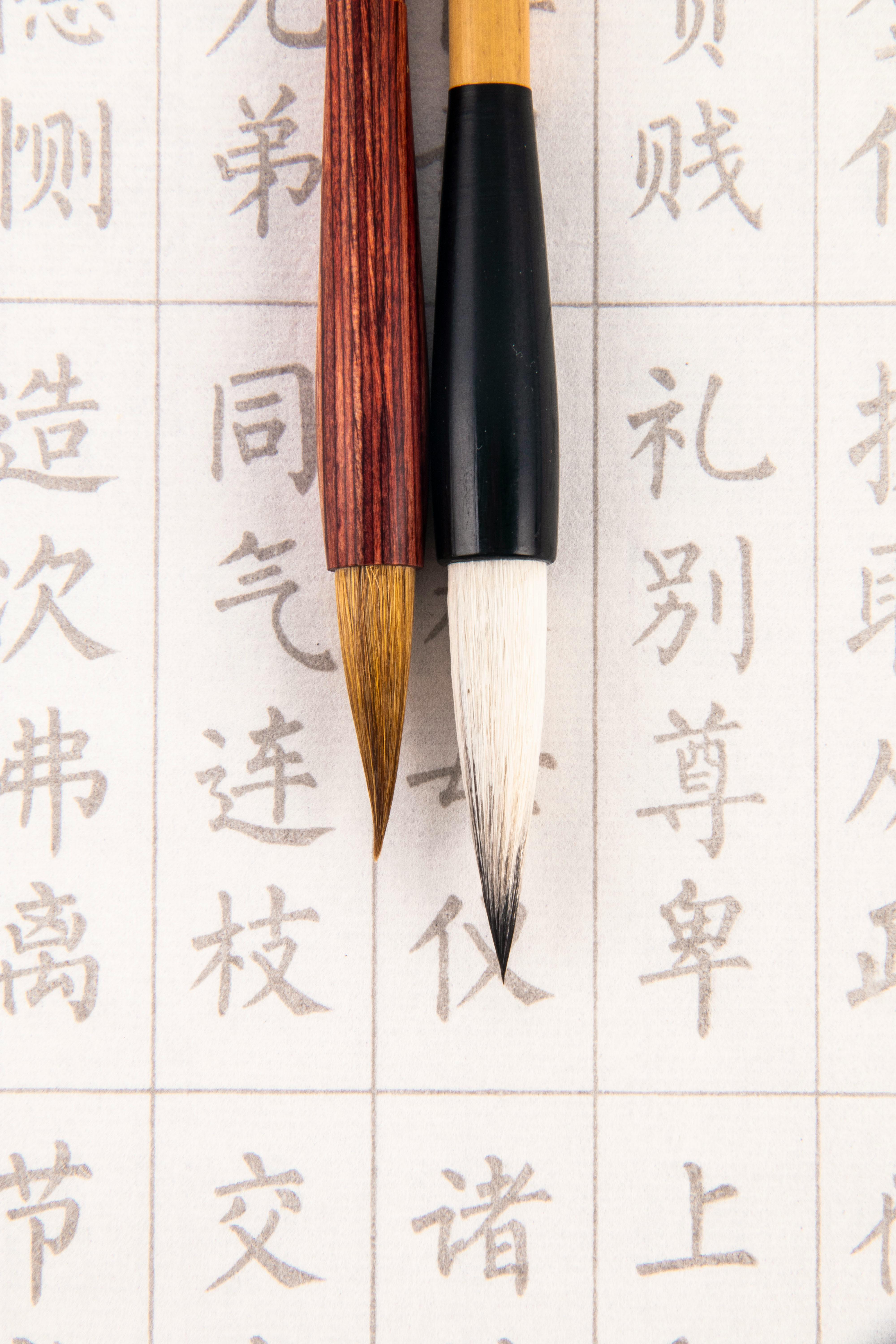
On the other side, Japanese design draws deeply from Zen Buddhism, embracing concepts like wabi-sabi – the profound appreciation of beauty in imperfection, impermanence, and transience. Imagine the subtle crackle glaze on an old ceramic bowl, the elegant way a weathered stone holds its story, or the natural grain of untreated wood. It emphasizes clean lines, meticulous craftsmanship, and a profound connection to nature. The concept of ma – the thoughtful and intentional use of negative space to create presence and impact – is also paramount, much like the deliberate pauses in music that give notes their power, or the quiet between architectural pillars that defines the grandeur of a space. Another fundamental principle, Kanso, or simplicity, emphasizes the elimination of clutter and the beauty of restraint, creating visual calm. Influenced by movements like the Muromachi period's aesthetic principles (14th-16th centuries), which saw the rise of the tea ceremony (chanoyu) with figures like Sen no Rikyū, and ikebana (flower arranging) as expressions of wabi-sabi, Japanese design speaks to quiet dignity and disciplined harmony. The ink wash paintings of masters like Sesshū Tōyō further exemplify this emphasis on essence and negative space, aligning perfectly with minimalist Japanese art. Even architectural styles like sukiya-zukuri, seen in traditional tea houses, embody this refinement, connection to nature, and deliberate simplicity. Beyond these, the Nihonga style of painting, using traditional Japanese pigments and techniques, often captures the ephemeral beauty of nature with a subtle, serene quality that aligns well with Japandi's aesthetic principles. Another crucial art form, Shodo (Japanese calligraphy), with its emphasis on expressive brushwork, controlled ink flow, and the profound significance of ma (negative space) in conveying emotion and meaning, also serves as a direct ancestor to the minimalist ink wash aesthetic seen in Japandi art. The understated elegance of the Kano School of painting, which often employed monochrome ink wash and a subdued palette, further highlights the deep roots of restrained aesthetics in Japanese art history.
Their convergence into Japandi, while gaining contemporary traction, isn't new. This mutual admiration for natural materials, craftsmanship, and quiet beauty has been brewing for decades, long before the term 'Japandi' emerged. I remember reading about a specific exhibition in the late 19th century where Japanese crafts were showcased in Europe, and thinking, "Ah, this is where the seeds were truly planted!" We can see hints of this cross-pollination even in historical movements like Japonism, where Japanese aesthetics profoundly influenced Western art and design. Think of Claude Monet's water lily paintings, clearly inspired by Japanese garden design and Ukiyo-e prints, or the bold outlines and unusual perspectives of woodblock prints influencing Impressionist and Post-Impressionist artists like Degas and Van Gogh. Even Frank Lloyd Wright's Prairie Style architecture shows a clear understanding of Japanese spatial principles, particularly the integration of interiors with nature and the emphasis on horizontality and open floor plans facilitated by elements like shoji screens. More broadly, Japanese concepts of simplicity and natural forms have subtly seeped into 20th-century Western movements, influencing everything from minimalist sculpture to abstract expressionist compositions, and even pre-dating into movements like Art Nouveau with its organic forms, and the Arts and Crafts Movement with its emphasis on traditional craftsmanship and rejection of industrial mass production. Even the De Stijl movement, though purely geometric, shares a minimalist rigor and clarity that resonates with Kanso.
This synthesis reflects a broader global appreciation for craftsmanship and a gentle reaction against the excesses of mass production, emphasizing quality, longevity, and thoughtful, sustainable design. In a world of increasing sensory overload, the deliberate calm of Japandi offers a much-needed sanctuary, aligning perfectly with a growing collective desire for mindfulness and well-being. It’s why this aesthetic resonates so deeply with me and why I believe it's more than just a passing style; it’s a way of being.
Japandi in the Digital Age: Spreading Calm in a Connected World
It's fascinating to observe how quickly concepts like Japandi can travel across the globe today, largely thanks to the internet and social media. Platforms like Instagram and Pinterest have become virtual mood boards, allowing millions to discover and share this aesthetic, often inspiring their own Japandi home decor projects. This digital dissemination accelerates trends, yes, but for Japandi, it feels more like a shared global longing for tranquility. Online galleries and marketplaces also make it easier than ever to connect with artisans worldwide, fostering a global appreciation for unique, handmade pieces that embody the Japandi spirit.
However, this digital age also brings its own complexities. While digital art offers new avenues for expression, for Japandi, I find its tangible, physical counterpart often aligns more closely with the grounding principles. The inherent connection to craftsmanship, natural materials, and the visible artist's hand in traditional or contemporary physical art fosters a sense of authenticity and presence that deeply resonates with wabi-sabi. While some forms of digital art (like minimalist digital prints with organic forms and muted palettes, or generative art that mimics natural processes) can certainly find a place in a Japandi home if thoughtfully curated, I believe the speculative and often ephemeral nature of many digital assets like NFTs, coupled with their environmental impact from blockchain technology, feels fundamentally at odds with the thoughtful, grounded philosophy of Japandi. This aesthetic cherishes tangible craft, mindful appreciation, and a deep, sustained connection to nature and human effort, often advocating for longevity over fleeting trends and demanding a certain presence that can only be found in the physical realm. True Japandi art, in my opinion, should feel like it has a history, even if it's brand new, or perhaps a soul that can be felt and touched, inviting slow living and profound connection.
The Essence of Japandi Art: Evoking Feeling and Intent
When you’re choosing Japandi wall art for your space, I want you to pause and ask yourself: "How does this make me feel?" Because in a Japandi home, art isn't just decoration; it's an intrinsic extension of that calm, balanced atmosphere. It’s an emotional anchor, a quiet affirmation of peace, a visual breath. You're aiming for pieces that evoke tranquility, mindfulness, and a deep appreciation for nature and simplicity. Forget anything overtly loud, jarring, or complex. We're going for a whisper, not a shout, a quiet reflection of your inner calm. The art itself is a testament to the serene, soulful living we crave. This is where you find true calming art for a tranquil home.
The Philosophy: Embracing Wabi-Sabi, Ma, Kanso, and Mono No Aware
This Japanese concept, wabi-sabi, is truly a game-changer for me. It’s about finding beauty in imperfection, transience, and natural cycles. Think a slightly uneven clay pot, its surface perhaps showing subtle pinholes from the firing, or the beautiful, weathered grain of aged wood, with its gentle fissures and faded pigments. Where Western aesthetics might traditionally label these as flaws, wabi-sabi embraces them as unique marks of character, a story of existence. It's about authenticity, about acknowledging that nothing is permanent, perfect, or complete – and for me, that's where the real magic lies, a profound sense of peace in acceptance. I remember one moment early in my art journey, I was so frustrated by a "mistake" in a painting. But then, I learned about wabi-sabi, and suddenly, that "flaw" became a unique mark, a story, and a powerful lesson in letting go. It was incredibly freeing. For art, this means pieces that aren’t perfectly symmetrical, that have visible, confident brushstrokes, natural textures, or even subtle 'flaws' – like a slightly unaligned print, a naturally torn edge on handmade paper, or the unique glaze variations on a ceramic piece – that tell a story. This also extends to the subtle beauty of patina, the natural aging and wear that gives an object character and depth. Your art can reflect this beautifully – a testament to life's gentle ebb and flow. This might manifest as prints made with traditional Japanese woodblock techniques where slight variations are inherent, or perhaps abstract watercolors with unpredictable pigment blooms, celebrating the spontaneity of the medium. It's about recognizing that true beauty isn't about flawless execution, but about the unique character imbued by the human hand and the natural world. It’s this discernible soul, this authentic artist’s narrative, that truly elevates a piece in a Japandi setting. This is the essence of wabi-sabi decor.
Equally vital is ma, the intentional use of negative space. It's the thoughtful emptiness that allows an object to truly breathe and assert its presence. Think of the expansive sky in a minimalist landscape painting, allowing a distant mountain to feel grand, or the deliberate stillness of a dancer pausing between movements, making the next move more impactful. It's like the pregnant pause in a conversation, allowing words to truly sink in, or the careful arrangement of stones in a Zen garden. In art, this means compositions that aren't crowded, where the viewer's eye is invited to rest, to contemplate what isn't there as much as what is. Think of a single, elegant brushstroke on a vast expanse of white paper – the 'ma' around it amplifies its presence. This concept is fundamental to creating minimalist art for Japanese-style home and overall Japandi art inspiration.
And then there’s Kanso, the principle of simplicity. It means stripping away the non-essential, leaving only what is truly necessary and beautiful. In Japandi art, this translates to uncluttered compositions, clean lines, and a focus on essential forms. It's about finding richness in reduction, ensuring that every element earns its place and contributes meaningfully to the overall sense of calm. This complements ma beautifully, as careful use of empty space is a form of powerful simplicity.
And finally, there’s mono no aware, a beautiful, poignant Japanese concept that speaks to a gentle sadness or wistfulness at the transience of life and beauty. It’s the feeling evoked by watching cherry blossoms fall, knowing their beauty is fleeting. This isn’t a somber sorrow, but a deep appreciation for the ephemeral, a quiet acceptance of impermanence. In Japandi art, it might be reflected in the delicate portrayal of a wilting flower, the subtle faded pigments of an antique textile, the visible patina on an aged metal sculpture, or the way natural light shifts across a textured wall, constantly changing and reminding us of time's passage. I remember working on an abstract series where I deliberately layered translucent washes, allowing earlier, faded layers to peek through, much like memories or the passing of seasons. That felt like truly capturing mono no aware.
The Visual Elements: Muted Palettes, Tactile Materials, and Light's Embrace
When I'm thinking Japandi art, my mind immediately drifts to a palette of muted, earthy tones. Think soft greys, warm beiges, creamy whites, dusty greens, and understated blues. Black can be used, but sparingly, for definition, perhaps in a delicate line drawing or a subtle frame. The idea is to create a sense of cohesion and calm, where no single color screams for attention. This isn't just about avoiding bright colors; it's about leveraging the psychology of color – muted, desaturated tones tend to be more calming and less stimulating, fostering relaxation and introspection. Colors like a soft moss green are psychologically linked to nature, growth, and tranquility, promoting a sense of serenity. Muted ocean blues can evoke vastness and peace, while warm beiges, creamy whites, and stone greys provide a grounding effect, creating a feeling of stability and comfort. Personally, I find specific combinations like a soft moss green with a warm stone grey, or a muted terracotta alongside a creamy off-white, create a truly grounding effect and foster a gentle visual harmony. Imagine a landscape painting where soft grey skies blend seamlessly into muted green hills, or an abstract piece featuring washes of warm beige with subtle hints of dusty rose, reminiscent of a misty morning or a serene stone garden. This isn't the place for neon pinks or electric oranges (believe me, I had a "bold accent" phase once that made my living room feel like a permanent rave; it was not serene). It’s about creating a backdrop for peace, much like a quiet forest floor. I've found that soft, cool undertones in blues and greens, balanced with warm, creamy neutrals, create an effortless visual harmony, inviting your eyes to rest. For more on how artists use color to evoke specific moods, you can explore how artists use color.
Art in a Japandi setting isn't just about what you see; it's also about what you feel or imagine feeling. The choice of material for your artwork plays a crucial role in creating that desired tactile warmth and connection to nature. This emphasis on the artist's hand – the visible trace of human effort and skill, the unique, unrepeatable quality that comes from natural materials and human creation – is paramount. It’s a direct counterpoint to mass production, giving you genuine natural texture art. I love to run my fingers (gently, of course!) over a canvas with a subtle impasto or a piece of textured paper; it's a quiet dialogue with the maker, a testament to the artist's dedication. Look for pieces that incorporate:
- Natural fibers: Think linen canvases, abstract needlepoint, woven tapestries, or macrame wall hangings. These bring an organic, handmade feel and incredible depth, often revealing the subtle variations in thread and weave. They absorb light softly, inviting a tactile connection and a sense of grounding. Materials like naturally dyed fiber art or shibori textiles add another layer of authenticity, showcasing unique patterns created by folding, twisting, or compressing fabric before dyeing. They feel calming and understated.
- Unglazed ceramics and clay: Sculptural pieces or wall hangings that embrace the raw, earthy quality of the material, often showcasing beautiful, inherent imperfections and natural forms from the firing process. Look for subtle variations in glaze (e.g., celadon, ash glazes, or even the intentional crackle of raku), visible kiln marks, or minor indentations that tell a story of their creation. Think of ceramic forms that feel like they were just pulled from the earth, unpolished and honest, such as the evocative, textured stoneware pieces by contemporary ceramicist Akiko Hirai.
- Wood: Art integrated with raw or minimally treated wood elements, highlighting its natural patterns, grain, and warmth. Perhaps a delicate woodblock print where the wood's texture is subtly impressed, or a sculpture where the wood's character is the star. This could even extend to frames made from light, unvarnished oak or birch. Visible carving marks or the subtle irregularities in a hand-carved piece celebrate the human touch.
- Paper: Especially thick, textured paper, perhaps with deckled edges, for prints, etchings, or drawings that feel substantial and authentic. Japanese papers like kozo or mulberry paper are excellent choices, known for their unique fibrous textures and ability to absorb ink in distinctive ways, adding to the overall sensory experience. Artists like Agnes Martin, known for her minimalist grid paintings with subtle textures, offer a good example of how the material itself can create a profound, quiet presence, inviting slow, deliberate looking, much like a quiet poem.
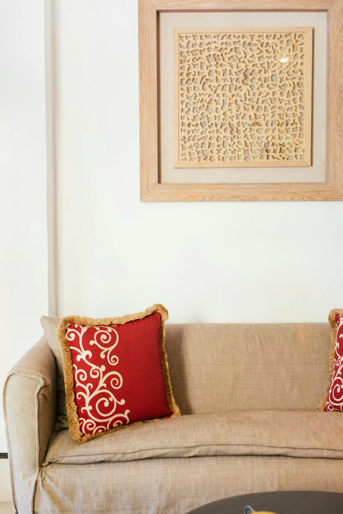
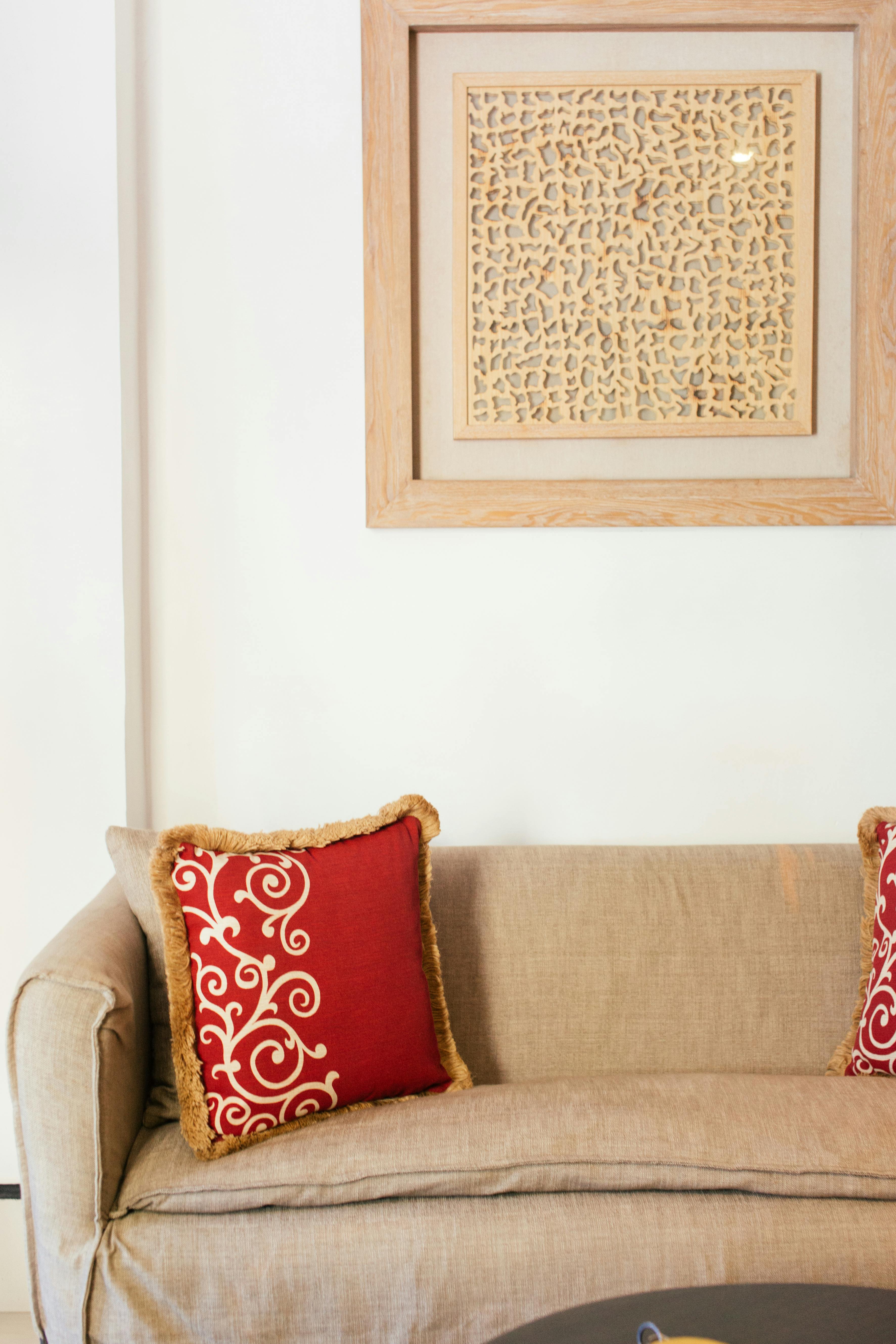
Framing Materials: Don't forget the frame itself! For Japandi, think unvarnished light woods like oak, birch, or even walnut with a matte, brushed, or unfinished feel. These natural wood frames extend the tactile dimension of the art, creating a cohesive, grounded presentation that complements, rather than distracts from, the artwork. Subtle matting, perhaps with a soft, natural texture in off-white or a muted tone, can also enhance the art's presence without overwhelming it. Avoid anything ornate, glossy, or overly polished (I once tried a super shiny frame on a wabi-sabi piece and it just screamed "look at me!" instead of breathing with the art; it was a quickly rectified mistake). Light woods (like birch) feel airy and Scandinavian, while darker, matte woods (like walnut) bring a grounding, earthy richness that nods to Japanese craftsmanship. These materials ground the art, giving it a tangible presence that resonates with the Japandi emphasis on natural authenticity and the quiet luxury of simplicity. They invite you to look closer, to touch (if appropriate!), and to appreciate the story of its creation, making the art a truly immersive experience. This is how you select artisanal art.
The Dance of Light: Embracing Transience
In Japandi design, natural light is paramount. It’s not just about brightening a room; it’s about appreciating the subtle shifts throughout the day – a deeply wabi-sabi concept, embracing transience. Your chosen art can become an active participant in this dance, reflecting the transient beauty of time. I remember a particular abstract piece, a subtle charcoal drawing, that would utterly transform from morning to evening. In the soft dawn light, it was barely there, a quiet whisper. By afternoon, the textured lines would cast delicate shadows, giving it new depth and energy. It was like living with a constantly evolving meditation, a gentle reminder of impermanence. As an artist, I often consider how my work will interact with light at different times of day, aiming to create these subtle, living changes.

- Subtle textures: Art with a slightly raised surface or varying levels of sheen (matte is often preferred) will react beautifully to changing light, revealing new depths and dimensions throughout the day. Look for techniques like impasto (where paint is applied thickly, creating a textured surface) that create natural shadows and highlights. Matte oil paints or highly textured papers are fantastic for this, absorbing and reflecting light softly rather than with a harsh glare, inviting quiet contemplation. Even subtle use of chiaroscuro (strong contrasts between light and dark, as seen in many classical paintings) can enhance this effect, inviting a quiet contemplation of changing forms. Think of how a single dark line on a light canvas can cast a gentle shadow that shifts with the afternoon sun, making the art feel alive. A perfectly composed minimalist abstract, for instance, thrives on this interplay.
- Minimalist compositions & Negative Space (Ma): Pieces with ample negative space (the Japanese concept of ma) allow shadows to play, creating dynamic, ephemeral forms that change with the sun’s movement. This adds a layer of transient beauty, very much in the spirit of wabi-sabi. A perfectly composed minimalist abstract, for instance, thrives on this interplay. Even for art for apartments, careful scaling can create immense impact.
- Placement near windows: A carefully chosen piece can catch and diffuse light, becoming a focal point that changes its mood from morning to evening. The art doesn't just hang there; it lives and breathes with the natural world outside, becoming a quiet meditation on time and change. It's a daily reminder of impermanence, a beautiful philosophical concept embedded in daily living. For rooms with low light, understanding how to choose art for a room with low light can further enhance this interplay.
The Subtle Language of Symbolism in Japandi Art
Beyond aesthetics, Japandi art often incorporates subtle symbolism, drawing from nature and Zen philosophy. This isn't about overt, complex narratives, but quiet visual cues that add layers of meaning and connection, contributing to a sense of conscious living. Look for motifs like:
- Bamboo: A powerful symbol of strength, flexibility, and resilience, growing tall yet bending with the wind. It represents purity and growth. In an abstract context, a single, flowing vertical line in ink or a sparse arrangement of narrow forms in a textile could subtly evoke the essence of bamboo without being a literal depiction.
- Pine: Symbolizes longevity, wisdom, and steadfastness, often enduring harsh conditions. It might appear as a dark, textured form in a minimalist landscape painting or as delicate, clustered needles in a print.
- Cranes: In Japanese culture, cranes symbolize good fortune, longevity, and peace, often depicted in elegant, minimalist forms or as abstract, soaring shapes. Imagine a simple outline or a delicate, light brushstroke suggesting a crane's wing in flight.
- Circles (Ensō): The Zen circle, often drawn with a single brushstroke, symbolizes enlightenment, the universe, and the elegant simplicity of life and imperfection. It's a perfect expression of ma and wabi-sabi. Its abstract form can represent completeness and emptiness simultaneously, a powerful, quiet visual anchor. A simple, imperfect circle in a muted tone can be a profound statement.
- Mountains: Symbolizing stability, strength, and permanence, often depicted as soft, undulating silhouettes in minimalist landscapes or as textured abstract forms.
- Water: Representing flow, adaptability, and purification, appearing as serene ripples, gentle waves, or vast, calm surfaces in abstract works, perhaps using translucent washes of color.
- Birds (general): Beyond cranes, birds can symbolize freedom, travel, or act as messengers of nature, often rendered in delicate, understated forms or as subtle silhouettes.
- Clouds: Representing impermanence, change, and the ethereal, often depicted as soft, hazy forms that blend into expansive skies in landscape art or abstract gradients.
- Stones: Symbolizing grounding, endurance, and tranquility, seen in textured prints, subtle sculptures, or even as arrangements of river stones on a minimalist display.
These symbols, when integrated subtly into abstract forms, delicate line drawings, or nature-inspired prints, add a profound yet understated depth, inviting a personal, contemplative dialogue with the artwork. They act as quiet affirmations of life's enduring beauty and cycles. This is the heart of Zen art and contributes to a truly mindful home.
The Multi-Sensory Experience & Biophilic Connection
While visual art is central, remember that a truly Japandi space engages more than just your eyes. Consider how complementary elements like scent and sound can enhance the tranquil atmosphere established by your art, deepening your connection to conscious living. A subtle diffuser with earthy essential oils (sandalwood, hinoki, cedarwood) can evoke the natural materials used in your art, such as wood or clay, deepening the connection. Imagine the subtle, woody aroma of hinoki cypress complementing the raw texture of an unglazed ceramic sculpture. The quiet hum of a carefully chosen ambient playlist, perhaps with nature sounds or minimalist instrumental music (like traditional Koto music or minimalist piano), can further immerse you in the meditative quality of your home. Even the soft rustle of linen curtains in a gentle breeze contributes to this holistic calm. I often integrate soft, natural sounds from a sound bowl or gentle chimes into my studio space to enhance the connection with my art. Imagine a minimalist ink wash painting, subtly enhanced by the scent of hinoki, with the faint sound of falling rain – it transforms the art into a truly encompassing sanctuary. This holistic approach ensures the art is part of a rich, multi-sensory environment, contributing to overall well-being. This also ties into biophilic design, which actively seeks to connect inhabitants to nature through design by incorporating natural light, organic forms, and natural materials, a principle Japandi art inherently embraces.
Choosing the Right Japandi Art: Practical Styles and Types
Now that we've steeped ourselves in the philosophy and aesthetics, let's get practical. What types of art will truly sing in a Japandi home? Okay, now for the practical bit. What exactly should you be looking for? After my own experiments (some successful, some... less so, like that one piece I tried to convince myself had 'character' but was just undeniably messy), here are the types of art I find sing harmoniously with Japandi. This isn't a prescriptive list, mind you, but more of a gentle nudge in the right direction, refined by personal experience and my artistic practice.

Nature-Inspired Pieces: Bringing the Outside In (Without the Bugs)
This one feels like a no-brainer, right? Japandi is profoundly connected to nature, a balm for the soul. Look for minimalist art for Japanese-style home or Scandinavian art that subtly references landscapes, botanical forms, or natural textures. This could be a minimalist landscape painting where vast, misty skies meet distant, understated horizons; a delicate print of swaying bamboo branches (perhaps reminiscent of traditional Japanese aesthetics); or even an abstract piece inspired by the rugged textures of rock formations, the serene ripple of water, the gentle movement of sand dunes, or the quiet strength of bark and raw silk. The key is subtlety and atmosphere over literal representation. Think quiet contemplation, not a vibrant jungle scene. Styles like Kōrin school art, with its stylized natural motifs often featuring flat color planes and decorative yet subtle patterns, or atmospheric landscape photography (with its soft focus and muted light), work beautifully here. Traditional Japanese ink wash landscapes (Sumi-e) or even contemporary botanical prints emphasizing negative space and the quiet dignity of nature are perfect examples. Look for contemporary artists like Hiroshi Senju, known for his serene waterfall paintings, or those exploring abstract interpretations of natural elements. I often gravitate towards muted watercolors of forest scenes or elegant ink drawings of single leaves, much like what you'd find when exploring how to choose art for a Scandinavian style home.
Handcrafted & Imperfect: The Wabi-Sabi Touch (My Favorite Kind of Detail)
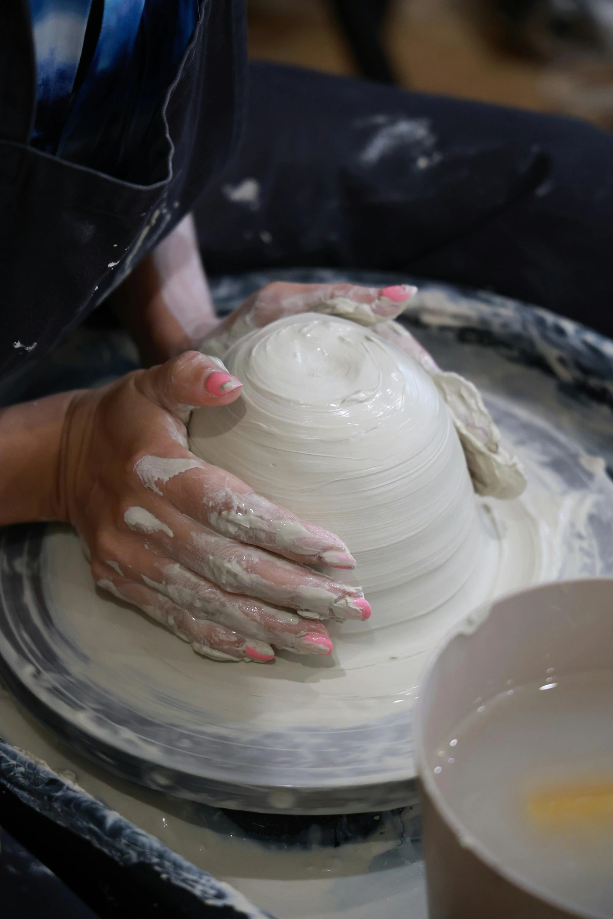
Remember wabi-sabi, that beautiful embrace of imperfection? This is where it truly shines in art. Seek out pieces with a clear, palpable sense of craftsmanship, where the artist's hand is not just visible but celebrated. Think textiles with visible weaves and subtle irregularities (perhaps shibori dyed fabrics or naturally dyed fiber art), ceramic wall hangings that clearly show the potter's touch in their texture and organic form, or even drawings with a slightly rough, handmade feel that beautifully eschews digital perfection. The distinct marks of tools, subtle variations in print registration, or the unique textures created by impasto paint application are all testament to the genuine human effort. These pieces add immense warmth, genuine texture, and a grounded, authentic quality that mass-produced items, no matter how stylish, just can't replicate. It’s about celebrating the unique human element, which always feels deeply good to me. My own artistic journey often involves creating pieces that embody this very spirit – the unique textures and quiet stories of abstract forms that hint at nature's own imperfections. This is where art truly gains a soul, inviting slow art appreciation. To find such pieces, look for "artisanal ceramics," "hand-loomed textiles," or "etchings by independent artists" on platforms known for unique, handmade goods, or visit local craft markets and art fairs where you can often meet the makers themselves. Don't forget to consider vintage finds at flea markets or antique shops, which often carry the beautiful patina of age and history, perfectly embodying the wabi-sabi principle. If you're feeling inspired, even simple DIY projects like creating your own minimalist ink washes, framing a found, weathered object, or pressing natural botanicals can embody this spirit, making art a truly personal act of creation and self-care.
Abstract Art: The Unexpected Perfect Match (If You Do It Right)
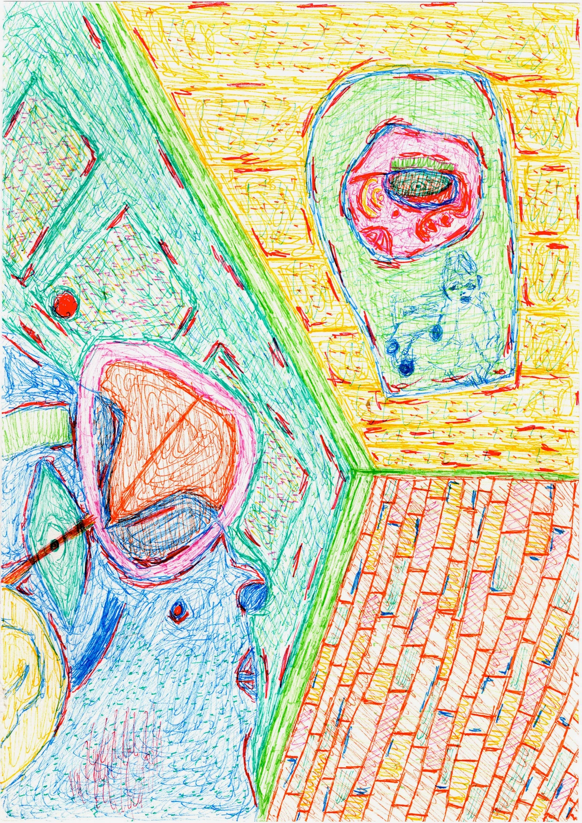
Now, you might be thinking, "Abstract art for a minimalist Japandi home? Really?" And my answer is a resounding yes, but with crucial caveats. We’re not talking about chaotic, aggressive abstract art here, like the energetic splatters of a Jackson Pollock, or the vibrant chaos of an early Kandinsky. We're looking for pieces that feature organic forms (soft curves, subtle gradients, fluid biomorphic shapes), gentle textures (diffused light effects, blurred edges), minimalist compositions, and a thoughtful use of space (that ma again!). Think subtle washes of color that resemble weathered wood grain, delicate lines that mimic flowing water, or abstract interpretations of natural elements like mist or stone. This kind of abstract art can beautifully convey the feeling or essence of nature and tranquility without being literally representational. Look for color field paintings with subtle, atmospheric gradients, or minimalist geometric abstracts that use restrained lines and muted palettes to create balance rather than chaos. For example, amorphous shapes that blend into each other, calligraphic brushstrokes that suggest natural movement, or softened geometric patterns that feel grounded. These works create visual interest without overwhelming the serene atmosphere, offering a quiet depth that invites contemplation and introspection. They can be incredibly grounding, offering a sense of calm movement or static peace. The scale of abstract art also matters: a single, large abstract piece can create immense impact and a sense of calm grandeur, while a cluster of smaller, subtly related abstracts can offer intimate visual interest without clutter. If you’re into exploring this further, I’ve got a whole guide on art for minimalist interiors generally, and another on what is minimalism in art that might spark your own creativity. For more on the abstract art side of things, check out what is abstract art or the definitive guide to understanding abstraction in contemporary art.
Traditional & Modern Interpretations: Beyond the Usual
While abstract, nature-inspired, and handcrafted art are cornerstones, don't overlook other categories that align with the Japandi ethos through their simplicity, intentionality, and connection to authenticity, fostering Japandi interior design art:
- Minimalist Ink Wash Paintings (Sumi-e): A direct descendant of traditional Japanese art, Sumi-e uses black ink in varying concentrations to create ethereal landscapes or figures. Its core principles emphasize not just the brushstroke, but also the importance of "emptiness" or negative space (ma) to create a sense of vastness and profound quiet. Their sparse beauty and emphasis on negative space are perfect for a Japandi interior, capturing immense depth with minimal strokes. Look for fluid, confident brushwork that conveys essence rather than precise detail, like a single bamboo stalk or a distant mountain, achieved through varying ink density and brush pressure. Modern interpretations might explore contemporary subjects or slightly altered compositions, but always retain that reverence for negative space and fluid brushwork. The practice of ensō (the Zen circle) is a perfect visual example of this principle in action.
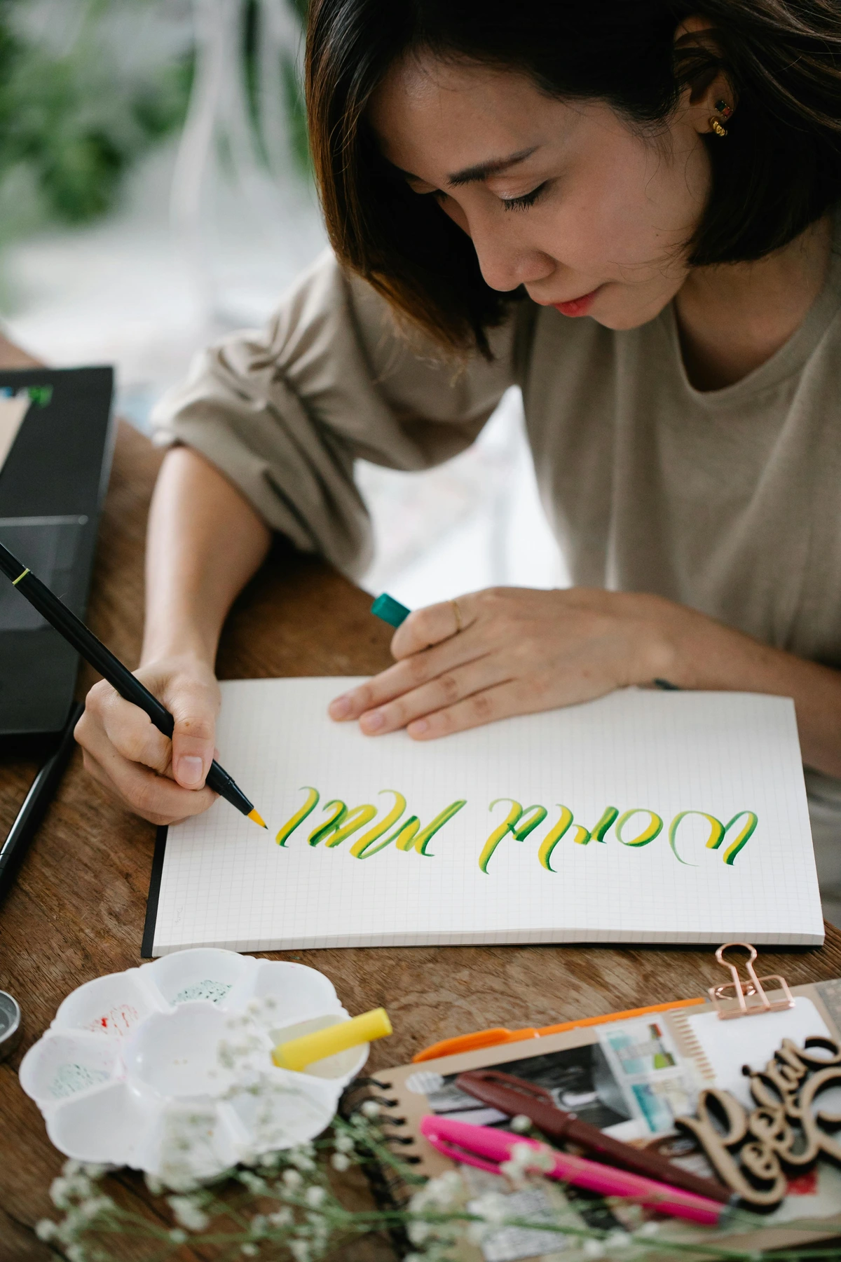
- Delicate Line Art & Pen and Ink Drawings: These emphasize precision, restraint, and the beauty of an unadorned line. Whether figurative or abstract, they bring a quiet strength and thoughtfulness, often playing beautifully with negative space. A single, elegant line can convey as much emotion as a complex painting. Look for simplicity in form and a deliberate, almost meditative quality in the lines. Contemplative single figures, minimalist architectural studies, delicate botanical line drawings, or very simple still lifes are ideal subjects. This aligns perfectly with the understanding of elements of art line.
- Botanical Illustrations: While nature-inspired, botanical illustrations often focus on the detailed form of a single plant or flower, celebrating natural beauty in a controlled, elegant way. They're less about a sprawling landscape and more about the quiet dignity of a leaf, a stem, or a single bloom, often rendered in muted tones or monochrome. Even digital botanical art can fit, provided it adheres to muted palettes, clean compositions, and avoids a slick, mass-produced feel. Consider artists like Pierre-Joseph Redouté or Ernst Haeckel for classic inspiration, or contemporary artists creating minimalist botanical prints focusing on the texture and form of single leaves or seed pods, with ample white space.
- Minimalist Woodblock Prints (Ukiyo-e influence): While traditional Ukiyo-e (Japanese woodblock prints) like those by Hokusai often featured vibrant colors and depictions of landscapes, actors, or scenes from daily life, their underlying emphasis on clean lines, defined shapes, and often natural subjects offers a strong foundation for contemporary interpretations. For Japandi, look for modern woodblock prints that distill these elements into a more subdued, Japandi-friendly palette, focusing on natural dyes or simpler compositions that highlight the essential forms and quiet reverence for nature (e.g., a single tree, a gentle wave). Seek out contemporary artists who reinterpret Ukiyo-e motifs with a focus on essential forms and quiet reverence. The beauty lies in the printmaking process itself, and the ability to reinterpret classic motifs with quiet reverence, emphasizing essence over elaborate detail. More about this can be found in the enduring legacy of ukiyo-e.
- Mixed Media and Collage (with caveats): If carefully executed, mixed media or collage pieces can also fit. Look for works that integrate natural materials like dried leaves, handmade paper (e.g., kozo or linen paper), textile scraps, sand, or natural pigments, adhering to a muted palette and minimalist composition. The textures should be subtle, and the overall impression one of quiet discovery rather than jarring juxtaposition. For example, a successful Japandi collage might use subtly textured handmade papers layered with delicate dried flower petals or linen fabric scraps, all within an earthy, monochromatic palette. The focus should always be on natural elements and a subdued harmony. I've found success with using pressed flowers and subtle ink washes on handmade paper to create delicate, ephemeral compositions. Even the philosophical concept of Kintsugi, the Japanese art of repairing broken pottery with gold lacquer, beautifully embodies wabi-sabi's celebration of imperfection and resilience, offering inspiration for art that embraces its own history.
Beyond Wall Art: Integrating Three-Dimensional Forms
While flat wall art is a cornerstone, three-dimensional pieces add a vital layer of depth, texture, and authenticity to a Japandi space. These pieces further embody the concept of wabi-sabi home decor art by highlighting natural materials and visible craftsmanship. Consider:
- Sculptural Ceramics & Organic Forms: Beyond flat wall art, sculptural pieces or vessels with organic, fluid shapes are perfect. These can add texture and an authentic, earthy feel, especially if they embrace the wabi-sabi aesthetic of subtle imperfections and natural firing processes. Think of beautifully shaped, unglazed stoneware by contemporary ceramicists like Akiko Hirai, known for her textured, imperfect stoneware, or simple, smoothly carved, unpolished wood forms that mimic natural elements like seed pods, flowing water, or the biomorphic shapes of Danish sculptor Jean Arp. When displaying, consider placing them alongside a single, natural material vase or a simple wooden tray, allowing each element to have its own breathing space and avoiding clutter. For more on this, I have some thoughts on what is design in art that might spark your own approach to form, and how to pair abstract art with wood furniture for harmonious arrangements.
- "Found Objects" or Repurposed Materials: This is a fantastic way to embrace the wabi-sabi principle! Look for pieces that elevate natural elements like beautifully shaped driftwood, smooth river stones arranged on a minimalist tray, or aged metal with a rich patina, thoughtfully placed on a simple wooden stand. The key is thoughtful arrangement and presentation – often, a single, beautifully weathered object placed intentionally on a minimalist shelf or a simple wooden stand can serve as profound art, celebrating history, transience, and the inherent beauty of nature's imperfections. Avoid anything that looks like clutter; the focus should always be on serene simplicity and respect for the object's story and inherent beauty. I once found a piece of driftwood on a beach that, with just a little cleaning and a simple stand, became a powerful sculptural piece in my own home, reminding me of the ocean's vastness and time's relentless flow.

Quick Guide: Japandi Art Characteristics by Type
To help you visualize, here's a quick summary of Japandi art characteristics across different forms, guiding you in your search for Japandi home decor ideas:
Art Type | Key Japandi Trait | Visual Examples | Mood/Feeling Evoked |
|---|---|---|---|
| Nature-Inspired | Subtle references to landscapes, botanicals, textures | Minimalist misty landscapes, delicate branch prints, water ripples | Grounded, Serene, Organic, Reflective |
| Handcrafted | Visible craftsmanship, authentic texture, imperfection | Woven linen art, ceramic wall forms, rough ink drawings | Authentic, Warm, Tactile, Soulful |
| Abstract | Organic forms, muted colors, minimalist composition | Soft washes of beige/grey, delicate charcoal lines, stone textures | Calm, Introspective, Modern, Balanced |
| Sumi-e | Sparse beauty, negative space, ethereal ink washes | Single brushstrokes of bamboo, misty mountain silhouettes | Meditative, Zen, Tranquil, Profound |
| Line Art | Precision, restraint, unadorned simplicity | Elegant minimalist figures, subtle geometric patterns | Thoughtful, Clean, Elegant, Poised |
| Botanical | Detailed focus on single plants, elegant forms | Close-up studies of leaves, monochrome floral prints | Natural, Refined, Peaceful, Delicate |
| Sculptural Forms | Organic shapes, raw materials, visible handiwork | Unglazed stoneware vessels, carved wooden abstract forms | Grounded, Tactile, Meditative, Honest |
Placement & Scale: Cultivating Visual Calm
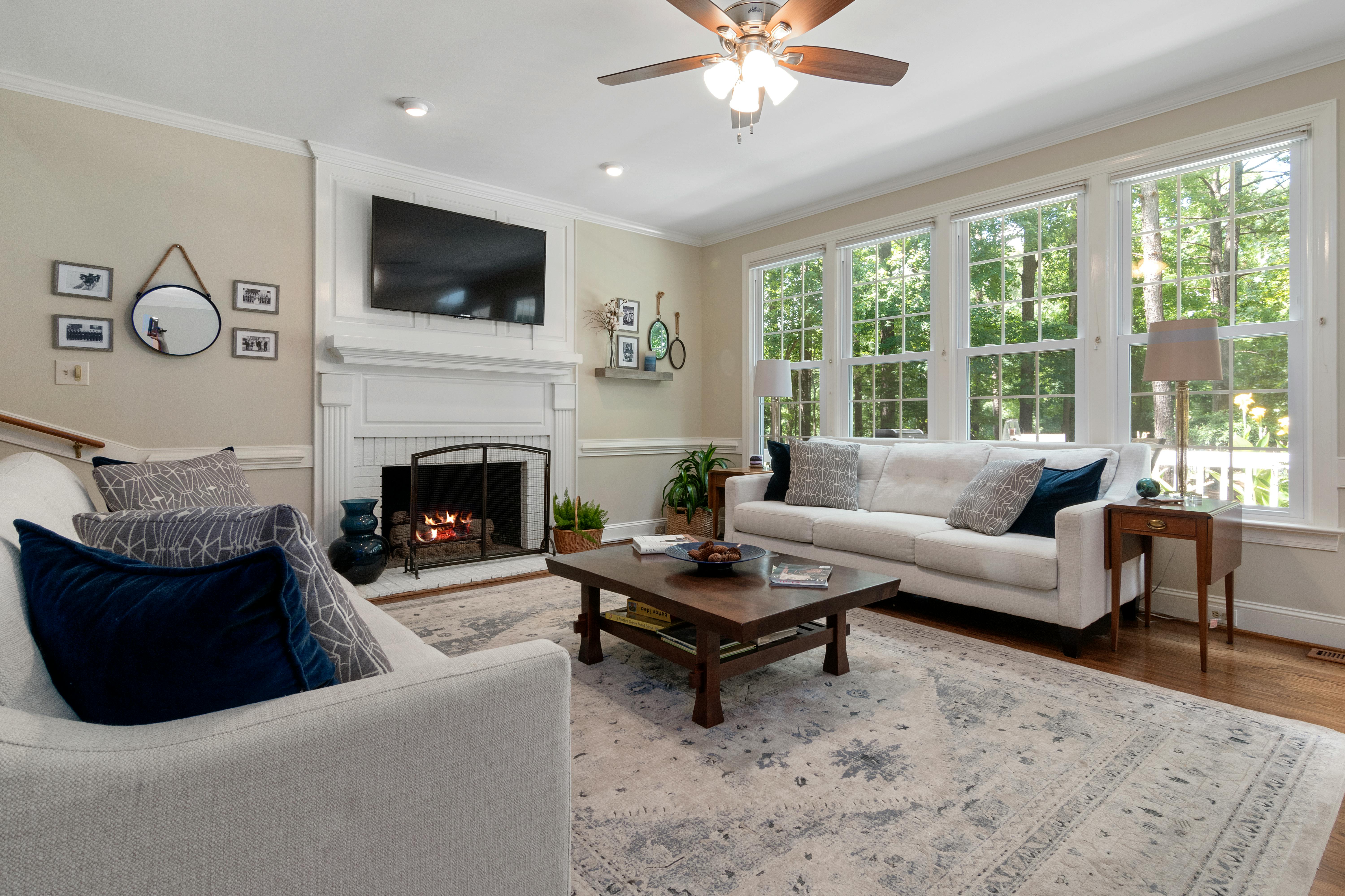
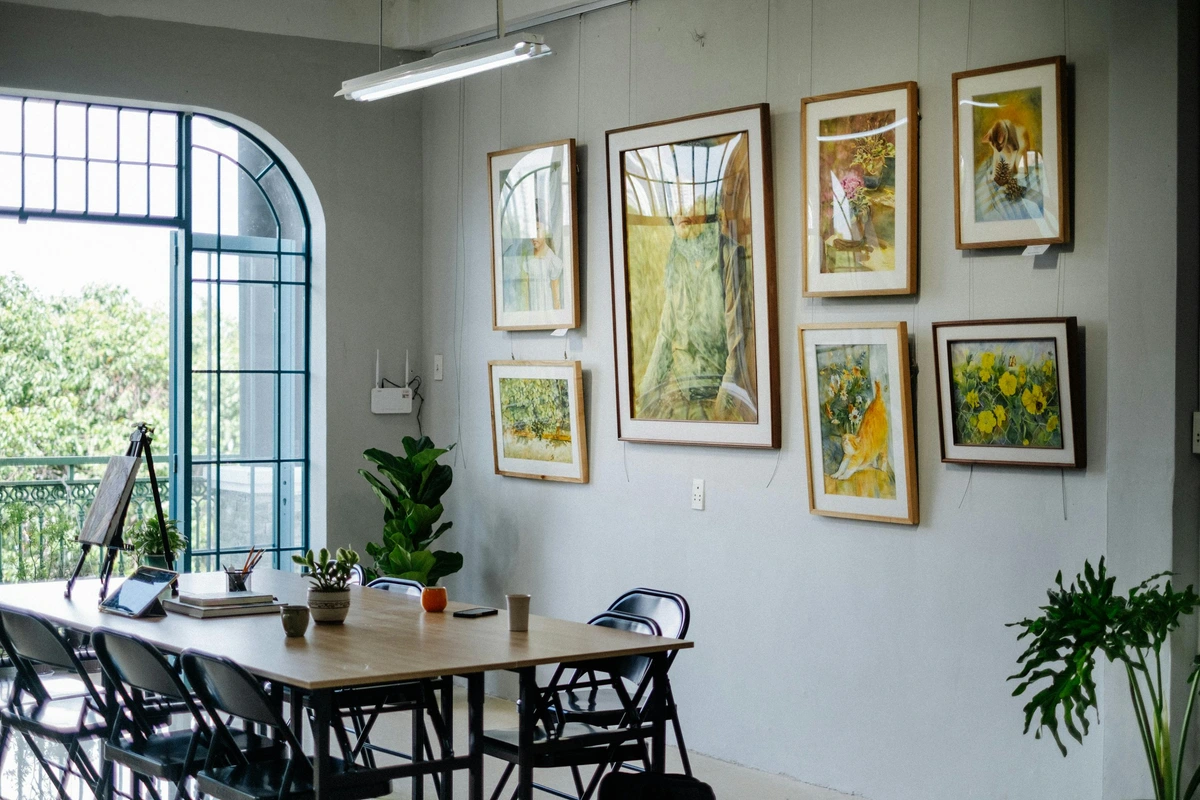
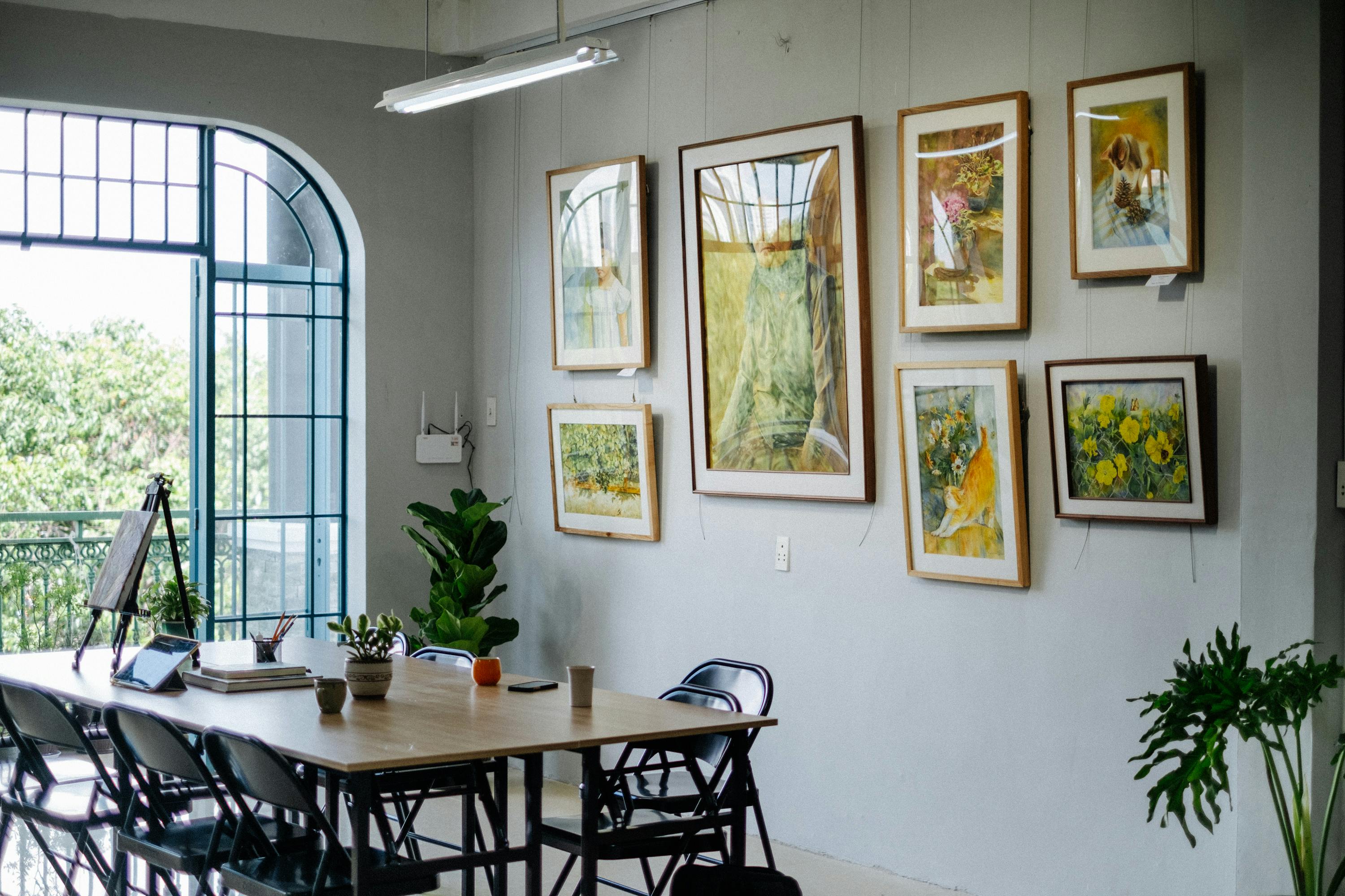
Even the most perfect piece of art can feel wrong if it’s hung incorrectly. For Japandi, less is definitively more. You don’t need a sprawling gallery wall (unless it’s very carefully curated with minimal, cohesive pieces, perhaps like those found on how to arrange pictures on a wall). Focus instead on one or two impactful pieces that command quiet attention without shouting. Remember, the goal is often to enhance a room's functionality through visual calm, not distract from it. The principles of serenity and spaciousness are paramount here; every placement should feel deliberate and contribute to the room's tranquil atmosphere, ensuring the art doesn't just fill space, but enhances it by utilizing ma – intentional, meaningful negative space.







Scale for the Room: Letting Art Breathe
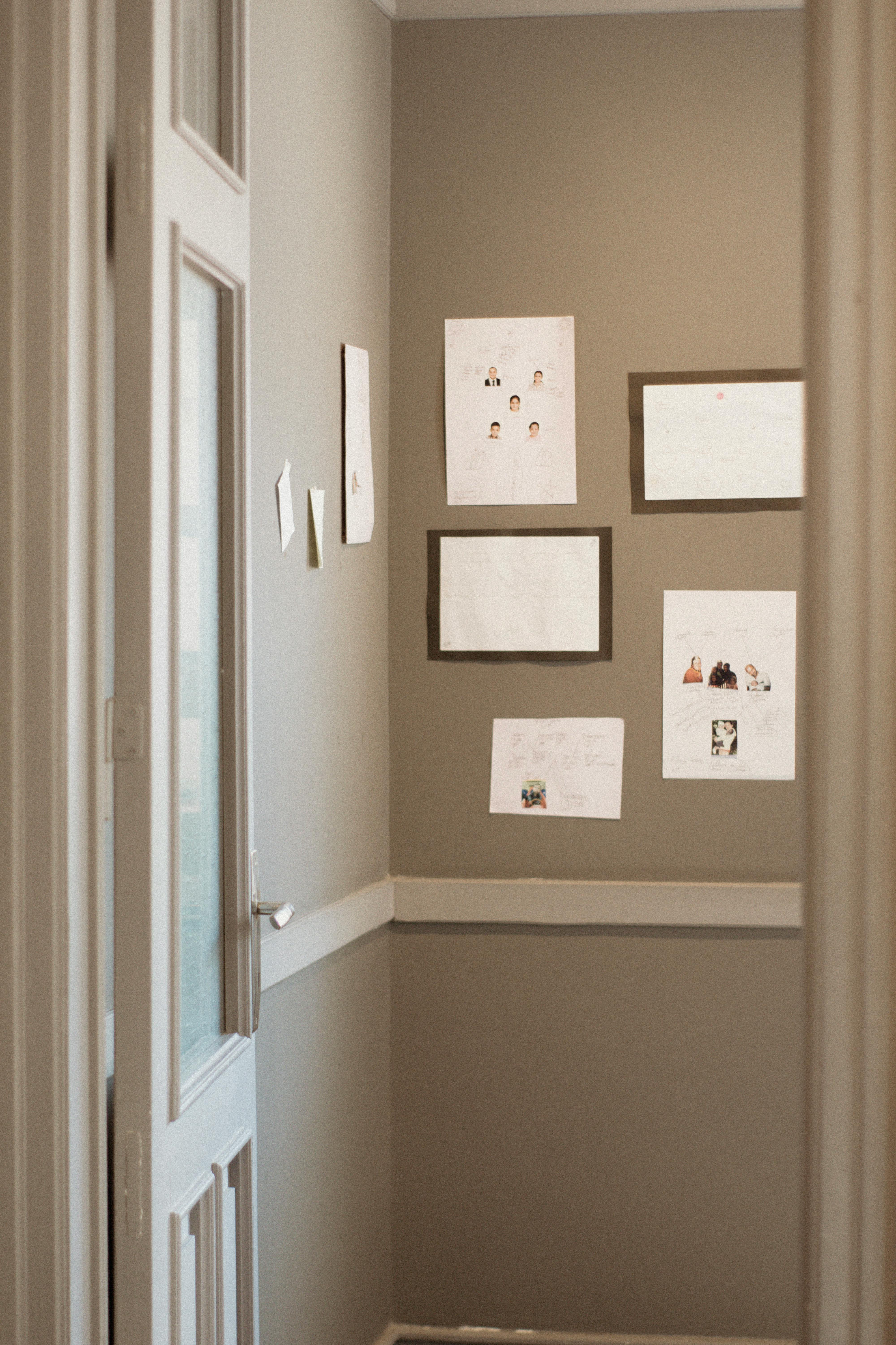
Start by considering the overall architecture and size of your room. A tiny piece on a huge wall looks lost, almost swallowed, and an oversized piece in a small nook can feel suffocating, disrupting the sense of ma and Kanso. My rule of thumb is often that art should be about two-thirds the width of the furniture it's above, but always step back and see how it feels in the entire space. For example, for a sofa measuring 8 feet wide, artwork around 5-6 feet wide would likely be appropriate. Remember, the surrounding negative space is just as important as the art itself – it allows the art to breathe. For example, a single large artwork on a prominent wall with significant empty space around it can create a powerful sense of calm and expansive scale. Conversely, a small cluster of art pieces can be impactful if there's ample space between each piece and around the grouping, perhaps following the golden ratio for pleasing proportions. Even for art for apartments, careful scaling can create immense impact. For an entryway, a single, vertically oriented ink wash painting can beautifully flank a doorway, drawing the eye upwards without clutter; you can find more specific advice on art for entryway if you're thinking about that tricky space.
Eye Level is Key: Natural Viewing
Generally, hang the center of your art at eye level (around 57-60 inches from the floor for a standing viewer). If it’s above furniture, leave a comfortable gap – my rule of thumb is often 6-8 inches between the bottom of the artwork and the top of the furniture (e.g., sofa, console table). This creates an easy, natural viewing experience. In a bedroom, a calming abstract piece above the bed can create a serene focal point, aiding relaxation. For more specific bedroom advice, check out how to choose art for a bedroom. For a dining room, aim for art that complements conversation, perhaps a landscape that inspires calm reflection without being too demanding of attention during a meal. It's all about intentionality; for more specific advice, check out how to choose art for a dining room.
Embrace Negative Space (Ma) & Simplicity (Kanso): The Power of Emptiness
Just as important as the art itself is the space around it. Japandi thrives on openness and breathing room – this is where the Japanese concepts of ma and Kanso truly come alive. Don't feel the need to fill every wall. Sometimes, an empty wall is the most calming wall, a perfect visual pause. Allow each element to have its own breathing space. Think of it like the silence between musical notes that gives the melody its impact, or the carefully placed stones in a Zen garden. And if you have high ceilings, you'll want to explore the-evolution-of-art-in-interior-design-from-grand-salons-to-modern-minimalism to make art shine there too! Ultimately, every placement should feel deliberate and contribute to the room's serene atmosphere, creating a sense of peace and expansive calm.
Japandi Art for Specific Rooms: Tailored Tranquility
Thinking about where to place your art in different parts of your home? Each room can benefit from a tailored approach to Japandi art, contributing to a cohesive Japandi interior design:
- Living Room: This is often the heart of the home, a space for connection and relaxation. A single, commanding abstract piece in muted tones, or a serene nature-inspired landscape, can serve as a calming anchor, inviting conversation without overwhelming it. Consider a large-scale abstract painting with subtle gradients of grey and beige, or a set of three identical, minimalist botanical prints arranged horizontally above a low-slung linen sofa. Prioritize pieces that promote visual flow and an uncluttered feel.
- Bedroom: Serenity is paramount here. Choose art that encourages rest and introspection. Soft, abstract forms, delicate botanical prints, or minimalist ink washes in a quiet palette above the bed can create a deeply tranquil sanctuary. Avoid anything too stimulating or emotionally complex. A subtle cloud study or a simple, framed calligraphic piece can work wonders. For more specific bedroom advice, check out how to choose art for a bedroom.
- Home Office: For a workspace, art can help foster focus and calm. Consider a minimalist line drawing, a subtle geometric abstract, or a small, handcrafted ceramic piece that adds warmth without distraction. A framed calligraphic piece or a subtle abstract that evokes natural patterns can enhance concentration and peace, free from visual clutter. For even more detail, explore choosing-art-for-home-office.
- Hallway/Entryway: These transitional spaces are perfect for setting the tone. A single, elegant piece – perhaps a vertical Sumi-e painting of a bamboo stalk or a textured fiber artwork with a simple, organic pattern – can act as a quiet invitation, welcoming you home with a sense of calm and intentionality. It's an opportunity to create a moment of visual pause before entering the main living areas.
Common Pitfalls to Steer Clear Of (From My Own Costly Mistakes!)
Alright, a little tough love now, because I’ve certainly bought pieces that just didn’t fit. Learn from my errors, please! I still cringe thinking about that one neon print I thought would be an "ironic twist" in my otherwise calm living room – it wasn't ironic, it was just a headache, a persistent visual shout in a room begging for a whisper. The beauty of Japandi is in its quiet conviction, not its loud statements. I also once tried to force a highly detailed, busy Victorian-era landscape into a Japandi setting; it just screamed "chaos!" instead of calm. It was a quickly rectified mistake, trust me.

- Overly Bright or Saturated Colors: Unless it’s a very specific, carefully chosen accent (like a deep forest green, a soft indigo, or earthy terracotta) that still feels natural and complements an organic element, these will clash irrevocably with the serene Japandi palette. Think of a single, vibrant cherry blossom among muted tones – it’s about a mindful pop, not a riot of color. Generally, I advise sticking to the muted spectrum to maintain harmony and avoid visual agitation. Avoid colors like electric blue, hot pink, or neon yellow; they create visual noise rather than quiet contemplation. For example, a deep forest green, like moss after rain, or a warm ochre, like dried clay, can work beautifully, but a stark primary red or vibrant purple will likely feel out of place. This is where understanding the psychology of color in interior design with art becomes paramount, to ensure your choices foster calm, not chaos.
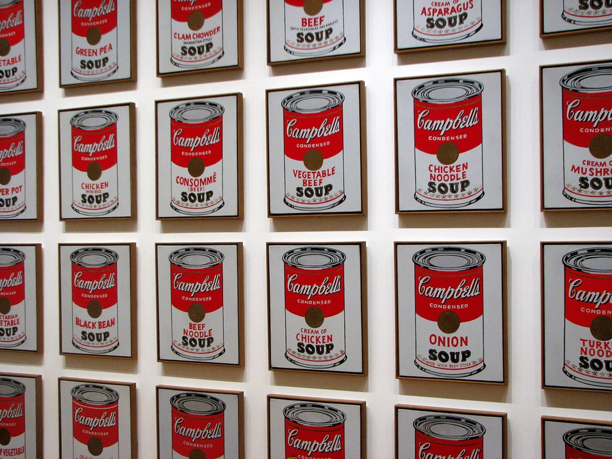
- Busy, Chaotic Compositions: Anything that feels visually cluttered or demands too much of your attention goes against the calm, minimalist ethos and the principle of Kanso. If you find yourself having to "study" a piece to understand it, or if it features overlapping, aggressive brushstrokes, or too many focal points fighting for attention, it's probably too complex for a Japandi space. The goal is instant serenity; complex narratives or an overwhelming number of elements are usually best avoided. This is one of the key differences from decorating with abstract art in bohemian-chic interiors (a guide to layering and texture, which is a very different aesthetic), for example, or expressive contemporary pieces that lean into visual dynamism. Avoid overly ornate Baroque paintings, hyper-realistic portraits, or bold Pop Art pieces like Andy Warhol's Campbell's Soup Cans, which often rely on vibrant colors and overt commentary.
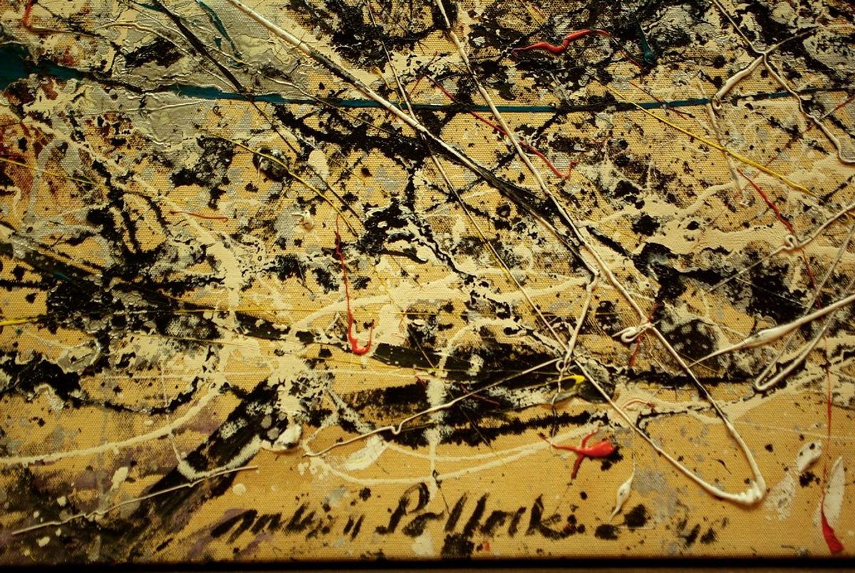

- Mass-Produced "Generic" Art: Japandi celebrates craftsmanship, authenticity, and connection to the artist's hand. A generic print that could be from anywhere often lacks the soul needed to resonate with the wabi-sabi principle. The absence of a unique story or a discernible artist's touch is the primary detractor, making it feel cold and detached rather than warm and authentic. It misses the inherent narrative and tangible human effort that defines genuine craft. Opt for pieces that feel unique, even if they're limited edition prints of original works from emerging artists. Support genuine creativity. This is also why I generally advise caution with digital, speculative assets like NFTs; their environmental impact, speculative nature, and often detached, transactional reality feel fundamentally at odds with the thoughtful, grounded philosophy of Japandi, which cherishes tangible craft, mindful appreciation, and a deep connection to nature and human effort. True Japandi art, in my opinion, should feel like it has a history, even if it's brand new, fostering slow living values.
- Excessive Glam or Shine: Think matte, natural finishes over high gloss or metallic sheen. While a subtle metallic accent can work if integrated with extreme care (perhaps a touch of brushed brass in a frame), anything that feels overtly luxurious or flashy will disrupt the grounded, understated elegance of Japandi. The focus is on natural beauty, not ostentation or artificial sparkle. Your aim is quiet luxury, not overt opulence.
- Over-reliance on Fleeting Trends: While Japandi itself is a popular aesthetic, the art you choose within it should possess timeless appeal. Avoid pieces that are merely trendy and will quickly feel dated. True Japandi art aligns with wabi-sabi's appreciation for longevity and inherent beauty, rather than chasing temporary fads. Seek art that you genuinely connect with and that will endure as a calming presence in your home for years to come. This aligns with Japandi's inherent sustainability, as choosing durable, timeless pieces reduces the need for constant replacement.
Sourcing Your Japandi Art: A Mindful and Sustainable Approach
Finding art is a deeply personal journey, truly. It’s about connecting with a piece, letting it speak to you, allowing it to become a part of your daily meditation. When looking for that perfect Japandi piece, consider where and how you source it – it's part of the mindful process of building a wabi-sabi home decor art collection:
- Support Local Artisans & Independent Artists: Seek out artists and craftspeople in your community or through online platforms like Etsy (filter for handmade/artisanal), specialized contemporary art marketplaces focusing on unique, minimalist, or craft-oriented pieces, or even local art collectives and university art departments. Their unique pieces often embody the handmade, imperfect beauty of wabi-sabi and bring a genuine story into your home. Don't underestimate the power of connecting directly with the creator, or even reading their artist's statement to understand the intent behind the work. This fosters a connection that mass production simply cannot offer, reinforcing ethical art buying.
- Visit Art Galleries & Fairs: Explore local art galleries that feature emerging artists, or visit art fairs that showcase contemporary, minimalist, or craft-oriented work. This allows you to see pieces in person, appreciate their textures, and discuss the art directly with gallerists or even the artists themselves. Look for exhibitions that align with natural themes or abstract expressionism with a subdued palette. It's an immersive experience that digital viewing, however convenient, can never fully replicate.


Ethical and Sustainable Choices: Honoring Nature's Harmony
Prioritize artists who use sustainable materials or eco-conscious practices. This aligns perfectly with Japandi’s reverence for nature and mindful living. Look for natural dyes, recycled paper for prints, FSC-certified or reclaimed wood for frames, or artists who minimize waste in their process. You can often research an artist's sustainability practices by checking their website's 'about' or 'process' sections, or by simply inquiring directly. Avoid mass-produced items from questionable sources that might contradict the ethos of thoughtful creation, making your choices truly sustainable art purchases.
- Discover Original and Limited Edition Pieces: Investing in original art or limited edition prints ensures you’re bringing a piece of genuine craftsmanship into your space. It has a depth and character that mass-produced reproductions simply can't offer. Look to online galleries specializing in minimalist or contemporary art, or even directly contact artists whose work you admire. Remember, originality and uniqueness are cherished in Japandi, becoming quiet treasures in your home. Don't forget to explore flea markets, antique shops, or online vintage and antique marketplaces (like Chairish or 1stDibs) for unique, handcrafted, or vintage pieces that embody wabi-sabi through their age and inherent story.
- Consider Your Budget (Mindful Collecting): Japandi art doesn't have to break the bank. You can find beautiful, suitable pieces across a range of price points, from affordable limited edition prints by emerging artists to unique handcrafted items, or even create your own DIY pieces. The key is intentionality and genuine connection, not cost. Start small, allow your collection to grow organically, and cherish each piece for the story it tells and the calm it brings. I've often found that a single, carefully chosen print or a small, handmade ceramic piece can bring more joy than a room full of expensive but soulless decor.
DIY Japandi Art: A Personal Touch
If you're on a budget or simply want a more personal connection, consider creating your own Japandi-inspired art. Simple projects like minimalist ink washes, abstract watercolor studies in muted tones, framing beautifully textured handmade paper with deckled edges, arranging natural found objects (like smooth stones or elegant dried branches) in a thoughtful way, or even textured abstract paintings using natural materials like sand or coffee grounds mixed into the paint can embody the Japandi spirit beautifully. It’s an act of mindful creation that adds unique soul to your space, fostering conscious creativity.
I often find myself drawn to abstract pieces that hint at landscapes or textures, much like the ones I create myself. There's a particular satisfaction in creating something that embraces simplicity and the subtle dance of nature. If you’re curious, you can always browse my art collection to see what resonates with you. And if you ever find yourself in 's-Hertogenbosch, do stop by my museum – seeing art in person is always a different, more profound experience.
Frequently Asked Questions: Your Japandi Art Queries Answered
Q: What kind of frames work best for Japandi art?
A: Definitely lean towards natural wood frames (light oak, birch, walnut), or very simple, thin black or white frames. As discussed earlier, matte, brushed, or unfinished wood enhances the natural aesthetic. Natural wood frames complement the earthy tones and organic textures inherent in Japandi art, creating a cohesive natural aesthetic. Avoid ornate, shiny, or overly decorative frames. A simple, natural frame enhances the art without competing with it, letting the artwork itself breathe and maintaining visual serenity. Think of the frame as a quiet border, not a statement piece. Subtle matting, perhaps with a soft, natural texture in off-white or a muted tone, can also enhance the art's presence without overwhelming it. Light woods (like birch) feel airy and Scandinavian, while darker, matte woods (like walnut) bring a grounding, earthy richness that nods to Japanese craftsmanship.
Q: How many pieces of art should I have, and can I do a gallery wall?
A: My personal philosophy is "less is more." Focus on a few impactful pieces rather than many small ones. One large, thoughtfully chosen piece can create more serenity than a cluttered gallery wall, embodying ma and Kanso. If you do opt for a gallery wall, ensure it's curated with minimal, cohesive pieces that share a common palette, theme, or texture – for example, a collection of all monochrome botanical prints in varying sizes, a series of minimalist abstracts in a specific muted color palette, or a mix of Sumi-e and delicate line art. Ensure a consistent color palette across all pieces, maintain similar framing styles, and ensure adequate spacing between each artwork to maintain the principle of ma. The goal is breathing room and quiet contemplation, allowing each piece to truly shine, not visual overload. You can find more advice on how to arrange pictures on a wall.
Q: Can Japandi art be colorful at all?
A: While muted palettes are dominant, subtle pops of color can be incorporated mindfully. Think of a deep forest green, a soft indigo, or a warm ochre, perhaps inspired by natural dyes or minerals, or even the subtle colors found in nature itself, like a ripening fruit or a specific type of muted flower. For example, a deep indigo could be used in a small abstract piece above a dark wood console table, or a touch of soft terracotta could appear in a ceramic piece. The key is that the color should feel grounded and organic, acting as an accent rather than a dominant, vibrant force. It should feel like a natural element that enhances, not disrupts, the overall calm. Consider the principles of how artists use color in a muted context. Think of the deep blues found in indigo dyes, the rich greens of moss, or the earthy terracotta hues of clay.
Q: Where should I start if I'm new to Japandi art?
A: Begin by observing nature and practicing mindfulness in your own home. What colors bring you peace? What textures feel comforting? Then, explore minimalist abstract pieces or subtle nature-inspired prints in earthy tones. Consider starting with one significant piece for a key area like your living room or bedroom to set the tone, such as a minimalist landscape photograph with soft lighting, or a simple abstract watercolor study in muted tones. Don't rush the process; allow yourself to connect with pieces that truly resonate with your personal sense of calm. You can also explore decorating with art in Japandi style interiors for initial inspiration.
Q: How can I integrate existing art pieces into a Japandi home?
A: Assess your current art for color palette and composition. Can you reframe pieces in natural wood or simple black/white frames? Re-matting and re-framing pieces in natural materials or soft, muted tones can significantly alter their appearance. Even a vibrant piece can be integrated if it's balanced by ample negative space (ma) and surrounded by otherwise muted decor, or if you group it with other pieces sharing a similar color palette to create cohesion. Sometimes, less is more: choose one or two existing pieces that align best and store the rest. The key is to see if your existing art can contribute to the calm, rather than merely exist within it. You might even find new inspiration in your old pieces by applying a Japandi lens.
Q: What's the difference between 'minimalist' and 'Japandi' art?
A: While both embrace simplicity, minimalist art (in its purest form) often focuses on extreme reduction, clean lines, and starkness, sometimes to the point of austerity. Japandi art, while minimalist, adds distinct layers of warmth, natural texture, and an explicit connection to nature and imperfection (wabi-sabi). It's minimalism with a soul, inviting coziness and a grounded feel rather than just stark efficiency. It's a subtle but significant difference – one seeks purity through absence, the other seeks harmony through intentional, tactile presence. For more on this, see what is minimalism in art.
Q: Can I use photographs in a Japandi space?
A: Absolutely! Look for photographs that emphasize natural landscapes, abstract textures found in nature (like close-ups of weathered wood grain, sand ripples, or water surfaces), or minimalist compositions with soft, natural lighting and muted tones. Black and white photography can be particularly effective in conveying calm, timelessness, and a sense of introspective quiet, echoing the simplicity of ink washes. Avoid overtly busy street scenes, highly saturated, or dramatic imagery. This is a great way to bring natural texture art into your home.
Q: How do I ensure my art choices reflect my personal style within the Japandi framework?
A: Start by identifying what aspects of Japandi resonate most with you. Is it the serenity, the profound connection to nature, the celebration of craftsmanship, or perhaps the modern interpretation of tradition? Then, seek out art that expresses those values through your preferred artistic lens. For example, if you love bold textures, translate that into a Japandi context by choosing textiles with a prominent, natural weave or impasto paintings in earthy tones. If you prefer figurative art, look for pieces with muted palettes, simplified forms, and a contemplative mood. Your personal connection is the final, most important filter – let it guide you to pieces that feel authentically yours while still contributing to that peaceful Japandi vibe. Create a mood board of images that resonate with you, noting common colors, textures, and compositions. This will reveal your underlying Japandi preferences. It’s about finding your unique whisper within the collective calm.
Q: How can I use sculptural and 3D art in a Japandi home?
A: Sculptural and three-dimensional pieces are wonderful for adding depth, texture, and a tangible connection to craftsmanship. Focus on materials like unglazed ceramics, raw wood, natural stone, polished concrete, rough-hewn stone, or natural fibers like woven reeds. Look for organic, fluid shapes or minimalist geometric forms that resonate with nature, such as smooth, unglazed ceramic vessels with subtle asymmetry, or carved wooden forms that mimic natural elements like seed pods or flowing water, reminiscent of Jean Arp's biomorphic sculptures. Place them mindfully on low side tables, shelves, or as floor pieces, allowing ample negative space around them. Their presence should be grounding and quiet, inviting touch and close inspection, rather than dominating the room. Lighting can play a significant role here, highlighting the textures and forms, casting subtle shadows that change throughout the day. They become tactile meditations, embodying the wabi-sabi principle through their inherent imperfections and natural beauty. Consider also how to pair abstract art with wood furniture for harmonious arrangements.
Q: Can I use plants as art in a Japandi space?
A: Absolutely, and it's highly encouraged! Plants are living sculptures that embody the natural beauty and transience cherished in Japandi, further enhancing your biophilic connection. Choose minimalist, elegant plants like a single Fiddle Leaf Fig for its broad, elegant leaves and sculptural form, a graceful Snake Plant for its architectural lines and air-purifying qualities, or delicate bamboo, placed in simple, unglazed ceramic pots. Consider air plants displayed in minimalist terrariums, or a single, elegant bonsai tree. Arrange them to create ma (negative space) and allow their natural forms to be appreciated. They introduce subtle movement, fresh air, and a direct connection to nature, enhancing the calming atmosphere established by your other artworks. Think of them as dynamic, living art installations, and explore further ideas on art for plant parents.
Q: How do I balance art with other decorative elements to avoid clutter?
A: In Japandi design, every element should earn its place. Think of your art as part of a larger, carefully composed still life. Choose functional decor items made from natural materials (e.g., a simple ceramic vase, a linen throw). Ensure ample negative space (ma) around both art and decor. A good guiding principle is "one focal point per surface" or "allow each element to have its own breathing space." Aim for a ratio of roughly 60% empty space to 40% objects (including art and decor) in any given area to ensure a sense of calm. The goal isn't to fill every surface, but to create visual pauses that allow each item to be appreciated. When in doubt, remove an item; if the space feels more peaceful without it, that was the right choice. It's an ongoing dance of addition and subtraction, always striving for that tranquil balance, a true application of Kanso.
Q: How do I find authentic wabi-sabi art and distinguish it from simply 'bad' art?
A: This is a great question, and it speaks to the core of wabi-sabi. Authentic wabi-sabi art celebrates deliberate imperfection, the beauty of natural processes, and the visible hand of the maker. It has an inherent story and a sense of quiet dignity, even in its flaws. "Bad" art, on the other hand, often stems from a lack of skill, poor composition, or an absence of intention. When seeking wabi-sabi, look for pieces where imperfections feel organic and intentional – a slight wobble or uneven glaze in a handmade pot that tells of the firing process, visible brushstrokes that convey confidence and emotion, or natural variations in material like wood grain that are highlighted rather than hidden. It’s about accepting the transient and incomplete, not excusing poor craftsmanship. The feel of the piece is also crucial: does it evoke a sense of peace and acceptance, or does it just look unfinished or simply wrong? Trust your intuition; true wabi-sabi will evoke a sense of calm and profound authenticity, not a feeling of something being unfinished or simply wrong. Authentic wabi-sabi possesses a quiet dignity and a sense of narrative; "bad" art often lacks intention and feels merely unfinished or accidental.
Q: How should I care for Japandi art made with natural materials?
A: Given Japandi's emphasis on natural materials, care is crucial. For textile art, gently dust with a soft brush or use a low-setting vacuum. Ceramic pieces can be cleaned with a dry cloth; avoid harsh chemicals that could damage glazes or raw surfaces. For works on paper, ensure they are framed with UV-protective glass and kept out of direct sunlight to prevent fading. Wood elements benefit from occasional oiling (using natural oils like linseed or tung oil) to maintain their natural luster and prevent drying. Always handle pieces with clean hands. This mindful approach to care extends the lifespan and appreciation of your chosen artworks, honoring their craftsmanship and natural origins.
Conclusion: Your Path to a Serene Home
So there you have it, my friend. Choosing Japandi art for a home isn’t about following strict rules; it’s about understanding the beating heart of the aesthetic and letting that guide your eye. It’s about creating a peaceful, beautiful space that feels authentically you, a sanctuary that breathes with you and offers a quiet haven from the world's demands. This mindful approach to art selection isn't just decorating; it's an act of self-care, a conscious way to build a harmonious environment that supports your inner calm and nurtures your well-being. Ultimately, embracing Japandi art is an investment in your well-being, a conscious choice to cultivate a home that nurtures peace and quiet reflection. Remember, Japandi art is about embracing natural beauty, celebrating imperfection, and creating a sanctuary of calm. By focusing on muted palettes, tactile materials, and mindful placement, you can find pieces that truly resonate, transforming your home into a testament to serene, soulful living. So, take a deep breath, trust your intuition, and happy hunting – may your home become a testament to serene, soulful living! If you're looking to explore more about how different artistic philosophies shape interiors, you might also enjoy reading art for minimalist interiors or understanding the elements of design in art.