Hot Press vs. Cold Press Watercolor Paper: My Messy, Hard-Won Guide
A personal, no-nonsense guide to choosing between hot press and cold press watercolor paper. I break down the real-world differences, from texture to technique.

Hot Press vs. Cold Press Paper: Unlocking Your Perfect Creative Canvas – The Ultimate Guide to Mastering Watercolor Paper
I’ll be honest with you: the first time someone asked me if I preferred hot press or cold press paper, I just blinked. It sounded like something you’d order at a fancy coffee shop, like a double-shot espresso with extra froth, perhaps even with a sprinkle of artisanal foam. I mumbled “whichever is cheapest” and scurried away, a little embarrassed, my artistic confidence as thin as a single wash on dry paper. For years, I just blindly bought whatever pad vaguely said “watercolor” on the cover and hoped for the best. And you know what? That led to some… interesting results. And by interesting, I mean paintings that looked like a muddy puddle after a storm, colors that refused to blend like stubborn teenagers (you know the ones), and delicate details that bled into oblivion faster than a secret on social media. My journey into art, much like life, has often been a series of happy accidents and unexpected detours. But this particular detour, the one involving the very foundation of my watercolor work, taught me a crucial lesson – a lesson that could save you countless hours of frustration, and truly unlock a new dimension in your art. This article aims to be the most comprehensive resource you'll find, guiding you through every nuance of watercolor paper selection and use.
The Foundational Truth: Paper is Everything
This initial confusion, this accidental trial-and-error phase, taught me a crucial lesson that reverberates through every brushstroke: the surface you paint on is just as important as the paint you use. Shocker, I know, but it’s truly one of those fundamental truths of watercolor that can transform your practice from frustrating guesswork to intentional creation. Choosing between hot press and cold press isn't just a technical detail; it’s a profound creative decision that fundamentally changes how your paint behaves, what techniques are possible, and what your final piece feels like. It’s like picking the right stage for your performance – the wrong one can trip you up, the right one lets you soar. So let's demystify this, shall we? Think of me as your friend who’s already made all the mistakes so you don’t have to, guiding you through the glorious, sometimes gritty, world of watercolor paper. And believe me, understanding this fundamental choice can save you a lot of frustration and unlock a whole new world of artistic possibilities, opening doors to styles and effects you might not have thought possible. You'll gain a deeper appreciation for how the very foundation of your art influences everything that follows, from the subtle nuances of a wash to the crispness of a detailed line. It's a journey into the soul of your artwork.
What's the Big Deal, Anyway? The Secret's in the Squeeze
At its core, the difference between hot and cold press paper is dead simple, yet profoundly impactful. It all comes down to how the paper is made, a fascinating, almost alchemical process that transforms raw fibers into a receptive canvas. But before we even get to the pressing, the very fibers the paper is made from—and how they’re prepared—are crucial. Imagine wood pulp or cotton rag (or even more exotic options like bamboo or hemp) being meticulously cleaned and beaten to separate individual fibers, a process that determines the length and strength of the individual fibers. This beating isn't just a simple mechanical action; it’s crucial because it physically alters the fibers, flattening and fraying them, which significantly increases their surface area and enhances their ability to bond with each other and absorb water. This process, also known as fibrillation, is a delicate dance of mechanical and chemical forces, often involving additives to enhance paper strength or modify absorbency. Different degrees of beating contribute to the final paper's characteristics, affecting everything from its density and porosity to its ultimate strength and texture. This fibrous slurry, often a carefully guarded blend, is then spread evenly over a fine mesh screen, allowing water to drain away and the fibers to interlock, forming nascent sheets. This initial web of fibers is surprisingly delicate, a translucent membrane of potential, but it's the foundational matrix of your future artwork. After these delicate sheets are formed, they undergo an initial pressing to squeeze out excess water, consolidating them into a coherent, paintable surface. This semi-dried state is then ready for the crucial next step: the final pressing that will define its character. But there's a lot more to it than just a squeeze – the final treatment, specifically the temperature and pressure applied, is where the magic truly happens, defining the paper's character and ultimately, your painting experience. Broadly, this treatment leads to three primary types of watercolor paper, each offering a distinct surface for your creative vision: Hot Press, Cold Press, and its more rugged cousin, Rough Press.
At its core, the difference between hot and cold press paper is dead simple, yet profoundly impactful. It all comes down to how the paper is made, a fascinating, almost alchemical process that transforms raw fibers into a receptive canvas. But before we even get to the pressing, the very fibers the paper is made from—and how they’re prepared—are crucial. Imagine wood pulp or cotton rag (or even more exotic options like bamboo or hemp) being meticulously cleaned and beaten to separate individual fibers, a process that determines the length and strength of the individual fibers. This beating isn't just a simple mechanical action; it’s crucial because it physically alters the fibers, flattening and fraying them, which significantly increases their surface area and enhances their ability to bond with each other and absorb water. This process, also known as fibrillation, is a delicate dance of mechanical and chemical forces, often involving additives to enhance paper strength or modify absorbency. Different degrees of beating contribute to the final paper's characteristics, affecting everything from its density and porosity to its ultimate strength and texture. This fibrous slurry, often a carefully guarded blend, is then spread evenly over a fine mesh screen, allowing water to drain away and the fibers to interlock, forming nascent sheets. This initial web of fibers is surprisingly delicate, but it's the foundational matrix of your future artwork. After these delicate sheets are formed, they undergo an initial pressing to squeeze out excess water, consolidating them into a coherent, paintable surface. But there's a lot more to it than just a squeeze – the final treatment, specifically the temperature and pressure applied, is where the magic truly happens, defining the paper's character and ultimately, your painting experience. Broadly, this treatment leads to two primary types of watercolor paper: Hot Press and Cold Press, with a more rugged cousin, Rough Press, joining the family.
Historically, papermaking was a labor-intensive craft, a true art form in itself, with each sheet carefully formed by hand, often by skilled artisans who understood the subtle interplay of fiber, water, and pressure. Early papermakers, from ancient China (where paper was invented around 105 AD) to medieval Europe, meticulously prepared fibers and laid sheets one by one, often using materials like linen and cotton rags. These early papers, though inconsistent by modern standards, were a testament to the enduring human need for a surface to record thoughts and images, and they laid the groundwork for the innovations to come. Today, while much of the process is automated in large mills, the fundamental principles remain largely unchanged, though the scale and precision have evolved dramatically. The quality and type of fibers, the purity of the water used, the fineness of the screens (which can impart a subtle watermark or texture, like a smooth wove pattern or a distinctly ribbed laid pattern, both echoes of historical papermaking techniques), and critically, the specific pressure and temperature applied in the final stages—these are the alchemical ingredients that determine whether your paper is destined for crisp details or soft, atmospheric washes. It’s a subtle science, refined over centuries, that yields dramatically different artistic experiences, each offering a unique canvas for your creative vision. The journey from raw fiber to finished sheet is far more complex and fascinating than it often appears, a silent testament to human ingenuity.
The Role of Deckle Edges: A Mark of Craftsmanship
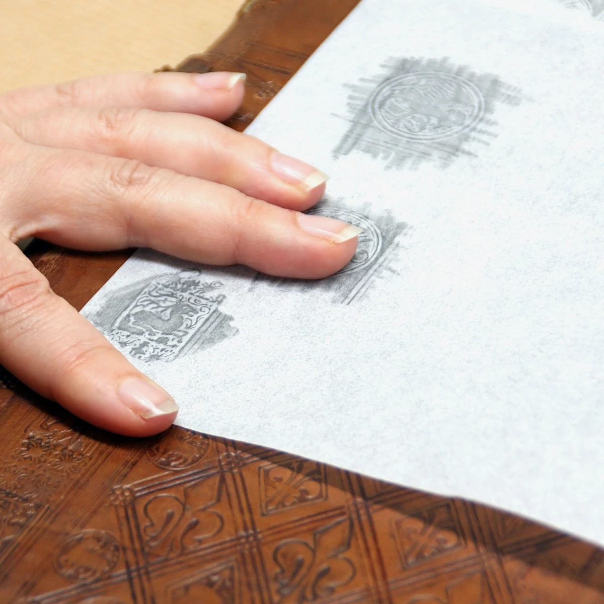
Before diving into the press types, let's talk briefly about a charming characteristic you might encounter: deckle edges. These are the irregular, feathery, untrimmed edges found on traditional handmade papers, and sometimes replicated on machine-made papers for aesthetic appeal. They are formed when the fibrous pulp slurry escapes under the papermaking mold, creating a natural, soft edge. A deckle edge is often considered a sign of high-quality, artisan paper and can add a beautiful, organic touch to your finished artwork, enhancing its handmade feel. While not directly impacting how paint behaves, it's a detail that speaks to the heritage and craftsmanship behind the paper, subtly influencing the presentation and perceived value of a piece. It’s like the perfect frame pre-built into the paper itself, a small nod to the history of the craft, connecting your modern piece to centuries of papermaking tradition.
The Raw Materials: Cotton, Cellulose, and Beyond
Before any pressing happens, the fundamental composition of your watercolor paper makes a world of difference, profoundly impacting its performance and longevity. Most high-quality watercolor papers are traditionally made from either 100% cotton (often called rag paper) or wood pulp (cellulose). However, the market is continually innovating, expanding to include other fascinating options like bamboo, hemp, or even synthetic papers (like YUPO), each bringing its own unique properties and characteristics to the artistic table. The choice of fiber isn't just about cost; it's about how the paper will perform under your brush, how it reacts to water, and crucially, how long your artwork will last. The choice of fiber isn't just about cost; it's about how the paper will perform under your brush, how it reacts to water, and crucially, how long your artwork will last.
- 100% Cotton Paper (Rag Paper): This is often considered the crème de la crème, and for good reason. Cotton fibers are naturally long, strong, and inherently absorbent, creating a robust and resilient sheet. This type of paper can withstand a lot of abuse – scrubbing, lifting, multiple layers, and aggressive techniques – without falling apart, pilling, or showing signs of stress. Its superior wet strength means it can hold up to repeated reworking and manipulation without deteriorating. It’s naturally acid-free and lignin-free, meaning your artwork will last for centuries without yellowing, becoming brittle, or degrading. It feels substantial in your hand, has a beautiful drape when wet, and truly holds onto pigment in a way that allows for rich, luminous washes and incredible depth of color. For any serious piece you intend to keep or sell, 100% cotton is almost always the gold standard for archival quality and ensuring your artistic legacy endures.
- Wood Pulp Paper (Cellulose): More affordable and widely available, papers made from wood pulp are still perfectly viable, especially for beginners, practice, or studies. However, the fibers are shorter and weaker than cotton, making them more prone to pilling or tearing if overworked, especially with repeated scrubbing or lifting. While many quality wood pulp papers are now treated to be acid-free and often buffered to resist future acid development (sometimes offering a 'good for a few decades' archival rating, rather than centuries), they generally lack the inherent strength and longevity of cotton. They are often less absorbent, can buckle more easily, and are more prone to pilling or tearing if overworked, especially with repeated scrubbing or lifting. While they can be a great entry point, understanding their limitations will help you avoid frustration and manage expectations.
- Synthetic Papers (e.g., YUPO): These are a more modern, experimental option, typically made from 100% polypropylene, a non-porous plastic film. Unlike traditional papers, YUPO doesn't absorb water; paint sits entirely on the surface, creating unique effects. Colors remain incredibly vibrant, and lifting is exceptionally easy, making it ideal for experimental techniques, hard-edge painting, or creating crisp, jewel-like effects. However, it can be challenging to work with as the paint moves very freely, offering little control for traditional washes. It’s certainly not for beginners, but a fascinating surface for those looking to push boundaries.
So, when you're choosing paper, it's not just about the hot or cold press, but also about the very soul and origin of the paper – what it's made of and how it behaves! Understanding the fiber content is the first step in predicting how your chosen paper will react to your paints and techniques.
Environmental & Ethical Considerations: Choosing Sustainable Paper
As artists, we're becoming increasingly aware of the materials we use and their impact on the planet. The good news is that the papermaking industry is responding with a growing number of sustainable and eco-friendly options. This isn't just a trend; it's a commitment to responsible sourcing and production that allows artists to align their creative practice with their values.
- FSC Certified Papers: Look for the FSC (Forest Stewardship Council) certification on wood pulp papers. This label ensures that the wood fibers come from responsibly managed forests, promoting sustainable forestry practices and protecting biodiversity.
- Recycled Content: Papers made from recycled post-consumer waste or recycled cotton rags significantly reduce the demand for virgin fibers, minimizing environmental impact.
- Alternative Fibers: As mentioned, papers made from rapidly renewable resources like bamboo and hemp are excellent sustainable choices. These plants require less water, pesticides, and land to grow compared to traditional wood pulp sources.
- Manufacturing Processes: Some manufacturers are also adopting more eco-friendly production methods, reducing water usage, energy consumption, and chemical waste.
Choosing sustainable paper doesn't mean compromising on quality or performance. In fact, many eco-friendly options offer exceptional handling characteristics and unique textures that can inspire new artistic directions. Look for manufacturers who transparently share their sourcing and production methods. It's a small but powerful way to make a positive impact with every stroke of your brush, ensuring that our artistic legacy is also a responsible one. You can read more about this in the FAQ section, "Are there eco-friendly or sustainable watercolor paper options?"
Hot Press Paper: The Smooth Operator – Precision, Detail, and Control
- Characteristics: This paper is literally run through hot, polished metal rollers under high pressure. Imagine taking a steam iron to a piece of fabric – the heat and intense pressure effectively flatten and compress the paper fibers, giving it a super smooth, almost glossy surface. This results in very little to no tooth (that’s the term for the texture or grain of the paper), making it feel almost like drawing paper. This tightly compacted surface means pigment tends to sit directly on top, leading to incredibly sharp lines and vibrant colors. It's the smooth operator, through and through, a minimalist's dream, ideal for precision, whether you're working with delicate botanical details or bold graphic illustrations. Its surface is often likened to that of drawing paper, offering minimal resistance to your brush, making it perfect for techniques that demand controlled fluidity. This lack of tooth can also make lifting (removing paint) easier compared to textured papers, as the pigment hasn't sunk deep into the fibers, allowing for subtle corrections and highlights that are almost impossible on more absorbent surfaces. It's also an exceptional surface for incorporating pen and ink (especially for crisp line art or intricate cross-hatching), technical drawing (where precision is paramount), calligraphy (allowing nibs to glide effortlessly), and even fine graphite or colored pencil work, as the smooth surface allows for crisp lines, smooth blending, and vibrant color saturation without interruption from texture. This makes it an ideal choice for artists who demand meticulous control and flawless execution across various media.
Cold Press Paper: The Textured Classic – Versatility, Blending, and Expressive Texture
- Characteristics: In contrast, cold press paper is pressed through cold rollers, or sometimes simply allowed to air dry with less intense pressure. This gentler, cooler process allows the paper to retain much of its natural texture. It's bumpy, with distinct hills and valleys – what artists affectionately call its "tooth." This varied surface gives the paper character, providing tiny crevices for pigment to settle into, influencing paint absorption, drying time, and the overall aesthetic of your washes. Think of it as a friendly terrain for your watercolors to explore, providing natural texture and depth and making it incredibly versatile. Its surface readily accepts and holds pigment, making it ideal for the soft, diffused blends that define many traditional watercolor styles. This varied surface also provides a natural texture that can be leveraged for expressive effects like granulation (where pigments separate and settle into the paper's valleys, creating stunning, speckled appearances that add visual depth and character) and dry brush work (where minimal paint on the brush skims the paper's peaks, leaving broken, textured marks that are perfect for capturing rough surfaces like rocks, bark, or distant foliage). This interplay between pigment and paper texture is one of the true joys of cold press. The additional working time provided by its absorbency makes it incredibly forgiving, allowing artists to blend and manipulate colors with greater ease. This makes it particularly suited for techniques like wet-on-wet and layering, where colors can slowly merge and build depth, and it provides a satisfying drag for the brush, enhancing textural control.
### The Magic of Sizing: How Paper Controls Water and Pigment Behavior
Beyond the raw materials and the pressing, there's another hidden hero in the world of watercolor paper: sizing. Sizing is a substance – traditionally gelatin (for which many papers were not vegan, a critical detail for some artists), but now often synthetic, and sometimes even plant-based for vegan options – added to the paper pulp (called internal sizing) or applied to the surface of the finished paper (called external sizing). It's what controls the paper's absorbency and prevents it from acting like a blotter or blotting paper. Without proper sizing, watercolor paper would instantly soak up paint, giving you no time to work, blend, or create nuanced washes, and colors would appear dull and lifeless, bleeding uncontrollably. Think of sizing as the gatekeeper of water, carefully moderating how quickly and deeply pigment interacts with the paper fibers. The type and amount of sizing profoundly impact everything from the vibrancy of your colors to your ability to lift paint, create smooth gradations, and even how quickly your washes dry. It's what dictates the entire dance between water and pigment on the paper's surface.
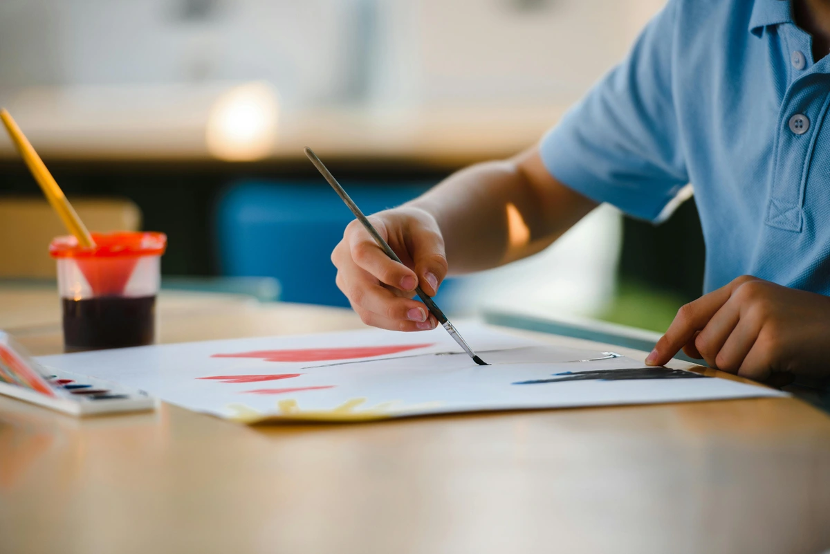
Beyond Smooth and Textured: The World of Finishes
While "Hot Press," "Cold Press," and "Rough" are the primary categories, you might also encounter terms like "fine grain," "medium grain," or "satin" when looking at watercolor papers. These terms often relate directly to the degree of pressing, acting as a more granular description of the paper's tooth – that delightful surface texture that makes watercolor, well, watercolor. It's important to remember that manufacturers use these terms with slight variations, but the underlying principle is consistent: they describe the level of surface texture.
- Hot Press (Fine Grain / Satin): This is the smoothest option, with virtually no texture. It allows for crisp lines and fine details, making it the preferred choice for botanical illustrations, detailed portraits, or any work requiring high precision. Its uniform surface is also excellent for technical drawings and fine calligraphy.
- Cold Press (Medium Grain / Not): This is the most popular choice, offering a noticeable but not overly aggressive texture. It's often referred to as "Not" paper, short for "not hot pressed." This texture is ideal for a versatile balance of detail and wash work, making it the all-rounder for most watercolor artists. It provides enough tooth for subtle granulation and dry brush effects without interfering with moderate detail.
- Rough Paper (Coarse Grain): As its name implies, this is the most textured of the three, with prominent hills and valleys that grab pigment dramatically, creating bold and expressive effects. It's the go-to for atmospheric landscapes or abstract work where texture is a key player, providing a rugged, almost sculptural landscape for your watercolors to interact with, enhancing gestural marks and spontaneous brushwork. This pronounced texture is a deliberate choice, intended to amplify the organic interplay of water and pigment, pushing your art towards a more dynamic and less controlled aesthetic.
Understanding these nuances can help you further refine your paper choice for specific effects, letting you match your artistic vision with the perfect surface and technique. Think of it as having a richer palette of textures to paint on, each one inspiring a different approach.
- Internal Sizing: Added to the pulp slurry before the sheets are formed, internal sizing distributes sizing agents throughout the paper's entire structure. This affects the paper's foundational absorbency, creating an initial resistance to water penetration and ensuring the fibers bond correctly during formation. It's like building water resistance into the very DNA of the paper, controlling the rate at which the fibers absorb liquid and bond with each other. This internal sizing contributes to the paper's overall structural integrity when wet.
- External Sizing (Surface Sizing): Applied after the sheet is formed and dried, often as a gelatin bath (for traditional papers, sometimes synthetic or even plant-based for vegan options), external sizing primarily affects the paper's surface behavior. This crucial outer layer dictates how paint sits on top, how easily it can be lifted, and how vibrant colors appear. It's this layer that actively controls how paint blooms and spreads, giving you the control for delicate washes or sharp edges. The external sizing is particularly responsible for the paper's
Different amounts and types of sizing contribute significantly to how quickly paint dries, how easily it can be lifted, and how vibrant the colors appear. Too much sizing, and the paint beads up like water on a freshly waxed car, offering little absorption and making it difficult to achieve smooth washes. Too little, and it sinks in instantly, dulling colors and giving you no time to work, making the paper behave like blotting paper. It's a delicate, almost alchemical balance, and manufacturers guard their sizing recipes like ancient secrets, as it profoundly impacts the feel and performance of their paper. The quality and amount of sizing can vary significantly between brands, even for papers of the same type and weight, leading to subtle but noticeable differences in how your paint behaves – sometimes called "hard sized" for less absorbent paper or "soft sized" for more absorbent. This is why artists often develop strong preferences for particular brands, finding that one paper's sizing offers just the right amount of resistance and absorbency for their style, impacting everything from paint flow to granulation effects.
That simple difference in manufacturing creates two completely different playgrounds for your paint. One is a slick skating rink, perfect for agile moves and sharp turns; the other is a beautiful, rugged hiking trail, inviting you to explore its varied terrain. It’s like choosing between a paved road and a winding forest path for your journey – both offer beauty, but demand different vehicles and techniques. Understanding these fundamental differences is the first step toward mastering watercolor, allowing you to intentionally select the right paper to achieve your desired artistic effect.
The Showdown: Hot Press vs. Cold Press at a Glance
I’m a visual person, and sometimes a table just cuts through the noise. Here’s the breakdown of how these two papers stack up in the real world.
Feature  | Hot Press (The Smooth Operator) | Cold Press (The Textured Classic) |
|---|---|---|
| Texture | Very smooth, minimal tooth. | Noticeable texture, bumpy. Often called “Not” paper. |
| Paint Behavior | Paint sits on top, dries quickly. | Paint sinks into the valleys, dries slower. |
| Best for Details | Excellent. Perfect for pen, ink, and fine brushwork. | Good, but the texture can break up fine lines. |
| Washes | Can be tricky. Prone to streaking if you're not fast. | Glorious. The texture helps create even, beautiful washes. |
| Lifting Paint | Easier to lift color since it hasn't sunk in deep. | More difficult. The paint gets locked into the paper fibers. |
| Color Appearance | Colors appear very bright and vibrant. | Colors can appear slightly less vibrant as they sink in. |
| Scanning/Photos | Scans beautifully, no texture to create shadows. | Texture can be tricky to photograph without glare. |
| Overall Vibe | Modern, crisp, graphic, illustrative. | Traditional, expressive, classic watercolor look. |
| Ideal Applications | Detailed botanicals, fashion illustration, calligraphy, pen & ink, portraiture, hyperrealism, technical drawings, precise geometric forms, highly layered glazes. | Landscapes, abstracts, loose florals, expressive portraits, wet-on-wet techniques, atmospheric effects, dry brush textures, granulation studies. |
| Blendability | Smooth, but can be challenging for large, seamless gradients without practice. | Excellent for soft, diffused blends; colors melt into each other beautifully. |
| Dry Brush Effects | Minimal texture means dry brush is subtle, good for fine textures. | Pronounced texture excels at vibrant, broken dry brush effects. |
| Masking Fluid | Easier to apply and remove cleanly due to smooth surface. | Can be more challenging to remove without damaging the paper's tooth. |
| Techniques it Excels At | Fine-line drawing, delicate washes, glazing, pen & wash, ink drawings, detailed colored pencil work. | Wet-on-wet, lifting, granulation, dry brush, soft edges, layered washes for depth, experimental textures. |
A Deeper Dive into Hot Press: The Detail-Oriented Friend
I reach for hot press paper when I know my plan involves intricate details, when every tiny line and dot needs to sing. If I’m using ink alongside my watercolors, or if I’m planning on drawing a portrait with very fine lines, hot press is my absolute go-to. The smooth, almost slick surface is a dream for pen nibs, allowing them to glide effortlessly without snagging or skipping, giving you those razor-sharp edges that bring precision to life. It’s like painting on glass, in the best possible way, allowing for an almost hyper-realistic approach to subjects. This smooth canvas is also phenomenal for calligraphy or fine-line drawing (perhaps with your favorite technical pens or dip pens), where crisp, uninterrupted lines are paramount. It’s also incredibly receptive to colored pencils, allowing for smooth, burnished layers and vibrant detail, and even graphite for hyper-realistic renderings.
Because the paint tends to sit more on the surface rather than sinking into deep valleys, you get these incredibly crisp edges and vivid color saturation. This makes it fantastic for precise work like botanical illustrations where every stamen and petal needs clarity, for fashion sketches demanding clean lines, for architectural renderings, or anything that needs to look clean, precise, and graphically impactful. It’s also my secret weapon for building up delicate glazes – thin, transparent layers of color – one after another, creating incredible depth without disturbing the underlying layers. Think of those luminous oil paintings by the Old Masters; hot press allows for a similar, though watercolor-specific, layering effect, allowing you to build subtle shifts in tone and color with remarkable control. Furthermore, for pieces I know I'll be digitizing for prints or online portfolios, scanning hot press is an absolute breeze – no distracting texture to worry about, just pure, unadulterated color and line. It's the ideal surface for artists who value control and meticulous execution, and who aren't afraid of its demanding nature. Its smooth surface also makes it less prone to paint bleeding outwards, maintaining sharp lines.
The downside? It’s not very forgiving, a bit like a prima donna of papers, demanding a certain level of finesse and speed. Water tends to pool and run, creating hard edges or 'blossoms' if you’re not quick enough or your paper isn't perfectly flat. Blending large, smooth washes of color requires a confident, quick hand, and a mastery of water control that can take some time to develop. While not the first choice for sweeping, atmospheric landscapes, its precision makes it indispensable for other applications. Think of the meticulous botanical studies by artists like Maria Sibylla Merian, or the crisp architectural illustrations of more contemporary artists; hot press would have been their undeniable ally. My personal tip? If you’re struggling with streaking, try working with the paper tilted slightly, allowing gravity to assist in distributing the wash evenly, or work flat and use a minimum of water for your washes, building up color gradually. Some artists even use a hairdryer on a cool setting to control drying, though be careful not to overdry or warp the paper. It’s a bit high-strung, yes, but for the right job, when you need that uncompromising precision, it’s an absolute star. If you're just starting out, you can find some great options in this guide to essential watercolor supplies for beginners and definitely consider starting with cold press to build your confidence, allowing you to develop a feel for water control on a more forgiving surface. For artists working with technical illustrations or highly detailed work, hot press paper's uniform surface ensures that every line and shape is rendered with pristine clarity, making it the top choice for fields like scientific illustration or architectural drafting.
Getting to Know Cold Press: The Forgiving All-Rounder
If watercolor papers had a popularity contest, cold press would be the homecoming queen. It’s the most commonly used paper for a reason. That lovely texture—the tooth—is incredibly versatile and forgiving.
The little valleys in the paper grab the pigment and water, holding onto them just a little longer, giving you more time to work, blend, and fuss over your washes. This increased working time is invaluable, especially when you’re learning or when you want soft, diffused edges, making it ideal for the wet-on-wet technique where you apply wet paint to a pre-wetted surface, allowing colors to bleed and blend organically. This method is fantastic for creating ethereal skies, soft backgrounds, and fluid transitions between colors. This texture is also what truly brings out that beautiful granulation effect, where pigments separate and settle in the dips and troughs of the paper, creating stunning, subtle variations in color and giving your work an organic, almost geological feel. If you love loose, expressive landscapes, moody skyscapes, or abstract art where texture plays a key role, cold press is undoubtedly your soulmate. I often find myself reaching for it when I want my watercolors to feel alive and organic, reflecting the unpredictability of nature itself. It's truly a paper that collaborates with the artist, enhancing the natural flow and movement of water and pigment.
It’s the paper I learned on, and honestly, it’s the paper I still use for about 80% of my work. It just feels like what watercolor paper should feel like – toothy, responsive, and ready for adventure. This versatility is precisely why it's often the recommended starting point for beginners; it allows for mistakes and corrections, fostering confidence without the daunting precision demanded by hot press. Its texture is also fantastic for dry brush techniques, where you use a brush with minimal water to skim the surface, leaving broken strokes that highlight the paper's tooth and create incredible texture for things like foliage, rocks, or weathered surfaces. It can handle a surprising amount of scrubbing, allows for effective lifting (with some effort and the right tools like a damp, clean brush or sponge), and generally tolerates multiple layers of paint without falling apart or becoming overly stressed. This robustness is a huge confidence booster, letting you explore and correct without fear, making it ideal for learning and experimentation. For a deeper look into the world of watercolor, and all the delightful things you can do with cold press, check out this definitive guide to watercolor painting techniques. Its forgiving nature makes it a true companion on any artistic journey, allowing you to focus on developing your skills rather than fighting your materials.

And Then There's Rough Paper: Embracing the Wild Side – Texture, Expression, and Bold Statements
Just to be thorough, and because the world of paper loves to keep us on our toes, there's a third, more adventurous option: Rough Press. As the name implies, it's even more textured than cold press – think of it as cold press turned up to 11, or perhaps a rugged mountain trail compared to cold press's gentle hills. The texture is pronounced, with deep, irregular indentations that create a dramatic, almost sculptural surface. If you ever wondered what it feels like to paint on a moonscape, this is probably it, offering an incredible playground for texture and expressive mark-making. Artists like John Singer Sargent occasionally used rough paper to capture the dynamic energy and texture of his landscapes and portraits, leveraging its unique surface to enhance the painterly qualities of his work. The way the paper's texture breaks up pigment can add a spontaneous, almost unfinished quality that many artists find incredibly appealing for expressive pieces, blurring the line between painting and drawing, and inviting the viewer to engage with the tactile surface.
What Rough Paper is Good For
- Dramatic Landscapes & Seascapes: The deep valleys and ridges capture pigment in a way that creates incredible, built-in shadows and highlights. This is perfect for expressing stormy skies, craggy mountains, turbulent waters, or any scene where natural, rugged texture is paramount. The paper itself becomes part of the landscape, almost like a pre-textured canvas for monumental scenes.
- Abstract Work: If you revel in texture and want your paint to do some of the heavy lifting, rough paper is a dream. Granulation effects are not just present; they are amplified and celebrated, creating stunning visual interest and unexpected organic patterns. Dry brush techniques become incredibly dynamic and expressive, making the surface sing with broken color and raw energy. It's a fantastic surface for exploring texture in art and truly making the paper an active participant in your artwork.
- Expressive & Gestural Work: It inherently encourages a loose, bold, and uninhibited style. Trying to achieve fine details on rough paper is largely an exercise in frustration, but for broad strokes, bold washes, and expressive gestures, it's unparalleled. Think big, think gestural, think primal – perfect for capturing raw emotion and movement.
- Charcoal and Pastels: While focused on watercolor, rough paper can also be a magnificent surface for dry media like charcoal and soft pastels, as its tooth aggressively grabs and holds pigment, allowing for deep, rich layers and dramatic textural effects that would be impossible on a smooth surface. It provides a natural grip for powdery media, making blending and layering a tactile joy, and creating a unique aesthetic that celebrates the paper's inherent character. You can explore this further in articles like Best Paper for Charcoal Drawing, where the textural interaction is paramount.
The Challenges of Rough Paper
- Control is Difficult: The extreme texture means water and pigment can be very unpredictable. Achieving smooth, even washes is a significant challenge, often resulting in patchy or streaky areas, which can be a blessing or a curse depending on your intention. It demands a different kind of mastery, one that embraces the unexpected and learns to work with the paper's strong personality rather than against it.
- Detail is Almost Impossible: Fine lines will break up, skip, and disappear into the deep tooth. If precision is your goal, look away now. This paper forces you to embrace imperfection and broad strokes, pushing you towards a more abstract or expressive approach, where the raw energy of the texture can enhance the feeling of your art.
- Lifting is Harder: Once pigment settles into those deep crevices, especially with staining colors, it's much more difficult to lift out cleanly compared to smoother surfaces. This means corrections can be tricky, so it often encourages a more confident, one-pass painting style.
- Brush Wear: The abrasive surface can be harder on delicate natural hair brushes, so you might find yourself reaching for more robust synthetics or even bristle brushes, which can stand up to the vigorous interaction with the paper's tooth. Consider this when choosing your tools – sometimes a workhorse synthetic brush is precisely what rough paper calls for.
When to Embrace the Rough
Rough paper is definitely an advanced-level paper, one you might graduate to once you're intimately comfortable with cold press. It's not for every piece, but for those moments when you want your artwork to practically leap off the page with texture, raw energy, and a palpable sense of presence, it's absolutely worth exploring. It’s a paper that demands confidence and rewards spontaneity, often leading to exhilarating, unexpected results. If you feel stuck in a rut with smoother papers, a rough surface can literally shake up your technique and inspire new creative directions.
credit, licence
Choosing the Right Weight: Beyond Press
While hot, cold, and rough describe the surface texture, paper weight describes its thickness and durability. This is usually expressed in pounds (lb) for imperial measurements (e.g., 90lb, 140lb, 300lb) or grams per square meter (gsm) for metric (e.g., 190gsm, 300gsm, 640gsm). Think of it like this: the heavier the paper, the more water it can handle without warping, buckling, or needing to be stretched. This phenomenon, known as cockling, occurs when the paper fibers expand unevenly upon wetting and then contract as they dry, causing unsightly undulations and making the paper difficult to work on, scan, or frame. Cockling is not just an aesthetic issue; it can also affect the way paint settles on the paper, leading to uneven washes and unexpected texture. Heavier papers have more structural integrity and thus resist this warping more effectively, which is why they're often preferred for highly wet techniques or larger pieces.
- 90 lb (190 gsm): This is a lightweight paper, often found in student-grade pads. It's perfectly fine for sketching, practice, or dry media, but it will almost certainly buckle significantly with watercolor washes unless you stretch it beforehand. Stretching involves thoroughly wetting the paper, typically by soaking it, then taping it with archival gummed paper tape or stapling it to a rigid, non-absorbent board (like Gatorboard or a drawing board), and allowing it to dry taut and flat. This pre-stretching ensures the paper will remain perfectly flat even after multiple wet applications of paint. Great for studies, less so for finished pieces you want to frame without ripples, but perfect for experimenting without guilt, allowing you to try new techniques without fear of 'ruining' an expensive sheet. This weight is often chosen for sketchbooks or budget-friendly practice pads, where minor buckling is acceptable in exchange for lower cost.
- 140 lb (300 gsm): This is the workhorse, the most popular and versatile weight. It can handle a good amount of water with minimal buckling, making it suitable for most techniques and finished artwork. It's often recommended for beginners because it offers a good balance of durability and affordability, providing a robust surface without the need for stretching for most applications. If you're buying paper in bulk, this is usually a safe bet. It strikes an excellent balance between cost and performance, making it a reliable choice for daily practice, studies, and even many finished pieces. Many artists find this weight ideal for commissions and gallery-bound pieces, offering a balance of performance and cost-effectiveness.
- 300 lb (640 gsm): The heavyweight champion. This paper is incredibly thick and sturdy, feeling almost like cardboard. It can take a serious soaking, multiple layers, and aggressive scrubbing without any buckling, even without stretching. It's often favored by professional artists for its luxurious feel and ability to withstand extensive manipulation, ensuring a perfectly flat surface regardless of the amount of water applied. The downside? It's considerably more expensive, making it an investment, but for a truly important piece – a commission, a gallery submission, or a work you intend to cherish for years – it's an investment in quality, peace of mind, and the longevity of your artistic expression. Its substantial feel and unwavering flatness enhance the perceived value and professionalism of your work. This is often the choice for very large format watercolors or those incorporating extremely wet, multi-layered techniques, where maintaining a pristine surface is paramount.
So, while press dictates how your paint behaves on the surface, weight dictates how the paper itself responds to moisture and how much abuse it can take. Both are critical considerations for your artistic process.
Paper Formats: Sheets, Pads, Blocks, and Rolls
Beyond press and weight, paper comes in various formats, each suited to different workflows and budgets:
- Individual Sheets: Often considered the most economical way to buy high-quality artist-grade paper, especially in larger sizes. You can buy exactly what you need, but you'll need a way to store them flat and potentially stretch them. This format offers the most flexibility for custom sizes.
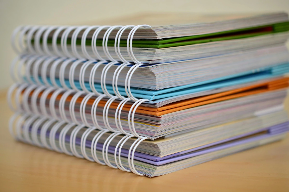
- Pads: Pages are bound on one side, allowing for easy tear-off. Convenient for studies, sketching, or when you don't need the paper to remain perfectly flat. They can still buckle with heavy washes, but are excellent for spontaneous work, practice, and travel when convenience is key.
- Blocks: These are glued on all four sides, offering a pre-stretched surface that minimizes buckling as the paper dries. Excellent for plein air painting or when you want a perfectly flat finish without the hassle of stretching. Once your painting is completely dry, you use a palette knife or a dull blade to carefully separate the top sheet from the block. They are a professional favorite for their convenience and consistent results.
- Rolls: For large-scale work or when you need custom sizes, paper comes in rolls. This is often the most cost-effective way to get very large pieces, but requires careful cutting and often extensive stretching before use. Ideal for mural-sized watercolors, banners, or collaborative projects where you need maximum flexibility in dimensions.
Your choice of format depends on your project scale, storage capacity, and preferred method for managing buckling.
Storage Tips for Different Formats
- Individual Sheets: Best stored flat in an archival portfolio or flat file drawer, away from humidity and light. Placing a clean, dry board on top can prevent curling.
- Pads: Keep them in their original packaging, stored flat to prevent cover damage and minimize dust accumulation. Use them for spontaneous work, knowing slight buckling is possible.
- Blocks: Store flat. The glued edges offer inherent protection against dust and warping until you remove the finished piece. Keep the block clean and dry.
- Rolls: Store vertically or horizontally in their original tubes, or in archival boxes designed for rolled artwork. Ensure they are protected from crushing and excessive unrolling, which can cause creases.
Preparing Your Paper: The Art of Stretching and Taping
Even with heavyweight papers, some artists prefer to stretch their watercolor paper, especially for larger works or very wet techniques like wet-on-wet washes. Stretching prevents cockling (the buckling or warping of paper when it gets wet and dries unevenly) and provides a perfectly flat, taut surface to work on. This is less critical for 300 lb paper, but highly recommended for 90 lb and often for 140 lb papers, particularly if you use a lot of water.
There are a few common methods for stretching:
- Gummed Paper Tape Method: This traditional method involves soaking your paper in water until it's fully saturated and relaxed (usually 5-10 minutes, depending on weight). Then, you lay it flat on a rigid, non-absorbent board (like plywood, Gatorboard, or MDF) and firmly tape all four edges down with gummed paper tape (which is water-activated). As the paper dries, it contracts and pulls taut, creating a drum-like surface. Once your painting is complete and dry, you carefully cut the paper from the board. This method creates a perfectly flat surface, crucial for even washes and preventing blooms.
- Stapling Method: Similar to the tape method, but after soaking, the wet paper is stapled securely around all edges to a wooden board. The staples should be close together to ensure even tension. This method is often more robust for very heavy washes or when working on larger pieces, providing a strong, unwavering tension.
- Watercolor Blocks: As discussed, these are pre-stretched for you, glued on all four sides. They are incredibly convenient but offer less flexibility in terms of custom sizing or saving individual sheets until completely dry. They are a professional favorite for their portability and consistent flat drying without needing additional supplies.
- Modern Stretching Frames: Newer options include specialized stretching frames that use a tension system to hold wet paper taut without adhesives, offering a reusable and mess-free alternative.
The key to successful stretching is ensuring the paper is fully expanded when you secure it to the board, so that as it dries and shrinks, it pulls taut and remains flat throughout your painting process. This process works because cellulose fibers expand when wet and contract when dry. By securing the paper in its expanded state, the subsequent contraction creates tension, resulting in a perfectly flat painting surface. It’s an extra step, yes, but for many artists, the smooth, unblemished surface it provides is well worth the effort.
So, Which One Should You Buy?
Okay, let's cut to the chase. You're standing in the art store, your wallet is trembling. What do you put in your basket?
- You should buy HOT PRESS if:
- You crave precision and fine detail, allowing every intricate line and brushstroke to stand out clearly.
- You plan to incorporate ink pens, technical drawing, or fine-line work into your art, where a smooth glide is essential and feathering is undesirable.
- You regularly scan your finished artwork for prints, digital portfolios, or online use, as its lack of texture translates beautifully without glare or shadows.
- You love sharp, crisp edges and ultra-vibrant, intense color saturation, especially for pieces where clarity and graphic impact are paramount.
- You use masking fluid extensively, as its smooth surface makes application and clean removal easier, preserving sharp edges without damaging the paper's fibers.
- You work in a very controlled, precise manner, enjoying intricate layering and delicate washes, and want predictable paint behavior with minimal interference from paper texture.
- You plan to add textural elements or fine shading with dry media like graphite, charcoal, or colored pencils, where you want the details to stand out clearly without interruption from the paper's tooth.
- You want to experiment with opaque mediums like gouache or thin acrylic washes, where you desire smooth blends and vibrant, untextured color application.
- You should buy COLD PRESS if:
- You are a beginner – seriously, start here. Its forgiving nature and increased working time will boost your confidence and allow you to learn water control more easily.
- You love creating beautiful, soft, and diffused washes of color, where transitions melt seamlessly into one another.
- You want to achieve that classic, slightly textured watercolor look, where the paper's tooth adds depth and character to your work.
- You paint in a loose, expressive style, embracing the flow of water, happy accidents, and the organic nature of watercolor.
- You enjoy experimental techniques like salt effects, alcohol blooms, or creating prominent granulation, wanting the paper's texture to enhance these effects and add visual interest.
- You're exploring abstract textures and want the paper's inherent character to contribute significantly to the artwork's mood and surface, creating a more organic, painterly feel.
- You frequently use dry brush techniques and want the paper's texture to create striking, broken marks for landscapes, foliage, or weathered surfaces, emphasizing the paper's physical presence.
- You're using gouache or watered-down acrylics and want to leverage the paper's absorbency and texture for unique, organic effects and layered depth, rather than a flat, smooth application.
- You should buy ROUGH PRESS if:
- You desire dramatic textures and bold effects, where the paper's surface actively contributes to the artwork's visual impact.
- You primarily create expressive landscapes, abstracts, or gestural pieces that thrive on broken color and amplified granulation.
- You embrace unpredictability and spontaneity in your painting process, letting the paper's personality guide your brushwork.
- You want to explore dry brush techniques to their fullest potential, creating rugged, tactile surfaces for elements like rocks, wood, or stormy skies.
- You're an experienced artist looking to push boundaries and experiment with highly textural effects that smoother papers cannot offer.
- You want to use gouache or acrylics in a bold, expressive way, allowing the paper's aggressive texture to contribute dramatically to the overall surface quality and visual impact of your mixed media pieces.
My personal advice? Buy a small pad or even individual sheets of each – perhaps a 140 lb cold press, a 140 lb hot press, and if you're feeling adventurous, a small rough sheet. There is no substitute for feeling it yourself, for letting the brush glide or dance across the surface. See how the paint flows, see how it dries, see which one frustrates you less and delights you more. Art is deeply personal, and your choice of paper is too; it's an extension of your creative voice. For more specific recommendations, this review of the best watercolor paper for artists is a great next step, or if you're looking for a good starting point, check out this guide to essential watercolor supplies for beginners. Remember, the best paper is the one that empowers you to create your best work.
The Importance of a Paper Sample Kit: Your Personal Research Lab
Creating a small paper sample kit for yourself is an invaluable exercise. Get a few sheets of different brands, weights, and presses. Label them clearly – perhaps with the paper type, weight, and brand. Then, dedicate a day to just playing with them, making swatches, trying various washes (even vs. graded), lifting techniques, dry brush, and perhaps even some pen or pencil marks. Document your findings! Create a systematic series of swatches, trying various washes (even vs. graded), lifting techniques, dry brush, and perhaps even some pen or pencil marks. Note how quickly the paper absorbs water, how colors mingle, and how easily they lift. It's through this direct, hands-on interaction that you'll truly understand the nuances each paper offers and discover your personal favorites, building a tactile memory of how different surfaces respond. Remember, the paper should feel like an extension of your creative hand, not a battle you have to fight. This personalized research will save you countless hours of frustration and wasted materials in the long run.
A Brief History of Watercolor Paper: From Humble Beginnings to Modern Masterpieces
It might seem like a niche topic, but the evolution of watercolor paper is actually a fascinating journey, deeply intertwined with the development of art itself. For centuries, artists used whatever surfaces were available – parchment, vellum, or simple handmade papers that were often inconsistent in quality and notoriously tricky for watercolor, tending to absorb paint unevenly or buckle horribly. Many Old Masters painstakingly prepared their own surfaces with various grounds and gesso to make them more receptive, a practice that highlights the inherent challenges of early papermaking for this delicate medium.
The real revolution for watercolor paper began to gain momentum in the 18th century, particularly with innovators like James Whatman in England. He developed groundbreaking methods for creating more consistent, durable, and, crucially, highly sized papers. Whatman's "wove" paper, with its uniform, non-ribbed texture, was a game-changer, providing artists with a reliable and receptive surface that allowed for new levels of detail and luminosity. This innovation wasn't just technical; it liberated watercolor from being merely a sketching medium and elevated it to a fine art form capable of producing finished, detailed works that could rival oils. This innovation wasn't just technical; it liberated watercolor from being merely a sketching medium and elevated it to a fine art form capable of producing finished, detailed works that could rival oils. This period saw a surge in watercolor's popularity, especially among British artists like J.M.W. Turner and John Constable, who pushed the boundaries of the medium, creating atmospheric landscapes and dramatic seascapes that would have been impossible on earlier, less stable papers. Turner, with his revolutionary use of light and color, and Constable, with his evocative depictions of the English countryside, demonstrated the expressive potential of watercolor, proving it could stand alongside oil painting. Their mastery of light and atmosphere often hinged on the very paper they chose, allowing for the subtle gradations and vibrant luminosity that defines their work.
The rise of industrial papermaking in the 19th century made paper more accessible and affordable, further democratizing art. Artists like Winslow Homer in America and the French Impressionists explored its potential, taking advantage of the newfound consistency and quality. They continued to push the boundaries of what the medium could do, with improvements in pulp processing, sizing agents, and pressing techniques leading to the diverse range of papers we enjoy today. Even today, manufacturers continue to refine processes, aiming for papers that are not only beautiful to paint on but also durable, archival, and increasingly, environmentally conscious, often utilizing new sustainable materials like bamboo and hemp. It's a testament to how fundamental this humble material is to artistic expression, a silent partner in countless masterpieces, from delicate floral studies to powerful abstract expressions, constantly evolving to meet the demands of a changing art world.

Beyond the Brush: Mixed Media Mastery
While this article focuses primarily on watercolor, it would be a disservice not to mention the incredible versatility of both hot and cold press papers for other artistic endeavors. Think of them as prime canvases for experimentation, offering a unique foundation for a diverse range of media, and inviting you to break free from traditional boundaries! Hot press, with its pristine surface, is exceptional for:
- Graphite and Colored Pencils: The smooth tooth allows for incredibly fine detail, smooth blending, and vibrant color saturation without the texture of the paper interfering. You can build up many layers for rich, deep colors, making it perfect for intricate colored pencil drawings where you want a smooth, polished finish, or graphite drawings demanding subtle tonal shifts. Explore more about pencils in our best sketching pencils for artists, best drawing pencils for beginners, or even our guide to how to use colored pencils for beginners.
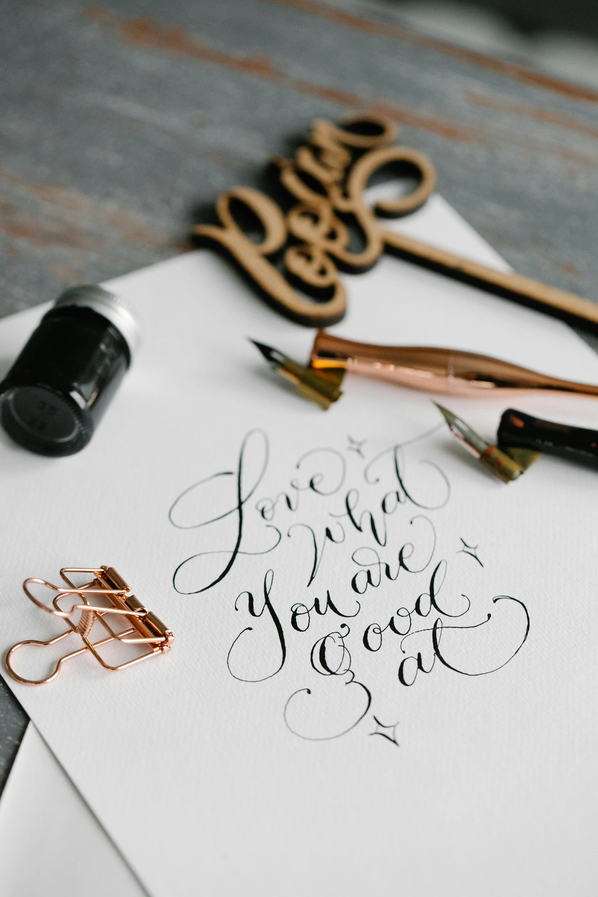
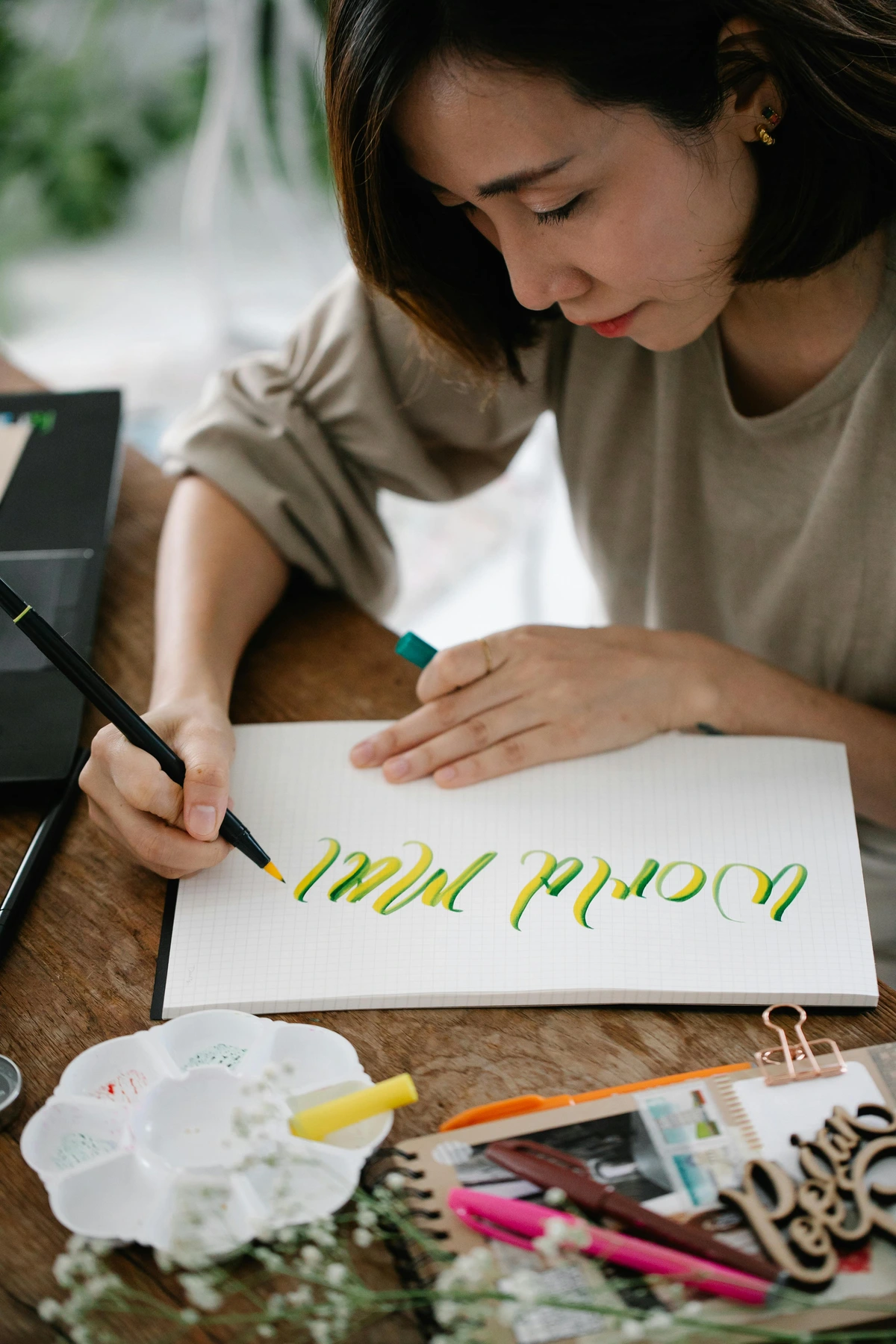
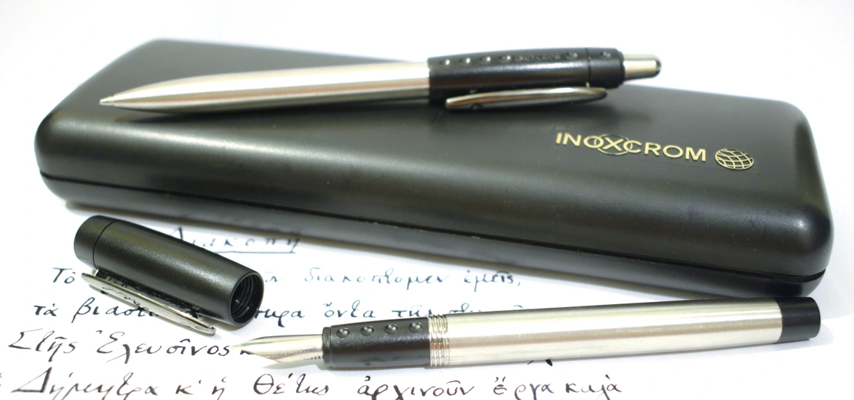
- Pen and Ink: Whether you're using technical pens for architectural drawings, calligraphy pens for elegant scripts, or brush pens for bold strokes, hot press offers an unparalleled glide and prevents feathering, ensuring crisp, clean lines every time. It's the ideal surface for detailed linework and sharp contrasts, making it perfect for ink wash techniques that rely on crisp edges. For mastering your script, consider our essential calligraphy supplies for beginners and basic calligraphy techniques for beginners. Hot press allows for those crisp, unbroken lines that define elegant script, making it ideal for formal invitations, detailed illustrations, or even creating striking graphic novels.
- Markers: Alcohol-based markers, like those beloved by illustrators and comic artists, perform beautifully on hot press, allowing for seamless blends and vibrant, streak-free applications. The smooth surface helps prevent excessive ink absorption and bleeding, ensuring your colors stay where you put them. For a deeper dive, explore articles like Copic Markers Review for Professional Artists or best markers for coloring. The smooth surface helps prevent excessive ink absorption and bleeding, ensuring your colors stay where you put them, leading to beautifully controlled and vibrant results. Hot press paper truly shines when crispness and precision are paramount across different dry and wet media.
Cold press, while textured, also shines with various media:
- Graphite and Charcoal: The tooth of cold press grabs onto dry media beautifully, allowing for rich tonal variations and expressive mark-making. Charcoal drawings, in particular, can achieve a wonderfully organic feel, with the texture adding depth and character, perfect for capturing subtle values and expressive mark-making. You can explore this further in articles like Best Paper for Charcoal Drawing. The slight tooth creates a beautiful texture that can be leveraged for expressive mark-making, capturing subtle tonal shifts and rich, velvety blacks.
- Pastels: Both soft and oil pastels can be layered effectively, with the texture providing a surface for the pigment to cling to, creating luminous, rich surfaces and enabling deep color saturation. It prevents the pastels from sliding around, making blending a more controlled process, and can be explored further in What is Pastel Painting?. The texture grabs the pigment, allowing for deep, rich layers and luminous color saturation that feels almost painterly.
- Gouache and Acrylic Washes: While primarily a watercolor paper, the absorbency and texture can offer unique effects when using opaque gouache (often called opaque watercolor) or watered-down acrylics, especially if you're layering. Gouache will retain some of its matte finish, while thin acrylic washes can mimic watercolor effects, sinking into the texture beautifully. For more on these mediums, explore the definitive guide to paint types for artists. For specific insights into gouache, refer to what is gouache painting or how to use gouache. On cold press, gouache will retain some of its matte finish, while thin acrylic washes can mimic watercolor effects, sinking into the texture beautifully. Cold press paper, with its welcoming texture, is a fantastic foundation for mixed media that celebrates organic marks and rich, layered surfaces.
So, don't be afraid to experiment beyond watercolor! Your chosen paper might just be the perfect partner for your next mixed media masterpiece. I often do my initial sketches on cold press with a light graphite pencil. But it doesn't stop there! Gouache, with its opaque qualities, loves both surfaces: crisp lines and clean edges on hot press, textured layers and rich body on cold. Ink, especially fine-line pen work, thrives on hot press, while brush pens can create interesting, expressive effects on cold press, where the texture can slightly break up the lines for added character. You can even use thin washes of acrylics on these papers, though they'll behave quite differently from traditional watercolors, often drying to a more permanent, plastic-like finish. The paper provides a wonderful foundation for exploring various paint types for artists, allowing you to push boundaries and find unique combinations. It’s truly a playground for mixed media, inviting you to layer and experiment, discovering new artistic avenues with every new material you introduce, from light pencil sketches to vibrant marker illustrations. Don't be afraid to combine! A crisp ink drawing on hot press can be collaged onto a cold press background with soft watercolor washes, or charcoal studies on rough paper can inspire mixed media pieces with acrylics and pastels. The possibilities are truly endless, limited only by your imagination and willingness to explore.
FAQ: Answering Your Burning Paper Questions
What about watercolor blocks and journals?
Watercolor blocks are pads of paper glued together on all four sides. This binding prevents the paper from buckling when wet, as the tension from the glued edges keeps it flat during the drying process. Once your painting is dry, you use a palette knife or a dull blade to carefully separate the top sheet from the block. They are fantastic for plein air painting or if you dislike stretching paper, offering a convenient, ready-to-use surface. They come in both hot press and cold press variations, so you can still choose your preferred texture. Watercolor journals or sketchbooks are similar, but typically bound on one side or spiral-bound, making them excellent for sequential studies, travel, or capturing quick ideas without the pressure of a single, precious sheet. While they may still buckle with heavy washes, they are perfect for studies, daily practice, and developing a consistent art practice. For more options, consider exploring this review of the best watercolor sets for beginners, which often include journals or small pads of paper, or best sketchbooks for watercolor artists. Blocks are a professional favorite for their convenience and consistent results, especially for plein air artists who need a stable surface on the go. Journals, while prone to some buckling, are perfect for capturing daily inspiration, travel sketches, or sequential studies without the pressure of a single, precious sheet.
How does paper texture affect light and shadow in a painting?
The paper's texture, or tooth, has a fascinating and often underestimated impact on how light and shadow play out in your finished artwork. On hot press paper, with its smooth surface, light reflects very evenly, leading to bright, crisp colors and sharp contrasts. Shadows appear clean and defined, as there are no inherent textures to break them up. This contributes to a more graphic, precise aesthetic.
In contrast, cold press and especially rough paper interact with light in a more complex way. The peaks and valleys of the texture create tiny micro-shadows and highlights, even before any paint is applied. When you paint, pigment settles into these depressions, and the raised areas catch the light, creating a natural sense of depth and luminosity. This can make colors appear richer and more varied, enhancing effects like granulation and dry brush. It adds an organic, almost sculptural quality to the surface, making the paper itself an active participant in the play of light and shadow, contributing to the overall mood and texture of the piece. This can lend a heightened sense of realism to landscapes, or a powerful, tangible presence to abstract compositions, making the artwork feel more immersive and dynamic.
What about vegan watercolor paper?
For artists conscious about animal products, the good news is that many watercolor papers are now available in vegan-friendly options. Traditionally, gelatin was a common ingredient in sizing (both internal and external), making many papers unsuitable for vegans. However, a growing number of manufacturers are now using plant-based or synthetic sizing agents. If you're looking for vegan paper, always check the product description or packaging for explicit labeling. Brands committed to ethical sourcing will clearly state if their paper is animal-product-free. This ensures you can pursue your art without compromising your values. Look for papers sized with synthetic or plant-based starches and glues instead of traditional gelatin, and verify ingredient lists if transparency is key to your artistic practice.
How does humidity affect watercolor paper?
Humidity is a significant factor in watercolor painting, and it affects both your paper and your paint! In high humidity, paper will absorb moisture from the air, causing it to become less absorbent to your paint and making it more prone to buckling. This means your washes will dry slower, giving you more working time and softer edges, but also increasing the risk of colors bleeding or becoming muddy if you're not careful. Conversely, in very dry conditions, paper can dry out quickly, leading to faster drying times and potentially harder edges on your washes. This can be beneficial for sharp details but challenging for seamless blends, requiring quicker application. Artists in humid climates often choose lighter papers or stretch their paper more diligently, while those in dry climates might use more water in their mixes or work more quickly. Understanding your environment and how it interacts with your materials is just another layer of mastery in watercolor, allowing you to adapt your technique for optimal results and avoid common issues like overworking or mudding. For example, in very humid conditions, you might want to consider using lighter washes or working with a hairdryer on a cool setting to speed up drying. In extremely dry conditions, pre-wetting your paper more thoroughly or working wet-on-wet can extend your working time.
Can I stretch hot press or cold press paper?
Absolutely, you can stretch both hot press and cold press paper, and for lighter weights (like 90 lb/190 gsm), it's highly recommended to prevent buckling, especially with wet-on-wet techniques or very heavy applications of water. While 140 lb (300 gsm) paper often manages well without stretching, many professional artists prefer to stretch it for larger works or very aggressive washes, ensuring a perfectly flat surface and eliminating any chance of cockling (the unsightly warping of paper). Hot press paper, despite its smoothness, can still buckle if heavily saturated, so stretching can be beneficial for large, intricate washes where a flawless surface is paramount. Rough paper, due to its inherent texture, is less commonly stretched, but if you're working on a very large piece or using extremely heavy washes, it can still benefit from the process to maintain its integrity. The core principle remains the same: pre-wetting the paper and taping it taut to a rigid board allows it to expand uniformly before you apply your paint, ensuring it dries flat and smooth, ready for framing or further work. For a detailed guide, you can refer to the section on "Preparing Your Paper: The Art of Stretching and Taping" above. While 300 lb paper often negates the need for stretching due to its inherent thickness, many artists still choose to do it for absolute flatness, especially for very large works where even minimal cockling would be problematic. Hot press paper, despite its smooth surface, can still buckle considerably with heavy saturation, making stretching a valuable step for maintaining that pristine, unblemished surface.
What is watercolor paper made of?
As I touched on earlier in the "Raw Materials" section, high-quality watercolor paper is typically made from 100% cotton fibers. This makes it incredibly durable, absorbent, and long-lasting – truly the gold standard for fine art. These long cotton fibers interlock to form a strong, stable sheet that can withstand a lot of abuse, from repeated washes to rigorous lifting. Student-grade or more affordable papers are often made from wood pulp (cellulose), which has shorter, weaker fibers, making them more prone to pilling or tearing if overworked. While perfectly good for practice and studies, they might not handle as much water, scrubbing, or manipulation as robust cotton rag paper, and often have a shorter archival life. You might also find papers made from bamboo, which offer a sustainable alternative with a unique feel and absorbency, or even synthetic papers (like YUPO) for highly experimental techniques where paint sits entirely on the surface, creating vibrant, almost enamel-like effects. Always check the label if you're curious about what you're really painting on, as the fiber content profoundly impacts the paper's behavior, longevity, and ultimately, your artistic results! For a deeper dive into the specific characteristics of different fiber types, refer back to the "Raw Materials: Cotton, Cellulose, and Beyond" section, and our section on "Environmental & Ethical Considerations: Choosing Sustainable Paper" above. The longer, stronger fibers of cotton paper interlock more effectively, creating a more stable and resilient matrix that resists tearing and pilling far better than the shorter, weaker fibers found in most wood pulp papers.
Is one paper better for beginners?
Yes, absolutely. If you're just starting your watercolor journey, I wholeheartedly recommend cold press paper for 99% of beginners. Its absorbency and textured surface (tooth) make it significantly more forgiving. You'll have more time to blend colors and coax your washes into submission, reducing the likelihood of hard edges and frustrating streaks. It can also take a bit more of a beating (a polite term for scrubbing and lifting) without showing immediate signs of wear, making it a great surface for experimentation and learning without the fear of instantly ruining a piece. Hot press, with its smooth, less absorbent surface, can be quite frustrating when you're just learning water control, as paint dries quickly and mistakes are harder to hide and correct. Start with cold press, build your confidence, and then venture into the slick world of hot press when you feel ready to tackle its unique challenges and rewards. Think of cold press as your friendly guide to the watercolor world, making your initial experiences far more enjoyable and productive. It offers a more forgiving learning curve, allowing you to focus on fundamental water control and blending techniques without the added frustration of a surface that rushes your process or makes mistakes glaringly obvious.
How can I tell if paper is hot press or cold press?
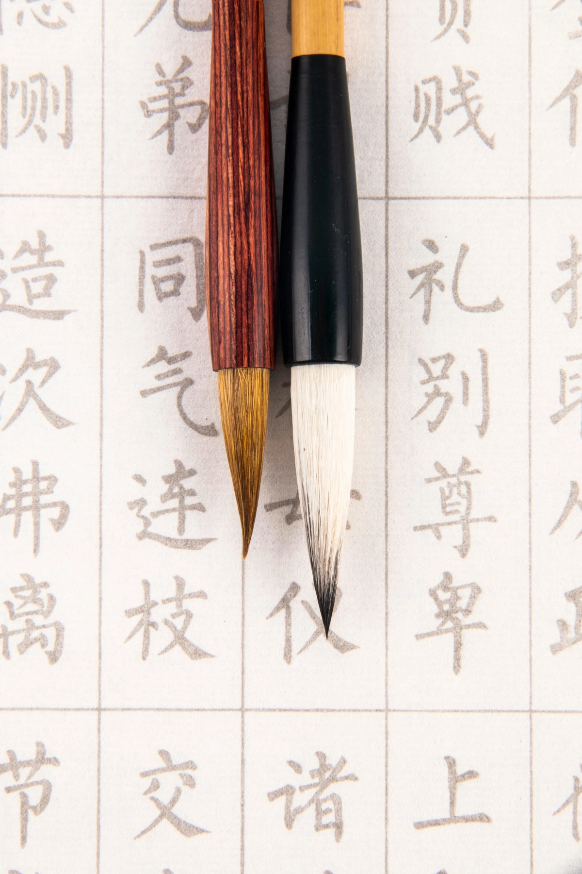
Sometimes, especially if you've lost the packaging, you might wonder what kind of paper you're holding. The easiest way to tell is by touch and sight. Hot press paper will feel exceptionally smooth, almost silky or waxy to the touch, and visually, it will appear very flat and uniform. Cold press paper, in contrast, will have a distinct, slightly bumpy texture that you can both feel and often see, giving it a more tactile quality. Rough paper takes this a step further, with very pronounced, often irregular, indentations. If you're still unsure, try drawing a light pencil line on it; on hot press it will be crisp and unbroken, while on cold press, the line will appear slightly broken or textured as it passes over the paper's tooth. It's a subtle but important distinction that becomes second nature with practice. You'll quickly learn to identify a paper by its unique feel and visual characteristics, which is part of building that intuitive relationship with your materials.
What does 'archival quality' mean for watercolor paper?
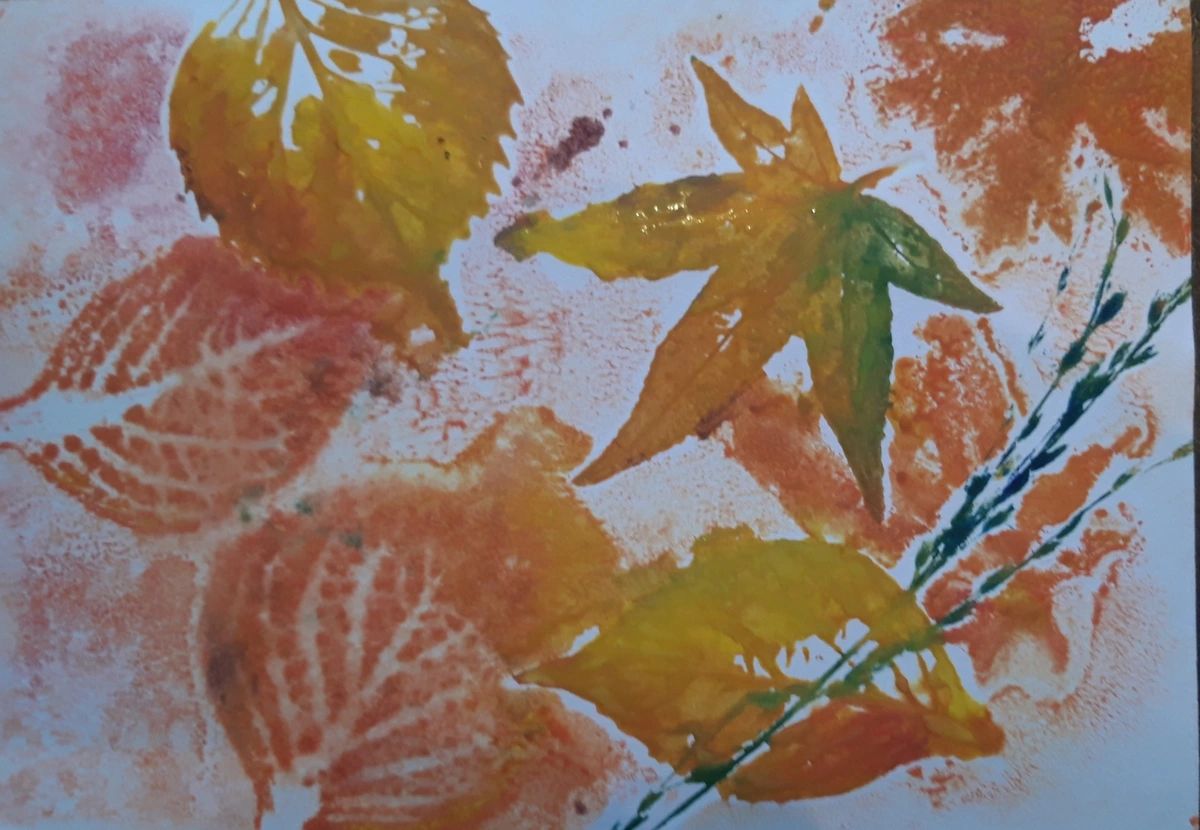
This is a term you'll see thrown around a lot, and it's important if you want your art to last! "Archival quality" for watercolor paper generally means two things: it's acid-free and lignin-free. Acid in paper causes it to yellow, become brittle, and degrade over time, leading to a loss of vibrancy and structural integrity. Lignin, a natural component in wood pulp, also causes discoloration and degradation, often appearing as yellowing around the edges and eventually compromising the artwork's longevity. 100% cotton papers are naturally acid and lignin-free, making them inherently archival and the gold standard for fine art. Wood pulp papers can be treated to be acid-free, but they may still contain lignin unless specifically processed to remove it. Always look for "acid-free" and preferably "100% cotton" if longevity is your goal and you want your artwork to endure for future generations. It's a small detail that can make a huge difference decades down the line, preserving your creative efforts. Another factor often considered is the paper's pH neutrality, meaning it has a pH of 7 or slightly above, which helps prevent acid degradation over time. This ensures your artwork remains stable and beautiful for generations. Another factor often considered is the paper's pH neutrality, meaning it has a pH of 7 or slightly above, which helps prevent acid degradation over time. This ensures your artwork remains stable and beautiful for generations.
Can I combine different paper types in one artwork?
While challenging, combining different paper types in a single artwork is an advanced technique that can lead to unique mixed media results! It often involves collage, where you adhere pieces of hot press, cold press, or even handmade papers onto a primary support. Each paper type will react differently to your paints and dry media, creating fascinating contrasts in texture, absorbency, and color vibrancy within the same piece. For example, a crisp detail on hot press might abut a soft, granulated wash on cold press. The key is careful planning, using archival adhesives, and understanding how each surface will behave to prevent long-term degradation. It’s an exciting avenue for artists who enjoy pushing the boundaries of traditional watercolor and mixed media.
Does paper weight (e.g., 140 lb / 300 gsm) matter more than the press?
No, I wouldn't say one matters more than the other; they are both incredibly important but affect different aspects of your painting experience. Think of it like this: Press (hot/cold/rough) primarily determines the paper's surface texture and, consequently, how it interacts with your paint – how details appear, how washes blend, and what textural effects you can achieve. It defines the 'feel' of the interaction. Weight determines the paper's sturdiness and how robustly it responds to moisture – specifically, how much water it can handle without significant warping, buckling, or pilling (the formation of small fiber balls on the surface due to friction or overworking). It defines the 'endurance' of the paper. A heavy paper (like 300 lb / 640 gsm) will take a serious soaking, regardless of its press, without needing stretching, offering a very stable surface. A lighter paper (90 lb / 190 gsm) will almost certainly buckle without prior preparation, limiting its use for very wet techniques. Most artists find a happy medium at 140 lb / 300 gsm for its versatility and balance of both characteristics. Ultimately, both characteristics are critical considerations, and your ideal combination will depend on your specific project and artistic style, as well as the amount of water you plan to use.
Do specific brushes work better on certain paper types?
Oh, absolutely! While any brush will technically work on any paper, some pairings are just magical, creating a synergy that enhances your technique. The relationship between your brush and paper is almost as important as the relationship between water and pigment – a harmonious interaction elevates your art!
- On Hot Press Paper: Because of its smooth, non-absorbent surface, brushes that maintain a sharp point or a crisp edge are fantastic. Think fine synthetic round brushes, liner brushes, or even calligraphy pens. These excel at harnessing that smooth surface for intricate detail, sharp lines, and precise applications. For laying down washes, very soft brushes like hake or flat wash brushes can help distribute paint evenly without disturbing the smooth surface too much, minimizing streaks. You want brushes that glide rather than dig, allowing for an almost glass-like application.
- On Cold Press Paper: The textured surface of cold press welcomes brushes with a bit more spring and belly. Natural hair brushes like squirrel mop brushes or soft sable brushes are excellent for holding a lot of water and paint, allowing you to coax pigment into the paper's texture and create beautiful, even, blended washes. For scrubbing, lifting, or creating dry brush effects, a stiffer synthetic brush or a bristle brush might be your best friend, as they can interact more aggressively with the paper's tooth to create broken, textured marks and highlight the paper's character.
- On Rough Paper: For the highly textured rough paper, robust brushes that can handle the abrasive surface are key. Stiffer synthetics or even bristle brushes are often preferred, especially for expressive strokes and dry brush work where you want to emphasize the texture. Delicate natural hair brushes might wear down more quickly on this surface, so I tend to save my expensive sables for smoother terrain, opting for brushes that can withstand a more vigorous interaction. This is where your brush becomes almost an extension of a sculpting tool. When choosing brushes for rough paper, consider robust synthetics or even bristle brushes, which can withstand the abrasive surface without excessive wear. Delicate natural hair brushes might wear down more quickly here, so save your expensive sables for smoother terrains.
It’s all about experimenting to find what feels right for your hand and your chosen paper, but knowing how the brush interacts with the tooth is a crucial step in mastering your medium and unlocking its full potential, allowing you to create a wider range of expressive marks. You can learn more about finding the right tools in this definitive guide to essential paint brush types for artists.
How do I store my watercolor paper and finished artwork?
Proper storage is absolutely critical for preserving your paper and artwork, ensuring your creations remain vibrant and intact for years, or even centuries, to come! Environmental factors are paper's worst enemies – think direct sunlight (which causes fading), fluctuating humidity (leading to mold or warping), extreme temperatures, and airborne pollutants (like smoke or dust) – so understanding proper storage is key. A little care here goes a long way in safeguarding your creative legacy, ensuring your work can be enjoyed by future generations.
- Unused Paper: Should always be stored flat, ideally in its original packaging or in an archival portfolio or flat file drawer. Keep it in a dry, cool place, away from direct sunlight, fluctuating temperatures, and especially high humidity, which can cause mold, foxing (small brown spots), or warping. Placing a clean, dry board or even a heavier book on top can help prevent curling and keep the paper pristine.
- Finished Artwork: If your artwork is on 100% cotton, acid-free paper, the primary goal is protection from light, dust, and environmental pollutants. Framing it under UV-protective glass (which filters harmful light rays that cause fading and discoloration) is ideal. If framing isn't immediately an option, store finished pieces in acid-free sleeves or archival boxes. Always avoid rolling artwork, as this can crack paint and damage the paper fibers; flat storage is paramount. Think of it as giving your precious creations a safe and comfortable home, ensuring they last for generations. For more in-depth advice, you might find this article on art storage solutions for collectors incredibly useful, as many of the principles apply to works on paper as well.
What about humidity control for storage?
Humidity control is paramount for storing both unused paper and finished artwork. Excessive humidity can lead to mold, mildew, foxing (small brown spots), and warping. Conversely, overly dry conditions can make paper brittle. Ideally, store paper in a stable environment with relative humidity between 40-60% and a consistent temperature (around 68-72°F or 20-22°C). Using desiccants in sealed archival boxes can help regulate humidity, while a humidifier or dehumidifier can manage your studio environment. This careful climate control is crucial for long-term preservation.
Troubleshooting Common Paper Problems
Even with the right paper, you might encounter some common challenges. Understanding them can save you a lot of frustration!
- Buckling/Cockling: As discussed, this is the most common issue, especially with lighter papers and heavy washes.
- Solution: Stretch your paper before painting (see "Preparing Your Paper" section). Use a heavier weight paper (140 lb or 300 lb). Work on a block. Use less water, or work in smaller, more controlled sections rather than attempting very large, single washes.
- Pilling: When tiny balls of paper fibers form on the surface, usually due to excessive scrubbing or rewetting.
- Solution: Use 100% cotton paper, which is more robust. Avoid overworking areas with a wet brush. Be gentle when lifting or scrubbing. Use a softer brush, and ensure previous layers are completely dry before rewetting an area to prevent reactivation and fiber damage.
- Hard Edges/Blooms (Cauliflowers): Occur when wet paint dries unevenly, often from adding water to a semi-dry wash or working on a surface that's drying too quickly.
- Solution: Work quickly and confidently with washes on hot press. Keep the entire wash area wet on cold press. Use a slightly tilted board to help washes flow evenly. In humid environments, washes dry slower, giving more time to blend. Conversely, in dry environments, consider pre-wetting the paper evenly or using a spritzer to keep the area damp.
- Dull Colors: Paint sinking into the paper too quickly can result in muted colors.
- Solution: Use properly sized paper. Good quality artist-grade paper is consistently sized. You can also apply a very light "pre-wash" or "sizing" of clear water before your color, though this takes practice. Alternatively, try using more concentrated pigment directly, or consider a paper with a slightly harder sizing for greater vibrancy.
- Feathering/Bleeding: Paint spreading uncontrollably beyond your intended lines.
- Solution: This often indicates too little sizing or a very absorbent paper. Use good quality hot press for sharp lines. Ensure your brush isn't overloaded with water. For fine lines, especially on less absorbent papers, consider using masking fluid or frisket to protect edges.
Understanding these common pitfalls and their solutions will help you proactively manage your materials and improve your painting results, turning potential frustrations into learning opportunities.
Are there eco-friendly or sustainable watercolor paper options?
Absolutely, and it's a growing area of innovation that I'm thrilled to see! For a detailed exploration of this topic, please refer to our dedicated section above: "Environmental & Ethical Considerations: Choosing Sustainable Paper". In short, yes, you'll find papers made from bamboo, hemp, or recycled cotton rags, and many brands prioritize responsible forestry practices, indicated by certifications like FSC (Forest Stewardship Council). Choosing these options is a small but impactful way to align your creative practice with your values and contribute to a more sustainable art world. Papers made from rapidly renewable resources like bamboo and hemp require less water and fewer pesticides to grow, making them excellent choices for reducing your environmental footprint. Always look for certifications like FSC (Forest Stewardship Council) for wood pulp papers to ensure responsible forestry.
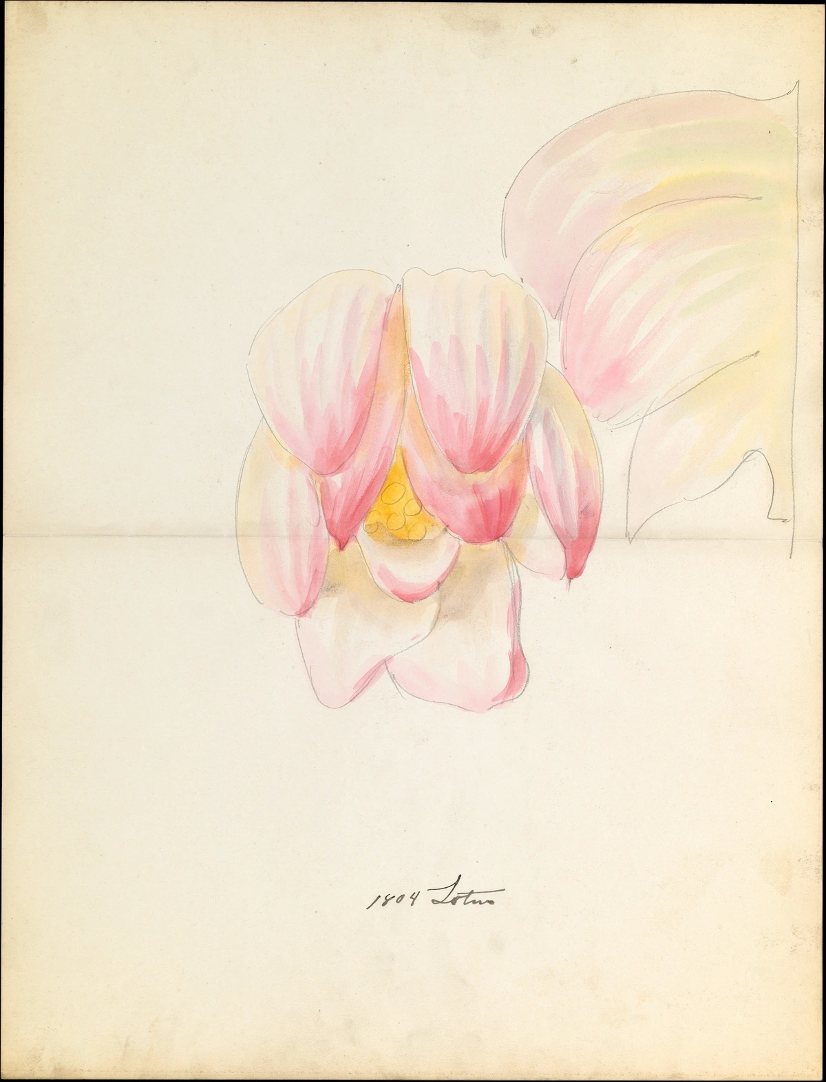
What's the difference between student-grade and artist-grade paper?
This is a common and incredibly important question, especially when you're starting out and trying to navigate the vast array of choices! The core difference lies in quality, consistency, permanence, and ultimately, artistic satisfaction – you truly get what you pay for in the world of paper.
- Artist-Grade Paper (also called professional or archival grade): This is the crème de la crème. It's typically made from 100% cotton fibers, ensuring superior strength, absorbency, and handling characteristics. It's consistently well-sized, meaning predictable paint behavior, superb color vibrancy, and excellent lifting/layering capabilities. Crucially, it's meticulously manufactured for archival permanence – it's acid-free and lignin-free, designed to withstand extensive manipulation and ensure your artwork lasts for centuries without degrading. While more expensive, the investment is reflected in the ease of use, the quality of results, and the longevity of your finished pieces, offering a truly professional foundation for your art.
- Student-Grade Paper: This is usually made from wood pulp (cellulose), which, as we discussed, has shorter, weaker fibers. It may have less consistent sizing, leading to unpredictable absorbency and sometimes duller colors. While often labeled “acid-free,” it may still contain residual lignin, meaning it's generally not designed for long-term archival stability and may yellow or become brittle over time, compromising your artwork's future. It's more prone to pilling or tearing when overworked with wet brushes or scrubbing, which can be frustrating for beginners. While perfect for practice, sketching, or trying new techniques without breaking the bank, it’s generally not recommended for finished pieces you want to preserve or sell. Think of it as training wheels – great for learning, but you'll want to upgrade for serious riding.
My advice? Invest in the best paper you can afford for your final, serious works; it truly makes a tangible difference to the process and outcome, fostering a more enjoyable and rewarding creative experience and ensuring your efforts are preserved. Artist-grade paper offers a consistent and predictable surface, allowing you to focus on your technique rather than battling your materials, which is invaluable for professional results and creative flow.
What are some popular watercolor paper brands?
Just like paints and brushes, artists often develop strong loyalties to particular paper brands, each offering a slightly different experience in terms of sizing, texture, and fiber content. Some of the most highly regarded and popular artist-grade watercolor paper brands include:
- Arches: A French brand, often considered the gold standard, renowned for its 100% cotton, archival quality paper with consistent sizing and a distinctive tooth. Available in hot, cold, and rough press.
- Fabriano Artistico: An Italian brand with a long history, offering 100% cotton, acid-free papers that are excellent for lifting and layering. Known for its soft, inviting surface.
- Strathmore: A popular American brand offering a wide range of papers, from student to artist grade, including good quality cotton and wood pulp options. Their 400 series and 500 series (100% cotton) are well-regarded.
- Winsor & Newton: While famous for paints, they also produce excellent watercolor papers, often 100% cotton, with good absorbency and strength.
- Canson Heritage: A relatively newer line from Canson, designed to emulate traditional handmade papers, offering a unique texture and excellent wet-on-wet performance.
- Saunders Waterford: A British brand, 100% cotton, often favored for its beautiful surface and robust handling, particularly good for heavy washes.
For student-grade options, brands like Canson XL Watercolor, Strathmore 300 series, and Legion Stonehenge Aqua are popular for their affordability and decent performance for practice and studies. Ultimately, trying out small sheets from different brands, as suggested in our "Importance of a Paper Sample Kit" section, is the best way to discover your personal favorite. Each brand's unique approach to sizing, fiber blend, and pressing will yield slightly different results, and finding your ideal match is a deeply personal journey.
Why is it sometimes called 'Not' paper?
This is a fun bit of art supply trivia that often confuses beginners, and I've certainly been there! Cold press paper is sometimes labeled as “Not” paper, particularly in the UK and parts of Europe. It's a simple contraction, standing for “not hot pressed.” So, if you see “Not” paper in your local art store or online, don’t be puzzled – it’s just another name for the versatile cold press paper we've been discussing, signifying its textured, non-smooth surface. Just another quirky detail in the wonderful world of art supplies, and a good way to impress your fellow artists or win a pub quiz! The term emerged because cold press was simply the standard paper, and hot press was the alternative, therefore 'not hot pressed' became its descriptor, reflecting the dominant method of production at the time.
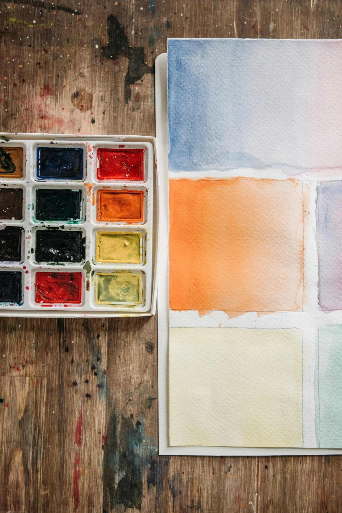


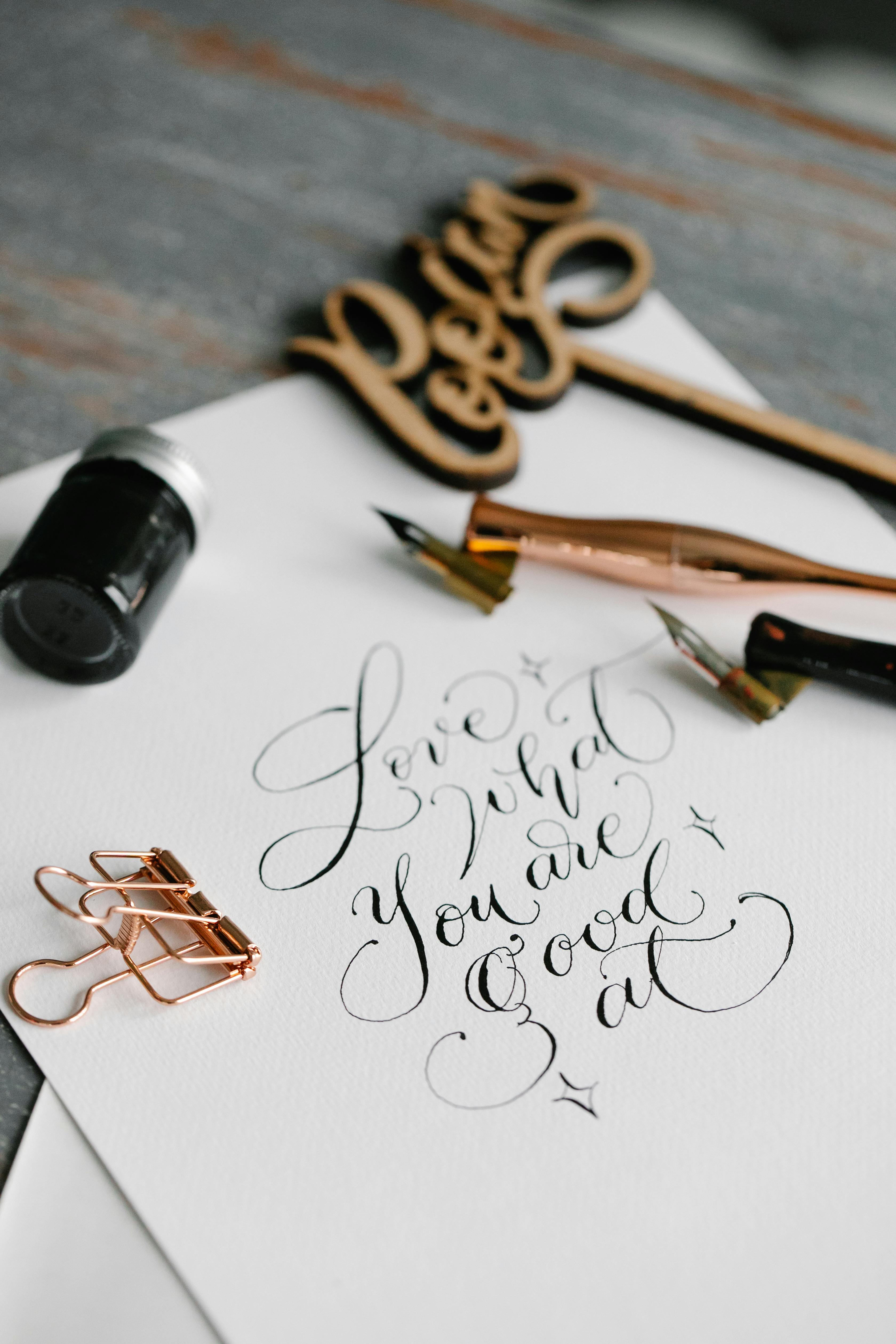
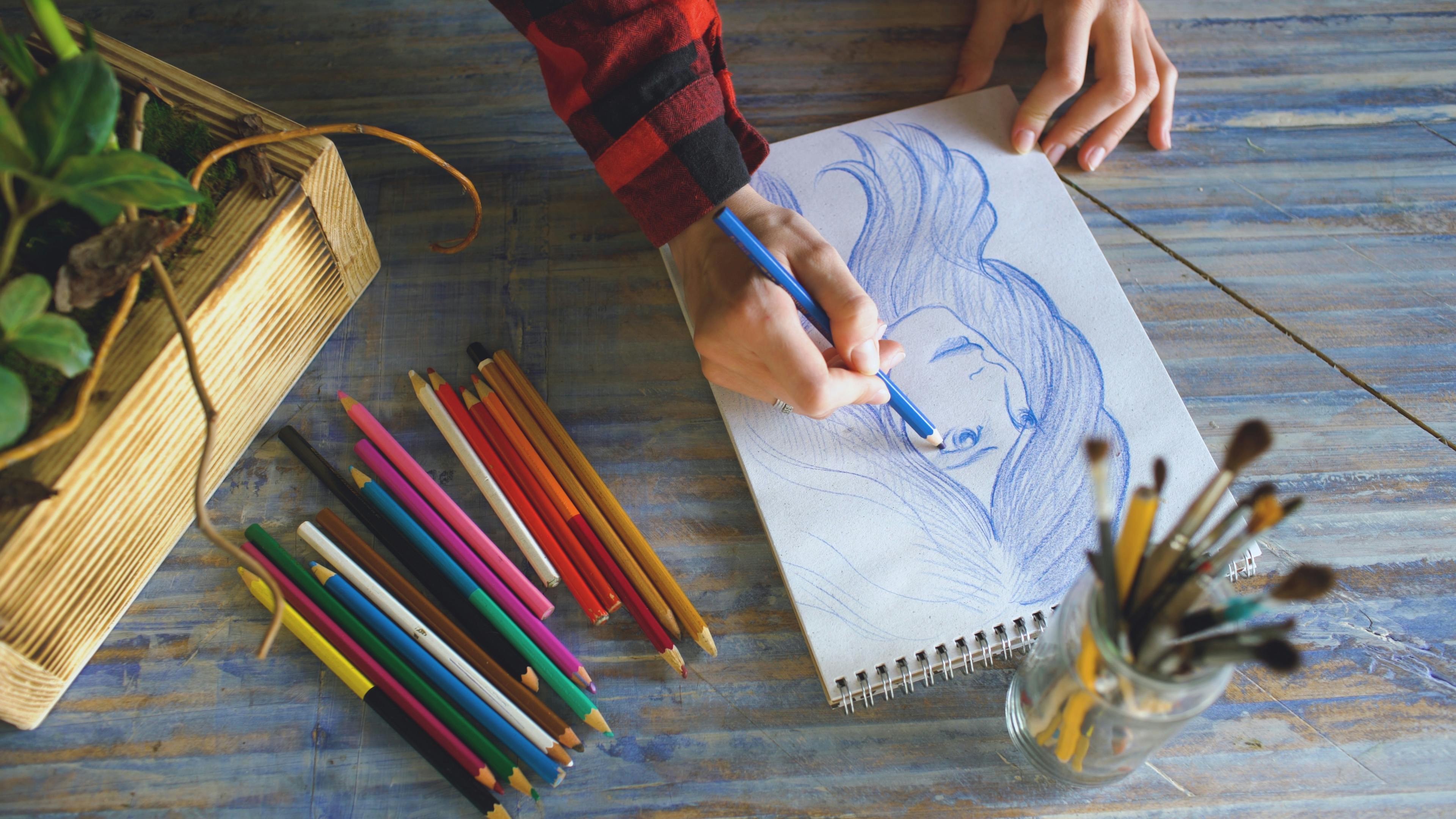


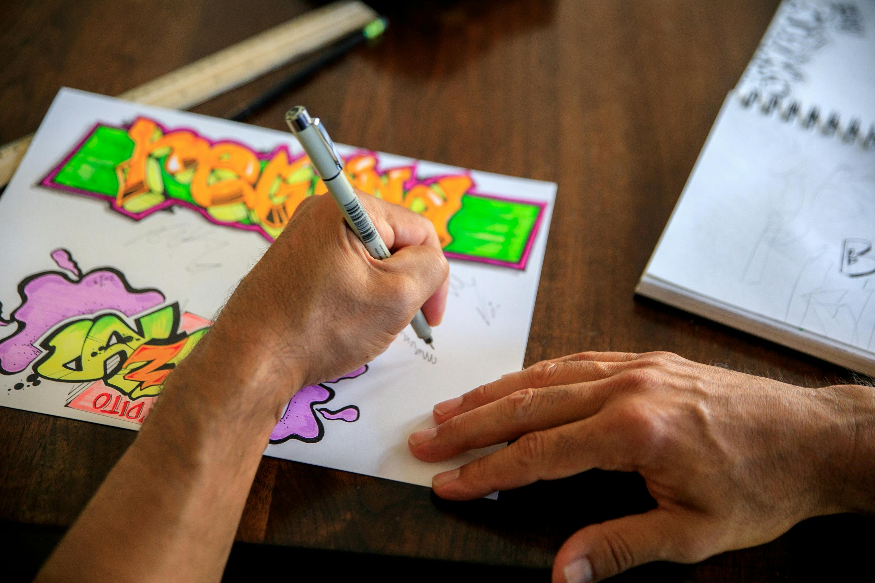

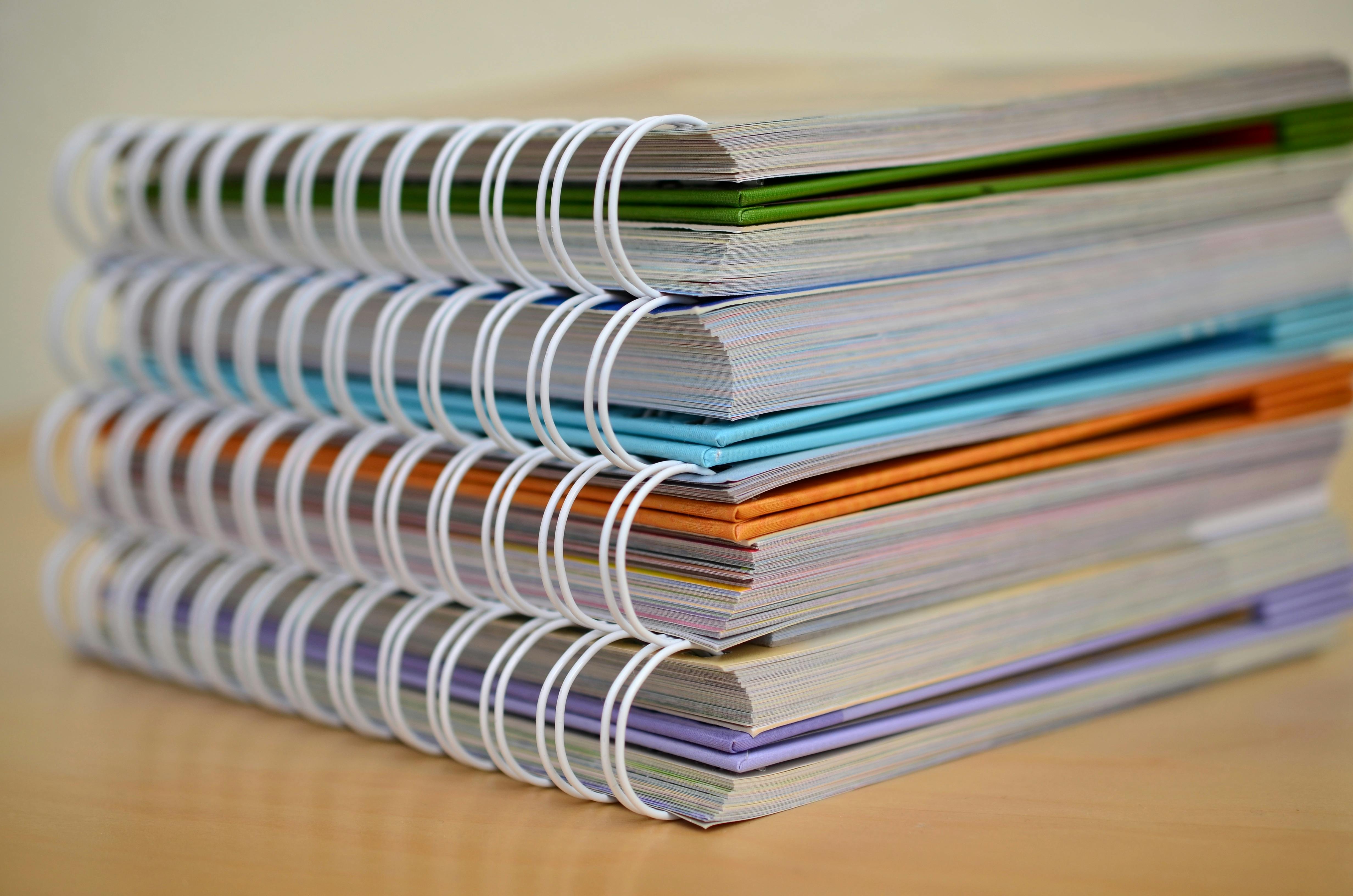

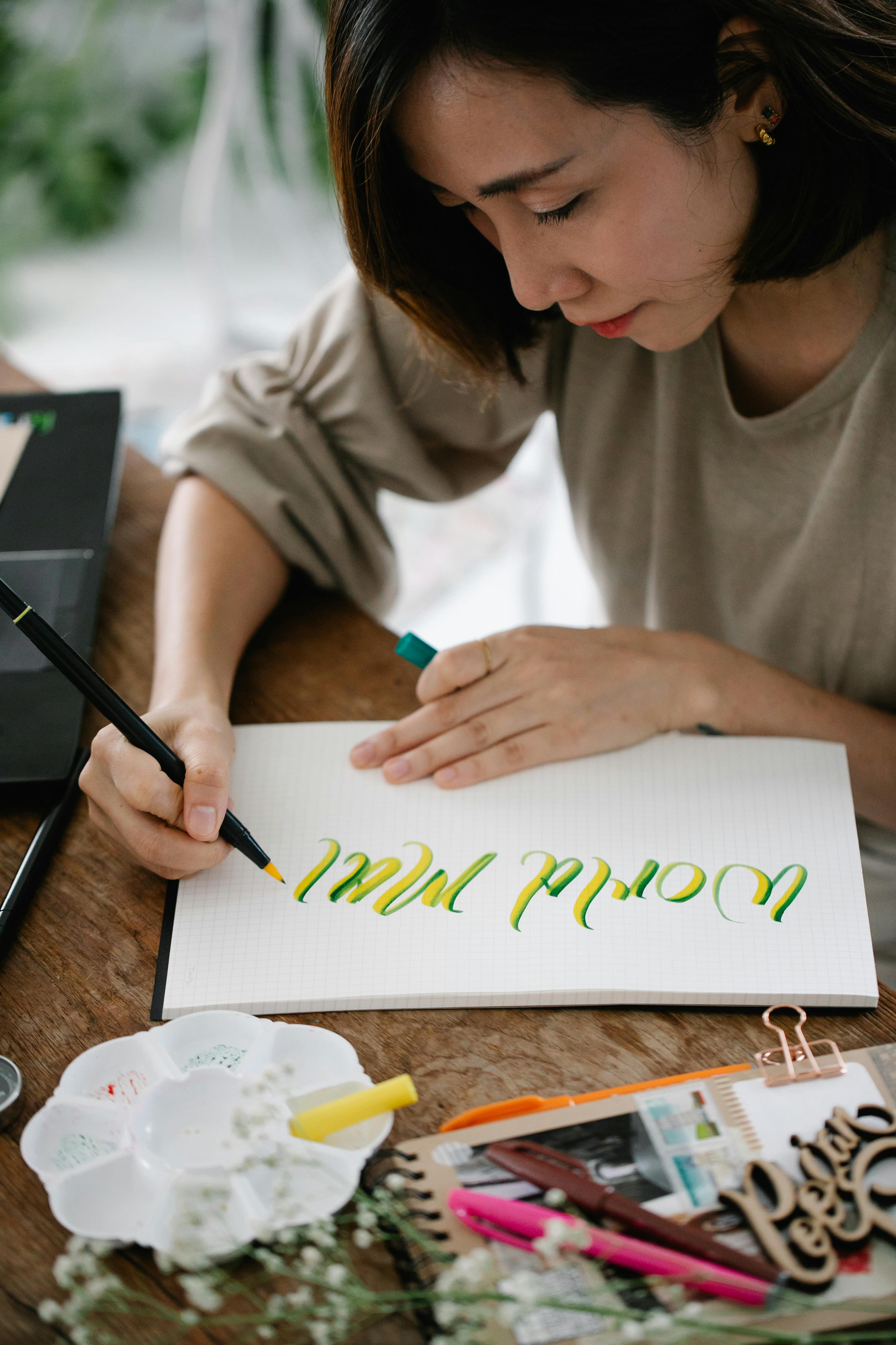





The Final Word: Embrace the Paper Journey
In the end, the whole hot press versus cold press debate isn't about finding the one 'correct' paper, the single, definitive answer written in stone. It's far more personal, more intuitive, and ultimately, more enriching than that. It's about building a deep relationship with your materials, understanding their quirks and strengths, and knowing how to wield them to bring your unique artistic vision to life, much like a musician chooses their instrument to best express their melody.
For me, it’s about that moment of intuition: knowing that for this hyper-detailed botanical illustration, the smooth, unyielding surface of hot press will serve me well, allowing every tiny vein and tendril to sing with clarity. And for that misty, atmospheric mountain landscape I’m dreaming of, the tooth of cold press will give me the glorious granulation and soft, diffused edges I crave. It’s about matching intention with material, and sometimes, letting the material guide the intention. The paper, in a very real sense, becomes a collaborator in the creative process, offering resistance, absorbing pigment, and subtly influencing every mark you make.
So please, don't be afraid to experiment. Don't be afraid to make a muddy mess – those are often where the greatest discoveries lie, where you learn the true voice of your tools and uncover unexpected artistic pathways. Every sheet of paper, whether beautifully painted on or spectacularly failed upon, is just another step on your unique creative journey. The world of watercolor paper is vast, inviting, and full of possibilities. Go on, dip your brush in, listen to what the paper has to say, and make something beautifully, authentically yours. The choice is yours, and that, my friend, is the real magic of art. If you're looking for where to start, you can always explore my art collection or delve deeper into the world of art at the Den Bosch Museum or discover more about the evolution of art on the timeline. Your personal journey with paper is just beginning, and I hope this guide has equipped you with the knowledge and confidence to explore it fully. Remember, the paper you choose is more than just a surface; it's a co-conspirator in your creative adventures, patiently waiting to be transformed by your unique vision. Embrace the process, cherish the unexpected, and let your paper be a testament to your ever-evolving artistic spirit.