How to Use Gouache: A Personal Guide for Beginner Artists
Ready to try gouache? This is my personal, step-by-step guide to using this unique paint, from mixing to layering. Learn the key techniques and avoid common mistakes.

My Unofficial Guide to Gouache: How to Tame This Wonderful, Opaque Beast — The Ultimate Handbook for Artists
I remember the first time I used gouache. I thought, "Great, it's just opaque watercolor, right?" And then, an hour later, I was staring at a muddy, streaky mess that looked like a failed elementary school project. Sound familiar? It was frustrating, sure, but it also sparked a deep, almost obsessive curiosity in me. Gouache isn't just watercolor's slightly thicker, more opaque cousin; it's the rebellious, often misunderstood artist of the paint family. It demands a different kind of respect, a shift in mindset, and once you crack its code, it offers an incredibly rewarding experience. It's like finding a new language to speak in, one filled with vibrant, flat colors and surprising versatility. This isn't just a guide; it's a journey into understanding why this medium has captivated artists for centuries. If something was good enough for the ancient Egyptians, illuminated manuscripts, and the vibrant posters of the Belle Époque, it's certainly worth our modern attention. In this comprehensive guide, we'll explore everything from its fascinating history and unique properties to essential supplies, core techniques, and advanced tips to help you master this captivating medium. Get ready to unlock gouache's full potential and make it sing on your paper!
This article is your compass and map for that adventure, a personal, battle-tested guide to getting started with gouache, seasoned with all the mistakes I've made and the happy accidents I've stumbled upon along the way. We're going to dive deep, from the absolute basics of what you need to the subtle quirks that make this medium so unique. If you're looking for a more formal, academic introduction, you might want to check out my article on what is gouache painting. But here? We're getting our hands deliciously dirty, exploring how to truly tame this wonderful, opaque beast and make it sing. This guide will be your trusted companion, helping you navigate the sometimes-tricky but always rewarding world of gouache. And maybe, just maybe, it'll inspire you to explore more of my abstract art too, where I often play with similar bold color concepts.
A Quick Jaunt Through History: The Enduring Appeal of Gouache
Origins and Evolution: From Ancient Papyri to Modern Masterpieces
Before we dive into the 'how-to,' let's acknowledge that gouache isn't some fleeting trend. This medium has been around for a very, very long time, proving its resilience and unique value to artists across millennia. Its roots stretch back to ancient Egypt, where it was used to color papyri. Imagine those vibrant hues adorning ancient texts! Fast forward to the European Middle Ages, and you'll find it brightening the pages of exquisite illuminated manuscripts, where its opacity was perfect for precise detail and rich color. Renaissance artists like Albrecht Dürer embraced its opacity for detailed studies, and it saw a resurgence in the 18th and 19th centuries, particularly for preparatory sketches, delicate miniature portraits, and even meticulous botanical illustrations where its fine detail capability was prized. By the Art Nouveau era, illustrators were smitten with its ability to create flat, graphic blocks of color perfect for posters and advertising, much like the bold designs we still admire today. Even today, with all our digital tools, gouache retains a special place, often bridging the gap between digital concept art and traditional painting. I think part of its enduring appeal is precisely its hands-on, tactile nature. It's a connection to history, sure, but it's also a testament to a medium that simply works when you need that specific blend of vibrancy and control. It’s comforting, in a way, to know that the struggles and triumphs I experience with a tube of gouache have been shared by artists centuries before me. This long and varied history isn't just a footnote; it's a testament to gouache's enduring versatility and power, showcasing its continuous evolution and adaptability across diverse artistic movements.
Notable Artists and Movements Embracing Gouache
Beyond general applications, specific artists and art movements have found gouache indispensable. Its unique qualities allowed them to achieve effects that other mediums couldn't quite replicate. Think of the intricate details in Persian miniatures, where gouache offered the precision and vibrancy needed for storytelling. Or the dynamic posters of Henri de Toulouse-Lautrec, whose bold graphic lines and flat colors in the Art Nouveau era were perfectly suited to gouache's character. Even American artists like Edward Hopper utilized gouache for preparatory sketches and finished works, appreciating its matte finish and speed for capturing scenes of everyday life.
To give you a clearer picture, here's a brief look at gouache's journey through time and some of its famous proponents:
Era  | Key Applications & Significance | Notable Artists/Movements |
|---|---|---|
| Ancient Egypt | Coloring papyri, funerary portraits; provided rich, flat colors. | Ancient Egyptian Scribes and Artisans |
| Middle Ages | Illuminated manuscripts; its opacity allowed for precise detail and vibrant, jewel-like hues. | Medieval Scribes and Illuminators, Persian and Indian Miniaturists |
| Renaissance | Preparatory sketches, detailed studies (e.g., Albrecht Dürer); offered quick, opaque studies. | Albrecht Dürer, Renaissance Draughtsmen |
| 18th-19th Century | Miniature portraits, detailed botanical illustrations, preparatory sketches, landscapes; favored for its delicate detail and rapid drying, perfect for capturing fleeting light and shadow. | William Blake, J.M.W. Turner, Thomas Girtin, Edward Hopper |
| Art Nouveau | Posters, advertising, illustration; its flat, graphic quality was ideal for bold, reproducible designs. | Henri de Toulouse-Lautrec, Alphonse Mucha, Aubrey Beardsley |
| 20th Century - Present | Animation cells, concept art, illustration, mixed media; valued for its speed, opacity, and unique matte finish. | Disney Animators, Maurice Sendak, Contemporary Illustrators, Concept Artists |

The Enduring Legacy of a Versatile Medium
From the precise, jewel-toned applications of early artists to the dynamic, graphic works of the Belle Époque, gouache has continually reinvented itself. It has served as a primary medium for finished pieces, a rapid tool for concept art, and a foundational element in mixed media explorations. This rich history isn't just a footnote; it's a powerful reminder of gouache's adaptability and enduring relevance in the artistic landscape. Artists throughout time have found unique ways to bend it to their will, demonstrating that its so-called 'quirks' are, in fact, integral to its expressive power.
Why Gouache? Its Unique Personality — A Deep Dive into Its Core Attributes
So, why bother with gouache when watercolor is so... easy (or so they say!) and acrylics are so forgiving? It's a fair question, one I asked myself many times amidst the mud and frustration. I remember one particularly disastrous attempt where I was trying to layer transparent glazes like watercolor, and it just kept lifting and creating this sickly, grey film. I almost gave up! But the truth is, gouache offers something distinctly different, a unique blend of properties that makes it indispensable for certain artistic expressions. It's not trying to be watercolor, nor is it merely a less permanent acrylic. Gouache carves out its own niche, offering a bridge between the two with its surprising opacity and matte finish. It truly feels like having the best of both worlds, once you learn its language. This distinct character is precisely why it remains a cherished tool in my studio, and why I believe it's worth your time to explore. It's a dance between control and spontaneity, a medium that truly bridges gaps, offering a unique tactile experience and expressive range that I haven't found anywhere else.
- Matte, Opaque Finish: This is its absolute hallmark, its defining characteristic, and frankly, what drew me in. Unlike the luminous, ethereal transparency of watercolor, gouache dries to a beautiful, flat, velvety matte finish. This unique quality makes it perfect for graphic illustration, design work, and creating bold, strong statements where you need crisp edges and solid color blocks. I particularly love how it can absorb light, giving a different kind of depth, a quiet intensity, that you simply don't get with a glossy acrylic. It's a sophisticated finish that truly demands attention, offering a unique visual texture that digital mediums often struggle to replicate. Imagine the rich, non-reflective surfaces of ancient frescoes, but in a portable, re-wettable form. That's the magic!
This matte finish is also a game-changer for reproduction. Because it doesn't reflect light, scanning or photographing gouache paintings is often much easier than dealing with glossy mediums. It means what you see on the paper is very close to what you'll see in print or on a screen, which is a huge advantage for illustrators and designers. The non-reflective surface also means gouache pieces can be viewed clearly from almost any angle without distracting glare.
- Rewettability: Just like watercolor, dried gouache can be rewet and reactivated with water, even after it's been bone dry for days or weeks. This is a glorious, double-edged sword, honestly. On one hand, it means you can easily rework areas, blend edges, and correct mistakes without much fuss, and it makes cleaning your palette an absolute breeze. It also means you can easily create a travel palette from dried tube paints, making it incredibly economical and portable. This forgiving nature is a huge boon for artists who like to experiment or who find other mediums too rigid. I can't tell you how many times I've thought a piece was ruined, only to come back the next day, re-wet an area, and totally transform it. It's a genuine 'undo' button in the physical world of paint! On the other, it means you have to be incredibly careful not to disturb dried layers if you're working on top of them with wet paint, lest you lift the underlying color. It's a delicate dance, a constant negotiation, but the flexibility it offers is immense. I've salvaged so many pieces thanks to this property, allowing for a truly iterative and forgiving process! It encourages a much more relaxed and experimental approach to art-making, truly empowering both beginners and seasoned artists alike. It's a medium that encourages bravery! This unique characteristic is also what makes gouache excellent for developing multi-layered compositions, as you can fine-tune previous layers.
- Layering Capability: This, for me, is where gouache truly starts to feel like a superpower, a secret weapon in your artistic arsenal. You can paint light colors over dark colors, which is a total game-changer compared to traditional transparent watercolor. Want a bright, crisp highlight on a deep, dark background? Absolutely. Need to fix an area, or add a new detail on top of a previously painted section? No problem. This allows for incredible flexibility, enabling you to build up complex compositions, refine details, and correct errors in a way that feels incredibly liberating. This ability to layer opaquely is often what truly draws artists in and sets it apart from other water-soluble paints. It allows for a truly iterative and forgiving process, which is fantastic for beginners and seasoned pros alike. This is where techniques like scumbling (applying thin layers of opaque color to create a soft, textured effect) and even careful impasto (building up thick textures with paint) can be explored, though with care to avoid cracking, adding textural richness to your work. The possibilities for depth and dimension are truly boundless. The ability to layer opaque colors allows for precise control over your composition, enabling you to refine details, adjust forms, and create a strong sense of visual hierarchy. This is particularly advantageous for correcting mistakes or making subtle adjustments to values and shapes, giving you a greater degree of control than purely transparent mediums.
- Binder and Pigments: What exactly is gouache made of? At its core, it's powdered pigment mixed with a binder, typically gum arabic, and often an inert white pigment (like chalk or calcium carbonate) to increase its opacity and give it that signature matte finish. This added filler is what makes it distinct from transparent watercolor, which primarily relies on pure pigment and gum arabic. Understanding these components helps you grasp why gouache behaves the way it does – the binder allows for re-wetting, and the fillers contribute to its body and opacity. It's a delicate balance that artists have refined over centuries to achieve its unique qualities.Pigment Types: Understanding Your ColorsJust like other art mediums, gouache uses various types of pigments, each with its own characteristics:
- Organic Pigments: Often derived from natural sources, these can offer intense, luminous colors. They might, however, be less lightfast than their inorganic counterparts, though modern chemistry is closing that gap.
- Inorganic Pigments: These are mineral-based and tend to be very stable and lightfast, offering reliable, earthy tones and strong coverage.
- Synthetic Pigments: Modern science has given us incredibly vibrant and lightfast synthetic pigments that expand the available color range and often provide excellent performance at a more accessible price point. The key is to look for reputable brands that prioritize high-quality pigments, regardless of their origin.
- Speed and Portability: It dries relatively quickly, often within minutes, which means you're not waiting around endlessly for layers to set. This rapid drying time is a huge advantage for artists working on tight deadlines or those who enjoy a brisk, spontaneous approach. And since it reactivates with water, a small pan set is incredibly portable, making it fantastic for sketching on the go, plein air painting, or quick studies. I often just grab a small set and my sketchbook for a coffee shop session; it’s far less fuss than oils or even intricate watercolor setups. The immediate gratification of seeing a bold color dry to a flat matte in moments is genuinely addictive. It’s the ideal companion for capturing fleeting moments or developing ideas rapidly.
It's this unique combination of watercolor's water-solubility and an acrylic-like opacity that makes gouache such a fascinating, and sometimes frustrating, medium. But trust me, the initial frustration is almost always temporary; the rewards are lasting and profound. It's a medium that truly bridges gaps, offering a unique tactile experience and expressive range that I haven't found anywhere else. To truly grasp its versatility, it helps to understand how it sits in the broader landscape of water-based paints, bridging the transparency of watercolor with the body of acrylics, yet maintaining its own distinct charm.
Gouache in Practice: Where It Shines Brightest — Unlocking Its Versatility
Beyond its unique properties, beyond the sheer joy of its velvety matte finish, gouache really finds its stride in specific artistic applications. It’s not just a beautiful paint; it's a powerful tool for certain creative expressions. Understanding these contexts can truly help you decide if it’s the right companion for your creative journey, and how it might fit into your existing artistic vocabulary. From quick studies to finished masterpieces, its adaptability makes it a favorite for many, including me. I've personally found it invaluable for its speed and its ability to deliver solid, punchy color when I need it most.
- Illustration and Design: This is perhaps gouache's most celebrated arena. Its flat, matte finish and incredible ability to produce crisp, clean edges make it an enduring favorite for illustrators, graphic designers, and animators. Think concept art, comic book coloring, packaging design, or editorial illustrations—gouache nails that vibrant, solid color look that reproduces beautifully in print and on screen. It offers a level of control and graphic punch that other mediums often struggle to match, which is why you'll see it everywhere from children's books to sophisticated ad campaigns. Its ability to create vector-like solidity with traditional paint is, frankly, astounding. I often lean on it when I want a drawing to pop with graphic intensity, much like some of my bolder abstract art pieces. It’s also ideal for creating mock-ups and storyboards due to its speed and ease of reproduction. Its graphic qualities make it an excellent choice for crisp lines and bold shapes, allowing for a strong visual impact that translates well across various design platforms. It truly bridges the gap between traditional painting and digital design aesthetics. I find it particularly useful for my abstract art when I want to define clear boundaries or create dynamic contrasts that capture the eye, much like the vibrant energy you see in a bustling market scene in my Den Bosch Markt inspired work.
- Fine Art Painting: While often associated with illustration, gouache is a powerful medium for standalone fine art pieces. Its versatility allows for a range of styles, from precise realism to expressive abstraction. Artists appreciate its capacity for solid color fields, its matte finish which can evoke a classic, fresco-like quality, and its speed, which enables quick studies or even finished works. I've seen incredible gouache paintings that possess the depth and complexity of oils or acrylics, proving it's far more than just a functional paint. Its unique attributes make it a compelling choice for artists seeking a distinct aesthetic and tactile experience.
- Plein Air Painting and Urban Sketching: Because it dries quickly and reactivates with water, a small pan set of gouache is an urban sketcher’s absolute best friend. Seriously, I can't emphasize this enough. No solvents, minimal mess, and you can pack up quickly, often within minutes of laying down your last stroke. I've used it countless times to capture fleeting street scenes, vibrant cityscapes, and dramatic landscapes on the fly. It's less precious than oils, allowing for spontaneous expression, and often more forgiving than transparent watercolors for outdoor work, especially if you need to adjust or add solid elements. It's the perfect companion for capturing the world around you with immediacy and impact. I love how I can make quick decisions and capture the mood of a scene before it changes, without the pressure of needing a perfectly transparent wash. Its portability and ease of setup make it ideal for spontaneous bursts of creativity when you're out and about, whether you're at a bustling Den Bosch Markt or a quiet park. The ability to capture the essence of a moment with solid, vibrant color and then pack up quickly is simply unparalleled. It feels like taking a little piece of your studio out into the world, ready for any visual adventure.
- Botanical and Scientific Illustration: For fields where precision, accurate color, and the ability to correct mistakes are paramount, gouache is an unparalleled choice. Its opacity allows for meticulous detail and solid color fills, perfect for depicting flora, fauna, or anatomical diagrams with scientific accuracy. The matte finish minimizes glare, making these illustrations ideal for reproduction in textbooks and journals. I've always admired the crispness you can achieve, making it a powerful tool for illustrative work that demands both beauty and factual representation. It allows for the intricate layering of fine details, from delicate veins on a leaf to the subtle textures of an insect. Unlike more transparent mediums, gouache ensures that each layer of detail stands out clearly, preventing muddiness and preserving the integrity of scientific accuracy. Gouache is also a fantastic choice for creating natural history illustrations, allowing artists to render subjects with both scientific accuracy and artistic elegance.
- Concept Art and Storyboarding: In the fast-paced worlds of animation, video game development, and film, gouache is a go-to for concept artists. Its speed, opacity, and ease of reproduction make it ideal for rapidly sketching out character designs, environment concepts, and visual narratives. You can quickly block in colors, make revisions, and present clear, concise visual ideas that capture the mood and style of a project. It’s a tool that allows for agile creativity, crucial when ideas need to evolve quickly. Many legendary animators and illustrators honed their craft with gouache, knowing its efficiency for quick iterations.
- Mixed Media: Gouache plays exceptionally well with others! It's like the friendly chameleon of the paint world. It can be layered over transparent watercolors for crisp, opaque details, used alongside colored pencils for texture and fine lines, or even integrated into collage work and screen printing. It’s incredibly versatile if you like to experiment and combine different materials, adding a unique matte pop to otherwise transparent or glossy compositions. I often find it's the perfect bridge when I want to add graphic, illustrative elements to a more fluid watercolor piece, or to add highlights and opaque details to pencil drawings. You can even combine it with ink, markers, or pastels for truly dynamic and textured artworks, expanding your expressive palette significantly, bringing together diverse textures and opacities in compelling ways. Its re-wettability, even when dry, also makes it an excellent choice for layered mixed media pieces, allowing for integration with other water-soluble materials.
- Calligraphy and Lettering: For artists passionate about typography, hand-lettering, or traditional calligraphy, gouache is a superb choice. Its opaque nature allows for vibrant, consistent lines on various paper types, and its re-wettability means you can achieve incredibly smooth, even strokes. It's often preferred for achieving crisp edges and bold forms, making it ideal for illuminated letters, custom stationery, or detailed graphic lettering where precision and rich color are paramount. Plus, the ability to mix custom colors offers an endless spectrum for creative expression in this intricate art form.
So, while it might challenge you initially, the sheer breadth of what you can achieve with gouache makes it an incredibly rewarding medium to master. It truly feels like it expands your artistic vocabulary and opens up new pathways for expression. The key, as with any art form, is to embrace the learning curve and enjoy the process of discovery. Trust me, the 'aha!' moments with gouache are incredibly satisfying. It's a journey that builds confidence and sharpens your observational skills, leading to a deeper appreciation for this unique paint. Don't worry if your first attempts don't look like a masterpiece – mine certainly didn't! The beauty is in the process, and every stroke teaches you something new. Embrace the chaos, find the rhythm, and watch your skills blossom.
The Bare Minimum: What You Actually Need to Get Started with Gouache — Essential Supplies for Your Artistic Journey
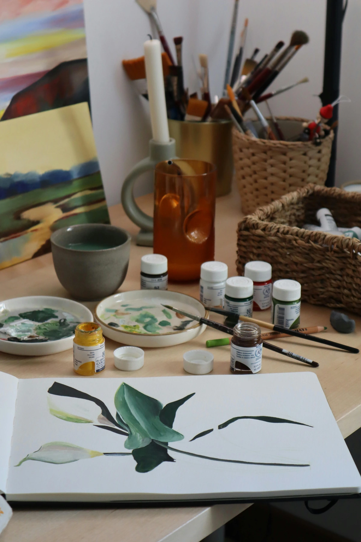
You can go wild with art supplies, and believe me, I have! But honestly, you don't need much to start. The beauty of gouache is its accessibility. Here’s the list of what I’d grab if I were starting from scratch today, focusing on getting the most bang for your buck and setting you up for success, not frustration. Remember, it's about making art, not collecting gear (though, I confess, I'm guilty of a bit of both!).
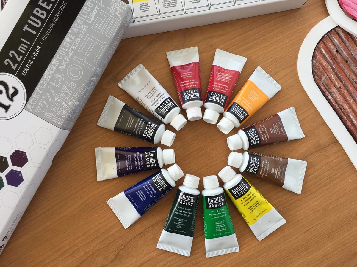
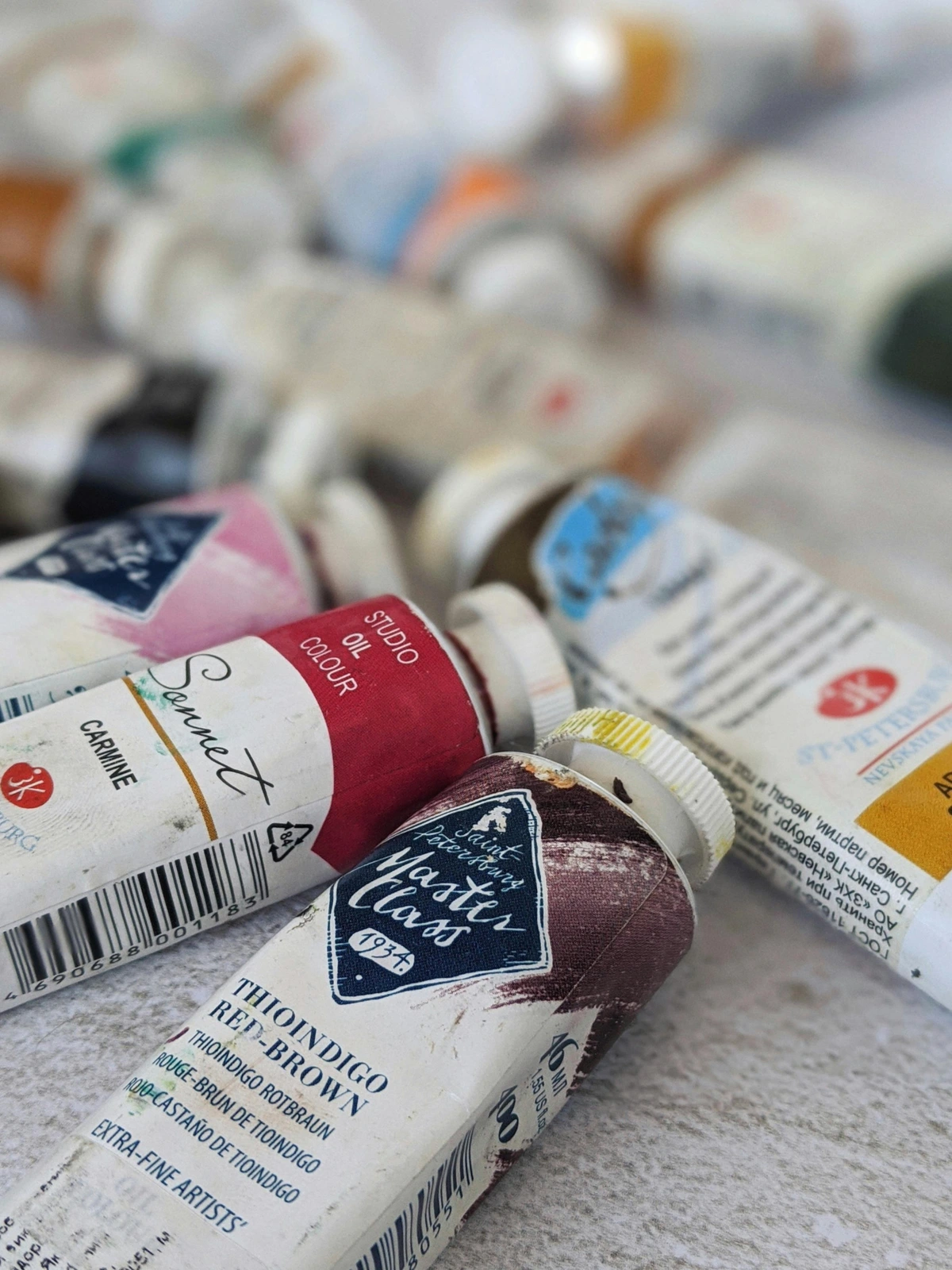
- Gouache Paint: Shocking, I know. The paint itself. You can find it in tubes or dried pans. Tubes are fantastic for squeezing out larger quantities, especially if you're mixing big batches of a single color. Pans, on the other hand, are remarkably convenient for travel and sketching, easily reactivated with a damp brush. Don't feel pressured to buy a massive set; a starter set with primary colors (red, yellow, blue), plus black and white, is more than enough to begin your journey. I mean, how many colors do you really need to start with? The magic is in the mixing, and understanding color theory (which we'll touch on later) can make a small palette feel boundless!When choosing, consider artist-grade (higher pigment load, better lightfastness, smoother application) versus student-grade (more fillers, less expensive, sometimes a chalkier finish). For true longevity, vibrancy, and a professional feel, artist-grade is the way to go, but student-grade is perfectly fine for practice, studies, and getting a feel for the medium without breaking the bank. Always look for lightfastness ratings on the tubes or pans if you intend your work to last, especially for pieces you plan to sell or exhibit. Beyond traditional gouache, you might also encounter Designer's Gouache, which is often formulated for optimal opacity and flow for illustration, or even Acrylic Gouache, which offers permanence once dry (though it loses the re-wettability that makes traditional gouache so unique!). If you're looking for specific recommendations, I've covered some in my review of the best gouache sets for beginners, and a broader look at paint types in my definitive guide to paint types for artists. For an even deeper dive into what makes a good paint, you might find my guide to essential gouache painting supplies for beginners useful.
Artist Grade vs. Student Grade: What's the Real Difference?
Feature | Artist-Grade Gouache | Student-Grade Gouache |
|---|---|---|
| Pigment Load | High; rich, vibrant, and pure colors | Lower; more fillers, colors can be less intense |
| Lightfastness | Generally excellent; ensures longevity of artwork | Varies, often lower; colors may fade over time |
| Binder Quality | High-quality binders for smooth application & minimal cracking | Lower quality binders, may lead to more cracking/chalkiness |
| Texture/Finish | Smoother, more consistent, truly matte | Can be chalkier, less consistent finish |
| Cost | Higher | Lower, more affordable |
| Best For | Professional work, archival pieces, artists who need consistent results | Practice, studies, beginners, experimentation |
Understanding White Gouache: Not All Whites Are Equal
White gouache is your secret weapon. Seriously. It's not just for lightening colors; it's for increasing opacity, creating pastel shades, and adding brilliant highlights. But you need to know which white to reach for:
- Titanium White: This is your powerhouse white. It's incredibly opaque, covers exceptionally well, and is usually the most lightfast. It's fantastic for strong highlights, mixing opaque pastels, and covering mistakes. It can, however, be a bit "chalky" if used too thickly straight from the tube.
- Zinc White: A more transparent white, often used in watercolors, that still offers some opacity in gouache. It's great for subtle tinting, creating slightly more translucent washes, and blending without overwhelming other colors. It tends to be less opaque than Titanium White. I always have both on hand; they serve different purposes. Titanium for punch, Zinc for nuance. I keep both on my palette at all times because they serve such distinct, valuable purposes.
- Tubes vs. Pans: A Gouache Showdown
- Tubes: Ideal for studio work, large areas, and when you need consistent, fresh paint. They offer a creamy consistency right out of the tube, which is perfect for smooth, even washes. The downside? They can dry out if not sealed properly (a common newbie mistake!), and sometimes you squeeze out more than you need, leading to waste if you're not careful. But for bold, consistent mixes, and when I'm really getting into a larger piece, tubes are my go-to. I find them indispensable for commissions or larger pieces where consistency is key.
- Pans: The ultimate travel companion! Dried gouache cakes reactivate beautifully with a damp brush, making them incredibly portable, mess-free, and surprisingly economical in the long run. They're excellent for sketching, small studies, and building a custom travel palette with your favorite colors. The only real drawback is that achieving a large, perfectly smooth wash from a pan can be a bit more challenging than with fresh tube paint, as you might pick up slight variations in pigment load. For urban sketching or quick studies, however, they are unbeatable. I even make my own travel pans by letting tube gouache dry in a palette! This little hack allows me to customize my travel palette with my absolute favorite colors, ensuring I always have the perfect hues on hand, whether I’m capturing a bustling city scene or a serene landscape. My travel palette is an ever-evolving experiment, a little portable piece of my studio that's always ready for adventure. I even have a small spray bottle just for these pans to keep them perfectly re-wettable when I'm on the go, which brings me to our next essential...
- Paper: Since gouache is water-based, you absolutely need paper that can handle moisture without buckling and curling up like a dying leaf. Trust me on this. Watercolor paper (140 lb / 300 gsm minimum) is your absolute best friend here; it's specifically designed for it, often with internal and external sizing (a gelatin or synthetic agent applied to the paper fibers) that reduces absorbency and prevents paint from sinking in too fast, keeping the pigment vibrant on the surface. Mixed media paper (again, 140lb/300gsm or heavier) also works wonderfully, offering a bit more versatility if you jump between mediums. However, please, for the love of all that is creative, avoid thin sketchbook paper for anything other than the quickest, most inconsequential doodles. It will warp, and it will frustrate you. I've learned that lesson more times than I care to admit, and it's a lesson I'm happy to spare you!Consider different surface textures too: hot press (smooth, great for fine detail), cold press (medium texture, wonderfully versatile), or rough (heavy texture, good for expressive work and granulation effects). My personal go-to is usually cold press; it feels like a good compromise for both detail and texture, offering just enough tooth without overpowering fine lines. For more in-depth paper insights, check out my thoughts on the best watercolor paper for artists, as much of that advice translates directly to gouache. And don't forget illustration board! It's fantastic for a perfectly flat, rigid surface that won't buckle, ideal for professional illustration, especially when you need a pristine, unblemished surface for scanning or reproduction. Think of it as a solid foundation for your masterpiece, ensuring longevity and a crisp presentation. For fine art applications, archival quality paper is essential to ensure your work endures for generations. Choosing the right paper is truly half the battle, directly impacting how your colors appear and how your layers interact.
Choosing Your Gouache Paper: A Summary
Paper Type | Minimum Weight | Surface Texture | Ideal For |
|---|---|---|---|
| Watercolor Paper | 140 lb (300 gsm) | Hot Press | Fine details, crisp lines, smooth washes |
| Cold Press | Versatile, general painting, good for lifting | ||
| Rough | Expressive work, granulating effects, rich texture | ||
| Mixed Media Paper | 140 lb (300 gsm) | Medium | Versatile for combining gouache with other mediums |
| Illustration Board | Varies | Smooth/Plate | Professional illustration, perfectly flat surfaces |
Specialty Papers for Gouache — Beyond the Basics
Beyond the standard watercolor and mixed media papers, there are a few other options that can really enhance your gouache experience, depending on your goals:
- Illustration Board: As I mentioned, this is a heavy-duty, rigid paper product with a smooth or plate surface. It's fantastic for detailed, precise work where you absolutely cannot tolerate buckling or warping. It's a favorite for professional illustrators.
- Bristol Board: Similar to illustration board but often less rigid, Bristol comes in various finishes (plate, vellum). The plate surface is ultra-smooth, great for fine lines and scanning, while vellum has a slight tooth. Both handle gouache beautifully, especially for graphic applications.
- Toned Paper: Working on toned paper (grey, tan, blue) can completely change the way you approach color and light. Gouache's opacity makes it ideal for working on dark or colored grounds, allowing you to build up lights with ease. It's a fun way to experiment and push your understanding of value.
- Understanding Paper Surfaces:
- Hot Press: This paper has a smooth, almost velvety surface. It's glorious for fine details, crisp lines, and smooth washes where you don't want any texture interfering. It can be a little less forgiving with lifting if you work wet-on-wet extensively, as the paint sits more on the surface.
- Cold Press: My versatile workhorse. It has a medium texture, or "tooth," which grabs the pigment beautifully, making it excellent for a wide range of techniques from washes to dry brushwork. It's generally more forgiving for lifting and layering than hot press. It's the one I recommend most often for beginners because of its balanced properties.
- Rough: This paper has a pronounced, heavy texture. It's fantastic for highly expressive work, creating interesting granular effects, and adding a lot of character to your washes. It can be challenging for fine detail, as your brush will skip over the "hills" of the paper. Think bold strokes and abstracted landscapes.
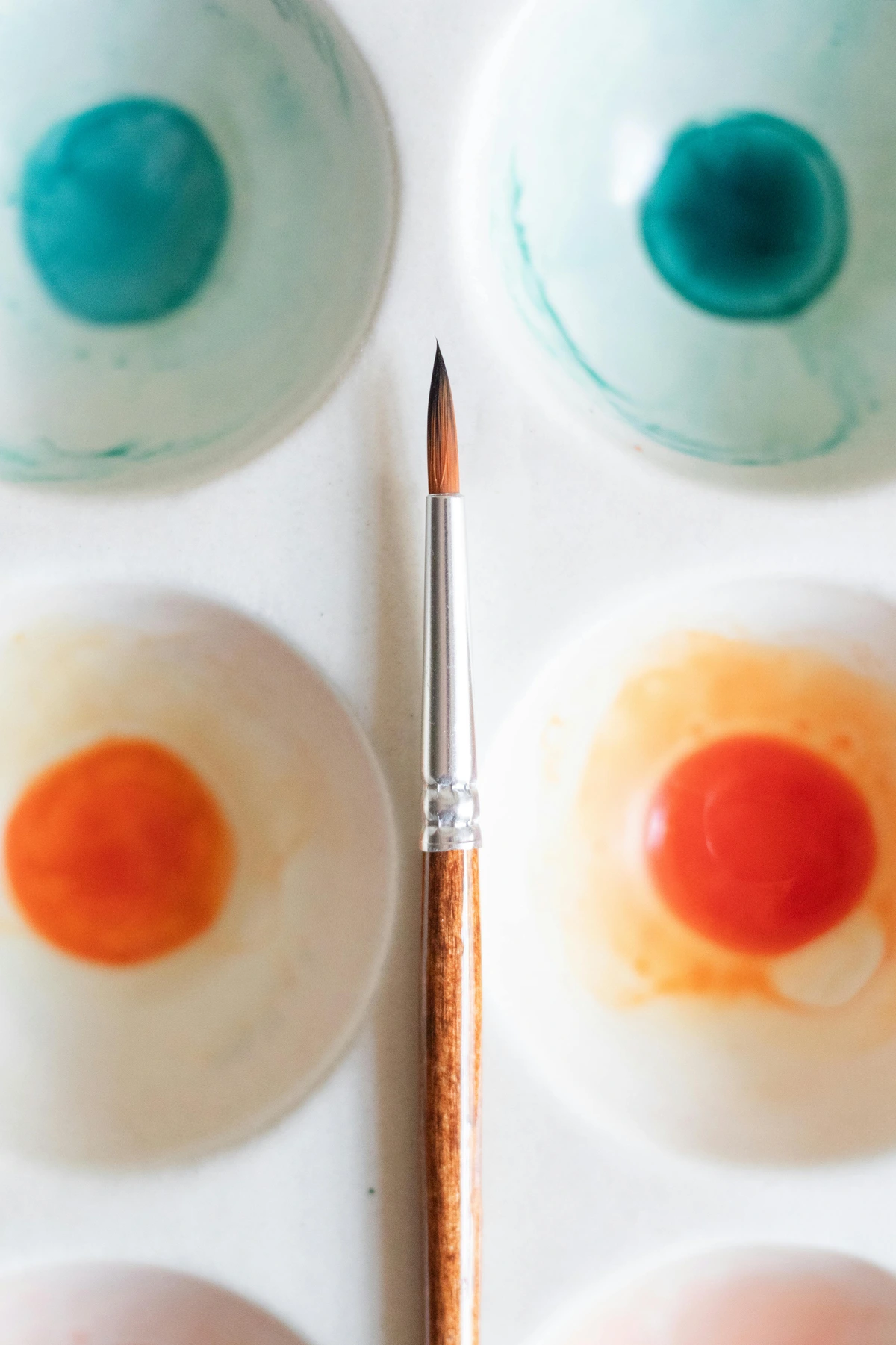
- Brushes: Look, you don't need to mortgage your house for fancy sable brushes. A small set of synthetic brushes designed for watercolor or acrylics will serve you perfectly. I always recommend having a core trio: a small round brush for those tiny details and delicate lines, a medium round brush for general work and broader strokes, and a flat brush (around half an inch or a quarter inch) for covering larger areas and creating crisp edges. As you progress, you might explore wash brushes for broad, even coverage, or liner brushes for super fine lines. The key is to keep them clean, especially with gouache, as dried paint can be a pain. If you want to know more about brushes, I’ve got an article on the best brushes for acrylic painting that has some crossover insights. For even more detailed brush information, my guide to acrylic paint brushes also offers valuable insights into shapes and uses that apply beautifully to gouache. Knowing your brushes is like knowing your dance partners – each one brings a different move to the floor.Brush Materials: Synthetic vs. Natural
- Synthetic Brushes: These are often made from nylon or other synthetic fibers. They're durable, springy, hold a good point, and are generally more affordable and easier to clean than natural hair brushes. They're an excellent choice for gouache as they offer good control and resist absorbing too much water.
- Natural Hair Brushes: Think sable, squirrel, or goat hair. These brushes excel at holding large amounts of water and pigment, creating smooth washes. While luxurious, they can be more delicate and require more careful cleaning. Some artists prefer them for certain effects, but for gouache's creamy consistency, synthetics often offer the best balance of performance and value.
Specialty Brushes: Expanding Your ToolkitBeyond the basics, you might explore:- Fan Brushes: Great for textures like grass, foliage, or soft blending.
- Filbert Brushes: A flat brush with an oval-shaped tip, excellent for softening edges and creating organic shapes.
- Mop Brushes: Large, soft brushes (often natural hair) designed to hold a lot of water for broad, even washes, though less common with gouache's opaque nature.
- Brush Types and Their Magic:
- Rounds: Essential for detail, line work, and general painting. A good round brush can do almost anything.
- Flats/Brights: Perfect for bold strokes, filling larger areas, and creating crisp edges. Great for architectural elements or geometric forms.
- Wash Brushes: Big, soft brushes for broad, even washes of color. Useful if you're working on larger pieces or want a very smooth background.
- Liners/Riggers: Extremely fine, long-bristled brushes for delicate lines, lettering, or small details. Think fine hairs, small branches, or intricate patterns.
Brush Care: The Unsung Hero of Your Art Practice
I can't stress this enough: clean your brushes. Especially with gouache. That creamy paint can dry hard and fast in the ferrule (the metal part holding the bristles) and ruin a good brush quicker than you can say “oops”! Dried gouache in the ferrule is a brush killer, causing bristles to splay and lose their shape. A simple routine of rinsing thoroughly in your dirty water, then gently cleaning with a mild soap and warm water, will drastically extend the life of your precious tools. Always reshape your brushes to their original point or chisel edge before drying them flat or upside down to prevent water from seeping into the ferrule. It's a small ritual, but a vital one for the longevity of your tools. A clean brush is a happy brush, and a happy brush makes for a happy artist! Taking care of your brushes is an investment in your artistic future.
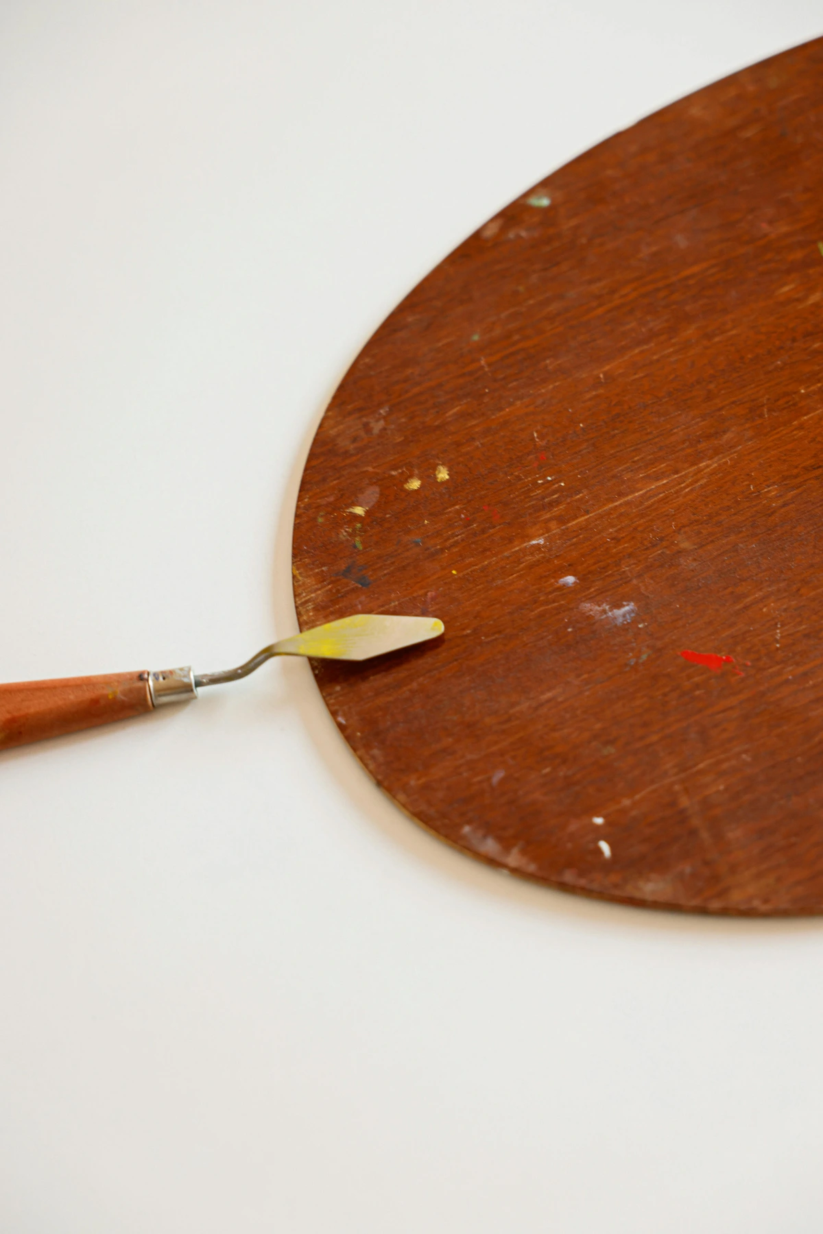
- A Palette: This is where the magic happens, where colors truly come alive (or become mud, let's be honest, we've all been there). Anything non-porous will work beautifully: a ceramic plate, a plastic watercolor palette with wells, even a piece of glass or an old tile. I personally prefer a white ceramic or porcelain palette because it gives you the truest representation of your mixed colors without any color bias from the palette itself. Covered palettes are also fantastic, especially for gouache, as they help keep your paint moist and workable for longer, reducing waste. A palette knife can be an absolute lifesaver here, especially for mixing larger quantities of paint without wearing out your delicate brushes, and for keeping your mixes really clean and vibrant. Plus, there’s something wonderfully satisfying about scraping off dried paint with a palette knife; it's almost meditative. For more on general palette hygiene, check out how to clean an oil painting palette for principles that apply across mediums. I often use a simple white ceramic dinner plate—it's cheap, easy to clean, and gives me a true sense of the color. Another little hack? Line your palette with wax paper or freezer paper for easy cleanup – just peel and toss the dirty paper! For travel, I love using a small tin with a lid and half-pans, allowing me to carry a curated selection of my favorite colors wherever I go.
- Two Jars of Water: For me, this is absolutely non-negotiable, a fundamental commandment of gouache painting. Always. Two. Jars. No excuses. One is your “dirty jar,” where you rinse the bulk of the paint off your brushes after each color. The second is your “clean jar,” reserved only for adding pristine water to your paint mixes, ensuring your colors stay pure and vibrant. This incredibly simple trick is the single best defense against accidentally contaminating your colors and creating that dreaded muddy mess that makes you want to throw your brush across the room. Trust me on this. I learned this the hard way, with many a beautiful, carefully mixed color turning instantly drab and lifeless because I was too lazy to grab a second jar. It’s a small habit, but it will save you so much frustration and wasted paint. You might also find a small spray bottle handy for keeping paint on your palette moist, especially if you're working slowly or in a dry environment. A quick spritz can rehydrate your mixes and extend your working time, preventing precious paint from drying out prematurely. Seriously, this simple setup makes a world of difference for clean color mixing and happy painting. It's one of those small habits that yields huge artistic dividends. Consider investing in two old mugs or jars that you're happy to dedicate to your art; the consistency of this practice will pay dividends in the vibrancy of your work.
Other Essential (But Often Overlooked) Supplies
These might seem minor, but they can make a world of difference to your gouache experience:
- Paper Towels or a Rag: Absolutely indispensable for dabbing excess water from your brush, blotting washes, and quick clean-ups. Keep them close! I usually have a roll nearby, ready for any emergency blot or brush wipe.
- Drafting Tape or Artist's Tape: To secure your paper to your work surface. This prevents buckling as the paper gets wet and ensures a flat surface for painting. For larger works, I even tape the edges to a rigid board to ensure it stays perfectly flat.
- Pencil and Eraser: For initial sketches. A light pencil touch is best, as heavy pencil lines can sometimes be hard to cover with gouache. A kneaded eraser is fantastic for gently lifting pencil marks without damaging the paper, leaving no residue behind. It's much kinder to your paper than a rubber eraser.
- Craft Knife/X-Acto and Cutting Mat: For neatly trimming your finished work or preparing paper. A sharp blade makes all the difference for clean edges, especially if you plan to frame your work.
- Fine-Mist Spray Bottle: I mentioned this earlier, but it's worth reiterating. A small spray bottle is invaluable for keeping your palette moist and reactivating dried paint on your palette. It prevents so much waste!
- Rigid Support Board: For taping your paper to, especially if you're using thinner paper or applying heavy washes. A simple piece of foam core or hardboard will do. This ensures your paper stays flat as it dries.
The Workspace: Your Creative Sanctuary
Before you even touch a brush to paper, take a moment to consider your workspace. It doesn't need to be a grand, sprawling studio (my first painting "studio" was a tiny corner of my kitchen table, constantly battling crumbs and coffee rings). What it does need is to be functional, well-lit, and a space where you feel comfortable and inspired.
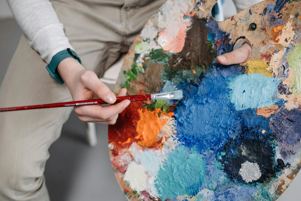
- Lighting is Key: Natural light is always preferred if you have it, especially if you're working with delicate color mixes. If not, invest in a good quality daylight-balanced lamp. Poor lighting can distort your color perception and lead to inaccuracies in your work.
- Comfort is Crucial: You'll be spending time here, so make sure your chair is comfortable and your work surface is at an ergonomic height. A wobbly table is the enemy of fine detail! Good posture and a stable surface can prevent fatigue and allow for greater precision in your strokes.
- Stay Organized (Mostly): While my own workspace often veers towards controlled chaos, having a designated spot for your essential tools can save you endless frustration. Clean brushes, accessible paints, and a clear mixing area are non-negotiables.
Ultimately, your workspace is your creative sanctuary, no matter how humble. Make it a place where you want to create, a place that invites you in and encourages you to get lost in the process. My own studio is a bit of a glorious mess, but it's my mess, and it's organized in a way that makes sense to me. Find your own rhythm and setup, and the art will follow. This intimate relationship with your creative space is incredibly personal and evolves with your practice. And trust me, the journey of finding that rhythm is just as much a part of the art as the painting itself. It's a continuous evolution, much like how my own abstract art has transformed over time. Creating a dedicated workspace, no matter how small, signals to your creative self that it's time to play.
Essential Supplies for Your Artistic Journey: A Quick Summary
Supply | Why You Need It | My Personal Take |
|---|---|---|
| Gouache Paint | Opaque, re-wettable color | Start with primary colors + black/white; tubes for studio, pans for travel. Artist-grade if you can. |
| Paper | Prevents buckling, holds water, ensures color vibrancy | 140 lb (300 gsm) watercolor or mixed media paper. Cold press is versatile; hot press for detail. |
| Brushes | Applies paint, creates marks, allows for various techniques | A few synthetics: small round, medium round, flat. Invest in good cleaning habits! |
| Palette | Surface for mixing colors, keeps mixes clean | Non-porous, white ceramic or porcelain is ideal for true color representation. Covered palettes extend work time. |
| Two Jars | Keeps colors clean, prevents mud, crucial for vibrancy | One for dirty rinses, one for clean water. Absolutely essential, no shortcuts! |
| Spray Bottle | Keeps paint moist on palette, prevents waste | A small mister can save paint and extend working time, especially in dry environments. |
| Paper Towels/Rag | For blotting, cleaning, dabbing excess water | Always have them within reach; indispensable for controlling moisture and quick cleanups. |
| Drafting/Artist's Tape | Secures paper, prevents buckling, creates clean edges | Crucial for working on large washes and maintaining a flat surface. |
| Pencil and Kneaded Eraser | For initial sketches, gentle corrections | Essential for laying down initial compositions without damaging paper. |
Understanding Color in Gouache: A Different Beast Entirely
Alright, before we get too deep into the physical act of putting paint on paper, we need to talk about color with gouache. Because it's not quite like watercolor, and it's definitely not like acrylics or oils. Gouache has a personality, and its colors behave uniquely, presenting both challenges and incredible opportunities. It's a learning curve, sure, but one that leads to a richer understanding of how colors truly work, especially in an opaque, matte medium. Understanding these nuances is key to mastering the medium and achieving the vibrant, precise results gouache is capable of.
- The Dry-Shift Phenomenon: This is the big one, the quirk that often catches beginners off guard, and it certainly got me more than once! Gouache colors tend to dry slightly lighter or darker than they appear when wet. Generally, lighter colors often dry darker, and darker colors can sometimes dry a touch lighter. It’s infuriating, yes, but crucially, it's predictable once you get used to it. This means you have to learn to see in gouache, to anticipate that shift. My best advice? Always keep a scrap piece of the same paper you're working on to do quick color swatches. Paint a small patch, let it dry for a minute or two, and then compare it to your wet mix. This practice is invaluable for accurately matching colors and achieving your desired values. It's like learning to trust a slightly mischievous friend – you know they'll surprise you, but you can learn to work with it. Embrace the swatching! It becomes second nature over time, I promise. This phenomenon is why developing a good color swatch habit is arguably the most crucial practice for gouache artists.
- Mixing for Opacity: Because gouache is opaque, mixing colors is a direct process, much like mixing acrylics. You're physically combining pigments to create a new, solid color. However, due to its rewetability, you can achieve beautiful, vibrant, and incredibly nuanced mixes. A key principle here is understanding how white and black affect your colors: adding white will lighten a color and increase its opacity (making it more pastel or desaturated), while adding black will darken it and, depending on the pigment, often increase opacity (making it more muted or heavier). Don't just think "lighter" or "darker"—think about how the quality of the color changes, influencing its hue, value, and saturation. Finding that perfect creamy consistency (remember our "melted ice cream" analogy?) is absolutely vital for true color mixing power; it ensures smooth blending and consistent coverage. For deeper dives, consider exploring articles on how to mix acrylic paint, as many principles overlap. Mastering this allows for the creation of an infinite spectrum of custom hues and values, essential for any serious artistic endeavor, allowing you to fine-tune your palette with incredible precision.
- The Power of White: White gouache (typically Zinc White or Titanium White, as we discussed earlier) is your absolute superpower, your secret weapon for control and vibrancy. It's not just for lightening colors; it's for increasing opacity, creating a vast spectrum of beautiful pastel shades, and adding those brilliant, crisp highlights that truly make your work pop. Need a bright, sharp edge against a dark background? White gouache. Want to bring down the intensity of a color without making it muddy? White gouache. Don't be afraid to use it liberally, strategically, and thoughtfully—it's what separates gouache from its transparent cousin and allows for unparalleled graphic punch. It's like having a spotlight you can turn on anywhere in your painting! This is particularly powerful for creating focal points and guiding the viewer's eye, a crucial element in art of composition.
- Layering vs. Mixing on Paper: While you can blend colors directly on the paper with gouache (especially wet-on-wet), I generally find that mixing thoroughly on the palette gives you more consistent, vibrant colors for large, flat areas and ensures better control over opacity. Layering, however, is a fundamental technique in gouache, and it's where its true magic often lies. It allows for both optical mixing (where colors applied in thin, somewhat translucent layers blend visually in the viewer's eye) and building complex hues through successive opaque overlays. You can use thin, translucent washes for subtle color shifts or build up thick, opaque layers for bold, sculptural effects. It's a crucial distinction for mastering the medium, enabling a versatile approach to building complex imagery and correcting errors with ease. Understanding when to mix and when to layer will unlock a whole new dimension in your gouache practice, letting you create both delicate nuances and powerful statements.
It's a subtle art, this color control with gouache, but once you embrace its quirks, you'll unlock a whole new world of expressive possibilities. Understanding how colors interact and how light and shadow play on that matte surface is key to truly expressing yourself. It's a journey, not a sprint, and every muddy mix is a lesson learned. Remember, the journey itself is the art. Keep practicing, keep experimenting, and don't be afraid to make a mess. That's where the real learning happens. These moments of experimentation are where true artistic breakthroughs occur, shaping your unique style and deepening your understanding of the medium. Embrace the beast, and it will truly sing for you. Remember, every master was once a beginner, and every stroke, every color mixed, every tiny detail adds to your growing expertise. It's a conversation with the medium, and it's always fascinating to see where it leads.
Basic Color Theory for Gouache Artists
Beyond just hue, understanding value (how light or dark a color is) and saturation (how intense or dull a color is) is absolutely paramount with gouache. Because of its opacity and the dry-shift, you're constantly making decisions about these elements. Adding white not only lightens a color but also desaturates it, creating those lovely pastels. Conversely, adding a touch of black or a complementary color can lower a color's saturation, making it more muted or earthy. This deliberate control over value and saturation allows for incredible depth and mood in your compositions. It’s like being a conductor, guiding the emotional resonance of your piece through careful color orchestration. I've spent countless hours just playing with these variables, and it's always an adventure to see what unexpected harmonies emerge. For more on this, you can explore articles on understanding balance in art composition and the definitive guide to understanding color harmonies in abstract art. Another important concept to grasp is color temperature – how warm (reds, oranges, yellows) or cool (blues, greens, purples) a color appears. Warm colors tend to advance, while cool colors recede, and gouache allows you to play with these effects to create depth and atmosphere in a uniquely opaque way.
The Importance of Value and Saturation in Gouache
Beyond just hue, understanding value (how light or dark a color is) and saturation (how intense or dull a color is) is absolutely paramount with gouache. Because of its opacity and the dry-shift, you're constantly making decisions about these elements. Adding white not only lightens a color but also desaturates it, creating those lovely pastels. Conversely, adding a touch of black or a complementary color can lower a color's saturation, making it more muted or earthy. This deliberate control over value and saturation allows for incredible depth and mood in your compositions. It’s like being a conductor, guiding the emotional resonance of your piece through careful color orchestration. I've spent countless hours just playing with these variables, and it's always an adventure to see what unexpected harmonies emerge. For more on this, you can explore articles on understanding balance in art composition and the definitive guide to understanding color harmonies in abstract art.
Q: Can gouache be used like watercolor?
A: Yes, to a degree! Because it's water-soluble, you can thin gouache down with plenty of water to create more transparent washes, similar to watercolor. However, it will still retain some of its inherent opacity due to the added white pigment. It won't achieve the same luminous transparency as pure watercolor, but it's a versatile way to use it, especially for underpaintings or subtle background effects. It's like a watercolor that went to the gym and got a bit bulkier. I often use thin gouache washes for an initial atmospheric layer, then build up more opaque forms on top, allowing the underlying colors to subtly influence the overall tone, much like in mixed media compositions.

Q: Is gouache toxic?
A: Most artist-grade gouache paints are non-toxic, especially if you stick to reputable brands. However, some pigments (like cadmium colors) can be toxic if ingested or handled improperly. Always check the labels on your specific tubes or pans for safety information, especially if you're working with children or have sensitivities. Good studio hygiene (not eating paint, washing hands) is always a good practice, regardless of the medium.
Q: How do I prevent gouache from cracking?
A: Cracking is usually a sign that your paint was applied too thickly or with too little water. The key is to achieve that creamy, "melted ice cream" consistency, as discussed in the section on Achieving the Perfect Consistency. Avoid globbing it on! If a layer is cracking, gently re-wet it and try to spread it more evenly or lift some paint away. Patience and proper consistency are your best friends here.
Q: Can I use gouache on canvas?
A: While gouache can be applied to canvas, it's not its ideal surface, especially traditional flexible canvas. Gouache thrives on rigid, absorbent surfaces like paper or illustration board. If applied too thickly to a flexible canvas, it can crack and flake over time due to the canvas flexing. If you really want to use it on canvas, I recommend using a rigid panel that's been properly primed with gesso, and applying your gouache in thinner, more flexible layers. Even then, framing under glass is a wise choice for protection. For best results, consider a specially prepared hardboard or wood panel.
Q: How do I store my gouache paintings?
A: Gouache paintings should be stored flat, preferably matted and framed under glass, to protect them from dust, moisture, and smudging. If you're storing unframed works, interleave them with glassine paper (a translucent, smooth paper) or acid-free tissue paper to prevent them from sticking to each other or smudging. Avoid rolling them, as this can cause cracking.
Q: What's the difference between gouache and tempera paint?
A: Both are opaque, water-based paints, but they differ primarily in their binder. Traditional tempera (like egg tempera) uses an egg yolk binder, which dries to a very permanent, durable, often luminous matte finish that is not re-wettable. Gouache typically uses gum arabic as a binder, which allows it to be re-wet even after drying. Both have beautiful qualities, but gouache offers that unique flexibility of being able to rework dried layers. Understanding this distinction helps artists choose the best medium for their desired permanence and working style. Tempera is often known for its vibrant, jewel-like colors and precision, while gouache is celebrated for its versatility and ease of blending.
Q: Can I mix gouache with watercolors?
A: Absolutely! This is a fantastic mixed media technique. You can use transparent watercolors for your initial washes and then apply opaque gouache on top for details, highlights, or corrections. The combination offers the best of both worlds: the luminosity of watercolor and the graphic punch of gouache. I often start my plein air sketches with a watercolor underpainting and then build up details with gouache. This intermingling of mediums can produce truly captivating and dynamic results, pushing the boundaries of traditional art forms. I often explore this in my own mixed media pieces, where the unique qualities of gouache add a distinct textural and visual element, creating a beautiful interplay of transparency and opacity.
Q: Why do my gouache colors look different when dry?
A: Ah, the dreaded "dry-shift"! As discussed in the "The Dry-Shift Phenomenon" section, this is a common characteristic of gouache. Lighter colors tend to dry a bit darker, and darker colors can sometimes dry a bit lighter. It takes practice to anticipate this shift. My best advice is to always keep a scrap piece of the same paper you're working on and make quick swatches of your mixed colors. Let them dry for a minute, then compare to your wet mix. This builds your visual memory and helps you choose the right wet color for the dry result you want. It's all about building that visual memory and trusting the process. Consistent swatching becomes your personal color dictionary.
Q: How can I make my gouache paintings more permanent?
A: While traditional gouache remains re-wettable, you can achieve permanence by mixing it with acrylic mediums like matte medium. Once dried with an acrylic medium, the gouache will no longer reactivate with water. Another option is to use a very light, matte spray fixative designed for pastels or charcoal, applied in multiple thin layers. However, the safest and most common way to protect a gouache painting is to frame it under glass with a mat. For long-term preservation and professional presentation, this is usually the recommended approach. Using archival-quality paper and lightfast pigments also contributes significantly to permanence.
Q: What's the best way to clean my gouache brushes?
A: As I emphasized in the Brush Care section, always rinse your brushes thoroughly in your "dirty" water jar immediately after use. Then, gently clean them with a mild soap (like artist's brush soap or even a gentle hand soap) and warm water. Work the soap into a lather, rinse, and repeat until all pigment is gone. Reshape the bristles to their original point or chisel edge and let them dry flat or upside down. This prevents paint from drying in the ferrule and ruining your brushes. Think of it as a small act of love for your tools – they work hard for you, so give them the care they deserve!
Q: Can I use gouache for impasto or thick textures?
A: You can use gouache for thick applications, but you need to be cautious. As mentioned in the Layering Capability section, if applied too thickly, especially straight from the tube, gouache can crack as it dries due to the binder shrinking. For robust impasto effects, I'd recommend mixing it with a suitable acrylic modeling paste or a textural medium, which will also make it permanent once dry. Otherwise, aim for a creamy but not overly thick consistency to avoid cracking. You want enough body to be opaque, but enough flexibility from the water and binder to prevent brittleness when dry. This is where experimentation with various acrylic mediums truly expands gouache's textural potential.
Q: Are there any specific lighting considerations when painting with gouache?
A: Absolutely! Because gouache dries matte, its appearance can change dramatically under different lighting conditions. Natural daylight is often best for color mixing and judging values accurately. If you're working under artificial light, try to use a daylight-balanced lamp (around 5000K). Avoid strong, direct spotlights, as they can create glare and distort your perception of the matte finish. Stepping back and viewing your work in different light is a good practice. I often take my paintings outside, or move them to different rooms in my studio to see how the colors react. It’s amazing what you notice with a fresh perspective and varied illumination, almost like the language of light itself changes its dialect. This subtle interaction of light with the matte surface is one of gouache's most charming, yet challenging, qualities.
Conclusion: Embrace the Gouache Journey — Your Path to Mastery
So, there you have it – my unofficial, slightly obsessive guide to gouache. I know it can seem a little intimidating at first, with its quirks and demands. But that's precisely what makes it so rewarding. It asks you to pay attention, to learn its language, and in return, it offers an incredible range of expression, from vibrant, flat graphics to nuanced, matte paintings. It's a medium that truly expands your artistic vocabulary.
Don't be afraid to make mistakes; they're not failures, but stepping stones. Every muddy mix, every unexpected crack, every frustrating streak is a lesson learned, a subtle whisper from the paint telling you how to better understand it. Grab a few tubes, some decent paper, two jars of water, and just start playing. You might just find, like I did, that this wonderful, opaque beast becomes your most cherished creative companion. And who knows, maybe it will even inspire some new abstract art for your home. Remember, the journey itself is the art. Keep practicing, keep experimenting, and don't be afraid to make a mess. That's where the real learning happens. Embrace the beast, and it will truly sing for you. Every challenge with gouache is an invitation to deepen your understanding and refine your touch. So, take a deep breath, grab your brush, and let's make some art. The versatility and rich history of gouache make it a rewarding medium for artists of all levels, from those just starting their creative journey to seasoned professionals.
Gouache at a Glance: Comparing with Other Water-Based Mediums
To truly appreciate gouache, it helps to see it in context with its closest relatives. Here's a quick comparison:
Characteristic | Watercolor | Gouache | Acrylics |
|---|---|---|---|
| Opacity | Transparent, luminous | Opaque (creamy consistency), matte finish | Opaque (can be thinned for transparency), glossy/satin |
| Rewettability | Fully re-wettable when dry | Fully re-wettable when dry, can lift layers | Dries permanent, not re-wettable |
| Drying Time | Fast | Fast (can crack if too thick) | Fast |
| Color Shift | Minimal | Significant (dries lighter/darker) | Minimal |
| Layering | Dark over light (glazing) | Light over dark possible, opaque layers | Light over dark, builds texture |
| Blending | Wet-on-wet for soft blends | Wet-on-wet (quick), feathering for subtle blends | Seamless wet-on-wet blending, longer open time |
Gouache Mediums and Additives: Extending Your Creative Toolkit — Experimenting Beyond the Basics
Just like other paints, gouache isn't always used straight from the tube or pan. There are various mediums and additives that can alter its working properties, expanding its expressive range. I find experimenting with these can lead to some truly exciting breakthroughs!
- Gum Arabic: This is the traditional binder for gouache (and watercolor). Adding a little extra gum arabic can increase transparency, gloss, and adhesion, though too much can make the paint brittle or prone to cracking. I sometimes add a tiny drop if I want a slightly more luminous glaze, or if I'm working with a particularly matte pigment that needs a touch more binding power. It's like giving your paint a little extra glue to hold things together.
- Ox Gall: A wetting agent that helps paint flow more smoothly and evenly, especially on less absorbent papers or when you desire a broader, more consistent wash. It breaks down the surface tension of water, allowing for more fluid and predictable paint application. Use sparingly, as a little goes a long way! I find it particularly useful when working on hot press paper, which can sometimes resist smooth washes. It’s like adding a tiny bit of magic to make your water behave.
- Wetting Agent/Flow Improver: Similar to ox gall, but often synthetic. These help reduce surface tension, allowing paint to flow more freely and preventing streaking. They're excellent for very smooth washes or working on less absorbent surfaces. They essentially make your paint a little more slippery, in a good way.
- Matte Medium: Adding an acrylic matte medium will increase the paint's body and, crucially, make it permanent once dry, preventing reactivation. This is a game-changer if you want the gouache look but need durability, especially for mixed media pieces or artwork that won't be framed under glass. It's essentially turning your gouache into a matte acrylic, giving you the best of both worlds with added permanence!
- Modeling Paste/Texture Gels: For artists who crave pronounced texture, mixing gouache with a small amount of modeling paste or a texture gel can create sculptural, impasto effects. Be mindful of cracking if applied too thickly without a flexible medium, but with the right additive, the possibilities are endless for adding tactile dimension to your work. Imagine painting a landscape where the mountains actually feel like mountains.
- Acrylic Mediums (General): You can mix gouache with other acrylic mediums (like flow improver for smoother blends) if you want to achieve different textures or make the gouache permanent once dry. This essentially turns it into an opaque, re-wettable acrylic hybrid, which is fascinating for mixed media artists. However, be aware that once mixed with an acrylic medium and dried, it loses its traditional gouache re-wettability and can no longer be reactivated with water. This is truly venturing into mixed media territory, opening up exciting possibilities for layered and textured works where permanence is desired. It's a fantastic way to experiment with surface quality and create truly unique effects. Just remember, once it's permanent, there's no going back!
## The Core Techniques: Getting Paint on Paper — Your Hands-On Guide to Gouache Application
Alright, you’ve got your supplies, your workspace is set, and you've got a basic handle on gouache's unique personality. Now, let's make some magic happen on paper. The "secret" to gouache is almost always in the consistency of your paint, but the way you apply it is just as critical. It's about developing that muscle memory, that intuitive feel for the medium—a dance between brush, water, and pigment. Don't worry if it's awkward at first; everyone starts there, including me. It's a journey of discovery, not a race.
We'll start with the absolute fundamentals, but remember, these are just starting points. The real joy comes from experimenting and finding what works for your hand and your vision. There's no single "right" way, only what feels right for you and the image you're trying to create.
Achieving the Perfect Consistency: The "Melted Ice Cream" Rule
I mention this often because it's that important. The consistency of your gouache dictates everything: its opacity, its flow, its drying behavior, and its ability to layer without cracking. I like to think of it as the "melted ice cream" consistency. Not watery milk, not stiff paste, but that perfect point where it's creamy, smooth, and flows off your brush effortlessly, holding its opaque body.
- Too thick? Oh, you'll know. The paint will drag your brush, feel stiff and clumpy, be hard to spread smoothly, and it’s almost guaranteed to crack once it dries, sometimes flaking right off the paper. Think of it like trying to spread cold butter straight from the fridge onto soft bread. It just doesn't work.
- Too thin? It'll betray its true nature and act just like transparent watercolor, becoming translucent, losing that beautiful, vibrant opacity we're chasing. Your light-over-dark superpower will vanish, and you'll be left with a weak, streaky mess. Think of runny milk versus heavy cream.
Getting this consistency right is truly a matter of intuition, practice, and a little bit of playful experimentation. Don't be afraid to "waste" a few small pieces of paper to the Gouache Gods in pursuit of that perfect rhythm. It's how you build that critical muscle memory.
Basic Application Techniques
Once you've mastered consistency, it's time to put paint to paper. These are your foundational brushstrokes and approaches.
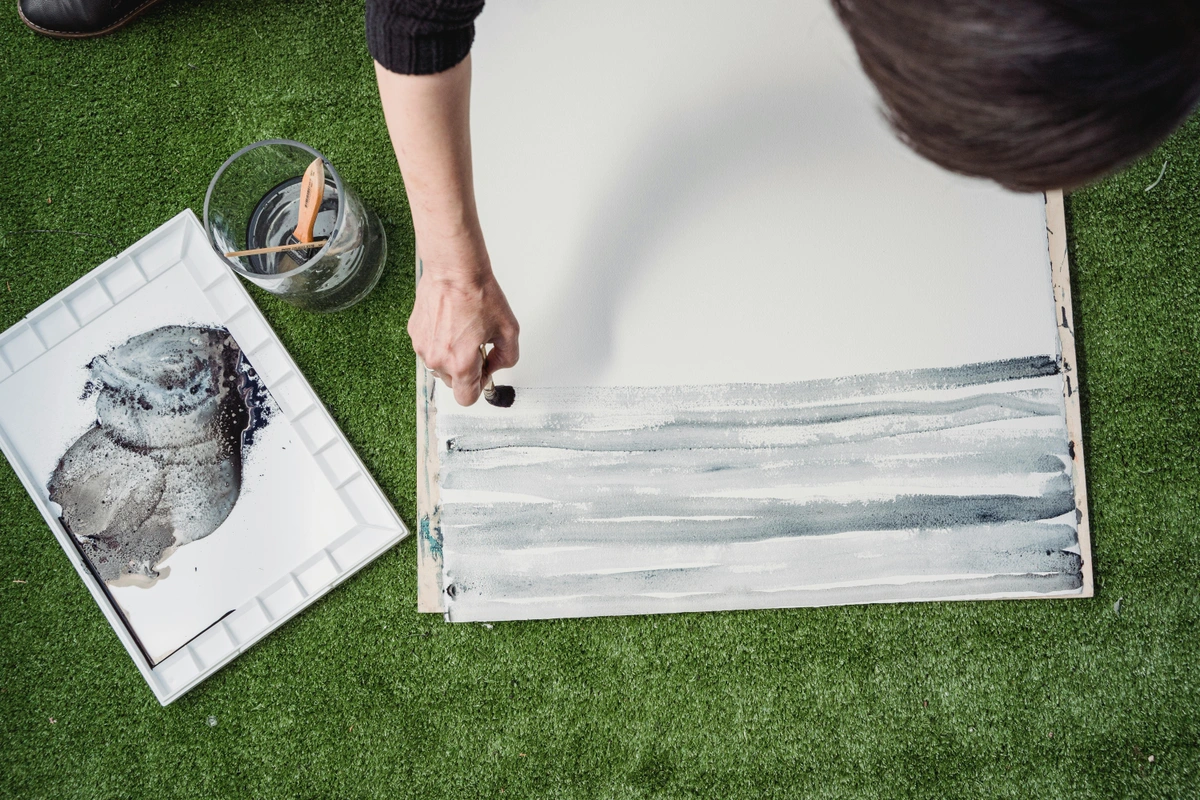
- The Art of the Flat Wash: One of gouache's superpowers is creating perfectly flat, opaque, matte fields of color. It's used all the time in illustration and design for this very reason. Mastering this can elevate your work, giving it a polished, professional look. It's a skill that takes practice, but the results are incredibly rewarding. It takes practice, but it's incredibly satisfying when you get it right.
- Mix Enough Paint: Mix more paint than you think you'll need. Nothing is worse than running out halfway through. Seriously, overestimate. It's easier to save excess gouache (especially in a pan) than to try and perfectly match a color mid-wash.
- Load Your Brush: Use a flat brush and load it evenly with your creamy paint mixture. You want it saturated, but not dripping.
- Apply with Confidence: Start at one edge of the area you want to cover. Apply the paint in a single, smooth stroke. Work swiftly and purposefully.
- Overlap Slightly: For the next stroke, slightly overlap the previous one while it's still wet. This helps avoid streaks and ensures an even application. The goal is to keep a wet edge.
- Don't Go Back: Resist the urge to go back and fuss with areas that have already started to dry. You’ll just lift the paint and create streaks. Let it dry, then you can decide if a second coat is needed.
- Layering (Wet-on-Dry): This is where gouache truly shines, allowing you to build up complexity. Ensure each layer is completely dry before applying the next. This prevents lifting and muddying. You can go from dark to light, or light to dark, which is incredibly liberating compared to watercolor. Think of it as building your painting, brick by opaque brick, to create the precise forms and colors you envision.
- Feathering and Blending: While gouache isn't known for seamless wet-on-wet blending like oils, you can achieve soft transitions and feathered edges with careful timing. Work quickly while the paint is still wet, or use a slightly damp brush to gently soften the edges of a still-drying stroke. For larger, softer blends, a dry brush technique can also create a beautiful, subtle gradient. It's a delicate dance, but the results can be stunningly smooth.
- Dry Brush: For texture and expressive marks, the dry brush technique is fantastic. Load your brush with paint (a little thicker than usual) and then remove most of it on a paper towel. Drag the brush lightly across the paper, allowing the bristles to skip over the texture, leaving a broken, textured mark. This is wonderful for creating effects like grass, fabric, or rough surfaces, adding a tactile quality to your work, much like the art of mark making itself. I often use this to create a sense of movement or atmosphere in my abstract art.
- Stippling and Hatching: For fine detail or unique textures, consider stippling (using small dots) or hatching (using parallel lines). Gouache's opacity makes these techniques pop, allowing you to build up values and textures with precision. These methods are excellent for adding intricate details to botanical illustrations or graphic design elements.
Common Gouache Mistakes and How to Avoid Them
We all make mistakes, especially when learning a new medium. Gouache has its own particular pitfalls, but once you know them, they're easy to sidestep. Trust me, I've made all of these (and probably more!).
- Too Much Water (Streaky Washes, Loss of Opacity): The most common mistake! If your paint is too thin, it acts like watercolor, losing its opaque punch. Solution: Aim for that heavy cream consistency. Swatch on scrap paper to check.
- Overworking Layers (Muddying, Lifting): Fussing with a layer that's already started to dry is a recipe for disaster. You'll reactivate the paint and create mud or lift the underlying layer. Solution: Apply layers swiftly and confidently, aiming for minimal strokes. If you need to fix something, let it dry completely, then apply a fresh, opaque layer, or carefully lift if necessary. Patience is key!
- Dirty Water (Dull Colors): Using the same jar for rinsing and mixing will inevitably lead to dull, lifeless colors. Solution: Use two jars! One for rinsing, one for clean water for mixing. This simple habit changes everything.
- Painting on Thin Paper (Buckling, Warping): Thin paper can't handle the moisture of gouache and will buckle. Solution: Always use heavy watercolor or mixed media paper (140 lb/300 gsm minimum), and tape it down to a rigid surface.
Troubleshooting Your Gouache Paintings: When Things Go Wrong
Even with the best intentions, things can go awry. Don't despair! Gouache is surprisingly forgiving.
- My Paint is Cracking! You applied it too thickly. Gently re-wet the cracked area with a clean, damp brush, allowing it to soften. You can then gently spread it out or lift some away before reapplying a thinner layer. For future work, thin your paint to that 'creamy' consistency. Remember, gouache likes to be applied in smooth, even layers, not thick impasto unless mixed with specific mediums.
- My Colors Look Muddy! This usually means you've overmixed on the paper, or your water was dirty. Try lifting the muddy area with a clean, damp brush and blotting gently. Next time, mix colors thoroughly on your palette and always use two water jars. Sometimes, simply painting an opaque layer over the mud once it's dry can rescue the situation.
- My Washes are Streaky! Either your paint was too thin, or you didn't keep a wet edge, or you overworked the drying paint. Practice your flat washes, ensuring consistent, creamy paint and swift, overlapping strokes. Remember: don't go back once the paint starts to set! Gravity also plays a role, so try working on a slightly inclined surface for larger washes.
- I Can't Get Crisp Edges! This could be due to a brush with splayed bristles or paint that's too thin. Ensure your brush has a good point or sharp edge, and your paint is at optimal creamy consistency. Practice drawing straight lines and sharp shapes. Using drafting tape can also help you achieve perfectly clean edges for graphic elements.
Protecting and Displaying Your Gouache Artwork
Congratulations, you've created a beautiful gouache piece! Now, how do you ensure it lasts and looks its best?
- Varnishing Gouache? A Delicate Question: Unlike oils or acrylics, traditional gouache is generally not varnished. Varnishes can often alter the matte finish (making it glossy) and even reactivate the water-soluble paint, causing streaks. If you absolutely want to protect it with a spray, look for a very light, matte spray fixative designed for pastels or charcoal, and apply it in very light, even coats from a distance. Test on a scrap piece first! My advice? Frame it under glass, it's the safest bet.
- Framing Under Glass is Best: Because gouache is susceptible to moisture and smudging, framing your finished work under glass is the ideal way to protect it. Use a mat board to keep the artwork from touching the glass, allowing for airflow and preventing condensation. This also protects against dust and environmental pollutants, ensuring your colors remain vibrant for decades.
- Avoid Direct Sunlight: Like many art mediums, prolonged exposure to direct sunlight can cause pigments to fade, even lightfast ones. Display your gouache art in a spot with indirect light to preserve its vibrancy for years to come. Think of it as protecting a cherished memory – you wouldn't leave it out in the sun to bleach, would you?