Gouache for Beginners: Unlock Matte Vibrancy with Expert Tips & Top Sets
Dive into gouache's matte magic! Discover personal studio secrets, compare beginner sets, and master tools to create stunning, opaque abstract art. Perfect for new artists ready for vibrant color.

Gouache for Beginners: Unlock Matte Vibrancy with Expert Tips & Top Sets
Ever looked at a vibrant, matte painting – perhaps a bold graphic illustration or a striking abstract piece – and wondered, "How do they get that color so smooth, so deep, and so utterly opaque?" For the longest time, I'll admit, the answer felt like a secret language only advanced artists spoke. Gouache. Just the word itself felt intimidating. It seemed to possess the ethereal fluidity of watercolor, yet the unapologetic, solid coverage of acrylics – a dichotomy that completely baffled my artist's brain, bless its pigment-addled little heart, always trying to solve the puzzle of light and color.
I remember staring at tubes in the art store, convinced it was a medium far beyond my grasp. But then, as it always does in my studio, curiosity got the better of me. I picked up a beginner set, and honestly? It was a delightful surprise, a total game-changer for quick sketches, vibrant studies, and just playing around without too much pressure. It's a medium that lets you capture everything from the delicate glow of a summer sunset to the crisp lines of a graphic poster, all with a uniquely satisfying matte finish. My initial apprehension quickly melted into a genuine fondness – a feeling that has been shared by artists for centuries, from the intricate detail of illuminated manuscripts to the bold statements of Art Nouveau posters, and even in some of my own abstract explorations where I crave that unique matte depth.
If you're currently dipping your toes into the art world, or perhaps you're already waist-deep in other mediums but curious about this wonderfully opaque and re-wettable paint, you've definitely come to the right place. I'm going to share my personal journey with gouache, some candid thoughts, and a few beginner-friendly sets that truly stand out in my experience. And trust me, once you get past that initial hurdle, it's a game-changer you'll wonder how you lived without! So, ready to unlock the magic and discover some of my studio secrets for making it sing? We'll cover everything from what gouache actually is, why it's perfect for new artists, what tools you'll need, and my own tricks for making it sing.
What's the Deal with Gouache Anyway? (My Personal Discovery)
Before we dive into specific sets, let's clear up the mystery: what is gouache? In the simplest terms, think of it as opaque watercolor. Yes, you heard that right! Unlike traditional watercolors, which thrive on transparency and letting the paper's white luminosity shine through, gouache's mission is to cover. It achieves this magical opacity thanks to larger pigment particles and often the addition of inert white pigment (like chalk, barium sulfate, or calcium carbonate) in its formulation. Think of these additives as tiny, light-reflecting agents that boost its covering power, making it incredibly different from its transparent cousin. It's like having a little bit of creative superpower at your fingertips.
It boasts a beautiful matte, velvety finish when dry, a quality I personally find incredibly satisfying – almost like touching a smooth, cool stone – especially for crisp graphic illustrations or those wonderfully bold, flat areas of color. This unique characteristic isn't new; gouache actually has a rich and storied history, dating back centuries. Its roots can be traced to ancient Egypt, and it was certainly a favorite during the European Renaissance, where artists like Albrecht Dürer employed it for detailed preparatory studies for their oil paintings, capturing vibrant forms before committing to the slower oil medium. It was famously used in illuminated manuscripts where opaque, rich colors were crucial for storytelling, often used in delicate layers and sometimes even for subtle gilding, giving a glowing effect. Later, artists like William Blake used it for his visionary prints and paintings, and even Gustav Klimt in his opulent Symbolist works, often combined with metallic elements. Its versatility saw a huge resurgence in the 20th century, becoming a favorite for commercial artists and illustrators like those creating iconic travel posters, mid-century book covers, and even early animation cels (think Disney's golden age, where animators needed consistent, flat colors for reproduction). Think of the intricate Art Nouveau illustrations of Alphonse Mucha, the expressive posters of Henri de Toulouse-Lautrec, or the beloved storybook art of Beatrix Potter – all masters who recognized gouache's unique punch and versatility. I've always been drawn to how these artists achieved such clarity and bold statements; it shows me how to bring similar precision and impact to the layered compositions of my own abstract pieces, even if the subjects are worlds apart. If you're curious about the medium's deeper roots and comprehensive guide, you might enjoy my article on the Ultimate Guide to Gouache Painting.
For me, discovering gouache felt like finding a creative cheat code. With watercolor, I always felt like I was battling to preserve the light from the paper. With gouache? I could just paint light over dark. Revolutionary! I remember a particular landscape sketch where I boldly added bright highlights over a dark forest, something I'd never dared with watercolor, and the sheer liberation of it was palpable. This unique quality truly sets it apart from other paint types, making it a fantastic choice for building up abstract compositions with distinct layers of color. If you're keen to explore the broader landscape of artistic mediums, you might find my thoughts on The Definitive Guide to Paint Types for Artists interesting too. The secret to its creamy, re-wettable nature often lies in its binder, typically gum arabic, a natural tree resin. The quality and type of gum arabic (e.g., Kordofan, Senegal) can subtly influence the paint's flow, sheen, and re-wetting properties, with higher quality binders contributing to a smoother, more vibrant application.
Why Gouache is Especially Great for Beginners (aka, Why I Wish I'd Started Sooner)
As an artist who thrives on vibrant, immediate expression, these three aspects of gouache are what make me kick myself for not discovering it sooner. Gouache combines vibrancy, forgiveness, and aesthetic versatility in a way that is incredibly appealing for diverse projects, making it ideal for new artists. Compared to watercolor, where a single mistake can feel catastrophic, or acrylics, which dry permanently almost instantly, gouache offers a wonderfully forgiving learning environment.
- Vibrant & Opaque Colors (They Just Pop!): The colors truly pop with gouache. They're rich, saturated, and inherently opaque, allowing you to achieve bold statements and flat areas of color that feel incredibly satisfying. This immediacy is hugely encouraging for beginners; you see impactful results quickly, which is a powerful motivator. It's like getting the richness and coverage of oil paint without the lengthy drying times or the mess of solvents, offering a similar depth of color without the transparency challenge of watercolor. I still remember the first time I laid down a solid block of primary red gouache – it just glowed, demanding attention. For my abstract work, this means I can quickly establish strong, foundational color fields and build dynamic compositions without waiting ages for layers to dry, which is a massive win for capturing that initial burst of creative energy. This makes it perfect for quick character designs, bold poster art, or establishing strong color fields in an abstract study.
- It's Incredibly Forgiving (Hello, Do-Overs!): Remember what I said about being able to paint light over dark? That's a huge deal. With traditional watercolor, a mistake often means starting over, or carefully lifting pigment. With gouache, its opacity means you can layer, correct, and even re-wet dried paint to rework areas. This is a massive relief when you're just starting out and, let's be honest, making a fair few 'happy accidents' (that sometimes aren't so happy). I once attempted a detailed botanical illustration, and what was supposed to be a delicate vein became a blob. With traditional watercolor, that would have meant starting anew. With gouache, I simply let it dry, painted a fresh, opaque layer over it, and poof – crisis averted! It really takes the pressure off, allowing for more playful experimentation. For my abstract pieces, this forgiveness is invaluable; it means I can spontaneously experiment with new lines, shapes, or even cover an entire section to try a new color harmony without fear of permanent damage. I've salvaged countless sketches that felt doomed, simply by reactivating and repainting.
- Versatile & Velvety Matte Finish: I'm a huge fan of the velvety, non-glossy finish. It's chic, it's modern, and it works wonderfully for everything from detailed botanical illustrations, where you can use opaque white for highlights, to bold graphic design elements, abstract pieces, and even texture studies. You can apply it thinly for a stained, watercolor-like effect, or thickly for a more textured, almost impasto feel (though it will crack if too thick). This adaptability means you're not limited to one style, which is fantastic for finding your artistic voice. Imagine a deep, velvety blue absorbing light – that's the kind of mood gouache can create, isn't it? This unique matte depth is something I actively pursue in my own abstract works; it creates a subtle, sophisticated quality that glossy paints just can't quite capture. The light just sinks in, creating a rich, almost textural experience, which I find inherently more inviting and less distracting than a reflective surface. It feels honest, raw, and deeply satisfying.
So, ready to dive a little deeper into why this magic works so well for those just starting out?

Essential Tools for Your Gouache Journey (Now that you know the secrets!)
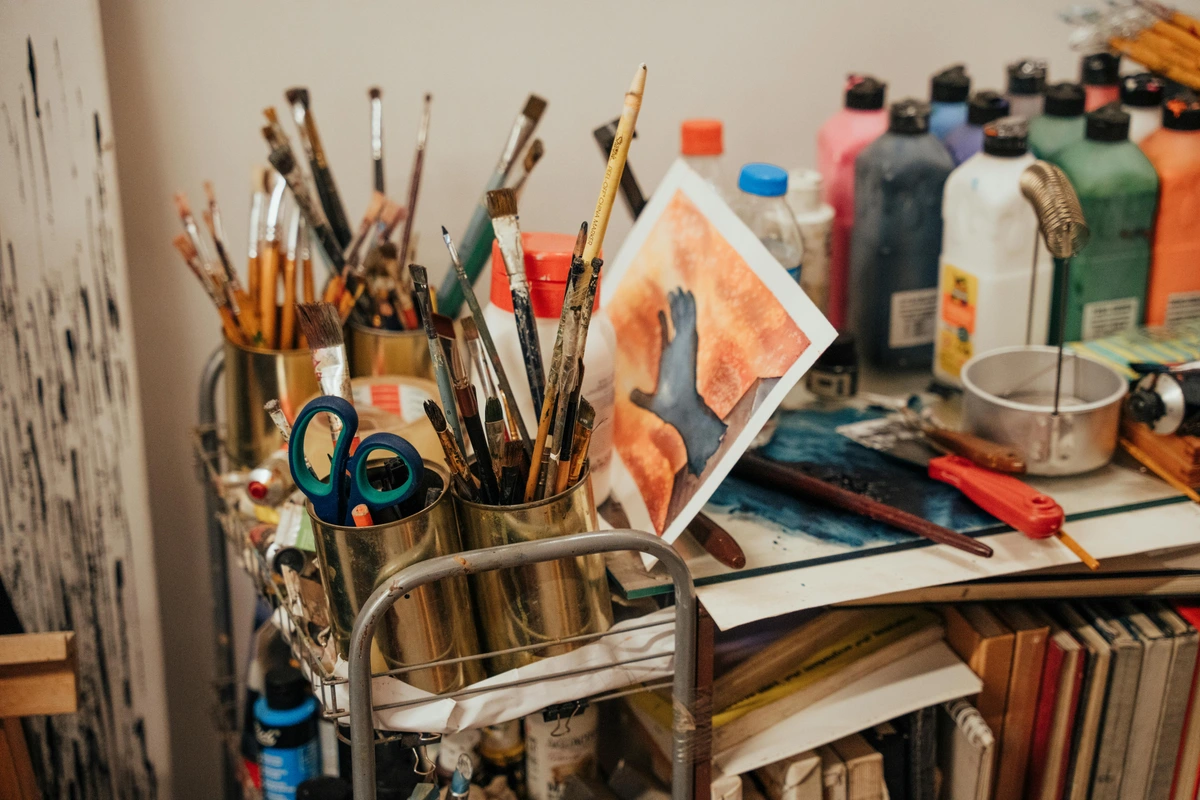
Now that we've explored the magic inside the tubes and pans, and have a handle on some studio secrets, let's talk about the trusty sidekicks that bring our gouache visions to life. While the paint is undoubtedly the star, a few essential tools make the experience even better. And no, you absolutely don't need to break the bank for these; honestly, some of my favorites are surprisingly humble tools. Once you've got your paints and core essentials, it's time to talk about the stage: what surfaces are we painting on, and what else will make your gouache experience sing? Because, let's be honest, the right supporting cast can make all the difference to the star of the show. If you want a comprehensive look at what you'll need, check out my guide on Essential Gouache Painting Supplies for Beginners.
What You'll Need: A Quick Starter List
- Gouache Paints: Tube or pan set (we'll dive into recommendations shortly!)
- Paper: Sturdy watercolor or mixed-media paper (140lb/300gsm is ideal)
- Brushes: A few good synthetic brushes (rounds, flats)
- Palette: Any non-porous surface (ceramic plate, plastic lid)
- Water Containers: Two cups for clean rinsing and mixing
- Paper Towels/Rag: For blotting brushes and cleaning up messes (and there will be messes!)
Surfaces: Paper and Beyond
- Paper: This is perhaps the most crucial supporting actor! You'll want sturdy paper, something that can handle a bit of water without buckling into a potato chip. Think watercolor paper (140lb/300gsm is ideal) or even thick mixed-media paper. Regular sketch paper is usually far too thin; trust me, I've had many a frustration with flimsy paper turning my beautiful gouache efforts into a wavy disaster. For details, I tend to reach for hot-press watercolor paper with its smooth surface, but if you love a bit of texture to grab the pigment, cold-press works beautifully too. The slight texture, or 'tooth' (that subtle grip on the paper's surface), of cold-press paper helps the paint adhere better and can add a subtle visual interest, especially for abstract work where texture can add so much. You might even explore specialized gouache papers, which are often heavily sized to minimize absorption and enhance the paint's vibrant opacity. Sizing, a substance added to paper pulp or applied to the surface, is critical; it reduces the paper's absorbency, preventing the paint from sinking in too quickly and losing its vibrancy or becoming muddy.
- Beyond Paper - Other Surfaces: While paper is the go-to, gouache can actually be applied to other surfaces too, given the right preparation! You can use it on primed canvas (though it will remain re-wettable unless sealed), wood panels (sanded to a smooth finish and sealed with a few coats of gesso or a wood sealer first), or even illustration board. The key is to ensure the surface isn't too absorbent, which would cause the paint to soak in unevenly and lose its vibrancy, nor too slick, which could lead to poor adhesion. A good primer or gesso provides the perfect tooth for the paint to grab onto. Experimentation here is half the fun! Just remember, the surface will greatly influence how the paint behaves and the final look of your piece.
Brushes, Palettes & Water
- Brushes: A few good quality synthetic brushes will serve you exceptionally well. I generally recommend synthetic over natural hair for gouache because they hold their shape better with the thicker, creamy paint and offer a good amount of spring (the brush's ability to snap back to its original shape) and stiffness, which is crucial for manipulating the often heavier gouache pigment. This gives you more precise control over those crisp lines and flat, opaque areas. Natural hair brushes, while wonderful for transparent watercolors, can sometimes become a bit limp or hold too much water with gouache, leading to less control over the paint's opacity and flow. Synthetic bristles like taklon or sablette offer a good balance of softness and spring, allowing the paint to glide smoothly and evenly without too much capillary action sucking up all the pigment. A couple of rounds (sizes 6, 8, 10 perhaps) and a flat brush (like a 1/2 inch or 1 cm) are a fantastic starting point. I've got a whole drawer full of brushes, and let's just say my brush drawer has seen better days, but the right shape still does the trick for a quick gouache session! For more on brush basics, you might like The Definitive Guide to Essential Paint Brush Types for Artists, as many principles apply across mediums.
- Palette: Any non-porous surface will do the trick. A ceramic plate, a plastic lid, or a dedicated watercolor palette. Remember, gouache re-wets beautifully, so even dried paint on your palette isn't wasted! Just reactivate it with a damp brush or a spritz of water. This is probably one of my favorite features – no wasted paint, ever. My palette often looks like a Rorschach test after a particularly vibrant brainstorming session, but hey, at least there's plenty of paint to reactivate!
- Water Containers: Two cups are always a good idea: one for rinsing off the bulk of the paint, and one for cleaner water for mixing. This simple trick prevents muddy colors – a lesson I learned the hard way more times than I care to admit, often resulting in what I affectionately called 'swamp water green' where a vibrant emerald should have been. Trust me, your colors will thank you for the clean water.
Student vs. Professional Grade Gouache: What's the Difference? (And Why You Should Care)
Before we jump into my personal set recommendations, there's a quick pitstop we need to make: understanding the difference between student-grade and professional-grade gouache. Now, don't overthink this; for beginners, student grade is often perfectly fine, but knowing the nuances can help you choose wisely or understand why one paint might behave differently than another. It's like knowing the difference between a reliable daily driver and a high-performance sports car – both get you there, but the journey might be a bit different!
At its core, paint is pigment suspended in a binder – the glue that holds the pigment particles together and allows them to adhere to a surface when dry, and in gouache's case, to be re-wet. The quality and type of this binder, along with the pigment load, are what largely separate student from professional grades.
Feature  | Student-Grade Gouache | Professional-Grade Gouache |
|---|---|---|
| Pigment Load | Lower concentration, more fillers, less expensive pigments | Higher concentration of pure pigment, fewer fillers |
| Vibrancy | Good, but can be slightly less intense and sometimes chalkier; colors may appear duller when dry on the palette. | Brighter, more vibrant colors straight from the tube/pan; maintain their richness better when dry. |
| Lightfastness | Varies, generally lower lightfastness ratings (may fade faster) | Typically uses more lightfast pigments, better color retention |
| Binder Quality | Often dextrin-based or lower-grade gum arabic, can be less refined, prone to cracking if thick | Usually high-grade gum arabic-based, finer, more consistent, smoother application |
| Handling | Can feel slightly grainier, stickier, or less fluid; may require more effort to re-wet evenly. | Smoother, more even application, superior re-wetting properties; creamy consistency. |
| Cost | More affordable | More expensive |
- Pigment Load: This is the big one. Professional-grade gouache, like Holbein or Winsor & Newton Designers Gouache, uses a higher concentration of pure pigment. This means brighter, more vibrant colors straight from the tube or pan, and often better mixing properties. For instance, a small dab of professional paint will go much further when mixing secondary or tertiary colors, allowing for more subtle and precise color shifts. For an abstract artist, a higher pigment load means you can achieve richer, more intense shadows or vibrant highlights with less paint, which is crucial for creating impactful contrast in abstract pieces without diluting the color's integrity. Student grades, such as Arteza or Royal Talens, while still vibrant, tend to use more fillers and less expensive pigments, resulting in slightly less intensity and sometimes a chalkier finish. It's like the difference between a homemade soup bursting with fresh ingredients and a canned version – both get the job done, but one just has a little more oomph.
- Lightfastness (The Fading Factor): This refers to how well a paint resists fading when exposed to light over time. Professional gouache typically uses more lightfast pigments, meaning your artwork will retain its color integrity for longer. For quick studies, sketchbook work, or pieces you plan to digitize, student grade is absolutely fine. But if you're creating pieces you intend to sell, display permanently, or consider for archival purposes (especially under direct light), professional quality is a crucial consideration. Brands like Winsor & Newton Designers Gouache, Holbein, and Schminke generally offer excellent lightfastness in their professional lines. Always check the lightfastness ratings on the tube or pan if permanence is a concern – they often use a star system or ASTM ratings. Trust me, I've had the heartbreak of seeing early, unsealed works fade over time; it's a hard lesson learned!
- Binder Quality (The Glue That Holds It All Together): The binder (usually gum arabic, sometimes dextrin or tragacanth) holds the pigment particles together and allows them to re-wet. In professional paints, the binder is often finer and more consistently milled, contributing to a smoother, more even application and superior re-wetting properties. Gum arabic, a natural tree resin, is prized for its flexibility and re-solubility. Dextrin, often used in student grades (like some Himi jelly gouache or Reeves sets), can sometimes lead to a slightly more brittle film when dry, making it prone to cracking if applied too thickly. A less refined binder in student paints might also affect brush drag, making the paint feel slightly 'stickier' or less fluid, and could even lead to slightly longer drying times because of different evaporation rates of the binder components. Student paints might sometimes feel a little grainier, crack more easily when dried thickly, or exhibit more pigment separation in the tube because of less refined binders and higher filler content.
My take? Start with student grade. It's affordable, forgiving, and you can learn so much without the pressure of wasting expensive paint. Once you feel comfortable, then consider upgrading a few tubes of your favorite colors to professional quality to experience the difference. You'll definitely notice it! Now that we've unlocked some of my personal studio tricks, and talked about the quality of the paint itself, let's look at what sets I actually recommend for diving in.
My Studio Secrets for Gouache Success: Beyond the Basics
Alright, you've got your paints, your paper, and your brushes (or you're about to!). Now let's talk about actually getting paint onto paper without too much existential dread. These are the things I've picked up from countless hours (and glorious messes) in my own studio, lessons that artists like myself, working on vibrant abstract art, embrace daily. After all, learning how the paint wants to behave is a journey, not a destination.
My Golden Rules for Working with Gouache:
- Nail That Creamy Consistency (My "Thick Yogurt" Rule): This is foundational. Start with less water than you think you need. Gouache performs its best when it's creamy, like a thick yogurt or melted ice cream – thick enough to be opaque, but fluid enough to flow smoothly from your brush. Visually, it should hold a soft peak on your palette and not spread out immediately. You can always add more water to thin it down, but taking it away is, well, harder (a lesson that, oddly enough, applies to many things in life). Overworking with too much water is a common beginner mistake that can lead to streaky or faded color. I once tried to paint a vibrant azure sky but added too much water, resulting in a thin, washed-out blue that looked nothing like the rich color I intended. The goal is a smooth, even flow that still retains its opacity – a delicate balance that comes with practice. And trust me, I've had enough 'yogurt' accidents on my studio floor to know this rule well! This is key for creating those bold, consistent color blocks I love in my abstract pieces.
- Layer Smartly (Patience is a Virtue, Even for Me!): While you can paint light over dark, letting layers dry completely before adding a new one is crucial, especially if you're aiming for crisp edges and vibrant overlays. Otherwise, you risk reactivating the layer underneath and creating a muddy mess where your crisp lines or vibrant overlays once were. Patience isn't always my strong suit, I'll admit, but with gouache, a little drying time goes a long way. Resist the urge to poke it! I once ruined a perfectly good sky because I just had to add one more cloud before it was truly dry, reactivating the layer below. Learn from my impatience. This thoughtful layering is essential for building depth and complex compositions.
- Embrace the Matte (The "Designer's Shift" Secret): The beautiful, velvety matte finish is one of gouache's signature characteristics. Don't try to make it glossy unless you're intentionally mixing it with another medium like acrylics (which, by the way, is a whole other fun experiment!). Understand that this matte quality means the color may appear slightly lighter when dry than when wet – a phenomenon known as 'designer's shift.' This happens because as the water evaporates, the binder consolidates around the pigment particles. Light then reflects differently off the dried, more compressed pigment, creating a slightly paler or less saturated appearance than when the pigment was suspended in wetter, more reflective water. Think of it like a dark plum looking intensely rich when wet, but a touch duller and lighter once dried. Or, consider how a vibrant photo on your phone screen might look a little less intense when printed. It's like a velvet cushion that looks deeper in the shadows than when it's freshly fluffed – the richness is there, but the light plays differently. The trick? Learn to anticipate it. If you aim for a vibrant, deep teal, you might mix your blue slightly darker and greener than you think you need, anticipating that the blue will lighten and potentially desaturate slightly upon drying. Colors with a high transparency or those with a lot of white pigment often show the most noticeable designer's shift, so be extra mindful with your light yellows or purples. Mix your colors slightly darker or more saturated than you intend for the final dry result, and importantly, swatch them out on a scrap piece of the same paper to see how they'll truly dry. This small step will save you so much frustration and is vital for achieving consistent color in commercial illustrations or detailed abstract work.
- Experiment with Color (My Abstract Artist's Take): Don't be afraid to mix and match! Gouache colors are incredibly vibrant on their own, but they play beautifully together. Its opacity means you can even mix lighter colors into darker ones on your palette to shift hues, something harder to achieve with transparent watercolors. If you're interested in really understanding how colors interact, especially in the context of creating impactful abstract pieces (like those found in my art for sale), my article on How Artists Use Color might spark some ideas. Gouache allows for bold exploration of color harmonies and value shifts. As an exercise, try creating a monochromatic study using only blues and their complementary oranges/yellows, focusing on distinct value shifts – gouache's opacity makes this surprisingly effective! Or, experiment with creating vibrant grays by mixing complementary colors (e.g., red and green) in varying proportions, which can result in more nuanced and lively neutrals than using a tube of pre-mixed gray. However, avoid overworking colors on the paper, as too much mixing can lead to muddiness. Aim for decisive strokes – trust your intuition!



Taking Your Gouache Further: Advanced Tips & Troubleshooting
Sometimes, though, you want gouache to do a little more, or a little less, of its natural thing. That's where mediums come in, and exploring them feels like opening a secret cupboard in your studio.
1. Mediums for Custom Effects
While gouache is wonderful on its own, you can experiment with mediums to alter its properties. A tiny drop of flow improver can help with smoother blends for larger washes, allowing for soft gradients, like blending a vast sky without harsh brush marks. Or a retarder can slightly extend your working time, which is great for those detailed botanical bits that require careful layering without the paint drying too quickly. You can even add a touch of opaque white gouache to transparent watercolors to give them some of that gouache 'punch.' Just remember, these will slightly change the paint's natural characteristics. Speaking of mixing, you might wonder why gouache is so different from acrylics, even though both can be opaque. It boils down to their binders: gouache uses a water-soluble binder (like gum arabic or dextrin), which means it can always be re-wet, even after drying. Acrylics, however, use an acrylic polymer emulsion that creates a permanent, waterproof film when dry. This fundamental chemical difference is why gouache offers that unique forgiveness, allowing you to lift or rework areas even days later, whereas acrylics are a 'one-shot' deal once dry – a crucial distinction for beginners! (You can also find more about acrylic mediums in my article on Best Acrylic Mediums for Abstract Artists for a broader perspective). It's crucial to understand that if you mix gouache with acrylic mediums or layer it over dry acrylics, those specific gouache layers will lose their re-wettable characteristic and become permanent along with the acrylics.
2. Achieving Permanence & Archival Quality
By nature, gouache remains re-wettable. If you want your finished piece to be more permanent and water-resistant (e.g., for display without glass, or for pieces you intend to sell and have last for generations), you can apply a workable fixative (like Krylon Workable Fixative) or a matte varnish specifically designed for artworks (such as Golden Archival Matte Varnish). These create a protective, often water-resistant, layer. Just be sure to test it first on a scrap piece, as some varnishes can alter the matte finish slightly or deepen colors. Remember the distinction: gouache is opaque, but not inherently permanent or waterproof without sealing. For true archival quality, always use professional-grade gouache with high lightfastness ratings on acid-free, archival paper, and consider a UV-protective varnish. This is critical for commissioned works or pieces intended for long-term exhibition. When selecting pigments, note that inorganic pigments (like cadmiums or earth tones) often have higher lightfastness than some organic pigments (like certain bright reds or purples), though modern organic pigments are constantly improving. Always check the lightfastness ratings on your specific paint tubes. Brands renowned for their professional gouache with excellent lightfastness include Winsor & Newton Designers Gouache, Holbein Artists' Gouache, Schmincke Horadam Gouache, and M. Graham Gouache. A hard-won lesson.
3. Exploring Texture & Effects
Don't be afraid to play! For subtle texture, try dry brushing – loading a nearly dry brush with paint and dragging it lightly over a dry layer. To do this, dip your brush in paint, then wipe almost all of it off on a paper towel until only a whisper of pigment remains, then lightly drag it across the dry surface to create a feathery, broken effect. You can also stipple with a brush or sponge for a speckled effect by dabbing the brush tip repeatedly, or even scratch into wet paint with a palette knife or the back of your brush for fine lines or expressive marks. The opacity of gouache lends itself beautifully to these kinds of layered textural experiments, which are fantastic for adding depth to abstract compositions. Experimenting with common pigments like Cadmiums will give you strong, opaque coverage, while Ultramarine Blue, for instance, has a unique granular quality that can add subtle texture when thinned, showing the versatility even within a limited palette.
4. Common Beginner Blunders & Troubleshooting
Beyond too much water, be mindful of overworking the paint (applying too many brushstrokes to a single area can lift the pigment underneath, creating patchy or faded spots, especially when re-wetting). Repeated scrubbing at a wet area can disturb the already laid-down pigment and even lift tiny fibers from the paper, resulting in a fuzzy or muddy appearance. It's best to lay down a stroke and then leave it! Also, watch out for not understanding the drying times for different thicknesses (thicker paint means longer dry time, and trying to layer too soon leads to reactivating previous layers), or trying to use it on very absorbent, un-primed surfaces that will just soak up the pigment unevenly. An un-primed surface, like untreated wood or thin printer paper, lacks the 'sizing' or primer necessary to prevent liquids from being absorbed too quickly and unevenly. This can lead to muddy colors or an inability to achieve smooth, vibrant blends. My rule of thumb: when in doubt, let it dry and come back to it! It's all about learning how the medium wants to behave, a skill many artists throughout history, from the intricate Art Nouveau illustrators to the bold mid-century graphic designers, mastered to create their iconic works. Gouache is perfectly suited for styles that favor clear lines, flat areas of color, and graphic punch.
Oh, and sometimes you might notice a chalky residue on dried gouache, known as blooming, especially in humid conditions or if too much binder separates. This happens when the water evaporates too quickly, leaving binder solids or excess opacifier on the surface. A gentle brush-off with a soft, dry brush can sometimes help, and consistent storage in a dry environment can mitigate it. Also, don't fret if your pan gouache develops pigment separation over time, where the binder collects on top – just give it a good stir or mist to reincorporate everything. Gouache's main limitation, if not sealed, is its continued re-solubility, meaning it's not ideal for environments where it might get wet post-completion, or for situations requiring absolute permanence without a protective layer. This re-solubility is also why working in very humid environments can sometimes lead to layers reactivating more easily, or even slight stickiness, a real test of patience! For reviving a completely dried tube of gouache, you can try piercing the dried paint with a skewer and adding a few drops of distilled water, letting it soak, then working it with a palette knife until creamy again, though it may never be quite as smooth as fresh paint. A quick note on safety: always check the labels on your gouache tubes for any specific health warnings, especially for pigments like Cadmiums, though most modern gouache paints are non-toxic for typical art use. Dispose of paint water responsibly by letting pigment settle and pouring off clear water, rather than down the drain. For dried pigment sediment, collect it in a sealed container or jar and dispose of it with your regular solid waste, keeping it out of waterways.
My Personal Picks: Beginner-Friendly Gouache Sets (Based on My Own Trials and Errors)
When you're starting out, the sheer number of options can be overwhelming. Trust me, I've been there, staring at art supply aisles with a deer-in-headlights look, probably drooling slightly and wondering if I needed all the colors. My own trials and errors have led me to a few solid recommendations. Here are a couple of types of gouache sets I've found to be excellent entry points, along with my honest thoughts, quirks, and all.
Feature | Tube Gouache Sets | Pan Gouache Sets |
|---|---|---|
| Pigment Delivery | Creamy, ready-to-use pigment | Dried cakes, re-wet with water |
| Initial Vibrancy | High, straight from the tube | Requires re-activation, builds up |
| Layering | Excellent for thick, opaque layers | Better for thinner, watercolor-like layers or building up slowly |
| Portability | Less portable, can be messy | Highly portable, great for sketchbooks |
| Waste | Can be wasteful if too much squeezed out | Minimal waste, controlled usage |
| Drying in Palette | Can crack if thick, but re-wettable | Dries hard, easily re-wettable |
| Ideal For | Illustrations, studio work, bold statements, abstract art with strong color fields | Sketching, urban art, on-the-go painting, delicate washes |
1. Tube Gouache Sets (for Immediate Vibrancy & Bold Statements)
- What I Like: These are fantastic for getting that rich, creamy pigment right out of the gate. Beyond popular student-grade brands like Himi (often called jelly gouache) or Winsor & Newton Designers Gouache, I've also had great experiences with Mijello Mission Gold for its incredible vibrancy and ShinHan SWC for its beautifully buttery consistency. The immediate impact is fantastic; there's an undeniable satisfaction in the tactile experience of squeezing that rich pigment onto your palette. It feels like you're unlocking pure color potential with every squeeze, ready for those bold, unblended fields of color that often define my abstract work.
- What Might Be Tricky: Ah, the classic 'too much squeeze' situation, a personal nemesis of mine! My palette often looks like a Rorschach test after a particularly vibrant brainstorming session because my enthusiasm, bless its heart, has a mind of its own. I once optimistically squeezed out a dollop for a small study, only to realize I'd deployed enough crimson for a full-scale battle scene, which then sat there judging me from the palette for days. Also, once they dry in the palette, they might crack if the layer is too thick (especially thicker, student-grade brands), but thankfully they're still re-wettable. Just rehydrate them! Sometimes, if left untouched for a very long time, you might notice some pigment separation in the tube, where the heavier pigment particles can settle and the binder may rise to the top. This happens due to differences in density and gravity. A good shake or massaging the tube usually sorts it out, though if it's particularly stubborn, you might need to gently warm the tube in your hands or carefully use a palette knife to re-incorporate everything into a smooth, homogenous consistency. A little tip for storage: try to keep your tubes upright, cap-down, or lay them flat to minimize binder separation over time. They can be a smidge messier to clean up if you're not careful, which, let's be honest, is most of us.
- Best For: Artists who want strong, opaque colors immediately, enjoy the hands-on process of mixing on a palette, and appreciate that 'professional artist' feel right from the start. Great for illustrations and studies where you want a smooth, consistent application without much fuss, or for abstract pieces demanding strong color presence.
2. Pan Gouache Sets (for Portability & Less Waste)
- What I Like: These are more akin to traditional watercolor pan sets, but with that lovely opaque kick. Often more affordable, incredibly convenient for portability, and they encourage you to be a bit more mindful with your paint usage – which for someone like me, who often goes overboard, is a blessing. I actually started with a pan set, mostly because it felt less intimidating; less commitment, you know? Besides Arteza, which offers good, budget-friendly options, I've found Paul Rubens and Kuretake Gansai Tambi to be excellent, highly pigmented choices for beginners. While Kuretake Gansai Tambi isn't strictly traditional gouache (it's often classified as an opaque watercolor due to its binder, which behaves slightly differently than a gum arabic based gouache, creating a slightly more translucent quality if heavily diluted), it offers very similar opaque qualities and performs beautifully for a gouache-like effect. When selecting a pan set, if the binder isn't explicitly stated, look for mentions of 'designer's gouache' or 'opaque watercolor' on the packaging; true gum arabic-based gouache is generally more forgiving for re-wetting and layering.
- What Might Be Tricky: Building up truly thick, opaque layers directly from a pan can sometimes feel a bit slower than with tubes. You'll definitely need a bit more water and patience to activate the pigments to a creamy consistency. My tip? Keep a small spray bottle handy to mist your pans a few minutes before you start painting; it helps immensely with activation without over- saturating the paint. If you're used to the instant gratification of tube paints, this might feel like an extra step. Also, while pan gouache is designed to dry, some brands might develop a chalky bloom on the surface if exposed to high humidity, though this usually wipes away easily with a soft brush. While often used interchangeably, it's worth noting that traditional gouache typically uses Gum Arabic as a binder, while some "opaque watercolors" or "designer colors" might use a different binder like dextrin or starch, which can affect consistency and re-wetting slightly. For most beginners, the difference is negligible, but it's part of the nuance!
Frequently Asked Questions About Gouache for Beginners (Your Burning Questions, Answered!)
I get a lot of questions about gouache, and that's totally understandable! It's a fantastic medium with a few unique quirks. Here are some of the most common ones I hear from aspiring gouache artists, along with my honest, studio-tested answers.
Is gouache hard to learn?
Absolutely not! In fact, I'd argue it's one of the most welcoming mediums for beginners – truly a dream come true for those who, like me, appreciate a bit of creative freedom. Remember how we talked about its fantastic re-wettability and glorious opacity earlier? Those are your superpowers! You can easily correct mistakes by painting right over them, which really removes a lot of the pressure that other mediums, like traditional watercolor, can impose. Compared to the unforgiving nature of watercolor (where mistakes are hard to hide) or the fast-drying permanence of acrylics, gouache offers a wonderfully patient learning curve. It's less about mastering intricate techniques initially and more about simply getting comfortable with how the paint behaves and feels on your brush and paper. Just dive in and play! The learning curve is gentle, and the vibrant, opaque rewards are immediate.
What kind of paper should I use for gouache?
Think sturdy! I always recommend using paper that has some weight to it, typically 140lb (300gsm) watercolor paper. You can also use good quality mixed-media paper or even bristol board. The key is to avoid thin, flimsy paper that will buckle or warp significantly when wet – believe me, I've learned that lesson the hard way, ending up with what looked more like a potato chip than a painting! For detailed work, a smooth hot-press watercolor paper is fantastic, while a slightly textured cold-press can help the paint adhere beautifully and add a nice artistic touch. The 'tooth' of the paper (that subtle surface texture we discussed) plays a big role in how the paint handles, so experiment to find your preference. Don't be afraid to try a few different types!
How do I clean my gouache brushes?
Cleaning gouache brushes is pretty straightforward – thankfully, no harsh chemicals needed here! Just rinse them thoroughly under running water and gently work out any pigment until the water runs clear. A little mild soap (like artist's brush soap or even dish soap) can help if paint has dried in the bristles. Always reshape your brushes to their original point or chisel edge before letting them dry flat or brush-head up to maintain their integrity. And here's a crucial, hard-won tip: don't let paint dry in the ferrule (that's the metal part that connects the bristles to the handle)! It's a nightmare to get out and can permanently damage your brush. A quick rinse immediately after use is your best friend – your brushes will thank you!
Can I mix gouache with other paints?
Yes, you absolutely can, and it's a lot of fun to experiment! Think of your studio as a laboratory. Gouache can be mixed with watercolors to adjust opacity and vibrancy; it's a great way to add a bit more 'punch' to your transparent washes or create soft, opaque pastels. It can also be layered over or under acrylics, though remember that acrylics are permanent when dry, so while they can coexist, any gouache mixed into acrylics, or layered over dry acrylics, will lose its re-wettable characteristic in those specific areas. Some artists even mix a touch of acrylic medium with gouache to make it more water-resistant, but then it's no longer 'pure' gouache, is it? Anyway, don't be afraid to try different combinations and see what exciting effects you can discover! It's how new techniques are born, and perhaps your next abstract masterpiece!
How do I store gouache paint?
Storing gouache properly helps preserve its longevity and keeps it ready for your next burst of creativity. For tube gouache, make sure the caps are tightly sealed after each use to prevent them from drying out. If a tube does dry out a bit, you can sometimes work in a drop or two of distilled water with a palette knife to revive it, though it might never be quite as smooth as fresh paint. A good trick for tubes is to store them cap-down or lying flat to help prevent binder separation. For pan gouache, simply let them dry completely after use before closing the palette. You can leave them uncovered in your studio, or keep them in their palette – they're designed to dry! The beauty of pan gouache is that if they dry out, they're easily re-activated with water. Just avoid exposing them to extreme temperature fluctuations or excessive humidity, which can sometimes lead to blooming on pans. For long-term archival storage of finished pieces, consider storing them flat in acid-free portfolios away from direct light, much like you would delicate watercolors. (For more general art storage tips, my article on art storage solutions for collectors might be useful).
Is gouache environmentally friendly?
This is an increasingly important question, and I'm glad you're asking it! Many gouache brands are becoming more environmentally conscious, which is fantastic news for our planet and our studios. Look for brands that offer non-toxic pigments and that use sustainable packaging. The fact that gouache is water-soluble means brush cleanup doesn't require harsh chemicals, and dried paint can often be re-activated, significantly reducing waste. Always dispose of paint water responsibly – ideally, let pigment settle and pour off the clear water, then dispose of the dried pigment sediment in solid waste, rather than down the drain, to protect waterways. For dried pigment sediment, collect it in a sealed container or jar and dispose of it with your regular solid waste, keeping it out of waterways. Every little bit helps our planet, right?
Is gouache archival?
This is a nuanced question, and one that often comes up, especially if you're thinking of selling your work. Gouache is not inherently permanent or waterproof unless sealed. Its archival quality depends on several factors: the lightfastness of the pigments used (professional grades are generally much better here, as we discussed), the paper it's painted on (acid-free, archival paper is essential), and whether it's eventually sealed with a UV-protective fixative or varnish. A workable fixative like Krylon Workable Fixative offers temporary protection and allows further layers, while a final matte varnish such as Golden Archival Matte Varnish provides more robust, long-term water resistance and UV protection, though it's usually irreversible. For display, keeping gouache under glass helps protect it from humidity, dust, and physical damage. So, yes, gouache can be archival, but it requires conscious choices in materials and finishing – it's not a set-it-and-forget-it medium if longevity is your goal. When selecting pigments, note that inorganic pigments (like cadmiums or earth tones) often have inherently higher lightfastness than some organic pigments (like certain bright reds or purples), though modern organic pigments are constantly improving. Always check the lightfastness rating on your specific paint tubes. Brands renowned for their professional gouache with excellent lightfastness include Winsor & Newton Designers Gouache, Holbein Artists' Gouache, Schmincke Horadam Gouache, and M. Graham Gouache. If you're creating a piece destined for a gallery or for a client, these considerations become critical.
Can I use gouache for plein air painting?
Absolutely! Gouache is a fantastic choice for plein air (outdoor) painting, especially pan sets. Their portability makes them incredibly convenient for tossing into a backpack or small field kit. You only need a brush and a water container, and perhaps a small spray bottle to reactivate your paints. The quick-drying nature of gouache means you can work relatively fast, which is a huge advantage when painting changing light conditions outdoors. The matte finish also reduces glare, making it easier to photograph your work on location. Just be mindful of direct sunlight drying your paints too quickly on the palette, and remember to secure your paper as wind can be a surprising adversary! For more on painting outdoors, check out What Is Plein Air Painting.
Can gouache be used for printing purposes?
Yes, absolutely! Gouache is actually an excellent medium for artworks intended for reproduction, which is why it was historically a favorite for illustrators and graphic designers. Its opaque, flat colors scan beautifully, making it very suitable for creating digital prints of your artwork. The matte finish means there's no glare from the paint itself to contend with during scanning or photography, resulting in cleaner, more accurate digital captures. Just be mindful of ensuring good lighting when capturing your work, and use a high-resolution scan to preserve all the detail. While you might need to make minor adjustments in editing software to match the on-screen vibrancy to the original, gouache provides a fantastic foundation for high-quality digital reproductions. Its clean lines and solid color fields translate exceptionally well, making it a powerful tool for artists who want to bridge traditional painting with digital presentation or product creation.
Final Thoughts: Just Go For It!
Gouache is, truly, a joy. It's forgiving, vibrant, and opens up so many possibilities, from crisp, clean illustrations to wonderfully expressive abstract pieces – or even just really satisfying color studies. Its re-wettable nature also makes it surprisingly versatile for digital workflows; you can easily scan a painted element, manipulate it digitally, and even print it back out to add more traditional gouache layers. My advice? Don't overthink it, and don't let perfection be the enemy of good. Just grab a set and start playing. My philosophy has always been that the best way to learn is by doing, by making a glorious, colorful mess, and by discovering what you genuinely love to create. Embrace the learning curve, the 'happy accidents,' and the sheer fun of it all. Who knows? Maybe your next masterpiece, or at least a really cool sketch for your portfolio, starts with a humble tube or pan of gouache. Gouache has certainly found its way into some of my abstract explorations, lending a unique matte depth I adore and allowing me to build those bold, layered compositions that are so central to my artistic voice. So, grab a set, a brush, and some paper. Your artistic adventure with gouache awaits – go make some beautiful, matte magic!
If you're curious about the kind of art I create these days, from the abstract to the deeply personal, you can always check out my latest works and prints for sale here. Or perhaps you'd like to trace my artistic journey over time on my timeline, or even visit my museum in 's-Hertogenbosch if you're ever in the Netherlands. Happy painting, fellow adventurer, and may your gouache journey be filled with vibrant discoveries!
*(This article is a deep dive into the practical aspects of gouache. For a more expansive historical context and exploration of its unique place in art history, consider exploring the Ultimate Guide to Gouache Painting on this site.)