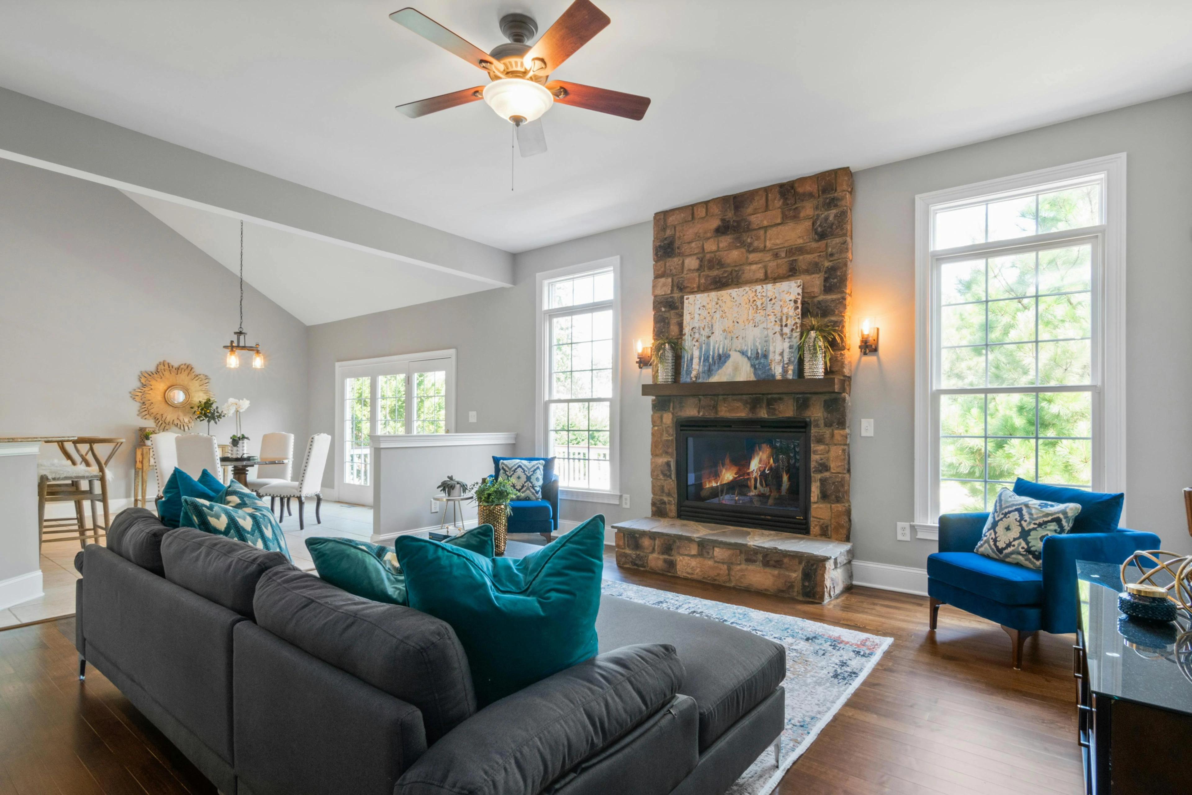
Color Psychology & Art: Crafting Moods & Home Personality
Discover how color psychology and abstract art transform homes. Learn to infuse specific moods, define unique chromatic personalities, and choose art that genuinely elevates your living spaces.

The Silent Language of Color: Infusing Moods with Art in Your Home
My Palette, Your Sanctuary: A Personal Journey Through Hues and Homes
What if your home could whisper stories, not with words, but with feeling? I've always been fascinated by how a simple splash of paint, or the right piece of art, can completely transform a space. It's not just about aesthetics; it's about the feeling, the unspoken conversation a room has with you. I remember walking into a friend's study once – the walls were a deep, calming green, and a single abstract painting with swirling blues and golds hung above a dark wood desk. Instantly, I felt focused, yet at peace. It was a clear demonstration of the subtle, powerful psychology of color at work, often amplified by the art chosen to inhabit that space. Today, I want to pull back the curtain on how I, as an artist, approach this fascinating interplay, sharing not just theory, but the very real, sometimes messy, experience of using color and art to craft genuine sanctuaries.
The Unspoken Dialogue: Why Color Matters
For me, color isn't just a visual attribute; it's a language. A silent, powerful one. Red can scream passion or danger, blue whispers calm or melancholy, and yellow shouts joy or caution. But it’s not always so straightforward, is it? We often hear about universal color psychology – how blue calms, red energizes, and green brings nature indoors. And yes, these are powerful general associations, explored by thinkers from Goethe's 'Theory of Colours' to Munsell's intricate color systems, both foundational to understanding how we perceive and organize color. When I talk about these associations, I also think about color temperature: the warmth of reds and oranges, or the coolness of blues and greens. It's an intuitive distinction, but one that profoundly impacts our emotional response – a cozy warmth versus a refreshing calm. I’ve certainly explored these depths in my art, delving into the emotional language of color in abstract art and even specific hues like the psychology of blue or the fiery heart of red. And speaking of interplay, have you ever noticed how two colors placed next to each other can dramatically change each other? That’s the magic of complementary colors – they create vibrancy and visual tension that can be incredibly impactful in a room. But here's the kicker, and this is where it gets interesting: while general principles exist, color psychology isn't a rigid science. Personal experiences, cultural backgrounds, and even current mood can profoundly alter how we perceive and react to a color. What feels serene to one person might feel cold to another. It’s less about strict rules and more about understanding the spectrum of possibilities.

Your Personal Sanctuary: Guiding the Palette
I think of interior design as creating a personal sanctuary, a space that truly reflects and supports you. It's not just about filling a space; it's about crafting an experience. And color, in all its nuanced glory, is arguably the most potent tool in that kit. The colors you choose for your walls, your furniture, and crucially, your art, directly influence your mood, your energy levels, and even your productivity. A calm bedroom, a vibrant living room, a focused office—each needs its own distinct chromatic personality. Think of it as the unique emotional fingerprint of a room's palette. For instance, a living room might have a warm, inviting chromatic personality with a deep terracotta wall and a vibrant abstract painting, while a bedroom leans into a cool, serene chromatic personality with soft blues and understated art.
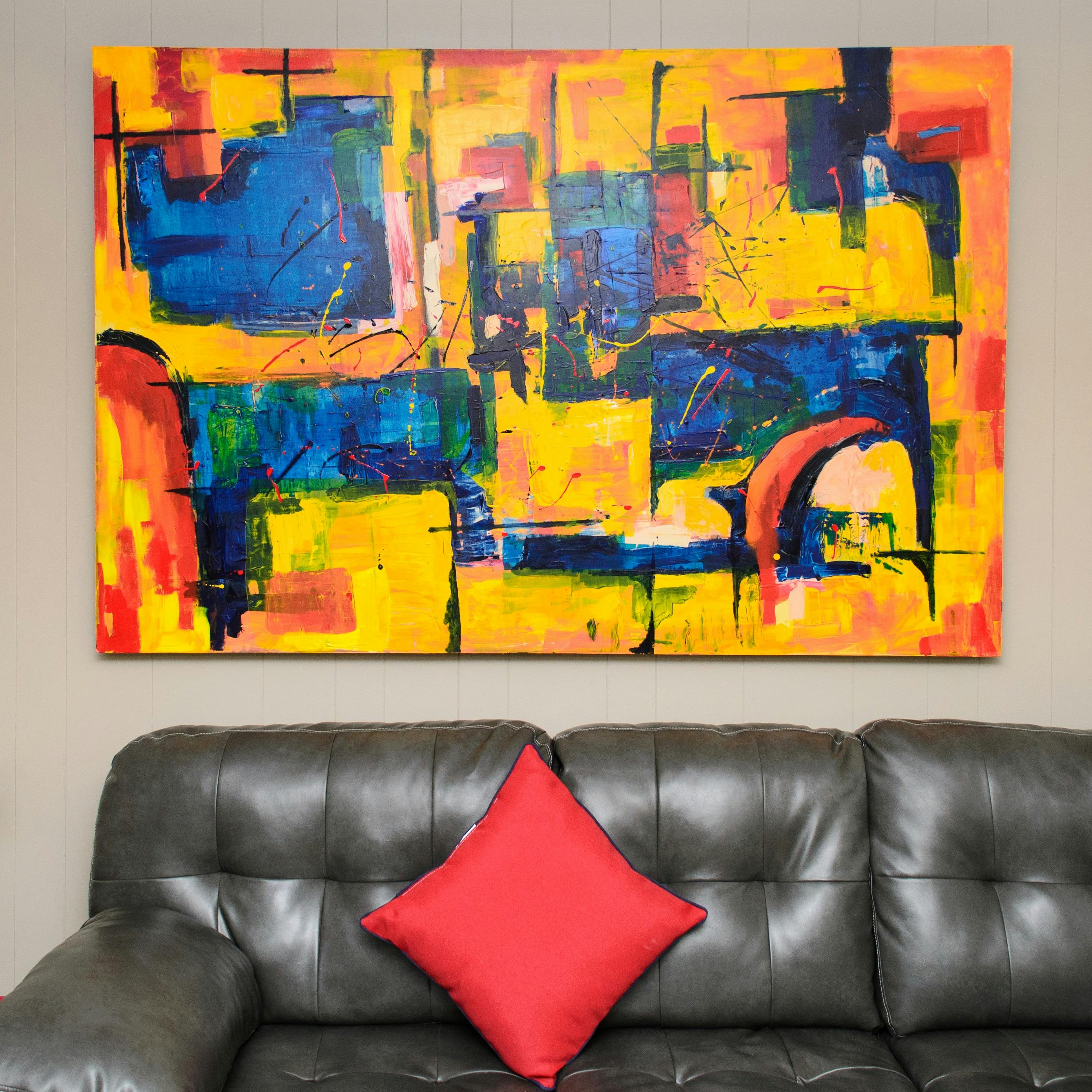
And here's where art steps in, not just as a decoration, but as a crucial player in orchestrating that mood. My abstract pieces, often bursting with beyond the primary: secondary and tertiary colors, aren't just pretty pictures. They are emotional anchors, energy conductors, and silent storytellers. When I talk about art 'activating' a space, I mean it breathes life into it, creates a focal point, and introduces a burst of unexpected emotion. It's the bold brushstrokes, the deliberate push and pull of dynamic compositions, the rich interplay of subtle textures (perhaps even visible impasto) that elevates a room from merely functional to truly inspiring.
Often, art can even be the starting point, the muse for your entire color scheme. Instead of agonizing over paint swatches first, find a piece that truly resonates with you. Then, you can:
- Extract Dominant Hues: Identify the main colors present in the artwork. If you have a piece with deep ocean blues, splashes of bright coral, and muted sandy beiges, your dominant hue might be the blue.
- Pull Accent Colors: Look for subtle pops of color that you might want to echo in smaller decorative items. That bright coral from your art could appear in a throw pillow.
- Choose Wall Colors: Select a neutral shade from the artwork, or a complementary muted tone, for your walls. That sandy beige from the art, or a soft grey-blue, would allow the art to sing.
- Layer Textures: Consider how the textures in the art (e.g., impasto, smooth finish) can be mirrored or contrasted in your soft furnishings.
This approach makes choosing art for your living room or any space an intuitive and exciting process, allowing the piece to truly speak to you and inform its surroundings. If you're pondering how to generally approach decorating your home, remember that while color is your foundation, art is the soul that defines its character.
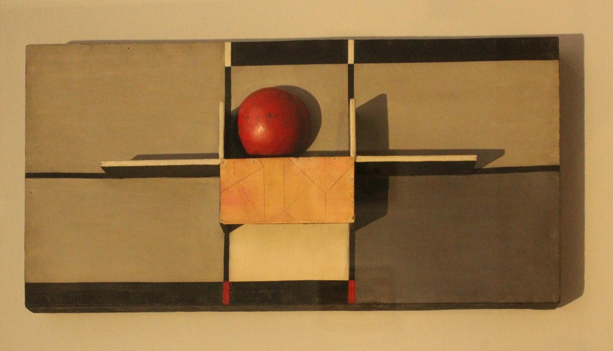
A Gallery of Moods: Room by Room
Alright, let's translate this philosophical meander into concrete applications, room by room. Based on my own experiences and what I've seen work beautifully for clients, here’s how to translate these ideas into real spaces. It’s less about strict rules and more about understanding what feeling you want to cultivate.
The Living Room: Inviting & Engaging
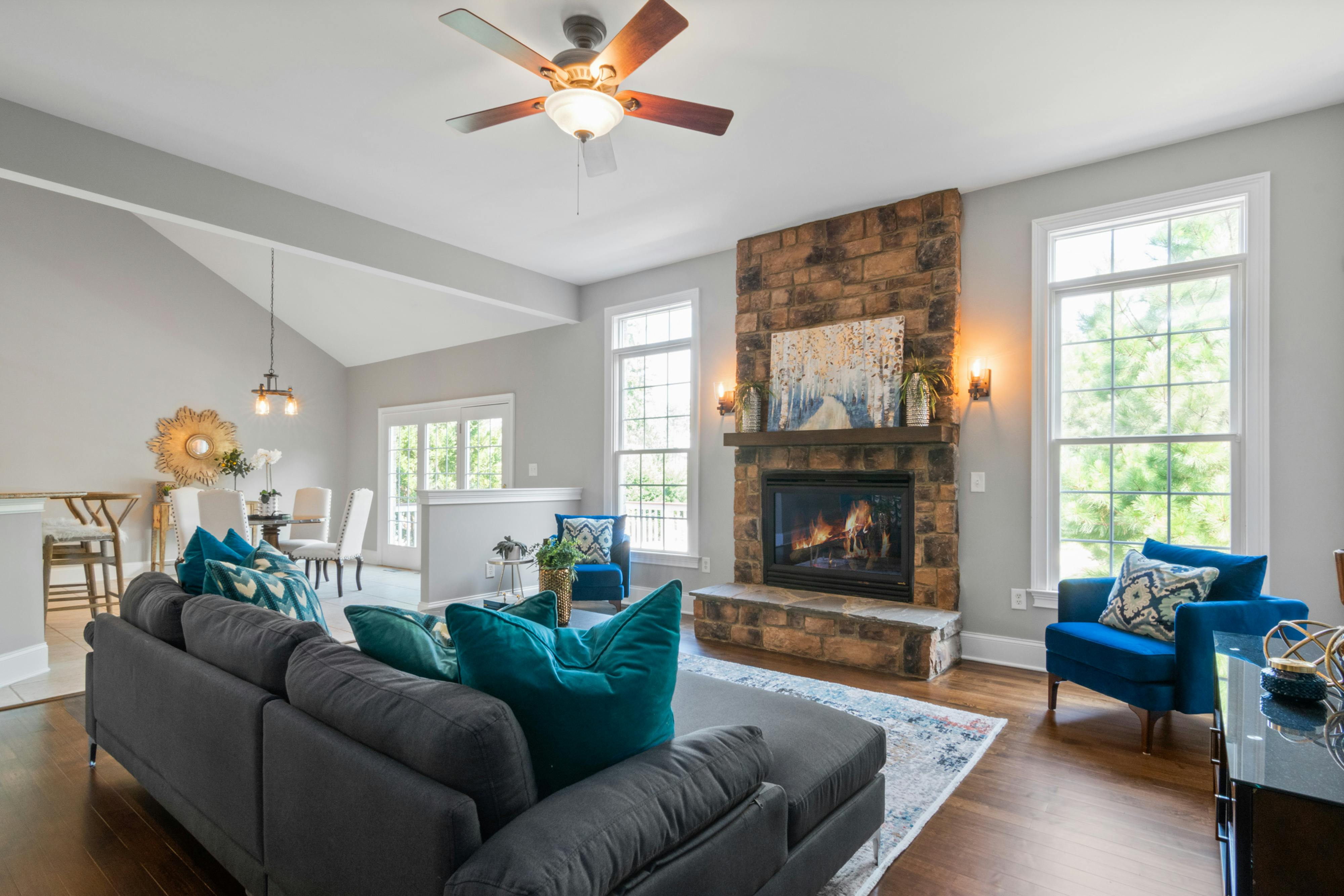
This is often the heart of the home, a place for connection and relaxation. Warm colors (reds, oranges, yellows) can foster conversation and energy. Cool colors (blues, greens) promote calm. The trick is to balance them. A bold abstract painting with warm tones can be tempered by cool wall colors or vice-versa. Think about a piece with dynamic yet inviting forms, maybe a blend of geometric and organic shapes, that either complements your existing scheme or offers a striking contrast that becomes a vibrant focal point. Conversely, a room overwhelmed by too many clashing, high-energy pieces can feel chaotic rather than inviting.
The Bedroom: Serene & Restful
For me, this is where calm reigns supreme. Soft blues, gentle greens, and muted purples are your allies. Art here should enhance tranquility, not disrupt it. Consider pieces with flowing lines, soft gradients, or subtle textures that whisper rather than shout. You want something that lets your mind unwind, not race. A piece with smooth transitions and perhaps a tactile quality can make all the difference. Avoid overly aggressive or complex pieces that demand intense mental processing; this is a space for release, not challenge.
The Home Office: Focused & Inspiring
Productivity is key here, but so is inspiration. Greens and blues can promote mental clarity and focus by reducing eye strain and promoting a sense of stability, while controlled pops of yellow can gently stimulate creativity without being distracting. I often find a piece with dynamic yet organized elements works wonders – something that encourages structured thinking but also allows for imaginative leaps. A pop of energetic color from an artwork can keep fatigue at bay. But steer clear of overly stark or dull art that drains energy rather than inspiring it. For smaller, more niche spaces like a home gym or even a powder room, the principles remain the same: match the art's mood to the room's function, perhaps even exploring art with interesting textural qualities to add depth in confined areas.
The Dining Room: Stimulating & Conversational
Dining rooms are for sharing, laughing, and connection. Think about colors that stimulate appetite and conversation—warm reds, oranges, or rich yellows. Art can be a wonderful conversation starter here. A large, captivating abstract piece, perhaps with intriguing linear patterns or a bold color field, can act as a visual feast, encouraging lively discussions. I once had a client who was hesitant about a large, vibrant piece for their dining room, fearing it would be 'too much.' After seeing it installed, they called to say it had completely transformed their dinners – people were talking more, laughing louder. It was a beautiful lesson in trusting the art to do its work. However, avoid anything too jarring or visually aggressive that might disrupt conversation or appetite.
Beyond the Canvas: My Philosophy of Color
When I create, whether it's for a gallery or for someone's home (you can always check out my art for sale), I'm not just thinking about shapes and lines. I'm thinking about the feeling, the atmosphere, the 'vibe.' My abstract art, by its very nature, invites personal interpretation, making it a perfect partner for interior design. One person might see a storm gathering in my blues and grays, while another finds a moment of quiet contemplation. This is the beauty of abstract art in your home – it's a conversation you control. It allows you to introduce color, emotion, and even subtle texture without literal representation, offering a sophisticated layer to your space. While interior design trends certainly ebb and flow – from minimalist whites to maximalist patterns – my approach to color is more about timeless emotional resonance than fleeting fads. I aim for pieces that evoke something primal, something deeply human, regardless of the year. It's this personal connection to my work, this dedication to crafting emotional landscapes, that I hope resonates with you when you're curating your own environment. My journey, documented on my timeline, is deeply intertwined with how I perceive and use color, evolving with every brushstroke.
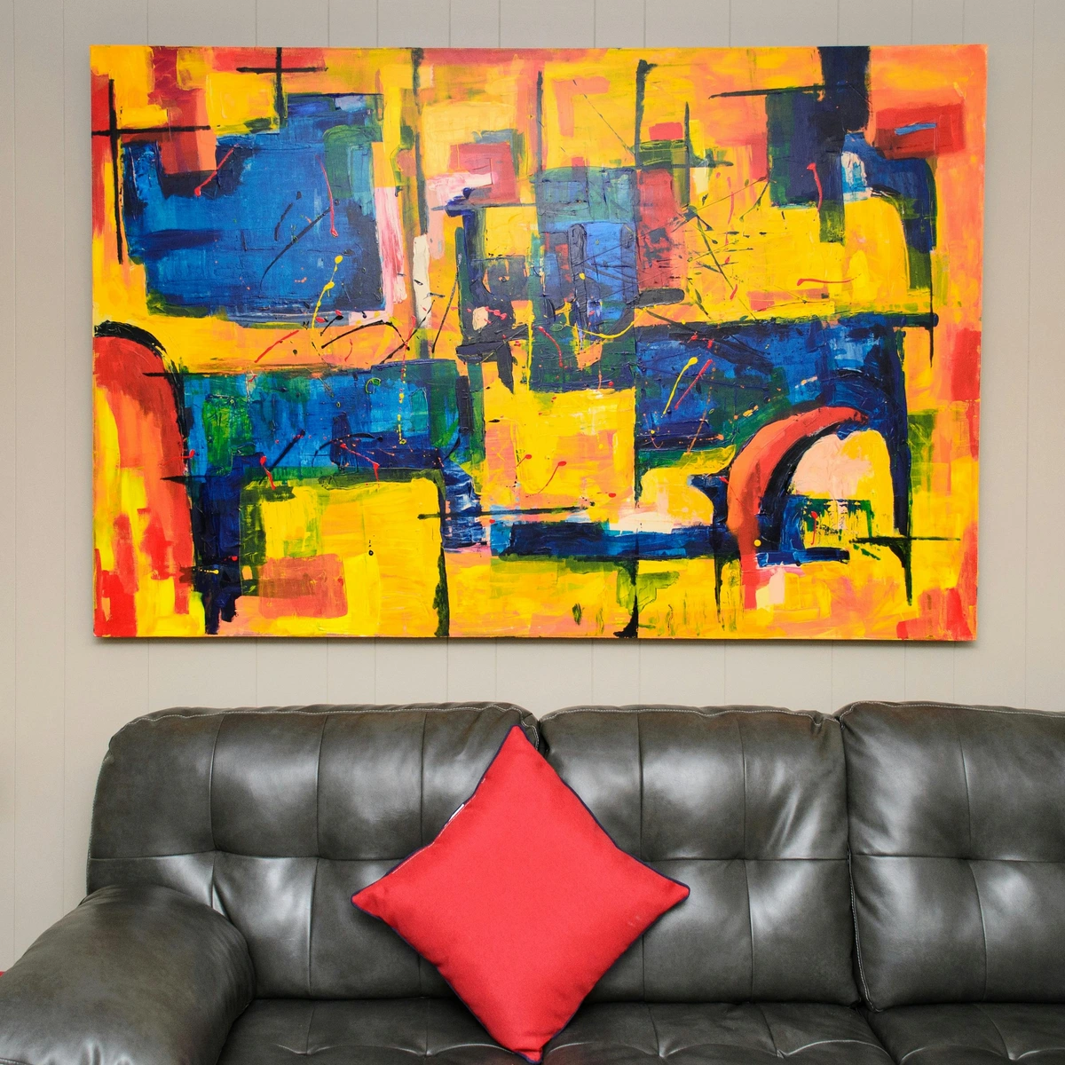


Harmonizing Your Hues: Practical Wisdom
Alright, so you're ready to dive in. Here are a few things I've learned that might make the process smoother, whether you're starting from scratch or refreshing an existing space:
- Consider the Room's Purpose First: Before anything else, define the primary function and desired mood of the room. A bustling kitchen demands a different chromatic energy than a tranquil nursery. Let the function dictate the primary mood, then layer colors and art accordingly.
- Start with the Art (Sometimes): If you fall head over heels for a piece, don't be afraid to build your room's color scheme around it. The art can be your muse. It's often easier than trying to find the perfect piece for an already established scheme. I once tried to force a beloved painting into a room with clashing undertones – it was a disaster! The painting sulked, the room felt off. I eventually learned to let the art lead, and the relief when everything clicked into place was palpable.
- Balance Warm and Cool: Even if you lean heavily into one palette, a touch of the opposite temperature can add depth and prevent the room from feeling flat or monotonous. A vibrant red abstract can still feature subtle cool undertones, creating a delightful visual tension.
- Embrace Contrast: Sometimes, the most striking rooms are those that embrace unexpected juxtapositions. A bold, energetic piece of art against a subdued wall can be breathtakingly effective, drawing the eye and making a powerful statement. Don't play it too safe if your gut tells you otherwise.
- Test, Test, Test: Get swatches, mock up ideas digitally, live with a piece of art (if possible) before committing. What looks good in a store might feel different in your home's unique lighting. And speaking of lighting, understanding how to choose the right lighting to enhance your abstract art collection is a game-changer – it literally changes how colors are perceived and can make or break how your art interacts with the room's palette. Remember, the goal is a beautiful space, not a color theory exam! Don't be afraid to break a 'rule' if it truly feels right.
Your Burning Questions: An Artist's Take
Can I mix warm and cool colors with art in one room?
Absolutely! In fact, mixing warm and cool tones often creates a more dynamic and inviting space. The key is balance. Use a dominant color, and then introduce accent colors from the opposite temperature through art or smaller decor items. My abstract art often features a blend of temperatures to create depth and interest.
How important is scale when choosing art for a color scheme?
Scale is incredibly important! A small piece in a vast room will get lost, regardless of its color. Conversely, an oversized piece can overwhelm a tiny space. The art's size relative to the wall and surrounding furniture impacts how its colors are perceived and how much of a statement they make. Think of it like a conversation: you want the art to speak, not to shout over everything or whisper unheard. This is especially true when using a colorful piece in a neutral room; its impact will be significantly amplified if the scale is right.
What if I love a colorful piece of art but my room is neutral?
Neutral rooms are fantastic canvases for colorful art! The art becomes the star, providing all the necessary vibrancy and emotional resonance. It's a classic strategy for a reason. You can even pull one or two subtle accent colors from the artwork and repeat them in small decorative items like throw pillows or a vase to create cohesion. Just ensure the scale of the art is appropriate for the wall space, allowing it to make a statement without overwhelming.
Should art always match the room's existing colors?
Not at all! While complementary colors create harmony, contrasting colors create visual interest and focal points. Sometimes, the most powerful statement comes from a piece that stands out, not blends in. The goal is to create a feeling, not a rigid match. It's about a conversation, not a perfect echo.
How do I choose art if my room has strong architectural features or a very specific existing color scheme?
This is a great challenge! If your room has strong features (like exposed brick, ornate moldings) or a vibrant existing scheme you love, art can either harmonize or provide a powerful counterpoint. For harmony, look for art that subtly echoes a color or line within the existing elements. For contrast, a piece with a completely different color temperature or a bold, minimalist design can create an exciting dialogue, allowing both the room and the art to shine without competing. The key is thoughtful placement and considering the overall visual weight – how an object draws the eye and balances the elements in the room. Art can literally act as a bridge, visually connecting disparate features or tones, bringing a sense of unity to a complex space.
Final Brushstrokes: A Call to Creative Living
At the end of the day, your home should be a reflection of you. And color, intertwined with the art you choose, is a profound way to express that. Don't be afraid to experiment, to trust your gut, and to let your space evolve with you. It's a journey, not a destination, and every piece of art, every hue, contributes to the beautiful story your home tells. My hope is that this conversation empowers you to look at your surroundings with fresh eyes, to see your walls not just as surfaces, but as opportunities for expression. Perhaps start by simply observing the colors in your favorite piece of clothing or a cherished photograph, and consider not just the hues, but the context – a vibrant sunset versus a calming forest scene, for instance. Then, bring that feeling home. And hey, if you're ever in the Netherlands, stop by my museum in 's-Hertogenbosch for a dose of vibrant color inspiration!