Drawing Inks for Artists: Types, Techniques, & My Creative Journey
Unlock the vibrant world of drawing inks. Discover India, acrylic, and watercolor ink types, master essential techniques, troubleshoot common issues, and find the perfect inks for your lasting abstract art.
My Inky Obsession: A Deep Dive into Drawing Inks for Artists
You know, sometimes I look at a finished piece, and I can pinpoint the exact moment I fell in love with a certain material. For me, with drawing inks, it wasn't one single moment but a slow, creeping realization that these vibrant, unpredictable liquids had completely captivated my artistic soul. It’s like finding that perfect coffee blend – once you’ve had it, there’s no going back. And trust me, when it comes to inks, I've had a lot of cups (and spilled a few too, much to my studio floor's chagrin).
I remember early on, feeling a bit intimidated by ink. It felt so permanent, so decisive, almost like a high-stakes gamble compared to the forgiving nature of a pencil. But that's exactly where its magic lies, isn't it? The sheer audacity of a confident ink line, the subtle washes that whisper across the page, or the explosive bursts of color that demand attention. It’s a medium that pushes you, sometimes kindly, sometimes with a playful shove, to embrace fluidity and trust your intuition. This isn't just about reviewing drawing inks; it's about celebrating the joy, the challenge, and the sheer expressive power they bring to an artist's table. Why do I keep coming back to inks, even when my studio is overflowing with paints and pastels? It boils down to unparalleled vibrancy, the delicious interplay of control and delightful lack thereof, and incredible versatility for mixed media in abstract art. If you've ever felt the thrill of embracing the unpredictable in your art, you'll understand.
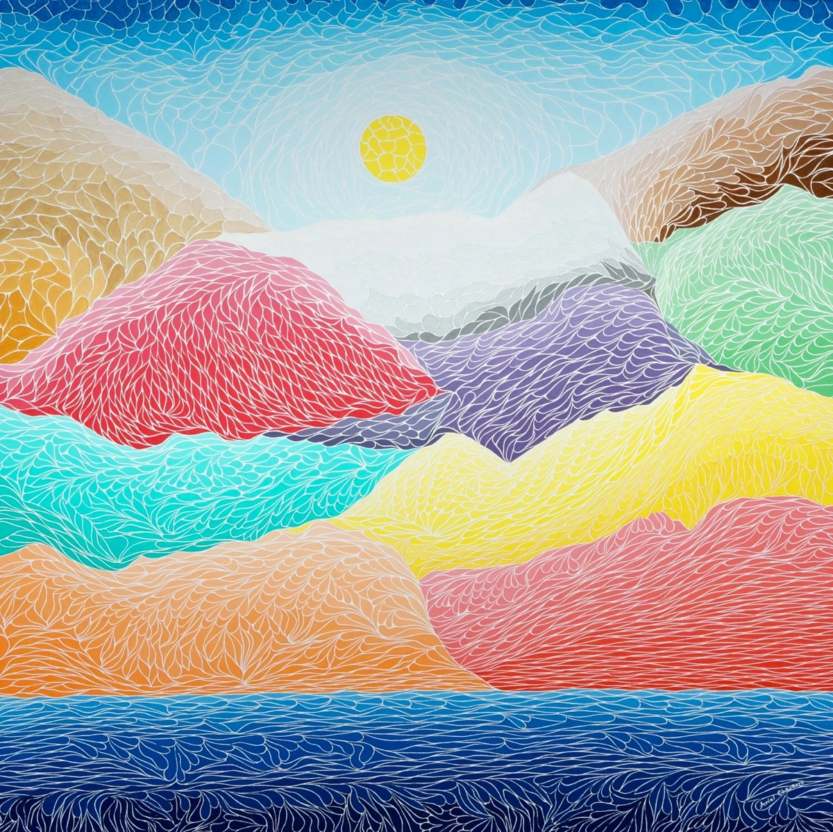
https://commons.wikimedia.org/wiki/File:The_Creation_Of_The_Mountains.jpg, https://creativecommons.org/licenses/by-sa/4.0/deed.en
A Brief History of Ink: From Ancient Scribes to Modern Expression
It’s easy to think of ink as a modern artistic tool, but its story stretches back millennia. My own journey into ink might feel recent, but it's built on a foundation laid by countless artists and scribes who came before.
Imagine ancient Egyptian scribes meticulously detailing papyrus with ink made from soot and gum arabic, or Chinese calligraphers perfecting their characters with similar concoctions. The precision of Renaissance draftsmen, like Albrecht Dürer, often relied on ink for detailed preliminary sketches, bringing a new level of detail and permanence to their studies. Think too of medieval Europe, where vibrant inks illuminated manuscripts, preserving knowledge and beauty, not just documenting, but elevating the text itself into art.
The journey continued through various artistic epochs. The intricate botanical and scientific illustrations of the 18th and 19th centuries demanded absolute precision, often rendered in fine ink lines. In the 19th century, artists like Aubrey Beardsley used ink to create his distinctive, sinuous black-and-white illustrations, pushing the boundaries of line work and symbolism. The Pre-Raphaelite Brotherhood, with artists like Dante Gabriel Rossetti and Edward Burne-Jones, also often used ink for their highly detailed and symbolic drawings, laying down fine lines and washes that evoke a sense of ethereal beauty. And for those who love narrative art, early comic strip artists found ink indispensable for defining bold outlines and dynamic action, bringing stories to life with graphic clarity. Japanese calligraphy, in particular, elevated ink use to an exquisite art form, where the quality of the ink and the skill of the artist became inseparable. Think about the profound expressiveness achieved with just a few strokes of Sumi ink!
The invention of the printing press in the 15th century vastly increased the demand for consistent, stable inks. By the industrial revolution, ink production became a sophisticated science. Yet, throughout all these technological advancements, artists continued to embrace ink's expressive power, evolving its application from precise drafts to explosive abstract expressions. It’s a testament to its enduring appeal, truly, a thread connecting human expression across thousands of years.
The Big Three: My Essential Drawing Ink Types
Ready to get specific? When we talk about drawing inks, it’s not a one-size-fits-all situation. There are distinct personalities in the ink world, each with its own quirks and charms. To simplify things, here are the three primary types I find myself using most often – my go-to "liquid gold" for everything from crisp lines to luminous washes.
1. India Ink (The Steadfast Classic)
This is where many of us start, isn't it? The classic. India ink is typically a deep black, carbon pigment-based ink, originally derived from soot. What makes it fascinating is its duality: traditional India inks are incredibly lightfast and dry to a wonderfully permanent, often waterproof, and opaque finish. Many modern India inks, however, achieve their waterproofing and permanence through a shellac binder, which is also what gives them their distinctive sheen. This shellac-based variety dries harder and can be more challenging to clean from tools. I remember trying to erase it the first time – what a rookie mistake! That permanence teaches you to commit, which honestly, is a great lesson for any artist. It generally holds up exceptionally well against light, meaning your work won't fade into oblivion over time, making it excellent for archival pieces. I tend to use it for initial sketches, comic art, strong outlines, or when I want a really stark contrast. Just be mindful that shellac-based inks can sometimes clog fine pen nibs if not cleaned promptly, and some artists with sensitivities prefer to avoid them, especially when airbrushing due to airborne particles. My studio floor has a few permanent reminders of my early experiments, teaching me the importance of a steady hand and quick clean-up. While black India inks are typically waterproof, it’s worth noting that some colored India inks, especially older formulations or certain brands, might be dye-based and therefore not waterproof, so always check the label!
2. Acrylic Ink (The Modern Chameleon)
Oh, acrylic ink, where do I begin? If India ink is the wise elder, acrylic ink is the energetic, vibrant youngster of the family. These are essentially highly fluid acrylic paints, boasting incredible pigment intensity and lightfastness. Once dry, they're waterproof, flexible, and utterly brilliant. The color range is astonishing, far beyond what you'd typically find in traditional drawing inks. For anyone doing mixed media, these are an absolute dream. They spray, they drip, they wash, they layer – basically, they do whatever you ask of them, and then some. I love using them for airbrushing to create smooth gradients, or for creating fascinating textures by layering them with mediums like gel mediums, texture pastes, or even pouring mediums, or a bit of salt to create interesting granulations. You can also experiment with alcohol drips on wet ink for unique cellular patterns, or try lifting techniques with a damp brush to pull highlights from semi-dry layers. Thinking about the history of acrylic painting really puts into perspective how far these mediums have come!
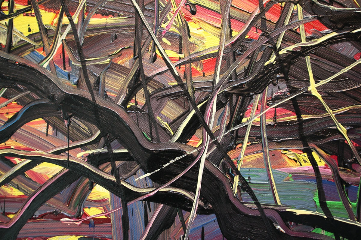
https://live.staticflickr.com/2875/8866942510_439379d853_b.jpg, https://creativecommons.org/licenses/by/2.0/
3. Watercolor Ink (The Luminous Whisper)
Now, watercolor inks are a different beast entirely. Unlike traditional pan watercolors, these usually come in liquid form, offering incredibly intense, transparent colors. They behave a lot like watercolors, blending beautifully and creating stunning washes, but with a punchier pigment load. To clarify a common confusion: while all watercolor inks are liquid, not all liquid watercolors are 'ink.' Think of true watercolor inks as concentrated, highly pigmented liquid watercolors, formulated for maximum intensity, precise application, and often better lightfastness for artists. Regular liquid watercolors might be more dilute or intended for broader, less precise applications.
You'll find two main types:
- Dye-based: Super vibrant, often incredibly transparent, but watch out for lightfastness. Some dye-based inks can fade significantly over time if exposed to UV light. Imagine sketching a beautiful, temporary piece in your travel journal – a dye-based ink would be perfect here for its immediate vibrancy. Great for sketchbook work or digital reproduction, but maybe not for archival pieces unless specifically noted as lightfast. Dye-based inks tend to 'stain' the paper more, making them harder to lift.
- Pigment-based: These are generally more lightfast, though perhaps a tiny bit less vibrant than their dye-based cousins. They offer excellent transparency and blendability, making them fantastic for delicate washes and layered effects. If you're creating a subtle, luminous landscape that you intend to frame and display for years, a pigment-based watercolor ink is your friend. Pigment-based inks often allow for more manipulation and lifting if you work quickly.
When checking lightfastness, look for ASTM ratings (American Society for Testing and Materials). An ASTM Lightfastness I rating means excellent lightfastness, and ASTM II means very good. To give you some context, an ASTM I rating generally means the color is expected to remain stable for 100+ years under museum conditions, while ASTM II means 50-100 years. These ratings are crucial if you want your work to last beyond your lifetime.
I often use these when I want to add a vibrant, translucent glaze to a piece, allowing the layers beneath to still peek through. They’re like painting with pure light, if that makes sense.
Ink Type Comparison: A Quick Overview
Ink Type | Key Characteristics | Permanence/Lightfastness | Opacity | Typical Use |
|---|---|---|---|---|
| India Ink | Carbon pigment/shellac-based, dries waterproof (usually), often shiny | Excellent, archival | Opaque | Strong lines, deep blacks, comic art, initial sketches, fine line work |
| Acrylic Ink | Fluid acrylic paint, pigment-based, dries waterproof, flexible | Excellent, archival | Opaque/Transparent | Vibrant color, mixed media, layering, washes, airbrushing, lifting techniques, texture creation |
| Watercolor Ink | Liquid watercolor, pigment or dye-based, transparent | Varies (check ASTM for I or II) | Transparent | Luminous washes, glazes, subtle layering, delicate illustrations, vibrant studies |
Beyond the Big Three: Other Inky Adventures and Specializations
While India, acrylic, and watercolor inks cover most of my artistic needs, the world of ink is vast. Occasionally, I'll dabble in other types, each offering a unique experience:
- Sumi Ink: This traditional East Asian ink, often sold as solid sticks to be ground with water, is deeply rich and uniquely expressive. It's water-soluble but offers incredible depth and versatility for calligraphy and brush painting. Its distinctive flow and intense black are unparalleled for certain expressive styles, and its traditional preparation can be a meditative process.
- Calligraphy Inks: These inks are typically formulated to be slightly thicker, providing a crisp line and preventing feathering, especially for dip pens. They come in a wide range of colors, but their lightfastness and archival qualities vary greatly, so always check the label if permanence is a concern. Many are dye-based and not waterproof, focusing on smooth flow for lettering rather than lasting art.
- Fountain Pen Inks: While primarily designed for writing, many artists use fountain pen inks for sketching and drawing, particularly in sketchbooks. They are almost always dye-based, incredibly fluid, and offer a beautiful range of transparent colors. However, they are rarely lightfast or waterproof once dry, making them less suitable for archival fine art but wonderful for ephemeral studies and quick expressive marks.
What Makes an Ink "The Best" for You? My Criteria for Choosing
Okay, "best" is a really subjective word in art, isn't it? What's perfect for my expressive abstract work might be all wrong for a meticulous botanical illustrator. So, how do you even begin to pick the right ink for your journey? From my perspective, and what I've learned through countless experiments (and yes, a few ruined drawings – I once mistook permanent ink for washable and learned that lesson the hard way), here's what I look for when I consider an ink "best" for my kind of drawing:
- Permanence & Lightfastness: This is crucial if you're creating work you intend to last. You don't want your beautiful colors fading away after a few months. Always check the label for "archival" or "lightfast" ratings (often ASTM I or II). It’s also worth remembering that even the most lightfast ink can suffer if applied to a poor-quality, acidic paper that deteriorates over time. The combination of archival ink and archival paper is key. I'm especially conscious of this when I'm creating pieces that I hope someone might buy and cherish for years.
- Viscosity & Flow: Some inks are thick and syrupy, others are watery and free-flowing. The "best" one depends on your tool and technique. For dip pens, I prefer something with a bit more body and a smooth, consistent release. For washes, the runnier, the better, allowing for quick, even coverage. You want an ink that glides from your chosen tool, feeling like an extension of your hand. You can also adjust an ink's behavior with additives like flow improvers (to make it runnier) or retarders (to slow drying time), which can be incredibly useful for specific techniques or tricky papers.
- Drying Time: This is a big one, especially if you're impatient like me! Fast-drying inks are great for layering and preventing smudges, but too fast, and they can clog your pens. Slower-drying inks allow for more blending and manipulation on the page. It's a balance, and sometimes I just can't wait for things to dry!
- Color Range & Intensity: Do they offer the hues you're looking for? Are the colors rich and saturated, or do they lean towards subtle pastels? For my work, I generally crave intensity and depth, though a good black or sepia is always a staple.
- Compatibility: How does it play with other mediums? Does it resist layering or react strangely with your paper? For my abstract expression, I need inks that are team players, happy to mingle with everything else on the canvas. I once tried to layer a heavily shellac-based India ink over a soft watercolor wash, and it just created a weird, resistant film, not the smooth layer I wanted. Lesson learned!
- Toxicity & Safety: Especially relevant for artists working in shared studios or with children, or for those with sensitivities. Always check labels for non-toxic certifications, especially with prolonged exposure or airbrushing.
- The Paper Test: This is probably my biggest, simplest tip: always test your ink on the exact paper you intend to use for your final piece. Papers have different 'sizing' – chemical additives that control absorbency – and this dramatically affects how an ink behaves, from bleeding to vibrancy. My favorite is a good quality watercolor paper, hot press for smooth lines, cold press for texture. Rougher cold press papers, for example, will grab and show more texture with dry-brush ink techniques, while a smooth hot press surface is ideal for crisp, unbroken fine lines.
Putting Ink to Paper: My Go-To Tools and My Favorite Ways to Play with Ink
Beyond just understanding the types and choosing the right bottle, truly getting to grips with inks means experimenting with how you apply them. This is where the real fun begins, and where you start to develop your own unique voice with the medium. My journey with inks is all about discovery, and these are some of the paths I often take:
My Go-To Tools:
- Dip Pens: Classic for a reason! They give you incredible line variation and can hold a good amount of ink. Great for expressive strokes and fine details.
- Brushes: From delicate watercolor brushes for washes to stiffer bristles for dry-brush effects, brushes open up a world of texture.
- Technical Pens/Fineliners: For precise, consistent lines, especially for detailed work or cross-hatching.
- Droppers/Pipettes: Wonderful for controlled drips, splatters, and adding individual color bursts.
- Atomizers/Spray Bottles: For soft, atmospheric washes or textured backgrounds.

Credit: Zenmuseum
My Favorite Ways to Play with Ink:
One of my favorite things to do is create diluted ink washes. For a soft, transparent layer, I'll dilute India ink or watercolor ink with water until it reaches a milky, almost tea-like consistency, allowing the paper's texture to beautifully show through. Then, I might go back in with a more concentrated ink, adding bolder strokes or details. Layering is key, and inks allow for an amazing build-up of depth without making the piece feel muddy.
You can also try lifting some acrylic inks with a damp, clean brush or even a sponge to create highlights or soften edges, especially effective before the ink fully dries. For a wonderfully coarse, textured effect, load a stiff brush with a small amount of India ink and lightly drag it across textured paper, letting the ink catch on the raised fibers. And don't be afraid to embrace accidents and evolution! That unexpected drip or a color bleeding into another can often be the most exciting part of the piece. Some of my most beloved works, which you might even see on my art for sale page, have a 'happy accident' at their core.
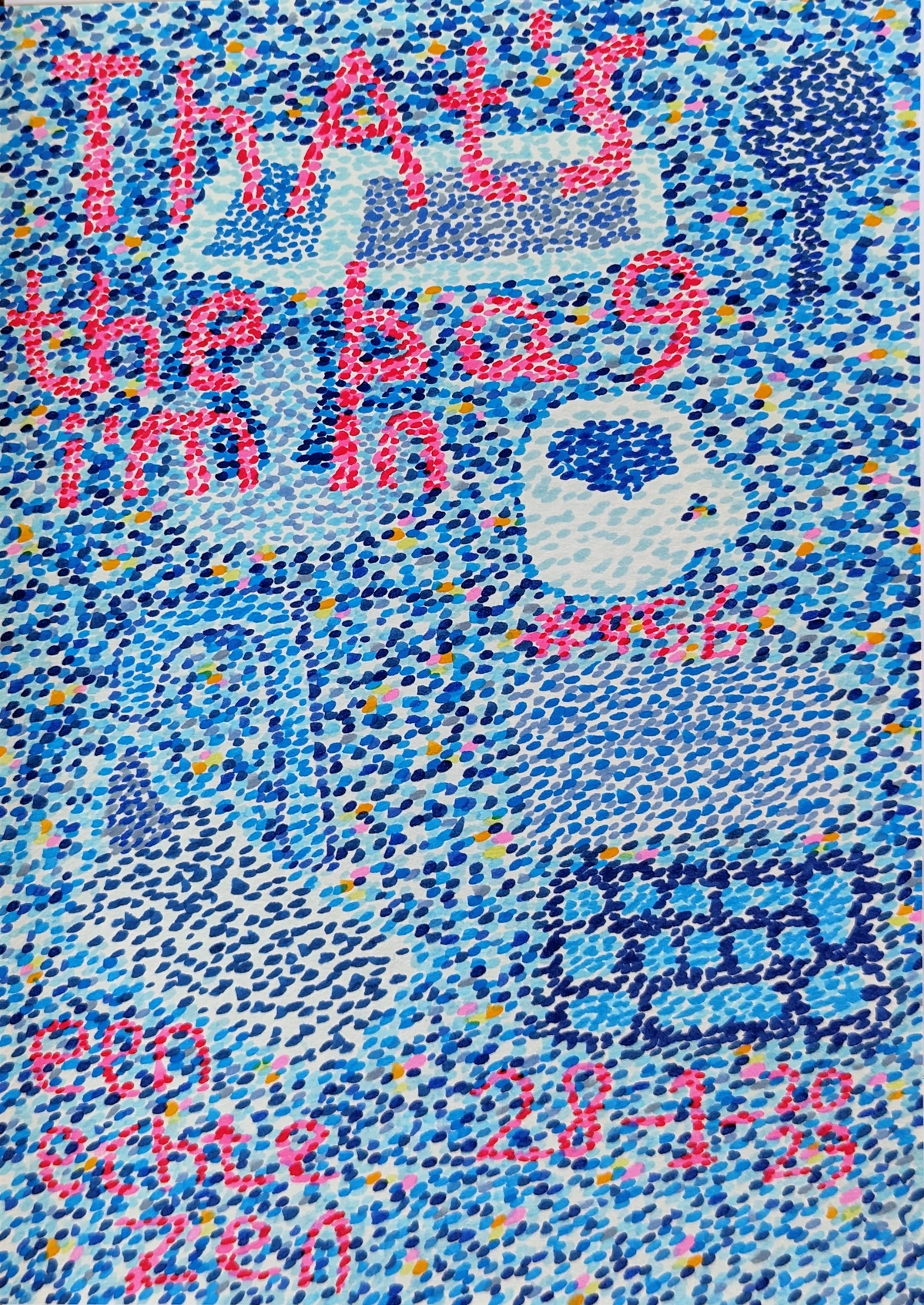
https://live.staticflickr.com/3731/13402193294_7e67ffc22a_b.jpg, https://creativecommons.org/licenses/by/2.0/
Troubleshooting Common Ink Quandaries
Even with the "best" inks, things can go sideways. I know, because I've caused more than my share of "sideways" moments! Here are a few common issues and my quick thoughts on how to tackle them:
- Bleeding/Feathering: This usually means your paper isn't suitable, or the ink is too thin for the paper's sizing. Paper sizing is a treatment that controls its absorbency; without it, or with too little, ink spreads uncontrollably like water on tissue paper. Try a heavier, smoother paper, or one specifically designed for ink. Hot press watercolor paper often works wonders.
- Clogging Pens: This is common with thicker inks or if you let them dry in your nib. Always clean your pens immediately after use. A little warm water and an old toothbrush go a long way. For particularly stubborn shellac-based India ink clogs, a brief soak in a specialized pen cleaner (or even ammonia-based window cleaner, with caution) can sometimes help, but prevention is always best.
- Uneven Washes: Often caused by too little water, too much ink on your brush, or working too slowly. When the ink dries at different rates across the surface, you get streaks or dark patches. Practice large, swift strokes, and make sure your surface is slightly damp if you want a really smooth, even wash.
- Fading Colors: Ah, the lightfastness issue again. If you're using dye-based inks for archival work, you must check their lightfastness rating (ASTM I or II). If in doubt, use pigment-based options or a UV protective varnish on the finished piece. Beyond the ink itself, remember that proper framing with UV-protective glass and acid-free mats can significantly extend the life of your artwork, acting as a final shield.
- Dried-Out Inks or Separation: Sometimes, especially with acrylic or watercolor inks, you might find a bottle has dried out a bit or pigments have settled. For pigment-based inks, give the bottle a vigorous shake before each use. For dried acrylics, a few drops of distilled water or a medium like flow improver can often revive it. If pigments have significantly separated and settled into a hard cake at the bottom, try carefully incorporating them with a palette knife or a firm stick before adding liquid. For watercolor inks, distilled water is usually sufficient. Just add slowly, stir, and test. Don't add too much too fast!
Credit: -, Licence: -
FAQ: Your Inky Questions Answered
Q: Can I mix different brands of ink?
A: Generally, yes, but proceed with caution! Pigment-based inks from different brands are usually fine together. Mixing dye-based with pigment-based can sometimes lead to unpredictable results or clumping. Always do a small test swatch first. It's like inviting two new friends to a party – sometimes they click, sometimes they just stare awkwardly at each other.
Q: What's the best paper for drawing inks?
A: Hands down, a good quality watercolor paper (hot press for smoother lines, cold press for texture) or Bristol board. Papers specifically marketed as "plate" or "smooth" are also excellent for intricate pen work. Avoid anything too absorbent or thin, as it will likely bleed.
Q: Are all India inks waterproof?
A: Most traditional black India inks (especially shellac-based ones) are waterproof once dry. However, always double-check the label! Colored India inks can sometimes be water-soluble. When in doubt, assume it's not waterproof until you've tested it.
Q: How do I clean my dip pens?
A: Simple! Wipe off excess ink, then rinse thoroughly under warm water. A soft brush can help with stubborn bits. Make sure the nib is completely dry before storing to prevent rust.
Q: Are liquid watercolors the same as watercolor inks?
A: Not quite. While both are liquid and watercolor-like, true watercolor inks are usually more intensely pigmented and formulated for greater lightfastness and layering precision. They're often used for more deliberate lines and saturated color, whereas liquid watercolors can be more dilute, sometimes acting more like fluid versions of pan watercolors with a broader wash application.
Q: What's the difference between drawing inks and calligraphy inks?
A: While there's overlap, drawing inks (like India or acrylic inks) are often formulated for permanence, lightfastness, and versatility with various tools for illustration and fine art. Calligraphy inks are specifically designed for fluent flow through dip pens and fountain pens, often with less emphasis on archival qualities, focusing instead on vibrant color and smooth writing. Many calligraphy inks are dye-based and water-soluble, making them less suitable for lasting artworks but excellent for expressive lettering.
Q: What's the typical shelf life of drawing inks?
A: This varies quite a bit! Generally, most drawing inks, if stored properly in sealed bottles away from direct sunlight and extreme temperatures, can last for several years, often 2-5 years or more. However, some dye-based watercolor inks might degrade faster, and acrylic inks, being pigment suspensions, can dry out if exposed to air. Always check the manufacturer's recommendations. If you notice a strange odor, mold, significant separation that won't re-mix, or a drastic change in flow, it's probably time to replace your bottle.
Q: I've made a mistake with permanent ink! Can I fix it?
A: Oh, the classic 'oops'! With truly permanent inks, 'fixing' usually means 'integrating.' Embrace it! Sometimes a 'mistake' becomes the most interesting part. You can try layering over it, turning it into a texture, or even incorporating it into a new design element. It's a great lesson in going with the flow and adapting.
My Final Strokes on Drawing Inks: Embrace the Ink!
Exploring drawing inks has truly expanded my artistic horizons. They’ve pushed me to be more spontaneous, more deliberate, and more playful all at once. If you haven't ventured deeply into the world of inks yet, I genuinely encourage you to grab a bottle (or three!) and just start experimenting. Forget perfection; embrace the drips, the splatters, the beautiful surprises. Who knows, you might just find your own "inky obsession" that transforms your creative practice.
And if you're ever near 's-Hertogenbosch, consider a visit to my museum to see how I've integrated these dynamic materials into some of my larger pieces. It’s been quite the journey, and inks have been a constant, vibrant companion along the way. Happy drawing!


