How to Make a Still Life Drawing: A Personal Journey into Form and Light
Uncover the magic of still life drawing with this comprehensive, personal guide. Learn to compose, light, and shade objects, transforming everyday items into compelling art.
How to Make a Still Life Drawing: A Personal Journey into Form and Light
I’ll confess, there was a time I thought still life drawing was, well, a bit stuffy. All those dusty fruit bowls and wilting flowers in classical paintings, right? I used to roll my eyes, thinking it was just a tedious academic exercise. But then I started to really look, to truly slow down and observe. And what I discovered was a secret language, a foundational practice that unlocks so much more than just rendering objects. It’s about seeing beyond the obvious, about understanding light, form, and composition – the very bedrock of all visual art, from realistic portraits to my most vibrant abstract pieces. This observational drawing is truly where fundamental skills and art techniques are forged. The beauty? These are the same foundational principles that underpin my most expressive abstract works, allowing me to build meaning and structure even in the wildest explosions of color. This practice, I’ve found, is where the initial whispers of your unique artistic voice begin to form, giving depth and intention to everything you create later on. It's a truth understood by masters throughout art history: the patient, focused study of everyday objects unlocks a profound understanding of visual principles, skills that are absolutely invaluable in developing your own unique artistic style, whether you pursue realism, abstract expressionism, or something in between. Indeed, the structural integrity you learn from drawing a sphere, the emotional impact of carefully observed light, the dynamic tension in a thoughtful composition – these aren't just for realism. They are the very bones beneath the surface of my most vibrant, expressive abstract pieces. If you’re yearning to connect with your artistic self, to truly understand the world around you, then grab a pencil. We're going on a journey together, one subtle shadow and glowing highlight at a time, to uncover the timeless lessons embedded in the mundane.
This journey is less about rigid rules and more about subtle observation, a fundamental practice where light and form become your primary language. It’s a space for quiet reflection, for seeing the world with fresh eyes, and for building a foundational artistic vocabulary that will inform every stroke you make in the future. It was a transformation for me, from seeing dusty objects to discovering the vibrant, living principles they embodied. And if it worked for me, a dyed-in-the-wool abstract artist, I promise it can work for you.
The Magic of Seeing (Why Bother with Still Life?)
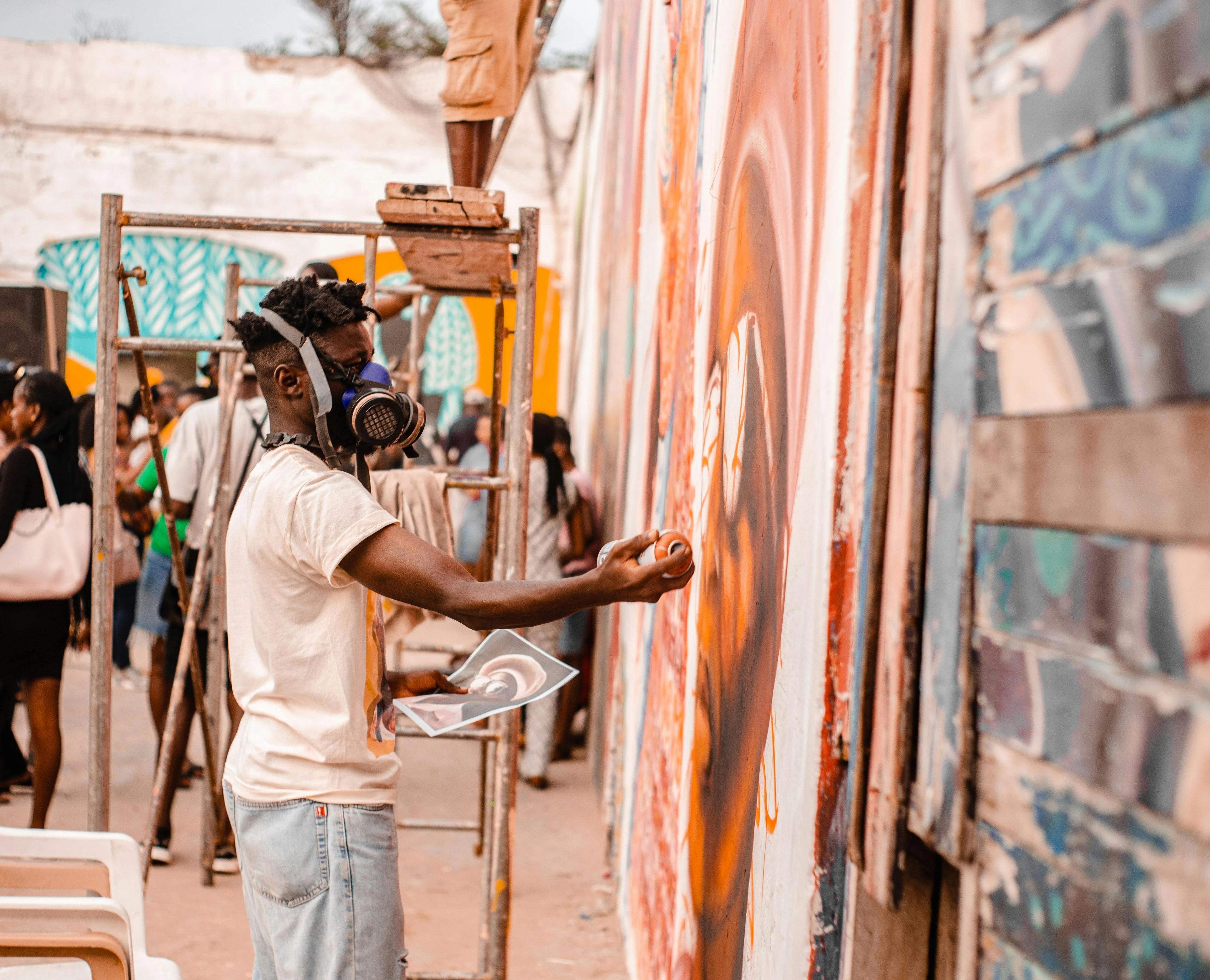
Before we even think about charcoal smudges and eraser crumbs, let's talk about the why. For me, still life isn't just about recreating reality; it’s a controlled laboratory for artistic experimentation. Historically, still life has served as a crucial training ground for artists, from ancient Roman frescoes to the detailed works of the Dutch Golden Age masters, allowing them to hone their skills in composition, perspective, and the rendering of light and texture. It's a tradition that continues to prove its immense value, evolving through movements like Baroque, Cubism, and Pop Art, demonstrating its enduring versatility and foundational importance. It allows you to slow down, to observe nuances that would otherwise vanish in the blink of an eye. Think of it as a meditation, a focused act of presence that hones your artistic senses, allowing you to see the extraordinary in the seemingly mundane. This deep engagement with the present moment, the quiet observation of form and light, can be incredibly grounding, offering a mental respite from the constant demands of the modern world. Honestly, it's like artistic weightlifting – building fundamental strength that you'll use in every other creative endeavor, whether it’s a sprawling landscape or an intense portrait. This intense focus on observation trains your eye to notice the subtle interplay of light and shadow, the delicate shifts in plane and angle, and the overarching unity of a scene – skills that are absolutely invaluable in everything from intricate how to draw a realistic face: a step-by-step guide to monumental public murals. It’s also a powerful way to cultivate mindfulness, a practice that extends far beyond the canvas, enriching your daily life with heightened awareness and appreciation.
The Foundational Power of Observation: Beyond Talent
One of the biggest misconceptions about art is that it's all about raw talent. While a certain inclination certainly helps, the truth is that art is a skill, and like any skill, it can be honed through deliberate practice. Still life drawing is perhaps the most direct route to developing those foundational skills. It teaches you patience, attention to detail, and the ability to break down complex visual information into manageable components. It’s like learning the grammar of visual language, giving you the tools to articulate any artistic idea you conceive, whether it's a realistic rendering or a fantastical abstraction. I've often found that the quiet discipline of observing a simple still life translates into a more intuitive understanding when I'm tackling a dynamic abstract piece. It's the silent force that grounds the wild explosions of color and form, giving them an underlying structural integrity. This methodical approach to seeing is directly applicable to understanding definitive guide to drawing techniques and forming the bedrock for almost any artistic pursuit.
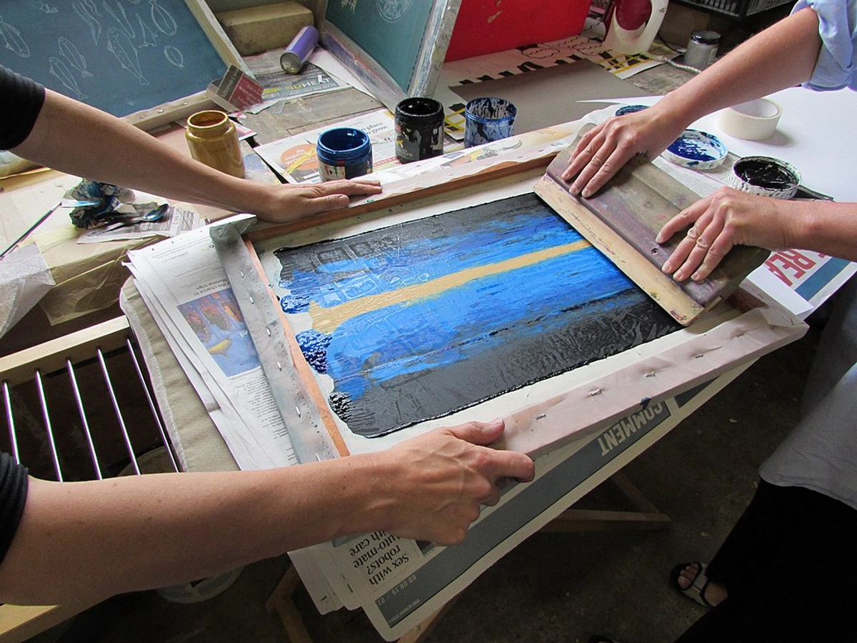
credit,
licence
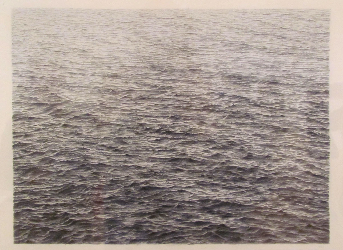
 credit,
licence
credit,
licence
More Than Just Apples and Oranges: The Elements of Art Unveiled
Seriously, I can't stress this enough. When you draw a still life, you're not just drawing an apple. You're drawing the way light falls on its curved surface, the shadow it casts, the space it occupies, and its relationship to the cup next to it. It’s an intensive course in understanding the elements of design in art: a comprehensive guide and a deep dive into definitive guide to understanding light in art. Historically, still life has been a crucial genre for artists to hone their skills in representation, symbolism, and painterly technique, evolving from classical antiquity through the Dutch Golden Age to modern and contemporary art movements. These are universal skills, transferable to landscapes, portraits, or even the most expressive abstract composition you can dream up. It’s where you learn the alphabet of visual language, understanding line, shape, form, value, color, texture, and space – the very building blocks of everything you see and create. This foundational understanding is often referred to as understanding elements of art: comprehensive guide or the definitive guide to the elements and principles of art: a visual language for all. Don't underestimate its power; it’s truly the fundamental toolkit for any aspiring artist.
Here's a deeper dive into these core elements, which I see as the DNA of any visual artwork. Each is a world unto itself, and still life drawing gives you a direct portal into mastering them:
Element | Description | How Still Life Teaches It |
|---|---|---|
| Line | The path of a point moving through space, defining edges and contours. Think of it as the most basic gesture, the initial spark of an idea on paper. | You learn to differentiate between expressive, gestural lines and precise, descriptive contours. You see how lines create movement, direction, and define the boundaries of form. |
| Shape | A two-dimensional enclosed area, defined by lines or other elements. These can be organic (like a leaf) or geometric (like a square), and their interplay creates visual interest. | You break down complex objects into simpler geometric and organic shapes, understanding their interaction and how they build up a larger form. |
| Form | A three-dimensional object or the illusion of three dimensions on a two-dimensional surface. This is where still life truly shines, transforming flat shapes into volumetric, tangible presences through light and shadow. It's about conveying depth and solidity, bringing your drawing to life. | This is where still life truly shines. Through careful observation of light and shadow, you learn to render the illusion of volume and depth, making flat shapes appear solid. |
| Value | The lightness or darkness of a color or tone. Mastering value is crucial. Still life forces you to accurately observe and translate the spectrum from brilliant highlights to the deepest shadows, giving your forms weight and solidity. This is the silent language of realism, defining every curve and plane. You can learn more about the definitive guide to understanding value in art: light, shadow, and form here. | Mastering value is crucial. Still life forces you to accurately observe and translate the spectrum from brilliant highlights to the deepest shadows, giving your forms weight and solidity. |
| Color | The perception of hue, saturation, and brightness. Even in black and white, you’re learning to interpret the value of colors – how light or dark a particular hue appears. When color is introduced, still life teaches you about color temperature (warm vs. cool), harmony, contrast, and how light changes local color, revealing its true character and mood. | Even in black and white, you’re learning to interpret the value of colors. When color is introduced, still life teaches you about color temperature, harmony, contrast, and how light changes local color. |
| Texture | The perceived surface quality of an object. Still life setups often include a variety of textures – smooth fruit, rough fabric, shiny metal. You learn techniques to suggest these textures, adding realism and tactile interest to your drawing, making the viewer almost feel the surface beneath their fingertips. | Still life setups often include a variety of textures – smooth fruit, rough fabric, shiny metal. You learn techniques to suggest these textures, adding realism and tactile interest to your drawing. |
| Space | The area around, between, and within objects. Still life teaches you to see and define both positive space (the objects themselves) and negative space (the empty areas around them), understanding how they interact to create a balanced and coherent composition. You learn to create the illusion of deep space on a flat surface, drawing the viewer into your imagined world. | Still life teaches you to see and define both positive space (the objects themselves) and negative space (the empty areas around them), understanding how they interact to create a balanced and coherent composition. You learn to create the illusion of deep space on a flat surface. |

The Preparatory Dance: Mindset and Space
Before we even get to arranging objects or sharpening pencils, I've found it incredibly helpful to set the internal and external stage. Your mindset and your physical workspace are like quiet collaborators in the artistic process, and giving them a little attention upfront can make a world of difference.
Cultivating an Artist's Mindset
This is less about grand declarations and more about subtle internal shifts. For me, it means letting go of the pressure for instant perfection. Still life drawing is a dialogue between you and the objects, a process of discovery, not just replication. Embrace curiosity, approach each session with a beginner's mind, and remember that every "mistake" is just data – an opportunity to adjust, observe more closely, and learn. It's about being present, truly seeing what's in front of you without judgment, and allowing yourself to play. Think of it as a low-stakes experiment, where the only real failure is not trying at all. I've found that adopting a 'growth mindset' – where every attempt, successful or not, is a chance to learn – is profoundly liberating. It moves you away from the anxiety of performance and towards the joy of discovery. Journaling about your artistic intentions and reflections before and after a session can also be a powerful tool to cultivate this mindset, shifting focus from the outcome to the process itself. And speaking of judgment, learning to quiet that harsh inner critic is a constant practice. Remind yourself that art is a journey, not a sprint to perfection. Every line is a learning experience, not a final verdict on your talent. For an even deeper dive, I've shared my thoughts on how to overcome fear of the blank canvas, which often starts right here, in the mind.
Setting Up Your Sanctuary (The Workspace)
Your studio doesn't have to be a grand, sun-drenched loft (though if it is, please invite me over!). It can be a quiet corner of your kitchen table, a cleared space on the floor, or a dedicated desk. The key is to make it yours, even temporarily. Minimize distractions – turn off notifications, put on some music if it helps you focus (I often lean into jazz for its improvisational flow), and make sure you have everything you need within easy reach. Good light, as we'll discuss, is crucial, but so is comfort. An uncomfortable artist is a distracted artist, and we don't want that! Consider investing in an adjustable stool or chair, and ensuring your materials are logically organized. Think about ergonomics – is your drawing surface at a comfortable height? Can you maintain good posture to prevent fatigue and discomfort during longer sessions? A clear workspace often leads to a clear mind, allowing you to focus entirely on the act of seeing and drawing. I often use small trays or containers to keep my pencils, erasers, and blending tools within easy reach, minimizing interruptions to my flow. Beyond just visual quiet, consider the other senses too. A subtle scent, like essential oils, or a specific playlist can act as a trigger, signaling to your brain that it's time to enter that creative flow state. Think of it as creating a sensory cue – a signal to your brain that it's time to transition into your creative flow state.
The Importance of a Designated Space
Even if your "studio" is just a temporary setup, having a designated space, however small, can significantly impact your creative routine. It signals to your brain that it's time to switch gears and enter artistic mode. This isn't about luxury; it's about ritual. The act of clearing a space, setting out your tools, and even just physically sitting down in that spot, can be a powerful trigger for creativity. It separates your art practice from the other demands of your day, making it easier to slip into that focused state of flow. Think of it as creating a mini-sanctuary for your artistic self.
Setting the Stage – Your Still Life Setup
Alright, let’s get practical. The beauty of still life is that your studio can be a corner of your kitchen table, a sun-drenched windowsill, or even the floor. You don't need fancy equipment, just a willingness to play.

Finding Your Narrative
This is where the fun begins, and honestly, it's often the part I spend too much time on (but in a good way!). Don't just grab random items. Think about what you want to say, even subtly. I like to call this cultivating 'the storyteller's eye' – seeing each object not just as a form, but as a character with a history or a role to play in your visual narrative. Do you want to capture a sense of calm with smooth, rounded stones? Or perhaps a bustling energy with an overflowing basket of textiles? I remember once, I found an old, tarnished skeleton key and paired it with a dried rose – immediately, a sense of forgotten secrets and transient beauty emerged. It wasn't planned, but the objects just spoke. I've often found myself drawn to objects with personal history, or interesting textures – a crumpled piece of paper, a beloved ceramic mug (even if it's chipped!). Your choices tell a story, evoke a mood, or spark a question, even before you make a single mark.
For beginners, I often recommend starting with a 'limited palette' of objects – perhaps three to five items that share a common theme or contrasting forms. This helps you focus on the fundamentals of composition and form without being overwhelmed by too many visual elements. For example, instead of a bustling market scene, start with a simple ceramic bowl, a piece of fruit, and a crumpled cloth. The fewer objects, the more deeply you can observe their individual characteristics and relationships.
Here’s a little table of ideas to get your narrative gears turning:
Narrative/Theme | Object Suggestions | Mood Evoked |
|---|---|---|
| Passage of Time | A wilting flower, an antique clock, a half-eaten fruit, a weathered book, dried leaves. | Melancholy, nostalgia, cycles of life, decay. |
| Comfort/Home | A favorite mug, a soft blanket, a worn slipper, a collection of pebbles, a simple loaf of bread. | Warmth, security, domesticity, tranquility. |
| Intellect/Study | Stack of books, spectacles, an open journal, a quill, an old map, a scientific instrument. | Curiosity, knowledge, reflection, contemplation. |
| Nature's Bounty | Fresh fruits and vegetables, seed pods, feathers, stones, branches, shells. | Abundance, organic beauty, earthiness, life force. |
| Personal History | A childhood toy, a souvenir, an inherited piece of jewelry, old letters, photographs. | Memory, identity, sentimentality, connection. |
Composition is King (or Queen!)
Oh, composition! If there’s one thing I could shout from the rooftops about still life, it’s this. The arrangement of your objects is paramount. It dictates where the viewer’s eye will go, what emotions they’ll feel, and ultimately, how successful your drawing will be. I often spend more time arranging my objects than I do on the initial sketch, and trust me, it pays off. If you want to dive deeper into the magic of how things are arranged, my thoughts on principles of still life composition and art of composition: guiding viewers eye might be just what you need. And for a broader perspective, check out the definitive guide to composition in art. Don't forget, there are also insights on the definitive guide to composition in abstract art: principles, techniques, and impact and the unseen structure: how composition guides my abstract art that can inform your still life practice. Before I even touch my materials, I'll often do several tiny 'thumbnail sketches' – small, quick drawings (literally the size of your thumb) that allow me to experiment with different arrangements and viewpoints without commitment. It's a fantastic way to quickly test ideas and solve compositional problems before investing time in a larger drawing.
The Golden Rules (and when to break them!)
While there are many compositional guidelines, remember they are just that – guidelines, not rigid laws. Think of them as tools to help you create a stronger, more engaging image. Once you understand why they work, you'll be better equipped to intentionally deviate from them for expressive purposes. The key is intent: break a rule because you want a specific effect, not because you're unaware of it. For me, the 'rules' are simply a foundation, a launching pad into more intuitive and personal arrangements. This philosophy extends to the concept of understanding unity and variety in art composition, where a balance between established order and spontaneous disruption often yields the most compelling results.
Here’s a quick checklist I use:
Principle | What I Look For | Why It Matters |
|---|---|---|
| Balance | Do objects feel stable, or is there an intentional tension? Is visual weight evenly distributed, or intentionally skewed? | Creates harmony and visual comfort, or purposeful tension. It's about distributing visual "weight" effectively within your composition. Remember, visual weight isn't just about size; it's also about color, value, and texture. A small, bright object can have as much visual weight as a large, dull one. Think about how a tiny, intensely dark shadow can anchor a composition. Read more about understanding balance in art composition. There are different types of balance too, like symmetrical (formal) and asymmetrical (informal), each conveying a distinct feeling. |
| Unity/Continuity | Do all the elements feel like they belong together? Are there visual connections that tie the composition into a cohesive whole? | Creates a sense of completeness and harmony, preventing the composition from feeling disjointed or like a collection of separate items. It's about how well the parts combine to make a cohesive whole, guiding the viewer's eye smoothly through the scene without jarring interruptions. This is closely related to understanding unity and variety in art composition. |
| Rhythm | Are there repeating shapes, lines, or forms that create a visual beat and lead the eye through the scene? | Guides the viewer's gaze, creating a sense of movement and visual flow, preventing the eye from getting stuck. This can be achieved through repetition of shapes, colors, or implied lines that lead the eye from one element to the next, creating a dynamic visual narrative. |
| Focal Point | Is there one primary area that immediately draws attention, and secondary points of interest? | Gives the viewer a clear starting point and a hierarchy of importance within the composition, directing their focus. Without a focal point, the eye wanders aimlessly. It's the star of your visual play, drawing the audience in and setting the stage for the rest of the narrative. |
| Depth | Are some objects clearly in front of others? Do they overlap, and how does scale change? | Adds realism and a sense of three-dimensionality, drawing the viewer into the space and preventing a flat appearance. This is where definitive guide to perspective in art becomes incredibly useful, along with understanding simple perspective drawing for beginners. Overlapping objects, changes in scale, and atmospheric perspective all contribute to this illusion of depth. |
| Atmospheric Perspective | The visual effect where objects farther away appear lighter, less detailed, and bluer/cooler in hue due to atmospheric haze. (Less relevant for small still lifes, but good to know!) | For still life, this can be subtle but effective. Consider how background elements might be slightly softer, less detailed, or lighter in value than foreground elements to enhance depth, even if it's just a few feet away. This mimics how the atmosphere subtly alters our perception of distant objects. |
| Variety | A thoughtful mix of shapes, sizes, textures, and values (e.g., smooth vs. rough, tall vs. short, dark vs. light). | Keeps the composition dynamic, engaging, and prevents it from becoming monotonous or predictable. A thoughtful mix of contrasting elements – rough against smooth, bright against dull, large against small – creates visual intrigue and encourages longer contemplation. |
| Negative Space | The empty space around and between your objects – does it form interesting shapes on its own? | Defines the positive shapes, provides breathing room, and contributes to the overall design's strength. Learning to see and intentionally shape negative space is a superpower in composition, often leading to more accurate and visually balanced drawings. |
Crafting a Focal Point
Every strong composition needs a focal point – that one element or area that immediately grabs the viewer's attention. In a still life, this might be the most intensely lit object, an area of high contrast, or an object with unique texture. Once the viewer's eye is drawn to this primary point, you then use other compositional elements like leading lines, rhythm, and secondary points of interest to guide their gaze around the rest of the drawing. It's like choreographing a visual dance, with your focal point as the star.
Beyond this checklist, consider these overarching compositional guidelines that artists have used for centuries. These aren't rigid rules but powerful frameworks to elevate your still life compositions to the next level:
Guideline | Description | How to Apply It to Still Life |
|---|---|---|
| Rule of Thirds | Divide your canvas into nine equal sections with two horizontal and two vertical lines. Place your focal points or key elements along these lines or at their intersections for dynamic balance. | Position important objects (e.g., the tallest item, the most colorful fruit) along the lines or at the points of intersection. Avoid placing your main subject dead-center, which can often feel static. This creates a more dynamic and visually interesting arrangement, drawing the viewer's eye deeper into the scene. It's a simple yet incredibly effective way to enhance visual interest and create a harmonious, balanced composition. |
| Golden Ratio | Also known as the divine proportion (approximately 1.618), this mathematical ratio creates aesthetically pleasing compositions. It often manifests as a spiral or a series of nested rectangles. | While harder to consciously apply in a still life setup with strict mathematical precision, you can intuitively arrange elements to echo this spiral, leading the eye through your arrangement, often placing your focal point at the tightest part of the spiral. The Golden Ratio, also explored in understanding the golden ratio in art and design: a guide to harmonious composition, often feels naturally harmonious to the human eye, creating an underlying sense of order and organic flow. It's about designing a visually pleasing journey for the viewer's gaze. |
| Triangular Composition | Arranging elements in a triangular form, often with the main subject at the apex. This creates a sense of stability, hierarchy, and can guide the viewer's eye. | Group three main objects or clusters of objects to form a pleasing triangle. This creates a natural visual flow and anchors your composition, preventing a scattered feeling. Consider both upright (stable, strong) and inverted (dynamic, precarious) triangles for different moods and emotional impacts. A strong triangular composition provides a sense of visual weight and direction, acting as a sturdy foundation for your arrangement. |
| Odd Numbers | It's a common artistic belief that odd numbers of elements (especially 3 or 5) are more visually appealing and dynamic than even numbers, as they create a natural focal point and avoid symmetry that can sometimes feel static. | When selecting objects for your still life, aim for an odd number of primary items. For example, three apples are often more visually engaging than two or four, as it naturally creates a central focus without needing to force it. This subtle asymmetry often feels more organic and engaging, prompting the eye to resolve the implied imbalance in a pleasant way. |
| Leading Lines | Real or implied lines (e.g., the edge of a table, a series of objects in a row) that draw the viewer's eye through the composition. | Arrange objects or use the edges of your setup to create lines (actual or implied) that guide the viewer's gaze towards your focal point or through the narrative of your piece. This creates a sense of movement and connection, acting as invisible pathways that invite the viewer to explore the entire composition. Think of a spoon pointing towards a fruit, or the edge of a book leading the eye to a small, intricate object. |
| Framing | Using elements within the scene to create a natural border around your main subject. | Position larger or peripheral objects (like a draped cloth or a taller vase) to partially enclose your focal point, drawing the eye inward and creating a sense of intimacy or importance around the main subject. This can also help to isolate your main subject, preventing distractions and ensuring its prominence within the scene. |
| Repetition | Repeating a shape, color, texture, or form throughout the composition. | Use similar shapes (e.g., multiple round fruits) or textures (e.g., several woven baskets) to create visual echoes, strengthening the sense of unity and rhythm within your still life. This repetition creates a soothing visual pattern that can lead the eye through the composition and enhance its overall harmony. |
| Proximity | Placing related objects closer together to create a sense of grouping or connection. | Group objects that belong together thematically or visually. This helps to organize the composition and tell a clearer story, preventing the scene from looking scattered or disconnected. Think of a cluster of old tools telling a story of craftsmanship, or a collection of shells suggesting a seaside memory. |
Beyond the Frame: Considering the Edges
When composing, it's not just about what's in the drawing, but also what's happening at the edges. Are objects being cut off in an interesting way? Does the background extend beyond the frame, suggesting a larger world? Thinking about these elements can add a layer of sophistication and intrigue to your still life, making it feel less like an isolated study and more like a glimpse into a broader scene. This awareness of the boundaries and what lies beyond is something I constantly consider in my abstract pieces, where the edge of the canvas is often just an arbitrary cutoff to a larger energetic field.
Lighting, My Dear Watson
Light is everything. Seriously. It defines form, creates mood, and adds drama. It's the silent storyteller of your still life. I've often thought of light as the emotional conductor of a drawing, capable of evoking anything from a serene morning calm to a brooding, dramatic intensity. Its manipulation is perhaps one of the most powerful tools in your artistic arsenal. A single, strong light source from one side (like a lamp or a window) is usually best for beginners. This creates a clear hierarchy of light and shadow, making it easier to understand how light defines form. Different qualities of light—soft, diffused light versus hard, direct light—can entirely change the mood and message of your drawing. Soft light creates gentle transitions and a more serene atmosphere, while hard light produces stark contrasts and a more dramatic, intense feeling. This will give you clear highlights, mid-tones, and shadows to work with. Avoid direct overhead light; it tends to flatten everything, turning your lovely three-dimensional objects into mere silhouettes. Imagine a harsh midday sun; everything loses its distinct form, becoming just a shape on the ground. You want light that gently (or dramatically!) wraps around your objects, revealing their curves and edges. For a deeper dive, check out the definitive guide to understanding light in art and explore how artists use light and shadow dramatically to truly harness this power. The interplay of light and shadow is also a core theme in the language of light: how illumination shapes my abstract compositions.
The Angle of Illumination
Beyond just the quality of light (hard or soft), the angle at which light strikes your still life setup is incredibly important. Think about how a sunrise or sunset casts long, dramatic shadows, or how a midday sun creates harsh, small shadows. Similarly, in your still life, a light source positioned to the side will emphasize contours and textures, creating strong core shadows and highlights that clearly define form. Frontal lighting tends to flatten forms, while backlighting can create stunning silhouettes and glowing 'rim' lights around your objects. Experiment with these angles to understand their impact on the mood and dimensionality of your drawing.
Consider these approaches to lighting:
Lighting Type | Characteristics | Effect on Still Life |
|---|---|---|
| Natural Light | Soft, diffused light from a window (especially on an overcast day) or direct sunlight for more dramatic effects. Changes over time. Consider how morning light (often cooler, bluer), midday light (harsher, more direct), and evening light (warmer, longer shadows) all cast different moods. | Creates gentle transitions and subtle shadows. Direct sunlight provides sharp contrasts and dramatic highlights, but requires faster work or consistent light conditions. |
| Artificial Light | A single desk lamp or adjustable art light. Consistent, controllable, but can sometimes feel less "natural." Allows for precise control over highlights and shadows. Great for long drawing sessions where you need unchanging conditions. Can create very strong, focused drama. | |
| Directional Light | Positioning the light source to the side, slightly in front, or slightly behind your objects. Think of this as your 'key light' (main light source), with ambient room light acting as your 'fill light' to soften harsh shadows, and perhaps a subtle light from behind creating a 'rim light' for separation. | Side lighting emphasizes form and texture by creating strong core shadows and highlights. Front lighting tends to flatten forms but illuminates details. Backlighting creates dramatic silhouettes and glowing edges (rim light). Each direction tells a different visual story. |
| Multiple Light Sources | Using more than one light source. (Generally not recommended for beginners). | Can create complex, confusing shadow patterns and flatten forms if not managed carefully. Best reserved for experienced artists aiming for specific, intricate effects. |
| High Contrast | The dramatic difference between the lightest and darkest values in your composition. | Creates drama, emphasizes focal points, and can evoke strong emotions. Think film noir or old master paintings for inspiration. This is a powerful tool to draw the viewer's eye and convey a specific mood, creating a sense of mystery, tension, or theatricality. It's about pushing the boundaries of light and shadow to their expressive limits. |
| Diffused Light | Light that is scattered and spread out, often achieved by bouncing light off a white surface or using a sheer curtain over a window. | Minimizes harsh shadows and strong highlights, creating soft transitions and a gentle, even illumination that can be ideal for capturing subtle textures and a serene mood. This kind of light is forgiving and excellent for beginners learning to build up forms gradually. |
| Spotlight/Direct Light | A concentrated beam of light, typically from a focused lamp or direct sunlight on a clear day. | Produces sharp, well-defined shadows and brilliant highlights, intensifying drama and contrast. Excellent for emphasizing specific details and creating a strong sense of theatricality, much like stage lighting. It's a bold choice that commands attention. |
The Dance of Values: Beyond Just Light and Dark
When we talk about light, we're really talking about value. Value is the lightness or darkness of a color, or, in monochromatic drawing, the different shades of grey. Understanding value is the single most important factor in making your two-dimensional drawing appear three-dimensional. It's not enough to simply draw an outline; you must render the subtle (and sometimes dramatic) shifts in value that define an object's form as light wraps around it. This is where how artists use light and shadow dramatically truly comes into play. Without accurate value, your forms will remain flat and unconvincing. It's the silent language that describes every curve, every plane, every dent, and every protrusion. Mastering value is essentially mastering the illusion of depth and form. For a comprehensive exploration, dive into the definitive guide to understanding value in art: light, shadow, and form.

Experiment! Move your light source, observe how the shadows dance, how the forms emerge. How does a single ray catch the edge of a ceramic vase, or highlight the fuzz on a peach? It’s like orchestrating your own tiny, luminous play, defining the very essence of your subject. The way light describes form is a lesson that will serve you well in definitive guide to understanding light in art.
Speaking of drama, you might have heard the term chiaroscuro. It's an Italian term meaning "light-dark," and it refers to the use of strong contrasts between light and dark, usually bold contrasts affecting a whole composition. It was famously employed by artists like Caravaggio and Rembrandt to create a sense of volume and drama, giving their figures an almost sculptural quality. While you might not be going for high Baroque drama in your first still life, understanding chiaroscuro – and its close cousin, sfumato (a technique of allowing tones and colors to shade gradually into one another, producing soft, hazy forms, famously used by Leonardo da Vinci) – means appreciating the power of those deep shadows and brilliant lights to sculpt form. It's truly a game-changer once you start seeing it, offering a range of expressive possibilities from stark drama to subtle mystery. You can learn more about what is chiaroscuro in art history and what is sfumato to deepen your understanding. And on that note, it's worth distinguishing between form shadows and cast shadows. A form shadow is the shadow that occurs on the object itself, showing its three-dimensional form. It wraps around the object, defining its curves and planes, and often has subtle shifts in value. A cast shadow, on the other hand, is the shadow an object throws onto another surface. Cast shadows are often sharper closer to the object and soften as they move away, helping to ground the object in its environment and define the space around it.
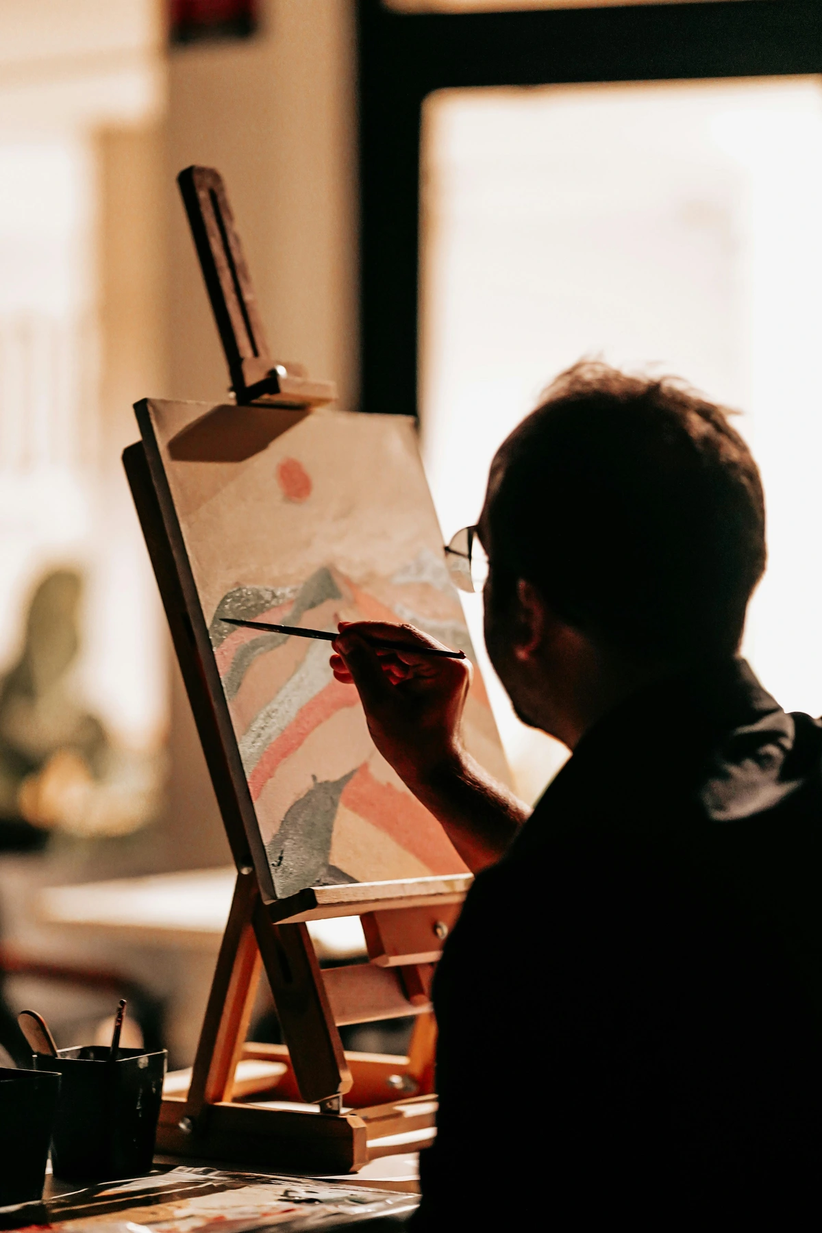
From Setup to Sketch – The Drawing Process: Bringing Vision to Life
Okay, canvas (or paper!) is ready, objects are arranged, light is perfect. Deep breath. Now, let’s make some marks. This is where observation transforms into creation, where your eye guides your hand in a fascinating dialogue with your subject. This entire process is about mindful engagement, from the first loose gesture to the final rendering of details. Embrace each step as an opportunity for discovery and a chance to truly connect with your artistic self.
Tools of the Trade (Keep it Simple)
You don’t need a whole art store, truly. For still life drawing, it’s less about a vast arsenal and more about understanding what each humble tool can do. A few pencils (HB, 2B, 4B or 6B are great for a range of values; I often lean on 2B for most of my sketching and 6B for those really dark accents), an eraser (a kneaded eraser is fantastic for lifting graphite without damaging the paper, and a plastic eraser for crisp clean-ups), and some good quality drawing paper will do wonders. For pencils, an HB is great for light sketching and initial blocking in. A 2B provides a good mid-range value for general shading and building up form. When you need those rich, deep darks to truly make your drawing pop, that's when a 4B or 6B comes into its own, allowing you to push the contrast and define those dramatic core and cast shadows. Consider investing in a good quality artist's pencil sharpener that gives a long, fine point – it makes a huge difference for detailed work! If you’re feeling fancy, a blending stump, tortillon, or even a cotton swab can help achieve those smooth transitions, especially on rounded forms. Don’t forget a simple pencil sharpener! Remember, it’s about the skill, not the arsenal – but having the right basic tools certainly helps. For a broader look at foundational skills, check out some basic drawing techniques: shading and lines, and explore essential drawing supplies for beginners for a more comprehensive list.
Your Pencil: An Extension of Your Eye
Your pencil isn't just a tool for making marks; it's an extension of your observational faculties. The way you hold it, the pressure you apply, and the angle at which it meets the paper all contribute to the expressive quality of your lines and shading. For initial sketching, I often hold the pencil further back, using my whole arm for loose, gestural movements. For detailed rendering, I might hold it closer to the tip, allowing for finer control and precision. Experiment with different grips and pressures to discover the full range of marks your pencil can create. Don't forget that best drawing pencils for beginners, best drawing pencils for realistic art, and reviewing the best drawing pencils for shading and detail can make a huge difference in your early experiences, guiding you toward the right tools for your specific needs.
The Magic of Erasers (They're Not Just for Mistakes!)
It might sound counter-intuitive, but erasers are just as much drawing tools as they are correction tools. A kneaded eraser is your best friend for still life. It's soft and pliable, allowing you to dab and lift graphite without damaging the paper's surface. This is perfect for creating soft highlights, cleaning up edges, or subtly lightening an area, almost like painting with negative space. A plastic eraser (or gum eraser) is firmer and more effective for completely removing dark lines or creating sharp, crisp highlights by 'drawing' into a shaded area. Experiment with both to discover their unique expressive potential, using them not just for fixing mistakes, but for actively shaping and refining your drawing.
The Subtle Art of Lifting and Shaping
Beyond simply erasing, think of your kneaded eraser as a sculpting tool. You can mold it into a point for fine highlights, flatten it for broader areas, or even roll it gently over a shaded area to create a soft, even tone. This ability to lift pigment rather than just rub it away is invaluable for creating nuanced effects and preserving the integrity of your paper. For example, to create a brilliant highlight on a shiny object, I'll often apply a dark value, then use a finely pointed kneaded eraser to lift out a sharp, bright point. This precision allows for incredibly subtle shifts in value and texture, bringing your still life to another level of realism and dimension.
When it comes to paper, don't underestimate its importance. The surface you draw on significantly impacts the final look. Here’s a quick guide to some common types:
Paper Type | Characteristics | Best For |
|---|---|---|
| Smooth (Hot Press) | Very fine, uniform surface. Little to no tooth. | Detailed graphite or ink work, sharp lines, smooth blending. Ideal for hyper-realism and delicate rendering. |
| Medium (Cold Press) | Slightly textured surface, with some "tooth" (fine bumps). | Versatile for most drawing mediums, good for both detail and textural effects, good for charcoal and pastels. A great all-rounder for beginners. |
| Rough (Rough/Vellum) | Pronounced texture, visible tooth. | Capturing rich textures, heavy shading with charcoal or pastels, expressive mark-making. The tooth holds pigment well, allowing for deep, rich tones. |
| Toned Paper | Paper with a mid-range color (e.g., grey, tan, sepia). | Working with mid-tones as a base, allowing highlights (white charcoal) and shadows (dark graphite) to pop. Excellent for learning value relationships and creating dramatic effects. |
| Bristol Board | A smooth, plate-like surface or a slightly vellum (textured) surface, usually thick and rigid. | Excellent for detailed ink work, marker renderings, and fine pencil drawings where a very smooth finish is desired. It doesn't buckle easily. |
| Newsprint | Very inexpensive, thin, and highly absorbent paper. | Perfect for quick gesture drawings, warm-ups, and practicing large, loose movements without worrying about wasting expensive paper. Not archival. |
The Weight of Your Paper: GSM Matters
Beyond texture, the weight of your paper (measured in grams per square meter, or GSM) also plays a crucial role. Heavier papers (e.g., 100 GSM and above) are generally more durable, less prone to buckling, and can withstand more erasing and layering of mediums. Lighter papers are often used for sketching or studies. For a still life that you intend to keep, investing in a good quality, acid-free paper with a decent weight will ensure its longevity and allow for a more robust drawing process.
For more in-depth guidance, check out the best drawing pencils for beginners and understanding and using charcoal for drawing for when you want to explore beyond graphite. If you're really intrigued, my thoughts on essential charcoal drawing supplies for beginners, best paper for charcoal drawing, and how to use charcoal for drawing basics can help you pick the right tools, whether it’s delicate vine charcoal or rich, compressed sticks.


The Initial Block-In – Finding the Forms
This is a crucial, often rushed, step. Resist the urge to draw details! Seriously, put down that urge to render every tiny blemish on the fruit. Before you even get to light, gestural lines, sometimes I like to start with a gesture drawing. This is a super quick, expressive sketch (think 30 seconds to a couple of minutes) that captures the essence and movement of your setup. It's about feeling the flow and energy, not accuracy. It's a fantastic way to warm up and loosen your hand, preventing you from getting too tight or precious with your initial marks. Don't worry about erasing; just let your hand move freely. Think of it as a dance, not a rigid blueprint. Then, after a few gesture studies, you can move to very light, gestural lines for your main drawing. Squint your eyes. Can you see the overall basic shapes? A sphere for an apple, a cylinder for a mug, a cube for a box? Look for the envelope of the entire composition first, then the envelope of each object. Think of an envelope as an imaginary box or boundary that contains the outer limits of your subject. This initial bounding box helps you get the overall scale and placement absolutely right before you commit to any internal details. This helps you get proportions and placement correct early on. It’s like building a house – you start with the foundation, not the decorative trim. And don't forget the negative space – the shapes formed by the empty areas around and between your objects. Drawing these 'empty' shapes can often make it easier to define the 'positive' shapes of your objects accurately. It's like finding the negative shapes created by the spaces between tree branches, which can often be easier to draw than the branches themselves. For more guidance, remember to look at the definitive guide to drawing techniques to refine your approach.
The Power of Negative Space: Drawing What Isn't There
It sounds counterintuitive, right? Drawing the empty spaces. But learning to see and accurately render negative space is one of the most powerful tools an artist can develop, especially in still life. When you focus on the shapes created by the gaps between objects, or the space around an object, your brain bypasses its preconceived notions of what an object should look like. This can dramatically improve your accuracy in proportions and placement, as well as strengthen your overall composition. Try outlining the negative shapes first, and you might be surprised at how much easier it becomes to define the positive forms of your objects. It's a fundamental shift in perception that unlocks greater accuracy and artistic freedom.
Here’s a quick guide to simplifying forms:
Common Object | Basic Geometric Form(s) | How to See It |
|---|---|---|
| Apple, Orange, Ball | Sphere | Look for the overall roundness. How does it sit? Is it a perfect sphere or slightly squashed? |
| Mug, Bottle, Can | Cylinder | Identify the cylindrical body. Pay attention to the ellipses at the top and bottom – are they flat or curved? |
| Box, Book, Die | Cube/Cuboid | Focus on the six planes and the angles where they meet. Use perspective to ensure the corners recede correctly. (definitive guide to perspective in art) |
| Cone, Funnel, Carrot | Cone | Observe the circular base and how it tapers to a point. |
| Pyramid | Pyramid | See the triangular faces converging at an apex. |

Establishing Relationships – Proportions and Placement
Now, refine those basic shapes. This is where the detective work really begins, turning you into a visual sleuth! Use your pencil (or a sighting stick) to measure relative proportions, constantly comparing and contrasting relationships within your setup.
Sighting and Measuring Techniques: Your Built-in Ruler
This is where the detective work really begins, and your pencil becomes your most valuable measuring tool! Hold it out at arm's length, close one eye, and use your thumb to mark off a measurement – say, the width of the apple. Now, without moving your arm, compare that "apple width" to other objects. How many "apple widths" wide is the mug? How tall is the bottle compared to the fruit? This is about relative comparison, not absolute measurement, and it's incredibly effective for getting things right, establishing accurate proportions.
You can also use "plumb lines" (vertical measurements) and "horizontal lines" (horizontal measurements) by holding your pencil perfectly vertical or horizontal against your scene to check alignments and angles. For example, if the top of your apple aligns horizontally with the middle of your vase, use your pencil to confirm this. Similarly, check if the edge of one object lines up vertically with another. It's like having a built-in level and plumb bob, and it dramatically improves accuracy, helping you avoid those frustrating 'wonky' proportions.
Also, pay excruciatingly close attention to how objects relate to each other in space – do they overlap? Is there a tiny gap between them (what I call "kissing edges" – always tricky!)? Are they aligned horizontally or vertically? These small details, often overlooked, are what truly build believability and a sense of depth in your drawing. The interaction between objects, how they touch or almost touch, is a silent conversation that defines the space of your composition, contributing to their accurate placement.
Understanding Plane Changes: The Subtlety of Form
As you refine your forms, start to think about plane changes. A sphere isn't just a perfect curve; it's a series of subtle, continuously shifting planes that turn away from the light. A box has distinct, flat planes. Learning to identify these shifts in plane, even on seemingly rounded objects, is key to creating a convincing illusion of three-dimensionality. This is where your understanding of understanding the elements of sculpture: form, space, and material becomes surprisingly relevant, even for a two-dimensional drawing. It's about translating the tactile world into a visual language of light and shadow.
Shading: Giving Life to Form
Ah, value! This is where your drawing truly comes alive, where flat shapes transform into three-dimensional forms. Think about your light source, that orchestrator of drama. Where are the brightest highlights – those tiny, intense spots where light directly hits? Where are the mid-tones that define the planes? Where are the darkest core shadows – those form-defining areas of the object itself that turn most abruptly away from the light source? These are crucial for conveying true three-dimensionality. And don't forget the subtle reflected lights bouncing back from other surfaces or the table, subtly illuminating the shadowed side, distinct from general ambient light. Finally, the cast shadow – the shadow an object throws onto another surface – grounds the object and gives it weight. Don't just draw outlines; draw the light and shadow, because that's what truly tells the story of form. This fundamental understanding is key to mastering shading techniques in drawing. It's the difference between a flat representation and a living, breathing object on your paper.
The Relationship Between Light, Shadow, and Form
Shading is more than just making things dark. It's about meticulously observing how light interacts with the surfaces of your objects. Every curve, every angle, every indentation will have a unique way of catching or deflecting light. The goal isn't just to copy what you see, but to understand why you see it – why a highlight appears in a certain spot, why a shadow takes a particular shape. This analytical approach to shading will not only improve the realism of your drawings but also deepen your overall visual comprehension.
The Five-Value System: Unlocking Form
To really nail shading, I find it helpful to think in terms of a 'six-value system' that simplifies how light interacts with a three-dimensional object, giving you a clear roadmap for rendering form:
- Highlight: The brightest spot, where light directly hits and reflects most intensely.
- Light Tone: The area directly facing the light source, receiving the most illumination. This is usually the second brightest area, where the local color of the object is most apparent.
- Mid-tone: The transitional area between light and shadow, where the form starts to turn away from the light. This is the neutral ground, neither fully illuminated nor fully in shadow.
- Core Shadow: The darkest part of the object itself, where it turns furthest from the light. This is crucial; it's the heart of the shadow on the form, defining its roundness or angularity.
- Reflected Light: A slightly lighter area within the core shadow, caused by light bouncing off nearby surfaces and illuminating the shadowed side. This is subtle but incredibly important for making shadows feel luminous and preventing your forms from looking cut out.
- Cast Shadow: The shadow the object throws onto the surface it rests on, or onto other objects. This grounds the object in its environment and provides crucial information about its relationship to the ground plane and other objects. This anchors the object in space.
Actively looking for and rendering these distinct values will dramatically improve the three-dimensionality and realism of your still life drawings. It's a mental checklist that helps you decode how light is behaving on every surface.
One subtle but powerful element to consider is edge quality. Not all edges are created equal! A hard, sharp edge (like the rim of a ceramic cup facing the light) will appear different from a soft, blurry edge (like a shadow cast on a rounded surface). Varying your edge quality – from razor-sharp to barely-there – adds immense realism and dimension to your drawing, helping to define the focal point and atmospheric depth. This is a technique I use constantly in my abstract work; a sharp edge might create tension, while a soft, blended edge can suggest a whisper or a transition. It's a powerful compositional tool in its own right.
The Power of Contour and Cross-Contour Lines
Before you dive deep into shading, consider the magic of contour lines. These are the outlines of your objects, but they're not just flat edges. A strong contour line can express the weight and form of an object. Even more powerful are cross-contour lines, which run across the surface of an object, mimicking its three-dimensional shape. Imagine drawing lines around an apple as if it were a globe, showing its curves. These lines help you understand and convey the volumetric form of your subject, acting as a skeleton for your shading. They are literally mapping the topography of your forms, helping you to translate three-dimensional reality onto a two-dimensional surface. This is a crucial step that many beginners rush, but it's the scaffolding upon which all your beautiful shading will rest.### Rendering Different Textures: Beyond the Smooth Surface
Texture is another vital element that brings your still life to life. Don't try to draw every single fiber of a cloth or every speck on a rusted object. Instead, focus on the overall impression of the texture. Is it rough, smooth, shiny, dull, porous, or reflective? Use varying line weights, hatching patterns, or stippling to suggest the texture rather than replicate it perfectly. For instance, a crumpled piece of fabric might be rendered with a lot of expressive, overlapping lines, while a smooth glass bottle might rely on subtle gradients and sharp highlights. Pay attention to how light interacts with the texture – does it create many tiny highlights, or does it diffuse broadly? This understanding of how texture affects light is something I constantly explore in my abstract pieces, where imagined textures play a huge role in creating depth and intrigue. It's about conveying the feeling of the surface, not just its photographic reproduction. This also ties into understanding the elements of art: a beginners guide to line, shape, color, and texture.
credit, licence
Technique | Description | When to Use It |
|---|---|---|
| Hatching | Parallel lines, closer together for darker values. | Good for defining edges, creating a sense of direction or texture. Particularly effective for conveying the grain of wood, the direction of hair, or the folds in fabric. The consistency of parallel lines can also suggest a sense of calm and order. |
| Cross-Hatching | Overlapping sets of parallel lines, usually perpendicular. | Builds up darker values quickly, adds texture and richness. Excellent for creating dense shadows, robust forms, and conveying a sense of woven or rough surfaces. It's a dynamic technique that can add a lot of energy to your drawing. |
| Stippling | Dots! Denser dots create darker values. This painstaking but rewarding technique is excellent for subtle textures, delicate shading, and soft transitions. Ideal for rendering skin, dusty surfaces, or creating a fine mist. It builds value with incredible precision. | Excellent for subtle textures, delicate shading, and soft transitions. Ideal for rendering skin, dusty surfaces, or a fine mist. |
| Scribbling | Loosely overlapping, random lines. Great for expressive, energetic textures, or rougher surfaces. Perfect for depicting tangled hair, unruly fabric, or a sense of chaotic movement. It brings a vibrant, uninhibited quality to your mark-making. | Great for expressive, energetic textures, or rougher surfaces. Perfect for depicting tangled hair, unruly fabric, or a sense of chaotic movement. |
| Blending/Smudging | Using a finger, blending stump, tortillon, or cotton swab to smooth pencil marks. For smooth transitions, soft forms (like fruit), and atmospheric effects. Use sparingly to avoid a 'muddy' look, and always ensure your darkest darks remain crisp. It's about control, not indiscriminate smearing. | For smooth transitions, soft forms (like fruit), and atmospheric effects. Use sparingly to avoid a 'muddy' look, and always ensure your darkest darks remain crisp. |
| Scumbling | Applying a light, opaque layer of color or tone over an existing layer, allowing parts of the underlying layer to show through. | Ideal for creating a soft, hazy texture, or for unifying areas with a subtle, broken color. It adds a delicate, atmospheric quality, allowing underlying textures or colors to peek through. Think of it as a translucent veil over your drawing. |
| Frottage | Rubbing a drawing implement (like a crayon or charcoal) over a textured surface placed underneath the paper. | A fun experimental technique to introduce realistic or abstract textures quickly, like wood grain, fabric weave, or rough stone. It's about capturing the physical imprint of a surface, adding a unique, unexpected dimension to your work. |
Combining Techniques for Richer Effects
Don't feel limited to just one shading technique! The most compelling drawings often combine several methods to create a richer, more varied surface. You might use smooth blending for a fruit's skin, then introduce subtle stippling for a dusty texture, and finish with crisp hatching to define an edge. It's about building up layers of information and visual interest, much like an orchestra uses different instruments to create a complex symphony. Experiment and discover your own unique combinations.
Troubleshooting Your Still Life Drawing
Even with all the best advice, you're going to hit roadblocks. Trust me, I still do! That's not a sign of failure; it's a sign you're engaged in the learning process. Here are some common frustrations I've encountered and a few thoughts on how to navigate them. Every challenge is just a puzzle waiting to be solved, and often, the most significant breakthroughs come from grappling with these difficulties. It's all part of the journey to mastering shading techniques in drawing and beyond. Remember, a 'mistake' is simply an opportunity for re-evaluation and a new direction.
Dealing with Frustration and "Muddy" Drawings
Ever finish a drawing and feel like it's just... dull? Flat? Like all your beautiful shades have merged into a grey soup? This often comes from over-blending, using too little contrast, or not clearly defining your light source. My advice? Take a break. Seriously, step away for an hour, or even a day. When you come back, look for your brightest highlights and darkest darks. Push them! You'll be amazed at the depth that emerges. Also, consider if you're using too many different pencil grades interchangeably. Sometimes, a simpler palette of values (e.g., just HB, 2B, and 6B) can force you to be more intentional. Another common culprit is not layering your values. Instead of pressing hard for immediate darkness, build up your darks gradually with multiple light layers. This creates a richer, more luminous shadow, preventing that flat, muddy appearance. It's like building up color in a painting – patience yields richer results.

Troubleshooting Inaccurate Proportions
Ah, the wonky apple, the tilted cup! Proportions are one of the trickiest beasts to tame. If your drawing feels "off," it's almost always a measurement issue. Go back to basics: use your pencil for sighting, check angles rigorously, and constantly compare the relationships between objects. Is the gap between the vase and the book wider or narrower than you drew it? Is the top of the bottle truly level with the base of the fruit? Don't be afraid to lightly erase and re-block. Early correction saves a lot of heartache later on. Remember, accuracy builds believability, even if your style is ultimately expressive. One trick I use if I suspect something is off is to flip my drawing upside down or look at it in a mirror. This disrupts your brain's interpretation of the image and allows you to see the shapes and relationships more objectively, often revealing errors you missed before. Another technique is to use a grid system, either by lightly drawing a grid on your paper and subject or by using a viewfinder with a grid. This can break down the complex scene into smaller, more manageable squares, making it easier to transfer proportions accurately. Other common mistakes to watch out for include not pushing your values enough (leading to a flat drawing) or having too many competing focal points (which confuses the viewer).
Embracing the Journey (Beyond the Basics)
Still life drawing is a practice, not a destination. You won't master it in one go, and that’s the beauty of it. Each drawing is a lesson, a chance to refine your eye and your hand. This continuous process of learning and evolving is what truly defines an artist's path, whether they're drawing apples or crafting monumental abstract installations. It’s about building a solid foundation that allows you to explore any artistic frontier you choose. It's a lifelong dialogue with the visual world, one subtle insight at a time.

Don't Fear the "Mistake"
Oh, how I used to agonize over every line! I'd erase until the paper was thin, convinced a single wrong stroke would ruin everything. But here's the secret, the really liberating truth: there are no mistakes, only opportunities to learn. Sometimes, the most interesting parts of my abstract work come from an unexpected mark or a spontaneous decision, a 'mistake' that pushes me in a new, exciting direction. This journey, much like how to overcome fear of the blank canvas, is about liberation, not perfection. Embrace the smudges, the slightly off-kilter perspective. It's your drawing, your vision, and these 'imperfections' are often what give it character. I've found that sometimes, the 'mistakes' are actually doorways to unique expressive choices. A slightly distorted reflection, an unexpected shadow – these can add intrigue and a personal touch that a perfectly rendered piece might lack. Don't be afraid to lean into those moments of happy accidents; they often lead to the most interesting discoveries. Remember, even the masters made 'mistakes' – or rather, they adapted and incorporated them into their evolving vision.
Your Unique Vision
As you practice still life, you'll start to develop your own unique way of seeing and interpreting. You might find yourself exaggerating certain forms, simplifying others, or playing with light in unexpected ways. This is where the magic happens – where the foundational practice begins to merge with your personal artistic voice. It’s part of the exciting process of finding my voice: the evolution of my abstract artistic style. The structural integrity you learn from observing a sphere, the emotional impact of carefully rendered light, the dynamic tension in a thoughtful composition – these aren't just for realism. For me, they are the very bones beneath the surface of my most vibrant, expressive abstract pieces, allowing the chaos to have meaning. It's why my still life drawings have, over time, directly informed and evolved into abstract compositions that tell stories all their own, much like the pieces you can explore at the den bosch museum or by looking at my timeline. The principles you master here – balance, contrast, dynamic form, and the interplay of light and shadow – are the very same tools you’ll wield, perhaps subconsciously, to create compelling abstract narratives. It's about developing an internal visual vocabulary that you can then translate into any artistic language you choose. Your unique vision isn't about avoiding the fundamentals; it's about deeply understanding them so you can break the 'rules' with intention and confidence.
The Still Life as a Stepping Stone to Abstraction
For an artist like me, who often works in abstract realms, the still life might seem like an unlikely bedfellow. But the truth is, it’s an indispensable training ground. When I look at a bowl of fruit, I’m not just seeing apples and bananas; I’m seeing spheres, cylinders, and ovoids. I’m seeing the interplay of light and shadow creating abstract shapes of value. I’m seeing the dynamic tension of objects arranged in space, creating a narrative even without a recognizable story. These are the building blocks of abstraction. The better I understand how to render these fundamental principles realistically, the more confidently I can distort, simplify, and rearrange them into new, expressive abstract forms. It’s about internalizing the language of form and light so deeply that you can speak it in a thousand different dialects.
Cultivating a Sustainable Artistic Practice
Art is a marathon, not a sprint. To truly grow, consistency is far more important than intensity. Building a sustainable practice, one that feeds your soul rather than draining it, is the real secret to a lifelong love affair with art. It's about nurturing your artistic spirit over the long haul, finding joy in the small daily acts of creation, and understanding that every mark made is a step forward, regardless of the outcome. And don't forget to celebrate the small wins! Every successful sketch, every moment of focused observation, is a victory. Acknowledge your effort, not just the final product.
Embracing the Sketchbook Habit
Your sketchbook isn't just for "good" drawings; it's a playground, a laboratory, a visual diary. Use it for quick gesture studies, material experiments, compositional thumbnails, or even just scribbling thoughts. The pressure is off! This regular, low-stakes engagement keeps your observational skills sharp and your hand-eye coordination honed, even on days when a full-blown still life feels too daunting. It’s where your ideas can freely roam and evolve. And don't underestimate the power of simply taking a break. Sometimes, the best thing you can do for a drawing (or yourself!) is to step away, clear your head, and come back with fresh eyes. This allows you to spot errors or opportunities for improvement that you might have missed when you were too engrossed. Remember, the sketchbook is a space for raw exploration, not for finished masterpieces. It's where you can freely experiment with the importance of sketching for artists, develop a power of the sketchbook habit, and learn how to start a sketchbook habit for artists. You might also find inspiration in my creative process: sketchbook to canvas and my sketchbook philosophy: why every artist needs a daily practice.
Overcoming Creative Blocks
We all hit them – those moments where the inspiration dries up, or the pencil just feels heavy. For still life, a creative block can often be overcome by simply changing your setup. Try new objects, a different light source, or even just rearrange a familiar setup entirely. Sometimes, just doing a series of really quick, messy gesture drawings (think 60 seconds each!) can break through the paralysis. It's about reactivating your visual curiosity and reminding yourself that art doesn't always have to be perfect; it just has to be done. Another powerful strategy is to revisit old works, not to criticize them, but to see what you've learned. Or, step away from drawing entirely and engage with another art form – visit a museum, listen to music, read a book. Often, inspiration for one medium can be sparked by another entirely different creative input. This cross-pollination of ideas can be incredibly rejuvenating, as I've found in my own journey of my creative process: from sketchbook to large-scale abstract canvas.
Reflecting and Evolving: The Power of Self-Critique and Learning
Learning to look at your own work with a critical but compassionate eye is a skill in itself. Ask yourself: What worked? What challenged me? What do I want to improve next time? Don't dwell on "failures," but see them as valuable data points guiding your next step. Seek out feedback from trusted peers or mentors if you can, but always filter it through your own artistic vision. The most profound learning comes from doing, reflecting, and then doing again, with renewed intention. This iterative process is how true mastery is achieved. It's like a scientific experiment where each attempt, successful or not, provides crucial data for the next iteration. Embrace the role of both artist and objective observer of your own work. This self-critique is a powerful engine for continuous growth and refinement.
Seeking and Giving Constructive Feedback
While personal reflection is crucial, seeking outside perspectives can accelerate your growth. Find trusted peers, mentors, or even online communities where you can share your work and receive constructive criticism. Learning to articulate what you're trying to achieve and then listening openly to how others perceive it is a skill in itself. Conversely, learning to give thoughtful, helpful feedback to others will also sharpen your own critical eye. Remember, the goal isn't just praise, but honest insights that help you see your work from new angles and push your boundaries.
Frequently Asked Questions (FAQ)
Q: What are the best objects to start with for still life drawing?
A: I always recommend starting with simple geometric shapes like a cube, sphere, and cylinder (a box, a ball, a mug) to understand form and shadow. Then, move to simple fruits, vegetables, or household items. Avoid anything too complex or reflective at first.
Q: How important is perfect realism in still life?
A: For beginners, it’s a fantastic way to train your eye and hand. But remember, the goal isn't just photo-realism. It’s about your interpretation. Don't be afraid to let your personal style emerge, even if it means deviating from perfect replication. It's about developing your unique artistic voice, which is far more valuable than sterile perfection.
Q: How can I make my still life drawings more expressive?
A: Expressiveness often comes from understanding the fundamentals so deeply that you can then choose to break or bend the 'rules' intentionally. Experiment with different mark-making techniques – use loose, gestural lines for energy, or fragmented lines to suggest fragility. Play with exaggerated values or colors (if using color) to evoke stronger emotions. Focus on the 'feeling' of the objects rather than just their appearance. Ultimately, letting your unique artistic voice guide your hand is key.
Q: What's the ideal lighting for a still life setup?
A: A single, consistent light source is usually best. A window (on an overcast day for softer light, or with direct sun for dramatic shadows) or a desk lamp. Position it to the side to create clear highlights, mid-tones, and distinct shadows. This makes understanding form much easier.
Q: Q: How long should I spend on one still life drawing?
A: There's no fixed rule! For a quick gesture sketch, 5-15 minutes can be incredibly beneficial for capturing the essence. For a more detailed study, you might spend several hours over multiple sessions, allowing for careful observation and rendering. The key is consistent practice, even short bursts, to train your eye and build muscle memory. Don't let the clock dictate your creativity.
Q: How do I handle perspective in a still life drawing?
A: Perspective, especially linear perspective, is crucial for making your objects look three-dimensional and correctly placed in space. Pay attention to how objects recede, how parallel lines appear to converge, and how ellipses change shape depending on your eye level. A basic understanding of definitive guide to perspective in art will make a huge difference.
Q: What if my drawing looks "flat"?
A: A flat drawing usually indicates a lack of strong value contrast or insufficient understanding of form. Revisit your light source – are your highlights bright enough and your shadows dark enough? Are you accurately depicting the core shadow, reflected light, and cast shadow? Focus on rendering forms rather than just outlines. Sometimes, the solution is as simple as pushing your darkest darks just a little bit further, or finding a subtle reflected light you missed. For more help, check out the definitive guide to understanding value in art: light, shadow, and form.
Q: How do I approach drawing complex textures?
A: Don't try to draw every single detail! Instead, observe the overall impression of the texture. Is it rough, smooth, shiny, dull? Use varying line weights, hatching patterns, or stippling (as discussed earlier) to suggest the texture rather than replicate it perfectly. For instance, a crumpled piece of fabric might be rendered with a lot of expressive, overlapping lines, while a smooth glass bottle might rely on subtle gradients and sharp highlights. This is about being an interpreter, not a copy machine. The goal is to evoke the texture, allowing the viewer's imagination to fill in the rest. This will also make the drawing more engaging and less photographic.
Q: How do I choose a background for my still life?
A: The background is as important as the objects themselves! Aim for simplicity and neutrality so it doesn't compete with your main subject. A draped cloth, a plain wall, or a large piece of paper can work wonders. Consider its value and color in relation to your objects to create contrast or harmony. Sometimes, a subtle pattern or texture in the background can add interest without distraction, but for beginners, keep it plain. Remember, the background helps to define the negative space and can greatly enhance or detract from your focal point. It's another element to intentionally compose, not just an afterthought.
Q: What about reflective or transparent objects?
A: These are definitely a challenge, but a rewarding one! For reflective objects (like metal or glass), don't try to draw what you know is there, but what you see. Focus on the distorted reflections of other objects, the environment, and the light source. It's a complex interplay of light and surface. For transparent objects, pay attention to the refractions and distortions through the material, and how the objects behind it are altered – the way light bends and shifts as it passes through. It's all about meticulously observing the light's behavior and trusting your eyes, even if what you see seems counterintuitive.
Q: How do I maintain consistency in my daily practice?
A: The key is to make it a habit, not a chore. Start small – even 15-20 minutes a day can make a huge difference. Find a consistent time and place. Keep your materials easily accessible. Don't aim for masterpieces in every session; some days might just be for quick sketches or studies. The act of showing up, even when you don't feel inspired, builds momentum and discipline over time. This consistent effort, often called 'showing up for your art,' is more impactful than sporadic, intense bursts of activity. It's the bedrock of a truly fulfilling artistic journey.
Q: Can I use mediums other than pencil for still life drawing?
A: Absolutely! While graphite pencil is excellent for beginners to understand value and form, don't hesitate to experiment. Charcoal offers rich, deep blacks and soft transitions, perfect for dramatic effects. Pastels allow you to introduce color while still focusing on drawing principles. Ink can bring sharp lines and strong contrasts. Even watercolor or gouache can be approached with a 'drawing' mindset, focusing on shapes and values. Each medium offers a different expressive quality and challenges you to see in new ways.
Q: Can I incorporate color into my still life drawings?
A: Absolutely! While many start with monochrome to master form and value, adding color can open up a whole new world of expressive possibilities. Begin with a limited palette to understand color mixing and how colors interact with light and shadow. Remember that colors also have 'value' – a dark red can have the same value as a dark blue, even though their hues are different. Experiment with colored pencils (like those reviewed in in-depth review: Caran d'Ache Luminance colored pencils), pastels (as seen in what is pastel painting), or even watercolor for a different approach. Color can dramatically shift the mood and narrative of your still life.
Q: Can still life drawing help with abstract art?
A: Absolutely! It’s a powerful way to understand fundamental principles like composition, light, form, and texture without the pressure of strict representation. These foundational skills are invaluable for creating compelling abstract art, allowing you to manipulate elements with intention, even without recognizable subjects. It's like learning the rules of grammar before you write poetry – you can break them with purpose. You might find my thoughts on the definitive guide to composition in abstract art particularly enlightening in this regard.
Q: What's the best way to practice drawing ellipses and circles accurately?
A: Drawing perfect circles and ellipses freehand is notoriously difficult. Practice drawing them repeatedly from your shoulder (not your wrist) in various sizes. Focus on making smooth, continuous movements. For ellipses, pay close attention to the minor axis (the shortest diameter) and ensure both sides are symmetrical. The 'width' of an ellipse changes dramatically with perspective, and still life is a perfect arena to master this. Using a light 'ghost' line before committing to a darker one can also help guide your hand. Repetition is truly key here, building muscle memory over time, making these tricky forms feel more natural.
Conclusion
So there you have it. My not-so-secret love affair with still life drawing. It’s more than just an academic exercise; it's a profound way to connect with the visual world, to train your eye, and to build the bedrock of your artistic practice. It's the silent force that grounds all my abstract explosions of color and form – the deep understanding that allows the chaos to have meaning. Don't let anyone tell you it's boring or stuffy. It's where the magic truly begins, where you learn the language of art from the ground up, and where your unique artistic voice, whether it whispers or shouts, starts to find its undeniable power. Grab that pencil, set up a few ordinary objects, and let's see what extraordinary things you discover about the world, and about your own artistic capabilities. And remember, the journey itself is the masterpiece. Every stroke, every observation, every moment of frustration and breakthrough contributes to the evolving tapestry of your artistic life. So go forth, create, and let the quiet power of still life illuminate your path. And when you're ready to share your own unique vision with the world, remember that the foundations you build here will empower you to create pieces that resonate deeply with others, perhaps even leading them to buy a piece of your expressive art, or to explore my own timeline of artistic evolution.


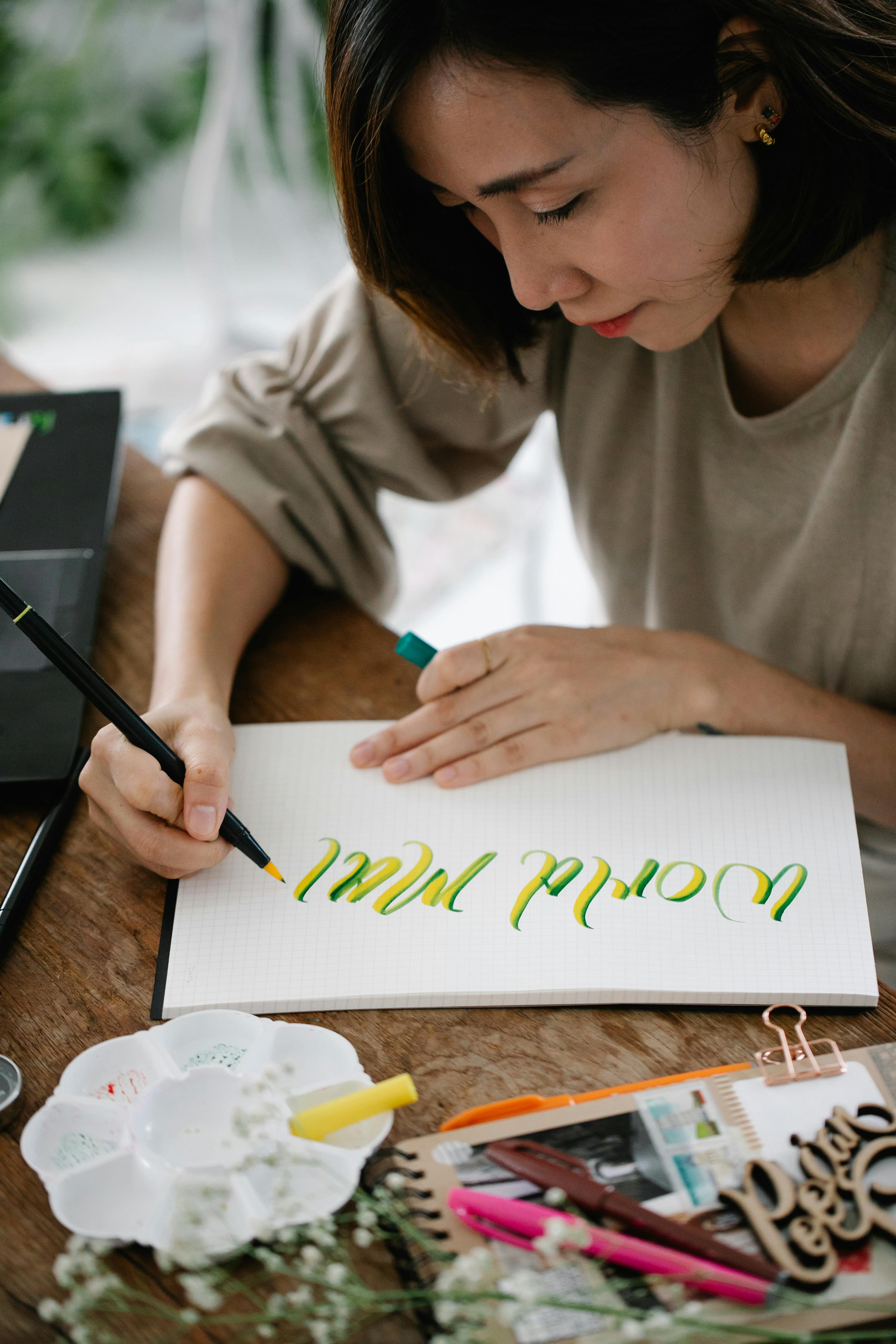