The Ultimate Guide: Choosing the Best Paper for Charcoal Drawing
Unlock the magic of charcoal! I share my personal journey and top tips for finding the perfect paper, exploring textures, weights, and brands to elevate your charcoal drawings.
The Ultimate Guide: Choosing the Best Paper for Charcoal Drawing
Let's be honest, we artists often get swept up in the magic of our mediums. The rich pigments of oils, the vibrant hues of pastels, or the precise dance of ink on paper – they all demand our attention. But there's a quiet, foundational hero often overlooked, especially in the world of charcoal: the paper itself. For me, charcoal drawing is a primal act, a direct connection to mark-making that feels ancient and utterly immediate. It captures light and shadow, form and feeling, with a raw, expressive power that few other mediums can match. I mean, have you ever seen a truly masterful charcoal portrait that just seems to breathe? Or an abstract piece where the energy practically vibrates off the surface? That’s charcoal magic.
Here's the kicker, though, and I've learned this through countless frustrating hours: the paper you choose for your charcoal drawing can truly make or break your entire artistic vision. Seriously, it's not just a blank canvas; it’s an active participant, a co-conspirator in your creative process, influencing every single stroke, every smudge, every nuanced tone. I've had so many moments of thinking my technique was off, only to realize the paper was fighting me, making my charcoal slide, smudge, or simply refuse to adhere. It’s like trying to bake a soufflé on a wobbly table – the ingredients might be perfect, but the foundation is all wrong.
This is why, as part of my continuous exploration into understanding and using charcoal for drawing, I felt compelled to share everything I've learned about this utterly crucial aspect. I want you to avoid those early struggles and find that perfect paper partner right from the start. Together, we're going to dive deep, from the microscopic landscape of its 'tooth' to the subtle psychology of its color, ensuring your charcoal journey is nothing short of transformative.
Why Charcoal? The Irresistible Pull of a Primal Medium
Before we get lost in the glorious weeds of paper specifics, let's take a moment to appreciate why we're even here, obsessing over paper for charcoal. What is it about this ancient medium that captures our imagination? For me, it's the sheer immediacy. There’s no complex setup like oil painting, no drying times, no fuss. You grab a stick, touch it to paper, and there's a mark. It's raw, visceral, and incredibly direct.
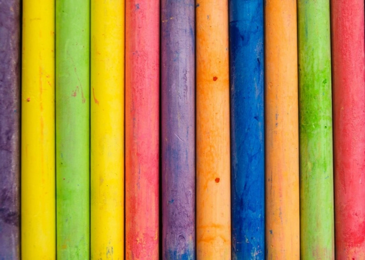
Charcoal allows for an extraordinary range of expression, from the most delicate, ethereal grays to the deepest, velvety blacks. It's incredibly versatile, capable of both loose, energetic gestures and hyper-realistic detail. There’s a beautiful forgiving quality to vine and willow charcoal, allowing you to lift and rework, almost like sculpting with light and shadow. But then, there's the assertive permanence of compressed charcoal, demanding a confident hand. This dance between control and spontaneity, between ephemeral dust and profound depth, is what keeps me coming back to charcoal, piece after piece. It's a medium that truly lets you explore the definitive guide to drawing techniques in its most fundamental form.## Why Paper isn't Just Paper: The 'Tooth' and TextureImagine charcoal as tiny, powdery particles – almost like a fine dust. Now, imagine your paper, not as a flat, inert canvas, but as a miniature landscape. The surface of drawing paper isn't perfectly smooth (unless it's hot-press, but we'll get to that). Instead, it has a subtle texture, microscopic valleys and peaks, that artists call 'tooth'. This 'tooth' is what truly performs the magic; it's what grabs onto those charcoal particles, holding them in place and allowing you to build up layers of tone and value. Without enough tooth, your charcoal just slides around, feels muddy, and won't achieve those rich, dark blacks or delicate, soft grays you're aiming for. It's like trying to make sandcastles on polished glass – just not going to happen effectively. This interaction of charcoal and tooth is fundamental to mastering shading techniques in drawing.Too much tooth, on the other hand, can be a blessing and a curse. It can create wonderful, expressive textures but might chew through your charcoal quickly, especially vine or willow, and make smooth blending a real challenge. You'll find yourself pushing harder, and that can lead to a fatigued hand and a frustrated mind. It’s all about finding that sweet spot for what you want to achieve, and believe me, it's a journey of discovery, often demanding a lot of playful experimentation with different charcoal types like compressed sticks, vine charcoal, and charcoal pencils.### The Spectrum of Paper Textures for CharcoalWhen I pick up a new pad of paper, the first thing I do is run my fingers over it. Yes, it might sound a bit quirky, but it tells me so much! That tactile feedback is invaluable. Here’s how I think about different textures, and how they lend themselves to various artistic intentions:

credit, licence#### Smooth (Low Tooth)I rarely reach for truly smooth paper for charcoal, as it doesn't offer much for the pigment to cling to. It's a bit like trying to paint on ice. However, for highly detailed, precise charcoal pencil work where you want minimal paper texture showing through, it can work beautifully. Think crisp edges, architectural lines, or hyper-realistic renderings where the charcoal itself needs to be the sole source of texture. Just be prepared for less layering and significant blending challenges, as the charcoal won't easily settle into the surface. Bristol board, known for its smooth, plate-like finish, is a prime example of a low-tooth surface.#### Medium ToothThis is my go-to, my old faithful. Papers with a medium tooth strike a beautiful balance. They hold enough charcoal to allow for rich tones and easy layering, but they’re not so aggressive that they prevent smooth blending or subtle transitions. This is where most general-purpose drawing papers fall, offering a forgiving surface for both focused detail and broader strokes. If you're just starting out, this is probably where you want to begin your exploration, as it gives you the most versatility to experiment with different charcoal types and techniques. It's truly the sweet spot for learning and developing your unique charcoal voice.#### Rough (High Tooth)Oh, the rough papers! These are fantastic for expressive, gestural, or abstract pieces where texture isn't just a byproduct, but an intentional part of the story. They grab charcoal with gusto, creating a vibrant, granulated effect that I absolutely adore for adding depth and drama. Think heavy charcoal sticks, loose gestures, and bold statements that revel in the tactile quality of the medium. It’s also brilliant for dry brush effects with charcoal dust, creating ethereal clouds of tone. Just a heads up, your charcoal will disappear faster on these surfaces – it's a hungry beast! This kind of texture can also really enhance a piece, bringing out a raw, energetic quality, much like how exploring texture: my favorite techniques for adding depth to abstract paintings can transform an artwork. The sheer tactile quality of these papers can truly elevate a charcoal piece, making the viewer almost feel the grit and grain. You can really see this expressive quality in pieces like this abstract charcoal work.
credit, licence## Understanding Your Tools: A Deeper Look at Charcoal Types
Okay, so we've established that paper is paramount. But the charcoal itself? It's not a monolith! The type of charcoal you choose will dramatically influence how it behaves on your chosen paper, and understanding this interplay is key to unlocking its full potential. Think of it like choosing the right brush for your paint – each has a specific purpose and character.
Vine and Willow Charcoal: The Ephemeral Whispers
These are the softest, purest forms of charcoal, essentially carbonized grapevines or willow sticks. They are incredibly light, powdery, and easily blendable, creating beautiful, ethereal tones. On a paper with a medium tooth, they glide, leaving a delicate mark that can be effortlessly lifted with a kneaded eraser, making them perfect for initial sketches, gesture drawings, and broad tonal studies where you want maximum flexibility. However, on smooth paper, they can feel almost too slippery, offering little grip, while on rough paper, they'll disappear quickly, filling the tooth but offering less control over fine detail. Their inherent fragility means they don't produce intensely dark blacks.
Compressed Charcoal Sticks: The Bold Declarations
When you need serious darks, unwavering lines, and a robust application, compressed charcoal is your go-to. These sticks are made from charcoal powder mixed with a binder (like gum arabic) and then compressed into various hardnesses, from soft (B, 2B) to hard (HB, H). The harder the stick, the lighter and sharper the line; the softer, the darker and richer the tone. On medium to rough papers, compressed charcoal truly shines, digging into the tooth to lay down dense, rich pigment that is much harder to erase (so commit!). On smooth paper, it can create incredibly crisp, dark lines and solid blocks of tone, but blending becomes more challenging, requiring significant pressure and specialized tools. I love them for adding drama and deep shadows.
Charcoal Pencils: Precision and Control
Charcoal pencils are essentially compressed charcoal encased in wood, much like graphite pencils. They offer the familiar feel and precision of a pencil, making them indispensable for fine details, crisp edges, and controlled cross-hatching. They come in a range of hardnesses, just like their stick counterparts. They perform beautifully on medium to smooth papers where intricate detail is desired. On rough paper, the pencil point might wear down quickly, and the paper's texture will assert itself more, sometimes making smooth lines difficult. They're my secret weapon for adding those sparkling highlights and sharp accents that bring a drawing to life.
Powdered Charcoal: The Atmospheric Builder
Sometimes, you don't want a stick or a pencil; you want a cloud. Powdered charcoal is exactly what it sounds like – finely ground charcoal dust. It's fantastic for creating large, soft washes of tone, atmospheric effects, and filling expansive areas quickly. You can apply it with a brush, a chamois, or even a cotton ball. It adheres wonderfully to medium and rough papers, settling into the tooth to create a velvety, diffused effect. On smooth paper, it tends to just sit on the surface, easily smudged, and challenging to control. I use it for backgrounds and establishing foundational tones before diving into detail.
Charcoal Type | Characteristics | Ideal Paper Tooth | Best For | Considerations |
|---|---|---|---|---|
| Vine/Willow | Soft, delicate, easily blendable, lifts well | Medium | Initial sketches, light tones, flexibility | Fragile, won't achieve deep blacks, very dusty |
| Compressed Sticks | Dense, rich blacks, bold lines, harder to erase | Medium to Rough | Dark tones, strong lines, dramatic shading | Less forgiving, can be hard to blend smoothly |
| Charcoal Pencils | Precise lines, control, varied hardness | Smooth to Medium | Fine details, crisp edges, controlled shading | Point wears quickly on rough paper, can feel rigid |
| Powdered Charcoal | Soft washes, atmospheric effects, broad coverage | Medium to Rough | Backgrounds, large areas, diffuse tones | Hard to control on smooth paper, very messy |
Now, with a better grip on the tools themselves, we can appreciate even more why paper truly isn't just paper.
Sometimes, you don't want a stick or a pencil; you want a cloud. Powdered charcoal is exactly what it sounds like – finely ground charcoal dust. It's fantastic for creating large, soft washes of tone, atmospheric effects, and filling expansive areas quickly. You can apply it with a brush, a chamois, or even a cotton ball. It adheres wonderfully to medium and rough papers, settling into the tooth to create a velvety, diffused effect. On smooth paper, it tends to just sit on the surface, easily smudged, and challenging to control. I use it for backgrounds and establishing foundational tones before diving into detail.
Now, with a better grip on the tools themselves, we can appreciate even more why paper truly isn't just paper.Once you’ve got a handle on tooth, that beautifully descriptive term, the next thing I consider is the paper’s weight. This is measured in GSM (grams per square meter) in most of the world, or sometimes in pounds (lb) in the US (where it can get a bit confusing, as 90lb drawing paper isn't necessarily heavier than 90lb watercolor paper due to different ream sizes, but I digress!). In my experience, heavier paper is almost always better for charcoal, and here's why.Why? Well, charcoal drawings, especially if you layer and blend a lot, can be surprisingly fragile. Those powdery layers need a robust foundation. Heavy paper is significantly more durable, less prone to buckling or tearing under pressure, and can withstand more aggressive erasing and reworking – a lifesaver when you’re still figuring things out! It also feels more substantial in hand, giving your finished piece a greater presence and, dare I say, a more professional feel. Think of it as the structural integrity of your artwork.I generally look for paper that’s at least 100 GSM (around 60 lb) for even casual sketching. If I’m planning a really intense piece, something with heavy layering, bold strokes, or lots of erasing and lifting, I’ll often go for 160 GSM (90 lb) or even higher, sometimes venturing into the 200-300 GSM range. It might seem like a small detail in the grand scheme of your artistic vision, but trust me, the difference in handling, durability, and the sheer longevity of your artwork is significant.
Decoding Paper Formats: Sheets, Pads, Rolls, and Blocks
It's not just what the paper is made of, or how much it weighs; it's also how it's presented to you. The format of your paper can greatly influence your workflow, the scale of your work, and even your approach to a drawing. I've worked with every format imaginable, and each has its own charm and its own set of practical considerations.
Loose Sheets: Freedom and Customization
Buying paper in loose sheets gives you the most flexibility. You can choose exactly the size you need, cut it down further for smaller studies, or even tape several together for a massive piece (though I rarely do that with charcoal). High-quality, specialized papers often come in large loose sheets, sometimes with a beautiful deckle edge (more on that in a moment!). This format is fantastic when you know exactly what you want, or when you're working on a single, significant piece that you might want to frame later. The downside? They can be prone to bending or damage if not stored properly.
Pads and Spiral-Bound Books: Portability and Practice
Ah, the trusty pad! This is the workhorse for daily practice, sketching, and studies. Papers in pads are glued along one edge, allowing for easy tear-off, while spiral-bound books are perfect for keeping your studies together in a chronological order, almost like a visual journal. They're incredibly convenient for taking to workshops, coffee shops, or just having beside your couch for those impromptu bursts of creativity. The consistency of paper within a pad is generally reliable, and the binding offers a degree of protection. Most of my initial charcoal explorations happen in a good quality pad.
Paper Rolls: Thinking Big (Really Big!)
For those ambitious, large-scale charcoal drawings – murals, expressive figures, or expansive abstract works – paper rolls are indispensable. Imagine having meters of continuous paper, allowing you to work without the constraints of standard sheet sizes. This format encourages grand gestures and a more physical engagement with your artwork. However, working with rolls requires ample studio space and a method to keep the paper flat, often involving taping it to a wall or a large drawing board. It's not for the faint of heart, but the freedom it offers is exhilarating.
Blocks: The Stable Surface
Paper blocks are essentially pads where the paper is glued on all four edges. This creates an incredibly stable surface that minimizes buckling or warping, especially if you're working with wet media or aggressive erasing (which, let's be honest, can happen with charcoal). When the drawing is complete and dry, you simply use a palette knife or a dull blade to separate the top sheet from the block. While less common for pure charcoal work than for watercolor, a good quality block can provide an exceptionally stable and pristine surface for very detailed or labor-intensive pieces where you want absolutely no movement from your paper.
Each format offers a different experience and suits different artistic temperaments and projects. Knowing these options allows you to choose the best container for your charcoal dreams.
The Unsung Hero: Exploring Paper Colors and Tones
When we think of charcoal drawings, most of us picture black charcoal on white paper. And while that's a classic for a reason, let me tell you, stepping into the world of colored charcoal paper can be a revelation. It's one of those 'aha!' moments that completely shifts your approach to light and shadow.
Think about it: white paper is your brightest highlight. But what if your paper isn't white? What if it's a soft gray, a warm cream, or even a deep brown? Suddenly, that paper tone becomes your mid-tone, or even a darker value, meaning you can work in both directions – adding darker charcoal for shadows and lighter charcoal (or even a white pastel pencil) for highlights. This can create incredible depth and atmosphere.
I often find that a mid-toned gray or a warm ochre paper can instantly give a charcoal drawing a more sophisticated, nuanced feel. It removes the starkness of pure white and allows the blacks and grays to really sing. It’s particularly effective for portraits or landscapes where you want to evoke a certain mood. Don't be afraid to experiment with papers in subtle blues, greens, or even muted reds. They can transform your piece in ways you never expected, much like how a painter chooses a toned canvas.
credit, licence You want your charcoal masterpieces to last, right?## The Subtle Art of Edges: Deckle vs. Cut
This might seem like a minor detail, but for those of us who appreciate the aesthetics of our materials, the edge of your paper can add a touch of artisanal charm. It’s the kind of thing that elevates a piece, making it feel more intentional, more handcrafted.
Deckle Edges: A Touch of History
A deckle edge is that soft, feathered, naturally uneven edge you find on traditionally made papers, especially those produced by hand or on cylinder mould machines. It's not torn; it's a natural result of the papermaking process where the pulp flows against a deckle frame. I absolutely adore a deckle edge; it whispers of history, of craftsmanship, and provides a beautiful, organic border that can enhance the presentation of your finished charcoal drawing, especially if you're framing it to show off the edges. It just feels right for expressive mediums like charcoal.
Cut Edges: Modern Precision
Most mass-produced papers, and certainly those from pads or rolls, have cut edges. These are sharp, straight, and precise, a result of machine cutting. While perfectly functional and often necessary for modern framing and presentation, they lack the romantic imperfection of a deckle. There’s nothing wrong with a crisp cut edge, of course; it provides a clean, contemporary feel. But once you start noticing deckle edges, they have a way of capturing your attention and adding a subtle richness to your work.
It’s these little details, these seemingly insignificant choices, that contribute to the overall experience of creating and appreciating art.
My Favorite Papers and Brands for Charcoal Drawing
Green Art: Exploring Sustainable Paper Choices
As artists, we’re often deeply connected to nature and the world around us – it inspires so much of what we do. So, it feels right to consider the environmental impact of our materials, including the paper we choose. Embracing sustainable practices isn't just a trend; it's a conscious choice that aligns our art with our values.
Beyond Virgin Wood Pulp: A Look at Alternatives
While conventional wood pulp paper has made great strides in sustainable forestry, there are other exciting options:
- Recycled Paper: This is the most obvious choice. Many art paper manufacturers now offer high-quality recycled drawing papers. These often reduce the demand for virgin timber, conserve water and energy, and divert waste from landfills. Look for papers with a high post-consumer waste (PCW) content.
- Alternative Fibers: Keep an eye out for papers made from non-wood fibers. Bamboo paper, for instance, is gaining popularity. Bamboo is a rapidly renewable resource, and papers made from it can offer unique textures and excellent archival qualities. Other fibers like hemp, cotton (again, using byproducts), or even agricultural waste can be transformed into beautiful drawing surfaces.
- Sustainable Certifications: Look for certifications like the Forest Stewardship Council (FSC) label. This indicates that the wood pulp used in the paper comes from responsibly managed forests, promoting environmental responsibility, social benefit, and economic viability.
Choosing sustainable paper doesn't mean compromising on quality. Many eco-friendly options are incredibly robust, archival, and offer exciting textural possibilities that can add another layer of depth to your charcoal work. It's about being informed and making choices that resonate with your artistic philosophy and your care for the planet.Over the years, I've tried countless papers. Some have been fleeting affairs, others long-term commitments. It's a bit like dating, isn't it? You try a few, some are fun for a moment, others just click and become indispensable. Here are a few that have truly stood the test of time in my studio. This isn't an exhaustive list, mind you, but these are the ones that have consistently delivered, providing that perfect surface for my expressive charcoal explorations.### ### Canson Mi-Teintes
This is probably the first serious charcoal paper I ever bought, and it remains a staple in my studio. Mi-Teintes is fantastic because it’s available in a wide range of colors (yes, charcoal isn't always on white paper, remember our chat about toned papers?) and has two distinct surfaces: one side has a more pronounced honeycomb texture, and the other is finely grained. I tend to prefer the finely grained side for most of my work, as it offers that perfect medium tooth that's so versatile. The honeycomb side, on the other hand, is brilliant for very expressive, textured pieces where you want the paper's character to shine through. It’s durable, affordable, and incredibly versatile – a true workhorse paper.
Stonehenge Drawing Paper
If you haven't tried Stonehenge paper, you're missing out on a truly beautiful experience, especially for charcoal. This is another one of my absolute favorites, and for good reason. It’s a 100% cotton rag paper, which means it boasts exceptional archival quality, feels incredibly luxurious, and can handle a lot of abuse – I mean, artistic exploration! It has a subtle, vellum-like finish with just the right amount of tooth to grab charcoal beautifully, allowing for smooth blending and rich, deep blacks. It’s incredibly strong, resists buckling, and stands up to aggressive erasing like a champ. It's often available in a lovely range of colors too, not just white, expanding your tonal possibilities. It feels substantial, holds its own, and consistently delivers a professional finish.
This is probably the first serious charcoal paper I ever bought, and it remains a staple in my studio. Mi-Teintes is fantastic because it’s available in a wide range of colors (yes, charcoal isn't always on white paper, remember our chat about toned papers?) and has two distinct surfaces: one side has a more pronounced honeycomb texture, and the other is finely grained. I tend to prefer the finely grained side for most of my work, as it offers that perfect medium tooth that's so versatile. The honeycomb side, on the other hand, is brilliant for very expressive, textured pieces where you want the paper's character to shine through. It’s durable, affordable, and incredibly versatile – a true workhorse paper.### ### Strathmore 400 Series Drawing Paper
A classic for a reason, and a paper I recommend to almost every budding charcoal artist. This paper is widely available and offers a good medium tooth, making it incredibly forgiving. It's a fantastic all-rounder for everything from quick gestures and studies to more refined, finished pieces. It's fairly robust and handles erasing well, which is a lifesaver when you're experimenting and making those inevitable happy (or not-so-happy) accidents. If you're looking for a reliable, accessible option to start with, you can't go wrong here. They also have a Bristol paper in their 300/400 series, which, while much smoother, can be excellent for crisp charcoal pencil lines and intricate detail.### ### Fabriano Ingres
Another beautiful option, often chosen specifically for its distinctive laid texture. Laid paper has subtle, parallel lines embedded in the surface from the papermaking process, which can add a unique, refined texture and a sense of classic artistry to your charcoal drawings. It’s usually of medium weight and comes in a gorgeous range of subtle, earthy colors that pair wonderfully with charcoal. It’s a bit more specialized than Mi-Teintes or Strathmore, but if you want to explore adding an inherent, elegant pattern and depth to your work, it’s absolutely worth trying. It feels like drawing on history, if that makes sense.### ### Newsprint (for quick studies)
Okay, this might sound counter-intuitive, and I might get a few raised eyebrows, but hear me out. For quick gestures, anatomical studies, or just getting warmed up before a serious session, newsprint is amazing. It's ridiculously cheap, comes in large pads (which is great for big, loose movements), and actually has a decent enough tooth to grab charcoal. The downside? It's thin, highly acidic, and yellows incredibly quickly, sometimes literally before your eyes, so it's absolutely not for archival work. But for practicing, for freeing up your arm, for simply making marks without the pressure of
Prepping Your Surface: Taming the Paper for Charcoal
You've chosen your paper, you've got your charcoal ready – but wait! Before you dive in, a little preparation can go a long way in ensuring a smoother, more satisfying drawing experience. Think of it as warming up before a performance; it sets the stage for success.
Securing Your Paper: Stability is Key
Even for dry media like charcoal, a stable surface is crucial. There's nothing worse than your paper sliding around or buckling under your hand when you're trying to lay down a delicate tone or a precise line.
- Taping: For individual sheets, I often use artist's masking tape or painter's tape to secure my paper to a drawing board, a rigid foam core, or even my desk. This keeps it firmly in place and prevents unwanted movement. Ensure the tape isn't too strong, especially on delicate papers, as it can tear the surface when removed.
- Clips: Bulldog clips or spring clips are fantastic for securing pads or loose sheets to a board, offering quick and easy removal.
- Drawing Boards: Investing in a good quality, smooth drawing board provides a consistent, flat surface that can significantly improve your control and comfort.
Stretching Paper (Mostly for Wet Media, but a thought)
While primarily a technique for watercolor or other wet media to prevent buckling, the concept of a perfectly flat surface is universal. For charcoal, if you're planning on using extensive washes of liquid fixative or working on extremely thin paper where humidity might cause issues, you could technically stretch it. However, for most charcoal applications, simply taping it down is sufficient. The key takeaway here is to aim for as much stability as possible, to let your focus be entirely on the art, not on wrestling with your materials.
Ultimately, a prepared surface allows for uninterrupted creative flow, and that's priceless.

The Final Act: Protecting and Presenting Your Charcoal Masterpiece
You've poured your heart and soul into your charcoal drawing, carefully navigating textures, tones, and techniques. Now, it's time for the crucial final steps: ensuring your masterpiece is preserved and presented in a way that truly honors your effort. This is where the archival quality we discussed earlier really comes into play.
The Power of Fixative (Revisited)
We touched on fixative in the 'Essential Tools' section, but it bears emphasizing its importance here. Charcoal, by its very nature, is a powdery medium, prone to smudging and lifting. A good quality fixative spray locks those particles onto the paper, creating a protective barrier.
- Application: Always spray in a well-ventilated area, holding the can approximately 10-12 inches (25-30 cm) from your artwork. Apply several light coats, allowing each to dry completely before the next, rather than one heavy coat, which can cause drips or change the paper's tone.
- Types: Look for "workable" fixatives if you anticipate needing to add more layers later, and "final" fixatives for permanent protection.
Storing Unframed Works: A Sanctuary for Art
Not every piece gets framed immediately, and proper storage is vital for unframed charcoal drawings:
- Flat Storage: Always store charcoal drawings flat, ideally in an archival portfolio or flat-file drawer. Storing them rolled or upright can lead to creasing, bending, or charcoal displacement.
- Interleaving: Place a sheet of glassine paper (a smooth, pH-neutral, translucent paper) between each drawing. This prevents charcoal from one drawing transferring to another and offers a physical barrier against smudging. Avoid newsprint or acidic papers for interleaving, as they will damage your artwork over time.
- Archival Boxes/Portfolios: Invest in acid-free, lignin-free storage boxes or portfolios. These provide a stable, protective environment, shielding your art from dust, light, and environmental fluctuations.
Framing for Longevity and Impact
Framing a charcoal drawing is not just about aesthetics; it's about ultimate protection:
- Matting: Always use an archival, acid-free mat board to create a space between the charcoal surface and the glass. Direct contact with glass can cause the charcoal to lift and adhere to the glass over time, especially with changes in humidity.
- UV Protective Glass/Acrylic: Charcoal is sensitive to light. UV-filtering glass or acrylic will significantly reduce fading and yellowing, preserving the integrity of your tones.
- Sealing the Back: Ensure the back of the frame is properly sealed to prevent dust, insects, and moisture from entering.
Your charcoal drawings are a testament to your vision and skill. By taking these final, thoughtful steps, you ensure that their beauty and impact will be enjoyed for years, even generations, to come. It's the ultimate respect for your own artistic legacy.
Mind Your Budget: Investing in Your Art (Wisely!)
Let's talk money, because art supplies can quickly add up, right? While I'm a huge advocate for using the best materials you can afford, I also believe in smart spending. It's about finding that sweet spot between quality and cost, especially when you're stocking up on paper.
When to Splurge: The Investment Piece
For your most important works – the ones you pour weeks into, the ones you hope to exhibit or sell, the ones you truly want to last – splurge on archival, 100% cotton rag paper. Think brands like Arches, Stonehenge, Fabriano Artistico. These papers are an investment in the longevity and professionalism of your art. They will handle your most aggressive techniques, tolerate more erasing, and present your charcoal with a beautiful, refined finish. This is where quality undeniably pays off. It's like building a solid art collection; some pieces warrant a higher investment, and your foundational materials are no different.
When to Save: The Daily Grind
For practice, quick studies, gesture drawings, value exercises, or just getting warmed up, there's absolutely no need to break the bank. This is where newsprint (as I mentioned, my guilty pleasure!) or good quality, acid-free wood pulp drawing pads come into their own. Brands like Strathmore 400 Series, Canson XL, or even store-brand drawing papers are fantastic. They provide a surface for experimentation without the pressure of wasting expensive materials. The key here is quantity over ultimate archival quality; you want to feel free to make as many marks and mistakes as possible without hesitation.
Finding the Balance: Mid-Range Magic
For finished pieces that aren't necessarily "museum bound" but still need to look good and last for a respectable amount of time, mid-range, acid-free wood pulp papers (like Canson Mi-Teintes or heavier Strathmore pads) offer an excellent balance. They're more durable and reliable than student-grade papers but won't sting your wallet as much as 100% cotton rag.
Ultimately, your budget should serve your art, not restrict it. By being strategic with your paper choices, you can ensure you always have the right surface for the job at hand, whether it's a monumental masterpiece or a quick, liberating sketch.
For Posterity: Understanding Archival Quality and Longevity
We’ve talked about tooth and weight, and a bit about color, but there's another crucial factor, especially if you want your charcoal drawings to last longer than a week: archival quality. This might sound a bit technical, but trust me, it's vital. Think of it as ensuring your art can withstand the test of time, proudly hanging on a wall for decades, perhaps even finding a home in a gallery or museum (like the Zenmuseum Den Bosch, for instance!).
At its core, archival quality in paper refers to its ability to resist degradation over time, ensuring your artwork endures for decades, perhaps even finding a home in a gallery or museum (like the Zenmuseum Den Bosch, for instance!). The primary enemies of paper longevity are acid and lignin.
Many inexpensive papers are made from wood pulp that hasn't been properly processed to remove acidic compounds. This inherent acidity causes the paper to yellow, become brittle, and eventually self-destruct. You've undoubtedly seen old newspapers or cheap sketchpad pages turn brown and flake away – that's acid doing its destructive work!
So, when you're shopping for archival paper, here's what to look for on the label:
- Acid-free: This is the most crucial indicator. It means the paper has a neutral pH (around 7) or is slightly alkaline, preventing the chemical breakdown that causes yellowing and embrittlement.
- pH neutral: Confirms the paper's acidity level is safe for long-term preservation.
- Lignin-free: Lignin is a natural component of wood that, when left in the pulp, contributes significantly to yellowing over time. Removing it further enhances the paper's longevity. Papers made from 100% cotton rag are naturally acid and lignin-free, making them the gold standard for archival work.
Investing in archival quality paper is more than just a technical choice; it's an act of respect for your own creative labor and a silent promise that your charcoal marks will endure, rather than fading into oblivion. It ensures that the emotional impact and visual storytelling you've painstakingly created will continue to speak to viewers far into the future.
Mastering Erasing and Lifting: Protecting Your Paper
In charcoal drawing, erasing isn't just about correcting mistakes; it's a fundamental drawing technique for creating highlights, refining shapes, and modulating tones. But not all erasers, or papers, are created equal when it comes to this delicate dance. Understanding how your paper reacts to erasing is crucial for maintaining its integrity and avoiding damage.
The Gentle Touch: Kneaded Erasers
My absolute favorite and the workhorse of any charcoal artist's kit is the kneaded eraser. This pliable, putty-like eraser works by lifting charcoal particles from the surface, rather than abrading the paper. It won't damage the paper's tooth, making it ideal for creating subtle highlights, softening edges, and cleaning up areas without leaving residue. On any paper, it's the safest bet for delicate work. You can mold it into a point for fine details or flatten it for broad lifts.
The Firm Hand: Plastic and Rubber Erasers
For more aggressive removal, especially of compressed charcoal, a plastic or rubber eraser can be effective. However, use these with extreme caution! They work by friction, literally rubbing away the charcoal, and in doing so, they can easily damage the paper's delicate tooth, leaving a roughened, "chewed-up" surface that won't accept charcoal well afterward. On smooth, plate-finish papers like Bristol, they can create shiny, slick spots. On rougher papers, they can tear fibers. Reserve these for stubborn marks on robust papers, or as a last resort.
The Unexpected Helper: Blu-Tack or Masking Tape
For very light lifting or to remove charcoal dust from an area without touching the drawing, a piece of Blu-Tack (that reusable adhesive putty) or even lightly dabbed masking tape can work wonders. They pick up loose particles without disturbing the underlying layers or the paper's surface.
Paper's Resilience: A Spectrum of Tolerance
The paper itself plays a huge role in how well it withstands erasing:
- Cotton rag papers are generally the most forgiving and resilient, tolerating more aggressive erasing without damage.
- Heavyweight wood pulp papers with a good internal sizing can also hold up well.
- Thin or lightly sized papers are highly susceptible to damage from erasing, leading to pilling, tearing, or loss of tooth.
- Sanded papers are designed to hold a lot of pigment, but their abrasive surface means aggressive erasing can quickly remove the grit and damage the paper.
- Velour paper is notoriously difficult to erase once charcoal is embedded, as the fibers trap the pigment.
Mastering erasing is as much a part of charcoal drawing as making marks. It’s about understanding your tools, your paper, and knowing when to apply a gentle touch versus when a bolder hand is needed.
Beyond the Basics: Specialized Surfaces for Charcoal
While the classic drawing papers are fantastic, there are also some specialized surfaces that can offer truly unique effects for charcoal. These are often geared towards pastel artists but work wonderfully with charcoal too, especially if you're looking for extreme texture or very specific blending capabilities.
Sanded Papers
Imagine sandpaper, but refined for artists. Sanded papers, like UArt Pastel Paper or Art Spectrum Colourfix, have a fine grit applied to their surface. This dramatically increases the tooth, allowing for an incredible number of layers of charcoal. You can build up rich, deep blacks and vibrant mid-tones with ease. The downside? They are aggressive, will consume your charcoal quickly, and aren't ideal for delicate blending with a finger (unless you want to lose a layer of skin!). They're fantastic for expressive work and holding a lot of pigment.
Velour Paper
Now this is a whole different beast! Velour paper, as its name suggests, has a soft, velvety surface. It’s wonderfully unique for charcoal, allowing you to create incredibly soft, diffused, and rich fields of tone. The charcoal sinks into the fibers, creating a dreamlike, almost airbrushed effect. However, it offers very little 'grab' for sharp lines or fine detail, and erasing can be a nightmare once the charcoal is embedded. It's a paper that demands a very specific approach, perfect for soft portraits or atmospheric landscapes where blending is paramount. It can feel like drawing on a cloud, and the results are truly distinctive.
Charcoal Technique | Ideal Paper Tooth | Best Charcoal Type(s) | Notes |
|---|---|---|---|
| Initial Sketch | Medium | Vine/Willow, Light Pencil | Allows for easy corrections and establishing composition. |
| Layering Tones | Medium to Rough | Compressed, Powdered | Good tooth allows multiple layers without saturating the surface. |
| Smooth Blending | Medium to Smooth | Vine/Willow, Soft Compressed | Paper needs some tooth to blend into, but not too much to resist movement. |
| Crisp Details | Smooth to Medium | Charcoal Pencils, Hard Compressed | Minimal paper texture allows the charcoal line to be primary. |
| Expressive Lines | Rough | Compressed Sticks | Paper texture interacts with broad strokes for dynamic effects. |
| Lifting/Highlights | Any (with kneaded eraser) | All | More resilient papers (cotton) tolerate lifting better without damage. |
| Frottage | Rough | Compressed, Powdered | The texture of the paper or object is key; high tooth grabs pigment. |
| Scumbling | Medium to Rough | Compressed, Vine | Paper tooth allows light, circular motions to deposit varied texture. |
| Dry Brush | Rough | Powdered, Vine | Paper's texture provides resistance, creating granular effects with light dust. |
| Heavy Dark Areas | Medium to Rough | Compressed Sticks | Good tooth supports dense application without becoming slick or overloaded. |
Now this is a whole different beast! Velour paper, as its name suggests, has a soft, velvety surface. It’s wonderfully unique for charcoal, allowing you to create incredibly soft, diffused, and rich fields of tone. The charcoal sinks into the fibers, creating a dreamlike, almost airbrushed effect. However, it offers very little 'grab' for sharp lines or fine detail, and erasing can be a nightmare once the charcoal is embedded. It's a paper that demands a very specific approach, perfect for soft portraits or atmospheric landscapes where blending is paramount. It can feel like drawing on a cloud, and the results are truly distinctive.
'perfection' on expensive paper, it’s unbeatable. It lets you loosen up without the pressure of precious materials, fostering a sense of artistic freedom.
Troubleshooting Common Paper Problems
Even with the best intentions and the finest papers, sometimes things don't go exactly as planned. Paper, like any material, can present its own set of challenges. Knowing how to identify and, more importantly, mitigate these issues can save you a lot of artistic headaches.
Buckling or Warping
- The Problem: Your paper isn't staying flat, especially after aggressive erasing, heavy layering, or if you've used a liquid fixative.
- Why it Happens: Changes in humidity, internal stresses in the paper, or uneven application of moisture (even from your hand or a damp blending tool). Thinner papers are more prone to this.
- The Fix:
- Tape it down: As mentioned in the "Prepping Your Surface" section, securing your paper to a rigid board can prevent most buckling.
- Weight it down: After applying fixative or if the paper starts to warp, place it under heavy, flat objects (like books) for a day or two to flatten it out.
- Consider blocks: If buckling is a constant issue, especially with mixed media, paper blocks are designed to prevent this.
Pilling or Fiber Breakup
- The Problem: Small bits of paper fiber start to roll up or tear away, leaving a fuzzy, damaged surface.
- Why it Happens: Over-erasing with abrasive erasers, excessive scrubbing or blending, or working on paper with a weak surface sizing.
- The Fix:
- Gentle touch: Use kneaded erasers predominantly.
- Change tools: If blending is causing pilling, switch from a stiff stump to a softer chamois or cotton ball.
- Better paper: Invest in papers with stronger surfaces, like 100% cotton rag, which are more resilient to manipulation.
Smudging Beyond Control (Before Fixative)
- The Problem: Your beautiful charcoal marks are smudging excessively, even with careful handling, making it hard to keep clean edges or pristine areas.
- Why it Happens: Lack of sufficient tooth on the paper, accumulation of too much charcoal dust, or natural oils from your hands transferring to the paper.
- The Fix:
- Interleafing: Place a clean sheet of paper (glassine is best) over areas you're not actively working on to protect them from your hand.
- Brush off excess dust: Gently brush away loose charcoal dust with a soft, clean brush before continuing to work.
- Choose toothier paper: If your current paper isn't grabbing enough pigment, consider a paper with more tooth for future projects.
- Clean hands: Wash your hands frequently, or wear cotton gloves if oils are a significant issue.
These common issues aren't roadblocks; they're learning opportunities. By understanding the 'why' behind them, you gain invaluable insight into the nature of your materials and how to master them.


