Mastering Shading Techniques in Drawing: Depth, Form, and Emotion
Transform flat art! This introspective guide dives into essential shading techniques (hatching, cross-hatching, blending, chiaroscuro), light principles (value, halftones, ambient occlusion), medium-specific tips, and common pitfalls, helping artists achieve captivating depth and emotional resonance in their work.
Mastering Shading Techniques in Drawing: Your Personal Journey Through Light and Shadow
I remember a time when my drawings felt… flat. Not flat in an intentional, minimalist kind of way (though I appreciate that aesthetic), but flat in the most deflating sense. My subjects just sat there, two-dimensional ghosts on paper, lacking any real presence. I used to think shading was just "coloring in the dark bits," which, let's be honest, is as profound as my understanding of my cat's inner monologue. But then, a quiet revelation hit me: shading isn't just about darkness; it's about light. It's about giving form, substance, and soul to the lines we lay down, whether drawing from keen observation or purely from the boundless landscape of our imagination. It's about making things feel real, even when they're entirely from your imagination. This foundational skill, often overlooked, holds the secret to transforming two-dimensional images into vibrant, tangible realities that resonate with viewers on a deeper level. Consider this a chat with a fellow traveler on the artistic path, sharing insights and occasional frustrations I encountered along the way – a journey from flatness to a world brimming with light and shadow. This pursuit of intentional depth is something I constantly explore in my own work, and you can see examples of this in my art for sale, where I strive for a similar resonance. In this journey, we'll traverse the fundamental principles of light, dissect key shading techniques, navigate common pitfalls, and discover how these foundational skills can breathe life into your artistic creations, helping you master both the science and the soul of drawing.
The Soul of Form: Why Shading Matters, and My Own "Aha!" Moment
Before I dive into the nitty-gritty, let's talk about why shading is so utterly captivating. Shading is the silent language of dimension, the alchemical process that turns a flat surface into a stage for three-dimensional forms. For me, it was less about wanting to draw hyper-realistically and more about the sheer magic of making something appear three-dimensional on a flat surface. It's like discovering the secret language of depth, where a simple circle suddenly gains the roundness of a ball, and a flat rectangle feels like it could hold objects. It's not just a trick; it's how our eyes interpret the world around us—through the interplay of light and shadow.
I recall sketching a simple apple years ago, painstakingly trying to outline every curve. It looked like a kindergarten drawing. I was stuck, frustrated that my hand wouldn't simply obey my eyes. Then, a mentor (bless their patient soul) told me to stop drawing lines and start seeing values. The apple wasn't defined by its edges alone, but by how light fell across its surface, creating gentle gradients and stark contrasts. It felt like someone had handed me the keys to a hidden dimension. Suddenly, my apple had weight, volume, and an almost edible sheen. This subtle shift in perspective, focusing on how light sculpts form, changed everything for me. It's like the deliberate interplay of elements in a well-composed photograph; shading frames your drawing's reality. Oh, and for a broader appreciation of art history, did you know that even ancient Egyptian artists used a form of value contrast in their wall paintings to distinguish elements, albeit without true perspective? From their bas-reliefs hinting at depth to the Greek sculptors who mastered form through shadow, artists have been grappling with representing three-dimensionality for millennia, evolving towards the sophisticated shading we explore today.
Decoding Light: Key Concepts Before We Begin
Before we wield our pencils like magic wands and delve into techniques, let's get cozy with some fundamental concepts – the grammar of light and shadow, if you will. Think of these as the compass and map for your shading adventure, all about how light behaves and influences what we see:
Term | Definition | Artistic Application/Tip |
|---|---|---|
| Value | The lightness or darkness of a color or tone. | This is the bedrock of all shading; without varied values, your drawing will remain flat. To truly perceive value, try squinting at your subject or using a grayscale chart for comparison – it helps simplify complex visual information into clear light and dark relationships. |
| Luminance | The actual, measurable amount of light emitted or reflected from a surface, independent of its color or hue. | For artists, it helps us understand the objective brightness of a surface, distinguishing it from perceived value which can be influenced by surrounding colors. It's about how much light, not just how bright it looks in context. |
| Light Source | Where the light originates. | Crucial for consistency. Without knowing where your light comes from, your shadows will wander aimlessly, like me in an IKEA store trying to find the exit. Remember, the type of light source also matters: a harsh, direct light creates crisp shadows, while a soft, diffused light (like an overcast day) produces gentler transitions. Natural light often has a cooler cast, while artificial light, especially incandescent, tends to be warmer. The intensity of light diminishes rapidly as the distance from the source increases (the inverse square law of light conceptually applies here), helping us understand why shadows deepen further from the light. |
| Color Temperature | The perceived warmth or coolness of a light source or color, measured in Kelvin. | A warm light source (e.g., candlelight) casts cooler, often bluer or purpler shadows, while a cool light source (e.g., overcast sky) can lead to warmer shadows. Understanding this interplay is crucial for realistic and vibrant shading in color. |
| Highlights | The brightest points, where light hits the surface most directly. | These are often small but powerful, giving objects their shine or intense illumination. |
| Halftones | The transition zone where light is visibly diminishing but still directly hitting the form, before it turns away into shadow. | It's the brightest part of the form that is not a highlight, gradually descending into the form shadow. Understanding this subtle zone is key to creating truly seamless, organic transitions, hinting at the object's curve away from the light. |
| Midtones | The broad range of values that exist between the highlight and the core shadow, encompassing the halftones and most of the subtle value shifts. | This is where most of the subtle transitions happen, giving an object its smooth, rounded appearance. This continuous flow of values from light to dark helps establish form continuity, ensuring the object feels like a unified, coherent whole. |
| Form Shadow | The general shadow area on the object itself, away from the direct light source. | This is the unlit side of the object that begins to define its three-dimensional form. |
| Core Shadow | The darkest part within the form shadow, on the object itself, furthest from the light source. | It defines the object's most profound bend or curve away from the light. |
| Reflected Light | Light that bounces off surrounding surfaces and subtly illuminates the form shadow area of your object. | It prevents shadows from looking absolutely flat and lifeless, adding nuance and realism. Think of it like a white wall subtly brightening a dark corner of a room, adding a soft glow where direct light can't reach. |
| Cast Shadow | The shadow an object casts onto an adjacent surface (like the ground or a wall). | This is vital for grounding your object in its environment and conveying depth and a sense of gravity. |
| Ambient Occlusion | The subtle, softer shadows that occur in crevices and where surfaces meet, even without a strong, direct light source. | Think of it as the faint darkening you see in the creases of a folded piece of paper or where two objects touch – it gives a natural, embedded feel, revealing the subtle connections between forms and adding crucial realism to contact points. To draw it, use a very soft touch with a dark pencil in those contact areas. |
| Atmospheric Perspective | How objects appear less distinct, lighter in value, and with reduced contrast as they recede into the distance due to intervening atmosphere. | In shading, this means distant objects appear lighter and less contrasted, helping to create a convincing sense of depth in landscapes or complex scenes. It's how you make mountains feel miles away. |
| Tooth | The texture or grain of the paper surface. | Crucial for shading! Smoother papers allow fine detail and smooth blends, while toothier papers grab pigment, making rich darks and textured effects easier. Choosing the right tooth is like choosing the right brush – it dictates your technique. |
My Toolkit of Tones: Essential Shading Techniques
With the language of light and shadow firmly in our grasp, it's time to pick up our tools and translate theory into tangible form. Understanding light is theoretical, but applying it is where the real joy – and sometimes the real struggle – begins. Now that we've decoded the fundamental concepts of light, let's explore the practical tools and techniques artists use to translate this understanding onto paper.
Hatching: The Foundational Stroke
Hatching is the simplest form of linear shading, using parallel lines to create tone. The closer the lines are, the darker the value appears. It's a foundational technique, a bit like learning to walk before you run with cross-hatching.
- How I approach it: I often use hatching for initial value blocking or to suggest the direction of a surface. Imagine drawing lines that follow the object's form, like contour lines. It's also great for quickly indicating light and shadow in a sketch. I remember trying to render a smooth cylinder with just hatching and realized the power of line direction to convey form – it's a deceptively simple technique that teaches fundamental control.
- Tips from my sketchpad:
- Consistent angle: Maintain the angle of your lines within a given area for a clean look, or vary it subtly to suggest curve.
- Pressure control: Vary your pencil pressure to create different line weights and thus different values.
- Edge definition: Use hatching lines that stop just short of an edge to give it a soft, ethereal quality, or take them right to the edge for a sharper definition.
- Practice Exercise: This helps build fundamental line control. Practice shading a simple cube and a cone using only hatching, focusing on how the density and direction of your lines define the planes and curves. How effectively can you suggest light falling across these forms with just parallel lines?
- The Essence of Hatching: Hatching is ideal for establishing basic tone, suggesting form direction, and creating a clean, linear texture, particularly effective in architectural drawings or quick studies.
Cross-Hatching: The Builder's Approach
Cross-hatching is like building a tiny, intricate fence, layer by layer, to hold the shadows in place. You create tone and texture using parallel lines, then cross over them with another set of parallel lines, and so on. It's a structured way to achieve depth and can introduce a dynamic energy.
- How I approach it: I usually start with a light layer, following the general curve or direction of the form – imagine drawing lines that wrap around the object's contours – think of them as invisible threads following the object's curves. Then, I add subsequent layers, changing the angle slightly, to build up darker values. The denser the lines and the more layers, the darker the area. I recall one early attempt where my cross-hatching ended up looking more like a prison cell than a defined form on a simple wooden block, a stark reminder that patience and varying angles are key. This technique, with its structured, energetic quality, frequently informs the dynamic compositions you see in some of my more expressive, abstract works, where I use lines to build visual weight and movement.
- Tips from my sketchpad:
- Vary your pressure: Lighter lines for subtle tones, heavier for intensity.
- Direction matters: Let your lines follow the form of the object. Think of them as contour lines for your shadow.
- Embrace the texture: Cross-hatching inherently creates a textured look, which can be fantastic for rough surfaces or dynamic energy.
- Practice Exercise: This exercise is crucial for developing control and understanding how line density translates to value. Try cross-hatching a simple sphere, focusing on how the lines curve and density changes around its form, then attempt a textured object like a woven basket. How might you use this structured approach to convey the texture of rough bark or the folds of a heavy cloak? And how might you adapt this rhythmic layering to add an unexpected dynamism to your own unique artistic expressions?
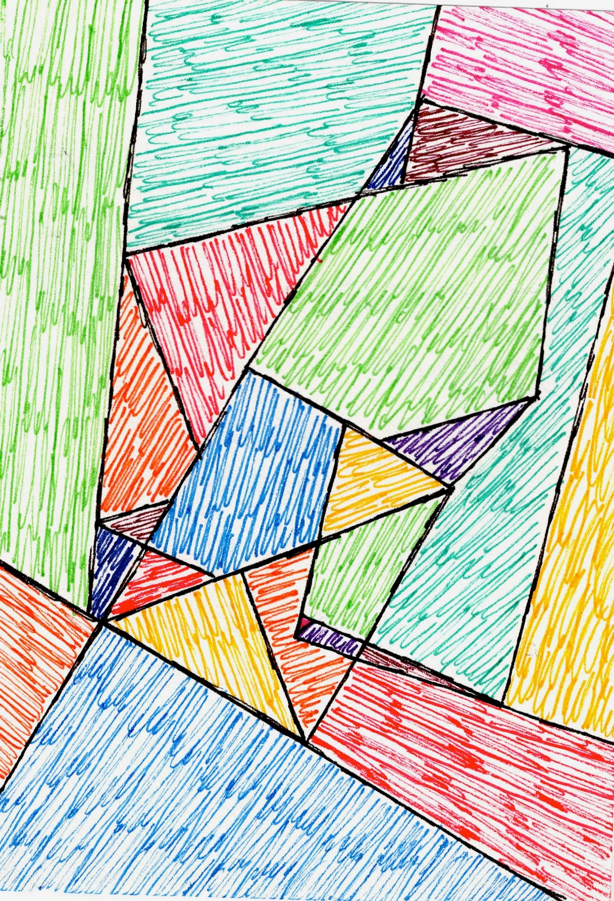
- The Essence of Cross-Hatching: Cross-hatching is your go-to for building solid form, dynamic texture, and creating a sense of raw energy or structured elegance, making it ideal for everything from architectural sketches to expressive figures.
Stippling: The Meditative Dance of Dots
Stippling is a wonderfully patient technique where you create tone using tiny dots. The closer together the dots, the darker the value. The further apart, the lighter. It's a meditative dance of tiny universes, each dot a whisper of darkness or light, ideal for conveying a grainy texture or a soft, misty feel.
- How I approach it: This one requires a certain zen. I find myself lost in the rhythm, building up areas bit by bit. It’s fantastic for conveying a grainy texture or a soft, misty feel, much like the subtle shifts in a fading memory. I've even found myself using stippling-like techniques digitally to create subtle atmospheric haze in abstract landscapes, where the individual marks dissolve into an overall impression of depth. I recall one particularly intricate stippling piece where my hand cramped, but the resulting texture was so rich, it felt like a tiny victory. It's a testament to patience, really.
- Tips from my sketchpad:
- Patience is paramount: Don't rush it. Stippling rewards slow, deliberate work, like watching paint dry, but in a good way.
- Vary dot size: While consistency is good, intentionally varying dot size can add organic texture and visual interest.
- Think about density: Focus on the space between the dots. Less space equals darker tone. It's all about perception.
- Practice Exercise: This helps you understand how cumulative small marks build significant tone and texture. Practice stippling on a textured object like an orange or a piece of rough fabric, paying attention to how varying dot density mimics its surface. Try to render a misty landscape or a starry night sky. Where might this patient, cumulative technique best capture the essence of a distant mist or the subtle texture of sandstone? How could this meditative approach inspire new textural elements in your own artwork?
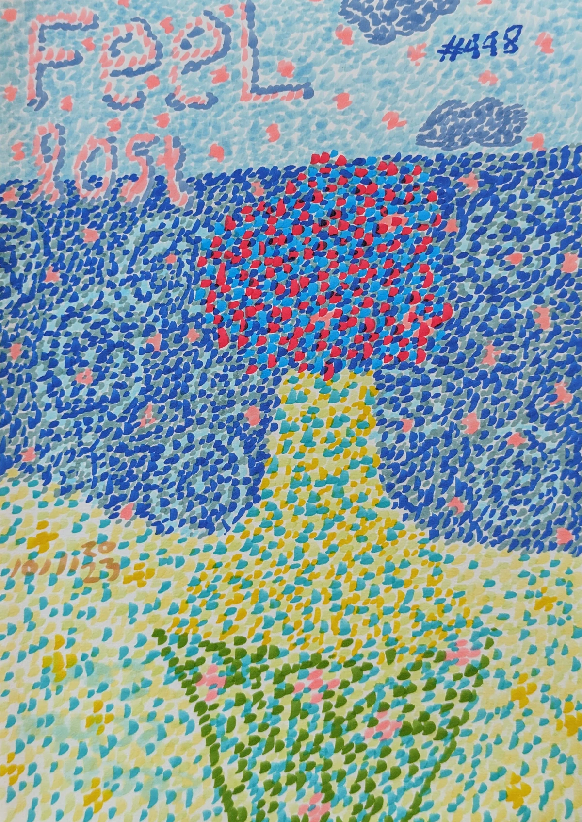
- The Essence of Stippling: Stippling excels at creating delicate textures, subtle gradients, and imparting a soft, ethereal quality to your work, perfect for rendering aging surfaces, light fog, or pointillist portraits.
Blending: The Art of Seamless Surrender
Blending is the art of seamless surrender, where one tone gently merges into the next, like a good conversation flowing effortlessly. It's about creating smooth, gradual transitions between values, giving surfaces a soft, continuous appearance. This technique is closely related to sfumato, an advanced Renaissance technique perfected by Leonardo da Vinci, where tones gradually merge into one another without definite outlines or borders, creating a soft, smoky, and almost imperceptible transition.
- How I approach it: I usually start with a light base layer of graphite, then use a blending stump (or even my finger, though that transfers oils) to smooth out the pencil marks. I build up layers, always working from light to dark. Be careful not to overwork an area; it’s surprisingly easy to accidentally muddy things if you push too hard too soon – a lesson I learned the hard way with many a smudged portrait that looked less like a person and more like a poorly rendered cloud. While my abstract works often embrace bold lines, the understanding of seamless transitions from blending subtly informs how I manage color gradients to create depth without harsh edges.
- Tips from my sketchpad:
- Light touch first: Always start lighter than you think you need and gradually build. You can always add more; taking it away is a pain.
- Tools matter: Blending stumps, tortillons, or even a soft tissue can give different effects. Experiment! A fluffy cotton ball for large, soft areas, a sharp tortillon for fine details.
- Layer, layer, layer: Smooth blends are built, not instantly achieved. Think of it like a beautiful sunset—many subtle shifts in color, not just a single wash.
- Practice Exercise: This exercise hones your ability to create fluid transitions and render smooth surfaces. Work on creating a seamless gradient from white to black on a strip of paper using only blending. Then, try to render a smooth, reflective surface like glass or polished metal, or a simple ceramic mug. Consider how you would vary your blending technique to capture its subtle gleam? For a truly advanced challenge, try to render a sphere or an egg, focusing on those almost imperceptible transitions that define sfumato.
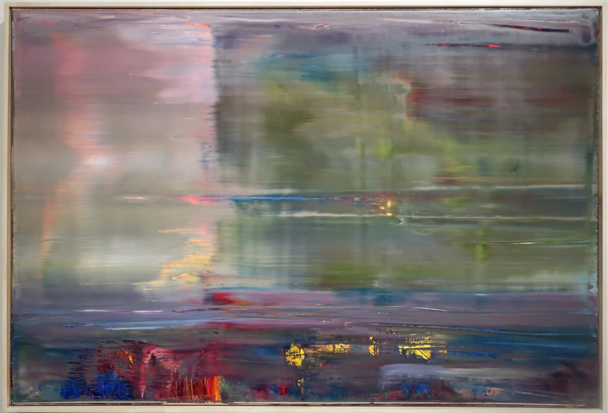
- The Essence of Blending: Blending is essential for rendering soft skin tones, reflective surfaces, and any object requiring a continuous, untextured appearance, creating a sense of realism and volume.
Scumbling: The Whispering Texture
Scumbling is a wonderful technique for adding texture and soft, atmospheric tone. Instead of distinct lines or dots, you use small, circular, overlapping motions with your pencil, often with a light touch. It’s like gently clouding an area with tone, allowing previous layers to show through and creating a diffused, irregular texture where the graphite catches on the paper's tooth. This technique excels at portraying soft, ethereal qualities. I find it especially effective for rendering soft fabrics, clouds, or the subtle variations in old plaster.
- How I approach it: I let my hand move freely in tiny, overlapping circles, building up layers very gradually. It's less about precision and more about building a suggestive, ethereal quality. It often feels like I'm trying to catch smoke on paper, capturing that fleeting, indistinct quality of atmosphere. This whispering texture, with its ability to create subtle, atmospheric depth, is a technique I often lean on in my abstract pieces to evoke a sense of diffuse light or ethereal landscapes. I even used it recently when trying to draw a particularly fluffy cloud, and the way the graphite caught on the paper's tooth perfectly mimicked its irregular, airy form.
- Tips from my sketchpad:
- Keep it light: Heavy pressure defeats the purpose of the airy, layered effect.
- Build slowly: Scumbling is all about cumulative effect. A little at a time creates magic.
- Experiment with tooth: Paper with a bit of texture (tooth) works beautifully with scumbling, allowing the graphite to catch on the peaks and leave the valleys lighter, enhancing the visual whisper.
- Practice Exercise: This exercise is perfect for developing a light touch and understanding how subtle texture can be created. Use scumbling to depict clouds in a sky or the soft folds of a delicate cloth, focusing on the cumulative effect of light, layered circles. A crumpled piece of paper is also excellent for practicing irregular textures with scumbling. How could this whispering texture bring to life the soft light of an overcast sky or the weathered surface of ancient stone? Consider how scumbling could create mysterious atmospheric effects in your own artwork?
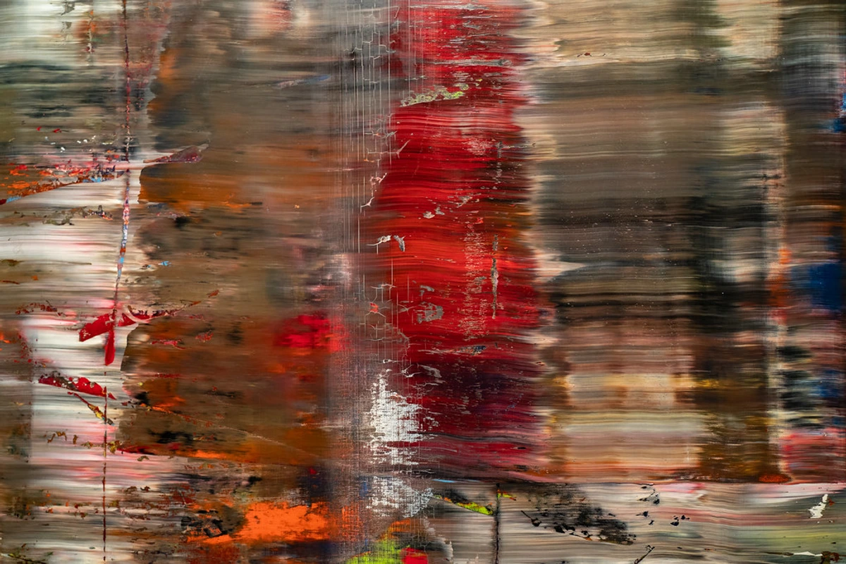
- The Essence of Scumbling: Scumbling is ideal for capturing atmospheric effects, soft textures, and subtle shifts in tone that require a delicate, non-linear approach, from misty landscapes to aged surfaces.
Chiaroscuro: The Grand Drama Queen
Chiaroscuro (Italian for "light-dark") is the grand drama queen of shading techniques, demanding attention and wielding shadows like a magician. It's characterized by strong contrasts between light and dark, usually affecting a whole composition, to create a profound sense of volume and dramatic effect. This dramatic technique reached its zenith during the Baroque period with masters like Caravaggio and Rembrandt, but its roots stretch back to the Renaissance with artists such as Leonardo da Vinci, Masaccio, and Ghirlandaio, who used it to add volume to figures in frescoes. Later, Vermeer masterfully used light to evoke intimacy and quiet contemplation, while artists like Georges de La Tour perfected a style known as Tenebrism, using extreme contrasts of light and dark to create a powerful, almost spiritual glow. Even in contemporary art, photographers like Gregory Crewdson employ dramatic, carefully constructed lighting to create an almost cinematic chiaroscuro effect, drawing viewers into surreal narratives and emphasizing psychological depth. Beyond just volume, chiaroscuro can evoke powerful emotions—mystery, grandeur, intimacy, or even stark fear—by manipulating what is revealed and what remains hidden in the dark, drawing the viewer into a carefully orchestrated narrative. It's not merely about darkness, but about the profound emotional weight and psychological depth that stark contrasts can carry. For me, it's the technique that truly makes a drawing breathe with intention, the deliberate choice to guide the viewer's eye and heart. I confess, it's easy to get lost in the drama, sometimes making shadows too dark, but learning to balance that intensity is part of the chiaroscuro journey, and a thrilling one at that.
- How I approach it: This technique isn't just about making things dark; it's about making the lights pop by surrounding them with profound shadows. It requires bold decision-making and a willingness to commit to the drama. I often imagine a single, theatrical spotlight on my subject, then ruthlessly decide what gets to stand in that light. It's about being assertive with your values, almost orchestrating a play of visibility and hidden depths. One time, I was working on a portrait where the eyes just weren't engaging. I pushed the shadows around the brow and beneath the chin, and suddenly, the eyes seemed to ignite with an inner light—a small, but powerful chiaroscuro moment. The psychological impact of what you choose to illuminate and what you hide in shadow is immense; it can evoke calmness, unease, or profound mystery.
- Tips from my sketchpad:
- Embrace the dark: Don't be afraid to go truly dark in your shadows. Often, beginners hold back, resulting in a lack of impact. Trust the process, and let those darks sing.
- Study the masters: Look at historical paintings that exemplify chiaroscuro to understand its power and psychological effect. It's like listening to an old blues record—you just feel its raw power and emotional resonance. Rembrandt's portraits, with their glowing faces emerging from deep shadow, are a masterclass in this.
- Focus on focal points: Use the dramatic lighting to draw the viewer's eye exactly where you want it, making your subject undeniably the star of the show.
- Practice Exercise: This exercise will push your understanding of extreme values and composition. Set up a simple still life with a single, strong light source (e.g., a lamp in a darkened room) and attempt to render it using only chiaroscuro, focusing on the stark contrasts and dramatic effect. What dramatic story could you tell by allowing some elements to recede into profound shadow, while others are bathed in stark light? How might you use such dramatic lighting to evoke a specific mood or narrative in your personal artistic projects?

- The Essence of Chiaroscuro: Chiaroscuro is reserved for creating high drama, intense psychological depth, and emphasizing specific elements within a composition through strong light-dark contrasts. This profound interplay of light and shadow, and the emotional weight it carries, profoundly influences the bold contrasts and focal points I create even in my non-representational art, drawing the eye through intense visual narratives.
Beyond Graphite & Traditional: Expanding Your Shading Palette
While graphite pencils are undeniably versatile and a fantastic starting point, don't shy away from experimenting with other media. Each tool has its own personality, influencing how you approach shading and how light and shadow manifest. Moreover, in our increasingly digital world, shading has found new frontiers. While the principles of light and shadow remain constant, the tools change, offering exciting new possibilities.
Medium-Specific Shading: The Personality of Your Tools
Each medium interacts with light and shadow uniquely, demanding a tailored approach. The texture, or 'tooth,' of your paper also plays a critical role: smoother papers allow for fine detail and smooth blends but can show graphite sheen, while toothier papers grab pigment, making rich darks and textured effects easier.
- Charcoal: Offers deep, velvety blacks and soft blends perfect for dramatic effects. It's fantastic for expressive, gestural work, but can be messy and has a matte finish that absorbs light rather than reflecting it. Its smudginess can be used for broad, soft shadows, or carefully controlled for dramatic edges, making it ideal for both bold strokes and subtle atmospheric effects.
- Conte Crayons: Provide rich, earthy tones and precise lines, feeling almost like drawing with compressed pigment, creating a different textural play of shadow. They're excellent for capturing robust forms and intense, opaque color, often producing a more granular, dense tone than charcoal.
- Pastels: Allow for vibrant, luminous layers and painterly blending, where light seems to shimmer through layers. Techniques like 'dusting' (applying pastel powder with a brush) or 'smudging' (blending with fingers or tortillons) create soft, atmospheric effects. Be mindful of their delicate nature and need for fixative, as their powdery texture means they don't 'bite' the paper quite as firmly.
- Colored Pencils: Require a different layering strategy to build values without becoming waxy, relying on optical mixing for their tonal shifts. Techniques like burnishing (applying heavy pressure with a light pencil to blend and flatten colors for a smooth, intense finish) or cross-hatching with multiple colors are key. When working with color, remember that color temperature also influences perceived value; cooler colors (blues, purples) often recede and appear darker in shadow, while warmer colors (yellows, oranges) tend to advance and appear brighter in light. A key practice here is value mapping, where artists mentally (or with digital tools) translate colors into a grayscale to understand their inherent lightness or darkness, ensuring accurate value relationships even in a full-color piece.
The real magic often happens when you let these different voices dance together, or when you lean into the unique qualities of one, understanding how each medium 'holds' or 'reflects' the light differently.
Digital Shading: The Pixel's Precision
Digital art programs offer an immense array of brushes, blend modes, and layering capabilities that can mimic traditional techniques while also providing unique advantages.
- Mimicking Traditional: Think of soft airbrushes for smooth blends (like traditional blending or sfumato), textured brushes for digital cross-hatching and scumbling, or the precise control of selection tools and layer masks to define sharp highlights and shadows (much like a carefully wielded eraser). Digital tools also allow you to simulate the tooth of paper for various effects, offering a surprising tactile experience even without a physical surface.
- Unique Advantages: A core benefit of digital shading is non-destructive editing, meaning you can make adjustments to values, colors, or effects on separate layers without permanently altering the original artwork. This allows for immense flexibility, easy experimentation with different light sources, and effortless correction of mistakes, making it a powerful, albeit different, beast. Blend modes like 'Multiply' can deepen shadows, 'Screen' or 'Color Dodge' can add luminous highlights, giving you granular control over light interaction and the ability to tweak intensity with a simple slider. It's like having an entire studio of lighting equipment at your fingertips.
It's about learning to translate your understanding of physical light into pixel values, often with a wider spectrum of possibilities. For me, digital tools offer a playground for rapid experimentation, allowing me to test dramatic lighting setups before committing to a canvas, often informing the light play in my large-scale abstract pieces. I've found it particularly liberating to experiment with different light sources and color palettes with a few clicks, saving hours of tedious re-drawing – a true game-changer for my creative process.
Rendering Textures: The Materiality of Light
Moreover, understanding the materiality of your subject—whether it's a shiny apple or a matte one, rough wood or polished metal—is paramount; each surface interacts with light uniquely, demanding a tailored approach to shading. Here’s how you might approach common textures:
- Metal: Highly reflective surfaces like polished metal require sharp, distinct highlights and often very dark, almost black, core shadows. The transitions are usually abrupt. Use precise blending for smooth reflections and subtle hatching or stippling for brushed or hammered finishes. Think about how the environment is reflected in the surface, as this will influence its values and perceived color. Chromium reflects everything, while brushed steel scatters light more broadly.
- Wood: Characterized by its grain. Use subtle hatching or scumbling to suggest the lines and imperfections of the grain, ensuring your strokes follow the wood's contours. Vary value within the grain to show depth and light interaction. Rough wood might use more distinct cross-hatching, while polished wood benefits from smoother blends and more defined highlights.
- Fabric: The way light interacts with fabric depends on its weave and drape. Smooth silks and satins will have soft blends and clear highlights on folds, similar to skin but often with sharper transitions where the fabric folds tightly. Rougher fabrics like denim or wool will benefit from cross-hatching or scumbling to mimic their texture, with shadows deepening in the creases and folds. Pay attention to how folds catch light and create complex shadows, and how the fabric’s inherent absorbency (or reflectivity) influences overall value.
- Skin: Demands subtle, smooth transitions. Blending is key for soft, even tones, but don't shy away from tiny stippled marks or very light scumbling to suggest pores, fine hairs, or specific skin textures in certain areas, especially for realism. Use reflected light to give skin a lifelike glow and avoid flat, muddy shadows. The subtle shifts in subsurface scattering also contribute to its luminous quality.
- Hair: Think about the overall mass and flow of hair, rather than individual strands. Use a combination of fine, directional lines for individual strands (especially at edges), scumbling for soft transitions within clumps, and careful blending to capture its volume and shine. Highlights on hair are usually long and flowing, following its form, but can also be broken and textured depending on the hair's curl or style.
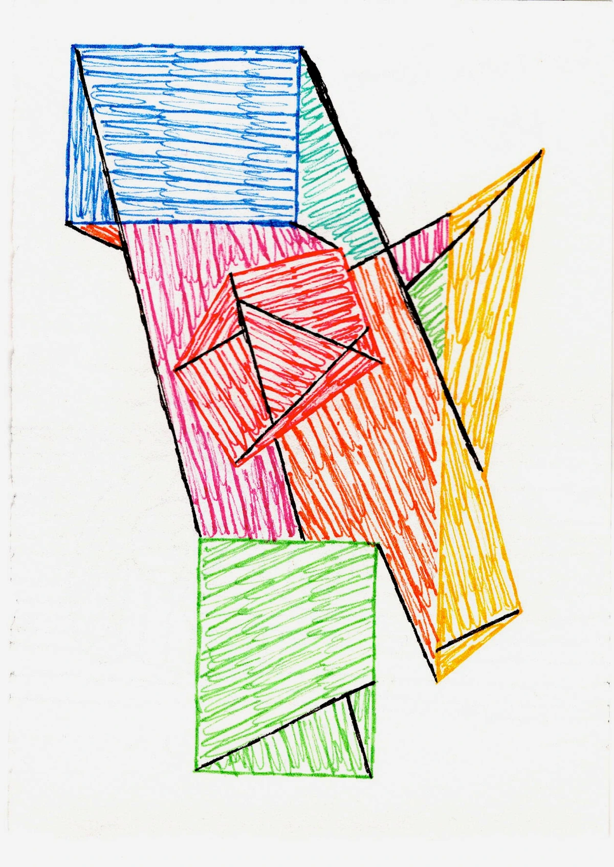
Experimentation is key here. Practice observing how light behaves on different surfaces in the real world; it's the ultimate guide.
Common Pitfalls and How to Avoid Them
Even with the right techniques, every artist encounters bumps on the road. Here are some common shading mistakes I've observed and experienced, along with ways to navigate them—believe me, I've made every single one of these at least twice:
- Inconsistent Light Source: One of the quickest ways to flatten a drawing is to have shadows falling in multiple directions. Solution: Mentally (or physically) establish a single, dominant light source and stick to it throughout your drawing. Ask yourself: "Where is the light coming from?" and ensure all highlights and shadows follow that logic. Try drawing a simple still life with a single lamp, consciously directing all shadows away from that source.
- Over-reliance on Outlines: Beginners often use heavy lines to define form, then try to fill in shadows. Solution: Think of shadows as defining the form rather than merely filling in an outline. Let your values and tonal shifts create the edges and curves of your object. Try an exercise where you draw an object using only shading, without any initial outlines.
- Neglecting Reflected Light: Shadows can look flat and lifeless without reflected light. Solution: Observe how light bounces off surrounding surfaces and subtly illuminates the shadow side of your object. Even the darkest shadows usually have a hint of light, preventing them from appearing as pure, dead black. Study a sphere or cylinder under a spotlight; notice the subtle glow on the shadow side where it meets the surface it's resting on.
- Lack of Value Range: Holding back on your darkest darks or brightest lights will result in a muted, undramatic drawing. Solution: Push your values. Use the full spectrum from the lightest possible tone to the darkest possible black to create maximum contrast and visual impact. To truly grasp extreme contrast, study the works of masters like Caravaggio or Rembrandt, and then try to replicate their dramatic light-dark relationships in a simple charcoal sketch.
- Over-blending: While blending creates smoothness, overworking an area can lead to a flat, muddy appearance and obliterate subtle textures. Solution: Use a lighter touch, work in gradual layers, and know when to stop. Sometimes, a hint of pencil texture adds more life than a perfectly smooth, but lifeless, blend. Practice stopping blending just as the desired smoothness is achieved, leaving some textural interest rather than striving for absolute uniformity.
- Over-rendering Texture: In an effort to show detail, artists can sometimes overwork texture, making surfaces appear busy or muddy, which can flatten the overall form instead of enhancing it. Solution: Focus on conveying the essence of texture rather than replicating every single detail. Suggest texture through varied marks and how light glances off surfaces, letting form and value take precedence; texture should enhance, not overwhelm. Instead of drawing every pore on an orange, suggest its rough surface with light stippling and careful highlight placement.
- Ignoring Paper's Texture: The choice of paper significantly impacts your shading, but sometimes we forget to work with its texture. Forcing smooth blends on highly textured paper or trying to achieve deep darks on very slick paper can lead to frustration and uneven results. Solution: Understand your paper's tooth. Use smoother papers for fine detail and very smooth blends, and toothier papers for rich darks and techniques like cross-hatching or scumbling that benefit from the paper grabbing pigment. Let the paper's qualities be an ally, not an obstacle. Try the same shading technique on two different papers (one smooth, one textured) to really feel the difference.
Beyond the Basics: Embracing Nuance and Practice
After navigating those common hurdles, you'll find that mastering shading isn't just about learning these techniques in isolation; it's about seeing them as tools in your creative arsenal. It's about observation, patience, and a willingness to fail spectacularly (and then try again). I remember one particularly stubborn portrait where I just couldn't get the light right. I shaded, erased, shaded again, until the paper was thin enough to read through. Eventually, I threw it across the room. But when I picked it up again the next day, a small, subtle shift in my approach, a lighter touch, made all the difference. Sometimes, the paper just needs a break, and so do you.
One of the biggest lessons I learned is that the principles of light and shadow apply everywhere, even in abstract art. For me, the connection between fundamental light principles and abstract expression became a fascinating internal dialogue, a constant whisper of depth and form. And intimately linked to light and shadow is negative space – the areas around and between your subjects. Learning to see and draw negative space is like learning to see the air that sculpts your forms; it's a powerful tool for defining edges, enhancing visual balance, and subtly suggesting volume through what isn't there, reinforcing how light and shadow interact with positive forms. Even when I'm working with vibrant, non-representational forms, the ghost of a light source, the suggestion of a shadow, the interplay of positive and negative space, much like how Mark Rothko's luminous color fields can evoke profound depth without depicting anything literal, still guides my hand, adding an intuitive depth that transcends literal representation. It’s a reminder that the universal laws of perception still inform even the most conceptual art. If you're curious about how these principles translate into non-representational art, you might find some interesting parallels in a guide to understanding abstract art styles.
Training Your Eye for Value: Daily Challenges
Beyond simply knowing the definitions, truly mastering shading means training your eye to see values accurately. It's a muscle that gets stronger with use. Try these daily challenges:
- Value Scales: Regularly create a grayscale value scale from pure white to pure black, aiming for evenly spaced steps. Then, try to match the values in your drawing to specific steps on your scale.
- Squinting: As mentioned, squinting helps simplify complex scenes into basic light and shadow shapes, making it easier to identify core values.
- Monochrome Studies: Work from photographs or life in black and white, or convert colored photos to grayscale. This forces you to focus solely on value relationships without the distraction of color.
- Observe Light in Your Daily Life: Pay attention to how light falls on everyday objects, how shadows behave at different times of day, and how reflected light subtly brightens dark areas. The world is your greatest teacher.
Remember, art isn't about perfectly replicating reality; it's about interpreting it through your unique lens. Don't get caught in the "perfection trap." Embrace the imperfections; they often hold the most character and tell the most compelling stories.
FAQ: Whispers from Fellow Travelers
As you embark on this journey, you might have some questions. Here are a few common ones I've encountered on this shaded path, some I've wrestled with myself:
Q: What's the best pencil for shading? A: There's no single "best." Graphite pencils come in a range from H (hard, lighter) to B (soft, darker). I usually start with a 2H or HB for initial sketching and lighter tones, and then move to 2B, 4B, or even 6B for darker shadows. It's like finding your favorite coffee mug; what feels perfect in your hand might be awkward for someone else. Experiment to find what feels right for you and your paper, and don't be afraid to mix and match!
Q: How do I avoid muddy-looking shading? A: Ah, the dreaded mud! I've been there, many times. This often happens from pressing too hard too soon, or by overworking an area with too many blending attempts. Try building up your layers gradually, using a lighter touch, and cleaning your blending tools regularly. Also, make sure your paper isn't too rough for the effect you want, which can pick up graphite unevenly. Sometimes less is truly more.
Q: Can I combine shading techniques? A: Absolutely, and please do! Combining techniques often leads to the most dynamic and interesting results. You might use blending for smooth skin tones, cross-hatching for fabric texture, and then hit it with some dramatic chiaroscuro for overall mood. Think of them as instruments in an orchestra—they sound great alone, but incredible together, creating a richer, more complex symphony of tones.
Q: How do these shading principles apply when working with color? A: Excellent question! When shading with color, you're still dealing with value (lightness/darkness), but now you also have hue (the color itself) and saturation (intensity of color) to consider. Generally, shadows aren't just darker versions of a color; they often lean towards cooler hues (blues, purples), while sunlit areas might appear warmer (yellows, oranges). This concept is known as color temperature. Reflected light can also introduce subtle shifts in hue. The key is to observe how colors change in light and shadow in the real world and experiment with adding desaturated versions or complementary colors in your shadow areas to prevent them from looking flat or muddy. It's about seeing value within color.
Q: How do I choose the right paper for shading? A: The texture, or "tooth," of your paper significantly impacts shading. Smoother papers (like Bristol board) are great for fine detail and very smooth blends but can be prone to showing graphite sheen and are less forgiving for corrections. Papers with more tooth (like drawing paper or watercolor paper) are excellent for holding graphite, creating rich darks, and excelling with techniques like cross-hatching and scumbling. They're also often more forgiving. Experiment with different types to see how they react with your chosen medium and technique; it's truly a game-changer.
Q: How do I choose a good subject for practicing shading? A: Start simple! Begin with basic geometric forms like spheres, cubes, and cylinders under a single, consistent light source—a sphere is fantastic for practicing smooth blending and understanding halftones, while a cube is perfect for stark value changes and mastering cast shadows. Once you're comfortable, move to simple everyday objects like fruit (excellent for blending!), a crumpled piece of paper (fantastic for scumbling practice!), a ceramic mug (great for capturing smooth reflections and form), or even a piece of draped fabric (a common and rewarding challenge for understanding folds and light). The goal is to focus on understanding how light interacts with form, not to perfectly replicate a complex scene. Gradually increase complexity as your confidence grows, perhaps even trying a self-portrait for a real challenge!
Q: How do shading principles apply to drawing different materials like metal, fabric, or skin? A: This is where observation truly shines! As discussed in the "Rendering Textures" section, each material has its unique way of interacting with light, dictating your technique choices. For metal, focus on sharp highlights and strong, often reflective, core shadows, using precise blending for polished surfaces and hatching or stippling for brushed or hammered finishes. Fabric requires understanding folds and wrinkles, using soft blends for smooth drapes and cross-hatching or scumbling for textured weaves like denim or wool. Skin demands subtle, smooth transitions, with blending being key, but don't shy away from tiny stippled marks or very light scumbling to suggest pores or texture in certain areas. For hair, think about its overall mass and flow, using a combination of fine lines for individual strands, scumbling for soft transitions within clumps, and careful blending to capture its volume and shine. Practice observing how light behaves on different surfaces in the real world; it's the ultimate guide.
Conclusion: Embrace the Shadows, Celebrate the Light
Shading, for me, stopped being a chore and became a form of meditation, a way to truly see the world, not just look at it. It's about understanding how light kisses a surface and how shadows embrace it, defining its very existence, transforming a flat surface into a universe of form and depth. It’s a skill that evolves with you, growing more nuanced and personal with every stroke, ultimately allowing you to communicate profound visual stories. So go forth, armed with your pencils and your newfound understanding, and make some beautiful shadows. Let them breathe life into your creations, tell your stories, and add that delicious, tangible depth that transforms a drawing from merely seen to truly felt. And remember, whether you're striving for realism or pushing the boundaries of abstraction, these principles are your steadfast guides. Embrace the journey, celebrate every stroke, and never stop exploring the magic of light and shadow.
If you're curious to see how my own artistic path has been shaped by these ongoing explorations of light and form, my artist journey timeline offers further insights into my creative evolution. Or, if you ever find yourself drawn to exploring art beyond the two-dimensional, you might even visit my Den Bosch museum, where you'll see firsthand how these very principles of light and shadow—the deliberate interplay of illuminated and obscured forms—play out not just in historical works, but in the contemporary pieces that have always captivated and inspired my own artistic journey, often in unexpected and profound ways, reminding us that every stroke, every shadow, holds a story. Happy drawing!


