Unlocking Harmony: My Personal Journey with the Golden Ratio in Art & Design
Join an artist's personal exploration of the Golden Ratio. Discover its profound presence in nature, art history, and psychology, and learn practical applications for creating harmonious compositions, from ancient wonders to modern abstract works. A guide for fellow creatives.
Unlocking Harmony: My Personal Journey with the Golden Ratio in Art & Design
Have you ever looked at a piece of art or a well-designed space and felt an inexplicable sense of calm, a feeling that everything just fits? It's like finding that perfect, comfortable silence in a noisy world, or seeing a perfectly aligned stack of books on a shelf – a tiny, satisfying sigh of recognition. For the longest time, I just thought it was magic, a natural talent some artists had and others didn't. But as I dove deeper into my own artistic practice, determined to understand the 'why' behind that feeling, I began to bump into a concept that felt less like magic and more like a gentle, universal whisper, an underlying rhythm to beauty: the Golden Ratio. This journey, much like my entire artist's timeline, has been one of constant discovery and evolving understanding.
It’s one of those things that, once you genuinely grasp it, you start seeing its echoes everywhere. And trust me, it’s not just for the ancient Greeks or the Renaissance masters. It’s a profound tool, a subtle guide, and sometimes, a delightful little secret that can elevate your compositions, whether you’re creating abstract pieces or designing a website. It offers a framework for creating designs that feel inherently balanced and pleasing to the eye, almost like a visual shorthand for "harmony," a silent language the universe seems to speak.
What Exactly is This Golden Ratio Thing? The Intuition Behind the Math
Let’s be honest, the word "ratio" can sound a bit intimidating, conjuring up flashbacks to high school math classes you probably tried to forget. I certainly did! My brain still instinctively shies away from equations, preferring the intuitive 'feel' of things. But strip away the complex formulas, and at its heart, the Golden Ratio is simply a specific proportion or relationship that appears repeatedly in nature and has been consciously (or subconsciously) applied in art and architecture for millennia. It's like discovering a secret handshake the universe uses to create beauty.
The Fibonacci Sequence: Phi's Accessible Cousin
Before we tackle the exact definition, let's meet the Fibonacci sequence, Phi's mathematical cousin. This sequence of numbers starts with 0 and 1, and each subsequent number is the sum of the two preceding ones: 0, 1, 1, 2, 3, 5, 8, 13, 21, 34, and so on. What's truly fascinating is that as you go further along the sequence, the ratio of any number to its preceding number approaches the Golden Ratio (e.g., 34/21 ≈ 1.619). This sequence, much like the Golden Ratio itself, appears abundantly in nature – from the branching of trees to the spirals of a pinecone. It feels less like cold numbers and more like a blueprint for natural growth and efficiency. This sequence, while fascinating on its own, holds a deeper secret: its ratios point us directly to the heart of our topic, the Golden Ratio itself.
Phi (φ): The Number Behind the Harmony
It's often represented by the Greek letter Phi (φ), and its approximate value is 1.618. What does this number mean in practical terms? Imagine dividing a line segment into two parts, A and B, where A is the longer segment. The Golden Ratio dictates that the total length of the line (A+B) divided by the longer segment (A) is equal to the longer segment (A) divided by the shorter segment (B). That is: (A+B)/A = A/B = φ. For example, if A is roughly 1.618 units and B is 1 unit, then (1.618+1)/1.618 ≈ 1.618, and 1.618/1 = 1.618. Confused yet? Don't worry, the visual is far more intuitive. Think of it this way: the larger part relates to the smaller part in the same way the whole relates to the larger part. It's a self-similar proportion that just feels right, a visual equilibrium where every part relates harmoniously to the whole.
For the mathematically inclined (and honestly, sometimes my inner geek just has to acknowledge it), Phi is the positive solution to the quadratic equation x² - x - 1 = 0. What's even more mind-boggling is that Phi is an irrational number, meaning its decimal representation goes on forever without repeating, much like Pi (π). This endless, non-repeating nature adds to its mystique and suggests a connection to the boundless complexity of the natural world. Don't worry if your eyes glaze over a bit; mine still do sometimes!
The Golden Rectangle and Spiral: Beauty in Proportion
This inherent mathematical beauty is most elegantly visualized through the Golden Rectangle. If you cut a square from one end of a Golden Rectangle, the remaining rectangle is also a Golden Rectangle. You can keep doing this infinitely, and if you draw an arc connecting the corners of these progressively smaller squares, you create the famous Golden Spiral. It’s this mesmerizing spiral we often see winding through seashells, galaxies, and even the unfurling of a fern. It's a pattern that whispers "growth" and "balance" simultaneously, a visually compelling manifestation of Phi.

https://images.zenmuseum.com/art/262/scan.jpeg, https://images.zenmuseum.com/art/262/scan.jpeg
Seeing this pattern emerge in nature made me realize it wasn't just some abstract mathematical concept; it was a fundamental element of visual appeal. It felt less like a rigid rule and more like uncovering the very grammar of beauty, or perhaps, the universe's preferred rhythm. It was a revelation, like realizing that the effortless grace of a dancer isn't just natural talent, but also years of understanding anatomy and movement. The Golden Ratio, for me, gives us a glimpse into the anatomy of visual harmony.
Why Does It Matter So Much in Art and Design? The Universal Language of Aesthetics
Why does this specific proportion resonate so deeply with us? For me, the Golden Ratio isn't about being prescriptive; it's about understanding why certain compositions resonate so deeply. It offers a framework for creating designs that feel inherently balanced and pleasing to the eye, almost like a familiar, comforting visual shorthand for "harmony," a subtle invitation to peace. It's like finding a melody that feels both new and ancient, instantly familiar to the soul.
Nature's Blueprint: The Prevalence of Phi
The Golden Ratio's pervasive presence in the natural world offers a compelling explanation for its aesthetic appeal. From the arrangement of leaves on a stem (known as phyllotaxis, where leaves spiral around a stem in a way that maximizes light exposure for each leaf – a highly efficient growth pattern) to the proportions of a hurricane, Phi appears repeatedly. This isn't just a coincidence; it reflects efficient growth, structural integrity, and optimal packing, often driven by mathematical principles of energy minimization. When we see this in art, we might be subconsciously recognizing a pattern that signifies natural order and efficiency. It’s as if nature herself is painting with this very brushstroke.
A Universal Aesthetic? The Psychology of Phi
There's a compelling theory that our brains are hardwired to find this proportion beautiful because of its prevalence in the natural world. When artists and designers incorporate it, they’re tapping into a deep-seated human preference for balance and order. Some psychological studies, while debated, suggest that humans consistently find objects and faces proportioned by the Golden Ratio more aesthetically pleasing. This isn't necessarily about rigid adherence, but about a subconscious appreciation for perceived order, predictability, and cognitive ease. Our brains are, perhaps, simply more comfortable processing visuals that reflect patterns they already know from the natural world. This quest for understanding what makes art 'work' also brings to mind the broader question of what constitutes design in art. It’s almost as if our visual system breathes a sigh of relief when encountering these proportions.
Creating Visual Balance and Flow
Using the Golden Ratio helps distribute elements within a composition in a way that feels organic and dynamic, rather than static or jarring. It guides the eye through the artwork by creating natural points of emphasis and visual rest, leading it naturally from one point of interest to the next. Think of it as choreographing a visual dance, ensuring every step feels purposeful and harmonious. This is where it becomes incredibly powerful for creating impactful abstract art where there's no obvious subject matter to guide the viewer, making structural harmony even more crucial. The Golden Ratio helps us speak that silent language of flow.
Examples Through the Ages (and How I See It Today)
History is littered with examples where the Golden Ratio is said to have been applied, though the degree of intentionality is often a fascinating point of debate. Sometimes, it's a close approximation that occurs naturally, a testament to the ratio's inherent aesthetic. Other times, it's clearly a conscious choice by the artist or architect. My brain still prefers the "aha!" moments to the "hmm, maybe?" ones, but the debates are part of the fun, aren't they?
It's important to note that the explicit understanding and widespread popularization of the Golden Ratio as a conscious design tool, particularly under the name "Golden Section" or "Divine Proportion," gained significant traction during the Renaissance and later in the 19th century. While ancient civilizations may have intuitively stumbled upon these aesthetically pleasing proportions, or their structures coincidentally aligned, the deliberate application as a mathematical principle in art became more formalized over time.
Ancient Wonders and Classical Proportions
From the pyramids of Giza (where some argue its proportions are evident, even if not explicitly planned with Phi, and this connection remains a subject of debate among scholars) to the Parthenon in ancient Greece, where its proportions are clearly evident in the facade and interior layout, the influence is undeniable. Consider the Great Pyramid of Giza, where some suggest the ratio of the apothem (slant height) to half the base perimeter approximates Phi. While debate continues, the visual resonance is striking – regardless of intent, these structures just feel right.
Renaissance Masters: The Human Form and Divine Proportions
During the Renaissance, artists like Leonardo Da Vinci and Michelangelo were deeply fascinated by human anatomy and natural proportions, often incorporating the Golden Ratio into their works. Think of the ideal human form in Da Vinci's iconic "Vitruvian Man," where many key proportions align with Phi. Or the arrangement of figures in "The Last Supper," where the overall composition and the placement of Christ are often analyzed through the lens of Golden Ratio principles. It wasn't just a trend; it was a deep dive into the underlying structure of beauty, connecting man to the divine through mathematics.
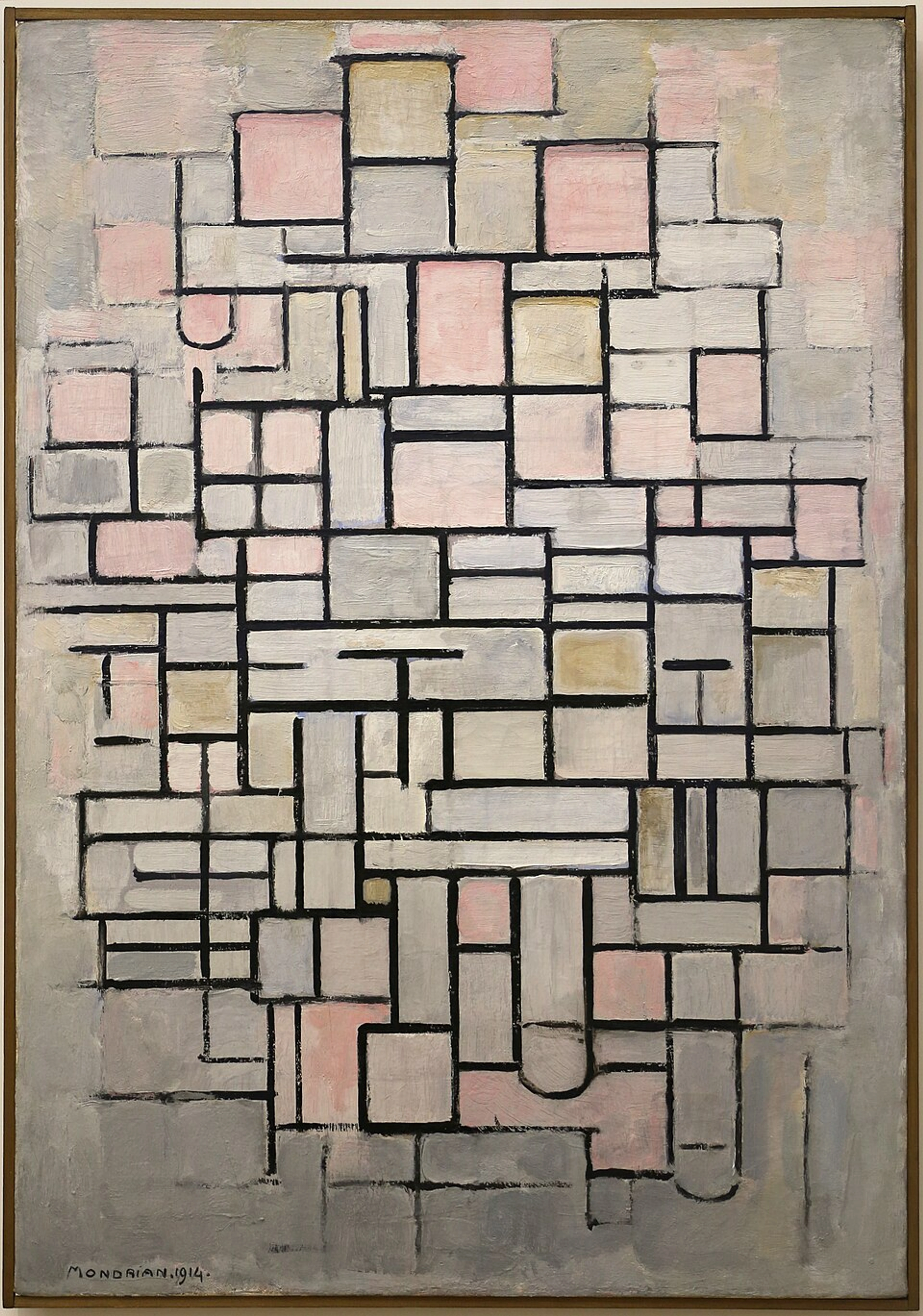
Modern Art and the Echoes of Harmony
Even in modern art, particularly in abstract works, you can find echoes of these principles. While Piet Mondrian might not have explicitly drawn Golden Ratio spirals, his rigorous quest for compositional balance and rhythmic arrangements often led to aesthetically pleasing proportions that align with these natural ratios. Imagine overlaying a Golden Spiral onto his "Composition No. IV"; you'd find the dominant rectangles and the intersection of primary lines often align with the spiral's natural progression, guiding the viewer's eye through his carefully constructed visual melody. It’s like these masters instinctively understood the universal rhythm, even without a compass and calculator.

https://commons.wikimedia.org/wiki/File:Piet_mondrian,_composizione_n._IV-composizione_n._6,_1914,_01.jpg, https://creativecommons.org/licenses/by/3.0
For me, as an artist creating contemporary abstract pieces, the Golden Ratio isn't a strict ruler I hold up to every canvas. Instead, it's a feeling, an intuitive guide that helps me understand why certain arrangements click and others don't. It's a way to refine my design in art choices without stifling spontaneity. It also subtly connects to other proportional systems, like the Fibonacci sequence or the broader concept of visual weight, all contributing to that elusive sense of 'rightness.' It felt like being handed a decoder ring for visual harmony, giving me the language to explain those gut feelings.
Applying the Golden Ratio to Your Work: A Practical Guide
So, how can you, a fellow creative spirit, bring this ancient wisdom into your modern practice? It’s less about rigid calculation and more about thoughtful, intuitive application. Here's a glimpse into my approach, along with some considerations:
Compositional Grids and the Golden Section
One of the most straightforward ways is to overlay a Golden Ratio grid or spiral onto your canvas (digital or physical) as a guide for placing focal points, dividing space, or arranging elements. Imagine dividing your composition not into arbitrary halves or thirds, but using the Golden Section to determine your key divisions. This can instantly elevate the perceived balance and harmony.
For instance, let's say I'm starting an abstract painting. Instead of just plopping elements down, I might first divide my canvas using the Golden Section. I'd draw a line at roughly 0.618 (1/φ) or 0.382 (1-1/φ) of the canvas width or height. These numbers represent the ratio of the smaller part to the whole (approximately 0.618) and the larger part to the whole (approximately 0.382), creating inherently balanced divisions. This creates a natural point of visual interest. Then, within that larger section, I might apply the rule again to place a prominent shape or a burst of color, allowing the spiral to dictate the flow of smaller details around it. It's a subtle push, not a rigid dictation, ensuring movement without chaos.
Proportions and Scale
Consider using the Golden Ratio for the relative sizes of elements within your piece. If you have two main elements, making their size difference approximate to 1:1.618 can create a pleasing visual hierarchy. This is something I often play with, especially when dealing with large color blocks or distinct shapes in my abstract pieces. It's about finding that sweet spot where elements feel related but not identical, creating movement without chaos.
My early attempts at composition were often a bit...random. I'd put a splash of color here, a line there, hoping for the best. Sometimes it worked, sometimes it didn't, and I rarely understood why. Learning about the Golden Ratio felt like being handed a decoder ring. It wasn't about stifling my spontaneous style, but about understanding the underlying currents that make a piece flow. It gave me a language to articulate the "why" behind the "what." It's a journey, like the entire artist's timeline of discovery, constantly evolving. And yes, sometimes I totally ignore it, just to see what happens – that's the beauty of art, right? We're all just experimenting!
Beyond Abstract: The Golden Ratio in Diverse Creative Fields
The beauty of the Golden Ratio is its versatility across various creative disciplines:
- Photography: Use the Golden Section grid to place your subject or key elements off-center, creating a more dynamic and engaging composition than a simple Rule of Thirds. Imagine framing a landscape with the horizon aligned to one of the Golden Section lines, or placing a portrait subject at a key intersection.
- Graphic Design: Apply it to layout design for posters, brochures, or even business cards. Determine ideal proportions for text blocks, image placements, and whitespace, creating a visually balanced and intuitive flow for the viewer.
- UI/UX Design: Use Golden Ratio proportions for elements like sidebar widths, content areas, or even typography sizes to create interfaces that feel inherently comfortable and easy to navigate for users.
- Architecture: Though debated in ancient contexts, modern architects often consciously use it to determine building proportions, room sizes, or window placements, aiming for aesthetic harmony and structural integrity.
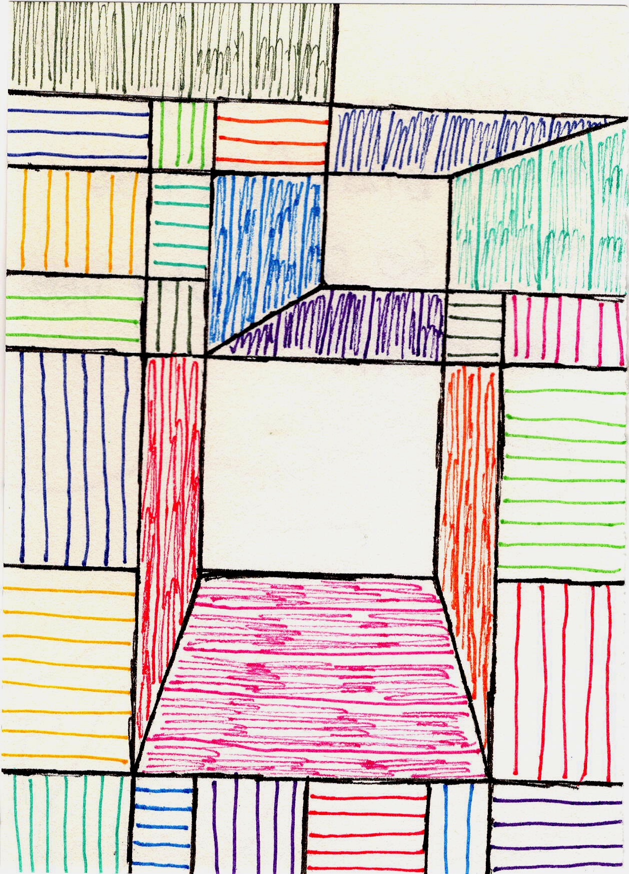
https://images.zenmuseum.com/art/161/scan.jpeg, https://images.zenmuseum.com/art/161/scan.jpeg
Harmonizing with Other Principles & Avoiding Pitfalls
While the Golden Ratio is a powerful tool, it’s not the only key to captivating compositions. Many artists blend it with other aesthetic principles. Think of the Rule of Odds, which suggests that an odd number of elements in a grouping is more visually appealing and natural. Or the Gestalt principles of visual perception (like proximity, similarity, closure), which describe how we group and interpret visual information. Even basic color theory plays a crucial role in creating balance and flow. The Golden Ratio often acts as a foundational rhythm, upon which these other principles can dance, creating layers of visual interest and harmony – a symphony of visual cues.
A common pitfall, though, is over-reliance or rigid application. Don't force it if it doesn't feel right; it's a guide, not a dictator. Another mistake is misapplication – trying to find it where it truly isn't, or simply using it as a justification after the fact (pareidolia). For example, imposing a Golden Spiral over an existing artwork and claiming intentionality without historical evidence, or distorting proportions in your own work purely to "fit" the ratio, can lead to forced, unnatural compositions. It's easy to see patterns everywhere once you're looking for them, so approach with a balance of enthusiasm and healthy skepticism. Use it as a starting point or a check, not as the sole arbiter of beauty. True mastery comes from knowing when to follow the rules, and more importantly, when to artfully break them.
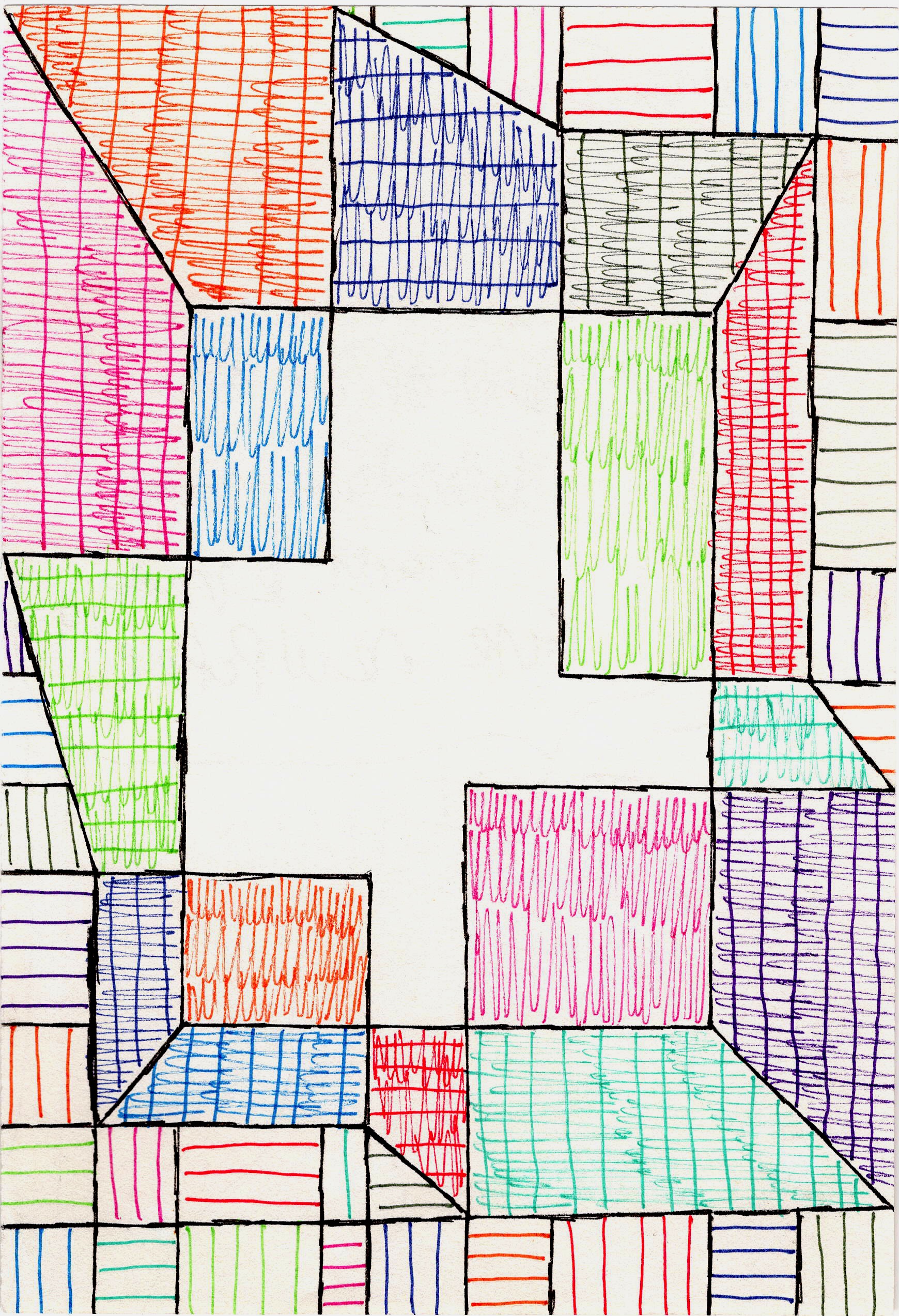
https://images.zenmuseum.com/art/182/scan.jpeg, https://images.zenmuseum.com/art/182/scan.jpeg
Is It a Strict Rule or a Guide? My Two Cents.
This is where the purists and the free spirits often diverge. Some argue the Golden Ratio is a sacred rule, the absolute path to beauty. Others dismiss it as an overused myth, or even a form of pareidolia (seeing patterns where none exist intentionally). I've heard debates fiercer than a critique night at art school. Sometimes I wonder if it's not just a comforting idea, a way for our pattern-seeking brains to impose order on the beautiful chaos of the world. Who really knows, right?
My personal take? It’s neither an unbreakable law nor a complete fiction. It’s a powerful, historically validated guide. Think of it like learning scales in music. You learn them to understand harmony and melody, but you don't play them exclusively in every performance. Or, consider learning the rules of perspective in drawing; you master them to create convincing depth, but then you might intentionally distort perspective for artistic impact. True artistry often comes from knowing the rules, understanding their effect, and then consciously deciding when to follow them and when to break them for impact.
For example, in one of my recent abstract pieces, I initially laid out the main compositional lines using a Golden Section grid. But as I started painting, a particularly vibrant color block felt too constrained by the 'perfect' division. I instinctively pushed it a little further, slightly off the grid, letting it bleed into another section. The result wasn't mathematically perfect, but it felt more dynamic, more alive. It broke the "rule" but created a new kind of tension and release that my intuition craved. That's the beauty of art, right? We're all just experimenting!
It’s about understanding the feeling it evokes. If you apply the Golden Ratio and your piece feels harmonious, great! If you try it and it feels stiff, perhaps your intuition is telling you to lean into another compositional approach. Art, after all, is deeply personal. What resonates with me, might not resonate with you, and that's perfectly okay. I mean, if everyone followed the same rules, wouldn't all art for sale look pretty much the same? And where's the fun in that? What if the secret to visual harmony has been whispering to us all along, waiting to be rediscovered in our own unique way?
Criticisms and Limitations of the Golden Ratio
While a compelling tool, it's important to acknowledge the limitations and criticisms often leveled against the Golden Ratio. Some argue that its widespread "discovery" in art and nature is often a result of confirmation bias – we look for it, so we find it, even in approximations. Others suggest that the human eye is naturally drawn to many different kinds of proportions, and reducing beauty to a single ratio can be overly simplistic, a form of over-interpretation. The artistic process is complex, blending conscious decision-making with intuition and serendipity. Relying too heavily on any single rule can stifle genuine creativity and lead to formulaic, rather than authentic, expression.
A classic example of pareidolia in this context might be when someone overlays a Golden Spiral onto any photograph, say, a plate of spaghetti, and then declares the composition beautiful because the pasta strands seem to follow the curve. While the spaghetti might be aesthetically pleasing, it's highly unlikely the chef intentionally arranged it using Phi! The true power lies not in blind adherence, but in an informed choice to use it as one tool among many in your creative toolkit.
Frequently Asked Questions
To address some common curiosities about the Golden Ratio in art:
Q: What's the difference between the Golden Ratio and the Rule of Thirds?
A: Both are compositional guides for dividing space. The Rule of Thirds divides a canvas into nine equal parts with two horizontal and two vertical lines, suggesting focal points at their intersections. It's simpler and more widely used. The Golden Ratio (specifically the Golden Section or Phi Grid) uses the 1:1.618 proportion for divisions, creating a more dynamic and, arguably, naturally pleasing asymmetry. While related in principle (dividing space for visual interest), they use different mathematical bases, with the Golden Ratio offering a more refined and organic approach rooted in natural proportions.
Q: Is the Golden Ratio only for traditional art?
A: Absolutely not! While its origins are in classical art and architecture, the principles of harmonious proportion are universal. Graphic designers use it for website design, photographers for framing, product designers for ergonomic aesthetics, and UI/UX designers for creating intuitive user interfaces. Even aspects of music composition have been analyzed through the lens of Golden Ratio. It’s particularly useful in abstract art where there's no inherent subject to guide composition, making structural harmony even more crucial.
Q: Do I have to use the Golden Ratio in my art?
A: No, you certainly don't! It's a tool, not a commandment. Many incredible artists create stunning works without ever considering Phi. The benefit of understanding it is that it adds another powerful technique to your compositional toolkit. It can help when you feel stuck or when a piece feels "off" but you can't pinpoint why. Ultimately, your artistic intuition and personal vision should always be your primary guide. It's just one of many fascinating aspects of understanding abstract art.
Q: What are some common pitfalls when trying to apply the Golden Ratio?
A: The main pitfalls include over-reliance or rigid application, forcing it when it doesn't feel natural. Another common mistake is misapplication or pareidolia – trying to find it where it truly isn't, or simply using it as a justification after the fact. For example, imposing a Golden Spiral over an existing artwork and claiming intentionality without historical evidence, or distorting proportions in your own work purely to "fit" the ratio, can lead to forced, unnatural compositions. Approach with a balance of enthusiasm and healthy skepticism; use it as a starting point or a check, not as the sole arbiter of beauty.
Q: How can I visually identify the Golden Ratio in existing art or nature?
A: Visually identifying the Golden Ratio often involves looking for the Golden Rectangle or the Golden Spiral. In nature, observe the spirals in a sunflower's seed head, the unfurling of a fern, or the shell of a nautilus. In art, you can mentally (or physically with an overlay) look for compositions where major divisions, focal points, or the overall proportions of elements align with the 1:1.618 ratio. Look for the "sweet spots" where the eye naturally rests or where the composition feels inherently balanced and dynamic. It's often more about a feeling of innate harmony than a precise measurement.
Conclusion: A Beautiful Anomaly, or the Secret Sauce?
So, is the Golden Ratio the mystical secret to all beauty? Perhaps not all beauty, but it certainly offers a profound insight into what makes many things visually appealing. For me, it’s a beautiful anomaly – a mathematical constant that resonates with our deepest aesthetic sensibilities. It's like a quiet hum that the universe plays, and our art can echo it.
Learning about it transformed my understanding of composition from a guessing game into a more informed, yet still intuitive, process. For instance, in my piece 'Rhythmic Geometry,' I consciously used the Golden Section to divide the canvas, allowing the main red and blue forms to align with those divisions, creating a sense of dynamic equilibrium that I couldn't achieve as reliably before. It's not about stifling creativity with rules, but about giving your creativity a stronger foundation, a deeper voice.
It's like realizing that the effortless grace of a dancer isn't just natural talent, but also years of understanding anatomy and movement. The Golden Ratio gives us a glimpse into the anatomy of visual harmony, and its whisper has been a constant companion on my artist's timeline. So go forth, explore, experiment, and perhaps, find your own perfect proportions. I invite you to actively seek out these patterns in the world around you and to integrate them, or playfully break them, in your own creative endeavors. And if you happen to be in the Netherlands, feel free to visit my museum in 's-Hertogenbosch to see firsthand how I play with these concepts in my own abstract work! Happy creating!


