Still Life Composition: My Journey from Apples to Abstract Expression
Discover how still life principles—focal points, balance, rhythm, negative space, light, and color—are the secret backbone of abstract art, explored through an artist's personal evolution.
Still Life Composition: My Journey from Apples to Abstract Expression
I know what you're thinking. Still life? Isn't that just... fruit bowls and flowers? And you're right, on the surface, it often is. For years, I'd scoffed at it, thinking it too traditional, too 'art school 101' – a phase I now look back on with a good-natured eye-roll. I even felt a bit too cool for school, if I'm being honest, convinced that true artistic freedom lay only in the wild, untamed territories of abstraction. I vividly recall one particularly dreary afternoon: I was staring at a dull, academic arrangement – a wilting rose, slumped in its vase like a defeated boxer, sat beside a dusty, forgotten book. It felt less like 'art' and more like a visual apology, a dusty corner of a forgotten room. I remember scoffing, "This is exactly why I hate still life. It's lifeless." But let me tell you, as an artist who often dives headfirst into the chaotic beauty of abstraction, the fundamental principles of still life composition are like the secret sauce, the silent backbone of everything I create. It’s where I first learned to truly see how elements on a canvas interact—a masterclass in visual language that transcends genre, teaching me to guide an eye, tell a story without words, and even make a mess feel intentional. This article is my love letter to those foundational principles, revealing how they secretly underpin every stroke, even in the wildest abstract explosions. So, let’s peel back the layers and see how these timeless lessons can deepen your vision too. In this article, we'll explore the magnetic pull of focal points, the dance of visual weight, the unseen paths of rhythm, and the profound power of negative space, all through the lens of my artist's journey from classic setups to pure expression.
Still life painting itself has a rich, often overlooked history, emerging prominently during the Dutch Golden Age where masters like Willem Kalf elevated humble kitchen scenes and Pieter Claesz meticulously rendered banquets, imbuing everyday objects with symbolism. Beyond mere aesthetic appeal or demonstration of skill, still life served as a critical laboratory for artists to master perspective, light, texture, and indeed, to communicate profound societal messages. These works, steeped in vanitas themes – subtle reminders of life's fleeting nature, perhaps a wilting flower or a skull signifying mortality – reflected a flourishing mercantile society grappling with newfound wealth and an ever-present awareness of mortality. Honestly, looking back, this concept of vanitas resonates so deeply with the ephemeral nature of inspiration in my own abstract work, where a fleeting moment of light or a splash of color captures a transient emotion. It was a profound exploration of the ordinary, made extraordinary through art. But the journey of still life didn't stop there. Artists also used still life to meticulously document the natural world, paving the way for scientific illustration and botanical studies, creating a visual record of species and anatomical details with breathtaking accuracy. This early observational rigor, for me, was the precursor to understanding the underlying forms I now deconstruct in abstraction. And then there's trompe-l'œil, a fascinating subgenre where artists create the illusion that depicted objects exist in three dimensions, masterfully tricking the viewer's eye. The genre continued its quiet revolution. Artists like Jean-Siméon Chardin brought humble, everyday objects to life with exquisite detail and psychological depth in the 18th century, emphasizing texture and subtle light, often imbuing simple domestic scenes with a quiet dignity. Across the Pyrenees, Francisco de Zurbarán imbued his stark, minimalist still lifes with a profound spiritual intensity, using austere arrangements of pots and fruit to evoke a monastic solemnity. Later, Paul Cézanne revolutionized still life, using it as a laboratory to explore form, color, and multiple perspectives, famously depicting apples and mountains as geometric forms. His radical approach of breaking objects into planes and exploring multiple viewpoints not only investigated optical experience but also the very structure of painting itself, directly laying groundwork for modern art movements like Cubism (where Pablo Picasso and Georges Braque famously deconstructed still life objects) and Fauvism by pushing beyond traditional representation and focusing on the underlying geometric forms of nature. Even Impressionists like Claude Monet, though famed for landscapes, often used still lifes of flowers, fruit, and everyday items to explore the fleeting effects of light and color, a precursor to the intense formal investigations of Post-Impressionists. The genre continued to evolve, influencing movements like Surrealism (think of Salvador Dalí's melting clocks) and Pop Art (Andy Warhol's Campbell's Soup Cans), and even influencing Photorealism and Hyperrealism in the 20th century, proving its adaptability and enduring relevance by meticulously recreating reality with stunning precision, sometimes even from photographs. Even today, its core lessons remain timeless, providing essential building blocks for any visual artist. While history shows us the 'what' and 'why' of still life, the true magic lies in the 'how' – the fundamental visual tools that artists have always employed, starting with the very essence of perception: light and color.
The Sensory Elements: Light and Color
Have you ever considered how much a single ray of light can change everything? While not elements of arrangement in the strictest sense – you can't physically move a ray of light like you can an apple – light and color play an utterly crucial role in how a composition is perceived and felt. They are the atmospheric shapers, instantly creating a focal point, dramatically influencing balance, establishing mood and atmosphere, and even evoking specific psychological responses. A strong light source can cast dramatic shadows, highlighting certain forms and pushing others into the background, creating instant depth and a sense of drama or calm. Consider how color temperature – the warm glow of a sunset or the cool light of an overcast day – subtly shifts the emotional landscape of your scene. Think of chiaroscuro, a technique perfected by Old Masters like Caravaggio, where strong contrasts between light and dark define form and create a powerful, almost theatrical drama. The interaction of light on textures, too, adds another crucial layer of visual information, creating perceived depth and differentiating surfaces – making a smooth apple feel distinct from a coarse cloth, or a shiny vase from a dull wall. In my abstract work, it's often the interplay of light and shadow on implied textures, or within layers of translucent paint, that defines form and emotion.
Light also gives us value, which is simply the lightness or darkness of a color. A strong contrast in value – putting a very light object next to a very dark one – creates immediate drama and draws the eye. This isn't just about color; it's about how much light or shadow an object holds, making it a powerful compositional tool on its own. For instance, a bright white sheet against a deep black background will pop, regardless of any hue.
Color, too, has incredible weight and emotional resonance. Warm colors tend to advance, cool colors recede. Vibrant hues demand attention, while muted tones offer calm. Beyond individual hues, the power of color relationships is crucial. Complementary colors (like red and green) placed together create vibrant energy and draw the eye because they are opposite on the color wheel and maximize simultaneous contrast, making each appear more intense. Analogous colors (like blues and greens), sharing common hues and existing side-by-side on the color wheel, foster a sense of harmony and calm. You can also explore monochromatic or limited palettes to create a unified, specific mood – perhaps a serene blue-grey study or an intense, fiery red composition. And don't forget saturation (intensity) and value (lightness/darkness) – a highly saturated, bright yellow can pop far more than a desaturated, dark blue, even if the blue is physically larger. Understanding these dynamics is like having a superpower, allowing you to not just arrange forms but to shape emotions. For instance, a predominantly blue composition might evoke serenity or melancholy, while one dominated by reds and oranges could feel energetic or aggressive. If you're curious about the deeper impact of color, check out my thoughts on the psychology of color in abstract art beyond basic hues. And for a peek into how I literally paint with illumination, you might enjoy reading about the language of light in abstract art. Light and color are the mood rings of your composition, changing everything, and often, they're the first tools I reach for to make that focal point sing. What colors are speaking to you today?

The Magnetic Pull: Crafting a Focal Point
Every great painting, still life or abstract, needs a magnet. Something that draws your eye in, makes it pause, and invites it to explore further. This magnet, your focal point, establishes a clear visual hierarchy, guiding the viewer's journey through the canvas and anchoring their emotional response. Why does hierarchy matter? Because it gives your composition a narrative, a starting point for the eye, and an emotional anchor. The elements with the most "visual weight" – perhaps a large, dark object, a vibrant color, a unique texture, or even an isolated element – naturally become candidates for the focal point. Sometimes, this is instinctively placed, but often, artists use techniques like the Rule of Thirds, mentally dividing their canvas into a 3x3 grid and placing key elements along these lines or at their intersections. This off-center placement creates a more dynamic and engaging composition than a centrally placed object, naturally drawing the eye because it prevents a static, 'passport photo' feel, making the image feel more active and engaging. Beyond the Rule of Thirds, artists also employ leading lines (lines that direct the eye), contrast (sharp differences in light, dark, or color), or even isolation (placing an object apart from others) to make that magnet even stronger. Think of these as powerful suggestions, not unbreakable laws – an artist's best friends in shaping perception. You might also encounter underlying principles like the Golden Ratio or the Fibonacci sequence, which, though often applied intuitively, create compositions that feel inherently harmonious and appealing to the eye because their proportional relationships mirror patterns found abundantly in nature (think nautilus shells or branching trees), resonating subconsciously with our visual perception. Interestingly, the viewer's own experiences, cultural background, and current emotional state can also subtly influence what elements they perceive as the primary focal point, adding another layer of depth to art appreciation. Of course, in some truly experimental abstract art, the absence of a single, clear focal point can itself be an intentional choice, inviting the eye to wander freely and explore an "all-over" composition, creating a sense of boundless energy or meditative calm. Sometimes, in a deliberate attempt to create dynamism, artists might even introduce visual tension by subtly disrupting these compositional guidelines, creating a captivating unease or energetic friction that still guides the eye effectively.
Now, in my abstract work, that 'magnet' might not be an apple. It might be a splash of vibrant red, a sharp line cutting through softness, or a particularly dense cluster of shapes, much like how Piet Mondrian's 'Tableau III: Composition in Oval' demonstrates visual hierarchy even in abstract forms. Without a strong focal point, the eye wanders aimlessly, and your masterpiece risks becoming merely a collection of elements rather than a cohesive visual story. My rule of thumb? If you can't identify one main thing your eye keeps returning to, you probably don't have a strong focal point yet. In essence, the focal point is your composition's handshake with the viewer, an invitation to stay awhile. And remember, light and color can be powerful tools to enhance this magnet's pull, drawing the eye with sharp contrasts or vibrant hues. What focal point grabs your attention most today?
The Dance of Weight: Achieving Balance
Once we've captured the viewer's attention with a strong focal point, the next crucial step is ensuring the entire piece feels stable and harmonious – that's where balance comes in. Balance isn't about perfectly symmetrical mirror images; that's often boring. While symmetrical balance (where elements are mirrored across a central axis) can create a sense of formality, calm, or monumentality, true artistic balance, especially asymmetrical balance or what I like to call 'dynamic equilibrium,' is about distributing visual weight so the composition feels stable and harmonious, even when the elements aren't identical. Think of it like balancing a small, intensely colorful gem on one side with a larger, more subdued stone on the other. It's not equal in size, but the visual 'weight' feels right. Visual weight isn't just about physical size or darkness; it's also profoundly influenced by color intensity (a small, vivid crimson can outweigh a large, muted grey), complexity (an intricate pattern demands more attention than a smooth surface), and even texture (a rough, impasto surface feels heavier than a smooth wash). For example, a single large, dark ceramic vase on the left of a still life might be beautifully balanced by a cluster of three smaller, brightly colored fruits and a delicate, flowing silk scarf on the right. This doesn't mean everything has to be perfectly calm, though; sometimes, an artist deliberately aims for visual tension – a controlled, intentional imbalance – to create dynamism, excitement, or even a sense of impending movement that pushes the viewer to engage more actively with the piece. Beyond just visual weight, the scale of individual objects and their proportion to each other and the overall canvas are also critical for achieving perceived balance and harmony.
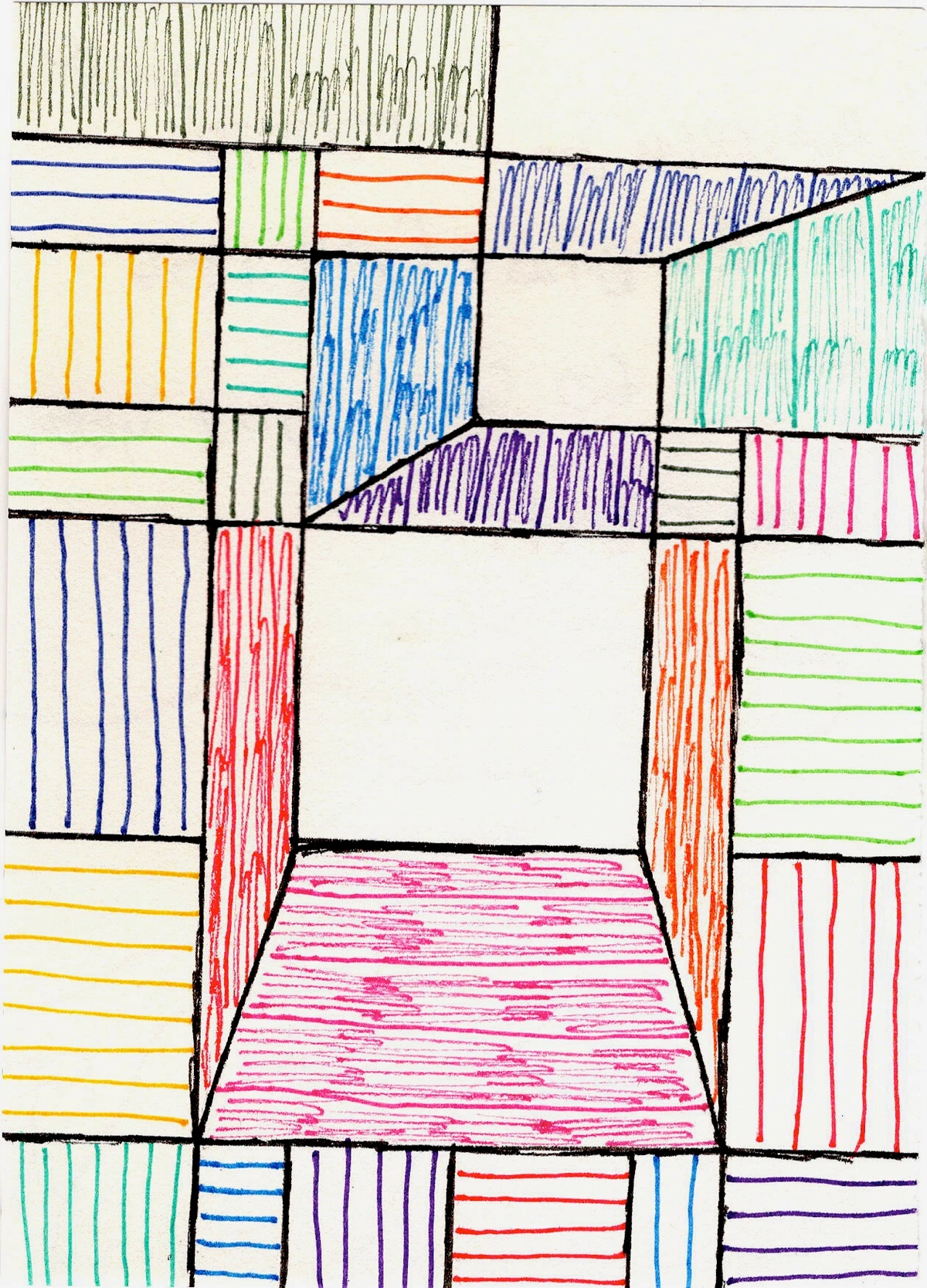
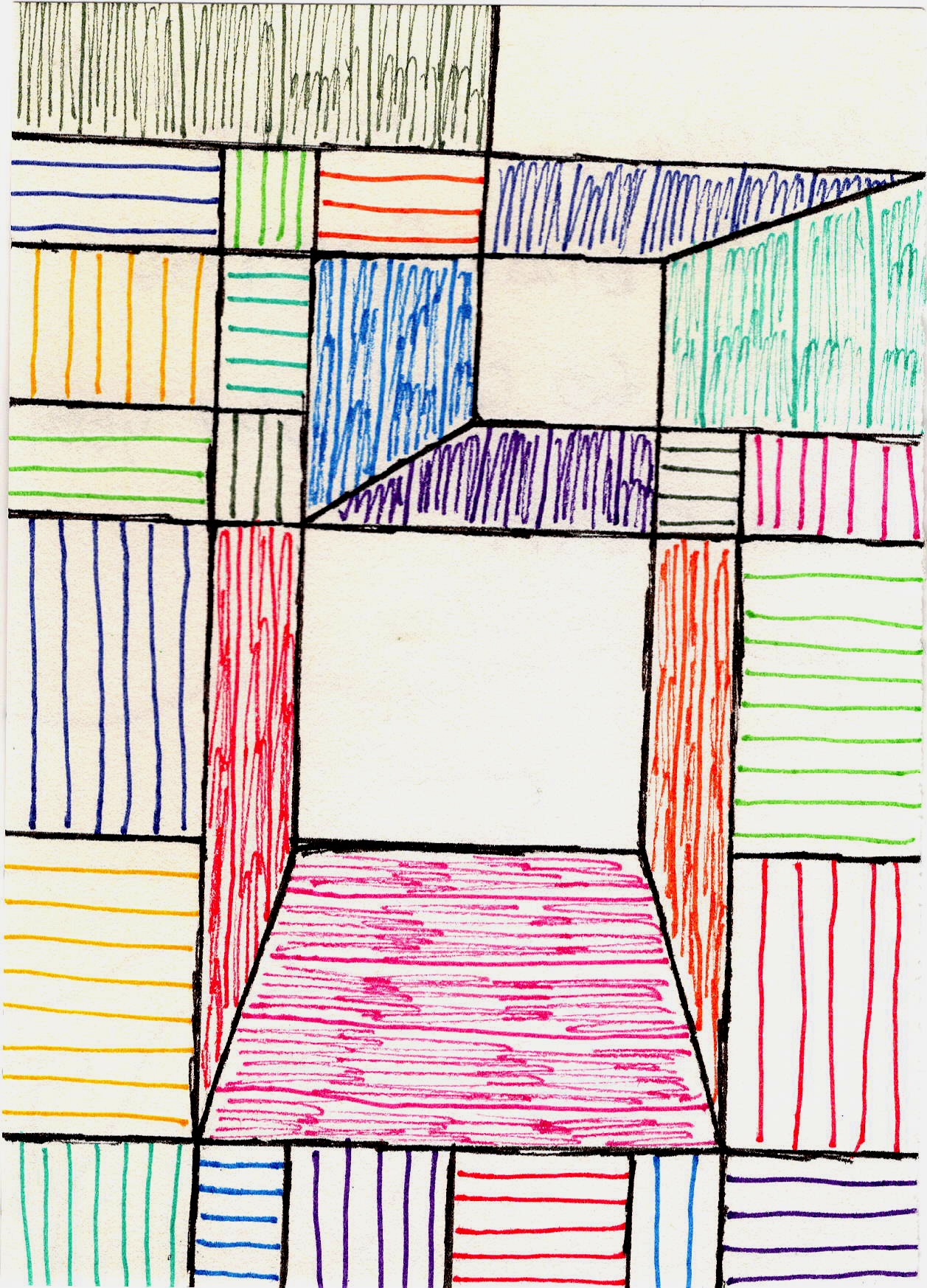
In still life, a large, dark object on one side might be beautifully balanced by several smaller, lighter objects on the other, or by a strong diagonal line. An abstract piece, like the one pictured above with its interplay of colorful geometric forms, demonstrates how visual weight can be perfectly distributed without rigid symmetry, fostering a feeling of stability and harmonious resolution, or sometimes, a captivating friction. I remember one abstract piece where I struggled for days with a heavy dark area on the bottom left. No matter what I did, it just felt lopsided. Adding a surprising bright yellow splash to the top right, even though much smaller, suddenly made the whole thing 'click.' It taught me that visual weight isn't just about size or darkness, but also intensity and perceived energy. And trust me, getting it 'right' often involves moving things around a dozen times until that little voice in your head says, 'Ah, there it is.' Ultimately, balance ensures your visual story doesn't tip over. Here again, light and color are your allies, with brighter, warmer colors often having more visual weight than darker, cooler ones. How do you know when your composition truly feels 'balanced'?
The Unseen Paths: Rhythm and Movement
With the composition feeling stable, we can now explore how the viewer's eye is guided through the artwork, creating a sense of flow and engagement. Ever notice how your eye travels through a good painting? That's rhythm and movement at play. Rhythm is about creating intentional visual pathways, using repeating shapes, lines, or colors to guide the viewer's gaze from one element to the next, usually towards your focal point and then around the rest of the composition. Movement is the actual journey your eye takes. While not always consciously applied, underlying mathematical principles like the Golden Ratio or the Fibonacci sequence often contribute to compositions that feel inherently harmonious and flow naturally. These ratios, found abundantly in nature (from branching trees to spiral shells to human proportions), create proportional relationships that resonate with our innate sense of order and organic growth, guiding the eye in a pleasing, predictable way. For instance, a series of increasingly smaller objects arranged diagonally, or a repeating curve, can create a palpable sense of movement, leading the eye on a gentle visual dance. Think of it like choreography for the eyes. In abstract art, implied lines – created by the edges of shapes, the direction of brushstrokes, or subtle color transitions – are just as powerful as explicit lines in dictating this visual dance. They lead the eye on an exciting, non-literal journey.

Robert Delaunay's 'Rhythm, Color' (above) demonstrates this beautifully in abstract form, using overlapping shapes and vibrant colors to create depth and guide the eye. This is something I constantly think about when I'm layering colors and forms in my abstract work – how do I invite the viewer to dance across the canvas? Rhythm makes your composition a journey, not just a destination. Where does your eye travel first when you look at a new piece of art?
Embracing the Void: The Power of Negative Space
As your eye dances across the canvas, guided by rhythm, it also encounters the quiet spaces in between – and this is where negative space truly shines. This one is a biggie, and it took me a while to truly grasp its importance. Negative space isn't just the 'empty' bits around your subjects; it's an active, powerful element of your composition. Think of it as the breathing room, the silence between the notes, making the main subjects sing. It defines and emphasizes your positive forms by creating their outlines and implied shapes, creates depth, and can significantly impact the overall balance and tension of a piece. Ignoring negative space is like ignoring the silence in music – it's crucial for impact, just as vital as the forms you're actually drawing or painting. In a still life, the space between fruits in a bowl, or the shape of the wall behind a vase, is your negative space, actively shaping the perception of the objects themselves. For instance, the curve of a mug handle against the background, or the space between two apples, isn't just empty; it forms its own active, implied shape that defines and enhances the objects around it. In abstract art, negative space doesn't merely recede; it can dynamically interact with positive forms, creating powerful implied shapes or guiding the eye through non-representational compositions, becoming a dynamic part of the composition rather than a mere backdrop. Imagine a bright, energetic shape, and the negative space around it defining its edges, pushing it forward, or pulling it back. Beyond defining forms, negative space can also be used as an emotional tool, creating a sense of emptiness, isolation, or even vastness, deepening the narrative of your piece. It also subtly influences the scale of positive forms, making them appear larger or smaller relative to the surrounding void, and actively contributes to the perceived depth of the composition. A great exercise to truly understand its power? Try drawing the negative space around a simple still life arrangement first, focusing on the shapes created by the gaps, before you even attempt to draw the objects themselves. It's truly eye-opening!
I’ve found that mastering negative space in still life drastically improved my ability to create dynamic abstract compositions. This understanding of 'breathing room' is something I constantly leverage in my abstract pieces to give my boldest forms the space they need to truly resonate. If you want to dive deeper, I've got a whole article on the role of negative space in abstract art, because it's truly transformative. How does negative space define the art you see every day?
Setting Up for Success (and Sanity)
Alright, practical stuff. How do I actually put these principles into action? For still life, it starts with observation and a bit of playful experimentation – often where the real magic (and sometimes the real frustration) happens. Here are some personal tips I've picked up, often the hard way:
- Gather & Edit: Don't just grab everything. Choose objects that have a relationship, a story, or interesting contrasts in texture, shape, or color. Less is often more. I used to put everything on the table, only to spend hours trying to make sense of the visual noise. Now, I curate. My biggest mistake early on? Thinking more objects equaled more interest. Often, it just equals a headache.
- Vary Heights and Depths: Avoid putting everything on the same plane. Stack books, use different sized boxes, drape fabric. Create visual interest by having things at different heights and varying distances from the viewer. This is key for creating depth and preventing a flat, boring arrangement.

- Light, Light, Light: Experiment with your light source. Natural window light is usually best, but a single lamp can create dramatic effects. Observe the shadows – they are just as important as the illuminated parts!
- Try Triangles & Odd Numbers: Psychologically, we find arrangements in odd numbers (3, 5, 7) more dynamic and interesting than the static symmetry of even numbers. Triangles are naturally stable and lead the eye. Try arranging your main elements in a triangular formation.
- Mind the Background & Foreground: Every inch of your scene counts. The background isn't just a passive backdrop; it's an active compositional element that defines, frames, and balances your main subjects, actively contributing to the composition's depth and overall harmony. Similarly, a thoughtfully chosen foreground element can add depth and draw the viewer in. Don't forget how elements interact with the edges of your canvas; sometimes a cropped object or a form leading off the edge can create incredible dynamism and a sense of a larger, unseen world.
- Consider Emotional Impact & Storytelling: Beyond just visual aesthetics, think deeply about the story you want to tell or the mood you want to evoke. Do these objects together convey tranquility, chaos, memory, celebration, or perhaps even defiance? For example, a stark, minimalist arrangement of old, rusted tools might evoke a sense of hard labor and forgotten utility, speaking to stoicism or the passage of time. Conversely, a vibrant, overflowing bowl of exotic fruits and fresh flowers could sing of abundance, ephemeral beauty, and joy. The emotional resonance of your chosen elements and their arrangement adds another powerful layer to your composition, turning a mere collection into a compelling narrative.
- Actively Compose with Negative Space: Don't just focus on the objects themselves. Look at the shapes the empty spaces create around and between them. How does the background interact? Does it frame your subject, or does it distract? Sometimes, simply shifting an object an inch can transform the negative space and strengthen your composition. You can even try using your fingers to frame a section of your setup, like a mini viewfinder, to isolate and analyze smaller compositions within the larger one.
- Match Composition to Canvas Scale: It’s vital to consider the scale and proportion of your objects not just to each other, but also to the actual size of the canvas you'll be working on. A monumental arrangement might feel cramped on a small canvas, while a minimalist setup could get lost on a huge one. Thinking about this relationship from the start helps ensure your entire piece feels right. I once tried to paint a vast, sprawling still life on a tiny canvas – let's just say it looked less like a grand banquet and more like a cluttered dollhouse! Learning that lesson the hard way saved me a lot of future frustration.

- Step Back (and Flip It!): Regularly step away from your setup, view it from a distance, or even take a photo and flip it horizontally. This tricks your brain into seeing the composition with fresh eyes, instantly revealing imbalances or areas that need adjustment. It's my secret weapon against visual fatigue.
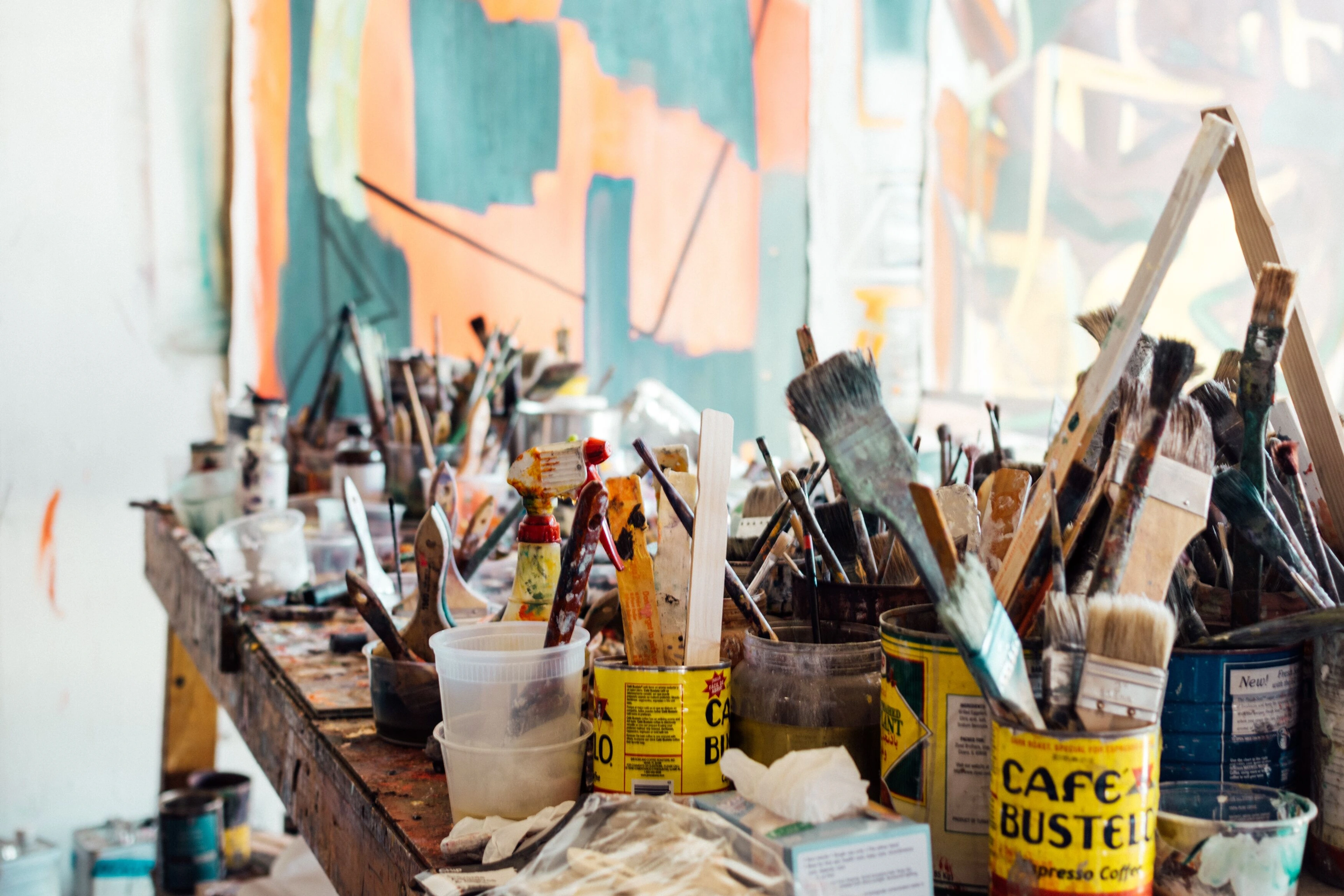
(Confession: My own studio often looks a lot like the one pictured here, proving that even with all these principles swirling in my head, the creative process is still beautifully, gloriously messy.) What's your favorite tip for composing a still life?
My Abstract Twist: From Still Life to Pure Expression
You might be wondering how all this 'old-school' still life stuff applies to the vibrant, often chaotic world of abstract art, the kind you see on my art for sale page. Well, for me, it's foundational. So how do these 'rules' – or rather, profound observations – translate to the wild, vibrant world of my abstract art?
For instance, the way a single strong light source illuminated my chipped ceramic mug, creating deep shadows and sharp highlights, taught me about defining form and creating drama with contrast. Now, in my abstract pieces, I might translate that specific lesson into bold, dark impasto strokes juxtaposed against a bright, luminous glaze – not representing an object, but feeling like a strong focal point. Or, the asymmetrical balance I learned from placing a heavy, dark vase against a cluster of lighter fruits in a still life translates in my abstract work to balancing a dense, textured block of vibrant color with a scattered arrangement of lighter, more delicate lines or translucent washes, ensuring visual stability without literal representation. Honestly, one of my biggest struggles in early abstract pieces was getting the rhythm right without explicit lines to follow. It took countless hours of pushing paint around, trying to feel that subtle flow, much like a musician finds the beat, but it eventually clicked, transforming my canvases from static arrangements to dynamic visual journeys. A specific example? I once arranged a still life with a strong diagonal implied by a series of fruit, leading the eye from the bottom left to the upper right. This simple arrangement of plums, grapes, and a half-eaten apple, subtly receding, became the initial spark for one of my earlier abstract works – a piece I called "Ascension" – where a sweeping, rising diagonal of increasingly vibrant blues and yellows, built from layered washes and energetic brushstrokes, recreated that exact sense of upward motion and visual progression, but entirely through abstract means. The rough, earthy texture of a wooden bowl in a still life, for instance, might translate into thick, gritty impasto paint or collage elements in an abstract piece, adding physical depth and tactile interest that guides the viewer's hand, not just their eye. It's about understanding how the scale of one element relates to another, and the overall proportion of shapes and colors. A tiny, intensely colored dot can hold its own against a sprawling wash of muted tones if its scale and placement are just right, just as a small, brightly chipped mug could define an entire still life. It's not about replicating reality, but about translating the essence of these compositional principles – the feeling of stability, the pull of attention, the flow of energy – into a language of pure form and color. It's about understanding why certain visual arrangements resonate with us on a fundamental level, then applying that wisdom to pure form and color. My entire artist's journey has been about this evolution, from realistic observations to emotive abstracts. It's as if still life taught me the rules, empowering me to confidently reinterpret them in my own unique way. So, the next time you approach a blank canvas, or even just arrange items on your desk, pause and consider these silent architects of vision. They are your allies, waiting to help you tell your story.
Frequently Asked Questions About Still Life Composition
Got questions? Good! That means you're really digging in. Here are some of the common ones I get, and a few I wish I'd asked myself sooner:
Q: Do I have to follow all these rules strictly?
A: Absolutely not! Think of them as guidelines, not laws. Art is about expression, and understanding the rules is what allows you to break them effectively, creating tension or unexpected harmony. My advice? Learn them, practice them, and then see how you can twist them to fit your own vision. Remember, sometimes the most powerful compositions are those that intentionally challenge expectations, a testament to the artist's unique intent.
Q: How can I find inspiration for still life objects?
A: Look around your home! Everyday objects make wonderful subjects. A crumpled piece of paper, a favorite coffee mug, old tools, plants, kitchen utensils – anything with interesting shape, texture, or personal meaning. Consider objects that tell a story about you or evoke specific memories or feelings. Natural elements like stones, leaves, or even a piece of driftwood are fantastic too, often bringing their own inherent narratives.
Q: What's the biggest mistake beginners make in still life composition?
A: Often, it's placing objects too evenly or symmetrically, or having too many objects that compete for attention. Beginners sometimes focus only on the objects themselves and neglect the spaces between them, or the background and foreground, which are all active compositional elements. Try to create variety in size, height, and spacing, and ensure there's one clear star of the show (your focal point!). And remember, giving your objects some breathing room can make all the difference!
Q: How do still life principles directly translate to abstract art?
Still Life Principle | Abstract Art Translation |
|---|---|
| Focal Point | Vibrant splash of color, dense cluster of shapes, strong contrast. |
| Balance | Balancing a bold, dense block of color with scattered, delicate lines or translucent washes. |
| Rhythm | Visual flow through implied lines, color gradients, or repeating patterns. |
| Negative Space | Active participant, creating implied shapes, dynamic interaction with positive forms. |
| Light & Color | Interplay of hues and values, dramatic contrasts, emotional resonance through saturation/temperature. |
| Line | Explicit marks, edges where colors meet, implied directions, foundational structure, conveying emotion. |
| Texture | Impasto, collage, layered brushwork creating physical depth, tactile interest, surface variation. |
It's about translating the intent and effect of these principles into a purely visual, emotional language.
Q: How does texture play a role in still life composition and abstract art?
A: In still life, texture adds tactile interest and visual weight, differentiating objects and creating contrast (e.g., the smooth skin of an apple versus the rough surface of a wooden bowl). It helps define forms and can even influence light and shadow, created through careful brushwork or the inherent qualities of materials. In abstract art, texture can be even more expressive, creating physical depth through techniques like impasto (thick paint application), collage, or by incorporating varied materials. It can also be implied through varying brushwork, layering, or suggestive lines. It guides the eye through surface variations, conveys emotion or energy without literal representation, and adds another sensory layer to your composition, enriching the viewer's experience.
Q: What is compositional unity and why does it matter?
A: Compositional unity is the overarching principle that ensures all individual elements within your artwork – focal point, balance, rhythm, light, color, negative space – work together harmoniously to create a cohesive, complete, and impactful whole. It's what makes a piece feel finished and intentional, guiding the viewer through a unified visual experience rather than a collection of disparate parts. Without unity, even strong individual elements can leave a composition feeling disjointed or unresolved. It’s the 'glue' that holds your visual story together, giving it purpose and profound impact.
Q: How does line function as a compositional element in both still life and abstract art?
A: In still life, lines are crucial for defining outlines of objects, creating contours, and establishing implied directions (like the line of sight from a viewer's eye to an object). They can guide the eye, suggest movement, or create stability. In abstract art, lines become even more expressive. They can be explicit (a drawn mark), implied (the edge where two colors meet), or suggested by a series of shapes. They generate rhythm, create tension, lead the eye, and form the foundational structure of a piece, often conveying emotion or energy directly without representing a physical object. It’s a powerful tool for visual storytelling in any genre.
Q: What's the difference between 'composition' and 'design' in art?
A: This is a great question, and sometimes the terms are used interchangeably, but there's a subtle distinction. Design refers to the overall plan and arrangement of all the visual elements (line, shape, color, texture, space, form) within an artwork. It's the blueprint. Composition, on the other hand, specifically refers to the arrangement of these elements within the frame of the artwork to create a unified and aesthetically pleasing whole. So, design is the broader term encompassing the elements and their arrangement, while composition focuses more specifically on how those elements are organized in a space to achieve a particular visual effect, guiding the viewer's eye and creating meaning. Think of design as the toolbox, and composition as the act of building something beautiful with those tools.
Final Thoughts: It's All About Seeing
Still life composition, at its heart, is about learning to see. Not just what's there, but how everything relates. It's about developing an artist's eye, whether you're arranging a bowl of fruit or throwing paint onto a canvas in a burst of intuition. It's a skill that transcends genre, a universal language spoken by all great art. Artists from Chardin to Cézanne, and even abstract pioneers like Picasso and Braque, mastered its nuances. They understood that a successful composition creates a sense of unity and harmony, where every element, from the dominant focal point to the subtle interplay of light and shadow, feels intentionally placed and contributes to the overall narrative or emotion. This underlying unity is what makes a piece truly resonate, giving it purpose beyond just aesthetics – it’s what allows a composition to feel complete, coherent, and profoundly impactful, rather than a mere collection of disconnected forms. Think of a classic Dutch Golden Age still life: the scattered crumbs, glinting glass, and carefully placed fruit all contribute to a single, rich narrative of abundance and fleeting time, a cohesive whole built from many individual elements. Similarly, in an abstract piece, a vibrant splash of color, a sharp diagonal line, and a serene area of negative space can come together to form an emotionally powerful, unified statement.
So, next time you're looking at a painting, any painting, take a moment. Can you feel the magnet pulling your eye? Is there a subtle dance happening across the surface? What story is the composition silently telling you? Understanding these principles, even if you choose to deliberately break them for expressive impact, empowers you to tell your visual story with clarity and conviction. It's a skill that transcends genre, a profound realization I've carried from those early fruit bowls directly into the most vibrant abstract explosions on my canvas. This journey of discovery never truly ends, and that, perhaps, is the most exciting part of being an artist – constantly learning to see anew. To see these principles in action, I invite you to explore my art for sale or visit a local gallery or even my museum in 's-Hertogenbosch – you might just see some pieces where the echoes of those early fruit bowls still subtly inform the most vibrant abstract explosions, creating a unique harmony you never knew you were looking for, and perhaps, inspiring you to see the world a little differently yourself.


