The Definitive Guide to Color Theory in Abstract Art: Principles, Psychology, and My Personal Application
Unlock the profound power of color in abstract art. Explore foundational principles, psychological impact, advanced optical effects, and my unique approach to application and breaking the rules, all through a personal lens.
The Definitive Guide to Color Theory in Abstract Art: Principles, Psychology, and My Personal Application
Honestly, when I first started painting, "color theory" felt a bit like trying to read a textbook written in an ancient language – intimidating, full of rigid rules, and, I'll admit, a little bit… dry. My journey into abstract art has always been about embracing intuition, letting the brush lead, and feeling my way through the canvas. But as I continued to explore, I realized that even the most intuitive expression benefits from a foundational understanding, a deeply personal grammar that allows emotions to be communicated with more nuance and clarity. That foundation, for me, eventually transformed from a rigid set of commands into a vibrant, flexible lexicon for emotion.
This isn't your average art school lecture – no dusty chalkboards or droning professors here. This is my exploration, my definitive guide to how I've come to understand and apply color theory in my own abstract work. And you, too, can decode its powerful language. It’s about finding profound freedom within structure, and sometimes, the sheer, rebellious joy in completely ignoring the very "rules" you've just learned. Perhaps it's a bit like learning to play jazz; you master the scales so you can improvise beautifully, or choose to deliberately play a wrong note for a powerful, unexpected effect. This guide will journey through the fundamental principles of color theory, delve into its profound psychological impact, and finally, share my deeply personal approach to applying and, sometimes, subverting these powerful ideas in my abstract practice.
Why Color Matters So Much in Abstract Art (and Life, Really)
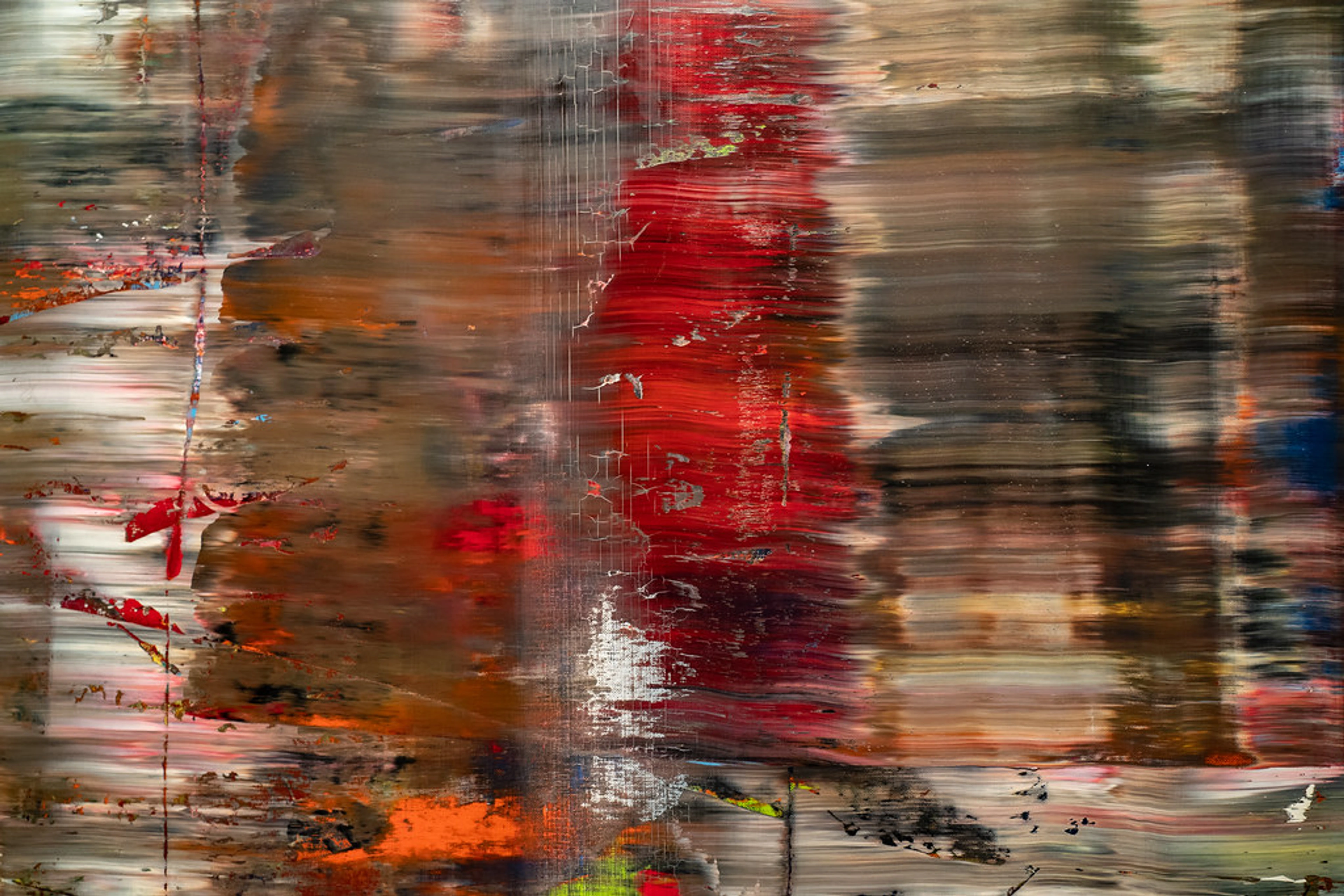
In abstract art, color isn't just an attribute; it's often the main event, the very heart of the narrative. There are no recognizable figures or landscapes to lean on, so the hues themselves carry the immense weight of expression, mood, and story. It's the silent protagonist, the emotional heartbeat. Historically, colors have carried deep symbolic and spiritual weight across cultures and throughout time – from the earthy ochres of ancient cave paintings that spoke of life and death, to the spiritual blues and gold leaf of medieval art symbolizing divinity, to Wassily Kandinsky's theories on the spiritual in art and the emotional resonance of pure color. Abstract art simply distills and amplifies this inherent power, making it the primary vehicle for connection.
Think about it: a grey, rainy day can make you feel quite different from a vibrant, sunny one. Our emotional landscape shifts subtly with the colors around us, and abstract art amplifies this inherent connection, making it undeniable. It’s like a secret language we all instinctively understand, a primal force that stirs something deep within us, often bypassing conscious thought. This primal connection is rooted in our physiology; our eyes perceive different wavelengths of light as distinct colors, triggering a cascade of neural responses that influence our emotions and even our physical state. I remember a morning in my studio, feeling particularly low, my canvas mirroring a muted despair, and then, spontaneously reaching for a vibrant cadmium yellow. The sheer act of applying it, seeing it burst forth, shifted something profound within me. It wasn't just paint; it was a defiant, audacious burst of joy against the grey, a small rebellion that changed the entire direction of the piece, and my mood.

Beyond raw emotion, the impact of color in abstract art is also profoundly influenced by its environment. The lighting – natural daylight versus warm artificial light – can dramatically alter how a color is perceived. Furthermore, the surrounding wall color or adjacent artworks can engage in a subtle, often surprising, dialogue with your piece, changing its perceived temperature, vibrancy, or even its perceived size. It's a living interaction, constantly shifting.
The ABCs of Color: My Take on the Fundamentals
But beyond its inherent emotional power, understanding the fundamental building blocks of color is essential for wielding it effectively, to compose visual symphonies or stir deep emotions. I used to think the color wheel was just for kids, a quaint relic from kindergarten. Turns out, it's a pretty handy compass for navigating the vast, often bewildering, ocean of color possibilities. Let's break down some of the basics, not as rigid laws etched in stone, but as incredibly useful tools in your ever-evolving creative toolkit.
1. The Mighty Color Wheel
You know the drill: primary colors (red, yellow, blue), secondary colors (orange, green, purple – made by mixing two primaries), and tertiary colors (like red-orange, blue-green, etc.). Simple enough on the surface, but understanding these fundamental relationships is utterly crucial. They are the building blocks, the fundamental notes in your chromatic symphony, from which all other harmonies and dissonances arise. When working with physical pigments, this system primarily describes subtractive color mixing, where combining colors absorbs more light, leading to darker hues, eventually resulting in a muddy black (or at least a very dark brown, if you're like me and struggle with true black). In contrast, it’s worth remembering that additive color mixing (how light mixes, like on screens or with spotlights) works quite differently, combining to create white light – a fascinating optical phenomenon that painters contend with in reverse.

2. Value, Saturation (Chroma), and Tones: The Nuances
Beyond just the pure hue itself, how bright or dull, dark or light a color is, profoundly impacts its message. It's like adjusting the volume, clarity, and weight of your visual instrument, adding layers of sophistication to your chromatic vocabulary. These elements allow you to sculpt visual space, creating focal points, guiding the eye through nuanced shifts, or conveying emotional depth even in the absence of traditional forms. I once worked on a piece that felt entirely flat, a jumble of pleasant but unimpactful hues. Only when I consciously pushed the value contrast, introducing a deep, inky shade alongside a luminous, airy tint, did the entire composition snap into focus, revealing a dynamic tension I hadn't foreseen.
- Value (Lightness/Darkness): This refers to how light or dark a color is. Adding white creates tints (lighter versions, often feeling airy or hopeful), and adding black creates shades (darker versions, which can feel profound, melancholic, or even ominous). Changing the value can shift a color's mood dramatically – a sky blue tint feels expansive and optimistic, while a deep midnight blue shade suggests mystery and contemplation.
- Saturation (Intensity/Purity or Chroma): How vibrant or dull a color is. A highly saturated red is like a blaring siren's call, demanding attention, while a desaturated, muted red is a hushed confession, an old photograph, or a faded memory. This property, sometimes referred to more technically as chroma, dictates the pureness and intensity of a color. In abstract art, playing with saturation allows for incredible subtlety, creating delicate whispers, or explosive impact, shouting from the canvas.
- Tones: These are created by adding grey to a pure hue, effectively muting its intensity and creating a more complex, often earthy quality. Tones can create sophisticated, understated palettes, perfect for works that aim for introspection, quiet contemplation, or a sense of vintage elegance rather than overt drama. They lend a certain weight and gravitas to a composition, making other colors feel more grounded or ethereal in contrast.

3. Color Harmonies: The Art of Getting Along (or Not)
This is where I find the most exciting possibilities emerge – understanding how colors interact and combine to create a unified (or intentionally fractured) visual experience. These relationships are the building blocks of any compelling palette. You can dive even deeper into these fascinating relationships, and the nuanced optical effects they produce, in my comprehensive guide to the definitive guide to understanding color harmonies in abstract art. Which color harmony are you most eager to explore further?


