Caran d'Ache Luminance Review: A Personal Take on the Best Colored Pencils
Dive into my in-depth, personal review of Caran d'Ache Luminance pencils. Are they worth the investment? I share my honest experiences, tips, and why these premium pencils stand out.
Caran d'Ache Luminance: My Unfiltered Love Letter (and Review) to These Pencils
There are moments in an artist's life when a tool doesn't just do a job; it transforms the entire creative journey. It whispers possibilities, dares you to push boundaries, and fundamentally changes how you see your own potential. For me, that moment arrived with Caran d'Ache Luminance colored pencils. This isn't just a review; it's a heartfelt confession of how these pencils utterly reshaped my understanding of color, texture, and the sheer joy of bringing visions to life on paper. You know, sometimes you just know when you've found something special, something that resonates with your creative soul. It’s a feeling that transcends mere utility, a quiet whisper that says, ‘This is it. This is what you’ve been searching for.’ And honestly, that feeling? It’s priceless, especially when it comes to the tools you pour your soul into. It’s not about the price tag alone, but the profound shift in your artistic capabilities, the quiet confidence that hums through your fingertips as you lay down each stroke. These aren't just art supplies; they're partners in a grand adventure, silent encouragers urging you to explore new artistic territories.
And because this is a deep dive, we're not just scratching the surface. We'll peel back the layers to explore the meticulous science behind their creamy consistency, the advanced techniques you can master with them, and crucially, how to make the most of your investment. We’ll even tackle common challenges and delve into the specific hues that have become my trusted companions. So, grab a coffee – or perhaps your favorite drawing pencil – and let's unravel the magic of Luminance together, ensuring your art not only looks stunning but lasts for generations. You see, for years, I'd been chasing that elusive feeling – the one where the tool disappears, and only the art remains. I'd tried countless brands, always searching for that perfect synergy, that unspoken agreement between my hand and the pigment. With Luminance, I found it. It was like finally learning to speak a language I'd always yearned to articulate, a language of light, shadow, and unadulterated emotion.
You know, there are some art supplies that feel like a guilty pleasure, and then there are others that feel like a grand, necessary investment. For me, Caran d'Ache Luminance colored pencils? They absolutely fall into the latter. I still remember the internal monologue, the endless scrolling through reviews, the nagging question: "Do I really need pencils that cost this much?" It was quite the battleground in my head, a testament to my frugal (or perhaps just hesitant) artist's soul. I mean, my wallet still quivers a little at the memory. But eventually, a whisper of artistic ambition, a nagging curiosity, and a deep-seated belief that the right tools can unlock new creative pathways won out. And honestly? I'm so incredibly glad they did. It felt like I was giving myself permission to be a serious artist, to stop making excuses, and to truly invest in my passion. This isn't just another review; it's a heartfelt confession of how these pencils utterly transformed my approach to color, to texture, and to the very joy of creating. I still remember the first piece I created with them – a portrait that finally captured the elusive glint in someone's eye, the subtle flush of their cheek. It was a revelation. For any artist grappling with their tool choices, it's always good to consider the general art supplies landscape, but sometimes, a big leap of faith leads to pure magic. This isn't just about what you create; it's about how you feel while creating it. And these pencils? They make me feel unstoppable, like I finally have the secret ingredient to turn my wildest artistic dreams into tangible realities.
The Unboxing Experience: A Little Bit of Sparkle
Before we dive into the nitty-gritty, let's talk about the initial encounter. You know, that moment when a new art supply arrives, promising a fresh chapter in your creative story? With Caran d'Ache, it's not just a package; it's an event. The meticulous packaging, the subtle weight of the tin—it's clear you're holding something special. It's almost a ceremonial unboxing, a prelude to the artistry that's about to unfold. It’s like the universe is saying, “Here, go make something beautiful.” The aroma alone, a faint, woody scent mingled with a hint of creamy wax, promised something rich and earthy. It was an invitation, a quiet ceremony before the vibrant explosion of color. I remember that distinct, almost nostalgic scent, the kind that transports you back to art class, but elevated. It’s more than just scent; it’s a tangible sense of anticipation, a promise whispered by the materials themselves that something extraordinary is about to unfold. You almost feel a nervous excitement, like a first date with a tool that you hope will become a lifelong companion. And then, there’s the subtle glint of the perfectly aligned lead within the wooden barrel, hinting at the precision and quality that awaits. The barrel itself, often crafted from sustainably sourced Californian cedar wood, feels balanced and comfortable, designed to become a natural extension of your hand. It's a small detail, but one that speaks volumes about the thoughtfulness put into every aspect of these instruments. You almost feel a nervous excitement, like a first date with a tool that you hope will become a lifelong companion.
The Unique Wax-Oil Binder: A Closer Look
The term "wax-oil binder" might sound technical, but it’s the secret sauce that gives Luminance pencils their incredible properties. Unlike purely wax-based pencils, which can sometimes feel draggy or prone to wax bloom with heavy layering, the addition of oil in the binder provides a silkier, more effortless glide. This isn't about making them behave like oil pencils; it's about achieving a perfect equilibrium where the pigment flow is smooth and consistent, allowing for optical color mixing and flawless transitions without muddiness. It's a carefully balanced formula that marries the best qualities of both worlds, ensuring both durability and a buttery application. This binder also plays a crucial role in the superior lightfastness, essentially encapsulating the pigments to protect them from UV degradation, ensuring your artwork remains as vibrant years from now as it is today. It’s truly a marvel of art material engineering. And when I say "meticulously balanced," I mean it. Caran d'Ache invests significant resources into refining these formulas, ensuring that each pencil delivers not just consistent color, but consistent performance. It's this dedication to the unseen details, the molecular structure of the binder, that translates into the buttery smooth application and phenomenal layering capabilities we artists crave. It's the kind of subtle innovation that makes all the difference, transforming a simple colored pencil into a sophisticated artistic instrument, capable of capturing the most fleeting emotions. Compared to purely oil-based pencils, Luminance retains that satisfying creaminess and vibrant opacity, while shedding the sometimes-gummy feel of lesser wax pencils. It’s truly a sweet spot in colored pencil technology.
Ergonomics and Physical Feel: A Silent Partner
Beyond the impressive internal science and brand legacy, the physical experience of holding and using a Luminance pencil deserves its own moment in the spotlight. Each pencil is designed with a comfortable, hexagonal barrel, which prevents them from rolling off your workspace (a small but mighty detail for any artist!). The weight feels balanced in the hand, neither too light nor too heavy, allowing for extended drawing sessions without hand fatigue. It’s this thoughtful design, coupled with the smooth glide of the wax-oil binder, that transforms the act of drawing from a mechanical task into an almost meditative flow. You quickly forget the tool itself and simply become absorbed in the process of bringing your vision to life. This isn't just about aesthetics; it's about practical comfort and seamless integration into your artistic practice. The cedar wood casing, often sourced from California, isn't just for looks; its subtle scent is part of the tactile experience, and its density contributes to the overall balance, becoming a natural extension of your hand rather than just a tool.
The Science Behind the Magic: Why Luminance Pencils Work So Well
You know that feeling when you just know something is well-made? With Luminance, it’s not just a feeling; there's some serious art science happening under the hood. It’s not simply a wax-based pencil; it's a meticulously engineered tool. The secret lies in their unique wax-oil binder, a proprietary blend that sets them apart. This isn't just any binder; it's a meticulously developed formulation of plant-based waxes and oils, granting them their characteristic creamy texture and incredible blendability. This innovative binder isn't just about smoothness; it's engineered for superior lightfastness and adhesion, ensuring your colors stay vibrant and resist fading. I've often wondered about the exact ratios, the alchemy behind it all, but the result is undeniably magic – a pencil that feels like a dream to use and stands the test of time. This dedication extends to their rigorous selection of pigments. Caran d'Ache sources only the purest, highest-quality pigments, often from mineral sources and rare earth pigments, which contributes to their vibrant intensity and, crucially, their exceptional lightfastness. This careful sourcing is not just about color; it's about consistency and longevity. Each batch undergoes stringent quality control checks, ensuring that every single pencil that leaves their Geneva workshops meets their exacting standards. It’s this unwavering commitment to both innovation and traditional craftsmanship that gives Luminance their almost mythical status among artists. They don't just pick any pigment; they hunt for the ones that sing, that vibrate with a life of their own, ensuring that what you put on paper is nothing short of brilliant. This meticulous process is what allows artists to layer and blend without fear of muddying, knowing each hue will hold its truth. Unlike some purely wax-based pencils that can feel sticky or prone to wax bloom (that frustrating waxy haze), Luminance manages to strike a perfect balance – soft enough to glide like butter, yet firm enough to hold a needle-fine point for intricate detail. This binder, combined with a very high concentration of pure, finely ground pigment, allows for effortless layering without muddying or oversaturating the paper's tooth. It's this precise formulation that truly sets them apart, making them not just a joy to use, but a consistent, reliable partner in your artistic endeavors, always ready to translate your vision onto paper.
The first time I held a set of Luminance pencils, it felt... different. Not just the reassuring weight of the tin, but the subtle sheen of each barrel, almost cool to the touch, and the perfectly centered core, promising precision. It’s like opening a fancy box of chocolates, but for an artist – a moment of pure indulgence before the serious work begins. You feel that little thrill, that sense of possibility, a silent invitation to create something truly beautiful, something truly you. I mean, my studio is usually a glorious mess – paint splatters on my jeans, brushes everywhere, and an assortment of half-used tubes. This was a moment of pristine calm before the creative storm, a sacred pause. It's almost ritualistic, isn't it? That first contact, unwrapping something new that promises to push your boundaries, to elevate your everyday practice into something more. I remember gently pulling out each pencil, feeling its individual weight and balance, admiring the perfectly uniform pigment core, a promise of consistent beauty. It felt like holding tiny wands of pure color, each one whispering possibilities and challenging me to see the world in richer hues. I remember picking out a vibrant scarlet, almost humming with energy, and a deep, contemplative indigo. Just holding them sparked a new narrative in my mind, a story waiting to be told through the dance of pigment on paper. I mean, my studio is usually a glorious mess – paint splatters on my jeans, brushes everywhere, and an assortment of half-used tubes. This was a moment of pristine calm before the creative storm, a sacred pause. It's almost ritualistic, isn't it? That first contact, unwrapping something new that promises to push your boundaries, to elevate your everyday practice into something more. I remember gently pulling out each pencil, feeling its individual weight and balance, admiring the perfectly uniform pigment core, a promise of consistent beauty. It felt like holding tiny wands of pure color, each one whispering possibilities and challenging me to see the world in richer hues. I remember picking out a vibrant scarlet, almost humming with energy, and a deep, contemplative indigo. Just holding them sparked a new narrative in my mind, a story waiting to be told through the dance of pigment on paper.
The Caran d'Ache Legacy: A History of Precision
Speaking of ritual, it's worth noting the heritage behind these tools. Caran d'Ache isn't just a name; it's a Swiss company with a rich history dating back to 1915, renowned for its commitment to quality and innovation in fine art materials. Their dedication to producing artist-grade supplies is palpable in every Luminance pencil. Knowing that you're working with a tool forged from over a century of expertise adds another layer to the experience, a quiet confidence that your materials are as serious about your art as you are. It’s a bit like driving a classic car – you feel the history in your hands, the legacy of craftsmanship informing every move. What's more, Caran d'Ache is also known for its commitment to ethical production and sustainability, using sustainably managed wood for their pencil casings. It's a small detail, but one that adds to the peace of mind, knowing your tools are not only excellent for your art but also kind to the planet. Beyond Luminance, Caran d'Ache boasts a rich lineage of iconic products, from their legendary Pablo and Supracolor pencils to their exquisite watercolor crayons and fountain pens. Each product line embodies the same Swiss precision and dedication to excellence, cementing their reputation as a powerhouse in the world of fine art and luxury writing instruments. It's this broader heritage of innovation that gives every Luminance pencil a sense of belonging to something much larger, a continuing story of artistic tools. From the iconic Fixpencil to their finely crafted pastels, their commitment to the artist's journey is evident in every single offering, making their brand synonymous with reliable, high-performing art supplies. It’s like being part of a secret society of quality, a knowing nod between artists who appreciate true craftsmanship.
Sustainability Efforts: Art with a Conscience
It's also worth noting Caran d'Ache's commitment to sustainability. Their use of sustainably managed wood for pencil casings isn't just a marketing ploy; it’s a genuine effort to minimize their environmental footprint. This ethical approach to production adds another layer of appreciation for their products. For me, knowing that the tools I cherish are also kind to the planet means I can create with a clear conscience, making the artistic process even more fulfilling. It's a small detail, but one that speaks volumes about a brand that truly values quality and responsibility across its entire operation.
Quality Control and Consistency: The Unsung Hero
For professional artists, or anyone working on a large series or commissioned piece, the consistency of these pigments, from one pencil to the next and from batch to batch, is another unsung hero. This predictability is invaluable. You know that if you run out of a particular shade, the replacement will perform exactly as expected, maintaining the integrity and harmony of your artwork without a hitch. It's a small detail that makes a monumental difference in practice. This dedication to pigment purity also means that the colors you see in the barrel are exactly what you'll get on the paper, without any unexpected shifts or muddiness. It's a level of reliability that, as an artist, brings immense peace of mind, allowing you to focus purely on your creative vision rather than battling your materials. This consistency is a cornerstone of professional art making, allowing for seamless integration of new materials into existing works without compromise. It’s like a silent agreement between you and your tools, a promise that they will always perform as expected.
My studio might often resemble a glorious explosion of color and chaos – paint splatters on my jeans, brushes everywhere, an assortment of half-used tubes. But amidst that beautiful mess, there's a sacred space for the tools that truly elevate my work. These pencils, they earned that spot.

The Core of the Matter: Pigment, Blending, and That Oh-So-Smooth Layering
Okay, enough about the aesthetics. Let's talk about what actually matters: how they perform. From the very first stroke, it was clear these weren't just any colored pencils. The pigment payoff is intense – rich, vibrant, and incredibly consistent. It’s like they picked up all the best bits from oil pastels and traditional pencils and merged them into one glorious tool. And that vibrancy isn't just superficial; it's deeply saturated, meaning you don't need to press hard to get brilliant color, which in turn means less wax buildup and smoother application. It’s almost a relief to experience such unadulterated color, especially if you're used to fighting with lesser pencils to get a decent hue. The consistency of these pigments, from one pencil to the next and from batch to batch, is another unsung hero. For professional artists, or anyone working on a large series or commissioned piece, this predictability is invaluable. You know that if you run out of a particular shade, the replacement will perform exactly as expected, maintaining the integrity and harmony of your artwork without a hitch. It's a small detail that makes a monumental difference in practice. This dedication to pigment purity also means that the colors you see in the barrel are exactly what you'll get on the paper, without any unexpected shifts or muddiness. It's a level of reliability that, as an artist, brings immense peace of mind, allowing you to focus purely on your creative vision rather than battling your materials. Compared to student-grade pencils, where pigment load can be inconsistent and colors often appear dull or chalky, Luminance offers a revelation: pure, unadulterated color that truly sings. This commitment to pigment purity means less filler and more vibrant, concentrated color with every stroke. It's like comparing a fresh-pressed juice to a watered-down cordial – the difference in intensity and flavor is immediate and undeniable. But beyond intensity, Luminance also offers a nuanced spectrum of opacity and transparency. Some pigments are naturally more opaque, providing excellent coverage, while others are wonderfully translucent, perfect for delicate glazes that allow underlying colors to subtly show through. This dual nature is a treasure for artists, enabling everything from bold, solid blocks of color to ethereal, shimmering layers that dance with light. Understanding the inherent transparency or opacity of each hue allows you to harness their full potential, creating optical mixes and atmospheric effects that are truly breathtaking. I often find myself playing with this balance, using opaque colors for impact and transparent ones to add a mysterious depth to my landscapes or abstract pieces. This mastery of opacity and transparency also means you can create incredible luminosity, allowing light to 'bounce' through layers, bringing a vibrant, almost ethereal glow to your work. It's not just about applying color; it's about sculpting with light and pigment.
Specific Pigment Characteristics: Beyond Just Color
What truly sets Luminance apart, and what I deeply appreciate, is how individual pigments behave. Some colors, like the rich blues or vibrant reds, inherently possess a higher opacity, giving you incredible coverage and punch from the very first stroke. These are my go-to's when I need a bold statement or a strong base layer. Others, particularly some of the more subtle greens or delicate purples, lean towards transparency, making them perfect for building luminous glazes that allow underlying colors to peek through. This isn’t a flaw; it's a feature. It means you can intentionally layer a transparent yellow over a blue to create a glowing green, or use an opaque earth tone to establish a strong form. Understanding these inherent qualities of each hue is like learning the secret language of your palette, allowing you to orchestrate complex visual harmonies and build truly dynamic compositions.
Pressure and Layering: Building Intensity – The Art of the Light Touch
One of the most transformative lessons I learned with Luminance was the power of controlled pressure. Unlike student-grade pencils where you might press hard to get immediate color, Luminance rewards patience and a light hand. Their highly pigmented, creamy cores mean you can achieve incredible intensity and depth with minimal pressure. This isn't about being timid; it's about being strategic.
Starting with very light layers, almost like a whisper of color, allows the pigment to gently adhere to the paper's tooth without saturating it too quickly. This preserves the 'grab' for subsequent layers, letting you build up vibrancy and depth gradually. Think of it like a sculptor slowly adding clay, rather than carving aggressively. This technique is crucial for preventing wax bloom, achieving seamless blends, and maximizing the number of layers you can apply. You’ll find that even the lightest touch yields a surprising amount of color, encouraging a more mindful and deliberate approach to your art. It truly feels like you're coaxing the color onto the paper, allowing it to blossom rather than forcing it. My personal rule of thumb is to start with the lightest pressure I can manage, barely touching the paper, and then gradually increase it over multiple passes. This allows the pigment to truly sink into the paper's fibers and bond, rather than sitting on top, which is often a culprit for frustrating wax bloom later on.
Advanced Blending and Layering Mastery: Unlocking Luminance's Full Potential
I often find myself wrestling with blending, especially when I want those seamless, almost atmospheric transitions that make a piece truly glow, where one color melts into the next without a visible line. With Luminance, it's almost effortless – a sigh of relief for my perfectionist tendencies. The wax-based core is uniquely formulated; it's soft enough to glide beautifully across the paper, almost like butter, yet surprisingly firm enough to hold a remarkably fine point, unlike some other softer wax pencils that crumble under pressure. This balance is key to both smooth blending and intricate detailing. I've layered six, seven, even eight colors without that waxy buildup or dreaded "bloom" you get with lesser pencils. It's a game-changer for someone like me who loves to explore texture and create depth. I remember working on a particularly challenging piece, trying to capture the shifting light of a sunset. Usually, I'd get frustrated with patchy areas, but with these, the colors just melted into each other. It was pure magic, honestly. The sheer control, the way I could coax out subtle variations in hue and value, it felt like I was finally speaking the language of color fluently. It’s not just about layering; it’s about merging colors, allowing them to sing together without any harsh transitions. I even found myself pushing the boundaries, experimenting with techniques I usually reserved for oil paints, just because these pencils felt so incredibly capable. I remember one piece where I wanted to depict the rough texture of old bark, and with Luminance, I could build up those subtle bumps and ridges through careful layering, creating a tactile illusion that felt almost real to the touch. Another time, for a silken fabric, the smooth, effortless blending allowed me to achieve a shimmering drape, each fold catching the light just so. This blendability also makes them perfect for exploring color harmonies directly on your paper, seeing how different hues interact and complement each other in real-time. It’s a sensory experience, a quiet conversation between my hand and the paper, and the pencils are the eloquent intermediaries.
Seamless Transitions and Color Mixing on Paper
Beyond just blending, Luminance pencils truly excel at on-paper color mixing. You don't always need to find the perfect shade in your set; often, you can create it by layering two or three distinct hues. Imagine laying down a soft yellow, then gently overlaying it with a transparent blue – the resulting green isn't just a mix, it has a luminous depth, a vibration that feels alive. Or consider a delicate blush of rose overlaid with a touch of sienna, creating a warm, living skin tone that breathes on the page. This isn't about guesswork; it's about intentional exploration, allowing you to fine-tune your palette directly on the artwork, discovering harmonious blends that truly resonate with your vision. This ability to create subtle, nuanced color transitions directly on your artwork is what makes them so powerful. It's about understanding how light layers interact, how a touch of a complementary color can mute a vibrant one, or how a warm glaze can transform a cool underpainting. It's an intuitive process, allowing you to coax out an infinite spectrum of shades that are truly unique to your piece. This approach to color isn't just technical; it's deeply emotional, allowing you to imbue your work with specific moods and narratives, much like how artists use color to convey meaning. For instance, combining a deep Ultramarine with a hint of Magenta can yield a rich, mysterious violet perfect for twilight skies, or layering a delicate Spring Green with a touch of Golden Yellow can create the vibrant, almost fluorescent glow of fresh spring foliage. It's in these subtle interactions that the true magic happens, as you build a living, breathing tapestry of color on your paper. And don’t even get me started on skin tones – the ability to mix nuanced blushes and shadows directly on the page, creating truly lifelike complexions, is a game-changer for portrait artists. It's almost effortless – a sigh of relief for my perfectionist tendencies. The wax-based core is uniquely formulated; it's soft enough to glide beautifully across the paper, almost like butter, yet surprisingly firm enough to hold a remarkably fine point, unlike some other softer wax pencils that crumble under pressure. This balance is key to both smooth blending and intricate detailing. I've layered six, seven, even eight colors without that waxy buildup or dreaded "bloom" you get with lesser pencils. It's a game-changer for someone like me who loves to explore texture and create depth. I remember working on a particularly challenging piece, trying to capture the shifting light of a sunset. Usually, I'd get frustrated with patchy areas, but with these, the colors just melted into each other. It was pure magic, honestly. The sheer control, the way I could coax out subtle variations in hue and value, it felt like I was finally speaking the language of color fluently. It’s not just about layering; it’s about merging colors, allowing them to sing together without any harsh transitions. I even found myself pushing the boundaries, experimenting with techniques I usually reserved for oil paints, just because these pencils felt so incredibly capable. This blendability also makes them perfect for exploring color harmonies directly on your paper, seeing how different hues interact and complement each other in real-time. With Luminance, it's almost effortless – a sigh of relief for my perfectionist tendencies. The wax-based core is uniquely formulated; it's soft enough to glide beautifully across the paper, almost like butter, yet surprisingly firm enough to hold a remarkably fine point, unlike some other softer wax pencils that crumble under pressure. This balance is key to both smooth blending and intricate detailing. I've layered six, seven, even eight colors without that waxy buildup or dreaded "bloom" you get with lesser pencils. It's a game-changer for someone like me who loves to explore texture and create depth. I remember working on a particularly challenging piece, trying to capture the shifting light of a sunset. Usually, I'd get frustrated with patchy areas, but with these, the colors just melted into each other. It was pure magic, honestly. The sheer control, the way I could coax out subtle variations in hue and value, it felt like I was finally speaking the language of color fluently. It’s not just about layering; it’s about merging colors, allowing them to sing together without any harsh transitions. I even found myself pushing the boundaries, experimenting with techniques I usually reserved for oil paints, just because these pencils felt so incredibly capable. This blendability also makes them perfect for exploring color harmonies directly on your paper, seeing how different hues interact and complement each other in real-time.
Applying Color Theory: Beyond Intuition
While intuition is a powerful force in art, understanding a bit of color theory can truly unlock the full potential of Luminance pencils. Think about complementary colors – placing a vibrant red next to a deep green doesn't just make them pop; with Luminance's blendability, you can create nuanced transition zones that sing with optical vibration. Or consider analogous colors, shades next to each other on the color wheel, for creating harmonious, serene compositions. Understanding warm and cool tones, and how they recede or advance on the paper, can dramatically impact the sense of depth in your work. I often refer back to how artists use color for inspiration, seeing how master painters leverage these principles, and then translate those ideas into the precise, layered world of colored pencils. It's like having a secret roadmap to emotional impact, allowing you to imbue your work with specific moods and narratives, much like how artists use color to convey meaning. It's not about rigid rules, but about informed choices that elevate your creative expression. Beyond just complementary, try exploring analogous color schemes with Luminance – hues next to each other on the color wheel – for serene, harmonious compositions. Imagine a gradient flowing from a soft yellow-green through a vibrant green to a deep blue-green, creating a lush, organic feel. Or perhaps a triadic harmony, utilizing three colors equally spaced on the color wheel, for bold, energetic pieces that truly pop. Monochromatic schemes, utilizing different values and intensities of a single hue, can also be breathtakingly powerful with Luminance, creating depth and mood with understated elegance. The beauty is that Luminance’s smooth blendability makes experimenting with these theories incredibly rewarding, allowing you to visualize and refine complex color relationships directly on your paper, transforming abstract concepts into tangible beauty. It's like having a secret roadmap to emotional impact, allowing you to imbue your work with specific moods and narratives, much like how artists use color to convey meaning. It's not about rigid rules, but about informed choices that elevate your creative expression.
Pushing the Pigment: Advanced Techniques with Luminance
Once you get a feel for the buttery richness of Luminance pencils, you'll likely, like me, start wanting to push their boundaries. They're not just for smooth layering; they're incredibly versatile for a range of advanced techniques that can add astounding depth and detail to your work.
Underpainting with Luminance: Laying the Foundation
You might typically think of underpainting with watercolors or acrylics, but Luminance pencils can be incredibly effective for laying down foundational tones. By using very light, transparent layers of a single color or a harmonious blend, you can establish the basic values and hues of your piece before committing to heavier layers. This is especially useful for creating a cohesive overall mood or for warming/cooling your subsequent layers. For instance, a light underpainting of a warm sepia can provide a rich, antique glow to a portrait, while a cool blue-grey can set a contemplative mood for a landscape. It's a fantastic way to save your more vibrant and opaque pigments for the top layers, while still building incredible depth from the ground up. This technique saves your more vibrant, opaque pigments for the final layers, allowing them to truly sing against a well-established tonal base.
Working with White and Black Luminance: Mastering Extremes
The white and black Luminance pencils are not just for filling in; they are powerful tools in their own right. The white, with its creamy opacity, isn't simply for highlights. It can be used to lighten existing colors, create subtle atmospheric effects, or even act as a blender, softening transitions and pushing pigments deeper into the paper's tooth. I often use it as a final, delicate glaze to unify colors or add a soft, luminous sheen. The black is equally versatile. Instead of being a flat, dead color, Luminance's black is rich and deep, perfect for creating intense shadows, powerful outlines, or adding dramatic contrast without muddiness. It can even be layered over other colors to deepen their hue without completely obscuring them. Mastering these two foundational colors with Luminance is a game-changer, allowing you to control the full spectrum of light and shadow with precision and impact.
Dry Layering for Subtle Texture
Sometimes, you don't want a glass-smooth finish; you want the tactile sensation of texture, the subtle grit of stone, the soft fuzz of a peach. Luminance pencils, despite their creaminess, are exceptional for building up dry, textured layers. By using light pressure and a cross-hatching or circular motion, you can gradually build up pigment, leaving the paper's tooth partially exposed, creating a soft, almost painterly texture that catches the light. This is fantastic for rendering natural elements like bark, rough fabric, or animal fur, where a bit of visible texture adds incredible realism and depth. It’s about coaxing the material to show its natural grain, rather than hiding it. I've used this to create the delicate bloom on a plum, or the rough, weathered surface of an old wooden door in a still life, and the effect is always surprisingly effective, adding a subtle narrative to the visual. It’s a patient technique, but the rewards are in the nuanced, almost tangible surfaces you can create, truly pushing the boundaries of what a colored pencil can achieve in terms of realism and depth. Think of depicting the subtle texture of tweed fabric, the grainy surface of a worn stone wall, or the soft fuzz of a ripe peach – dry layering allows you to build these tactile illusions with surprising conviction, inviting the viewer to not just see, but almost feel the artwork. Think of depicting the subtle texture of tweed fabric, the grainy surface of a worn stone wall, or the soft fuzz of a ripe peach – dry layering allows you to build these tactile illusions with surprising conviction, inviting the viewer to not just see, but almost feel the artwork.
Burnishing: The Glass-Smooth Finish
Burnishing, for the uninitiated, is when you apply a strong, heavy pressure with a light-colored pencil (often a colorless blender, or even white) over existing layers of color. It compresses the pigment, fills in the tooth of the paper, and creates a beautifully smooth, almost polished surface. With Luminance, this technique is a dream. Their soft, wax-based core means they respond incredibly well to burnishing, creating a vibrant, almost enamel-like finish that can make certain areas of your artwork pop with intensity. I've used it to make water look impossibly reflective, with light dancing on the surface, or to give a fruit a luscious, waxy, almost tactile sheen that makes you want to reach out and touch it. It’s also fantastic for creating a polished, almost photographic finish on certain elements in a composition, really making them pop against softer backgrounds. It’s like putting a protective, glowing seal on your colors. To achieve this, you'll often use a colorless blender pencil (like the Caran d'Ache Full Blender Bright), or a very light-colored pencil like white or cream, applying firm, even pressure. Some artists even use a smooth, hard object like a bone folder or the back of a spoon for an even more intense burnish, especially on larger areas. The magic happens as the layers compact, pushing the pigment deep into the paper's fibers and creating that exquisite, luminous depth, making your work almost glow from within. This technique can transform areas, making them appear almost wet, like the glossy surface of a cherry, or the reflective sheen on polished metal. Beyond the colorless blender, a very light, almost white, pastel pencil can sometimes be used for burnishing with a different textural effect, or even a smooth, hard object like a ceramic burnishing tool or a highly polished agate stone for an incredibly intense, almost enamel-like finish. The key is to apply even, firm pressure, allowing the wax to fully integrate and create that breathtaking, glass-smooth surface that glows from within. This technique can transform areas, making them appear almost wet, like the glossy surface of a cherry, or the reflective sheen on polished metal. Some artists even use a bone folder or the back of a spoon for an even more intense burnish, especially on larger areas. Beyond the colorless blender, a very light, almost white, pastel pencil can sometimes be used for burnishing with a different textural effect, or even a smooth, hard object like a ceramic burnishing tool or a highly polished agate stone for an incredibly intense, almost enamel-like finish. The key is to apply even, firm pressure, allowing the wax to fully integrate and create that breathtaking, glass-smooth surface that glows from within.
Solvent Blending: The Watercolor Effect
Now, this might sound a bit intimidating, but trust me, it’s exhilarating. Solvent blending involves using a small amount of an odorless mineral spirit (like Gamsol) or even rubbing alcohol applied with a brush or cotton swab over your colored pencil layers. The solvent dissolves the wax binder, allowing the pigments to meld together seamlessly, almost like a watercolor wash. With Luminance, this creates incredibly smooth gradients and can soften edges beautifully, allowing for ethereal backgrounds or subtle shifts in light that are truly painterly. I once used it on a hazy landscape to achieve a misty, atmospheric effect that I simply couldn't have gotten with dry blending alone, and it felt like I was unlocking a whole new dimension of the medium. It's a fantastic way to cover large areas with even color or to achieve a painterly effect that’s hard to get with dry blending alone. While odorless mineral spirits like Gamsol are popular, even a light touch of rubbing alcohol or isopropyl alcohol can work wonders for a quicker dry time and different effects. Some artists also experiment with Zest-It Pencil Blend (a citrus-based solvent) for a gentler, less odorous option. The key is to apply very small amounts with a fine brush or cotton swab, allowing the solvent to gently melt the wax binder and fuse the pigments. This technique excels at creating soft transitions, unifying broad areas of color, or achieving a painterly underpainting for subsequent dry layers. Remember, always test on a scrap piece of paper first, and work in a well-ventilated area to protect your lungs! Safety first, artistic freedom second (but a very close second, mind you!). Different solvents offer subtle variations: Gamsol creates a slower, more controlled melt, ideal for larger areas and delicate gradations. Rubbing alcohol works faster, offering a more immediate, sometimes bolder, effect. Experimentation is key to finding your preferred 'melting' agent.
Sgraffito and Lifting: Adding Texture and Light
While Luminance are fantastic for building layers, they also offer interesting possibilities for adding texture and highlights. Sgraffito is a technique where you scratch into layers of pigment to reveal the paper or underlying colors. With a fine-pointed tool (like an X-Acto knife, a needle, or even a specialized sgraffito tool), you can create delicate lines for hair, fur, or intricate details that seem to glow against the blended areas. It’s an effective way to inject crisp highlights or texture that feels embedded within the layers, rather than just sitting on top. It also offers incredible tactile possibilities, truly exploring texture in abstract art and giving your pieces a tangible quality. Think of scratching in the individual hairs on a fluffy animal, or the delicate sparkle on a dewdrop. Similarly, because of their waxy nature, you can sometimes gently lift pigment using a kneaded eraser, especially in earlier, lighter layers. This is great for reclaiming highlights or softening areas if you’ve gone a bit too heavy, giving you a chance to course-correct without starting over. It's about working with the material, not against it, to discover unexpected possibilities and find those luminous moments. For example, scratching into a dark, layered area to reveal a sliver of the bright paper beneath can create an astonishing effect of light piercing through shadow. And for lifting, a well-placed kneaded eraser can subtly soften a hard edge, or even re-introduce a lost highlight in a softer area, proving that even "mistakes" can become opportunities for refinement. I've personally used sgraffito to carve out the delicate tendrils of a spiderweb against a dark forest background, or the individual glistening scales on a fish. For lifting, imagine needing to soften the light on a cloud, or gently re-introducing the subtle glow of moonlight on water – a kneaded eraser applied with a light touch can achieve these ethereal effects, giving you remarkable control over the play of light and shadow in your piece. It’s about manipulating the existing pigment to reveal or soften, giving your artwork an almost sculptural quality. Remember, less is often more with sgraffito; subtle scratches can create more convincing texture than aggressive gouging.
Impressions and Indenting: Pre-Emptive Highlights
This is a bit of a trick, but a wonderfully effective one! Before you even apply your first layer of color, use a blunt-ended stylus, an empty ballpoint pen, or even a hardened pencil tip to press subtle lines into your paper. These indentations compress the paper fibers. When you then apply your Luminance colors over these lines, the pigment won't settle into the compressed grooves, leaving behind crisp, bright lines or tiny dots of untouched paper. It's magical for creating delicate whiskers on an animal, the sparkle of light on water, or fine strands of hair that seem to glow with realism. It's a proactive way to build in fine details and highlights that would be almost impossible to achieve by lifting color later, truly making your artwork shine. I’ve used this for everything from the glint in an eye to the tiny, almost invisible threads in a piece of fabric, adding a layer of hyper-realistic detail that truly elevates the final piece. It's a method that requires foresight and precision, but the payoff is immense, allowing you to achieve a luminosity and textural contrast that is simply unmatched by other techniques. It's like sculpting with light, pushing the paper to yield highlights before any color even touches it. I've used this trick for the delicate shimmer on dew-kissed grass, the almost invisible whiskers on a sleeping cat, or the intricate stitching on a piece of fabric in a still life. The result is always a crisp, untouched line or dot that seems to emanate its own light, creating a breathtaking illusion of realism that makes viewers lean in for a closer look. It’s a testament to planning and precision, and when done well, it truly makes your artwork sing with hyper-realistic detail, turning the ordinary into the extraordinary. For artists focused on botanical illustrations, this technique is a secret weapon for creating the fine veins in leaves or the delicate fuzz on petals, truly bringing flora to life. Experiment with different tools – a dull knitting needle for broader lines, a dried-up ballpoint pen for finer details, or even the back of a small paintbrush handle for subtle indentations.
Glazing for Luminous Depth: Transparent Layers
Beyond heavy layering, Luminance pencils are fantastic for glazing – applying very light, almost transparent layers of color to shift hues or add a luminous quality. Think of it like a whisper of color, gently laid over existing tones. This technique is particularly effective for creating atmospheric effects, subtle shadows, or giving a specific warmth or coolness to an area without overpowering the underlying colors. For example, a delicate layer of warm grey over a vibrant blue can instantly create a soft, hazy sky, or a whisper of yellow over green foliage can suggest a sun-drenched glow. It's about building optical mixtures on the surface, allowing the light to interact with multiple layers of pigment, creating a depth and richness that is truly breathtaking. It’s a technique that rewards patience and a light hand, transforming flat colors into vibrant, dynamic fields of light and shadow. I often think of glazing as painting with light, where each transparent layer subtly shifts the perception of the colors beneath, creating a living, breathing surface. It’s pure artistry in action. This technique is particularly effective for portraying atmospheric phenomena like mist or fog, or for creating the soft, diffused light of a distant landscape. It's a testament to the versatility of Luminance, allowing for both bold, opaque statements and delicate, translucent whispers of color. Imagine using a light glaze of a cool blue over a warm yellow to create a soft, verdant green, or a transparent layer of rose over a beige for a subtle, living skin tone. This is where you truly embrace the optical mixing capabilities of the pencils, allowing the human eye to blend the transparent layers, creating a depth and richness that feels almost three-dimensional. It's a dance between light and color, a quiet conversation where each layer contributes to a more profound visual story, transforming simple pigments into vibrant, luminous fields of light and shadow. You can also use a light glaze of a warm grey over a vibrant blue to create a soft, hazy sky, or a whisper of yellow over green foliage to suggest a sun-drenched glow. It's pure artistry in action, transforming flat colors into vibrant, dynamic fields of light and shadow. This technique is particularly effective for portraying atmospheric phenomena like mist or fog, or for creating the soft, diffused light of a distant landscape. It's a testament to the versatility of Luminance, allowing for both bold, opaque statements and delicate, translucent whispers of color. Imagine using a light glaze of a cool blue over a warm yellow to create a soft, verdant green, or a transparent layer of rose over a beige for a subtle, living skin tone. This is where you truly embrace the optical mixing capabilities of the pencils, allowing the human eye to blend the transparent layers, creating a depth and richness that feels almost three-dimensional. A touch of Salmon Pink over a warm yellow can create a breathtaking sunrise glow, or a thin layer of Dark English Green over a deep blue can evoke the mysterious depths of a shadowed forest.
Sgraffito and Lifting: Adding Texture and Light
While Luminance are fantastic for building layers, they also offer interesting possibilities for adding texture and highlights. Sgraffito is a technique where you scratch into layers of pigment to reveal the paper or underlying colors. With a fine-pointed tool (like an X-Acto knife, a needle, or even a specialized sgraffito tool), you can create delicate lines for hair, fur, or intricate details that seem to glow against the blended areas. It’s an effective way to inject crisp highlights or texture that feels embedded within the layers, rather than just sitting on top. It also offers incredible tactile possibilities, truly exploring texture in abstract art and giving your pieces a tangible quality. Think of scratching in the individual hairs on a fluffy animal, or the delicate sparkle on a dewdrop. Similarly, because of their waxy nature, you can sometimes gently lift pigment using a kneaded eraser, especially in earlier, lighter layers. This is great for reclaiming highlights or softening areas if you’ve gone a bit too heavy, giving you a chance to course-correct without starting over. It's about working with the material, not against it, to discover unexpected possibilities and find those luminous moments. For example, scratching into a dark, layered area to reveal a sliver of the bright paper beneath can create an astonishing effect of light piercing through shadow. And for lifting, a well-placed kneaded eraser can subtly soften a hard edge, or even re-introduce a lost highlight in a softer area, proving that even "mistakes" can become opportunities for refinement. For example, I've used sgraffito to carve out the delicate tendrils of a spiderweb against a dark forest background, or the individual glistening scales on a fish. For lifting, imagine needing to soften the light on a cloud, or gently re-introducing the subtle glow of moonlight on water – a kneaded eraser applied with a light touch can achieve these ethereal effects, giving you remarkable control over the play of light and shadow in your piece. It’s about manipulating the existing pigment to reveal or soften, giving your artwork an almost sculptural quality.
Learning these techniques felt like discovering secret pathways in my artistic journey, allowing me to add unprecedented depth and detail. It’s not about making things perfect; it’s about making them expressive, about pushing the boundaries of what you thought was possible with a colored pencil. I genuinely believe that mastering these subtle manipulations of pigment and surface is what elevates a good piece of art to a truly captivating one, giving it soul and dimension. The beauty is that each technique builds on the other, allowing for an incredibly rich and versatile approach to your artwork. It’s like learning a new language, and suddenly, you can articulate complex ideas and emotions with astonishing clarity.
Troubleshooting Blending Issues: When Colors Don't Play Nice
Even with Luminance's incredible blendability, you might occasionally encounter stubborn spots or areas where colors just don't seem to merge as smoothly as you'd like. This usually comes down to two main culprits: too much pressure too soon, or oversaturating the paper's tooth. If you find your colors resisting blending, try easing up on the pressure in the initial layers, allowing the pigment to build gradually. If an area feels 'waxy' and won't accept more pigment, a colorless blender can sometimes help push the existing pigment further into the paper, creating more room. Alternatively, a very light touch of solvent blending can rescue a 'stuck' area, melting the wax to allow for smoother transitions. Remember, your paper has a finite capacity for pigment, so respecting its 'tooth' is key to seamless blending. It’s about coaxing, not forcing, the colors into submission.

Wax Bloom: Understanding and Preventing
Before we talk about preserving your art for centuries, let's quickly address a common challenge: wax bloom. You know that milky, hazy film that sometimes appears on heavily layered colored pencil work? That's wax bloom, and it's essentially excess wax migrating to the surface of the pigment layers. While Luminance pencils are formulated to minimize this, it can still occur, especially in humid conditions or with very heavy application. The good news? It's easily remedied! A gentle buff with a soft, lint-free cloth (like a microfibre cloth) or a cotton ball will often remove it. To prevent it, try building up your layers gradually with lighter pressure, or incorporate a colorless blender or a very light layer of fixative between heavy applications to seal the wax. Ensuring your studio environment isn't overly humid can also help. It's not a flaw of the pencils, but a characteristic of wax-based mediums, and once you understand it, you can easily manage it, ensuring your vibrant colors remain pristine. Beyond humidity, rapid temperature changes can also contribute to wax bloom. If your artwork goes from a warm room to a cold one, the wax can contract and push to the surface more readily. So, consistency in your studio's climate control, as much as possible, can be a silent hero in preventing this hazy veil from appearing. A stable environment helps keep your precious pigments exactly where you want them – on the paper, shining vibrantly. Beyond a gentle buff, consider incorporating a very light, workable fixative spray between heavy layers – it acts as a sealant, preventing the wax from migrating to the surface. Some artists also find that using a slightly harder pencil (like a Faber-Castell Polychromos) for the very initial layers, before building up with Luminance, can help prevent bloom by providing a firmer, less waxy foundation. And remember, working in a dust-free environment can also contribute, as dust particles can sometimes attract and exacerbate the appearance of wax bloom. It's a multi-pronged attack on this common, yet conquerable, colored pencil challenge. Using a colorless blender pencil to "seal" layers can also effectively mitigate wax bloom by pressing the wax more firmly into the paper. Think of it as a gentle coaxing, rather than a battle, and sometimes a simple light buff with a soft cloth can bring back the vibrancy, restoring your art to its intended glory. Beyond humidity, rapid temperature changes can also contribute to wax bloom. If your artwork goes from a warm room to a cold one, the wax can contract and push to the surface more readily. So, consistency in your studio's climate control, as much as possible, can be a silent hero in preventing this hazy veil from appearing.
Lightfastness: Investing in Forever (Almost)
For any serious artist, and especially for one who sells work (and yes, shameless plug, you can find some of mine here), lightfastness isn't just a technical spec; it's a profound commitment. We pour our hearts, our souls, our very essence into a piece, and you want it to last, right? You don't want those vibrant sunsets and soulful portraits fading into a sad, ghostly version of themselves a few years down the line, a heartbreaking testament to impermanence. This is precisely where Luminance doesn't just shine; it glows. Caran d'Ache has poured immense research and dedication into ensuring these pencils meet the highest lightfastness standards (ASTM D-6901, particularly Lightfastness I, which signifies excellent permanence), meaning your art will truly endure, holding its original vibrancy for decades, even centuries, under museum conditions. For the uninitiated, Lightfastness I means the pigments are rated as 'Excellent' and have the highest resistance to fading when exposed to light over time – essentially, they're built to last for generations. This adherence to ASTM D-6901 standards (specifically Lightfastness I) isn't just a marketing claim; it's a scientific assurance, rigorously tested in laboratories. It means that Caran d'Ache isn't just telling you their pencils will last; they've got the data to prove it. This commitment elevates Luminance into the realm of truly archival materials, giving you the confidence that your artistic legacy will be preserved, literally for centuries, under proper display conditions. This rigorous testing involves exposing pigment swatches to accelerated light aging, simulating decades of exposure to ensure their stability. It's a global benchmark, signifying truly professional-grade permanence. It’s a silent promise to your future self, and to anyone who will cherish your art for generations to come. For the uninitiated, Lightfastness I means the pigments are rated as 'Excellent' and have the highest resistance to fading when exposed to light over time – essentially, they're built to last for generations. This rigorous testing ensures that your vibrant sunsets and soulful portraits won't fade into sad, ghostly versions of themselves, but will maintain their integrity and beauty for decades, if not centuries. It’s not just a claim; it’s a rigorously tested assurance, a benchmark for quality in the art world. I once had a commission, a vibrant portrait of a client's beloved pet, and the peace of mind knowing that my work wouldn't fade into a ghostly memory was truly priceless. It's an unspoken promise between artist and collector, a testament to the integrity of the work. As a professional artist, offering work for sale, there’s a quiet, underlying promise to the collector that the piece they love today will maintain its integrity and beauty for generations. It’s a huge responsibility! For me, it gives an incredible peace of mind. I still wince remembering a piece I did years ago with lesser pencils – a vibrant sunset that, over time, sadly faded into a ghostly imitation of its former glory. That experience taught me the hard way about the true cost of cutting corners, not just in materials, but in the enduring value of the artwork itself. With Luminance, there’s a deep assurance that the stories I tell with color today will continue to speak tomorrow, a testament to quality, a quiet promise, and frankly, a deep mark of respect for both the artist and the collector who will cherish that work. This lightfastness is particularly critical for professional artists working on commissions or gallery pieces, where the longevity of the artwork is paramount. It protects your reputation, ensures client satisfaction, and most importantly, guarantees that your artistic legacy will endure. It's more than just pigment; it's peace of mind, allowing you to create without the nagging fear of impermanence. It's about building a body of work that truly stands the test of time, a silent promise between you and your art, a legacy preserved.
The "But" Moment: Price and Value
Alright, let's address the elephant in the room: the price. Yes, Caran d'Ache Luminance pencils are expensive. There's no getting around that. I know what you're probably thinking, "Can any pencil really be worth that much?" And for a long time, I thought the same. I've reviewed other art supplies and even compared them to competitors like Prismacolor Premier colored pencils when weighing factors, but price is always a big one.
But here's my take: they're an investment, not just in your art, but in your tools. These pencils last. Their pigment is so rich that a little goes a very long way, and the sturdy construction means less breakage. If you're a hobbyist just doodling now and then, perhaps not. But if you're serious about your art, if you want to create pieces that sing with color and stand the test of time, then yes, they are absolutely worth it. Think of it like a musician investing in a high-quality instrument, or a chef in professional knives, or even a writer choosing a premium pen – it’s about the cost per use over the lifetime of the tool, not just the sticker price. It's about equipping yourself with tools that don't just do the job, but actively elevate your work, allowing you to reach new artistic heights, and ultimately, making the creative process more enjoyable and less frustrating. I often compare it to a high-end camera for a photographer or a top-tier sewing machine for a fashion designer – it's an investment in your craft that pays dividends in quality, efficiency, and sheer creative satisfaction. They save you frustration, they expand your creative possibilities, and the sheer joy of using them is, dare I say, priceless. I've personally made the mistake of cutting corners on tools in the past, only to find myself wrestling with limitations instead of immersing myself in creation. Think of it this way: you wouldn't buy a cheap set of chisels if you were serious about sculpting, or low-quality paints if you were a professional oil painter. It's an investment akin to acquiring a high-quality easel, a top-tier camera lens, or a meticulously crafted set of brushes – tools that not only perform flawlessly but inspire confidence and enable your best work. The initial sticker shock fades when you consider the longevity, the sheer joy of use, and the enhanced quality they bring to your entire creative output. They are an investment that pays dividends in artistic satisfaction and professional results. With Luminance, that struggle simply isn't there, allowing me to focus on the art itself, to lose myself in the flow of creation. This means not only better art but also a more efficient process, saving precious time that would otherwise be spent battling inferior materials. Consider the time saved from not having to constantly sharpen brittle cores, or the sheer efficiency of achieving vibrant color in fewer layers. These are tangible benefits that, over time, truly justify the initial outlay. It's an investment in your peace of mind and your artistic legacy. Think of it like a musician investing in a high-quality instrument, a chef in professional knives, or even a writer choosing a premium pen – it’s about the cost per use over the lifetime of the tool, not just the sticker price. They are an investment that pays dividends in artistic satisfaction and professional results. With Luminance, that struggle simply isn't there, allowing me to focus on the art itself, to lose myself in the flow of creation. This means not only better art but also a more efficient process, saving precious time that would otherwise be spent battling inferior materials. Consider the time saved from not having to constantly sharpen brittle cores, or the sheer efficiency of achieving vibrant color in fewer layers. These are tangible benefits that, over time, truly justify the initial outlay.
Navigating the Luminance Landscape: Choosing Your Perfect Set
So you're convinced (or at least highly intrigued!) by the magic of Luminance. Great! But then comes the next, often daunting, question: which set do you actually need? It's easy to get overwhelmed by choice, or to feel the pressure to buy the biggest set. Caran d'Ache offers these beauties in various configurations, and what's right for one artist might be overkill or underkill for another. The real trick here is to be honest with yourself about your current artistic needs and aspirations, rather than just what looks good on the shelf. It's about finding your perfect match, not someone else's. Caran d'Ache also occasionally releases specialized "mini-sets" or curated thematic collections, which can be an excellent way to acquire a focused palette without committing to a massive full set. These might include sets specifically for portraits, landscapes, or even limited edition color stories. Keep an eye out for these – they often provide a thoughtful entry point or a way to expand your existing collection with highly functional, harmonized color groups that save you the guesswork of individual selection. These smaller, curated sets are often a fantastic way to experience the premium quality of Luminance without the full financial commitment of a large set, allowing you to try before you fully commit, or to supplement an existing collection with highly specialized hues.
Understanding Set Sizes: From Samplers to Studios
Luminance pencils typically come in sets of 12, 20, 40, 76, and the majestic 100-count full range. If you're just dipping your toes in, a smaller set (12 or 20) can be a fantastic way to experience their quality without a huge upfront commitment. You'll get a feel for their blending and layering capabilities, even with a limited palette. For serious hobbyists or emerging professionals, the 40-count set offers a robust selection of essential colors, allowing for much more nuanced work, covering a broad spectrum of artistic needs. The 76 and 100-count sets are, understandably, significant investments, but they provide an unparalleled color range, minimizing the need for extensive color mixing and offering every hue you could possibly dream of. Think about the scope and ambition of your work: do you frequently work with highly detailed landscapes that require subtle shifts in green, or perhaps portraits demanding a vast array of skin tones? Or maybe you're into fantasy art, where vibrant, otherworldly hues are paramount, or wildlife art, where every subtle shift in fur color matters. Your artistic goals should dictate your set size. It's about aligning your investment with your creative needs, not just owning the biggest set; sometimes a carefully curated smaller set is far more effective. For instance, if you're primarily a monochrome artist, a set of 12 or 20 greys, blacks, and whites might be all you need, focusing your budget on quality over quantity. Or if you're exploring a new genre, starting small allows you to test the waters without financial strain. It’s about conscious consumption, making every pencil count in your artistic journey, and resisting the urge to collect simply for the sake of it. For botanical artists, a set with a robust selection of greens, delicate pinks, and subtle earth tones (like Spring Green, Peridot, Salmon Pink, Saffron) will be invaluable for capturing lifelike flora. Wildlife artists will often gravitate towards rich browns, greys, and muted naturals to render fur and feathers with stunning realism. Fantasy artists, on the other hand, might crave a broad spectrum of intense, vibrant hues that allow them to bring fantastical worlds to life. Your artistic genre is a powerful compass in guiding your set choice, ensuring your investment aligns perfectly with the visual language you speak. For botanical artists, a set with a robust selection of greens, delicate pinks, and subtle earth tones (like Spring Green, Peridot, Salmon Pink, Saffron) will be invaluable for capturing lifelike flora. Wildlife artists will often gravitate towards rich browns, greys, and muted naturals to render fur and feathers with stunning realism. Fantasy artists, on the other hand, might crave a broad spectrum of intense, vibrant hues that allow them to bring fantastical worlds to life. Your artistic genre is a powerful compass in guiding your set choice, ensuring your investment aligns perfectly with the visual language you speak.
The Open Stock Advantage: Building Your Custom Palette
One of the best things about professional-grade pencils like Luminance is the availability of open stock. This means you can buy individual pencils as needed, rather than entire sets. This is a game-changer for several reasons: Firstly, you can replace your most-used colors (I'm looking at you, favorite light grey and cream!) without buying a whole new set, which saves money and prevents unnecessary accumulation. Secondly, you can slowly build your collection over time, spreading the cost and carefully curating only the colors you truly need for your evolving palette or specific projects. And thirdly, it allows for a truly custom selection; say you find yourself constantly reaching for that one particular shade of grey, or that unique magenta that perfectly captures a certain light – you can replenish or acquire just those, making your collection perfectly tailored to your artistic voice, rather than a generic factory assortment. This flexibility is essential for any artist who wants a truly personalized toolkit. I've often found myself depleting a specific shade of blue when working on a series of seascapes, or a particular earth tone for portraits. Being able to restock just that one pencil, rather than an entire set, is not just economical but also environmentally conscious. It means less waste and a palette that is always optimized for your current artistic focus, a seamless flow that supports rather than hinders your creative process. This open stock system isn't just economical; it's also incredibly sustainable. Instead of replacing an entire set when only a few colors are depleted, you can simply purchase the exact replacements. This conscious consumption reduces waste and ensures that your beloved pencils remain a complete, functional part of your studio for years to come. It’s a quiet victory for both your wallet and the planet, allowing you to be both a passionate artist and a responsible consumer. I've often found myself depleting a specific shade of blue when working on a series of seascapes, or a particular earth tone for portraits. Being able to restock just that one pencil, rather than an entire set, is not just economical but also environmentally conscious. It means less waste and a palette that is always optimized for your current artistic focus, a seamless flow that supports rather than hinders your creative process.
Tailoring to Your Art: Portrait, Landscape, and Beyond
Consider what you mostly draw. If you're a portrait artist, investing in a good range of skin tones (like Sepia, Burnt Sienna, various pinks, and creams), subtle reds, and muted blues/greens will be paramount for realistic and vibrant complexions. For landscape artists, a wide array of blues (from sky to deep ocean), greens (from vibrant spring to muted forest), and rich earth tones (ochres, umbers, raw sienna) will be your bread and butter, enabling breathtaking natural scenes. Botanical artists will truly revel in the nuanced greens, delicate pinks, and natural hues (think spring green, peridot, salmon pink), allowing for lifelike flora and fauna that practically breathe off the page. If abstract art is your calling, a balanced set with strong primaries and secondaries, alongside a good range of neutrals, will give you maximum versatility to explore your unique vision, perhaps even linking to compositional guides to inform your choices. While the full 100-set is incredible, sometimes a strategically chosen smaller set, supplemented by open stock pencils tailored to your specific subject matter, can be just as effective and more economical. For instance, landscape artists might prioritize a rich selection of blues (Phthalocyanine Blue, Prussian Blue), greens (Grass Green, Dark English Green), and earth tones (Raw Umber, Burnt Sienna). Portrait artists, on the other hand, would benefit immensely from a variety of skin tones (Salmon Pink, Beige, Sepia), muted reds (Indian Red), and subtle blues for undertones. It’s about being smart with your investment, making sure every pencil in your collection earns its keep and truly serves your artistic voice, allowing you to tell your specific stories with precision and passion. For still life artists, a balanced set focusing on vibrant primaries, rich shadows, and a good selection of muted tones for rendering reflections and textures will be paramount. And for those who dabble in fantasy art or illustration, a broad, vibrant spectrum, perhaps with a lean towards jewel tones and ethereal pastels, can unlock entirely new realms of visual storytelling. Every genre has its own specific color demands, and aligning your Luminance selection with these demands is the ultimate act of self-care for your artistic practice. For still life artists, a balanced set focusing on vibrant primaries, rich shadows, and a good selection of muted tones for rendering reflections and textures will be paramount. And for those who dabble in fantasy art or illustration, a broad, vibrant spectrum, perhaps with a lean towards jewel tones and ethereal pastels, can unlock entirely new realms of visual storytelling. Every genre has its own specific color demands, and aligning your Luminance selection with these demands is the ultimate act of self-care for your artistic practice.
Luminance vs. Other Caran d'Ache Pencils: A Family Affair
Caran d'Ache boasts a stunning array of colored pencils, and while Luminance often steals the spotlight for its archival quality, it's worth understanding how it fits into the broader family. You might be wondering, "How do they compare to the beloved Pablo or Supracolor?"
- Caran d'Ache Pablo: These are oil-based, offering a firmer point than Luminance, which makes them exceptional for fine detail, precise lines, and initial underlayers. They layer beautifully but don't have the same buttery blendability or intense saturation as Luminance. They also boast excellent lightfastness, making them a fantastic companion for Luminance, often used for detail work or base layers where Luminance can then build creamy blends on top.
- Caran d'Ache Supracolor Soft Aquarelle: These are water-soluble colored pencils, meaning you can use them dry like a regular colored pencil or add water to create beautiful watercolor effects. They offer vibrant colors and good lightfastness (though generally not to the same extreme archival standard as Luminance). They're fantastic for mixed media, washes, or when you want the versatility of both dry and wet applications. I often use them for initial washes before layering Luminance for intricate details.
So, while Luminance stands alone for its unique wax-oil binder and superior lightfastness, the other Caran d'Ache lines are not lesser, just different. They each have their superpowers, and often, combining them creates truly magical effects, harnessing the best of all worlds in your art. It's like having a full orchestra at your disposal, each instrument playing a crucial role in the masterpiece.
Who Are They For? My Take
For some artists, the investment might simply not make sense, and that’s perfectly okay. It’s important to match your tools to your intentions and skill level.
Embracing Trial and Error: The Learning Curve
Even with premium tools like Luminance, there’s an inherent learning curve. Don’t expect instant mastery! I remember my first few attempts with them, trying to apply the same heavy-handed pressure I used with cheaper pencils. The results were... underwhelming, to say the least. It was only by slowing down, embracing lighter layers, and truly experimenting with their unique blendability that I began to unlock their magic. So, give yourself permission to play, to make "mistakes" (which are really just learning opportunities), and to discover your own unique rhythm with these pencils. Keep a dedicated swatch book or journal for testing colors, layering combinations, and blending techniques. This isn't just about the finished piece; it's about the journey of discovery, the process of truly understanding your materials.
Who They Are NOT For (And Why That's Okay!)
- Absolute Beginners: If you’re just starting out and unsure if colored pencils are even your medium, splashing out on Luminance might be overkill. You’ll be experimenting, making 'mistakes' (which are really just learning opportunities!), and a student-grade set will give you the freedom to do that without financial anxiety. Plus, the distinct feel and blending properties of Luminance can sometimes be a bit much to grasp if you haven't yet built a foundational understanding of colored pencil techniques. It's like learning to drive in a race car; sometimes a more forgiving model is best for initial lessons. For instance, if you're exploring colored pencils for the first time, a set of Faber-Castell Polychromos might offer a firmer point that’s easier to control, or Prismacolor Premier for their intense vibrancy at a lower price point (though with less lightfastness). These can be excellent "training wheels," allowing you to develop technique without the pressure of working with premium, high-cost materials. It’s not about inferiority; it's about suitability. Match your tools to your current skill level and artistic needs, and you'll find far less frustration and far more joy in the process. Perhaps you're still exploring different mediums, or your style is highly gestural and less reliant on fine detail, in which case a student-grade set like Crayola or a mid-range brand like Blick Studio pencils would be a fantastic starting point. Other great beginner-friendly options include Staedtler Ergosoft or Derwent Academy pencils, which offer good color payoff and blendability without the premium price tag. In these cases, it's absolutely okay to prioritize other tools or save your investment for when your artistic path truly calls for the unique qualities of Luminance. Your creativity isn't defined by the price tag of your materials; it's defined by your passion and your willingness to experiment. And that, my friend, is something no price can quantify.
- Casual Sketchers/Doodlers: For quick journal sketches, brainstorming, or everyday doodling where archival quality isn't a concern, these pencils are simply too precious and expensive. Grab a cheaper set for those spontaneous bursts of creativity. You wouldn't use a delicate, hand-stitched silk scarf for cleaning up spills, right? Similarly, Luminance pencils are fine instruments, best reserved for when their unique qualities can truly shine, rather than for quick, ephemeral sketches.
- Artists on a Very Tight Budget: Art can be an expensive pursuit, and if Luminance pencils mean you can't afford paper or other essential supplies, then they're not the right choice for you right now. Your creativity isn't determined by the price tag of your tools. Start where you are, with what you have, and build up. There are fantastic mid-range options that can still produce beautiful results, and investing in good paper and learning solid techniques will often yield more significant improvements than simply owning the most expensive tools. It's about maximizing your resources and nurturing your passion, regardless of your budget.
Ultimately, choosing art supplies is a personal journey, and there’s no shame in recognizing when a high-end tool isn't the right fit for your current needs or budget. The most important thing is to make art! Perhaps you're still exploring different mediums, or your style is highly gestural and less reliant on fine detail, in which case a student-grade set like Crayola or a mid-range brand like Blick Studio pencils would be a fantastic starting point. In these cases, it's absolutely okay to prioritize other tools or save your investment for when your artistic path truly calls for the unique qualities of Luminance. Your creativity isn't defined by the price tag of your materials; it's defined by your passion and your willingness to experiment. And that, my friend, is something no price can quantify.
So, who should consider these beauties?
- Professional Artists: Absolutely. For commissioned work, gallery pieces, or anything that needs to last and look its absolute best, these are non-negotiable. The consistency of pigment from pencil to pencil, and from batch to batch, is another unsung hero. You can rely on them to perform the same way every time, which is invaluable when you're working on a series or a large, complex piece that spans multiple sessions. This consistency minimizes frustrating surprises and allows you to maintain a cohesive aesthetic across an entire body of work, a crucial factor when building a professional portfolio or fulfilling client expectations.
- Serious Hobbyists: If you're passionate, dedicated, and truly want to take your colored pencil art to the next level, start saving! You won't regret the transformation in your work. You'll find yourself pushing boundaries you didn't even know existed, creating pieces that genuinely surprise and delight you. It's an investment in your growth, an enabling tool that allows your skills to truly catch up with your artistic vision, transforming what you thought was possible with colored pencils.
- Detail-Oriented Creators: The incredible ability to hold a fine point, combined with their layering capabilities, makes them supremely ideal for intricate illustrations, hyper-realistic portraits, and delicate botanical art. Think of rendering the individual threads of a lace garment, the intricate patterns on an insect's wing, or the subtle veins on a leaf – Luminance allows for that exquisite level of precision and realism that truly brings a subject to life.
- Mixed Media Explorers: Given their blendability and ability to layer without wax bloom, they integrate beautifully into mixed media pieces, offering precise detailing over other mediums like acrylics or watercolors. They act as a sophisticated bridge between wet and dry mediums, allowing for seamless transitions and intricate overlays that truly elevate a piece, much like a good mixed media guide might suggest.
I wouldn't necessarily recommend them as your very first set of colored pencils if you're just dipping your toes into art. There are plenty of fantastic student-grade options out there that are more forgiving on the wallet. But once you've found your stride, once you're ready to commit to the medium, Luminance should be at the top of your wish list.
Preserving Your Masterpieces: Care and Maintenance for Luminance Pencils
Investing in a set of Caran d'Ache Luminance pencils is like investing in a high-performance sports car: you don't just buy it and leave it in the rain. These are precision instruments, and a little care goes a long way in ensuring they last you for years, maintaining their quality and enhancing your artistic output.
Sharpening Wisdom: Keeping a Fine Point
Let’s be honest, nothing kills creative flow faster than a blunt pencil or a broken core. Given their soft, yet durable core, proper sharpening is crucial. Avoid cheap, flimsy sharpeners that might chew up the barrel or break the pigment core. A high-quality, sharp helical blade sharpener (either manual, which often gives more control and less chance of over-sharpening, or a robust electric one designed for artist pencils) is your best friend. The goal is a clean, precise cut that doesn’t stress the core. I’ve found that a gentle, slow twist, allowing the blade to do the work, is far better than aggressive force, which can snap the pigment or create an uneven point. For those who crave ultimate control and an exceptionally long, sharp point, carefully using a craft knife or scalpel to expose more of the pigment core, followed by refining the tip on a fine-grit sandpaper block (like a dedicated pencil sander or even a fine emery board), is an advanced technique worth exploring. This allows for unparalleled precision, giving you a needle-sharp point for the most intricate details, though it definitely requires practice, a steady hand, and always, always cutting away from yourself for safety! You want to maintain that perfectly centered core and a fine point for detail work without sacrificing too much precious pigment. When it comes to sharpeners, it's often a debate between manual and electric. A high-quality manual helical blade sharpener (like a Kum long-point sharpener) offers unparalleled control, allowing you to feel the resistance and stop before over-sharpening or breaking the core. It's a slower, more deliberate process, but it minimizes waste and extends the life of your precious pencils. Electric sharpeners, on the other hand, offer speed and convenience, but it's crucial to choose one designed for artist-grade pencils, often with a heavier-duty motor and a precision blade that won't chew up the soft Luminance cores. Avoid cheap, plastic sharpeners at all costs – they are the silent killers of expensive pencils! The goal is always a clean, consistent, sharp point that allows you to work with precision and confidence. A good sharpener truly protects your investment.
Storage Solutions: Protecting Your Investment
These pencils are robust, but they still benefit from proper storage. The original tin or a dedicated pencil case is ideal. The main enemies are heat, humidity, and sudden drops – essentially, anything that causes stress to the delicate balance of wood and wax. Extreme heat, like leaving them in a hot car or direct sunlight, can soften the wax core, making them prone to breakage and making the pigment less stable, potentially even causing wax bloom on the surface. Humidity, on the other hand, can cause the wood casing to expand or contract, potentially leading to cracks or even a separation from the core, making them difficult to sharpen. And a drop onto a hard floor? That's a surefire way to shatter the core internally, leading to endless frustrating breaks during sharpening, a silent killer of expensive pencils. Keep them in a cool, dry place, ideally flat or in a way that prevents them from rolling around. For travel, a sturdy, padded pencil case is a must to prevent internal damage. Think of it as a comfortable, safe bed for your pigment-rich friends, ensuring they're always ready for your next creative burst. It’s not just about protecting them from physical damage, but from the invisible ravages of the environment. Extreme fluctuations in temperature can cause the wax binder to expand and contract, leading to micro-fractures within the core that result in frustrating breaks when sharpening. High humidity can cause the wood casing to swell, loosening its grip on the pigment core, while excessive dryness can cause the wood to crack. Maintaining a stable, moderate environment (think consistent room temperature and average humidity) is key to preserving their integrity and ensuring they perform consistently, stroke after vibrant stroke. It's a small act of care that yields immense dividends in the longevity and reliability of your tools. I even keep a small dehumidifier in my studio during humid months, just to be extra sure! For travel or plein air work, a roll-up canvas pencil wrap or a sturdy, impact-resistant hard case with individual slots will prevent pencils from bumping into each other and minimize internal core breakage. And for long-term storage of your collection, consider acid-free archival boxes, much like you might for collectible art, to protect them from environmental fluctuations and preserve their quality.
Protecting Finished Work: Beyond the Last Stroke
Even with Luminance's superior lightfastness, protecting your finished artwork is paramount. If you're selling or exhibiting, framing under UV-protective glass is highly recommended to further safeguard against environmental factors, preventing those insidious UV rays from slowly degrading your beautiful colors. For works on paper, using a professional fixative (applied lightly and in thin, even layers in a well-ventilated area, always testing on a scrap first!) can offer an additional layer of protection, preventing smudging and providing a subtle barrier against dust and minor abrasions. There are different types – workable fixatives (like Krylon Workable Fixatif) allow you to add more layers for mixed media or ongoing projects, maintaining a surface you can continue to draw on. Final fixatives (such as Blair or Sennelier fixatives) create a more permanent seal, best applied when the artwork is completely finished. Choosing the right one depends on your needs, but always prioritize light, multiple coats over one heavy one to avoid any unwanted sheen or darkening, and always spray in a well-ventilated area, holding the can at the recommended distance. I personally favor a non-yellowing, matte or satin finish fixative to preserve the natural look of the pencils and ensure no unwelcome gloss. When choosing a fixative, you'll encounter a few types. Workable fixatives allow you to add more layers over the sprayed area, which is great for mixed media or pieces you're still developing. Final fixatives, on the other hand, create a more permanent, protective seal, best applied once the artwork is completely finished. Always spray in a well-ventilated area, holding the can at the recommended distance (usually 10-12 inches) and applying several very light, even coats rather than one heavy one. A heavy coat can lead to darkening, unwanted sheen, or even a slight color shift. Always test on a scrap piece of paper with Luminance swatches first to ensure the desired effect and prevent any unwelcome surprises on your finished masterpiece. It's the final, loving embrace that safeguards your creative labor. Remember, the journey doesn't end when the last stroke is made; it continues with ensuring your art endures for generations to come, a lasting testament to your vision and the quality of your materials. Some artists even opt for UV-protective varnishes or sprays for an extra layer of defense against environmental degradation, especially for works that will be displayed in direct sunlight.
Choosing the Right Paper: Your Pigment's Foundation
Just as a great chef needs quality ingredients, your Luminance pencils deserve the best paper. Forget flimsy sketch paper; these beauties crave something with a bit of tooth (texture) to grab and hold their rich pigment. My favorites include hot-press watercolor paper for smooth, detailed work (the subtle texture is just enough without being overly aggressive), or a good quality Bristol vellum for its incredible ability to handle multiple layers without buckling or pilling. A slightly textured drawing paper can also be fantastic. The key is finding a surface that allows for glorious, consistent layers without rapidly consuming the precious wax core. It's a journey of discovery, much like reviewing the best watercolor paper for artists, to find that perfect match that makes your colors sing. For instance, my go-to for incredibly detailed botanical illustrations is Arches Hot Press watercolor paper – its smooth, almost velvety surface allows for needle-fine lines and incredibly subtle gradients. For more textured landscapes or animal fur, Stonehenge paper (especially in a subtle vellum finish) offers just the right amount of tooth to grab multiple layers without pilling. And for mixed media pieces where I need a sturdy base, a high-quality Bristol Vellum surface is often my choice, as it stands up to both wet and dry applications beautifully. Each paper truly has its own voice, and finding the one that harmonizes with your Luminance pencils and your artistic style is a journey worth taking. It's about matching the paper’s personality with your artistic intent, allowing the paper to become an active participant in your creative process rather than just a passive surface. For example, my go-to for incredibly detailed botanical illustrations is Arches Hot Press watercolor paper – its smooth, almost velvety surface allows for needle-fine lines and incredibly subtle gradients. For more textured landscapes or animal fur, Stonehenge paper (especially in a subtle vellum finish) offers just the right amount of tooth to grab multiple layers without pilling. And for mixed media pieces where I need a sturdy base, a high-quality Bristol Vellum surface is often my choice, as it stands up to both wet and dry applications beautifully. Each paper truly has its own voice, and finding the one that harmonizes with your Luminance pencils and your artistic style is a journey worth taking. Another excellent option is Fabriano Artistico Hot Press, known for its consistent surface and ability to handle delicate details without over-absorbing pigment. For those who prefer a bit more texture, Strathmore 500 Series Bristol Plate offers a smooth yet sturdy foundation, ideal for highly rendered work.
Essential Companion Tools: Elevating Your Luminance Experience
Think of Luminance pencils as the star performers, and these companion tools as their indispensable supporting cast. Investing in the right tools around your pencils can dramatically enhance your workflow, protect your investment, and ultimately, elevate the quality of your finished art. It's about creating a harmonious ecosystem for your creativity.
Investing in Luminance pencils is the first step, but pairing them with the right companion tools can truly unlock their full potential and streamline your workflow. Think of it as assembling your dream team around these incredible pencils.
Drafting Brushes/Dusting Brushes: Keeping it Clean
Nothing can ruin a pristine layer of colored pencil faster than an errant smudge from pigment dust. This is where a soft, wide drafting brush or a dedicated dusting brush becomes your unsung hero. Used with a light, sweeping motion, it can gently remove any loose pigment particles from your artwork, preventing accidental smudges or unwanted blending. It's a simple tool, but one that drastically improves the cleanliness and professionalism of your finished pieces. I keep one right next to my pencils, almost as a ritualistic cleaning step before I move on to the next layer. It’s about being meticulous, about respecting the purity of your colors and the integrity of your hard work, ensuring that only intentional marks make it onto your masterpiece. I keep one right next to my pencils, almost as a ritualistic cleaning step before I move on to the next layer. This simple act can prevent smudges, keep your workspace cleaner, and ultimately lead to a more polished and professional final piece.
The Right Paper: Your Pigment's Foundation
Just as a great chef needs quality ingredients, your Luminance pencils deserve the best paper. Forget flimsy sketch paper; these beauties crave something with a bit of tooth (texture) to grab and hold their rich pigment. My favorites include hot-press watercolor paper for smooth, detailed work (the subtle texture is just enough without being overly aggressive), or a good quality Bristol vellum for its incredible ability to handle multiple layers without buckling or pilling. A slightly textured drawing paper can also be fantastic. The key is finding a surface that allows for glorious, consistent layers without rapidly consuming the precious wax core. It's a journey of discovery, much like reviewing the best watercolor paper for artists, to find that perfect match that makes your colors sing. For instance, my go-to for incredibly detailed botanical illustrations is Arches Hot Press watercolor paper – its smooth, almost velvety surface allows for needle-fine lines and incredibly subtle gradients. For more textured landscapes or animal fur, Stonehenge paper (especially in a subtle vellum finish) offers just the right amount of tooth to grab multiple layers without pilling. And for mixed media pieces where I need a sturdy base, a high-quality Bristol Vellum surface is often my choice, as it stands up to both wet and dry applications beautifully. Each paper truly has its own voice, and finding the one that harmonizes with your Luminance pencils and your artistic style is a journey worth taking. It's about matching the paper’s personality with your artistic intent, allowing the paper to become an active participant in your creative process rather than just a passive surface. For example, my go-to for incredibly detailed botanical illustrations is Arches Hot Press watercolor paper – its smooth, almost velvety surface allows for needle-fine lines and incredibly subtle gradients. For more textured landscapes or animal fur, Stonehenge paper (especially in a subtle vellum finish) offers just the right amount of tooth to grab multiple layers without pilling. And for mixed media pieces where I need a sturdy base, a high-quality Bristol Vellum surface is often my choice, as it stands up to both wet and dry applications beautifully. Each paper truly has its own voice, and finding the one that harmonizes with your Luminance pencils and your artistic style is a journey worth taking. Another excellent option is Fabriano Artistico Hot Press, known for its consistent surface and ability to handle delicate details without over-absorbing pigment. For those who prefer a bit more texture, Strathmore 500 Series Bristol Plate offers a smooth yet sturdy foundation, ideal for highly rendered work.
Precision Erasers: For When Life Happens (or Art)
Even with the best intentions, mistakes happen. And sometimes, you just want to soften an edge or lift a highlight. A good quality kneaded eraser is indispensable. It can gently lift pigment without damaging the paper, making it perfect for subtle corrections or creating delicate highlights, like the soft glow on a rounded cheek. For more precise lifting or crisp edges, a Tombow Mono Zero eraser (the stick eraser with a fine point) is an absolute game-changer. It allows you to erase with surgical precision, carving out details like fine whiskers or cleaning up stray marks around an eye, giving you incredible control over your finished piece. Don't be afraid to embrace the eraser; it's just another tool in your artistic arsenal, a secret weapon for precision and refinement! I've even used the sharp edge of a Mono Zero eraser to "draw" fine lines of light into a dark background, creating the illusion of distant stars or delicate threads of hair catching the light. It's about thinking of the eraser not just as a corrector, but as a sculptor of light and form. I’ve discovered that a clean, sharp edge of a Tombow Mono Zero eraser can literally draw in highlights, creating incredibly fine, almost glowing lines of untouched paper within a dark, layered area. This is magic for depicting delicate strands of hair, the sparkle of light on water, or the glint in an eye. A kneaded eraser, molded into a fine point, can softly lift pigment to create ethereal misty effects or subtle glows on rounded surfaces. It's about using the absence of color to define form and light, turning a corrective tool into an active participant in your creative process, revealing the light within the shadows. I've even used the sharp edge of a Mono Zero eraser to "draw" fine lines of light into a dark background, creating the illusion of distant stars or delicate threads of hair catching the light. It's about thinking of the eraser not just as a corrector, but as a sculptor of light and form, revealing the brilliance hidden beneath the pigment. For example, a well-placed kneaded eraser, molded to a fine point, can soften the edges of a cloud or delicately lift pigment to create the illusion of atmospheric haze. It’s about using these tools with intention, transforming potential mishaps into opportunities for artistic expression. I even use a simple pink eraser for broader, more aggressive lifting of initial, lighter layers when I need a fresh start on a section, though I'm always cautious not to damage the paper.
Specialized Blending Tools: Taking Smoothness Further
While Luminance pencils blend beautifully on their own, certain blending tools can elevate your work to an even smoother, more refined finish. A colorless blender pencil, specifically designed for wax-based mediums, can fuse layers together, creating an almost painted effect and eliminating any visible 'tooth' of the paper. It's like a magic wand for smooth transitions. Tortillons (tightly rolled paper stumps) or blending stumps are also excellent for seamlessly merging colors, especially in smaller areas or for controlled gradients, like the subtle shift in a sky. They pick up and distribute pigment, softening edges and creating a wonderfully diffused look. For even broader, smoother blends, some artists even use soft brushes (like a flat synthetic watercolor brush) to gently move the pigment, particularly when solvent blending. Experiment with different tools to find what works best for your specific style – I often grab a tortillon for backgrounds and a colorless blender for focal points, always on the lookout for that perfect, seamless merge. Beyond the traditional, I’ve found surprising success with everyday items too. A soft makeup brush (a fluffy eyeshadow brush, for instance) can be incredible for gently diffusing large areas of pigment, especially for atmospheric backgrounds or soft skin tones. Even a clean cotton swab can be surprisingly effective for controlled blending in smaller, intricate areas. And for those who love a truly polished finish, a smooth, hard object like a bone folder or even a polished agate burnisher (used carefully over layers) can compress the pigment to an almost glass-like sheen. It's all about experimentation – the "right" tool is often the one that helps you achieve your unique artistic vision, regardless of its original intended purpose. Don't be afraid to think outside the box; sometimes the most unexpected tools yield the most delightful results. I've even seen artists use a piece of velvet or chamois leather for broad, gentle blending, adding a subtle polish to large areas. For very delicate and fine blending, a blending nib or a piece of foam can also be surprisingly effective, allowing for ultra-smooth transitions in small, intricate areas without disrupting the underlying layers. Don't forget the humble finger! For very subtle, small area blending, the natural oils on your skin can help merge pigments, though always with a clean finger and light pressure to avoid smudges or transferring unwanted oils.
Preserving Your Masterpieces: Care and Maintenance for Luminance Pencils
Investing in a set of Caran d'Ache Luminance pencils is like investing in a high-performance sports car: you don't just buy it and leave it in the rain. These are precision instruments, and a little care goes a long way in ensuring they last you for years, maintaining their quality and enhancing your artistic output.
Sharpening Wisdom: Keeping a Fine Point
Let’s be honest, nothing kills creative flow faster than a blunt pencil or a broken core. Given their soft, yet durable core, proper sharpening is crucial. Avoid cheap, flimsy sharpeners that might chew up the barrel or break the pigment core. A high-quality, sharp helical blade sharpener (either manual, which often gives more control and less chance of over-sharpening, or a robust electric one designed for artist pencils) is your best friend. The goal is a clean, precise cut that doesn’t stress the core. I’ve found that a gentle, slow twist, allowing the blade to do the work, is far better than aggressive force, which can snap the pigment or create an uneven point. For those who crave ultimate control and an exceptionally long, sharp point, carefully using a craft knife or scalpel to expose more of the pigment core, followed by refining the tip on a fine-grit sandpaper block (like a dedicated pencil sander or even a fine emery board), is an advanced technique worth exploring. This allows for unparalleled precision, giving you a needle-sharp point for the most intricate details, though it definitely requires practice, a steady hand, and always, always cutting away from yourself for safety! You want to maintain that perfectly centered core and a fine point for detail work without sacrificing too much precious pigment. When it comes to sharpeners, it's often a debate between manual and electric. A high-quality manual helical blade sharpener (like a Kum long-point sharpener) offers unparalleled control, allowing you to feel the resistance and stop before over-sharpening or breaking the core. It's a slower, more deliberate process, but it minimizes waste and extends the life of your precious pencils. Electric sharpeners, on the other hand, offer speed and convenience, but it's crucial to choose one designed for artist-grade pencils, often with a heavier-duty motor and a precision blade that won't chew up the soft Luminance cores. Avoid cheap, plastic sharpeners at all costs – they are the silent killers of expensive pencils! The goal is always a clean, consistent, sharp point that allows you to work with precision and confidence. A good sharpener truly protects your investment. When it comes to sharpeners, it's often a debate between manual and electric. A high-quality manual helical blade sharpener (like a Kum long-point sharpener) offers unparalleled control, allowing you to feel the resistance and stop before over-sharpening or breaking the core. It's a slower, more deliberate process, but it minimizes waste and extends the life of your precious pencils. Electric sharpeners, on the other hand, offer speed and convenience, but it's crucial to choose one designed for artist-grade pencils, often with a heavier-duty motor and a precision blade that won't chew up the soft Luminance cores. Avoid cheap, plastic sharpeners at all costs – they are the silent killers of expensive pencils! The goal is always a clean, consistent, sharp point that allows you to work with precision and confidence.
Given their soft, yet durable core, proper sharpening is crucial. Avoid cheap, flimsy sharpeners that might chew up the barrel or break the pigment core. A high-quality, sharp helical blade sharpener (either manual, which often gives more control and less chance of over-sharpening, or a robust electric one designed for artist pencils) is your best friend. The goal is a clean, precise cut that doesn’t stress the core. I’ve found that a gentle, slow twist, allowing the blade to do the work, is far better than aggressive force, which can snap the pigment or create an uneven point. For those who crave ultimate control and an exceptionally long, sharp point, carefully using a craft knife or scalpel to expose more of the pigment core, followed by refining the tip on a fine-grit sandpaper block, is an advanced technique worth exploring. This allows for unparalleled precision, though it definitely requires practice and a steady hand! You want to maintain that perfectly centered core and a fine point for detail work without sacrificing too much precious pigment.
Storage Solutions: Protecting Your Investment
These pencils are robust, but they still benefit from proper storage. The original tin or a dedicated pencil case is ideal. The main enemies are heat, humidity, and sudden drops – essentially, anything that causes stress to the delicate balance of wood and wax. Extreme heat, like leaving them in a hot car or direct sunlight, can soften the wax core, making them prone to breakage and making the pigment less stable, potentially even causing wax bloom on the surface. Humidity, on the other hand, can cause the wood casing to expand or contract, potentially leading to cracks or even a separation from the core, making them difficult to sharpen. And a drop onto a hard floor? That's a surefire way to shatter the core internally, leading to endless frustrating breaks during sharpening, a silent killer of expensive pencils. Keep them in a cool, dry place, ideally flat or in a way that prevents them from rolling around. For travel, a sturdy, padded pencil case is a must to prevent internal damage. Think of it as a comfortable, safe bed for your pigment-rich friends, ensuring they're always ready for your next creative burst. It’s not just about protecting them from physical damage, but from the invisible ravages of the environment. Extreme fluctuations in temperature can cause the wax binder to expand and contract, leading to micro-fractures within the core that result in frustrating breaks when sharpening. High humidity can cause the wood casing to swell, loosening its grip on the pigment core, while excessive dryness can cause the wood to crack. Maintaining a stable, moderate environment (think consistent room temperature and average humidity) is key to preserving their integrity and ensuring they perform consistently, stroke after vibrant stroke. It's a small act of care that yields immense dividends in the longevity and reliability of your tools. I even keep a small dehumidifier in my studio during humid months, just to be extra sure! For travel or plein air work, a roll-up canvas pencil wrap or a sturdy, impact-resistant hard case with individual slots will prevent pencils from bumping into each other and minimize internal core breakage. And for long-term storage of your collection, consider acid-free archival boxes, much like you might for collectible art, to protect them from environmental fluctuations and preserve their quality. For travel or plein air work, a roll-up canvas pencil wrap or a sturdy, impact-resistant hard case with individual slots will prevent pencils from bumping into each other and minimize internal core breakage. And for long-term storage of your collection, consider acid-free archival boxes, much like you might for collectible art, to protect them from environmental fluctuations and preserve their quality.
Protecting Finished Work: Beyond the Last Stroke
Even with Luminance's superior lightfastness, protecting your finished artwork is paramount. If you're selling or exhibiting, framing under UV-protective glass is highly recommended to further safeguard against environmental factors, preventing those insidious UV rays from slowly degrading your beautiful colors. For works on paper, using a professional fixative (applied lightly and in thin, even layers in a well-ventilated area, always testing on a scrap first!) can offer an additional layer of protection, preventing smudging and providing a subtle barrier against dust and minor abrasions. There are different types – workable fixatives (like Krylon Workable Fixatif) allow you to add more layers for mixed media or ongoing projects, maintaining a surface you can continue to draw on. Final fixatives (such as Blair or Sennelier fixatives) create a more permanent seal, best applied when the artwork is completely finished. Choosing the right one depends on your needs, but always prioritize light, multiple coats over one heavy one to avoid any unwanted sheen or darkening, and always spray in a well-ventilated area, holding the can at the recommended distance. I personally favor a non-yellowing, matte or satin finish fixative to preserve the natural look of the pencils and ensure no unwelcome gloss. I personally favor a non-yellowing, matte or satin finish fixative to preserve the natural look of the pencils. When choosing a fixative, you'll encounter a few types. Workable fixatives allow you to add more layers over the sprayed area, which is great for mixed media or pieces you're still developing. Final fixatives, on the other hand, create a more permanent, protective seal, best applied once the artwork is completely finished. Always spray in a well-ventilated area, holding the can at the recommended distance (usually 10-12 inches) and applying several very light, even coats rather than one heavy one. A heavy coat can lead to darkening, unwanted sheen, or even a slight color shift. Always test on a scrap piece of paper with Luminance swatches first to ensure the desired effect and prevent any unwelcome surprises on your finished masterpiece. It's the final, loving embrace that safeguards your creative labor. Remember, the journey doesn't end when the last stroke is made; it continues with ensuring your art endures for generations to come, a lasting testament to your vision and the quality of your materials. Some artists even opt for UV-protective varnishes or sprays for an extra layer of defense against environmental degradation, especially for works that will be displayed in direct sunlight. Remember, the journey doesn't end when the last stroke is made; it continues with ensuring your art endures for generations to come, a lasting testament to your vision and the quality of your materials.
Archival Display and Storage: Ensuring Longevity
Beyond fixatives, how you display and store your finished Luminance artwork dramatically impacts its longevity. For display, always choose a location away from direct sunlight, extreme heat sources, or areas of high humidity (like bathrooms!). Framing with archival, acid-free mats and backing boards is non-negotiable to prevent yellowing and degradation of your paper over time. For storage, especially for pieces not currently on display, acid-free archival sleeves or boxes are your best friends. These protect against dust, pollutants, and environmental fluctuations. Treat your finished work with the reverence it deserves, and it will continue to tell its story for decades, if not centuries.

Troubleshooting Common Luminance Challenges: A Helping Hand

Even the best tools can present challenges, and Luminance pencils are no exception. But don't fret! Many common issues have simple solutions, allowing you to get back to creating with confidence.
Even the best tools can present challenges, and Luminance pencils are no exception. But don't fret! Many common issues have simple solutions, allowing you to get back to creating with confidence.
Tackling Wax Bloom: The Hazy Veil
Ah, wax bloom – the bane of many wax-based pencil artists. It's that cloudy, white haze that can sometimes appear on heavily layered areas of your artwork. It happens when excess wax rises to the surface. The good news? It's usually easily remedied! Gently wiping the affected area with a soft, lint-free cloth (like a microfibre cloth) or a cotton swab can often remove it. To prevent it, try building up layers more gradually with lighter pressure, or incorporate a colorless blender or a light fixative between layers. Ensuring your art isn't exposed to extreme cold after heavy application can also help, as rapid temperature drops can exacerbate the issue. Beyond a gentle buff, consider incorporating a very light, workable fixative spray between heavy layers – it acts as a sealant, preventing the wax from migrating to the surface. Some artists also find that using a slightly harder pencil (like a Faber-Castell Polychromos) for the very initial layers, before building up with Luminance, can help prevent bloom by providing a firmer, less waxy foundation. And remember, working in a dust-free environment can also contribute, as dust particles can sometimes attract and exacerbate the appearance of wax bloom. It's a multi-pronged attack on this common, yet conquerable, colored pencil challenge. Using a colorless blender pencil to "seal" layers can also effectively mitigate wax bloom by pressing the wax more firmly into the paper. Think of it as a gentle coaxing, rather than a battle, and sometimes a simple light buff with a soft cloth can bring back the vibrancy, restoring your art to its intended glory. Beyond a gentle buff, consider incorporating a very light, workable fixative spray between heavy layers – it acts as a sealant, preventing the wax from migrating to the surface. Some artists also find that using a slightly harder pencil (like a Faber-Castell Polychromos) for the very initial layers, before building up with Luminance, can help prevent bloom by providing a firmer, less waxy foundation. And remember, working in a dust-free environment can also contribute, as dust particles can sometimes attract and exacerbate the appearance of wax bloom. It's a multi-pronged attack on this common, yet conquerable, colored pencil challenge.
Ghosting: The Faint Echo of a Mistake
Have you ever erased a mark, only to find a faint, stubborn "ghost" of the pigment still clinging to the paper? That's ghosting, and it's a common issue, especially with intensely pigmented pencils like Luminance on certain papers. The wax binder, even when erased, can leave a subtle residue that the paper's fibers seem to "remember." To minimize this, preventatively, work with lighter pressure in initial layers so there's less pigment to remove. If it happens, try using a very clean kneaded eraser, gently dabbing and pulling rather than rubbing, which can smear pigment further. A clean, sharp Tombow Mono Zero eraser can also help lift more stubborn residue. Sometimes, a very light application of a colorless blender over the ghosted area, followed by gentle re-erasing, can help "scrub" the remaining pigment away. It’s a battle of patience, but with the right approach, you can usually make those ghosts vanish, restoring the pristine quality of your paper. For very subtle adjustments, even a clean cotton swab or a very soft brush can sometimes gently nudge pigment around, softening edges. And for those moments of deep frustration, sometimes it's best to step away, let the piece rest, and return with fresh eyes. Often, what felt like a disaster can be transformed into an unexpected opportunity with a bit of creative problem-solving. This isn't about hiding mistakes, but about skillfully integrating them into the artistic narrative, turning flaws into features. This isn't about hiding mistakes, but about skillfully integrating them into the artistic narrative, turning flaws into features.
Preventing Breakage: A Core Concern
Few things are more frustrating than a constantly breaking pencil core, especially with a premium tool like Luminance. While Caran d'Ache's cores are robust, internal breakage can occur from dropping pencils, aggressive sharpening, or even rough handling during shipping. To prevent this, always use a high-quality sharpener with a sharp blade (as discussed earlier!). Store your pencils securely in their original tin or a padded case, especially when traveling. If you do experience frequent breakage, try sharpening only a small amount at a time, or consider using a craft knife to remove the wood and inspect the core for internal cracks. Sometimes, a gentle re-seating of the core by tapping the pencil lightly on a hard surface (with the tip protected, perhaps against a padded surface or a stack of paper!) can help. When acquiring new pencils, especially through mail order, always inspect them carefully upon arrival. If you hear a rattling sound when gently shaking a pencil, it might indicate internal core breakage, in which case contacting the retailer for a replacement is advisable. For artists who travel or participate in plein air painting, investing in a sturdy, padded pencil case with individual slots is non-negotiable. This prevents pencils from bumping against each other, minimizing the risk of internal core damage that can lead to endless sharpening frustrations. Treat them like precious instruments, and they will serve you faithfully. This internal core breakage is often caused by dropping pencils, or even rough handling during shipping that creates micro-fractures within the pigment. A little TLC goes a long way in preserving your investment, and it’s always worth investigating if a pencil is consistently breaking – it might be a manufacturing fault (in which case, contact the retailer!) or just a clumsy moment that warrants a bit more care. When acquiring new pencils, especially through mail order, always inspect them carefully upon arrival. If you hear a rattling sound when gently shaking a pencil, it might indicate internal core breakage, in which case contacting the retailer for a replacement is advisable. This internal core breakage is often caused by dropping pencils, or even rough handling during shipping that creates micro-fractures within the pigment. A little TLC goes a long way in preserving your investment, and it’s always worth investigating if a pencil is consistently breaking – it might be a manufacturing fault (in which case, contact the retailer!) or just a clumsy moment that warrants a bit more care.
My Signature Luminance Hues: A Curated Palette
While the full range of Luminance is magnificent, there are always those few colors that become indispensable, the workhorses of your palette that you reach for again and again. For me, a few stand out as true heroes.
French Grey 30% (801): This isn't just a grey; it's a mood. It's the perfect cool neutral that can deepen shadows without making them muddy, create ethereal atmospheres, or provide subtle transitions that other colors simply can't achieve. I use it constantly for muted backgrounds, delicate skin undertones, or to add a hint of sophistication to almost any color blend.
Salmon Pink (043): This vibrant, yet soft, pink is an absolute joy. It’s not just for flowers or blush tones; I find myself reaching for it to add warmth to sunsets, a subtle glow to abstract compositions, or even to create unexpected highlights in landscapes. It has an incredible versatility that belies its simple name.
Dark English Green (225): This deep, rich green is pure magic for botanical art, landscapes, or even adding depth to abstract pieces. It layers beautifully, allowing you to build up incredibly dark, lush greens without resorting to black, and its slightly muted tone ensures realism and sophistication. It’s a foundational color for so many of my nature-inspired works, allowing for incredible depth and nuance in foliage and shadows.
These are just a few, but they represent the versatility and depth that Luminance offers, becoming true extensions of my artistic voice. But honestly, the whole palette is a treasure trove, and part of the fun is discovering your own signature hues that resonate with your creative spirit. Ultramarine (140): A quintessential blue, but with Luminance, it achieves an almost ethereal depth. It's my go-to for deep skies, moody shadows, and adding a touch of serene gravity to abstract compositions. It blends beautifully with almost any other color, creating rich purples with pinks or complex greens with yellows, making it incredibly versatile.
Violet Grey (810): This unique, muted violet-grey is pure genius for sophisticated shadows, creating depth without making colors feel cold or dead. It's fantastic for subtle atmospheric effects, or for adding a touch of understated elegance to almost any composition.
Moss Green (223): Another indispensable green for me. It’s a slightly desaturated, earthy green that perfectly captures the nuanced greens found in nature – think shaded foliage, damp moss, or the subtle tones of a distant forest. It blends beautifully with other greens and earth tones, adding a richness that feels utterly organic.
Naples Ochre (037): This warm, golden yellow-brown is incredibly versatile. I use it for everything from sun-drenched highlights, to rich skin tones, to adding warmth to landscapes and still life elements. It’s a vibrant yet grounding color that brings a natural glow to so many palettes.
These additional hues fill crucial gaps in my artistic storytelling, becoming go-to shades for specific effects and moods that help me articulate my vision with greater precision and emotion.
It's like finding new friends in a colorful crowd!
Violet Grey (810): This unique, muted violet-grey is pure genius for sophisticated shadows, creating depth without making colors feel cold or dead. It's fantastic for subtle atmospheric effects, or for adding a touch of understated elegance to almost any composition.
Moss Green (223): Another indispensable green for me. It’s a slightly desaturated, earthy green that perfectly captures the nuanced greens found in nature – think shaded foliage, damp moss, or the subtle tones of a distant forest. It blends beautifully with other greens and earth tones, adding a richness that feels utterly organic.
Naples Ochre (037): This warm, golden yellow-brown is incredibly versatile. I use it for everything from sun-drenched highlights, to rich skin tones, to adding warmth to landscapes and still life elements. It’s a vibrant yet grounding color that brings a natural glow to so many palettes.
These additional hues fill crucial gaps in my artistic storytelling, becoming go-to shades for specific effects and moods that help me articulate my vision with greater precision and emotion.
My Process with Luminance: A Deeper Dive
When I'm working with Luminance, I often approach it much like I do my abstract paintings – building layers slowly, letting colors interact. Sometimes I start with a very light touch, almost like a watercolor wash, and then build up the intensity. I've found that pairing them with a good quality paper is essential – something with a bit of tooth to grab the pigment, but not too much that it eats up the core too quickly. I've experimented with various papers, much like I've explored different surfaces for other mediums, and a smooth Bristol or a hot-press watercolor paper works wonders. The key, I've found, is to find a paper with just enough tooth to grab and hold the pigment, allowing for those glorious layers, but not so much that it rapidly consumes the core of these precious pencils. A vellum surface also offers a beautiful texture for blending. Don't underestimate the power of a good paper; it's the canvas for your colors, and the right choice can significantly enhance the blendability, layering, and overall vibrancy of your Luminance work. I’ve even experimented with sanded papers for super-fine layering and tooth, though they do consume pencils faster. Finding that 'just right' surface is a truly personal quest, almost as important as the pencils themselves!
And for my fellow experimenters, the way they blend makes them absolutely fantastic for mixed media projects too. I often find myself reaching for them for detailed accents over acrylic backgrounds, adding a softness or a sharp detail that other mediums can't quite achieve, like delicate veins on a leaf in an acrylic botanical piece, or subtle highlights on a painted abstract canvas. Their opacity and blendability make them surprisingly robust companions for ink washes, gouache, or even light watercolor layers, allowing you to bridge the gap between different artistic expressions and add a level of precision that truly elevates the final piece. Their compatibility with other mediums is surprisingly robust, making them a versatile companion in my studio. I often use them to add sharp, luminous highlights over watercolor washes, or to create soft, feathered edges on acrylic paintings. They're exceptional for bringing detail to pastel pieces without smudging the delicate surface. It's a bit like my journey with mixed media, always looking for ways to make materials complement each other and push the boundaries of what's possible, discovering new textures and effects that elevate the entire artwork. For a deeper dive into this fascinating realm, check out the definitive guide to mixed media in abstract art. The synergy is truly remarkable. And speaking of process, I always advocate for keeping a dedicated testing journal or swatch book. This isn't just a casual scribble; this journal becomes a living library of your artistic discoveries with Luminance. Document everything: the paper used, the number of layers, the blending tools, and even the pressure applied. With Luminance, it’s not just about swatching colors; it’s about testing layering combinations, exploring how different pressures affect pigment payoff, experimenting with blending techniques, and trying out various papers. This journal becomes an invaluable reference, a visual library of your discoveries, saving you time and potential frustration on your actual artwork. It's where you truly get to know your pencils, discovering their quirks and their magic, and building a foundation of knowledge that informs every stroke on your finished pieces. With Luminance, it’s not just about swatching colors; it’s about testing layering combinations, exploring how different pressures affect pigment payoff, experimenting with blending techniques, and trying out various papers. This journal becomes an invaluable reference, a visual library of your discoveries, saving you time and potential frustration on your actual artwork. It's where you truly get to know your pencils, discovering their quirks and their magic. My iterative layering approach often starts with the lightest possible touch, almost a ghost of color, gradually building intensity over multiple passes. I rarely jump straight to heavy pressure, as this allows me to maintain the paper's tooth for more layers and avoid wax bloom. It's a dance of patience, a conversation between my hand, the pencil, and the paper, each layer informing the next, slowly coaxing the vibrancy and depth to emerge. This mindful process isn't just about technique; it's about connecting deeply with the materials and allowing the artwork to reveal itself in its own time. This gradual buildup also allows for greater control over transitions and optical color mixing, as you can continuously assess and adjust the hue and value with each successive layer. And speaking of process, I always advocate for keeping a dedicated testing journal or swatch book. This isn't just a casual scribble; this journal becomes a living library of your artistic discoveries with Luminance. Document everything: the paper used, the number of layers, the blending tools, and even the pressure applied. With Luminance, it’s not just about swatching colors; it’s about testing layering combinations, exploring how different pressures affect pigment payoff, experimenting with blending techniques, and trying out various papers. This journal becomes an invaluable reference, a visual library of your discoveries, saving you time and potential frustration on your actual artwork. It's where you truly get to know your pencils, discovering their quirks and their magic, and building a foundation of knowledge that informs every stroke on your finished pieces.

Complementary Mediums: Expanding Your Horizons
Luminance pencils are powerful on their own, but they play incredibly well with others, expanding your creative horizons exponentially. For instance, I've often used them to add crisp details and rich shadows over watercolor washes, creating a beautiful interplay between soft, transparent backgrounds and sharp, vibrant foregrounds.

For underpainting, a light wash of watercolor or gouache can lay down foundational tones and save your precious Luminance pigment. Once dry, the pencils layer beautifully over these water-based mediums, adding rich detail and vibrancy. Similarly, thin layers of acrylic paint can provide a strong base, especially for mixed media pieces, over which the wax-based Luminance can be applied for fine details, highlights, or softening transitions. Don't be afraid to experiment with ink washes or even pastel pencils for certain effects. The key is to ensure any wet mediums are completely dry before applying Luminance to prevent smudging or damage. This versatility truly makes them a centerpiece in any adventurous artist's toolkit. I've even used them alongside oil pastels for intense bursts of color and rich texture, or over alcohol markers for crisp lines and subtle shading, where the Luminance can soften transitions or add fine details that markers can't quite achieve. For textural contrast, I've layered them over gelatos or art crayons, building up a painterly surface. It's all about exploring how different textures and binders can interact to create something truly unique, pushing the boundaries of what you thought was possible with your art supplies. A good guide to art materials can further inspire your mixed media journey. For underpainting, a light wash of watercolor or gouache can lay down foundational tones and save your precious Luminance pigment. Once dry, the pencils layer beautifully over these water-based mediums, adding rich detail and vibrancy. Similarly, thin layers of acrylic paint can provide a strong base, especially for mixed media pieces, over which the wax-based Luminance can be applied for fine details, highlights, or softening transitions. Don't be afraid to experiment with ink washes or even pastel pencils for certain effects. The key is to ensure any wet mediums are completely dry before applying Luminance to prevent smudging or damage. This versatility truly makes them a centerpiece in any adventurous artist's toolkit. I've even used them alongside oil pastels for intense bursts of color and rich texture, or over alcohol markers for crisp lines and subtle shading, where the Luminance can soften transitions or add fine details that markers can't quite achieve. For textural contrast, I've layered them over gelatos or art crayons, building up a painterly surface. It's all about exploring how different textures and binders can interact to create something truly unique, pushing the boundaries of what you thought was possible with your art supplies. A good guide to art materials can further inspire your mixed media journey. Luminance pencils are powerful on their own, but they play incredibly well with others, expanding your creative horizons exponentially. For underpainting, a light wash of watercolor or gouache can lay down foundational tones and save your precious Luminance pigment. Once dry, the pencils layer beautifully over these water-based mediums, adding rich detail and vibrancy. Similarly, thin layers of acrylic paint can provide a strong base, especially for mixed media pieces, over which the wax-based Luminance can be applied for fine details, highlights, or softening transitions. Don't be afraid to experiment with ink washes or even pastel pencils for certain effects. The key is to ensure any wet mediums are completely dry before applying Luminance to prevent smudging or damage. This versatility truly makes them a centerpiece in any adventurous artist's toolkit. I've even used them alongside oil pastels for intense bursts of color and rich texture, or over alcohol markers for crisp lines and subtle shading, where the Luminance can soften transitions or add fine details that markers can't quite achieve. For textural contrast, I've layered them over gelatos or art crayons, building up a painterly surface. It's all about exploring how different textures and binders can interact to create something truly unique, pushing the boundaries of what you thought was possible with your art supplies. A good guide to art materials can further inspire your mixed media journey. The synergy is truly remarkable. And speaking of process, I always advocate for keeping a dedicated testing journal or swatch book. This isn't just a casual scribble; this journal becomes a living library of your artistic discoveries with Luminance. Document everything: the paper used, the number of layers, the blending tools, and even the pressure applied. With Luminance, it’s not just about swatching colors; it’s about testing layering combinations, exploring how different pressures affect pigment payoff, experimenting with blending techniques, and trying out various papers. This journal becomes an invaluable reference, a visual library of your discoveries, saving you time and potential frustration on your actual artwork. It's where you truly get to know your pencils, discovering their quirks and their magic.
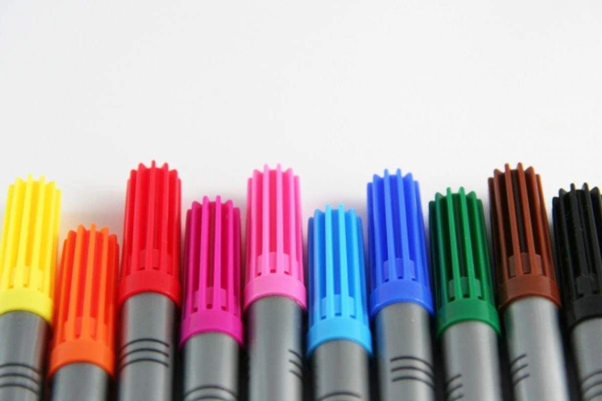
Beyond the Basics: Common Luminance Questions
How do environmental factors affect Luminance pencils?
While Luminance pencils, like most fine art materials, are sensitive to their environment. Extreme heat (like being left in a hot car or direct sunlight) can soften the wax core, making them more prone to breakage and potentially causing wax bloom. Extreme cold can make the wax brittle, also leading to breakage. High humidity can cause the wood casing to expand and contract, potentially separating from the pigment core. The best practice is to store them in a cool, dry place, away from direct sunlight and extreme temperature fluctuations. Think of it as creating a stable, comfortable home for your precious tools, ensuring they remain in peak condition for every artistic endeavor. These environmental factors aren't just minor inconveniences; they can significantly impact the performance and longevity of your pencils, leading to frustration and wasted investment. Consistent, moderate conditions are truly the unsung heroes of art material preservation, ensuring your tools are always ready to translate your vision onto paper without compromise.
What are the common mistakes beginners make with Luminance pencils?
One of the biggest mistakes is treating them like student-grade pencils, applying too much pressure too soon. Luminance excel with light, delicate layers, built up gradually to achieve depth and vibrancy. Pushing too hard too early can quickly lead to wax bloom or a muddy finish, which is a crying shame for such beautiful pigments! The key is patience: multiple light layers create a richer, deeper color than a single heavy application. Another common error is neglecting paper choice; using overly smooth paper can lead to frustrating wax bloom and poor pigment adhesion, while overly coarse paper can consume the soft core too quickly, eating away at your investment. Finding that 'just right' tooth is crucial. Lastly, not understanding or embracing their unique blending capabilities can lead to frustration – these aren’t pencils you just scribble with; they invite a thoughtful, layered approach. Many beginners also rush the layering process, trying to achieve full opacity in one or two passes. The true magic of Luminance lies in building up 5, 6, even 10 light layers to achieve incredible depth and luminosity without wax buildup. Embrace the journey of layering, and let the colors sing, and you'll avoid many of these common pitfalls. Remember, patience is a virtue, especially in art, and with Luminance, it truly pays off in vibrant, luminous results. Another common mistake is neglecting color theory – simply layering colors without understanding how they interact can lead to muddy or dull results. Taking a moment to consider complementary or analogous colors can transform your blending from accidental to intentional, unlocking a whole new level of vibrancy and harmony.
Can Luminance pencils be used for sketching or light work?
How often should I "rest" my Luminance pencils?
While not a strict rule, I've found that giving your heavily used Luminance pencils a "rest" can sometimes benefit their performance, especially if you notice frequent tip breakage or a slight change in consistency during intense, long drawing sessions. This isn't a scientific process, but some artists believe that allowing the wax core to "settle" after heavy use can help restore its internal structure. Think of it like letting your muscles recover after a tough workout. Simply set aside the pencils you’ve been using most vigorously for a day or two, perhaps in a cool, stable environment, and return to them later. It's a small, intuitive act of care that often seems to result in smoother sharpening and less core breakage upon reuse. It’s about listening to your tools, just as you listen to your own creative flow.
How do I clean my Luminance pencils?
While Luminance pencils don't typically require cleaning, keeping their barrels free of excessive pigment dust can prevent accidental smudging on your artwork. A soft, dry cloth can be used to gently wipe down the barrels. Avoid using any solvents or harsh chemicals directly on the pencils, as this could damage the wood casing or affect the wax binder. For the tips, if you're experiencing a buildup of a lighter color after blending with a darker one, simply sharpen the pencil a tiny bit or wipe the tip on a scrap piece of paper until the true color emerges again. I often keep a dedicated piece of scrap paper nearby specifically for this purpose – a quick swipe and you're back to pristine pigment, ready for your next stroke of genius.
How to correct mistakes effectively?
It's okay, we all make 'em! The good news is that with Luminance, many mistakes can be corrected or softened. For light applications, a kneaded eraser can gently lift pigment without damaging the paper's surface. For heavier applications or darker colors, a Tombow Mono Zero eraser is fantastic for precise lifting, allowing you to clean up edges or even erase small areas entirely. If you've pressed too hard or laid down too much pigment, you can sometimes use a colorless blender to push the excess pigment into the paper, softening the area. For major overapplications, lightly dabbing with a sticky tack or even carefully scraping with an X-Acto knife (on very sturdy paper and with extreme caution!) can remove some pigment, though this should be a last resort. Patience and light layers initially are your best defense against 'mistakes'. Remember, every 'mistake' is just a stepping stone to a new technique or a deeper understanding of your materials, so don't be afraid to experiment, even if it means a little erasing! For very subtle adjustments, even a clean cotton swab or a very soft brush can sometimes gently nudge pigment around, softening edges. And for those moments of deep frustration, sometimes it's best to step away, let the piece rest, and return with fresh eyes. Often, what felt like a disaster can be transformed into an unexpected opportunity with a bit of creative problem-solving.
While they can be used for sketching, their cost and rich pigment payoff often mean they're reserved for more refined work, where every stroke counts. For initial light sketches, brainstorming, or laying down initial compositional lines, a good old graphite pencil or a less expensive, harder colored pencil (like a Faber-Castell Polychromos for its firm point) is usually preferred to preserve your precious Luminance. Think of it like this: you wouldn't use a fine-tipped calligraphy pen for rough notes. However, for adding subtle details, delicate glazes, or refining edges in finished pieces, their light touch and unparalleled blendability are absolutely exceptional, allowing for those finishing touches that truly bring a piece to life. It’s about being strategic with your tools! For quick color studies or capturing fleeting moments, a cheaper set is ideal, but when you need that luminous quality or precise detail in a finished work, Luminance are unparalleled, and their 'light touch' capabilities are perfect for those final, ethereal layers. It's about respecting the tool and its capabilities, and choosing the right instrument for the right job. For fine details or delicate glazes in a finished work, their light touch and unparalleled blendability are absolutely exceptional, allowing for those finishing touches that truly bring a piece to life. But for initial rough sketches or brainstorming where broad strokes and quick ideas are paramount, a less precious tool will often serve you better, preserving your Luminance for their true calling: creating luminous, lasting color.
Can I mix Caran d'Ache Luminance with other brands of colored pencils?
Absolutely, and in fact, many professional artists do! While Luminance are incredible on their own, they often play well with others, especially other professional-grade pencils. You might use Faber-Castell Polychromos (oil-based) for their firmer point and excellent detail work in the initial layers, and then layer Luminance over them for their creamy blending and vibrant top layers. Some artists even use Prismacolor Premier (wax-based, but softer) for their intense saturation and blendability in certain areas, knowing Luminance can provide the superior lightfastness for the most critical colors. The key is to experiment on a scrap piece of paper first, understanding how the different binders and hardnesses interact. Often, the combination creates unique effects that neither brand could achieve alone, truly expanding your artistic palette. For instance, using Luminance for the foundational layers and then Polychromos for crisp details can give you the best of both worlds: buttery smooth blends and razor-sharp lines. It's like assembling a dream team of art supplies, each bringing its unique superpower to the table! You might also use Prismacolor Premier for their intense saturation and blendability in certain areas, knowing Luminance can provide the superior lightfastness for the most critical colors. The key is to experiment on a scrap piece of paper first, understanding how the different binders and hardnesses interact, and finding your own perfect combination. This creative synergy can unlock artistic possibilities that neither brand could achieve alone, truly expanding your artistic palette and expression. For quick color studies or capturing fleeting moments, a cheaper set is ideal, but when you need that luminous quality or precise detail in a finished work, Luminance are unparalleled, and their 'light touch' capabilities are perfect for those final, ethereal layers.
Final Strokes: A Confession of Enduring Affection
The Emotional Connection: More Than Just Tools
You know, it’s easy to talk about technical specs, lightfastness ratings, and pigment loads. But for me, the true magic of Caran d'Ache Luminance pencils lies beyond the measurable. It's in the way they feel in my hand, the quiet satisfaction of a perfect stroke, the sheer joy of watching colors blend seamlessly on paper. It's an emotional connection, a feeling of partnership with a tool that truly understands and amplifies my creative intentions. They’re not just instruments; they’re confidantes, silent witnesses to my artistic struggles and triumphs. They encourage a slower, more mindful approach to art-making, inviting me to savor each moment of creation, transforming the act of drawing into a deeply meditative experience. It’s a love story, plain and simple, between an artist and her most cherished companions.
So, after all that, what's the verdict? I guess you could say it's a love story. A love story between an artist and her tools. The Caran d'Ache Luminance pencils aren't just pencils; they're an extension of my creative will. They empower me to achieve colors and textures I struggled with before. They make the artistic process more joyful, less frustrating. If you've been on the fence, wondering if they're worth the plunge, I hope my rambling thoughts have nudged you a little closer to giving them a try. Sometimes, the best art isn't just about talent; it's about having the right tools that truly speak your creative language. And for me, Luminance speaks volumes. They don't just help me make art; they help me become more of the artist I aspire to be.
I'm constantly pushing my boundaries, whether it's through my art at my museum or simply in my daily studio practice. And these pencils have definitely become a cherished part of that journey.
Luminance in the Classroom: Teaching and Learning
For art educators and students alike, Luminance pencils offer a profound learning experience. As a teacher, demonstrating with these pencils showcases the absolute pinnacle of what the medium can achieve, inspiring students to reach for higher standards. For students, even using a limited selection can be a revelation, teaching them about the importance of pigment quality, layering, and subtle blending in a way that cheaper pencils simply can't. It's an investment in art education, providing tangible examples of excellence and helping to cultivate a deeper appreciation for fine art materials. Learning on Luminance sets a benchmark for quality, making the transition to other professional mediums feel more intuitive and informed. It’s about equipping the next generation of artists with the best possible tools to translate their visions, fostering a sense of dedication and precision from the outset.
Mindset of a Luminance Artist: Embracing the Investment
Beyond the technical aspects, using Luminance pencils fosters a particular mindset. It's a commitment to quality, a quiet confidence in your tools, and an invitation to slow down and savor the creative process. When you invest in these pencils, you're not just buying pigment and wood; you're buying into a philosophy of excellence. It encourages a more thoughtful, deliberate approach to your art, pushing you to match the quality of your materials with the quality of your effort. It's a subtle but powerful shift, transforming your practice into something more intentional and, dare I say, more joyful. You begin to trust your materials implicitly, allowing you to truly lose yourself in the flow of creation rather than wrestling with limitations. It’s like the pencils whisper, “Go on, you’ve got this.” They've not only improved my artwork but, dare I say, they've deepened my appreciation for the craft itself. This dedication to quality encourages a more thoughtful and deliberate approach, transforming your practice into something more intentional and, dare I say, more joyful. It's about building a relationship with your tools, understanding their nuances, and letting them guide you to new artistic heights. So go on, give them a try. Your artistic soul might just thank you, and your artwork will certainly show the difference. This mindset also embraces the idea of continuous learning and refinement. Luminance pencils reward patience and observation, inviting you to constantly experiment and discover new possibilities within their rich spectrum.

The Global Community: Sharing Luminance Art
One of the most inspiring aspects of using a premium art material like Luminance is becoming part of a passionate, global community of artists. From online forums and social media groups to dedicated workshops and exhibitions, there’s a vibrant network of creators who share tips, showcase their work, and celebrate the unique qualities of these pencils. It’s a wonderful place to find inspiration, learn new techniques, and connect with fellow artists who share your enthusiasm for high-quality tools. Seeing the diverse ways in which artists around the world utilize Luminance, from hyper-realistic portraits to breathtaking landscapes and imaginative abstract pieces, constantly pushes my own creative boundaries and reminds me that art is a boundless, shared journey. It’s a testament to the power of shared passion, transforming individual artistic pursuits into a collective celebration of color and creativity.
If you have your own experiences with Luminance, or questions about specific techniques, drop a comment below! I'd love to hear from you and continue the conversation about these incredible tools.
Frequently Asked Questions
Are Caran d'Ache Luminance pencils worth the price?
In my experience, yes, if you are a professional artist or a very serious hobbyist. Their unparalleled lightfastness, pigment quality, and blending capabilities justify the investment for archival quality work.
Are Luminance suitable for children/young artists?
While the quality is exceptional, Luminance pencils are generally not recommended for young children or absolute beginners due to their high cost and the nuanced techniques required to fully appreciate them. Student-grade pencils are far more forgiving for initial experimentation and learning. However, for a serious, dedicated young artist who has already developed foundational skills, a small set could be an inspiring investment, offering a glimpse into professional-grade materials.
How do Luminance compare to other professional colored pencils like Prismacolor Premier or Faber-Castell Polychromos?
Luminance pencils are wax-based, uniquely formulated for extreme blendability and superior lightfastness (a major selling point!), making them excellent for smooth, rich layers and deep saturation without heavy pressure. Prismacolor Premiers are also wax-based, very soft, and incredibly vibrant, blending beautifully, but they generally have lower lightfastness ratings, meaning your artwork might fade over time. Polychromos are oil-based, offering a firmer feel and excellent point retention, which makes them fantastic for fine detail and layering without the worry of wax bloom; they also boast excellent lightfastness. However, their blending characteristics are different, often requiring more pressure or solvents. Each has its distinct strengths and feel, but for a combination of creamy blendability, rich pigment, and unparalleled archival quality, Luminance often takes the crown, especially for professional artists concerned with permanence. If I had to pick a "desert island" pencil for versatility, blendability, and lasting power, Luminance would undoubtedly be it, capable of handling everything from soft, ethereal washes to bold, saturated statements, all while promising that your creative efforts will endure.
What surfaces can be used with Luminance pencils beyond paper?
While paper is the most common and ideal surface for Luminance pencils, their versatile wax-oil binder means you can experiment with other surfaces, though always with a test first! They can be used to add detail and color over properly prepared wood panels (sanded and primed with gesso), offering a unique textural quality. Some artists successfully apply them over canvas (again, primed and perhaps with a toothy ground applied) for mixed media pieces, especially for fine details or blending into painted backgrounds. They can even adhere to certain textiles or treated fabrics for artistic embellishment. The key is a surface that has a bit of "tooth" to grab the pigment and is relatively non-absorbent. It's about being an art explorer, pushing the boundaries of the medium, and discovering unexpected ways to bring your visions to life.
What's the best paper to use with Caran d'Ache Luminance?
Papers with a slight tooth are ideal, allowing for multiple layers and good pigment adhesion. Hot-press watercolor paper, smooth Bristol, or even a good quality drawing paper with a subtle texture can work wonderfully. The key is to find something that can handle the layering without becoming saturated too quickly.
Final Strokes: A Confession of Enduring Affection
So, after all that, what's the verdict? I guess you could say it's a love story. A love story between an artist and her tools. The Caran d'Ache Luminance pencils aren't just pencils; they're an extension of my creative will. They empower me to achieve colors and textures I struggled with before. They make the artistic process more joyful, less frustrating. If you've been on the fence, wondering if they're worth the plunge, I hope my rambling thoughts have nudged you a little closer to giving them a try. Sometimes, the best art isn't just about talent; it's about having the right tools that truly speak your creative language. And for me, Luminance speaks volumes.
I'm constantly pushing my boundaries, whether it's through my art at my museum or simply in my daily studio practice. And these pencils have definitely become a cherished part of that journey.


