How to Draw a Realistic Face: My Candid, Step-by-Step Guide
Ever wanted to draw a realistic face but felt intimidated? Join me on a personal, step-by-step journey to demystify proportions, shading, and detail for captivating portraits.
# How to Draw a Realistic Face: Your Deep Dive into the Art of Human Likeness
Honestly, for the longest time, the idea of drawing a realistic face felt like trying to capture smoke with a net. And let's be real, who hasn't felt that artistic struggle? It’s like trying to teach a cat to fetch – you know it’s possible in theory, but the execution… well, that’s another story entirely. I once tried to draw my grandmother, a woman whose face was a roadmap of a beautiful, full life, and it came out looking like a slightly confused potato. That was a rough day. This isn't just a technical guide; it's a reflection on my own messy, rewarding journey to understanding the human face on paper. My early attempts at faces often looked like they'd been in a wrestling match with a particularly feisty octopus, all skewed proportions and features that seemed to defy gravity. I remember vividly the frustration, the crumpled papers, the internal monologue questioning if I'd ever truly 'get it'. But here's the thing about art, and life, I suppose: if you keep showing up, if you keep trying, eventually, the smoke starts to condense, and you find a way to hold it. It's a journey filled with tiny victories and monumental 'aha!' moments, and I'm here to share how I navigated the wilderness of anatomical confusion to finally draw faces that actually *look* like faces. This guide isn't about perfection; it's about progress, understanding, and finding the joy in the process of bringing a human likeness to life on paper. It's about learning to *see* in a whole new way, stripping away assumptions and truly observing the magnificent complexity before you. Before we even touch a pencil, here's a quick challenge: find a mirror, any mirror. Look at your own face, really look. Notice the subtle curve of your cheek, the way your eyebrow arches, or the slight asymmetry between your two eyes. Don't judge, just observe. That's the first step – truly *seeing* the magnificent complexity before you, stripping away assumptions and preconceived notions. We're going to dive deep, from the foundational bone structure that dictates form, to the subtle interplay of light and shadow that breathes life into your lines, and all the way to capturing those unique details that make a portrait truly 'them'. We'll explore the hidden structures, the subtle shifts in value, and the unique expressions that make each face a masterpiece waiting to be drawn. This isn't just a guide; it's an invitation to a deeper, more empathetic way of seeing the world – and the faces within it.
It's a journey, not a destination, and honestly, sometimes it feels like a wrestling match with your own brain. But stick with me. I've stumbled through the awkward phases, made faces that looked like they belonged on a different planet, and questioned my sanity more times than I can count. This guide is built on those stumbles, transforming them into stepping stones for *your* artistic path.
## The Unspoken Truth: Why Faces Feel So Hard (And How to Conquer It)
Before we dive into the nitty-gritty, let's acknowledge the elephant in the art room: drawing faces is *hard*. It’s not just about getting lines on paper; it’s about capturing personality, emotion, and that elusive spark of life. There's an uncanny valley effect where a drawing can be almost right, but still feel deeply *wrong*. This isn't a failing on your part, but a testament to the incredible subtlety of human perception. Our brains are hardwired to recognize faces, so even tiny inaccuracies stand out like a sore thumb. This hyper-sensitivity, while useful in real life, can be a real pain in the easel when you're trying to draw! It means a millimeter difference in eye placement can push a drawing from 'almost there' to 'creepy doll territory'. But don't let that intimidate you! I used to get so frustrated, thinking my brain was actively sabotaging me! But here's a little trick: sometimes, when a drawing feels 'off,' try flipping it upside down (or looking at it in a mirror). Your brain, suddenly confused, stops trying to 'correct' it into a generic face and instead sees pure shapes and lines, revealing the actual inaccuracies. It's like resetting your artistic vision, and it’s a lifesaver for spotting those subtle distortions that trip us up. This guide is designed to break down that intimidation, offering practical steps alongside the candid reflections of someone who's been there, crumpled a lot of paper, and eventually found a way to make faces *work*. It's about demystifying the process and giving you the tools to not just draw, but to *understand* what you're seeing. We'll explore why our brains are so good at spotting flaws in faces and how to leverage that knowledge to create more convincing art, avoiding the dreaded 'uncanny valley' effect. We'll also dive into how to diagnose *why* a drawing might feel "off"—it's often not a major flaw, but a subtle combination of minor inaccuracies that our highly sensitive brains pick up on instantly. Understanding this is half the battle won. In the dedicated section on Overcoming Common Challenges, we'll explore this fascinating psychological phenomenon in more detail, arming you with even more tools to diagnose and overcome it.
## My Journey to Understanding the Human Face (and its Many Quirks)
I remember sitting in a life drawing class, staring intently at a model, and just feeling utterly lost. My hand knew how to make lines, but my brain couldn't translate the three-dimensional form in front of me into two dimensions in a way that looked remotely human. It was frustrating, to say the least. My early attempts were… well, they had character, if "character" meant looking like a distant relative of a Picasso painting that had seen better days. I remember one particularly frustrating session where I spent hours on an eye, only to realize the entire head was skewed. I just wanted to throw my pencil across the room! Sometimes it felt like my pencil had a mind of its own, refusing to put lines where my brain told it to. There was one particularly memorable portrait where the model’s ears seemed to migrate halfway up her head, giving her a perpetually startled expression. Those moments, though, were the crucible. It was these moments of near despair, the outright failures, that pushed me to look deeper, to question *why* things weren't working. It taught me that failure isn't the opposite of success, it's a stepping stone.
My biggest revelation came when I stopped trying to draw *a face* and started trying to draw *shapes* and *values*. Before even the Loomis sphere, I found it incredibly helpful to visualize the entire head, and even the neck, as a combination of basic geometric forms. Imagine the cranium as a sphere, the jaw as a modified cube or wedge, and the neck as a cylinder connecting the head to the torso. This initial simplification helps you understand the overall mass and how light will interact with these primary forms, making it easier to place features accurately within a three-dimensional framework. I remember thinking, "Surely, it can't be that simple?" But honestly, it was like unlocking a secret level in a video game! Try this: grab a piece of paper and just draw a simple sphere, a cube, and a cylinder from a few different angles. Don't worry about perfection, just get a feel for their three-dimensional presence. Then, try lightly sketching a head, visualizing these forms underneath the skin. Suddenly, the daunting task of drawing a nose becomes a manageable challenge of placing a wedge, and an eye socket becomes a gentle indentation in a sphere. It sounds almost too simple, but it was like someone handed me the decoder ring, allowing me to see beyond the overwhelming complexity of a face into its underlying architecture. Instead of seeing an eye, I saw a series of overlapping ovals, curves, and dark spots. Instead of a nose, I saw planes catching the light and planes falling into shadow. This shift in perception, this ability to break down the overwhelming complexity into manageable abstract forms, was the single most powerful change in my artistic approach. It's not about making a perfect replica; it's about translating what you truly *see* onto the page, without the baggage of preconceived notions. This foundational understanding is often the first 'aha!' moment for many aspiring artists, myself included. Seriously, spending 10-15 minutes just sketching these basic forms daily, from different angles, will rewire your brain to see form more effectively than endless hours of trying to draw 'perfect' faces.
Here’s another quick challenge: grab a reference photo of a face, but squint your eyes until the details blur. What do you see? Just broad shapes of light and shadow, right? Try drawing *that*. Don't worry about the lines of the nose or mouth, just the big, abstract patches of value. You'll be amazed at how much easier it is to capture the overall form and how much more three-dimensional your sketch feels. This "squint test" is a secret weapon for simplifying complexity.
The breakthrough for me wasn't a sudden flash of genius (I wish!). It was also significantly aided by truly understanding the **Planes of the Face**. Imagine the face isn't just a smooth, curved surface, but a series of flattened, geometric planes, like a simplified sculpture. There's a main front plane, side planes for the temples and cheeks, planes for the forehead, and subtle shifts for the nose, mouth, and chin. These planes catch light and fall into shadow differently, giving the face its three-dimensional quality and making it easier to understand how to apply values. You can find simplified "plane heads" (like the Asaro head or Reilly abstraction) that explicitly illustrate this concept, offering a fantastic way to practice shading fundamental forms before tackling the organic complexity of a real face. When I first started, I thought, "Planes? But faces are smooth!" It took me a while to realize it wasn't about drawing sharp angles on a face, but *seeing* the subtle shifts in direction. A great way to internalize this is to find a simple plastic skull or even sculpt a basic head shape from clay. Then, try to imagine or even mark the different planes on it. Move it around in different lighting conditions and see how highlights and shadows define these planes. You'll quickly notice how the light catches the cheekbone differently from the temple, or how the planes of the nose create a distinct architectural structure. Speaking of which, if you want to dive deeper into how these anatomical structures form the face, our section on The Role of Anatomy in Portraiture will be your new best friend. It was a slow, deliberate process of breaking down the face into simpler shapes, understanding light, and most importantly, truly *seeing* what was there, rather than what I *thought* was there. I remember one particularly stubborn morning, I was wrestling with a nose that just refused to sit right. It looked pasted on, flat, and entirely unconvincing. Then, a mentor simply told me, "Stop drawing the nose. Draw the *box* the nose lives in." And just like that, a switch flipped. I started visualizing the nose as a series of planes and angles, almost like a tiny architectural project, and suddenly, it had volume. This wasn't just "drawing more"; it was **deliberate practice** – focusing on specific weaknesses, analyzing mistakes, and constantly iterating. It’s like learning a new language – you start with basic vocabulary before you can write poetry. This approach, I've found, is absolutely fundamental to any drawing technique, especially when you're aiming for something as complex as a human face. For example, I started spending entire sessions just drawing spheres and cubes, trying to understand how light and shadow wrapped around them, before even attempting a human form. It felt painstaking at the time, but it built the foundational understanding I desperately needed. It's about isolating a single skill, like drawing an accurate sphere from multiple angles, and practicing it until it becomes second nature, rather than trying to draw a perfect face every single time. This focused repetition is what truly builds muscle memory and a deeper understanding of form. Don't be afraid to dedicate an entire hour, for instance, just to drawing different types of noses from various angles, or just eyes, or just mouths. This kind of 'deliberate practice' is what takes you from guessing to truly knowing.
Another trick I picked up for understanding planes is to use a strong, single light source on your reference (or even your own face in a mirror). As you move the light, observe how the highlights and shadows shift, defining new planes. Try to identify the 'major' planes first – the forehead, the side of the face, the underside of the chin – and then break those down into smaller, more subtle shifts. It’s like learning to see the geometry hidden beneath the organic surface. It was a slow, deliberate process of breaking down the face into simpler shapes, understanding light, and most importantly, truly *seeing* what was there, rather than what I *thought* was there. I remember one particularly stubborn morning, I was wrestling with a nose that just refused to sit right. It looked pasted on, flat, and entirely unconvincing. Then, a mentor simply told me, "Stop drawing the nose. Draw the *box* the nose lives in." And just like that, a switch flipped. I started visualizing the nose as a series of planes and angles, almost like a tiny architectural project, and suddenly, it had volume. This wasn't just "drawing more"; it was **deliberate practice** – focusing on specific weaknesses, analyzing mistakes, and constantly iterating. It’s like learning a new language – you start with basic vocabulary before you can write poetry. This approach, I've found, is absolutely fundamental to any drawing technique, especially when you're aiming for something as complex as a human face. For example, I started spending entire sessions just drawing spheres and cubes, trying to understand how light and shadow wrapped around them, before even attempting a human form. It felt painstaking at the time, but it built the foundational understanding I desperately needed. It's about isolating a single skill, like drawing an accurate sphere from multiple angles, and practicing it until it becomes second nature, rather than trying to draw a perfect face every single time. This focused repetition is what truly builds muscle memory and a deeper understanding of form.
Speaking of which, if you're looking for more general drawing advice, I've poured a lot of my thoughts into my [definitive guide to drawing techniques](/finder/page/definitive-guide-to-drawing-techniques). We'll keep coming back to these core principles, applying them specifically to the fascinating challenge of the human face.
---
## Essential Tools for the Aspiring Face-Drawer
You don't need a fancy studio filled with esoteric gadgets to draw a face. In fact, some of my best "a-ha!" moments happened with just a humble pencil and a piece of scrap paper. That said, having the right basic supplies certainly makes the journey smoother.
I usually start with a good set of graphite pencils, ranging from a hard 'H' for light sketching to softer 'B' pencils for rich shadows. The 'H' pencils (like 2H, H) are fantastic for those initial, barely-there construction lines – they don't dig into the paper and are easy to erase. They're perfect for mapping out proportions and the Loomis sphere without leaving permanent marks. When I'm ready to commit, I'll reach for an HB or B for general shading and building up mid-tones – these are your workhorses, versatile enough for most of your drawing. And for those really dramatic, velvety darks? Nothing beats a 4B, 6B, or even 8B. These softer leads are essential for creating depth and contrast, making your drawing feel three-dimensional. Just be gentle with them, as they can smudge easily if you're not careful. For textured areas like hair or stubble, I often use a very light touch with a slightly softer pencil (like a 2B or 4B) to suggest individual strands without making them too sharp. A kneaded eraser is a lifesaver for lifting graphite without smudging, allowing for subtle adjustments without damaging the paper. I used to think erasers were just for mistakes, but a kneaded eraser is a sculptor's tool! You can shape it into a point for tiny highlights, flatten it to lift large areas of value, or dab it gently to soften edges and create ethereal glows. Learning to sculpt and dab with your kneaded eraser is an art in itself! It's like a magic sponge for unwanted lines, perfect for softening edges or creating highlights by gently dabbing. Learning to sculpt and dab with your kneaded eraser is an art in itself! Experiment with twisting it to create small, precise points for individual hair highlights, or pressing it flat and dabbing to create soft, luminous effects on cheekbones. A good vinyl eraser is also crucial for sharper, cleaner corrections, capable of completely removing mistakes without leaving residue. And for those really precise, tiny highlights or cleaning up small smudges, an electric eraser can be a game-changer – it's like having a tiny, powerful magic wand for perfection! And a good sharpener is non-negotiable – blunt pencils are the enemy of detail! Don't underestimate the power of a perfectly sharpened point! And don't be afraid to experiment with different types of sharpeners; some give a longer, finer point, while others are more robust for softer leads. A good point is the secret to crisp details. I keep a variety on hand: a simple hand-held metal sharpener for quick touch-ups, a desktop helical sharpener for consistent long points, and even a sandpaper block for crafting a needle-sharp point on softer leads, which is invaluable for those super-fine details like individual hairs or the catchlight in an eye. Sometimes, for certain effects, I even use an X-Acto knife to carefully carve a precise point on a graphite stick, which can be fantastic for very specific, angular details or tight cross-hatching.
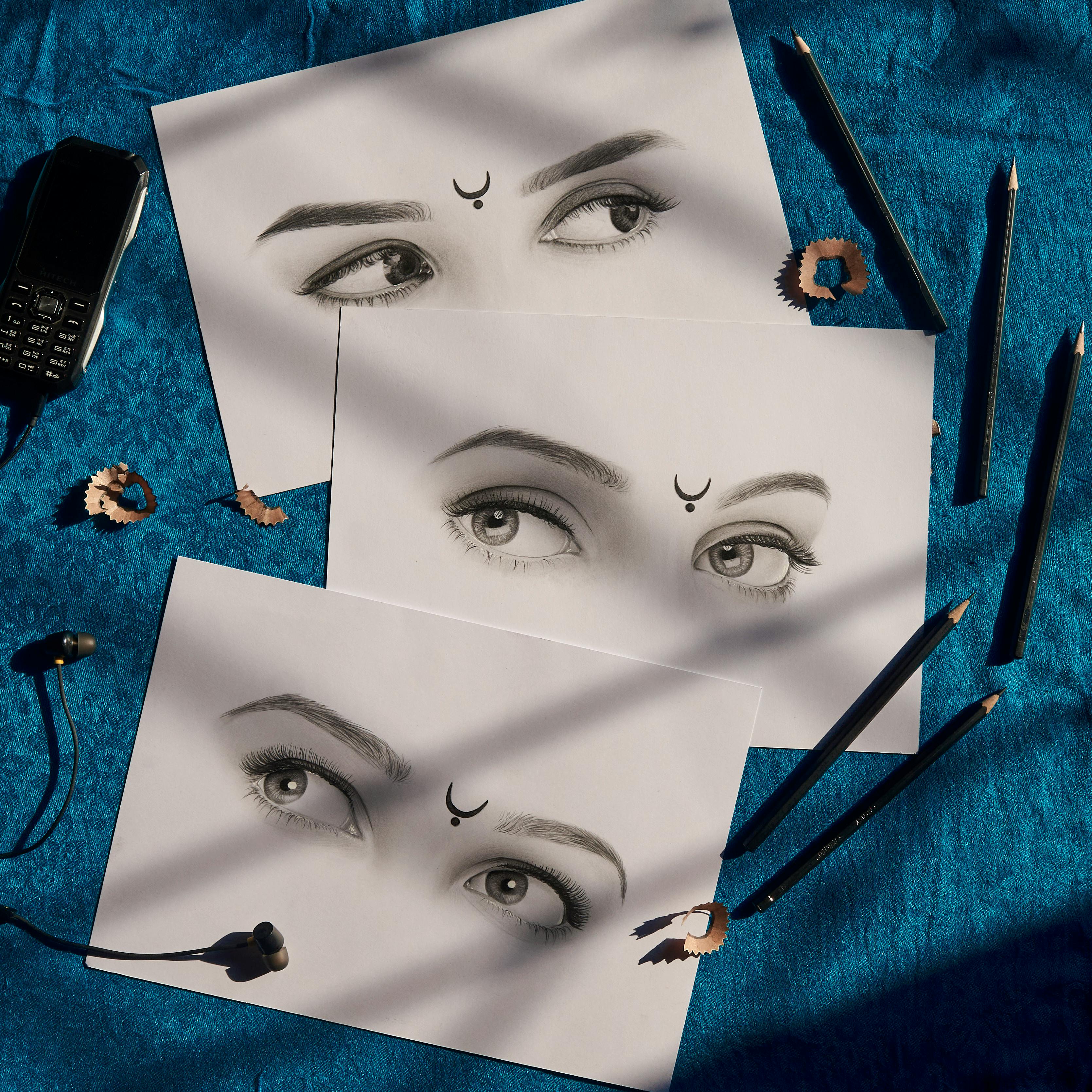
* **Alt Text (English):** Realistic eye drawing tutorial supplies: pencils, sharpener shavings, earphones, and an old mobile phone on a blue textured surface.
* **Alt Text (Dutch):** Realistische oog teken tutorial benodigdheden: potloden, puntenslijper krullen, oordopjes en een oude mobiele telefoon op een blauw textuur oppervlak.
### Expanding Your Media: Beyond Graphite
While graphite is king for learning, don't be afraid to experiment!
* **Colored Pencils:** These offer a beautiful way to introduce subtle hues and realistic skin tones. They blend differently than graphite, allowing for layering and rich color saturation. Just like graphite, you'll find a range of hardness, and layering is key to avoiding a waxy finish.
* **Charcoal and Conté Crayon:** For dramatic depth and rich blacks, charcoal is unparalleled. It's messier, sure, but the expressive power it offers for portraits is incredible. Conté crayons offer similar richness but with a firmer texture and a range of earthy tones, perfect for capturing warm skin undertones or dramatic chiaroscuro effects. Just be prepared for the smudges and invest in a good fixative!
* **Pastels:** Both soft and oil pastels can create incredibly lifelike, painterly effects for faces. Their blendability allows for seamless transitions and vibrant color, mimicking the softness of skin beautifully. Soft pastels are more powdery and blend easily for subtle gradients, while oil pastels have a creamy, intense color that works well for bold statements and rich textures. However, they require good fixative and careful handling to prevent smudging and preserve your work.
Each medium has its quirks and charms, and exploring them will not only expand your artistic vocabulary but also deepen your understanding of value, texture, and form – principles that are universal to all drawing. Don't feel pressured to master them all at once, but definitely allow yourself the joy of experimentation when you feel ready!
### Reference Materials
Beyond your physical drawing tools, your most potent resources are your reference materials. Whether it's a mirror for self-portraits (an often-overlooked and incredibly accessible model!), high-quality photographs, or even anatomical models, good references are your visual compass. When using photos, be mindful of lens distortions, and whenever possible, use multiple references of the same subject from different angles to get a truly three-dimensional understanding. Observing from life, even for a few minutes, trains your eye in ways photos simply can't, as you capture subtle shifts in light and form in real-time. I keep a variety on hand: a simple hand-held metal sharpener for quick touch-ups, a desktop helical sharpener for consistent long points, and even a sandpaper block for crafting a needle-sharp point on softer leads, which is invaluable for those super-fine details like individual hairs or the catchlight in an eye. Sometimes, for certain effects, I even use an X-Acto knife to carefully carve a precise point on a graphite stick, which can be fantastic for very specific, angular details or tight cross-hatching.
### Drawing Surfaces and Supports
Oh, and a good drawing board or easel can make a world of difference too. I used to hunch over my desk, convinced I was being "intense," only to realize I was just giving myself a terrible neck ache and distorting my perspective! Drawing on a flat surface can lead to perspective distortions, especially with larger pieces. Drawing at an angle helps you see your work more accurately and keeps your posture happy, preventing those pesky neck and back aches! A sturdy surface also provides consistent pressure for your pencil, which is critical for smooth gradients and even shading. Don't underestimate the impact of comfortable posture on your artistic endurance and the accuracy of your lines! Drawing on a flat surface can lead to perspective distortions, especially with larger pieces. Drawing at an angle helps you see your work more accurately and keeps your posture happy, preventing those pesky neck and back aches! A sturdy surface also provides consistent pressure for your pencil, which is critical for smooth gradients and even shading. Don't underestimate the impact of comfortable posture on your artistic endurance and the accuracy of your lines! For larger works, I often use an adjustable drawing table or even a portable field easel to maintain optimal viewing angles and support my arm, which significantly reduces fatigue and improves precision.
### The Importance of Good Lighting
And while we're on the subject of environment, good lighting for your workspace is non-negotiable! I used to draw in dimly lit corners, wondering why my values were always off, only to realize I simply couldn't *see* them properly. Aim for diffuse, even light, ideally from the side, to avoid harsh shadows on your drawing surface. A good daylight lamp (one that simulates natural sunlight, often around 5000K-6500K color temperature) can mimic natural light and prevent color distortion (if you're using color). Proper lighting reduces eye strain, helps you accurately perceive values, and makes the entire drawing process more enjoyable and accurate. It's like trying to bake a cake in the dark; you need to see what you're doing! Seriously, investing in a good quality task lamp will pay dividends in eye comfort and accuracy.
And let's not forget paper! The surface you draw on makes a massive difference. For graphite portraits, I often reach for a smooth, heavier-weight paper (like Bristol or a hot-press watercolor paper) that can handle multiple layers without buckling or becoming too textured. This allows for those buttery smooth skin tones. But what does "tooth" actually mean, and why does it matter? Think of tooth like tiny hills and valleys on your paper; a fine tooth provides a smoother surface for fine details and blended graphite, while a rougher tooth grabs more pigment, which is fantastic for textured effects or expressive charcoal work. Experiment with different types to see what feels right for you. For realistic graphite portraits, I find papers with a fine, consistent tooth, often labeled as "plate" or "vellum" finishes, work best for achieving seamless blends. Hot-press watercolor paper also offers a beautifully smooth surface, which I adore for those buttery skin tones. Heavier weights (like 80lb or 100lb or even 140lb) also prevent buckling and allow for more vigorous erasing without damaging the surface. For charcoal or when you want a bit more texture, you might prefer a paper with more "tooth" (like a Canson Mi-Teintes) to grab the pigment effectively. Don't be afraid to invest in good paper; it truly makes a difference in your results. Sometimes, I even tone my paper with a light wash of watercolor or pastel before I start, which can provide a beautiful mid-tone to work against, making your lights and darks pop even more. This isn't just an aesthetic choice; it can actually help you judge values more accurately, as you're working from a neutral starting point rather than pure white.
Beyond the weight and tooth, consider the *color* of your paper. While white is standard, a toned paper (a light grey, beige, or even a subtle blue) can be incredibly helpful for value judgment, as you're working from a mid-tone rather than pure white. It can make those bright highlights pop even more and give your drawing a more sophisticated, unified feel from the outset. A slightly textured paper (often called "tooth") can be great for charcoal or adding subtle texture to skin, but too much texture can make fine details a nightmare, especially for smooth gradients. Think of tooth like tiny hills and valleys on your paper; a fine tooth provides a smoother surface for fine details and blended graphite, while a rougher tooth grabs more pigment, which is fantastic for textured effects or expressive charcoal work. Experiment with different types to see what feels right for you. For realistic graphite portraits, I find papers with a fine, consistent tooth, often labeled as "plate" or "vellum" finishes, work best for achieving seamless blends. Hot-press watercolor paper also offers a beautifully smooth surface, which I adore for those buttery skin tones. Heavier weights (like 80lb or 100lb or even 140lb) also prevent buckling and allow for more vigorous erasing without damaging the surface. For charcoal or when you want a bit more texture, you might prefer a paper with more "tooth" (like a Canson Mi-Teintes) to grab the pigment effectively. Don't be afraid to invest in good paper; it truly makes a difference in your results. Sometimes, I even tone my paper with a light wash of watercolor or pastel before I start, which can provide a beautiful mid-tone to work against, making your lights and darks pop even more. This technique is often used by old masters and can give your work an instant boost of sophistication.
I've also dabbled with charcoal, which offers incredible depth for portraiture, and you can read all about getting started with those in my guide on [essential charcoal drawing supplies for beginners](/finder/page/essential-charcoal-drawing-supplies-for-beginners) and [understanding and using charcoal for drawing](/finder/page/understanding-and-using-charcoal-for-drawing).
{.img-responsive}
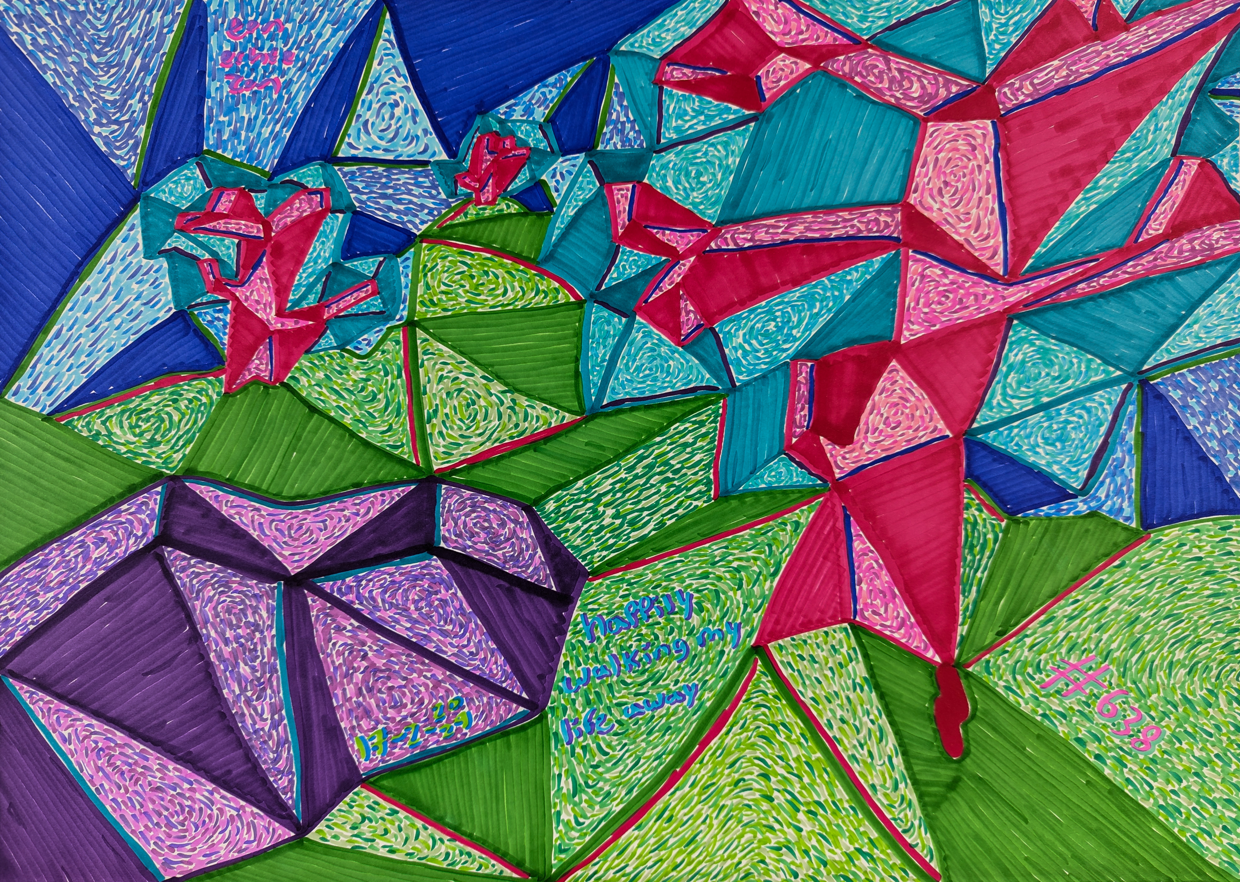
* **Alt Text (English):** Cluttered artist's workbench with brushes, paints, and tools. Abstract painting visible in background.
* **Alt Text (Dutch):** Rommelige werkbank van een kunstenaar met penselen, verf en gereedschap. Abstract schilderij zichtbaar op de achtergrond.

[credit](-),
[licence](-){.img-responsive}
{.img-responsive}
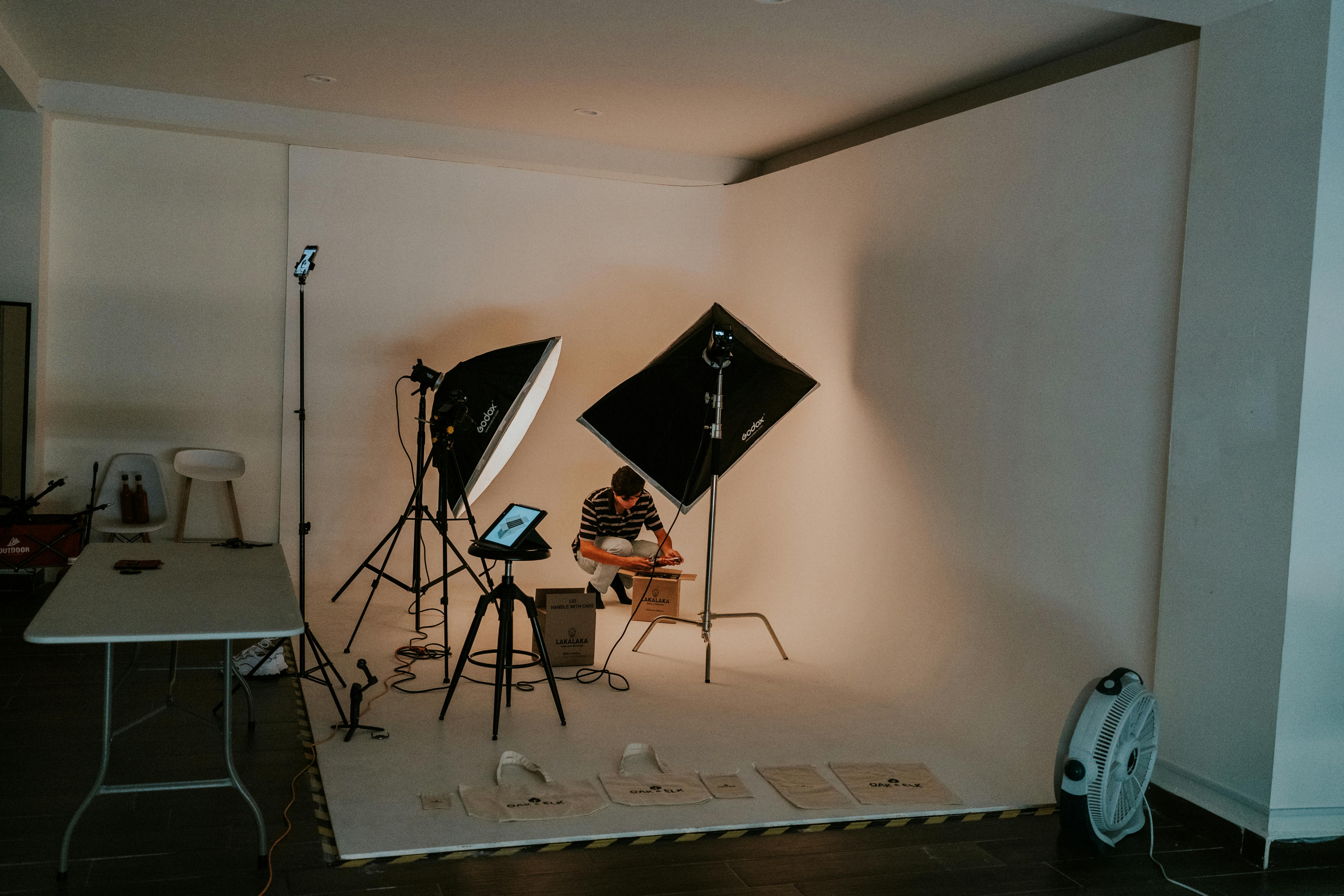
* **Alt Text (English):** Man setting up lighting equipment in an art studio for a photo session
* **Alt Text (Dutch):** Man die belichtingsapparatuur opzet in een kunststudio voor een fotosessie
Oh, and blending tools! Fingers are fine in a pinch, but a blending stump or tortillon (those tightly rolled paper tools) can really help create smooth transitions and subtle gradations, especially in the more delicate areas of the face. They're fantastic for pushing pigment into the paper's tooth, creating silky smooth skin tones. I also sometimes use soft brushes (makeup brushes work wonders!) for larger, softer transitions, and cotton swabs for smaller areas. Even a chamois cloth can be a revelation for smoothing out large areas of graphite. Just remember to keep them clean, or you'll be smudging instead of blending! Dedicate different blending tools for different value ranges to avoid cross-contamination! One trick I learned the hard way: always test your blending tool on a scrap piece of paper first to ensure it's clean. Nothing is worse than spending an hour on a smooth cheek and then introducing a rogue dark smudge from a dirty tortillon. Seriously, a small piece of sandpaper is your blending stump's best friend for keeping it pristine. And for ultra-fine blending in tiny areas like the inner corner of an eye or around the nostril, a Q-tip or a very small, soft paintbrush can work wonders.
When using a blending stump, try a light, circular motion for larger areas, gradually decreasing pressure as you approach edges you want to keep sharper. For smaller details, use the tip of a finely sharpened tortillon. And don't be afraid to experiment with the *pressure* you apply – a light touch for subtle blends, a firmer press for a more saturated, smooth effect.
### Protecting Your Masterpieces: Fixatives and Storage
After all that hard work, the last thing you want is for your drawing to smudge or degrade. A workable fixative spray can be a lifesaver, especially for graphite and charcoal drawings, as it creates a protective barrier. Apply it in light, even coats in a well-ventilated area. For storage, always keep your finished pieces flat or rolled (but never tightly creased) in a cool, dry place, ideally interleaved with acid-free tissue paper or stored in an archival portfolio. This prevents smudging, protects against environmental damage, and ensures your art stands the test of time. Think of it as giving your drawings a comfortable and safe home after their creation.
### Protecting Your Masterpieces: Fixatives and Storage
After all that hard work, the last thing you want is for your drawing to smudge or degrade. A workable fixative spray can be a lifesaver, especially for graphite and charcoal drawings, as it creates a protective barrier without completely sealing the surface, allowing for further adjustments. Apply it in light, even coats in a well-ventilated area, holding the can a good distance away to avoid harsh splatters. For storage, always keep your finished pieces flat or rolled (but never tightly creased) in a cool, dry place, ideally interleaved with acid-free tissue paper or stored in an archival portfolio. This prevents smudging, protects against environmental damage, and ensures your art stands the test of time. For more comprehensive advice, you might find my guide on [how to take care of your art](/finder/page/how-to-take-care-of-your-art) useful – it's all about giving your drawings a comfortable and safe home after their creation.
### Maintaining Your Tools
This might seem like a small detail, but keeping your tools in good shape is crucial for consistent results. Clean your blending stumps regularly by rubbing them on sandpaper or a spare piece of paper. Sharpen your pencils often; a dull pencil is the enemy of precision. And always store your paper flat to prevent warping. A little bit of care goes a long way in ensuring your materials are always ready to help you create your best work.
Oh, and a quick tip that saved me countless smudges: use a drawing guard or even just a clean piece of scrap paper under your drawing hand. This acts as a barrier, preventing the natural oils from your skin and any existing graphite from smudging areas you've already worked on. Seriously, it's a game-changer, especially for left-handed artists (like me!). This simple habit will dramatically improve the cleanliness and precision of your finished work.
[https://images.pexels.com/photos/22690804/pexels-photo-22690804/free-photo-of-person-drawing-with-color-pencils.jpeg](https://images.pexels.com/photos/22690804/pexels-photo-22690804/free-photo-of-person-drawing-with-color-pencils.jpeg), [https://creativecommons.org/public-domain/](https://creativecommons.org/public-domain/)
If you're still piecing together your art kit, I've got a comprehensive run-down on the [best drawing pencils for beginners](/finder/page/best-drawing-pencils-for-beginners). Trust me, good tools don't make the artist, but they sure do make the process a lot more enjoyable.
---
## Laying the Foundation: Proportions, My Old Foe (and Friend)
This is where many of us, myself included, stumble. It’s tempting to jump straight to the eyes or mouth, but if the underlying structure isn’t right, those beautiful features will just float aimlessly on the page. I've found that sometimes, focusing on the *spaces between* features – the "negative space" – can be just as helpful as focusing on the features themselves. It's like looking at the puzzle pieces that *aren't* the face, if that makes sense! Try this: next time you're drawing an ear, don't just focus on the ear itself. Look at the shape of the negative space *behind* the ear, or the space between the ear and the jawline. Often, getting that negative shape right will automatically put the ear in the correct position and proportion. It tricks your brain into seeing shapes rather than predefined objects, bypassing your brain's tendency to idealize or simplify. It tricks your brain into seeing shapes rather than predefined objects, bypassing your brain's tendency to idealize or simplify. Think of it like building a house – you need a solid foundation before you start decorating the rooms, ensuring the walls are plumb and the roof is level before you even think about paint colors. This whole concept of getting things in the right place is something I've explored quite a bit in my [definitive guide to proportion in art](/finder/page/definitive-guide-to-proportion-in-art). It’s about seeing the whole before getting lost in the parts, and it's a discipline that will save you countless headaches and crumpled drawings. It's truly a game-changer, moving you from frustrated guessing to confident construction.
For example, when drawing a profile, instead of focusing solely on the curve of the nose or chin, try to draw the *shape of the air* around it – the negative space. The shape between the nose and the forehead, or the space between the chin and the neck, can often tell you more about the accuracy of your form than focusing directly on the features themselves. It's a subtle shift in perspective that yields huge dividends. It's like learning to see the absence as much as the presence, and it dramatically improves your ability to capture accurate proportions, especially for tricky angles.
### The Importance of Construction Lines
Before you even think about shading or details, you need to establish your **construction lines**. These are light, often geometric lines that map out the underlying structure of the head and its features. They're your scaffolding, the skeleton upon which you'll build your realistic face. Don't press hard, and don't worry if they look messy at first; they're meant to be erased or covered later. These lines help you establish the angle of the head, the tilt of the eyes, the curve of the jaw – all the fundamental elements that ensure your features sit correctly in three-dimensional space. Think of them as your secret weapon for accuracy, guiding your hand before you commit to any permanent lines.
### ### The Loomis Method (My Go-To Starting Point for Structure)
When I first encountered Andrew Loomis's method, it felt like finally having a map in a wilderness of anatomical confusion. It's a fantastic starting point for understanding head structure. Essentially, you begin with a sphere, which represents the cranium. Then, you flatten the sides to indicate the temples, and add the jawline. It gives you a three-dimensional guide, even on a flat surface. Don't worry about perfect circles or lines at this stage; it's all about getting the general mass and angle right. And this is especially crucial when the head isn't facing straight on. Whether it's tilted up, down, or to the side, the Loomis method adapts beautifully. One common pitfall I stumbled into was trying to force every face into the same 'average' Loomis head. But just as people have unique features, they also have unique skull shapes! Some heads are naturally longer and narrower, others are wider and more rounded, and some have very prominent chins or brow ridges. The Loomis method is a flexible framework; don't be afraid to adjust the initial sphere and jaw forms to better reflect the unique underlying structure of your subject. Observing these subtle variations from the very first construction lines is key to capturing a true likeness, rather than a generic mannequin. If the head is looking down, imagine the sphere tilting forward, and the jawline shortening. If looking up, the sphere tilts back, and the underside of the jaw becomes more visible. You have to actively visualize that sphere in 3D, almost like you're holding a clay model in your hand, rotating it to match your subject's pose. I find myself constantly reminding students (and myself!) that the initial sketch is a whisper, not a shout. You can always refine. Remember, the Loomis method isn't about rigid rules, but about a malleable framework to help you understand and construct the head in three dimensions, adapting to countless variations. For instance, if the head is looking slightly down and to the side, your initial sphere should tilt forward and rotate. The central vertical line of the face will curve, and the horizontal lines (for the eyes, nose, and mouth) will also curve to reflect the tilt. Imagine a rubber band stretched around the head; that's the curve you're looking for. This mental rotation is a skill in itself, allowing you to correctly foreshorten features and align them with the head's position. I find myself constantly reminding students (and myself!) that the initial sketch is a whisper, not a shout. You can always refine.
To make this visualization easier, you can draw light, curved "cross-contour" lines over your initial Loomis sphere – imagine lines that wrap around the form in different directions, indicating its three-dimensionality. These lines become your personal grid, helping you keep track of how the head is turning in space, and ensuring your features follow that curve. Seriously, this simple addition will make your initial block-in feel so much more solid and three-dimensional, preventing those 'flat mask' issues.
### The Rule of Fifths (Horizontal Proportions)
Before diving into specific methods like Loomis, it's worth familiarizing yourself with general proportional guidelines. One often-cited rule is the "Rule of Fifths" for horizontal facial proportions. This suggests that the width of the face, from ear to ear, can be roughly divided into five equal sections: ear-to-outer-eye, outer-eye-to-inner-eye, inner-eye-to-inner-eye (the space between the eyes), inner-eye-to-outer-eye, and outer-eye-to-ear. This is a guideline, not a rigid law, as individual faces vary greatly, but it provides a useful framework for understanding relative spacing and avoiding common errors like eyes that are too close or too far apart. My biggest 'aha!' moment here was realizing these are *starting points*, not absolute truths. For example, some people naturally have wider-set eyes, or a slightly narrower space between the eyes. If you rigidly stick to the "one eye width between the eyes" rule for everyone, you'll miss their unique likeness! Use these rules to establish a plausible foundation, but then immediately begin to compare your drawing to your reference, looking for the *specific* deviations that make your subject unique. Don't be afraid to subtly adjust these guidelines to match the individual in front of you. It's a quick mental check to ensure your foundational layout is plausible before you commit to details.
Before diving into specific methods like Loomis, it's worth familiarizing yourself with general proportional guidelines. One often-cited rule is the "Rule of Fifths" for horizontal facial proportions. This suggests that the width of the face, from ear to ear, can be roughly divided into five equal sections: ear-to-outer-eye, outer-eye-to-inner-eye, inner-eye-to-inner-eye (the space between the eyes), inner-eye-to-outer-eye, and outer-eye-to-ear. This is a guideline, not a rigid law, as individual faces vary greatly, but it provides a useful framework for understanding relative spacing and avoiding common errors like eyes that are too close or too far apart. My biggest 'aha!' moment here was realizing these are *starting points*, not absolute truths. For example, some people naturally have wider-set eyes, or a slightly narrower space between the eyes. If you rigidly stick to the "one eye width between the eyes" rule for everyone, you'll miss their unique likeness! Use these rules to establish a plausible foundation, but then immediately begin to compare your drawing to your reference, looking for the *specific* deviations that make your subject unique. Don't be afraid to subtly adjust these guidelines to match the individual in front of you. It's a quick mental check to ensure your foundational layout is plausible before you commit to details.
Try this: when placing the eyes, instead of just measuring, compare the *distances* between them. Is the space between the eyes truly one eye-width, or is it slightly less, or slightly more? Is the distance from the outer corner of the eye to the ear canal equal on both sides (if the head is straight)? These comparative measurements are often more helpful than absolute rules.
### The Rule of Thirds (Vertical Proportions)
Understanding the hairline is also key. It's often neglected, but it defines a significant portion of the face's top structure. The distance from the hairline to the eyebrows, from eyebrows to the bottom of the nose, and from the bottom of the nose to the chin are often roughly equal – another handy proportion to keep in mind, though it varies wildly person to person. This 'rule of thirds' is a brilliant starting point, but remember it's a guideline, not a rigid law. I used to blindly apply this, and then wonder why my subjects looked like they'd had a sudden growth spurt in their forehead! Don't be afraid to experiment with different hairline placements to get the unique feel of your subject's forehead; a slightly higher or lower hairline, a widow's peak, or a receding hairline can drastically change the perceived age or character of a face. Observing these subtle variations is key to capturing a true likeness. Mastering these basic rules of thumb will give you a solid scaffolding upon which to build your unique portraits.
Understanding the hairline is also key. It's often neglected, but it defines a significant portion of the face's top structure. The distance from the hairline to the eyebrows, from eyebrows to the bottom of the nose, and from the bottom of the nose to the chin are often roughly equal – another handy proportion to keep in mind, though it varies wildly person to person. This 'rule of thirds' is a brilliant starting point, but remember it's a guideline, not a rigid law. I used to blindly apply this, and then wonder why my subjects looked like they'd had a sudden growth spurt in their forehead! Don't be afraid to experiment with different hairline placements to get the unique feel of your subject's forehead; a slightly higher or lower hairline, a widow's peak, or a receding hairline can drastically change the perceived age or character of a face. Observing these subtle variations is key to capturing a true likeness. Mastering these basic rules of thumb will give you a solid scaffolding upon which to build your unique portraits.
When establishing the hairline, don't just guess. Look for subtle cues in your reference: where does the hair actually *start*? Does it recede at the temples? Is there a widow's peak? These seemingly minor details are crucial for capturing likeness and avoiding the "helmet head" look. Don't be afraid to experiment with different hairline placements to get the unique feel of your subject's forehead; a slightly higher or lower hairline, a widow's peak, or a receding hairline can drastically change the perceived age or character of a face. Observing these subtle variations is key to capturing a true likeness. Mastering these basic rules of thumb will give you a solid scaffolding upon which to build your unique portraits.
### The "Map" of the Face: Key Landmarks
Once you have that basic skull shape, you can start marking out the key features. This is where the magic of relative measurement comes in. Here are some general guidelines I swear by, though remember, every face is unique:
* **Eyes:** Generally, the eyes sit around the halfway point of the head (from the top of the skull to the chin). And a quirky little fact I love: there's usually the space of *one eye* between the two eyes. This little trick is a godsend for getting eye spacing right and avoiding that slightly-too-close or too-wide look, though again, individual variations exist! Also, consider the brow ridge – it's a crucial anatomical landmark that casts a subtle shadow over the eyes and gives them depth, rather than having them float on the surface. It's the subtle curve of the skull that protects the eyes, and understanding its form will make your eyes feel like they're actually *set* into the head. Remember that the human eye is a sphere, not a flat almond, and drawing it as such is the first step to realism. My personal breakthrough here was realizing I needed to draw the *eye socket* first, almost like a hollow in the skull, *then* place the spherical eyeball within it, and *finally* drape the eyelids over that. This ensures the eye feels deeply integrated into the face, rather than appearing to float on the surface. A common rookie mistake I made was drawing the eyes as flat, outlined ovals just *on* the face, rather than *set into* the skull. It makes them look like stickers! To avoid this, always visualize the brow ridge and the eye socket first. The eye is a sphere nestled within that bony protection, and the eyelids are merely drapery over that sphere. This subtle shift in perception instantly gives your eyes more depth and realism.
Try this: in your sketchbook, just draw a series of spheres. Then, on top of each sphere, lightly draw a brow ridge. Now, imagine eyelids draping over that sphere, following its curve. It's a fantastic exercise for understanding how the spherical eye is integrated into the face's bony structure, and how the eyelids are simply thin layers of skin conforming to that sphere.
* **Nose:** The bottom of the nose often falls about halfway between the eyebrows and the chin. Think of it as a central anchor for the mid-face, but more importantly, start seeing it as a complex structure of bone and cartilage that can be simplified into a series of simple planes – a front plane, two side planes, and the planes of the nostrils. Getting these basic blocks in place first will save you headaches later. Pay attention to how the nasal bone forms the bridge and how the cartilages shape the tip and nostrils, even if you're not explicitly drawing every detail of the anatomy. I once heard an artist say, "The nose is like a little house," and it totally changed my perspective! Instead of just drawing the front, try to visualize its underside, the way the nostrils curve, and how the septum (the fleshy bit between the nostrils) connects to the upper lip. This three-dimensional thinking instantly gives your nose more volume and makes it feel like it's actually projecting from the face. I used to draw noses as just a triangular outline, which made them look like a cartoon! The biggest mistake is drawing the nose as a single, flat shape. Instead, try to see it as a complex structure of connected planes and masses. Even a simple block-in of a front plane and two side planes will give it a sense of three-dimensionality from the very beginning. This initial simplification will save you from that 'pasted-on' look.' Also, consider the subtle indentation where the nasal bone meets the forehead (the nasion), and how the tip of the nose (the apex) projects. These small landmarks help to define the nose's overall architecture and its relationship to the rest of the face.
To further this, when you're blocking in the nose, also consider the subtle indentation where the nasal bone meets the forehead (the nasion), and how the tip of the nose (the apex) projects. These small landmarks help to define the nose's overall architecture and its relationship to the rest of the face.
* **Mouth:** The corners of the mouth typically align with the pupils of the eyes when relaxed. The bottom lip is often halfway between the nose and the chin. This alignment can shift dramatically with expression – a wide smile will extend those corners far past the pupils, while a pout will pull them inward. It's a solid neutral starting point, but always be ready to adapt based on the emotion you're trying to convey. Also, notice the subtle curve of the upper lip's 'Cupid's bow' and the slight protrusion of the upper lip over the lower; these are crucial for naturalism. A mistake I frequently saw (and made!) was drawing the mouth as just a horizontal line. But a mouth is a complex, three-dimensional form, full of subtle curves and undulations! Remember, the upper lip typically protrudes slightly further than the lower, and the 'Cupid's bow' (that double curve on the upper lip) is a defining characteristic. Always consider the volume of the lips, not just their outline, and how they sit on the curve of the jaw.
Even a relaxed mouth isn't perfectly straight; there's often a subtle curve to the lip line, sometimes a gentle 'M' shape for the upper lip and a softer 'W' shape for the lower. Observing these nuances will make your mouths feel less stiff and more natural.
* **Ears:** These usually align with the space between the eyebrows and the bottom of the nose. This is perhaps the most commonly mis-placed feature, often drawn too high or too low. Always double-check this alignment! Also, remember the ear is not flat; it has a complex, curled structure of cartilage, like a mini-sculpture on the side of the head. Don't just draw an outline; hint at its internal forms. Honestly, for the longest time, my ears either looked like flattened pancakes stuck on the side of the head, or they'd somehow migrated to the subject's hairline! The most common mistake with ears is drawing them too flat or misplacing them vertically. Remember, they emerge from the skull at an angle, and their top usually aligns with the brow, while the bottom aligns with the base of the nose. Always visualize the ear in 3D, and think of its complex curves and folds, not just its outer silhouette. Don't be afraid to break down the ear into its basic anatomical components: the **helix** (the outer rim), the **antihelix** (the inner ridge parallel to the helix), the **scapha** (the curved depression between the helix and antihelix), the **concha** (the deep hollow near the ear canal), the **tragus** (the small bump in front of the ear canal), and the **antitragus** (the bump opposite the tragus), and of course, the **earlobe**. Understanding these pieces will make the whole seem less daunting.
A common oversight is forgetting that the ear is often angled slightly backward, not perfectly vertical. If you imagine a line running from the front of the jaw to the back of the ear, it's rarely parallel to the ground. Capturing this subtle tilt is key for a natural placement.
This isn't gospel, of course. People have long noses, high eyebrows, small chins – but these guidelines give you a wonderful starting point before you get lost in the wonderful variations of humanity. The jawline and chin are also incredibly important in defining the overall shape and character of the face. A strong jawline can convey determination, while a softer one might suggest gentleness. Pay attention to how the jaw curves from the ear down to the chin, and how the chin itself forms part of that structure. These subtle differences truly bring a face to life. A person's chin can be broad, narrow, rounded, or pointed, and each variation contributes significantly to their unique silhouette. Understanding these subtle structural differences, from the angle of the jaw to the projection of the chin, is fundamental to capturing a unique likeness – it's often the subtle deviations from the 'average' that make a face truly recognizable. The neck, too, plays a vital role in grounding the head to the body. Pay attention to the subtle curves and shadows of the sternocleidomastoid muscles, which connect the head to the collarbone. These muscles, even in a relaxed pose, influence the tilt and angle of the head, adding another layer of realism and depth to your portrait.
For a deeper dive into one of the most expressive features, my article on [how to draw a realistic eye for beginners](/finder/page/how-to-draw-a-realistic-eye-for-beginners) goes into much more detail. And if you're looking for a holistic approach to rendering the entire human form, my [definitive guide to portraiture](/finder/page/definitive-guide-to-portraiture) is another treasure trove of insights. These foundational elements are the bedrock upon which all compelling portraits are built.
---
## Bringing Form to Flatness: Shading and Light
This is where the magic really happens, turning your structural sketch into something that feels like it has volume and depth. Without proper shading, a drawing can look, well, flat. It’s all about understanding how light interacts with the curves and planes of the face. This also brings us to **edge control** – the sharpness or softness of the lines and shadows. A hard edge will make an object appear closer and more defined, appearing in crisp focus, while a soft edge allows it to recede or blend, creating a sense of realism and depth by suggesting distance or gradual transitions. Mastering this is like having a secret weapon in your artistic arsenal, allowing you to guide the viewer's eye and create compelling focal points. Think of it like a photographer adjusting their lens; some areas are razor-sharp, while others gently blur into the background, all to serve the overall composition and realism.
I always encourage artists to think of the face as a series of planes – almost like a simplified sculpture. Imagine a sculptor chiseling away, defining the forehead plane, the side plane of the temple, the cheekbone plane, the subtle planes of the nose, and the various planes of the mouth and chin. Each plane catches light differently, or falls into shadow, giving the face its three-dimensional quality. This is where understanding your light source becomes paramount. Is the light coming from above (top-down lighting)? This emphasizes the brow ridge and cheekbones, casting strong shadows under the nose and chin, often creating a dramatic effect. The side (raking light)? This creates dramatic contrasts, emphasizing one side of the face while plunging the other into deeper shadow, perfect for dramatic effects and revealing texture. From below (underlighting)? This creates an eerie, unnatural effect, often used in horror, reversing the natural pattern of shadows. Backlighting, for example, creates a halo effect around the head, pushing the face into silhouette and emphasizing the outer edges of the form. Front lighting, conversely, tends to flatten features, making careful value rendering even more critical to maintain depth. What areas will be brightest, and which will recede into shadow? Each light source tells a different story and sculpts the face in unique ways. A little secret? Distinguish between *cast shadows* (the dark areas created when an object blocks light, like a nose shadow on the cheek or the shadow of the upper lip) and *form shadows* (the shadows that define the curvature of the object itself, like the underside of a cheekbone or the subtle curve of the forehead). This distinction is critical for creating convincing three-dimensionality. I used to think shadows were just black holes, but that's a one-way ticket to a flat, muddy drawing! Reflected light is that beautiful, subtle glow you see *within* the shadow areas, where light bounces off a nearby surface (like a shoulder, a collar, or even the air itself) and gently illuminates the shadowed form. It prevents shadows from looking heavy and dead, making them feel transparent and integrated with the environment. To render it, use a slightly lighter value within your shadows, but be careful not to make it too bright, or it will pull the shadow forward and flatten your form again. It's a delicate dance! Beyond these, there are also **occlusion shadows** – the darkest darks, found in tiny crevices or where two surfaces meet very closely, like the corner of an eye or under the top lip. Mastering these nuances will truly elevate your shading game.
Here’s a practical way to train your eye: take a simple object (like an apple or a white mug) and light it with a single, strong light source. Observe where the cast shadows are (sharp, defined, falling *onto* another surface) and where the form shadows are (soft, gradually transitioning, defining the *curve* of the object itself). This simple exercise will dramatically improve your ability to differentiate and render them on a face.
{.img-responsive} For instance, with overhead light, the underside of the nose and chin will naturally fall into shadow, while the forehead and cheekbones might catch the brightest highlights. A side light will create dramatic contrasts, emphasizing one side of the face while plunging the other into deeper shadow, perfect for dramatic effects. Backlighting will outline the form with a halo of light, pushing features into silhouette, while front lighting tends to flatten features, making careful value rendering even more critical. Each light source tells a different story and sculpts the face in unique ways. But let's get a bit more granular: we have **core shadows** (the darkest part of the form shadow, where light can't reach), **reflected light** (the subtle bounce of light from surrounding surfaces into the shadow areas, preventing them from being pure black), and **occlusion shadows** (the darkest darks, found in tiny crevices or where two surfaces meet very closely, like the corner of an eye or under the top lip). Mastering these nuances will truly elevate your shading game. And speaking of shadows, it's vital to remember that light and shadow play out differently on various skin tones. On darker skin tones, highlights can appear even more brilliant due to the greater contrast, and the transitions between light and shadow can be incredibly rich and nuanced, often revealing subtle, warm undertones. On lighter skin tones, the value range might be compressed, making subtle shifts in form and reflected light even more critical to convey depth. It’s not about changing the principles of light, but about adjusting your *value interpretation* to accurately reflect how that light interacts with different complexions. Remember, understanding how light interacts with form is the absolute backbone of realistic drawing. Without it, your drawings will always feel flat, no matter how accurate your lines are. This is also where understanding the properties of different drawing media, like charcoal's ability to create rich, deep blacks, can really enhance your work, as explored in [understanding and using charcoal for drawing](/finder/page/understanding-and-using-charcoal-for-drawing).
For darker skin tones, pay extra attention to the reflected light in the shadow areas – it can be more pronounced and colorful due to the skin's natural reflectivity. For lighter skin tones, the nuances of the mid-tones become incredibly important; a slight shift in value can create a significant change in form. It’s all about careful observation and a sensitive touch. This subtle variation in value interpretation is what truly captures the unique essence of different complexions, moving beyond a generic approach to skin rendering. It's about celebrating the rich tapestry of human skin tones, not just generalizing them. Every complexion has its own unique beauty and challenge to render accurately. Don't shy away from it; embrace the subtle shifts and rich undertones. That's where the real magic of rendering skin lies. It's a subtle dance of light and shadow on a complex canvas. A lifelong study, and a beautiful one. Never stop learning, never stop observing. That's the true spirit of an artist. A restless, curious, beautiful spirit. That's what makes you an artist. Embrace that incredible part of yourself. It's a gift. Cherish it, hone it, share it. Let your unique perspective enrich the world. It's a gift only you can give. So give it generously. The world needs your vision. Your unique way of seeing, of feeling, of creating. It's your superpower. Wield it with joy and purpose. Your art is a gift to the world. A beautiful, lasting contribution. Your mark on the world. A unique, beautiful imprint. Left by your heart and hand. What an incredible legacy. Your art speaks volumes long after you're gone. A timeless voice. Resonating through generations. Touching lives across time. A timeless connection. The human spirit reaching out. Through your hands, through your vision. You are a channel for beauty. Let it flow freely through you. Unhindered, unapologetic. Your artistic truth. Unfiltered, powerful. That's the essence of authentic art. Honest, raw, and true. That's the art that resonates deeply. It touches the soul. The ultimate connection. Art as a bridge to understanding. A universal language for all. Breaking down barriers, building connections. Art as a force for unity. Bringing people together through shared experience. The universal language of beauty. Speaking to hearts across the globe. Uniting humanity through beauty. A profound and noble purpose. To touch, to move, to inspire. The ultimate aspiration of any artist. To create something truly meaningful and lasting. That's the artist's dream. To leave something beautiful behind. Your contribution to the human story. A precious, invaluable gift. Your art, a treasure for humanity. Priceless, profound, eternal. That's the true nature of art. A timeless echo of the human spirit. Connecting us all, across every divide. Art, the universal language of humanity. Speaking to all, without words. The language of the soul. Understood by all, felt by many. The universal truth of art. Connecting all humanity. Art, the ultimate bridge. Connecting souls, transcending words. The profound language of art. Speaking directly to the heart. The most powerful form of communication. Art, speaking where words fail. The universal language of emotion. Felt by all, understood by many. The silent, powerful language of the soul. Speaking volumes where words fall short. That's the extraordinary power of visual art. To evoke emotion, to tell stories, to transcend words. That's the magic you wield. A power to inspire, to connect, to transform. The profound essence of your creative gift. Cherish it, hone it, share it freely. Your unique contribution to the human experience. A profound gift, shared with the world. Your vision, a light for others. Guiding, comforting, igniting imagination. The beautiful impact of your artistic voice. Resonating deeply, inspiring endlessly. Don't fall into the trap of thinking darker skin means simply 'more shadow'; instead, it often means a wider, richer range of values and subtle color shifts.
### Atmospheric Perspective in Faces
This might sound like something only for landscapes, but **atmospheric perspective** subtly applies to faces too! Objects further away appear less distinct, with less contrast and often a lighter value. While you won't see dramatic atmospheric haze on a face, this principle means that features that recede (like the far side of a cheek in a three-quarter view, or the hairline as it blends into the scalp) will have softer edges and slightly lower contrast than features closer to the viewer (like a sharp highlight on the bridge of the nose). It's a subtle way to enhance the illusion of depth, preventing the entire face from looking uniformly "in focus" and flat. Think of it as gently blurring areas that are less important or further away from the viewer's eye, guiding focus. It's one of those 'invisible' details that makes a huge difference in the perceived realism of your work.
### The Dramatic Power of Chiaroscuro
Speaking of light and shadow, if you truly want to make your portraits pop, look into **Chiaroscuro**. This Italian term refers to the strong contrast between light and dark, usually bold contrasts affecting a whole composition. It's often used to create a sense of drama or to emphasize a particular feature, pushing other elements into shadow. Think of the Old Masters like Caravaggio or Rembrandt. They mastered this technique, using intense light and deep shadows to sculpt forms and evoke powerful emotions. Applying chiaroscuro in your own face drawings means being unafraid to go for those dramatic darks and brilliant highlights, creating a powerful, almost sculptural, effect that brings incredible life and depth to your work.
{.img-responsive}
* **Alt Text (English):** Abstract black and white photo of a man exhaling cigarette smoke, dramatic lighting.
* **Alt Text (Dutch):** Abstracte zwart-witfoto van een man die sigarettenrook uitblaast, dramatische belichting.
Chiaroscuro can also lend itself to hyperrealism, where the artist aims to capture reality with photographic precision, often using intense light and shadow to enhance the illusion of depth and texture.
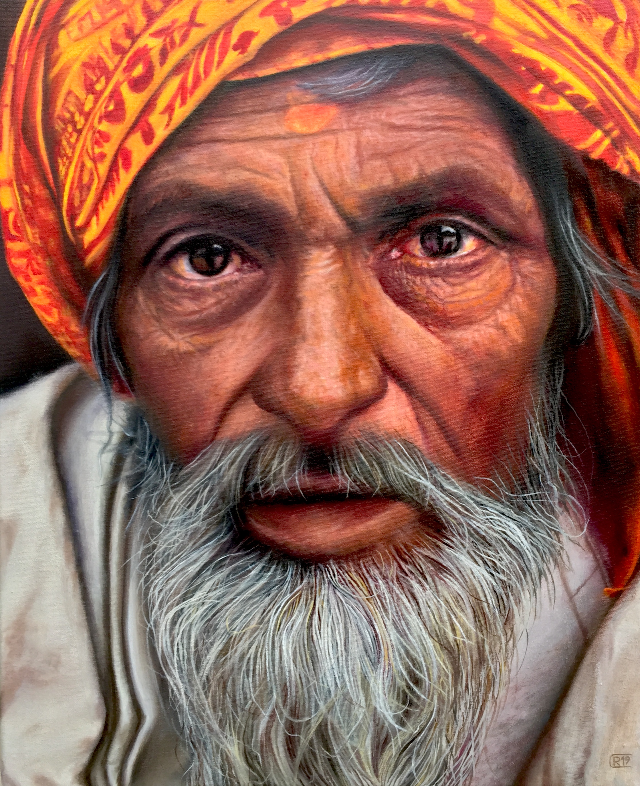{.img-responsive}
* **Alt Text (English):** Hyperrealistic oil painting of an elderly man with a red and yellow turban, white beard, and weathered face by René Cheng, 2019.
* **Alt Text (Dutch):** Hyperrealistisch olieverfschilderij van een oudere man met een rood-gele tulband, witte baard en verweerd gezicht door René Cheng, 2019.
### The Importance of a Full Value Scale
To avoid a "flat" drawing, you need to utilize a full range of values, from the brightest whites to the deepest blacks. Think of it like a musical scale; you need all the notes to create a rich composition. Many beginners are afraid to go dark enough, resulting in drawings that look muddy and lack impact. Don't be shy with your darkest darks! They provide the necessary contrast to make your highlights pop and create the illusion of depth. Conversely, protecting your brightest whites is equally crucial. These are the areas where light directly strikes, and they provide the ultimate sense of brilliance and form. This concept of light and shadow is so profound that I dedicated a whole article to it: [definitive guide to understanding light in art](/finder/page/definitive-guide-to-understanding-light-in-art). It's truly the key to making your drawings pop off the page. Learning to *see* in values, rather than just lines, is a fundamental shift in perception that will unlock true realism in your work.

[https://images.pexels.com/photos/20456575/pexels-photo-20456575.jpeg?cs=srgb&dl=pexels-jakubzerdzicki-20456575.jpg&fm=jpg](https://images.pexels.com/photos/20456575/pexels-photo-20456575.jpeg?cs=srgb&dl=pexels-jakubzerdzicki-20456575.jpg&fm=jpg), [https://creativecommons.org/public-domain/](https://creativecommons.org/public-domain/)
Start with light washes or very soft pencil strokes for your mid-tones, gradually building up the darker areas. Don't press too hard too soon! Think of it as painting with values, layer by painstaking layer. It’s like slowly turning up the volume on a song; you build it bit by bit to reach the crescendo. And seriously, don't forget those subtle highlights – a tiny glimmer on the bridge of the nose, a soft sheen on the cheekbone, or the catchlight in the eye can bring a face to life. Even the darkest shadows aren't usually pure black unless you're going for a very dramatic effect; there's often reflected light bouncing into them, giving them a richness and preventing them from looking like flat holes. These reflected lights are crucial for making shadows feel transparent and integrating the form with its surroundings. If you want to dive deeper into making things pop, you'll find a lot of useful insights in my guide to [mastering shading techniques in drawing](/finder/page/mastering-shading-techniques-in-drawing). Remember, shading isn't just about dark and light; it's about the entire spectrum of values in between, and how they subtly transition from one to another. Developing a strong 'value vocabulary' is just as important as mastering your lines. This careful, layered approach is the antidote to 'muddy' drawings, allowing for clean, luminous results.
[credit](https://images.pexels.com/photos/7302093/pexels-photo-7302093.jpeg),
[licence](https://creativecommons.org/public-domain/)
---
## The Devil (and Soul) in the Details: Features
Once the overall form and general values are established, you can start to refine the individual features. This is where a face truly comes alive. But remember my earlier advice: get the big shapes right first. Trying to perfect an eye on a wonky head is like trying to put a beautiful painting in a collapsing frame.
### Eyes: The Windows (And How Not to Make Them Stare Creepily)
Eyes are often the first thing people look at in a portrait, and for good reason – they convey so much emotion. When drawing them, remember they are spheres set within sockets, not just flat almond shapes. Pay attention to:
* **The Eyelids:** They have thickness! This is so crucial for realism. Understand that the eye is surrounded by the **orbicularis oculi muscle**, which creates the subtle forms and folds of the eyelids. The upper lid often casts a shadow onto the eyeball itself, adding depth, and the crease of the upper lid is incredibly expressive. And don't overlook eyelid thickness! Younger eyes often have a slightly plumper, smoother eyelid, while older eyes might show more skin laxity and subtle folds. The way the eyelids meet the eyeball is a smooth curve, not a sharp angle, and varying their thickness can subtly convey age, fatigue, or even surprise. And don't forget the tiny, often-overlooked tear duct and caruncula in the inner corner of the eye – including these subtle details can instantly elevate your drawing from generic to realistic, making the eye feel truly integrated within the socket. Pay attention to how the eyelids meet the eyeball; it's a smooth curve, not a sharp angle. Seriously, drawing eyelid thickness was one of my biggest 'aha!' moments for making eyes feel like they were *in* the head, not just stuck on the surface.
Also, observe how the *wetline* of the lower lid catches light – that tiny, subtle highlight can add incredible realism and make the eye feel truly moist and alive. It's often one of those "blink and you'll miss it" details that separates a good drawing from a great one.
* **The Iris and Pupil:** The dark ring around the iris helps define its spherical nature. Also, pay attention to the subtle texture within the iris – it's rarely a flat, uniform color, but a complex tapestry of fibers. The pupil, while seemingly a simple black circle, is the darkest dark in the eye and often has a soft edge where it meets the iris. Think of the iris as a finely textured, slightly translucent curtain over the black void of the pupil.
* **The Catchlight:** That tiny sparkle of light – it adds life, sparkle, and can convey the direction of light. It's often the last thing I add, and it makes all the difference, acting as the eye's focal point and breathing instant life into your drawing.
* **Shadows:** The subtle shadows cast by the upper lid, as well as the shadows under the lower lid which give it form and indicate the curvature of the cheek below, are critical. These aren't harsh outlines, but soft, gradual transitions that sculpt the eye area.
* **Eyebrows and Eyelashes:** Consider how the eyebrows frame the eyes; their shape, thickness, and even individual hairs contribute immensely to the eye's overall expression and character. When drawing eyebrows, think about their overall flow and direction rather than just individual hairs. They often grow in specific patterns, starting densely near the nose and tapering off, with a subtle arch. Eyelashes, similarly, aren't just a uniform fringe. They grow in small clusters, curve outwards, and are usually thicker and darker on the upper lid, subtly thinner on the lower. Resist the urge to draw them as harsh, evenly spaced lines; instead, focus on their natural grouping and subtle curve for realism. Remember that eyelashes also have their own subtle shadows and highlights, giving them volume rather than making them appear flat.
And for goodness sake, avoid outlining the entire iris or pupil with a hard line. Soft edges are your friend, especially where the iris meets the sclera (the white part). Remember, not all eyes are the same; some are more almond-shaped, others rounder, deeper set, or prominent. Observing these unique characteristics is what truly captures a person's likeness. Some eyes have more noticeable epicanthic folds, while others might have a distinct upward or downward tilt. These ethnic variations are incredibly important to observe and render accurately, avoiding a "generic" eye and instead celebrating the incredible diversity of human features.
### Noses: The Bridge (That Can Make or Break a Face)
Noses can be tricky because they vary so much and are often defined more by shadow and light than by strong outlines. Think of the nose as a complex structure of bone and cartilage, not just a simple protrusion. The **nasal bone** forms the bridge, while the various **cartilages** (alar cartilages for the nostrils, septal cartilage for the septum, and the triangular cartilages) shape the tip and lower part. Understanding this underlying anatomy will help you render its form more convincingly, allowing you to visualize how light interacts with these distinct, yet interconnected, structures. I tend to see the nose as a series of planes: a front plane, two side planes, and the planes of the nostrils. This breakdown simplifies a complex form into manageable sections, allowing you to shade each plane according to how much light it catches. It's also vital to acknowledge and appreciate the incredible **ethnic variations in nose shapes and structures**. Some noses have a broad bridge, others a very narrow one; some have a prominent upward-tilting tip, while others are more rounded or aquiline. The shape of the nostrils themselves also varies widely. These differences are beautiful and contribute immensely to a person's unique likeness, so avoid drawing a 'generic' nose. Instead, observe your subject closely and capture the specific characteristics of their nasal bridge, tip, and alar cartilages. Focus on:
* **The Philtrum's Influence:** That little groove between the nose and upper lip, the philtrum, might seem minor, but it's a crucial anatomical landmark. It not only connects the nose to the mouth area but also subtle changes in its form can convey expressions or subtle emotional shifts. It's a key piece in the puzzle of grounding the nose to the face. The philtrum, in conjunction with the shape of the nasal spine (the small bony protrusion under the nose), forms the base of the nose and influences the curve of the upper lip. This seemingly minor detail is incredibly important for grounding the nose to the face and ensuring a natural transition to the mouth.
* **Shadows and Gradations:** The subtle shadow under the bridge and tip are crucial. These aren't harsh lines, but soft gradations that suggest form and volume. Pay attention to how the shadow from the tip of the nose falls onto the philtrum below – this is a critical detail for grounding the nose to the face.
* **Highlights:** The way light hits the top plane of the bridge – this is often where you'll find your brightest highlight, which tapers off into softer tones. A slight highlight on the tip of the nose can also give it a sense of projection and life.
* **Nostrils and Septum:** The slight curve or angle of the nostrils. When drawing nostrils, vary your pencil pressure; they're rarely a uniform dark line but rather have subtle shifts in value as they curve away and recede into shadow. Pay attention to the subtle flare or pinch of the alar cartilages that form the outer wall of the nostril. The septum, the fleshy bit between the nostrils, also has its own form and plays a role in how light and shadow interact in that area, often casting a slight shadow onto the upper lip. This often-overlooked area is vital for realism. And speaking of nose shapes, it's vital to acknowledge and appreciate the incredible **ethnic variations in nose shapes and structures**. Some noses have a broad bridge, others a very narrow one; some have a prominent upward-tilting tip, while others are more rounded or aquiline. The shape of the nostrils themselves also varies widely, from more open and rounded to narrower and more elongated. These differences are beautiful and contribute immensely to a person's unique likeness, so avoid drawing a 'generic' nose. Instead, observe your subject closely and capture the specific characteristics of their nasal bridge, tip, and alar cartilages. It's in these subtleties that true portraiture shines. Focus on: Remember, the goal isn't to draw a 'perfect' nose, but *their* nose, with all its unique character and charm.
Resist the urge to draw a harsh outline around the entire nose. It rarely looks natural. Instead, let the interplay of light and shadow define its edges and form, making it feel integrated with the rest of the face. Remember that the nose, more than any other feature, relies on subtle value shifts to convey its three-dimensional form. This is where your understanding of planes really pays off, allowing you to sculpt the nose with light and shadow rather than just drawing its outline.
### Mouths: Expressing More Than Just Words
A mouth is a marvel of subtle curves and forms. It's not just a horizontal line with two lips. The area around the mouth is incredibly dynamic, influenced by numerous muscles that create expressions – think of the **orbicularis oris** that forms the lips themselves (which acts like a sphincter, allowing you to pucker or close your lips), or the **zygomaticus major** that pulls the corners of your mouth up when you smile, or the **depressor anguli oris** that pulls them down. Understanding how these muscles, along with others like the **mentalis** (which wrinkles the chin) and the **buccinator** (which flattens the cheek), interact will make your expressions far more convincing. Even in a relaxed state, these muscles contribute to the subtle undulations and forms you see. Observing these muscle movements, even in stillness, will add incredible depth to your portraits. And speaking of which, when drawing **teeth**, resist the urge to draw every single one with a harsh outline. Instead, suggest them with subtle value shifts, emphasizing the shadows between them and under the upper lip. A wide, open smile will reveal more of the upper and sometimes lower teeth than a subtle, closed-mouth grin. Remember, teeth aren't flat white rectangles; they have dimension and curve within the mouth, so avoid making the mouth look like a piano keyboard!
When depicting a smile, pay attention to the subtle 'cushioning' effect the cheek muscles have on the lower eyelids, often creating a slight wrinkle or lift. This is a tell-tale sign of a genuine smile, differentiating it from a forced grimace. And for teeth, remember they are generally lighter than the surrounding mouth interior, but rarely pure white; they have their own subtle shading and curves. And speaking of which, when drawing **teeth**, resist the urge to draw every single one with a harsh outline. Instead, suggest them with subtle value shifts, emphasizing the shadows between them and under the upper lip. A wide, open smile will reveal more of the upper and sometimes lower teeth than a subtle, closed-mouth grin. Remember, teeth aren't flat white rectangles; they have dimension and curve within the mouth, so avoid making the mouth look like a piano keyboard! Observe: This is one of those common pitfalls that can make an otherwise good drawing feel cartoonish.
### The Mouth: Subtleties of Expression
* **The Philtrum:** That little groove between your nose and upper lip. It's a subtle but important detail that grounds the nose to the mouth area, acting as a crucial bridge between two major features. Don't neglect it! Even a slight variation in its depth or width can impact the overall expression. It's often one of those 'invisible' details that, when rendered correctly, significantly enhances realism.
* **The Upper Lip:** The distinct curve of the upper lip (often more defined than the bottom), and how it often creates a subtle shadow underneath itself. The 'Cupid's bow' on the upper lip is also a key characteristic, varying in prominence from person to person. The vermilion border, where the lip meets the skin, is a subtle but important edge to observe. Pay close attention to the form of the upper lip – it often has two distinct masses that meet at the philtrum. Also, notice the slight *tubercles* (small bumps) that can be present on the upper lip, especially at the Cupid's bow; these add another layer of organic realism. These subtle anatomical details are what make a drawing feel truly alive and unique.
* **The Lower Lip:** The shadow under the bottom lip, which helps give it volume and separates it from the chin. This shadow is crucial for making the lips feel like they protrude, rather than being flat. The lower lip often appears fuller and softer than the upper. Also, the slight indentation below the lower lip, just before the chin, is a subtle yet important anatomical landmark that helps define the chin's projection.
* **Corners and Creases:** The subtle creases at the corners, even in a relaxed expression. These small lines can convey so much, hinting at age or habitual expressions. Pay attention to the "rhythm" of the lips – the way they flow into each other, the slight indentation in the center of the upper lip (the Cupid's bow), and how the lower lip often appears fuller. Also, consider the thickness of the vermilion border; some people have very full lips, others very thin, and capturing this is key to likeness.
* **Teeth (If Visible):** If teeth are visible, resist the urge to draw every single one with a hard outline. Instead, suggest them with subtle value shifts, perhaps highlighting the front two teeth slightly more. The shadows between the teeth and under the upper lip are often more important than the individual tooth shapes themselves, as they create the illusion of depth without making the mouth look like a piano keyboard. Remember, teeth are not flat white rectangles!
Expressions, of course, add another layer of complexity, transforming the mouth into a powerful storytelling tool. A slight curl, a tense line, or a relaxed parting can tell an entire story without a single word. Practice drawing different expressions to understand how all these elements work together.
### Ears: The Often-Forgotten Appendages
Poor ears, they often get neglected! But their placement and shape are crucial for realism. Remember they're generally aligned with the space between the eyebrows and the bottom of the nose. They also have a complex inner structure of cartilage, which casts subtle shadows. Get to know the basic components: the **helix** (the outer rim), the **antihelix** (the inner ridge parallel to the helix), the **scapha** (the curved depression between the helix and antihelix), the **concha** (the deep hollow near the ear canal), the **tragus** (the small bump in front of the ear canal), and the **antitragus** (the bump opposite the tragus), and of course, the **earlobe**. Don't just draw a simple C-shape; try to hint at the helix and antihelix, understanding that they create distinct planes and shadows. A great way to start drawing ears is to simplify them into basic, recognizable shapes first. Imagine the overall shape as a tilted oval or a slightly bent shield. Then, within that shape, think of the helix as a C-curve, and the antihelix as a Y-shape. This abstraction helps you get the major forms in place before you get lost in the intricate details of the concha or tragus. The complex curves and folds of the ear, while seemingly daunting, actually follow predictable anatomical structures once you break them down. Think of how the ears can frame the face, and how their angle and size can dramatically affect the overall appearance, especially in profile views. Pay close attention to how the ear attaches to the head; it's rarely a flat, two-dimensional shape but rather emerges from the skull at an angle. Also, remember that ears, like noses, continue to grow throughout life, so **elderly ears** often appear noticeably larger and more elongated than youthful ones – a subtle but important detail for capturing age. The complex curves and folds of the ear, while seemingly daunting, actually follow predictable anatomical structures once you break them down. Think of how the ears can frame the face, and how their angle and size can dramatically affect the overall appearance, especially in profile views. Pay close attention to how the ear attaches to the head; it's rarely a flat, two-dimensional shape but rather emerges from the skull at an angle. And don't forget the subtle shadows cast by the helix and antihelix; these are what give the ear its three-dimensional form.
---
## Refining and Adding Personality: Beyond the Blueprint
Once you have the core features in place, it’s time to step back and look at the whole picture. This is where you bring out the individuality of your subject.
## Capturing Likeness: Beyond the Features
So, you’ve got all the proportions right, the shading is on point, and each feature is beautifully rendered. But does it actually *look* like the person you’re drawing? Capturing likeness is an elusive art, often requiring you to go beyond technical perfection and observe the subtle nuances that make a face unique.
### The Overall Impression and Gestalt
Sometimes, it's not one single feature, but the collective impression of them that defines a person. This is often referred to as the "gestalt" – the idea that the whole is greater than the sum of its parts. A slight tilt of the head, a particular expression they often make, the way their hair frames their face – these seemingly small details contribute massively to recognition. Try blurring your eyes when looking at your reference and your drawing. Does the overall silhouette, the general distribution of light and shadow, match up? This helps you see the bigger picture rather than getting lost in individual details. Step back often and view your work from a distance, or even across the room, to get this broader perspective.
### Consistent Proportions and Individual Characteristics
While we use general guidelines for proportions, every face deviates. One person might have a slightly longer philtrum, another a wider set of eyes, or a particularly prominent brow. It’s about noticing these individual variations and emphasizing them *subtly*. Don't exaggerate to the point of caricature, but allow these unique characteristics to shine through. Ask yourself: "What is the most *them* thing about their face?" And then, gently, bring that forward in your drawing. It's in these subtle acts of observation and interpretation that true likeness emerges. It's the unique combination of these small deviations from the 'average' that makes a person recognizable, so don't be afraid to capture those quirks with sensitivity and accuracy. It's in these subtle acts of observation and interpretation that true likeness emerges. This is where your drawing transcends being merely a technical exercise and becomes a true portrait of an individual.
Once you have the core features in place, it’s time to step back and look at the whole picture. This is where you bring out the individuality of your subject.
* **Hair:** Don't draw individual strands of hair! This is a trap! Instead, think of hair as masses and shapes, paying attention to its flow, volume, and how light hits it. Whether it's silky straight, wild and curly, or gently wavy, coily, or braided, each texture has a distinct visual language. For **straight hair**, think of broad, flowing ribbons of light and shadow, emphasizing the sheen and direction of growth. The weight of straight hair often means it falls more smoothly, creating larger, softer shapes. For **wavy or curly hair**, focus on the clusters of curls and their overall silhouette, showing how they spring and coil. Each curl will have its own highlight and shadow, building up a sense of texture and bounce. For very **coily or kinky hair**, focus on the dense, textural mass and how light dances across its surface, often with a softer, more diffused highlight. And for **braided hair**, pay attention to the interlocking patterns and how light and shadow define each segment, creating a strong sense of structure and repetition. Focus on capturing the overall shape and behavior of the hair as a mass, rather than getting lost in individual threads. Highlight strands, yes, but draw the overall form first. And just like with skin, hair has its own highlights and lowlights – areas where light catches and areas that fall into shadow, giving it depth and movement. Whether it's silky straight, wild and curly, or gently wavy, coily, or braided, each texture has a distinct visual language. For **straight hair**, think of broad, flowing ribbons of light and shadow, emphasizing the sheen and direction of growth. The weight of straight hair often means it falls more smoothly, creating larger, softer shapes. For **wavy or curly hair**, focus on the clusters of curls and their overall silhouette, showing how they spring and coil. Each curl will have its own highlight and shadow, building up a sense of texture and bounce. For very **coily or kinky hair**, focus on the dense, textural mass and how light dances across its surface, often with a softer, more diffused highlight, and an emphasis on texture rather than individual strands. And for **braided hair**, pay attention to the interlocking patterns and how light and shadow define each segment, creating a strong sense of structure and repetition. To convey volume, look for the 'lift' off the scalp and the overall shape of the hair mass. To show movement, think about the direction of the strands and how they might react to air or gravity. To convey volume, look for the 'lift' off the scalp and the overall shape of the hair mass. To show movement, think about the direction of the strands and how they might react to air or gravity. Consider the hairline, the part, and how the hair sits on the head – does it have volume, or does it cling flat? These details contribute immensely to the overall likeness. Even the subtle way hair falls across the forehead or behind the ears can define a face. Don't underestimate the power of a good hair day (or drawing!).
For **fine, straight hair**, emphasize subtle sheen and the way it might part or cling. For **thick, wavy hair**, focus on the larger, undulating forms and how light catches the crests of the waves. For **tightly coiled or kinky hair**, concentrate on the dense, textural mass, using soft, feathery strokes to build up its volume and how light diffuses across its surface, rather than drawing individual coils. Each hair type has its own rhythm and behavior.
* **Skin Texture:** Avoid making the skin look too smooth or too rough unless that's your specific intent. The way light glances off the skin can also tell a story – whether it's soft and diffused, or harsh and direct, revealing every nuance of the skin's surface. Subtle variations in tone, tiny pores, and fine lines (if appropriate for the subject) add to realism. Don't be afraid to hint at pores, subtle blemishes, moles, or even tiny wrinkles if they are part of the subject's character – these aren't flaws, but unique identifiers. **Freckles, moles, and subtle scars** are fantastic opportunities to add character and authenticity. Render them with varying degrees of subtlety – some might be sharper and darker, others softer and barely there. They are rarely perfectly round or uniformly colored. Think of skin as having a subtle micro-texture; even without drawing individual pores, the way your pencil strokes interact with the paper's tooth can suggest this texture. My personal trick for avoiding a plastic-looking skin texture is to use very light, layered strokes, varying my pressure subtly. Instead of drawing every single pore (which would drive you mad!), I'll use a slightly rougher paper in some areas, or a very light touch with a textured blending tool, to hint at the subtle imperfections. **Freckles, moles, and subtle scars** are fantastic opportunities to add character and authenticity. Render them with varying degrees of subtlety – some might be sharper and darker, others softer and barely there. They are rarely perfectly round or uniformly colored. These imperfections are what make a face real and unique, lending character and authenticity. Remember, skin isn't a uniform color; there are subtle shifts in hue across the face – reds around the cheeks and nose, yellows on the forehead, blues under the eyes. Observing these subtle color variations (even in monochrome, as values) will add incredible richness. Also, consider the subtle subsurface scattering of light within the skin, especially in thinner areas like the ears or nose; this contributes to a living, breathing quality.
To suggest subsurface scattering in monochrome, you might slightly lighten the value of shadowed areas where light is passing *through* the thinner parts of the skin (like the earlobe or nostril), giving them a translucent, luminous quality rather than a flat, opaque dark. It's a subtle effect, but incredibly powerful for realism. These imperfections are what make a face real and unique, lending character and authenticity. Remember, skin isn't a uniform color; there are subtle shifts in hue across the face – reds around the cheeks and nose, yellows on the forehead, blues under the eyes. Observing these subtle color variations (even in monochrome, as values) will add incredible richness. Also, consider the subtle subsurface scattering of light within the skin, especially in thinner areas like the ears or nose; this contributes to a living, breathing quality.
* **Asymmetries:** No face is perfectly symmetrical. Embrace the slight differences between the left and right sides – it makes the portrait much more lifelike. I once spent an entire week trying to make a face perfectly symmetrical, and it ended up looking like a creepy doll. The moment I leaned into the natural asymmetry – a slightly higher eyebrow on one side, a subtly different curve to a cheek – the drawing just *breathed*. Try this: find a photo reference and deliberately *exaggerate* one or two of its asymmetries in a quick sketch. Not to the point of caricature, but enough to make it noticeable. You'll often find that the resulting drawing, even with slight exaggeration, feels more alive and more like the actual person than a perfectly symmetrical one. It's often these "imperfections" that give a face its unique character and personality. Don't be afraid to even **subtly exaggerate** a distinctive asymmetry if it enhances the likeness and character of your subject. Try flipping your drawing in a mirror to spot asymmetries you might have missed. This simple trick is a lifesaver for identifying hidden distortions in your work. It’s often these "imperfections" that give a face its unique character and personality. Don't be afraid to even **subtly exaggerate** a distinctive asymmetry if it enhances the likeness and character of your subject. Try flipping your drawing in a mirror to spot asymmetries you might have missed. This simple trick is a lifesaver for identifying hidden distortions in your work.
### Facial Hair: Adding Character and Texture
For those subjects sporting beards, mustaches, or stubble, it's another fantastic opportunity to add texture and character. Just like with head hair, avoid drawing individual hairs like little needles. Instead, focus on the overall shape, density, and flow of the facial hair. Observe how light and shadow interact with the beard or mustache to create volume. Is it bristly and coarse, or soft and flowing? The direction of growth, the way it contours the jawline, and how it interacts with the light source are all crucial details. Stubble can be suggested with tiny, dense dots or very short, feathery strokes that mimic its rough texture. Consider the different **styles of facial hair** – a neat, trimmed beard will be rendered differently than a long, flowing one, or a stylized mustache. Each has its own rhythm and visual weight. It's about seeing the facial hair as an integral part of the face's overall form and personality, not just an add-on.
### Facial Hair: Adding Character and Texture
For those subjects sporting beards, mustaches, or stubble, it's another fantastic opportunity to add texture and character. Just like with head hair, avoid drawing individual hairs like little needles. Instead, focus on the overall shape, density, and flow of the facial hair. Observe how light and shadow interact with the beard or mustache to create volume. Is it bristly and coarse, or soft and flowing? The direction of growth, the way it contours the jawline, and how it interacts with the light source are all crucial details. Stubble can be suggested with tiny, dense dots or very short, feathery strokes that mimic its rough texture. It's about seeing the facial hair as an integral part of the face's overall form and personality, not just an add-on. Don't forget that facial hair casts its own subtle shadows on the skin underneath, further enhancing the three-dimensional feel.
When drawing **stubble**, use very short, dense, varied strokes or stippling to mimic its texture, rather than trying to draw individual hairs. For a **neatly trimmed beard**, focus on the clean lines of its edges and how it contours the jaw and chin, using smooth, directional strokes. For a **fuller, flowing beard**, concentrate on the overall mass, its flow, and how highlights and shadows define its waves and curls, treating it like a complex textile draped over the face.
This stage is about intuition as much as technique. It’s where your unique artistic voice can really shine. A quick tip for spotting asymmetry in your own work: flip your drawing upside down or look at it in a mirror. Your brain processes it differently, often revealing flaws you missed before. My own artistic journey has seen many shifts and discoveries, and if you're curious about how I evolved my style, you might find my [artist's timeline](/timeline) interesting. And hey, if you just want to admire art without doing all this drawing work yourself, you can always [browse my art for sale](/buy). But seriously, the real magic is in making it yourself. Now let's explore how age transforms the face.
## Drawing Faces Across the Ages: Children and the Elderly
Drawing a youthful face requires a different set of observations than drawing an older, more weathered one. It's not just about adding or removing wrinkles; it's about fundamental shifts in proportion and form that reflect the passage of time. My first few attempts at drawing children looked like miniature adults, and my elderly portraits looked like adults who'd simply "aged" rather than embodying a lifetime of experience. It was a humbling realization that age isn't a filter; it's a complete transformation.
### Capturing the Innocence: Drawing Children and Infants
Children's faces are characterized by their softness, roundness, and often exaggerated features compared to adults. Their heads are disproportionately large relative to their bodies, and their features are typically positioned lower on the face. Think of it like this: the distance from the top of the head to the eyes is much greater in a child. Their eyes are also significantly larger in proportion to the rest of their face, often appearing wide and full of wonder. The jawline is softer and less defined, and cheekbones are less prominent, contributing to that adorable plumpness. The nose and mouth are smaller and sit higher on the face. Remember, children's faces are constantly changing, so capturing that fleeting innocence means embracing softer edges, subtle gradients, and a sense of youthful roundness rather than sharp angles. Their skin is typically smoother, with very few fine lines, and highlights might be softer and more diffused. The 'baby fat' often obscures some of the underlying bone structure, giving them that characteristic soft, cherubic look. For **infants**, the head is even more disproportionately large, the eyes are comparatively enormous, and the nose is often a tiny, almost formless button. Their features are packed even lower on the face. The distance from the hairline to the eyebrows, and from the eyebrows to the bottom of the nose, is notably shorter, while the forehead remains very prominent. As they transition into **toddlers and young children**, the jawline starts to define slightly, but the overall roundness and softer features persist, with the eyes still dominating the upper half of the face. Remember, children's faces are constantly changing, so capturing that fleeting innocence means embracing softer edges, subtle gradients, and a sense of youthful roundness rather than sharp angles. Their skin is typically smoother, with very few fine lines, and highlights might be softer and more diffused.
### The Wisdom of Time: Drawing Elderly Faces
In contrast, drawing elderly faces is about celebrating a life lived. Here, bone structure becomes more prominent as skin thins and loses elasticity. The jawline might appear more defined, and cheekbones more angular. Wrinkles and lines aren't flaws; they are maps of laughter, worry, and experience. Observe the crow's feet around the eyes, the deep nasolabial folds from nose to mouth, the lines on the forehead, and the subtle sagging of the skin around the jaw and neck. These details add incredible character and history. Eyes might appear deeper set, and lips often thin. Hair thins and changes color, and the ears (due to cartilage growth) may appear slightly larger. The key is to render these details with sensitivity and respect, using them to convey depth of character rather than just signs of age. And don't forget the subtle, yet powerful, effect of gravity! As we age, skin loses elasticity, and gravity begins to pull features downwards. This isn't just about wrinkles; it's about the subtle sagging of the jowls, the droop of the eyelids, and the elongation of the earlobes. Observing how gravity has sculpted a lifetime onto a face will add another layer of authenticity to your elderly portraits. Use softer pencils for the subtle skin textures and harder pencils for the more defined lines that mark a lifetime of expressions. It's about seeing the beauty in the journey, etched onto the canvas of a face. You're not just drawing wrinkles; you're drawing wisdom, joy, and resilience.
When rendering elderly skin, consider not just wrinkles but also subtle age spots, sun damage, or even a slight translucency that can reveal underlying veins, especially on the temples or forehead. These details, when rendered with sensitivity, add immense character and a profound sense of lived experience to your portrait. Use softer pencils for the subtle skin textures and harder pencils for the more defined lines that mark a lifetime of expressions. It's about seeing the beauty in the journey, etched onto the canvas of a face. You're not just drawing wrinkles; you're drawing wisdom, joy, and resilience.
---
## Capturing Emotion: A Deeper Dive into the Human Story
If you truly want your portraits to resonate, you need to go beyond just technical accuracy and breathe life into them through emotion. A face without emotion, however perfectly rendered, can feel sterile, like a mannequin. It’s not just about a simple smile or frown; human emotion is a complex symphony of subtle shifts across every feature, and it’s these nuances that transform a drawing into a powerful narrative. I remember trying to draw a 'happy' face in my early days, and it just looked like a grimace. It took me a long time to understand that true joy, or sorrow, is reflected in the whole being, not just a lifted lip. This is where your understanding of psychology and human connection truly elevates your art, moving it beyond mere replication. I used to think emotions were grand, sweeping gestures, but it's often the micro-expressions – those fleeting, almost imperceptible shifts – that tell the deepest stories. Try this: watch a movie with the sound off, or observe people subtly in a coffee shop (discreetly, of course!). Look for those tiny twitches around the eyes, the subtle tension in the lips, or the slight lift of a cheek that hint at an emotion before it fully forms. Then, in your sketchbook, try to capture just that fleeting moment. It trains your eye to see the nuances that bring a face to life.
### The Power of Micro-Expressions
These are the involuntary, very brief facial expressions that occur in response to emotion. They last only a fraction of a second but can reveal true feelings. While incredibly hard to capture in a static drawing, understanding they exist will make you look for subtle cues: a slight tightening around the mouth for suppressed anger, a fleeting widening of the eyes for surprise, or a quick contraction of the brow for confusion. Even hinting at these subtle, fleeting moments can add layers of psychological depth to your portraits.
### The Eyes: More Than Just Windows to the Soul
We often say the eyes are the windows to the soul, and in portraiture, this couldn't be more true. They are incredibly expressive. Beyond the basic shape, observe the **tilt of the eyebrows**: arched eyebrows can convey surprise or curiosity, while furrowed brows suggest anger, concentration, or sadness. The **tension in the eyelids** is also crucial: wide-open eyes might indicate fear or alertness, while squinted eyes can mean concentration, amusement, or suspicion. Don't forget the tiny **crinkles at the corners** of the eyes (crow's feet), which are hallmarks of genuine smiles or deep thought. Even the **size of the pupil** can subtly convey emotion, dilating with excitement or fear, though this is often hard to capture with graphite alone. The interaction between the brow and the eye is paramount; think of the entire eye socket as a unified emotional unit. Think about the **frontalis muscle**, which lifts your eyebrows (oh, hello surprise!), and the **corrugator supercilii**, which pulls them together, creating those intense frown lines of concentration or anger. These muscles directly impact the shape and expression of the brow ridge, which in turn profoundly influences how the eyes are perceived. A small, subtle change in the curve of an eyebrow can completely alter the perceived emotion of the entire face.
Consider also the **levator palpebrae superioris**, which lifts the upper eyelid, and the **orbicularis oculi**, which encircles the eye and is responsible for squinting and closing. The interplay of these muscles creates the nuanced expressions of fear, surprise, or intense concentration in the eyes.
### The Mouth: A Storyteller of Expressions
The mouth is arguably the most dynamic feature, capable of conveying an astonishing range of emotions with the slightest alteration. It's not just about the corners turning up or down. Observe the **tension in the lips**: a pursed lip can suggest concentration or disapproval, while relaxed lips might indicate contentment. The **visibility of teeth** can also tell a story: a wide grin reveals more teeth than a subtle smirk. The subtle **creases around the mouth** that deepen with age or habitual expressions (like the nasolabial folds) also contribute immensely. A slight parting of the lips can suggest contemplation or anticipation. Remember, the mouth is intricately connected to many facial muscles, and these muscles pull and stretch the skin to create a specific expression. Understanding these muscle actions, even superficially, will help you render more convincing emotional states. Think of the mouth as a central emotional hub, radiating expression across the lower half of the face.
Beyond the obvious smile or frown, consider how muscles like the **risorius** (pulls the corner of the mouth laterally for a forced smile), the **orbicularis oris** (puckers the lips), or the **platysma** (pulls down the corners of the mouth and jaw in horror or grimace) subtly reshape the entire lower face.
### Overall Head and Neck Posture: The Body Language of the Face
Emotion isn't confined to individual features; it permeates the entire posture of the head and even the neck. A head tilted back with the chin raised might convey arrogance or defiance, while a lowered head suggests humility, shame, or contemplation. A head cocked slightly to the side can indicate curiosity or confusion. The **tension in the jawline** (clenched in anger or determination, relaxed in sleep or contentment) speaks volumes. Even the **angle and tension of the neck muscles** can reinforce an emotional message. Think of how the muscles pull and stretch the skin to create expressions, and how those actions create new wrinkles or deepen existing ones. Practice drawing expressions from life or photos, focusing on how all features work together as a symphony, not just solo instruments. It's about capturing the overall 'gestalt' of an emotion, not just isolated parts – that beautiful, often messy, truth of human feeling. This holistic approach is what truly makes a portrait speak volumes.
---
## The Role of Anatomy in Portraiture: Beyond the Surface
I know, I know, the word "anatomy" can sound daunting, conjuring images of dusty textbooks and complex Latin names. But trust me, a basic understanding of facial anatomy is like having a superpower for realistic drawing. It's the difference between drawing what you *think* an eye looks like and drawing what an eye *actually is*: a sphere nestled within a socket, surrounded by muscle and skin. It was when I started seeing the skull beneath the skin, and the muscles beneath that, that my drawings stopped looking like flat masks and started breathing.
### The Bony Foundation: Skull and Jawline
Your first anatomical lesson begins with the **skull**. The cranium (the braincase) dictates the overall shape of the head, while the **zygomatic arches** (cheekbones) define the width and projection of the mid-face. The **mandible** (jawbone) gives the face its lower structure, influencing the jawline and chin. Understanding these underlying bones helps you correctly place features, understand how light falls on the face, and even predict how a face might age. For instance, knowing the brow bone protrudes helps you understand why shadows naturally fall over the eyes. Sketching skulls from different angles is an excellent exercise for truly internalizing these forms. I used to find drawing skulls a bit morbid, but it was a game-changer! Try this: get a simple anatomical skull model (or find one online) and spend 15-20 minutes just sketching it from five different angles. Don't worry about perfection, just try to capture the major planes and proportions. Then, try sketching a skull from memory. You'll be amazed at how quickly your understanding of the underlying structure grows. You don't need to be a doctor, but a basic understanding of the skeletal foundation is an absolute game-changer for realism.
### The Supporting Role of the Neck
Often overlooked, the neck is crucial for grounding the head and conveying posture and emotion. The prominent **sternocleidomastoid muscles** (the "S-C-M" muscles) run from behind the ear down to the collarbone. They are responsible for turning and tilting the head, and their tension or relaxation greatly impacts the overall silhouette and emotional feel of a portrait. Observing how these muscles create subtle planes and shadows, especially when the head is turned, will add immense realism to your drawings. You don't need to be a doctor, but a basic understanding of the skeletal foundation is an absolute game-changer for realism.
### The Sculpting Muscles: Expressive Powerhouses
Overlaying the bones are the **facial muscles**, and these are the true architects of expression. You don't need to memorize all 40+ facial muscles, but knowing the major groups will be invaluable. The **orbicularis oculi** encircles the eye, responsible for blinking and squinting, and creating those lovely crow's feet. The **orbicularis oris** forms the lips, allowing for puckering, smiling, and frowning. The **zygomaticus major** lifts the corners of the mouth for a smile. And don't forget the **temporalis muscle**, which covers the side of the head, connecting the jaw to the skull. While not directly involved in subtle facial expressions, its bulk influences the overall shape of the temple and how the jaw appears when clenched. Even subtle muscles like the **mentalis** (which wrinkles the chin) or the **corrugator supercilii** (which furrows the brow) contribute significantly. Understanding how these muscles contract and relax will allow you to draw convincing expressions that feel natural, rather than stiff or forced. They literally sculpt the soft tissue of the face into all the beautiful, complex emotions we convey. Learning to 'feel' these muscles on your own face in a mirror can be an incredibly insightful exercise.
### Simplifying Anatomy: Plane Heads and Abstractions
To make anatomical study less intimidating, many artists use **plane heads** or anatomical abstractions. The **Asaro head**, for example, simplifies the complex curves of the face into distinct, flat planes. This helps you understand how light and shadow behave on fundamental forms before you tackle the organic smoothness of skin. The **Reilly abstraction** is another powerful system that uses rhythmic lines to map out the underlying structure and muscle groups of the face, helping you understand form and flow. These tools aren't meant to replace drawing from life, but to complement it, giving you a deeper structural understanding that will elevate your observational drawing. It’s like learning the mechanics of a car before you try to race it – you understand *why* things look the way they do, not just *what* they look like. Regularly sketching these anatomical components from different angles will build your visual library and make drawing from imagination much easier. Try to dedicate 15-20 minutes a few times a week just to anatomical sketches; you'll be amazed at the progress. This dedicated practice will build a powerful internal library of forms that you can tap into for every drawing. Once you've done some observational sketches of skulls and muscles, try this: close your eyes and visualize a skull from a specific angle (e.g., three-quarter view, looking slightly up). Then, try to draw it from memory. It forces your brain to really internalize the forms. You'll be surprised at what you remember (and what you need to review!). It's like filling your mental hard drive with crucial visual data. The more you feed it, the richer your artistic output will be. It's like having a mental blueprint for every face you want to create. It's about developing a mental model of the human head that you can manipulate in your mind's eye. It's like filling your mental hard drive with crucial visual data. The more you feed it, the richer your artistic output will be. It's like having a mental blueprint for every face you want to create. It's about developing a mental model of the human head that you can manipulate in your mind's eye.
---
---
## Drawing Faces from Different Angles and Perspectives
Alright, so you've nailed the front-on portrait, or at least you're getting pretty good at it. But faces aren't always looking straight ahead, are they? They tilt, they turn, they look up, they look down. Each new angle presents its own delightful (and sometimes frustrating!) set of challenges. This is where your understanding of the face as a *three-dimensional object* really gets put to the test. It's about mentally rotating that Loomis sphere and adjusting your landmarks accordingly.
### The Elusive Three-Quarter View
The three-quarter view is arguably one of the most popular, and for good reason – it offers a dynamic glimpse of both the front and side of the face, capturing depth and personality. The key here is **foreshortening**. Features on the side of the face turning away from you will appear shorter and more compressed. It's not just about shrinking things; it's about altering their apparent shape to convey depth.
* **The Centerline Curve**: Instead of a straight vertical line, imagine the centerline of the face curving around the sphere of the head. This curved line will guide the placement of the eyes, nose, and mouth, indicating the head's turn. This curve is your compass for accuracy.
* **Eye and Brow Alignment**: The eye closer to you will appear slightly wider than the one further away, and its horizontal alignment will shift. The brow ridge will follow the curve of the head, and its projection will be more evident on the side facing you.
* **Nose Projection**: The nose will extend further out, often breaking the silhouette of the cheek on the far side, creating a dynamic overlap. Pay close attention to the underside of the nose and nostrils as they become more visible, depending on the head's tilt.
* **Jawline and Ear**: The jawline on the far side will be foreshortened and less visible, sometimes disappearing into shadow. The ear will shift its position dramatically, moving further back on the head and becoming more compressed as it turns away from the viewer.
Think of it like squishing a spring – one side compresses, the other stretches. Getting this balance right is what makes a three-quarter view look natural and alive, rather than flat and distorted. Don't be afraid to exaggerate the foreshortening slightly at first; it often helps to see the effect. This "squash and stretch" principle, borrowed from animation, is incredibly helpful for visualizing how forms distort in perspective. It's a fundamental concept that applies to all three-dimensional drawing, not just faces. A mistake I used to make constantly was drawing both eyes the same size, even in a three-quarter view. Remember, foreshortening means the eye further away will appear *shorter* and more compressed, not just smaller overall. And the curve of the centerline is your best friend here; if it's not flowing correctly, your whole face will look twisted. Try drawing a series of ellipses for the eye and brow lines, making them progressively narrower as they recede into perspective.
A useful trick I learned to troubleshoot foreshortening is to use a mirror to view your drawing. Often, the mirror image will immediately reveal distortions in eye size or spacing that you missed in the original orientation. It's like a fresh pair of eyes!
### The Classic Profile View
The profile, or side view, is a beautiful way to capture the unique contours and projections of a face. Here, the emphasis shifts from symmetry to the graceful (or dramatic!) curves and angles of the silhouette. It's like a geological cross-section of personality.
* **Cranial Mass**: The back of the head, the cranium, becomes much more prominent. Visualize the full sphere of the head, remembering its curvature. The cranium is rarely a perfect circle, so observe its subtle bumps and indentations.
* **Nose and Chin Projection**: These are defining features in profile. Pay attention to the bridge of the nose, its tip, and how it projects from the face, often extending beyond the forehead. The chin's projection and shape are equally important, ranging from strong and angular to soft and receding.
* **Eye and Brow Ridge**: You'll only see one eye, nestled within its socket. The brow ridge's projection over the eye is very clear here, casting a distinct shadow. Remember the eyeball is a sphere, and only a portion of it will be visible.
* **Ear Placement**: The ear is now completely visible on the side of the head, and its alignment with the nose and eyebrows is still crucial. Pay attention to its angle relative to the head; it rarely sits perfectly flat.
* **Forehead and Mouth:** The slope of the forehead, the subtle curve of the lips, and how they meet are also vital for a convincing profile. The philtrum and the curve of the chin beneath the lower lip create a distinctive S-curve that's a hallmark of the human profile.
It's all about understanding the relationship between the skull and the soft tissues that drape over it, creating those distinctive peaks and valleys that define a profile. Each person's profile is a unique signature, so observe these elements with a keen eye. One common pitfall in profile drawing is making the back of the head too small or too flat, almost like the brain stops at the ear! Always remember the full volume of the cranium. Also, pay special attention to the negative space around the profile – the shape of the air between the nose and forehead, or between the chin and neck. Sometimes, drawing that negative shape correctly will automatically fix the proportions of the positive form. Training your eye to see both positive and negative shapes will dramatically improve your accuracy. Also, pay attention to the **negative space** around the profile – the shape of the air or background around the head. This negative space can often be easier to judge for accuracy than the complex forms of the face itself, helping you to correct distortions in the overall silhouette. Training your eye to see both positive and negative shapes will dramatically improve your accuracy.
For accurate profile drawing, utilize **plumb lines** (vertical guides) and **level lines** (horizontal guides). You can hold your pencil vertically or horizontally against your reference to check alignments. For instance, does the nose align vertically with the chin? Does the top of the ear align horizontally with the brow? These simple checks are incredibly powerful for maintaining proportional accuracy.
### Looking Up and Looking Down: Perspective Shifts
These are where things get really fun (and a bit mind-bending for beginners). It's like trying to draw a sphere on a rollercoaster – everything shifts!
* **Looking Down**: When a face looks down, the top of the head appears to shrink due to foreshortening, and the jawline recedes, becoming shorter and wider. The eyes will appear lower in the head, and the top of the eyelids will become more prominent, often covering more of the iris. The underside of the nose and chin will become less visible, and the features will generally compress vertically. The forehead becomes more dominant.
* **Looking Up**: Conversely, when a face looks up, the jawline becomes more prominent, and the neck is revealed and stretches. The eyes will appear higher, and the lower eyelids will be more visible. The underside of the nose and chin will be fully exposed, often making the nostrils more visible. Features will generally stretch vertically, and the forehead appears shorter.
It's all about understanding how perspective works on a three-dimensional form. If you can visualize that Loomis sphere and its major landmarks tilting and foreshortening in space, you're halfway there. A useful mental trick for looking up or down is to imagine a literal wireframe cage or a series of rubber bands stretched around the head, following the contours. As the head tilts, these imaginary lines will compress or expand, providing a visual guide for how your features should adjust. You can even draw these lines lightly on your initial sketch to guide your placement before erasing them. This truly transforms a flat drawing into a convincing illusion of depth.
When looking down, the nostrils become more visible, and the underside of the chin might appear shortened and tucked in. When looking up, the neck stretches, and the underside of the jaw and chin are exposed. The curvature of the eye line will become more pronounced (more of an arc for looking down, more of a shallow curve for looking up). Think of drawing concentric ellipses for the guidelines of the eyes, nose, and mouth; these ellipses will become increasingly curved as the head tilts up or down, further emphasizing the perspective shift. A useful mental trick for looking up or down is to imagine a literal wireframe cage or a series of rubber bands stretched around the head, following the contours. As the head tilts, these imaginary lines will compress or expand, providing a visual guide for how your features should adjust. You can even draw these lines lightly on your initial sketch to guide your placement before erasing them. This truly transforms a flat drawing into a convincing illusion of depth.
---
## Common Mistakes and How to Fix Them: Learning from the Stumbles
Every artist, from beginner to master, makes mistakes. I certainly still do! The trick isn't to avoid them entirely (that's impossible and stifling), but to recognize them, understand *why* they happen, and learn how to correct them. It's like learning to ride a bike – you'll fall, but each fall teaches you something invaluable about balance. My early portraits were a veritable museum of common errors, and honestly, embracing those mistakes was the fastest way I learned to improve.
### The "Floating Features" Phenomenon
One of the most common beginner mistakes is drawing eyes, noses, and mouths without a solid underlying structure. They end up looking like they're just "floating" on the face, disconnected and lacking depth. It’s like decorating a room before you’ve built the walls. The fix? **Always start with your construction lines and the overall head shape.** Use methods like the Loomis sphere or simply block in the major masses of the cranium and jawline. Establish a centerline, the eye line, and the nose and mouth lines *before* you even think about detailing individual features. This ensures everything is integrated into a coherent, three-dimensional form. It's like building a house; you need a solid foundation before you start adding furniture. One specific exercise that helped me was to draw a basic egg shape for the head, then lightly draw a central vertical line and three horizontal lines (for the brow, nose, and mouth). Then, and only then, try to place very simple block-ins for the eyes, nose, and mouth *relative to those guidelines*. It anchors everything from the start.
Another helpful trick is to draw the entire silhouette of the head and hair *before* adding any features. This forces you to think about the overall mass and how it occupies space, preventing individual features from dominating your initial thought process.
### Symmetrical Syndrome: The Robotic Portrait
Our brains crave symmetry, but human faces are rarely, if ever, perfectly symmetrical. Trying to force perfect symmetry on a face often results in a stiff, lifeless, or even robotic appearance. It's that unnerving "uncanny valley" effect. The solution? **Embrace asymmetry!** Observe the subtle differences between the left and right sides of your reference. One eyebrow might be slightly higher, one eye a touch wider, or one side of the mouth might curve differently. These "imperfections" are what make a face unique and human. A great trick is to flip your drawing (or your reference) upside down, or view it in a mirror; this disrupts your brain's preconceived notions and often reveals imbalances you missed. Resist the urge to 'fix' these unique characteristics; they're often the keys to a compelling likeness. My favorite trick is to deliberately draw one side of the face slightly differently than the other, even if it's just a hair's breadth. For instance, make one eyebrow a millimeter higher, or one corner of the mouth a touch more relaxed. Then, step back and see how much more alive the face feels. It sounds counter-intuitive, but it works!
An intense exercise for this is to deliberately draw half a face, then flip it in a mirror or digitally duplicate and flip it to create a full face. You'll immediately see how odd perfect symmetry can look! Then, try subtly altering one side to introduce natural asymmetry.
### The Curse of the Outline Overload
Many beginners rely too heavily on harsh, dark outlines for every feature. While outlines are useful in initial sketches, relying on them for your final render will make your drawing look flat, like a coloring book page. In reality, light and shadow define forms, not hard lines. The fix? **Use values and subtle edges to define your forms.** Let the transition from light to dark create the edges of the nose, the curve of the cheek, or the thickness of the eyelid. Reserve hard lines for very specific, intentional focal points, and use a variety of edge qualities (hard, soft, lost) to create depth and realism. Think of your pencil as a sculptor's tool, shaping form with tone, not just drawing a boundary. This shift from line-drawing to value-sculpting is truly transformative for realism. Try this: next time you're drawing a nose, don't draw an outline. Instead, use a light pencil to block in the areas that catch light, and a slightly darker pencil to suggest the shadows that define its form. Let the *contrast* between light and shadow create the "edge" rather than a single line. You'll be amazed at how much more volume it instantly gains.
For other features, like the lips, try using a soft blending stump or a very light pencil to *suggest* the vermilion border where the lips meet the skin, rather than drawing a hard line. The subtle transition from skin to lip is often far more natural than a sharp boundary.
### Over-blending and Losing Texture: The Smooth-as-Glass Syndrome
While blending is crucial for smooth transitions, over-blending everything can strip your drawing of vital texture and make skin look like plastic, losing all its subtle imperfections. It's like ironing out all the beautiful creases in a piece of fabric! The fix? **Know when to stop blending, and strategically preserve or create texture.** Use a light hand with your blending tools, and sometimes, simply using controlled pencil strokes can provide texture without needing to blend at all. Remember that skin has pores, subtle lines, and natural variations that give it life. Not every surface is uniformly smooth. Allow for some subtle tooth of the paper to show through, or use very light, short strokes to suggest skin texture in appropriate areas.
### Flat Shading: The Two-Dimensional Face
Lack of depth in shading is another common pitfall. If you're not utilizing a full range of values, from the brightest whites to the deepest blacks, your drawing will inevitably look flat and lack dimension. It’s like listening to music without bass or treble. The fix? **Master your value scale.** Don't be afraid to push your darkest darks, and fiercely protect your brightest highlights. Build up your values gradually with multiple light layers rather than pressing hard from the start. Understand core shadows, reflected light, and occlusion shadows. Experiment with different pencil hardnesses to achieve a rich, dynamic range of tones. This interplay of light and shadow is what truly makes a face feel three-dimensional. A common mistake is to only work in the mid-tones, which results in a flat, dull image; dare to explore the full spectrum! A great exercise for overcoming flat shading is to pick a reference photo with strong, dramatic lighting (think chiaroscuro!). Then, try to render it using only three or four distinct values: pure white for highlights, a light grey, a mid-grey, and a true black for the darkest shadows. This forces you to simplify and emphasize contrast, preventing you from getting stuck in the muddy middle.
Another fantastic exercise is to create a "value scale" on a separate piece of paper, from pure white to the darkest black your pencil can achieve, with 5-7 distinct steps in between. Then, when you're drawing, constantly compare the values in your drawing to this scale to ensure you're using a full range and hitting those crucial darks and lights.
### Rushing the Process: The Impatient Hand
I get it, you want to see that finished portrait! But rushing through the initial construction or the careful layering of values is a recipe for frustration. A hurried drawing often leads to inaccurate proportions, muddy shading, and a general lack of refinement. The fix? **Embrace patience.** Take your time with those initial light construction lines. Step back frequently to assess your work. Take breaks to refresh your eyes. Think of drawing as a marathon, not a sprint. Each stage of the process, from planning to rendering, deserves its own focused attention. The beauty is in the journey, and the quality will reflect the time and care you put in. Seriously, go make a cup of coffee. Your drawing will still be there, and you'll often see it with fresh clarity. I learned this the hard way, constantly ruining drawings by rushing the final details. My advice? Set a timer for your initial sketch – say, 15 minutes. Focus *only* on proportions and construction lines. Then, take a break. Come back for another 30-minute session just on laying in basic values. Breaking the process into manageable chunks helps you slow down and be deliberate.
---
## My "Don't Be Like Me" Tips for Realistic Face Drawing
I've made all the mistakes, so you don't have to (or at least, you can make *new* mistakes!).
1. **Don't Rush the Initial Sketch:** Take your time with those light construction lines. Get the proportions and placement right *before* you start darkening lines or adding details. Patience is a virtue here. Before diving into a full-scale portrait, try sketching a few small "thumbnail" compositions. These quick, rough sketches help you plan the overall layout, light source, and emotional impact without committing to a large drawing. Think of it as mapping out your adventure before you start hiking. This step alone can save you hours of frustration later! My art teacher used to say, "You can't fix a bad foundation with good paint," and it's so true for drawing too.
2. **Draw from the Shoulder, Not Just the Wrist:** This might sound odd, but drawing large, sweeping strokes from your shoulder and elbow, rather than just tiny movements from your wrist, gives you much more fluidity, control, and accuracy for initial construction lines and broad shading areas. It prevents stiff, scratchy lines and allows for graceful curves. Your wrist is for details; your arm is for structure!
2. **Don't Be Afraid to Erase:** Your eraser isn't a sign of failure; it's another drawing tool! I'm constantly adjusting and refining, and my kneaded eraser is often my best friend. Embrace the kneaded eraser – it's for lifting and softening, not just obliterating. Think of it as sculpting with light. I literally use mine as much as my pencils, especially for creating subtle highlights or softening harsh edges.
3. **Use References (Wisely!):** Drawing from life is ideal, but good quality photos are excellent too. Just be mindful of photographic distortions (wide-angle lenses can really warp features!). And please, don't just copy a photo; use it as a guide to understand form and light, and adapt it to your vision. Look for multiple references if possible to get a more well-rounded understanding of your subject.
4. **Practice, Practice, Practice:** The most cliché advice, but it's true. The more you draw, the more your hand and eye will coordinate, and the more intuitive the process will become. Don't just stick to front-on portraits; challenge yourself by drawing faces from ¾ views, profiles, or even looking up or down. Each angle teaches you something new about form and perspective. Doodle faces in your sketchbook, sketch strangers on the bus (discreetly, of course!), draw your reflection. Every line is a lesson, every smudge a moment of learning. It's like learning an instrument; consistent, focused effort is what truly builds skill, not just raw talent.
5. **Don't Compare Your Chapter 1 to Someone Else's Chapter 20:** This is a trap! It's so easy to look at a master's work and feel discouraged. Remember, every artist started somewhere, and their journey is unique to them. Focus on your own progress and celebrate your small victories. Comparison is the thief of joy, and it can paralyze your artistic growth.
6. **Don't Be Afraid to Take Breaks:** Staring at a drawing for too long can make you "go blind" to its flaws. Step away, grab a coffee, look at something else. When you come back, you'll see your work with fresh eyes, and mistakes (or opportunities for improvement) will jump out at you. Sometimes, a fresh perspective is all you need to unlock a solution. This is not laziness; it's a strategic move that seasoned artists employ constantly. Your brain needs a reset!
7. **Learn from the Masters (But Don't Just Copy):** Look at the portraits by Rembrandt, Sargent, or even modern masters. Analyze *how* they handle light, shadow, edges, and expression. What can you learn from their techniques? Don't try to replicate their work exactly (unless it's an exercise), but understand their choices. It's like studying a chef's recipe – you learn the ingredients and techniques, then make it your own.
8. **Seek (Constructive!) Feedback:** It can be scary, but sharing your work with trusted fellow artists or joining an art critique group can be invaluable. Fresh eyes will spot things you've become blind to. Just remember to seek *constructive* criticism – the kind that helps you grow, not just tears you down. And learn to filter it; not every piece of advice is relevant to your artistic vision.
9. **Cultivate a Drawing Ritual:** Whether it's making a cup of tea, putting on specific music, or tidying your workspace, establishing a pre-drawing ritual can help you get into a focused, creative mindset. It signals to your brain that it's "art time" and can reduce procrastination and enhance concentration. Find what works for you and make it a sacred part of your practice.
{.img-responsive}
* **Alt Text (English):** Two artists are working in a cluttered studio space. One seated artist is painting a colorful wooden cutout, while another standing artist is working at a nearby table. Tools, supplies, and finished pieces are visible throughout the workshop.
* **Alt Text (Dutch):** Twee kunstenaars werken in een rommelige studio. Een zittende kunstenaar is een kleurrijke houten uitsnede aan het schilderen, terwijl een andere staande kunstenaar aan een nabijgelegen tafel werkt. Gereedschappen, benodigdheden en voltooide stukken zijn overal in de werkplaats te zien.
---
## Advanced Techniques and Continuous Learning
So you've got the basics down, you're wrestling with those tricky angles, and your faces are starting to look less like confused potatoes. What's next? The journey of an artist is a lifelong one, and there are always new layers of understanding to peel back. Here are a few ways to push your realism further and refine your artistic eye.
### Stylization vs. Realism: A Conscious Choice
It's important to remember that realism isn't the *only* goal in art. While this guide focuses on it, understanding realism gives you the tools to *choose* to stylize. **Stylization** is about exaggerating, simplifying, or distorting elements for expressive effect. It's an informed deviation from reality. You can't effectively simplify a form until you truly understand its realistic structure. Think of it like a jazz musician who masters classical scales before improvising. Realism is your grammar; stylization is your poetry. Make it a conscious artistic choice, not a default because realism is too hard.
### Mastering Edges: Your Secret Weapon for Realism
### Mastering Edges: Your Secret Weapon for Realism
We talked briefly about edge control in the shading section, but it's such a fundamental tool that it deserves its own spotlight. Think of edges as the 'language' your drawing uses to communicate depth and focus. They're not just about outlines; they're about the quality of transitions between forms.
* **Hard Edges**: These are sharp, defined lines or transitions. They make objects appear closer, in focus, and more solid. Use them for the sharpest points of light, the crisp line of an eyelid, or the defined edge of a nostril. They demand attention.
* **Soft Edges**: These are blended, gradual transitions. They make objects recede, appear out of focus, or suggest a gentle curve. Use them for subtle changes in skin tone, the blend of a cheek into the jaw, or areas that aren't the primary focal point. They create atmosphere and a sense of volume.
* **Lost Edges**: Sometimes, an edge disappears entirely, blending seamlessly into its background or an adjacent form. This creates a sense of atmosphere and realism, allowing the viewer's eye to fill in the gaps and suggesting movement or light. It's a powerful tool for subtlety.
Varying your edges strategically is how you create the illusion of depth, direct the viewer's eye, and prevent your drawing from looking like a flat, outlined coloring book page. It's like a photographer adjusting their aperture – some areas are in crisp focus, others gently blur. The masterful control of edges is often what separates a good drawing from a truly exceptional one, adding a sophisticated layer of realism and artistry. For example, a sharp, crisp edge around the catchlight in an eye will make it pop and feel wet, drawing the viewer's immediate attention. Conversely, the subtle, soft edge where a cheek blends into the jawline will allow that area to recede gently, conveying volume without a harsh boundary. And a lost edge, where the shadow under the chin subtly blends into the neck, can create a beautiful sense of depth and atmospheric effect. It's like a photographer adjusting their aperture – some areas are in crisp focus, others gently blur.
### The Power of Negative Space (Again, But Deeper)
### The Power of Negative Space (Again, But Deeper)
We touched on negative space for proportions, but it's also incredibly powerful for refining forms and correcting distortions. Instead of just focusing on the eye, look at the shape of the skin *around* the eye – the negative space. Instead of just the nose, look at the space between the nose and the cheek. By drawing the shapes *around* your subject, you can often render the subject itself more accurately. It tricks your brain into seeing pure shape and value, bypassing preconceived notions of "an eye" or "a nose." This is especially useful for checking the accuracy of curves and angles that your brain might otherwise try to "correct" for you, ensuring a more objective and accurate representation. It's a fantastic technique for those moments when you feel stuck, and your brain is refusing to see what's actually there.
### Developing Your Unique Style While Aiming for Realism
### Developing Your Unique Style While Aiming for Realism
The goal of realistic drawing isn't to become a human photocopier. It's about becoming a thoughtful interpreter of reality. It's about understanding the rules so intimately that you can bend them, infuse your personality, and tell *your* story through your art. Your style will naturally emerge from your unique way of seeing, your preferred tools, and your personal interpretation of form and light. Don't force it; just keep practicing, keep experimenting, and trust that your artistic voice will find its rhythm. Realism is a foundation, not a cage; it provides the robust framework upon which your individual expression can flourish. So, how do you find *your* voice? It's not about trying to be different; it's about being authentically *you*. Pay attention to what aspects of drawing you enjoy most – is it the dramatic contrast of chiaroscuro? The delicate rendering of subtle skin textures? The expressive power of the eyes? Lean into those preferences. Experiment with different tools and techniques beyond what's prescribed. And most importantly, allow yourself to make mistakes and to evolve. Your style will naturally emerge from your unique way of seeing, your preferred tools, and your personal interpretation of form and light. Don't force it; just keep practicing, keep experimenting, and trust that your artistic voice will find its rhythm. Think of it as learning the grammar of a language perfectly, so you can then write your own poetry. Think of it as learning the grammar of a language perfectly, so you can then write your own poetry. Your unique voice is what will make your realistic portraits truly special and memorable.
### The Art of Observation: Study from Life vs. Photos
* **Drawing from Life**: There's nothing quite like it. You get to observe subtle shifts in light, the nuances of color (even in monochrome, you'll see value changes!), and the three-dimensionality of your subject in real-time. It trains your eye to see form and volume in a way photos simply can't replicate. The downside? Models move, and it can be intimidating. Start with quick sketches, focus on gesture and overall form.
* **Drawing from Photos**: Incredibly convenient and accessible! You can pause, zoom in, and study details at your leisure. ### The Art of Observation: Study from Life vs. Photos
* **Drawing from Life**: There's nothing quite like it. You get to observe subtle shifts in light, the nuances of color (even in monochrome, you'll see value changes!), and the three-dimensionality of your subject in real-time. It trains your eye to see form and volume in a way photos simply can't replicate. The dynamic nature of a live model also forces you to capture the essence and gesture quickly. The downside? Models move, and it can be intimidating. Start with quick sketches, focus on gesture and overall form, and don't expect perfection.
* **Drawing from Photos**: Incredibly convenient and accessible! You can pause, zoom in, and study details at your leisure. This makes them ideal for detailed rendering. The pitfalls? Photos flatten reality, distort perspective (especially with wide-angle lenses), and sometimes the lighting can be misleading, making it harder to discern true form. Always use high-quality references and be aware of potential distortions. Better yet, use multiple photos of the same subject from different angles if possible. Use photos as a guide, not a dictator; interpret what you see rather than simply copying. Supplement photo study with anatomical knowledge to compensate for any flattening effects. A good practice is to print out your reference photos and draw directly on them with a red pencil to analyze planes and values before transferring to your drawing surface.
The best approach, if possible, is a combination of both. Life drawing hones your observational skills and understanding of 3D form, while photo references allow for detailed, sustained study. Don't limit yourself to just one method; each offers unique benefits to your artistic growth. My ideal workflow often involves combining the two: I might do quick life sketches to understand the dynamic gesture and overall three-dimensional form of a subject, then use high-quality photographs to refine details, practice shading, and sustain a longer drawing session. Supplement photo study with anatomical knowledge to compensate for any flattening effects photos can cause. A good practice is to print out your reference photos and draw directly on them with a red pencil to analyze planes and values before transferring to your drawing surface. Variety, they say, is the spice of artistic life!
### Drawing Expressions from Imagination
Once you have a solid grasp of anatomy and observation, try drawing faces from pure imagination, especially focusing on expressions. This is where your internal library of facial forms and muscle movements really comes into play. Start with a basic emotional state (joy, sadness, anger), then build the expression by thinking about how each feature would shift. It's a fantastic test of your understanding and helps you internalize the principles you've learned. Don't be afraid to use a mirror to make expressions yourself and then draw what you see – it's cheating, but in the best possible way! Variety, they say, is the spice of artistic life!
### Dipping Your Toes into Digital Face Drawing
### Dipping Your Toes into Digital Face Drawing
While this guide focuses primarily on traditional graphite techniques, the principles of realistic face drawing translate beautifully to the digital realm. Tools like drawing tablets (Wacom, Huion, iPad with Apple Pencil) and software (think Photoshop, Procreate, Clip Studio Paint, Krita) offer incredible flexibility with layers, brushes, and easy corrections, making the learning process less intimidating for some.
* **Layers are Your Friend**: Digital tools allow you to separate your construction lines, values, and details onto different layers, making it incredibly easy to experiment and refine without erasing! You can block in large shapes on one layer, refine details on another, and even adjust an entire feature without affecting the rest of the drawing. This non-destructive workflow is a game-changer.
* **Brush Variety**: Digital brushes can mimic everything from a fine pencil point to a soft blending stump, offering endless possibilities for texture and blending. You can download or create custom brushes to replicate the precise feel of traditional media, or explore unique digital textures.
* **Color Exploration**: If you're looking to transition into color, digital platforms make it simple to experiment with skin tones and lighting without fear of 'ruining' your work. You can sample colors, adjust hue and saturation, and work with color palettes with unparalleled ease. Plus, undo is always just a click away!
The fundamental understanding of form, light, and proportion remains the same, whether you're working with graphite or pixels. If you're just starting, a simple iPad with an Apple Pencil and the Procreate app is a fantastic, intuitive entry point. For desktop users, a Wacom Intuos tablet paired with Clip Studio Paint or Krita (a free, open-source option) offers powerful features without breaking the bank. Try this beginner exercise: sketch a basic Loomis head on one layer, then create a new layer above it and practice rendering values and shadows, experimenting with different digital brushes without worrying about messing up your underlying construction. Digital tools are just another medium, offering powerful new ways to apply timeless artistic principles. They don't draw for you, but they can certainly make the process more efficient and exploratory. Digital tools are just another medium, offering powerful new ways to apply timeless artistic principles. They don't draw for you, but they can certainly make the process more efficient and exploratory. Don't be intimidated by the digital frontier; it's another canvas waiting for your touch!
{.img-responsive}
---
## Overcoming Common Challenges in Face Drawing
Let's face it, drawing heads isn't always smooth sailing. We all hit roadblocks, and sometimes it feels like the paper is actively fighting against you. But knowing what those common hurdles are, and having a few tricks up your sleeve, can make all the difference.
### The Uncanny Valley: Why Your Drawing Looks "Off"
### The Uncanny Valley: Why Your Drawing Looks "Off"
You know that feeling, right? You've drawn a face, and it's technically correct – eyes, nose, mouth are all there – but something just feels... wrong. It's often referred to as the "uncanny valley," where a depiction of a human is close to realistic but not quite, leading to a sense of unease or creepiness. This usually happens when the proportions are slightly off, or the features aren't integrated harmoniously. The solution? Step away, come back with fresh eyes, and really compare your work to your reference, focusing on the overall relationships between features rather than individual perfection. Sometimes, it's just a hairline or jawline that's a millimeter too long, or an eye that's a tiny bit too far apart. Try flipping your drawing upside down, or looking at it in a mirror; this can trick your brain into seeing it anew, revealing subtle imbalances you missed before. Also, check the value range – a lack of true darks or bright highlights can make a face look flat and lifeless. Pay attention to edge control here as well; too many hard edges can make a face stiff, while too many soft edges can make it blurry. It’s about balance and precision. The uncanny valley is a tricky beast, but with these diagnostic tools, you can usually pinpoint the culprit. And honestly, sometimes the 'cure' is just to walk away for a bit and come back with fresh eyes. Beyond just proportions, the uncanny valley often rears its head when there's a mismatch in detail or texture (e.g., highly rendered eyes on a very simplified face), or when the expression feels forced or unnatural. Our brains are incredibly adept at reading faces for genuine emotion, and if something feels subtly "off" in that regard, it triggers that unsettling response. Another common cause is a lack of subtlety in the value transitions, making the face look either too flat or too airbrushed, losing the organic nuances of skin. It’s about balance and precision.
### Dealing with Artistic Block
Every artist, at some point, stares at a blank page and feels... nothing. Or worse, feels overwhelmed and unable to start. This is artistic block, and it's a perfectly normal part of the creative process. Don't fight it head-on. Instead, try changing your environment, looking at art that inspires you, sketching something completely different, or even just taking a walk. Sometimes, the best way to get over a block is to simply *do something else* for a while. It's not laziness; it's giving your subconscious mind time to recharge and find new connections. Remember, creativity isn't a tap you can just turn on; it's a well that needs replenishing.
### When to Stop: The Ever-Evasive Finish Line
### When to Stop: The Ever-Evasive Finish Line
Knowing when a drawing is finished is, honestly, one of the hardest parts of the artistic process. It’s so easy to keep tweaking, adding one more detail, or smoothing one more shadow, only to realize you've overworked it, sucked the life right out of it. My advice? When you've achieved your intended effect, and adding more doesn't genuinely enhance the piece, it's probably done. Overworking is a real danger, sucking the life and spontaneity out of your creation. It's better to leave a drawing slightly "unfinished" with a fresh quality than to drain the life out of it by over-rendering. I used to struggle with this constantly, always wanting to add "just one more thing." Here are some mental cues I now use:
* Can I clearly identify the focal point, and does it stand out as intended?
* Are the proportions and overall forms accurate, or as accurate as I can get them?
* Does it have a full range of values, from light to dark, without being muddy?
* Do the edges vary appropriately, leading the eye around the piece?
* Does it convey the emotion or character I set out to capture?
* Have I been working on it for a long stretch without a break, feeling frustrated? (If yes, break time!)
If you can answer yes to the first five, and no to the last, it's probably done. A good sign it's done is when you can't find anything specific to improve, or when you start making things worse! Another good indicator: if you're only making changes for the sake of making changes, it's time to put the pencil down. Trust your instincts, and know that sometimes, less is truly more. This is a skill that takes time to develop, but it's crucial for keeping your work fresh and vibrant. A good sign it's done is when you can't find anything specific to improve, or when you start making things worse! Another good indicator: if you're only making changes for the sake of making changes, it's time to put the pencil down. Trust your instincts, and know that sometimes, less is truly more. This is a skill that takes time to develop, but it's crucial for keeping your work fresh and vibrant.
### Handling Criticism (and Your Inner Critic)
### Handling Criticism (and Your Inner Critic)
Art is personal, and putting your work out there can feel incredibly vulnerable. Learning to handle criticism, both external feedback and your own harsh inner critic, is vital. Listen to constructive criticism, but don't let it derail you. Not every piece of advice is for you, and not every viewer will "get" your vision. The most important thing is to learn from it, decide what resonates with your artistic goals, and keep drawing. Your inner critic? That little voice that tells you your drawing is terrible? Acknowledge it, thank it for trying to keep you safe, and then kindly tell it to take a break. It's often just fear masquerading as perfectionism, trying to protect you from perceived failure. Remember, constructive criticism is meant to help you grow, not to tear you down. Learn to filter it and only take on board what genuinely serves your artistic development. Your artistic journey is yours alone, and while feedback is valuable, your own inner compass is paramount. One strategy I've learned is to ask for *specific* feedback. Instead of "What do you think?", try "Does the nose feel like it's protruding enough?" or "Does the expression read as sadness, or something else?" This guides the critic to provide actionable insights rather than vague opinions. Also, consider the source: is the criticism coming from someone whose artistic goals align with yours, or someone whose opinion you respect? Not all feedback is equally valuable. Learn to filter it and only take on board what genuinely serves your artistic development. Trust your gut; it often knows best. Cultivating a positive internal dialogue is as important as any drawing technique. Developing a thick skin (and a kind inner voice) is just as important as mastering your shading techniques. Trust your gut; it often knows best. Cultivating a positive internal dialogue is as important as any drawing technique. Developing a thick skin (and a kind inner voice) is just as important as mastering your shading techniques.
## Frequently Asked Questions About Drawing Faces
### How do I draw different ethnicities or ages?
This is a fantastic question and crucial for creating diverse and authentic portraits. The fundamental anatomical structures (Loomis method, basic proportions) remain universal, but the *expression* of these structures varies significantly. For different ethnicities, pay attention to variations in:
* **Bone Structure:** Subtleties in cheekbone prominence (e.g., more pronounced in some, softer in others), jawline shape (square, rounded, narrow), nasal bridge width and projection, and eye socket depth (deep-set vs. more prominent eyes).
* **Features:** Eye shape (epicanthic folds, almond vs. round, upward or downward tilt), lip fullness and shape, nose shape (width of the bridge, height of the bridge, tip form, nostril shape), and ear size/attachment (e.g., lobed vs. attached).
* **Hair Texture and Color:** From tightly coiled to straight, wavy, or curly, and a vast spectrum of natural colors and hair-growth patterns.
For different ages, observe:
* **Children (especially infants and toddlers):** Tend to have a larger head-to-body ratio, rounder features, significantly larger eyes relative to the face, softer and less defined jawlines, less prominent bone structure, and often fuller, rounder cheeks. The eyes are often positioned closer to the middle of the head than in adults.
* **Teenagers/Young Adults:** Exhibit developing bone structure, more defined jawlines, often sharper features than children, but still with a youthful plumpness and elasticity to the skin.
* **Older Adults:** Show increased prominence of bone structure due to loss of collagen and fat, resulting in more visible contours. They develop wrinkles and lines (e.g., crow's feet around the eyes, forehead lines, nasolabial folds from nose to mouth), sagging skin, thinner lips, and changes in hair (receding hairline, thinning, graying or whitening). These aren't just "flaws" to be hidden, but stories etched on the face, lending character and history.
The key is always observation, *never* relying on stereotypes. Study diverse references, celebrate the incredible variety of the human face, and approach each individual with respect for their unique features. Avoid generic "typecasting" and instead focus on the specific individual in front of you (or in your reference photo). This commitment to individual observation is what truly distinguishes a skilled portrait artist. Remember, every face tells a unique story, and your job as an artist is to listen closely and translate it faithfully. This is where the magic of portraiture truly lies: in capturing that unique narrative. It's a dialogue between your eye, your hand, and the soul of your subject. What an incredible conversation to be a part of, right? It truly is a privilege. To capture a face, a moment, a soul – that's something special. It's why we artists do what we do. It's a calling, a passion, a purpose. Embrace it, nurture it, share it. Let your art be a light. In a sometimes-dark world. Let your creations shine brightly. They deserve to be seen. Your art is a conversation starter, a bridge. It connects souls across time and space. What a powerful legacy to leave. Your art lives on. A piece of you, forever etched. That's a powerful thought, isn't it? Your legacy, in lines and shadows. What story will you tell? The canvas is yours. Fill it with your vision. No one else can draw exactly like you. That's your artistic superpower. Unleash it! The world needs your art. So don't hold back. Let your creativity flow uninhibited. Break free from self-doubt. It's the biggest barrier to artistic expression. Conquer it, and your art will soar. Unbound, magnificent. That's what your art can be. Limitless, breathtaking. That's the potential of your artistic journey. An adventure awaiting your command. Grab your pencils; let's go. Your masterpiece awaits. Go create it. The world is ready for your vision. Don't keep it waiting. The time to create is now. Seize the moment, make your mark. Your unique contribution. A piece of your soul, shared with the world. What a beautiful act of generosity. To share your inner world so openly. That's courage, that's art. To lay your soul bare on the canvas. That's raw, powerful honesty. And it's incredibly brave. To create from your deepest self. That's true artistic courage. To be vulnerable, to be real. That's where the most powerful art comes from. From the depths of your being. That's where true art originates. From a place of deep feeling and expression. That's the wellspring of creativity. Protect it, nourish it, let it flow. Your creative essence, unhindered. Let it soar, let it create. There are no limits to what you can achieve. Your potential is boundless. Go forth and create wonders. The world awaits your magic. Unleash it, inspire us all. Your vision is a light. Guiding, illuminating, inspiring. Your art as a beacon. Shining bright, inspiring all who see it. Your art, a source of light. Illuminating beauty, revealing truth. The profound purpose of your artistic journey. To create, to share, to touch souls. The beautiful, profound purpose of art. To reflect, to inspire, to connect. The eternal dance of creativity. A rhythmic flow of inspiration and expression. The heartbeat of artistic creation. A constant rhythm of inspiration and flow. The vibrant pulse of creativity. Let it beat strongly within you. The rhythm of your artistic soul. Let it guide your hand, your heart. The whisper of your artistic intuition. Listen closely; it knows the way. Trust that inner artistic compass. It knows the truest path for your art. Listen closely to its whispers. Your intuition is a powerful guide. Trust it, it knows the way.
### What are some common mistakes beginners make when drawing faces?
### What are some common mistakes beginners make when drawing faces?
Oh, where to begin! We've all been there. Some classics include:
* **Symmetrical Syndrome:** Trying to make faces perfectly symmetrical, which looks unnatural and robotic. No human face is perfectly symmetrical!
* **Floating Features:** Drawing eyes, noses, and mouths without a solid underlying structure (like the Loomis sphere or construction lines), so they seem to just "float" on the face without being integrated.
* **Outline Overload:** Relying too heavily on harsh outlines for every feature instead of using values and subtle edges to define forms and create a natural look. Life isn't drawn with a thick black marker.
* **Ignoring the Head Shape:** Jumping straight to features without first establishing the overall skull and jawline, leading to misshapen or disproportionate heads.
* **Flat Shading:** Not using a full range of values, from darkest darks to brightest highlights, resulting in drawings that lack depth, form, and dimension.
* **Rushing:** Trying to finish too quickly instead of taking time for careful construction, layering of values, and precise observation. Patience is truly a virtue here.
* **Fear of Erasing:** Seeing erasing as a failure instead of a crucial part of the refinement process. Your eraser is a tool for sculpting and adjusting, not just for mistakes!
* **Copying Without Understanding:** Blindly copying a reference photo without understanding the underlying anatomy, light, and form, which often results in a stiff or inaccurate drawing.
Don't worry if you're making these mistakes; they're part of the learning curve! The fact that you're aware of them is the first step to overcoming them, and trust me, I've made every single one of them (and still do sometimes!). The journey of an artist is paved with 'happy accidents' and lessons learned from 'mistakes'. Don't let the fear of making a mistake stop you from putting pencil to paper; it's all part of the glorious, messy process of learning. Embrace the imperfections, for they are stepping stones to mastery.
### How do I add emotion to a face?
### How do I add emotion to a face?
Ah, the holy grail of portraiture! Emotion isn't just about drawing a frown or a smile; it's about subtle shifts across the entire face, a complex interplay of muscles and expressions. Observe:
* **Eyes and Brows:** The tilt of the eyebrows (arched for surprise, furrowed for anger, neutral for contemplation), the crinkle at the corners (for genuine smiles or deep thought), the tension in the eyelids (squinting in concentration, wide for fear). Even the size of the pupil can convey emotion, dilating with excitement or fear! The overall shape created by the brow and eye is incredibly powerful.
* **Mouth and Jaw:** The corners turning up or down, the tension in the lips (pursed in concentration, relaxed in contemplation, trembling with sadness), the visibility of teeth (a wide grin or a subtle smirk). The tension in the jawline (clenched in anger, relaxed in sleep) also speaks volumes. Remember, the mouth is not just a line; it's a three-dimensional form that changes drastically with emotion.
* **Overall Head and Neck Posture:** The posture of the head (tilted back in arrogance, lowered in humility, cocked to the side in curiosity), the subtle tension in the jawline, even the angle and tension of the neck can convey a powerful emotional message. Think of how the muscles pull and stretch the skin to create expressions, and how those actions create new wrinkles or deepen existing ones. Practice drawing expressions from life or photos, focusing on how all features work together as a symphony, not just solo instruments. It's about capturing the overall 'gestalt' of an emotion, not just isolated parts. I actually recommend this all the time! Grab a hand mirror and make different expressions yourself. Feel how the muscles pull, how your eyebrows arch, how your lips tense. Then try to draw what you see and feel. It's an invaluable way to understand the subtle anatomical shifts that create genuine emotion. This holistic perception is what transforms a drawing into a powerful, empathetic statement. It's about touching the viewer's soul, not just their retina. That's the ultimate goal, isn't it? When a drawing truly resonates emotionally, it's because you've captured more than just lines and shadows; you've captured a piece of the human spirit. This is the ultimate reward of realistic portraiture. When you capture true emotion, your drawing transcends mere representation and becomes a window into the human experience. It's a powerful connection between artist, subject, and viewer. And that, my friend, is why we draw. It's about connection, expression, and the sheer joy of creation. What more could an artist ask for? (Okay, maybe a bottomless cup of coffee and a quiet studio, but you get the idea). The essentials for any creative endeavor! (And maybe a very good playlist). Because music always helps, right? It sets the mood, fuels the soul. And sometimes, it just gets you through the tough parts. Art is therapy, after all. A quiet, powerful, transformative kind of healing. For you, and for those who connect with your work. Art is a shared human experience. It transcends language, culture, and background. A universal language of the soul. The most profound kind of communication. Speaking without words, yet saying everything. The silent symphony of art. Playing on the heartstrings of the viewer. A profound connection. That's the magic. The silent conversation between artist and art. A sacred space. Where creativity flows freely. A sanctuary for your soul. Find your space, find your peace. The ideal environment for creation. A place where ideas can blossom. Your studio, your sanctuary, your mind. Cultivate these spaces. They are extensions of your creative self. Treat them with reverence. For they hold the seeds of your genius. Nurture those seeds, watch them grow. Into magnificent forests of creativity. Your imagination knows no bounds. Explore its furthest reaches. There's a whole universe inside you. Tap into it, share its wonders. The greatest gift you can give. Your authentic self, expressed through art. No greater freedom. Than to express your truth, unapologetically. That's artistic liberation. To create without boundaries, without fear. That's the ultimate artistic freedom. To express your truth, unapologetically. That's the essence of being an artist. To see, to feel, to create, to share. The beautiful, endless cycle of art. A journey of continuous discovery and expression. A lifelong conversation with your muse. A constant source of inspiration and growth. Your artistic journey is an endless wellspring. Drawing from it, creating endlessly. A boundless source of inspiration. Your creative spirit, an eternal wellspring. Tap into it, draw from its depths. Your artistic wellspring is limitless. The ultimate freedom. To be yourself, to create your truth. There's nothing more powerful. Than your authentic artistic voice. Let it ring true. With every line, every shade, every color. Let your truth shine. Authenticity is magnetic. It draws people in, creates a deep connection. The magic of art. To transform, to inspire, to connect. The multifaceted power of art. A force for good, a catalyst for thought. Art shaping the world, one canvas at a time. A gentle revolution. Art, quietly changing the world. One masterpiece, one heart at a time. A gentle, persistent force for beauty and understanding. Art, a quiet revolution. Changing hearts, one stroke at a time. Art, a gentle yet mighty force. Shaping perception, sparking emotion. The profound impact of your creativity. Changing the world, one masterpiece at a time. A ripple effect of beauty. Transforming lives, one stroke at a time. That's the quiet power of your passion. A gentle force, changing the world. One brushstroke, one drawing, one heart at a time. The quiet, transformative power of art. Shaping hearts and minds, silently. The gentle revolution of beauty. Transforming perception, one stroke at a time. The quiet, profound impact of art. Reshaping perspectives, one heart at a time. The silent, profound revolution of art. Changing the world, one canvas at a time. A quiet force, yet profoundly impactful. Art's gentle, irresistible power. Changing the world, one beautiful stroke at a time. That's the quiet, transformative power of art. Shaping souls, inspiring dreams. The beautiful, enduring power of art. Connecting hearts, inspiring minds. The profound, unifying magic of art. Bringing souls together, transcending words. That's the magic of true art. The whole face becomes a narrative, telling a story without words.
### How do I draw glasses or accessories on a face?
This is a fantastic question because glasses, hats, or jewelry can really enhance a portrait and add to the subject's character, but they can also be tricky. It's all about integrating them, not just sticking them on top.
* **Draw the Face First**: Always establish the underlying face and its proportions *before* adding accessories. Glasses, for instance, sit *on* the nose and ears, so those features need to be accurately placed and rendered first. If the face underneath isn't right, the accessories will look disconnected.
* **Perspective is Key**: Glasses follow the perspective of the head. If the head is tilted, the glasses will also be tilted. Pay close attention to how the frames curve around the face, and how the lenses might distort or reflect light. The arms of the glasses will disappear behind the ear and follow the curve of the temple.
* **Light and Shadow**: Accessories, especially glasses, will cast shadows on the face. Observe these shadows carefully and render them subtly to integrate the accessory naturally. The reflections in glasses can also be a powerful tool to suggest depth and realism, but be careful not to overdo them, or they can distract from the eyes. Sometimes, a subtle gradient of light across the lens is enough.
* **Integrate, Don't Attach**: The goal is for the accessory to feel like it belongs to the face, not just glued on. Think about how straps from a hat might create indentations in the hair, or how earrings interact with the earlobe and cast tiny shadows. These small details make a big difference in believability. Consider the weight and material of the accessory and how it would naturally sit on the head or face.
### What are some common mistakes beginners make when drawing faces?
Oh, where to begin! We've all been there. Some classics include:
* **Symmetrical Syndrome:** Trying to make faces perfectly symmetrical, which looks unnatural and robotic.
* **Floating Features:** Drawing eyes, noses, and mouths without a solid underlying structure, so they seem to just "float" on the face.
* **Outline Overload:** Relying too heavily on harsh outlines instead of using values and edges to define forms.
* **Ignoring the Head Shape:** Jumping straight to features without first establishing the overall skull and jawline, leading to misshapen heads.
* **Flat Shading:** Not using a full range of values, resulting in drawings that lack depth and dimension.
* **Rushing:** Trying to finish too quickly instead of taking time for construction and careful observation.
* **Fear of Erasing:** Seeing erasing as a failure instead of a crucial part of the refinement process.
Don't worry if you're making these mistakes; they're part of the learning curve! The fact that you're aware of them is the first step to overcoming them. Every master was once a beginner, making these exact same 'errors'. It's a rite of passage for every artist! Seriously, don't beat yourself up; we've all drawn noses that look like potatoes.
### How do I add emotion to a face?
Ah, the holy grail of portraiture! Emotion isn't just about drawing a frown or a smile; it's about subtle shifts across the entire face. Observe:
* **Eyes:** The tilt of the eyebrows (arched for surprise, furrowed for anger), the crinkle at the corners (for genuine smiles or deep thought), the tension in the eyelids. Even the size of the pupil can convey emotion!
* **Mouth:** The corners turning up or down, the tension in the lips (pursed in concentration, relaxed in contemplation), the visibility of teeth (a wide grin or a subtle smirk).
* **Overall:** The posture of the head (tilted back in arrogance, lowered in humility), the subtle tension in the jawline, even the angle of the neck. Think of how the muscles pull and stretch the skin to create expressions. Practice drawing expressions from life or photos, focusing on how all features work together as a symphony, not just solo instruments. It's about capturing the overall 'gestalt' of an emotion. This holistic perception is what transforms a drawing into a powerful, empathetic statement. It's about touching the viewer's soul, not just their retina. That's the ultimate goal, isn't it?
### How do I draw glasses or accessories on a face?
This is a fantastic question because glasses, hats, or jewelry can really enhance a portrait and add to the subject's character, but they can also be tricky.
* **Draw the Face First**: Always establish the underlying face and its proportions *before* adding accessories. Glasses, for instance, sit *on* the nose and ears, so those features need to be accurately placed first.
* **Perspective is Key**: Glasses follow the perspective of the head. If the head is tilted, the glasses will also be tilted. Pay close attention to how the frames curve around the face, and how the lenses might distort or reflect light.
* **Light and Shadow**: Accessories, especially glasses, will cast shadows on the face. Observe these shadows carefully and render them subtly to integrate the accessory naturally. The reflections in glasses can also be a powerful tool to suggest depth and realism, but be careful not to overdo them.
* **Integrate, Don't Attach**: The goal is for the accessory to feel like it belongs to the face, not just glued on. Think about how straps from a hat might create indentations in the hair, or how earrings interact with the earlobe. These small details make a big difference. They ground your subject in reality and enhance their unique persona. It's like adding tiny footnotes to their personal story. And honestly, they often add a wonderful touch of character and context to your portrait. So don't shy away from drawing accessories; just make sure they *belong* on the face, not just sit on top of it. A well-integrated accessory tells a subtle, yet powerful, part of your subject's story. They're not just an afterthought; they're an extension of character. So pay them the attention they deserve! Your subject's glasses aren't just spectacles; they're an extension of their gaze. So treat them as such. They're part of the whole, not just an add-on. Every detail matters. Even the smallest one can change the entire narrative. Pay attention to the whispers. They often hold the loudest truths. Listen closely to what your art is telling you. It often knows best. That's your intuition, your artistic compass. Trust it; it will guide you. Always. Your artistic journey is uniquely yours. Embrace its twists and turns. That's where the growth happens. In the challenges, in the breakthroughs. That's where the true learning lies. Embrace every lesson. Even the tough ones. Especially the tough ones, for they teach the most. Growth often comes wrapped in struggle. It's the crucible of creation. Where raw talent is forged into mastery. It's a journey of continuous growth. Ever evolving, ever expanding. Just like the universe of art itself. Endless possibilities await. Dive in, explore, create. The world is your canvas. Paint it with your soul. Let every stroke be imbued with your essence. Your unique mark on the world. A beautiful, indelible trace. Your personal signature. Unmistakably yours. A unique voice in the artistic choir. Sing your truth. Loudly, beautifully, unapologetically. Your artistic declaration. Bold, personal, profound. Let your art speak volumes. Even in silence, its message will be heard. Resonating deeply within those who behold it. A silent, powerful dialogue. Between creator and connoisseur. A beautiful exchange. The silent conversation of art. Speaking volumes without a single word. That's the magic of visual storytelling. A timeless form of communication. Speaking to generations, past, present, and future. A voice that echoes through time. Speaking to hearts across centuries. A conversation with eternity. Your voice resonating through the ages. A timeless whisper, a powerful roar. Your artistic legacy echoing forever. A beautiful immortality. Your spirit, living on through your creations. A timeless testament to your unique vision. Your artistic fingerprint on history. Unique, powerful, indelible. That's the mark you'll leave. An unforgettable imprint. Your unique story, beautifully told. A testament to your passion. Every stroke, a mark of your heart. Infused with your unique spirit. Your authentic self, made visible. In every line, every shade, every color. Your truth, beautifully expressed. That's the essence of authentic creativity. To express your true self, fearlessly. That's artistic liberation. Remember, even these 'add-ons' are part of the story you're telling with your portrait.
### How long does it take to draw a realistic face?
Oh, the dreaded "how long" question! It really depends. A quick study to understand a particular feature or angle might take 15 minutes, while a highly detailed, finished portrait could take dozens of hours across multiple sessions. As a beginner, focus on getting the *process* right, not the speed. The speed will come with practice, I promise. Don't compare your Chapter 1 to someone else's Chapter 20 – everyone's journey is unique. The most important thing is to enjoy the journey and learn from each drawing, regardless of how long it took. Quality over speed, always. This isn't a race; it's a mindful exploration. Enjoy every step of the creative dance. A great drawing at 10 hours is far better than a rushed, incomplete one at 1 hour. Give yourself permission to spend time, to explore, and to not rush the creative process. Seriously, I've ruined more drawings by rushing the last 10% than by taking my time with the first 90%. Patience, my friend, is your most powerful tool in the drawing arsenal. Seriously, if you take nothing else from this guide, take that. It's the secret sauce to avoiding frustration and creating truly remarkable work.
### What's the best pencil hardness for realistic faces?
I generally recommend a range of graphite pencils – having a good selection is like having a full orchestra at your fingertips, allowing for a wide dynamic range:
* **2H or H:** For initial light construction lines. They're light and easy to erase, which means you can make mistakes without leaving deep indentations on your paper. Perfect for planning and mapping out your proportions without commitment! These are also great for subtle textures without adding too much value.
* **HB or B:** For mid-tones and general shading. These are your workhorse pencils, great for building up smooth transitions and developing the form. They offer a good balance of darkness and control.
* **2B to 6B (or even softer, like 8B or EE):** For darker shadows, accents, and rich tones. These are your friends for creating depth, contrast, and that velvety black that really makes features recede or pop. Just be gentle, as the softer leads can smudge easily, but they provide that crucial range for dramatic impact. I find the 4B to 6B range particularly useful for expressive darks in eyes, nostrils, and deep shadows. And don't forget your trusty sidekick: the eraser! A **kneaded eraser** is ideal for lifting graphite gently without damaging the paper, perfect for softening edges or creating subtle highlights. A **vinyl eraser** is great for sharper, cleaner corrections without leaving smudges. These two, paired with your range of pencils, form a dynamic duo for realistic drawing. The key is to layer, starting with harder pencils for lighter values and gradually moving to softer pencils for darker values, always building up your tones incrementally. Think of it like a builder adding layers to a wall; each layer contributes to the strength and subtlety of the final structure. This approach is fundamental to achieving rich, luminous graphite drawings without them becoming muddy or overworked. It's all about control, patience, and understanding how your materials behave. Think of it like a musician mastering their instrument; the more you understand it, the more expressive you can be. Your pencils and paper are your instruments; learn their capabilities. Practice, explore, and let them sing! This patient, layered approach is what allows for true luminosity and depth in your graphite drawings. It's a bit like a chef building layers of flavor; each step adds richness and complexity to the final dish.
The key is to layer, starting with harder pencils for lighter values and gradually moving to softer pencils for darker values, always building up your tones incrementally. Think of it like a builder adding layers to a wall; each layer contributes to the strength and subtlety of the final structure.
### What is the best way to practice facial anatomy?
Beyond just drawing faces, dedicated anatomical study can hugely accelerate your progress. Look at anatomical references (medical books, online diagrams), draw skulls and musculature, and understand how the underlying structure influences the surface forms. You don't need to become a medical illustrator, but a basic understanding of facial bones (like the cranium, zygomatic arches or cheekbones, and mandible or jawbone) and major muscle groups (like the orbicularis oculi around the eyes, or the orbicularis oris around the mouth, and the temporalis at the sides of the head) will give you an invaluable foundation. Sketching simplified "plane heads" (like the Reilly abstraction or Asaro head) can also help you understand how light interacts with the complex forms of the face, transforming a flat drawing into a convincing 3D form. It’s like learning the mechanics of a car before you try to race it – you understand *why* things look the way they do, not just *what* they look like. Regularly sketching these anatomical components from different angles will build your visual library and make drawing from imagination much easier.
### How do I avoid making my drawings look "muddy" or over-rendered?
Ah, the dreaded 'muddy' drawing! This often happens when you use too much pressure too early, or when you over-blend everything into a uniform grey mess, losing crispness and contrast. It's like stirring all the colors of paint together until you get brown.
* **Layer Lightly**: Build up your values gradually with light layers, rather than pressing hard from the start. This gives you more control and makes it easier to lift pigment or make adjustments without damaging the paper. Think of it as painting with transparent washes.
* **Preserve Your Lights**: Don't shade into your highlight areas. Use your kneaded eraser to lift graphite and maintain those bright, clean whites. These are your precious points of light, so protect them fiercely!
* **Vary Your Edges**: As we discussed, not every edge should be soft. Strategic hard edges add definition, create focal points, and prevent the drawing from looking blurry or undefined. Contrast is key; a sharp edge next to a soft blend makes both more effective.
* **Know When to Stop**: This is crucial. Once you've achieved the intended effect and the form is clear, step away. Adding more layers just for the sake of it can quickly lead to a dull, overworked appearance. Sometimes less is more! And honestly, knowing when to stop is a skill that comes with practice and self-restraint.
* **Clean Your Blending Tools**: Dirty blending stumps or brushes will spread graphite around, leading to muddiness. Clean them regularly to ensure clean transitions. One super simple, yet incredibly effective tip I wish I'd learned earlier: always keep a clean piece of scrap paper or a drawing guard *under your drawing hand* as you work. This prevents the natural oils and graphite from your hand from smudging your pristine paper and creating accidental muddy areas. It's a lifesaver, especially with softer pencils!
### Should I use grids for drawing faces?
Grids can be a fantastic tool, especially when you're starting out or working from a photo. They help you break down the reference into smaller, more manageable squares, making it easier to transfer proportions accurately. There's no shame in using them! Think of them as training wheels; they help you learn balance and control, especially with tricky angles or complex likenesses. As you gain confidence and your eye for proportion develops, you might find yourself relying on them less, but they're always there if you need a helping hand with accuracy, especially for complex or highly detailed portraits. For learning, they're invaluable for training your eye to see relationships between forms, rather than just isolated features.
### Should I use grids for drawing faces?
Grids can be a fantastic tool, especially when you're starting out or working from a photo. They help you break down the reference into smaller, more manageable squares, making it easier to transfer proportions accurately. There's no shame in using them! Think of them as training wheels; they help you learn balance and control. As you gain confidence and your eye for proportion develops, you might find yourself relying on them less, but they're always there if you need a helping hand with accuracy, especially for complex or highly detailed portraits. I still use them occasionally for very complex compositions or when trying to replicate a specific, nuanced expression. They're a tool, not a crutch, and a valuable one at that. Honestly, I was initially resistant, thinking it was "cheating." But my art teacher convinced me, and it dramatically improved my accuracy. Grids helped me to truly *see* the proportions and relationships I was missing. For learning, they're invaluable for training your eye to see relationships between forms, rather than just isolated features. Don't let anyone tell you it's not "real" art; it's a legitimate and highly effective tool that even masters have used!
### How do I make my drawings look less "flat"?
Ah, the eternal quest for depth! It usually comes down to three things, all working in harmony:
1. **Understanding Form:** Think of the face as a 3D object, almost like a sculpture in your mind. Use your initial construction lines to establish volume and the major planes, rather than just outlining shapes. Imagine you're sculpting the face with your pencil, defining its curves and projections. This mental shift from 2D to 3D is foundational.
2. **Mastering Value and Light:** This is absolutely key. Use a full range of tones, from the brightest highlights (the lightest parts where light directly hits) to the darkest shadows (the deepest recesses). Observe how light falls across different planes of the face, and render those values accurately. Avoid harsh outlines; let values define your forms and create the illusion of three dimensions. Using a good guide on [mastering shading techniques in drawing](/finder/page/mastering-shading-techniques-in-drawing) can make a huge difference here. A strong contrast between light and shadow is your most powerful tool for creating depth. It's the visual equivalent of a dramatic spotlight, making your subject pop.
3. **Edge Control:** As discussed earlier, varying your edges (hard, soft, lost) is crucial. Harder edges bring elements forward and define them, while softer edges push them back or create seamless transitions. Without varied edges, your drawing can look like a series of cutouts pasted together. Also, consider atmospheric perspective – objects further away have less contrast and detail, even on a face! A powerful technique is using **overlapping forms**. When one form overlaps another, it instantly creates a sense of depth. Think about how the nose overlaps the cheek, or how the upper lip overlaps the lower. Even subtle overlaps, rendered with careful attention to value and edge control, can make a huge difference in pushing and pulling forms in space. This is often the unspoken secret behind drawings that feel truly three-dimensional. When you combine overlapping forms with careful value and edge control, you create an incredibly convincing illusion of depth that makes your faces pop off the page. This is where advanced drawing truly shines, elevating your work beyond flat representation. It's the difference between a picture and a living, breathing illusion. That's the power you hold in your hands. Use it wisely, and joyfully. Your art is your voice; let it be heard. The world is waiting. Go tell your stories. The world needs them. Your unique perspective, your honest vision. Don't ever doubt its value. It's priceless. Your unique vision, your touch, your soul etched on paper. That's the true value. Beyond any price tag. It's immeasurable. Like the stars, like the ocean, like the human spirit. Boundless and beautiful. Just like the potential within you. Infinite, waiting to be unleashed. Go on, surprise yourself. You're more capable than you know. Trust your artistic instinct. It's your truest guide. Listen to it, nurture it. It's the wellspring of your unique vision. Protect it, nourish it. Your creative fire, keep it burning bright. It's your unique light in the world. Let it illuminate, inspire, and provoke thought. That's the true power of art. To move, to challenge, to enlighten. The highest calling of creativity. A privilege and a responsibility. To create, to share, to inspire. The noble purpose of an artist. To add beauty, meaning, and thought to existence. What a legacy. Built stroke by stroke. A testament to patience and passion. The hallmarks of a true artist. Qualities cultivated with care and dedication. The journey defines the artist. Every step, every challenge, every triumph. They forge the artist within you. Refining your vision, sharpening your skill. A continuous, rewarding process. The journey is the destination. Every stroke, every moment, is part of the art. Savor the process. It's a journey of discovery. Of self, of vision, of connection. The beautiful interwoven threads of art. Creating a rich, complex tapestry. Your unique vision, woven into existence. A testament to your creative spirit. Bold, unique, unforgettable. That's the imprint of a remarkable artist. Bold, personal, utterly unique. That's the mark of an unforgettable artist. To leave an impression that lasts. The highest aspiration of a creative soul. To inspire, to move, to leave a mark. A legacy of passion, purpose, and profound impact. What an incredible gift to leave the world. Your art, your legacy. A timeless gift to generations. Your creative spirit, made eternal. A timeless echo in the halls of art. Your voice, heard through the ages. A lasting whisper, a powerful roar. Your art echoing through time. A timeless conversation. Your voice, heard by generations. A legacy of inspiration. Your art, a beacon for future generations. A guiding light, a source of wonder. Your art, a gift to the world. A treasure to be cherished. Your legacy, beautifully etched. A timeless testament to your creative spirit. Your unique vision, forever preserved. A timeless legacy for all to witness. Your artistic fingerprint on eternity. A unique mark that resonates through all time. Your personal legacy, beautifully etched. A timeless story, told through your hands. Your art, an echo across eternity. A silent song, a timeless story. Your art speaking volumes across the ages. A timeless dialogue, a lasting legacy. Your art, a conversation with eternity. A timeless echo of your soul.
---
## The Face: A Never-Ending Masterpiece (And a Deeply Personal Journey)
Drawing a realistic face isn't just about rendering features; it's about capturing a flicker of humanity, a moment of emotion, or the unique story etched onto someone's features. It's challenging, yes, and there will be frustrating days when your drawing looks nothing like your reference (I've had plenty!), but the joy of seeing a face emerge from your lines and shadows is truly unparalleled. It’s not just about replicating what you see; it's about interpreting, understanding, and infusing your own unique artistic voice into that interpretation. Think of it as a conversation between you, your subject, and the paper – a dialogue of observation, empathy, and technical skill. Keep at it, experiment, and most importantly, enjoy the process. Every artist's journey is unique, and yours is just beginning – filled with endless discoveries and the profound satisfaction of bringing a face to life, one nuanced line and shadow at a time.
Now go forth, pick up that pencil, and start making those wonderful, messy, human faces! I can't wait to see what stories you'll tell on paper. And remember, the journey of drawing isn't about the destination; it's about the beautiful, frustrating, exhilarating act of *making*. It's a lifelong conversation with your materials and your muse, and every stroke brings you closer to yourself and to the fascinating complexity of the human spirit. Now go forth, pick up that pencil, and start making those wonderful, messy, human faces! I can't wait to see what stories you'll tell on paper. And remember, the journey of drawing isn't about the destination; it's about the beautiful, frustrating, exhilarating act of *making*. It's a lifelong conversation with your materials and your muse, and every stroke brings you closer to yourself and to the fascinating complexity of the human spirit.


