
Golden vs. Liquitex: Which Pro Acrylic Paint Is Right For You? A Personal Take
Deciding between Golden and Liquitex acrylics? Join me as I share my personal insights, experiences, and a detailed comparison to help you choose the best professional paints for your art studio and creative journey.
Golden vs. Liquitex: The Definitive Professional Acrylic Paint Showdown
For years, it's been the whispered debate in art studios and supply aisles, a question that sparks passionate discussion among acrylic artists: Golden or Liquitex? As a seasoned abstract artist who lives and breathes color and texture, I’ve spent countless hours pushing the limits of both brands, translating my internal visions onto canvas. This isn't just about brand loyalty; it's like choosing between two beloved friends, both incredible, but with distinct personalities that resonate differently with each artistic temperament. My goal here is to cut through the noise and provide the most comprehensive, authoritative guide to help you make an informed choice for your own creative journey. This isn't just about paint; it's about empowering your vision, expanding your technical toolkit, and ultimately, deepening your connection to your creative process. Prepare to dive deep.
I vividly recall my early days, standing in art supply stores, staring at the intimidating wall of paint tubes. Tubes of Golden Heavy Body, tubes of Liquitex Professional, all promising vibrant colors and professional quality. My head would spin. It felt like a significant commitment, and in many ways, it was. Choosing your primary paints genuinely shapes how you interact with your medium, influencing everything from your basic brushstrokes for acrylic painting to your textural explorations. It profoundly shapes your approach to how to abstract art, laying the groundwork for your visual language and dictating the very feel of your finished pieces.
But before we even dive into the contenders, let's acknowledge the bigger picture: the fundamental elements of art and principles of design. Whether it's the interplay of line, the weight of form, the dynamic of space, or the depth of value, your choice of paint directly impacts how these foundational concepts manifest in your work. The texture of a heavy body paint, for instance, can define a bold line or create a palpable form, while the transparency of a fluid acrylic can build luminous layers that play with light and shadow. Every decision, from pigment to binder, becomes a tool in your artistic arsenal, shaping the very language of your creation. I know what you’re probably thinking: "Just tell me which one is better!" But the truth, as with most things in art (and life, if I'm honest), is that it’s rarely that simple. It really boils down to your process, your style, and what you’re trying to achieve on the canvas. This isn't just about brand preference; it's about understanding the nuanced differences that empower your creative vision, unlocking new possibilities for the emotional resonance of my abstract art: how feelings guide my brushstrokes. We're going to dive deep, compare them side-by-side, and give you the ultimate guide to making an informed choice for your studio.

The Big Question: Why Does Your Paint Choice Matter Anyway?
Before we dive into the nitty-gritty of each brand, let's take a beat. Why does this even matter? I mean, paint is paint, right? Well, not quite. The difference between student-grade and professional-grade paints, and even between professional brands, can be monumental. We're talking about things like pigment load, which affects how vibrant and opaque your colors are; consistency (or viscosity), which dictates how the paint feels on your brush and how it blends; drying time, which dictates your working window; and crucially, lightfastness and permanence, which determine if your beautiful creation will look the same in 50 years. For me, as an artist creating pieces that I hope will bring joy for decades, these factors aren't just details – they're foundational.
Beyond Just Pigment: The Role of Fillers and Extenders
When we talk about pigment load, it's also important to understand what else might be in the tube. Student-grade paints, and even some professional lines, might include fillers or extenders (like clay, chalk, or silica). While these aren't inherently bad – they can modify texture, increase transparency, or reduce cost – in higher concentrations, they dilute the pigment, leading to less vibrant, less intense colors. Professional brands, especially Golden, pride themselves on minimizing these, ensuring that what you're paying for is maximum pure pigment and high-quality binder. This makes a huge difference in the longevity and brilliance of your work, a key factor in archival quality.
Before we dive into the nitty-gritty of each brand, let's take a beat. Why does this even matter? I mean, paint is paint, right? Well, not quite. The difference between student-grade and professional-grade paints, and even between professional brands, can be monumental. We're talking about things like pigment load, which affects how vibrant and opaque your colors are; consistency (or viscosity), which dictates how the paint feels on your brush and how it blends; drying time, which dictates your working window; and crucially, lightfastness and permanence, which determine if your beautiful creation will look the same in 50 years. For me, as an artist creating pieces that I hope will bring joy for decades, these factors aren't just details – they're foundational.

Beyond that, we're talking about:
- Binders: The acrylic polymer emulsion that holds the pigment together, impacting everything from film strength and flexibility to resistance to cracking over time. These seemingly small choices affect the archival quality of your work—a fancy way of saying, "will it last a lifetime?"
- Intermixability: How well different colors (and even brands, as we'll see!) can be blended without muddying or compromising their individual properties. This also extends to drying accelerators and retarders, specialized mediums that can either speed up or slow down drying time, giving you more control over your working window.
- Sheen/Finish: The final reflective quality of your dried paint, ranging from matte to satin to gloss. This subtly but significantly impacts how light interacts with your artwork and the perceived depth of colors.
- Texture: The physical surface quality of the dried paint, from smooth and ethereal to thick, impasto-laden peaks. Your paint choice directly influences the tactile and visual texture of your finished piece.
Understanding these foundational aspects of acrylics can genuinely transform your approach, much like understanding the history of acrylic painting from industrial innovation to artistic medium transformed mine. Before you even apply paint, you'll often use gesso to prepare your surface, a choice that further impacts how your chosen paint performs. If you want to understand more about the different types of paints out there, you might find my guide to paint types for artists helpful: definitive guide to paint types for artists.


The Science Behind Professional Acrylics: More Than Just Color
Before we get into the brands themselves, let's take a quick detour into the fascinating world of paint chemistry. Because, trust me, a little knowledge here goes a long way in appreciating why these professional paints command their price tags and perform the way they do. We're talking about the three main components: pigment, binder, and vehicle, and a crucial fourth: additives.
- Pigment: This is where the color comes from. Professional paints use high concentrations of pure, finely ground pigments. The more pigment, the more vibrant, opaque, and lightfast the paint. Think of it as the soul of the color. The particle size of the pigment also plays a role; finer particles can lead to smoother application and more intense color, while coarser particles might offer unique textural qualities, influencing everything from smooth washes to granular effects. It's like the fundamental building block, determining not just color, but how it interacts with light and other pigments.
- Binder: For acrylics, this is typically an acrylic polymer emulsion. It's the "glue" that holds the pigment particles together and adheres them to your surface. A high-quality binder ensures excellent film strength, flexibility, and resistance to cracking over time. This is key for the permanence and archival quality we artists crave. The quality and specific formulation of the binder are paramount, dictating everything from how the paint dries to its final sheen and even its ability to resist environmental degradation over decades. A good binder is the unsung hero, ensuring your vibrant colors don't just sit on the canvas, but become a durable, lasting part of it.
The Polymer Story: From Liquid to Film
At a molecular level, the acrylic binder is made up of tiny polymer spheres suspended in water (the emulsion). When the water vehicle evaporates, these spheres come into closer contact, flatten, and fuse together to form a continuous, durable, plastic-like film. This process, known as coalescence, is what makes acrylics permanent and water-resistant once dry. The quality of these polymer particles and their ability to coalesce effectively is a key differentiator in professional-grade paints, directly impacting the final film's strength, clarity, and resistance to environmental degradation.
- Vehicle: This is the liquid that carries the pigment and binder, allowing the paint to flow. In acrylics, the vehicle is water. As the water evaporates, the binder particles fuse, trapping the pigment and forming a durable, plastic-like film. The purity of this water, believe it or not, can even subtly affect drying times and film consistency, though for most of us, tap water is perfectly fine. Think of it as the delivery system, making the paint workable before it sets into its permanent form.
- Additives: These are the unsung heroes that fine-tune the paint's properties. We're talking about dispersants to keep pigments evenly suspended for uniform color, thickeners to control consistency (this is where rheology — the study of the flow of matter — comes into play, defining how thick or fluid the paint feels on your brush or palette knife), flow improvers for smoother application and leveling, defoamers to prevent bubbles, and even preservatives to prevent microbial growth in the tube. These subtle additions are what give each brand its unique handling characteristics, influencing everything from surface tension to final sheen and ultimately shaping your working properties and the expressive potential of the paint.
The precise balance and quality of these components are what differentiate student-grade from professional-grade paints, and indeed, what creates the subtle (and sometimes not-so-subtle) differences between brands like Golden and Liquitex. It's an intricate dance of science and art, all designed to give us the best possible tool for our creative expression.

Meet the Contenders: Golden Acrylics – The Scientist's Dream
Ah, Golden Artist Colors. The name alone suggests a certain gravitas, doesn't it? My first real interaction with Golden felt like I was stepping into the big leagues. I'd heard whispers of its superior quality from other artists, almost like a secret handshake among those in the know. And let me tell you, when I finally tried it, I understood the hype. Golden feels like a company run by artists who also happen to be brilliant chemists. Their precision, their range, their consistency – it's all just chef's kiss. It's worth noting that Golden was founded by Sam Golden in 1980, building on a legacy of paint-making that began with his uncle, Leonard Bocour, who produced custom paints for artists like Mark Rothko and Helen Frankenthaler. This deep history in serving professional artists, custom-tailoring paints for the Abstract Expressionists, is baked into their DNA, and it truly shows in their products. They're not just making paint; they're advancing the science of it, often in direct collaboration with working artists to meet evolving needs. This commitment to pushing the envelope while maintaining traditional quality is why so many professionals swear by them. I've heard stories of their chemists working directly with artists to solve specific textural or performance needs, truly embodying the 'scientist's dream' moniker. This direct dialogue between scientists and practitioners means Golden's products are not just scientifically sound but also deeply artist-informed, a fusion that results in truly exceptional materials for everything from delicate glazes to robust impasto. Moreover, Golden is deeply committed to artist education, providing extensive technical support, workshops, and online resources that help artists master their materials and expand their creative horizons.
Golden's Commitment to Artist Safety and the 'Exclusion List'
Golden is also renowned for its proactive stance on artist safety. They maintain what they call an "Exclusion List," a public document detailing pigments and raw materials they will not use due to concerns about their long-term health or environmental impact. This level of transparency and commitment to responsible manufacturing is a huge draw for artists who are increasingly mindful of the materials they bring into their studios and homes. It's a testament to their ethical approach, extending beyond just performance to the well-being of the artist and the planet.

What I Love About Golden:
- Unmatched Pigment Load & Purity: Seriously, the colors are ridiculously vibrant. A little goes a long way, which somewhat justifies the higher price point (we'll get to that). The intensity means less layering for opacity. Not only is the raw pigment concentration high, but their tinting strength (the ability of a color to maintain its intensity when mixed with white or other colors) is exceptional, meaning a small amount can powerfully influence a mixture. Golden prides itself on using single-pigment colors wherever possible, which results in cleaner, more predictable mixes and vibrant secondary and tertiary colors. This dedication to single-pigment formulations means that when you mix, say, a Golden Cadmium Yellow with an Ultramarine Blue, you're getting a true secondary green without the muddying effects that can occur with multi-pigment convenience mixes. This purity is crucial for me when I'm diving deep into the psychology of color in abstract art: beyond basic hues, exploring specific color palettes, or aiming for ultimate color harmonies in abstract art, as it allows for unparalleled luminosity and depth in my abstract work.
Golden's Core Product Lines: A Quick Overview
To navigate Golden's extensive offerings, here’s a quick rundown of their primary paint lines, each tailored for distinct artistic approaches:
Product Line | Consistency | Key Characteristics | Best For |
|---|---|---|---|
| Heavy Body | Thick, buttery | High pigment load, retains brushstrokes and texture, excellent opacity. | Impasto, expressive brushwork, sculptural effects, mixing with gels and pastes. |
| Fluid Acrylics | Smooth, cream-like | High pigment load in a thinner consistency, excellent for staining, glazes, and smooth color fields. | Washes, glazes, fine details, airbrushing, pouring techniques (when mixed with pouring medium). |
| Open Acrylics | Slightly softer, buttery | Extended working time (up to several hours), allows for blending and layering similar to oils. | Wet-into-wet blending, portraiture, delicate gradients, artists who prefer a longer open time. |
| High Flow | Ink-like, very fluid | High pigment load, extremely thin, behaves like ink or watercolor but with acrylic permanence. | Staining raw canvas, airbrushing, calligraphy, fine line work, watercolor effects, pen & ink applications. |
| QoR Watercolors | Traditional Watercolor | Golden's venture into watercolors, offering incredible pigment intensity and vibrancy, rewetability, and excellent lightfastness. | Traditional watercolor techniques, vibrant washes, fine details, artists who appreciate the quality of Golden pigments in a different medium. |
This variety is a testament to Golden's dedication to providing artists with precisely the right tool for their vision, whether it's a thick impasto or a delicate wash.
- Diverse Consistencies: Golden doesn't just do one type of acrylic; they offer a sophisticated spectrum, each with unique properties:
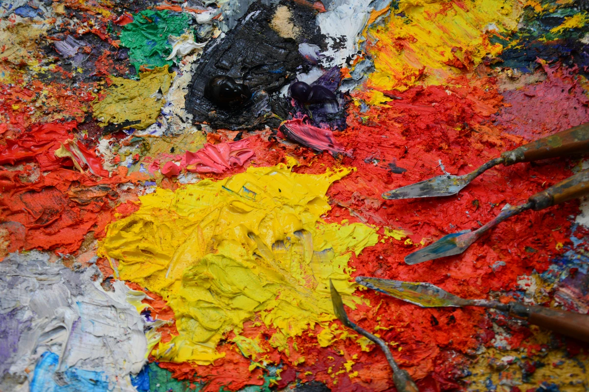
- Heavy Body: This is my go-to for building serious impasto and expressive brushwork. It boasts a thick, buttery consistency that holds its shape beautifully, allowing for sharp peaks and deep valleys in the paint film. Ideal for sculptural effects and retaining distinct brushstrokes.
- Fluid: For thinner applications, luminous glazes, or when I want a smooth, even wash without losing that intense pigment saturation. These are essential for delicate color transitions and achieving seamless fields of color.
- Open: This is a game-changer if you, like me, sometimes wish acrylics wouldn't dry quite so fast. I remember one large abstract piece where I was attempting a sunset gradient with impossibly subtle shifts from deep violet to fiery orange across a vast canvas. Without Golden Open Acrylics, it would have been a frantic, impossible sprint against drying paint. The extended working time allowed me to truly blend, layer, and adjust the colors with a meditative patience usually reserved for oil painting, making blending a dream. It's almost like having the best of both worlds with oils and acrylics, allowing for more nuanced color transitions and glazes that are typically harder to achieve with fast-drying acrylics. This extended open time makes techniques like wet-into-wet blending, which is common in oil painting, feasible with acrylics, opening up a whole new realm of possibilities for my creative process from idea to finished abstract painting.
- High Flow: Like an ink, this line is extremely thin but packed with pigment, perfect for staining raw canvas, airbrushing, calligraphy, or fine line work. It behaves almost like a watercolor but with the permanence of acrylic.
- Incredible Mediums Range: Their selection of best acrylic mediums for abstract artists is, frankly, intimidatingly good and incredibly comprehensive. From gels that create glass-like finishes to pastes that build extreme texture, if you can imagine a modification, Golden probably has a medium for it. Their Fluid Matte Medium, for instance, is a staple for achieving transparent, matte glazes, while Heavy Gel (Matte) can transform fluid paint into a thick, brushstroke-retaining paste. They even have specialized products like Pouring Mediums that create level, even films and Fiber Paste for sculptural effects. You'll also find Self-Leveling Clear Gel for smooth, enamel-like surfaces, and Light Molding Paste for creating incredibly lightweight, yet substantial, sculptural forms. This is where their scientific approach really shines, offering artists unparalleled control over their medium. It's almost like they read my mind when I'm exploring texture in abstract art: techniques and materials or delving into the definitive guide to texture in abstract art: techniques, materials, and sensory impact.
- Consistency & Quality Control: Every tube, every pot, feels exactly as it should, batch after batch. There's a trust built there that means I can focus purely on my art, not on whether the paint will behave as expected. This consistent quality allows for reliable how to layer colors in acrylic painting and predictable results, freeing me to focus on the composition in art explained.
- Unwavering Archival Quality & Lightfastness: Golden is obsessive about lightfastness ratings (how well a pigment resists fading when exposed to light over time), often conducting rigorous accelerated light exposure tests. They adhere to strict ASTM (American Society for Testing and Materials) standards, providing transparent labeling for each color's specific rating (ASTM I, II, or III). This commitment to documented lightfastness gives me immense peace of mind that my art will endure for generations, a crucial consideration for any professional artist whose work is destined for galleries or private collections. This dedication to archival quality is a cornerstone of their brand identity, making them a trusted choice for artists who prioritize longevity.
- Exceptional Surface Adhesion: Golden acrylics are formulated to adhere beautifully to a vast array of surfaces, from traditional canvas and paper to wood, metal, and even some plastics. This makes them incredibly versatile for mixed-media artists or anyone experimenting with unconventional substrates. The strong adhesion ensures a durable, lasting bond, reducing the risk of chipping or flaking. I've used them on everything from raw canvas to found objects, and they hold up incredibly well, which is vital for the longevity of complex mixed-media pieces.
- Environmental Stewardship: Golden is actively engaged in researching and implementing more sustainable practices, from responsible sourcing of pigments to exploring eco-friendly packaging and production methods. They understand that as artists, we're part of a larger ecosystem, and their efforts reflect a commitment to minimizing environmental impact.
Where Golden Might Give You Pause:
- The Price Tag: Let's not mince words: Golden can be expensive. For artists just starting out or working on very large pieces where volume is key, the cost can be a real barrier. It's an investment, for sure.
- Overwhelming Selection: While a strength, the sheer number of different lines and mediums can be a bit much for a beginner. It requires some research to understand what each product does and how it fits into your practice.

Then There's Liquitex: The Innovator's Pal (My Old Friend)
Liquitex holds a special place in my heart, truly. It was one of the first professional acrylic brands I ever consistently used, and it felt like a gateway drug to serious art-making. When you're first exploring basic brushstrokes for acrylic painting or just generally messing around, a reliable, readily available paint is invaluable. Liquitex has been around for ages, and they've constantly pushed the boundaries of what acrylics can do. They feel like the cool, innovative friend who always has a new gadget or technique up their sleeve. In fact, Liquitex pioneered artist-grade acrylics in 1955, launching the first water-based acrylic gesso and artist acrylic paints. They literally helped shape the medium we know today, continually innovating with new forms and applications for artists. This pioneering spirit extends to their global presence, making Liquitex a readily available and trusted brand for artists around the world, from bustling city studios to remote creative havens. Their accessibility is a huge benefit for artists seeking consistent quality no matter where their journey takes them. I remember one mentor telling me about the excitement when Liquitex first came out – it was a game-changer, offering artists a new, versatile medium that dried fast and offered incredible possibilities for experimentation and new techniques. This groundbreaking innovation allowed for quick layering and a departure from the slower drying times of oils, truly democratizing art-making for a new generation of artists.

Why Liquitex Has a Special Place in My Studio:
- Excellent All-Round Performance: Liquitex Professional Heavy Body and Soft Body paints offer fantastic color saturation and coverage. Their covering power (the ability to obscure what's underneath) is impressive, often achieving solid, opaque layers with minimal effort. They're reliable, and I always know what I'm getting. It's a solid, dependable workhorse, excellent for building composition in art explained or creating bold lines and gestures.
- Reliable Performance in Various Climates: I've found Liquitex paints to perform consistently well across different environmental conditions. Whether I'm painting in a humid studio or a drier climate, their stability and working properties remain predictable, which is a huge benefit when traveling or working in less-than-ideal conditions. This consistency is vital for artists whose work takes them to diverse locations or whose studios experience environmental shifts.
- Pouring Medium: For pouring techniques, I've always found their pouring medium to deliver consistent, beautiful results. It's easy to use and reliably produces those smooth, cell-like effects.
Liquitex's Core Product Lines: Accessibility Meets Innovation
Liquitex offers a streamlined yet comprehensive range, making it easy for artists to find what they need for a variety of techniques:
Product Line | Consistency | Key Characteristics | Best For |
|---|---|---|---|
| Heavy Body | Thick, creamy | Excellent for retaining brushstrokes, strong color saturation, good for impasto and texture. | Impasto, expressive painting, traditional brushwork, mixing with gels and pastes. |
| Soft Body | Smooth, fluid | High pigment load, flows beautifully, ideal for smooth applications, glazes, and fine detail. | Washes, glazes, airbrushing, detailed work, mixing with mediums, seamless color fields. |
| Acrylic Ink | Liquid, dye-like | Extremely fluid, vibrant, permanent once dry, similar to watercolors or traditional inks but with acrylic properties. | Staining, drawing, airbrushing, watercolor effects, calligraphy, mixed media. |
| Spray Paint | Aerosol | Artist-grade acrylic paint in a spray can, excellent coverage, lightfast, low odor. | Murals, street art, stenciling, atmospheric backgrounds, adding graphic elements. |
| Acrylic Markers | Pen-like applicator | Opaque, lightfast acrylic paint in various nib sizes, precise application. | Detailing, outlining, graphic work, signing artworks, on-the-go sketching. |
Liquitex's focus on innovative application methods and dependable core products makes it a favorite for artists who want both reliability and new ways to express themselves. Their commitment to artist education also plays a significant role here, providing resources that help artists integrate these innovations into their practice seamlessly.
- Excellent All-Round Performance: Liquitex Professional Heavy Body and Soft Body paints offer fantastic color saturation and coverage. Their covering power (the ability to obscure what's underneath) is impressive, often achieving solid, opaque layers with minimal effort. They're reliable, and I always know what I'm getting. It's a solid, dependable workhorse.
- Reliable Performance in Various Climates: I've found Liquitex paints to perform consistently well across different environmental conditions. Whether I'm painting in a humid studio or a drier climate, their stability and working properties remain predictable, which is a huge benefit when traveling or working in less-than-ideal conditions.
- Soft Body Versatility: Their Soft Body acrylics are truly a joy to work with. They flow beautifully for washes and glazes, mix effortlessly, and are incredibly versatile for just about any application. I recall a series where I needed vast, uninterrupted fields of color, almost like atmospheric backdrops for more defined elements. Liquitex Soft Body allowed me to achieve those perfectly smooth, even applications that just poured onto the canvas, almost effortlessly. If I'm doing a quick sketch or trying out a new color palette, Soft Body is often my first reach. They are perfect for achieving smooth, even color fields without visible brushstrokes, and their consistency makes them ideal for blending with mediums without becoming too stiff. It's a fantastic foundation for intricate layering, which I often do when I'm trying to master the unseen layers: my process of building depth and narrative in abstract mixed-media. I even use them for creating thin veils of color, building up luminosity and optical mixing in my abstract pieces, contributing to a sense of subtle balance in art composition. Their smooth flow is also excellent for achieving the delicate transitions often seen in how to mix and match different art styles in your home.
- Innovation Beyond Tubes: This is where Liquitex truly shines as an innovator. Their range includes Acrylic Spray Paints which are phenomenal for street art styles, stenciling, or creating atmospheric backgrounds, and Acrylic Markers which are brilliant for adding graphic elements or fine details. They think beyond the brush, which I appreciate for my exploring texture: my favorite techniques for adding depth to abstract paintings. Their Heavy Body line, while thick, is still incredibly smooth and blends beautifully, making it a reliable choice for expressive brushwork. And let's not forget their Professional Pouring Mediums, which are formulated for creating those stunning cell effects and marbleized patterns that have become so popular in contemporary abstract art. I've even experimented with their mediums to create unique textural bases before applying paint, blurring the lines between painting and sculpture, a testament to their versatile formulations. Their innovation in pouring mediums, in particular, has opened up entirely new aesthetic avenues for me, creating liquid, organic flows that are both mesmerizing and unpredictable, often used in conjunction with the definitive guide to mixed media in abstract art: techniques, materials, and contemporary masters.
- Accessibility & Availability: You can find Liquitex almost anywhere good art supplies are sold. This is huge when you run out of that perfect shade mid-project and need a quick refill. This widespread availability makes it a consistent choice for artists, much like reviewing the best acrylic paint brands for professional artists highlights reliability as a key factor.
- Educational Resources and Community Engagement: Liquitex has a long history of supporting artists through educational content, workshops, and community initiatives. They provide extensive information on techniques, product usage, and historical context, making them a fantastic resource for artists looking to deepen their understanding of the medium and the definitive guide to art materials: from traditional to contemporary mediums.
A Few Things to Consider with Liquitex:
- Pigment Concentration Nuances: While excellent, some specific colors in the Liquitex range might feel a touch less intensely pigmented than their Golden counterparts, especially comparing their Heavy Body lines. It's a subtle difference, but one I've noticed over years of use. This doesn't mean they're inferior; rather, it often requires a bit more layering or mixing to achieve the same opacity or saturation as Golden's most intensely pigmented colors. For certain applications, this can actually be an advantage, allowing for more transparent glazing and subtle color shifts without overdoing it. This nuanced pigmentation means Liquitex can be ideal for building up layers of color gradually, achieving delicate luminosity or atmospheric depth where an overly opaque paint might obscure previous layers too quickly.
- Mediums Range: While comprehensive, it's true it doesn't quite have the sheer breadth and niche specialization that Golden offers. If you're looking for a very specific, unique textural gel, Golden might have the edge. However, Liquitex provides incredibly reliable and versatile mediums for common uses, particularly their pouring mediums and gels which are staples in many studios. Their focus is often on broadly applicable innovation rather than hyper-specialization.
- Environmental Consciousness: Like Golden, Liquitex is increasingly mindful of its environmental footprint. While still a work in progress across the industry, they are exploring sustainable practices in packaging, sourcing, and waste reduction.


Understanding the Nuances of Pigment: A Quick Dive into Color Science
When we talk about "pigment load," it's easy to think it's just about how much color is packed into the tube. And while that's a big part of it, there's a deeper science at play that influences how a color behaves, whether it's from Golden or Liquitex. Understanding these nuances is key to truly mastering your palette and achieving your desired artistic effects.
- Single-Pigment vs. Multi-Pigment Colors: Some colors are made from a single pigment (e.g., Cadmium Red Light), while others are mixes of two or more pigments (e.g., Sap Green). Single-pigment colors generally offer cleaner, more predictable mixes, maintaining their vibrancy when blended. Multi-pigment colors can sometimes become muddy or dull when mixed with other colors, making them less ideal for sophisticated color theory explorations or my approach to color mixing: creating vibrant palettes in abstract painting. Both Golden and Liquitex offer a range of both, but understanding this distinction can significantly enhance your color choices.
- Organic vs. Inorganic Pigments: Organic pigments are carbon-based and often yield brighter, more transparent colors (e.g., Phthalo Blue). Inorganic pigments are mineral-based and tend to be more opaque, earthy, and historically significant (e.g., Ochres, Cadmiums). Each has unique characteristics in terms of lightfastness, texture, and handling, impacting everything from glazing to impasto techniques.
- Pigment Particle Size: This is a subtle but significant factor. Finely ground pigments often create smoother, more uniform washes and can appear more intense. Coarser pigments, on the other hand, might offer interesting granulation or textural effects, especially in fluid applications, contributing to unique visual textures.
- Pigment Density (Specific Gravity): Distinct from pigment load, density refers to the weight of a pigment relative to its volume. Some pigments are naturally heavier or lighter than others. This can subtly affect how they mix and settle, particularly in fluid applications or pouring techniques, influencing the final appearance of cells or marbling patterns. This is a fascinating aspect of how artists use color that goes beyond mere hue.
- Color Index Names (e.g., PR108, PY35): Ever noticed those seemingly cryptic codes on paint tubes? These are the International Colour Index Names, a standardized system that identifies the exact chemical composition of the pigment. Knowing these codes (like PR108 for Cadmium Red or PB29 for Ultramarine Blue) helps artists understand a pigment's true nature, regardless of brand-specific marketing names, and predict its behavior in mixes and its long-term stability.
- Hue, Value, Saturation: Beyond just the name, understanding the definitive guide to color theory in art: from pigments to psychology helps us appreciate the nuances. Hue is the pure color (red, blue), value is its lightness or darkness (from white to black), and saturation is its intensity or purity. Professional paints from both brands offer exceptional control over these elements, which is crucial for creating impactful color harmonies and visual depth.
Pigment Information: A Deeper Dive
To truly master your palette, diving a bit deeper into pigment information can be immensely helpful. Manufacturers often provide detailed pigment information, including:
- Chemical Composition: Understanding the chemical makeup of a pigment can help predict its interactions with other pigments and mediums.
- Lightfastness Ratings: As mentioned, this is crucial for the longevity of your artwork. Always check for ASTM ratings.
- Opacity/Transparency: Knowing if a pigment is naturally opaque or transparent informs your layering and glazing techniques.
- Oil Absorption: While less critical for acrylics than oils, it still influences how much binder is needed and can subtly affect consistency and drying.
This granular understanding of pigment isn't just for chemists; it empowers us as artists to make more deliberate choices, anticipating how our colors will interact and ensuring the longevity and vibrancy of our work.
Beyond the Tube: The Importance of a Limited Palette
While the sheer variety of pigments can be thrilling, I've found immense power in exploring a limited palette. This isn't about restriction; it's about deepening your understanding of color relationships. By working with a small, carefully chosen selection of primary and secondary colors, you force yourself to truly understand mixing, value shifts, and saturation control. It's a fantastic exercise for developing your "color eye" and can lead to incredibly harmonious and sophisticated results. Plus, it's easier on the wallet and helps avoid decision fatigue. It really makes you think about the definitive guide to understanding color harmonies in abstract art in a very practical way.


Head-to-Head: My Side-by-Side Thoughts
Okay, let's get down to the brass tacks. How do these two titans stack up when I put them side-by-side in my studio? For many artists, this direct comparison is where the rubber meets the road. Here's my honest assessment, keeping in mind that personal preference plays a huge role here.
Feature | Golden Professional Acrylics | Liquitex Professional Acrylics | My Take |
|---|---|---|---|
| Pigment Load | Exceptionally high, leading to incredible vibrancy and opacity. | Very high, excellent color saturation, sometimes a slight variation compared to Golden. | Golden often wins on raw intensity, but Liquitex is still top-tier. |
| Consistency | Diverse (Heavy Body, Fluid, Open, High Flow) – Heavy Body is rich and buttery. | Diverse (Heavy Body, Soft Body) – Heavy Body is smooth, Soft Body is incredibly versatile. | Golden Heavy Body feels thicker; Liquitex Soft Body is a standout for flow. |
| Drying Time | Standard fast-drying acrylic (except for Open Acrylics). | Standard fast-drying acrylic. | Pretty similar, Open Acrylics from Golden are the clear winner for extended work time. |
| Mediums Range | Unparalleled. Extremely specialized and extensive range for every imaginable effect. | Comprehensive, good for common uses, strong in pouring and innovative applications. | Golden leads for niche, scientific modifications; Liquitex for reliable everyday mediums. |
| Innovation | Focus on pure pigment quality and highly specialized mediums. | Focus on expanding acrylic applications (sprays, markers, pouring mediums). | Both innovate, but in different directions. Liquitex feels more 'street art' adjacent. |
| Cost | Generally higher price point. | Generally slightly more affordable than Golden. | Golden is an investment; Liquitex offers great value for professional quality. |
| Availability | Widely available in specialized art stores and online. | Extremely widely available in most art stores and online. | Liquitex has a slight edge in being easier to find quickly. |
| Binder Type | High-quality acrylic polymer emulsions, often proprietary formulations. | Robust acrylic polymer emulsions, designed for consistent performance. | Both use excellent acrylic binders, but Golden's can feel more tailored to specific lines. |
| Color Saturation (Perceived) | Often has a deeper, more immediate vibrancy, especially in glazes. | Excellent vibrancy, but can sometimes require slightly more layering for depth. | Golden often 'pops' with less effort, but Liquitex achieves similar results with technique. |
| Texture/Body Feel (Heavy Body) | Exceptionally thick, buttery, and holds impasto exquisitely. | Smooth, creamy, and maintains good peaks; slightly less stiff than Golden Heavy Body. | Golden for maximum sculptural texture; Liquitex for blendable, substantial body. |
| Flexibility/Film Strength | Excellent, designed for long-term durability and resistance to cracking. | Very good, robust film strength, designed for consistent performance across applications. | Both offer superb archival quality, ensuring longevity. |
| Odor | Minimal, typically a faint acrylic odor. | Minimal, typically a faint acrylic odor. | Both are low-odor, making them pleasant to work with in the studio. |
| Eco-Consciousness | Actively researching and implementing sustainable practices (e.g., responsible sourcing). | Committed to reducing environmental impact through various initiatives. | Both brands are increasingly mindful, but this is an evolving area across the industry. |
| Drying Time (Standard) | Fast-drying (except Open Acrylics). | Fast-drying. | Generally comparable, requiring artists to manage working time effectively. |
| Sheen/Finish Options | Offers a variety of finishes, from matte to gloss, often achievable with mediums. | Primarily satin finish, but controllable with a range of gloss and matte mediums. | Both offer control, Golden has a wider native range, Liquitex achieves with mediums. |
| Environmental Footprint | Actively researching and implementing sustainable practices (e.g., responsible sourcing, waste reduction). | Committed to reducing environmental impact through various initiatives and packaging. | Both brands are increasingly mindful, but this is an evolving area across the industry. |
| Artist Support/Education | Extensive technical support, educational videos, workshops, and comprehensive online resources. | Long history of supporting artists with educational content, workshops, and community engagement. | Both offer excellent resources, Golden leans technical, Liquitex on broader community. |
| Consistency Across Batches | Excellent, ensuring predictable results every time. | Very good, reliable performance across batches. | Both are highly consistent, crucial for professional work. |
| Packaging | Often uses high-quality, durable tubes and containers. | Practical, widely available packaging designed for broad accessibility. | Both prioritize functional packaging, with some variation in material. |
Pigment Load & Vibrancy:
If I'm being brutally honest, Golden often feels like it has a smidge more raw pigment punch. It's that subtle difference where a thin glaze just pops a bit more intensely, or a single coat offers surprisingly opaque coverage. This often translates to needing less paint overall, making the higher price point a little more palatable for some artists. That said, Liquitex is no slouch. Its colors are rich and beautiful, and for 90% of my work, the difference isn't a deal-breaker. It's more of a nuanced appreciation, and many Liquitex colors can achieve comparable intensity with careful layering or selection of their more opaque pigments. It's a testament to the fact that while pigment load is crucial, technique also plays a massive role in the definitive guide to understanding value in art: light, shadow, and form and overall composition in art explained. For example, using a pure pigment Golden color for a final transparent glaze can really make the underlying layers sing, while a carefully mixed, slightly less pigmented Liquitex color can achieve a beautiful, diffused glow when built up with multiple thin applications. It’s less about a 'winner' and more about understanding what each paint wants to do. For instance, when I want to achieve the deepest, most saturated blues, Golden's Ultramarine Blue often gets me there with fewer layers and a more immediate punch. However, Liquitex's Phthalo Blue (Green Shade), with its intense transparency, can offer incredible depth and luminosity with a skilled hand and careful layering, creating a different kind of rich, jewel-like effect. It's a choice between immediate intensity and buildable complexity, influencing your entire approach to how artists use color.
Consistency & Application:
This is where personal preference really comes into play. I adore the thick, almost sculptural quality of Golden's Heavy Body. It’s perfect when I want to build physical texture, allowing for sharp peaks and deep valleys in the paint film. But for laying down smooth fields of color or doing some quick studies, Liquitex's Soft Body is incredibly agile. It just glides, making it fantastic for seamless washes and glazes without visible brushstrokes. When working with a palette knife, both perform wonderfully, but Golden's thickness allows for more dramatic impasto and more pronounced sculptural effects. The choice often comes down to the desired tactile quality and the specific aesthetic you're aiming for in your exploring texture: my favorite techniques for adding depth to abstract paintings.
And let's not forget how your brush choice interacts with these consistencies! A stiff hog-bristle brush will push Golden Heavy Body around to create bold textures, while a soft synthetic brush might be better for the smooth applications of Liquitex Soft Body. Understanding the interplay between paint viscosity and your best acrylic paint brushes for artists is another layer of control for your artistic vision. For example, a good quality filbert brush can create both soft edges and defined strokes, adapting beautifully to different paint consistencies and artistic intentions.
Drying Time & Open Time:
Most acrylics dry fast – a blessing and a curse, depending on the day. Golden Open Acrylics are, without a doubt, the champions here if you need more blending time. They really do extend the working window, which can be invaluable for certain techniques or if you live in a particularly dry climate. Standard Golden and Liquitex heavy and soft body paints dry at similar rates. This rapid drying can be a blessing for layering quickly, but a challenge for seamless blending on the canvas. Mastering techniques to manage drying time, like using a spray bottle with water, using acrylic retarders, or working in smaller sections, is a fundamental skill for any acrylic artist, particularly in abstract work where intuitive painting often requires flexibility. Conversely, the fast-drying nature can also be leveraged for techniques like dry brush painting, where quick drying allows for immediate layering of textural marks. I've often found myself racing against the clock with traditional acrylics, but Golden Open has opened up new possibilities for mastering glazing techniques in oil painting using acrylics, which is a delightful irony. This adaptability to drying times allows for a vast array of approaches, from dynamic, spontaneous bursts of color to meticulously rendered, layered compositions. Beyond Open Acrylics, artists often employ strategies like using an acrylic retarder medium (which slows drying), keeping a spray bottle of water handy to mist their palette and canvas, or working in smaller, manageable sections to combat the quick-drying nature of standard acrylics. It's all about control, even when the clock is ticking.
Mediums & Compatibility:
If you're a mixed-media artist or someone who loves to push the boundaries of texture and surface, Golden's mediums range is a veritable playground. They have a medium for everything. From fluid matte mediums to heavy gels, modeling pastes, gessos, and even specialized flow release agents, the possibilities are endless. These painting mediums allow for unparalleled manipulation of paint consistency, drying time, transparency, sheen, and texture. Speaking of sheen, understanding the difference between gloss and matte finishes (and how mediums can alter them) is crucial for controlling the final look of your artwork. A gloss finish intensifies colors and can give a wet look, while a matte finish mutes reflections and provides a softer, sometimes more earthy feel. Liquitex also offers excellent, reliable mediums for general use and specific applications like pouring, but Golden truly goes deeper into the really specialized stuff. My my journey with mixed media: blending materials for abstract expression article dives into some of these possibilities, demonstrating how these mediums are not just additives, but integral to the artistic process. I've even experimented with Golden's exploring oil sticks for expressive mark-making in conjunction with their gels to create truly unique mixed-media textures. A key consideration here is also inter-brand compatibility; while generally safe to mix professional acrylics from different manufacturers, it's always wise to test small amounts first to ensure no unexpected reactions or compromises to archival quality. Most professional acrylics share a similar acrylic polymer emulsion binder, ensuring a broad degree of compatibility, making artistic experimentation across brands a viable and exciting endeavor.
Beyond the Tube: Other Forms of Acrylics
While tubes and pots of heavy body or fluid acrylics are the staples, both Golden and Liquitex offer a fascinating array of other formats that open up new creative avenues. For artists, this is where acrylics truly flex their versatility muscles, allowing for an incredibly broad range of expressive techniques.

Acrylic Gels and Pastes
Beyond liquid paints, both Golden and Liquitex offer an incredible array of gels and pastes that dramatically expand the textural and sculptural possibilities of acrylics. These aren't just thickeners; they are designed to create specific effects:
Acrylic Inks and High Flow Paints: Precision and Flow
These are essentially super-fluid acrylics, often with an ink-like consistency but retaining the high pigment load of professional paints. Golden's High Flow Acrylics are a prime example, perfect for:
- Staining raw canvas for vibrant backgrounds.
- Airbrushing for smooth gradients and fine details.
- Calligraphy and pen work (yes, you can draw with paint!).
- Washes and glazes where extreme fluidity is desired.
Liquitex offers similar formulations, excelling in vibrant washes and techniques where a very thin, yet intense, layer of color is needed. Think about how these could enhance the art of mark-making: expressive lines and gestures in abstract painting.
- Gels: Acrylic gels are essentially paint without pigment. They come in various viscosities (soft, heavy, extra heavy) and finishes (gloss, matte, semi-gloss).
- Uses: Extending paint, increasing transparency for glazes, building texture, creating impasto, or acting as an adhesive for collage elements. My favorite is a Heavy Gel (Matte) for creating sculptural impasto effects that hold their form.
- Pastes: Often opaque and typically heavier than gels, pastes contain solid particles (like marble dust or pumice) to create specific, often gritty, textures.
- Uses: Building extreme surface texture, creating grounds for other media (like pastels or charcoal), or generating unique sculptural elements. Modeling Paste is fantastic for creating dramatic relief, while Fiber Paste can simulate a paper-like, fibrous texture.
- Specialty Additives: Beyond the basics, you'll find mediums that mimic specific surfaces, like Glass Bead Gel for a translucent, granular effect, or Micaceous Iron Oxide for a shimmering, metallic texture.
These mediums are indispensable for artists like me who are constantly exploring texture: my favorite techniques for adding depth to abstract paintings or pushing the boundaries of mixed media. They allow for unparalleled control over the tactile and visual qualities of your artwork, transforming the canvas into a dynamic, multi-sensory experience.
Acrylic Inks and High Flow Paints
These are essentially super-fluid acrylics, often with an ink-like consistency but retaining the high pigment load of professional paints. Golden's High Flow Acrylics are a prime example, perfect for:
- Staining raw canvas for vibrant backgrounds.
- Airbrushing for smooth gradients and fine details.
- Calligraphy and pen work (yes, you can draw with paint!).
- Washes and glazes where extreme fluidity is desired.
Liquitex offers similar formulations, excelling in vibrant washes and techniques where a very thin, yet intense, layer of color is needed. Think about how these could enhance the art of mark-making: expressive lines and gestures in abstract painting.
Acrylic Gouache
Another fascinating innovation, acrylic gouache, offers the matte, opaque finish of traditional gouache but with the permanence and water-resistance of acrylics once dry. Both Golden and Liquitex offer versions of this unique paint. It's fantastic for:
- Flat, uniform color fields without visible brushstrokes, achieving a truly contemporary, graphic aesthetic.
- Graphic illustration and design work, where crisp lines and solid blocks of color are paramount.
- Mixed media where a truly opaque, non-reflective layer is needed, creating strong contrasts with more textured or transparent elements. This can be particularly useful when exploring the definitive guide to mixed media in abstract art: techniques materials and contemporary masters.
- Adding crisp details and clean edges over other acrylic layers, without any 'bleed' or interaction.
This hybrid medium bridges the gap between traditional opaque watercolors and acrylics, offering artists even more tools for precise, vibrant expression. Because it dries waterproof, acrylic gouache allows for layering without reactivating previous layers, making it incredibly versatile for illustrators, designers, and mixed-media artists who need flat, rich color that stays put. It's also distinct from traditional gouache, which is re-wettable even when dry, and regular acrylics, which often retain a slight sheen. Acrylic gouache offers that coveted matte, velvety finish directly from the tube. It's a testament to the continuous evolution of acrylic technology, constantly providing new avenues for creative expression.
Acrylic Sprays and Markers
This is where Liquitex really carved out a niche for itself, though Golden also offers spray products.
- Liquitex Acrylic Spray Paints are artist-grade aerosols that deliver permanent, lightfast color without the toxic fumes often associated with traditional spray paints. They're fantastic for:
- Street art aesthetics and murals.
- Stenciling and masking techniques.
- Creating atmospheric backgrounds and soft edges.
- Adding graphic elements or bold bursts of color.
- Acrylic Markers provide precision and portability, essentially paint in a pen format with various nib sizes. Both brands offer these, great for:
- Adding fine details or bold lines, offering sharp edges and consistent color flow.
- Outlining and graphic work, creating crisp definitions or adding illustrative elements.
- Signing artworks with permanence and clarity. This is especially helpful for creating a unique artist statement explained on the back of your canvas.
- On-the-go sketching and color studies, providing a convenient and mess-free way to capture ideas or block in quick color.
These alternative forms demonstrate the continuous innovation within the acrylic world, pushing the boundaries of what's possible and integrating seamlessly into mixed-media practices.
Acrylic Paints for Specialized Surfaces
Beyond traditional art surfaces, acrylics have been formulated to adhere to a surprising array of materials. You'll find specialized acrylics for:
- Fabric Painting: Designed to remain flexible and washable once cured, these allow you to create wearable art without cracking.
- Outdoor Murals: Formulated with extra UV resistance and durability to withstand the elements, extending the lifespan of public art.
- Glass and Ceramics: While some require heat-setting, these paints can transform everyday objects into personalized art pieces.
These innovations expand the scope of acrylic art beyond the canvas, inviting artists to explore new dimensions and applications for their creativity.

Choosing Your Palette: A Strategic Approach
Beyond the Golden vs. Liquitex debate, how do you actually go about selecting the colors and types of paints that are right for your studio? It's not just about what you like; it's about what serves your artistic goals. This is where understanding color harmonies in abstract art and how artists use color becomes less theoretical and more deeply practical.
The Role of Complementary and Analogous Colors
When building your palette, think beyond just individual hues. Understanding how colors interact is crucial. Complementary colors (like red and green, blue and orange, yellow and purple) sit opposite each other on the color wheel. Placing them next to each other creates high contrast and visual pop. Analogous colors (three colors next to each other on the color wheel, like blue, blue-green, and green) create a more harmonious, soothing effect. Experimenting with these relationships can dramatically impact the emotional resonance and visual impact of your abstract work, creating a vibrant composition in art explained.
Understanding Your Personal Artistic Style
Before you even choose a tube of paint, taking a moment to understand your own artistic inclinations can be incredibly powerful. Are you drawn to bold, expressive lines and gestures, or do you prefer the subtle beauty of layered glazes? Do you lean towards a limited palette for focused explorations, or a vibrant spectrum of color harmonies? Your aesthetic preferences, your emotional connection to certain hues (perhaps the psychology of color in abstract art: beyond basic hues or how artists use color), and even your typical working pace will all influence which paints and mediums will serve you best. For instance, if you revel in slow, meditative blending, Golden Open Acrylics will be a game-changer. If you're a fast, intuitive painter who loves bold marks, Liquitex Heavy Body might be your go-to. Don't fight your natural tendencies; find materials that amplify them. This self-awareness is key to developing your unique artistic style. Ask yourself: Do I prefer smooth gradients or visible brushstrokes? Do I work quickly or in layers over several sessions? What emotional qualities do I want my colors to convey (see the psychology of color in abstract art: beyond basic hues)? The answers will guide you to the materials that feel like an extension of your creative self.
Testing Before Committing: The Smart Artist's Approach
Before investing heavily in a new brand or a whole new range of colors, I always advocate for a trial period. Buy a few tubes of each brand's Heavy Body or Soft Body in your core colors. Work with them side-by-side, paying attention to their handling, drying time, and how they mix. This hands-on experience is far more valuable than any review (even mine!).
Regardless of brand, a well-thought-out core palette will serve you well. Here’s a suggestion for a versatile starting point, focusing on single-pigment colors for clean mixing:
Color Category | Suggested Pigment (Example) | Why It's Essential |
|---|---|---|
| Warm Red | Cadmium Red Light (PR108) | Vibrant, opaque, excellent for creating warmth and strong focal points. |
| Cool Red/Magenta | Quinacridone Magenta (PR122) | Versatile for purples and bright pinks, excellent for mixing clean secondary colors. |
| Warm Yellow | Cadmium Yellow Medium (PY35) | Opaque, sunny, essential for greens and oranges, offers a strong, inviting presence. |
| Cool Yellow | Hansa Yellow Light (PY3) | Transparent, bright, ideal for clear greens and luminous glazes. |
| Warm Blue | Ultramarine Blue (PB29) | Deep, rich blue, leans purple, great for shadows and intense mixes. |
| Cool Blue | Phthalo Blue (Green Shade) (PB15:3) | Intense, transparent, leans green, powerful for vibrant turquoises and deep cool tones. |
| Earth Tone | Yellow Ochre (PY43) | Natural, grounded, perfect for muting colors or creating subtle, earthy blends. |
| White | Titanium White (PW6) | Opaque, strong tinting strength, essential for lightening and creating pastels. |
| Black | Carbon Black (PBk7) | Deep, opaque, useful for strong contrasts and darkening colors (use sparingly to avoid muddiness). |
| Primary Cyan | Phthalo Blue (Green Shade) (PB15) | A foundational cool blue that, when mixed with primary yellow, creates incredibly clean and vibrant greens. Essential for a comprehensive CMY mixing palette. |
Maintaining Your Palette: A Little Care Goes a Long Way
Beyond just choosing your paints, proper palette maintenance is crucial for efficiency and longevity. I've learned the hard way that a clean, organized palette can significantly speed up my workflow and prevent wasted paint.
- Regular Cleaning: Scrape off dried paint regularly. While dried acrylic is permanent, fresh paint is easily removed with water.
- Wet Palettes: For longer sessions or to preserve paint overnight, a wet palette (either store-bought or DIY with a shallow tray, wet paper towel, and parchment paper) is a game-changer. It keeps your acrylics workable for hours or even days.
- Organized Squeezing: Develop a habit of squeezing out colors in a consistent order on your palette. This helps with muscle memory and quick color retrieval, much like understanding color theory helps with how artists use color.
For the Beginner or Explorer
If you're just starting out, or simply want to experiment without a huge upfront investment, I'd suggest starting with a core set of Liquitex Professional Soft Body paints. Their versatility and slightly lower price point make them ideal for:
- Learning color mixing: Their smooth consistency makes blending on the palette effortless. You can learn more about my approach to color mixing: creating vibrant palettes in abstract painting. When building your palette, consider starting with single-pigment colors (like Ultramarine Blue, Cadmium Yellow Medium, Quinacridone Magenta). These provide the cleanest, most predictable mixes, giving you a deeper understanding of color relationships and how to achieve beyond the primary: how I use secondary and tertiary colors to create complex abstract worlds. Once you're comfortable, you can then expand to convenience mixes or multi-pigment colors.
- Practicing brushstrokes: They flow beautifully and allow you to focus on technique without fighting the paint. Check out my guide on basic brushstrokes for acrylic painting and experiment with various best acrylic paint brushes for artists.
- Working on larger experimental pieces: You get excellent quality without breaking the bank, allowing for expansive exploration and freedom to make "happy accidents."
For the Serious Professional or Archival Work
When your work is destined for galleries, commissions, or you simply demand the utmost in archival quality and pigment intensity, Golden Artist Colors truly shine. This is where the investment pays off for:
- Impasto and texture: Their Heavy Body and specialized gels (like Heavy Gel Matte or Extra Heavy Gel) create incredible sculptural effects. If you're wondering what is impasto painting, Golden paints are your best friend.
- Precise control: Their vast range of mediums allows for unparalleled manipulation of paint properties.
- Specialty Colors: Both brands offer unique colors like Golden's Iridescent or Interference colors, or Liquitex's Fluorescents, which can add incredible depth and unique visual effects to professional work, expanding the expressive possibilities of your palette.
- Guaranteed longevity: Their commitment to lightfastness and archival standards ensures your legacy, preserving your artistic vision for future generations. For professional artists, this peace of mind is invaluable, knowing your work will endure the test of time.
For Mixed-Media Mavericks
If your studio looks like a glorious explosion of different materials (like mine often does!), you'll likely find a place for both brands.
- Liquitex's innovative tools like sprays and markers integrate beautifully with other mediums, adding graphic punch.
- Golden's diverse gels and pastes are fantastic for building unique surfaces that can then be layered with everything from charcoal to collage elements, creating incredible texture and depth. My journey with mixed media: blending materials for abstract expression is a testament to this versatility, allowing for true multi-layered expression.
Ultimately, the "right" palette is a dynamic, evolving thing. It adapts to your current projects, your financial considerations, and your artistic curiosity. Don't be afraid to mix and match – even between different consistencies! For example, I often thin down Golden Heavy Body with Golden Fluid Acrylics or various acrylic mediums to achieve a desired flow without compromising pigment load. This versatility is a huge strength of the medium. Always prioritize what brings your vision to life.

Understanding Your Personal Artistic Style
Before you even choose a tube of paint, taking a moment to understand your own artistic inclinations can be incredibly powerful. Are you drawn to bold, expressive lines and gestures, or do you prefer the subtle beauty of layered glazes? Do you lean towards a limited palette for focused explorations, or a vibrant spectrum of color harmonies? Your aesthetic preferences, your emotional connection to certain hues (perhaps the soul of indigo or the fiery heart of red), and even your typical working pace will all influence which paints and mediums will serve you best. For instance, if you revel in slow, meditative blending, Golden Open Acrylics will be a game-changer. If you're a fast, intuitive painter who loves bold marks, Liquitex Heavy Body might be your go-to. Don't fight your natural tendencies; find materials that amplify them. This self-awareness is key to developing your unique artistic style.
The Price Tag:
This is the elephant in the studio, isn't it? Golden is generally more expensive. It's an investment that I make for certain pieces where I want the absolute highest archival quality and specific handling characteristics. Liquitex offers incredible professional quality at a slightly more accessible price point, making it my go-to for larger canvases or when I'm just experimenting and don't want to worry about every drop.
Beyond Paint: Understanding Your Surface
It's easy to get caught up in the paint itself, but the surface you paint on plays an equally critical role in the final outcome and the longevity of your artwork. Think about it: even the most exquisite Golden or Liquitex paint can only perform as well as the canvas, panel, or paper beneath it.
Priming for Success
Canvas Types and Weaves
Before we even talk about gesso, let's consider the canvas itself. Not all canvases are created equal, and the weave and material can significantly impact how your paint behaves and the final look of your artwork. Common types include:
- Cotton Canvas: The most popular and affordable, typically with a medium weave. It's versatile and works well for most acrylic applications.
- Linen Canvas: Known for its strength, durability, and fine, tight weave. It's more expensive but offers a smoother surface and is highly prized for archival work, especially for the ultimate guide to abstract art movements: from early pioneers to contemporary trends where surface matters.
- Duck Canvas: A heavier, coarser cotton canvas, often used for very large pieces or when a pronounced texture is desired. Its robust nature is great for aggressive brushwork or heavy impasto.
Understanding these basic differences helps you choose a surface that complements your painting style and intended outcome.
Most artists prepare their surfaces with gesso. Gesso provides a stable, slightly absorbent ground for your paint, preventing it from soaking into the fibers of raw canvas or paper. It also enhances paint adhesion and can brighten colors. Understanding what gesso is in painting and how to prepare a canvas for acrylic painting are foundational skills for ensuring the longevity and vibrancy of your artwork.
- Acrylic Gesso: The most common type, providing a flexible, archival base suitable for most acrylic applications. It creates a slight tooth for the paint to adhere to, which prevents excessive absorption into the support and allows colors to sit vibrantly on the surface. I always ensure a good, even coat to maximize paint vibrancy and longevity.
- Clear Gesso: For those who want the raw canvas or wood grain to show through, clear gesso provides the same protective and adhesive qualities without altering the underlying color of your support. This is particularly useful for certain mixed-media techniques or when the natural aesthetic of the surface is part of the artwork.
- Colored Gesso: Far from just a neutral base, colored gesso can influence the overall tone and atmosphere of your painting from the outset. Imagine starting a landscape with a warm yellow ground or a moody portrait with a dark gray base – it offers interesting compositional starting points and can unify your palette. I sometimes use a warm colored gesso to create a subtle glow under my cool abstract fields, a little trick to add depth without obvious layering.
- Absorbent Gesso: Designed to create a more watercolor-like surface, absorbent gesso allows acrylic washes to sink in and spread, mimicking the properties of traditional watercolor paper. This opens up new possibilities for fluid techniques with acrylics.
- Textured Gesso/Grounds: Some gessos are specifically formulated to add tooth or texture to your surface, creating a more dynamic ground for your paint. This can range from fine sand-like textures to coarser, more sculptural grounds, perfect for exploring texture in abstract art: techniques and materials. Learning how to apply gesso to canvas: a beginners guide is a foundational skill. These textured grounds can truly transform how the paint behaves, almost becoming part of the composition itself, and are excellent for developing the definitive guide to texture in abstract art: techniques, materials, and sensory impact.
Beyond just applying gesso, consider sanding between thin coats for a super-smooth surface, or applying multiple coats for increased opacity and a more robust ground. Each layer builds up the surface, influencing everything from how your brush glides to the final luminosity of your colors. This meticulous preparation is often the unsung hero of a truly professional painting.
Types of Surfaces and Their Impact
Choosing your surface is as much a creative decision as selecting your colors. Each material offers unique properties that interact with acrylics in different ways. Understanding these differences can significantly impact your artistic process and the final presentation of your work.
Surface Type | Key Characteristics | Best For |
|---|---|---|
| Stretched Canvas | Traditional, flexible, subtle texture, lightweight. | Large-scale works, dynamic compositions, expressive brushwork, portability, and traditional gallery presentation. Ideal for abstract art movements and bold statements. |
| Wood Panels | Rigid, stable, smooth or slightly textured, less prone to warping. | Heavy impasto, highly textured work, precise detail, aggressive techniques, and commissions requiring maximum stability. Excellent for detailed work or creating a smooth, uninterrupted surface. |
| Heavyweight Paper | Affordable, versatile, ideal for studies, sketches, and fluid applications. Must be archival (acid-free) and thick (300gsm/140lb+). | Studies, sketches, works on paper, fluid acrylics, inks, mixed media experiments, or when exploring new compositional ideas before committing to larger pieces. |
| Other Substrates | Metal, plastic, glass, fabric, found objects – requires specialized priming for adhesion. | Mixed media in abstract art, experimental projects, installations, and pushing the boundaries of traditional painting. |
Matching your paint's characteristics (e.g., Golden Heavy Body for impasto) with an appropriate surface (e.g., a rigid wood panel) is a strategic decision that supports your artistic intentions and ensures the longevity of your creations. Just as important is the preparation of that surface; a poorly primed surface can lead to paint flaking or poor adhesion over time, compromising the entire artwork.
The Role of Isolation Coats and Varnishes
Once your painting is complete and fully dry (which can take days or even weeks for very thick impasto), the final steps for long-term preservation are often applying an isolation coat and a varnish. An isolation coat (typically a thin layer of gloss medium) provides a permanent, non-removable barrier between your paint layers and the final varnish. This protects the paint during varnish application or removal. The varnish (available in gloss, satin, or matte) then provides a removable, sacrificial layer that protects the painting from dust, UV light, and environmental pollutants. It also unifies the sheen of the artwork, bringing out the depth of colors. These layers are crucial for ensuring the archival integrity and longevity of your work.
Matching your paint's characteristics (e.g., Golden Heavy Body for impasto) with an appropriate surface (e.g., a rigid wood panel) is a strategic decision that supports your artistic intentions and ensures the longevity of your creations. Just as important is the preparation of that surface; a poorly primed surface can lead to paint flaking or poor adhesion over time, compromising the entire artwork.
When I Reach for Golden:
I typically grab my Golden Heavy Body for my more significant, gallery-bound abstract pieces where I'm building up serious texture, want maximum archival quality, or need a very specific medium effect. Their Open Acrylics are also invaluable when I'm trying to achieve those elusive, soft blends or seamless transitions that need more working time. It's my choice when precision and ultimate control are paramount. If you're looking for archival-quality prints of my own art, you can always check out my art for sale section.
When I Reach for Liquitex:
Liquitex Professional Soft Body is usually my daily driver for underpaintings, color studies, or when I'm working on larger abstract compositions where I need a good quantity of reliable, vibrant paint. Their spray paints are fantastic for urban-inspired elements or textured backgrounds. I also lean on Liquitex for experimentation, for those "what if I try this?" moments, without the pang of using up my more precious Golden tubes.
Ultimately, it's about trying both. Buy a few tubes of each in your favorite colors, experiment, and see what truly sings to you. Your artistic journey is unique, and so too should be your tools.
Expanding Your Palette: Beyond the Brands, Essential Supplies and Techniques
Beyond just the paint, the world of art supplies is vast and exciting. Think about your best acrylic paint brushes for artists, or how you prepare your surface with how to apply gesso to canvas: a beginners guide, or even how a palette knife can transform your texture. These elements all contribute to the final piece, and finding the right tools across the board can elevate your work significantly. My own artistic journey, often chronicled in my timeline, involves a constant evolution of materials and techniques.
Working with Limited Color Palettes
Sometimes, less is more. Forcing yourself to work with a very limited palette – perhaps just a warm and cool primary, plus black and white – can be an incredible exercise for understanding color mixing and value relationships. It challenges you to create a vast range of hues and tones from a restricted set, often leading to surprising discoveries and a deeper appreciation for the nuances of color. It's a fantastic way to develop your eye and create visually cohesive artworks, much like mastering understanding the elements of design in art: a comprehensive guide with fewer variables.
Essential Studio Tools Beyond Paint
While paint and brushes are obvious, a well-equipped studio includes several other crucial items:
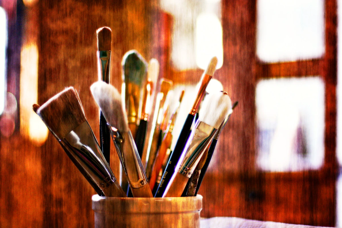
- Cleaning Supplies: Dedicated brush soaps, brush holders, and plenty of water containers are indispensable for maintaining your tools. Remember, proper care of your best acrylic paint brushes for artists directly impacts their longevity and performance.
- Easels: Whether you prefer a standing studio easel, a portable field easel for plein air painting, or a simple tabletop easel, having a stable support for your canvas is key. This will ensure comfort during long painting sessions and contribute to your overall creative flow.
- Palettes: From traditional wooden palettes to disposable paper palettes or stay-wet palettes for acrylics, choose what suits your workflow best. A clean, organized palette can significantly speed up your workflow and prevent wasted paint.
- Spray Bottle: A fine mist spray bottle filled with water is invaluable for keeping acrylics workable on the palette and on the canvas, especially in dry climates or when blending. It's a simple tool that offers incredible control over drying time.
- Palette Knives: Not just for mixing, palette knives can be used for applying thick impasto, creating unique textures, or even scraping off excess paint. They are versatile tools for expressive mark-making.
- Gloves and Apron: Protecting your hands and clothing from paint is practical. While acrylics are non-toxic, some pigments can stain.
- Good Lighting: Essential for accurate color perception. Natural daylight is ideal, but quality daylight-balanced artificial lights are a must for studio work.
- Sketchbooks and Reference Materials: Your ideas don't always flow directly onto the canvas. Keeping a sketchbook (or several!) for preliminary studies, color tests, and visual notes is invaluable. And don't underestimate the power of a good library of reference images or actual objects for inspiration, even in abstract art.
Connecting with the Acrylic Art Community
Beyond the individual brands and techniques, a vibrant community of acrylic artists thrives online and offline. Engaging with this community can be an incredible source of inspiration, learning, and support.
- Online Forums & Groups: Platforms like Reddit (r/acrylicpainting), Facebook groups, and specialized art forums offer spaces to ask questions, share your work, and learn from others. These communities are fantastic for troubleshooting, sharing progress, and feeling connected to a wider artistic world.
- Workshops & Classes: Many artists and art supply stores offer workshops, both in-person and virtually, that can introduce you to new techniques, materials, and artistic perspectives. I've always found that learning from others, even in a different medium, can spark unexpected ideas for my own work.
- Social Media: Follow your favorite artists and brands on Instagram, YouTube, and other platforms for daily inspiration, technique demonstrations, and behind-the-scenes glimpses into their studios. It's a visual feast that constantly fuels my creative fire.
- Art Blogs & Websites: Sites like ZenMuseum.com (if I do say so myself!) and others provide in-depth articles, tutorials, and reviews that can deepen your understanding of the medium and the broader art world.
- Local Art Groups and Galleries: Don't forget the power of in-person connection! Joining local art groups, attending gallery openings, and participating in open studio events can offer invaluable networking opportunities, critiques, and a sense of belonging. Seeing how others use these materials in real life can be incredibly inspiring.
Sharing your artistic journey, receiving feedback (constructive, of course!), and seeing how other artists utilize these incredible paints can dramatically accelerate your growth and keep your passion burning brightly.
Protecting Your Artwork: Varnishing and Framing
Once your masterpiece is complete, the journey isn't over. Proper varnishing (after an isolation coat, as mentioned earlier) protects your work from UV damage, dust, and environmental pollutants, ensuring its longevity. Choosing the right framing (or gallery-wrapping a canvas) not only presents your art beautifully but also adds another layer of physical protection. Think about how the frame or presentation enhances the composition in art explained and overall impact of your piece. These final steps are crucial for preserving your artistic legacy.
Connecting with the Acrylic Art Community
Beyond the individual brands and techniques, a vibrant community of acrylic artists thrives online and offline. Engaging with this community can be an incredible source of inspiration, learning, and support, helping you navigate your my creative journey from concept to canvas in abstract art.
- Online Forums & Groups: Platforms like Reddit (r/acrylicpainting), Facebook groups, and specialized art forums offer spaces to ask questions, share your work, and learn from others. These communities are fantastic for troubleshooting, sharing progress, and feeling connected to a wider artistic world, especially when exploring abstract concepts like understanding the elements of design in art: a comprehensive guide.
- Workshops & Classes: Many artists and art supply stores offer workshops, both in-person and virtually, that can introduce you to new techniques, materials, and artistic perspectives. I've always found that learning from others, even in a different medium, can spark unexpected ideas for my own work and deepen my understanding of the definitive guide to understanding abstraction in contemporary art.
- Social Media: Follow your favorite artists and brands on Instagram, YouTube, and other platforms for daily inspiration, technique demonstrations, and behind-the-scenes glimpses into their studios. It's a visual feast that constantly fuels my creative fire.
- Art Blogs & Websites: Sites like ZenMuseum.com (if I do say so myself!) and others provide in-depth articles, tutorials, and reviews that can deepen your understanding of the medium and the broader art world.
Sharing your artistic journey, receiving feedback (constructive, of course!), and seeing how other artists utilize these incredible paints can dramatically accelerate your growth and keep your passion burning brightly.

The Importance of Your Studio Setup
Beyond the individual materials, the environment in which you create plays a huge role. Whether it's a dedicated studio space, a corner of a spare room, or just a portable easel, having a functional and inspiring workspace is key. Consider:
- Lighting: Good natural light or balanced artificial light is crucial for accurate color perception. I prefer a north-facing window for consistent, cool light, but good artificial daylight-balanced bulbs can be a lifesaver on cloudy days. This directly impacts how you perceive and mix how artists use color.
- Ventilation: Especially important if you're using sprays or certain mediums. An open window or a small fan can make a big difference for your health and comfort, particularly when working with mixed media.
- Organization: Keeping your supplies tidy (or at least knowing where everything is in the beautiful chaos!) saves time and reduces frustration. A place for everything, and everything in its place... most of the time, anyway! This efficiency allows you to maintain flow and focus on the composition in art explained.
- Comfort: A comfortable chair and easel setup can prevent fatigue during long painting sessions. Your body will thank you after hours of intense creative work, enabling longer, more productive artistic sessions.

The Importance of Water Quality
It might sound overly pedantic, but the quality of the water you use with your acrylics can actually make a subtle difference. Tap water, especially if it's hard or contains high levels of chlorine, can sometimes affect the long-term stability or drying properties of your acrylics. While usually not a deal-breaker for most studio work, for truly archival pieces or very delicate techniques (like fine washes or glazes), some artists opt for distilled water. It's a small detail, but one that reflects the meticulousness sometimes required in professional art practice and can contribute to the ultimate archival quality of your finished pieces. Hard water, for example, can introduce mineral deposits, while chlorinated water might subtly impact the chemical stability of the acrylic emulsion over decades. For most casual painting, tap water is fine, but for museum-quality work, distilled water is a worthwhile consideration to eliminate any potential contaminants.
Understanding Paint Labels: Decoding the Jargon
When you look at a tube of professional acrylic paint, you'll see more than just the color name. These labels contain crucial information that can guide your choices. Here are some key things to look for:
Label Information | What it Means |
|---|---|
| ASTM Lightfastness Rating | This is critical for permanence. It indicates how well a pigment resists fading when exposed to light over time. |
- ASTM I (Excellent): Will remain unchanged for 100+ years under museum conditions. This is what you want for archival work.
- ASTM II (Very Good): Will remain unchanged for 50-100 years. Still very good for professional work.
- ASTM III (Fair/Poor): Not recommended for permanent artwork due to rapid fading. | | Pigment Identification | Look for codes like "PY3" (Pigment Yellow 3) or "PB29" (Pigment Blue 29). These are International Colour Index Names, telling you the specific chemical composition of the pigment. This is essential for understanding its inherent properties, such as transparency, tinting strength, and mixing behavior. | | Opacity/Transparency Symbol | Often a square symbol indicates how transparent or opaque the color is:
- Solid square: Opaque (covers underlying layers well)
- Half-solid square: Semi-opaque/semi-transparent
- Hollow square: Transparent (allows underlying layers to show through, great for glazes) | | Series Number | Indicates the price group of the paint, often related to the cost of the raw pigments. Higher series numbers typically mean more expensive (and often rarer) pigments. | | Vehicle/Binder | While usually implied for acrylics (acrylic polymer emulsion), some brands might specify details or proprietary formulations. This is the "glue" that holds the pigment. | | Safety Warnings | Look for non-toxic certifications like ACMI AP (Approved Product) seal. This is especially important if you have sensitivities, work with children, or are concerned about handling certain pigments (e.g., Cadmiums and Cobalts, while lightfast, should be handled with care and not ingested). Always check the manufacturer's safety data sheets (SDS) if you have any doubts about a specific pigment. | | Manufacturer Contact Info | Most professional brands provide contact information (website, phone, email). This can be invaluable for asking specific questions about product composition, safety data sheets (SDS), or technical support, deepening your understanding beyond the basic elements of art. |
Taking a moment to understand these details empowers you to make truly informed decisions about your materials, aligning them perfectly with your artistic intentions for composition in art explained or even just understanding the elements of art.
Understanding Pigment Origin and Cost
Ever wonder why some colors are so much more expensive? It often boils down to the rarity, difficulty of processing, or unique chemical structure of the pigment itself. Natural inorganic pigments like genuine Lapis Lazuli (though rarely used in modern acrylics due to cost) or Cadmium pigments (synthetically produced but derived from rare elements) are inherently more expensive to source and refine than common organic pigments like Phthalo Blue. Understanding this helps demystify the "Series Number" on a paint tube – it's typically a direct reflection of the cost of the raw pigment, not necessarily a judgment on the quality of the paint as a whole.
The Environmental Footprint of Acrylics: Painting with a Conscience
As artists, we're not just consumers of materials; we're part of a larger ecosystem. And while acrylics are incredibly versatile, it's worth acknowledging their environmental impact and exploring ways to minimize it. Since acrylics are plastic-based, they're not biodegradable, and improper disposal can contribute to microplastic pollution. This can be a tough pill to swallow for conscious creators, but awareness is the first step.
Microplastics and Acrylics
One of the most significant environmental concerns with acrylics is their contribution to microplastic pollution. Every time we wash our brushes, tiny plastic particles from the dried paint film (which is essentially plastic) can enter the water system. These microplastics can then end up in oceans and even our food chain. This isn't to deter you from using acrylics, but rather to highlight the importance of proper disposal and conscious studio practices to mitigate this impact.
What Can Artists Do?
- Mindful Consumption: Buy only what you need, and use up every last drop of paint. Those little bits left in the tube can often be reactivated or used for small projects. This not only reduces waste but also encourages creativity in using every resource, challenging you to think inventively.
- Proper Disposal: Never wash acrylic paint down the drain. Let paint water settle, pour off the clear water, and dispose of the solid paint residue in the trash. Using a "paint water filtration system" or even just a dedicated bucket for solids can make a big difference. This simple step can prevent microplastics from entering our waterways, safeguarding our environment.
- Choose Eco-Conscious Brands: Some brands are actively working on more sustainable practices, from recycled packaging to reducing their carbon footprint. While 100% "eco-friendly" acrylics are still a work in progress due to the nature of polymers, every little bit helps. You might want to explore resources on best eco-friendly art supplies for conscious artists.
- Reuse and Recycle: Repurpose old containers for water, mediums, or palette scrapings. Recycle packaging where possible. I often save old yogurt containers for water or mixing mediums, a small but impactful act of reuse.
- Support Research: As consumers, our demand for greener products can drive innovation in the art supply industry. Let your voice be heard through your purchasing choices and by engaging with brands about their sustainability efforts.
Alternative Art Materials: Beyond Acrylics
For artists seeking even lower environmental impact, exploring traditional or alternative mediums can be a fulfilling journey:

- Oil Paints: While using solvents can be an issue, modern solvent-free oil painting techniques and natural pigment options make oils a viable, long-lasting alternative. Plus, they offer a completely different working experience with extended open times.
- Watercolors and Gouache: These water-based paints, especially those made with natural pigments and binders like gum arabic, generally have a much smaller environmental footprint. Their transparency and rewetability offer unique effects not possible with acrylics.
- Natural Pigments and Binders: Some artists go completely back to basics, grinding their own natural pigments and binding them with traditional vehicles like egg tempera (casein), beeswax (encaustic), or plant-based gums. This approach offers ultimate control and a deep connection to materials.
- Drawing Materials: Charcoal, graphite, and pastels (especially those with natural binders) offer rich expressive potential with minimal environmental impact compared to plastic-based paints. I find myself returning to charcoal when I need to reconnect with raw mark-making.
It's a complex issue, and there are no easy answers, but simply being aware and making conscious choices is a powerful step towards a more sustainable art practice.
Alternative Art Materials: Beyond Acrylics
For artists seeking even lower environmental impact, exploring traditional or alternative mediums can be a fulfilling journey:
- Oil Paints: While using solvents can be an issue, modern solvent-free oil painting techniques and natural pigment options make oils a viable, long-lasting alternative. Plus, they offer a completely different working experience with extended open times and rich, slow-drying luminosity, perfect for traditional blending and glazing techniques.
- Watercolors and Gouache: These water-based paints, especially those made with natural pigments and binders like gum arabic, generally have a much smaller environmental footprint. Their transparency, rewetability, and delicate nature offer unique effects not possible with acrylics, allowing for subtle washes, vibrant stains, and expressive layering.
- Natural Pigments and Binders: Some artists go completely back to basics, grinding their own natural pigments and binding them with traditional vehicles like egg tempera (casein), beeswax (encaustic), or plant-based gums. This approach offers ultimate control, a deep connection to materials, and a significantly reduced environmental impact.
- Drawing Materials: Charcoal, graphite, and pastels (especially those with natural binders) offer rich expressive potential with minimal environmental impact compared to plastic-based paints. I find myself returning to charcoal when I need to reconnect with raw mark-making and the pure art of mark-making: expressive lines and gestures in abstract painting.
This exploration beyond acrylics not only broadens your artistic toolkit but also allows you to make more intentional choices about the materials you bring into your studio and the world.
Frequently Asked Questions (FAQ)
How do I make my acrylics dry slower or faster?
To slow down drying time, you can add an acrylic retarder medium to your paint, which extends the open time and allows for more blending. Alternatively, keeping a fine mist spray bottle of water handy to mist your palette and canvas can help keep paint workable. To speed up drying, ensure good airflow in your studio (a fan, but not directed directly at the canvas to avoid skinning), work in thinner layers, or use a hair dryer on a low, cool setting from a distance (be cautious not to overheat the paint film).
What is 'Archival Quality' in acrylics?
"Archival quality" refers to an art material's ability to resist deterioration over time. For acrylics, this primarily means the paint film won't crack, yellow, or fade due to environmental factors like light, humidity, or temperature fluctuations. Professional-grade acrylics like Golden and Liquitex are formulated to be archival, using lightfast pigments and stable acrylic polymer binders. This ensures that the colors remain true and the structural integrity of the paint film is maintained for many decades, preserving your artistic vision for future generations and making your art for sale a lasting investment.
What is an 'acrylic skin' and how can I use it?
An acrylic skin is a dried, flexible film of acrylic paint that has been peeled off a non-absorbent surface (like plastic sheeting, glass, or silicone). Artists often create them intentionally by pouring thin layers of paint and letting them dry, sometimes with embedded elements. These skins can then be cut, torn, and adhered to new artworks, collages, or mixed-media pieces, offering unique textural and dimensional qualities. It's a fantastic way to experiment with mixed media and reuse leftover paint.
Can I mix Golden and Liquitex paints?
Yes, absolutely! Both Golden and Liquitex are professional-grade acrylics and are generally compatible. I often mix them on my palette without any issues. The only thing to be mindful of is that different consistencies might affect the final texture or flow, but chemically, they play well together. This compatibility allows for incredible creative freedom, letting you leverage the specific strengths of each brand in a single piece. For instance, you could use Golden's heavy body for impasto and then glaze over it with Liquitex Soft Body without any chemical interaction issues.
Are there different grades of professional acrylics?
While the main distinction is student vs. professional, even within professional lines, there can be subtle variations. Some brands might offer an "artist's series" that uses the absolute highest concentration of rare or expensive pigments, while their "studio series" might use slightly less costly but still high-quality alternatives. Always check the pigment information, series number, and lightfastness ratings on the tube to understand the specific grade and quality of the professional paint you're using. This nuance allows you to tailor your material choices to specific projects or budget considerations, even within a professional context.
What about student-grade acrylics versus professional-grade?
The primary difference lies in pigment load and binder quality. Student-grade paints use less pigment and more fillers, resulting in weaker, less vibrant colors and often a lower lightfastness rating. Their binders might also be less robust, leading to a less durable paint film over time. Professional-grade paints (like Golden and Liquitex) boast a much higher pigment concentration, superior binders, and excellent lightfastness, ensuring your colors are vibrant and your artwork lasts for generations. While student paints are great for practice and experimentation, investing in professional paints for finished pieces is always recommended for archival quality.
How do I prevent my acrylics from cracking?
Cracking in acrylics can usually be avoided by following a few best practices: always apply paint to a properly primed, flexible surface (like gessoed canvas or a flexible panel), avoid excessively thick applications in a single layer (especially with non-gel mediums, as paint shrinks as it dries), and don't paint over wet oil paint (acrylics should always be on top of a dry, non-oily surface). Ensuring your layers are fully dry before applying the next can also help. Professional-grade paints, with their superior binders, are inherently more resistant to cracking.
How should I store my acrylic paints?
Proper storage can significantly extend the life of your acrylics. Always keep tubes and pots tightly sealed to prevent air exposure and drying. Store them in a cool, dark place, away from extreme temperature fluctuations and direct sunlight. Avoid freezing, as this can break down the emulsion. If a tube starts to clog, clear the opening with a needle or paperclip. For pots, ensure the lid is sealed tightly, perhaps even placing a piece of plastic wrap over the opening before securing the lid to create an airtight seal.
Can I use acrylics on fabric or clothing?
Yes, with certain considerations! Regular artist acrylics will create a somewhat stiff film on fabric and might crack over time, especially with washing. For fabric, it's best to use fabric specific acrylic paints or mix your artist acrylics with a fabric medium. Fabric mediums increase the paint's flexibility and adhesion to textiles, making it more durable and washable. Always heat-set the painted fabric according to the medium's instructions for best results, and do a test swatch first! This is a fun way to bring your art off the canvas and into everyday life, but definitely read those instructions!
Are there eco-friendly options for acrylics?
While acrylics are synthetic, some brands are making efforts towards more sustainable practices, for instance, using recycled packaging or focusing on non-toxic pigments. It's an area still developing, but worth looking into if you're keen on best eco-friendly art supplies for conscious artists. Beyond that, some artists are exploring alternative binders like casein or natural pigments, though these aren't "acrylics" in the traditional sense. The key is conscious consumption and proper disposal. It's an ongoing conversation, and as artists, our collective choices can influence the market towards more sustainable options.
What's the difference between "heavy body" and "fluid" acrylics?
Heavy body acrylics have a thick, buttery consistency, similar to oil paints, and retain brushstrokes and texture. They're great for impasto and creating dimensional effects. Think of them when you want your brushwork to be a physical part of the painting. Fluid acrylics have a thinner, cream-like consistency, perfect for smooth applications, glazes, washes, and fine detail without losing pigment intensity. They are often preferred for staining, pouring, or when you need a smooth, level finish. It's a fundamental distinction that greatly impacts the definitive guide to understanding line in abstract art: from gestural marks to geometric forms. I often use heavy body for bold statements and fluid for the more ethereal, atmospheric elements in my work.
Why are professional acrylics so expensive?
The cost reflects the quality of the pigment load (pure, lightfast pigments are expensive and often sourced from specific regions), the superior binders used (which ensure durability and flexibility), and the extensive research and development that goes into creating highly stable, archival, and versatile formulas. You're paying for intensity, permanence, a reliable working experience, and consistency across batches – qualities that student-grade paints simply can't offer. Think of it as investing in the longevity and vibrancy of your artistic legacy, ensuring your art for sale retains its integrity for decades. It's not just paint; it's a promise of enduring beauty and a testament to the science and craftsmanship behind high-quality art materials.
What's the best way to clean my palette?
For acrylics, immediate cleaning is key! If you're using a non-porous palette (like glass, plastic, or ceramic), scrape off wet paint with a palette knife, then wipe with a paper towel and rinse with water. For dried acrylics, a scraper or a dedicated acrylic remover might be needed, though prevention is easier. If using a disposable paper palette, simply discard it. For longer painting sessions, a "stay-wet" palette (a shallow tray with a sponge and parchment paper) can keep your paints workable for days, significantly reducing waste and cleaning effort.
How do I clean my brushes after using acrylics?
Clean brushes immediately after use! Acrylics dry fast and are permanent once dry. I typically wipe off excess paint, then wash them with soap and water (a gentle hand soap or dedicated brush cleaner works wonders) until all paint is removed. Don't let paint dry in the ferrule (the metal part holding the bristles), as this can permanently damage your brushes. Reshape the bristles and let them dry flat or brush-side up to prevent water from seeping into the ferrule, which can loosen the glue. Proper brush care is essential for extending the life of your best acrylic paint brushes for artists. Trust me, a ruined brush is a sad studio day!
Why are professional acrylics so expensive?
The cost reflects the quality of the pigment load (pure, lightfast pigments are expensive and often sourced from specific regions), the superior binders used (which ensure durability and flexibility), and the extensive research and development that goes into creating highly stable, archival, and versatile formulas. You're paying for intensity, permanence, a reliable working experience, and consistency across batches – qualities that student-grade paints simply can't offer. Think of it as investing in the longevity and vibrancy of your artistic legacy, ensuring your art for sale retains its integrity for decades. It's not just paint; it's a promise of enduring beauty.
What is 'Archival Quality' in acrylics?
"Archival quality" refers to an art material's ability to resist deterioration over time. For acrylics, this primarily means the paint film won't crack, yellow, or fade due to environmental factors like light, humidity, or temperature fluctuations. Professional-grade acrylics like Golden and Liquitex are formulated to be archival, using lightfast pigments and stable acrylic polymer binders. This ensures that the colors remain true and the structural integrity of the paint film is maintained for many decades, preserving your artistic vision.
Conclusion: Your Art, Your Rules
Choosing between Golden and Liquitex isn't a matter of one being inherently "better" than the other, but rather which one resonates more with your artistic journey at a given moment. Both are exceptional brands that empower artists to create stunning work, and my own studio is a testament to that, often a lively conversation between the two. My advice, as always, is to experiment. Play. Get messy. Find what truly makes your creative heart sing, because that's where the magic happens. Remember, the paints are just tools; you are the artist, and your unique vision is the most potent medium of all. This deep dive, I hope, has armed you with the confidence and curiosity to explore the vibrant world of professional acrylics. Don't be afraid to mix and match, to break "rules," and to forge your own path. If you're ever in Den Bosch, I'd love for you to see how these materials come to life in my work at my den bosch museum exhibit, or explore more of my thoughts on art and process in my timeline. And remember, the conversation about art materials is just one facet of a much larger, endlessly fascinating artistic world, full of the definitive guide to understanding abstraction in contemporary art and continuous innovation. Ultimately, choosing between Golden and Liquitex isn't about finding a single 'best' brand, but about discovering the tools that best amplify your unique artistic voice. My studio, a testament to this philosophy, often hosts a lively conversation between the two. Each tube, each medium, offers a distinct potential, waiting for your touch to transform it into art. My advice, as always, is to experiment relentlessly. Play, get messy, and embrace the unexpected. Trust your intuition and let your materials guide you to new discoveries. If you're ever in Den Bosch, I'd love for you to see how these materials come to life in my work at my den bosch museum exhibit, or explore more of my thoughts on art and process in my timeline. Remember, the paints are merely instruments; you are the artist, and your vision is the most potent medium of all. Dive in, and let your creative spirit soar. May your palette always be vibrant, your process joyful, and your art enduring.


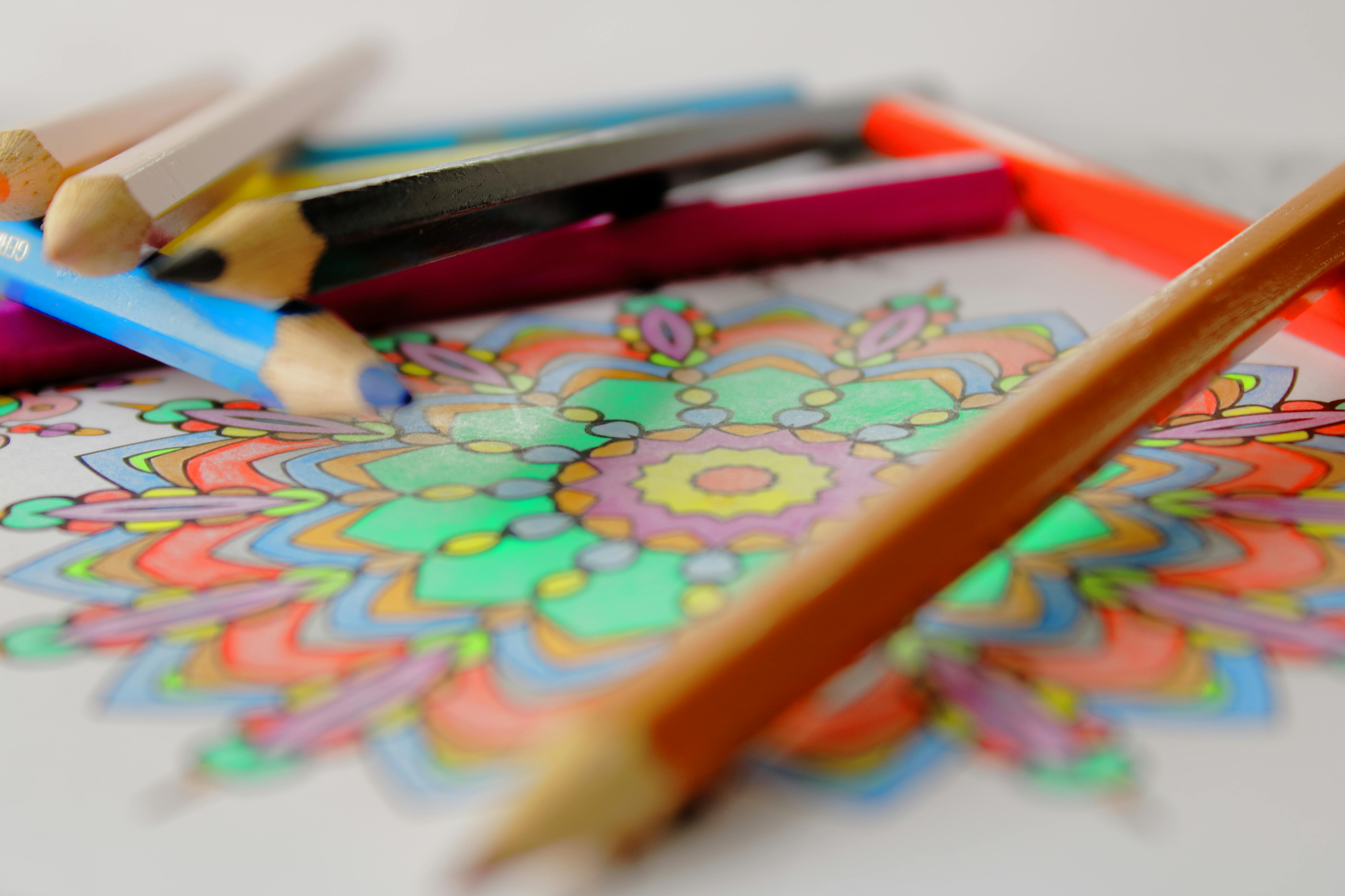
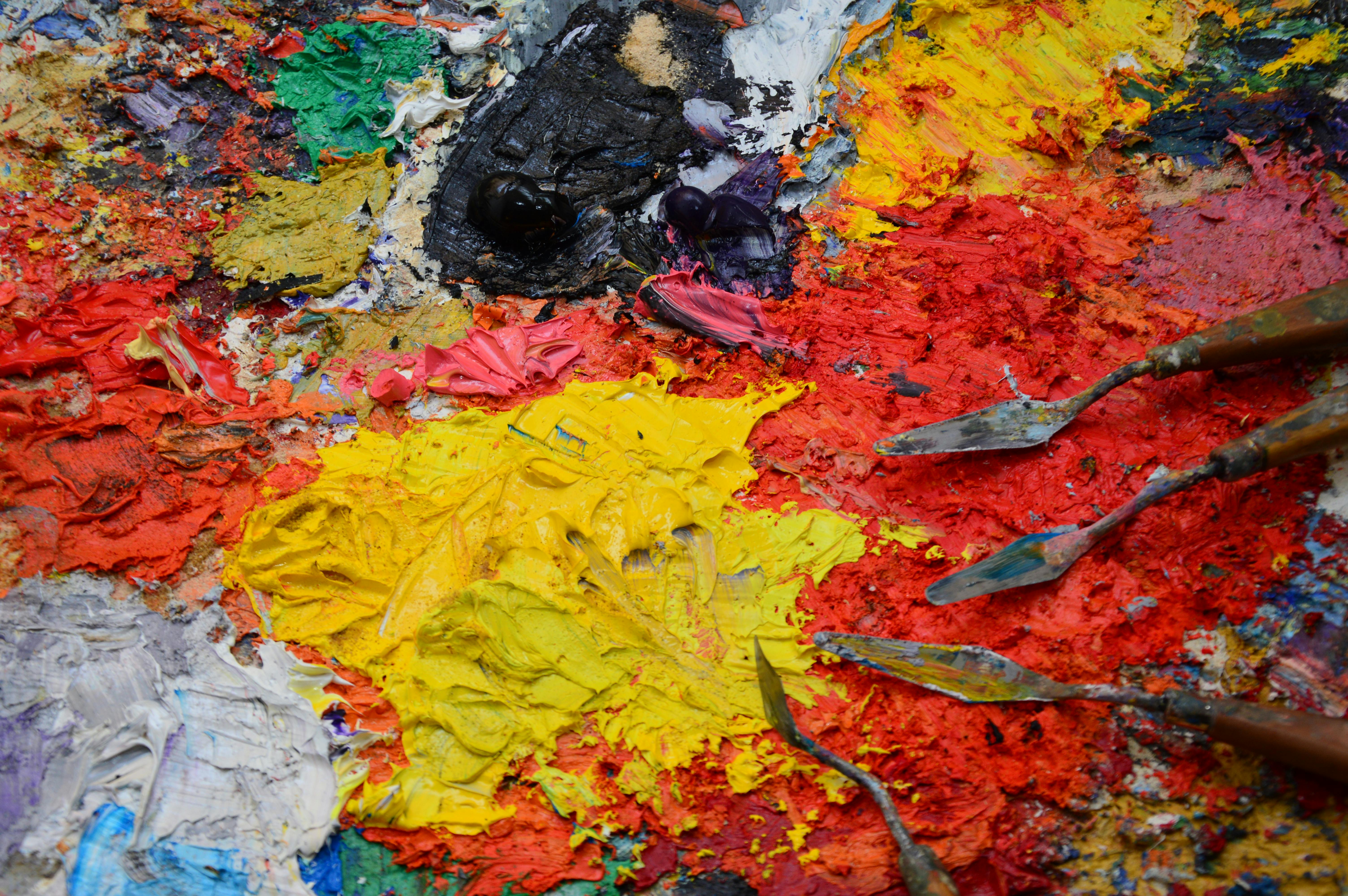