My Indigo Journey: Emotion, Depth, & The Enduring Calling of Blue in Abstract Art
Explore an artist's profound, personal journey with indigo and the spectrum of blue in abstract art. Discover unique layering techniques, emotional insights, and how this captivating hue sparks a dialogue with your soul.
My Indigo Journey: Emotion, Depth, & the Enduring Calling of Blue in Abstract Art
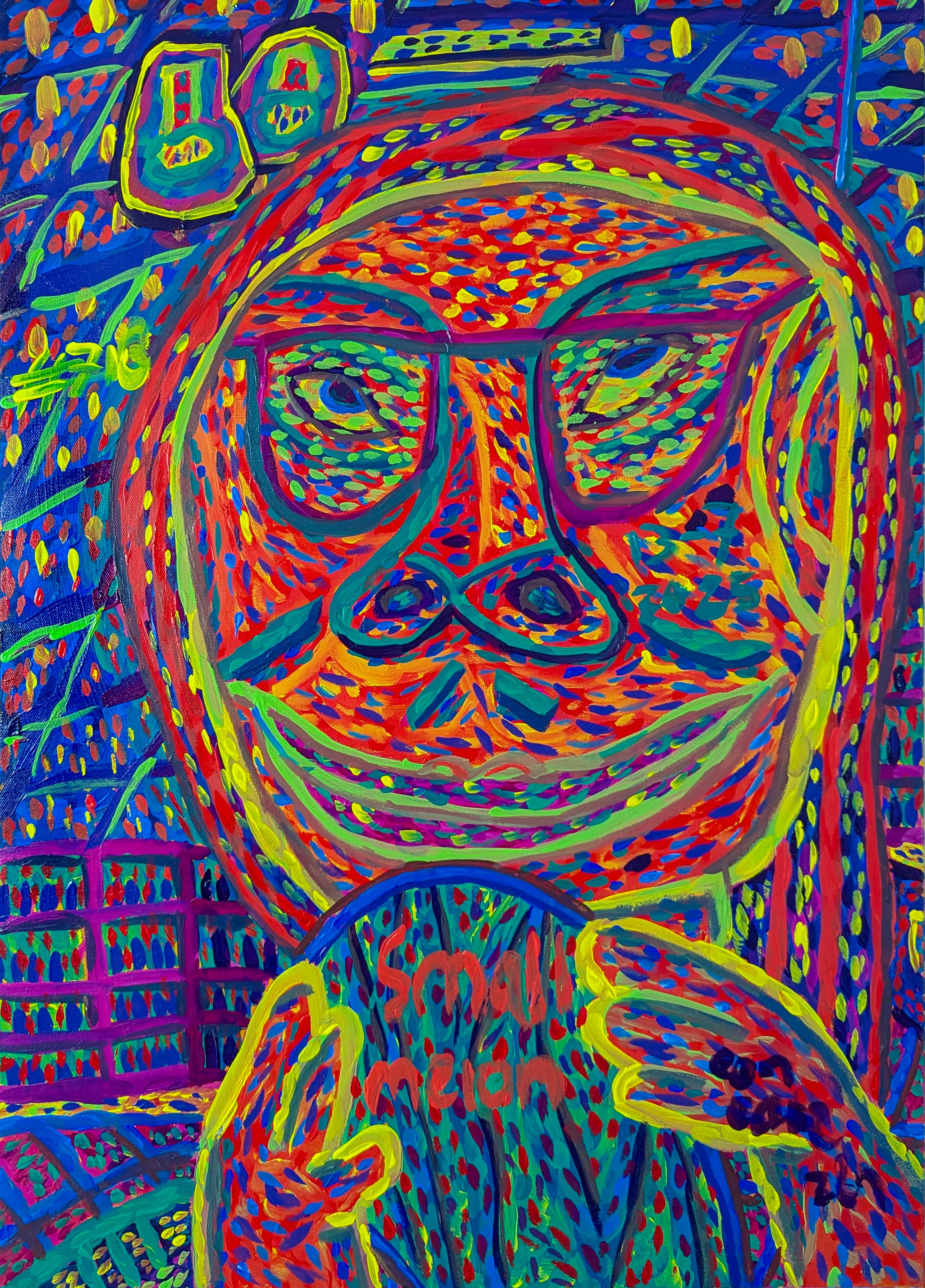
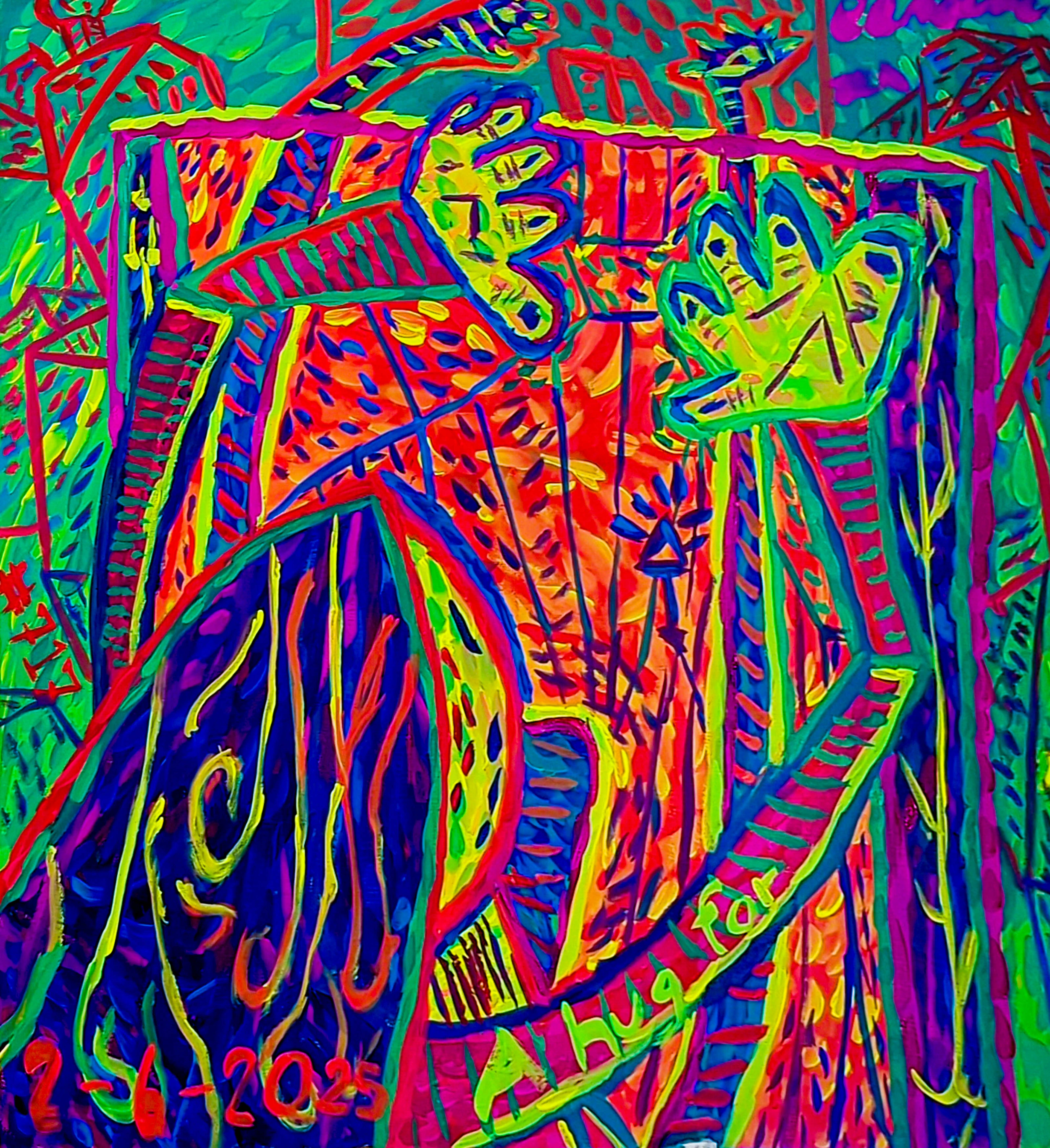
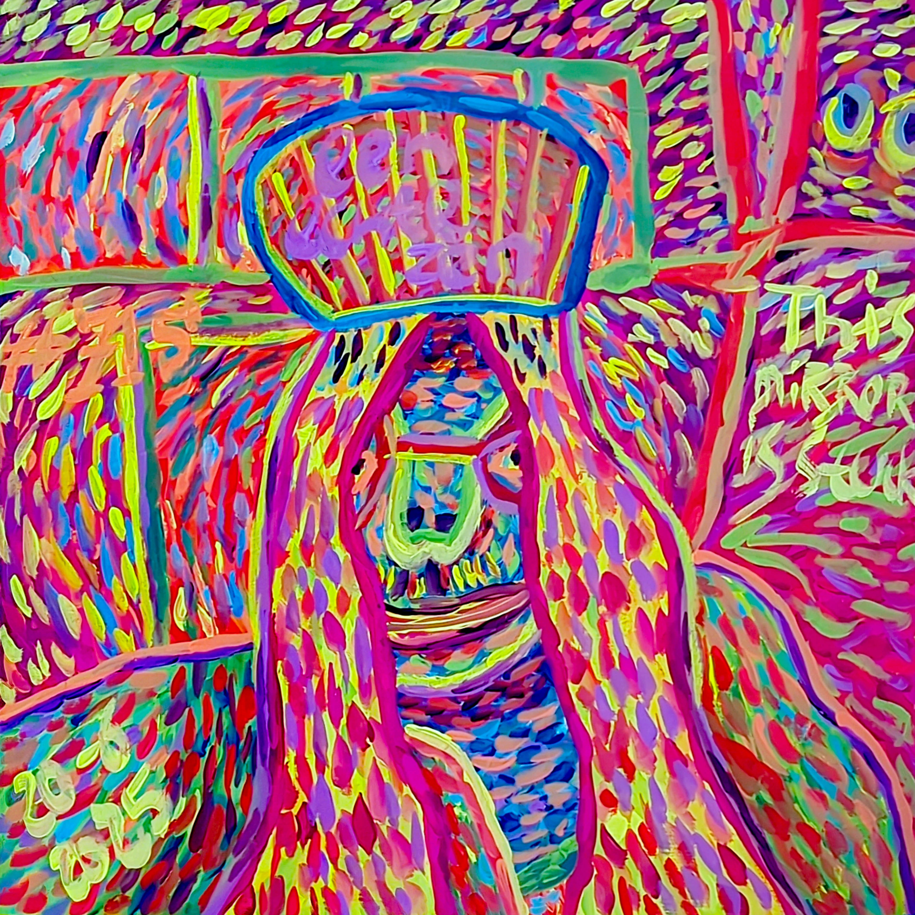
There's a color that speaks to me in whispers, a shade that feels less like a choice and more like a calling – it's a constant resonance within my artistic spirit: blue, particularly the deep, enigmatic indigo. I often joke that while I think I choose blue, it's more likely that blue, in its quiet, persistent way, chose me. Like a well-meaning but utterly determined companion, it has woven itself into the very fabric of my artistic soul. For me, blue isn’t just a color on the palette; it’s the profound, resonant hum that underpins much of my abstract work, a deep chord struck within – a vast, often unarticulated story waiting to unfold. So, come with me, if you will, as I unravel the threads of this lifelong affair with blue, particularly the profound depths of indigo, and explore how this captivating hue shapes my abstract canvases and sparks conversations not just with me, but perhaps, with a quiet corner of your own soul too.
A Lifelong Dialogue with Blue
My fascination with blue began subtly, perhaps with the electric cobalt of a summer sky on a perfectly clear day during childhood summers, or the deep, unknowable expanse of the ocean that always felt like a doorway to other worlds, pulling me into its silent stories. I also recall the comforting, almost sacred blue of my grandmother’s favorite porcelain vase, its intricate patterns holding a universe of quiet reflection. I remember one particular summer, maybe five or six years old, sitting by a window as a sudden, violent thunderstorm broke. The sky turned an impossible, bruised indigo, and the air crackled with a primeval energy that both terrified and thrilled me. Then, just as quickly, the sun burst through, painting the puddles with an electric sapphire. It wasn't just a color; it was an event, a raw, undeniable force that seemed to mirror the tumultuous, exhilarating landscape of a child's inner world. That feeling stuck. It's a primal connection, I think, forged in those early moments: the scent of rain-soaked earth after a summer storm, the cool, smooth surface of that ceramic, even the electric buzz of a perfectly clear summer sky – each made blue feel tangible, a silent, deeply reassuring companion.
As an artist, this connection evolved from mere appreciation to a profound dialogue. Blue became the language I often default to when words fail, when emotions are too complex to articulate directly. Perhaps it's because blue, with its infinite associations of sky and sea, and its cool composure, inherently holds the vastness of unarticulated emotion, the quiet depth of contemplation, and the boundless potential of the unspoken. I remember one piece, a swirling canvas of cerulean and deep navy, where I was grappling with a profound sense of wistful longing – a feeling too elusive for words. Blue captured that delicate balance between quiet contemplation and a vibrant, hopeful burst of energy, a complex emotional landscape that only it seemed capable of expressing.
Over the years, as I delved deeper into the emotional language of color in abstract art, blue consistently emerged as my primary interpreter. It's the anchor in my artistic explorations, a steadfast presence that allows me to venture into new territories while always feeling grounded. There's a particular comfort in its versatility, allowing it to be both the calm and the storm within a single canvas. But among all its shades, there is one that calls to me most insistently, drawing me into its deepest mysteries: indigo – a color that whispers of ancient truths and untold stories.
Beyond Calm: The Deeper Psychology of My Indigo
While blue is often associated with tranquility, peace, and stability – and historically, it held religious significance or denoted rarity – my relationship with indigo goes far deeper, often diverging from conventional interpretations. While traditional color psychology often links indigo to intuition, spirituality, or the 'third eye,' while acknowledging these broader interpretations, my connection to it is more grounded in the quiet, reflective journey of the inner self. For me, indigo embodies introspection, a profound melancholy that isn't sad, but rather a reflective quietude – like the quiet beauty of a winter evening, or the gentle ache of nostalgia for a memory you’re not sure is entirely yours. It's the color of the subconscious, of dreams, and of the hidden depths that we rarely allow to surface. Sometimes it's the stillness before a revelation, sometimes the echo of a forgotten truth, shimmering just out of reach.
It's a departure from the more conventional interpretations discussed in the psychology of color in abstract art: beyond basic hues. Indigo, for me, holds a certain mystery, a wisdom that feels ancient and boundless, perhaps because of its historical significance as a precious, deeply saturated dye. Historically, its rarity and intense hue made it a symbol of wealth and power, even spirituality, a legacy that still resonates in its perceived depth today. That's why I've always been drawn to artists who master deep, resonant blues, seeing their work as kindred spirits to my own explorations. For Rothko, it's the boundless, spiritual depth he achieved through his immersive color-field canvases, creating silent, almost sacred expanses that resonate with the vast, unarticulated emotions I seek to capture. You can explore his mastery further in my ultimate guide to Rothko. With Richter, it’s the way his blurred or scraped blues hint at hidden structures, at layers of history and emotion beneath the surface – a silent conversation across time, echoing my own attempts to uncover forgotten truths, which you can learn more about in my ultimate guide to Gerhard Richter. Another artist whose profound use of blue, particularly in its purest form, has always captivated me is Yves Klein. Though his approach was different, his relentless pursuit of a single, universal blue, IKB (International Klein Blue), speaks to the depth and singularity one can find within this hue, inspiring my own quest for indigo's ultimate expression. And then there's Anish Kapoor, whose void-like, deeply saturated blue works, almost swallowing light, echo that profound, sometimes unsettling, contemplation of the infinite that I seek with indigo. His sculptures feel like physical manifestations of the 'unspoken' and the 'subconscious' I mentioned earlier; you can dive into his work further with my ultimate guide to Anish Kapoor.
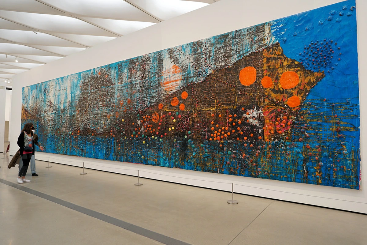
This profound depth, however, isn't always easy to harness. Indigo demands a certain respect, much like a good relationship. It has a tendency to absorb light, sometimes threatening to pull a composition into a muddy abyss if not handled with care. This isn't merely a trick of the eye; indigo pigments, often composed of organic compounds like indigotin, possess a unique molecular structure that allows them to absorb a broad spectrum of visible light, reflecting very little. This inherent depth is both its allure and its challenge. And frankly, it stains my hands with a stubborn dignity that serves as a constant, beautiful reminder of our wrestling match.
I recall one particular piece where I wrestled for days with an indigo base, fighting its gravitational pull towards murkiness. It felt like trying to coax a secret from a shy friend. Only by meticulously applying a thin, almost translucent veil of cadmium red beneath the final indigo layer did it finally yield, shimmering with a previously hidden warmth; the cadmium red providing a warm, almost luminous undertone that the indigo couldn't entirely obscure, allowing light to dance. Another time, I was trying to convey a feeling of fleeting memory, and indigo kept making it too heavy. A simple, almost invisible layer of iridescent medium beneath the indigo transformed it, giving it an ethereal, almost holographic quality that perfectly captured the elusive nature of recollection; the iridescent particles refracting light and adding a subtle inner glow. My usual trick? To prevent it from becoming too heavy, I often balance its profound weight by layering a thin wash of vibrant cadmium yellow or a touch of magenta beneath a translucent indigo layer, letting the underlying warmth peek through and making the indigo truly sing. It's a reminder that beauty often lies in complexity, not simplicity – the most profound statements often emerge from the interplay of opposing forces.
The Spectrum of My Blue Universe
It’s never just one blue. Oh no, that would be far too simple for a soul as complex as... well, mine, perhaps even yours! My studio is a playground of cerulean, sapphire, turquoise, navy, and, of course, the ever-present indigo. Each shade has its own distinct personality, its own story to tell, and its own unique vibration in my abstract universe. I don't just 'play' with these variations; I coax them, layer them, and juxtapose them to create a truly multifaceted emotional landscape. You can explore more about the broader impact of this hue in the psychology of blue in abstract art.
- Cerulean: The exhilarating breath of a new beginning, the boundless sky on a clear summer day, bringing a sense of expansive possibility and lightness. For me, it's the spontaneous joy of a rediscovered childhood memory, perhaps a bright, airy wash representing the first burst of creativity in my "Awakening" series.
- Sapphire: The quiet power of ancient wisdom, a deep, unwavering gaze, adding a touch of classic elegance and depth without losing its brilliance. It reminds me of hushed secrets and timeless truths, like the grounded, confident stroke in my "Eternal Gaze" pieces.
- Turquoise: A playful, vibrant whisper of tropical adventures, or the soothing energy of healing waters, feeling like a bridge between the spiritual and the earthly. It's the unexpected burst of creative energy, often finding its way into a surprising highlight in my "Luminous Horizons" series.
- Navy: The steadfast anchor in a turbulent sea, the comforting weight of certainty, often anchoring a more chaotic composition or providing a sense of quiet authority. It’s the feeling of returning home after a long journey, providing the solid foundation for my "Homecoming" canvases.
- Indigo: As explored, this is my profound, introspective blue – the color of the subconscious and ancient wisdom, always hinting at untold stories. It’s the constant, deep hum in almost all my work, the quiet core from which all other blues emerge.
From the ethereal quality of a light blue wash to the grounding weight of a deep midnight hue, I meticulously orchestrate these variations, ensuring each contributes its unique voice. I often find myself layering these blues, almost like composing a piece of music, each note adding to the overall harmony or dissonance. It's a dance of light and shadow, transparency and opacity, creating an intricate web of emotion. If you're curious about my layering process, you might enjoy my article on my approach to color mixing: creating vibrant palettes in abstract painting.
Crafting Depth: How Indigo Layers in My Work
But how does one truly coax the soul out of such a deep hue? The magic of blue, especially indigo, truly comes alive through layering. I often start with a diluted wash, building up intensity slowly, patiently, allowing translucent layers to interact and mingle on the canvas. This meticulous process, whether with fluid acrylics or thinned oils, creates a luminosity and depth that a single, opaque layer simply cannot achieve. It’s akin to watching mist clear from a mountain range, slowly revealing subtle, unexpected details beneath the surface. It’s in these deliberate, almost ritualistic layers that the true soul of indigo emerges, revealing its quiet power and emotional range, always inviting you to look deeper, to find what shimmers just beneath the surface. For instance, in a recent series exploring the concept of 'unspoken memories,' I began with a translucent wash of deep ultramarine, allowing its inherent sadness to seep into the canvas. Over this, I built up layers of indigo, each slightly different in opacity and tone, until the initial ultramarine glimmered through like a forgotten dream. Then, a final, almost dry-brushed layer of cerulean caught the light on the surface, hinting at hope, much like fleeting clarity emerging from a deep, complex thought.
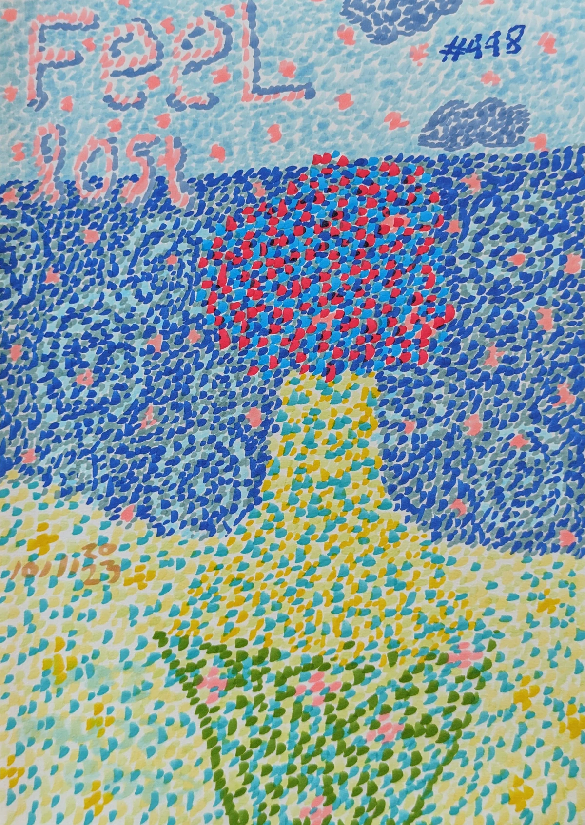
In another series, "Joyful Reverberations," I employed indigo to ground vibrant, energetic compositions. Here, a solid, almost playful base of cadmium orange sometimes sits beneath a thin, shimmering layer of indigo, allowing sparks of warmth to dance through the cool depth, creating a dynamic tension that vibrates with life. And in my "Cosmic Embrace" series, I've experimented with a slightly desaturated, almost dusty indigo – like aged velvet – applying it over a subtle underpainting of metallic silver. This creates a breathtaking sense of infinite space, where the indigo deepens into an almost black void, yet hints of distant stars shimmer through, evoking both the profound loneliness and the quiet majesty of the universe. The interplay of various blues, and sometimes even a surprising underpainting of complementary colors like deep orange or fiery red, adds a vibrant tension and resonance precisely because they push against indigo's coolness, making the indigo truly sing its complex, profound note. My approach to building these visual narratives is deeply intuitive, often blending materials to enrich the texture and story. You can learn more about this in the language of layers: building depth in abstract acrylics and explore my techniques further in my journey with mixed media: blending materials for abstract expression. It’s in these layers that the true soul of indigo emerges, revealing its quiet power and emotional range, always inviting you to look deeper.
Blue as a Mirror: Connecting with Viewers
One of the most rewarding aspects of my work is seeing how viewers connect with the blue in my paintings. It’s fascinating how a color so personal to me can evoke such strong, often shared, feelings in others. This ability of color to evoke shared emotional responses is well-documented in color psychology, but in abstract art, it takes on an even more intimate, subjective resonance. Abstract art, by its very nature, invites viewers to bring their own experiences and emotions to fill the "gaps," creating a deeply personal dialogue between the artwork and the observer. I recall one visitor to my studio who stood before an indigo-dominant piece for a long time, then told me it perfectly captured the feeling of a 'beautiful farewell,' a sense of closure mixed with lingering affection. It was a sentiment I hadn't consciously intended, but it resonated deeply with the melancholic quietude I felt while painting it. These moments create a beautiful dialogue, a shared space for reflection. It's a testament to how abstract art can be finding your reflection: how abstract art can be a mirror to your inner world. And sometimes, these profound connections lead to questions, a desire to peek behind the canvas and understand the artist's mind. So, consider this next section a little candid conversation, addressing some of the questions you've asked, a small offering from my bluest thoughts.
If you're curious to see how blue expresses itself in my latest pieces and how it might speak to you, I invite you to explore my art for sale. Each piece is a fragment of my journey, imbued with the spirit of indigo, waiting for its story to connect with yours.
FAQ: Diving Deeper into My Blues
Many of you have asked about my deep, sometimes obsessive, relationship with blue, so I wanted to address some common questions here. Consider this a little peek behind the curtain of my bluest thoughts, or perhaps, a confession.
Q: Why do you use so much blue in your abstract art?
A: It's an intuitive pull, yes, but also a color that offers an unparalleled emotional landscape for my work. Blue, with its vast range from airy cerulean to profound indigo, allows me to explore everything from serene contemplation to dynamic emotional surges, the paradoxes of quiet strength, and the liminal spaces between dreams and reality. It feels like home, creatively speaking, because it consistently offers avenues for complex expression that other colors don't quite capture for me. Beyond its deeply personal resonance, blue also carries a rich tapestry of universal associations – from the vastness of the sky and sea to ancient symbols of wisdom and calm. And I suspect, deep down, that this shared language of blue is why my work often finds a quiet echo in the hearts of those who see it, allowing them to find their own stories, their own truths, within its embrace.
Q: Is indigo a difficult color to work with?
A: All colors have their quirks! Indigo's depth can be challenging but incredibly rewarding. It demands respect and patience, much like a good relationship – or trying to teach an old dog new tricks. Its tendency to absorb light means you need to be mindful of muddiness, especially when mixing with certain pigments or laying it over opaque colors. Sometimes, it feels like it's fighting me, stubbornly holding onto its secrets, but those struggles often lead to the most profound breakthroughs. It asks you to slow down and truly see it, to understand its elusive nature. And frankly, it stains my hands with a stubborn dignity that serves as a constant, beautiful reminder of our wrestling match.
Q: How does blue influence the mood of your abstract pieces?
A: It's a spectrum, a symphony! From serene and contemplative to dynamic and powerful, the shade, tone, and application of blue dictate the emotional current. Sometimes it's a quiet whisper of longing, other times a resonant roar of revelation. It can be the cool embrace of solitude or the vibrant pulse of connection. Think of it as the emotional weather system of my canvases.
Q: Do you have a favorite shade of blue?
A: That's like asking a parent to pick a favorite child! But if I had to choose, a deep, rich indigo always holds a special, almost sacred, place in my heart. It's the wise elder of my palette, full of stories yet to be told.
Q: How do you choose which specific shade of blue for a new piece?
A: It's rarely a conscious decision. Often, a specific emotion, memory, or even a fleeting image will arrive, bringing with it a dominant blue. Sometimes, it's the conversation between two other colors on my palette that cries out for a particular blue to complete the dialogue. Other times, it's simply the feel of the brush on the canvas, guiding me towards a certain hue. It's an intuitive dance, a listening to the canvas and my own inner landscape, occasionally with a little nudge from my subconscious.
Final Thoughts: An Enduring Blue Note
Blue, and especially indigo, isn't just a color; it's a partner, a confidante, and an enduring calling in my artistic journey. It challenges me, inspires me, and offers a vast emotional palette through which to explore the complexities of human experience. It’s a constant source of wonder and a reminder that even in abstraction, there's always a deep, personal story waiting to be told – a story that often begins and ends with blue. My ongoing narrative with this captivating hue is constantly evolving, much like my art itself, always inviting deeper introspection and a unique dialogue. For more on my journey and how my connection to color has shaped my creative path, check out my artist's timeline. And if you're ever in 's-Hertogenbosch, I warmly invite you to drop by my artist's museum to experience the full spectrum of my work firsthand. And if you embark on your own blue journey, perhaps you'll find your own blue note there, echoing within you, a silent truth only indigo can articulate, a story only your soul can tell.


