My Top Acrylic Paints: A Professional Artist's Essential Guide & Reviews
Dive into a professional artist's candid guide to top acrylic paints. Discover essential criteria, honest brand reviews, archival quality, sustainable practices, and more for vibrant, lasting abstract art.
My Top Acrylic Paints: A Professional Artist's Essential Guide & Reviews
There's a curious kind of obsession that takes hold of an artist, isn't there? For me, it manifests most acutely in the paint aisle, a kaleidoscope of tubes and bottles whispering promises of pure, unadulterated color. I've spent countless hours, and a regrettable amount of money, chasing that elusive 'perfect' acrylic, even convincing myself once that a bargain-bin brand could be coaxed into brilliance. (Spoiler: my studio floor still bears the silent, colorful witness to my artistic delusions.) It's not just about slapping pigment onto a canvas; it's about finding that material that sings with your vision, that doesn't fight you, and, perhaps most importantly, that ensures your artistic legacy isn't fading faster than a summer tan. Investing in quality truly transforms your creative journey, freeing you to focus on the art of composition and the depth of your expression, rather than wrestling with your materials. In this guide, I'll share my top professional acrylic paint brands, delve into the critical criteria I obsess over (from pigment power to lightfastness), and explain why this investment unlocks a world of possibilities for vibrant, lasting art. We'll explore the science, the soul, and even the sustainable choices that shape a truly professional practice. Come, let's peek into my paint-stained world...
Why Quality Acrylic Paint Isn't Just a Luxury, It's an Investment (and a Sanity Saver)
I'll confess, early in my artist's journey, I thought paint was paint. Boy, was I wrong! There's a certain misguided optimism in trying to make a budget paint perform like a professional one. It’s like trying to win a Formula 1 race in a golf cart – admirable effort, but ultimately just frustrating and messy. For professional artists, or anyone serious about their craft, the quality of your acrylic paint directly impacts the vibrancy, longevity, and even the joy of your work. The secret lies not just in the label, but in the formulation itself – superior paints often boast finer pigment particles and higher-grade binders, which drastically affect performance.
Did you know modern acrylic paints, as we know them today, only truly took off in the mid-20th century, emerging from earlier experiments with synthetic polymers in the 1930s and 40s? This wasn't just a new paint; it was a revolution, offering artists a fast-drying, versatile, and durable alternative to oils and watercolors. The full, fascinating story of this artistic upheaval can be found in The History of Acrylic Painting. This relatively young history means continuous innovation, constantly pushing the boundaries of what's possible with paint – a truly exhilarating evolution to be part of. Each year brings subtle advancements in pigment stability, binder flexibility, and even environmental responsibility, making our materials more sophisticated and reliable than ever before. But beyond its captivating journey through time, the true magic of acrylic paint lies within its very composition, particularly its binder.
The true magic often lies in the binder – usually an acrylic polymer emulsion. This isn't just glue; it's the very backbone of the paint, dictating its flexibility, adhesion, and water resistance once dry. Think of it as the invisible scaffolding holding every pigment particle in place, allowing your artwork to breathe and move without cracking. Professional-grade acrylics boast 100% acrylic polymer emulsion binders, meaning the binder itself is entirely composed of acrylic resin. Student paints, in contrast, often cut corners by using lower-quality polymers, less durable co-polymers, or introducing fillers (like clay or chalk) to bulk up the paint and reduce costs. These fillers dilute the pigment load, compromise the film's integrity, and can lead to a less flexible, more brittle film over time – a quiet heartbreak for any artist hoping their work endures. This superior binder is what gives professional paint its flexibility and its tenacious grip on the canvas, a silent promise of enduring quality that frees you from worry.
We’re talking about pigment load, the sheer concentration of color that gives your work that luminous depth. We’re talking about consistency, how the paint feels on your brush, how it moves, how it layers, and whether it holds a sharp line or creates a lush texture. And crucially, lightfastness – the paint’s ability to resist fading over time. Imagine pouring your heart into a piece, only for it to slowly dim. It's a heartbreak I wouldn't wish on anyone. Investing in quality removes these roadblocks, allowing your vision to truly take center stage.

Artist Mixing Paint on Palette, https://creativecommons.org/publicdomain/zero/1.0/
So, with these fundamental qualities in mind, what exactly am I looking for when I scrutinize a tube of paint, pouring over technical sheets and swatch tests? What truly separates a good acrylic paint from a great one? It boils down to a few core principles that guide my selection and ensure my abstract paintings truly sing:
What I Obsess Over: My Criteria for the Best Acrylic Brands
Pigment Powerhouse: The Heart of the Color
This is number one, without question. I want colors that explode off the canvas, vibrant and true. A high pigment load means I use less paint to achieve the same intensity, making higher-priced paints, paradoxically perhaps, more economical in the long run. Beyond the sheer vibrancy, I’m fascinated by the pigments themselves. Organic (synthetic) pigments often offer intense, bright, and transparent colors, perfect for luminous glazes, while inorganic (mineral-based) pigments, like many earth tones or cadmiums, tend to be more opaque and renowned for their historical stability and covering power. Both types, in professional grades, now achieve incredible lightfastness, but understanding their nature can profoundly guide your palette choices and approach to color mixing. Beyond color and lightfastness, these distinctions subtly influence drying times and handling. Inorganic pigments, with their often larger particle size, can sometimes contribute to a slightly faster surface dry time and a more 'gritty' feel even when finely milled, while fine organic pigments can remain 'open' a touch longer, allowing for more subtle blending. It's a delicate dance, this chemistry, and one worth understanding. It’s also about purity – colors that mix beautifully without becoming muddy, a real game-changer. Beyond these traditional categories, the world of pigments is constantly expanding, offering specialized options like iridescent, interference, or metallic pigments that capture and reflect light in mesmerizing ways, or rich earth pigments that lend an ancient, grounding quality to a piece. These unique pigments require a finely tuned binder system to truly shine, emphasizing why professional-grade formulations are so crucial for consistent, brilliant results across the entire spectrum of artistic effects.
Decoding Pigment Codes and Understanding Their Roots
Ever wondered what those cryptic letters and numbers on your paint tubes mean, like 'PB15' or 'PY3'? I remember staring at these codes the first time, wondering if I'd stumbled upon some alchemical formula. Turns out, it's just the art world's very sensible, if slightly arcane, universal language. It's like learning a secret handshake for the paint world, isn't it? These are Pigment Index Names, a universal language for artists. 'P' stands for Pigment, followed by a letter indicating the color group (B for Blue, Y for Yellow, R for Red, etc.), and a number for the specific chemical composition. For instance, PB15 (Phthalo Blue) is a vibrant, transparent organic pigment, while PY3 (Hansa Yellow Light) is a bright, semi-opaque organic yellow. You might see PR101 (Transparent Iron Oxide Red), an inorganic earth pigment known for its natural warmth and excellent lightfastness, or PV19 (Quinacridone Violet/Red), an incredibly rich, transparent organic pigment. Understanding these codes helps you predict how a color will behave – its transparency, tinting strength, and even its environmental profile. And here’s a confession: what truly excites me is getting to know the specific pigment, not just its color name. A 'Cadmium Red' might be a pure cadmium pigment (PR108), or it could be a 'hue' – a blend of different, often less expensive, pigments designed to mimic cadmium's color, like PR254 (Pyrrole Red) and PY83 (Diarylide Yellow). Always peek behind the curtain of the name to the Pigment Index Number (PIN) to understand the true heart of your color. While hues can offer brilliant, lightfast alternatives, a pure pigment often provides a cleaner mixing experience and predictable behavior, especially when tinting. Many modern brands are also innovating with non-toxic alternatives to traditional heavy metal pigments, offering artists safer and more sustainable choices without compromising on quality.
Consistency is Key: Flow, Texture, and Freedom
Do you prefer buttery smooth, heavy body, or fluid? I dabble in all, depending on the piece. Sometimes I want to build thick, impasto textures, other times I need a smooth, almost glazed effect for building depth in abstract acrylics. I once tried to coax a thin, runny acrylic into holding a sharp impasto edge for a commission – a fool's errand that ended with me wiping away layers in frustration. Conversely, trying to create a smooth, ethereal glaze with a stiff heavy body can feel like painting with peanut butter. The right consistency, matched to the technique, feels like the universe aligning. The best brands offer a range of consistencies, allowing me the freedom to experiment. This adaptability is crucial for expressing the full range of emotions in my work. Beyond the primary binder, paint manufacturers often use subtle viscosity modifiers to fine-tune a paint’s body, ensuring it feels just right on the brush, whether you’re aiming for a delicate wash or a bold, sculptural mark. The way pigments are dispersed within the binder also profoundly impacts consistency; superior grinding ensures a smoother, more uniform paint film and prevents gritty textures, allowing for both delicate washes and robust impasto with ease.
The Test of Time: Lightfastness and Archival Quality
This is where the 'professional' aspect truly shines. My art is meant to last, to be enjoyed for generations. So, paints with excellent lightfastness ratings (ASTM I or II) are paramount. This isn't just about preserving color; it's about respecting the art itself and the person who collects it. A truly archival piece, however, demands ASTM I (Excellent Lightfastness), guaranteeing the color will remain virtually unchanged for 100+ years under ideal 'museum conditions' – controlled light, temperature, and humidity that are, let's be honest, far kinder than the average sun-drenched living room. ASTM II offers 'Very Good Lightfastness' for 50-100 years. While perfectly acceptable for many pieces, understand that in a brightly lit home, a painting rated ASTM II might show subtle changes sooner than one rated ASTM I. This isn't just a technical spec; it's a quiet promise to the future, a deep respect for the time and emotion poured into the art, and a practical consideration for its long-term display. I've heard stories of beloved pieces slowly fading into shadows; a silent heartbreak that reminds me why this technical detail is, in fact, deeply emotional.
Drying Time & Working Properties
Acrylics, bless their speedy hearts, dry quickly. This can be a sprint or a marathon, depending on the piece. For those moments when I need more time to blend or rework a large abstract piece, I often reach for 'open acrylics,' a unique formulation specifically designed to stay wet significantly longer, giving me a much-needed reprieve. Unlike traditional acrylics that skin over quickly, open acrylics extend that precious working window, sometimes for hours. Alternatively, I incorporate specific acrylic mediums, like retarders, that extend drying time, allowing for a more meditative and controlled process. It’s a delicate dance between capturing that spontaneous burst of energy and having the control to finesse a subtle gradient, allowing me to truly engage with the art of intuitive painting.
Beyond Lightfastness: The Broader Spectrum of Archival Quality
While lightfastness is paramount, the journey of archival quality doesn't end there. Think of it as a multi-layered defense system for your art. Beyond resisting UV light, professional-grade acrylics are formulated for overall chemical stability – meaning they resist reactions with atmospheric pollutants or other materials, preventing discoloration or degradation over time. They're also less prone to yellowing, a common affliction of older oil paints and lower-grade acrylics where the binder itself discolors. This comprehensive stability, combined with the inherent flexibility of 100% acrylic polymer binders, ensures that your artwork not only retains its vibrant colors but also its structural integrity for generations. It’s a quiet testament to the artist's dedication and the paint manufacturer's science, a legacy woven into every layer. For an artwork to truly endure centuries, other factors like environmental stability (consistent temperature and humidity), proper handling, and suitable framing also play a critical role, but a superior paint film provides the fundamental building block.
Beyond the Tube: The Silent Partners That Elevate Your Paint
Choosing the right paint is just one piece of the puzzle, a single note in the grand symphony of creation. To truly unlock the potential of your chosen pigments, you need to think about their supporting cast, the silent partners that elevate good work to great. The way you apply it, what you apply it on, and how you think about your process all contribute to the final outcome. Your paints need good company to truly shine, otherwise, it's like sending a soloist onto the stage without an orchestra.
- Brushes & Tools: Even the best paint won't magically fix a bad brush. Investing in quality brushes, palette knives, and other mark-making tools is crucial. They are your direct connection to the canvas.
- Surfaces: The canvas or surface you paint on makes a huge difference. Ensure it's properly primed to allow your beautiful paints to shine. And gesso, that unassuming primer, is more than just a surface prep; it seals your canvas, protecting the fibers from the acrylics' slight acidity over time and, crucially, creates 'tooth' – a microscopic texture, like tiny, interlocking anchors, that gives the paint something substantial to grip onto, ensuring superior paint adhesion and longevity. It's the unsung hero of permanence, a silent guardian of your artistic intention, a sturdy handshake between canvas and color.
- Mediums: Acrylic mediums are incredibly versatile additions that can extend drying time (like retarders), change consistency, add texture (like modeling paste or texture gels), or create transparent glazes (like gloss mediums). They are generally transparent or semi-transparent, designed to alter properties without significantly diluting the pigment. For instance, gel mediums primarily increase transparency, body, and sheen without affecting pigment load, making them ideal for glazes or extending colors, while fluid mediums primarily thin paint without significantly altering its body, making them perfect for washes or fine detail. Modeling paste, on the other hand, is designed to build thick, sculptural textures, offering an opaque, often heavy-bodied, and carvable surface. And for those drawn to fluid abstraction, acrylic pouring mediums facilitate smooth, cell-like patterns without compromising paint integrity. They're like secret potions for expanding your paint's capabilities, allowing you to manipulate your medium far beyond its straight-from-the-tube state.
- Acrylic Inks: And for when I want pure liquid color? Acrylic inks offer intense, transparent, and incredibly fluid pigment, perfect for staining, washes, or fine detail, often complementing my heavy body work.
- Varnishes: The final, often overlooked, layer of protection. A good varnish not only unifies the sheen of your finished piece (available in gloss, satin, or matte finishes) but also provides a crucial barrier against dust, UV light, and atmospheric pollutants. It's the silent bodyguard for your masterpiece, ensuring its vibrancy remains locked in for future generations.

Creative Art Studio with Brushes and Paints, https://creativecommons.org/publicdomain/zero/1.0/
Expanding Your Palette: A Nod to Acrylic Gouache
For a completely different texture and finish, sometimes I reach for acrylic gouache. Unlike traditional acrylics that dry with a sheen, acrylic gouache offers a beautifully opaque, matte finish. It's fantastic for areas needing flat, uniform color, or for precise graphic work, and dries quickly like regular acrylics. It’s a wonderful tool for adding crisp, graphic elements or a velvety softness that contrasts beautifully with the impasto textures of heavy body paints.
A Thought on Sustainable Art Practices in Your Studio
Our artistic choices ripple outwards, often touching the very earth that inspires us. This is a quiet consideration that always hums in the background for me, a growing awareness that our materials have a journey beyond the canvas. While perfection is elusive, I find myself increasingly drawn to brands that are transparent about their pigment sourcing and actively innovating to reduce their environmental footprint. Some brands, like Sennelier with their clever pouches, offer great solutions, and I've seen others explore refillable options or incorporate recycled content into their packaging. Every conscious choice, however small, feels like a quiet nod to the earth that inspires so much of my work.
When it comes to disposal, I've learned the hard way that acrylic paints contain plastic polymers; never wash large amounts down the drain. Instead, I let excess paint dry on my palette and peel it off to dispose of in regular solid waste. For cleaning brushes and tools, I use a dedicated container for rinse water, allowing the pigment and binder particles to settle overnight. I then carefully pour off the clear water and dispose of the settled sludge as solid waste. It’s a small effort, but it adds up, ensuring your art not only endures but also aligns with a conscious creative practice. I, for one, always try to use a palette scraper to get every last bit of paint out of the tube before washing my palette, minimizing waste and microplastic runoff – a small effort, but it adds up.
So, with these principles as my guiding stars, I've navigated the vast, shimmering sea of acrylics to find the brands that consistently deliver on their promises, becoming the true companions in my studio. These are the ones that have earned their permanent, often paint-splattered, place on my shelf and behind many of the pieces you see in my art for sale.

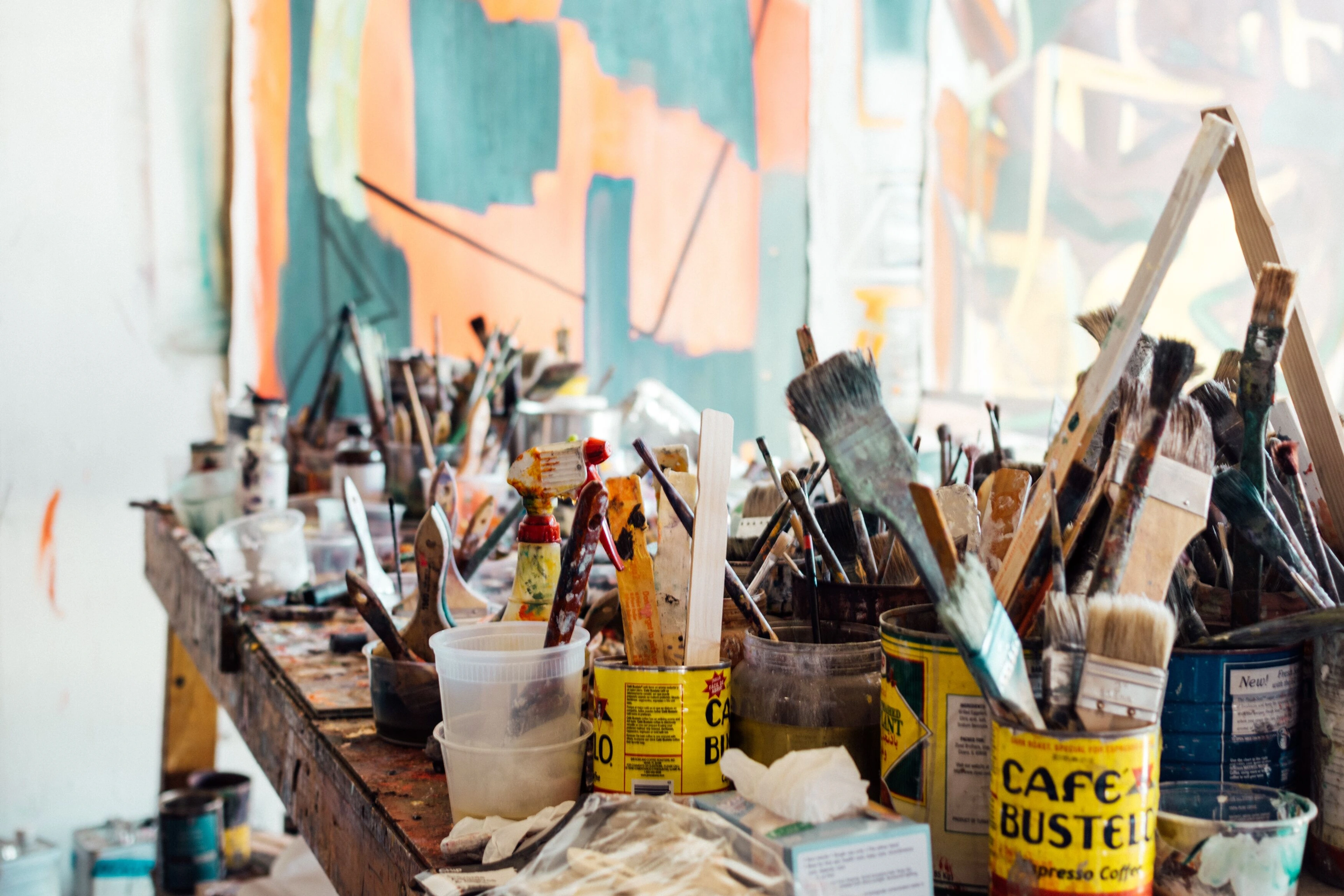
Cluttered Artist's Workbench with Painting Supplies, https://creativecommons.org/publicdomain/zero/1.0/
As an artist, my studio is a laboratory, and these brands are my most trusted tools, chosen for their unwavering quality and how they respond to my creative demands. Here's a look at my top picks:
1. Golden Heavy Body Acrylics
When you need paint that truly sings with uncompromised vibrancy...
Oh, Golden. If paints could wear crowns, this brand would be king. Their Heavy Body Acrylics are simply phenomenal. The pigment load is insane, offering intense, rich colors with incredible coverage. They have a buttery, smooth consistency that holds brushstrokes beautifully, making them ideal for creating textured surfaces, which I adore. They feel luxurious, and honestly, a little goes a long way. I remember one abstract piece where a particular Golden cadmium red just sang, effortlessly creating the focal point I envisioned; it layered like a dream and radiated warmth. It was like the paint was doing half the work for me. When I want a bold, definitive statement, or need a color to truly sing, Golden is my undisputed champion, often favored by those seeking maximal impact and archival quality, allowing me to explore a vast emotional language of color. It's a premium investment, but one that undeniably pays dividends in artistic freedom and lasting brilliance. Their Fluid and Open Acrylics lines are equally exceptional for different applications, showcasing the brand's versatility, and while a premium choice, their extensive product range often includes options suitable for artists at various stages, even if their Heavy Body is top-tier. Does that sound like the kind of paint that would fuel your next bold statement or allow you to explore a vast emotional language of color with confidence? This is the champion when compromise isn't an option, where pure pigment and archival integrity reign supreme.
Golden Heavy Body Acrylics, https://creativecommons.org/publicdomain/zero/1.0/
- Best For: Bold statements, impasto, vibrant color, and maximal archival quality.
2. Liquitex Professional Heavy Body Acrylics
For the artist who builds worlds layer by layer with unwavering consistency...
Liquitex Professional is another workhorse in my studio. Their Heavy Body Acrylics are wonderfully versatile, offering a slightly smoother consistency than Golden, which I find excellent for both thick applications and smoother blending. Their color vibrancy is impressive, and they boast excellent lightfastness, giving me peace of mind. When I’m building up those initial, robust layers, often covering broad areas, Liquitex feels like an old, reliable friend. Its slightly longer working time compared to some heavy bodies also offers a welcome moment for contemplation, a subtle pause before the next bold move. I recall a large-scale piece where I needed strong, opaque foundations, and Liquitex laid down those layers with unwavering consistency, providing the perfect canvas for subsequent expressive marks. For starting layers or when I'm engaging in a bit of my journey with mixed media, Liquitex often steps up to the plate. It's a robust choice for abstract artists who layer extensively, valuing its versatility and consistent performance. Plus, their larger tubes often offer excellent value for money compared to some competitors, which my pragmatic side always appreciates, especially when stocking up on their extensive range of mediums. Liquitex also offers a comprehensive student-grade line, "Liquitex Basics," which is a fantastic entry point for aspiring artists to experience the brand's quality before committing to the professional range. Could Liquitex be the consistent partner for your own foundational layers or your journey with mixed media?
Liquitex Professional Heavy Body Acrylics, https://creativecommons.org/publicdomain/zero/1.0/
- Best For: Versatile layering, smooth blending, and robust foundational work.
3. Winsor & Newton Professional Acrylics
Where finesse meets luminosity, crafting delicate transitions and ethereal glazes...
Winsor & Newton have a long-standing reputation in the art world, and their Professional Acrylics certainly live up to it. What I particularly love about these is their slightly more fluid consistency compared to Golden or Liquitex Heavy Body, while still retaining incredible pigment intensity. This makes them fantastic for glazing, smooth blending, and creating subtle shifts in color. There was a recent series of abstract landscapes where I needed the softest, most ethereal atmospheric effects. Winsor & Newton’s fluidity for glazing was absolutely indispensable, allowing me to build light and shadow with an almost watercolor-like delicacy, creating a profound sense of depth and mystery. If I'm working on a piece where delicate transitions are key, or when I'm really trying to master certain basic brushstrokes for acrylic painting, these are my go-to. They dry to a beautiful, satin finish and are perfect for artists focused on subtle shifts and fine detail. Often found in the mid-to-high range, they strike a beautiful balance between quality and accessibility, particularly notable for their vibrant single-pigment colors. While their professional range is exceptional, Winsor & Newton also offers the "Galeria" student-grade line, providing excellent quality for practice and developing skills at a more accessible price point. Imagine the subtle shifts you could achieve; is this the fluidity your work craves for mastering basic brushstrokes for acrylic painting?

Winsor & Newton Professional Acrylics, https://creativecommons.org/publicdomain/zero/1.0/
- Best For: Glazing, subtle blending, delicate transitions, and fine detail.
4. Sennelier Abstract Heavy Body Acrylics
For spontaneous bursts of unmediated color, directly from the source...
Now, for something a bit different! Sennelier, a classic French brand, introduced their Abstract Heavy Body Acrylics in pouches, and I was immediately intrigued. It feels a bit like squeezing out a gourmet sauce, which is a surprisingly satisfying tactile experience. The paint itself is wonderfully creamy, highly pigmented, and retains brushstrokes well. The pouch design is genius for avoiding waste and allowing direct application, which can be incredibly liberating for intuitive painting. The very first time I squeezed a vibrant green from one of their pouches directly onto a large canvas, it felt like an act of pure, uninhibited creation, bypassing the palette entirely. No fuss, just raw color meeting surface – a thrilling, immediate connection. While the pouch design is genius for avoiding waste and allowing direct application, a slight word of caution: achieving ultra-fine detail directly from the pouch can be tricky, and if not handled carefully, you might occasionally encounter a stubborn air bubble. But for sheer, unadulterated spontaneity? Pure joy! When I want to just go and get a raw, direct application, these are a fun, experimental choice, appealing to those who value spontaneity and direct material engagement. They offer innovative convenience for a modest premium, and their color range is surprisingly broad and intense, making them a worthy professional option for expressive work, though they don't have a distinct "student" line like some larger brands. Ready to embrace pure, unmediated color and let your spontaneity take over for your intuitive painting process?
Sennelier Abstract Heavy Body Acrylics, https://creativecommons.org/publicdomain/zero/1.0/
- Best For: Spontaneous application, direct mark-making, and minimal waste.
Professional Acrylic Brands at a Glance
Brand | Primary Consistency | Key Strengths | Best For |
|---|---|---|---|
| Golden | Heavy Body (also Fluid, Open) | Insane pigment load, buttery texture, maximum archival quality | Bold impasto, vibrant color, definitive statements |
| Liquitex | Heavy Body (also Soft Body, Ink) | Versatile, consistent, slightly longer working time, good value | Layering, smooth blending, robust foundations, mixed media |
| Winsor & Newton | Professional Acrylics (more fluid than heavy body) | Luminous glazes, subtle blends, satin finish, fine detail | Delicate transitions, ethereal effects, precise work |
| Sennelier | Heavy Body (pouches) | Creamy, highly pigmented, direct application, minimal waste | Spontaneity, direct mark-making, experimental approaches |
Frequently Asked Questions About Professional Acrylic Paints
Curiosity, I've found, is an artist's best friend. Here are some of the questions I often ponder, or get asked, about the world of professional acrylics – because understanding your materials truly empowers your art.
Q1: Are student-grade acrylics ever acceptable for professional work?
Honestly? Not usually for finished pieces intended for sale or long-term display. While they can be fantastic for practice, sketching, or underpaintings, student-grade paints typically have a lower pigment concentration, use less expensive fillers, and may have inferior lightfastness. This means less vibrant colors and a higher risk of fading over time. Save them for your sketchbook adventures, where mistakes are just happy accidents!
Q2: How do I know if a paint is lightfast?
Look for the ASTM (American Society for Testing and Materials) rating on the tube or product description. ASTM I indicates excellent lightfastness (will remain unchanged for 100+ years under museum conditions), and ASTM II indicates very good lightfastness (will remain unchanged for 50-100 years). Anything lower, or paints without a rating, might be risky for archival work.
Q3: What's the difference between heavy body and fluid acrylics?
Heavy body acrylics have a thick, buttery consistency, similar to oil paints. They retain brushstrokes, are excellent for impasto techniques, and offer good coverage. Fluid acrylics have a more liquid, ink-like consistency, ideal for staining, glazing, pouring, and fine detail work. Both offer high pigment loads in professional grades, but fluid acrylics typically have a higher binder-to-pigment ratio, contributing to their liquid nature without compromising color intensity; it just depends on your preferred application.
Q4: Should I stick to one brand for all my paints?
Not at all! Many artists, myself included, mix and match brands. Different brands excel in different areas or offer unique color ranges or consistencies. As long as you're using professional-grade acrylics (and not mixing with incompatible media like oils without proper knowledge), you're generally safe to combine them. My studio is a beautiful, chaotic symphony of tubes from various makers! It's all part of the alchemy of layers, where different textures and hues come together to tell a story.
Q5: Are "artist-grade" and "professional-grade" acrylics the same thing?
Generally, yes, these terms are often used interchangeably to denote the highest quality paints available to artists. Both imply a high pigment load, excellent lightfastness, and superior binders, distinguishing them from 'student-grade' paints. The key is to look beyond the marketing term and check for specific information like ASTM ratings and pigment details on the label. A truly professional-grade paint will always provide this transparency.
Q6: What exactly are acrylic mediums for?
Acrylic mediums are incredibly versatile additions that can transform your paint's properties. For example, use a gloss medium to create luminous, transparent glazes, or modeling paste to build sculptural, textured surfaces. They can also extend drying time (like retarders), thin paint without losing pigment intensity (like fluid mediums), or alter the final finish (gloss, matte). They're like your paint's co-creators, helping you achieve a wider range of effects, expanding your creative toolkit.
Q7: How should I store my acrylic paints?
To maximize their shelf life and maintain optimal consistency, store your acrylic paints in a cool, dry place away from direct sunlight and extreme temperatures. Always ensure caps are tightly sealed to prevent drying out and air exposure, which can alter the paint's working properties over time. Treat them like precious potions; they are, after all, the conduits of your vision.
Q8: What is acrylic gouache and how is it different?
Acrylic gouache is a type of acrylic paint that dries to an opaque, matte finish, similar to traditional gouache but with the permanent, water-resistant properties of acrylics once dry. Unlike standard acrylics that often have a slight sheen, acrylic gouache is ideal for flat, even color application and graphic work, offering a velvety appearance without losing color intensity.
Q9: Can acrylics become brittle and crack over time?
Unfortunately, yes, lower-quality acrylics (especially student-grade ones with more fillers) can become brittle, leading to cracking, particularly if applied thickly or stored in fluctuating temperatures. This is precisely why investing in professional-grade paints with 100% acrylic polymer binders is so crucial. These superior binders maintain their flexibility for decades, ensuring your artwork remains supple and crack-resistant, a silent promise of enduring quality. It’s a peace of mind worth every penny.
Q10: How can I tell if my acrylic paints have gone bad?
Acrylic paints have a remarkably long shelf life if stored correctly, often lasting many years. However, signs of spoilage include a strong, unpleasant ammonia-like smell (beyond the normal acrylic odor), separation of the binder and pigment that won't re-mix with stirring, or the paint becoming stringy, lumpy, or too stiff to use. While minor consistency changes can sometimes be rectified with a little water or medium, significant degradation usually means it's time to replace the tube. Trust your senses; if it doesn't look or feel right, it's best to err on the side of caution for your precious artwork.
The Canvas Awaits: My Final Thoughts
Ultimately, the paint is just a vibrant language for your unique vision. The most expensive paint won't make a masterpiece, but it certainly removes a lot of frustrating obstacles, freeing you to focus on the art of composition and the depth of your expression. Choosing the "best" acrylic paint brand is, after all, a deeply personal decision, much like choosing a favorite coffee mug or a muse. It's about finding what resonates with your hand, your style, and your artistic temperament. These brands are my steadfast companions in the often-unpredictable journey of creation, supporting me in expressing the vibrant, abstract worlds I envision, often in conjunction with different consistencies or even other media for unique effects.
I encourage you to experiment, to get your hands (and studio) delightfully messy, and to discover your own favorites across various brands and consistencies. Don't be afraid to splurge a little on quality; your art, and your artistic self, will thank you for it. After all, life's too short for dull, fading colors, wouldn't you agree? Perhaps your next masterpiece, crafted with the perfect paints, will find its way onto a gallery wall, or even inspire someone to visit the Den Bosch Museum to see what else art can do. The possibilities are as endless as the colors themselves, and the journey of discovery is half the fun. May your canvas always await with anticipation, and your colors sing with the vibrancy of your soul.


