
Best Books on Color Theory: My Curated Guide to Mastering Hues for Artists
Unlock the secrets of color! As an abstract artist, I've journeyed through countless pages to find the most impactful color theory books. This curated guide shares my top picks and personal insights, helping you master hues and elevate your art, whether you're a beginner or seeking a deeper understanding.
The Ultimate Guide to Mastering Hues: Best Books on Color Theory for Artists
I still remember the early days in my studio, standing in front of a blank canvas, tubes of vibrant paint staring back at me, and feeling… utterly lost. It wasn't just about mixing paint; it was about orchestrating a symphony of hues, trying to speak a language I only half-understood. Have you ever felt that intense pull towards color, yet struggled to make your artistic vision come alive on the canvas? That yearning for harmony, for intention, for true expression? Believe me, I've been there, fumbling in the dark, wondering if I'd ever truly 'get' it. It felt like standing at the edge of a vibrant, limitless ocean, desperate to dive in but without a map or even a sturdy raft. This isn't just about mixing paint; it's about unlocking a deeper, more profound connection to your creative self, allowing you to articulate unspoken stories and emotions with every stroke of color. My aim with this guide is to give you that map, that sturdy raft, and the confidence to dive headfirst into the exhilarating world of color theory. For a foundational overview, check out our definitive guide to color theory in art.
Have you ever stood before a masterpiece, captivated by its palette, and wondered how the artist achieved such magic? Or perhaps you're tired of your own colors not quite 'singing' together? You're definitely not alone. Mastering color is a lifelong journey, a delightful obsession, but with the right guides, it can be an incredibly exhilarating one. This isn't just a list of books; it's an invitation to fundamentally transform your artistic practice, to move beyond guesswork and into a realm of informed, intuitive color choices that will make your work truly resonate. We'll explore foundational concepts, delve into the profound psychology of hues, uncover the rich history of color theory, and examine the essential texts that have shaped my own abstract journey, helping me articulate unspoken stories with every vibrant stroke. My goal is to equip you with the knowledge to make every color choice a confident, deliberate act of expression.
Like many artists, I initially thought color theory was some dry, academic pursuit best left to art historians or those hyper-realistic painters who obsess over every nuance of light. Honestly, for years, I actively avoided it, convinced it would somehow clip my creative wings. Boy, was I wrong. Color theory, I've come to learn, isn't about stifling creativity; it's about giving you a map so you can explore the wilderness of color with confidence, knowing where the hidden treasures lie and where the dragons might be (or at least, the muddy browns that seem to appear out of nowhere). It's about empowering your intuition with knowledge, giving you the tools to articulate the emotions bubbling within you, rather than just fumbling in the dark. It's truly about unlocking your unique vision and giving it the chromatic language it deserves. It’s the difference between merely seeing colors and truly understanding their profound power to communicate, to evoke, and to transform a canvas into a vibrant narrative.
My journey through the world of color theory has been deeply personal, filled with countless 'aha!' moments that completely shifted how I approach my abstract work. These weren't always comfortable shifts – sometimes they meant dismantling old habits and facing what felt like creative dead ends – but they were always profoundly rewarding, leading to breakthroughs that invigorated my entire practice. And honestly, a significant part of that journey, those deeply personal 'aha!' moments, was guided by some truly incredible books that acted as illuminating lighthouses in the vast ocean of color. So, if you're feeling that same delightful, yet sometimes daunting, pull towards mastering color, you're in the right place. I've sifted through piles of texts, some brilliant, some baffling, to bring you my curated list of the best books on color theory – the ones that genuinely made a difference in my studio. This guide isn't just about theory; it's about unlocking your own intuitive brilliance and finding your unique voice in the vast, vibrant universe of color. It's the ultimate resource to transform your understanding and application of color, empowering you to create with unparalleled confidence and expression, moving past mere decoration into true communication. We'll explore not just the 'what,' but the 'why' and 'how,' making complex concepts feel accessible and immediately applicable to your own canvas. This guide aims to be your most trusted companion, covering everything from the fundamental building blocks of hue and value to the subtle nuances of color psychology and the rich history of how artists have wrestled with this captivating element throughout time. For a deeper dive into these foundational principles, check out our definitive guide to color theory in art. Let's unlock the secrets together, transforming your artistic vision from tentative steps to confident leaps!

Understanding the Core Elements of Color Theory: Your Foundational Language
For abstract artists like me, understanding these core elements isn't just academic – though there's certainly a rich history to delve into – it's absolutely foundational to building expressive and impactful compositions. It’s the difference between merely making marks on a canvas and intentionally weaving a visual narrative with precision and feeling. Think of them as the essential instruments in your artistic orchestra, the tools that allow us to orchestrate vibrant symphonies of color, to conjure worlds of emotion and meaning without needing to depict a single recognizable object. When I think of mastering color, I think of having a profound conversation with the canvas, and these elements are my vocabulary. They are the bedrock upon which all sophisticated color work is built, allowing you to move beyond imitation into true innovation.
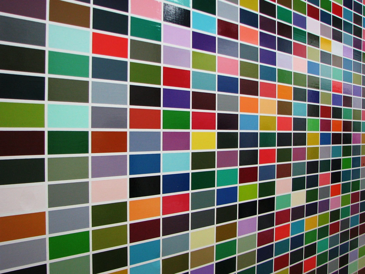
Before we dive deeper into specific books, it’s worth laying out the fundamental building blocks of color theory. Consider this your foundational language. These are the vocabulary and grammar you’ll be learning, the basic elements that every artist manipulates to create their visual narratives. Mastering these concepts is like learning your scales before composing a symphony; they give you the structure to build upon, and the freedom to improvise later, to truly make the music your own. Having a solid grasp on these allows you to speak the language of color with fluency and confidence, moving beyond simply seeing to truly understanding and shaping. They are the essential toolkit for any artist, especially those in abstraction, who wish to communicate with unparalleled clarity and emotional depth.
Here's a quick cheat sheet for the core elements, highlighting how each contributes to the expressive power of your art:
Element | What it is | How it helps your abstract art |
|---|---|---|
| Hue | The pure name of a color (e.g., red, blue, yellow) | Forms the basis of the color wheel, identifies and categorizes colors, and serves as the primary identifier for any given color. |
| Saturation | The intensity, purity, or vividness of a color | Creates depth and space, guides the viewer's eye, and powerfully evokes specific moods (from vibrant energy to quiet contemplation). |
| Value | The lightness or darkness of a color, independent of hue | Defines forms, establishes contrast, creates focal points, and is arguably the most crucial element for creating three-dimensionality and visual hierarchy. |
| Harmony | Aesthetically pleasing and balanced color combinations | Ensures visual unity, balance, and emotional resonance within a composition, transforming disparate hues into a cohesive narrative. |
| Temperature | The perceived warmth or coolness of a color | Creates illusions of depth (warm colors advance, cool colors recede), establishes atmosphere, and profoundly impacts emotional resonance. |
Hue: The Name of the Color
Hue is simply the pure state of a color – what we commonly call its 'name.' Think red, blue, green, yellow. It's the dominant wavelength of light that our eyes perceive. On a traditional color wheel, the hues are arranged in a spectrum, moving seamlessly from one to the next. Understanding hue is the first step in identifying and categorizing colors, providing a basic framework for discussion and analysis. It's the primary identifier, the core identity of any given color. For instance, the red in a fiery sunset, the deep blue of a summer sky, or the vibrant green of fresh spring leaves are all distinct hues. It’s the foundational note in our color symphony, the purest form of color before light and darkness begin to play their part.
From these pure hues, we derive everything else. Primary colors (red, yellow, blue in the traditional RYB model) are the irreducible building blocks; they can't be created by mixing other colors. Think of them as the foundational notes in a musical scale, the absolute starting point, as explored in what are the primary colors. Combine primaries, and you get secondary colors (orange, green, violet). Mix a primary with an adjacent secondary, and you arrive at tertiary colors (like red-orange or blue-green). This hierarchical structure of hues forms the backbone of the traditional color wheel, giving us a logical map for understanding color relationships, how they interact, and how to intentionally move between them. While the standard RYB (Red, Yellow, Blue) primary color wheel is commonly taught, it's worth noting that other systems exist, like the CMY (Cyan, Magenta, Yellow) model used in printing, or even the artist Stephen Quiller's unique wheel, each offering a different lens on color relationships. Understanding this hierarchy is crucial for building complex palettes, allowing you to venture beyond the obvious primary and secondary combinations and into the rich subtleties of color that truly sing. For me, grasping this structure was like suddenly being able to navigate a complex city without a map, recognizing hidden alleys and vibrant districts rather than just main roads. It opened up a whole new world of expressive possibilities in my abstract work, moving past the literal and into the infinitely nuanced. It's where you start to understand beyond the primary: how I use secondary and tertiary colors to create complex abstract worlds – finding unexpected beauty in the mixes. Mastering hue is about recognizing the pure essence of each color and then understanding its place within the grand chromatic family, ready to interact and transform.
Saturation: The Intensity or Purity of Color
Saturation, sometimes called chroma, refers to the intensity or purity of a color. A highly saturated color is vibrant, vivid, and rich, appearing very close to its pure pigment form. A desaturated color, on the other hand, is duller, grayer, and closer to white, black, or gray. Imagine a brilliant, fiery red versus a muted, dusty rose; the red is highly saturated, while the rose is desaturated. Learning to control saturation allows you to create depth, guide the viewer's eye, and evoke specific moods. High saturation colors tend to advance, feeling closer and more urgent, while low saturation colors recede, creating a sense of distance or calm. I often use subtle shifts in saturation in my abstract pieces to create an illusion of spatial depth, pushing certain elements forward and allowing others to subtly pull back, or to evoke a sense of quietude or even nostalgia. A faded memory, for instance, might be best expressed with less saturated hues, while a burst of pure joy demands full chroma. For abstract compositions, manipulating saturation can create powerful visual hierarchies, drawing the eye to focal points of intense color while allowing other areas to quietly support the overall narrative. It's a key tool for building dynamic tension or serene calm, giving your colors a voice beyond just their name. Think of a booming drum versus a soft whisper – both convey sound, but with vastly different intensities. Mastering saturation is like learning to control the volume of your colors, allowing them to speak with anything from a booming declaration to a subtle, introspective murmur.
Value: The Lightness or Darkness of Color
Value describes how light or dark a color is, irrespective of its hue or saturation. It's arguably the most crucial element in creating a sense of form, depth, and contrast in a painting. A color can be light (high value, like a pale yellow) or dark (low value, like a deep indigo). Understanding value helps you define shapes, create focal points, and establish a sense of three-dimensionality. Squinting your eyes to blur the hues and focus only on the lightness and darkness is a classic technique artists use to assess the values in their work. A strong value contrast can create drama, while subtle shifts in value can create a sense of softness or mystery. Think about how important how artists use light and shadow dramatically is, which is intimately tied to value, or how the language of light: how illumination shapes my abstract compositions impacts my work. It also plays a significant role in creating a visual hierarchy, drawing the viewer's eye to areas of high contrast or carefully balanced luminosity. For abstract artists, value is the invisible scaffolding that gives form and structure to non-representational compositions, allowing for dynamic movement and a profound sense of space even without literal objects.
Beyond just light and dark, value encompasses three critical sub-concepts, which for me, were some of the most exciting discoveries:
Concept | Definition | Example (from Red) | Evoked Feeling/Impact for Abstract Art |
|---|---|---|---|
| Tint | A hue to which white has been added, making it lighter and more luminous. | Pink | Creates sensations of lightness, airiness, delicacy, softness, or ethereal possibility. |
| Shade | A hue to which black has been added, making it darker and more intense. | Maroon | Conveys depth, drama, solemnity, weight, grounding, or a sense of mystery. |
| Tone | A hue to which gray (or both black and white) has been added, muting it. | Dusty Rose | Suggests sophistication, subtlety, age, quiet contemplation, or veiled emotion. |
Mastering these nuances allows for incredible control over the perceived weight and presence of colors in your abstract work, truly sculpting the visual space. A subtle shift in tone can completely alter the emotional register of a painting, from vibrant joy to melancholic contemplation. I often use these nuances to create a sense of veiled layers or unfolding narratives in my work, where lighter tints might suggest hope and possibility, and deeper shades might hint at mystery or a quiet internal landscape. It's a powerful way to add complexity and emotional depth without relying on literal representation. These sub-concepts allow you to fine-tune the emotional language of your colors, making them sing with precision and profound intention.
Color Harmonies: The Art of Putting Colors Together
This is where things get really exciting! Color harmonies are combinations of colors that are considered aesthetically pleasing or visually balanced. There are several classic approaches, each offering a unique pathway to visual balance and emotional resonance. For a comprehensive dive into mastering these relationships, check out the definitive guide to understanding color harmonies in abstract art. Understanding these principles transforms random color selections into deliberate, impactful choices, allowing your abstract compositions to resonate with profound unity and feeling.

- Monochromatic: Variations in value and saturation of a single hue. Think of a painting composed entirely of different shades of blue, from sky blue to deep navy. These are fantastic for creating a sense of unity, tranquility, or subtle mood, often seen in minimalist or contemplative works. The beauty lies in the subtle dance of light and shadow, relying entirely on value and saturation to create depth and visual interest. I often gravitate towards these palettes when I want to create a deeply introspective or meditative piece, allowing the viewer's eye to explore subtle shifts rather than dramatic clashes. This approach allows for profound emotional depth within a limited chromatic range, akin to a quiet, powerful whisper.
- Analogous: Colors adjacent to each other on the color wheel (e.g., blue, blue-green, green). These tend to be harmonious and calm, like a forest scene dominated by greens and yellows. Analogous schemes are often found in nature and are excellent for creating serene landscapes or seamless transitions. For abstract work, I find them perfect for building a sense of natural flow and gentle energy, like a visual river guiding the eye, or creating a subtle, unfolding narrative that feels inherently balanced and cohesive.
- Complementary: Colors directly opposite each other on the color wheel (e.g., red and green, blue and orange). These create high contrast and vibrancy, making each color appear more intense, as we discussed with simultaneous contrast. It's a dynamic pairing that can really make your work pop, often used for dramatic effect or to draw immediate attention. The intense visual vibration they create can be exhilarating, making each hue feel more alive. When I want a piece to truly sing with energy, a complementary pairing is my go-to, creating that delightful tension that keeps the eye engaged. It's the visual equivalent of a clap of thunder, demanding attention and creating an electrifying focal point.
- Split-Complementary: A variation of the complementary scheme. Instead of using a direct complementary color, you use the two colors adjacent to it. For example, if your main color is blue, instead of orange, you'd use red-orange and yellow-orange. This offers a high contrast but with less tension than a direct complementary pair, providing a more sophisticated and nuanced balance, perfect for dynamic yet harmonious abstract compositions. I often employ this for complex pieces where I want vibrant energy without feeling jarring, allowing for a richer, more subtle conversation between the hues, creating a sense of balanced excitement rather than direct confrontation.
- Triadic: Three colors equally spaced on the color wheel (e.g., red, yellow, blue). These schemes tend to be vibrant and balanced, offering a rich range of expression. I find triadic harmonies incredibly versatile for abstract compositions, especially when aiming for a lively and energetic feel without being chaotic. They create a strong visual statement, providing a solid, vibrant foundation for complex emotional narratives, like a perfectly orchestrated visual symphony.
- Tetradic (or Rectangular): Four colors arranged into two complementary pairs. This can be complex but offers incredible richness and variety, though it requires careful balancing to avoid chaos. When handled skillfully, it can create a sophisticated and multifaceted visual narrative, often seen in complex figurative or narrative works. For abstract artists, this is a master challenge, allowing for incredibly rich and dynamic compositions that can tell a sprawling, intricate story, almost like weaving a complex tapestry of emotions.
- Square: Similar to tetradic, but uses four colors equally spaced around the color wheel. This creates a bold, balanced palette that can be very energetic, but again, careful handling is required to prevent it from becoming overwhelming. It's a challenging but rewarding scheme for artists who enjoy pushing boundaries and creating vibrant, multi-tonal pieces. When I use a square harmony, I'm aiming for a sense of contained chaos, a vibrant energy that feels both expansive and deeply rooted, creating a sense of powerful, controlled explosion of color.
Color Temperature: Warmth and Coolness
While we touched on this briefly, color temperature is a fundamental and often counter-intuitive concept that unlocks incredible depth in your art. Colors are generally perceived as warm (reds, oranges, yellows, associated with sun and fire) or cool (blues, greens, purples, associated with water and ice). But here's the crucial part: it's always relative! A yellow-green can be warmer than a blue-green, even though both are 'green.' This relativity is what artists exploit. Think of it like cooking: a spice might be 'hot,' but some are hotter than others, and their heat changes when combined with other ingredients. For example, a blue-green can feel warm when placed next to a pure blue, but cool when adjacent to a yellow-green. This relativity is what artists exploit to create incredible spatial illusions and emotional depth.
Manipulating color temperature is a powerful way to create a sense of depth, atmosphere, and emotional resonance. Warm colors tend to advance and feel closer, creating a sense of intimacy or energy, while cool colors recede and feel further away, evoking spaciousness or calm. It's a subtle yet incredibly effective tool for guiding the viewer's eye and conveying emotion without resorting to overt symbolism. Imagine a cool, distant mountain range subtly shifting to warmer tones as it approaches the foreground, or the stark emotional difference between a warm, inviting yellow versus a cold, almost sickly yellow. These subtle shifts can completely transform the narrative of a piece, making the colors breathe and interact on the canvas in a profoundly emotional way.
I often think of it as a spectrum within a spectrum, a subtle dial you can turn within each color. A cool red, like alizarin crimson, might have blue undertones that make it feel more reserved, almost melancholic, than a warm red, like cadmium red, which leans towards orange and vibrates with energy. These subtle temperature shifts within a single hue family are fantastic for creating vibration, dynamism, and an illusion of atmospheric depth, especially in abstract landscapes or emotional compositions. It's truly a game-changer for moving beyond flat, one-dimensional color, allowing you to sculpt perceived space and energy with nuanced chromatic shifts. Understanding this 'warm-cool' interplay is paramount for making your colors feel alive and responsive to light, making them breathe and interact on the canvas in a profoundly emotional way. It's like learning the subtle inflections in a voice; they can completely alter the meaning of a sentence. It's a concept I find myself constantly revisiting in my own abstract work, experimenting with how even a tiny shift can completely alter the emotional resonance of a piece. By mastering temperature, you gain the ability to create truly immersive and emotionally resonant abstract worlds.
Beyond the Basics: Advanced Color Concepts
Once you have a solid grasp of hue, saturation, value, harmonies, and temperature, there's a whole universe of deeper color concepts to explore. These are the nuances, the subtle interactions, and the mind-bending phenomena that truly separate the casual dabbler from the deliberate color magician. These concepts allow you to push your understanding of color from a passive observation to an active, manipulative force in your art, unlocking an entirely new dimension of expressive control. For me, this is where the true magic of color theory reveals itself, transforming abstract composition into a dynamic dance of perception and intention.
Simultaneous Contrast: The Dance of Adjacent Hues
Remember when I mentioned how complementary colors can make each other pop? That's just one facet of simultaneous contrast, a phenomenon where two colors placed next to each other affect each other's perceived hue, lightness, and saturation. It's an optical illusion that artists have been exploiting for centuries. Put a dull gray next to a vibrant red, and that gray will suddenly take on a subtle greenish tint. Place two identical reds, one surrounded by a cool blue and the other by a warm yellow, and they will appear subtly different. Understanding this 'optical vibration' is incredibly powerful. It means you're not just choosing colors in isolation; you're orchestrating their interactions, making them speak to each other on the canvas. It's like a secret weapon for making your colors feel alive and dynamic, creating effects that are far greater than the sum of their individual parts. I found this particularly impactful in my abstract work, where I often rely on these interactions to create depth and movement without any literal forms, making the very air on the canvas vibrate with energy. It's a truly magical aspect of color that once you see, you can't unsee, and once you master, you can't stop using. This phenomenon allows you to conjure illusions of movement, luminosity, and even psychological tension, making your abstract compositions breathe with an almost living energy.
Additive vs. Subtractive Color Systems: A Crucial Distinction
This is fundamental, especially in our digital age! I still remember the confusion when I first encountered this distinction. If you're looking for a broader overview, take a look at our definitive guide to color theory in art. In a nutshell, additive color is about light. Mixing red, green, and blue light (RGB) in equal parts creates white light. This is what you see on your computer screen, TV, or phone – more light, brighter color. This system is crucial for understanding digital art, lighting design, and photography, and it's a completely different beast than what happens on your canvas. The primaries here are Red, Green, and Blue, and combining them literally adds wavelengths of light, resulting in a lighter, brighter sensation.
In contrast, subtractive color is about pigments. Mixing cyan, magenta, and yellow pigments (CMY, or CMYK with black for true black) in equal parts tends towards black or a muddy brown. More pigment means less light reflected, leading to darker colors. As painters, we primarily work with the subtractive system, which is why a deep understanding of pigment properties (as Michael Wilcox explores so brilliantly in Blue and Yellow Don't Make Green) is so vital. The primaries here are Cyan, Magenta, and Yellow (or Red, Yellow, Blue in traditional art education), and combining them subtracts wavelengths of light, resulting in a darker, denser color. Getting these two systems straight can prevent a lot of frustration when translating vibrant digital mock-ups to physical paintings, avoiding that inevitable 'why doesn't it look the same?' moment. For abstract artists, this means understanding the nuances of how different pigments absorb and reflect light to achieve desired optical effects on the canvas, a vastly different experience than working with light on a screen, and it informs every single material choice I make, from the very first brushstroke, allowing for intentional luminosity or profound depth.
Color Gamut: The Range of What You Can See (or Print)
Have you ever wondered why a vibrant color on your screen looks a little dull when you print it? That's often a matter of color gamut. A gamut refers to the complete range of colors that a particular device (like a monitor), a printing process, or even a set of pigments can reproduce. Digital screens often have a much wider gamut than print processes, which is why careful color management is absolutely crucial for artists working across both mediums. I've had my fair share of frustrating print outcomes where what looked dazzling on screen turned dull on paper – a truly disheartening experience! Understanding the limitations and capabilities of your chosen medium's gamut allows for more realistic expectations and informed color choices. For abstract artists, this can mean strategically selecting pigments that achieve the desired luminosity and vibrancy within the physical limitations of paint, or meticulously adjusting digital palettes to anticipate print outcomes, saving you from unwelcome surprises and wasted materials. It's about knowing the boundaries, not to be constrained by them, but to push them intelligently, ensuring your artistic vision translates faithfully across diverse formats, from screen to canvas to print.
Metamerism: When Colors Play Tricks
Here’s a fun, slightly bewildering phenomenon that can really throw a wrench in your color plans: metamerism. This is when two colors appear to match perfectly under one light source but look distinctly different under another. I’ve experienced the heartbreak of mixing the perfect custom green in my studio, only for it to look completely different under the harsh white of gallery lights, or subtly shift under warm evening sun. It happens because different pigments achieve the same perceived color by reflecting and absorbing light differently across the spectrum. Being aware of metamerism means always, always checking your colors under various lighting conditions—natural daylight, artificial studio light, harsh gallery spots—especially for commissions or exhibition pieces, to avoid any unwelcome surprises. I’ve definitely learned this the hard way – a painting looking one way in my studio and another entirely at a show can be a gut punch! It’s a profound reminder that color is fundamentally tied to light, and light is rarely static. For abstract artists, this can profoundly impact how a piece is perceived depending on its exhibition environment, making consistent lighting crucial for intended impact or, conversely, offering an exciting opportunity to create pieces that are designed to subtly shift and reveal new dimensions under varying light conditions, adding a dynamic, almost living quality to the work. One practical tip: if a color match is critical, try to compare samples under the actual lighting conditions of where the artwork will be displayed, and document your results rigorously. Embracing this complexity allows for a more nuanced and responsive approach to color application.
Color Constancy: What Our Brains Do for Us
Our brains are incredible, constantly performing complex magic behind the scenes! Color constancy is the perceptual phenomenon where the perceived color of objects remains relatively constant under varying illumination conditions. Imagine a red apple: it still looks red whether it's under bright sunlight, dim indoor light, or even a green-tinted shade. Our brain performs complex mental adjustments, 'correcting' for the overall light source, so we don't perceive the apple as shifting wildly in color every time the light changes. As artists, this is both a blessing and a challenge. While our brains are incredible and simplify things for everyday life, we often need to consciously 'unlearn' this innate correction to accurately observe and paint the actual color shifts caused by light, rather than just painting what we 'know' the color to be. It’s a constant, fascinating battle between what your brain tells you and what your eyes actually see, and learning to trust your eyes over your preconceived notions is a crucial, liberating step in mastering color for any artist, but especially for those delving into abstraction. A great exercise is to try to paint an object exactly as you see its color in a particular light, even if it feels 'wrong' to your brain. You'll be amazed at the subtle shifts you start to capture, and this 'unlearning' will fundamentally transform your observational skills and your palette choices. For abstract artists, this 'unlearning' allows for a deeper, more authentic engagement with color, freeing it from literal interpretation and letting it speak purely in terms of feeling and sensation.
The Psychology of Color: More Than Just Aesthetics
Color isn't just a visual phenomenon; it's a powerful psychological tool, capable of influencing our emotions, perceptions, and even behaviors. The psychology of color in abstract art beyond basic hues is a fascinating field, and understanding its basics can give your art an added layer of intentional impact, allowing you to speak directly to the viewer's subconscious. It's why certain brands use specific colors for their logos, or why a hospital room might be painted in calming tones. For abstract artists, this understanding is paramount; without literal forms, color often carries the entire emotional narrative, making it essential to choose hues with profound intention.
Cultural and Personal Variations in Color Psychology
Here's where it gets really interesting: while we can talk about general associations, color psychology isn't a rigid, one-size-fits-all concept. Our individual experiences, memories, and cultural backgrounds profoundly shape how we perceive and react to colors. For example, while white symbolizes purity and new beginnings in many Western cultures, it's often associated with mourning in some Eastern traditions. Similarly, red might signify love and passion in one culture, but danger or debt in another. As artists, being mindful of these nuances allows us to create work that resonates more deeply or, conversely, to playfully challenge expectations. When I choose a color for a piece, I'm not just thinking about its universal impact, but also its potential personal echoes and cultural interpretations. It adds another layer of storytelling, a subtle conversation with the viewer's own internal world, as explored in understanding the symbolism of colors in different cultures. This depth of understanding allows your abstract pieces to truly connect on a global, yet deeply personal, level, making them resonate on multiple, often subconscious, frequencies.
Here's a quick overview of some common psychological associations, though remember these are broad strokes, not strict rules, and can vary wildly by individual perception and cultural background – a palette of possibilities rather than a rigid code:
Color | Common Associations (Western Culture) | Artistic Application | Abstract Art Interpretation & Personal Connection |
|---|---|---|---|
| Red | Passion, energy, anger, danger, love, excitement, courage | Demands attention, creates focal points, conveys strong emotion, vitality | Can be used to create explosive energy, focal points of intense emotion, or a sense of raw, untamed power in abstract fields. Check out the fiery heart: how red ignites passion and energy in my abstract compositions. For me, red is often the initial spark, the first chaotic energy that gets a painting going, representing raw, untamed emotion, a visceral cry or a celebratory shout. |
| Blue | Calm, stability, sadness, trust, introspection, peace, wisdom | Recedes, creates atmosphere, evokes serenity or melancholy, expanse | Often used to evoke vastness, introspection, a sense of calm depth, or profound melancholy. Can feel boundless, like an endless sky or the deepest ocean. Explore the psychology of blue in abstract art, and my personal connection in the soul of indigo: my personal connection to blue in abstract art. It’s the color of quiet contemplation, of the deep, unseen currents beneath the surface of thought. |
| Yellow | Joy, optimism, creativity, warmth, warning, intellect, enlightenment | Uplifting, energetic, can feel overwhelming in large doses, illuminates | Infuses compositions with light, optimism, and spontaneous energy. Can represent intellectual clarity or joyful chaos, a sudden burst of insight. See the psychology of yellow in my art. In my abstract work, yellow often acts as a burst of pure, unadulterated light, a moment of awakening, a playful whisper of hope, or the vibrant energy of a new idea taking flight. |
| Green | Nature, growth, harmony, renewal, envy, freshness, healing | Calming, balanced, represents vitality or tranquility, organic feel | Connects to organic forms, growth, renewal, and often brings a grounding, earthy serenity or vibrant freshness to abstract landscapes. It's the color of quiet potential, of life unfolding, of the very breath of nature captured on canvas. I find myself using green when a piece needs to feel alive, to breathe, or to suggest a quiet moment of natural balance and introspection, a whispered promise of potential. Explore the psychology of green in my art. |
| Orange | Enthusiasm, warmth, creativity, excitement, autumn, accessibility, spontaneity | Invites interaction, less aggressive than red, vibrant, friendly | A playful and dynamic color in abstraction, often used to bridge warm and cool, or to create vibrant, inviting passages of pure energy and spontaneity. For me, orange is a burst of unexpected joy, a friendly interjection that softens the edges and invites the viewer further into the composition, like a warm hand reaching out, a splash of unexpected delight. |
| Purple | Royalty, mystery, spirituality, sophistication, mourning, imagination | Luxurious, enigmatic, can be calming or dramatic, inspires awe | Conveys deep mystery, spiritual depth, or luxurious sophistication. Can feel contemplative or dramatically powerful, often associated with the subconscious, the hidden depths of thought and emotion. I'm drawn to purple when I want to imbue a piece with a sense of the mystical, the unknown, or a deep, introspective quietude that borders on the spiritual, a hint of something just beyond reach, a whispered secret. |
| Black | Power, elegance, mystery, death, rebellion, formality, sophistication, gravity | Adds drama, depth, defines forms, can feel heavy or oppressive, grounds | Provides crucial grounding, intense contrast, or deep, almost infinite, spaces in abstract work, enhancing the vibrancy of surrounding colors. Far from just a dark absence, black, for me, is the fertile ground from which other colors emerge, a powerful anchor that gives weight and gravitas to the entire composition, a profound silence that makes other sounds resonate, a canvas for cosmic mystery. |
| White | Purity, simplicity, cleanliness, peace, innocence, emptiness, spirituality | Creates space, light, openness, can feel sterile or expansive | Offers breathing room, luminosity, or a sense of stark purity. Can be used to create expansive, ethereal fields or define sharp forms. In my art, white is rarely just 'blank.' It's the silent hum of possibility, the expansive space that allows other colors to truly resonate, or a stark, powerful statement of clarity, a fresh start, a blank page awaiting a new story. |
| Brown | Earthiness, warmth, stability, reliability, comfort, nature | Grounds compositions, adds organic texture, evokes natural settings | Creates foundational warmth, stability, and organic texture. Essential for grounding abstract compositions and providing a natural, tactile feel. I love brown for its ability to bring a sense of history, a lived-in warmth, and a connection to the raw, natural world into my abstract pieces, a comforting presence, an echo of ancient earth. |
| Gray | Neutrality, sophistication, balance, melancholy, formality, modesty | Creates subtle transitions, adds refinement, can dampen or enhance other colors | Offers subtle transitions, sophisticated calm, or acts as a vital neutral stage allowing other colors to truly pop. Can also evoke a sense of quiet introspection or melancholy. For me, gray is the master of subtlety, the quiet mediator that can either soften a vibrant palette or bring a sophisticated edge to an otherwise overwhelming composition, a silent witness to the chromatic conversation. |
It's important to remember that these associations can be deeply cultural and intensely personal. What feels calming to one person might feel sterile to another. For example, while white symbolizes purity and new beginnings in many Western cultures, it's often associated with mourning in some Eastern traditions. Similarly, red might signify love and passion in one culture, but danger or debt in another. However, being aware of these general psychological impacts allows you to make more informed, empathetic choices about the emotional landscape of your abstract work, helping you tell specific stories or evoke desired feelings. For a deeper dive into how this plays out in practice, explore the emotional language of color in abstract art, the emotional resonance of my abstract art, or even the colors of my life: how personal experiences shape my abstract palettes. Ultimately, understanding these nuances transforms your color choices from mere aesthetics into a powerful form of non-verbal communication, connecting deeply with your audience.
A Brief History of Color Theory in Art: Understanding Our Roots and Evolution
While our personal 'aha!' moments often feel revolutionary, artists and thinkers have been grappling with the mysteries of color for centuries. Understanding this lineage gives us a richer context for our own explorations, allowing us to build upon the giants who came before us, to stand on their shoulders. It's truly fascinating to see how each era built upon, or sometimes challenged, the understandings that came before, leading us to our current, multifaceted appreciation of color – a journey that mirrors our own growth in the studio. This historical journey isn't just academic; it reveals the timeless human quest to understand and harness color's profound power, a quest that continues in every artist's studio today.
Early Beginnings: From Philosophical Musings to Newton's Spectrum
Ancient philosophers like Aristotle made early attempts to categorize colors, often based on primal elements and subjective observation, often connecting them to the elements of earth, air, fire, and water. However, the study of color wasn't confined to philosophy. For instance, in ancient Egypt, the precise use of pigments in murals and sculptures demonstrated a sophisticated, albeit empirical, understanding of color's symbolic and visual impact, linking specific hues to deities, emotions, and aspects of the natural world. Figures like Leonardo da Vinci made significant, albeit informal, observations about color and light in the Renaissance. His notebooks are filled with profound insights into atmospheric perspective – how colors change with distance – foreshadowing later scientific inquiries. He also noted the effects of complementary colors, albeit without formal scientific terminology. It's a reminder that artists were often the first scientists, observing the world with a keen eye, dissecting visual phenomena long before formal scientific methods emerged. However, a truly scientific approach began to emerge with Isaac Newton. In the late 17th century, his groundbreaking experiments with prisms demonstrated that white light is not pure but is composed of a spectrum of colors. He then famously arranged these colors into a circle, giving us one of the first scientifically based color wheels. This monumental work moved color study from philosophical speculation to empirical observation, fundamentally shifting how we understand light and color as physical phenomena, laying the groundwork for everything that followed. His work showed us that color isn't just a subjective experience, but also a measurable, physical property of light, a truly revolutionary insight for its time, providing a tangible framework for future artistic and scientific exploration.
Goethe and the Romantic Response: The Human Element
Fast forward to the early 19th century, and Johann Wolfgang von Goethe, the renowned poet and scientist, published his Theory of Colours. Goethe passionately challenged Newton's purely physical approach, arguing that color is primarily a subjective, perceptual phenomenon, heavily influenced by human experience and emotion. He wasn't just interested in what colors were, but how they made us feel – a question that still occupies abstract artists today. His extensive work explored how colors affect us psychologically, emphasizing the importance of the observer and the dynamic interplay of light and dark, which led to his unique color wheel focusing on psychological primaries. While scientifically controversial at the time, Goethe's profound focus on perception and emotional impact resonates deeply with abstract artists today, highlighting color's power beyond mere physics and acknowledging the profound connection between hue and human feeling. It's a beautiful example of how art and science, seemingly disparate, often dance around the same profound truths. His insights remind me that while the physics of light are fascinating, the human experience of color is where its true magic lies for an artist, allowing us to truly communicate without literal depiction. Goethe’s emphasis on the experience of color laid crucial groundwork for expressive and abstract art, validating the artist's emotional response as a primary source of chromatic meaning.
Chevreul and the Science of Optical Mixing
Later in the 19th century, French chemist Michel Eugène Chevreul made significant contributions with his groundbreaking work on simultaneous contrast, a concept I touched on earlier and find absolutely mesmerizing. While working in a tapestry factory, he noticed how adjacent colors profoundly affected each other's appearance, leading to his extensive research on color relationships and optical mixing. This work heavily influenced a generation of artists, particularly the Impressionists and Neo-Impressionists, who were actively seeking new ways to capture light and vibrancy in their work. Chevreul demonstrated scientifically how colors interact when placed side-by-side, making each appear more vibrant, duller, or even change in hue. This understanding encouraged artists to abandon pre-mixing colors on the palette in favor of placing small, pure strokes of color next to each other on the canvas, allowing the viewer's eye to blend them optically – a technique that created unprecedented luminosity and visual energy in their works. For example, a patch of red placed next to a patch of green will appear far more vibrant than if either color were seen in isolation. This was a game-changer for me, revealing the hidden dance of colors on the canvas and proving that color is never truly static.
The Impressionists and Neo-Impressionists: Light, Color, and Perception
The late 19th century saw artists like Claude Monet, Georges Seurat, and Paul Signac (the Impressionists and Neo-Impressionists) become deeply, almost obsessively, interested in color theory, often directly incorporating contemporary scientific findings into their practice. Monet's relentless pursuit of capturing fleeting light and its effect on local color – often painting the same subject at different times of day – and Seurat's meticulous Pointillism—using small, broken brushstrokes of pure color that would blend in the viewer's eye rather than on the palette—are prime examples of this scientific-artistic fusion. This allowed for unprecedented luminosity and vibrancy, fundamentally altering the course of painting and how we understand light in art. Their radical approach forced the art world to reconsider the very nature of color perception and its role in creating form and light, making color itself a primary subject. The Impressionists, for example, famously rejected black as a shadow color, instead using mixes of complementary hues to create darker, more vibrant shadows, directly applying Chevreul's findings to their canvases and demonstrating a profound mastery of how artists use color to depict the world. Their canvases became vibrant tapestries of pure color, an explosion of light and emotion that directly influenced the abstract movements to come, showing how color could stand alone as a powerful expressive force.
Post-Impressionism and Color as Expression: Beyond Optical Reality
Following the Impressionists, the Post-Impressionists took color in an even more expressive direction. Artists like Vincent van Gogh and Paul Gauguin moved beyond merely recording optical reality, using color to convey emotional states, symbolic meaning, and personal experience. Van Gogh’s swirling, intense blues and yellows, for example, were not just observations of light but direct expressions of his inner turmoil and spiritual longing. Gauguin used flat areas of bold, often non-naturalistic color to evoke primal emotions and a sense of the exotic, famously stating, "Color! What a language!" This era truly cemented color as a primary tool for emotional and psychological expression, paving the way for the radical shifts that would occur in 20th-century art and profoundly influencing the burgeoning abstract movements. For abstract artists, this was a pivotal moment, validating the idea that color itself, unburdened by literal representation, could communicate profound truths and emotional landscapes.
The Bauhaus and Modern Color Education: Systematizing Creativity
In the early 20th century, institutions like the groundbreaking Bauhaus school in Germany became crucial centers for modern color theory education. Visionary artists and educators like Johannes Itten (whose foundational book we'll discuss in depth) and Josef Albers (another luminary on my list) systematized color study, elevating it from subjective exploration to a structured discipline. They developed rigorous exercises and theories that are still foundational to art education worldwide, exploring color harmony, contrast, and interaction with a rigor that aimed to unlock universal principles of visual language. Their work profoundly influenced generations of artists, designers, and architects, solidifying color theory as a legitimate and essential academic discipline for artists. This era demystified color, providing concrete tools for creative exploration rather than rigid rules, paving the way for abstract art's profound embrace of color as a primary expressive element. It taught us that understanding the 'rules' is the first step to truly breaking them with purpose. I often think of their systematic approach as building a sturdy bridge between pure intuition and informed artistic choice, giving abstract artists a framework to intentionally construct their vibrant, non-representational worlds.
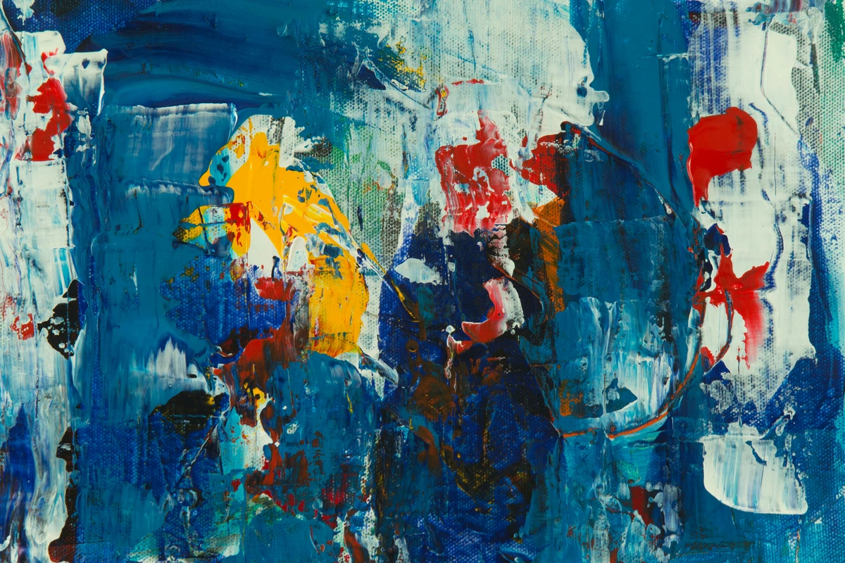
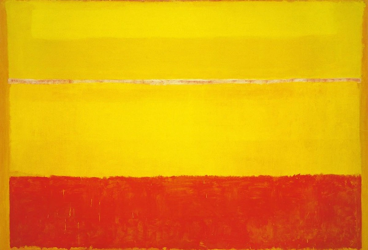
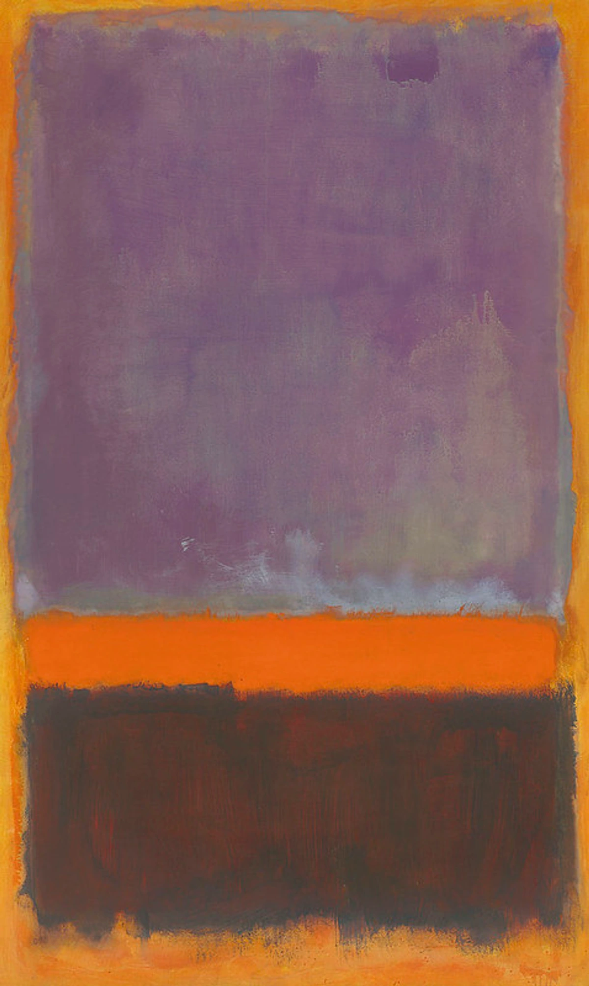
Abstract Expressionism and the Power of Pure Color: Feeling Made Visible
The mid-20th century saw the rise of Abstract Expressionism, where color became an almost spiritual force, completely divorced from representational forms. Artists like Mark Rothko and Barnett Newman created monumental color field paintings, aiming to evoke profound emotional and sublime experiences purely through large areas of saturated hue. For Rothko, his expansive rectangles of color were meant to envelop the viewer, creating an almost meditative or confrontational experience, inviting deep introspection. Newman's "zip" paintings, with their singular lines bisecting vast color fields, explored concepts of the sublime and human presence, using color to define vast spiritual landscapes. This movement demonstrated the ultimate power of color to communicate directly and viscerally, making it the central protagonist in the artistic narrative and proving that emotion could be expressed with unparalleled intensity through abstract chromatic arrangements. It was a testament to color's ability to transcend the physical and touch the very soul.
Era/Figure | Key Contribution to Color Theory | Impact on Art (especially Abstract Art) |
|---|---|---|
| Ancient Cultures | Empirical understanding of symbolic and visual impact, linking colors to elements and early use for narrative. | Laid groundwork for symbolic meaning and emotional use of color in early art forms. |
| Leonardo da Vinci | Informal observations on atmospheric perspective, color interaction, and the dynamic nature of light. | Foreshadowed scientific inquiry; recognized how perceived space and light affected color, informing early representational depth. |
| Isaac Newton | Scientific demonstration of white light's spectrum; first scientifically based color wheel, establishing physical properties. | Shifted color study from philosophy to physics; provided an objective framework, influencing later artists to analyze color systematically. |
| Johann Wolfgang von Goethe | Challenged Newton; emphasized subjective, psychological, and emotional impact of color, focusing on human perception. | Introduced the idea that color is deeply tied to human perception and feeling, profoundly influencing expressive and abstract art by validating emotional response. |
| Michel Eugène Chevreul | Groundbreaking work on simultaneous contrast and optical mixing, observing how adjacent colors influence each other. | Influenced Impressionists and Neo-Impressionists; encouraged placing pure colors side-by-side for vibrancy, creating dynamism in abstract compositions. |
| Impressionists & Neo-Impressionists | Applied scientific principles (Chevreul); obsessed with capturing fleeting light and optical mixing through broken color. | Revolutionized painting by making color and light the primary subject; led to unprecedented luminosity and vibrancy, directly influencing abstract movements to treat color as an independent entity. |
| Post-Impressionists | Used color for emotional states, symbolic meaning, and personal experience, moving beyond optical reality into expressive realms. | Solidified color as a powerful tool for emotional and psychological expression, paving the way for 20th-century abstract art's focus on conveying internal states. |
| The Bauhaus School | Systematized color study (Itten, Albers); elevated it to a structured academic discipline for artists and designers. | Provided concrete tools for creative exploration; demystified color, offering a crucial bridge between intuition and informed choice for abstract artists building visual language. |
| Abstract Expressionism | Color became an almost spiritual, non-representational force, evoking profound emotional and sublime experiences purely through fields of hue. | Demonstrated color's ultimate power to communicate directly and viscerally, making it the central protagonist in artistic narrative and proving emotion could be expressed purely chromatically. |
| Digital Age | Introduced additive (RGB) vs. subtractive (CMYK) complexities; sophisticated digital tools for palette generation and analysis. | New challenges in translating digital to physical; expanded accessibility for experimentation and informed color choices; bridging historical knowledge with modern practice for abstract artists navigating multiple platforms. |
Color in the Digital Age: From Pixels to Paint
Fast forward to today, and color theory continues to evolve with technology at a dizzying pace. The advent of digital art and design introduced new complexities, particularly concerning additive (RGB) and subtractive (CMYK) color spaces. Artists now navigate the constant challenge of translating vibrant screen colors to physical prints or paintings, a hurdle I've often faced in my own work, where a dazzling digital composition can look surprisingly muted on canvas. This era has also seen the rise of incredibly sophisticated digital tools that aid in color palette generation and analysis, making color experimentation more accessible than ever. Understanding both traditional pigment mixing and digital color principles is absolutely crucial for the contemporary artist, bridging historical knowledge with modern practice. It's about being fluent in multiple color languages, ensuring your artistic vision translates seamlessly across diverse mediums. From color calibration for monitors to advanced software for generating harmonious palettes, the digital age offers both new challenges and powerful new allies in the pursuit of color mastery, fundamentally changing how abstract artists conceptualize and execute their work, bridging the gap between ephemeral light and tangible pigment. From color calibration for monitors to advanced software for generating harmonious palettes, the digital age offers both new challenges and powerful new allies in the pursuit of color mastery.
Why Bother with Color Theory Anyway? Unlocking Your Creative Potential
Moving Beyond Fear: Embracing Color Confidence
I know, I know. "Theory" can sound intimidating, like something that will suck the joy out of your creative process. But here's a secret: for me, truly engaging with color theory wasn't about imposing rules; it was about banishing fear. The fear of muddy colors, the fear of making jarring combinations, the fear that my art wouldn't 'say' what I intended. Understanding the underlying principles transforms these fears into exciting challenges. It gives you the confidence to experiment boldly, knowing that you have a framework to return to, a language to express your successes and diagnose your 'happy accidents.' It's like learning to drive a powerful car – you need to understand the mechanics to truly push its limits, to feel the exhilaration of controlled speed. Color theory gives you that control, that confidence, that exhilarating sense of artistic freedom, empowering you to make intentional chromatic choices rather than relying on guesswork.
"Isn't art about feeling?" I hear you ask, perhaps with a touch of skepticism. "Shouldn't I just paint what feels right?" Absolutely! Emotion and intuition are the undeniable heart of abstract art, and honestly, that's where my journey always begins. But here's the thing I've learned, sometimes the hard way: true, unbounded freedom in expression often comes from a deep, almost instinctual, understanding of your tools. Imagine a jazz musician trying to compose without knowing chords or scales; they might stumble upon something beautiful by chance, but with knowledge, they can intentionally craft masterpieces, bending and breaking the rules with profound purpose and a wicked grin. Color is no different. Knowing the principles of color theory isn't about rigid adherence; it's about expanding your vocabulary, giving you more nuanced ways to speak through your art, to whisper or to shout with chromatic precision. It allows you to move beyond happy accidents to truly intentional brilliance. It's the difference between guessing and guiding, between hoping and knowing. For a more foundational understanding, check out this definitive guide to color theory in art. For me, understanding what color theory is wasn't about following rigid rules; it was about understanding why certain color combinations sing, why others clash, and most importantly, how to manipulate those effects to convey the emotions and narratives I want in my abstract pieces. It unlocked a whole new language, like suddenly being able to converse in vivid poetry rather than basic prose. I used to think the primary colors were just, well, primary. But after diving into theory, I started seeing how I could push beyond the primary hues, using secondary and tertiary colors to create complex abstract worlds with intention.

Beyond simply empowering your creative choices, a solid grasp of color theory offers several tangible benefits, fundamentally transforming your artistic process – believe me, I've seen it firsthand in my own studio:
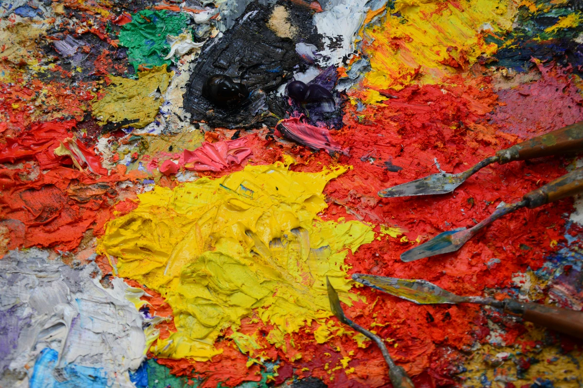
- Prevents Muddy Colors: Oh, the agony of muddy mixes! Understanding how pigments truly mix and interact at a fundamental level can save you countless hours of frustration and wasted paint, helping you achieve cleaner, more vibrant, and luminous results on your palette and canvas. It's about knowing your materials intimately, allowing you to create with unparalleled confidence and chromatic brilliance.
- Creates Visual Cohesion: Knowing about color harmonies and relationships allows you to create artwork that feels unified, deliberate, and intentionally composed, even when using a diverse or daring palette. It brings a sense of order to complexity, a quiet hum of agreement between disparate hues, transforming potential chaos into elegant balance and a clear visual narrative.
- Enhances Emotional Impact: By intentionally choosing colors based on their psychological associations and temperature, you can evoke specific moods, feelings, and narratives in your viewers more effectively, making your art resonate on a deeper, more visceral level. This is absolutely key for the emotional resonance of my abstract art – I want my pieces to feel something, to communicate on an unspoken wavelength, creating a profound connection.
- Improves Depth and Form: Mastery of value and color temperature allows you to convincingly create illusions of three-dimensionality, space, and distance on a two-dimensional surface, making your forms appear to breathe, advance, and recede. It’s how you sculpt perceived space with chromatic shifts, even in the most non-representational pieces, creating worlds within the canvas that invite exploration.
- Develops Your Unique Style: This is a big one. The more you understand the 'rules' and underlying principles, the more effectively and purposefully you can break them to develop a distinctive artistic voice and signature style that is uniquely your own. It's not about imitation, but informed innovation, a confident stride into your artistic identity, allowing your unique chromatic signature to emerge.
- Fosters Artistic Communication: A shared language of color theory allows artists to analyze, discuss, and critique art with a deeper understanding, fostering growth and shared learning within the artistic community. It also helps you articulate your own artistic intentions with clarity and confidence, moving beyond vague descriptions to precise chromatic explanations, building bridges with your audience and fellow creators.
- Boosts Problem-Solving: When a color combination isn't working, knowing the principles of color theory gives you a diagnostic framework. Is it a value issue? A saturation problem? A clash in temperature? This knowledge helps you troubleshoot and arrive at solutions more efficiently, saving you time and frustration in the studio, and turning roadblocks into creative challenges that empower rather than hinder.
- Unlocks a Deeper Appreciation: Beyond your own art, understanding color theory will profoundly deepen your appreciation for the art of others, from ancient masters to contemporary innovators. You'll see more, understand more, and feel more when you look at any visual creation, enriching your entire experience of the world, and connecting you to a timeless artistic conversation.
Dispelling Common Color Theory Myths
Myth | Reality | Why it Matters for Artists |
|---|---|---|
| Color mixing is just intuitive. | While intuition plays a role, understanding pigment properties and color relationships leads to more predictable and vibrant results. | Prevents muddy colors, allows for intentional vibrant mixes, and reduces frustration, leading to more intentional artistic choices and a clearer artistic voice. |
| You must use primary colors only. | Limiting palettes can be powerful, but secondary and tertiary colors, along with neutrals, offer a far richer expressive range. | Expands your creative vocabulary, allows for nuanced moods, and sophisticated palettes, truly broadening your expressive capabilities and narrative potential. |
| Bright colors always advance, dull colors always recede. | This is generally true, but value contrast and color temperature play equally important roles in creating depth and illusion. | Gives you more tools to create depth, guides the eye effectively, and sculpts space, making your compositions dynamic and engaging, even in abstraction. |
| Color is purely subjective. | While personal preference exists, universal principles of perception and psychology influence how colors are generally experienced. | Allows for intentional emotional impact, broader communication, and understanding audience response, enabling you to speak directly to the viewer's subconscious with greater precision. |
| Black is just dark, white is just light. | Black and white are crucial for value, but they also have temperature and can be mixed with hues to create rich, nuanced shades and tints. | Enables more vibrant shadows, luminous highlights, and sophisticated tonal variations, adding incredible depth and complexity to your work, transforming seemingly simple values into expressive elements. |
| Color is always subjective (no rules). | While interpretation is personal, fundamental principles of perception, psychology, and optics create universal tendencies in how colors are experienced. | Allows you to intentionally evoke specific responses and communicate more effectively, rather than leaving everything to chance, turning artistic guesswork into informed intuition and purposeful creation. |
| You need natural light to see true colors. | While ideal, learning to perceive and compensate for various light sources (artificial, warm, cool) is a crucial artistic skill. | Helps artists work effectively in any environment, whether studio, gallery, or outdoors, and anticipate how work will be viewed, ensuring consistent artistic impact regardless of lighting. |
| Mixing all primaries creates true black. | In pigment (subtractive) mixing, combining primaries usually results in a muddy brown or desaturated dark, not a pure black. | Prevents frustrating muddy mixes; encourages understanding of actual pigment behavior and the use of true black pigments when needed, leading to cleaner and more impactful darks. |
| Only 'talented' artists can master color. | Color mastery is a skill developed through informed practice, observation, and understanding, not just innate talent. | Democratizes color learning, empowering any artist willing to learn and experiment to achieve profound color control, transforming perceived limitations into achievable goals. |

My Own "Aha!" Moments with Color: Unveiling Hidden Dynamics
One of my biggest revelations came when I understood the true, visceral power of simultaneous contrast. Suddenly, I wasn't just putting a red next to a green; I was actively thinking about how each color would make the other vibrate, retreat, or pop. It was like discovering a hidden amplifier for my pigments, a secret language they spoke to each other! Imagine painting a brilliant blue square and then surrounding it with a pale yellow – that blue will instantly feel more intense, more alive, almost vibrating off the canvas. That's simultaneous contrast at play, and it's pure magic that you can harness. It’s an almost alchemical reaction, allowing you to create incredible dynamism and tension, or serene balance, simply through intelligent placement. This realization completely transformed how I composed my abstract pieces, allowing me to build internal light and movement purely through chromatic interaction.
Another profound insight arrived when I grappled with color temperature. For years, I'd loosely thought of blues as 'cool' and reds as 'warm,' which, you know, is generally true. But understanding the relative temperature—that a warm blue can exist next to a cool blue, or a cool red next to a warm red—was a game-changer for creating depth and mood. It’s like knowing the subtle inflections in a voice; they can completely alter the meaning of a sentence. It helped me realize that the psychology of color isn't just fluffy theory, but a potent tool that how artists use color to evoke specific responses, allowing my abstract work to convey complex emotional narratives with subtle yet powerful chromatic shifts.

Navigating the Rainbow: What Makes a Great Color Theory Book? My Essential Criteria
Before I jump into my favorites, let's talk about what I look for in a really great color theory book. Because, let's be honest, there are a lot out there, and some are just... fine. I'm after the ones that don't just state facts but illuminate them. They should feel like a trusted companion, guiding you through the vibrant, sometimes bewildering, landscape of color with clarity and insight.
Depth and Nuance: Going Beyond the Surface
A truly great color theory book doesn't just skim the surface; it delves into the subtleties and complexities. It explores the 'why' behind the 'what,' offering insights into the underlying physics, psychology, and historical context of color. It helps you understand not just how to mix a color, but why that specific mix evokes a particular feeling or creates a certain optical effect. For me, the books that truly sing are those that reveal new layers of understanding with each revisit, constantly challenging and deepening my appreciation for color's infinite possibilities. They offer a profound dive into the chromatic universe, equipping you with the knowledge to wield color with genuine mastery and a rich understanding of its many dimensions.
Before I jump into my favorites, let's talk about what I look for in a really great color theory book. Because, let's be honest, there are a lot out there, and some are just... fine. I'm after the ones that don't just state facts but illuminate them.
Practicality Over Pedantry: Actionable Insights for the Studio
For me, a great color theory book has to be actionable. I don't want to just read about concepts; I want to understand how to apply them in my painting. It needs to bridge the gap between abstract ideas and the concrete act of mixing paint on a palette. If it doesn't give me exercises, examples, or a new way of seeing, it's probably not making it onto my shelf. I'm looking for a book that helps me get my hands dirty, not just one that fills my head with academic jargon. It should inspire me to grab my paintbrushes and try new things, even if it means glorious failure. It's about empowering practice, not just theoretical understanding.
For me, a great color theory book has to be actionable. I don't want to just read about concepts; I want to understand how to apply them in my painting. It needs to bridge the gap between abstract ideas and the concrete act of mixing paint on a palette. If it doesn't give me exercises, examples, or a new way of seeing, it's probably not making it onto my shelf.

Visual Appeal is Key: Showing, Not Just Telling
If a book talks about color harmony but shows no examples, it's like a chef describing a gourmet meal without letting you taste it – utterly frustrating! Give me vibrant illustrations, clear diagrams of color wheels, and side-by-side comparisons that make the theory leap off the page and into my perception. It's about empowering your eyes to understand, not just your brain to intellectualize. This might seem obvious for a book about color, but you'd be surprised how many fall short! A truly helpful book on color theory uses clear, well-reproduced examples that demonstrate concepts in action. It shows, rather than just tells, making complex ideas immediately graspable. After all, we're visual artists, and we learn best by seeing! The best books offer a visual feast, ensuring that the theoretical concepts are not just understood, but felt and seen.
Relatability and Inspiration: A Guiding Voice, Not a Dry Lecture
I want a book that encourages me to embrace my quirks, to see mistakes as discoveries, and to find joy in the process. It should ignite that spark of curiosity that makes you eager to explore every hue and shade imaginable. It’s about building confidence, not just imparting facts. The best books feel like a conversation with a knowledgeable friend, not a lecture. They inspire you to experiment, to see the world with a fresh eye, and to push your own boundaries. They make you excited to get back to your studio and try something new, transforming the learning process into an exciting artistic adventure, where every page turned feels like a step closer to unlocking your unique chromatic voice.
My Top Picks: The Essential Books on Color Theory That Shaped My Practice
Think of this as my personal curriculum for anyone serious about elevating their color game. Each one offers a unique lens, a different pathway into the kaleidoscopic world of color. Alright, drumroll please! These are the books that have profoundly influenced my understanding and use of color. They're staples in my creative library, and I find myself revisiting them again and again. Some are classics, some are modern gems, but all offer invaluable insights. They are the lighthouses that guided me through the vast ocean of chromatic possibilities, transforming my artistic practice from hesitant exploration to confident mastery.
Think of this as my personal curriculum for anyone serious about elevating their color game. Each one offers a unique lens, a different pathway into the kaleidoscopic world of color.
Alright, drumroll please! These are the books that have profoundly influenced my understanding and use of color. They're staples in my creative library, and I find myself revisiting them again and again. Some are classics, some are modern gems, but all offer invaluable insights.
For the Foundational Thinker: Interaction of Color by Josef Albers
If you want to truly experience color, not just read about it, Albers is your guru. This book is a masterpiece of experiential learning. It's less a textbook and more a series of visual exercises that force you to confront how colors influence each other in real time. His famous squares demonstrate optical illusion and simultaneous contrast in ways that will, quite frankly, blow your mind and fundamentally change how you perceive color relationships. It's rigorous, challenging, and utterly transformative. It helped me understand that color isn't static; it's always in flux, always interacting, always responding to its neighbors. Albers insists that what you see is what matters, not what you know intellectually about a color. This book will rewire your brain, making you see color in a fundamentally new and profound way. It’s like a workout for your eyes and your color perception, pushing you to truly observe and engage with the material rather than passively absorb information. For abstract artists, this book is particularly powerful because it emphasizes the subjective experience of color, training you to trust your eye above all else, which is paramount when creating non-representational work, fostering an intuitive yet informed chromatic intelligence. 

For the Practical Painter: Color and Light: A Guide for the Realist Painter by James Gurney
While Gurney's focus is admittedly on realism, the principles he explores are universally applicable to any visual artist – abstract or otherwise. His explanations of how light affects color, how shadows work, and the nuances of atmospheric perspective are pure gold for understanding how to create depth and dimension on a two-dimensional surface. He breaks down complex concepts with remarkable clarity and abundant, beautiful examples. I found his sections on color palettes and gamuts incredibly helpful for making intentional choices in my abstract compositions, even if I'm not painting a dinosaur (though, sometimes, a vibrant, abstract dinosaur does sound appealing!). Gurney's approach is about demystifying light and shadow, showing you how to observe them accurately and translate them into paint. It’s like having a seasoned mentor looking over your shoulder, offering clear, actionable advice. His insights on how light shapes form and defines color are indispensable for artists across all genres, teaching you to truly see the world around you with an artist's eye. For those interested in a broader view of light, check out how artists use light and shadow dramatically and the language of light: how illumination shapes my abstract compositions.
Who it's for: Artists across all genres, including abstract, who want to master how light and shadow affect color, create depth, and understand realistic color phenomena. Especially good for those who want practical techniques for observing and translating light into dynamic and expressive abstract forms.
For Modern Application: Color Theory for Artists by Patti Mollica
Mollica offers a more contemporary and accessible approach, which is fantastic for those who might feel intimidated by the older, more academic texts (and believe me, I've been there!). She focuses squarely on practical application in painting, covering everything from the nitty-gritty of mixing pigments to understanding complex color relationships and intentionally creating mood with your palette. Her straightforward explanations and vibrant examples make complex ideas easy to grasp and immediately applicable. This is a great bridge between foundational theory and the joyous, sometimes messy, act of getting paint on canvas. Mollica's strength lies in making the complex digestible, showing precisely how theoretical concepts translate directly to tangible results in your artwork. It’s the kind of book that makes you want to immediately stop reading and start painting, which, for me, is the highest praise you can give a practical art book.
Who it's for: Beginners and intermediate artists looking for a modern, highly practical guide to applying color theory directly to their painting practice. Excellent for those who appreciate clear, concise explanations and immediate applicability.
The Definitive Classic: The Elements of Color by Johannes Itten
Itten's work is an absolute cornerstone of modern color theory education, a true classic. Based on his revolutionary teachings at the Bauhaus, this book is comprehensive, covering everything from color physics and the principles of harmony to the profound impact of contrast, and his famous seven types of color contrast. It's dense, yes, and requires focused attention, but it is incredibly rewarding. Think of it as the academic foundation that underpins all other studies, the bedrock upon which you can build your understanding. It's a must-read for anyone serious about a deep dive into color, and it profoundly helped me appreciate the underlying structure beneath the apparent chaos of brilliant hues. Itten doesn't just present information; he provides a systematic framework for understanding color's behavior and potential, giving you the tools to analyze and construct your own harmonies and contrasts with precision and intent. It's a deep dive, but the rewards for your artistic practice are profound and lasting.
Itten's work is a cornerstone of modern color theory education. Based on his teachings at the Bauhaus, this book is comprehensive, covering color physics, harmony, contrast, and his famous seven types of color contrast. It's dense, yes, but incredibly rewarding. Think of it as the academic foundation that underpins all other studies. It's a must-read for anyone serious about a deep dive into color, and it helped me truly appreciate the structure beneath the apparent chaos of brilliant hues.
For Challenging Assumptions: Blue and Yellow Don't Make Green by Michael Wilcox
This book is a delightful provocateur, and it completely changed how I think about pigment mixing. Michael Wilcox challenges the traditional color wheel, arguing that most art students are taught an oversimplified version of color mixing that leads to muddy results. He dives deep into the specific properties of pigments, explaining why certain blues and yellows, when mixed, yield dull greens (or no green at all!) and how to achieve truly vibrant secondary colors. It's less about abstract theory and more about the nitty-gritty science of paint on your palette. If you’ve ever found yourself frustrated with murky mixes, this book is a must-read. It's a fantastic resource for any artist who wants to truly understand the materials they're working with, moving beyond rote learning to genuine mastery of pigment behavior. I found it utterly liberating for creating cleaner, more luminous colors in my abstract pieces.
Who it's for: Artists who are serious about understanding pigment behavior, want to achieve cleaner mixes, and are willing to challenge traditional color theory assumptions. Essential for painters who are frustrated by muddy colors. It’s particularly valuable for abstract artists who rely heavily on pure, vibrant color to convey emotion and form.
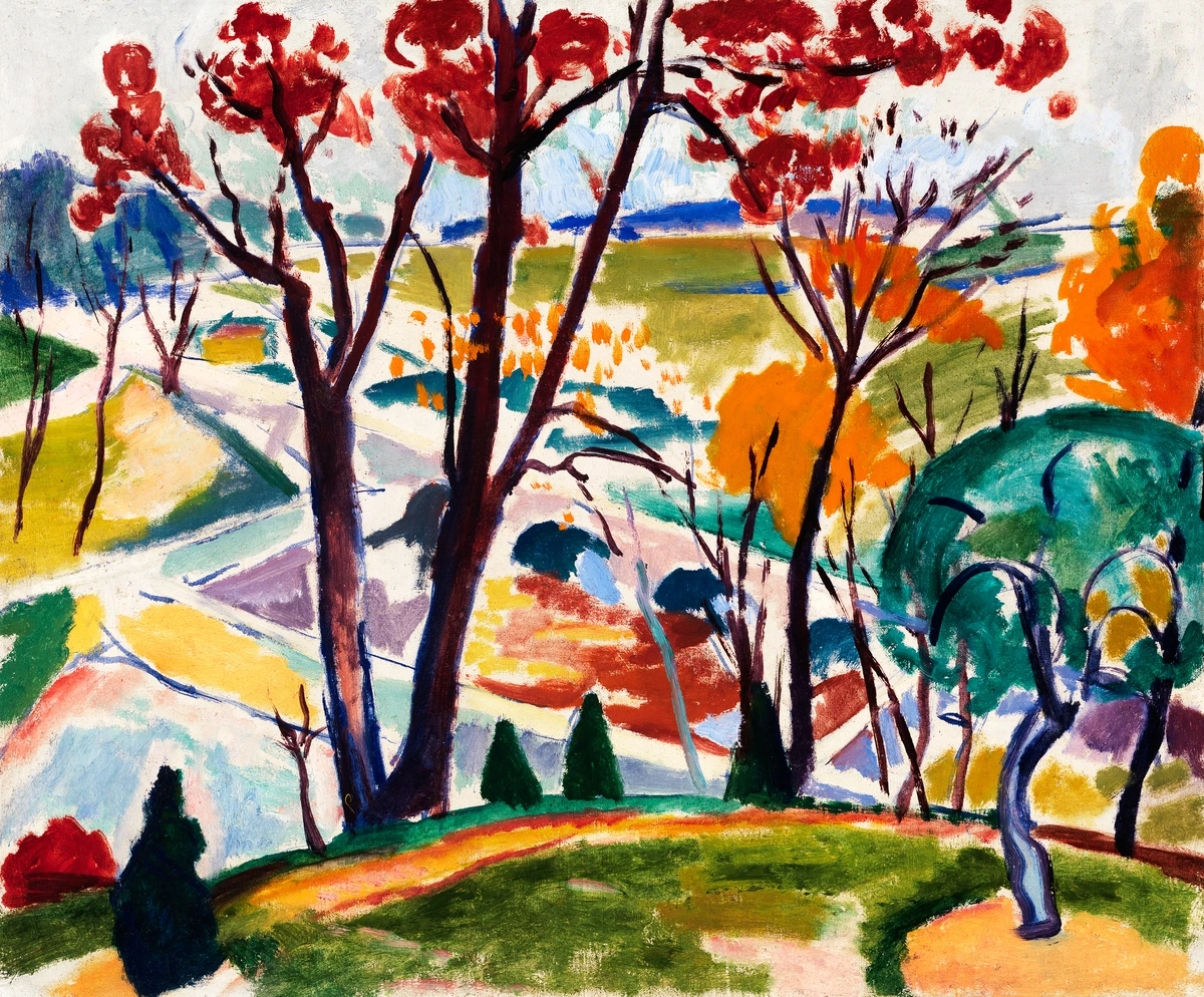
For Perceptual Learning: Color: A Course in Mastering the Art of Mixing Colors by Betty Edwards
Betty Edwards, renowned for Drawing on the Right Side of the Brain, brings her unique pedagogical approach to color. This book focuses heavily on perceptual learning, guiding you through exercises designed to sharpen your eye for color relationships, mixing, and the subtle nuances of hue, value, and saturation. It’s a very hands-on book, encouraging you to actively mix and observe rather than just passively read. Edwards' method helps you bypass intellectual preconceptions about color and instead see what is actually there, fostering a more intuitive and accurate approach to color mixing and application. If you learn best by doing, and want to develop a truly keen eye for color, this book is an invaluable resource. It's about training your brain to trust your vision, even when it seems to contradict what you 'know'. For abstract artists, this means being able to truly perceive the subtleties of color interaction without the mental shortcuts of representational art, allowing for a more profound and authentic expression.
Who it's for: Visual learners and artists who benefit from hands-on exercises and a structured approach to developing their color perception and mixing skills. It's particularly useful for artists who feel their intellectual understanding of color isn't translating effectively to their actual painting practice, offering a bridge to embodied chromatic knowledge.
For the Medium-Specific Artist: Color Choices: A Guide to the Visual Effects of Color by Stephen Quiller
Stephen Quiller’s work, particularly his unique color wheel and palette system, is a revelation for artists, especially those working with watercolor or acrylics. He meticulously breaks down pigments into transparent, opaque, warm, and cool categories, offering a highly practical and systematic approach to mixing. His book empowers you to make intentional choices about your palette based on the desired visual effects, whether you're aiming for luminous washes or bold, opaque strokes. It’s not just theory; it's a direct roadmap to understanding and utilizing the specific characteristics of your chosen medium for maximum impact. I found his insights incredibly useful for refining my abstract painting process, especially when planning for specific textural and luminosity effects, ensuring that every brushstroke contributes precisely to the overall feeling of the piece.
Who it's for: Artists working with specific mediums (especially watercolor and acrylics) who want a systematic approach to palette building and understanding pigment characteristics for precise visual effects. It's ideal for those who want to precisely control the outcome of their mixes and leverage the unique properties of their chosen paints, ultimately achieving a deeper connection between intention and material.
For the Explorer of Perception: The Art of Color by Johannes Itten
While "The Elements of Color" is Itten's foundational academic text, "The Art of Color" serves as a more accessible, visual companion, perfect for those who want to see and do rather than just read. It's filled with Itten's iconic color exercises and diagrams, making his complex theories tangible and immediately applicable. This book is a brilliant entry point for artists who want to grasp the emotional and spatial effects of color contrasts and harmonies through direct experimentation. It’s less about dry theory and more about hands-on discovery, a guided tour through the visual mechanics of color that will profoundly deepen your perception. For abstract artists, this translates into a powerful ability to construct complex visual narratives purely through the interplay of color, fostering a sophisticated understanding of how hues influence emotional response and spatial relationships. This book cultivates a heightened visual intelligence, allowing you to intuitively understand and manipulate color with profound impact.
Who it's for: This book is ideal for visual learners, students, and artists looking for a practical, exercise-driven approach to understanding color contrasts, harmonies, and emotional effects. It's especially valuable for those who appreciate Itten's systematic yet artistic insights, and who want to develop a profound and intuitive grasp of chromatic interaction, transforming abstract concepts into tangible, perceivable artistic power.
These books, collectively, have guided me from someone guessing with color to someone making deliberate, informed choices, even in the freest abstract pieces. They've given me the confidence to experiment boldly, knowing that I have a framework to return to. They’ve transformed my approach, turning every color choice from a hopeful gamble into an exciting, calculated decision. It’s not just about mixing paint; it’s about mixing intention, emotion, and intellect on the canvas. These texts are not just guides; they are catalysts for artistic growth, pushing you to explore the full, vibrant spectrum of your creative potential.
Here's a quick overview of these incredible resources, summarizing their unique contributions to the artist's journey:
Book Title | Author | Key Focus | Why I Love It & Its Impact on Abstract Art |
|---|---|---|---|
| Interaction of Color | Josef Albers | Experiential learning, optical illusions, simultaneous contrast, subjective perception. | Forces you to see and experience color interactions firsthand, fundamentally transforming perception. Essential for abstract artists seeking dynamic, non-representational compositions that vibrate with energy. |
| Color and Light: A Guide for the Realist Painter | James Gurney | Light's effect on color, shadows, atmospheric perspective, practical palettes for luminosity. | Breaks down complex lighting into practical, universal principles. Invaluable for abstract artists creating depth, atmosphere, and a sense of internal illumination without literal forms. |
| Color Theory for Artists | Patti Mollica | Contemporary application, pigment mixing, intentional mood creation, color relationships. | Accessible, practical, and bridges theory to canvas with clear examples. Perfect for abstract artists wanting to confidently create emotionally resonant and technically sound palettes for modern works. |
| The Elements of Color | Johannes Itten | Comprehensive theory, color physics, principles of harmony, seven types of contrast. | The foundational academic text; dense but essential for a deep, systematic understanding. Provides abstract artists with a rigorous framework for constructing complex and impactful chromatic compositions. |
| Blue and Yellow Don't Make Green | Michael Wilcox | Pigment properties, accurate color mixing based on material science, challenging traditional assumptions. | Revolutionized my understanding of actual pigment behavior for cleaner, vibrant mixes. Crucial for abstract painters who rely on pure, luminous colors to convey emotion and form. |
| Color: A Course in Mastering the Art of Mixing Colors | Betty Edwards | Perceptual learning, sharpening the eye for subtle color relationships, hands-on mixing. | Hands-on exercises train your eye to truly see color, fostering intuitive accuracy. Empowers abstract artists to perceive subtle chromatic interactions beyond intellectual preconceptions. |
| Color Choices: A Guide to the Visual Effects of Color | Stephen Quiller | Medium-specific palettes (watercolor/acrylics), systematic pigment categorization, achieving precise visual effects. | Offers a highly practical system for choosing and mixing colors based on desired effects and medium. Ideal for abstract artists to leverage specific paint properties for texture, luminosity, and impact. |
| The Art of Color | Johannes Itten | Practical exercises, visual perception, direct experience of color contrasts and harmony. | A visually-driven companion to his academic work, perfect for hands-on learning and immediate application. Cultivates a profound and intuitive grasp of chromatic interaction for expressive abstract art. |
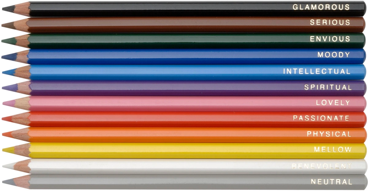
Beyond the Pages: Applying What You Learn – Bridging Theory and Practice
Reading these books, absorbing these concepts, that's just the beginning of your journey, of course. The real magic, the true transformation, happens when you bring that knowledge into your studio and actually get your hands dirty. Don't just passively absorb; actively practice, experiment, and yes, even make glorious mistakes. It's like learning a new language; you can study all the grammar you want, but you won't become truly fluent until you start speaking, stumbling, and making glorious mistakes. The journey from intellectual understanding to embodied artistic skill is paved with countless hours of experimentation and observation. For a deeper dive into my personal approach, explore my approach to color mixing: creating vibrant palettes in abstract painting. Here are some concrete ways I bridge the gap between abstract knowledge and tangible artistic expression, turning theory into transformative practice.
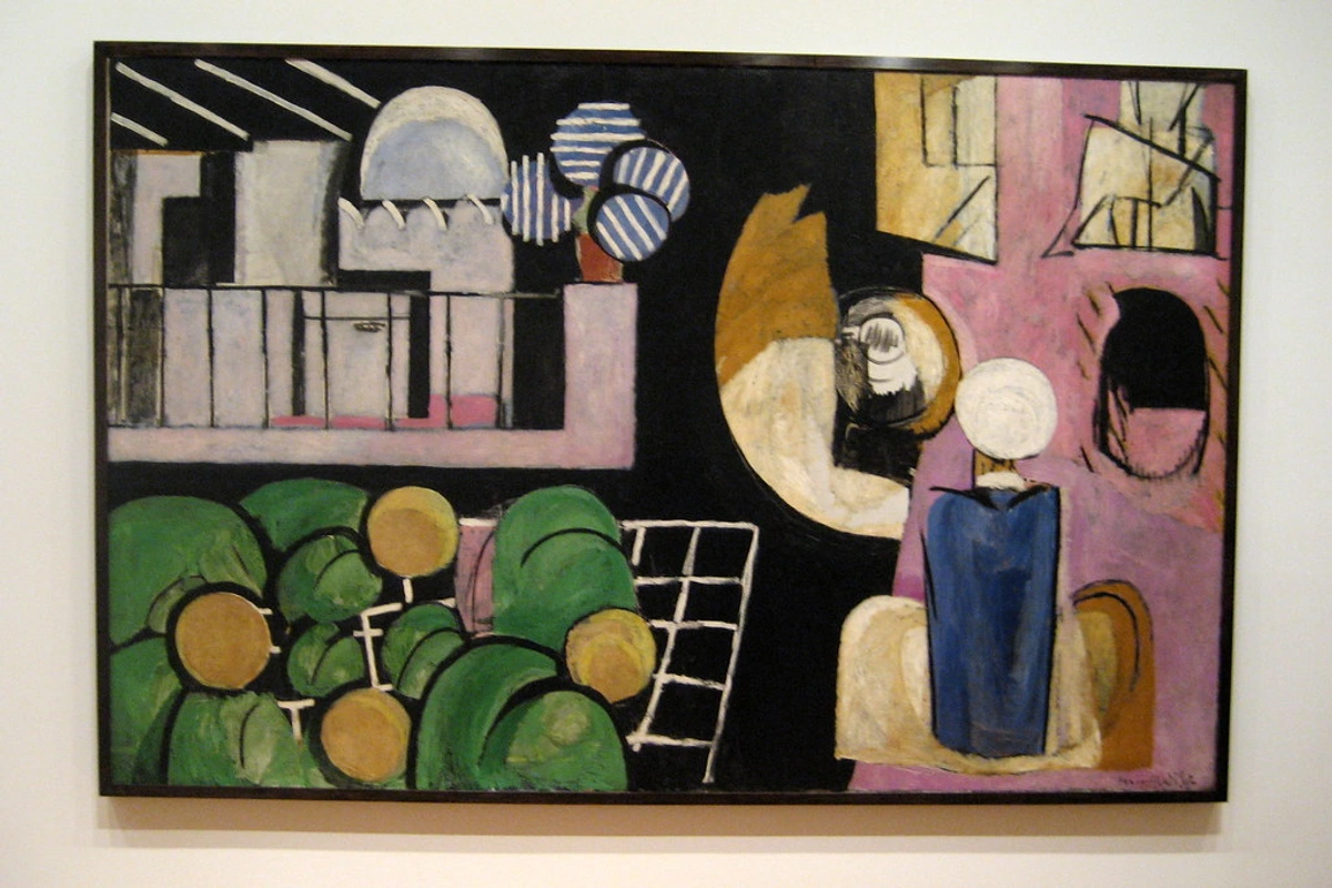
- Color Swatch Studies: This is probably the most fundamental and, dare I say, meditative exercise. Create hundreds, even thousands, of color swatches. Mix every color you own with every other color. See what happens when you introduce a tiny speck of black or white. Keep meticulous notes, noting down pigment names, ratios, and your observations. This is a crucial step I took to truly grasp the principles of color theory in abstract art, its psychology, and practical application, building my own personal pigment dictionary. It's how you discover unexpected harmonies and potent clashes. Don't underestimate the power of simply seeing what happens when pigments meet. It’s where countless 'aha!' moments happen for me, turning abstract concepts into tangible, visual knowledge.
Building a Personal Color Reference: Your Custom Atlas of Hues
Think of this as creating your own, utterly personalized color atlas. Beyond just swatches, this involves systematically recording your observations, experiments, and insights. This could be a dedicated physical binder with painted swatches, notes on pigment brands and mixing ratios, and observations on how colors react under different lighting. Or it could be a digital database of palettes you've built, complete with notes on their emotional impact or visual purpose. This resource becomes invaluable for future projects, allowing you to recall precise mixes, understand unexpected interactions, and quickly find the perfect hue for a specific artistic intention. It's a living document of your unique chromatic journey, growing with every brushstroke and observation, transforming guesswork into informed choice and intuition into mastery.
- Limited Palettes: Challenge yourself to create a painting using only 2-3 colors plus white. This forces you to understand value and intensity in a profound new way, pushing you to extract every possible nuance from your chosen hues. It's incredible how much you can achieve with so little, and it dramatically improves your ability to create cohesive, harmonious compositions. My own experiments with limited palettes often lead to unexpected discoveries, like realizing how much depth and emotional resonance can be created with just two carefully chosen hues, forcing a kind of elegant simplicity. It's like writing a poem with only a few select words – every word carries immense weight and meaning, just like every color.
- Color Mood Boards: Before starting a new piece, especially an abstract one, I often create a digital or physical mood board centered around a specific color scheme (e.g., analogous, complementary, triadic). Collect images, textures, and words that evoke the mood you want, paying close attention to the colors used and how they interact. This helps pre-visualize and solidify your color intentions, allowing you to establish the emotional and visual 'key' of your painting before you even pick up a brush, ensuring a cohesive and intentional outcome. Don't be afraid to use apps like Adobe Color or Coolors for digital inspiration and palette building; they're fantastic tools for quick conceptualization, transforming ephemeral ideas into concrete visual plans, and allowing for rapid, informed experimentation before committing to paint.
- Analyze Masterworks (for Color): Not to create a duplicate, but to analyze. Pick an abstract painting you love, and try to recreate its color palette. What choices did the artist make? How do the colors interact? How do they support the emotional narrative? This feeds directly into understanding the emotional language of color in abstract art and the psychology of color in abstract art beyond basic hues. Look at how a master like Joan Miró used vibrant colors and biomorphic forms to create dreamlike landscapes in 'Figures in a Landscape'. Think about Van Gogh's intense yellows, or Rothko's expansive color fields – what stories are their colors telling? Consider also how artists across different movements, from the bold palettes of Fauvism to the geometric explorations of Cubism, utilized color to push artistic boundaries. This critical observation sharpens your eye and expands your own chromatic vocabulary, transforming passive viewing into active learning.
- Digital Color Studies: Don't shy away from digital tools! While I'm a firm believer in the tactile experience of physical paint, apps like Adobe Color, Coolors, Paletton, or even built-in color pickers and adjustment layers in digital painting software (like Procreate, Photoshop, or Affinity Photo) can be incredible for quickly testing out color harmonies, creating palettes, and visualizing how colors interact without wasting precious paint. Use them for rapid experimentation, for generating initial ideas, and for refining your conceptual understanding before you ever pick up a physical brush. They're fantastic for quick iterations and seeing possibilities. Just remember, the final tactile experience of physical paint is unique, but digital tools are invaluable for planning and exploration, bridging the gap between fleeting ideas and concrete chromatic plans.
- Plein Air Painting (Even Abstractly): Get outside! Step away from the studio and observe natural light and color in its ever-changing glory. Even if you're an abstract artist, painting from observation, or even just making color notes and quick sketches of color relationships, can profoundly inform your studio work. Notice how light shifts colors throughout the day, how atmospheric perspective affects hues (making distant mountains appear bluer, for instance), and the unexpected harmonies present in nature. It’s an unparalleled way to sharpen your color perception in a real-world context, teaching you to truly see rather than just relying on memory or assumption. I often find unexpected color combinations in the mundane beauty of the world, like the subtle pinks in a winter sky or the vibrant purples in a deep shadow. These real-world observations feed directly into the richness of my abstract palette, grounding my non-representational work in the profound truth of observed light and color. It's a powerful way to infuse your abstract expressions with the undeniable vitality of the natural world.
- Color Journaling: Dedicate a sketchbook specifically to color studies – think of it as your color diary. Don't worry about creating finished pieces; focus purely on exploring color relationships, making quick sketches of color observations from everyday life, or creating abstract swatches based on specific emotional states. It’s a low-pressure way to build your visual color library, a personal compendium of chromatic knowledge and feeling that you can refer back to again and again. It allows for pure, unadulterated color play, a safe space to explore a 'red that feels angry' or a 'blue that whispers hope,' without the pressure of a final outcome, fostering true creative freedom and allowing your unique color language to develop organically.
- Observe Constantly: This might sound obvious, but it's the most powerful tool of all. Look at the world around you with new 'color eyes,' with a heightened awareness. Notice the subtle shifts, the way light changes hues throughout the day, the unexpected harmonies in everyday scenes. It's everywhere, from the subtle blue in a shadow to the vibrant red of a sunset, from the muted tones of a city street to the explosive colors of a flower market. The world is your ultimate, never-ending color palette, constantly offering lessons and inspiration if you're open to seeing it. I find endless inspiration in the most mundane things – the unexpected green of mold on an old wall, the complex grays of a cloudy sky, or the vivid pop of a discarded piece of plastic against concrete. Everything holds a color lesson if you're willing to truly see. This constant observation will infuse your abstract work with an undeniable authenticity and depth.
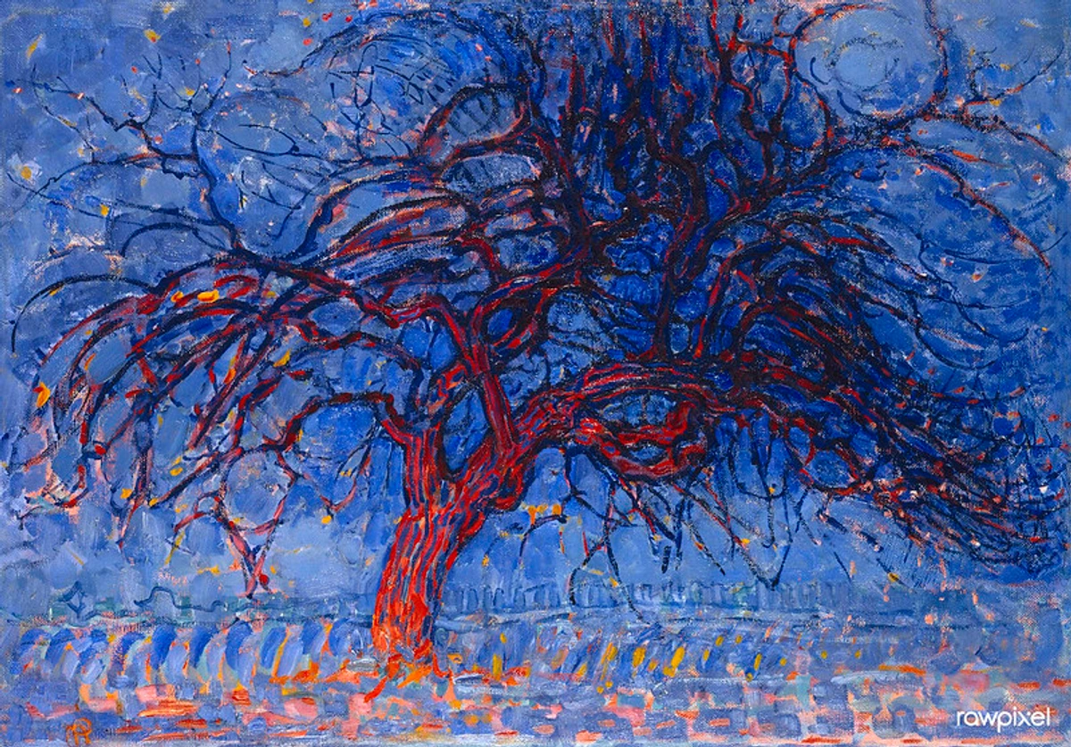
credit, licence
This isn't just about painting; it's about seeing. It's about developing an informed eye that can then push boundaries and forge new paths in your art. And if you're ever in need of a new piece to inspire your own color journey, you can always browse my latest abstract works. Perhaps one of my pieces will spark a new color revelation in your own practice, leading you down an exciting, unexpected path.
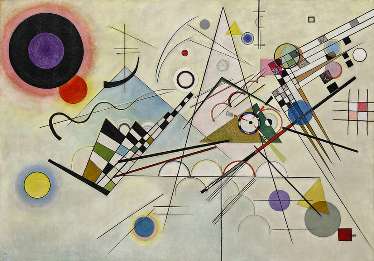
FAQ: Your Burning Color Questions Answered – Demystifying the Spectrum
I get asked a lot about color, and rightly so! It's one of the most captivating yet challenging aspects of art. Here are some common questions I hear:
Do I Really Need to Study Color Theory to Be a Good Artist?
"Need" is a strong word, and art should always, ultimately, come from the heart. But I'd wholeheartedly say that studying color theory is immensely beneficial, almost like gaining a superpower. Think of it less as a strict requirement and more as equipping yourself with a rich vocabulary. It gives you the tools to make deliberate, impactful choices with your colors, rather than relying solely on guesswork. It elevates your intuitive choices from happy accidents to intentional brilliance, allowing you to articulate your vision with precision. It’s like a jazz musician learning scales and chords; they can still improvise by feel, but knowing the underlying principles makes their creations consistently extraordinary and allows for endless innovation. For me, it took the frustration out of color choices and replaced it with exciting, informed exploration, transforming my struggles into opportunities and opening up a whole new world of creative possibilities. It's the difference between merely making marks and making powerful, meaningful statements with every stroke of color.
Which Book is Best for Beginners?
If you're just starting, I'd lean towards Color Theory for Artists by Patti Mollica for its accessibility, clear explanations, and practical approach that quickly gets you painting. Or, if you prefer a more hands-on, visual learning experience that challenges your perceptions from day one, dive straight into Interaction of Color by Josef Albers – just be prepared to do the exercises! If your biggest frustration is muddy mixes and you want a more technical, pigment-focused approach from the get-go, Michael Wilcox's Blue and Yellow Don't Make Green is a fantastic, if unconventional, starting point. Honestly, picking one that genuinely resonates with your learning style is far more important than finding a definitive 'best' – the best book is the one that gets you excited to learn and create! Each of these offers a unique entry point into the vast world of color, so trust your gut on which one speaks to you and embark on your colorful journey. The key is to find the guide that empowers your individual artistic voice.
How Do I Practice Color Theory Without Just Copying?
Ah, a great question, and one I get asked often! Practice isn't about rote copying or duplicating someone else's work. It's about deep, playful experimentation. Try creating your own color wheels using unconventional palettes, like only muted tones or only neon hues. Do studies where you explore precisely how one color changes when surrounded by different hues, observing the nuances of simultaneous contrast. Paint the same scene or abstract composition using three entirely different color schemes (e.g., analogous, complementary, monochromatic) to see the dramatic shifts in mood and impact. The goal is to build your own internal library of color knowledge, your own intuitive understanding, not just mimic someone else's style. Think of it as developing your own unique accent in the language of color. The key is to constantly ask 'what if?' and then fearlessly follow that curiosity with actual paint on a canvas or digital brushstrokes on a screen, seeing what emerges, and reveling in the unexpected discoveries. It's about informed play, where every experiment expands your personal chromatic vocabulary.
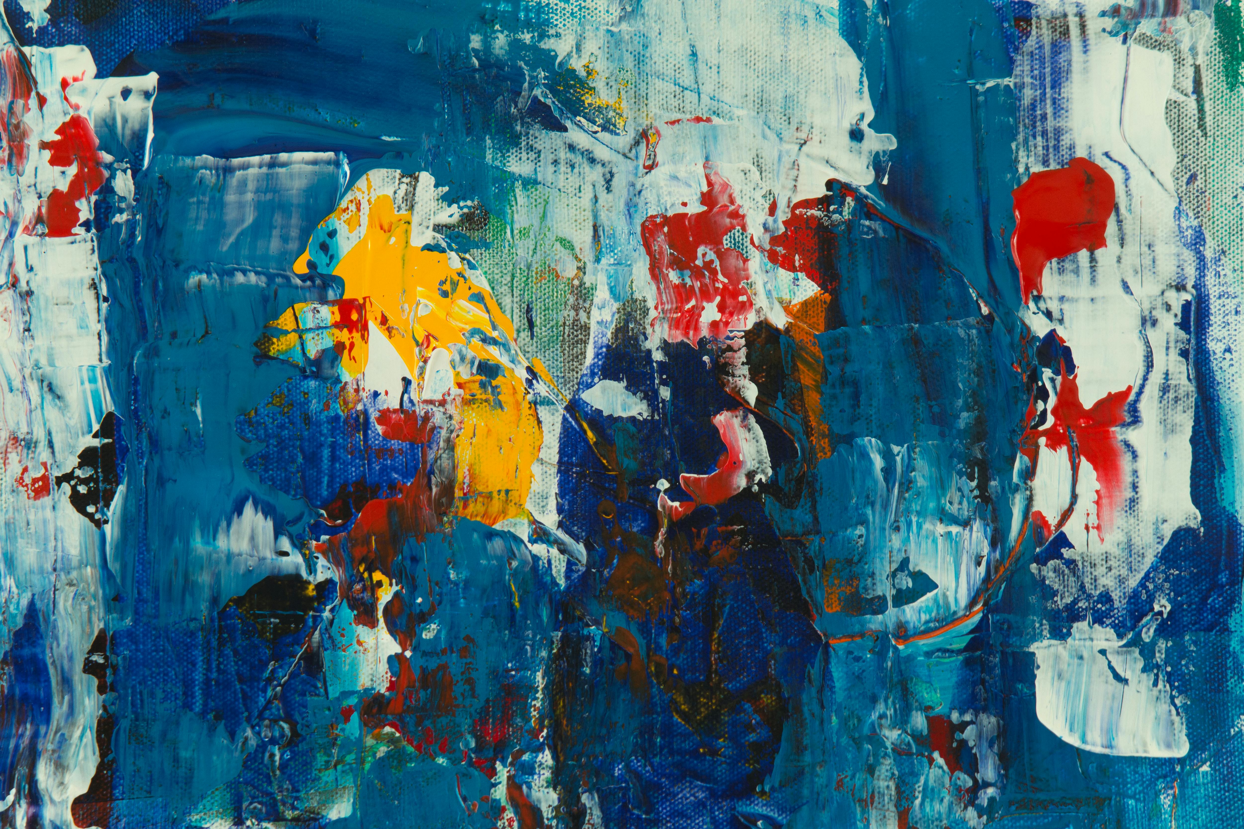
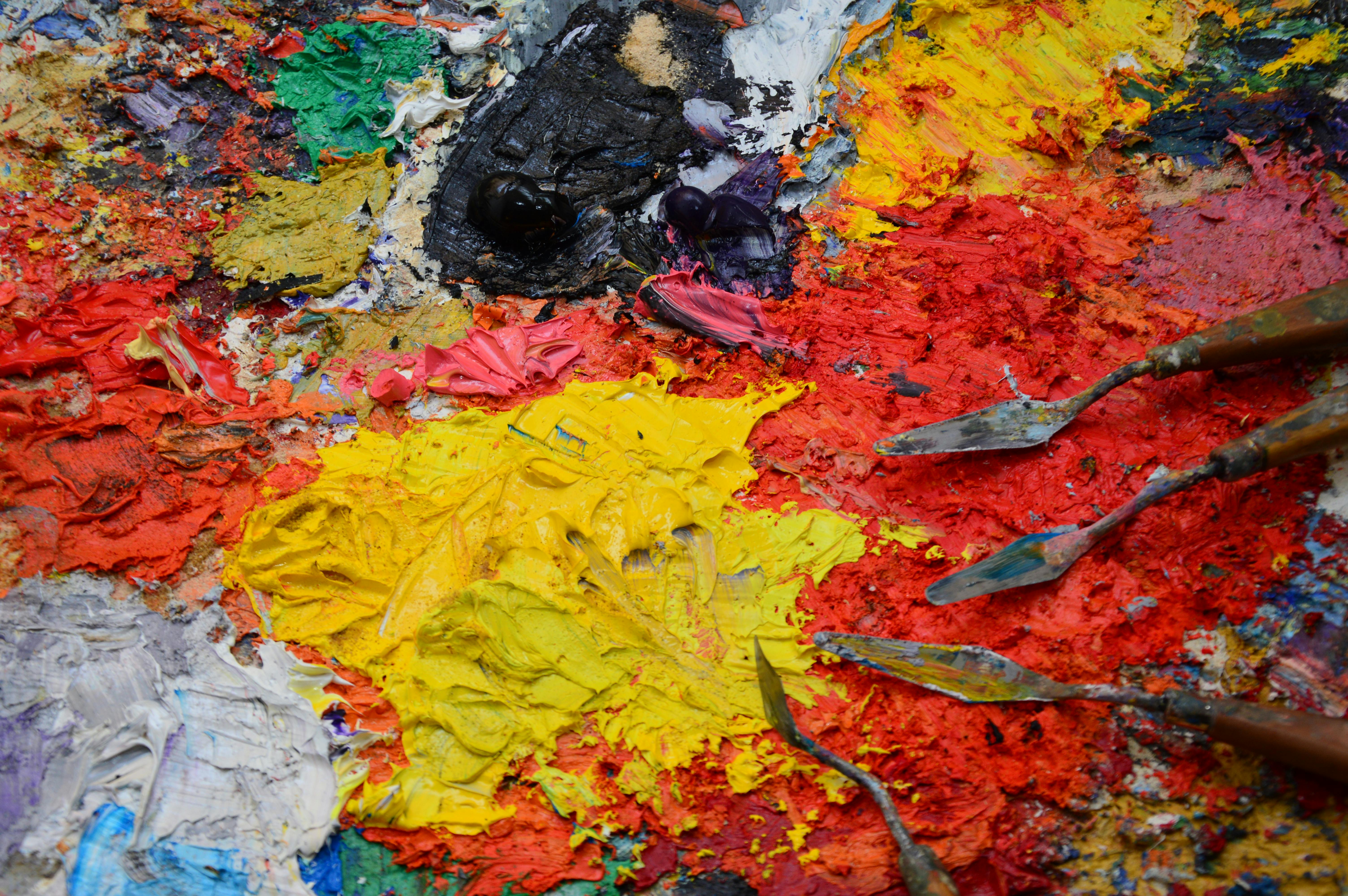
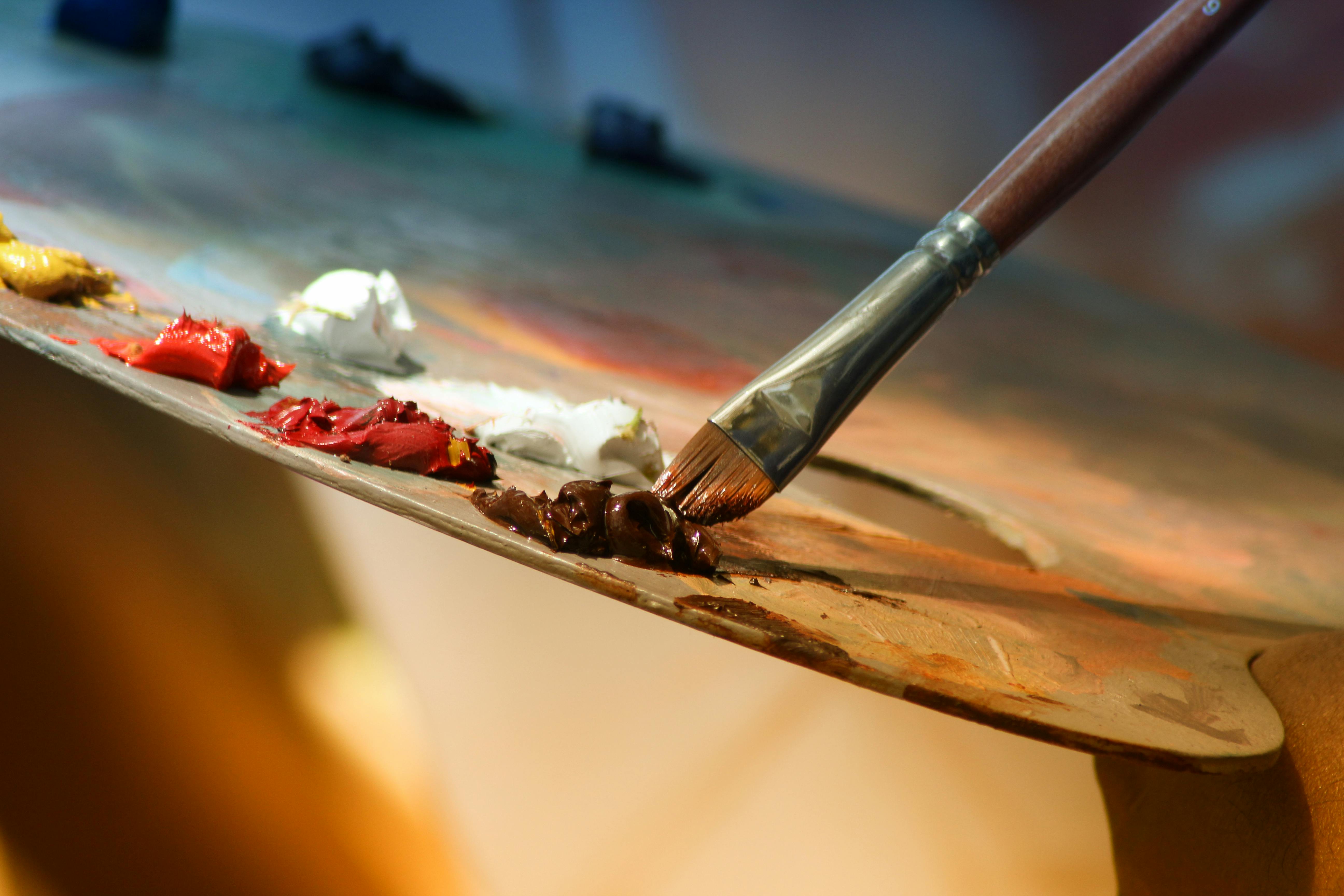
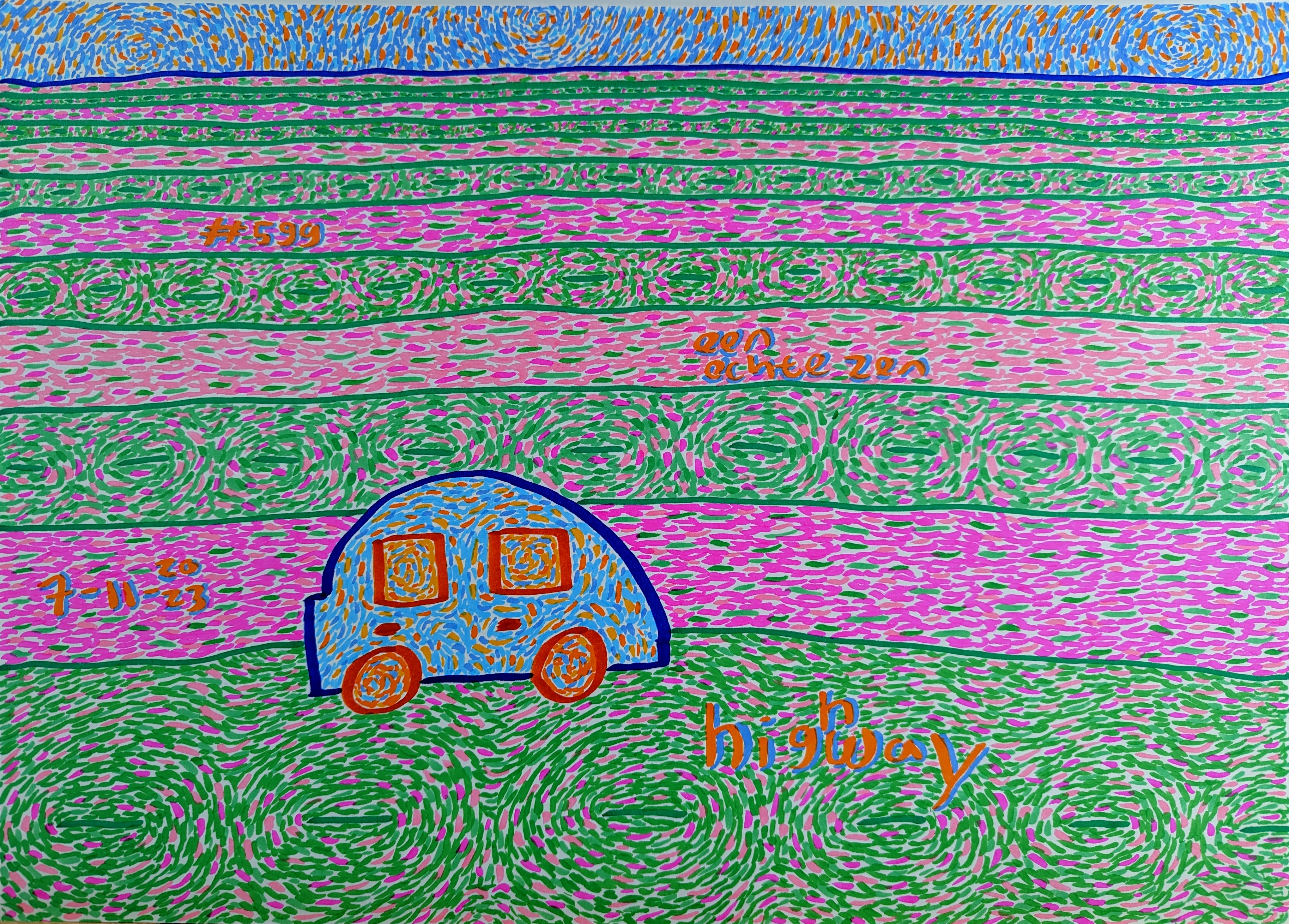
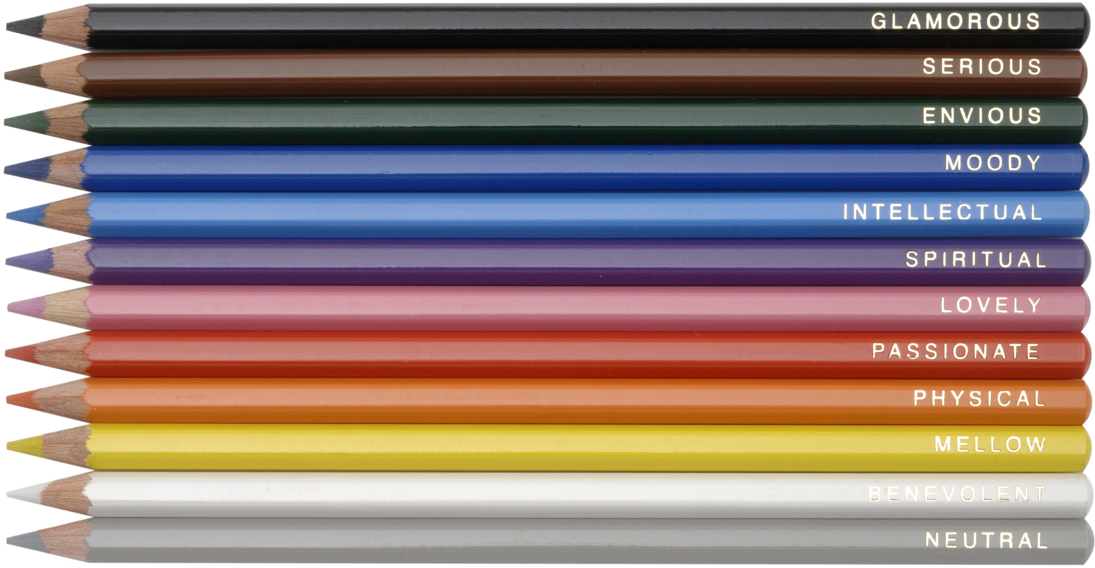
Can Color Theory Apply to Abstract Art?
Absolutely, and I'd argue, even more so! In abstract art, freed from the constraints of representing reality, color often carries the primary narrative and emotional weight. Understanding principles like contrast, harmony, temperature, and value isn't just helpful; it's essential for creating dynamic compositions that truly evoke specific feelings or tell complex stories without relying on representational forms. For me, it's how I sculpt emotions with paint, building entire worlds of feeling purely through nuanced shifts in hue and intensity. Without a strong grasp of color theory, abstract art can quickly become chaotic or visually muddy; with it, it becomes a finely tuned orchestra of emotions and visual sensations, capable of profound communication. It's the skeleton beneath the skin, giving structure and purpose to the boundless freedom of abstraction. It allows you to build worlds of pure emotion and meaning, unburdened by literal representation, forging a powerful and unique artistic voice. You can explore this further in the definitive guide to understanding abstract art from cubism to contemporary expression. It empowers the abstract artist to imbue their work with deep, intentional resonance, transforming simple shapes and lines into profound emotional landscapes.
Are There Any Digital Tools for Learning Color Theory?
Yes, absolutely, and many of them are fantastic! While I'm a firm believer in hands-on practice with physical paint – there's just no substitute for the tactile experience – digital tools can be incredible for experimentation and rapid iteration. Apps like Adobe Color, Coolors, Paletton, or even built-in color pickers and adjustment layers in digital painting software (like Procreate, Photoshop, or Affinity Photo) allow you to quickly test harmonies, create palettes, and visualize how colors interact without wasting precious paint. They're a great supplement, especially for initial ideation and understanding broad relationships. However, always remember: nothing quite replicates the tactile experience and nuanced results of real pigments interacting on a canvas, but digital tools are excellent for quick ideation and exploration. They're like a helpful assistant in your color journey, but the final masterpiece still requires your discerning eye and informed touch.
How Do I Overcome a Creative Block with Color?
Ah, the dreaded creative block! We all face it. When it comes to color, I find the best way to break through is to simplify. Go back to basics: pick two colors you normally wouldn't pair together and create a dozen swatches exploring their interaction. Or, try a monochromatic study of a single hue, pushing its values and saturations to their limits. Sometimes, the pressure to create a 'masterpiece' is what paralyzes us. By engaging in low-stakes color play, you remind yourself of the joy of experimentation, and often, that's all it takes for the inspiration to flow again. Don't force a grand vision; just play with color, like a child with crayons, and allow the unexpected to emerge. This playful approach can be incredibly liberating.
How Do I Choose the 'Right' Colors for My Artwork?
This is perhaps the most frequent and profound question I receive! The 'right' colors are ultimately the ones that effectively communicate your artistic intention and evoke the desired emotional response. It's less about a strict formula and more about informed intuition. Start with your emotional goal: do you want to evoke joy, melancholy, energy, or calm? Then, consider the psychological associations of colors and how harmonies (monochromatic, analogous, complementary, etc.) can support that mood. Experiment with values and temperatures to create depth and focus. Look to nature, art history, and even everyday objects for inspiration. Most importantly, trust your gut, but a gut that's been educated by theory and practice. The 'right' colors are often the ones you choose with purpose, even if they initially feel unconventional. My own process, for example, is deeply tied to the emotional palette: how I choose colors for my abstract art, where feeling and intention guide every choice, transforming the selection process into a deeply personal and expressive act. It's about finding the chromatic language that resonates most authentically with your artistic soul.
What's the Difference Between Pigment and Light Color?
This is a fundamental distinction that often trips up beginners! In simple terms, pigment color (subtractive) is what you see in paints, inks, and dyes. It works by absorbing certain wavelengths of light and reflecting others. The more pigments you mix, the more light is absorbed, and the darker the color gets (eventually leading to black or muddy brown). Think of painting on a canvas. Light color (additive), on the other hand, is about emitted light, like from your computer screen or a stage light. When you mix different colored lights, you're adding wavelengths, so the more light you mix, the brighter it gets, eventually leading to white light. Understanding this difference is crucial, especially when you're trying to translate a vibrant digital mock-up to a physical painting, or vice versa, to avoid those inevitable 'why doesn't it look the same?' moments. It's the difference between physical matter and pure energy, and knowing both systems is essential for a contemporary artist.
Can Color Theory Help Me Develop My Own Unique Color Style?
Absolutely! In fact, I'd argue it's one of the most powerful tools for cultivating a distinctive artistic voice. By understanding the underlying mechanics of color – how hues interact, how values create drama, how temperatures evoke mood – you gain the freedom to intentionally manipulate these elements. It moves you beyond simply replicating what you see or what's 'expected' to making deliberate, informed choices that reflect your personal vision. Knowing the 'rules' allows you to break them with purpose, to push boundaries, and to discover unique color combinations that resonate with your individual aesthetic. It's about building a robust chromatic vocabulary so you can speak your truth through your art with unparalleled clarity and originality, forging a signature style that is uniquely yours. Your personal history, emotions, and worldview will naturally filter through this knowledge, resulting in a palette that is truly your own, a chromatic fingerprint that sets your work apart. It transforms guesswork into informed, confident innovation.
How Can I Develop My Own Unique Color Palette?
Developing your signature palette is a journey of self-discovery! It starts with intense observation: what colors are you naturally drawn to? What emotional responses do certain combinations evoke in you? Begin by collecting images, fabrics, or even natural objects that resonate with you, and analyze their color schemes. Create color journals filled with swatches and notes on why certain colors 'feel' right. Don't be afraid to experiment with unusual pairings or to lean into colors that others might avoid. Limit your palette intentionally sometimes, forcing yourself to explore the full range of a few chosen hues. And most importantly, allow your personal experiences and emotions to guide you. The colors of your life, your memories, your dreams – these are the truest wellsprings of your unique artistic voice. It’s not about finding a perfect formula, but about allowing your personal chromatic language to emerge organically through consistent exploration and courageous experimentation. This deeply personal approach is what will truly make your abstract art sing with authenticity and resonate with your inner world. Think of it as painting your autobiography in hues and tones.
How Often Should I Revisit Color Theory?
Think of color theory not as a one-time class, but as a lifelong conversation. I revisit foundational concepts constantly, often when I'm feeling stuck or embarking on a new series. Each time, with more experience under my belt, I discover new layers of meaning and practical application. It's like re-reading a beloved book; you notice different things depending on where you are in life. I recommend actively engaging with color theory principles through studies, exercises, and critical observation every few months, or whenever you feel your work could benefit from a fresh perspective. The goal isn't memorization, but a deepening, intuitive understanding that becomes an intrinsic part of your artistic process, evolving as you do, much like an evolving artistic journey documented on a timeline. This continuous engagement ensures your relationship with color remains dynamic, informed, and ever-expanding, allowing your artistic voice to mature with profound chromatic wisdom. It's a journey of endless discovery, continually enriching your visual dialogue with the world.
My Final Brushstroke: A Personal Invitation to Your Color Journey
Diving into color theory through these books was one of the most rewarding journeys I've taken as an artist. It transformed my relationship with paint, turning what once felt like a struggle into a joyful, informed exploration. Each page turned, each exercise completed, deepened my understanding and broadened my creative horizons in ways I never imagined. I truly believe that investing in this kind of knowledge is investing directly in your artistic soul. It’s an investment that pays dividends in every stroke, every mix, and every piece you create, making your process richer and your outcomes more intentional, and ultimately, making your art sing with an undeniable authenticity and power.
So, my friend, grab a book, get your paints ready, and prepare to see the world, and your art, in a whole new spectrum of light. Who knows what incredible color stories you'll uncover, what emotional landscapes you'll paint, or what new techniques you'll master? Maybe it will even inspire you to visit the Zen Dageraad museum in Den Bosch someday to see how I've applied these very principles in my larger works, or even explore the timeline of my artistic journey, tracing the evolution of my understanding of color. The canvas, whether physical or digital, awaits your informed, inspired touch. Moreover, this journey connects you to a lineage of artists who have pondered these same profound questions for centuries, and to a vibrant community of contemporary creators eager to share and learn, making you part of a timeless conversation. And remember, if you're ever in need of a new piece to inspire your own color journey, you can always browse my latest abstract works.
Happy painting, and may your colors always sing! Remember, every brushstroke is an opportunity to learn, to grow, and to express the vibrant, complex world within you. The possibilities are, quite literally, endless, and the journey is its own magnificent reward.