
Procreate for Beginners: Master Digital Art, Conquer the Blank Canvas & Unlock Your Creative Superpowers
Lost in Procreate? This ultimate, no-jargon guide helps absolute beginners master the interface, essential tools like layers & QuickShape, & create vibrant digital art with confidence. Unlock your iPad's full creative potential!
Procreate for Beginners: Master Digital Art, Conquer the Blank Canvas & Unlock Your Creative Superpowers
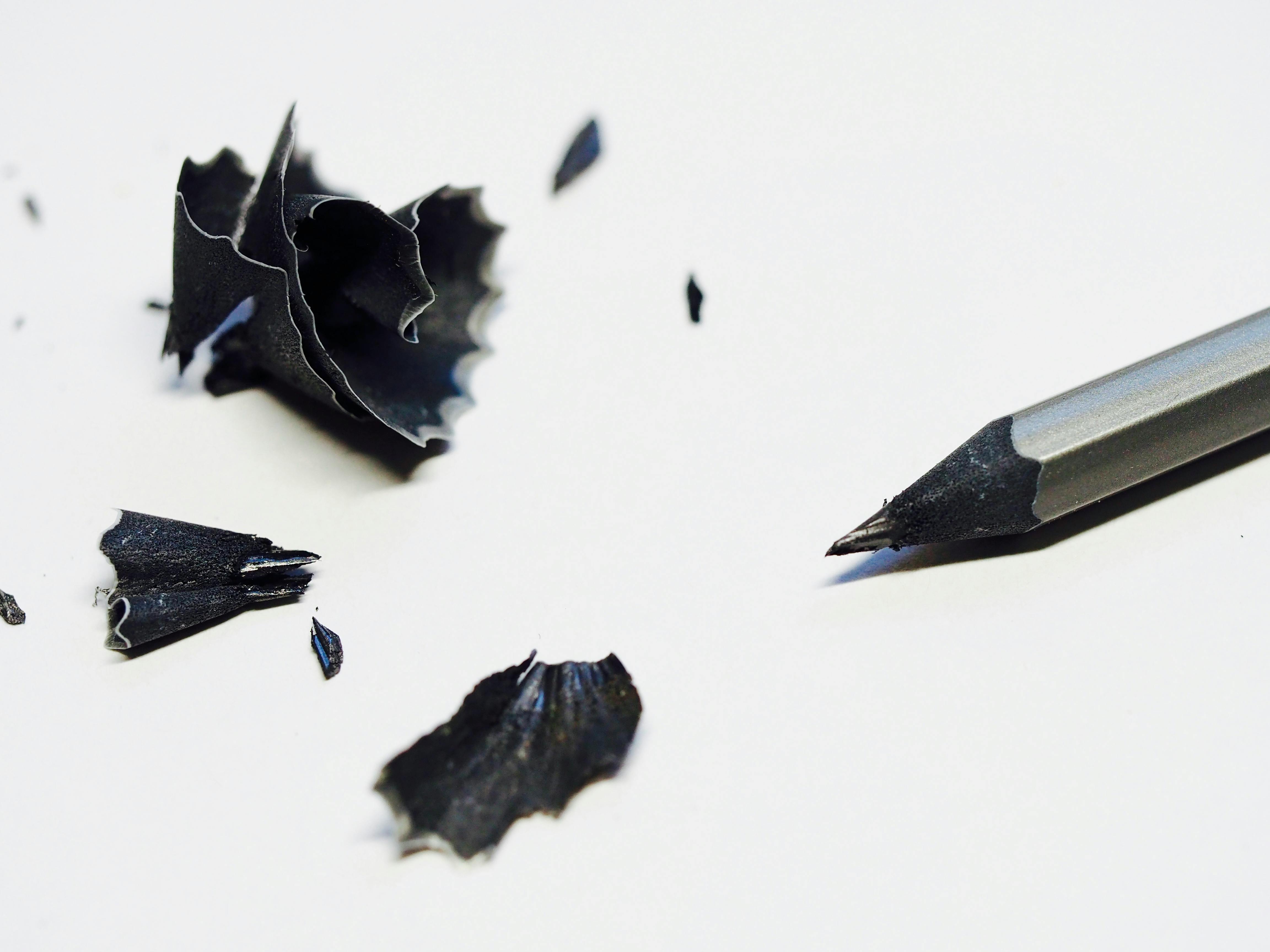
I remember the first time I opened Procreate on a brand-new iPad. It presented me with a pristine, terrifyingly blank white canvas. I poked around, drew a few wobbly lines with my finger, and promptly closed it, feeling completely overwhelmed. It felt like being handed the keys to a spaceship with no instruction manual, and honestly, for a long time, my first few attempts in Procreate looked like a toddler's fever dream. Sound familiar?
If you're feeling that right now, take a deep breath. This isn't just for you; it's a guide to help you conquer that initial blank canvas fear, much like learning to overcome the fear of the blank canvas in any medium. What clicked for me, what transformed Procreate from a bewildering gadget into a genuine superpower in my creative toolkit, was truly understanding layers. But fear not, because Procreate is far more approachable than it first seems, and I'm here to guide you through it.
This isn't going to be a super-technical, jargon-filled manual. Think of this more as me, sitting next to you, pointing at the screen and saying, "Okay, ignore all that other stuff for now. Just tap this. See? Cool, right?" By the end of this guide, you'll be ready to translate your initial ideas into vibrant digital creations. Seriously. We'll cover the essential interface, crucial tools, and your very first steps to confidently making digital art.
So, What is Procreate, Anyway?
At its core, Procreate is a powerful digital illustration app designed exclusively for iPad. Developed by Savage Interactive, the app first launched in 2011 and has since become a cornerstone for digital artists worldwide. Its intense focus on a single hardware ecosystem (iPadOS) is precisely what makes it so incredibly fluid and intuitive. While other robust software like Clip Studio Paint, Krita, or Adobe Fresco offer multi-platform solutions (great for those who need to work across desktop and mobile), Procreate's developers can fine-tune every pixel, every brushstroke, to the iPad's specific capabilities. This means unparalleled performance, seamless integration with the Apple Pencil's advanced features (like tilt and pressure sensitivity), and a butter-smooth user experience. It's like having a custom-built sports car, where every component is perfectly matched to extract maximum performance. This dedication to a single platform has allowed Procreate to push the boundaries of what's possible in mobile digital art, a journey that has evolved significantly from the early days of rudimentary paint programs like MS Paint, or even early versions of Adobe Photoshop and Corel Painter that dominated the desktop art scene.
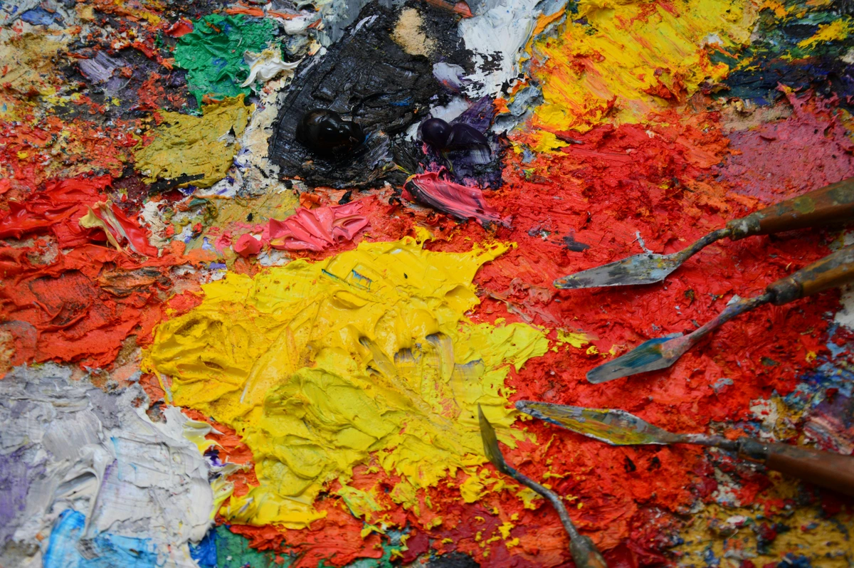
Unlike other creative software that asks for a monthly subscription (and, let's be honest, a piece of your soul, or at least your bank account every month), Procreate is a one-time purchase from the App Store. That alone made me a fan before I even drew a single line; a perpetual license feels like a creative freedom pass. It's an investment, sure, but one that pays dividends in endless creative possibilities without that nagging monthly fee. It's become the go-to tool for everyone from professional illustrators and concept artists sketching on their commute to hobbyists doodling on the couch, or even artists exploring the rise of digital abstract art. It's basically a complete art studio you can carry around, ready for inspiration to strike anywhere, anytime.
Getting Started: The Bare Essentials
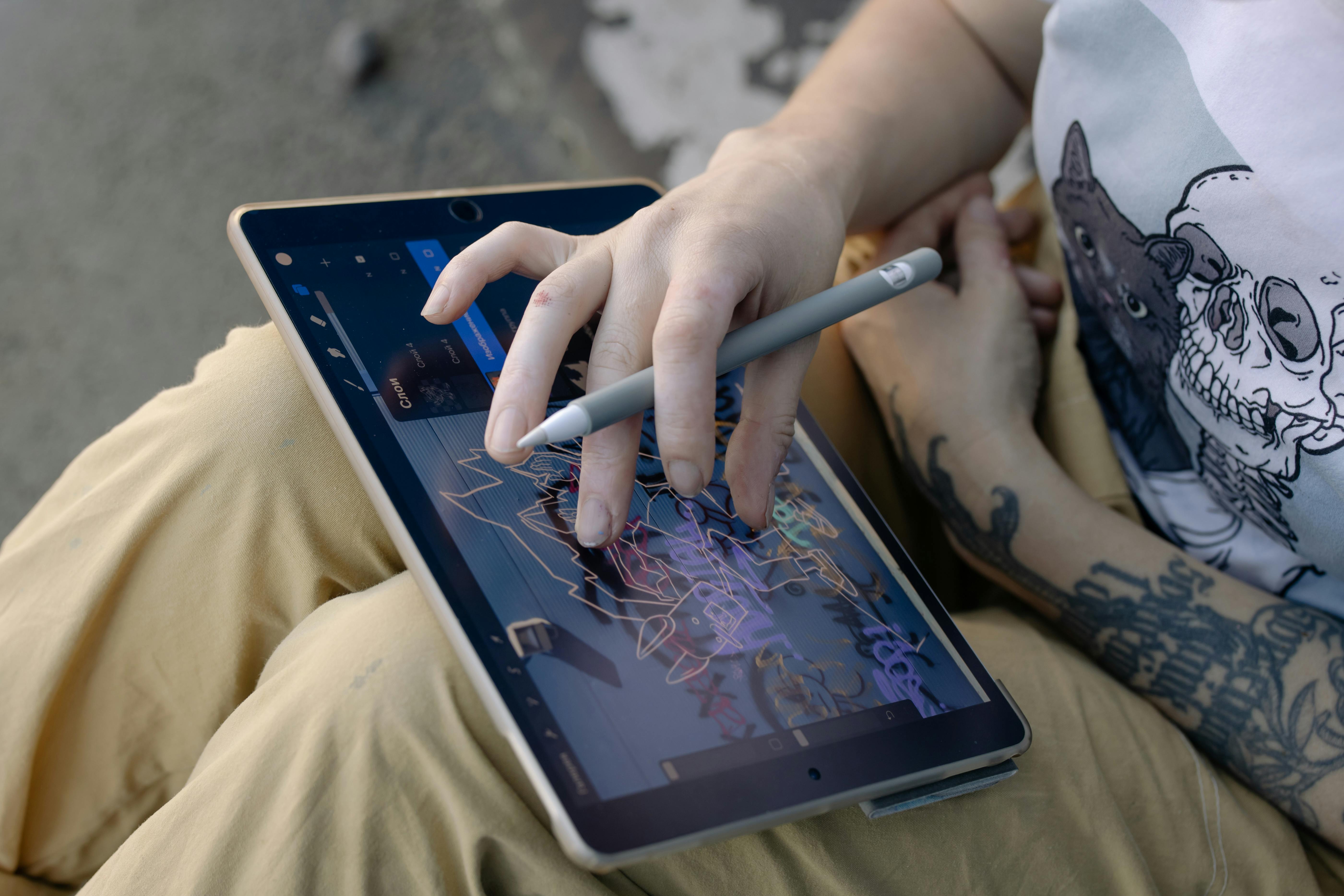
Before you dive in, let's talk gear. The good news is, the list is short. The even better news? You don't need the latest and greatest to start making amazing art.
Item | Why You Need It | My Two Cents |
|---|---|---|
| An iPad | The app only runs on iPadOS. | Any model that supports an Apple Pencil will work, but a larger screen is always nice for detailed work, while smaller ones are fantastic for portability. Don't feel you need the newest, most expensive one to start. |
| Apple Pencil | For pressure sensitivity, precision, and a truly natural drawing experience. | This is non-negotiable in my book. Drawing with your finger is fine for doodles, but the Pencil is what turns the iPad into a serious art tool. First or second generation works great. |
| Procreate App | The star of the show. | A single, affordable purchase from the App Store. Best money you'll spend on a creative app, hands down. |
| Optional: Screen Protector | Some artists prefer a 'paper-like' feel or protection from scratches. | I've tried a few; they add friction which can feel more natural, but they do wear down Apple Pencil nibs faster. Also, if you draw a lot, they can reduce hand fatigue. Totally a personal preference. Pro-Tip: If you use a paper-like screen protector, consider getting extra Apple Pencil nibs, as they wear out quicker! |
| Optional: iPad Stand | For ergonomic comfort during long drawing sessions. | Game-changer for your neck and wrists. Doesn't have to be fancy; even a cheap adjustable one helps immensely. |

That's it. No giant drawing tablets tethered to a computer, no complex setups. Just you, the screen, and a pen. Now that you have your essential tools, let's take a guided tour of Procreate's workspace.

The Grand Tour: Navigating the Procreate Interface
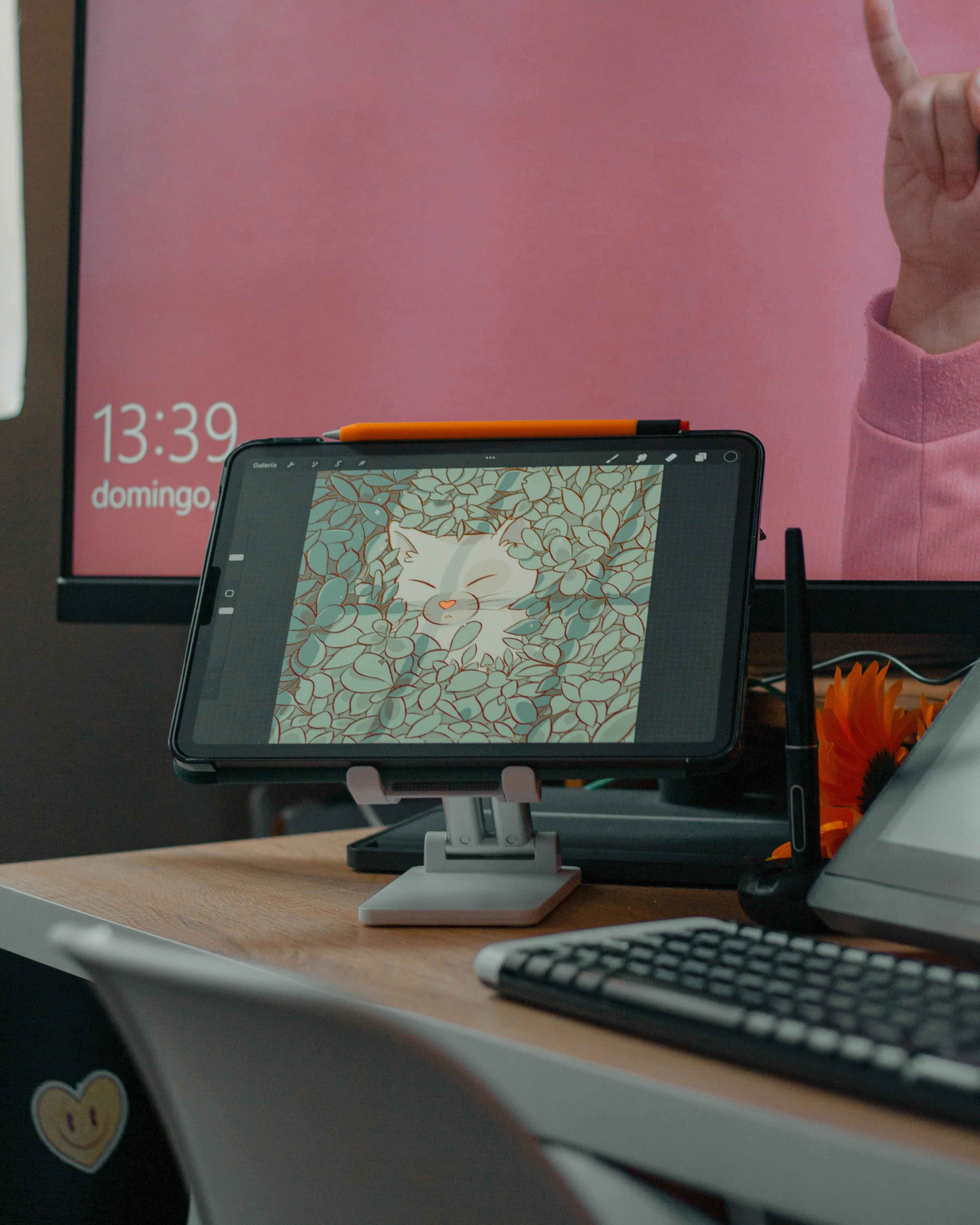
When you first open the app, you'll land in the Gallery. This is where all your creations live. You can organize them into 'Stacks' (which are basically folders), import files, or start a new canvas. Tap the + icon in the top right to create a new canvas. You can choose a preset size (like 'Screen Size') or create a custom one. For now, just tap Screen Size to jump in.
Once you've created or opened a canvas, you'll find yourself in the heart of Procreate's creative environment. At first glance, the Procreate workspace appears wonderfully simple, almost deceptively so. But beneath its clean surface lies a powerhouse of creative potential. Let's break down the key areas:
Basic Digital Art Concepts: Your Foundation
Before we dive into the Procreate interface itself, it's worth a quick chat about a few fundamental digital art concepts. Understanding these will make using Procreate much more intuitive:
- Pixels & Resolution: Digital art is made of tiny squares called pixels. Resolution refers to the number of pixels in an image (e.g., 1920x1080 pixels). More pixels mean a larger, more detailed image, but also a larger file size and potentially fewer layers available on older iPads. Procreate is a raster-based program, meaning it works with pixels, unlike vector-based programs which use mathematical paths.
- Raster vs. Vector: Procreate's raster nature means your art is essentially a grid of colored dots. While this allows for incredible detail and painterly effects, scaling up a raster image too much can lead to pixelation (jagged edges). Vector art, on the other hand, scales infinitely without losing quality, but has a different artistic feel. Procreate is optimized for the richness of raster painting.
- Color Profiles: You'll often hear about RGB (Red, Green, Blue) and CMYK (Cyan, Magenta, Yellow, Key/Black). RGB is for screens (like your iPad), while CMYK is for printing. Procreate defaults to RGB, which is perfect for digital-first art. If you plan to print professionally, you might need to convert your artwork to CMYK later, but don't worry about that just yet!
Essential Gestures: Your Digital Shortcuts
Now that you know a little about what's under the hood, let's talk about how you'll actually drive Procreate. The app is heavily gesture-driven, and learning these early will save you so much time and frustration. Some gestures can even be customized in your iPad's Accessibility settings for a truly personalized workflow, or remapped to certain Apple Pencil accessories.
- Undo: Two-finger tap on the canvas. Super important when you're experimenting! You can also tap the curved arrow at the bottom of the left sidebar.
- Redo: Three-finger tap on the canvas. For when you undo too much, or realize your "mistake" was actually brilliant. The curved arrow at the bottom of the left sidebar also does this.
- Pinch to Zoom: Use two fingers to pinch in and out to zoom, and drag to pan around your canvas. This is how you get into the fine details.
- Fit to Screen: Pinch with two fingers and then quickly release. Snaps your canvas back to full view.
- Hide Interface: Four-finger tap. For when you want to see your artwork fullscreen, without distractions. You can also swipe down with three fingers to reveal the iPad's notification bar, then tap anywhere outside it to bring back the Procreate interface.
The Power of Undo & Redo: Your Creative Safety Net
Let's pause here for a moment. If there's one feature that truly sets digital art apart from traditional mediums, it's the magical ability to undo. Think about it: in real life, a misplaced brushstroke on a canvas can be a disaster. In Procreate? It's just two fingers and a tap away from vanishing. This isn't just a convenience; it's a creative superpower. It gives you permission to truly play without fear of messing up. Make a bold stroke you hate? Undo. Try a crazy color combination? Undo if it fails. This constant safety net encourages experimentation, pushing you to try new things and learn faster, which is invaluable on your artistic journey.
The Main Workspace: A Quick Overview
With those gestures in your toolkit, let's look at the main command centers of the Procreate canvas.

Top Left Corner (The 'Control Panel')
The top left corner is your command center for managing your canvas and accessing powerful editing tools. Think of this like your artist's apron pocket – where you keep your essential utilities for managing your canvas, importing inspiration, and tweaking your work.
- Actions (wrench icon): This is where you'll find all the practical stuff: canvas settings, importing photos to trace or reference, cutting out parts of your work, sharing your masterpieces, and tweaking your preferences. You'll also find the Reference Companion here, which lets you pin a reference image to your screen without it being part of your canvas. It's a lifesaver for working from photos, anatomical studies, or color palettes, so you don't have to keep switching apps.
- Adjustments (magic wand icon): Apply non-destructive effects like blur, noise, liquefy, and color balance to your layers. "Non-destructive" is a key concept here: it means you can always go back and change or remove the effect later without permanently altering your original artwork underneath. Think of these as Instagram filters for your artwork, but with much more granular control.
- Selection (S-ribbon icon): Precisely select areas of your artwork for isolated edits. We'll talk more about this crucial tool in a moment.
- Transform (mouse pointer icon): Move, scale, rotate, and distort selected elements or entire layers. This is your go-to for repositioning elements with precision.
Top Right Corner (The 'Art Tools')
This is where the magic happens, housing your primary creative instruments – your digital brushes, paints, and canvas management.
- Brush Library (brush icon): Your vast collection of brushes (pencil, ink, paint, texture, and more). It's overwhelming, I know – it's like being in a candy store where every candy looks delicious, and you don't know where to start. (And then you end up collecting 500 custom brushes and only using 5, speaking from experience. I'm a digital squirrel, I hoard brushes, especially those fancy oil paint texture brushes I've barely touched.) For now, just know a universe of customization and creation exists here. My advice? Start with the 'Sketching' or 'Inking' categories. Tap and hold a brush to quickly reset its settings to default, a handy trick when you've accidentally tweaked too much. You'll also find 'Recents' for brushes you've used recently and 'Library' for organizing custom sets. And when you're ready to dive deeper, the Brush Studio (accessible by tapping a brush and then 'Brush Studio') lets you customize almost everything about a brush. This includes:
- Shape: How the brush tip looks (e.g., round, square, textured).
- Grain: The texture that's applied within each brushstroke.
- Pressure Dynamics: How the brush responds to your Apple Pencil's pressure, tilt, and speed.
- Wet Mix: Mimicking traditional paint properties like how colors blend or spread.
- Stabilization: Helping you draw smoother lines. It's an entire world unto itself, allowing you to create truly unique tools.
- Smudge (finger icon): Blend and soften your colors and lines, just like smudging charcoal on paper. You can even choose any brush from your library to control the smudge effect, giving you incredible versatility.
- Eraser (eraser icon): Remove parts of your artwork, with the added benefit of using any brush from your library as an eraser shape. Want to erase with a textured edge? You got it.
- Layers (two squares icon): Manage the individual transparent sheets that make up your artwork. This is probably the single most important concept in all of digital art, offering immense flexibility and non-destructive editing. Think of them like transparent sheets stacked on top of each other: you can draw on one without affecting another. A stroke of red on layer one won't mix with a stroke of blue on layer two unless you actively blend them. It was truly understanding layers that made me feel like I gained a creative superpower. My advice? Always use more layers than you think you need! You can even explore different Blending Modes here (like Multiply, Screen, Overlay) which change how colors from one layer interact with colors on layers below:
- Multiply: Generally darkens colors, great for shadows and shading.
- Screen: Generally lightens colors, perfect for highlights or glow effects.
- Overlay: Boosts contrast and vibrancy, often used for adding texture or overall color adjustments. But don't worry about mastering those just yet. Just know they're there for when you want to get fancy with transparency and effects.
- Color (colored circle icon): Your active color palette and color picker. When you tap it, you'll see different modes like Disc, Classic, Harmony, Values, and Palettes. Disc and Classic are great for beginners, allowing you to easily pick hues, saturation, and brightness. Hue defines the pure color (red, blue, green), Saturation defines its intensity (vivid vs. dull), and Brightness defines its lightness (light vs. dark). Harmony suggests aesthetically pleasing color combinations (complementary, analogous, triadic, etc.) based on color theory principles, guiding you toward balanced palettes. Complementary colors (opposite on the color wheel) create high contrast and excitement, while analogous colors (next to each other) provide a harmonious, calm feel. This can be incredibly useful, even if you don't have a definitive guide to color theory in art opened on the side. Values lets you input precise hex codes or RGB/HSB numerical inputs. Palettes are for saving your favorite color sets, a real time-saver once you find colors you love.
- Left Side Slider: These two sliders control your current brush's Brush Size (top) and Brush Opacity (bottom). Slide up to increase, down to decrease. The undo/redo buttons are at the bottom of this bar, offering a visual alternative to the two/three-finger tap gestures.
Your First Drawing: Let's Make Something!
Theory is boring, I agree. So now that we've explored the tools, let's put them to work and create your very first digital sketch. Don't worry about making a masterpiece; the goal here is just to get comfortable. Remember, all art begins with experimentation, not perfection. Let's draw a simple apple!
- Pick a Brush: Tap the brush icon in the top right. Go to the Sketching category and pick the 6B Pencil. It feels natural and is very forgiving.
- Choose a Color: Tap the colored circle in the far top right. Drag your finger around to find a color you like (maybe a light grey or a desaturated red for the apple outline) and close the panel.
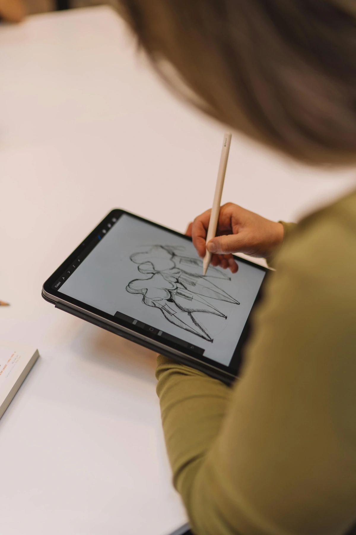
- Draw an Apple Shape: Draw a rough apple shape on your canvas. Don't lift your pencil at the end. Just hold it there for a second. See that? Procreate's QuickShape feature just snapped your wobbly shape into a smoother, more refined one. You can even tap 'Edit Shape' at the top to refine it further, turning a rough oval into a perfect ellipse, or quickly creating perfect squares, triangles, and straight lines using the same method.
- Create a New Layer: This is where digital art truly shines for me. Tap the layers icon (the two squares) and then tap the
+to add a new layer. As we discussed, layers are like transparent sheets stacked on top of each other. This means you can mess with one part of your drawing (like the color) without ruining another (like your outline). My advice? Always use more layers than you think you need! - Color Your Apple: On your new layer, which should be on top of your outline layer, pick an apple color (a nice red or green). Now, drag that color from the circle in the top right and drop it inside your apple's outline. ColorDrop just filled it in for you. Remember, ColorDrop needs a closed shape to work effectively; if you have even a tiny gap (sometimes just a stray pixel!), the color might spill across the entire canvas. Imagine trying to fill a balloon with a tiny hole – the air escapes! Because you're on a separate layer, your original outline is safe and sound, ready for any future edits, demonstrating the power of a non-destructive workflow.
There. You just used five of the most fundamental features in Procreate without even breaking a sweat. You've made a shape, colored it, and used layers. That's a huge first step!
Your Next Steps: Keeping the Momentum
Now that you've got a feel for the basics, here are a few things to try next:
- Experiment with Brushes: Head back to the Brush Library and try out some different sketching or inking brushes. See how they feel. Don't be afraid to make a mess!
- Add Simple Shading: Create another new layer above your color layer. Using a slightly darker shade of your apple color and a soft brush, try to add a simple shadow to one side of your apple. Lower the opacity of the brush for a subtle effect.
- Draw Something Else: Try sketching a coffee cup, a simple leaf, or even just practice drawing perfect circles and squares with QuickShape. The more you draw, the more comfortable you'll become.
Three Game-Changing Features to Learn Early
Once you've got your feet wet with basic shapes, colors, and layers, it's time to unlock some of Procreate's true power. These three features will level up your art game immediately and make you feel like a digital art wizard. Honestly, mastering these early transformed my own workflow.
- Selection Tool: The 'S' ribbon icon is your best friend for complex work and precise edits. You can draw a selection around a part of your image using various modes: Freehand (draw any shape), Rectangle, Ellipse, or Automatic. Automatic mode intelligently selects contiguous areas of similar color, making quick work of filling specific zones. For example, if you've drawn a character with a patterned shirt, Automatic selection can quickly isolate just the shirt, even with its complex edges, so you can repaint or adjust it without affecting the skin or background. Once selected, you can move, resize, repaint, or apply adjustments just to that section. It's like digital masking tape, allowing for isolated, focused work. (Pro-tip: For quick, accurate selections of an entire shape on a layer, tap the layers icon, then tap the layer thumbnail and choose 'Select'.) This tool has saved me countless hours, allowing for seamless revisions without having to redraw entire elements.
- Alpha Lock: I use this constantly. In the layers panel, take two fingers and swipe right on your apple's color layer. You'll see a checkered background appear on the layer's thumbnail. This means Alpha Lock is on. Now, anything you draw or paint will only appear where you've already painted on that layer. Think of it like a digital stencil; it's perfect for adding highlights, shadows, textures, or patterns to an existing shape without ever going outside the lines. It's incredibly precise. (Pro-tip: Alpha Lock applies directly to the pixels on the current layer, meaning if you paint over something, it replaces those pixels. It's a direct, destructive edit to that layer – meaning once you paint, the original pixels are gone, though you can still undo.)
- Clipping Masks: This is like Alpha Lock but even more flexible and non-destructive. Create a new layer above your shape layer. Tap the new layer's thumbnail and select 'Clipping Mask' from the menu. Now, this new layer is 'clipped' to the one below it. Whatever you draw on the clipped layer will only show up on top of the pixels of the layer below. The big advantage is that it's non-destructive; you can move, edit, or delete the clipped layer (say, a layer of shadows or textures) without affecting the base shape. I often use this for coloring line art: I put my line art on a base layer, then create a new layer for colors and clip it to the line art. Or, if I want to add a subtle texture to my colored shape, I'll use a clipping mask, allowing me to adjust the texture independently. This means you can even A/B test different shading styles or texture overlays on your apple without touching the original color layer. (Pro-tip: Clipping masks are fantastic for experimenting with effects or shadows without committing them directly to your base layer, making them far more flexible for non-destructive edits than Alpha Lock.)
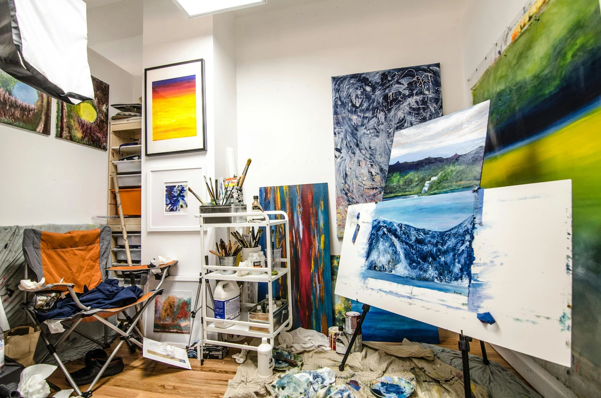
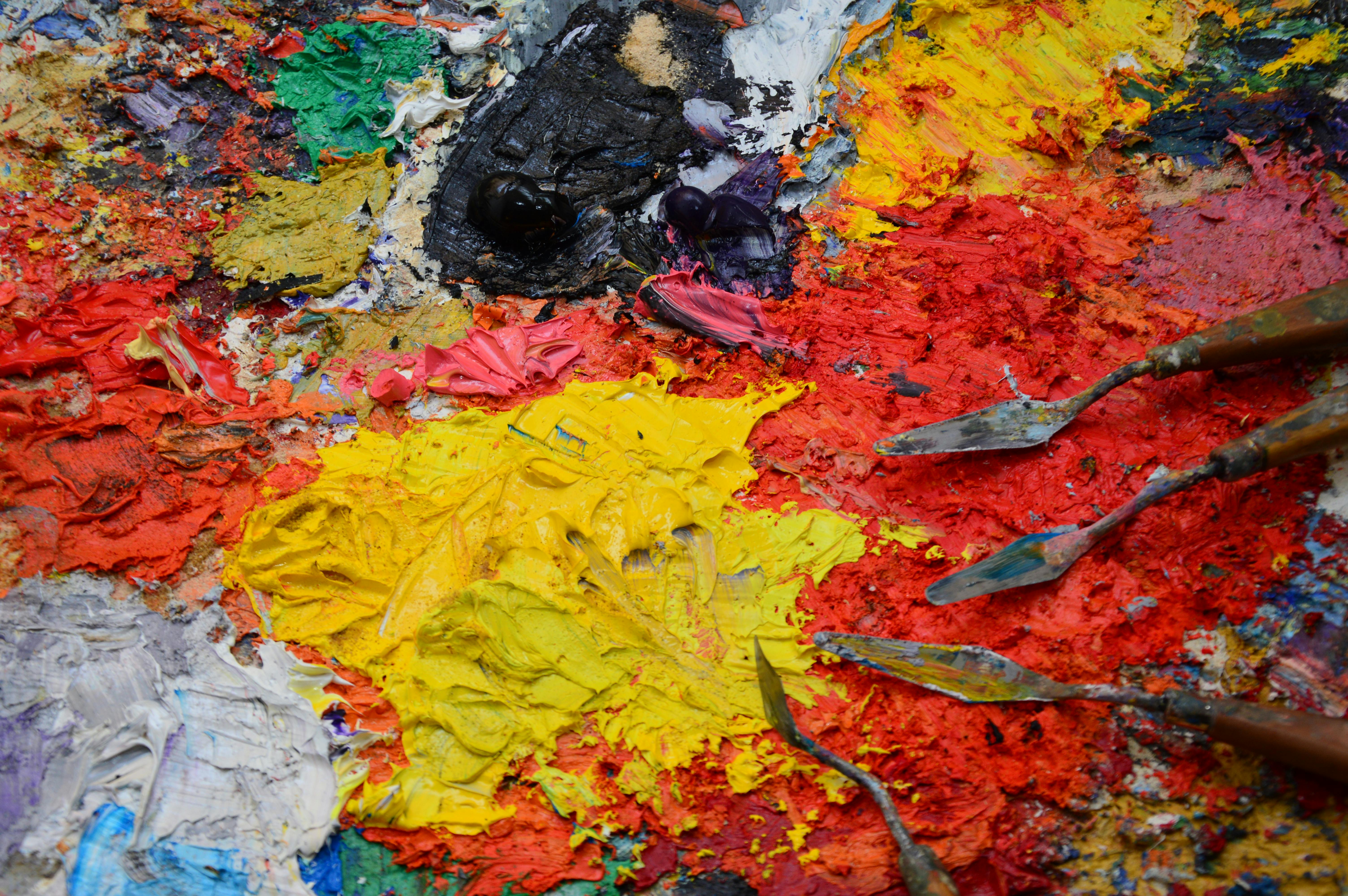
Understanding these tools is key to building depth and complexity, just as it is in traditional painting. While the medium is different, the core ideas are the same as when I'm building depth in abstract acrylics. These features are your power tools for refining and evolving your digital creations.
Common Pitfalls for Beginners (and How to Avoid Them!)
Every artist, digital or traditional, makes mistakes. It's part of the process! But some common traps can trip up Procreate beginners. Here are a few I've observed (and definitely fallen into myself):
- Not Using Enough Layers: This is perhaps the biggest one. It feels counter-intuitive at first, but having separate layers for lines, colors, shadows, and highlights gives you immense flexibility for edits. If everything's on one layer, changing a color might mean redrawing an entire section. Force yourself to create new layers, even for small details!
- Over-Reliance on Undo: While the undo feature is a godsend, constantly undoing every 'mistake' can prevent you from truly seeing and learning from them. Sometimes a happy accident or an unexpected stroke can lead to a breakthrough. Try to push through perceived mistakes sometimes, or at least analyze them before erasing them entirely.
- Trying Too Many Brushes at Once: The Brush Library is a wonderland, but diving into all 200+ brushes simultaneously can lead to decision paralysis and inconsistent results. Pick 2-3 basic brushes (a pencil, an inker, a soft airbrush) and master them before exploring more niche options.
- Neglecting Foundational Drawing Skills: Procreate is a tool, not a shortcut. If you struggle with perspective, anatomy, or color theory in traditional mediums, you'll still struggle with them digitally. Dedicate time to traditional sketching and drawing exercises, as these skills translate directly and enhance your digital work.
- Expecting Instant Perfection: Digital art has a learning curve. Your first pieces won't look like the pros you see on Instagram. Be patient with yourself, celebrate small victories, and focus on consistent practice over achieving an instant masterpiece.
Frequently Asked Questions (FAQ)
Q: Do I need the most expensive iPad Pro?
A: Absolutely not. I started on a basic iPad. Any modern iPad that supports the Apple Pencil will run Procreate beautifully. The 'Pro' models offer features like higher refresh rates (ProMotion) which makes drawing feel slightly smoother, but it's a luxury, not a necessity. Focus on your art, not your gear. You can always upgrade later if you truly feel limited. Most beginners will find any Apple Pencil-compatible iPad perfectly adequate to learn and create amazing art.
Q: Can I use Procreate on a laptop or Android tablet?
A: Nope. Procreate is an iPad-exclusive app. This dedicated approach is part of its strength, as the developers can optimize it perfectly for Apple's hardware and software. For other platforms, you might look into apps like Clip Studio Paint (multi-platform), Krita (free, open-source), or Adobe Fresco (Windows, iOS).
Q: How do I get more brushes?
A: Procreate comes with a fantastic built-in library, but the brush community is massive. You can buy custom brush packs from other artists online (Etsy and Gumroad are popular places), download free ones, or even learn to make your own from scratch within the app's powerful Brush Studio. Just be careful—collecting brushes can become its own addictive hobby, like a digital squirrel hoarding nuts (I have 50 different texture brushes I've barely touched, waiting for that 'perfect' project!). Start with the defaults; they're incredibly versatile and often all you need.
Q: What's the best canvas size to use?
A: It depends entirely on your goal. If you're just sketching or creating digital-first work to be viewed on a screen, 'Screen Size' (optimized for your iPad's display) is perfectly fine. Procreate also offers various presets under the + icon, like '4K' or 'US Paper', which are good starting points.
For social media, consider common pixel dimensions:
- Instagram square: 1080x1080 pixels
- Instagram portrait: 1080x1350 pixels
- Instagram landscape: 1080x566 pixels
If you plan to print your work, you need to think about resolution and DPI (Dots Per Inch). A good starting point for a high-quality print is 3000x4000 pixels at 300 DPI. For web use, 72 DPI is generally sufficient as screens don't display individual pixels as densely as printers. Understanding the distinction is crucial: resolution (pixel dimensions) is the total number of pixels in your image, while DPI (dots per inch) tells a printer how densely to place those pixels. A higher DPI (like 300) tells the printer to fit more ink dots per inch, resulting in sharper details. Also, if designing for professional print, remember to account for bleed – the extra area around your design that gets trimmed off. This ensures no unprinted edges, even if the cut is slightly off. Printing houses usually provide specific bleed requirements, but 0.125 inches (3.175 mm) on each side is a common standard.
Q: My art doesn't look 'good enough.' How do I find inspiration or improve?
A: Every artist, even seasoned pros, has these thoughts. The truth is, 'good enough' is subjective and constantly evolving. Focus on consistent practice rather than perfect outcomes. For inspiration, look around you! Nature, everyday objects, emotions, music—anything can spark an idea. Experiment with different brushes, colors, and techniques. Try specific exercises:
- Daily Object Study: Draw your favorite object from three different angles. Focus on its form and how light hits it.
- Emotion into Abstract: Illustrate an emotion (joy, sadness, anger) using only colors, shapes, and brushstrokes. Don't worry about representation.
- Master Study: Pick an artwork you admire (digital or traditional) and try to recreate a small section of it, paying attention to colors, brushwork, and composition.
- Redraw Challenge: Take an old sketch of yours and redraw it, applying everything you've learned since.
Daily sketching from life or photos is invaluable. Consider following other artists online, but be sure to create more than you consume. Remember, the journey is the art.

Q: How do I export my artwork?
A: You can export your artwork from the Actions (wrench icon) menu under 'Share'. Procreate offers various formats depending on your needs:
- PNG: For high-quality images with transparency (great for web, stickers, or overlays). Larger file size due to lossless compression.
- JPG: For smaller file sizes (good for sharing online where transparency isn't needed). Uses lossy compression, so some detail is lost.
- PSD: (Photoshop Document) If you want to continue working in Photoshop and preserve all your layers. This is invaluable for further retouching, compositing multiple elements, or creating variations without losing your original Procreate work.
- TIFF: For uncompressed, high-quality professional prints and archival purposes. Very large file size but preserves maximum detail.
- PDF: Good for sharing multi-page documents or prints.
- GIF/MP4: If you've created animations or time-lapse videos of your drawing process – a fun way to share your creative journey! Procreate automatically records your entire drawing process as a time-lapse, which you can easily export.
Procreate Community & Resources
One of the best things about Procreate is its vibrant and supportive community. Beyond the app itself, there's a wealth of resources available:

- The Official Procreate Handbook: Built right into the app (find it under 'Help' in the Actions menu), this comprehensive guide covers every feature. I'd particularly recommend checking out the 'Introduction to Layers' and 'Brush Studio' sections when you're ready to dive deeper.
- Official Procreate Forums: A great place to ask questions, share your work, and find tutorials directly from Savage Interactive and experienced users.
- YouTube Tutorials: Countless artists create free tutorials covering everything from beginner basics to advanced techniques for illustration, concept art, comics, and even animation. Search for specific Procreate tutorials on topics like "how to draw hair in Procreate" or "Procreate watercolor effects."
- Online Courses & Communities: Platforms like Skillshare, Domestika, and Patreon host many artists offering in-depth courses or exclusive content for Procreate users.
- Instagram & Pinterest: Incredible sources of inspiration and quick tips from other digital artists.
A Final Thought: Embrace the Journey
The most important tool isn't the pencil or the app; it's permission to play and make bad art. Your first few dozen drawings might not be masterpieces, and that's okay. Mine certainly weren't. The goal is to build familiarity and muscle memory. Explore the brushes. See what happens when you mess with the color sliders. Try to create some abstract art without any goal in mind.
Procreate is a deep, powerful program, and its accessibility has profoundly impacted the freelance art world, enabling countless artists to create stunning work on the go. You only need to know a fraction of its features to start creating amazing things. Be patient with yourself, stay curious, and have fun. You've already taken the biggest step by conquering that initial blank canvas fear. Now, keep drawing! Perhaps next, you'll delve into custom brush creation, exploring brushes that emulate watercolor paint, oil paint, or even specific calligraphy styles. You might explore how Procreate can be used for illustration, concept art, or even fine art painting styles. Welcome to the club. If you're looking for unique, contemporary pieces for your own space, feel free to browse my art collection.
Procreate Glossary for Beginners
Here's a quick reference for some of the key terms you'll encounter in Procreate:
- Alpha Lock: A layer setting that allows you to paint or draw only on the pixels that already exist on that layer. Think of it as painting inside the lines of your existing artwork on that specific layer.
- Blending Modes: Layer settings that control how the colors of one layer interact with the colors on the layers below it (e.g., Multiply for darkening, Screen for lightening, Overlay for contrast).
- Brush Studio: Procreate's advanced editor where you can customize every aspect of a brush, from its shape and grain to its pressure response and wetness.
- Canvas: Your digital art board or workspace where you create your artwork.
- Clipping Mask: A non-destructive layer setting where a layer's visibility is clipped to the contents of the layer directly below it. It's great for adding details, shadows, or textures without directly altering the base layer.
- ColorDrop: Procreate's quick fill tool that allows you to drag a color from the color palette and drop it into a closed shape to fill it with color.
- DPI (Dots Per Inch): A measurement used in printing to describe the resolution of an image, indicating how many ink dots a printer places per inch. Higher DPI means sharper prints.
- Layers: Individual, transparent sheets that stack on top of each other, allowing you to create and edit different elements of your artwork independently.
- Non-Destructive Editing: Making changes to your artwork in a way that allows you to easily reverse, modify, or remove those changes later without permanently altering the original pixels (e.g., Adjustments, Clipping Masks).
- Pixels: The smallest individual units (tiny squares) that make up a digital image. The more pixels, the higher the image resolution.
- QuickShape: A feature that automatically perfects imperfect shapes (like circles, squares, or straight lines) if you draw a shape and hold your Apple Pencil for a moment at the end.