
The Ultimate Starter Drawing Kit: A Curator's Guide
Feeling overwhelmed by art supplies? I'll guide you through building the perfect beginner drawing kit. Discover the essential pencils, paper, and tools you *actually* need to start.
Your First Drawing Kit: A Curator's Guide to What You Actually Need – And Nothing More
Have you ever stood in an art supply store, utterly overwhelmed, staring at a dizzying expanse of pencils, paints, and papers? I certainly have. That feeling, a mix of excitement and paralysis, is the classic paradox of choice. So many options promising instant mastery but often delivering only inertia. You might leave with a single, lonely HB pencil, a silent admission of defeat, or worse – an expensive, unopened 72-piece set, a monument to artistic ambition deferred. This isn't just about acquiring tools; it's about making a deliberate, empowering choice to engage with your creativity, to step past the overwhelm and into the joy of making. We're here to cut through the noise, to transform that initial overwhelm into confident action. My goal is to equip you not just with tools, but with purpose and clarity – the essential ingredients for a sustainable artistic practice. Consider this your definitive blueprint, curated from decades of artistic exploration, to build a foundation that truly lasts. For those who feel an initial spark of creativity but struggle with consistency, I've found that a well-chosen starting kit can act as a powerful anchor.
Here at Zenmuseum, I believe in empowering every budding artist. My goal is to simplify the often-intimidating world of art supplies, guiding you with clarity and insight. Think of this guide not just as a shopping list, but as an apprenticeship in discernment, a journey to equip your creative spirit without weighing it down with unnecessary baggage. We're building a bridge, not a barrier, to your artistic endeavors. This isn't just about finding the cheapest or most abundant supplies; it’s about making a thoughtful investment in tools that genuinely serve your creative growth, allowing your intrinsic motivation to take hold. We’re curating, not just collecting. This is why I've painstakingly selected specific items, knowing that the right tools, thoughtfully chosen, can be a true catalyst for your creative journey and foster a lifelong love of making.
Let's strip away all that noise, shall we? Because the true goal of your first drawing kit isn't to possess every tool under the sun. No, it's far more profound. It's about meticulously curating a small, high-quality collection that acts as a catalyst, dissolving friction and whispering to you, "Just draw." It's about constructing a bedrock of confidence, not a towering edifice of untouched supplies. Consider me your personal curator for this inaugural, pivotal collection. We aren't merely acquiring items; we are meticulously constructing a tangible gateway to your nascent creativity, and believe me, it's far less daunting than the art store makes it seem. The greatest hurdle, in my experience, is almost always just beginning, a mental block I’ve explored in depth in my article on how to overcome fear of the blank canvas. It's a journey from contemplation to creation, and it starts with a few deliberate choices. We'll focus on tools that are versatile, forgiving, and genuinely inspiring, not those that look impressive but gather dust. This guide is your shortcut to confidence, providing clear recommendations so you can spend less time shopping and more time creating. As an artist, I've seen countless beginners stumble here, paralyzed by choice, so my aim is to make your first steps as smooth and joyful as possible.
The Psychology of Starting: Overcoming Decision Fatigue
Before we dive into the physical tools, let's talk about the mental ones. That feeling of being overwhelmed in the art store? It's a real psychological phenomenon called decision fatigue. When faced with too many choices, our brains get exhausted, leading to procrastination, poorer decisions, or simply giving up. For an artist, this means less drawing. My philosophy is to proactively combat this by offering you a focused, curated selection, eliminating the mental load of choice so you can save all your creative energy for the act of making. It's about streamlining your pathway to art, making it as effortless and inviting as possible. This approach isn't about limiting your potential; it's about unlocking it by removing unnecessary obstacles. Think of it as clearing the runway so your inspiration can take flight. It’s the difference between trying to navigate a dense jungle and strolling down a clear path – one invites adventure, the other, exhaustion. Research in cognitive psychology even shows that excessive choice can lead to lower satisfaction with chosen items, even if the choice itself was optimal. By narrowing the field, we ensure your initial experiences are positive and reinforce your creative drive, rather than stifling it.
Ergonomics and Posture: Your Body as a Tool
Before you even make your first mark, take a moment to consider your physical setup. Drawing, like any craft, can put a strain on your body if you're not mindful of ergonomics. Maintaining good posture – sitting upright with your back supported, shoulders relaxed, and feet flat on the floor – isn't just about comfort; it's about preventing fatigue and injury, and ultimately, allowing you to draw for longer periods with greater focus. Your drawing surface should ideally be angled slightly, bringing your paper closer to your eyes and reducing neck strain. A simple drafting table or even a sturdy book under your sketchbook can make a world of difference. Your body is your most important tool, and taking care of it ensures a long, joyful artistic journey. Ignoring this can lead to discomfort, tension, and a premature end to your creative sessions. It’s a foundational consideration, much like choosing the right pencil.
The Mind-Body Connection in Art
It's not just about physical alignment; it's about how your body influences your creative flow. When you're uncomfortable, your mind is distracted by the discomfort, pulling energy away from the art. Conversely, a comfortable, well-supported posture allows for a meditative focus, almost merging your physical self with the creative act. This mind-body connection is powerful. I’ve noticed in my own practice that when I neglect my posture, my lines become hesitant, my focus wanes, and my overall enjoyment of the process diminishes. It’s a subtle dance, but one worth mastering for sustained creative energy.
The Philosophy: Less is So Much More
Before we talk about specific items, let's get our mindset right. A beginner artist doesn't learn faster with more tools. In fact, the opposite is true. Limiting your options forces you to learn the fundamentals. I remember when I first started, I had a massive set of colored pencils, and I spent more time agonizing over which shade of green to use than actually drawing a leaf. With just a few pencils, you’ll discover the incredible range of marks you can make by varying pressure, angle, and grip. You learn what your tools can really do. Adding more just becomes a distraction. This focus allows you to build foundational skills – understanding value, texture, and form – without the cognitive load of navigating a vast, unfamiliar arsenal. It's about deep learning, not broad collecting. This isn't about deprivation; it's about strategic enablement. It’s like a chef mastering a few core ingredients before tackling a complex menu – the depth of understanding gained is invaluable.
Think of it this way: when you're overwhelmed by choice, your brain expends energy on decision-making rather than on the creative task itself. A pared-down kit reduces this cognitive load, freeing you to focus entirely on the act of drawing. It fosters deliberate practice, where you intentionally work on improving specific skills rather than aimlessly doodling. You'll master how a single pencil can create an astonishing array of tones, from the lightest whisper to the deepest shadow, simply by varying your pressure and angle. This intimate understanding of your tools is far more valuable than a sprawling collection of untouched supplies. It's a bit like learning to cook with a few fresh ingredients instead of a pantry full of processed foods; you learn the nuances, the true potential.
Your first kit should be lean, versatile, and focused on the absolute essentials of mark-making. This minimalist approach isn't about restriction; it's about liberation, allowing your creativity to flourish without the burden of too many choices.
The Importance of a Minimal Palette
I've seen it time and again: artists buying elaborate sets of every conceivable color or grade of pencil, only to use a fraction of them. It's a common trap, one I've fallen into myself more times than I care to admit. A minimal palette isn't about being cheap; it's about being strategic and intentional. By limiting your choices, you're forced to get creative with what you have, pushing the boundaries of what a single tool can achieve. You learn to mix colors on the paper, to create a wider range of values from a single pencil, and to understand the subtle nuances of your materials. This deep engagement with fewer tools leads to a more profound understanding of your craft. It pushes you to become a master of your chosen instruments, rather than a collector of unused potential. And honestly, it makes packing for art on the go infinitely easier! This principle applies across all mediums, whether you're working with graphite, a select few colored pencils, or even a limited range of paints. It fosters resourcefulness, sharpens your problem-solving skills, and cultivates a deeper understanding of color relationships and mixing, which are invaluable lessons no matter how extensive your future toolkit becomes.
Palette Type | Benefits | Potential Drawbacks |
|---|---|---|
| Minimal Palette | Forces mastery of fundamentals, deepens understanding of tools, fosters resourcefulness, reduces decision fatigue, enhances portability. | May feel restrictive initially, requires creative problem-solving. |
| Extensive Palette | Offers wide range of immediate options, can inspire experimentation (once fundamentals are learned). | Increases decision fatigue, can lead to superficial learning, often results in unused supplies, less portable. |
The Unskippable Core: Pencils, Paper, and Erasers
This is it. The undeniable, foundational trinity of drawing: pencils, paper, and erasers. If you get these three fundamental elements right, truly right, you possess not just supplies, but the entire ecosystem necessary to cultivate a serious, deeply rewarding, and endlessly fulfilling drawing practice. Everything else, at this stage, is just noise. Think of these three as your creative bedrock, the essential components that will teach you the visual language of art without distraction. They are your primary dialogue partners in the journey of mark-making.
Building Blocks of Visual Language
I often tell aspiring artists that these three elements are your ABCs, your basic grammar. You can't write a novel without understanding letters, words, and sentences, can you? In the same way, you can't create compelling art without mastering these core tools. They allow you to understand fundamental concepts like line, shape, form, value, and texture. Once you have a solid grasp of these, the world of art opens up, and you'll find that many advanced techniques in other mediums build directly upon the skills you hone with just a pencil, paper, and an eraser. It's about laying a strong, unwavering foundation. Truly, these simple instruments hold the key to unlocking vast artistic potential.
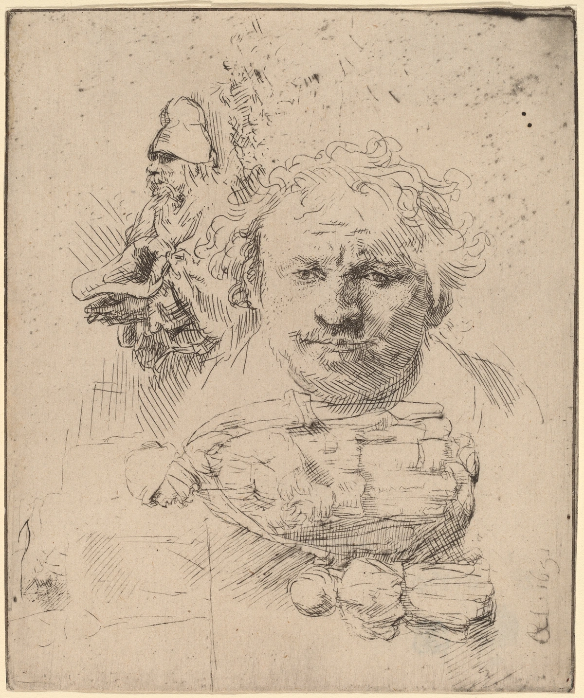
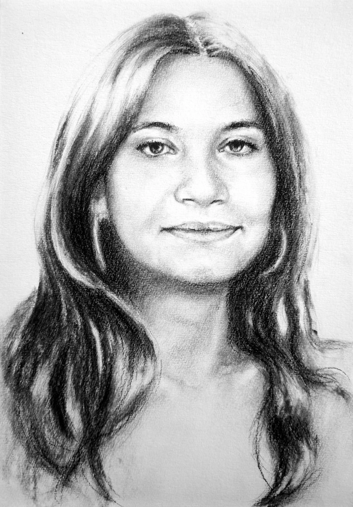
1. Graphite Pencils: The Very Heart of the Kit
Forget those sprawling, intimidating pencil sets that promise a universe of options but often deliver only overwhelm. Believe me, you don’t need them. Instead, a handful of thoughtfully chosen pencils is all it takes to unlock an enormous tonal range, from the whisper of a line to the deepest velvet shadow. Pencils, as you'll quickly discover, are graded on a fascinating scale from H (Hard) to B (Black/Soft). Think of H pencils as the architects of your drawing – they yield crisp, light, precise lines perfect for initial mapping. B pencils, on the other hand, are the poets, delivering darker, richer, and yes, wonderfully smudgier lines that invite expression and depth. It's a system designed to give you nuanced control over every mark.
Understanding Graphite Composition and Types
At its core, a graphite pencil is a blend of finely ground graphite (a crystalline form of carbon) and clay, encased in wood. The ratio of graphite to clay determines the pencil's hardness and darkness. More clay means a harder lead (H grades), yielding lighter lines and sharper points. More graphite means a softer lead (B grades), resulting in darker, smoother, and more blendable marks. This ancient material, a cousin to diamond, has been used for drawing since the 16th century, though modern pencils emerged in the late 18th century. It’s a testament to simple, effective technology.
Beyond the traditional wood-cased pencils, you'll also encounter:
- Woodless Graphite Pencils: Solid sticks of pure graphite, coated in a thin lacquer to keep your hands clean. They're fantastic for covering large areas quickly and can be sharpened to a fine point for detail, offering an intense, uninterrupted drawing experience.
- Clutch Pencils (Lead Holders): These are essentially refillable mechanical pencils that hold thicker leads (typically 2mm or larger). They offer the consistent feel of a traditional pencil with the convenience of refills and can use various graphite grades, making them a favorite for artists who want control and refillability without the constant sharpening of wood.
- Mechanical Pencils: While I generally don't recommend these for foundational learning (we'll dive into why later in the FAQ), they undeniably have a place for very fine, consistent lines, especially in technical drawing, intricate detail work, or when you need an unwavering line width.
- Graphite Sticks: Similar to woodless pencils but often thicker and without a lacquer coating, allowing for a more direct, tactile experience. Excellent for broad strokes, large areas of tone, and expressive mark-making. They invite a completely different, more physical engagement with the drawing surface, pushing you to draw from your shoulder rather than just your wrist.
Each type offers a slightly different drawing experience, from the precise control of a clutch pencil to the broad expressiveness of a graphite stick. Experimentation, once you've mastered the basics, is key to finding what resonates with your personal style and specific project needs.
To truly understand these magical sticks, to hear their unique voices, a quick glance at the grading system is essential. This isn't just a random assortment of letters and numbers; it's a finely tuned scale designed to give artists precise control over their marks. I remember early on thinking 'a pencil is a pencil,' until I truly started to feel the difference, how each one responded to the paper like a different instrument in an orchestra. Here’s a simple breakdown of the most common grades you’ll encounter:
Grade Range | Hardness | Line Quality | Best For |
|---|---|---|---|
| 9H - 2H | Very Hard | Very Light, Crisp, Clean | Technical drawing, initial light sketches |
| H | Hard | Light, precise, good for detail | Light outlines, preliminary sketching |
| F | Fine Point | Slightly darker than H, maintains sharp point | Fine detail, consistent line work, sketching that requires a slightly bolder mark than H grades |
| HB | Medium | Medium Gray, Versatile | General sketching, writing, foundational lines |
| 2B - 9B | Soft | Dark, Rich, Easy to Smudge | Shading, adding depth, expressive marks |
This table illustrates the broad spectrum of graphite grades, but it's in the nuanced application that their true power is revealed. Each pencil is a unique voice in your artistic choir.
This careful selection isn't arbitrary. It's based on decades of making marks and understanding the specific roles each grade plays in building a compelling drawing. We're looking for versatility and control, not just a broad spectrum of darkness.
Beyond the Grades: The Feel of Graphite
It's not just about the numbers and letters; it's about the feel. This is where the true artistry lies. An H pencil, with its higher clay content, will drag slightly, offering crisp, almost scratchy feedback, ideal for precise planning, architectural lines, or subtle initial lay-ins. A B pencil, conversely, with its generous graphite content, will glide with buttery smoothness, almost melting onto the paper, inviting you to create expressive strokes and luxurious darks. Learning to anticipate and respond to this tactile feedback is a crucial step in developing a confident, intuitive hand. Each grade isn't just a shade; it's a unique drawing experience, a subtle dance between your hand, the pencil's composition, and the receptive surface of the paper.
Understanding Grades in Practice
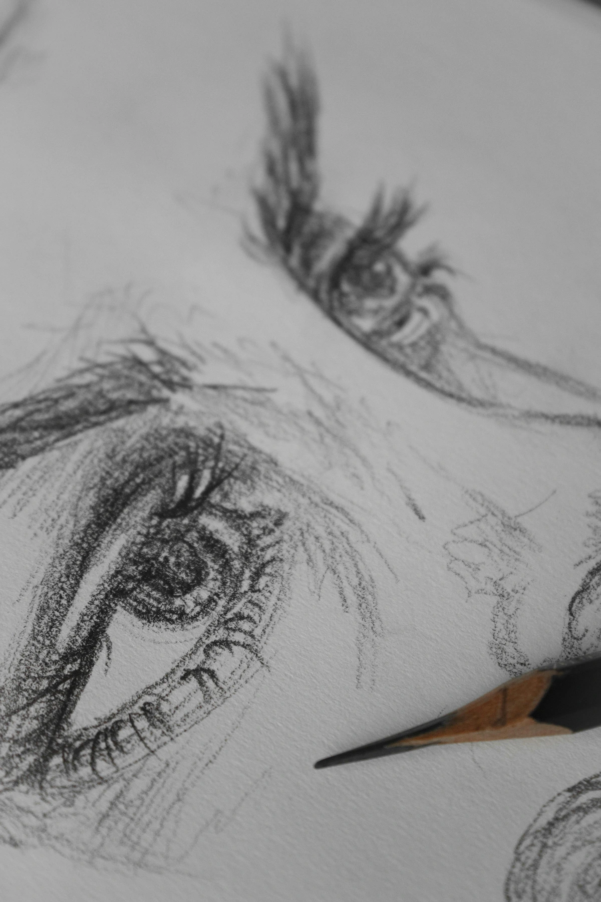
To truly internalize the difference between these grades, to feel the nuances in your hand, I always recommend a simple exercise: create a value scale. On a strip of paper, draw a series of squares or rectangles. In the first, use your 6B to create the darkest possible tone, pressing firmly and allowing its rich, velvety black to emerge. In the next, use the 4B, then 2B, then HB, applying consistent pressure to see the inherent middle-to-light values each pencil offers. Then, go back and try to create a smooth gradient within each pencil's range, from its lightest whisper to its darkest capability. You can also experiment with blending adjacent grades to see how seamlessly they transition, creating a continuous spectrum of tone. This hands-on exploration, this tactile discovery, reveals the true expressive power hidden within just a few pencils. It's a foundational exercise that builds both your understanding of your tools and your control over your hand. Don't underestimate its power; it's like learning the scales before composing a symphony, essential for true instrumental mastery.
For a truly perfect, no-fuss starter set, I wholeheartedly recommend acquiring just these four individual pencils. This quartet will empower you to create an astonishing range of effects, far more than you might imagine. I recall one day realizing just how much variation I could get from these few, and it felt like unlocking a secret language. For those aiming for hyper-realism, you might eventually branch out, but these four are your bedrock.
For more options and deeper dives into specialized pencils, you might want to explore the best drawing pencils for realistic art.
- HB: This is your essential, multi-purpose workhorse. It’s superb for those delicate initial sketches, mapping out your composition, and establishing those crucial mid-tones that define form – truly the backbone of your graphite palette.
- 2B: The logical next step in terms of darkness. Perfect for deepening your lines, adding that initial whisper of shadow, and beginning to sculpt your forms with greater authority.
- 4B: Now we're getting into the luscious, rich darks. This is a wonderfully soft pencil, ideal for building up richer, deeper values without needing to press too hard. It glides on the paper, inviting luxurious layering and smooth transitions.
- 6B: Your absolute go-to for the darkest darks, for those moments when you need to create dramatic contrast, powerful accents, and truly profound, inky shadows. It's the exclamation mark of your drawing, adding ultimate punch and presence.
With just these four, you can create a full range of values, from the lightest atmospheric haze to the deepest abyss. This small, yet mighty, selection is covered in more detail in my guide to the best sketching pencils for artists. Trust me, starting with these is far more effective and less intimidating than fumbling through a sprawling 24-piece set. And when it comes to brands, a good student-grade brand like Staedtler Mars Lumograph, Faber-Castell Goldfaber, or Derwent Academy will serve you beautifully. These brands offer excellent quality and consistency without the premium price tag of professional artist-grade pencils, which often focus on extreme lightfastness or ultra-fine pigment grinding—details that aren't critical when you're just honing your fundamental skills. Save your money for more paper! Professional brands like Caran d'Ache Grafwood or Tombow Mono 100 are exquisite, offering even smoother application and a wider range of nuanced grades, but their benefits are truly appreciated once you've developed a discerning hand and a specific need. Remember, it's the artist, not the tool, that creates magic, and these pencils are more than capable hands in your creative journey.
The Anatomy of a Pencil: More Than Just Wood and Lead
When I first started, I thought a pencil was just... a pencil. But there's a fascinating bit of engineering and material science in these humble tools. The core, of course, is the graphite and clay mixture, but the wood casing plays a role too. Quality pencils use smoothly milled cedar, which sharpens evenly and protects the delicate core. The bonding of the core to the wood is also critical; cheap pencils often have leads that break repeatedly because they're not properly glued, leading to endless frustration and wasted material. This is often the tell-tale sign of a truly poor quality pencil, where the core breaks internally every time you sharpen it. Understanding these subtle qualities helps you appreciate why a well-made pencil, even a student-grade one, is a joy to work with, while a poorly made one can actively hinder your progress. It's a testament to the idea that even the simplest tools benefit from thoughtful design. This unseen craftsmanship contributes significantly to your drawing experience.
Mastering Your Grip: Unlocking Versatility
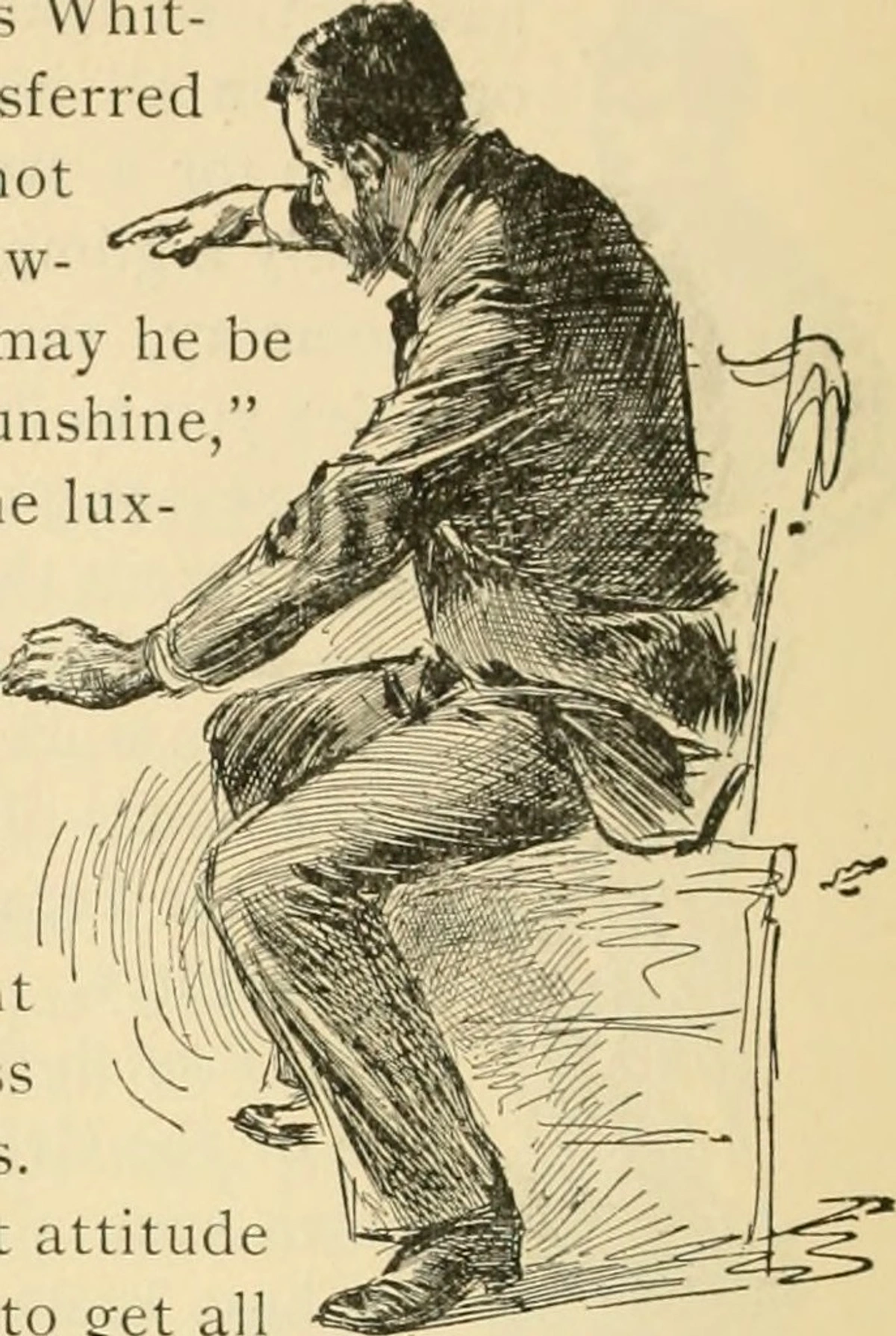
Beyond the pencil itself, how you hold it dramatically impacts your mark-making. Most beginners instinctively adopt a writing grip, which is great for precision and detail. But for broader strokes, softer shading, and a more expressive line, try shifting to an overhand grip (holding the pencil further back, almost like a conductor's baton) or an underhand grip (with your pinky or side of your hand resting on the paper, allowing for lighter pressure). Experimenting with these different grips will unlock a surprising range of possibilities, from light washes of tone to bold, confident lines. It's about letting your whole arm, not just your wrist, get involved in the drawing process, cultivating a more fluid and less constrained approach. This small adjustment can feel awkward at first, but it's a huge step towards expressive freedom. A subtle shift in grip can completely change the energy of your line, transforming a hesitant sketch into a dynamic gesture. A great exercise is to practice drawing continuous, overlapping circles with your arm, gradually transitioning from a writing grip to an overhand grip to feel the difference in control and range of motion.
The Power of Arm Movement
When I first started, I was a total wrist-drawer. Everything was tight, small, and a bit stiff. It wasn't until an instructor forced me to draw exclusively from my shoulder and elbow that my work truly opened up, becoming looser, more expressive, and more confident. The writing grip, while excellent for fine detail, can lead to cramped hands and rigid lines if not balanced with other approaches. By engaging your whole arm, you gain access to a greater range of motion, allowing for sweeping curves, bold gestures, and more dynamic mark-making. It's like the difference between whispering a secret and shouting a declaration; both have their place, but you need control over both. A fantastic exercise to unlock this is to stand at an easel or even a wall, tape up a large sheet of paper, and with your arm fully extended, practice drawing large, continuous ovals and figure eights from your shoulder. Feel the difference in freedom and energy compared to tiny wrist movements.

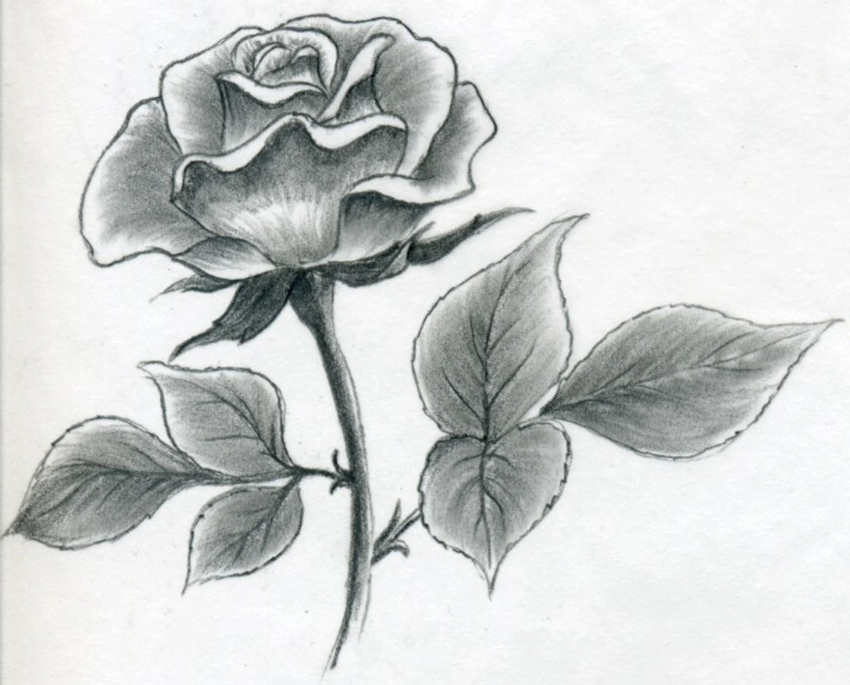
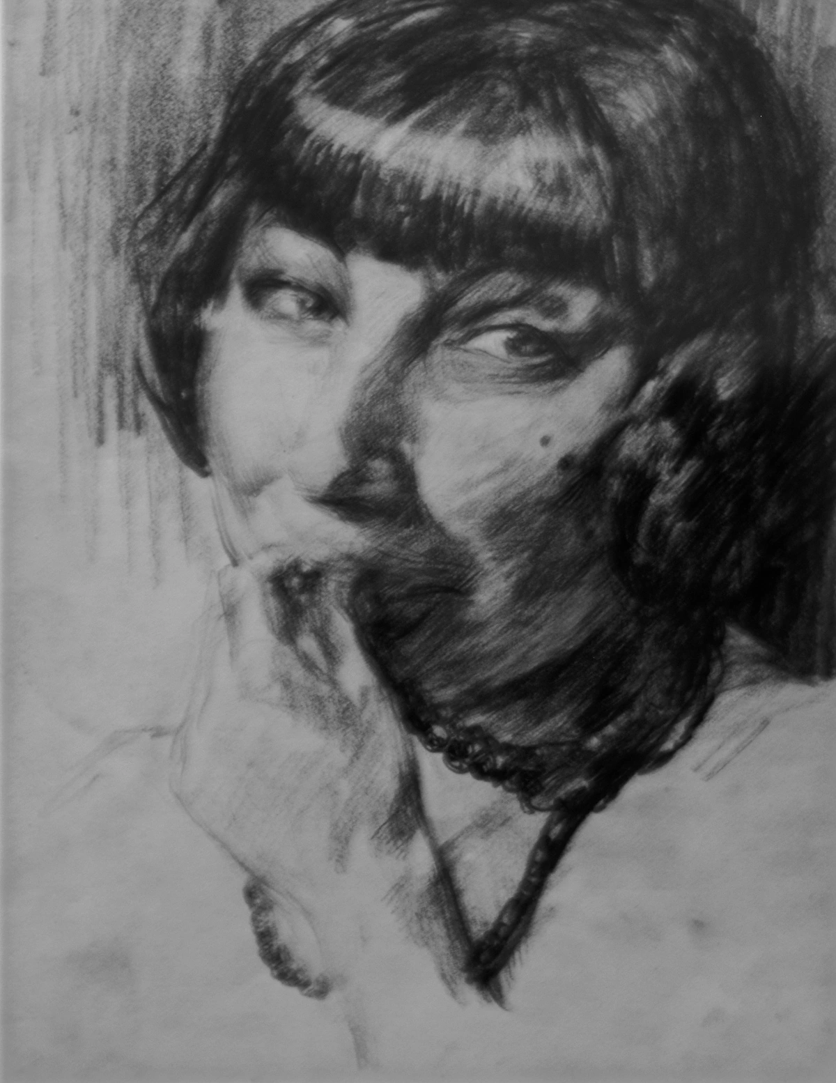
Blending Graphite: Softening Your Edges
Once you're comfortable with mark-making, the next frontier is blending. Blending allows you to create smooth transitions, soft shadows, and a painterly quality in your graphite drawings. While your finger is an instinctive tool, it can transfer oils from your skin to the paper, potentially leaving smudges or making areas resistant to further graphite application. My go-to tools are simple: tortillons (tightly rolled paper sticks) or blending stumps (similar, but firmer and with two pointed ends). Cotton swabs or even a soft tissue can also work for larger areas. A soft cloth, like a chamois, can also be exceptionally useful for broad, smooth blending. The key is to use a light touch and build up layers gradually. Blending isn't just about making things soft; it's about controlling edges and creating convincing form. A subtle blend can make a form appear to turn in space, while a crisp edge defines a sharp plane. Experiment with different pressures and tools; you'll be amazed at the subtlety you can achieve.
Advanced Blending Tools and Techniques
Beyond the basics, artists often explore other blending tools. A chamois cloth (a soft leather cloth) is wonderful for large, smooth areas of graphite, offering a very gentle and even blend. For tiny details, a brush can be used to subtly move graphite particles. Some artists even use specific makeup sponges for very soft, broad blending. The key to effective blending is knowing when to blend and when to leave a crisp edge. Not every area needs to be soft and diffused. Strategic blending emphasizes form, while unblended strokes can convey texture or energy. It's a dance between precision and softness. Mastering blending allows you to create atmosphere, volume, and depth.
Pencil Care: Extending the Life of Your Tools
Even the best pencils deserve a little care. Keep them in a simple pencil case to protect their tips from breaking (there's nothing more frustrating than a freshly sharpened pencil snapping mid-stroke). I personally love a roll-up canvas case; it keeps everything organized and protected. Avoid letting them roll off your desk, as internal graphite breakage can lead to constant sharpening woes. Also, keep them away from extreme temperatures or humidity, as this can affect the wood casing and even the graphite core. A little respect for your tools goes a long way in ensuring they serve your creativity faithfully. Proper care isn't just about preserving your tools; it's about respecting your artistic practice. And, on a slightly humorous but important note, resist the urge to ever lick your pencil tips! While it might seem like a quick fix for a darker line, it introduces moisture and saliva into the wood and graphite, which can eventually degrade both the material and your artwork.
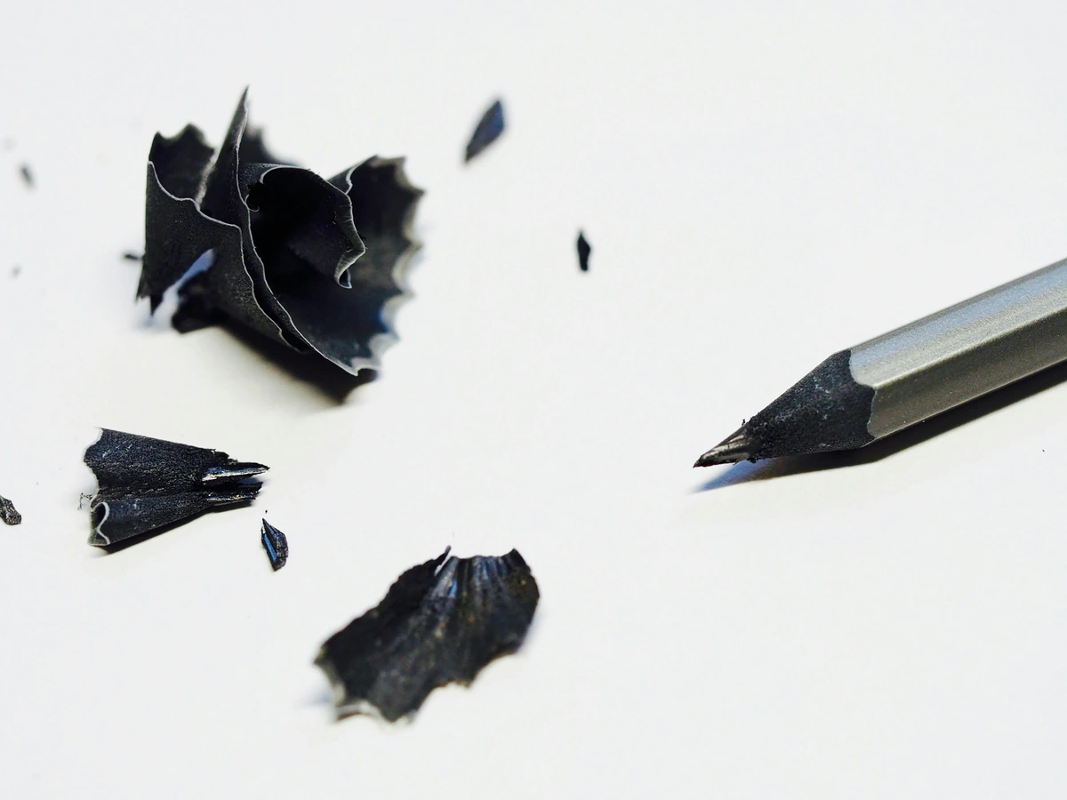
The Art of Sharpening: More Than Just a Point
Let's talk sharpeners, because this is often where aspiring artists (myself included, early on!) go wrong. A truly good sharpener doesn't just create a point; it preserves your pencil's core and extends its life, treating your precious graphite with respect. I've broken more leads than I care to admit with flimsy plastic contraptions that devour pencils like hungry beasts. A sturdy metal sharpener is non-negotiable. Look for one with a high-quality, replaceable blade, as a sharp blade makes all the difference. For maximum versatility, consider a two-hole sharpener (one for a standard point, one for a longer, more delicate point, especially useful for softer B pencils) or even a dedicated long-point sharpener that exposes more lead, allowing for broader strokes and greater versatility. This allows for both delicate details and broad strokes, giving your pencils incredible range.
For studio work, a desk-mounted helical sharpener (the kind with a crank) offers exceptional consistency and durability, producing perfect points every time without chewing up wood or breaking leads. Some artists even prefer using a craft knife or blade to hand-sharpen their pencils, allowing for a custom point tailored precisely to their needs – a technique that takes practice and caution but offers ultimate control over the length and shape of the lead. Whichever you choose, keep the blades clean; dull blades tear rather than cut, damaging your precious tools and frustrating your efforts. I like to use a small, stiff brush or even a toothpick to clear out any graphite dust and wood shavings that accumulate. A well-sharpened pencil isn't just a tool; it's an invitation to draw, a clean slate for your ideas to begin.
Storage Solutions: Protecting Your Investment
Beyond just a simple case, consider how you store your pencils. A roll-up canvas wrap is fantastic for portability and keeps each pencil separate, preventing them from clanking together and causing internal damage, which is often the silent killer of good pencils. For studio storage, a desk organizer or a simple box with compartments prevents pencils from rolling around and breaking. The goal is to minimize impact and prevent the internal graphite core from fracturing, which can lead to frustrating breaks every time you sharpen. Trust me, the small effort of proper storage saves you a lot of grief (and money on broken pencils) in the long run. Plus, a well-organized workspace just feels better, doesn't it? It’s a subtle act of self-care for your artistic practice, creating an environment that invites creativity. Some artists even use drafting tape or drafting dots to secure their paper to their drawing surface, preventing it from shifting, which is another small but significant improvement to workflow and focus.
Pencil Extenders and Point Protectors: Maximize Every Mark
Ever wish your favorite pencil didn't have to be thrown away when it gets too short to hold comfortably? Enter the pencil extender. This ingenious device is a handle with a ferrule that grips your short pencil stub, making it usable again until the very last inch. It's an eco-friendly and economical way to get the most out of your cherished tools, especially those professional-grade beauties. And to prevent those frustrating broken tips in your pencil case, point protectors (small plastic or metal caps) are a simple, inexpensive solution. They slip over the sharpened tip, guarding against accidental impact and ensuring your pencil is always ready for action. These small additions can dramatically extend the life and usability of your drawing instruments.
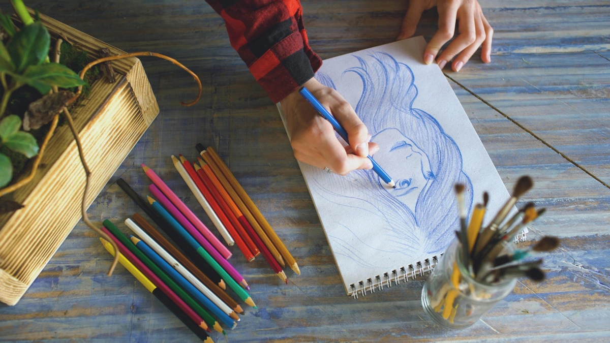
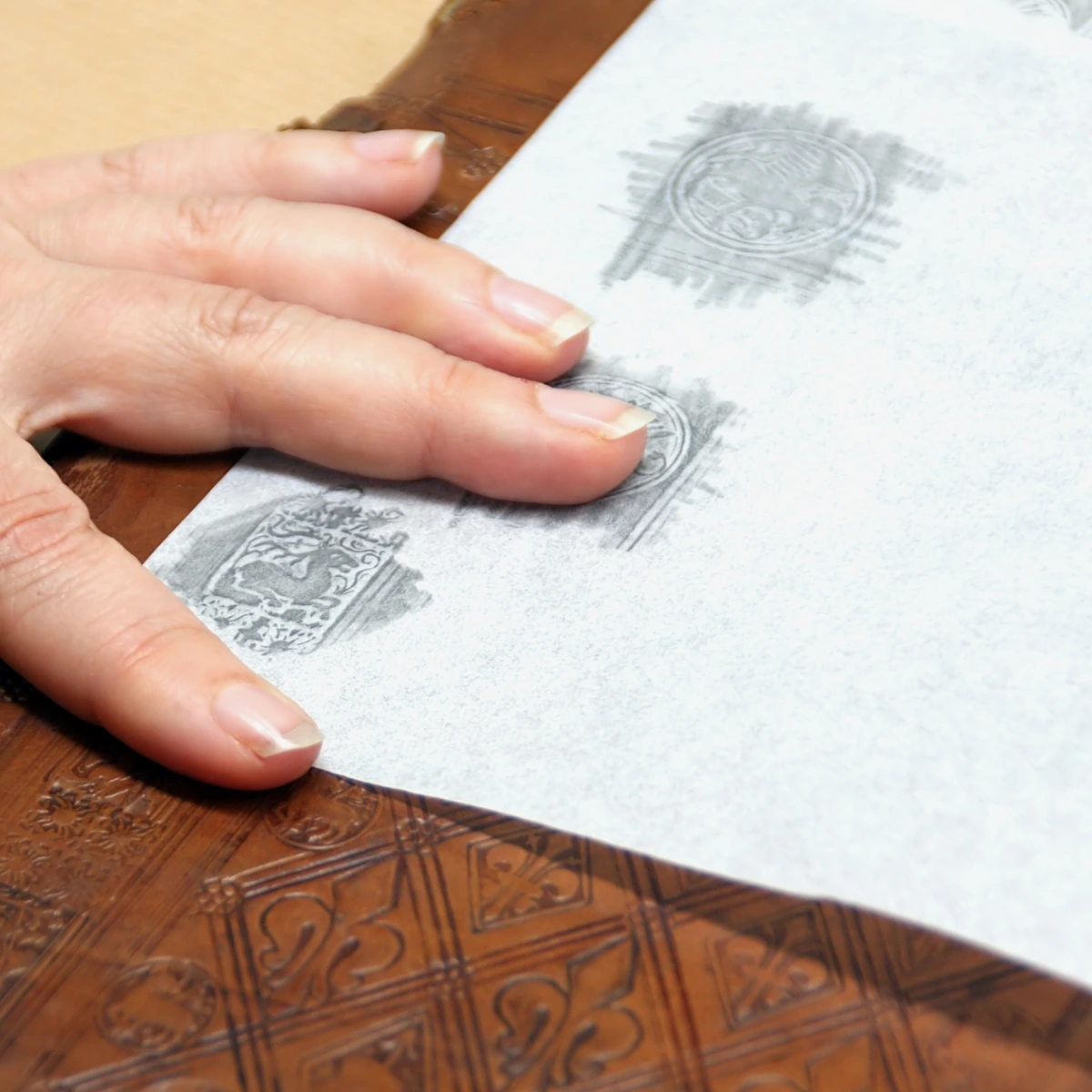
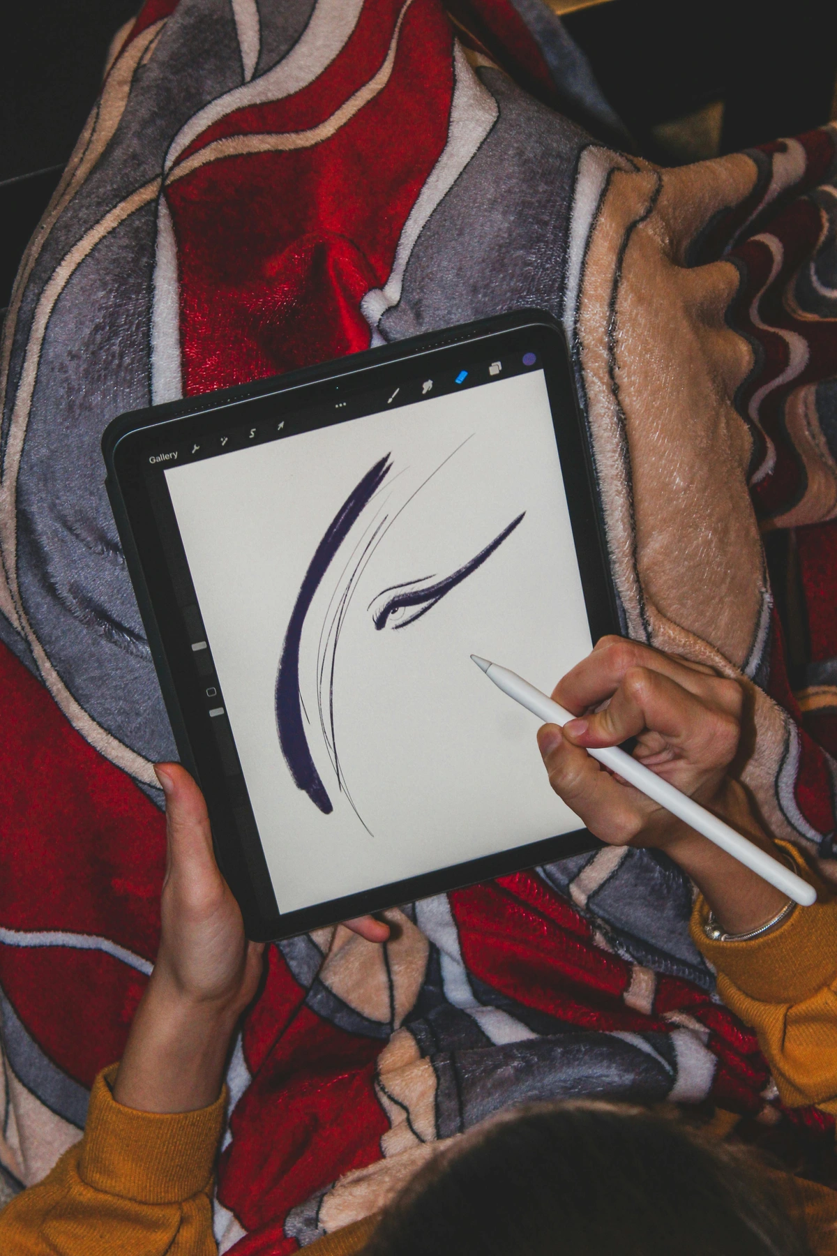
2. Paper: Your Playground
Paper is not just... well, paper. It’s a canvas for your thoughts, a receptive surface that profoundly influences every mark you make. The texture, the weight, the way it interacts with your graphite – it all dramatically shapes the final outcome. For a budding artist, the most practical, forgiving, and frankly, encouraging choice is almost always a sketchbook. It’s more than just bound sheets; it's a living archive. It keeps all your exploratory scribbles, hesitant lines, and triumphant breakthroughs in one tangible place, creating a visible narrative of your progress over time—a deeply personal story you can literally flip through. My own artistic timeline is richly punctuated with pages from sketchbooks of my early days, and seeing that journey unfold is incredibly motivating. Never underestimate the power of a physical record of your artistic journey. It’s where your creative history is written.
The Unsung Hero: Why Paper Matters More Than You Think
I've seen artists agonize over their pencils, spending hours researching the perfect lead, only to grab the cheapest printer paper available. This is a missed opportunity, a fundamental oversight! The paper is half the equation, arguably more. It's the stage upon which your performance unfolds, the foundation for every mark. A poor-quality paper can make even expensive pencils feel cheap, providing no 'grab' for the pigment, while a good paper can elevate even the simplest marks, making them sing. Understanding the nuances of paper means understanding how it interacts with your tools, how it influences blending, layering, and even the longevity of your artwork. It's a relationship, a dialogue between the graphite and the fibers, and investing a little thought (and a bit more budget) into your paper choice will pay dividends in your artistic satisfaction and overall creative experience. It's truly a collaborative partner in your creative process. The fibers of the paper literally grab the graphite, and a paper with a consistent, desirable 'tooth' makes a profound difference in the richness and depth you can achieve, allowing for subtle tonal shifts and deep, dark values.
Choosing the right paper can feel like an art in itself, but it doesn't have to be daunting. The right paper complements your tools and your technique, making the drawing process more enjoyable and the results more satisfying. It's about finding that symbiotic relationship between surface and medium. Let's demystify it a bit.

What to look for:
- Size: Something around A5 (5.8 x 8.3 inches) or A4 (8.3 x 11.7 inches) is perfect. It's portable but not so small that you feel cramped. These sizes strike a beautiful balance, offering enough space to develop your ideas without feeling overwhelming or too cumbersome to carry around. I personally find smaller sizes liberating for quick studies and capturing fleeting moments, while larger sheets encourage grander gestures and a looser approach.
- Weight: This is surprisingly crucial. Paper weight is measured in pounds (lb) in the US or grams per square meter (gsm) internationally. Aim for paper that is at least 70 lb (100 gsm), but honestly, I prefer something closer to 90-100 lb (150-160 gsm) if your budget allows. Thinner paper will buckle, tear easily under pressure, and simply won't stand up to the joyous aggression of erasing or layering, especially as you develop your confidence. Heavier paper feels more substantial, holds up better to repeated reworking, and gives your drawings a more professional, finished feel.
- Tooth: Ah, the "tooth" of the paper – it’s a delightful tactile quality, literally the microscopic texture of the paper's surface. You absolutely want a medium tooth. Why? Because paper that's too smooth (like standard printer paper or hot press watercolor paper) won't 'grab' the graphite effectively, leaving you with faint, slippery lines and making blending a challenge. Think of it like trying to draw on glass – not much fun. Conversely, paper that's too rough will eat your pencils alive and make fine detail work a frustration, leaving a very grainy, broken line. A medium tooth strikes that perfect balance, allowing the graphite to adhere beautifully and enabling stunning layering and tonal transitions. For subtle effects, a finer tooth can be exquisite, while for expressive, textural work, a slightly coarser tooth can be invigorating, revealing the grit and texture of your marks. This interplay between pencil and tooth is where the magic truly happens.
Understanding Paper Grain and Direction
Beyond just weight and tooth, paper also has a grain direction. This refers to the way the cellulose fibers of the paper are aligned during manufacturing. While it might seem like a minor detail to a beginner, it can significantly affect how the paper behaves, especially when tearing, folding, or working with wet media (though less so with graphite). Paper folds more cleanly with the grain and is more resistant to buckling when stretched or pulled in that direction. For drawing, understanding grain becomes more important if you're working on very large sheets, or if you plan to incorporate subtle folding or creasing into your mixed media work. It's a subtle nod to the craftsmanship behind your chosen surface, a hidden characteristic that can either aid or hinder your process. Consider it a secret handshake between you and the paper makers, a detail that hints at the paper's very structure.
The Role of Toned Paper for Value Studies
Before you dive into a white page, consider the liberating potential of toned paper. These sketchbooks come in various shades of grey, tan, or even light blue. The beauty of toned paper is that it provides an instant mid-tone. Instead of working from white (no value) to dark, you start from a middle value. This means you can add both highlights (with a white pencil or pastel) and shadows (with your graphite or charcoal). It's a fantastic way to learn about value and light because you're actively building both light and dark from a neutral base, rather than just adding darkness to a void. It can feel like a revelation, opening up new ways to think about form and contrast. I highly recommend experimenting with a toned paper sketchbook once you're comfortable with the basics on white. Toned paper is particularly excellent for dramatic chiaroscuro studies or for subjects where you want a moody, atmospheric feel, such as nighttime scenes or portraits with strong directional lighting.
Beyond just 'tooth,' you might encounter terms like hot press, cold press, and rough paper. Hot press paper is very smooth, ideal for fine detail and ink work, but challenging for beginners with graphite. Cold press is the most common and versatile, offering that lovely medium tooth perfect for drawing and light washes. Rough paper, as the name suggests, has a very pronounced texture, great for creating bold, textural effects but less suited for intricate detail. For our purposes, cold press is your best friend. It’s like having a head start in understanding light.
Working with Different Paper Textures
Once you get a feel for how graphite interacts with a medium tooth, don't be afraid to experiment. A smoother paper (like hot press or Bristol board) is excellent for rendering fine details, precise linework, and creating a sleek finish. Rougher papers, on the other hand, are fantastic for building up rich textures, creating dramatic value shifts, and encouraging a looser, more expressive style. They'll grab more pigment from your softer B pencils, leading to deeper, more pronounced shadows. Understanding this interplay between pencil and paper is key to unlocking new expressive possibilities. It's a continuous dance between your tool, your hand, and the surface you're working on. Each paper surface has its own personality, and learning to work with it is part of the fun. Different textures will literally invite different kinds of marks from you, pushing your experimentation.
Archival Quality and Longevity
Also, consider archival quality. While not essential for every quick practice sketch (my early sketchbooks are full of yellowed scribbles, and that's perfectly okay!), if you create something you truly love and want to preserve, ensure your paper is acid-free. Acid-free paper prevents yellowing, brittleness, and degradation over time, ensuring your artwork lasts for decades, preserving your creative efforts. Some papers are also described as pH neutral, which offers similar protection against deterioration, often specifically indicating the absence of lignin, a plant compound that naturally breaks down and yellows paper over time. It's a small detail that makes a huge difference if you intend for your work to be passed down, displayed for years, or even sold. Think of it as investing in the future of your artistic legacy, ensuring your marks endure through time.
The Role of Gesso in Extending Longevity
While we're discussing longevity, it's worth briefly mentioning gesso. Though more commonly associated with painting surfaces like canvas, gesso (a primer) can also be applied to drawing papers, especially heavier ones, to create a more stable, archival surface. It prepares the surface, offers a consistent tooth, and acts as a barrier, protecting the paper from the acids in some art materials and from environmental degradation. For more on this foundational substance, explore what is gesso in painting, how to apply gesso to canvas, or delve into gesso vs. primer: what's the difference. While often associated with painting, a thin layer of gesso can truly transform a drawing surface. You can even learn how to make your own canvas for painting for a truly customized experience. For the truly adventurous, learning how to make your own gesso: a diy guide for artists can add another layer of connection to your materials.
Exploring Different Sketchbook Sizes
While A4 and A5 are fantastic starting points, don't be afraid to branch out once you're comfortable. A pocket-sized A6 sketchbook can be incredibly liberating for quick sketches on the go, perfect for capturing fleeting moments of inspiration – I always have one in my bag. I find a small sketchbook is perfect for capturing the essence of a scene quickly, forcing me to prioritize what truly matters. Conversely, a larger A3 or even A2 pad can encourage grander gestures, allowing you to loosen up and draw from your shoulder rather than just your wrist. Each size offers a slightly different drawing experience and encourages different habits, so explore as your confidence grows! I’ve found that working large can sometimes break down mental blocks, forcing you out of the habit of fiddly detail and into a more fluid, energetic approach. And for those looking to improve their work, sometimes a simple change in scale is all it takes to see things with fresh eyes. It's like changing your perspective on a problem; sometimes a different canvas provides a new solution.
Types of Sketchbooks for Beginners
While any sketchbook is better than no sketchbook, here are a few types to consider:
- Mixed Media Sketchbooks: Often a great choice as they can handle a variety of dry media (pencils, charcoal) and even light washes of wet media (ink, watercolor) without too much buckling. Look for slightly heavier paper, around 90-120 lb (150-200 gsm). These are incredibly versatile if you're keen to dabble in a bit of everything without committing to specialized paper for each medium.
- Drawing Sketchbooks: Specifically designed for dry media, these will often have that ideal medium tooth we talked about. They're optimized for graphite, charcoal, and pastels, allowing for excellent layering and blending.
- Watercolor Sketchbooks: If you're planning to move into washes and ink sooner rather than later, a dedicated watercolor sketchbook (usually 140lb/300gsm or heavier, often cold press) can be a game-changer, preventing buckling and allowing for smooth washes. For more, explore our guide to the best watercolor paper for artists review.
- Toned Paper Sketchbooks: These sketchbooks come with paper in shades of grey or tan. They're fantastic for learning to work with mid-tones, as you can add both highlights (with white pencil or pastel) and shadows (with graphite or charcoal). It's a slightly more advanced approach but yields stunning results.
- Eco-Friendly Options: Many brands now offer sketchbooks with recycled paper. It’s a great way to be kind to the planet while unleashing your creativity, and often these papers have a lovely, unique texture of their own. For further exploration of sustainable art practices, consider best eco-friendly art supplies for conscious artists.
- Hardcover vs. Softcover: Hardcover sketchbooks offer better protection for your artwork and a sturdy surface for drawing without a desk, which is fantastic for urban sketching or drawing on the couch. The rigid cover also protects your precious pages from creasing or damage in a bag. Softcover ones are lighter and more flexible, often preferred for portability and for laying perfectly flat, which can be a huge advantage for scanning or photographing your work. The choice really depends on your primary use case and personal preference. I lean towards hardcover for studio work and softcover for sketching on the go. You can even learn how to make your own sketchbook for a truly personalized and deeply satisfying experience.
Sketchbook Bindings: How Your Pages Stay Together
The binding of your sketchbook might seem like a minor detail, but it can significantly impact your drawing experience:
- Spiral-Bound: These are incredibly popular for a reason! They lie perfectly flat, allowing you to work across two pages seamlessly and preventing the book from closing on you. The pages can also be easily torn out if you wish. The downside is that the spiral can get bent or snagged.
- Perfect-Bound (Glue-Bound): Pages are glued together at the spine, giving a sleek, book-like appearance. They tend to be less durable if you frequently open them flat, as the spine can crack. Often favored for presentation or if you prefer a more traditional book feel.
- Stitched/Smyth-Sewn: Found in higher-quality sketchbooks, these offer exceptional durability and allow the book to lie relatively flat. The pages are physically sewn together in signatures, making for a very robust binding that can withstand heavy use. They often have a more artisanal feel.
Each binding type has its pros and cons, and understanding them helps you choose a sketchbook that truly suits your working style and how you intend to use your creative archive.
3. Erasers & a Sharpener: The Support Crew
An eraser, to truly grasp its magic, isn't merely a tool for rectifying perceived errors or a testament to your imperfections. No, think of it as an active drawing implement, a sculptor of light, a tool for creation just as much as for correction. You can wield it to subtly lift highlights, carve out intricate textures, and even shape negative space, revealing the brilliance beneath the graphite. It’s about adding light and refining form, not just subtracting unwanted marks. Just as much as you learn to apply graphite, learning to remove it with intention, with precision and purpose, can transform your drawings from flat to dynamic, from static to vibrant. It's a dialogue between positive and negative space, a constant push and pull that gives your work life. Consider it your secret weapon for making perceived mistakes disappear, and then reappear as intentional artistic choices, elevating your work to new levels of subtlety.
The Eraser's Arsenal:
- Kneaded Eraser: This, my friends, is the undisputed Most Valuable Player of the eraser world. It’s a marvelously soft, pliable, almost clay-like eraser that you can literally sculpt with your fingers. Need to lift a tiny highlight in an eye? Pinch it to a fine point. Want to soften a large area of shadow? Flatten it out. You can even roll it across a charcoal drawing to pick up excess pigment without disturbing the paper. Its brilliance lies in its ability to absorb graphite rather than abrasively rubbing it away, meaning it leaves behind absolutely no dusty residue to mar your pristine paper. It's gentle, effective, and endlessly versatile, truly an active drawing implement for shaping light and texture. I often use it not to erase, but to pull light back into a drawing, creating subtle glows and refining edges – it’s a sculptor’s tool for light. A handy trick: when your kneaded eraser gets saturated with graphite, simply knead it like dough until a clean surface emerges. It's endlessly reusable!
- Vinyl/Plastic Eraser: This is your heavy-hitter, your line obliterator, reserved for those moments when you need to completely, utterly vanquish a stubborn mark. It’s more abrasive than its kneaded cousin, so employ it with a light touch to avoid damaging your paper's tooth. But when used judiciously, it is remarkably effective at achieving a clean slate. Brands like Staedtler Mars Plastic are renowned for their clean erasing power. Remember, always use a very light touch and check the paper's surface for any damage; you don't want to create irreparable divots! It’s for when you mean business.
- Gum Eraser: The unsung hero for delicate surfaces. Made from a soft, crumbly rubber, gum erasers are less abrasive than vinyl ones. They crumble as they work, lifting graphite without much friction, making them ideal for softer papers or for gently lightening large areas without damaging the paper's surface. They do leave a lot of crumbs, but that's a small price to pay for gentle erasing. Think of it as a delicate brush for removing pigment.
- Eraser Pen/Stick Eraser: These are invaluable for precision erasing, like a surgical tool for your artwork. They're essentially thin, retractable eraser sticks, often with a plastic or metal casing, that can be sharpened to an incredibly fine point. Perfect for lifting tiny details, cleaning up razor-sharp edges, or adding crisp, luminous highlights in tight areas that a traditional kneaded or vinyl eraser might smudge. I find them indispensable for rendering fine hair, delicate textures, or precise reflections in an eye. They are your scalpel for light.
Electric Erasers and Sandpaper Blocks: Advanced Erasing Power
For those seeking even more control and efficiency, consider these specialized tools:
- Electric Eraser: This battery-operated device spins a small eraser core at high speed, making quick and precise work of stubborn marks or for creating fine highlights. It's excellent for technical drawing or for artists who need to erase small areas with minimal effort. Just be mindful of its power, as it can abrade paper if used too aggressively.
- Sandpaper Block: A simple tool designed for sharpening kneaded and vinyl erasers to a fine point. Instead of cutting away at your eraser, you gently rub it against the fine-grit sandpaper, creating a clean, sharp edge for precise erasing. It’s a great way to maintain the functionality of your erasers.
The Indispensable Sharpener:
And please, I implore you, invest in a truly good metal pencil sharpener. This might seem like a small detail, but it’s monumental. A flimsy, cheap plastic sharpener will, without fail, chew up your precious pencils, brutally snapping graphite cores and leaving you with frustrating, uneven points. I've been there, watching a perfectly good 6B disappear into a plastic abyss. A simple, sturdy metal sharpener (the kind with a replaceable blade is even better) will, by contrast, bless you with a consistently clean, satisfyingly sharp point every single time, preserving your pencils and your sanity. For an even finer point, consider a two-step sharpener that first removes the wood, then sharpens the graphite core. I personally swear by the classic German-made sharpeners; they’re incredibly precise, providing consistent, clean points. A dull pencil is a barrier; a sharp one is an invitation. It’s the ritual before the creation.
Comparing Eraser Types
To help you choose, here's a quick comparison of the most common eraser types:
Eraser Type | Primary Use | Characteristics | Best For |
|---|---|---|---|
| Kneaded | Lifting, highlighting, blending | Soft, pliable, absorbs graphite, no residue, reusable | Subtle lightening, charcoal, smudges, shaping light, blending |
| Vinyl/Plastic | Complete removal, crisp edges | Firm, abrasive, clean erasure, leaves residue, can damage paper if used too aggressively | Stubborn marks, clean edges, crisp lines, heavy correction |
| Gum | Gentle lightening, diffuse removal | Soft, crumbly, low abrasion, leaves crumbs, ideal for delicate surfaces | Delicate papers, large areas, soft graphite, minimal paper disruption |
| Eraser Pen | Precision erasing, fine details | Sharp point, controlled removal, minimal residue, retractable | Highlights, fine lines, tight areas, intricate textures |
| Electric Eraser | Quick, precise removal, fine highlights | Battery-operated, high-speed, can be abrasive, rechargeable | Technical drawing, small details, consistent erasing power |

Types of Sharpeners: Finding Your Perfect Point
- Manual Metal Sharpeners: These are the classics, often pocket-sized, with a single or double blade. They're reliable and portable, just ensure the blades are sharp and replaced regularly.
- Long Point Sharpeners: Designed specifically for art pencils, these remove more wood to expose a longer lead point, ideal for broad strokes and detailed work alike. They offer greater control over your marks.
- Crank Sharpeners (Helical): These are desk-mounted and incredibly efficient, producing consistently sharp points with minimal effort. They're perfect for studio use where you're sharpening frequently.
- Electric Sharpeners: Fast and convenient, but choose wisely. Cheaper models can overheat and damage pencils. Look for models with helical cutters and automatic stop features to prevent over-sharpening. While they can be a time-saver, I find the tactile feedback of a good manual sharpener more satisfying for art pencils.
- Craft Knives/Blades: For the purist (or masochist, depending on your patience!), a sharp craft knife allows you to hand-carve the perfect custom point. This offers ultimate control but requires practice and caution. It's particularly useful for creating a long, tapered point on softer pencils, allowing for incredible versatility from a single tool.
Another small but mighty tool for precision erasing is an eraser shield. This thin metal stencil has various shapes and openings, allowing you to isolate tiny areas for erasing without disturbing the surrounding marks. It's fantastic for creating crisp highlights or cleaning up edges. Think of it as a tiny, metallic guardian for your delicate lines.
Dust Brushes: Your Clean Canvas Ally
It might seem trivial, but a small, soft dust brush (often a drafting brush) is an indispensable tool. After erasing, you'll inevitably have eraser crumbs and graphite dust on your paper. Never wipe it away with your hand, as this can smudge your drawing and transfer oils. Instead, gently brush it away with a dedicated dust brush. It's a small habit that makes a huge difference in keeping your work clean and pristine. Trust me, learning to love your dust brush will save you from countless frustrating smudges and preserve the clarity of your delicate graphite work.
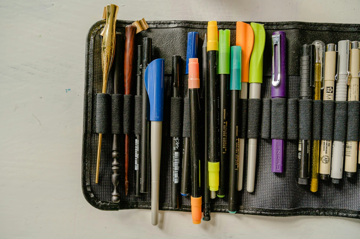
The Curated Starter Kit: Your Shopping List
Here it is. Simple, effective, and everything you need to begin. This isn't just a list; it's a carefully selected toolkit, a strategic arsenal designed to remove friction and invite boundless creativity. Think of this as your initial investment in yourself, a thoughtfully chosen collection that eliminates decision fatigue and lets you dive straight into the joy of making. Each item has been picked to offer maximum versatility and learning potential, ensuring every dollar spent is a powerful step towards sustainable artistic growth.

- Pencils (buy individually): HB, 2B, 4B, 6B – this specific quartet gives you maximum range for minimal investment, covering the full spectrum of values from delicate to dramatic. For more options and deeper dives, explore the best drawing pencils for beginners and best sketching pencils for artists.
- Sketchbook: A5 or A4 size, spiral-bound, at least 70 lb (100 gsm) paper with a medium tooth. I strongly recommend spiral-bound for ease of use and its ability to lie perfectly flat, which is invaluable. Consider also a mixed media sketchbook for future versatility if you envision dabbling in other dry media or light washes. For further guidance on maintaining your creative flow, dive into sketchbook practices for artists: idea to habit.
- Erasers: One kneaded eraser (your soft sculptor of light, for lifting and shaping) and one vinyl eraser (your heavy-hitter for complete, crisp removal). A good quality eraser will save you a lot of grief and prevent damage to your precious paper.
- Sharpener: A small, sturdy, single-blade metal sharpener. (Because a good point makes all the difference in your mark-making, and cheap plastic sharpeners are truly the enemy of good pencils and your artistic sanity!)
- Dust Brush (Optional but Recommended): A small, soft brush to gently sweep away eraser crumbs and graphite dust without smudging your work.
That’s truly it. No hidden fees, no secret compartments of must-have gadgets. This entire, thoughtfully assembled kit, these foundational instruments, will genuinely cost you less than a single fancy dinner out. Yet, in return, it promises to unlock not just hundreds, but potentially thousands of hours of unfettered creative potential. It’s a remarkable return on a modest investment, a tangible commitment to your artistic journey. You can readily observe how these very simple tools, wielded with intention, form the bedrock for much more complex and expressive works when you take a moment to browse art for sale. This kit is your invitation to begin; don't overthink it, just start making marks. Don’t just admire the art; create it.
Beyond the Core: When to Expand Your Toolkit
Once you’ve truly mastered the foundational kit – once those HB, 2B, 4B, and 6B pencils feel like extensions of your hand, and you intuitively understand your paper and erasers – then, and only then, does it make sense to explore new frontiers. Think of it like learning to drive. You don’t start with a race car; you master the basics in a standard vehicle first. Adding new mediums prematurely can introduce unnecessary complexity, leading to frustration rather than growth, and can even hinder the development of your core drawing skills. Patience, here, is a profound virtue that pays dividends in artistic skill and deep understanding. It's about building a strong artistic vocabulary before attempting to write a novel, ensuring your foundation is robust enough to support more complex narratives.
Light Source and Shadows: Understanding the Fundamentals
Before diving into new mediums, let's touch upon two foundational concepts that transcend any tool: light source and shadows. Understanding where light originates and how it interacts with objects is paramount to creating believable form and depth. A consistent light source creates predictable patterns of light and shadow, which are essential for making objects appear three-dimensional on your two-dimensional page. Observe how light casts distinct shadows (form shadows and cast shadows), and how it creates highlights and mid-tones. Training your eye to see these patterns will dramatically improve your ability to render any subject, in any medium. It’s the visual grammar that allows you to sculpt with light, and it’s a lesson that will serve you whether you're using graphite, charcoal, or oil paint.
My personal journey taught me that rushing into new tools before you understand the basics is a surefire way to feel inadequate. Instead, build confidence with graphite. Learn the language of light and shadow, form and texture. Once that foundation is solid, each new medium becomes an exciting extension of your existing skills, not a completely alien challenge. It's about a measured, joyful expansion, not a frantic acquisition.

The Gateway to New Horizons
I view the basic drawing kit as your launchpad. It provides the core skills that are transferable to almost any other visual art medium. Whether you dream of painting vibrant landscapes or sculpting intricate forms, the ability to observe, translate three dimensions into two, and control your marks originates here. So, don't feel pressure to immediately jump into a dozen new supplies. Instead, enjoy the process of becoming truly fluent in the language of graphite. You'll know when it's time to explore; a new curiosity will spark, a technique will call to you, or you'll simply crave a different kind of mark. That's when you know you're ready to thoughtfully expand your arsenal.
Charcoal: Embracing the Bold and Expressive
If graphite is the subtle whisper, charcoal is the resonant shout. This medium offers unparalleled depth and dramatic contrast, making it a favorite for expressive portraits, figure drawing, and bold landscapes. There are several forms: vine charcoal for light, easily blendable marks; compressed charcoal for rich, dark tones; and charcoal pencils for greater control and less mess. Remember, charcoal is inherently dusty, so a good fixative and dedicated workspace are key. It demands a different approach to layering and blending than graphite, but the rewards are immense. For charcoal, you'll often want a paper with more tooth, like a textured drawing paper, to really grab and hold the pigment. You can blend charcoal with your fingers, a chamois cloth, a blending stump, or even a soft brush to achieve smooth transitions. For a deeper dive into this fascinating medium, explore my guide on understanding and using charcoal for drawing and the essential charcoal drawing supplies for beginners. I found charcoal to be incredibly liberating after years of graphite; the sheer intensity of the darks felt like a new emotional language on the page.
Types of Charcoal and Their Uses
Charcoal Type | Characteristics | Best For |
|---|---|---|
| Vine Charcoal | Very soft, smudges easily, light marks, easily erasable | Light sketches, tonal studies, initial lay-ins, delicate touches |
| Willow Charcoal | Slightly denser than vine, darker lines, blendable/erasable | Bridge between vine and compressed, more substance without losing flexibility |
| Compressed Charcoal | Pigment with binder, intense darks, harder to erase, various hardnesses | Expressive mark-making, deep shadows, dramatic contrast, bold statements |
| Charcoal Pencils | Compressed charcoal in wood, precision, cleaner | Detail work, crisp lines, refining edges, fine hair details |
| White Charcoal | Adds highlights, works on toned paper, builds light | Highlights, toned paper, preparatory sketches on dark surfaces, reverse drawing |
- Vine Charcoal: Made from carbonized grapevines or willow twigs, it's very soft, smudges easily, and is great for light sketches, tonal studies, and easily erased marks. It's less dense and creates a lighter black, perfect for initial lay-ins or capturing gestural poses quickly. It offers a very delicate, ethereal touch.
- Willow Charcoal: Similar to vine, but often a bit denser, offering slightly darker lines while still being easily blendable and erasable. It's a fantastic bridge between the lightness of vine and the intensity of compressed charcoal, providing a bit more substance without losing flexibility.
- Compressed Charcoal: Pigment mixed with a binder and pressed into sticks. It comes in various hardnesses (soft, medium, hard) and produces rich, intensely dark blacks that are harder to erase but offer unparalleled value. It's fantastic for expressive mark-making and deep shadows, truly the heavy hitter for dramatic contrast and bold statements. This is your go-to for making a strong, impactful statement.
- Charcoal Pencils: Compressed charcoal encased in wood, offering precision and cleanliness similar to graphite pencils. They're excellent for detail work and adding crisp lines within charcoal drawings, giving you control without the usual mess of loose charcoal. They’re invaluable for refining edges or adding fine hair details that require a sharp point.
- White Charcoal: Yes, white charcoal exists! It's a fantastic tool for adding highlights and working on toned paper, allowing you to build up light rather than just erase to white. It can also be used for preparatory sketches on dark surfaces, reversing your thought process and building from dark to light, which can be a wonderfully liberating experience. It acts almost like a reverse drawing tool, pulling light forward, making it a versatile addition to your charcoal kit.
Working with Charcoal: Tips and Techniques
Charcoal demands a different mindset than graphite. Embrace the mess! Work from general to specific, building up your values. Blending can be done with fingers (though this transfers oils), blending stumps, chamois cloths (soft leather), or even soft brushes for subtle transitions. To protect your finished work, a fixative spray is crucial to prevent smudging. Always use it in a well-ventilated area, holding the can at the recommended distance and applying multiple light coats to avoid creating an uneven, glossy finish. I've learned the hard way that one heavy coat can ruin a subtle drawing! And remember, charcoal is incredibly versatile – try it on different textured papers to see how the tooth grabs the pigment and creates unique effects, from gritty landscapes to velvety portraits. For specific paper recommendations, check out my guide to the best paper for charcoal drawing.
Essential Charcoal Accessories
Beyond the charcoal itself, a few accessories will greatly enhance your experience. A kneaded eraser (yes, again!) is even more vital for charcoal, as it can gently lift pigment without smudging. A good chamois cloth is superior to fingers for blending large areas evenly. And a reliable fixative spray is non-negotiable for preserving your finished work. Trust me, you don't want to spend hours on a charcoal drawing only for it to smudge into oblivion because you skipped the fixative. It's like putting the finishing touches on a sculpture and then forgetting to bake it.

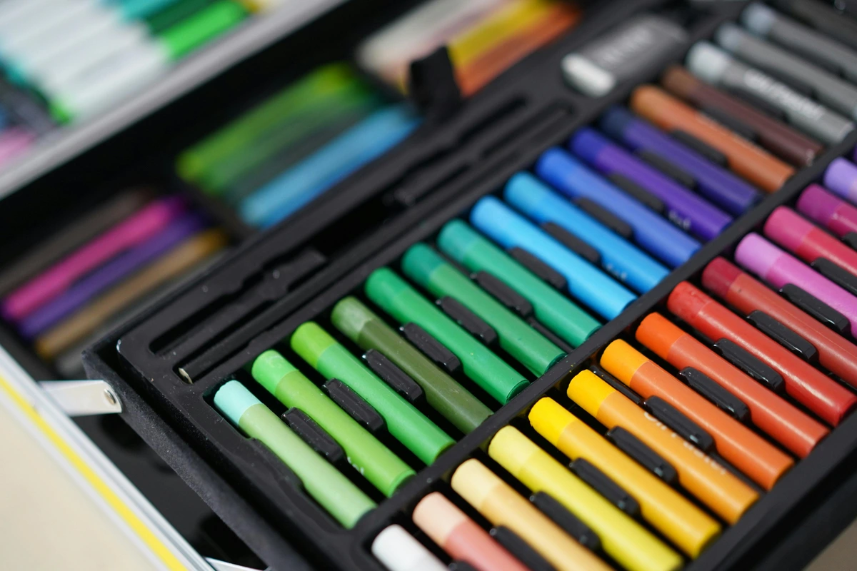
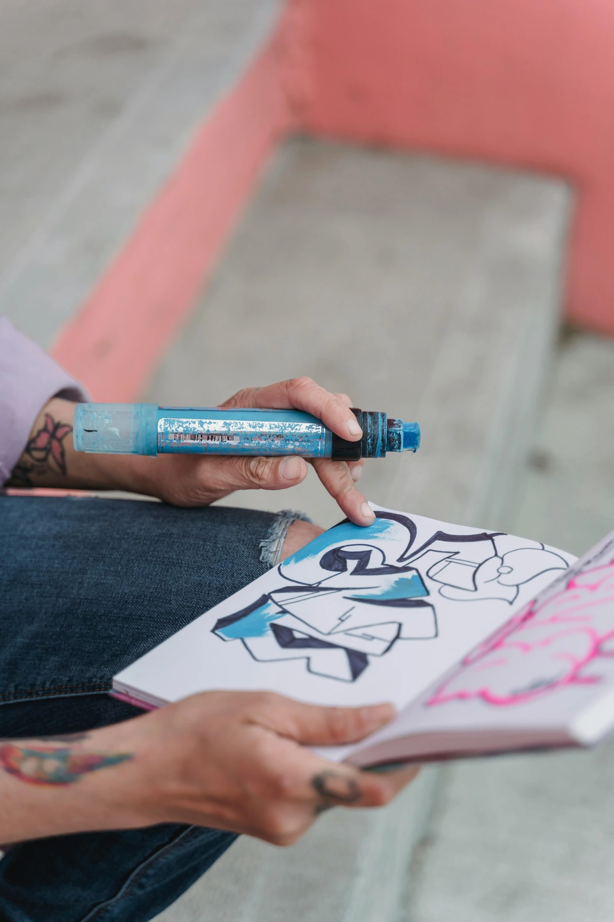
Colored Pencils: A World of Hue and Texture
Once you've mastered value, colored pencils open up the vast and captivating realm of color theory. These versatile tools allow for incredible layering, blending, and precision, creating rich, luminous effects that can mimic painting. Unlike paints, you build up color gradually, allowing for nuanced transitions and vibrant saturation without the mess of liquids. High-quality colored pencils have a high pigment load and a creamy binder, making blending a dream and allowing the colors to truly sing. Start with a smaller set of artist-grade pencils and gradually expand your palette as your understanding of color grows. If you're ready to dive into color, check out my in-depth review of Faber-Castell Polychromos colored pencils, the Prismacolor Premier colored pencils review, or a comparison between Derwent vs Faber-Castell colored pencils. You'll also encounter wax-based (like Prismacolor, known for their creamy laydown and easy blending) and oil-based (like Polychromos, prized for holding a finer point and being more resistant to wax bloom) pencils, each with distinct blending properties and feel. Understanding these subtle differences will greatly enhance your control over the medium.
Beyond simply applying color, colored pencils demand an understanding of layering and pressure. You build up intensity and blend hues by applying multiple thin layers, gradually increasing pressure. This technique allows for incredibly rich, luminous results that can't be achieved with a single, heavy stroke. You'll also encounter wax-based (like Prismacolor) and oil-based (like Polychromos) pencils, each with distinct blending properties and feel. Wax-based are generally softer and blend more easily, while oil-based hold a finer point and are more resistant to wax bloom. Understanding these subtle differences will greatly enhance your control over the medium. But remember, the foundational understanding of value you gain from graphite is still paramount; color enhances form, but value defines it. Color is the poetry, but value is the grammar.
Type | Characteristics | Best For |
|---|---|---|
| Wax-based | Creamy laydown, blends easily, vibrant, softer core | Smooth transitions, rich saturation, easy layering, covering large areas |
| Oil-based | Holds a finer point, resistant to wax bloom, harder core | Fine detail, sharp lines, precise layering, less prone to smudging |
Colored Pencil Techniques: Building Luminous Layers
- Layering (Burnishing): This involves applying multiple light layers of color, gradually building up intensity. Once you have a good amount of pigment down, you can use a colorless blender or a very light-colored pencil to burnish (rub firmly) over the layers, pushing the pigment into the paper's tooth and creating a smooth, intense, almost painted finish. It’s like polishing a gem to reveal its inner brilliance.
- Hatching and Cross-Hatching: Just as with graphite, these linear techniques can be used to build up color and value, creating texture and direction in your strokes. Varying the closeness and direction of your lines can create a huge range of effects.
- Scumbling: Applying color in small, circular, overlapping motions. This creates a soft, textured appearance and can be great for blending colors subtly without harsh lines.
- Impressing (Indenting): Before applying color, use a blunt stylus or an empty ballpoint pen to draw lines or details into your paper. When you then draw over these impressed lines with colored pencil, the pigment won't adhere to the indentations, leaving crisp, uncolored lines. It’s a wonderful technique for highlights or fine details like whiskers or hair strands, creating an illusion of texture and light. This method is especially effective for rendering fine, light details against darker backgrounds.
- Solvent Blending: For an even smoother, paint-like effect, try using a colorless blending solution (often alcohol-based) with a brush or cotton swab. This dissolves and spreads the pigment, creating seamless transitions and vibrant washes, much like traditional painting. Just make sure to work in a well-ventilated area! This technique truly blurs the line between drawing and painting.
Oil Pastels: Bold Strokes and Creamy Blends
For artists seeking a more painterly approach without the complexities of wet paint, oil pastels are a fantastic next step. These vibrant, creamy sticks allow for bold, expressive strokes, direct color application, and easy blending with fingers or a tortillon. They offer a unique tactile experience, bridging the gap between drawing and painting. Unlike soft pastels, they are less dusty and don't require fixative, making them wonderfully approachable. You can blend them directly on the paper with your fingers, a tortillon, or even a solvent like turpentine or mineral spirits for a more painterly, dissolved effect. Layering is also key with oil pastels; you can build up rich, impasto textures or scratch into layers to reveal colors underneath (sgraffito), a technique that literally means 'to scratch away.' They work beautifully on a variety of surfaces, from paper to canvas boards. Explore the best oil pastels for artists review and a beginner's guide to using oil pastels to start your journey. They're surprisingly versatile, offering a spectrum of effects from smooth, blended transitions to thick, textured impasto. It's like painting with a crayon, but with far more sophistication.
Oil Pastel Techniques: From Blending to Impasto
- Direct Application & Blending: Oil pastels are meant to be applied directly. You can blend colors by rubbing them together with your finger, a tortillon, or even a soft cloth. The creamy texture allows for seamless transitions and vibrant mixes.
- Layering: Build up multiple layers of color for richness and depth. Lighter colors can often be layered over darker ones, which is a unique characteristic compared to some other dry media.
- Sgraffito: This involves applying a layer of color, then another contrasting color over it, and finally scratching through the top layer to reveal the color beneath. It’s excellent for creating fine lines, textures, or even calligraphic effects.
- Solvent Blending: For a more paint-like effect, you can use a brush dipped in a small amount of odorless mineral spirits or turpentine to dissolve and spread the pastel, creating soft washes and smooth gradients. Work in a well-ventilated area for this!
- Impasto: Because of their creamy nature, oil pastels can be applied thickly, building up texture and creating a sense of dimension, similar to oil painting. Use the side of the stick or even a palette knife for this.
Soft Pastels: The Pure Pigment Experience
Often confused with oil pastels, soft pastels are a distinctly different medium, beloved for their pure, vibrant pigment and velvety texture. Made primarily of pigment and a minimal binder, they are incredibly blendable and allow for a very direct, uninhibited application of color. They are, however, quite dusty and absolutely require a textured paper (often called 'pastel paper' or 'pastel ground') to grab and hold the pigment, and a fixative spray to prevent smudging and preserve the artwork. Soft pastels are fantastic for expressive portraits, luminous landscapes, and any work where rich, layered color and soft blending are desired. They offer a unique immediacy, almost like drawing with pure color, capturing light and atmosphere with breathtaking softness and a unique painterly feel.
Feature | Soft Pastels | Oil Pastels |
|---|---|---|
| Composition | Pure pigment with minimal binder | Pigment with oil/wax binder |
| Texture | Velvety, powdery, rich | Creamy, buttery, dense |
| Dustiness | Very dusty, requires fixative | Less dusty, generally no fixative required |
| Blending | Easily blendable with fingers/stumps | Blends with fingers/solvents, can be layered |
| Permanence | Requires fixative, delicate | More durable, less prone to smudging |
| Appearance | Matte, luminous, soft edges | Glossier, vibrant, can build impasto |
| Best For | Expressive portraits, landscapes, luminous effects | Bold strokes, direct color, impasto textures, painterly effects |
Soft Pastel Surfaces and Techniques
- Paper Choice: For soft pastels, a paper with a pronounced, aggressive tooth is absolutely essential. This can be sanded pastel paper (which has a fine abrasive surface that truly grips the pigment), Canson Mi-Teintes, or even watercolor paper with a rough surface. The tooth acts like tiny valleys that grab and hold the pastel pigment, preventing it from simply dusting off the page. For a deeper dive, my guide on what are soft pastels and how to use them offers more specific recommendations on pastel grounds and surfaces.
- Blending: Soft pastels are incredibly blendable, almost melting into each other. You can use your fingers, tortillons, cotton swabs, or specialized foam applicators. The key is a light touch to build up layers gradually, creating soft, ethereal transitions. The tactile experience of blending soft pastels is truly unique and deeply satisfying.
- Layering & Underpainting: You can build up many layers of pastel, creating incredible depth and vibrancy. Some artists start with an underpainting using a different medium (like watercolor or ink) to establish initial tones and a foundation, then layer pastels over it. This adds depth and complexity, creating luminous effects that seem to glow from within.
- Fixative: Because of their inherent dustiness, soft pastel drawings absolutely require a fixative spray to prevent smudging and ensure their longevity. Apply multiple light coats from a distance in a well-ventilated area to avoid darkening colors or creating an undesirable glossy finish. It's a delicate balance to preserve the vibrancy without flattening the texture. And remember, fixative is permanent, so be sure you're happy with your work before spraying – a lesson I learned the hard way a few times, sacrificing some lovely pieces to over-eager spraying! It’s the final, crucial step to preserving your pastel masterpieces.

Watercolors: The Dance of Pigment and Water
Watercolors, with their luminous transparency and fluid nature, offer a meditative and expressive experience. The key to mastering watercolors lies in understanding water control – how much water to mix with your pigment, and how wet your paper is. From delicate washes to vibrant glazes, this medium is incredibly versatile. You'll need good watercolor paper (heavier than drawing paper to prevent buckling – 140 lb/300 gsm is a great starting point), a reliable set of pigments. These come in pans (dry cakes, activated with water, great for portability) or tubes (concentrated liquid pigment, offering vibrant color and easier mixing). For brushes, a good round brush (size 6 or 8) and a flat wash brush (1/2 inch or 1 inch) are excellent versatile choices. You'll also want a simple palette for mixing your colors, which can be as basic as a ceramic plate or a dedicated plastic palette. Dive into the world of transparent beauty with our guides to essential watercolor supplies for beginners, basic watercolor techniques, and a look at the best watercolor paper for artists review. Don’t forget to explore the best watercolor sets for beginners and reviewing the best professional watercolor sets for specific recommendations.

Watercolor Techniques: A Dance with Water
- Wet-on-Wet: Applying wet paint to a wet surface. This creates soft, diffused edges and beautiful, unpredictable blends. It's fantastic for skies, atmospheric effects, and backgrounds. It's a wonderful technique for embracing serendipity and letting the water do its magic.
- Wet-on-Dry: Applying wet paint to a dry surface. This results in crisp, defined edges and more controlled washes. Ideal for details, sharp lines, and building up layers. This is where precision takes center stage, allowing you to define forms clearly.
- Layering (Glazing): Applying transparent washes of color over dried layers. This builds depth and creates rich, luminous hues without muddying. It's a cornerstone of watercolor painting, allowing light to shine through each layer, creating an almost glowing effect.
- Lifting: Removing paint from the paper to create highlights or soften edges. This can be done with a clean, damp brush, a sponge, or even a tissue while the paint is still wet or slightly damp. For dried paint, a stiff brush or a damp cloth can be used with more effort, but always be gentle to protect the paper's surface. It's a subtle form of subtracting to add light.
- Dry Brush: Using a brush with very little water and pigment on a dry surface. This creates a broken, textured effect, wonderful for depicting rough surfaces, grass, or distant foliage. It's a testament to how even the slightest amount of pigment can create a powerful visual impact, adding texture and interest.
- Gradients: Creating a smooth, continuous transition from one color to another, or from a dark tone to a light tone, often by gradually adding more water or changing pigment concentration as you move across the paper. It's a foundational skill for creating depth and atmosphere.
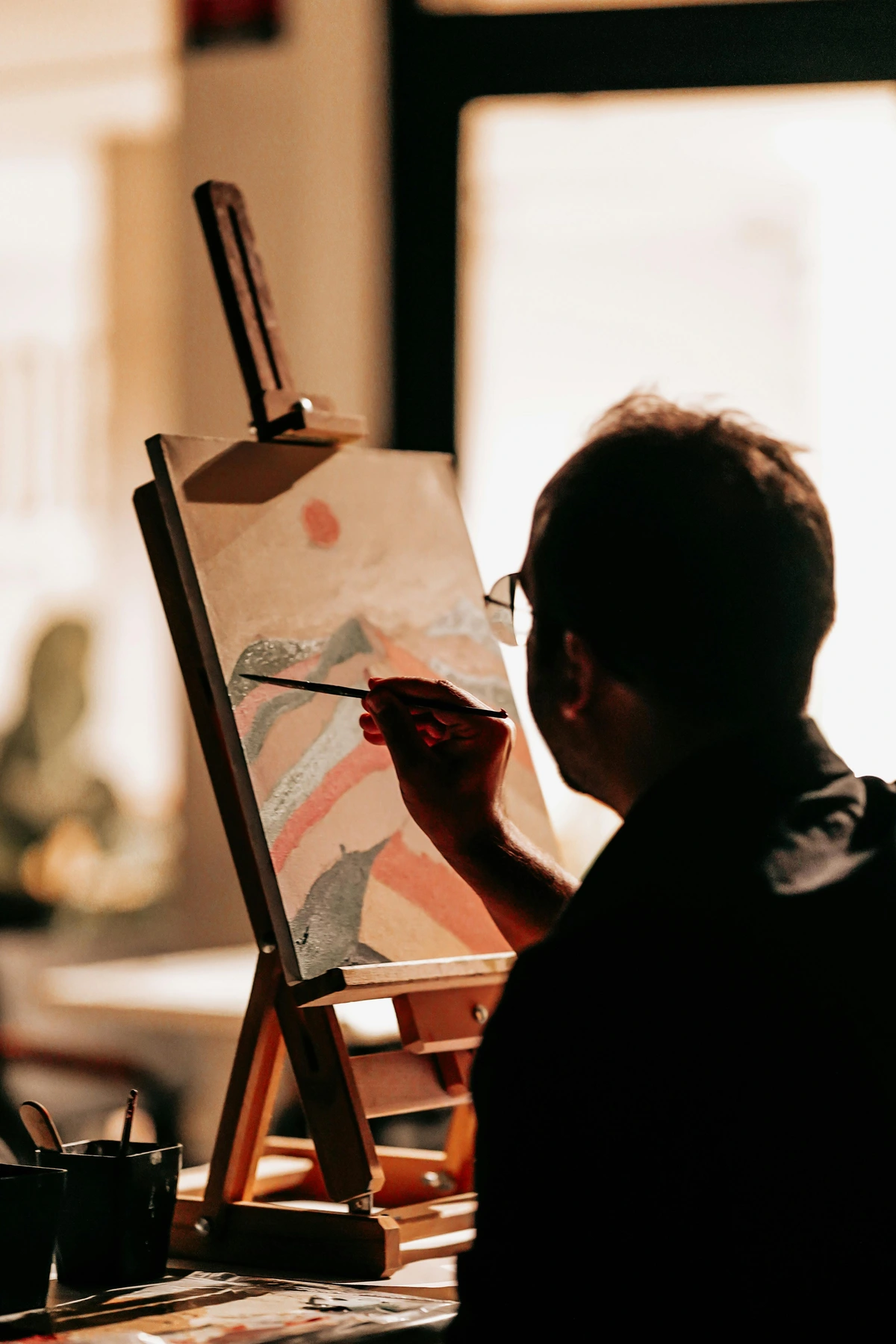
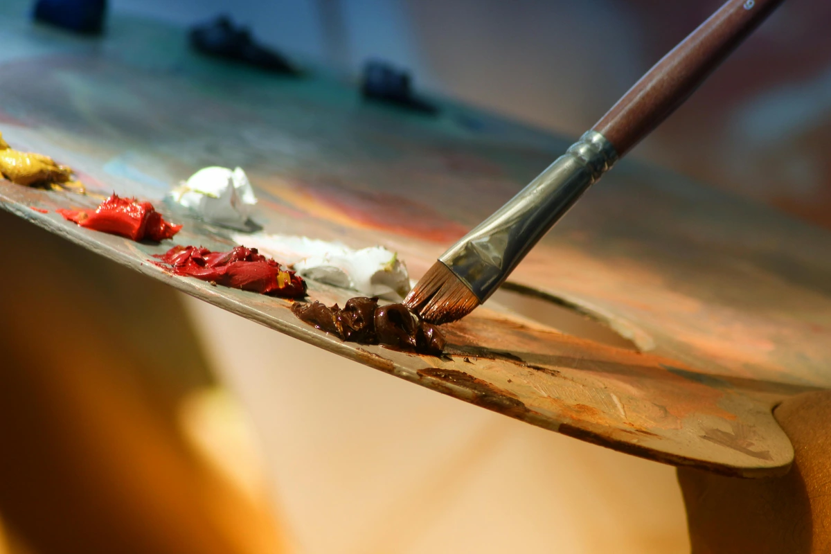
Digital Art: The Modern Frontier
For many, the world of digital art represents an exciting, boundless frontier. Using a graphics tablet and stylus, you can mimic almost any traditional medium, with the added advantages of infinite undo, layers, and a vast array of brushes and effects. While I always recommend starting with traditional tools to build foundational skills, transitioning to digital can be incredibly rewarding. Look for drawing tablets for beginners that offer good pressure sensitivity and a comfortable stylus. The learning curve involves mastering software like Photoshop, Procreate (for iPad users), Clip Studio Paint, or even free options like Krita or Autodesk Sketchbook. When choosing a tablet, you'll find two main types: screenless tablets (where you draw on the tablet and look at your computer screen, like Wacom Intuos) and display tablets (where you draw directly on the screen, like Wacom Cintiq or an iPad with Apple Pencil). Screenless tablets are more budget-friendly and excellent for beginners. The creative possibilities are truly endless. Explore my guide to the best drawing tablets for beginners and top drawing tablets for digital artists when you're ready to make the leap. It's a different way to engage with your creativity, offering unique tools and workflows. Digital art doesn't replace traditional art; it expands its horizons, offering new avenues for expression and experimentation.
Understanding the Digital Canvas: Raster vs. Vector
Before you dive headfirst into digital art, it's helpful to understand the two main types of digital images: raster and vector. Raster images (like photographs or paintings in Photoshop) are made up of a grid of pixels. When you zoom in too far, you start to see individual squares, and the image can become pixelated. Vector images, on the other hand, are based on mathematical equations that define lines, shapes, and colors. They can be scaled to any size without losing quality, making them ideal for logos, illustrations, and graphic design. Most digital painting and sketching software works with raster images, while programs like Adobe Illustrator or Inkscape are for vector art. Knowing the difference helps you choose the right tools and understand the capabilities and limitations of each. It's a foundational distinction that impacts your workflow and the final output.
Image Type | Characteristics | Best For |
|---|---|---|
| Raster | Pixel-based, resolution-dependent, loses quality when scaled | Photographs, digital paintings, realistic textures |
| Vector | Math-based, resolution-independent, scalable without loss | Logos, illustrations, graphic design, clean lines |
Choosing Your Digital Tools: Tablets and Software
- Screenless Tablets: These are generally more affordable and a great entry point. You draw on a pad while looking at your computer monitor. It takes a little getting used to the hand-eye coordination, but many professional artists swear by them. Key features to look for include pressure sensitivity (how well the tablet registers varying pressure from your stylus), report rate (how quickly the tablet responds to your stylus movements), and programmable buttons on the tablet and stylus for shortcuts. Don't underestimate the power of a good, basic screenless tablet; it’s a powerhouse for serious work, offering a valuable tactile experience without the visual distraction of your hand on the screen.
- Display Tablets: These are the more immersive (and expensive) option, allowing you to draw directly on the screen, mimicking the feel of traditional art more closely. Brands like Wacom Cintiq or iPads with Apple Pencil are popular choices. The experience is incredibly intuitive and can feel very natural for those transitioning from traditional media, offering a direct hand-to-screen connection. Features like pen tilt recognition and express keys on the tablet itself can further enhance your workflow and efficiency.
- Software: The software you choose is just as important as the hardware. Popular options include:
- Photoshop: The industry standard, powerful for both drawing and photo manipulation. It’s a beast, but incredibly versatile, a true Swiss Army knife for digital artists.
- Procreate (iPad only): Incredibly intuitive and powerful, a favorite for many digital artists for its streamlined interface and robust features. It's a game-changer for mobile creativity.
- Clip Studio Paint: Excellent for comics, manga, and animation, with robust drawing tools and fantastic line stabilization. It feels like drawing on paper, offering incredible control and a vast array of brushes.
- Krita / Autodesk Sketchbook: Fantastic free options that offer a surprising amount of professional features, perfect for beginners on a budget. Don't let the free price tag fool you; these are robust and capable programs that can grow with you. They're a great way to dip your toes into digital art without a significant financial commitment.

The Allure of Digital Art: Benefits and Challenges
Digital art offers a liberating array of benefits: infinite undo history (a lifesaver!), layers for non-destructive editing, a vast library of customizable brushes, and the ability to share work instantly. It's also incredibly clean, saving you from messy studios. However, it comes with its own challenges. The initial learning curve for software can be steep, and some artists find the disconnect between drawing on a tablet and seeing it on a screen (for screenless tablets) difficult to adapt to. There's also the constant temptation to over-correct or rely too heavily on digital tools rather than fundamental drawing skills. My advice? Embrace the benefits, but use them as enhancements to your traditional skills, not replacements. The best digital artists often have a strong foundation in traditional drawing and painting. It's a powerful tool, but like any tool, its effectiveness lies in the hand that wields it.
Ink & Pens: Precision and Boldness
For those drawn to clean lines, graphic styles, or the permanence of ink, exploring various pens and inks can be a thrilling adventure. From fine-liner technical pens that offer incredible precision (perfect for cross-hatching or stippling) to brush pens that emulate the fluidity of a paintbrush, the world of ink is vast. India ink with a dip pen provides a classic, expressive experience, while modern archival-quality markers offer vibrant, opaque color. The challenge with ink is its unforgiving nature – every mark is a commitment! But with practice, the control and dramatic impact you can achieve are unparalleled. To delve deeper, check out my best drawing pens for artists review and a closer look at Micron pens for artists. For a slightly different take on ink, you might also be interested in essential calligraphy supplies for beginners and basic calligraphy techniques for beginners. It's a medium that demands confidence and precision, but rewards you with unparalleled clarity.
Exploring Different Types of Pens and Inks
Pen Type | Characteristics | Best For |
|---|---|---|
| Fine Liner Pens | Consistent, crisp lines, various nib sizes, often archival | Intricate details, cross-hatching, technical drawing, outlining |
| Brush Pens | Flexible felt/nylon tips, line variation based on pressure | Calligraphy, expressive line work, dynamic strokes, filling areas |
| Dip Pens | Metal nibs with separate ink, incredible line variation | Traditional calligraphy, expressive illustration, custom line weights |
| Technical Pens | Tubular nibs, extremely consistent line widths | Drafting, architectural drawings, detailed illustrations, uniform lines |
| Gel Pens | Smooth, opaque, vibrant gel ink | Highlights, bold accents, adding texture, mixed media |
| Rollerball Pens | Smooth ink flow, consistent line, vibrant color | General drawing, quick sketches, journaling, note-taking |
- Fine Liner Pens: These pens offer consistent, crisp lines, perfect for intricate details, cross-hatching, and technical drawing. Brands like Micron, Staedtler Pigment Liner, and Faber-Castell Pitt Artist Pens are popular. They come in various nib sizes, allowing for incredible precision.
- Brush Pens: Combining the convenience of a marker with the expressiveness of a brush, these pens have flexible felt or nylon tips that create thick or thin lines depending on pressure. They're fantastic for calligraphy, expressive line work, and adding dynamic strokes.
- Dip Pens: The classic choice for calligraphers and illustrators. A metal nib is attached to a holder and dipped into liquid ink. This offers incredible line variation and a deeply satisfying, traditional feel. You'll need different nibs for different effects.
- Technical Pens: Engineered for precision, these pens have tubular nibs that deliver extremely consistent line widths. They're often used for drafting, architectural drawings, and detailed illustrations where uniformity is key.
- Inks: Beyond just black, inks come in a rainbow of colors. Look for India ink (waterproof and opaque when dry), drawing ink (can be water-soluble or waterproof), and pigment-based archival inks (fade-resistant). Experiment with their properties on different papers.
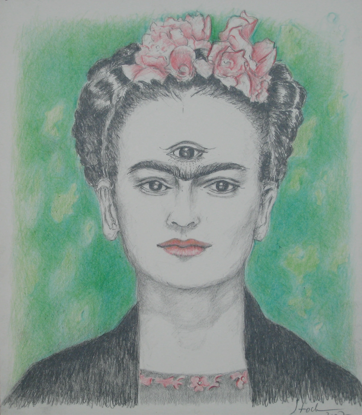
For a general overview of tools, consider checking out the best drawing pens for artists review. And if you're interested in bolder, more opaque ink applications, explore guides like best alcohol-based markers for artists and copic markers review for professional artists.
Acrylics: Versatility and Bold Color
Once you're comfortable with drawing and perhaps some simpler painting mediums, acrylic paints offer a fantastic leap into the world of opaque color and versatile applications. Acrylics are water-soluble when wet, making cleanup easy, but dry quickly to a permanent, flexible finish. This fast drying time can be both a challenge and an advantage, allowing for quick layering. They can be used thinly like watercolors or thickly like oils, and mixed with various mediums to achieve different textures and effects. You'll need brushes, a palette, and a surface like canvas or sturdy paper. Acrylics are an incredibly forgiving and vibrant medium, perfect for bold explorations in color. For an overview of paint types, check out my definitive guide to paint types for artists. For specific brand reviews, you might find the Liquitex Basics acrylic paint review helpful, and for tools, consider best acrylic paint brushes for artists and how to mix acrylic paint. Acrylics are a true workhorse, adaptable to almost any style.
Essential Acrylic Supplies
To get started with acrylics, you'll need a few key items: a set of acrylic paints (student grade is fine initially), a variety of brushes (flats, rounds, filberts – explore the best acrylic paint brushes for artists), a palette (a plastic tray or even a paper plate works), and a painting surface (canvas, canvas boards, or heavy paper). Water for thinning and cleaning, and paper towels are also indispensable. You might also want to explore Liquitex Basics acrylic paint review for specific recommendations. For preparing your surface, consult how to prepare a canvas for acrylic painting. You might also find reviews on best brushes for acrylic painting helpful when choosing your tools.
Brush Shape | Characteristics | Best For |
|---|---|---|
| Round | Versatile, pointed tip, wide belly | Fine lines, detail work, washes, filling small areas |
| Flat | Square edge, long bristles | Bold strokes, sharp edges, washes, blocking in color, impasto |
| Bright | Short flat bristles, square edge | Impasto, bold, controlled strokes, blending |
| Filbert | Flat with an oval tip, blend of round and flat | Soft edges, blending, creating rounded shapes, figurative work |
| Fan | Fan-shaped, thin bristles | Blending, softening edges, creating textures (foliage, grass), special effects |
| Liner | Very long, thin bristles, pointed tip | Fine lines, delicate details, lettering, signatures |
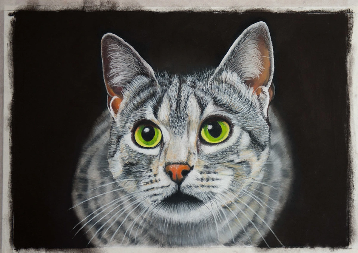
Acrylic Painting Techniques
Acrylics are incredibly versatile, allowing for a huge range of techniques:
- Washes: Thinned with water, acrylics can be used like watercolors for transparent washes.
- Impasto: Applied thickly, straight from the tube, to create visible brushstrokes and texture. You can achieve dramatic, sculptural effects with impasto, adding a physical dimension to your work.
- Layering: Acrylics dry quickly, allowing you to build up multiple layers without muddying colors. This rapid drying time is a huge advantage for artists who like to work quickly and build complex compositions.
- Glazing: Applying thin, transparent layers of color over a dry underpainting to create depth and luminosity. This technique can create incredible richness and subtle color shifts.
- Dry Brush: Using a brush with very little paint to create a textured, broken color effect. For more on this, check out dry brush technique: acrylic painting.
- Palette Knife Painting: Applying paint with a palette knife instead of a brush for bold, expressive textures and flat areas of color. This technique provides a unique, uninhibited feel, often leading to surprising textures and dynamic compositions. To explore this tool, see what is a palette knife and how to use it and best palette knives for artists.
Acrylics are truly a medium for experimentation, allowing you to mimic various styles and textures. For more on how colors interact, consider how to mix acrylic paint and how to blend acrylic paint on canvas for beginners.
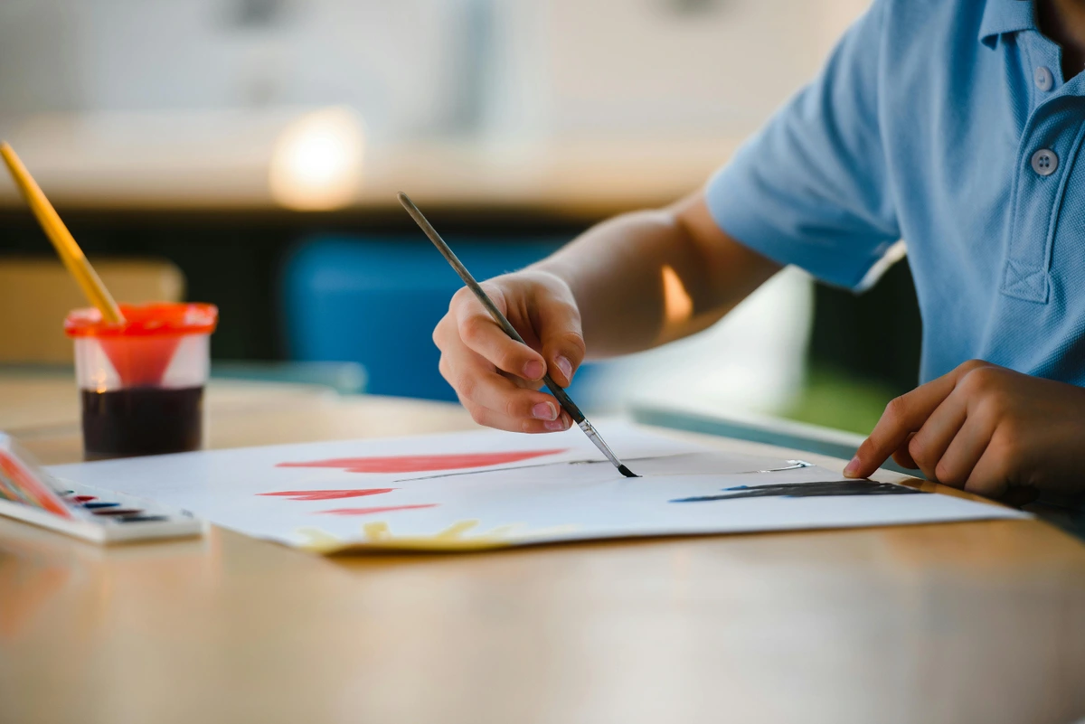
Oils: Richness, Depth, and History
Oil paints are perhaps the most historically significant and revered medium in Western art, prized for their rich colors, luminous depth, and long drying time that allows for extensive blending and reworking. Unlike acrylics, oils use an oil-based binder (typically linseed oil), requiring solvents like turpentine or odorless mineral spirits for thinning and cleanup. This medium demands patience, but the results – deep, vibrant colors and subtle transitions – are often unparalleled. You'll need oil paints, brushes (natural bristles are often preferred), a palette, solvents, and a prepared surface (gessoed canvas or wood panel). For beginners, student-grade oil paints are a good starting point, and I recommend exploring guides like best oil paints for beginners and reviewing the best oil paint sets for beginners. Oils are a medium of contemplation and slow, deliberate beauty.
Oil Painting Essentials
Getting started with oils requires a few dedicated supplies: a basic set of oil paints, brushes designed for oils (often hog bristle brushes are a good start – see best oil painting brushes for artists), a palette (glass, wood, or disposable paper palettes), linseed oil (as a medium to thin paints and improve flow), and odorless mineral spirits (for cleaning brushes and thinning). Ventilation is key when working with solvents. For surfaces, a pre-gessoed canvas is ideal. You can also dive into how to make your own oil paint if you're feeling particularly ambitious, or compare brands with Holbein vs Winsor Newton oil paints. For deeper insights into techniques, explore the definitive guide to oil painting techniques and mastering glazing techniques in oil painting.
Medium Type | Primary Function | Characteristics | Impact on Paint |
|---|---|---|---|
| Linseed Oil | Thins paint, increases flow, glossy finish | Slows drying, increases transparency, adds flexibility | Richer, more fluid application, enhanced luminosity |
| Stand Oil | Imparts smooth, enamel-like finish, glossy | Very slow drying, thick, self-leveling | Smooth, even glazes, reduces brushstrokes |
| Walnut Oil | Thins paint, less yellowing than linseed | Faster drying than linseed, good for whites/blues | Cleaner colors, slightly less flexible film |
| Poppy Seed Oil | Very pale, non-yellowing, glossy | Slowest drying, delicate, best for light colors | Preserves purity of whites, subtle color shifts |
| Alkyd Mediums | Accelerates drying, increases flow | Synthetic resin, can be glossy or matte, various consistencies | Faster workflow, creates durable, flexible paint film |
| Turpentine | Thins paint, solvent for cleaning | Strong odor, evaporates quickly, matte finish | Reduces viscosity, quick drying, can dull colors |
| Odorless Mineral Spirits (OMS) | Thins paint, solvent for cleaning, less odor | Evaporates quickly, safer alternative to turpentine, matte finish | Similar to turpentine but with reduced fumes, preferred by many |
Key Oil Painting Techniques
- Alla Prima (Wet-on-Wet): Finishing a painting in one session, while the paint is still wet, allowing for seamless blending and fresh, spontaneous strokes.
- Glazing: Applying thin, transparent layers of paint over dry layers, building up luminous color and depth. This is where oils truly shine. For more, dive into mastering glazing techniques in oil painting.
- Scumbling: Applying a thin, opaque layer of paint with a dry brush over a darker, dry layer, creating a broken color effect and texture.
- Impasto: Applying paint thickly with a brush or palette knife to create pronounced texture and a three-dimensional surface.
- Underpainting/Grisaille: Creating a monochromatic (often grey or brown) underpainting to establish values and forms before applying color layers. This is a classic technique for building strong compositions, ensuring your light and shadow patterns are resolved before you even think about color. You can learn more about this approach in exploring the power of monochromatic art: beyond black and white. For human forms, consider how to mix realistic skin tones in oil paint.
Ultimately, the beauty of oil painting lies in its capacity for depth and luminosity, a result of these thoughtful techniques. For a more exhaustive exploration, see the definitive guide to oil painting techniques.
FAQ: Your Questions Answered
I can already hear the questions bubbling up, echoing those I once had myself. Let's tackle them, transforming those uncertainties into stepping stones for your artistic journey. No question is too basic when you're starting out.
General Art Supply Questions
Do I need charcoal or pastels to start?
Absolutely not. While charcoal is an undeniably fantastic and incredibly expressive medium (as we discussed in the "Beyond the Core" section), it introduces a whole new set of challenges. It's gloriously messy, behaves dramatically differently from graphite (think smudging, dust, and fixative!), and demands a distinct approach. My advice? Master the pencil first. Truly understand how to manipulate value, sculpt form, and capture light using a single, familiar medium. Build that core competence. Only then, once those fundamentals are deeply ingrained, should you consider venturing into the thrilling, yet challenging, world of charcoal or the creamy delights of pastels. Simplicity, particularly in these early stages, is not just key—it's paramount to sustainable growth. You wouldn't learn to run before you can walk, and the same principle applies here. For more specific guidance on charcoal, refer to how to use charcoal for drawing basics and what is pastel painting. Trust me, I made the mistake of buying a huge set of pastels early on, thinking more tools equaled more talent, and they sat mostly untouched until I truly understood drawing fundamentals. The graphite will teach you patience and observation in a way that instant color simply cannot.
Should I draw from life or from photos?
Both! Drawing from life (observational drawing) is invaluable for training your eye to see true forms, proportions, and values, unmediated by a camera lens. It teaches you to translate three dimensions into two, sharpening your perception of space and light. However, drawing from photos can be a practical way to study complex subjects (like a roaring tiger!), practice composition, or work when conditions aren't ideal for life drawing (like trying to sketch a quickly passing cloud formation). The key is to understand the inherent limitations of photos – they flatten perspective, compress values, and often distort colors. Use photos as a reference, a starting point, but always strive to inject your own interpretation and understanding, informed by your life drawing practice. I often use photos for specific elements or inspiration, but always compose the final piece with my own artistic vision and understanding of reality.

How do I protect my finished artwork?
Protecting your artwork depends on the medium, and it's a crucial step to ensure your creations endure. For graphite and charcoal drawings, a fixative spray is essential to prevent smudging. Always spray in a well-ventilated area, holding the can a good distance away and applying multiple light, even coats – never one heavy blast. For pastels, fixative is also crucial. For paintings (acrylics, oils, watercolors), a varnish offers protection from UV light, dust, and environmental damage, and can even unify the sheen of your painting. Varnishes come in gloss, satin, and matte finishes, allowing you to choose the final look. Always ensure your painting is fully dry before varnishing (especially with oils, which can take months, sometimes even a year, to fully cure). Store your finished pieces flat or carefully framed under glass, away from direct sunlight and extreme humidity, which can cause warping or cracking. For a deeper dive into the world of painting foundations, you might find our guide to what are painting mediums useful, and for oil paintings specifically, refer to how to varnish an oil painting: a step-by-step guide. For acrylics, you can consult how to varnish an acrylic painting.
How can I protect my artwork during transport?
Transporting artwork can be nerve-wracking! For drawings and prints, always place them in a rigid portfolio or between two pieces of sturdy foam core, secured with tape to prevent shifting. Cover the art with glassine paper (a semi-transparent, acid-free paper) to protect the surface from smudges and dust. For framed pieces, use corner protectors and wrap them securely in bubble wrap or moving blankets. Paintings, especially oils, need to be completely dry before transport. Consider specialized art shipping boxes for larger or more valuable works. A little extra care here can prevent a lot of heartbreak later on.

### Can I just use a regular mechanical pencil?
You certainly can, technically, use a mechanical pencil for certain applications. And for quick notes or very precise, consistent line work (like technical drafting or very fine cross-hatching), they absolutely have their place. However, for developing foundational drawing skills and true artistic versatility, it's profoundly limiting. The magic of a traditional wooden pencil lies in its inherent versatility: you can use its beautifully exposed side for broad, sweeping shading strokes, creating soft gradients and covering large areas quickly. This is a foundational technique for building form and volume that is simply impossible to replicate with a mechanical pencil’s fixed, unyielding point. You miss out on a whole dimension of mark-making, limiting your ability to truly understand how pressure and angle translate into varied marks on paper. It's a bit like trying to learn to cook with only pre-packaged ingredients – you miss the nuances of raw materials, the subtle control, the tactile feedback, and the sheer joy of hands-on creation. Stick with traditional pencils for foundational learning; they teach you more about your hand, your material, and the paper. They teach you to feel the resistance of the lead, to hear the subtle scratch of the graphite on paper, and to see the profound variations that come from a simple shift in pressure and angle. For more options on traditional tools, explore our guide to essential drawing supplies for beginners.
What are some common art terms I should know?
Art, like any field, has its own vocabulary. Knowing a few key terms can help you understand discussions and articulate your own artistic ideas. We've touched on value (lightness/darkness) and form (3D quality). Others include hue (the pure color), saturation (intensity of color), composition (arrangement of elements), perspective (creating illusion of depth), negative space (space around the subject), texture (surface quality), and medium (the materials used). Don't feel pressured to memorize them all at once, but gradually familiarizing yourself will enrich your artistic dialogue and understanding.
Should I take an art class or learn on my own?
Both paths have immense value, and often, the best approach is a blend of the two! Learning on your own allows for immense freedom, self-discovery, and working at your own pace. You can follow online tutorials, read books (like this article, perhaps!), and experiment freely. However, an art class offers structured learning, direct, personalized feedback from an experienced instructor, and the invaluable camaraderie of a creative community. Constructive criticism can be absolutely essential for identifying blind spots and pushing past plateaus – sometimes you just need another pair of seasoned eyes on your work to see what you're missing. If you can, try both! Start with self-study to find your rhythm and explore your interests, and when I first did, I learned a lot about my own preferences and learning style. Then, when you feel ready, explore local workshops or online courses to get that crucial outside perspective. The important thing is to keep learning and challenging yourself, however that looks for you. Your artistic journey is unique, and there's no single 'right' path. The direct feedback from a good instructor in a class setting can sometimes be the catalyst you need to push past a plateau, offering insights you might miss on your own. It's truly like having a personal trainer for your creative muscles, guiding you to new strengths.
What about using rulers and other drawing aids?
Rulers, compasses, protractors, and even French curves can be incredibly useful tools, particularly in technical drawing, architectural renderings, or when you need absolute precision and crisp, straight lines. They are aids, not crutches! However, for foundational artistic drawing, I recommend developing your freehand skills first. Learning to draw a straight line or a perfect circle without assistance trains your eye and hand in a way that simply relying on a ruler won't. Once you've honed that intrinsic sense of line and form, then integrate drawing aids as tools to enhance your precision where needed. They serve a purpose, but they shouldn't replace your fundamental skill development.
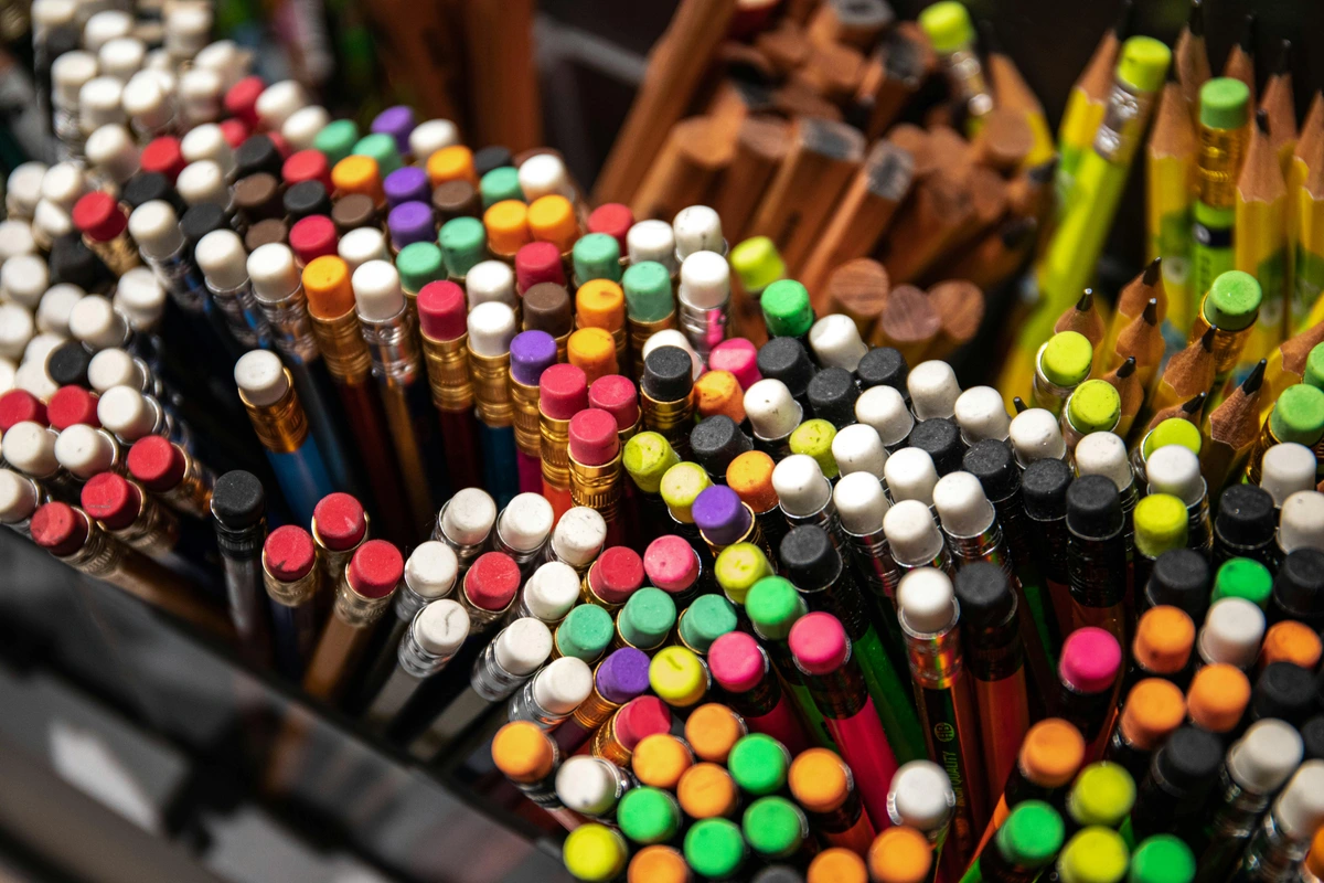
Are expensive brands really that much better?
For a beginner, let’s be absolutely clear: a good, reliable student-grade brand is not just sufficient, it's perfect. Brands like Faber-Castell Goldfaber, Derwent Academy, or Staedtler Mars Lumograph offer superb quality that far exceeds what you need when you're just finding your footing, and they do so without the intimidating premium price tag of professional-grade pencils. The subtle differences in professional lines usually boil down to things like superior lightfastness (how long the pigment resists fading in light), ultra-fine pigment grinding for smoother application, or even more minute consistency in graphite particulate. These are legitimate concerns for an artist selling their archival work, but frankly, they are absolutely not a primary concern when you're just learning to make your first confident marks. Save your money, and invest it in more paper instead! You're learning the language, not trying to publish a thesis just yet. For more comprehensive recommendations across mediums, check out our guide to the best art supplies for beginners. You can also look into guides like reviewing the best gouache sets for beginners or best gouache paint brands for artists if you venture into those mediums. Professional-grade pencils, while offering incredibly smooth laydown and pigment richness, are more of a luxury once you know precisely what you're looking for, rather than a necessity for learning.
What are some common drawing mistakes to avoid?
Ah, the classic pitfalls! Don't worry, we all make them, myself included. Here are a few to be mindful of, not as rigid rules to fear, but as gentle reminders for growth:
- Pressing Too Hard: Especially with graphite, heavy pressure applied too early can irreparably damage the paper's tooth, making it impossible to add lighter layers, blend smoothly, or erase cleanly. Start light, build up pressure gradually – think of it as a conversation, not a fight, with your paper.
- Drawing from only one reference or perspective: This limits your understanding of a subject's true form and how light interacts with it in three dimensions. Try sketching a single object from multiple angles, or combine elements from several references to create something new and more informed. It builds a more robust mental library and a deeper comprehension.
- Only Drawing What You Know: This is a comfort trap that limits growth. Actively seek out new subjects, challenging perspectives, and different textures. Step outside your comfort zone; that's where the real learning happens and new discoveries are made.
- Ignoring Fundamentals: Skipping basics like value, form, and composition in favor of jumping straight to complex, highly rendered subjects will inevitably hinder your progress in the long run. Embrace the learning process, the building blocks are essential – they are your artistic ABCs.
- Lack of Observation: Don't just draw what you think you see or what your brain tells you is there; draw what you actually see. Train your eye to truly observe shapes, negative space, and the subtle relationships between objects. It's about seeing the world with an artist's eye, not just a casual glance, but a deep, focused gaze.
- Comparing Yourself to Others: The fastest way to kill your creative spirit and invite self-doubt. Everyone's journey is unique, with different starting points and different paces. Focus solely on your own progress and celebrate even the smallest victories. Comparison is the thief of joy, and creativity thrives on joy and self-acceptance. Your unique vision is your greatest asset, don't let comparison diminish it.
How do I deal with art supply waste (e.g., empty tubes, broken pencils)?
Being an artist can sometimes feel a bit wasteful, but there are conscious choices you can make! Empty paint tubes can often be recycled with other metal items, or some brands even have recycling programs. Broken pencils can be salvaged with pencil extenders (as discussed earlier!). For dirty water from painting, allow the pigment to settle, then pour off the clear water and dispose of the sludge responsibly (check local guidelines, as some pigments are toxic). Consider buying larger tubes of frequently used colors to reduce packaging, and opt for brands with eco-friendly packaging where possible. It's about being mindful and making sustainable choices as part of your artistic practice.
What about technical pens or markers?
Similar to charcoal, these are wonderful tools for specific purposes (inking, illustration, graphic work). But they demand a different kind of precision and permanence than a pencil. You commit your line instantly, which can be daunting for a beginner. While incredible for clean linework and vibrant color, I recommend sticking with the forgiving nature of graphite and eraser for now, especially for foundational learning. Your patience will be rewarded. Learn to walk before you try to sprint with permanent markers! Once you're comfortable, then explore the precision of Micron pens for artists or the vibrant range of best alcohol-based markers for artists.
How do I deal with artist's block?
Artist's block is a sneaky beast that creeps up on all of us, from seasoned pros to absolute beginners. It's usually not a lack of ideas, but a fear of failure or perfectionism. My advice?
- Lower the Stakes: Do some quick, meaningless sketches. Draw with your non-dominant hand. Draw blind contours. The goal isn't a masterpiece, just to get your hand moving and bypass your inner critic. The messier, the better! I've found sometimes just doodling without any specific goal is enough to trick my brain into creating again.
- Change Your Environment: Go for a walk. Visit a museum. Sketch at a coffee shop. A change of scenery can spark new ideas, or at least shift your mental furniture.
- Try a New Medium: If you're stuck on graphite, grab some cheap watercolors and just play. No pressure, just exploration. Sometimes a new tactile experience is all it takes.
- Go Back to Basics: Practice some value scales or draw simple geometric shapes. Reconnecting with fundamentals can sometimes reignite the spark, reminding you of the joy of pure mark-making.
- Revisit Old Work: Look through your old sketchbooks. You might find hidden gems, forgotten ideas, or simply see how far you've come. This can be incredibly motivating and break the cycle of self-criticism.
- Consume Art: Look at art you love, read about artists, visit galleries. Fill your well of inspiration. Sometimes you need to receive before you can give.
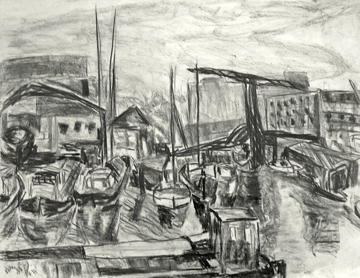
How often should I practice?
This is a classic question, and my answer is always the same: consistently. Five minutes every day is infinitely more beneficial than a marathon five-hour session once a month. Daily practice builds muscle memory, sharpens observation skills, and keeps your creative flow engaged. It doesn't have to be a masterpiece; a quick sketch of your hand, a cup, or a simple shape is enough to keep the habit alive. The goal is to make drawing a natural, effortless part of your routine. Remember, it's about building a habit, a continuous conversation with your creativity – a daily check-in with your artistic self. Think of it like learning a musical instrument: short, regular sessions are far more effective for building skill and confidence than infrequent, long ones.

Embracing Imperfection and Process Over Product
I struggled for years with the idea that every drawing had to be a masterpiece. It was paralyzing. The truth is, most of your practice will be imperfect, exploratory, and messy. And that’s not just okay; it's essential. Focus on the process of drawing, the joy of making marks, and the act of observation, rather than solely on the product. The masterpieces will come, but only after hundreds, even thousands, of imperfect sketches. It’s a journey, not a destination, and every single mark you make, no matter how humble, is a step along that path. This mindset shift is, in my experience, one of the most powerful tools an artist can acquire.
What's 'value' in art and why is it important?
Ah, value! This is one of the absolute pillars of drawing, arguably even more critical than color for creating convincing form. Value refers to the lightness or darkness of a color or tone. It's the entire spectrum from pure white to pure black, and all the myriad shades of grey in between. Why is it so important? Because value defines form, creates depth, and establishes mood and atmosphere. Without a good understanding of value, your drawings will appear flat, two-dimensional, no matter how perfectly rendered your lines or how vibrant your colors are.
Think of it like this: A sphere drawn only with an outline looks flat, like a simple circle. But add a smooth gradient of values from light to dark, and suddenly, that flat circle has dimension, volume, and weight. Mastering value allows you to sculpt with light and shadow, making objects appear three-dimensional on a two-dimensional surface. It's the visual language of light, and it’s what gives your drawings weight, realism, and a sense of tangible presence. Practicing value scales with your graphite pencils is one of the most effective exercises you can do, truly opening your eyes to seeing light and shadow. It's the foundation upon which all other visual elements are built, the bedrock of visual communication.
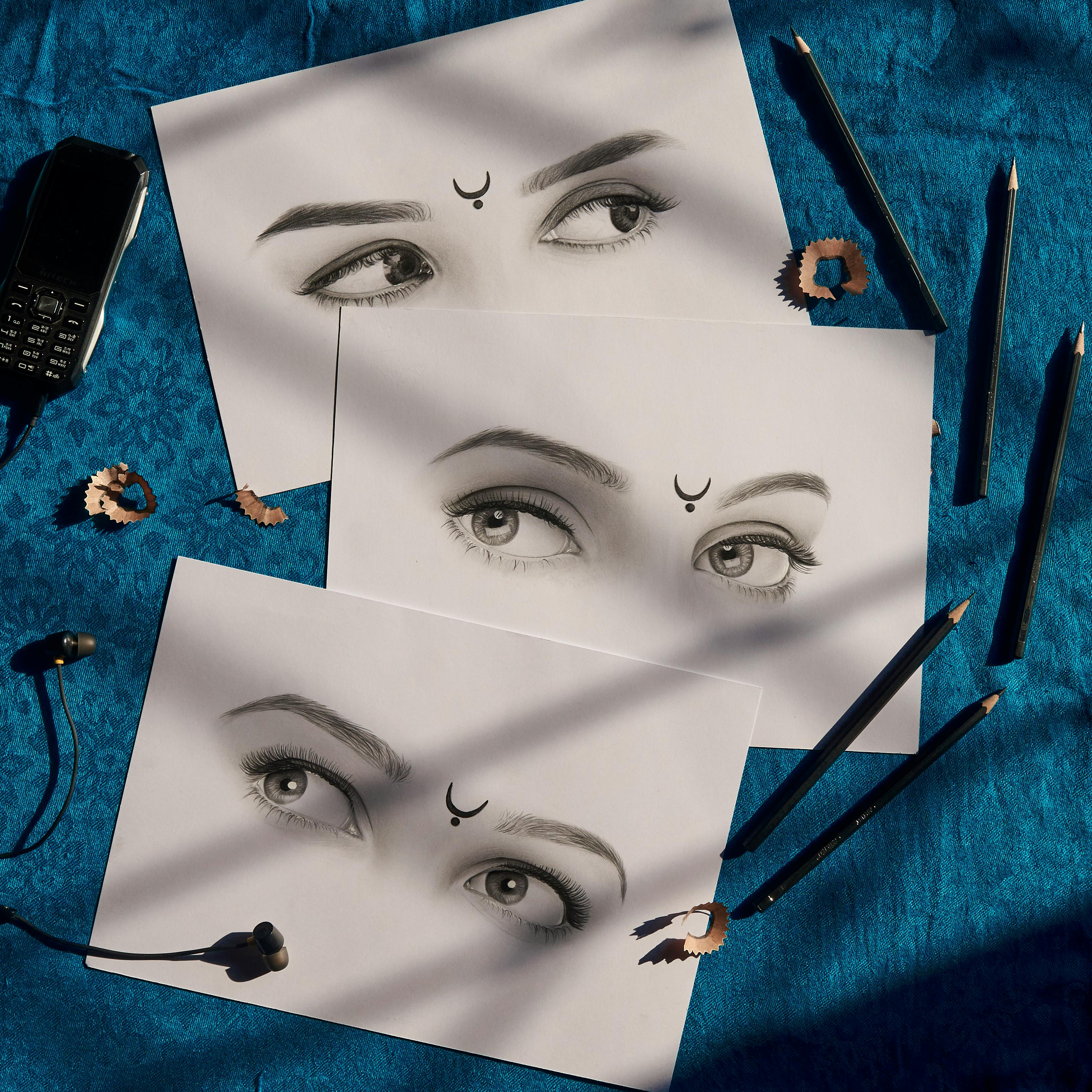
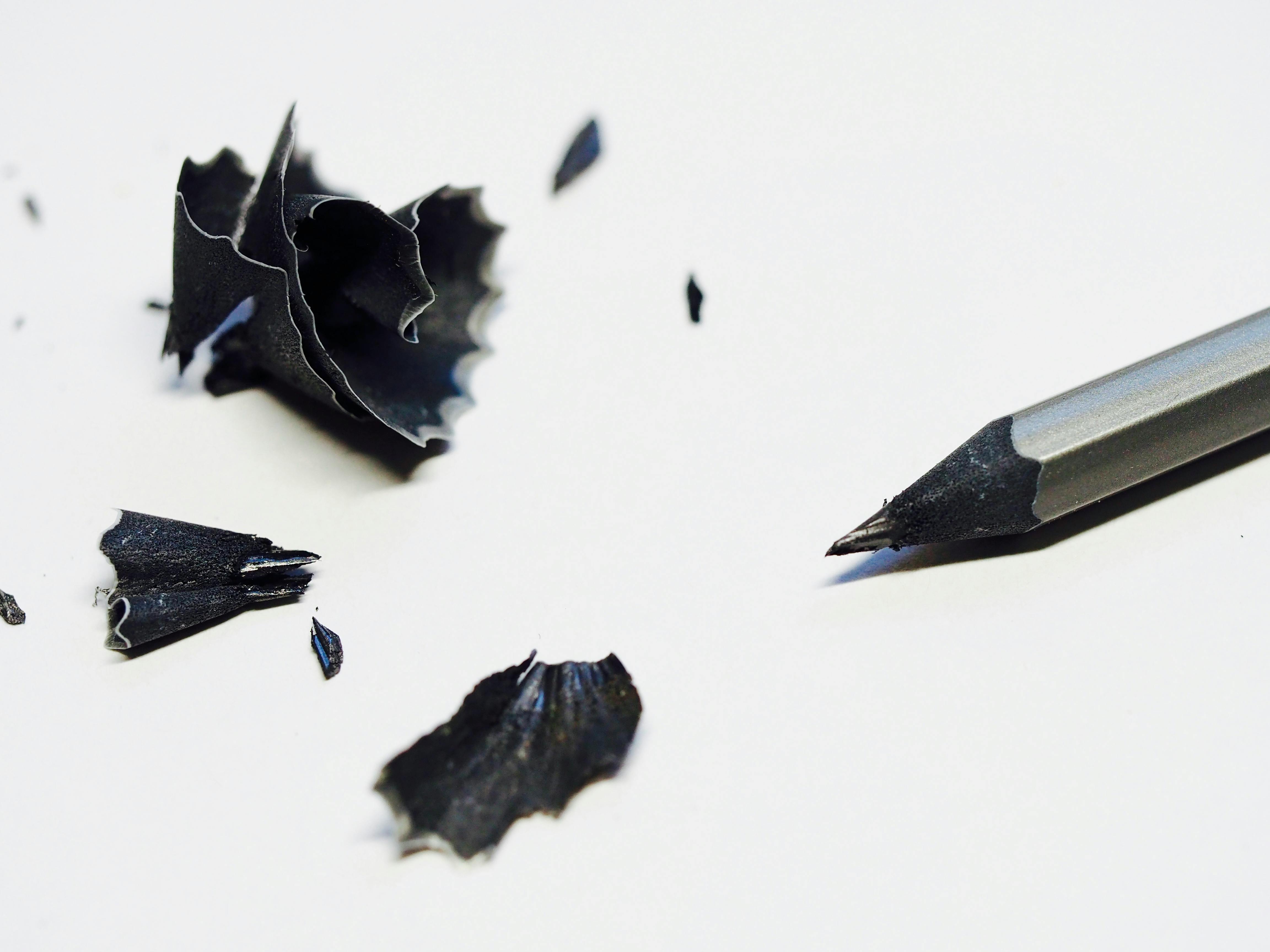
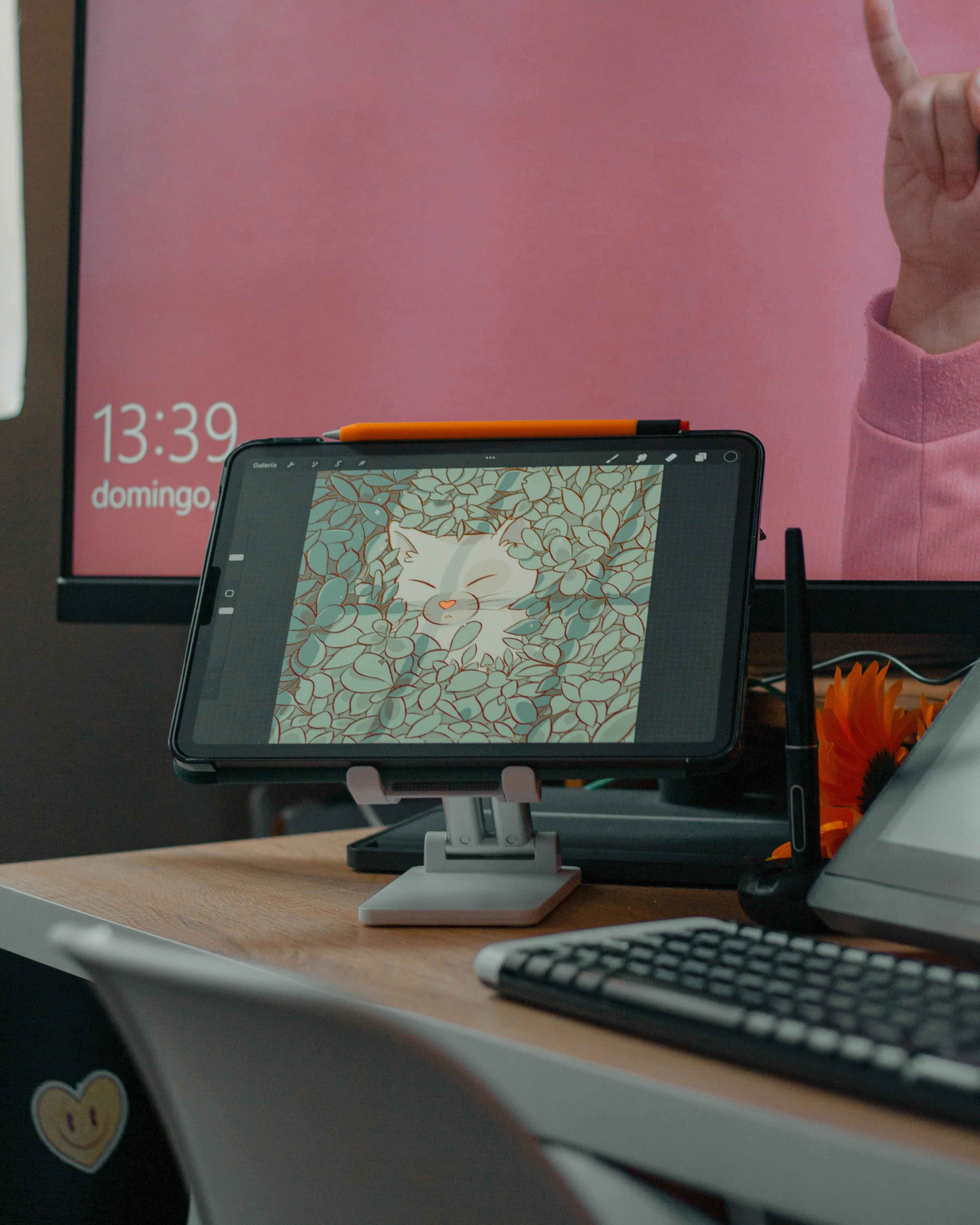
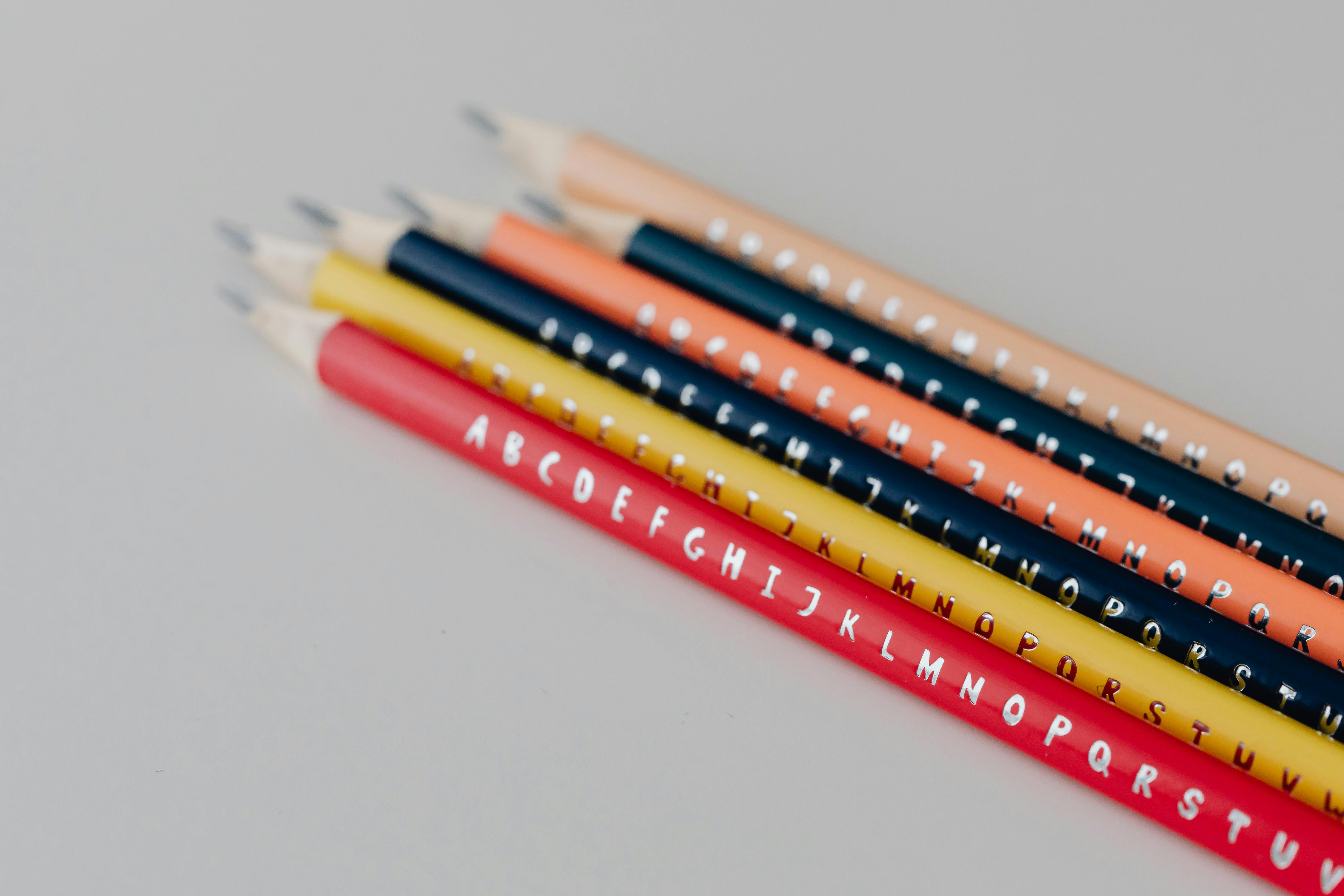
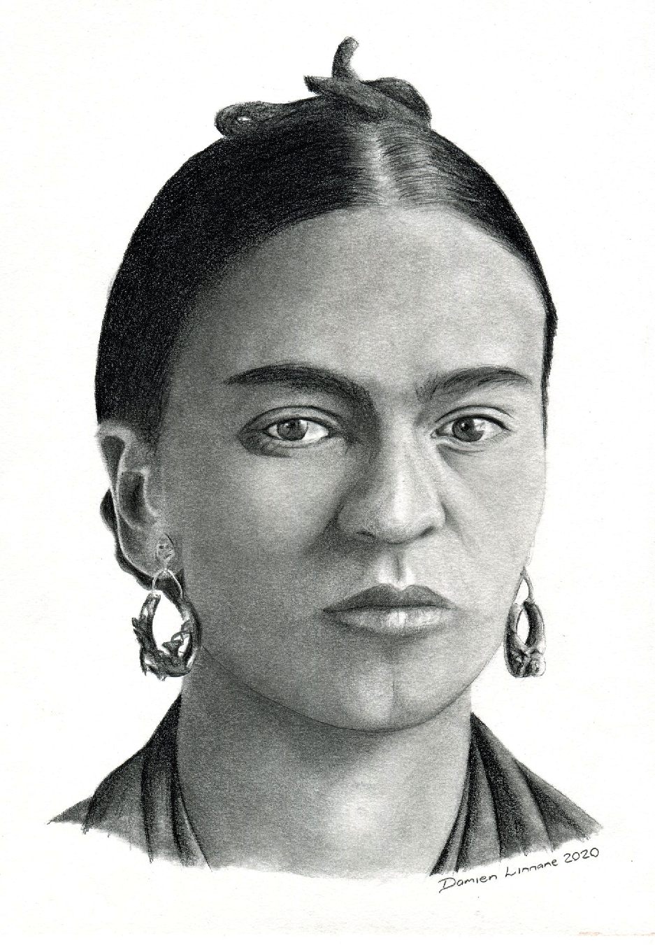
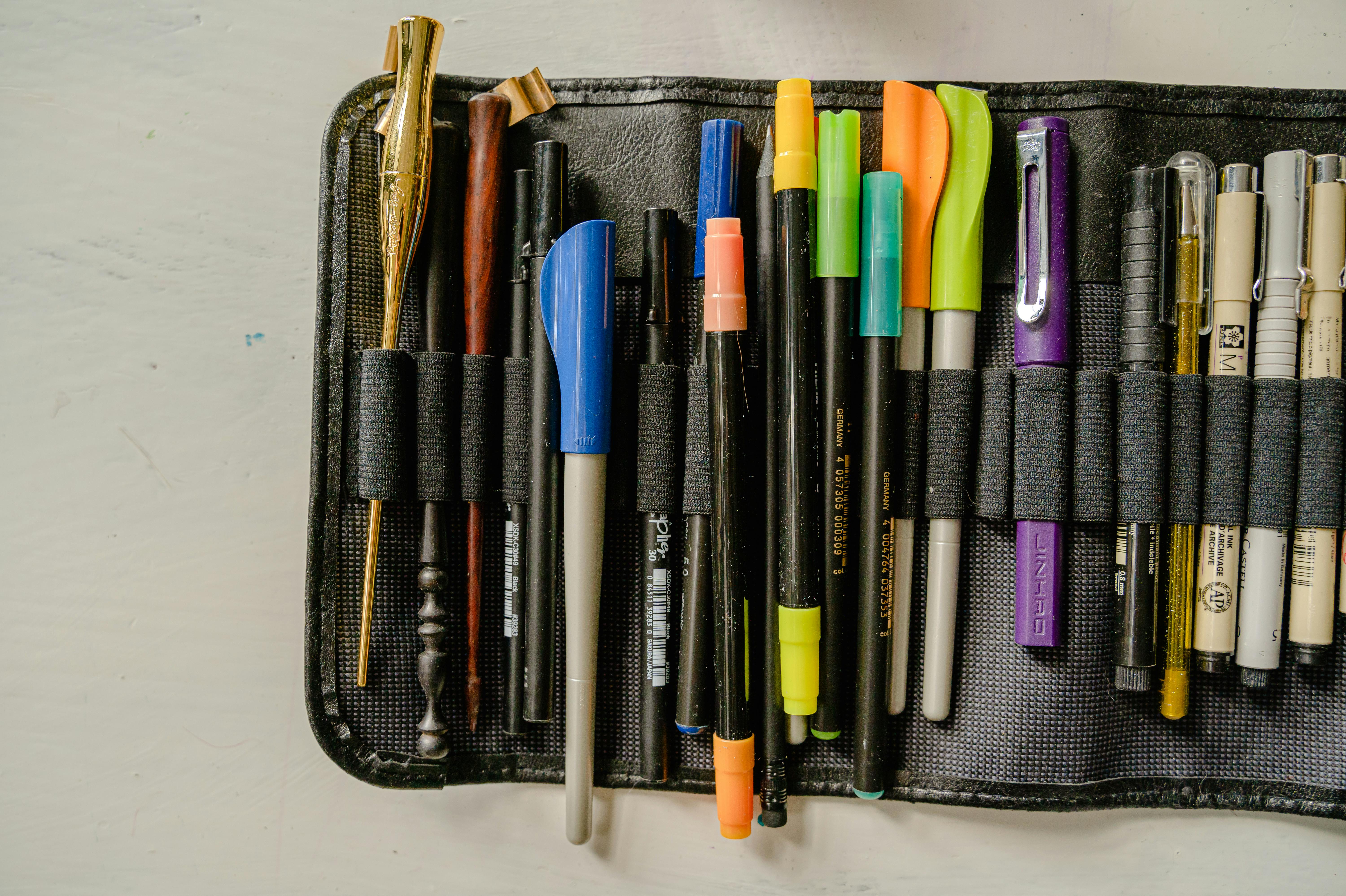
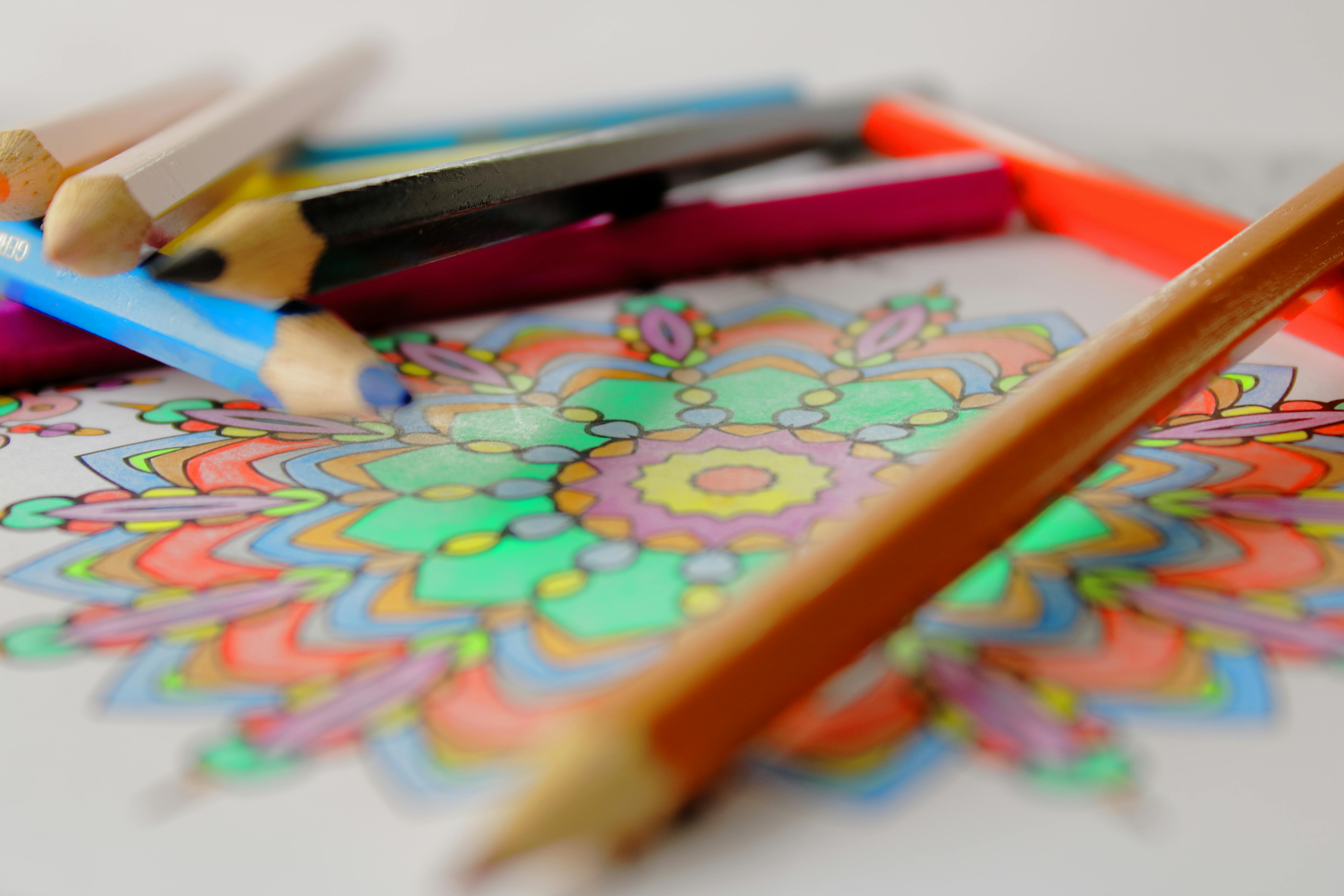
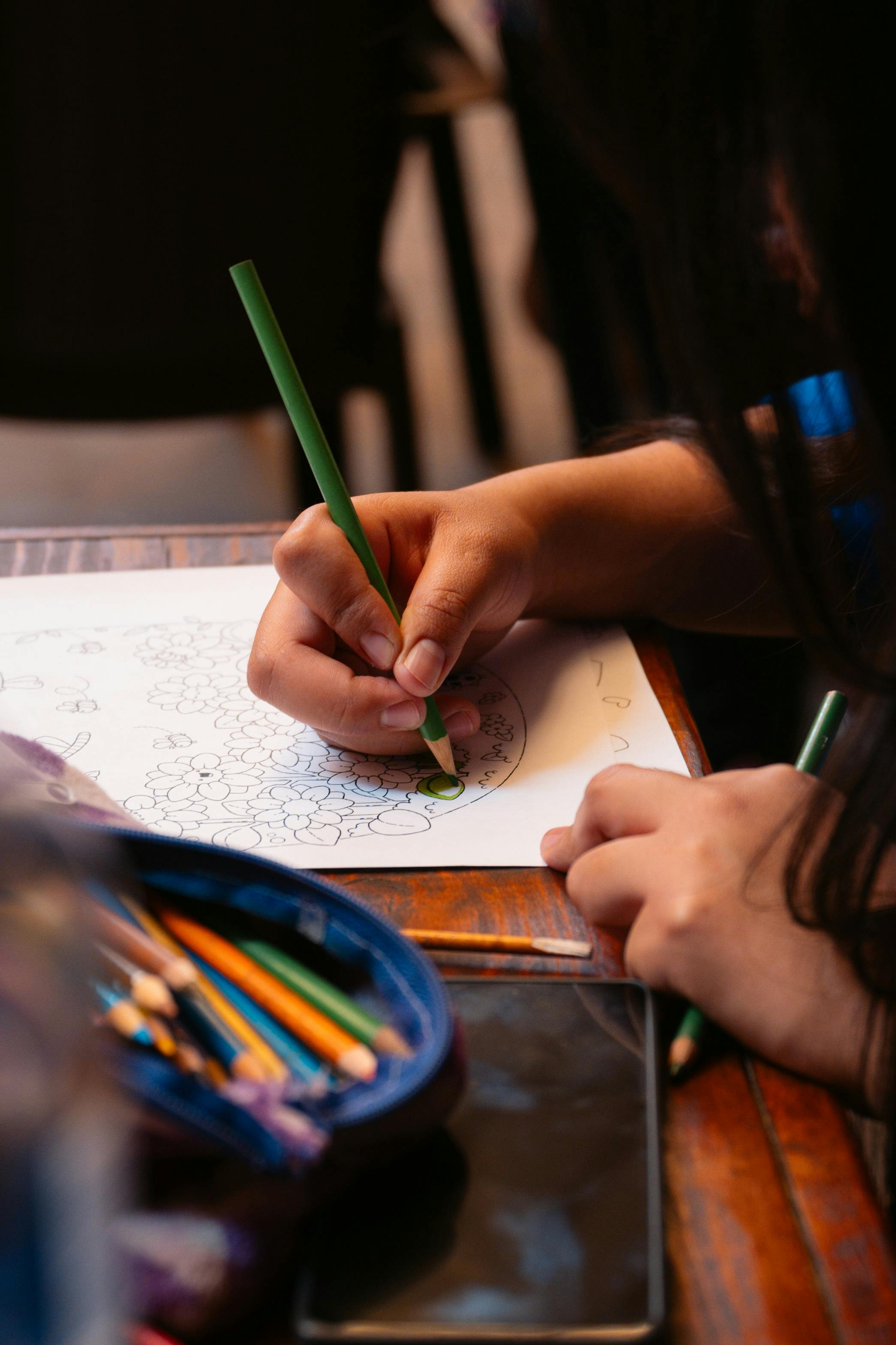
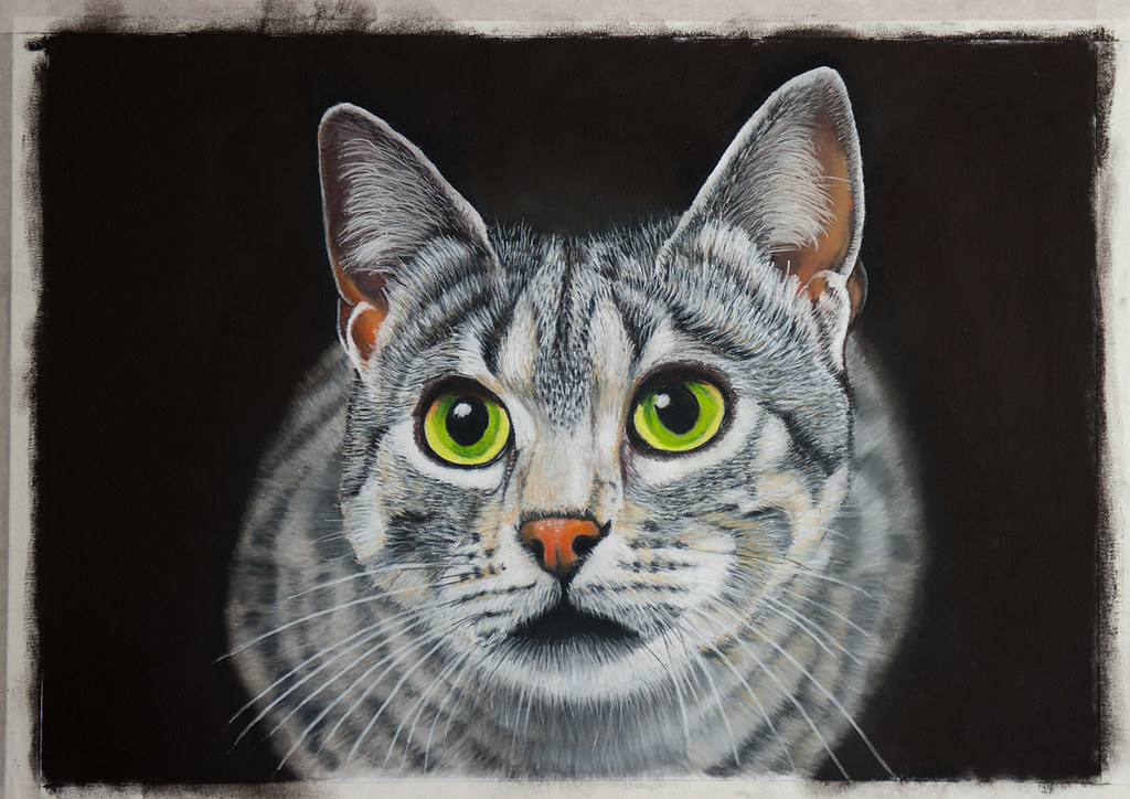
How can I improve my drawing techniques?
Improving your drawing techniques is a continuous journey of observation, dedicated practice, and fearless experimentation. Beyond just putting pencil to paper, actively studying foundational techniques can dramatically accelerate your growth. This includes understanding line quality (how thick or thin, dark or light your line is), cross-hatching, stippling, and various blending methods. Deliberate practice, focusing intensely on one skill at a time, is far more effective than aimless doodling. For a comprehensive guide to expanding your skillset, explore my definitive guide to drawing techniques. It's a treasure trove of insights to help you push past plateaus and truly level up your artistry. Remember, mastery is a marathon, not a sprint, and every single mark contributes to your progress.
The Power of Copying Masterpieces
One of the most effective, yet often overlooked, ways to improve your technique is to copy the masters. No, not to plagiarize, but to learn. Find drawings or paintings you admire, and try to replicate them. Don't trace, but truly draw them. This exercise forces you to analyze the artist's decisions: how they handled line, how they achieved certain values, their compositional choices. It's like an intensive art history lesson that also builds your hand-eye coordination and technical skill. Many of the greatest artists throughout history learned by copying, and it's a practice I still engage in when I feel stuck or want to push my boundaries.
What about composition in drawing?
Composition is the silent orchestrator of your artwork, dictating how all the elements within your drawing relate to each other and, crucially, how they guide the viewer's eye through the piece. It’s not just about what you draw, but how you arrange it, creating a visual narrative. Learning basic compositional principles like the rule of thirds, leading lines, and negative space can transform a merely good drawing into a compelling, unforgettable one. These principles are universal, applying across all art forms, from abstract to realistic, and understanding them is a superpower. To truly elevate your work, delve into the definitive guide to composition in abstract art – many of its profound lessons apply directly to representational drawing as well. It's the difference between a random collection of objects and a cohesive, engaging story. A well-composed piece draws the viewer in, holds their gaze, and communicates its message with clarity and impact.
Understanding Negative Space
This is a concept that truly blew my mind when I first encountered it. Negative space refers to the space around and between the subject of your drawing. Instead of focusing only on the object itself, try drawing the shapes of the empty space surrounding it. This can be incredibly helpful for achieving accurate proportions and a strong composition. Your brain often simplifies objects, but it's less likely to simplify an abstract negative shape. By consciously observing and drawing negative space, you train your eye to see more accurately, improving your positive forms almost magically. It’s a powerful trick that shifts your perception and unlocks a deeper level of observation. A great exercise is to try drawing a chair by only drawing the shapes of the air around and through it, rather than focusing on the chair itself.
I have my kit... now what? How do I find things to draw?
Draw what’s right in front of you! Seriously. Look around. Your trusty coffee cup, your perpetually untied shoe, the complex landscape of your own hand (a fantastic subject, by the way, full of form and expression!). The world, in its glorious, mundane everydayness, is an overflowing treasure chest of interesting shapes, dynamic shadows, and compelling forms. Don't feel pressured to find 'perfect' subjects or to wait for grand inspiration; the beauty is in the act of observation and translation, the simple joy of making marks. When you feel ready for a bit more structured guidance, I've compiled my extensive thoughts on how to find your art subject. But before you even click that link, remember the single most important directive: simply start moving your hand across the paper. That, right there, is the beginning of everything. Every mark is a tiny act of courage, a step into your creative self.
Setting Up Your Creative Space
You don't need a grand studio to make art. A corner of a table, a quiet nook, or even a lap desk can be your sanctuary. The key is to create a space that invites you to draw. Good lighting (more on that later), a comfortable chair, and easy access to your curated kit are far more important than square footage. I've found that having my supplies readily available, rather than tucked away in a drawer, significantly increases the likelihood that I'll actually sit down and make something. Make it a space you want to be in, a low-friction zone for creativity to flourish. Even a small, dedicated spot can signal to your brain that it's time to create, fostering a consistent practice.
What's the difference between sketching and drawing?
Often used interchangeably, I view sketching as the exploratory, uninhibited act of capturing an idea quickly, practicing a form, or simply letting your hand move. It's about process, not perfection, a visual stream of consciousness. Drawing, on the other hand, implies a more deliberate, often more refined and finished piece of work, where careful attention is paid to detail, composition, and rendering. Think of sketching as the brainstorming phase, and drawing as the polished presentation. Both are vital for artistic development, and one naturally leads to the other. Embrace the freedom of sketching to inform the precision of your drawing; they are two sides of the same creative coin. One fuels the other.

What's the best lighting for drawing?
The ideal lighting for drawing is consistent, indirect light. Natural daylight from a window, especially one that doesn't get direct sun, is usually the best. Avoid harsh, direct light as it creates strong, unflattering shadows that can obscure forms, making it harder to discern subtle values. If working at night, a good quality, adjustable desk lamp with a 'daylight' bulb (around 5000K, which mimics natural daylight) is indispensable. Position the light so it casts shadows in a way that helps you define form, typically from above and slightly to one side, mirroring how natural light falls. Experiment to find what works best for your eyes and your subject. Proper lighting is truly an unsung hero of a productive art practice.
The Importance of a Clean Workspace
This might seem like a small point, but a clean workspace is a clean mind. Clutter can be distracting and, practically speaking, can lead to smudges on your precious artwork. I'm not saying you need a sterile environment (mine certainly isn't!), but having dedicated spots for your tools and keeping your drawing surface clear will significantly improve your focus and prevent accidental damage to your work. It's about respecting your creative process and the materials that enable it. A little organization goes a long way in inviting creativity, I find.
What about perspective in drawing?
Ah, perspective! It's one of those fundamental concepts that can feel intimidating, but it's utterly essential for creating believable depth and space on a two-dimensional surface. Starting with basic one-point and two-point perspective exercises can dramatically improve your ability to draw objects and scenes convincingly, making your world feel tangible. It's less about rigid, stifling rules and more about understanding how things recede in space, how parallel lines appear to converge, and how objects appear to diminish in size as they get further away. When you're ready to tackle this fascinating challenge, dive into my definitive guide to perspective in art. It will unlock a whole new dimension (pun intended!) to your drawing, making your compositions far more dynamic and realistic. Think of it as mapping out the world on your page, creating an illusion of depth that draws the viewer in and immerses them in your creation.

Basic Forms and Construction Drawing
Before you can draw a complex figure or landscape, it's incredibly helpful, indeed essential, to understand how to draw basic geometric forms: cubes, cylinders, spheres, and cones. Why? Because nearly every object in the world, no matter how intricate, can be broken down into these fundamental, simpler shapes. A head is essentially a sphere (or an ovoid), an arm is a cylinder, a house is a collection of cubes and prisms. By mastering these basic forms in perspective and with proper value, you gain the fundamental ability to construct any object convincingly from the ground up. It's the skeleton beneath the skin of reality, the underlying structure, and understanding it is key to building believable, three-dimensional forms on your paper. This is where your HB pencil really shines – sketching out these foundational shapes with light, exploratory lines. It's like learning the grammar of visual reality, allowing you to articulate any visual sentence.
Developing Your Artistic Style: Finding Your Unique Voice
As you progress, you'll naturally start to develop your own unique artistic style. This isn't something you force; it emerges organically from your consistent practice, your experiments with different mediums, and your personal observations of the world. Think of it as your visual accent, a fingerprint that distinguishes your work. It's the culmination of your preferences in line, color, texture, and composition, intertwined with your personality and perspective. Don't chase a particular style; instead, embrace exploration, pay attention to what truly excites you, and let your voice unfold naturally. It's a journey of self-discovery as much as it is an artistic one, and the most compelling art always has a genuine, individual voice. The quirks and imperfections along the way are often the very things that define your uniqueness.
Critique and Feedback: Growing Through Others' Eyes
Receiving and giving constructive criticism is an invaluable part of artistic growth. It can be daunting to share your work, but a fresh pair of eyes can often spot areas for improvement that you, being so close to the piece, might overlook. Seek out feedback from trusted peers, instructors, or online communities. When receiving critique, try to listen without defensiveness, focusing on understanding the perspective rather than justifying your choices. Not all feedback will resonate, and that's okay, but even uncomfortable observations can spark new ideas. When giving feedback, be specific, constructive, and always start with something you genuinely admire. It's about helping each other grow, not tearing down. Remember, art is a conversation, and critique is one of its most potent dialects.
Your First Mark Awaits
There you have it. A simple, no-nonsense, curated guide to your first drawing kit. The mystique is gone. The wall of choices has been narrowed down to a handful of powerful, versatile tools, and a whole world of artistic exploration awaits you beyond the core. This guide is your compass for navigating the exciting, sometimes overwhelming, landscape of art supplies, ensuring your journey begins with purpose and clarity.
The Importance of Warm-Up Exercises
Just like an athlete warms up before a race, an artist benefits immensely from warm-up exercises. Before diving into your main drawing, spend five to ten minutes doing quick, loose sketches. Draw circles, straight lines, spirals, or scribble randomly. This helps to loosen your hand, gets your eyes accustomed to seeing, and mentally prepares you for focused work. It's about shaking off the rust and getting into the flow, and it prevents those first few precious marks on your serious drawing from feeling stiff or hesitant. Trust me, it makes a huge difference. It's a small investment with a huge payoff in fluidity and confidence. You wouldn't run a sprint without stretching first, would you? The same applies to your drawing hand.
What about printmaking or sculpture?
While this guide focuses on drawing and painting mediums, the principles you learn – composition, value, form, texture – are universally applicable. Printmaking (like linocut, screen printing, or etching) is a vast and exciting field that transforms drawn images into reproducible art. It offers a unique blend of drawing and craft, resulting in tactile, often unexpected results. Sculpture involves working in three dimensions, bringing form into physical space. Both are incredible avenues for artistic expression once you have a solid foundation in two-dimensional work. They often require specialized tools and processes, but the creative spirit behind them is the same. Don't feel you have to limit yourself to one discipline; the artistic journey is all about exploration!
Exploring Mixed Media: Combining Disciplines
Once you're comfortable with a few different mediums, the world of mixed media opens up. This involves combining two or more art forms in a single piece, creating rich textures, unexpected visual dialogues, and entirely new effects. Imagine a graphite drawing with watercolor washes, or an ink drawing with colored pencil accents. There are no rules here, only endless possibilities for experimentation and personal expression. It's a fantastic way to break free from the perceived limitations of a single medium and to discover unique combinations that resonate with your artistic voice. Don't be afraid to experiment, that's where the real magic happens!
How do I clean my brushes?
Proper brush care is not just important, it's absolutely crucial for the longevity and performance of your tools! For water-soluble mediums (watercolors, acrylics, gouache), rinse your brushes thoroughly with lukewarm water immediately after use, making sure no pigment remains near the ferrule (the metal part connecting bristles to handle), where it can dry and cause the bristles to splay. For oil paints, you'll first need a solvent (like odorless mineral spirits or turpentine) to remove the bulk of the paint, followed by a thorough wash with soap and water (a dedicated brush soap works wonders). Always reshape the bristles to their original point or chisel edge while damp and store them upright (bristles up) or flat to prevent bending and keep their shape. Never, ever let paint dry in your bristles; it’s a death sentence for a brush! Good brushes are an investment, and treating them with care ensures they'll serve you well for years, often becoming cherished companions in your artistic journey. Think of it as a small act of respect for your tools, which in turn nurtures your creative practice. A clean brush is a happy brush, and a happy brush makes for happy art. I've learned the hard way that a neglected brush can ruin a painting as quickly as a clumsy hand, so treat them as extensions of your artistic will.
What is gesso and why is it used?
Gesso is a primer used to prepare surfaces for painting, especially canvas or wood panels. It creates a stable, slightly absorbent, and often white surface for paint to adhere to, acting as a crucial barrier. It protects the canvas fibers from the acidity of oil paints, provides 'tooth' (a slight texture) for the paint to grab onto, and brightens colors, making them appear more vibrant. Without gesso, canvas would absorb paint unevenly, and colors would appear dull and lifeless. It’s the invisible foundation that ensures your painting stands the test of time and truly shines. For more, check out what is gesso in painting and gesso vs. primer: what's the difference. You can also learn how to stretch canvas for painting or even how to make your own canvas for painting for a truly hands-on approach. For those feeling particularly ambitious, you can even explore how to make your own gesso: a diy guide for artists. It's truly the unsung hero of many a vibrant painting.
How do I choose the right art supplies store?
Local art supply stores often offer invaluable, personalized advice and a chance to feel materials in person – to truly connect with the tools before you buy them. Online retailers, conversely, usually have wider selections and competitive prices, making them great for niche items or bulk purchases. My advice? Try both! Support your local shop for advice, workshops, and quick needs, and use online stores for bulk purchases or specialty items you can't find locally. Read reviews, compare prices, and prioritize customer service and product knowledge. The best store is one that empowers your artistic journey, that feels like a partner, not just a vendor that sells you stuff. For more general advice on getting started, you might find our guide to essential drawing supplies for beginners helpful. It’s about building a relationship with your suppliers, just as you do with your tools and your craft.
Final Thoughts: The Journey Begins Now
The most expensive, meticulously assembled, professional-grade drawing kit in the world is, let's be honest, absolutely worthless if it remains pristine, gathering dust in a drawer. Conversely, a humble, thoughtfully curated set of just four well-chosen graphite pencils and a single, beloved sketchbook—one that you actually use, every single day, with joy and purpose—is infinitely more precious and powerful. Don't fall prey to the illusion of needing the "perfect" moment or the "perfect" tools. The moment, I assure you, is precisely now, and the tools you need are already within your reach. And these tools, these simple extensions of your will, are truly all you need to begin your endlessly rewarding artistic journey. Now, go. Make a mark. The world, and your creative soul, are waiting. Your unique vision deserves to be expressed, and the path to expressing it begins with that first, brave stroke. What are you waiting for? Embrace the blank page, for it holds infinite possibilities. The most profound artistic statement often begins with the simplest of marks. The greatest masterpiece you'll ever create is the one you haven't started yet. And if you ever find yourself struggling to monetize your art, remember that simply selling prints or originals through a platform like My Shop can be a rewarding next step after you've built a body of work you're proud of, sharing your unique voice with a wider audience.