What Are Soft Pastels? My Personal Guide to Using Them & Making Art
Ever wondered about the magic of soft pastels? Join me on a personal journey as I demystify this vibrant medium, from choosing your first sticks to mastering blending techniques, and discover why they're a must-try for any artist.
What Are Soft Pastels? Your Definitive Guide to Using Them & Making Art
Oh, soft pastels! For me, they represent one of the most direct and profoundly personal ways to make art. It's almost like you're literally sculpting light and color onto the paper with your fingertips, a tactile dance where your hand connects directly to the raw pigment. This isn't just a medium; it’s an experience—a direct conversation between your hand and the raw essence of color. If you've ever watched an artist effortlessly blend vibrant hues with a swipe of their hand, chances are you were witnessing the magic of soft pastels. They're often misunderstood, sometimes dismissed as "fancy chalk," but once you delve in, their glorious, dusty potential quickly becomes apparent. It's a medium steeped in history, embraced by masters, and yet as fresh and immediate as a new idea. But what are they, really? And how do we even begin to tame their glorious potential, navigate the inevitable dust, and unlock the luminous art they promise?
I've spent years exploring this medium, and I'm thrilled to share everything I've learned. From understanding the core materials to mastering advanced techniques, overcoming common challenges, and even diving into their fascinating history, this guide aims to be your most comprehensive resource. We'll get our hands dirty (literally!) and discover why these vibrant sticks have captivated artists for centuries – from Renaissance sketches to Impressionist masterpieces and beyond. This isn't just a guide; it's your invitation to a vibrant, tactile journey into the heart of color and expression, promising to transform your understanding and application of this incredible medium. Ready to dive in and get a little dusty?
Unpacking the Magic: What Exactly ARE Soft Pastels?
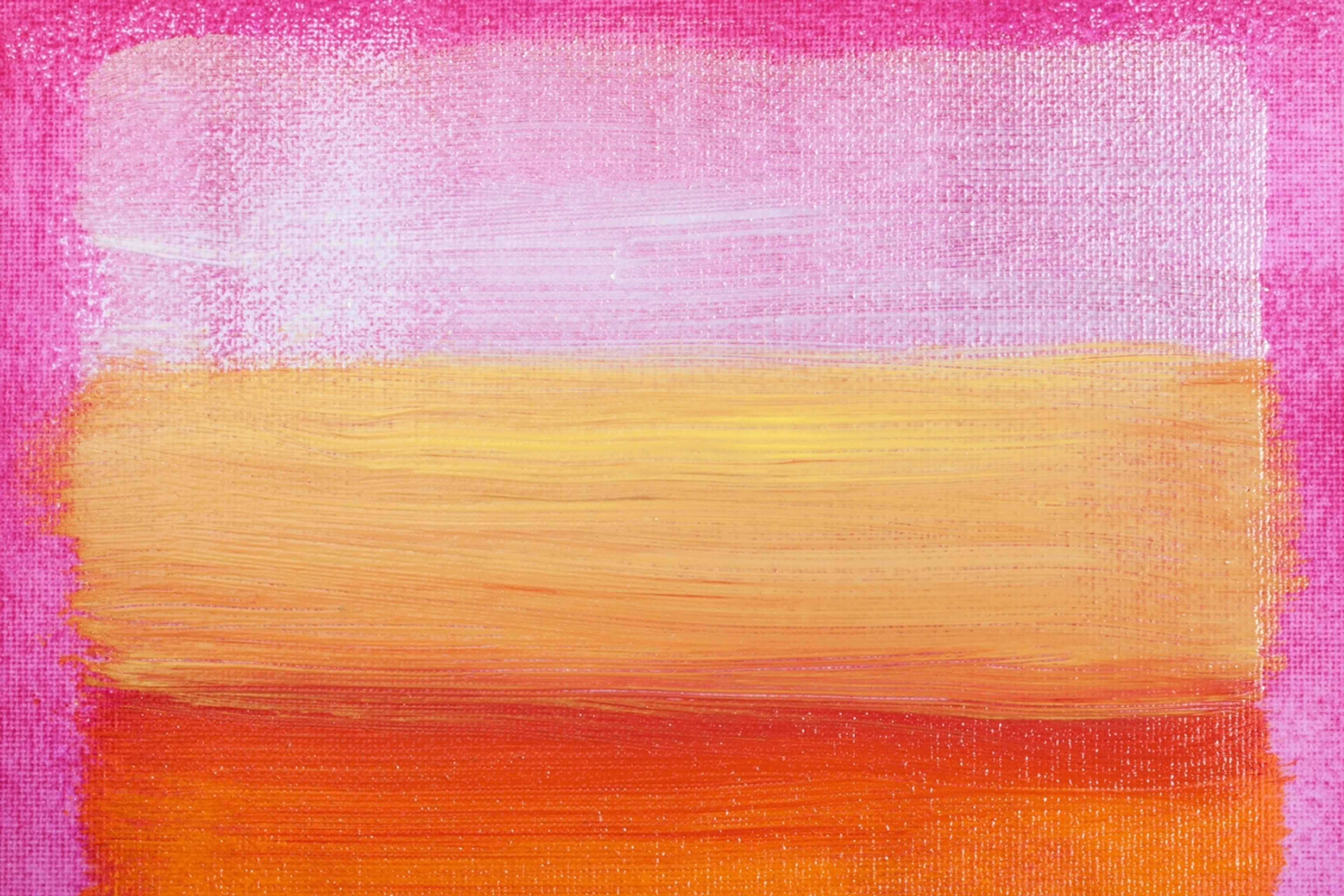
When I first stumbled upon soft pastels, I honestly thought they were just fancy chalk. Boy, was I wrong! While they share a chalky appearance, soft pastels are an art medium composed almost entirely of pure powdered pigment, bound together with a minimal amount of natural binder (like gum tragacanth). This exceptionally high pigment concentration is what gives them their incredible intensity, velvety texture, and unparalleled light reflection. It’s why the colors sing off the page with such vibrancy – they’re essentially raw color, compressed into a stick, waiting to be unleashed. The binder's role is critical here: it holds the pigment together just enough to form a usable stick, but its scarcity means you're getting almost undiluted color directly onto your surface, which is something truly special.
Forms of Soft Pastels: More Than Just Sticks
While the classic stick form is what most people picture, soft pastels come in a few different iterations, each with its own advantages. Understanding these can really broaden your artistic horizons and open up new possibilities for mark-making and expression:
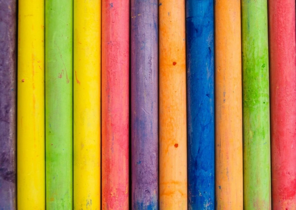
- Soft Pastel Sticks: These are the traditional form, varying dramatically in softness, size, and even shape between brands. From chunky blocks ideal for covering large areas to slender sticks perfect for mid-range strokes, they are fantastic for broad application, intense layering, and effortless blending. The softer the stick, generally, the more pure pigment it delivers and the more easily it blends, but also the more fragile and dusty it becomes. Conversely, slightly firmer sticks offer more control for certain techniques.
- Pastel Pencils: Think of these as soft pastels encased in wood, much like traditional best sketching pencils for artists or how to use colored pencils for beginners. They offer incredible precision for details, fine lines, delicate crosshatching, and crisp edges that are difficult to achieve with sticks. While they still deliver that vibrant pastel pigment, their wooden casing makes them significantly less messy and easier to handle for intricate work.
- Pan Pastels: This is a relatively newer innovation in the pastel world, and one I'm quite fond of for specific applications. Pan pastels are highly concentrated soft pastel pigments packed into compact pans, quite similar in appearance to watercolor pans. They are applied with specially designed sponges or tools, allowing for incredibly smooth, painterly applications, soft washes of color, and surprisingly minimal dust compared to sticks. They're excellent for backgrounds, broad, even coverage, and creating seamless gradients, often feeling more like painting than drawing.
- Soft Pastel Grounds/Mediums: While not a pastel form themselves, these are important to mention. These are acrylic-based mediums embedded with fine, gritty particles that create a
The Nuance of Softness: Grades of Pastel
Not all soft pastels are created equal, and their 'softness' is a key characteristic that deeply impacts how they behave. Understanding these grades can help you choose the right stick for the right job:
- Extra Soft Pastels: These are often described as buttery or creamy. Brands like Sennelier, Schmincke, and Terry Ludwig fall into this category. They lay down a huge amount of pure pigment with minimal pressure, making them fantastic for rich, vibrant top layers, blending, and creating dense color fields. However, they are also the most fragile and create the most dust.
- Medium Soft Pastels: Brands like Rembrandt or Faber-Castell Pitt Pastels often sit in this range. They offer a good balance between pigment load and structural integrity. They're still wonderfully blendable and vibrant but are less prone to breaking and can hold a slightly sharper edge for longer. These are often excellent for all-around use and a great starting point.
- Harder Soft Pastels: While still 'soft' compared to true hard pastels, some brands or specific sticks within a set will be firmer. These are excellent for initial sketching, laying down foundational colors without filling the paper's tooth too quickly, and for creating sharper details or fine lines when a pastel pencil isn't quite right. They produce less dust and are more durable. I often reach for these for my initial gestures or to block in large areas of local color with less commitment.
Understanding Your Pigments: From Earth to Synthetic
Just as important as the softness is the pigment itself. Soft pastels are, at their heart, pure pigment. The quality and type of pigment significantly impact the color's vibrancy, lightfastness, and even its texture.
- Organic Pigments: Derived from natural sources, often resulting in earthy, muted tones (e.g., ochres, siennas, umbers). These tend to be very lightfast and reliable.
- Inorganic Pigments: These can be natural minerals or synthetically produced. They often yield brighter, more intense colors (e.g., Ultramarine Blue, Cadmium Red). Modern synthetic pigments have greatly expanded the artist's palette, offering incredible vibrancy and often superior lightfastness compared to historical equivalents.
- Binder-to-Pigment Ratio: While all soft pastels have a minimal binder, the exact ratio can slightly vary between brands, influencing the
They're often confused with other pastel types or even colored pencils, but there are some crucial differences I've learned to appreciate:
Feature | Soft Pastels | Oil Pastels | Hard Pastels | Colored Pencils |
|---|---|---|---|---|
| Composition | High pigment, minimal binder | Pigment with oil/wax binder | High pigment, more binder | Pigment, wax/oil binder, wood casing |
| Texture | Velvety, powdery, soft | Creamy, waxy, oil-like | Firmer, chalky, less dusty | Smooth, pencil-like |
| Blending | Excellent, effortless finger blending | Blends well, often with solvent/turpentine | Good for lines, limited blending | Blends via layering, sometimes with solvent |
| Vibrancy | Extremely vibrant, opaque | Very vibrant, can be translucent or opaque | Good, but less intense than soft/oil | Moderate, can be built up |
| Dustiness | Very high | Low to none | Moderate | None |
| Best Use | Layering, blending, expressive strokes | Bold strokes, impasto, mixed media | Detailing, initial sketches, crisp lines | Detailing, fine lines, controlled shading |
That pure pigment? It's what gives soft pastels their incredible capacity for luminous, expressive color. I often find myself thinking about how much of the emotional language of color in abstract art truly shines through when I’m using pastels. Unlike paints where pigment is suspended in liquid, pastels are dry particles that refract light, creating a unique, radiant glow. The way colors interact, the way they layer and merge, creating optical shifts and breathtaking vibrancy, it's just breathtaking.

Why Dive Into the World of Soft Pastels? My Personal Ode to This Dusty Friend
So, why bother with a medium that's notoriously dusty and, let's be honest, a bit fragile? I've heard all the complaints, but for me, the reasons are deeply personal and artistically compelling. It's not just about the finished piece; it's about the process itself.

- Instant Gratification & Fleeting Moments: One of my favorite things about pastels is their directness. There’s no drying time, no brushes to clean (unless you count your dusty fingers and workspace!). You lay down color, and it’s there, immediately, demanding attention. This immediacy is fantastic for capturing fleeting ideas, doing quick studies, gesture drawings, or just getting a burst of creative energy out before it evaporates. I love how I can go from a blank page to a vibrant sketch in minutes, truly capturing the essence of a moment or an emotion, especially when working from life or rapidly changing light.
- Unparalleled Vibrancy & Luminous Depth: As I mentioned, it’s pure pigment, unbound by heavy oils or acrylic polymers. The colors are incredibly rich and luminous, offering a depth that can be hard to achieve with other dry mediums. When you layer pastels, the dry pigment particles interact optically, reflecting light in a unique way that creates a shimmering, almost light-filled surface. It’s like painting with crushed jewels, where each stroke contributes to a glowing, ethereal quality that truly sings off the page, allowing for intense saturation and subtle nuances that make colors feel alive.
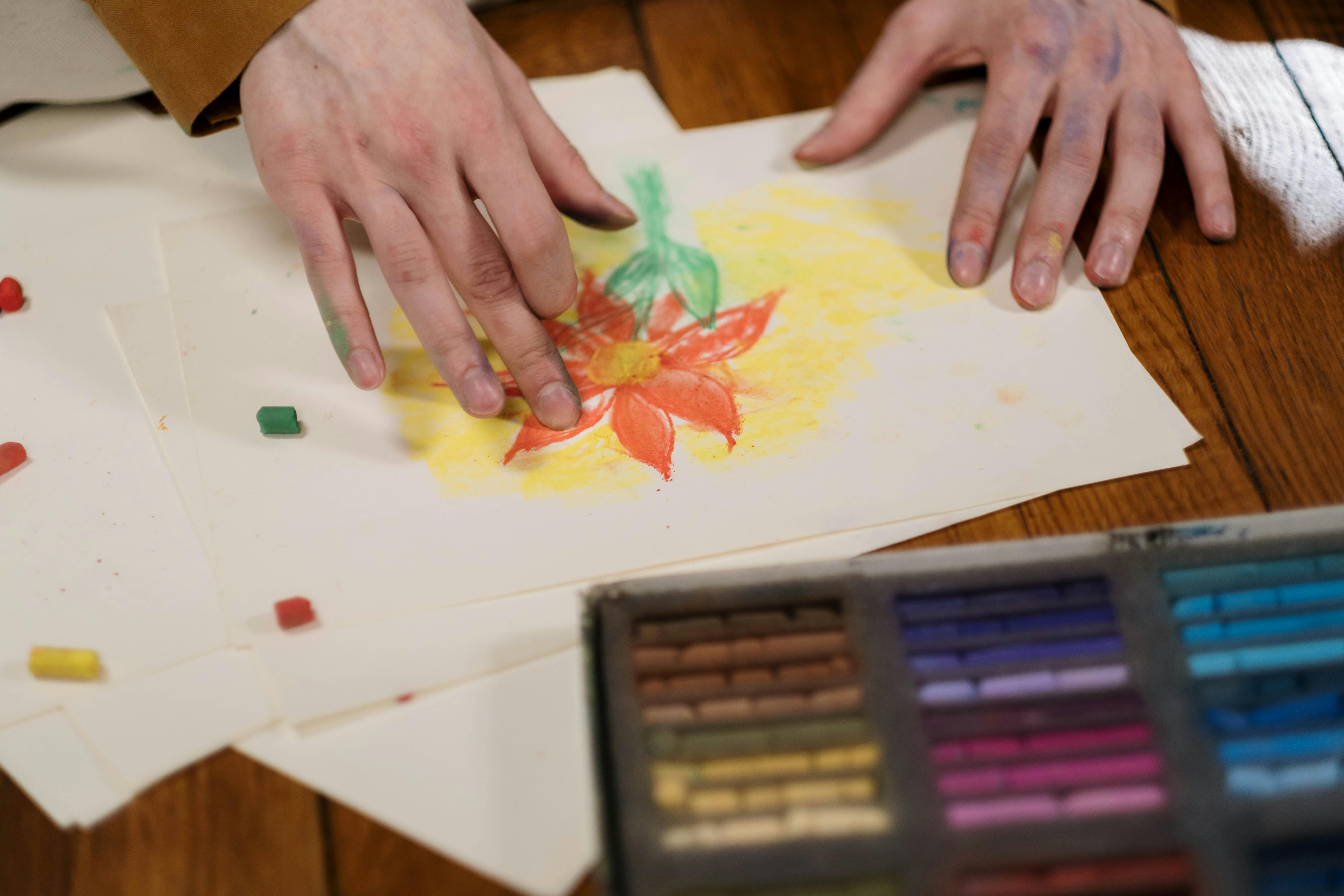
- Sensory Experience & Tactile Connection: This is a big one for me. The feel of the pastel gliding across textured paper, the satisfying whisper of the pigment dust falling, the direct intimacy of blending with my fingers – it’s a very visceral, hands-on experience that I find incredibly meditative. It’s a bit like working with clay, but for color, allowing a direct connection to the material. There’s something deeply satisfying about feeling the colors yield and merge under my touch. I often lose myself in the physical act of smudging, shaping, and building the colors, almost like a conversation with the surface.
- Blending Brilliance & Ethereal Transitions: Soft pastels are champions of blending, a quality that makes them incredibly versatile. You can create seamless transitions, soft gradients, and ethereal glows with surprising ease, simply by rubbing with a finger, a tortillon, or a soft cloth. This directly influences how I approach composition in art explained, allowing for soft focal points, energetic bursts of diffused color, or moody, atmospheric shifts that are hard to replicate in other mediums. I find this especially useful for creating atmospheric landscapes or abstract pieces where soft, undefined edges contribute to the overall mood.
- Versatility & Mixed Media Adventures: While they excel on their own, soft pastels also play wonderfully with other mediums, acting as a fantastic bridge between wet and dry techniques. I’ve incorporated them into my journey with mixed media: blending materials for abstract expression, adding highlights or textured layers over acrylics, watercolors, gouache, or even oil pastels for different effects. They're not just a primary medium; they're a fantastic tool for adding finishing touches, atmospheric glows, or unique textures to almost any piece, bringing a soft, painterly quality that other mediums can't quite replicate. For artists exploring diverse paint types, understanding definitive guide to paint types for artists can help integrate pastels even more effectively.
Getting Started: Your Essential Soft Pastel Toolkit
Alright, convinced to give them a try? Excellent! You don't need a huge, expensive setup to start. I always tell beginners to invest in quality over quantity – a few good sticks and the right paper will go much further than a giant set of student-grade pastels. Here's what I recommend for a beginner's soft pastel kit:
1. The Soft Pastels Themselves
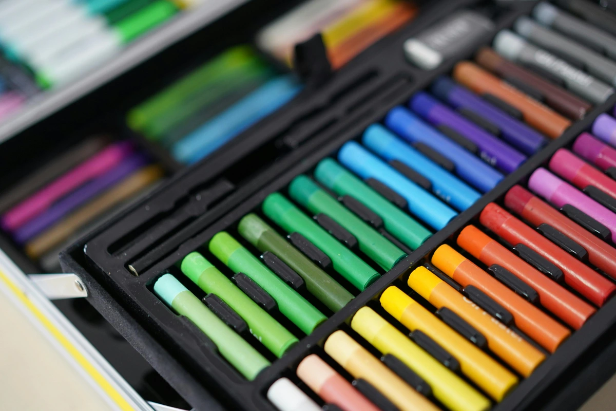
Start with a small set of artist-grade soft pastels. You’ll find student-grade options, but I always recommend investing in artist-grade if you can. The pigment quality, blending ability, and lightfastness are significantly better, even in entry-level artist-grade pastels. A set of 12-24 colors is more than enough to explore a wide range of subjects; you don't need hundreds to start. You can always expand later as you discover your preferred palette. Brands like Sennelier, Schmincke, and Terry Ludwig are truly luxurious, but Faber-Castell Pitt Pastels or Rembrandt are fantastic starting points that offer excellent quality without breaking the bank and are widely available. Remember, each brand has a slightly different feel and texture, so don't be afraid to experiment to find what resonates with you.

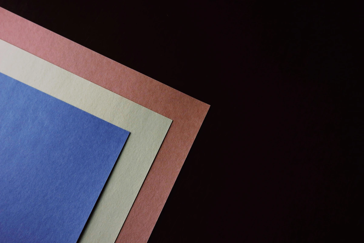
2. The Right Paper: A Game Changer
This is crucial. The right paper is arguably as important as the pastels themselves. Soft pastels need a surface with a bit of "tooth" or texture to grip the pigment. Without it, the pastel will just slide off, and you won't be able to build up vibrant layers or blend effectively. Think of the paper's tooth like a tiny landscape of peaks and valleys for the pigment particles to nestle into, creating adhesion and allowing for multiple layers of rich color.
Here are a few types I recommend, each offering a unique experience:
- Sanded Papers: These are my absolute favorite, especially for multi-layered work. Brands like UArt, Wallis, or Pastelmat offer a gritty surface that grabs an incredible amount of pigment, allowing for many layers without saturating the tooth. They're a bit pricier, but worth every penny.
- Canson Mi-Teintes: A classic and widely accessible choice, this paper has a distinct honeycomb texture on one side and a finer grain on the other. It's less expensive than sanded papers and a fantastic starting point for beginners, offering decent tooth for blending and layering without being overly aggressive. I often use the smoother side for more delicate work and the textured side for bold, expressive pieces.
- Velour Paper: This has a soft, velvety surface that creates beautiful, muted blends. It takes fewer layers than sanded paper but can produce wonderfully soft effects.
- Watercolor Paper (Cold Press): If you're just experimenting, a good quality cold press watercolor paper can work in a pinch, though its tooth is less pronounced than specialized pastel papers. For more on paper choices, you might find my guide to best watercolor paper or best paper for charcoal drawing helpful, as some principles overlap.
Always experiment with different surfaces to find what feels right for your style.
3. Fixatives: To Spray or Not to Spray? That is the Question!
Ah, fixatives! The great debate in the pastel world, and one that sparks many conversations among artists. A fixative is a clear, protective spray that you apply to pastel artwork to prevent smudging and increase the adhesion of the pigment to the paper. There are generally two types:
- Workable Fixatives: These allow you to continue layering pastels after application. They offer a light layer of protection and can help "reset" the paper's tooth if it becomes saturated.
- Final Fixatives: These are meant for the completed artwork, providing a stronger protective layer.
- Pros: Reduces dust, protects finished work from accidental smudges, can allow for more layers, especially with workable fixatives.
- Cons: Can darken or slightly alter colors (especially if applied too heavily), can make the surface slick, reducing further pastel adhesion, and sometimes flatten the luminous quality.
My personal take? Use it sparingly, and only when absolutely necessary. For intermediate layers, if you need to build up a lot of pastel or restore tooth, a workable fixative can be a lifesaver. For final pieces, a very light, even spray from a distance (in a well-ventilated area, please, and consider wearing a mask!) can offer some protection. Always test on a scrap piece first to see how it affects your colors! Brands like Spectrafix or Sennelier Latour are popular choices.
4. Blending Tools (Beyond Your Fingers)
While I adore blending with my fingertips – it's such a direct, sensory experience – sometimes you need a little more precision, want to keep your hands cleaner, or achieve specific effects.
- Tortillons & Blending Stumps: These tightly rolled paper sticks come to a point and are excellent for blending small areas, softening edges, or creating soft transitions without introducing skin oils. Keep them clean by rubbing them gently on sandpaper or a rough cloth.
- Cotton Swabs/Q-Tips: Simple, effective, and disposable, these are great for very small, delicate blending, especially in areas where you want to maintain clean color separation.
- Foam Applicators/Sponge Brushes: These can cover larger areas smoothly and evenly, making them ideal for backgrounds or creating a soft, diffused glow.
- Soft Cloths: Microfiber cloths, chamois, or even old t-shirt scraps work well for gentle, broad blending or for carefully removing excess dust without smudging.
- Color Shapers: These silicone-tipped tools come in various shapes and degrees of firmness. They can push and blend pastel without lifting too much pigment, offering a different kind of control than finger blending, and are excellent for creating crisp edges within soft areas.
5. Erasers & Sharpening Tools
Yes, you can erase pastel!
- Kneaded Eraser: This is your best friend. It's soft, moldable, and lifts pigment without damaging the paper. You can shape it into a point for fine details or dab it for general lightening.
- Hard Erasers: Vinyl or plastic erasers can remove more pigment but use them gently to avoid marring the paper.
- Pencil Sharpeners: For sharpening pastel pencils or creating fine pastel dust from sticks. A craft knife can also be used carefully.
6. Easels and Work Surfaces
Working vertically on an easel lets gravity do some of the work, pulling dust down and away from your art, which is a major advantage for cleanliness. It also gives you a better, more holistic perspective on your work as it develops, allowing you to step back and assess your progress. If a full easel isn't an option, a slightly inclined drawing board on a tabletop works wonders, providing a good angle for both working and viewing. Always protect your work surface with newspaper, a large sheet, or even a specialized dust tray – trust me, pastel dust gets everywhere! Consider your posture when working; good ergonomics will save your back and neck in the long run.
Mastering the Medium: Techniques for Soft Pastel Success
Once you have your basic toolkit, it's time to get down to the joyful, sometimes messy, business of making art! Soft pastels offer an incredible range of expressive possibilities. Here are some techniques I've found essential for unlocking their full potential.
1. Layering: Building Depth and Richness
Layering is the heart of pastel painting. Because pastels are opaque, you can build up color from dark to light (or light to dark, if you're feeling adventurous!), creating incredible depth and luminosity.
- Start with Light Pressure: Begin with a light hand, applying thin layers of color. This preserves the tooth of the paper, allowing you to add more layers later. Think of it as gently caressing the paper with the pastel.
- Underpainting: Many artists (myself included!) like to start with an underpainting using a contrasting color or even a thinned wash of watercolor or acrylic. This can create exciting optical mixtures and add vibrancy to your final layers.
- Crosshatching & Scumbling: Don't be afraid to apply color in different directions. Crosshatching builds intensity, while scumbling (light, circular motions) creates a soft, ethereal texture.
- "Feathering" Colors: Gently drag the side of the pastel stick over a previously laid color to create a delicate shimmer or to subtly shift a hue without fully blending it.
2. Blending Techniques: From Seamless to Textured
This is where the magic really happens with soft pastels. There are so many ways to blend, each yielding a different effect:
- Finger Blending: My go-to! The warmth and natural oils from your skin can create incredibly smooth, seamless transitions. Just be mindful of keeping your fingers clean (a damp cloth or baby wipe nearby is essential) to avoid muddying colors.
- Tortillons & Stumps: Perfect for precise blending in smaller areas or for achieving crisp edges within a soft blend. They're also great for keeping lighter colors pure.
- Cloth Blending: A soft cotton cloth or a chamois can create broad, soft blends, ideal for backgrounds or large areas of diffused color.
- Optical Blending (Layering without physically blending): Sometimes, the best "blend" is no physical blend at all! By layering complementary or analogous colors next to or over each other with light pressure, your eye will mix them optically, resulting in a vibrant, lively effect. This is a technique I use a lot in my abstract work to create dynamic color interactions.
- Solvent Blending (Wet Blending): For a truly painterly effect, you can dissolve pastel pigment with a small amount of odorless mineral spirits, rubbing alcohol, or even water (if your paper is suitable). Apply the solvent with a brush, cotton swab, or rag over a layer of pastel. This creates a rich, paint-like wash that dries quickly and provides a strong, smooth underpainting or a unique blended texture. Just make sure your paper can handle wet media!
3. Mark Making: Expressive Strokes and Details
Soft pastels aren't just for blending. They're incredibly versatile for creating a variety of marks:

- Broad Strokes: Use the side of the pastel stick for sweeping gestures, perfect for covering large areas quickly or capturing energetic movement.
- Fine Lines: Break a pastel stick to get a sharp edge, or use a pastel pencil for crisp details, outlines, or hatching.
- Dabbing & Tapping: Create interesting textures by lightly dabbing the pastel stick onto the paper, leaving small deposits of pure color. This is excellent for foliage, sparkling water, or abstract textures.
- Broken Color: Apply short, broken strokes of different colors side-by-side without blending. This allows the underlying colors to peek through, creating a vibrant, shimmering surface.
4. Working with Underpaintings: The Foundation for Brilliance
An underpainting is a base layer of color that sets the tone, establishes values, and can profoundly influence the final outcome of your pastel painting. I love experimenting with these, as they add an unexpected depth and luminosity:
- Complementary Underpainting: This is one of my favorites! Using a complementary color (e.g., a red underpainting for a green landscape, or orange for a blue sky) can make your top layers pop with incredible vibrancy. The small flecks of the underpainting that show through create optical excitement and prevent the final colors from looking flat. It’s like having a secret energy glowing from beneath.
- Monochromatic Underpainting: Laying down a grisaille (greyscale) or a single-color wash (a 'bistre' or 'verdaccio' in art historical terms) can help establish values and composition before you introduce the full spectrum of your pastels. This ensures your light and shadow relationships are solid before color comes into play, creating a strong foundation.
- Wet Underpainting: Applying a thinned wash of watercolor, gouache, acrylic, or even a soft pastel dissolved with alcohol or water (if suitable for the paper) can create a vibrant, stain-like base that dries quickly. This provides a rich, textured ground that the pastels grab onto beautifully, adding another dimension and preventing any stark white areas from showing through. Just make sure your paper can handle the wet media without buckling!
- Abstract Underpainting: Sometimes, I'll just loosely block in abstract shapes and colors as an underpainting, letting intuition guide me. This creates an exciting, unpredictable base that often inspires the final composition and color choices, pushing me out of my comfort zone.
Using Value and Color Theory: The Science Behind the Magic
Beyond the physical techniques, a strong understanding of value (lightness and darkness) and color theory will elevate your pastel work dramatically. It's not just about putting pretty colors on paper; it's about making them sing in harmony.
1. Mastering Value: The Backbone of Your Artwork
Value refers to how light or dark a color is, independent of its hue. It's the skeleton of your painting, providing structure and form.
- Start with a Value Study: Before diving into full color, try doing a monochromatic study using only shades of grey, black, and white pastels. This forces you to focus solely on light and shadow, which is critical for creating a sense of three-dimensionality.
- Identify Light Source: Always consider where your light source is coming from. This will dictate where your highlights, mid-tones, and shadows fall, giving your subject form and presence.
- Squint Test: Step back from your artwork and squint your eyes. This simplifies the image into large areas of light and dark, helping you identify areas where your values might be too similar or too contrasting.
2. Harnessing Color Theory: Making Colors Sing
Color theory is a vast and fascinating subject, but even a basic understanding can profoundly impact your pastel work.
- The Color Wheel is Your Friend: Familiarize yourself with complementary colors (opposite on the color wheel, like red and green) and analogous colors (next to each other, like blue, blue-green, and green).
- Complementary Colors for Pop: Using small touches of a complementary color in the shadow areas of a subject can make the main color appear more vibrant. For example, a hint of purple in the shadows of a yellow object.
- Analogous Colors for Harmony: Analogous color schemes create a sense of unity and calm. Think of a sunset with reds, oranges, and yellows blending seamlessly.
- Temperature (Warm vs. Cool): Warm colors (reds, oranges, yellows) tend to advance, while cool colors (blues, greens, purples) tend to recede. Use this to create depth and guide the viewer's eye. Warm highlights and cool shadows are a common, effective strategy.
- Saturation: This refers to the intensity or purity of a color. You can desaturate a color by adding its complement or a neutral grey, which can be useful for creating atmospheric perspective or shifting focus.
Understanding and intentionally applying these principles will transform your pastels from mere colored drawings into rich, dynamic paintings.
Common Challenges & My Solutions (Embracing the Dust!)
Alright, let's address the elephant in the room: the dust! Yes, soft pastels are messy. But like many things in art (and life!), understanding the challenges allows you to develop strategies to not just cope, but to thrive with them.
1. Managing Dust: A Tidy Artist's Secret Weapon
The fine pigment dust from soft pastels is inevitable, but it doesn't have to be overwhelming or a health hazard if managed properly. Think of it as part of the process, like flour in baking!
- Work Vertically: As mentioned, an easel helps gravity pull dust downwards, keeping it off your current working area and preventing smudging.
- Tap and Catch: Periodically tap the back of your pastel surface or carefully lift and gently tap it against a table over a trash can to dislodge excess dust. Never, ever blow on your work, as this can embed dust into the paper's tooth and create permanent smudges. A soft, dedicated brush can also gently sweep away loose dust.
- Protect Your Workspace: Always lay down newspaper, a large sheet, or even a specialized dust tray under your easel or drawing board. This makes cleanup significantly easier.
- Ventilation & Personal Protection: Work in a well-ventilated area. For prolonged sessions, I strongly recommend wearing a particulate respirator or dust mask, especially if you have allergies or respiratory sensitivities. Your lungs will thank you!
- Cleanliness is Key: Keep a damp cloth or baby wipes handy for your hands. Invest in a dedicated brush or sponge for cleaning your work area regularly, and consider a small, handheld vacuum for pastel dust cleanup.
2. Protecting Finished Work: Fixatives & Framing
Once a pastel painting is complete, protecting it is paramount due to its delicate nature.
- To Fixate or Not? Revisited: As discussed, fixatives are an option. If you do use them, apply several very light coats from a distance rather than one heavy one. Think of it as a misty rain, not a downpour.
- Glass is Your Friend: The most reliable way to protect a pastel painting is to frame it under glass. Use spacers or a mat board to ensure the pastel surface doesn't touch the glass, preventing smudging and allowing air circulation.
- Storage: For unframed pieces, store them horizontally with glassine paper (a smooth, semi-transparent, non-stick paper) placed gently over the surface, then slipped into a portfolio. Avoid tracing paper or regular tissue paper, as these can actually pull pigment off.
3. Lightfastness: Ensuring Longevity
We talked about lightfastness in the comparison table, and it's worth reiterating, especially if you plan for your artwork to last. Not all pigments are created equal when it comes to fading over time, and a truly beautiful piece deserves to retain its original vibrancy for generations.
- Artist-Grade Quality & Ratings: This is a major reason why I advocate for artist-grade pastels. Manufacturers of professional-grade pastels often provide lightfastness ratings for each color, typically using the ASTM (American Society for Testing and Materials) system (I, II, or III, where I is excellent) or a star system (*** being excellent). Always choose colors rated "excellent" or "very good" (ASTM I or II, or ***) for works you intend to keep, sell, or exhibit. These ratings indicate how well a pigment resists fading when exposed to light over extended periods.
- Pigment Choice Matters: Some pigments are inherently more fugitive (prone to fading) than others. Historically, certain vibrant reds or purples were known to fade, but modern chemistry has greatly improved this. Still, it's good practice to be aware and prioritize highly rated pigments.
- Minimize Direct Sunlight: Even with excellent lightfastness, prolonged and intense exposure to direct sunlight or strong UV light can eventually impact any artwork. Display your pastel paintings in areas with diffused light, away from direct windows, and consider UV-protective glass for framing if preservation is a top priority. Think of it as an extra layer of sunscreen for your art!
Beyond the Basics: Advanced Explorations with Soft Pastels
Once you've got a handle on the fundamentals, the world of soft pastels truly opens up. Don't be afraid to push boundaries and experiment!
1. Mixed Media Magic: Combining Pastels with Other Mediums
Pastels are incredibly gregarious and love to mingle. I've already mentioned my journey with mixed media, but let's dive a little deeper into some specific combinations:
- Pastels over Watercolor or Gouache: A wash of watercolor or gouache can provide a beautiful, luminous underpainting. Once dry, pastels glide over it, adding soft edges, vibrant highlights, or rich shadows.
- Pastels with Acrylics: Acrylics can provide a textured, opaque base. Pastels can then be layered on top for atmospheric effects, soft transitions, or to bring a painterly quality to hard-edged acrylic work.
- Pastels with Ink or Charcoal: Create dynamic line work with ink or charcoal, then soften and colorize with pastels. This can lead to very expressive, gestural pieces.
- Pastels with Oil Sticks: While oil pastels are different, oil sticks (which are essentially oil paint in stick form) can be combined with soft pastels for a rich, textured mixed media piece, though layering order is crucial here. For more on this, check out Exploring Oil Sticks for Expressive Mark-Making.
2. Developing Your Personal Style with Pastels
The beauty of soft pastels lies in their directness and immediacy, which makes them perfect for developing a unique artistic voice.
- Embrace Imperfection: The dust, the slight smudges – these aren't failures, they're part of the medium's charm. Learn to incorporate them into your style.
- Experiment with Pressure: Varying your pressure from a whisper-light touch to a firm stroke can create a huge range of effects.
- Find Your Palette: Some artists gravitate towards bright, bold colors; others prefer muted, earthy tones. Explore what speaks to you.
- Don't Be Afraid to Get Abstract: Pastels are fantastic for abstract expression. Their blendability and vibrant pigment allow for intuitive, emotive mark-making without getting bogged down in detail. Many of my abstract art pieces begin with a vibrant pastel underpainting or use pastels for final, expressive strokes.
A Brief History of Pastels: From Renaissance to Modern Art
It might surprise you to learn that pastels have a rich and venerable history, dating back to the Renaissance! They weren't just a fleeting trend; they were embraced by masters and have evolved significantly over centuries.
- Early Beginnings (15th - 17th Century): It might surprise you to learn that the earliest documented use of pastels can be traced to Leonardo da Vinci, around the late 15th century. He was known to use them for quick sketches and studies, appreciating their immediacy. However, they became more widely employed in the 16th and 17th centuries by artists like Hans Holbein the Younger, particularly for preparatory sketches and portraits. Their ability to capture subtle flesh tones and delicate textures made them invaluable for rendering lifelike visages, especially before the widespread availability of other drawing media.
- The Golden Age (18th Century): The 18th century is truly considered the "golden age" of pastel, especially within the opulent and refined courts of France. Artists like the Venetian Rosalba Carriera, Maurice Quentin de La Tour (known as "the Prince of Pastellists"), and Jean-Baptiste-Siméon Chardin elevated pastel to a respected fine art medium. They produced stunning, highly detailed portraits and intimate genre scenes that captured the delicate sensibilities of the Rococo era. Carriera, in particular, was instrumental in popularizing pastels across Europe, proving their capacity for both grandeur and subtle charm, and securing their place in academic circles.
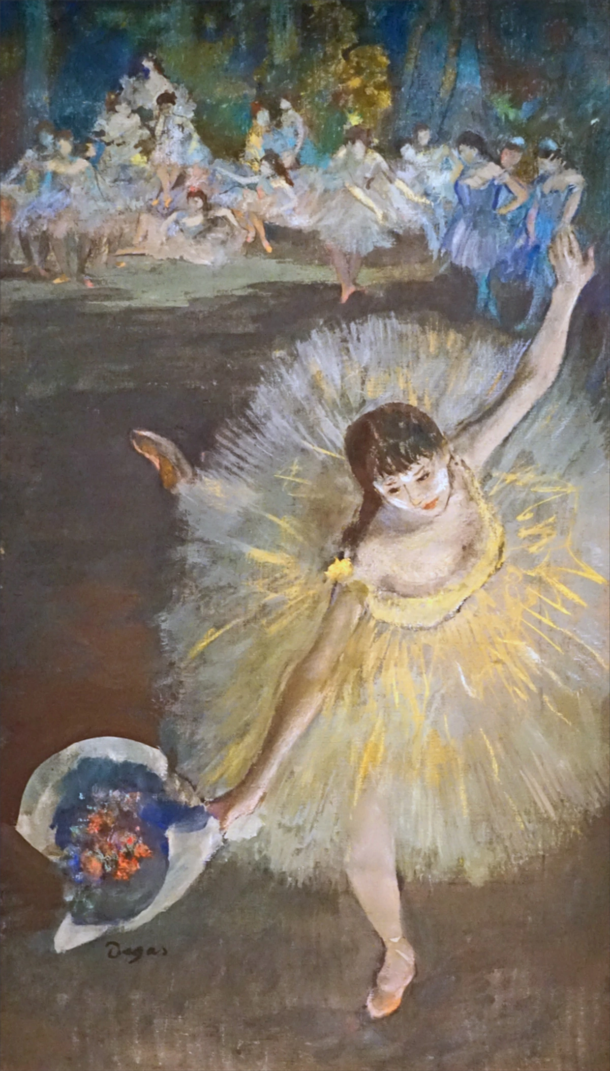
- 19th Century Revival: Despite a decline in popularity with the rise of oil painting and photography, pastels saw a significant revival in the 19th century. Impressionists and Post-Impressionists, drawn to their vibrant, unmediated colors and immediacy, rediscovered the medium with enthusiasm. Artists like Édouard Manet and Claude Monet experimented with pastels, but Edgar Degas is perhaps the most famous proponent, using them extensively in his iconic dancer series. He pushed the boundaries of what was thought possible with the medium, layering pastels in a radical way to capture movement, light, and fleeting moments, transforming them from a preparatory tool into a primary expressive medium.
- Modern and Contemporary Art: Today, pastels continue to be a beloved medium for artists across various styles, from hyper-realism to abstract expressionism. Their unique qualities – intense, luminous color, tactile application, and exceptional blending capabilities – ensure their enduring appeal in the contemporary art world. Many contemporary artists appreciate their versatility in mixed media, their directness for expressive gestures, and their ability to create both delicate nuances and bold statements. To learn even more about the historical context and evolution, you can explore What is Pastel Painting?.
Frequently Asked Questions About Soft Pastels
I get a lot of questions about soft pastels, and that's great! It means people are curious and ready to explore. Here are a few common ones:
- How should I store my unused pastels? Proper storage keeps your pastels organized and protected. Keep them in their original padded boxes or in shallow drawers with foam inserts. Some artists like to sort them by color in dedicated pastel boxes. Avoid storing them in direct sunlight or extreme temperatures, and prevent them from rattling around, which can cause breakage. Even broken pieces are perfectly usable, so don't discard them!
- Are soft pastels toxic? Generally, modern soft pastels from reputable brands are non-toxic, especially if you're not inhaling large amounts of dust. However, some pigments historically used (like cadmium colors) could be toxic. Always check the manufacturer's labels for safety information. Good ventilation and avoiding direct inhalation of dust (e.g., by tapping excess dust off rather than blowing) are always good practices to maintain a healthy studio environment.
- Can I use hairspray as a fixative? While tempting in a pinch, I strongly advise against using hairspray. It's often acidic, can yellow over time, and might not offer adequate protection. Invest in an artist-grade fixative specifically designed for pastels.
- How do I clean my hands after using pastels? Baby wipes are a lifesaver! Otherwise, soap and water work perfectly. For stubborn pigment, a bit of oil (like baby oil or olive oil) on a rag can help break down the pigment before washing with soap.
- How do I clean a finished pastel painting? This is a delicate process! For light dust accumulation, you can very gently use a soft, dry, wide brush (like a Hake brush) to dust the surface. However, avoid rubbing or applying any pressure. The safest and most recommended method is to frame your artwork under glass with proper spacers, which eliminates the need for surface cleaning. Avoid any liquids or harsh cleaning agents.
- My pastels keep breaking! What do I do? Soft pastels are inherently fragile due to their minimal binder, so breakage is a common, almost inevitable, occurrence. Store them in padded boxes, and when working, use gentle pressure. Even broken pieces are perfectly usable for broad strokes, creating fine pastel dust for blending, or for use in pastel pencils. Don't throw them away – they still hold beautiful pigment!
Ready to Make Your Mark?
Soft pastels are more than just a medium; they're a journey into vibrant color, tactile sensation, and expressive freedom. They might be a bit dusty, a little fragile, and occasionally challenging, but the rewards – the luminous colors, the direct connection to your art, the sheer joy of creating something truly unique – are immense. Don't let their "messy" reputation deter you. Embrace the process, experiment with gusto, and let your fingers dance across the paper.
I hope this comprehensive guide has not only answered your questions but also ignited a spark of inspiration within you. There's an entire world of rich, luminous expression waiting for you to discover with soft pastels. So, gather your tools, choose your colors, and allow yourself the freedom to explore. Now go forth and make some beautiful, dusty, and profoundly personal art!
