Color Rebels: A Personal Guide to Artists Who Painted Loudly
Forget beige. Let's dive into the artists who threw the color rulebook out the window. A personal tour of the masters of bold color, from Matisse to Basquiat.
Color Rebels: Your Personal Guide to Artists Who Painted Loudly
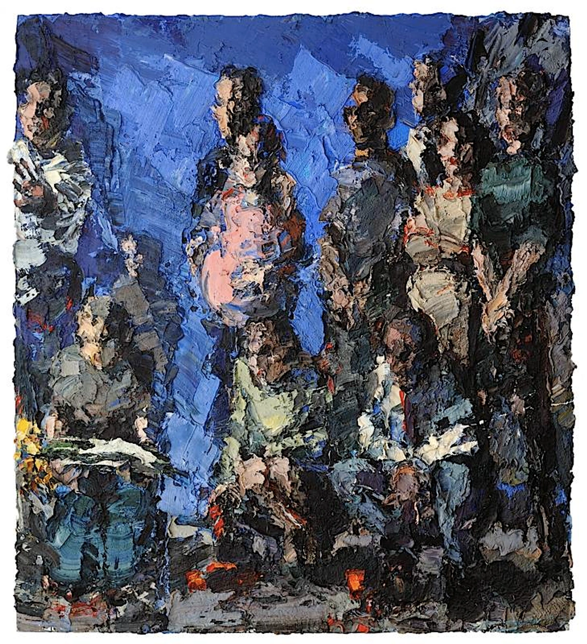
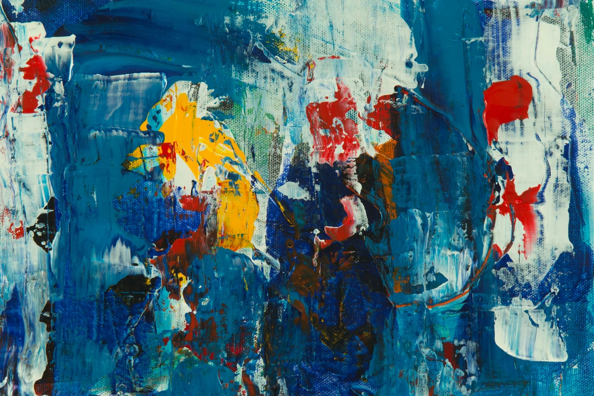
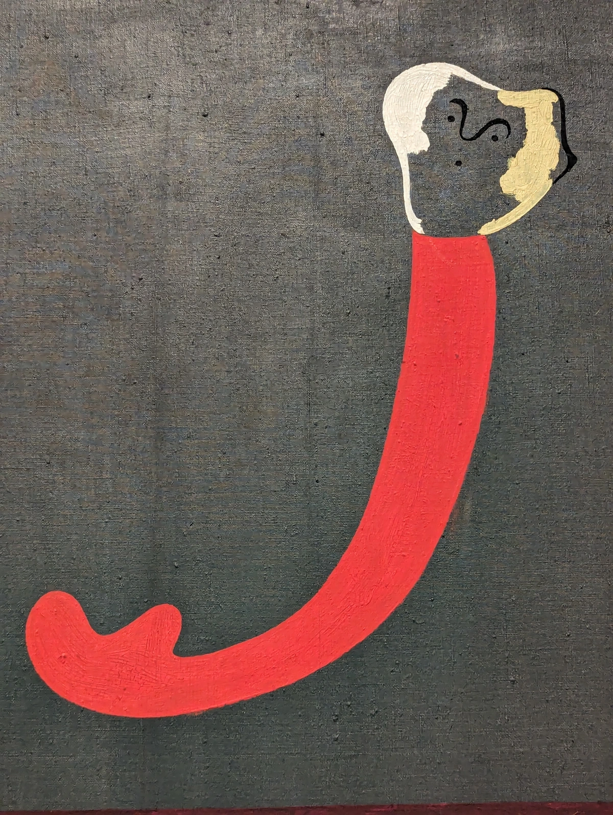
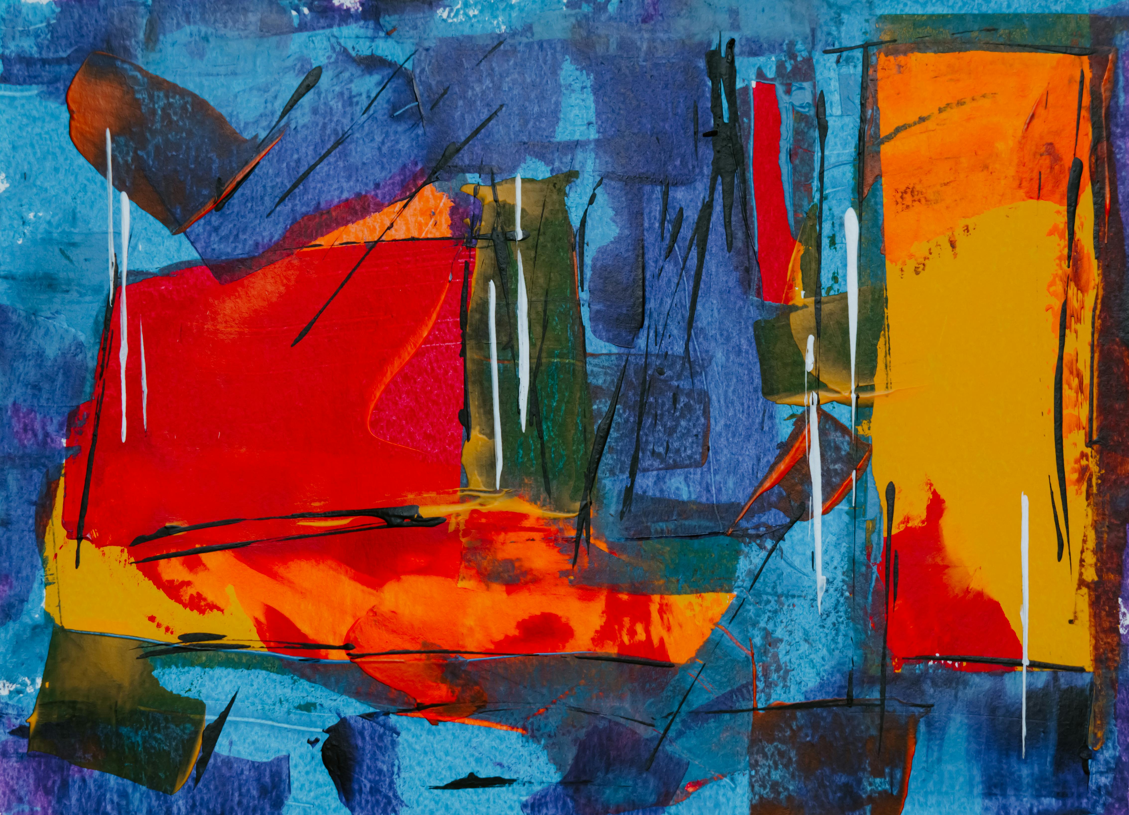
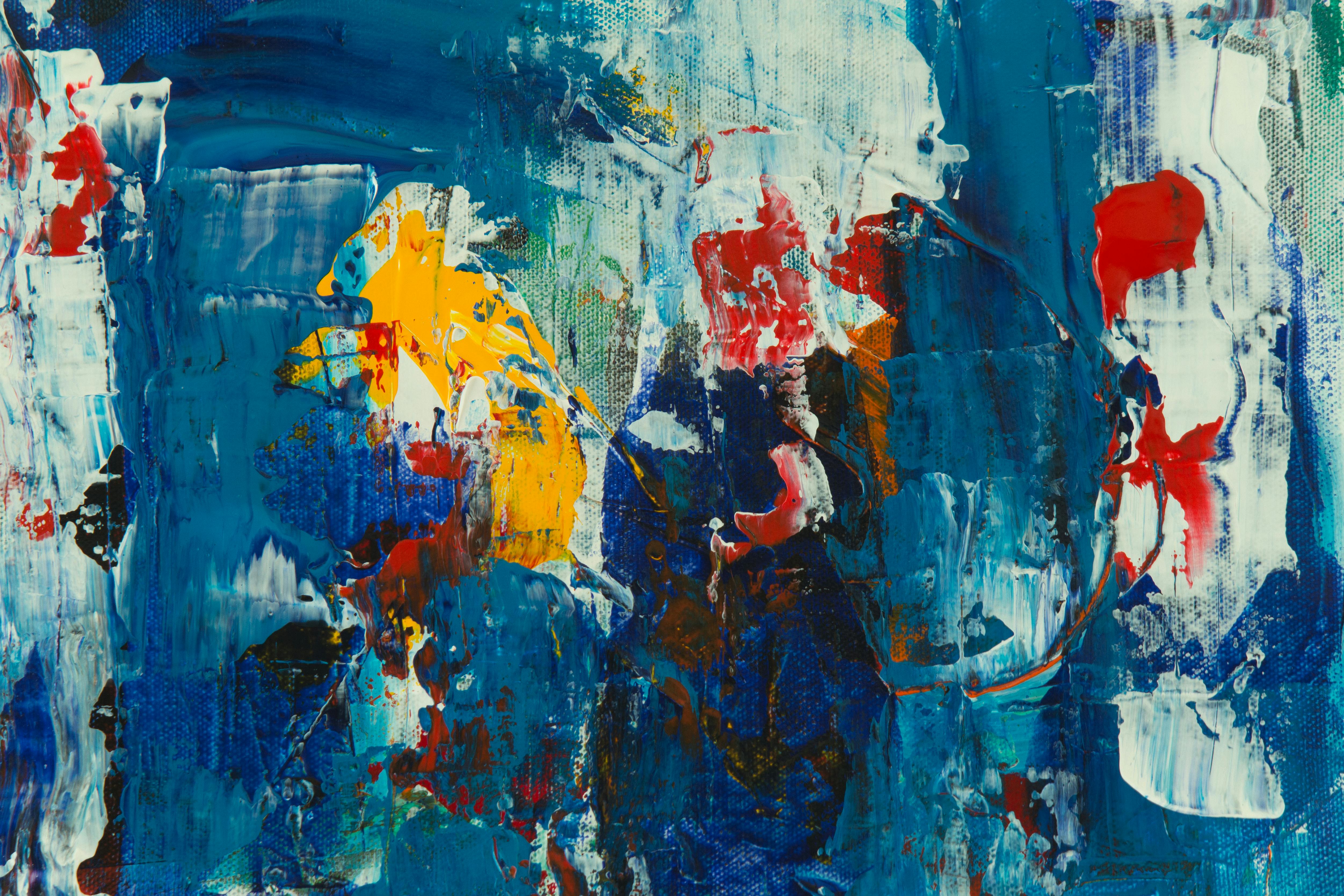
I have a confession: I’m a color addict. Muted tones are fine, they have their place, but what truly gets my heart racing, what makes me feel alive, is color that screams. Color that doesn't apologize for being there. It’s an energy you can feel, a visual punch that can instantly shift the mood of a room, and your own mood along with it. Honestly, as an artist, it's probably why my own work is so saturated—I'm constantly chasing that electrifying feeling. You can see how I try to capture it in my own artistic timeline.
But this isn't just about my personal obsession, or the way I splash bold colors onto a canvas. For centuries, artists have wielded bold color as a weapon, a tool for rebellion, and a direct line to raw, unfiltered emotion. They're the ones who stared at a perfectly pleasant green sky in a landscape and thought, 'You know what? Let’s make it red.' They challenged perception, demanded attention, and, frankly, changed everything.
This article is a deep dive, a personal expedition through my hall of fame for these audacious color rebels. These are the artists who, for me, truly define what it means to be fearless with a palette, to use color not just as decoration, but as a profound statement. We’ll explore their stories, their techniques, and the enduring impact of their vibrant visions on art history and even on how we perceive the world today, hoping to inspire you to find your own vibrant voice.
Movement/Artist | Era | Key Characteristics & Color Use |
|---|
What is color theory and how does it relate to bold art?
Color theory is essentially a practical guide to mixing colors and the visual effects of specific color combinations. For artists wielding bold colors, it's not just a set of rules, it’s a playbook for rebellion, absolutely fundamental to making their statements sing! It helps them understand how to achieve maximum vibrancy, create dynamic contrasts that practically jump off the canvas, and evoke specific, often intense, emotional responses. Think of it like this: knowing your instrument helps you play it louder, more effectively. It’s the underlying structure that gives the wildest chromatic explosions their power, the science behind the scream, if you will.
Concepts like complementary colors (opposites on the color wheel, like red and green, which create incredible visual tension and high contrast when placed together) are leveraged to make those bold statements truly impactful. Then there are analogous colors (next to each other, creating harmony and a sense of visual flow, but still with a vibrant punch), and color temperature (the difference between warm hues like reds and yellows, and cool hues like blues and greens). But it doesn't stop there. Consider triadic color schemes, which use three colors equally spaced on the color wheel (like red, yellow, and blue) to create vibrant, balanced compositions. Or monochromatic schemes, which leverage different shades, tints, and tones of a single color for sophisticated depth while maintaining intensity. All of these are tools in the artist's arsenal, used to make those bold statements truly impactful.
Learning about these tools has been a game-changer in my own practice. I’ve found that even when aiming for pure emotional expression, a foundational understanding of color interaction gives you the freedom to push boundaries more effectively. It's like knowing the rules before you break them. You can explore this further in our definitive guide to color theory in art.
How can I incorporate bold color into my own art?
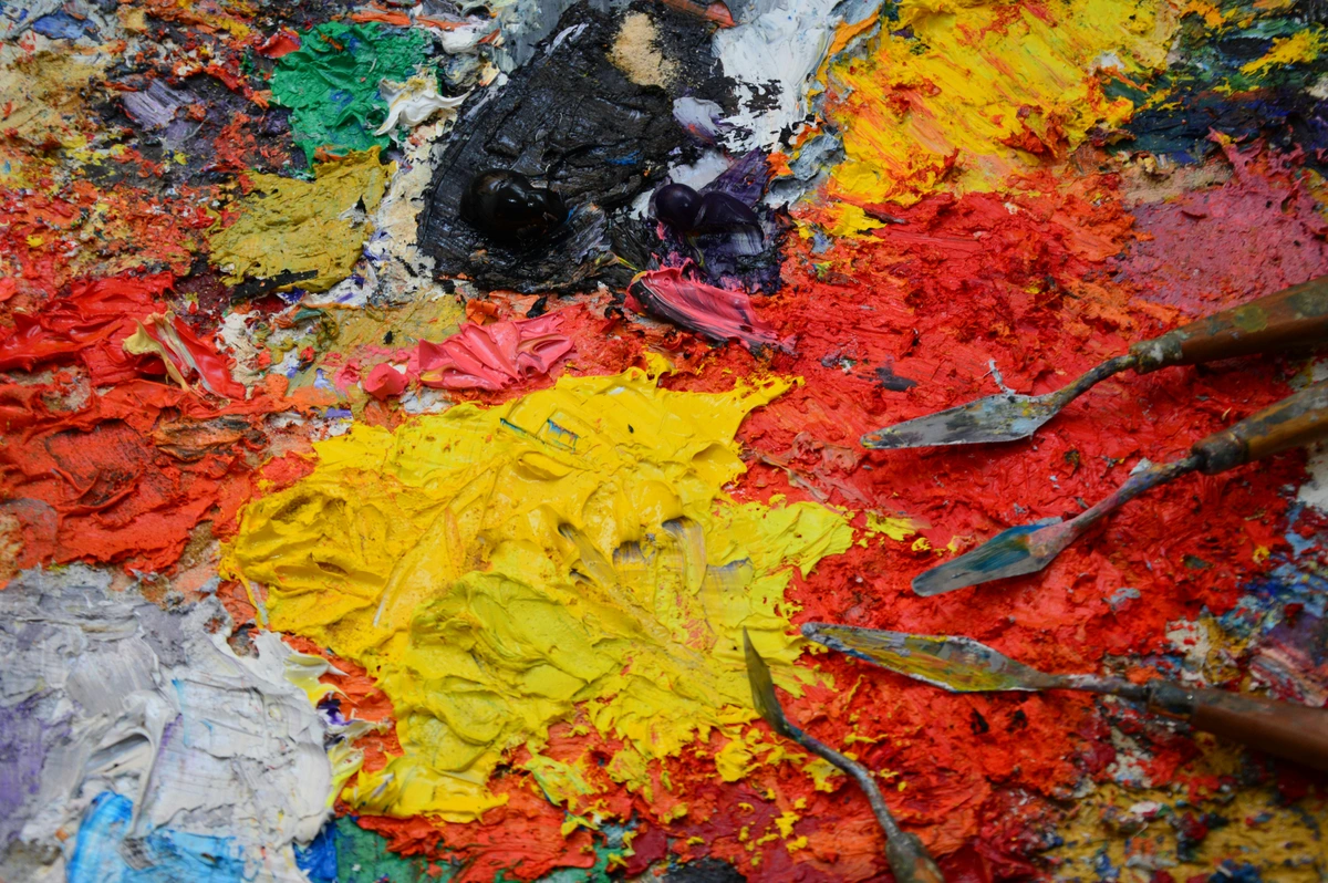
First, don't be afraid to experiment! Start with a limited, high-contrast palette. Try applying paint directly from the tube (pure pigment) rather than over-mixing—I often call this 'unleashing the tube.' Play with juxtaposition—place a vibrant red next to a strong green and see what happens; the visual vibration can be astonishing. Consider the scale of your work; larger pieces naturally create a more immersive color experience, enveloping the viewer in your chromatic world. Also, don't overlook texture; thick, impasto applications of bold color can literally make your work pop off the canvas, adding another layer of sensory engagement.
Most importantly, let your emotions guide your choices. If a color feels right, if it makes your heart race, then it’s probably the right color for your rebellious statement. Think less about 'what color should I use?' and more about 'what feeling do I want this color to create?' Remember, art, especially with bold color, is a conversation between you, the canvas, and the viewer's emotional response. For more hands-on guidance, check out my thoughts on my approach to color mixing and how I build the language of layers.
What's the difference between Fauvism and Expressionism in terms of color?
While both movements are famous for their bold, non-naturalistic use of color, their intent differed. Fauvism (early 1900s, like Matisse and Derain) used color with a joyous, almost decorative abandon. Their goal was to liberate color from its descriptive role, using it to express light, mood, and compositional balance, often resulting in vibrant, uplifting, or harmonious canvases. German Expressionism (roughly contemporaneous, like Kirchner and Kandinsky) used bold, often clashing, and distorted colors to convey deep emotional anguish, anxiety, and psychological turmoil. Their palettes were less about joy and more about internal struggle, often creating unsettling or raw visual experiences. Think of Fauvism as a jubilant shout, and Expressionism as a primal scream.
Are there any artists who used bold color historically, before the modern era?
Absolutely! While the modern art movements of the 20th century explicitly rebelled against naturalistic color, bold and vibrant hues have always held power. Think of Medieval stained glass in grand cathedrals—the intense blues, reds, and golds weren't just pretty; they were designed to create an immersive, spiritual, and awe-inspiring experience, conveying biblical narratives with a luminous, almost otherworldly brilliance. Even in the Renaissance, artists like Titian pushed the boundaries of color, using rich, deep reds and blues to create emotional depth and luxurious textures in his portraits and mythological scenes. It’s a perennial human impulse to be drawn to, and to wield, strong colors for impact, emotion, and storytelling.

credit, licence--------------------- | :------------- | :------------------------------------------------------------------------------------------------------------------------------------------------------------------------------------------------------------------------------------------------------------------------------------------------------------------------- | | Fauvism | Early 20th C. | Pure, unmixed, non-naturalistic colors applied with joyful abandon; color as an autonomous element, conveying emotion and light rather than mimicking reality. | | German Expressionism | Early 20th C. | Bold, often clashing colors and distorted forms to convey inner turmoil, anxiety, and profound psychological states; color as a direct emotional scream. | | Abstract Expressionism| Mid 20th C. | Monumental scale, large fields of intense, vibrating color to create immersive emotional experiences; color as the primary subject, aiming for spiritual or transcendental feelings. | | Op Art | Mid 20th C. | Precise geometric forms and dazzling, high-contrast color combinations to create optical illusions of movement, vibration, and depth; color as a trick of the eye, engaging direct perception. | | Pop Art | Mid-late 20th C.| Loud, often garish colors of advertising and mass media; color used to comment on consumerism, popular culture, and the visual language of the modern commercial world. | | Neo-Expressionism | Late 20th C. | Raw, aggressive, and often clashing colors, combined with figurative elements and energetic brushwork, to express intense emotions, social critique, and personal narratives. (Think Basquiat!) | | Street Art/Graffiti | Late 20th C.-Present | Vibrant, immediate, and often highly saturated colors applied in public spaces to convey social commentary, personal expression, or simply aesthetic dynamism; color as a democratic, accessible art form that reclaims urban landscapes. | | Contemporary Digital Art | Late 20th C.-Present | Dynamic, luminous, and often interactive use of color through pixels, light, and projection; color as an immersive, technologically-driven experience, exploring new visual frontiers. |
This table just scratches the surface, of course. Each of these movements, and the individual artists within them, brought their own unique twist to the revolutionary act of painting loudly.
The Original Wild Beasts: When Color Broke Free
You can't talk about bold color, about art that truly liberates itself from the constraints of reality, without starting with the Fauvists. The name literally means “the wild beasts,” which was initially an insult hurled by a critic at the 1905 Salon d'Automne. But these artists? They wore it like a badge of honor. And honestly, it fits perfectly. They painted with a kind of primal, joyful abandon, letting color explode directly from the tube onto the canvas, unmixed, unashamed. It was a radical departure, a movement that declared color's independence. They weren't interested in gentle, muted tones or subtle gradations; they wanted their canvases to sing, or rather, to roar. Imagine a world where trees aren't just green, but electric blue, and skin tones shift into vibrant oranges and purples—that was the Fauvist vision. It's an attitude I often try to embody in my own work, that sense of fearless chromatic exploration.
If you're as fascinated by this period as I am, you'll want to explore the ultimate guide to Fauvism.
Henri Matisse: The King of Pure Color
For me, the undisputed king of the wild beasts, the artist who truly showed the world how to make color sing (or scream), is Henri Matisse. He didn't just use color; he treated it as a fundamental building block for emotion, completely separate from the mundane dictates of reality. If he felt a room should be drenched in a world-swallowing red to convey a sense of warmth and intense domesticity, then that’s precisely what he did. Reality be damned, feeling was paramount. He wasn't afraid to use a shocking pink for a face or a brilliant green for a shadow, not because it was 'realistic,' but because it felt right, it conveyed the inner truth of the scene.
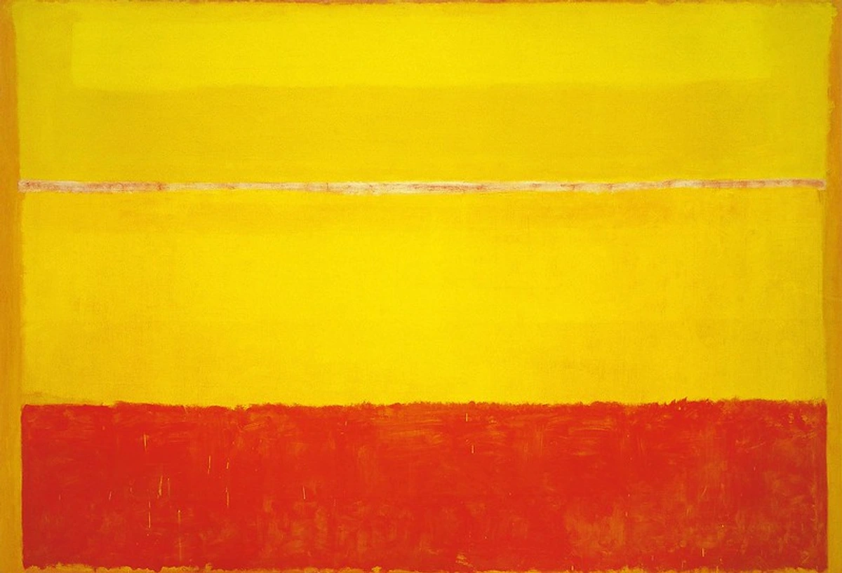
Look at his iconic The Red Room (also known as Harmony in Red). It’s not just a red room; it's the red room. The audacious crimson consumes everything—the walls, the table, the very air—flattening the perspective and transforming the entire scene into a pulsating pattern of pure feeling. This wasn't merely decorative; it was revolutionary. It was a bold declaration that the artist's internal world, their subjective emotional landscape, was far more significant than any external, objective reality. This profound idea is central to understanding the emotional language of color in abstract art. Dive deeper into his genius with our ultimate guide to Henri Matisse.
Beyond his canvases, Matisse's later cut-outs continued his exploration of color and form, using pure sheets of painted paper to create vibrant, joyful, and often monumental compositions. These works are a testament to his lifelong dedication to exploring the expressive power of color in its most distilled form. His ability to distill complex emotions into simple, yet powerful, chromatic arrangements is a constant source of inspiration, for me and countless others.
André Derain: Co-Founder of the Wild Ones
While Matisse is often seen as the figurehead, André Derain was equally pivotal in defining the Fauvist aesthetic. His landscapes, particularly those painted in London, explode with non-naturalistic oranges, purples, and blues, demonstrating a joyous disregard for conventional representation. Derain and Matisse shared studios and ideas, pushing each other to greater extremes of chromatic intensity, experimenting with simultaneous contrast and the emotional resonance of pure hue.
Derain’s work truly embodies the raw energy and experimental spirit of Fauvism, showing how color could be both decorative and deeply expressive without needing to mimic reality. He proved that a green sky or a blue tree wasn't just acceptable; it could be profoundly evocative, a direct conduit to the artist's feeling rather than an objective record of the world.
Other Fauvist Voices: Unleashing the Palette
Beyond the central figures, other Fauves like Maurice de Vlaminck brought a raw, almost aggressive application of color to his street scenes and landscapes, often with thick, expressive brushstrokes that amplified the emotional impact of his vibrant palettes. And then there was Kees van Dongen, known for his vibrant, often risqué portraits that pulsed with life and color, capturing the hedonism and dynamism of early 20th-century urban life. These artists collectively liberated color from its descriptive function. They carved out a space where color could exist for its own sake, a powerful language in itself.
The Emotional Charge: From Fauvism to Expressionism
As the 20th century unfurled, the audacious use of color didn't fade; it evolved, taking on new emotional and psychological dimensions. Building on the Fauvists' groundbreaking use of intense hues, a movement arose that plunged deeper into the human psyche: German Expressionism. Unlike the joyful abandon of Fauvism, Expressionism often employed bold, clashing colors and distorted forms to convey anxiety, fear, and profound inner turmoil. Think of it as color used not to celebrate beauty, but to confront harsh realities and intense internal states.
This was color as a direct emotional scream, a way to externalize the soul's deepest agitations. It’s a fascinating, often unsettling, journey into the human condition, explored by groups like Die Brücke (The Bridge) and Der Blaue Reiter (The Blue Rider). Artists like Ernst Ludwig Kirchner (from Die Brücke) used jarring, angular forms and acidic, clashing colors to depict the alienation of modern life, while Wassily Kandinsky (from Der Blaue Reiter), moving towards abstraction, used vibrant, non-representational colors to explore spiritual and emotional realms. Each group, though distinct, shared a common thread: using color with an intensity that bypasses the intellect and strikes directly at the heart.
Edvard Munch: The Primal Scream of Color
While technically a precursor to German Expressionism, Edvard Munch's work profoundly influenced its development, especially in his fearless use of highly charged, non-naturalistic colors to convey intense psychological states. His most famous work, The Scream, with its swirling, blood-red sky, is a primal example of color as an emotional conduit, reflecting inner anguish rather than outer observation. His intensely personal explorations of themes like love, fear, and death found their perfect visual language in his bold and often unsettling palettes.
Munch understood that color could bypass the intellect and strike directly at the heart, making viewers feel the artist's own raw emotions. It's a powerful, almost visceral approach that still resonates today. The way he allows color to deform and express internal states is something I constantly think about when I'm trying to capture pure feeling on canvas. You can dive deeper into his world with our guide, ultimate guide to Edvard Munch.
## When Color Became the Entire Story: Abstract Expressionism and the Color Field
After the Fauvists and the burgeoning Expressionists had already shown us that color could be liberated, the next leap was even bigger, more immersive, more overwhelming. What if color wasn't just in the painting? What if color was the painting? This is where the Abstract Expressionists come in, particularly the Color Field painters, who took the idea of color's emotional power to monumental, all-encompassing scales. This movement, emerging in post-WWII America, marked a profound shift from the introspective narratives of European artistic traditions. It wasn't about depicting reality, or even overtly expressing angst through figures, but about creating an immersive experience where color itself became the sole subject, aiming for profound spiritual, transcendental, or existential feelings. It's a kind of meditation, but with a punch, a direct confrontation with pure chroma.
The artists of Abstract Expressionism believed in the raw, unmediated power of color to communicate the deepest human experiences, bypassing intellect for pure feeling. They wanted to create a sense of the sublime, of awe, of confronting something larger than oneself. This often meant vast canvases, overwhelming the viewer's field of vision, forcing an emotional rather than intellectual engagement. It’s an approach that speaks to the very core of why I create abstract art, always striving for that unmediated emotional impact.
Mark Rothko: The Sublimity of Pure Color
Standing in front of a Mark Rothko painting is less like looking at a picture and more like standing on the edge of an emotional ocean. He used huge canvases with large, hovering blocks of intense, vibrating color to completely envelop you. He wanted viewers to feel a sense of awe, introspection, and even spiritual transcendence, an experience he believed was essential to human existence.
He wasn't painting a landscape or a person; he was trying to paint tragedy, ecstasy, and doom. The bold, saturated colors were his vocabulary, meticulously chosen and applied to evoke specific psychological states. People sometimes cry in front of his paintings, and I totally get it. It’s a direct hit to the nervous system, a profound encounter with pure emotion that transcends mere visual appreciation. For me, Rothko's genius lies in his ability to make color itself a profound psychological event, demonstrating that intensity isn't just about loudness, but depth.
Other Color Field Visionaries: Newman and Still
Other Color Field painters also sought to create sublime, immersive experiences through the power of color on a grand scale. Barnett Newman, for instance, with his monumental canvases punctuated by stark vertical lines he called 'zips,' used color fields not for their decorative quality, but as a vehicle for spiritual and philosophical inquiry. These 'zips' cut through vast expanses of color, creating tension and defining space within the chromatic field. And then there's Clyfford Still, whose jagged, luminous forms, often reaching across vast, textured fields of color, evoke primal forces of nature and the human struggle. His unique technique of layering and scraping paint created a distinctive, almost geological texture, giving his bold colors an organic, raw power. Both, like Rothko, were less interested in beauty and more in profound, almost confrontational, engagement with color as an existential force. If you want to dive deeper into this world, the ultimate guide to abstract expressionism and our ultimate guide to Rothko are great places to start.
Helen Frankenthaler: Staining the Canvas with Emotion
While Rothko's blocks hovered, Helen Frankenthaler pioneered a revolutionary technique that made color literally soak into the canvas, becoming one with it. Her Color Field paintings, particularly her 'soak-stain' works, involved pouring thinned paint directly onto unprimed canvas, allowing the pigment to bleed and spread in luminous, ethereal washes. This created vast, atmospheric fields of color that were both fluid and intensely vibrant, almost like giant watercolors, but with the permanence and scale of oil painting.

Her process was spontaneous and gestural, yet the resulting compositions were often serene and contemplative. Frankenthaler demonstrated that bold color didn't always have to be aggressive; it could be soft, expansive, and deeply meditative, opening up new possibilities for emotional expression in abstract art. It was a fluid rebellion, showing that pure color could be both monumental and incredibly delicate. Her legacy continues to inspire artists who seek to create art where color isn't just applied, but truly becomes the fabric of the piece.
The Dazzling Illusions: Op Art's Bold Geometry
Moving forward in the mid-20th century, some artists pushed color into an entirely new dimension: illusion. Op Art, short for Optical Art, emerged in the 1960s, using precise geometric forms and dazzling color combinations to create mesmerizing effects of movement, vibration, and depth on a two-dimensional surface. This was color as a trick of the eye, a visual puzzle that engaged the viewer's perception directly, often leading to a sense of disorientation or even physical sensations. It was less about emotional expression and more about the mechanics of sight and perception. What always fascinated me about Op Art is its ability to bypass narrative and hit you purely through visual mechanics.
At its core, Op Art leverages principles of optical illusion and perception, using contrasting colors, lines, and shapes to create effects such as: Flicker, where colors seem to vibrate; Moire patterns, generated by overlapping lines; and illusory movement, where static images appear to move. It’s art that actively requires your brain to participate, making you question what you’re seeing. It’s almost like a playful challenge to your visual system, proving how easily our perceptions can be manipulated by bold, intelligent design.
Victor Vasarely: The Father of Op Art
Considered the father of Op Art, Victor Vasarely meticulously designed paintings and sculptures that played with optical illusions, often using high-contrast colors and repetitive patterns to create a sense of pulsating motion. His work wasn't just about what you saw, but how you saw it – how your brain interpreted the visual information. He deliberately created works that were dynamic and visually unstable, challenging the static nature of traditional painting. His cubes, spheres, and grids, rendered in precise, often monochromatic or complementary color schemes, became iconic of the movement. It always makes me wonder about the subtle ways our brains construct reality from visual input.
Vasarely's vibrant, often intense, geometric patterns challenged conventional notions of painting, inviting viewers into an interactive visual experience. His art demonstrated that even in abstraction, or perhaps especially in it, bold color could be harnessed to create captivating and disorienting sensory experiences. He proved that pure visual stimuli, when expertly arranged, could evoke a powerful, almost physical response.
Bridget Riley: The Master of Optical Movement
Another key figure, Bridget Riley, also masterfully explored these illusions, often using black and white or subtle color shifts to create mesmerizing waves, dizzying patterns, and pulsating grids that seem to ripple and breathe across the canvas. Her early black and white works were particularly impactful, creating a strong sense of optical movement solely through line and contrast. Later, she introduced color, often in precise gradients or rhythmic arrangements, to amplify these dizzying effects, pushing the boundaries of what a flat surface could convey. Her rigorous approach to composition and color placement allows for a pure, unadulterated visual experience, a direct challenge to the eye. To truly appreciate Vasarely's pioneering vision, check out our ultimate guide to Victor Vasarely, the father of Op Art.
The Modern Mavericks: Color in Our Time
The rebellion didn't stop in the 20th century, nor did the relentless pursuit of color's expressive potential. Contemporary artists continue to push the boundaries, using color in ways that are playful, political, profoundly personal, and even socially critical. The mid to late 20th century, especially, saw color explode from the fine art gallery into everyday life, blurring the lines between high culture and mass appeal. It’s a glorious, messy, vibrant journey, and I’m here for every audacious stroke of it.
Andy Warhol: The Pop Art Color Revolution
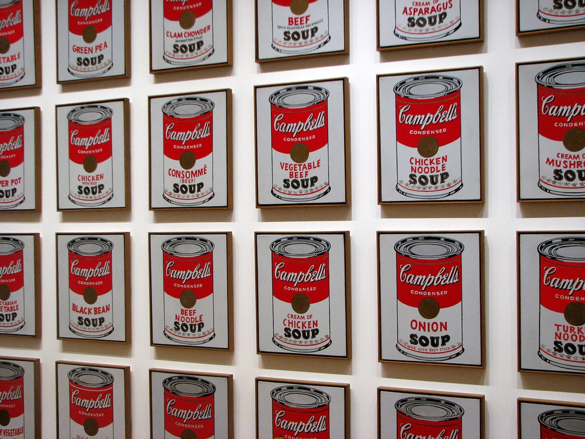
You simply can't talk about bold color in the modern era without mentioning Pop Art, and by extension, its undeniable superstar, Andy Warhol. Emerging in the 1950s and really exploding in the 60s, Pop Art was a direct response to the perceived seriousness and elitism of Abstract Expressionism. It embraced the everyday, the mundane, the commercial—and it did so with a chromatic punch. Warhol took the loud, demanding, often garish colors of advertising, mass media, and screen printing, and he elevated them—or perhaps democratized them—into high art. His iconic Campbell's Soup cans aren't just paintings of soup; they're a sharp, vibrant commentary on mass culture, consumerism, and the very colors designed to grab your attention in a bustling supermarket aisle. Warhol’s use of color was deliberate: flat, unmodulated, and often artificial, mirroring the commercial processes he depicted. He embraced the reproducibility of imagery, turning everyday objects and celebrity portraits into vivid, repeated icons, challenging our notions of originality and artistic value. He understood that in a media-saturated world, the impact of a bold, instantly recognizable color scheme was paramount.
The flatness, the repetition, and the unapologetic boldness of the colors are the entire point of Warhol's work. It’s direct, it's instantly iconic, and it's unapologetically commercial. He understood that color, in the modern age, had become a brand, a symbol, a way to cut through the noise. It’s a lesson that still rings true today, as we navigate a world of constant visual stimulation. To truly appreciate his legacy, check out our ultimate guide to Andy Warhol and the broader ultimate guide to Pop Art.
Roy Lichtenstein: Comic Book Colors, Fine Art Impact
Another giant of Pop Art, Roy Lichtenstein, harnessed the vivid, primary colors of comic books and commercial printing to create his distinctive, large-scale canvases. He meticulously replicated the Ben-Day dots (the small, colored dots used in commercial printing) and thick outlines found in newspaper strips, but on a monumental scale, forcing viewers to confront the artificiality and power of commercial aesthetics. He often chose emotionally charged scenes from romance or war comics, stripping them down to their essential, brightly colored forms. What I find incredible is how he transformed a mass-produced aesthetic into something deeply considered and impactful in a fine art context.

Lichtenstein's bold use of saturated blues, reds, and yellows, often juxtaposed with crisp black lines and those signature Ben-Day dots, brought an unmistakable graphic punch to the gallery space. His work was a clever and often ironic commentary on popular culture, elevating the 'low' art of comics to the 'high' art of painting, all while demonstrating the undeniable power of simplified, yet aggressive, color. It’s a playful but profound look at how we consume images, and how even the most mundane commercial aesthetic can be transformed into something thought-provoking and visually arresting. He forced us to look at the visual language of consumerism with a new, critical eye, all wrapped up in dazzling, pop-art packaging. His legacy is a reminder that inspiration for bold expression can come from anywhere, even the pages of a comic book.
Jean-Michel Basquiat: The Raw Energy of Urban Color
If Warhol’s color was cool, calculated, and often detached, Jean-Michel Basquiat's was hot, explosive, and deeply visceral. His work feels like it was ripped straight from the city streets, scrawled with urgent messages, and then slapped onto a canvas with furious energy. The colors he employed are raw, clashing, and full of a nervous, electric intensity. He used these audacious hues—bright yellows, aggressive reds, deep blues—to convey anger, joy, history, and sharp social critique all at once, often layered with text and symbols, creating a complex visual language that defied easy categorization. It’s an intensity I strive for in my own work when I want to convey raw emotion.
There's a seemingly childlike freedom in his palettes and drawing style, a raw, almost untamed energy that explodes across the canvas, but the subjects—ranging from racial inequality to personal identity, from historical figures to everyday objects—are anything but innocent. Basquiat wove together text, symbols, and images from diverse sources, creating a complex, layered visual language that reflected his experiences as a Black artist navigating a predominantly white art world. This tension, this dynamic interplay between raw, urgent color and profound subject matter, is what makes his work so powerful and enduring, a true voice of urban experience, social critique, and personal narrative. You can delve deeper into his impactful career with our ultimate guide to Jean-Michel Basquiat and explore his connection to Neo-Expressionism.

Yayoi Kusama: The Infinity of Color
For a truly immersive, kaleidoscopic color experience, there's absolutely no one like Yayoi Kusama. Her entire artistic universe revolves around themes of obsession, repetition, and infinity, and her primary tools are her ubiquitous polka dots and incredibly vibrant, often monochromatic or high-contrast color schemes. Walking into one of her Infinity Rooms is less like viewing art and more like stepping directly into her brilliant, often unsettling, mind—a mind that uses color to both confront and transcend reality, blurring the boundaries between the self and the universe. It's a testament to the power of a singular vision, amplified by color.

Her relentless use of bold, repetitive color and patterns—especially her signature polka dots—isn't just decorative; it's a profound, therapeutic way of exploring deeply personal themes of infinity, identity, cosmic interconnectedness, and mental health. Her Infinity Mirror Rooms, filled with myriad glowing dots or reflective spheres, create an overwhelming, boundless sensory experience where the viewer is immersed in an endless colorful universe. It’s both playfully exuberant and deeply profound, proving unequivocally that bright colors, when wielded with such singular vision, can carry incredibly serious weight and evoke powerful emotional responses, even a sense of ecstatic self-obliteration. Explore more of her unique vision with our ultimate guide to Yayoi Kusama.
Ellsworth Kelly: The Precision of Pure Color
While many artists we've discussed use color to express raw emotion or dazzling illusion, Ellsworth Kelly carved his own path by meticulously exploring the relationship between pure color, form, and space. A pivotal figure in Hard-Edge Painting and Minimalism, Kelly's work consists of large, often monochromatic panels of intensely saturated color, precisely shaped and arranged. His aim wasn't to tell a story or evoke a specific emotion through narrative, but to create a direct, unadulterated visual experience of color and form itself. For Kelly, the color was the subject. He removed any trace of the artist's hand, creating smooth, flat surfaces of vibrant hues that demanded to be seen for their inherent qualities. Whether a brilliant red rectangle or a sweeping blue curve, his pieces highlight the profound impact a single, bold color can have when isolated and presented with absolute clarity. It's a different kind of color rebellion—one of radical purity and precision, stripping away all excess to reveal the unvarnished power of hue. His work reminds us that bold color doesn't always have to be frenetic; it can be incredibly impactful in its stillness and self-containment. It's a powerful lesson in how restraint can amplify the power of color. Discover more about the power of reduction in our ultimate guide to minimalism.

Global Color Visionaries: Beyond the Western Canon
The story of bold color in art is expansive, vibrant, and certainly not confined to Western movements or the most familiar names. Across continents and through various stylistic approaches, artists have continually found new ways to harness vibrant hues, infusing their work with cultural narratives, personal histories, and universal human experiences. This global tapestry of color rebellion is truly awe-inspiring, reminding us that the impulse to paint loudly transcends geography. Let's look at a few more who have left an indelible, colorful mark, expanding our understanding of what it means to truly be fearless with a palette. It's a crucial reminder that the language of color is universal, yet spoken with countless unique accents.
Color in the Digital Age: From Pixels to Projections
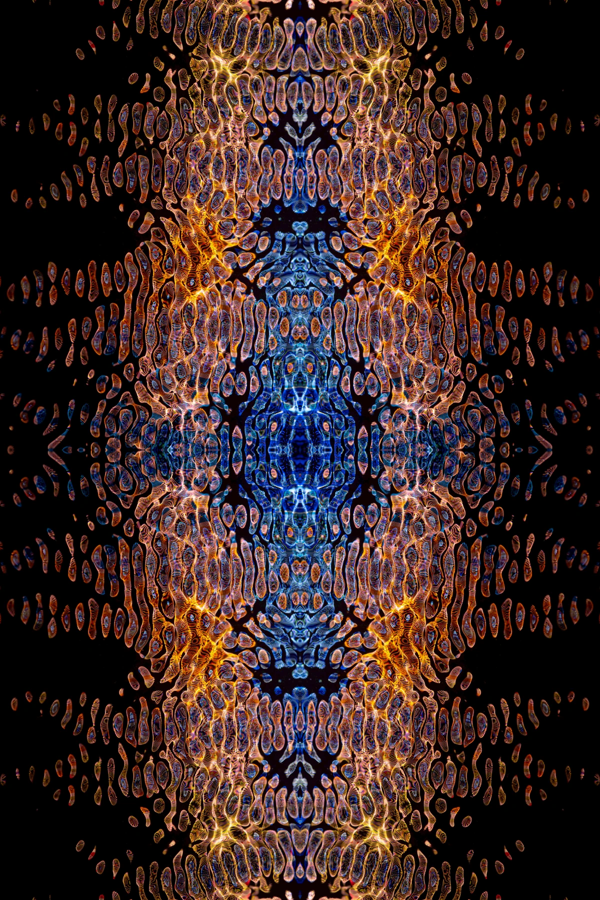
As we hurtle into the 21st century, the canvas is no longer just linen and paint. Digital art has opened up an entirely new frontier for bold color, allowing artists unprecedented control over luminosity, saturation, and the dynamic interplay of hues. From vibrant NFTs (though I admit, I approach the blockchain world with a healthy dose of skepticism, I can't deny their visual impact when done well) to immersive video art installations and generative art, color in the digital realm can literally glow, shift, and pulse with an intensity rarely achievable with traditional pigments.
Artists working with screens, projectors, and interactive media can manipulate light itself, creating environments where color envelops the viewer in a completely new way. Think of large-scale projections bathing architectural facades in a cascade of brilliant, shifting colors, or virtual reality experiences that transport you into a kaleidoscopic world of pure chromatic sensation. This is color unbound, a rebellious push into new technologies that continues to redefine what it means to paint loudly, to dazzle, and to provoke emotion with pure light and pixels. It’s an exciting, slightly dizzying, evolution of the color rebel's toolkit, constantly expanding the possibilities of chromatic expression.
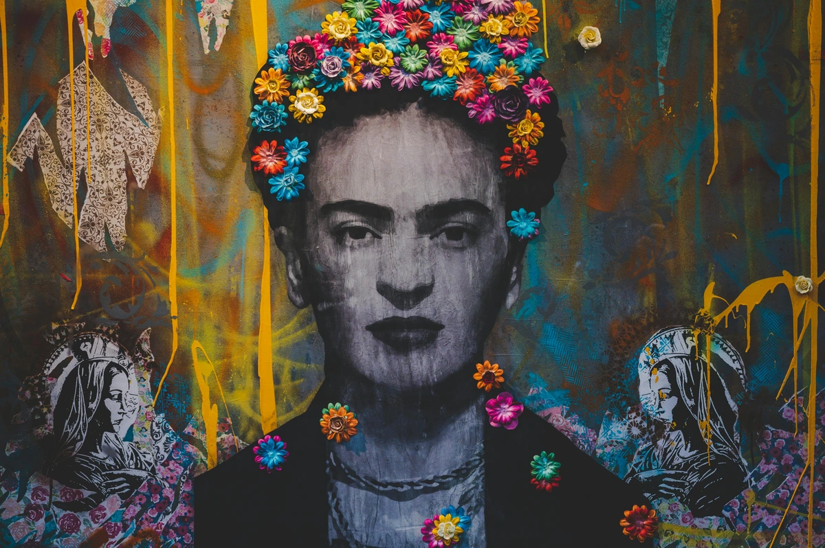
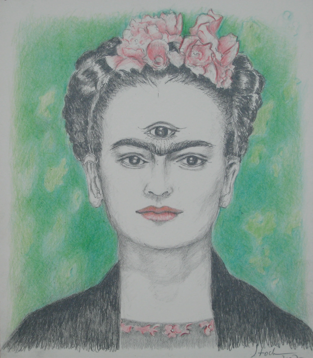
Frida Kahlo: Emotional Autobiography in Vivid Hues
Frida Kahlo, the iconic Mexican painter, used color with an intensity that mirrored her own tumultuous life and profound emotional depth. Her self-portraits, renowned for their unflinching honesty, are often saturated with vibrant indigenous Mexican colors—rich reds, deep greens, and brilliant blues—that are symbolic, narrative, and deeply personal. These colors were often drawn from traditional Mexican folk art and textiles, infusing her work with both personal suffering and national pride. It's a powerful example of how culture and personal experience can define a palette.
Kahlo's palette was a powerful, almost sacred, language of pain, passion, and cultural pride. The bold colors in her work don't just depict; they emote, drawing viewers into her psychological landscape and the complex tapestry of her Mexican heritage. She often used deep reds and fuchsias to represent blood, life, and suffering, alongside vibrant blues and greens drawn from traditional Mexican folk art, which symbolized nature, fertility, and even sorrow. She proved that even in realism, color could be a deeply expressive, almost spiritual, force, a mirror to a complex inner world that was both intensely personal and universally resonant. To truly understand her impact, read our ultimate guide to Frida Kahlo.
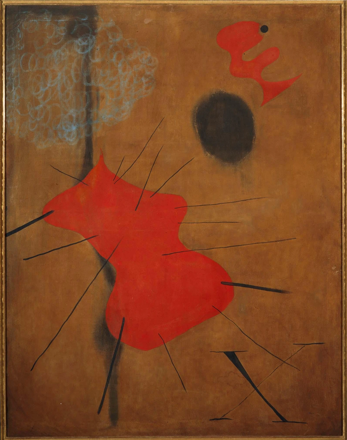
Joan Miró: Biomorphic Forms and Primary Punch
From Spain, Joan Miró was a master of Surrealism whose playful yet profound works are instantly recognizable by their vibrant, almost childlike, use of primary colors—especially reds, blues, and yellows—set against sparse, often dreamlike backgrounds. He filled his canvases with biomorphic forms, celestial bodies, and whimsical creatures, all outlined with a crisp precision that made his colors pop, giving a sense of energetic movement and fantastical narrative. His ability to make such simple shapes feel so alive through color is something I constantly find inspiring.
Miró’s work, whether painting or sculpture, often had an energetic, almost explosive feel, demonstrating that even in abstract or symbolic realms, a bold, well-chosen palette could convey immense vitality and imagination. His colors were never arbitrary; they were carefully placed to create dynamic tension and narrative within his fantastical worlds, drawing viewers into a cosmic dance of forms and hues. He created a unique visual vocabulary, where vibrant splashes of color coexisted with precise lines and playful, biomorphic shapes, inviting viewers to explore a dreamscape that was both deeply personal and universally appealing. Discover more about his enchanting art in our ultimate guide to Joan Miró.
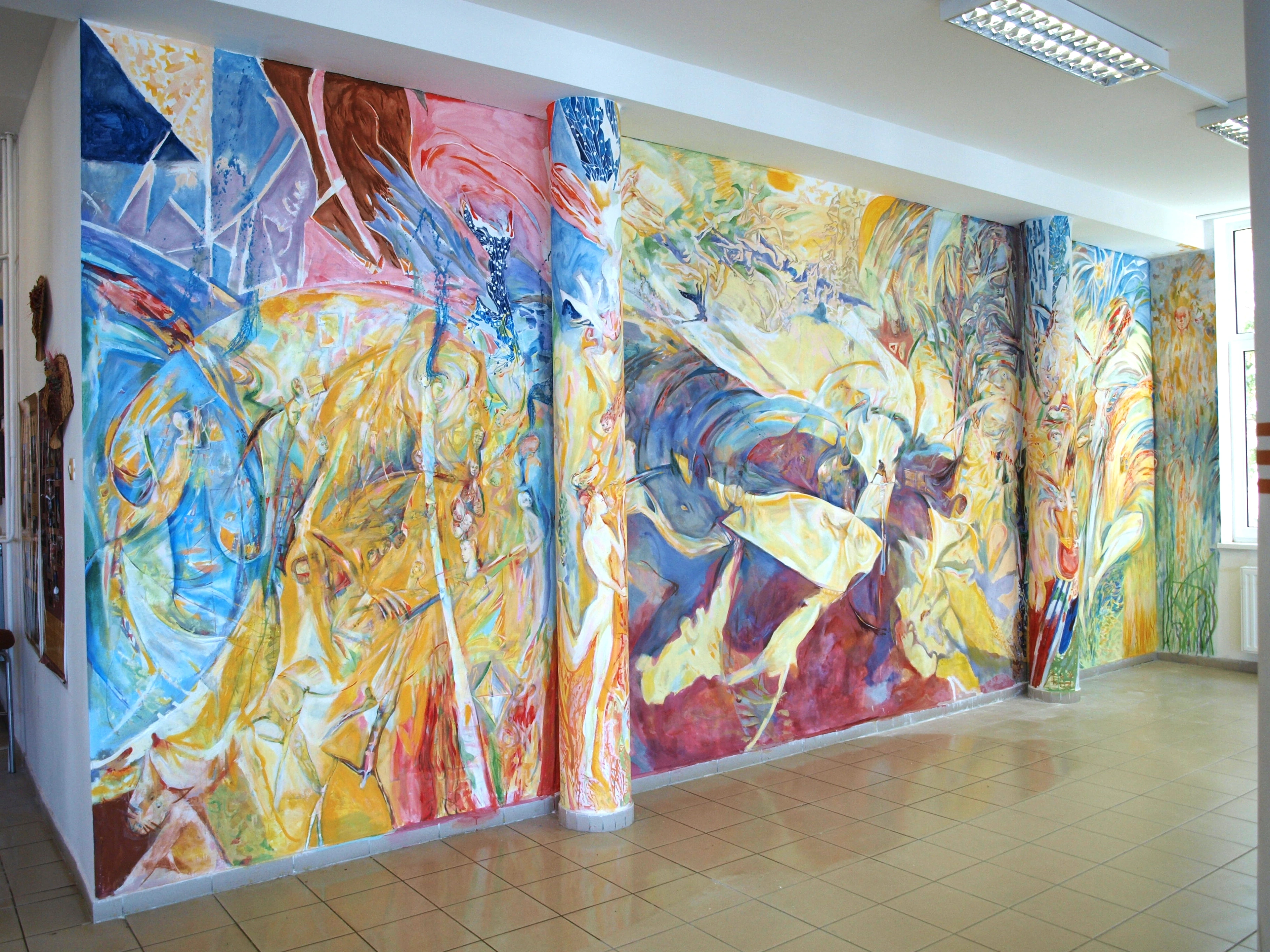
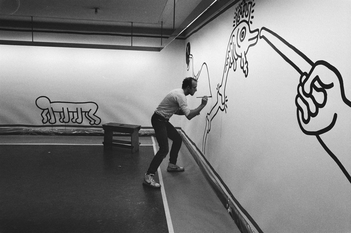
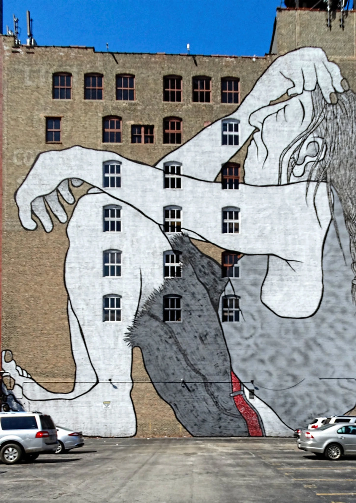
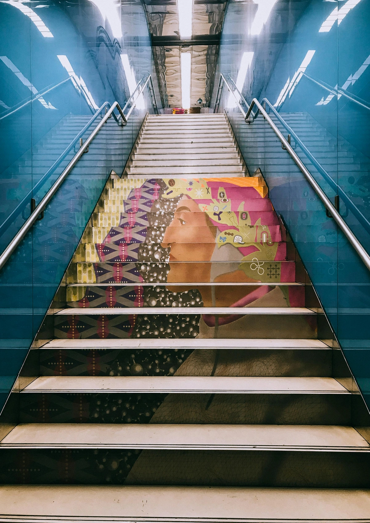
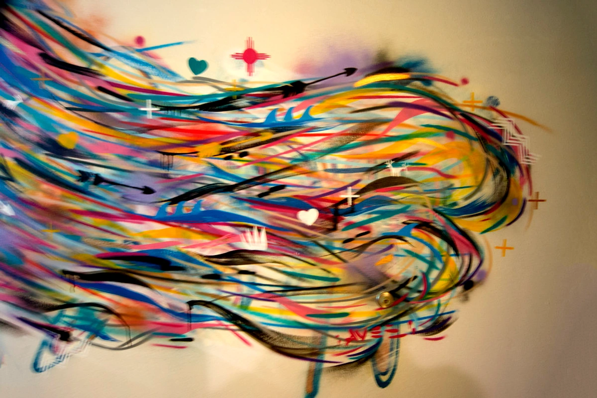
Street Art and Graffiti: The Urban Canvas Explodes
In our modern landscape, perhaps no artistic movement screams "color rebel" louder, more directly, and more democratically than Street Art and Graffiti. Born from counter-culture movements and urban environments, this art form utilizes vibrant, immediate, and often highly saturated colors to transform public spaces into dynamic canvases. From the intricate, sprawling murals of São Paulo to the political stencils of Banksy, street art reclaims urban landscapes, making powerful statements that are accessible to everyone. It’s raw, it's visceral, and it often bypasses traditional gallery spaces to bring art directly to the people. I think of it as public art that refuses to be ignored, often with a potent message.
Artists use everything from spray paint and stencils to large-scale murals, employing bold color combinations to grab attention, convey social commentary, personal expression, or simply inject aesthetic dynamism into everyday life. The sheer scale and public nature of street art often amplify its chromatic impact, making it impossible to ignore. It’s a testament to the enduring power of bold color as a tool for communication, identity, and vibrant rebellion in the heart of our cities.
Perhaps one of the most famous (and famously elusive) figures in this realm is Banksy. While often working in monochromatic stencils, his work frequently incorporates splashes of bold color to highlight political messages or create stark contrasts that amplify his social commentary. His pieces, whether critical or humorous, use visual impact to force engagement, proving that even a subtle use of intense color can be profoundly rebellious.

Why Are We So Drawn to Bold Color?
I think it’s primal. Bold colors trigger something deep within us, an almost instinctual response, a kind of pre-verbal communication. They can electrify us, soothe us, or even agitate us, sometimes all at once depending on the combination and context. There's a whole fascinating field dedicated to the psychology of color in abstract art, exploring everything from evolutionary biology (think ripe red fruit signaling sustenance, or warning colors in nature) to deep cultural conditioning that assigns meaning to hues across societies. Our brains are hardwired to respond to these signals.
But on a simpler, more personal level, I think we just crave the intensity. In a world that can often feel muted, overwhelming, or just plain gray, a blast of pure, unapologetic color is a visceral reminder to feel something, and to feel it strongly. It's a jolt of visual caffeine for the soul, a direct hit to our nervous system. We are, after all, visual creatures, and color speaks a universal, powerful language that transcends words, hitting us directly in our emotional core. It's a glorious, undeniable presence.
Here's a quick, simplified look at how some bold colors tend to hit us, keeping in mind these are broad generalizations and cultural context always plays a huge role:
Color | Common Psychological Associations |
|---|---|
| Red | Energy, passion, anger, love, danger, excitement, power, urgency. Culturally: prosperity (China), mourning (South Africa), sacred (India). |
| Blue | Calm, serenity, sadness, stability, trustworthiness, depth, coolness. Culturally: protection (Middle East), truth (Western), mourning (Iran). |
| Yellow | Joy, happiness, optimism, warmth, caution, energy, intellect. Culturally: sacred (India), mourning (Egypt), courage (Japan). |
| Green | Nature, growth, harmony, freshness, fertility, envy, healing, ambition. Culturally: Islam (sacred), danger (some Western contexts), prosperity (Western). |
| Orange | Enthusiasm, creativity, determination, warmth, success, stimulation, fascination, joy, aggression. Culturally: spirituality (Buddhism), harvest (Western). |
| Purple | Royalty, power, ambition, luxury, mystery, wisdom, creativity, magic, extravagance, spirituality. Culturally: mourning (Thailand, Brazil), wealth (Western). |
| Black | Power, elegance, death, evil, mystery, formality, fear. Culturally: mourning (Western), rebirth (Egypt), sophistication (fashion). |
| White | Purity, innocence, cleanliness, peace, sterility, emptiness. Culturally: mourning (East Asia), purity (Western), divine (many cultures). |
Conclusion: The Unapologetic Power of Color
Ultimately, these artists, these glorious color rebels, gave us permission to see the world differently, to feel more intensely. They showed us that color doesn't have to be a perfect, timid reflection of reality; it can be a vibrant, audacious reflection of our own inner landscapes, our emotions, our dreams, and our protests. And that, to me, is a profound freedom—a freedom I think about every time I pick up a brush, every time I mix a new hue, every time I strive to capture a feeling in a splash of paint. It’s about more than just pigment; it's about the courage to express, to challenge, and to connect. This journey through the history of color rebellion has deepened my own appreciation for the fearless spirit that drives truly impactful art.
If you're curious to see how this love for color translates into my own work, to explore my journey of chasing that perfect, screaming hue, you can see my artistic timeline on my [/timeline] or, better yet, find a piece to start your own colorful collection over at my [/buy] page. Let's keep the rebellion alive, one vibrant stroke at a time, and never apologize for the colors we choose to live by.
What colors are calling to you right now? Let your palette be your guide, and paint your world loudly!--- | :------------------------------------------------------------------------------------------------------- | | Red | Energy, passion, anger, love, danger, excitement, power, urgency | | Blue| Calm, serenity, sadness, stability, trustworthiness, depth, coolness | | Yellow| Joy, happiness, optimism, warmth, caution, energy, intellect | | Green| Nature, growth, harmony, freshness, fertility, envy, healing, ambition | | Orange| Enthusiasm, creativity, determination, warmth, success, stimulation, fascination, joy, aggression | | Purple| Royalty, power, ambition, luxury, mystery, wisdom, creativity, magic, extravagance, spirituality |
Of course, these are broad strokes, and cultural context plays a huge role. But the underlying power is undeniable. Color is communication, often bypassing words entirely.
Bringing the Rebellion Home: Incorporating Bold Color into Your Space
Bringing that energy, that unapologetic vitality, into your own space can be truly transformative. It doesn't have to be a whole wall bathed in shocking pink (though, if that's your vibe, go for it!); even a single piece of art with bold, impactful colors can act as a magnetic focal point, injecting life, personality, and conversation into a room. It’s about creating moments of visual excitement in your everyday, about making your environment a reflection of your own vibrant spirit.
Don't be intimidated by the idea of 'too much.' Sometimes, 'too much' is just right. Consider these ideas:
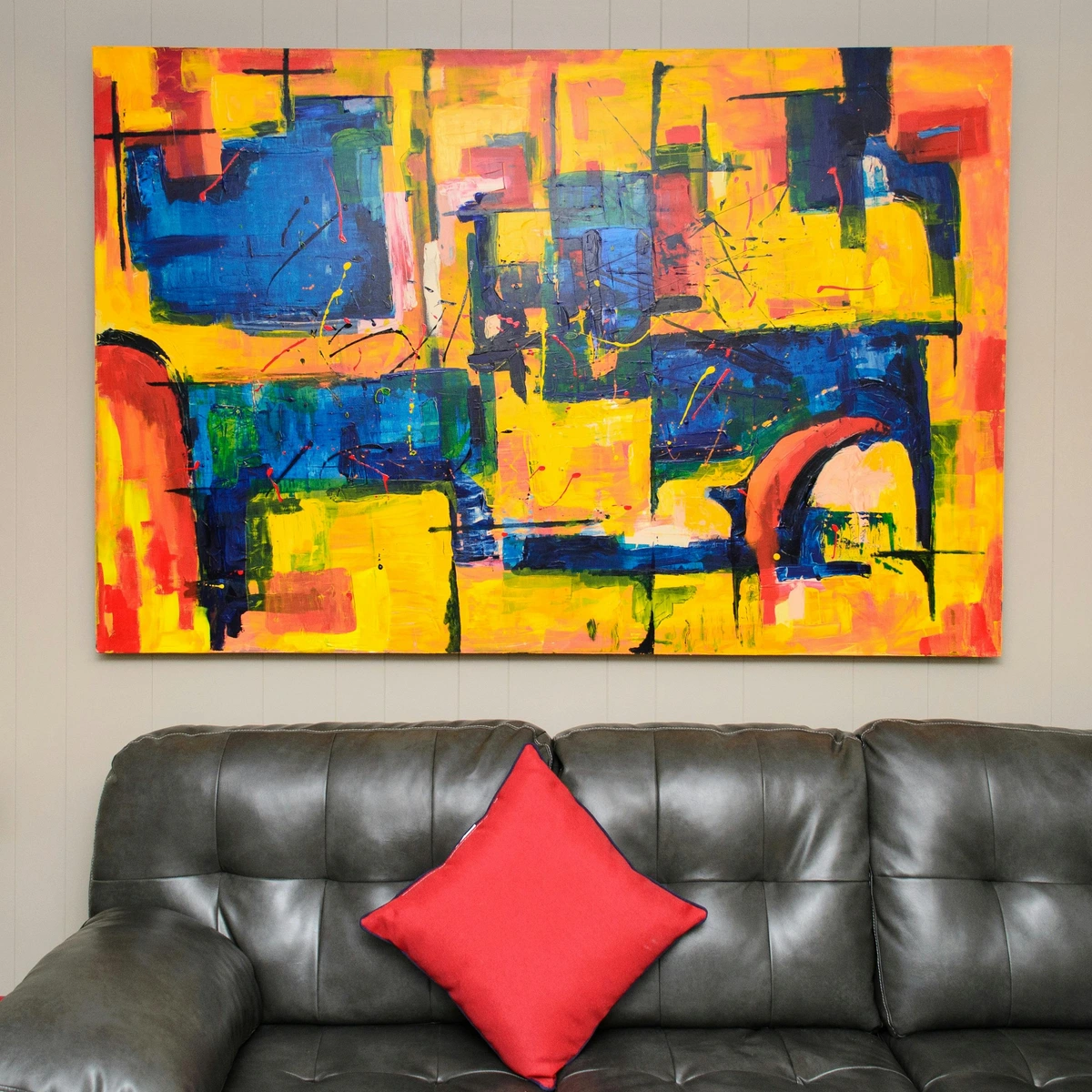
- The Statement Piece: A large abstract painting with a commanding palette immediately sets the tone for a room. This is often my go-to strategy when I want a room to truly sing.
- Color Accents: Integrate bold hues through smaller objects like cushions, throws, or ceramic vases to add pops of visual interest. These small explosions of color can tie a space together without overwhelming it.
- Unexpected Combinations: Just like the Fauvists, don't be afraid to pair colors you wouldn't typically expect to see together. Sometimes the most rebellious combinations create the most dynamic spaces, sparking visual intrigue.
- Lighting: Experiment with how different lighting (natural or artificial) affects the vibrancy of colors in your art and decor. A well-placed light can make a bold color truly sing, altering its mood throughout the day.
- Art Groupings: Create a 'gallery wall' with several smaller, bold pieces. The collective impact can be incredibly powerful, telling a richer color story.
If you're wondering how to start, or how to confidently integrate such pieces, learning how to choose art for your living room is a fantastic first step. Think of it as painting your personal narrative with daring strokes, letting your space tell a story of unapologetic color.
The Palette of Possibilities: Techniques for Bold Expression
So, how do these artists achieve such incredible chromatic intensity? It's not just about choosing bright pigments; it's about technique, medium, and a profound understanding of how colors interact.

Mediums That Shout
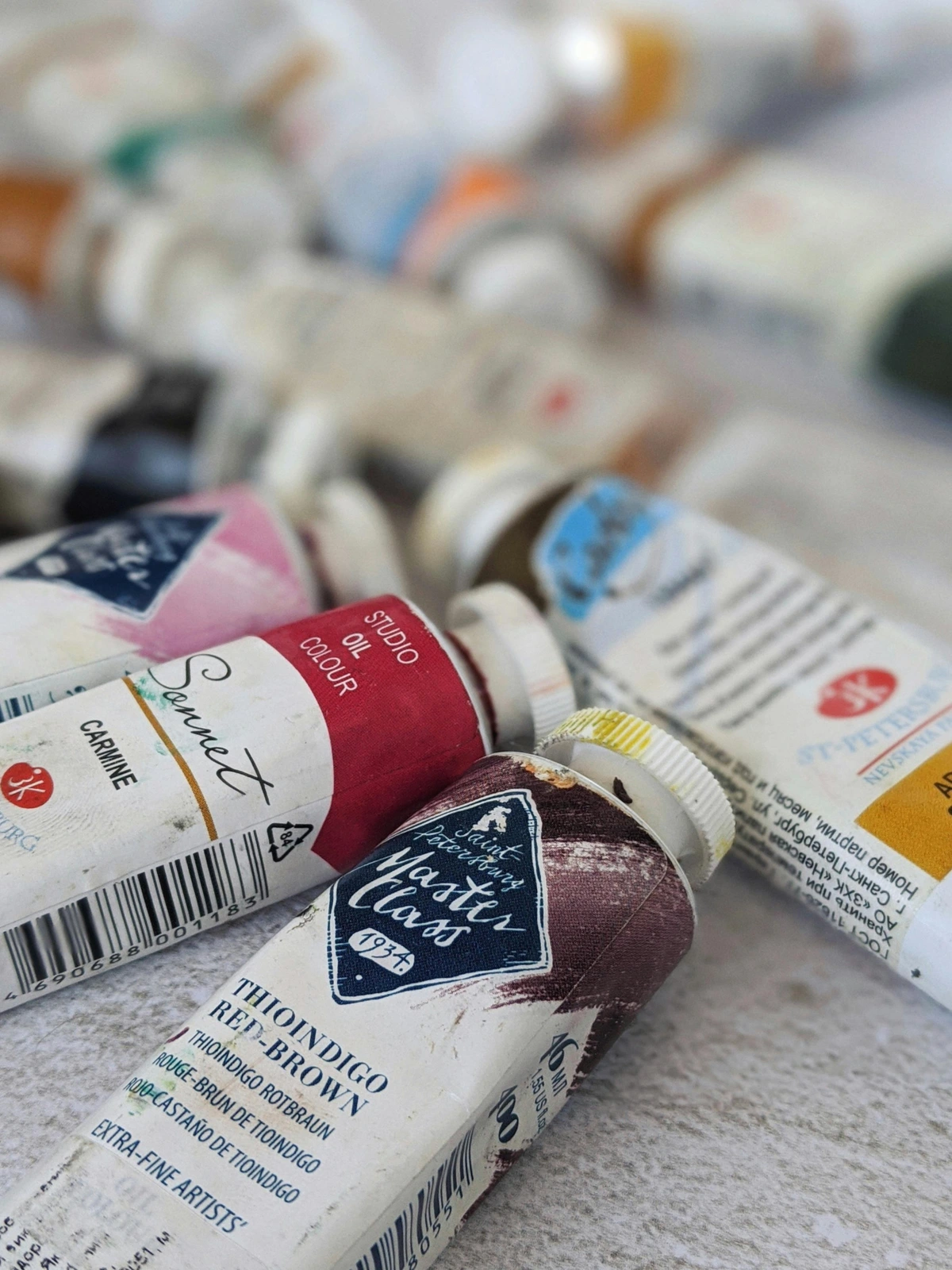
- Acrylics & Oils: These are the heavy hitters when it comes to bold color. Their high pigment load allows for incredible saturation and opacity. Artists can layer them thickly (impasto) for texture, or thin them for luminous glazes, all while maintaining their vibrant punch.
- Gouache & Watercolor: While often associated with softer tones, artists can use gouache (an opaque watercolor) and even regular watercolors with bold intent through layering, strong washes, and concentrated pigments.
- Screen Printing: As seen with Pop Art, screen printing allows for flat, unmodulated areas of intense color, creating graphic impact that feels both industrial and artistic.
Techniques for Maximum Impact
- Pure Pigment: Many color rebels apply paint straight from the tube, avoiding extensive mixing that can dull hues. This creates a raw, immediate vibrancy, a direct connection to the pigment's inherent power.
- Juxtaposition (Complementary & Contrasting Colors): Placing complementary colors (like red and green, or blue and orange) next to each other makes both appear more intense, creating a visual 'vibration' or a dynamic tension. This is a cornerstone of effective color use.
- Impasto: Applying paint in thick, textured strokes creates a sculptural quality that catches light and adds a tactile dimension to color, making it almost leap off the canvas. Think Van Gogh's swirling skies, where the paint itself becomes a physical manifestation of emotion.
- Glazing: While seemingly subtle, thin, transparent layers of color applied over dried paint can build incredible depth and luminosity, making underlying colors glow with renewed intensity. It’s like adding another dimension to the color.
- Color Blocking: Using large, unmodulated areas of solid, bold color to create strong visual statements and define forms without relying on intricate details. This creates immediate impact and clarity.
- Optical Mixing: Allowing the viewer's eye to blend small strokes or dots of pure color when viewed from a distance, creating new, vibrant hues that can be more luminous than physically mixed pigments (think Pointillism, though Op Art also uses similar principles).
- Large Scale: Immense canvases, like those favored by the Color Field painters, allow color to envelop the viewer, creating an immersive, all-encompassing experience where the sheer presence of color becomes overwhelming.
Ultimately, the choice of technique and medium is another brushstroke in the artist's statement—another way to make that color sing its loudest, to ensure its message is heard, seen, and felt.

Frequently Asked Questions (FAQ)
Who is the most famous artist for using bold colors?
That's a tough one, as the definition of 'bold' can be subjective, and many artists have made significant contributions! However, if I had to pick a few, Henri Matisse is almost universally recognized as a master of bold, expressive color, especially during his Fauvist period. Vincent van Gogh is another strong contender, whose intense, impasto brushstrokes and vibrant palettes left an undeniable mark. In the realm of Abstract Expressionism, Mark Rothko achieved monumental fame for his immersive color fields. And in modern pop culture, Andy Warhol and Jean-Michel Basquiat leveraged bold, often shocking, colors to create their iconic works. It really depends on which era and style resonates most with you, but all these artists certainly painted loudly!
What art movement is known for bold, unrealistic colors?
Fauvism is absolutely the quintessential movement for this! Active in the early 1900s, artists like Matisse and André Derain intentionally used intense, non-naturalistic colors to express raw emotion and break from academic tradition. Following that, German Expressionism also employed bold, often clashing colors to convey psychological states. Later, Pop Art in the 1960s famously adopted the bold, graphic colors drawn from advertising and commercial media. And let's not forget Op Art, which used bold, high-contrast colors to create dazzling optical illusions!
What about Vincent van Gogh?
Absolutely! While he wasn't formally part of the Fauvist or Expressionist movements, Vincent van Gogh was an undeniable trailblazer in using bold, expressive color. His thick application of paint (known as impasto) and his use of vibrant, often swirling yellows, blues, and greens were revolutionary for his time. He didn't just depict reality; he infused it with his passionate inner world, and his fearless approach to color deeply influenced the Fauvists and Expressionists who came after him. He’s a true color rebel! His ability to make color convey such intense personal emotion is something I find endlessly compelling. You can see his mastery in our ultimate guide to Van Gogh.

Is it hard to decorate with art that uses bold colors?
Not at all! In fact, I find it can often be easier. A single, powerful piece with bold colors can be the statement piece that instantly defines and ties a whole room together. It can provide a fantastic, energizing contrast in a minimalist space or beautifully complement an already eclectic decor. The key is to trust your intuition and find what genuinely resonates with you. Don't be afraid to let one vibrant piece dictate the mood! Check out some ideas for decorating with abstract art in Bohemian Chic interiors for inspiration.
How do artists achieve such intensity of color?
Artists achieve intense color through a combination of factors: using pure, unmixed pigments straight from the tube; employing high-quality paints with high pigment concentration; utilizing techniques like glazing (thin, transparent layers of color) or impasto (thick, textured application); and cleverly using color theory through juxtaposition of complementary or contrasting hues. The medium also plays a role, with acrylics and oils often allowing for the most vibrant saturation. It's a conscious, often meticulous, process of maximizing visual punch.

What are some lesser-known movements or artists known for bold color?
Beyond the giants, there are many incredible artists and movements that deserve more attention for their daring use of color. Consider the Blue Rider group (Der Blaue Reiter) within German Expressionism, with artists like Franz Marc using intense, symbolic colors (think his vivid blue horses, symbolizing spirituality and peace) and Gabriele Münter who employed bold, simplified forms and pure hues, often with a raw, folk-art sensibility. Or, in the realm of Surrealism, artists like Roberto Matta used incredibly vivid palettes in their cosmic, often unsettling, psychological landscapes, creating a sense of dynamic, internal worlds. Even early Cubism, while not always associated with bold color, often featured strong, foundational hues, and later artists like Sonia Delaunay (Orphism) used vibrant, interlocking circles of color to create rhythmic compositions that celebrated pure chromatic abstraction.
And let's not forget the incredible tradition of Indian Miniature Painting, which, over centuries, developed a sophisticated visual language using jewel-toned, highly saturated colors to depict narratives from mythology, court life, and literature with exquisite detail and symbolic meaning. The boldness here lies not just in intensity, but in the deliberate, symbolic use of each hue. In contemporary art, the sheer diversity of street artists and muralists globally showcases a continuous, boundless exploration of bold color, often bringing local narratives to life with breathtaking vibrancy.
Ultimately, these artists gave us permission to see the world differently. They showed us that color doesn't have to be a perfect reflection of reality; it can be a reflection of our own inner landscapes. And that's a freedom I think about every time I pick up a brush. If you're curious to see how this love for color translates into my own work, you can see my journey on my [/timeline] or find a piece to start your own collection over at my [/buy] page.