Famous Pop Art Paintings: The Icons You Already Know
A deep dive into the most famous Pop Art paintings, from Warhol's Soup Cans to Lichtenstein's comics. Discover the stories behind these iconic works.

The Pop Art Paintings Everyone Knows (Even If They Don't Know It)
Let's face it, some art is just everywhere. We encounter these iconic images daily – on apparel, home decor, in films, and across countless digital platforms. They're so deeply woven into our collective consciousness that we often overlook their profound artistic and cultural significance. But what if we paused to truly examine them? To understand how a mundane soup can or a dramatic comic book panel transcended its commercial origin to become a global art icon? That's precisely our mission: to go beyond mere recognition and delve into the enduring power of these Pop Art masterpieces. Consider this your definitive journey into the works that didn't just define a movement; they redefined art itself, making the popular profound, and the ordinary, extraordinary. I've always found it fascinating how certain images can become so ubiquitous that their artistic origins fade into the background, almost like a visual hum we take for granted. This article aims to bring those origins back into sharp focus.
I think of these works not just as paintings, but as profound cultural flashpoints. They echo back to the early 20th-century avant-garde movements that first dared to question the very boundaries of art – movements like Dada and Surrealism that had already experimented with collage, found objects, and the subversion of artistic norms. Pop Art marked a seismic shift, a moment when art stopped looking up at the heavens and started looking around at the supermarket aisle and the Sunday funnies. It wasn't just a revolution; it was a loud, vibrant explosion that fundamentally changed our relationship with art forever. These were its icons, boldly declaring that anything, even the most mundane product or celebrity image, could be elevated to the status of fine art. It was a movement that truly mirrored the world it sprang from—a direct, often provocative, engagement with the new realities of mass production, media, and consumer desire. It challenged the very definition of art, pushing it into the streets, the homes, and the minds of ordinary people, making it more accessible and, paradoxically, more profound.
But before we dive into the specific masterpieces, I think it’s crucial to understand the fertile ground from which Pop Art sprung. It wasn’t a sudden, isolated phenomenon, nor was it a whimsical detour from serious art. Instead, it was a logical, albeit audacious, response to a rapidly changing post-war world, eager to shed the perceived seriousness and elitism of earlier movements and embrace the everyday with a keen, often ironic, eye. This movement didn't just appear out of nowhere; it was a direct reaction, a spirited retort, to the prevailing artistic orthodoxy of its time. It was a cultural thermometer, measuring the temperature of a society rapidly accelerating into an age of mass media and consumer abundance, a fascinating and often bewildering new reality, a landscape ripe for artistic exploration. What strikes me most is how deeply rooted Pop Art was in its contemporary moment, reflecting society back to itself with a mischievous wink.
The Cultural Crossroads: Where Pop Art Began
Imagine the post-World War II era: a period of unprecedented economic boom, especially in America, giving rise to widespread affluence and a burgeoning middle class. This prosperity, however, was deeply tinged with the anxieties of the Cold War, casting a long shadow of nuclear fear, and the burgeoning Civil Rights Movement, adding a profound layer of social and political complexity beneath the shiny veneer of consumer culture. Alongside this, the television became a household staple, advertising saturated every corner of life, and a new generation found itself grappling with the implications of mass consumerism and a relentless onslaught of commercial imagery. This wasn't just about owning more things; it was about a new way of life, a new visual language that permeated every aspect of society. High-brow and deeply introspective, Abstract Expressionism, with its angst-ridden canvases and focus on individual emotion, had dominated the art world. However, a new wave of artists felt increasingly disconnected from its perceived seriousness and elitism. I can see why; after years of wartime austerity and then the somber, existential weight of Abstract Expressionism, people were ready for something different. They yearned for an art form that engaged directly with the everyday, the popular, and the commercial—the very fabric of their rapidly evolving society. They saw potential in the vernacular, in the imagery that surrounded them daily, rather than in abstract gestures of the subconscious. It was a democratic impulse, a desire to bridge the gap between art and life, high culture and low culture, in a way that had never quite been done before. They observed that the public was already visually sophisticated, fluent in the language of advertising and media, and saw no reason why art couldn't speak that same language, often with a mischievous wink.
This shift wasn't solely an American invention. Across the Atlantic, in the mid-1950s, a group of artists, architects, writers, and critics in London formed the Independent Group. Think of them as intellectual pioneers, almost like a think tank dissecting the emergent consumer landscape. Figures like Richard Hamilton, Eduardo Paolozzi, and the critic Lawrence Alloway (who actually coined the term "Pop Art" – short for "Popular Art" – in 1955) were already dissecting American popular culture – Hollywood movies, science fiction, advertising – seeing it not as something to dismiss, but as a rich source of cultural data and artistic inspiration. They were fascinated by the power of mass media and its ubiquitous imagery, often discussing these phenomena in their now-legendary "This Is Tomorrow" exhibitions and lectures at the Institute of Contemporary Arts (ICA). Their critical yet enthusiastic engagement with American commercialism provided a crucial theoretical underpinning for the movement, laying the intellectual groundwork for a new kind of art that could speak directly to the modern world, a world increasingly defined by glossy images and catchy slogans. This transatlantic dialogue, a fascinating exchange between European intellectual discourse and American commercial exuberance, really set the stage. It's truly incredible how these conversations across continents ultimately shaped a global art movement.
This paved the way for artists to embrace the imagery of billboards, comic books, and product packaging, turning what was once considered "low culture" into the very fabric of "high art." It was a daring move, a blurring of lines that continues to provoke and inspire. So, let’s take a stroll through the gallery of the ultra-famous, the works that defined this exhilarating movement—the pieces that, for better or worse, are probably already etched into your brain.
The Core Icons: The Masterpieces That Defined Pop Art
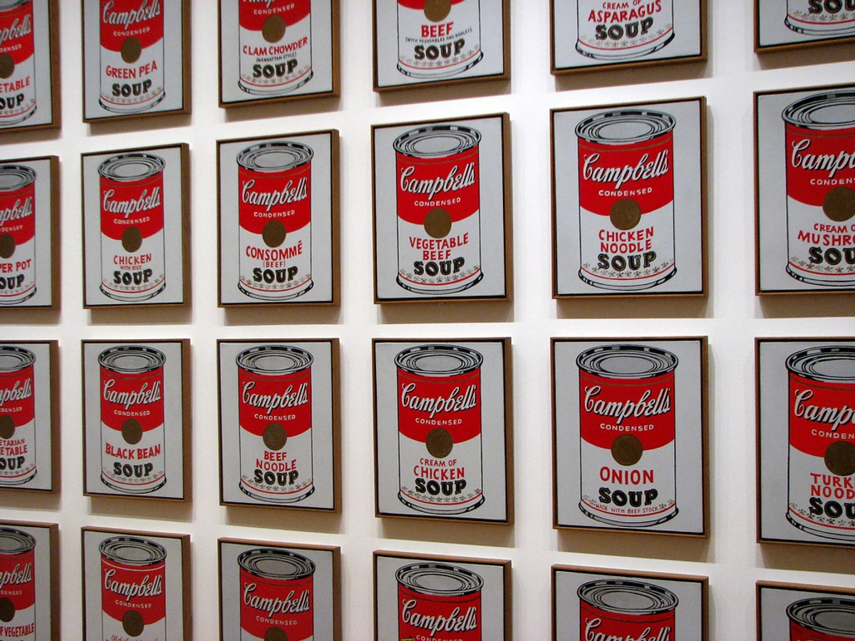
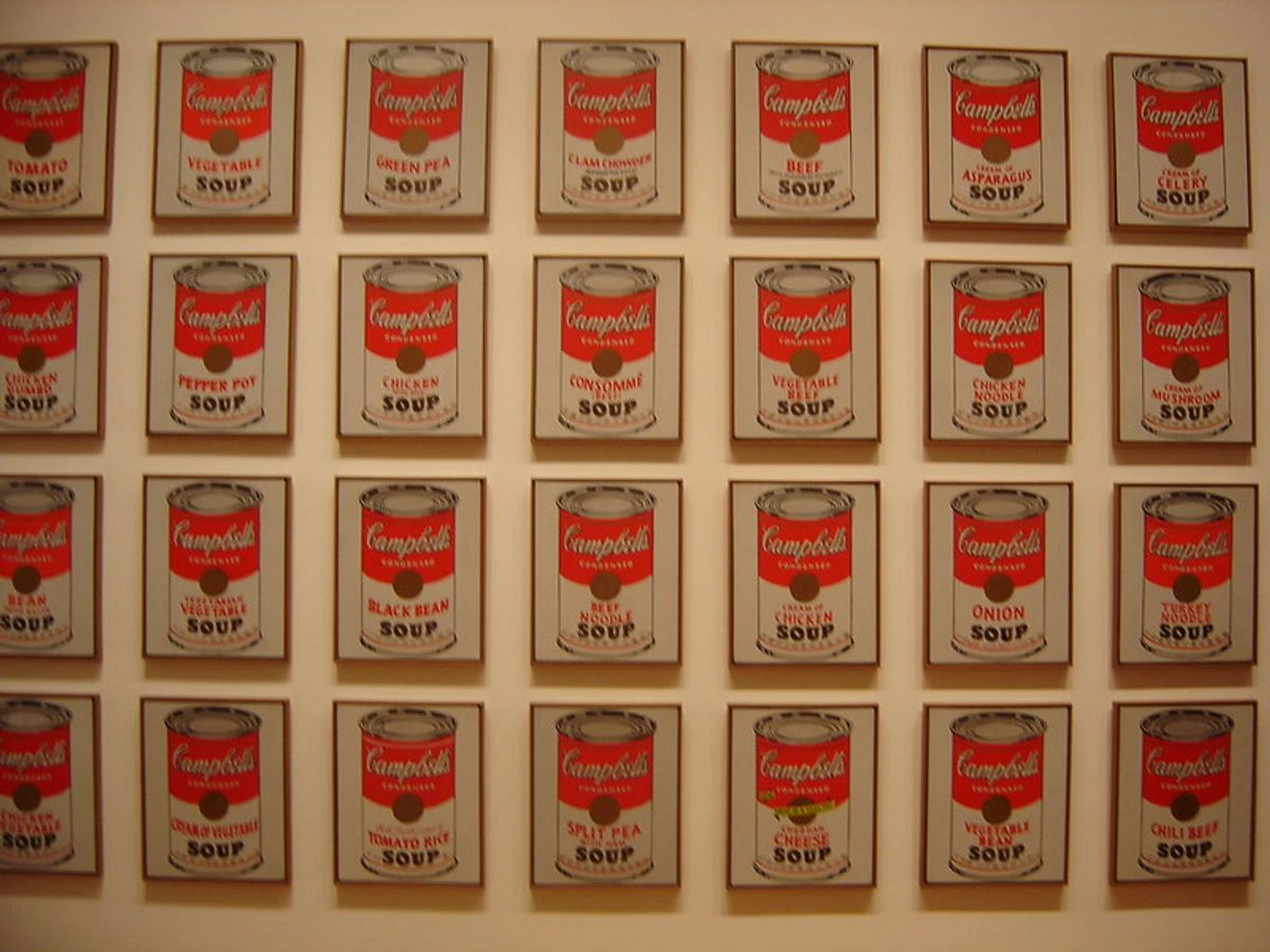
1. Andy Warhol - Campbell's Soup Cans (1962)
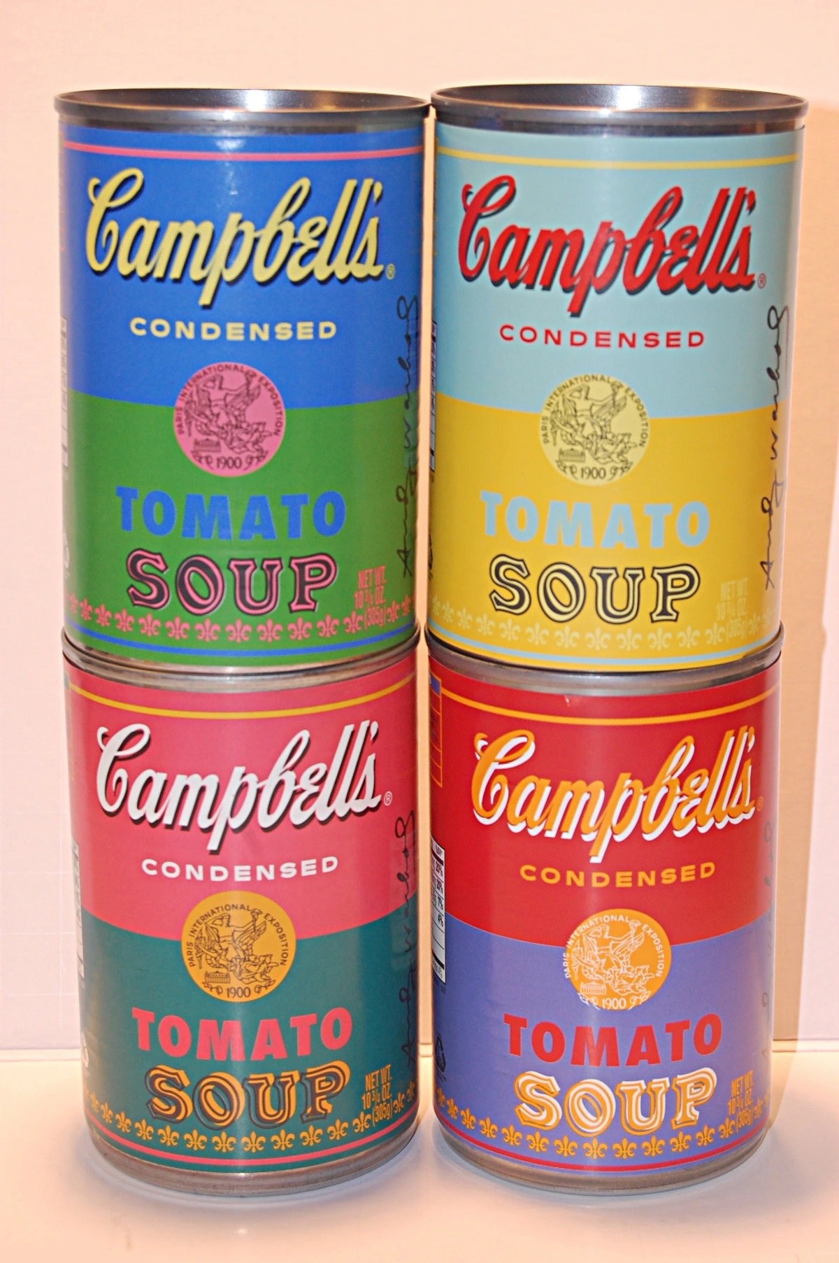
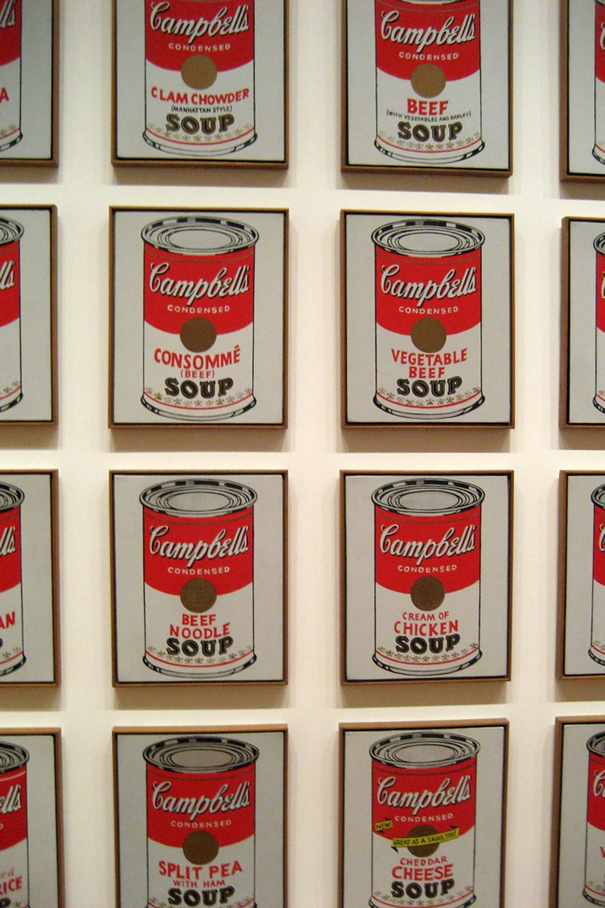
This is it. The big one, perhaps the quintessential example. If Pop Art has a founding document, it might just be this iconic series of 32 canvases, each meticulously depicting a different flavor of Campbell's soup. When they were first exhibited at the Ferus Gallery in Los Angeles in 1962, they were displayed on a narrow ledge, just like products on a supermarket shelf. This wasn't just a display choice; it was a conceptual statement, forcing viewers to immediately question the boundaries between commercial display and high art exhibition. I find that subtle yet brilliant detail utterly captivating. The gallerist, Irving Blum, even offered them for sale individually, but later decided to keep them as a single series, a testament to their collective power. It was a direct, unapologetic challenge to the established art world, a witty and provocative statement that echoed throughout the art scene. Some critics were outraged, dismissing it as mere commercialism, while others recognized its profound commentary on modern society. Warhol, who began his career as a highly successful commercial illustrator, was uniquely positioned to understand and subvert the language of advertising. He transformed the familiar into something unsettlingly artistic, forcing a re-evaluation of aesthetic value itself. This wasn't merely painting a soup can; it was painting the idea of a soup can, the ubiquity of it, the cultural weight it carried – a meditation on the very fabric of American consumer identity.

Warhol wasn't just painting soup; he was holding up a mirror to America's obsession with mass production and consumerism. He understood, perhaps better than anyone, the profound impact of commercial imagery on the human psyche. The repetitive nature of the cans, displayed like products on a shelf, deliberately blurred the lines between a grocery store and a gallery, forcing viewers to question the very definition of art itself.
His choice of screen printing (a semi-mechanized process that transfers an image onto a surface using a mesh screen and ink) was pivotal. This technique, also known as silkscreen, allowed him to reproduce images with an almost industrial precision, deliberately removing the visible "artist's hand" that had been so central to Abstract Expressionism. This wasn't about the artist's unique gesture or emotional outpouring; it was about the omnipresent, machine-made aesthetic of consumer culture itself. The repetition inherent in screen printing perfectly mirrored the endless supply of consumer goods, and indeed, Warhol would later extend this repetitive fascination to his haunting 'Death and Disaster' series, exploring the morbid side of mass media consumption. It was a radical idea: that something so mundane, so everyday, so mass-produced, could be the subject of high art. Andy Warhol essentially broke the rules by declaring there were no rules about what art could be about. It was a playful yet profound challenge to the art establishment, asking us to reconsider the very nature of artistic creation in an age of abundant commercial imagery. He took something ubiquitous and made it extraordinary, blurring the boundaries between art and life in a way that few had dared before. I often think about how this choice of medium was as much a conceptual statement as the subject matter itself.
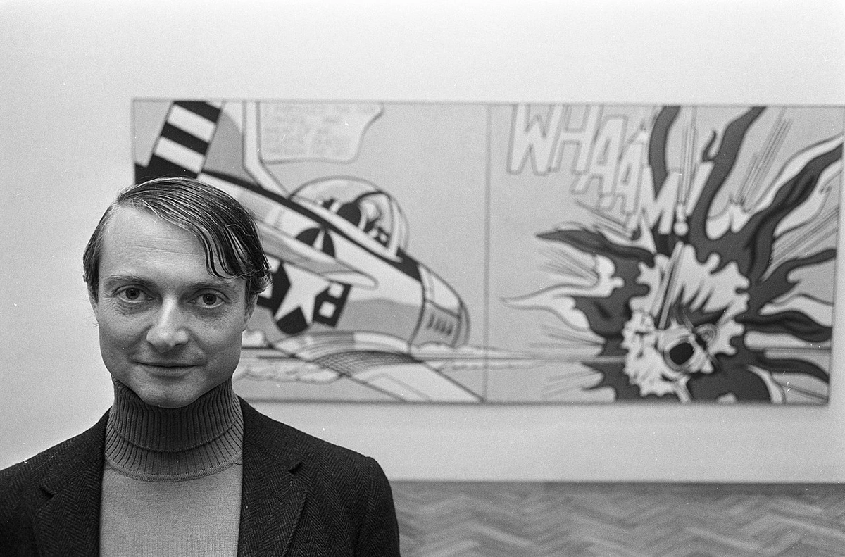
2. Roy Lichtenstein - Whaam! (1963)
If Warhol looked to the supermarket, Roy Lichtenstein looked to the comic book, and specifically, to the intense, pulp drama found within their pages. Whaam! is explosive, loud, and unapologetically dramatic. It’s a giant diptych (a two-panel painting) that captures a fighter jet blowing another plane out of the sky. This particular image was directly appropriated from a 1962 DC Comics' All-American Men of War issue, specifically a panel illustrated by Irv Novick. Lichtenstein's meticulous recreation and monumental scaling transform a fleeting, disposable image into a lasting commentary. It feels like a single, frozen moment of intense action, lifted directly from a war comic and magnified to monumental scale, demanding attention in a way the original never could.
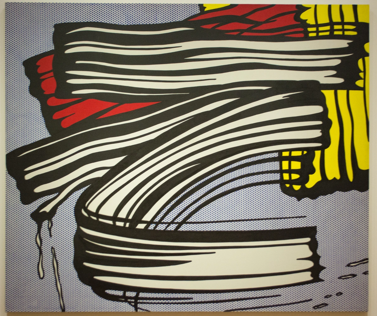
What always gets me is the technique. Lichtenstein painstakingly recreated the look of commercial printing, including the famous Ben-Day dots. These small, colored dots, named after illustrator and printer Benjamin Day, were a staple of comic book production, used to create color and shading through varying sizes and spacing. From a distance, they merge to create solid colors and nuanced shading, mimicking the optical illusion of commercial newspaper printing. But up close, they reveal the mechanical pattern, a powerful reminder of the artwork's commercial origins and a deliberate nod to the industrial nature of mass media. He meticulously transferred a disposable, low-art form—a comic book panel—and elevated it to monumental status, both celebrating its graphic power and forcing the art world to question its own snobbery about what qualifies as "high art." It was a masterful act of appropriation and transformation that cemented Roy Lichtenstein's place in art history. It's a fascinating peek behind the curtain of mass media production, isn't it? He wasn't just copying; he was dissecting, analyzing, and ultimately transforming. He forced us to confront the pervasive influence of mass media and its aesthetic on our perception of reality, long before the age of digital imagery.
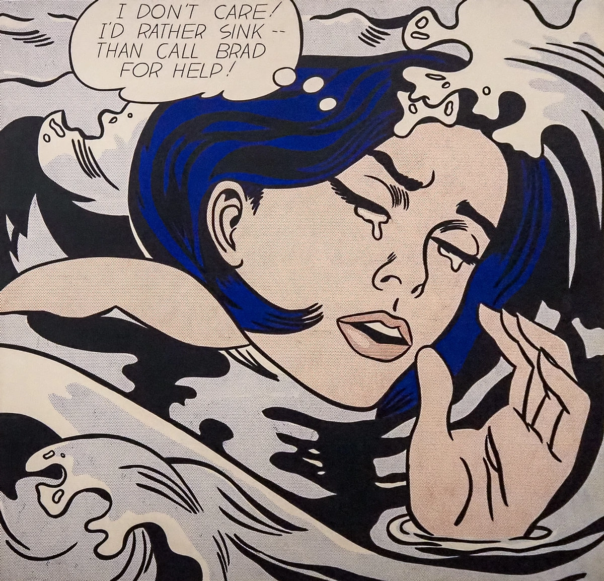
3. Roy Lichtenstein - Drowning Girl (1963)
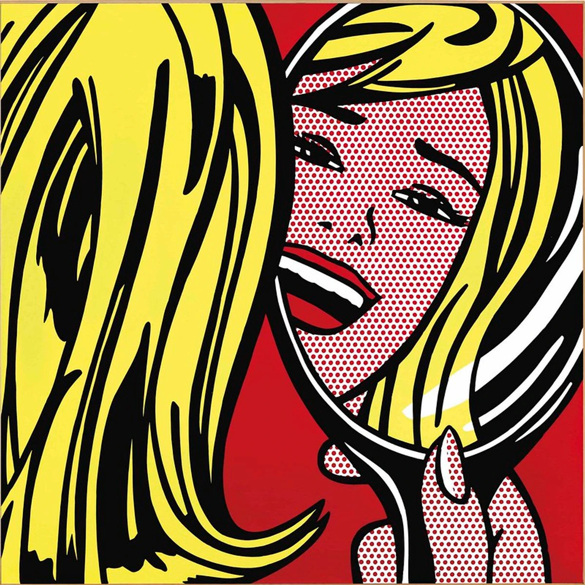
Yes, another Lichtenstein, but it's impossible to ignore this one, as it presents the other side of the Pop Art coin: not explosive action, but high-pitched melodrama, a commentary on the emotional extremes often found in popular culture. The thought bubble is key: "I don't care! I'd rather sink -- than call Brad for help!"
It’s almost funny in its over-the-top angst, a deliberate exaggeration that highlights the theatricality of melodrama. Lichtenstein meticulously rendered this image, originally lifted from a 1962 DC Comics' Secret Hearts issue, specifically a panel illustrated by Tony Abruzzo. By isolating it and blowing it up to a massive scale, he transforms its context entirely. It becomes a poignant commentary on how women were often depicted in popular media—as passive, emotional victims perpetually entangled in romantic dramas, forever waiting for a "Brad" to save them. The single thought bubble, removed from its serialized narrative, amplifies the sense of individual crisis, yet the mechanical reproduction hints at the universality of such portrayals. It's both a celebration of the comic book aesthetic and a sharp critique of its gendered tropes, and that's a tightrope few artists can walk with such finesse. Lichtenstein's use of a comic book romance panel, a genre often dismissed as frivolous, forces a re-evaluation of both the source material and the societal norms it reflects. I often wonder if he foresaw the meme culture of today, where a single, dramatic image can become a widely shared commentary on universal human experiences, albeit with a deeper, more artistic intention here. It reminds me that even in the most exaggerated forms, art can hold a mirror to societal narratives about gender and emotion.
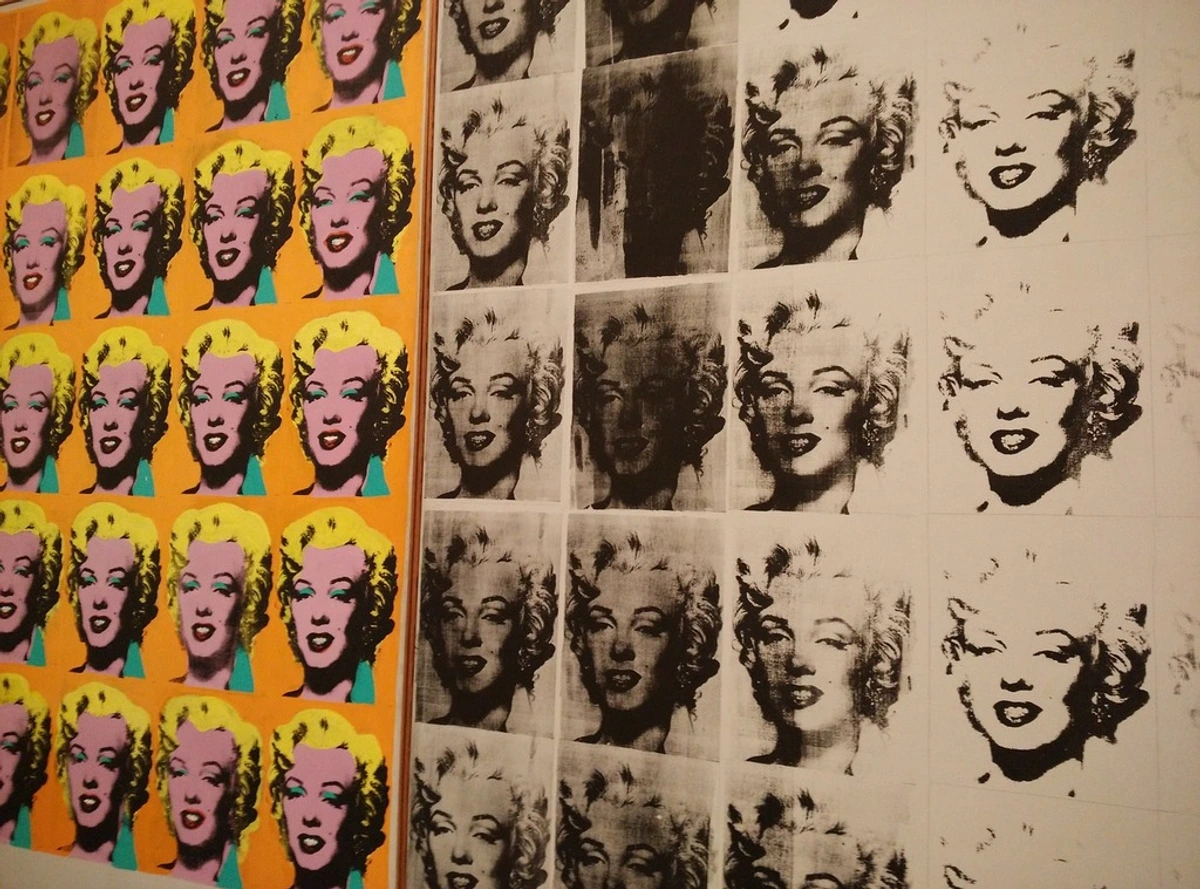
4. Andy Warhol - Marilyn Diptych (1962)
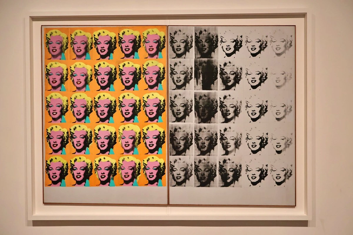
Shortly after Marilyn Monroe's tragic death in 1962, Warhol created this masterpiece, a profound visual elegy. It’s one of the most haunting pieces of Pop Art, and for me, it’s Warhol's best work, capturing the ephemeral nature of celebrity and the stark reality of mortality. He used a single publicity photo of Monroe, a readily available, mass-produced image, and silk-screened it fifty times across two canvases, creating a powerful, repetitive grid that both glorifies and diminishes its subject.
The left panel, bursting with garish, almost artificial, vibrant color, represents her dazzling public persona—the manufactured glamour and idealized image of Marilyn the world adored. It's the Marilyn of the silver screen, perpetually smiling and radiant, a carefully constructed illusion, almost a commercial product. The right panel, however, is a stark, almost brutal counterpoint, rendered in fading black and white. Here, the images progressively smudge, blur, and disappear into near oblivion, mirroring the transient nature of fame and, more poignantly, the ultimate erasure of a life. This stark contrast is profoundly moving, creating a powerful and haunting statement not just about Marilyn's fate, but about life, death, and the insatiable, often destructive, nature of a celebrity culture that both creates and devours its icons. The relentless repetition, rather than celebrating her individuality, paradoxically makes her face feel less like a unique person and more like a mass-produced product being stamped out on an assembly line. This, I think, is a chillingly accurate and prescient take on the relentless machinery of modern fame and its impact on personal identity, a theme that continues to resonate today, making it a timeless commentary on the human cost of idolization. It’s a profound visual elegy, a memento mori for the age of mass media.
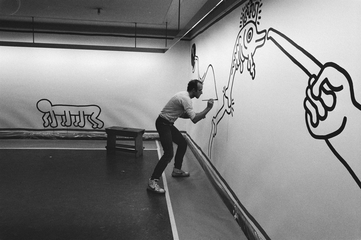
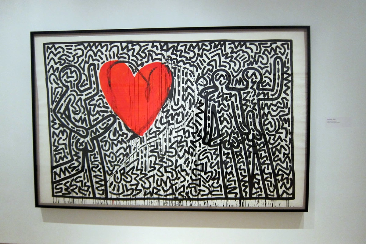
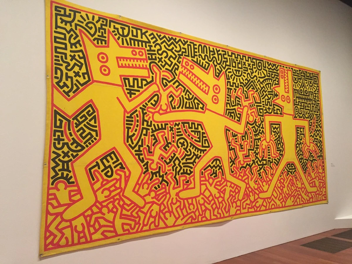
5. Keith Haring - Untitled (1982)
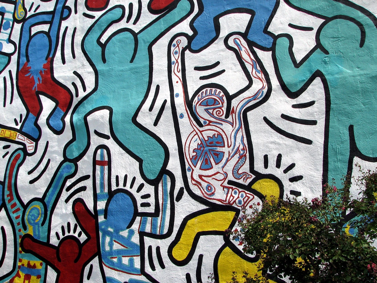
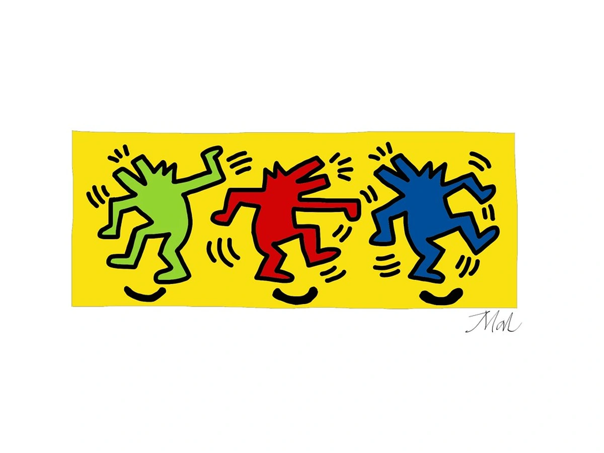
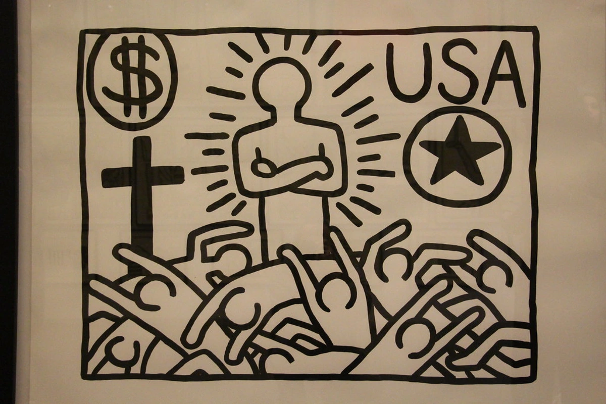
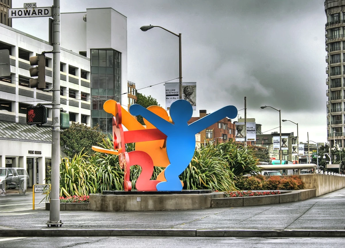
Not all Pop Art was about critiquing consumerism; some of it was about pure, unadulterated joy, communication, and urgent social commentary. Keith Haring’s work emerged from the vibrant and often gritty New York City street art scene of the 1980s, a decade later than much of the core Pop Art movement but deeply connected to its democratic impulses. His visual language of crawling babies, barking dogs, and dancing figures is instantly recognizable, a powerful testament to art's ability to transcend traditional barriers and speak directly to a mass audience. He was a master of public art, believing in art's power to communicate directly with people, bypassing the traditional gallery system.
His art was truly for everyone, a testament to his belief in art's democratic power and its role as a tool for social change. Haring famously began drawing in New York City subway stations, using white chalk on the black advertising panels. He saw the subway as a vast, pulsating public canvas, a place where art could be accessible and immediate, not locked away in an exclusive gallery. This piece, like so much of his work, captures that vibrant, democratic energy perfectly. The bold, continuous lines, often described as "radiant baby" or "barking dog" motifs, and vibrant colors communicate an undeniable sense of life, unity, and rhythm. Beyond mere aesthetics, Haring's seemingly simple style often carried powerful social messages, becoming a visual language for activism and hope. He used his universally understood visual language to address critical issues of his time, including AIDS awareness, apartheid, and the crack epidemic, transforming public spaces into arenas for urgent dialogue. It's Pop Art that literally wants to dance with you, inviting participation and breaking down social and artistic barriers alike, proving that profound messages can be delivered with joy and accessibility, even in the face of profound adversity. I remember seeing a Haring mural once, and the sheer energy radiating from it was infectious; it truly makes you feel like art can be a force for good in the world.
Beyond the Core Icons: Expanding the Pop Art Landscape
While Warhol and Lichtenstein might be the most recognizable names—the superstars, if you will—the Pop Art movement was a vibrant constellation of artists, each bringing their unique vision to the table. Expanding our view allows us to appreciate the true breadth and depth of this revolutionary period and the many ways artists grappled with the explosion of popular culture, from the everyday mundane to the grand political statements. Let's delve into some other essential masterpieces that broaden our understanding of this iconic era, showcasing the true diversity and genius within this fascinating art historical chapter.
6. James Rosenquist - F-111 (1965)
Imagine a painting that spans an entire room, a colossal montage of consumer products, military hardware, and fragments of faces—that's James Rosenquist's monumental F-111 (1965). Measuring 86 feet long, this work wraps around the viewer, demanding their attention, much like the billboards it mimics. Rosenquist, who started his career as a billboard painter, brought that large-scale, commercial aesthetic directly into the gallery.

F-111 is a dizzying kaleidoscope of contradictory images: a colossal tire, a plate of spaghetti, a little girl under a hairdryer, and the titular F-111 fighter jet, a symbol of American military might. It's a powerful and scathing critique of the military-industrial complex and the complicity of consumer culture in wartime America. The juxtaposition of mundane objects with the instruments of war is deeply unsettling, forcing viewers to confront the uncomfortable relationship between prosperity and destruction, and the ways in which everyday life can be interwoven with global conflicts. It's a brilliant example of how Pop Art could move beyond simple aesthetics to deliver a sharp, profound political statement, all while using the very language of advertising it sought to critique. It's a reminder that even the most glossy surfaces can hide a deeper, more troubling reality. I find his ability to weave seemingly disparate elements into a cohesive and impactful narrative utterly masterful.
7. Tom Wesselmann - Great American Nude (series, 1961-present)
Shifting from the political to the personal, yet still deeply rooted in the Pop Art sensibility, we encounter Tom Wesselmann's Great American Nude series. From the early 1960s onwards, Wesselmann took the traditional art historical subject of the female nude and radically recontextualized it within modern, commercial settings. His nudes are often faceless, their features obscured by objects, bold colors, or simply left blank, transforming them from individuals into idealized, almost anonymous, figures of desire. These works, often set in brightly colored, consumer-filled interiors, provocatively blend the high art tradition of the nude with the pervasive imagery of advertising and popular media. He masterfully used bold outlines and flat planes of vibrant color, directly echoing commercial printing techniques.
What makes Wesselmann's work so distinctly Pop is his embrace of mass media aesthetics, bold outlines, and flat planes of vibrant color. He frequently incorporated actual objects—working televisions, telephones, real landscapes seen through windows, or even framed reproductions of other artworks—into his canvases, further blurring the lines between painting, sculpture, and reality. His nudes exist in interiors saturated with the symbols of American consumerism and domesticity. This series offers a complex commentary on desire, advertising, and the objectification of women in popular culture, presenting a cool, detached, yet undeniably seductive vision of the American dream, or perhaps, its alluring superficiality. He challenges us to consider how we consume images of the body, just as we consume products from the supermarket. What strikes me is how he manages to be both alluring and critical at the same time, a truly difficult balance to strike. His work often feels like a snapshot of a meticulously arranged, yet artificial, paradise, reflecting the manufactured allure of mid-century American domesticity. It's a fascinating study in how art can both celebrate and dissect the aesthetics of desire, transforming the private realm of the nude into a public spectacle of consumer desire.
8. Claes Oldenburg - The Store (1961)
Imagine walking into an art gallery and instead of pristine, untouchable canvases, you find a messy, crowded store filled with crudely made, brightly painted sculptures of everyday objects: pastries, clothing, household items. That's exactly what Claes Oldenburg did with The Store (1961), a groundbreaking project that redefined the art exhibition. It was both an art exhibition and a functioning shop in his Lower East Side studio, blurring the lines between art, commerce, and everyday life in a profoundly witty and provocative way. He was, in essence, selling art about commerce within a commercial setting, creating a fascinating meta-commentary on the art market itself.
Oldenburg created soft sculptures out of canvas and plaster, then painted them with enamel. These weren't sleek, mass-produced items; they were lumpy, tactile, and deliberately imperfect, a playful subversion of the polished consumer goods they mimicked. This deliberate crudeness was a rejection of the slick perfection of advertising, a human touch introduced to the world of the machine. His later colossal public sculptures, like Clothespin in Philadelphia or Spoonbridge and Cherry in Minneapolis, take this idea to an even grander, more whimsical scale, transforming public spaces and challenging our perception of urban landmarks. He reminds us that even the most mundane objects, when recontextualized and reimagined, can spark joy and critical thought, making us see our everyday environment with fresh, often humorous, eyes.
9. George Segal - The Diner (1964)
George Segal's contribution to Pop Art was distinctly different, yet equally powerful, offering a melancholic counterpoint to the movement's often boisterous exuberance. Instead of vibrant colors and bold graphics, Segal captured the essence of everyday American life through haunting, life-size plaster figures in meticulously recreated, often mundane, environments. His iconic work, The Diner (1964), presents a tableau of ordinary people in a classic American roadside eatery, a scene frozen in time.
What strikes me about Segal’s work is its profound quietude amidst the Pop Art clamor. These ghostly white figures, cast from living models, occupy real-world settings (tables, chairs, counters, coffee machines), creating a disquieting sense of hyper-realism. They feel both intimately familiar and eerily isolated, capturing a sense of introspection and existential reflection often overlooked in the more bombastic Pop narratives. The Diner is less about mass media and more about the human experience within the mass-produced landscape. It's a poignant exploration of solitude and connection in an increasingly anonymous society, offering a powerful, melancholic counterpoint to the movement's typical exuberance and reminding us of the quiet dramas unfolding beneath the surface of everyday life. I see his work as a silent film within the loud blockbuster of Pop Art, offering a moment of poignant reflection.

11. Robert Indiana - LOVE (1967)
If there's one image that embodies the optimistic spirit of the late 1960s, it's Robert Indiana's iconic LOVE sculpture and accompanying print. Originally created as a Christmas card for MoMA in 1965, the stacked, tilted "LO" over "VE" with the leaning "O" quickly became a global phenomenon. It’s a testament to the power of graphic simplicity.
Indiana, who referred to himself as an "American painter of signs," distilled complex emotions into simple, bold, graphic statements. The repetition of the four letters, the vibrant color combinations, and the distinctive typography all speak to the Pop Art embrace of commercial aesthetics and universally recognizable symbols. It’s been reproduced endlessly, often without the artist's permission, a testament to its pervasive cultural impact, but also a poignant reminder of the very mass-production and commodification that Pop Art simultaneously celebrated and critiqued. It's a word that evokes deep feeling, yet Indiana made it into an instantly digestible, highly reproducible graphic icon. I find that tension fascinating – the profound reduced to the popular, yet losing none of its power. It's a symbol that, despite its simplicity, continues to spark conversation about meaning and commerciality.
12. Jasper Johns - Flag (1954-1955)
Before Warhol's soup cans, there was Jasper Johns's Flag. Painted between 1954 and 1955, this seminal work predates much of the formal Pop Art movement but is undeniably a foundational piece, shifting the conversation around what constitutes art itself. Johns famously declared his intention to paint "things the mind already knows," directly challenging the Abstract Expressionist emphasis on unique, internal gestures and instead focusing on universal, recognizable symbols. His exploration extended beyond flags to include series of numbers, targets, and maps, each pushing the viewer to question perception and representation. This act of painting a familiar object was a radical departure, a conceptual grenade thrown into the art world.
Is it a painting of a flag, or is it a flag? This provocative question is at the heart of the work and remains a cornerstone of its enduring appeal. Johns used the familiar image of the American flag, rendered in encaustic (wax paint), a challenging and ancient medium, on three separate canvases mounted on plywood. The tactile, painterly surface, often filled with newspaper fragments and visible brushstrokes, complicates the simple recognition of the flag. This process-oriented technique challenges the viewer to consider the object itself versus its representation, pushing the boundaries of what art could be. It’s less about national pride and more about the nature of perception, representation, and semiotics—how meaning is made through signs and symbols. Johns opened the door for artists to critically examine everyday objects and symbols, paving the way for the later, more overt Pop Art explorations and even the Conceptual Art movement that followed. His Flag wasn't just a painting; it was a philosophical statement, urging us to question what we see and what we think we know. I often revisit this piece to remind myself that true artistic innovation often lies in asking fundamental questions about the familiar. It’s a work that asks us to truly look.
13. David Hockney - A Bigger Splash (1967)
While often associated with a distinct California aesthetic, David Hockney's A Bigger Splash (1967) is a quintessential example of how Pop Art embraced modern life and the emergent leisure culture. This iconic painting captures the fleeting moment after someone has plunged into a swimming pool, leaving behind a dramatic, almost theatrical, white splash against the serene blue water and a minimalist landscape.
Hockney's work is characterized by its meticulous, almost photographic precision, yet it retains a painterly quality, a tension that fascinated many Pop artists. The flat, almost abstract quality of the colors, the stark geometry of the building, and the crisp blue of the sky all evoke the cool, detached glamour of 1960s Los Angeles. The splash itself, a momentary burst of energy, is rendered with painstaking detail, a testament to the artist's ability to capture the ephemeral. A Bigger Splash isn't just a pretty picture; it's a commentary on the fleeting nature of luxury, the illusion of leisure, and the silent narratives that unfold in seemingly idyllic settings. It speaks to the allure of the American dream, rendered with a distinctly British, subtly critical, eye.
14. Richard Hamilton - Just what is it that makes today's homes so different, so appealing? (1956)
While American Pop Art exploded with figures like Warhol and Lichtenstein, its roots can be traced to a different cultural landscape: post-war Britain. And if there's one work that epitomizes early British Pop, it's Richard Hamilton's Just what is it that makes today's homes so different, so appealing?
This small but profoundly impactful collage, created for the Independent Group's "This Is Tomorrow" exhibition in 1956, is often cited as the very first work of Pop Art, arguably defining its aesthetic from the outset. It's a dizzying array of clipped images from American magazines, meticulously arranged to depict a "modern" living room—a fantasy space brimming with the latest consumer goods. You'll spot a bodybuilder holding a Tootsie Pop (a clever nod to the "pop" in Pop Art!), a nude woman on a sofa with a lampshade on her head, a prominent Ford logo, a vacuum cleaner, a television, and even a framed comic book on the wall. Hamilton masterfully synthesized the iconography of consumer culture, advertising, and popular media into a single, cohesive, and subtly satirical vision. It's a brilliant snapshot of the aspirations and anxieties of the burgeoning consumer age, laying bare the seductive power of mass-produced desires and predicting the future of visual culture. Hamilton didn't just borrow from popular culture; he analyzed it, critiqued it, and elevated it to a new level of artistic discourse, setting the stage for decades of art that would engage with mass media. It's an artwork that, despite its small size, opens up an entire world of meaning and cultural observation, acting as a veritable manifesto for the nascent Pop movement. I see it as a fascinating precursor, almost a crystal ball showing us the consumer culture that was about to fully explode.
15. Eduardo Paolozzi - I was a Rich Man's Plaything (1947)
Even earlier than Hamilton's seminal collage, Scottish artist Eduardo Paolozzi was experimenting with similar themes. His collage I was a Rich Man's Plaything, created in 1947, is often considered a precursor to the Pop Art movement and one of its earliest manifestations in Britain.
This collage features an array of American consumer detritus: a pin-up girl, a Coca-Cola logo, a cherry pie, a military aircraft, and the gun from an advertisement. The title itself is a provocative statement, hinting at the seductive yet potentially destructive nature of consumer culture. Paolozzi was one of the founding members of the Independent Group and, through works like this, demonstrated an early fascination with the fragmented, overwhelming visual language of modern advertising and media. His approach, combining seemingly unrelated commercial images, shares a lineage with Dada and Surrealist collage, but with a new focus on the mundane and the popular. His work, alongside Hamilton's, underscores the transatlantic dialogue that shaped Pop Art, revealing its diverse origins and complex relationship with consumer society, and setting the stage for the artistic explosion to come. It’s a powerful reminder that groundbreaking movements often have multiple, interwoven origin points.
15. Marisol Escobar - The Party (1965-1966)
Bringing a unique blend of Pop Art's sensibility with folk art charm and a sharp, often satirical, social commentary, Marisol Escobar (often known simply as Marisol) carved out her own distinct niche. Her monumental installation, The Party, features fifteen life-size, box-like wooden figures, many of which are self-portraits, meticulously dressed in real clothing and adorned with cast sections of Marisol's own body (hands, feet, faces). It's a startlingly intimate yet publicly staged commentary on social gatherings and the performative nature of identity. What I love about Marisol is her ability to combine the personal with the public, creating art that feels both vulnerable and fiercely intelligent.
Marisol's figures are at once familiar and profoundly unsettling, a witty critique of the superficiality of high society and the masks people wear in social situations. The use of everyday objects, photography, and assemblage places her firmly within the Pop Art camp, but her craftsmanship and sculptural approach set her apart. She masterfully blends carved wood with plaster casts, drawing, and found objects to create figures that feel both monumental and vulnerable. For me, The Party is a powerful reminder that Pop Art wasn't a monolith; it was a vibrant tapestry of individual voices, each engaging with the complexities of modern life in their own unforgettable way. Her work offers a poignant, often humorous, look at the human condition within the glamorous yet often isolating world of celebrity and social expectation. I appreciate how she managed to infuse such personal introspection into a movement often characterized by its cool detachment.
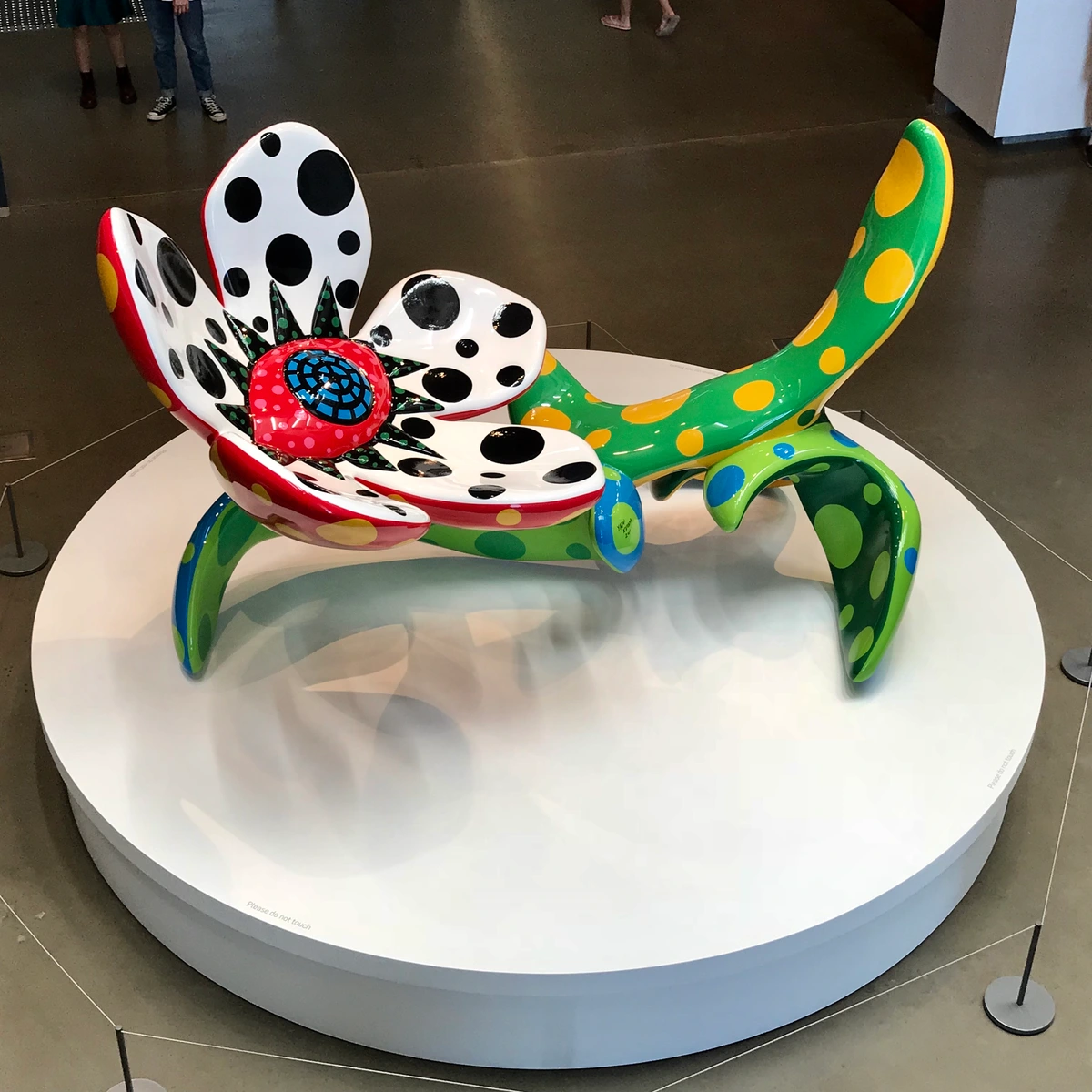
16. Yayoi Kusama - Accumulation No. 1 (1962)
While often categorized broadly as a conceptual artist or a minimalist, the Japanese artist Yayoi Kusama's early work shares a deep, often unsettling, kinship with Pop Art, particularly in its obsessive repetition and engagement with everyday objects. Her Accumulation No. 1 (1962) is a chillingly fascinating piece: an armchair entirely covered with hundreds of white, stuffed, phallic-like protrusions. It’s an early example of her "soft sculptures" and her enduring fascination with accumulation, obsession, and pattern. Kusama’s work transcends easy categorization, but her recontextualization of domestic objects and her exploration of repetition aligns perfectly with Pop Art's core tenets.
Kusama's work, born from intense personal experiences and hallucinations, transforms the familiar into something alien and overwhelming. By taking a domestic object and systematically covering it with repetitive forms, she blur the lines between comfort and discomfort, desire and repulsion. It’s Pop Art in its recontextualization of the mundane, but with a deeply psychological edge that sets it apart. The relentless repetition, a hallmark of her entire oeuvre, echoes the mass production of consumer goods, yet her hand-crafted approach injects a potent sense of the personal and the handmade. Her work, I find, reminds us that even within the seemingly cool detachment of Pop, there can be profound depths of personal experience and subversive critique, offering a bridge to later feminist and performance art. It’s a testament to her enduring power as an artist, and a powerful statement on the psychological undercurrents of repetition and obsession.
18. Peter Blake - On the Balcony (1955-1957)
British artist Peter Blake is a pivotal figure in the early development of Pop Art, particularly known for his elaborate collages and his role in shaping the aesthetic of the music world. On the Balcony (1955-1957) is a seminal work that perfectly exemplifies his early engagement with popular culture. It's a complex, almost autobiographical collage that references art history, popular culture, and personal interests. The painting depicts a group of figures on a balcony, surrounded by a dizzying array of popular imagery—magazine covers, photographs of celebrities, art historical reproductions, and even a framed target. It’s a work that simultaneously celebrates and dissects the visual overload of modern life, creating a layered narrative that invites endless viewing. Blake's meticulous arrangement of these disparate elements, his embrace of vernacular imagery, and his blurring of high and low culture firmly establish him as a foundational Pop artist. His ability to weave personal narrative with mass-produced imagery is something I find incredibly compelling, offering a unique bridge between fine art and everyday experience.
19. Mel Ramos - Chiquita (1964)
If you want to talk about Pop Art's playful, often provocative, engagement with advertising and desire, then Mel Ramos is an essential name. His work, exemplified by Chiquita (1964), directly confronts the seductive power of commercial imagery. Ramos is famous for his vibrant paintings of pin-up girls posed with or emerging from mass-produced products and brand logos, from candy bars to soft drinks. Chiquita features a stylized female nude alongside the iconic Chiquita banana logo, creating a witty and often audacious commentary on the commodification of both products and the female form in popular culture. His work uses the slick, idealized aesthetic of advertising to highlight the pervasive nature of consumer desire, often with a humorous and slightly subversive edge. I find his work fascinating because it doesn't just appropriate commercial imagery; it interrogates the very mechanisms of allure that underpin advertising, making us question what exactly we're being sold.
20. Sigmar Polke - Bunnies (1966)
Moving to Germany, Sigmar Polke was a key figure in what became known as "Capitalist Realism," a German response to Pop Art that offered a more satirical and politically charged critique of consumer society. His work Bunnies (1966) is a prime example of his sardonic wit and his experimental approach to painting. The work depicts four women, derived from a magazine photograph, rendered with deliberately misregistered Ben-Day dots—a clear nod to Lichtenstein, but with a critical twist. Polke often embraced "bad painting" aesthetics, using cheap fabrics and unconventional materials, and deliberately flawed printing processes to highlight the imperfections and manipulative nature of mass media. Bunnies is less a celebration and more a playful critique of media's role in shaping desires and presenting idealized, often superficial, images of women. Polke's work is brilliant in its ability to be both visually engaging and intellectually sharp, proving that Pop Art could be a vehicle for profound social and political commentary. He reminds me that humor can be a powerful tool for critique.
21. Evelyne Axell - Ice Cream (1964)
From Belgium, Evelyne Axell brought a distinct feminist and sensual voice to Pop Art, creating vibrant and often provocative works that celebrated female liberation and desire. Her painting Ice Cream (1964) is a joyful and subversive piece that directly engages with the visual language of advertising and popular culture, but from a woman's perspective. It features a woman ecstatically licking an ice cream cone, rendered in Axell's signature bold colors and smooth, almost plastic-like surfaces. The work reclaims female pleasure and agency, subverting traditional patriarchal portrayals of women in art and media. Axell's work is characterized by its use of new materials, such as plexiglass and synthetic paints, which gave her paintings a glossy, modern finish, further connecting them to the consumer aesthetic. I find her work refreshing and powerful, offering a crucial female perspective within a movement often dominated by male artists.
22. Allen Jones - Chair, Table, Hatstand (1969)
While highly controversial, Allen Jones's series of furniture sculptures, Chair, Table, Hatstand (1969), are undeniably significant within the broader Pop Art discourse for their stark commentary on gender and objectification. These works feature life-sized, fiberglass mannequins of women, dressed in fetishistic attire, transformed into functional pieces of furniture. They are designed to be used as a chair, a table, and a hat stand. The works immediately provoked outrage and continue to spark intense debate about misogyny, the objectification of women in popular culture, and the boundaries of artistic expression. Jones's intention, he claimed, was to critique the objectification he saw in advertising, but many argued the works themselves perpetuated it. Regardless of intent, these pieces force a confrontation with uncomfortable truths about societal attitudes towards women and consumption, embodying the most extreme and problematic aspects of Pop Art's engagement with popular imagery. They certainly make you think, even if uncomfortably, about the messages embedded in our visual culture. This is a tough one to grapple with, but it's important to acknowledge that not all art is easy or universally celebrated.
What Ties Them All Together?
You look at these seemingly disparate works – a soup can, a fighter jet, a movie star, a crying woman, dancing figures, a conceptual "store," a four-letter word, and a national flag – and they appear so different, yet they all pulse with the same vibrant Pop Art DNA. They are all, in their own unique ways, grappling with the explosive visual landscape of post-war society, mirroring its obsessions, anxieties, and aspirations. Here’s a quick breakdown of some core ideas they share, demonstrating the movement's remarkable thematic coherence despite its stylistic diversity:
| Concept | Warhol's Soup Cans | Lichtenstein's Whaam! | Warhol's Marilyn | Haring's Untitled | Rosenquist's F-111 | Wesselmann's Great American Nude | Segal's The Diner | Oldenburg's Store | Indiana's LOVE | Johns's Flag | Hockney's A Bigger Splash | Hamilton's Just what is it... | Paolozzi's Rich Man's Plaything | | :--- | :--- | :--- | :--- | :--- | :--- | :--- | :--- | :--- | :--- | :--- | :--- | :--- | | Source Material | Supermarket Product Label | Comic Book Panel | Publicity Photo | Street/Subway Graffiti | Billboard Fragments/War Imagery | Commercial Nudes/Interiors | Plaster Casts/Real Objects | Everyday Consumer Objects | Universal Symbol/Graphic Design | National Flag | Photography/LA Lifestyle | American Magazine Ads/Comics | Magazine Clippings/Ads | | Main Theme | Consumerism, Mass Production, Mundane Art | War, Action, Mass Media, Appropriation | Celebrity, Mortality, Repetition | Life, Energy, Community, Activism | War, Consumerism, Media Saturation | Desire, Domesticity, Objectification | Urban Alienation, Everyday Life | Commerce, Soft Sculpture, Everyday Art | Love, Graphic Power, Ubiquity | Perception, Representation, Iconography | Leisure, LA Lifestyle, Photography | Consumerism, Domestic Bliss, Advertising | Post-War Consumerism, Americanization | | Artistic Style | Silk-screen, Repetition | Bold Outlines, Ben-Day Dots | Silk-screen, Repetition | Simple Lines, Bold Color, Movement | Large-scale Painting, Collage | Stylized Painting, Collage | Life-size Plaster Figures | Soft Sculpture, Plaster, Enamel Paint | Bold Typography, Color Blocking | Encaustic, Layering, Object-as-Art | Acrylic on Canvas, Photo-realism | Collage, Found Imagery, Satire | Collage, Found Imagery, Juxtaposition | | Core Question | Can this be art? | Is this low-culture or high-art? | What is fame? | Who is art for? | What is the cost of consumerism? | How does media shape desire? | How do we connect in modern life? | What is the nature of a store/sculpture? | Can a word be art? | Is it a flag, or a painting of a flag? | How does a moment become eternal? | What defines the modern home? | What defines desire and wealth? |
These artists, and many other famous Pop Art artists, weren't just making pretty pictures. They challenged us to think about the everyday, the ubiquitous, and the commercial in entirely new ways, transforming the mundane into the monumental. Their work was a mirror, and sometimes a funhouse mirror, held up to a rapidly changing world. They were asking tough questions about the world they lived in—a world that was becoming saturated with media, advertising, and celebrity culture. Sound familiar? That's why their work still feels so relevant today.
Key Themes and Characteristics of Pop Art
Beyond the individual masterpieces, Pop Art is unified by a set of revolutionary ideas and aesthetic choices that profoundly challenged the very fabric of the art world. When I look at these works, I see a deliberate and often playful subversion of traditional artistic values, a bold questioning of what art could be, and where it could find its inspiration.

1. Appropriation and Recontextualization
Perhaps the most defining characteristic of Pop Art is its radical embrace of appropriation (the artistic practice of taking existing images, objects, or ideas and incorporating them into new art). This wasn't entirely new—think of Cubist collage or Duchamp's readymades—but Pop artists pushed it further, directly sourcing from popular culture: comic books, advertisements, product packaging, and celebrity photographs. They didn't aim for creation from scratch; their genius lay in selecting and re-presenting existing imagery, often with minimal alteration beyond scale and medium. By isolating a single comic panel or blowing up a soup can label to monumental scale, artists like Lichtenstein and Warhol forced us to look at the familiar with fresh eyes, stripping away its mundane context and elevating it to the realm of fine art. Artists like Richard Hamilton and Eduardo Paolozzi built entire compositions from magazine clippings, creating new narratives from fragmented commercial realities. This recontextualization made us ask profound questions: what happens to meaning when an image is pulled from its original source and placed within the sacred space of a gallery? Does its message change? Does its value shift? Pop Art taught us that context is everything, and that the act of choosing and presenting an image could be as artistic as creating one from scratch. It challenged the very notion of originality, arguing that in a media-saturated world, the act of curation and re-presentation could be just as, if not more, powerful than pure invention. I often think of it as a form of visual alchemy, transforming the base metal of mass culture into artistic gold.
2. Consumerism and Mass Culture
Pop Art arrived hand-in-hand with the post-war economic boom and the inexorable rise of a pervasive consumer culture. The artists were utterly fascinated—and perhaps a little overwhelmed—by the sheer abundance of mass-produced goods and the relentless, seductive power of advertising that increasingly shaped daily life. Warhol's endless soup cans, Oldenburg's giant hamburgers, Indiana's LOVE design, Mel Ramos's pin-up girls interacting with product labels, or Sigmar Polke's consumerist satires all directly referenced this new, glossy landscape. They highlighted how our identities, desires, and even aspirations were becoming increasingly intertwined with the brands and products we consumed. This wasn't always a straightforward celebration; it often offered a nuanced critique of the phenomenon, questioning the underlying values and potential emptiness of a purely material existence. It was a clear acknowledgment that culture was no longer confined to the elite, high-brow spaces; it was everywhere, relentlessly, on every billboard, television screen, and supermarket shelf. They essentially asked, "If this is what we're consuming, shouldn't art reflect it?" By bringing these everyday objects into the gallery, they forced a confrontation with the commercial forces shaping modern identity. It's a dialogue that continues today, as we grapple with ever-increasing consumer choice and digital consumption. I sometimes think about how this aspect of Pop Art was incredibly prescient, foreseeing our modern hyper-consumerist landscape.
3. Mechanical Reproduction and the De-emphasis of the Artist's Hand
In stark contrast to the gestural brushstrokes of Abstract Expressionism, many Pop artists deliberately employed techniques that minimized the visible "artist's hand." Warhol's silk-screening, Lichtenstein's meticulous rendering of Ben-Day dots, Oldenburg's fabricated soft sculptures, and even Sigmar Polke's deliberately misregistered dots all aimed for a machine-made aesthetic, often appearing as if they rolled off an assembly line. This challenged the Romantic notion of the artist as a solitary genius pouring their soul onto the canvas, a concept deeply ingrained in earlier movements. Instead, Pop Art suggested that art could be cool, detached, and even mass-produced, mirroring the industrial processes that shaped modern life. It was a provocative statement about authorship and authenticity in an age of mechanical reproduction, inviting us to reconsider the value placed on uniqueness versus ubiquity, and suggesting that art could embrace the efficiency and reproducibility of the factory floor. This was a radical departure, and I believe it forever changed the way artists think about their role in the creative process and the potential for broad dissemination of their work.
4. Irony, Humor, and Critique
Beneath the bright colors and seemingly straightforward imagery, Pop Art often hummed with a subtle, sometimes biting, irony and humor. Whether it was Lichtenstein's melodramatic Drowning Girl with her over-the-top angst, Hamilton's cluttered ideal home, Oldenburg's whimsical soft sculptures, or Sigmar Polke's satirical 'Bunnies,' the artists often held up a funhouse mirror to society's absurdities and contradictions. They critiqued the shallowness of celebrity culture, the relentless pursuit of consumer goods, and the stereotypical portrayals in media, but they did so with a playful wink and a clever twist rather than outright condemnation. It was a critique embedded within an embrace of the very culture they questioned, making it all the more potent and digestible for a mass audience. They showed me that art could be both serious and seriously fun, and that sometimes, a laugh can be more insightful than a lecture, prompting deeper reflection through clever juxtaposition rather than overt moralizing. It's a reminder that criticality doesn't always need to be solemn; it can be sharp, witty, and deeply engaging.
5. Iconography and Symbolism
Pop Art was a masterclass in reinterpreting familiar symbols and popular iconography. Artists like Jasper Johns took the most recognizable emblem of the United States—the American flag—and turned it into a subject for profound artistic inquiry. Robert Indiana stripped the word "LOVE" down to its essential graphic form, transforming a profound human emotion into a universal, mass-producible icon. Artists like Keith Haring created an entire language of recognizable symbols—radiant babies, barking dogs—that became synonymous with urgent social messages. Even artists like Mel Ramos used highly recognizable brand logos alongside pin-up figures to explore the pervasive nature of commercial iconography. These artists understood that symbols carry immense cultural weight and could be manipulated, celebrated, or critiqued simply by being re-presented in an artistic context. They tapped into the collective unconscious, playing with images that viewers already "knew," allowing for immediate recognition coupled with a fresh, often critical, perspective. It's almost like they were hacking the visual language of society, repurposing its most potent symbols for new meanings and dialogues.
6. Bold Colors and Graphic Design
One of the most immediate and striking characteristics of Pop Art is its unapologetic use of bold, often primary colors, and a strong emphasis on graphic design principles. This aesthetic choice was a direct nod to the vibrant world of advertising, comic books, and product packaging, where visual impact and immediate communication were paramount. Artists like Lichtenstein employed thick outlines and flat areas of color, mimicking commercial printing processes. Warhol’s saturated, almost artificial hues in his celebrity portraits created a dazzling, yet often unsettling, glamour. Evelyne Axell’s vibrant, often sensual canvases and Richard Lindner’s sharply delineated figures further exemplify this commitment to visual punch. This was art meant to be seen, to grab you, and I think it succeeded brilliantly. This embrace of graphic clarity and intense color wasn't just decorative; it was a deliberate strategy to grab attention, to make art as instantly recognizable and impactful as a billboard or a magazine ad, ensuring its "pop" appeal. I've always found the sheer boldness of these colors captivating, almost a visual shout in a world that was becoming increasingly gray.
7. Blurring the Lines Between High and Low Culture
Perhaps Pop Art's most enduring legacy is its dismantling of the rigid hierarchy between "high art" (the hallowed halls of museums, traditionally valued for its intellectual or spiritual depth) and "low culture" (the seemingly disposable world of comic books, advertising, and folk art). By unapologetically bringing the imagery of the street and the supermarket into the gallery, Pop artists asserted that all visual culture was valid and worthy of artistic exploration and critical attention. This profound democratization of art opened up new possibilities and conversations, making art more accessible, more relevant to a wider audience, and forever changing the landscape of modern and contemporary art. It showed me, and I think many others, that inspiration can truly be found anywhere, and that sometimes the most profound statements can come from the most unexpected sources, challenging the very gatekeepers of taste and aesthetic value.
Pop Art Beyond the Canvas: Fashion, Music, and Design
It would be a disservice to limit Pop Art's influence purely to the gallery walls. This wasn't just an art movement; it was a cultural phenomenon that permeated every facet of modern life, reflecting and shaping the aesthetics of its era. I often think about how art, at its most potent, isn't confined to a single medium, but spills over, infects, and transforms other creative fields. Pop Art did this with an undeniable swagger, leaving an indelible mark on fashion, music, and design. It was a true cultural phenomenon, showing that art could permeate every aspect of daily life, from the clothes we wear to the records we spin.
Fashion: Wearable Art and Bold Statements
The bold graphics, vibrant colors, and iconic imagery of Pop Art found a natural home in the fashion world. Designers were quick to translate the movement's democratic spirit and visual punch into wearable art. Think of Yves Saint Laurent's iconic "Mondrian Collection" of 1965, directly referencing geometric abstraction, but the spirit of Pop, with its graphic prints and youth-driven energy, was everywhere. Designers like Paco Rabanne and André Courrèges embraced space-age aesthetics, geometric shapes, and bold, primary colors, directly echoing the Pop sensibility. From Mary Quant's mod designs and mini-skirts to the rise of brightly colored synthetic fabrics, fashion embraced the playful, often rebellious, attitude of Pop. Clothes became a canvas for bold patterns, comic book motifs, and even direct appropriations of everyday objects, allowing individuals to literally wear their cultural commentary. Artists like Allen Jones even explored fashion through his provocative furniture sculptures that blurred the lines between art, design, and the human form. It was an era where personal style became an extension of artistic expression, a loud declaration that popular culture was not only valid but fashionable. I still find myself drawn to the bold graphic prints and confident silhouettes from that era; there’s an enduring freshness to it, a confident assertion of individuality through mass-produced style.
Music: Visual Identity and Album Art
The symbiotic relationship between Pop Art and popular music is undeniable. The energy, irreverence, and mass appeal of both movements fed into each other, creating a dynamic cultural synergy. Bands like The Beatles and The Rolling Stones embraced Pop's visual language for their album covers, transforming them into miniature art pieces that reached millions. Andy Warhol famously designed the iconic banana cover for The Velvet Underground & Nico's debut album, a perfect encapsulation of Pop's provocative spirit. Peter Blake, another foundational British Pop artist, co-designed the unforgettable cover for The Beatles' Sgt. Pepper's Lonely Hearts Club Band, a kaleidoscopic collage that perfectly captured the zeitgeist. The bold, graphic aesthetic, the use of celebrity imagery, and the playful subversion of norms became hallmarks of album art throughout the 60s and beyond, making music an even more multi-sensory experience. It solidified the idea that an album cover was more than just packaging; it was a crucial part of an artist's identity and message, often becoming as iconic as the music itself. Think of the instantly recognizable album art for The Beatles' Sgt. Pepper's Lonely Hearts Club Band or The Rolling Stones' Sticky Fingers; these are works of art in their own right, directly influenced by Pop Art sensibilities. This cross-pollination extended to music videos, stage designs, and even band names, demonstrating how art could amplify and define a musical era, making the sonic inherently visual.
Design: From Interiors to Everyday Objects
Pop Art's embrace of industrial processes, mass production, and commercial aesthetics revolutionized graphic design, product design, and interior spaces. Designers began to play with scale, repetition, and vibrant color palettes in ways that directly mirrored Pop Art's visual vocabulary. Furniture designs became bolder, more sculptural, and often made from new, brightly colored plastics. Iconic pieces like Joe Colombo's Tube Chair (1969) or Gae Aulenti's Pipistrello Lamp (1965) exemplify this bold, often whimsical, departure from traditional forms. Advertising, in particular, was profoundly impacted, adopting Pop Art's directness, wit, and graphic clarity to create campaigns that were instantly recognizable and culturally resonant. From lamps shaped like giant comic book speech bubbles to the iconic "Sacco" beanbag chair (1968) or Verner Panton's cantilevered plastic chairs, Pop Art proved that art could be functional, accessible, and deeply embedded in the everyday environments we inhabit. It fundamentally changed how we perceived beauty and utility, arguing that good design could be popular, playful, and still profoundly impactful. I'm always amazed at how those design principles continue to influence contemporary aesthetics, from product packaging to interior spaces, even inspiring contemporary abstract art that seeks to capture the energy and complexity of the present moment. It's a testament to the lasting power of Pop Art's democratic vision, showing that even the most functional objects could be imbued with artistic flair and cultural commentary.
FAQ: Your Pop Art Painting Questions Answered
Sometimes, the simplest questions unlock the deepest understanding, and with a movement as playful and profound as Pop Art, there are always layers to uncover. Here are a few thoughts on what people often ask about Pop Art, delving a little deeper than surface explanations and offering some personal insights along the way.
Q: What techniques did Pop Artists commonly use?
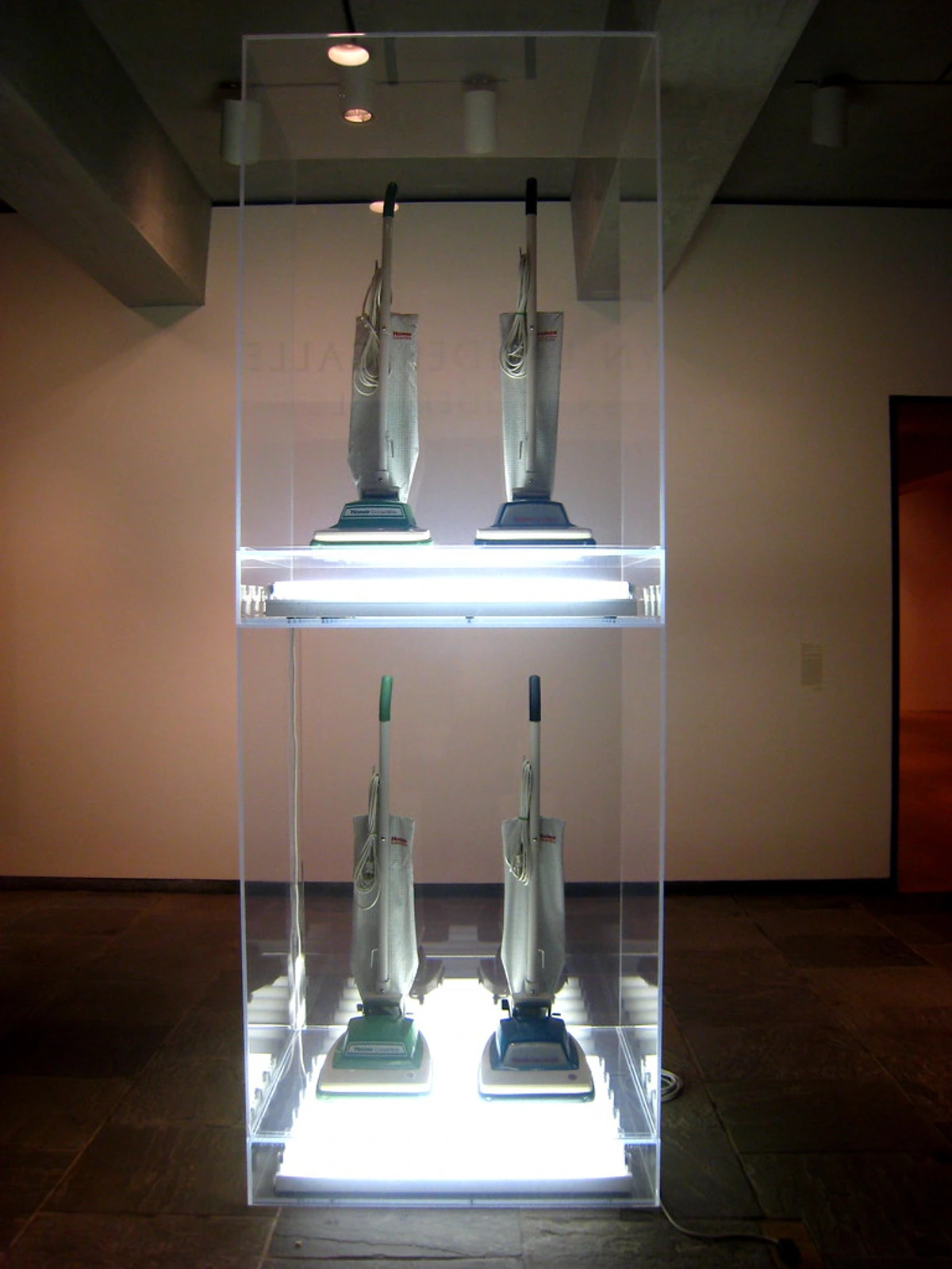
A: Pop artists were masters of adapting and subverting commercial and industrial techniques, truly revolutionizing how art was made and often blurring the lines between creation and production. Screen printing (or silk-screening), pioneered by Warhol and employed by Robert Rauschenberg for his layered images, allowed for the mass reproduction of images, mimicking factory production lines and deliberately removing the artist's unique hand. This was a radical departure from the intensely personal mark-making of Abstract Expressionism. Ben-Day dots, meticulously recreated by Lichtenstein and even deliberately misregistered by Sigmar Polke, replicated the cheap printing processes of comic books, drawing attention to their mechanical origins and the artificiality of mass media imagery. Collage and assemblage (as seen in Paolozzi and Hamilton's early works, or Robert Rauschenberg's seminal Combines, and even Peter Blake's structured compositions) were crucial for juxtaposing found imagery and objects, creating dynamic and often jarring new narratives. Artists also employed bold outlines, flat areas of intense color, and exaggerated scales to emulate advertising and comic book aesthetics, and explored sculpture in soft forms (Oldenburg) or hyper-realistic plaster (Segal). Essentially, they turned the tools of commerce into instruments of fine art, often with an almost surgical precision, elevating the everyday through precise execution and making us question the very definition of artistic skill. It's a fascinating paradox, using the very methods of mass production to create unique artistic statements, blurring the very act of creation with that of production.
Q: What are some common criticisms of Pop Art?
A: Pop Art wasn't universally loved, and I think it's important to acknowledge that. Many traditional critics initially dismissed it as superficial, trivial, and even anti-art. They argued it lacked the intellectual depth, emotional intensity, and technical skill expected of "fine art." Some, like critic Clement Greenberg, viewed it as a dangerous regression, a surrender to kitsch and commercialism. Others saw it as a cynical embrace of consumerism, rather than a critique, believing it simply glorified the very commercial forces it claimed to observe. The use of mechanical reproduction also drew criticism, as it seemed to devalue the artist's unique hand and the notion of originality, a stark contrast to the heroic individualism of Abstract Expressionism. Furthermore, some works, like Allen Jones's controversial sculptures, faced significant criticism for their perceived misogyny and objectification of women, highlighting that even within a revolutionary movement, ethical and social questions remained potent. I sometimes wonder if the sheer accessibility and popularity of Pop Art made the establishment inherently suspicious of it, proving that anything that challenges the status quo is bound to ruffle a few feathers. Yet, in hindsight, these criticisms often highlight the very revolutionary aspects of the movement, proving how effectively it challenged entrenched artistic values.
Q: Why is it called Pop Art?
A: The name is short for "Popular Art," which pretty much sums it up! It refers to the movement's deliberate focus on subjects, imagery, and techniques drawn directly from popular, mass-produced culture like advertising, comic books, and everyday consumer goods. It was a conscious effort to bring art down from its ivory tower and engage with the ubiquitous visual language that permeated daily life for the average person, rather than remaining an exclusive realm for the elite. The term was coined by British critic Lawrence Alloway in 1955, and it perfectly encapsulated the movement's radical embrace of the vernacular and its rejection of perceived artistic snobbery. It felt like a breath of fresh air, a direct challenge to the often-intimidating seriousness of previous art movements.
Q: Who was the first Pop Artist?
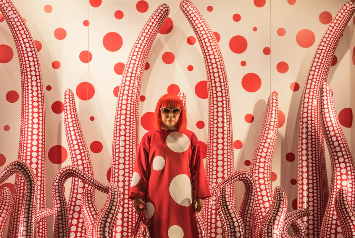
A: This is a tricky one, and art historians love to debate it! While the term "Pop Art" was coined by British critic Lawrence Alloway in 1955, and artists like Eduardo Paolozzi and Richard Hamilton were creating works that fit the description as early as the late 1940s and mid-1950s in Britain, the movement exploded independently in America shortly after. Paolozzi's collage I was a Rich Man's Plaything (1947) is often cited as the earliest precursor, demonstrating an early fascination with American consumer culture and its visual language. Richard Hamilton's Just what is it that makes today's homes so different, so appealing? (1956) is also frequently cited as the first definitive Pop Art artwork due to its comprehensive visual inventory of consumer culture. However, in America, Jasper Johns's Flag (1954-1955) is seen as a foundational piece, paving the way for the later, more overt Pop artists like Warhol and Lichtenstein by questioning the nature of images and objects and blurring the line between art and everyday life. So, it really depends on whether you're looking for the absolute earliest work that anticipated the movement, or the popular explosion of the movement itself, and which side of the Atlantic you're focusing on. It’s a bit like asking who invented rock and roll – many influences converging at once, making a singular origin point nearly impossible to pinpoint! What's undeniable is the collective energy that burst forth, forever changing the artistic landscape. Peter Blake, too, was instrumental in early British Pop, making him another strong contender for the title.
Q: What were the typical color palettes of Pop Art?
A: Pop Art is almost synonymous with a vibrant, often jarring, use of bold, unmixed, and frequently primary colors. Think electric reds, bright blues, sunshine yellows, and stark blacks and whites. These palettes were a direct nod to the commercial world: the flat, high-contrast colors found in comic books, advertising posters, product packaging, and billboards. Artists weren't interested in nuanced, subtle tones, nor the more organic palettes of previous movements; they wanted immediate visual impact, a punchy aesthetic that mirrored the commercial world's relentless pursuit of attention. Warhol's electric color fields, Lichtenstein's stark primaries, and Haring's joyful explosions of color are all prime examples. It was a conscious rejection of the more somber or introspective palettes of earlier movements, aiming for an aesthetic that was, quite literally, "pop." Think of the vibrant reds, yellows, and blues that practically jump off the canvas; it was an artistic wake-up call, designed to grab your attention immediately.
Q: What distinguishes British Pop Art from American Pop Art?
A: While both shared a fascination with popular culture, there were subtle but significant differences. British Pop Art, emerging slightly earlier, was often more academic and analytical, stemming from intellectual discussions within groups like the Independent Group. Artists like Hamilton, Paolozzi, and Peter Blake tended to approach American consumerism with a degree of critical distance, almost as anthropological observers, dissecting its imagery from a post-war, slightly less affluent perspective. There was a sense of marvel and critique at the perceived extravagance of American life, often filtered through the lens of collage and intellectual discourse. American Pop Art, conversely, was often more direct, bold, and seemingly less critical (or at least, its critique was more subtly embedded), reflecting the widespread affluence and media saturation of 1960s America. Warhol, Lichtenstein, and Oldenburg dove headfirst into the imagery, often mirroring its commercial techniques and aesthetic with an almost detached enthusiasm, embodying the very culture they engaged with. One was a thoughtful commentary on an invading culture; the other was often a full immersion in it, reflecting the very fabric of their society, leading to different nuances in their critiques and celebrations of the popular.

Q: What was the political context of Pop Art?
A: Pop Art emerged during a tumultuous yet prosperous era. In America, the 1960s were marked by the Vietnam War, the Civil Rights Movement, the Cold War, and a growing sense of social unrest, alongside an unprecedented consumer boom. While much of Pop Art might seem apolitical at first glance, its engagement with consumerism, mass media, and national symbols often carried subtle—and sometimes overt—political undertones. Works like James Rosenquist's F-111 directly critiqued the military-industrial complex by juxtaposing consumer items with instruments of war. Gerald Laing's Souvenir (of the Cuban Missile Crisis) directly addressed Cold War anxieties. Sigmar Polke's "Capitalist Realism" also offered a sharp, often cynical, commentary on consumerism in post-war Germany. Warhol's celebrity portraits, while glamorizing, also commented on the manufactured nature of public figures and the power of media, often with a chilling undertone after figures like Marilyn Monroe. Even the celebration of everyday objects could be seen as a democratic gesture, challenging elitist art norms and implicitly questioning who art was for. It was an art movement deeply embedded in the social and political fabric of its time, reflecting both the anxieties and aspirations of a rapidly changing world, and sometimes providing a visual outlet for dissent and commentary. I find that the best art often emerges from these crucibles of social change, offering a unique lens through which to understand our collective history, even when it's cloaked in bright colors and comic book aesthetics.
Q: What was the influence of Abstract Expressionism on Pop Art?
A: It was less of an influence and more of a direct rejection and reaction, a deliberate turning of the page from what Pop artists perceived as the grandiosity of the preceding movement. Abstract Expressionism, with its emphasis on individual gesture, intense emotion, and deep psychological introspection, was the dominant art movement in America immediately preceding Pop Art. Pop artists felt it had become too serious, too elitist, and too detached from everyday life, almost self-indulgent. I can understand that sentiment; sometimes art needs to lighten up and engage with the world outside the artist's head. They deliberately moved away from its gestural brushstrokes and profound emotionality, opting instead for a "cool" rather than "hot" aesthetic – detached, ironic, and often impersonal styles that embraced mass culture, reflecting the impersonal nature of mass media itself. While artists like Robert Rauschenberg acted as a bridge, incorporating elements of both, the general thrust of Pop Art was a playful yet pointed retort to the perceived grandiosity and angst of Abstract Expressionism, seeking to connect with a broader audience through accessible imagery rather than esoteric personal expression. It was a clear statement that art could be both intellectual and approachable, without needing to delve into the artist's tormented psyche.
Q: Is Pop Art just copying?
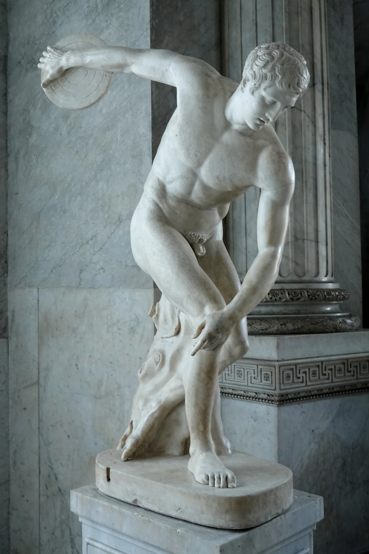
A: That was a major criticism at the time, and it’s a fair question that continues to spark debate! But it's not really copying in a derogatory sense; it's a profound act of artistic transformation. The artists made crucial changes in scale, color, and context that fundamentally altered the meaning and perception of the original. By taking a comic panel and making it a six-foot-tall painting, Lichtenstein forces you to see it in a completely new way, to appreciate its formal qualities and its cultural significance. Warhol's choice of the soup can wasn't just copying; it was a meditation on mass production and branding. Robert Rauschenberg's incorporation of news imagery wasn't plagiarism; it was a re-contextualization of media's impact on history. Artists like Peter Blake, too, reassembled found imagery in collages to create new narratives rather than simply duplicating existing ones. It's about re-contextualizing the familiar, inviting a critical distance from images we normally consume without a second thought. It transforms a fleeting, disposable image into a permanent, contemplative object, challenging our notions of originality and artistic skill. It's a re-presentation, not a mere reproduction, prompting us to examine the pervasive imagery of our lives with a critical and appreciative eye. I believe this act of re-contextualization is where much of Pop Art's genius truly lies; it forces a deeper engagement with the everyday, inviting us to look closer at what we often take for granted.
Q: Did Pop Art have female artists?
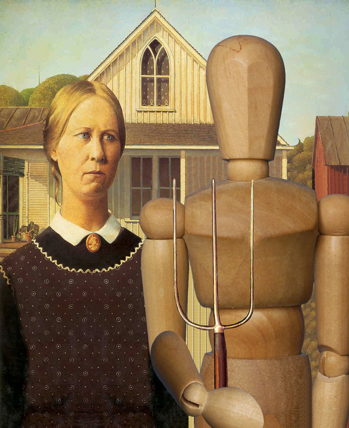
A: Absolutely! While many of the most famous names are male, important female artists were integral to Pop Art's development and impact. Artists like Yayoi Kusama (Japan), though often associated with Minimalism or Conceptual Art, deeply engaged with themes of repetition and obsession that resonated with Pop Art. Her polka dot motifs and immersive installations share a clear visual and conceptual lineage. In America, figures like Marisol Escobar created witty, often satirical, wooden sculptures that blended folk art with Pop aesthetics, offering a distinct voice. In Britain, Pauline Boty was a prominent figure, creating vibrant collages and paintings that engaged with celebrity and gender. From Belgium, Evelyne Axell brought a sensual, feminist edge to Pop with her bold, often playful, canvases. And later, feminist artists like Judy Chicago built upon Pop Art's use of popular imagery to critique gender roles and elevate women's narratives, though their work often moved into other conceptual territories. While perhaps not as prominently featured in early narratives, their contributions are increasingly recognized as essential to the movement's breadth and legacy. I'm glad to see their vital role getting the recognition it deserves in the broader art historical discourse, reminding us that art history is constantly being rewritten to be more inclusive.
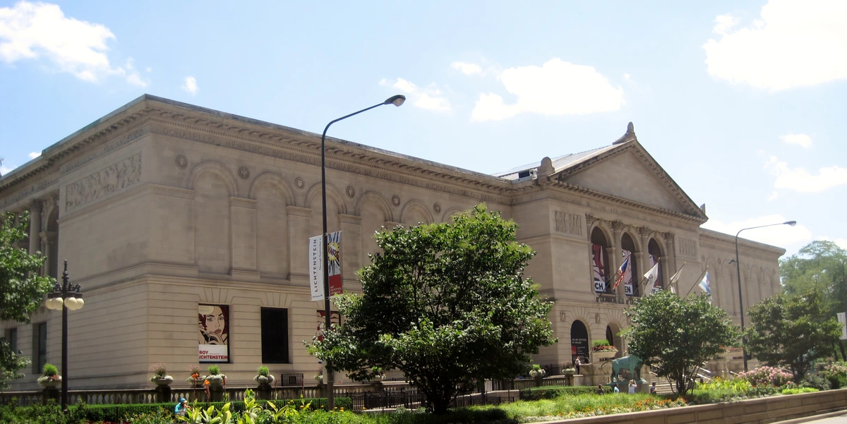
Q: What is the global impact of Pop Art?
A: While often seen as an American and British phenomenon, Pop Art's influence quickly spread globally, like a catchy tune on the radio that you just can't get out of your head. Artists in countries like Japan (e.g., Yayoi Kusama's early works), Italy, Germany (e.g., Sigmar Polke's 'Capitalist Realism'), and France/Belgium (e.g., Evelyne Axell) began to incorporate local popular culture, advertising, and media into their work, often with unique national inflections. For example, Japanese Pop Art often engaged with Manga, traditional ukiyo-e prints, and consumer products specific to their culture, while Italian Pop Art drew heavily on fashion, design, and cinema. This global embrace demonstrated that the core tenets of Pop Art—its engagement with mass culture, its questioning of high/low distinctions, and its use of commercial aesthetics—were universally resonant, proving that local commercial imagery could speak to universal artistic concerns. It transcended its origins to become a truly international language of contemporary art, demonstrating that the visual landscape of consumerism was a global phenomenon ripe for artistic commentary and critique, proving that its ideas had universal resonance far beyond its initial Anglo-American origins. I find it fascinating how each culture filters these universal themes through its own unique lens, creating a rich tapestry of artistic expression.
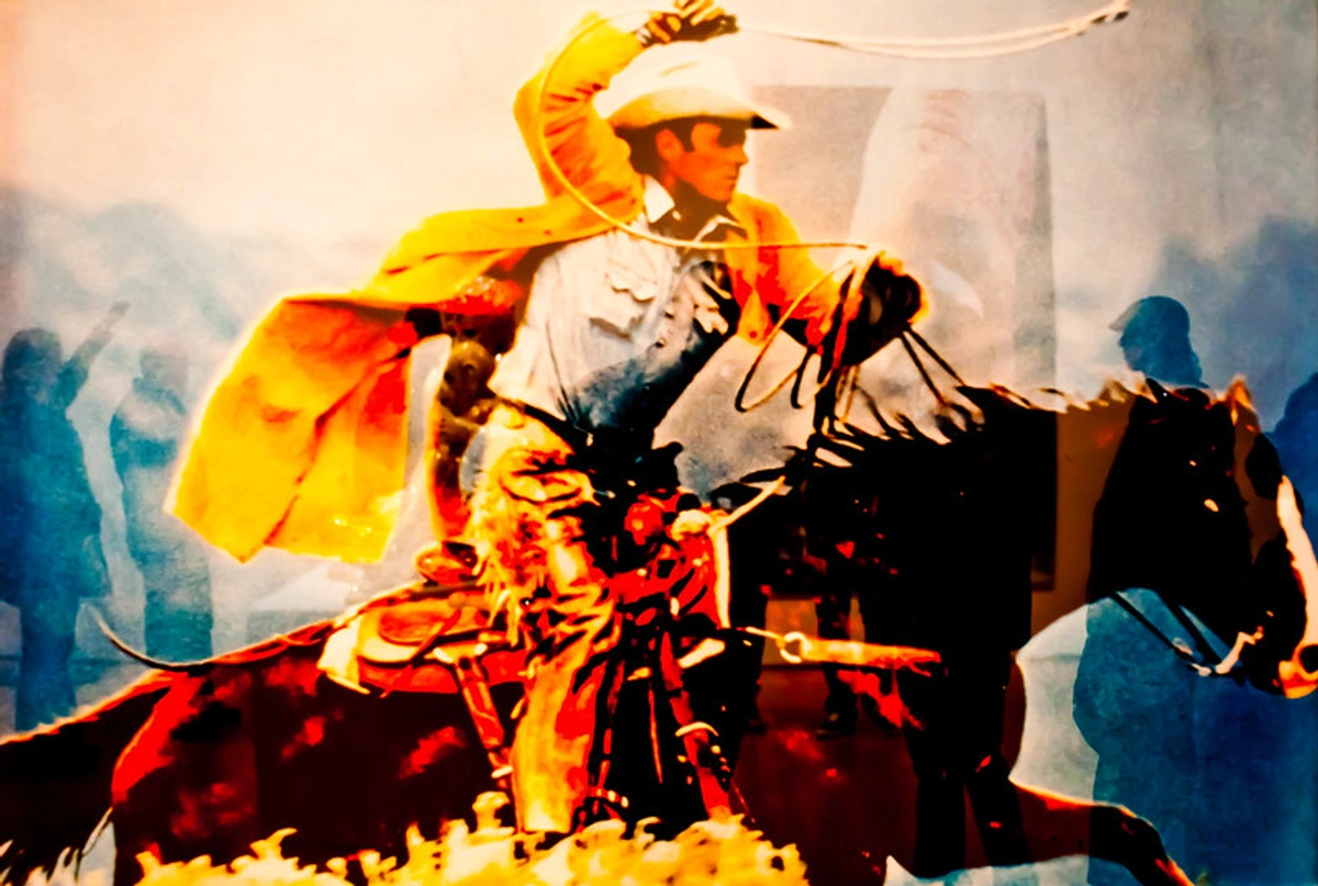
Q: How does Pop Art relate to advertising?
A: The relationship between Pop Art and advertising is complex and fascinating—a kind of love-hate affair, or at least a highly analytical one! Many Pop artists, like Andy Warhol and James Rosenquist, actually worked in commercial art before becoming fine artists, giving them an intimate understanding of advertising's power and techniques. They borrowed advertising's visual strategies: bold colors, graphic clarity, repetition, and the use of iconic imagery to grab attention. In turn, Pop Art's aesthetic of bright, clean, and recognizable imagery has profoundly influenced advertising and graphic design since the 1960s, creating a continuous feedback loop. Pop Art, in a way, held up a mirror to advertising, celebrating its seductive power while also subtly—or not so subtly—critiquing its consumerist messages and the way it shapes our desires. It showed that the very language of commerce could be used for art, and that art could, in turn, become a form of commentary on commerce.
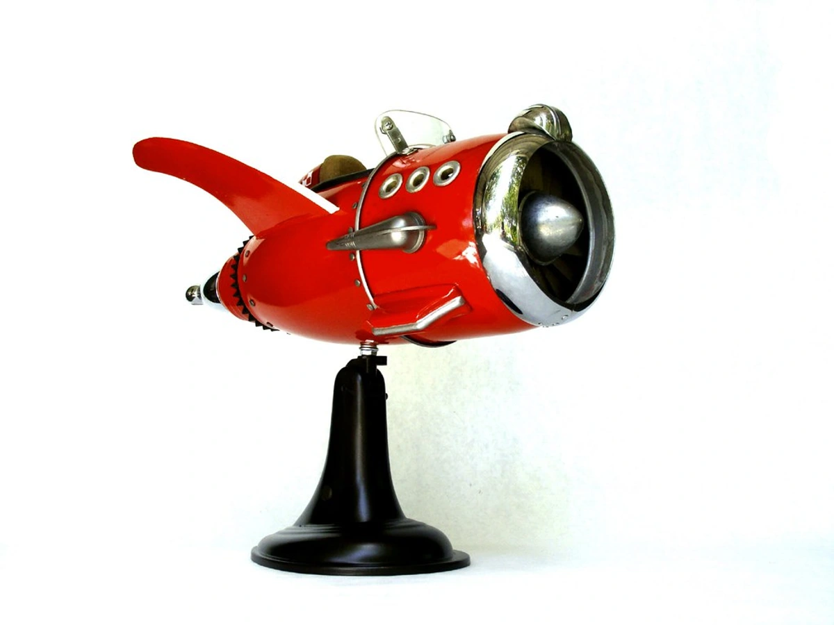
Q: How did Pop Art influence culture beyond fine art?
A: Its tendrils reached far beyond the gallery! Pop Art's embrace of popular imagery, bold graphics, and mass production fundamentally altered advertising and graphic design, making them more impactful and visually resonant. In fashion, it inspired vibrant colors, graphic prints, and the "mod" aesthetic, turning clothing into a form of self-expression. Think about iconic album covers, movie posters, or even the visual language of television; Pop Art left its mark everywhere that popular culture intersected with visual aesthetics. It wasn't just art reflecting culture; it was art actively shaping it, blurring the lines between disciplines and proving that artistic inspiration could truly be found in every corner of the modern world. I sometimes wonder if we're still living in the echoes of that initial Pop explosion.
Q: How did Pop Art influence subsequent art movements?
A: Its influence is colossal and almost impossible to overstate! Pop Art essentially cleared the path for Postmodernism, profoundly impacting how artists thought about creation, authenticity, and meaning. By questioning notions of originality, authorship, and the division between high and low culture, it opened doors for movements like Conceptual Art, Minimalism, and even later forms of Neo-Expressionism, Appropriation Art, and Street Art. Artists realized they could work with anything, from performance to installation, and that the "idea" behind the art could be as important, if not more important, than the object itself. It permanently broadened the definition of what art could be, setting a precedent for the diverse and often challenging art we see today, pushing boundaries that continue to be explored and redefined.
Q: What are common misconceptions about Pop Art?
A: I think one of the biggest misconceptions is that it's "easy" or purely commercial. While it used commercial imagery, the artists were engaged in serious intellectual and philosophical inquiries about art, society, and media. Another common one is that it was purely an American phenomenon; as we've discussed, British Pop Art played a crucial foundational role. Lastly, it's sometimes seen as purely celebratory of consumerism, but often, there was a subtle—or not so subtle—critique embedded within the bright colors and familiar forms. It was rarely just a mirror; it was often a funhouse mirror, distorting reality to make us look closer.
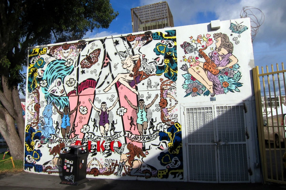
Q: Who are the most famous Pop artists?
A: Besides the titans like Warhol, Lichtenstein, and Haring, other major figures I constantly return to include Jasper Johns, Robert Rauschenberg (often seen as a bridge between Abstract Expressionism and Pop), Claes Oldenburg, and David Hockney. Also crucial are James Rosenquist, Tom Wesselmann, George Segal, Robert Indiana, Richard Hamilton, Eduardo Paolozzi, and Marisol Escobar. Globally, artists like Yayoi Kusama (Japan), Sigmar Polke and Gerhard Richter (Germany), Pauline Boty (Britain), and Evelyne Axell (Belgium) also engaged with Pop principles, albeit through their unique lenses, often blending it with local cultural concerns or more critical stances. And in the contemporary world, artists like Jeff Koons undeniably carry the torch of Pop Art's legacy, exploring themes of consumerism, celebrity, and monumentality in new, often audacious and sometimes controversial, ways. You can delve into a more comprehensive list in our guide to famous pop art artists.
Q: Where can I see these paintings?
A: Most are in major modern art museums around the world, making them accessible to a broad public—which, I think, is a beautiful extension of Pop Art's own democratic spirit. For instance, you'll find Campbell's Soup Cans and many Lichtenstein works at MoMA in New York and the Art Institute of Chicago. The Marilyn Diptych and Whaam! are highlights at the Tate Modern in London. Rauschenberg's seminal "Combines" can be found at MoMA and the Philadelphia Museum of Art. Haring's works are found worldwide, and many of his public murals can still be seen on the streets, a testament to his democratic vision. You can often find Oldenburg's monumental public sculptures in city centers across the globe, like Clothespin in Philadelphia. For a more comprehensive list of institutions and exhibitions, I always recommend checking museum websites or dedicated ultimate guide to pop art resources, as collections can shift and special exhibitions are always emerging. Always a good idea to call ahead!
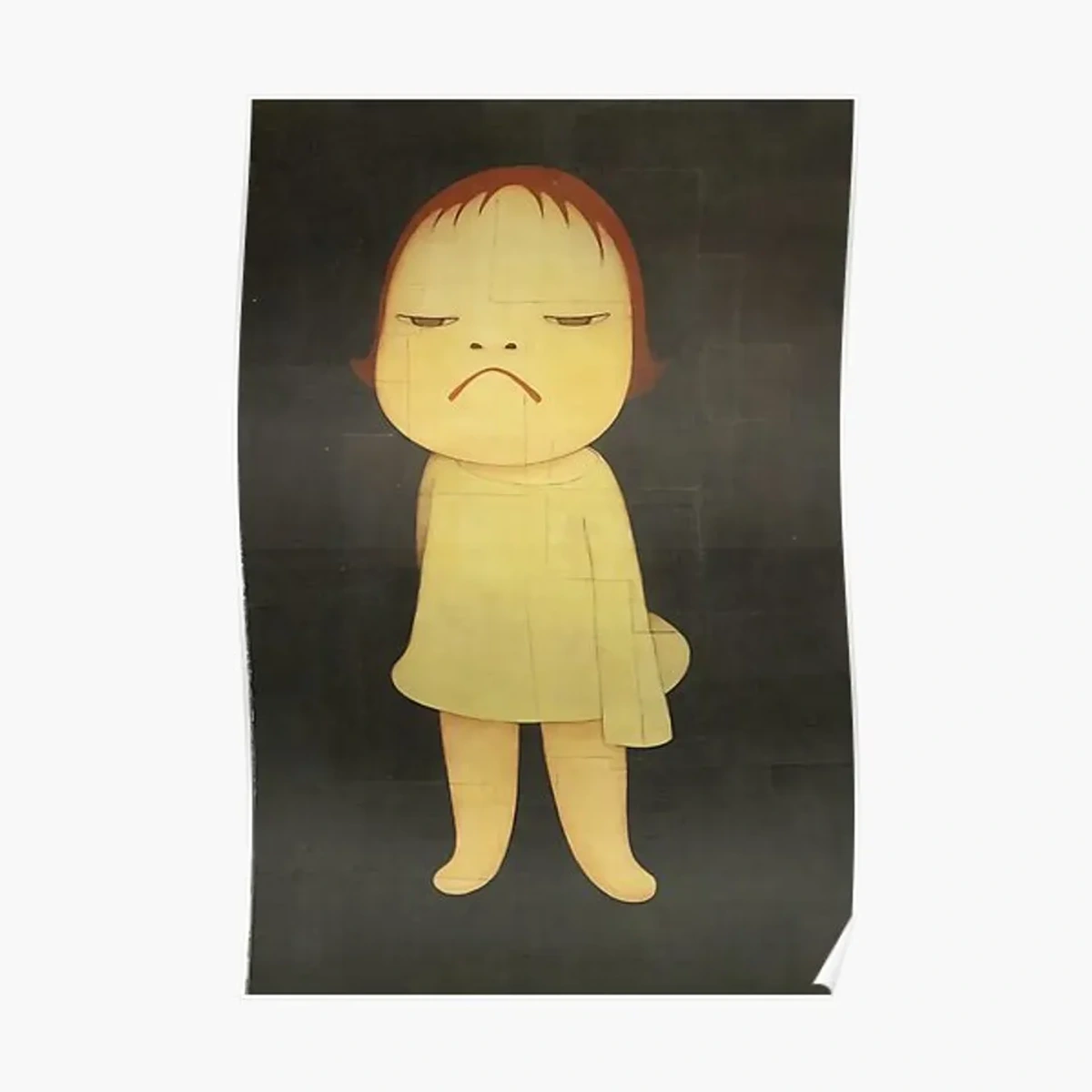
The Legacy and Continued Relevance of Pop Art
Pop Art didn't just end with the 1960s; it fundamentally reshaped the art world's trajectory in ways that continue to resonate deeply in contemporary practice. Its influence echoes profoundly in subsequent movements, particularly in Postmodernism, which continued to question originality, authorship, and the hierarchies between art forms. Artists embraced the idea that anything could be art, leading to the rise of Conceptual Art, Minimalism, and later, vibrant forms of Neo-Expressionism and Street Art, exemplified by artists like Banksy. The very dialogue we have today about consumerism, celebrity, and mass media, and how art reflects and critiques these forces, owes a huge debt to Pop Art's initial, brave forays into these complex territories. It truly opened the floodgates for a more inclusive and often provocative artistic landscape.
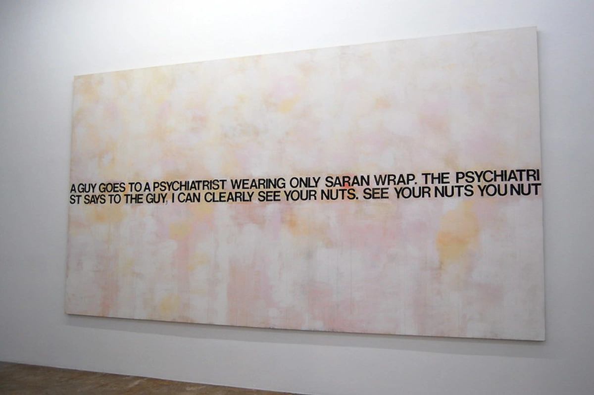
I often find myself reflecting on how artists like Bridget Riley (though typically associated with Op Art) or even contemporary figures like Jeff Koons continue to grapple with similar visual languages of repetition, pattern, and optical effect that Pop Art explored. Koons, in particular, with his monumental, shiny sculptures of everyday objects and pop culture icons, directly extends Pop Art's engagement with consumerism and celebrity into the 21st century, often pushing the boundaries of taste and value in audacious ways. The movement taught us that art can be playful, accessible, and deeply critical all at once. It dismantled the ivory tower, inviting everyone into the conversation, and for that, I think its legacy is truly enduring and still very much alive in the art we see today, influencing everything from fine art to graphic design to street art.



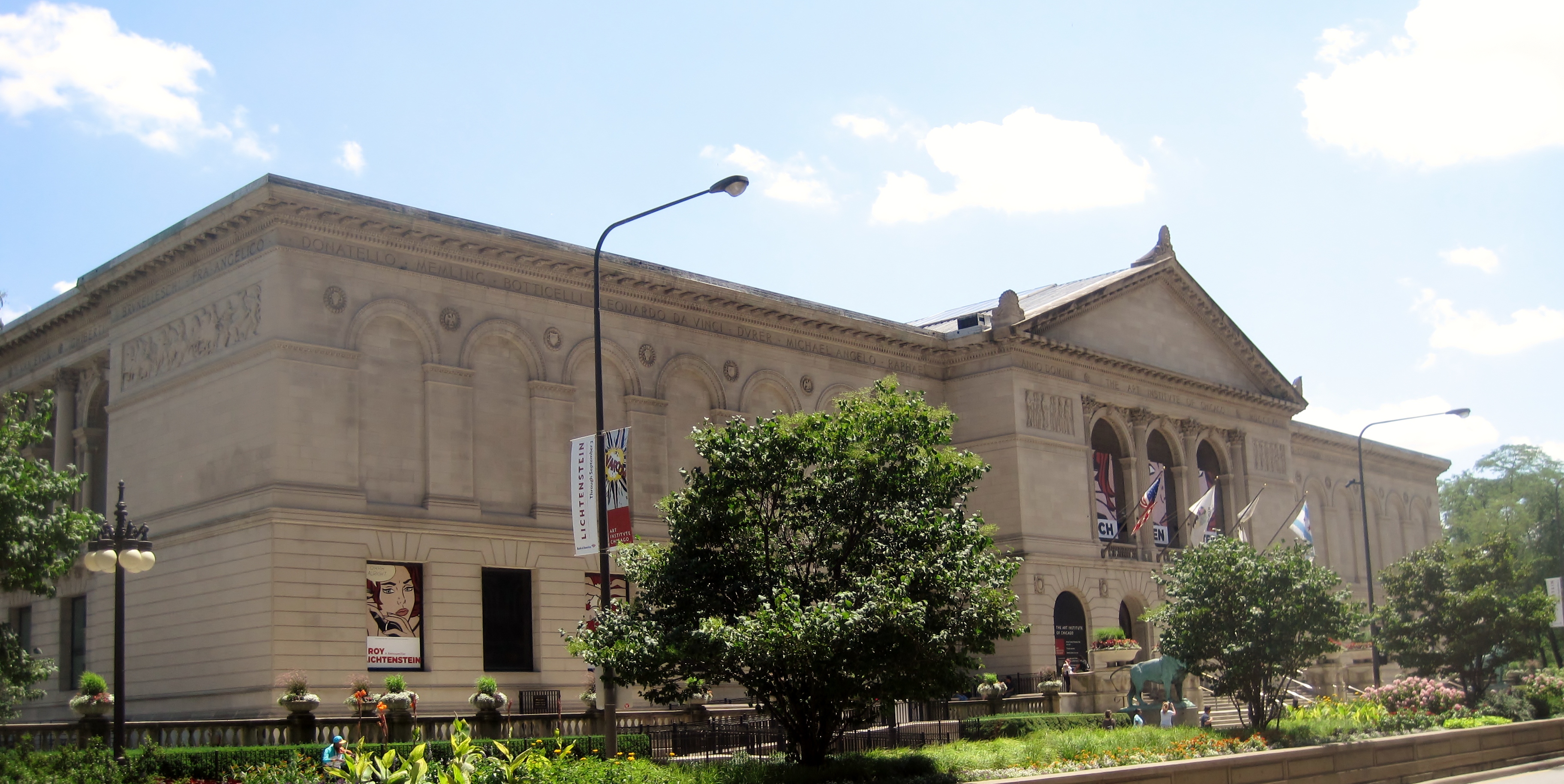



A Final Thought: The Enduring Pop
So, what makes a painting, or any artwork for that matter, truly famous, truly pop? I believe it's a potent cocktail of perfect timing, a truly revolutionary idea that shakes up existing norms, and an image so utterly powerful, so immediately resonant, that it permanently lodges itself in the collective public consciousness. The great Pop Art paintings did all three, and then some, proving that art could be both intellectually rigorous and immensely popular without compromising either.
They captured the dizzying, exhilarating, and sometimes unsettling spirit of their time so perfectly that they've transcended their era to become genuinely timeless. They taught us to look at the mundane with wonder, at the commercial with critical eyes, and at art itself with a newfound sense of democratic possibility. They're not just art about popular culture; they are popular culture, woven into the very fabric of our visual world. And that, I think, is the most profound thing of all – the way they continue to echo, challenge, and delight, proving that art, at its best, is truly for everyone, a vibrant conversation across decades and disciplines.
Want to explore more revolutionary art movements or discover how contemporary artists continue to push boundaries? Dive into our comprehensive guides on the history of pop art from consumerism to cultural icon or learn more about the ultimate guide to pop art. If you're interested in art that speaks to modern times, much like the vibrant and complex works we've discussed, you might even find inspiration in the contemporary abstract art available to buy from artists who similarly seek to capture the energy and complexity of the present moment, carrying forward the torch of artistic innovation and relevance. And don't forget to explore other fascinating movements like Minimalism, Cubism, or the powerful Neo-Expressionism, each offering their own profound commentary on their respective eras. You can also explore our timeline for a broader view of art history or visit our Den Bosch Museum for unique exhibits. I genuinely believe that understanding movements like Pop Art gives us a richer appreciation for the art being made today, bridging the past and the present in exciting ways.