Best Beginner Oil Painting Kit: An Artist's Honest Review
Overwhelmed by oil painting kits? I break down what you actually need, review the best sets for beginners, and reveal what's always missing from the box.

The Ultimate Guide to Finding the Best Beginner Oil Painting Kit (That You Won't Immediately Outgrow)
Let's be honest. The search for the perfect beginner oil painting kit is a bit like online dating. You see all these flashy profiles—boxes promising a complete studio, a rainbow of colors, instant artistic genius. You get excited, you click 'add to cart,' and you have this deep-seated fear that what shows up will be a huge disappointment.
I’ve been there. My first foray into oils was a messy, confusing, and glorious disaster. Part of it was my own cluelessness, sure, but a significant chunk of that frustration came directly from a 'kit' that was less a curated starting point and more a random assortment of hand-me-downs. A good kit can be a fantastic shortcut, a beautifully curated starting point that lets you focus on the painting, not the shopping list. But a bad kit? It's a box of pure, unadulterated frustration, and let me tell you, I’ve sworn off more than one ‘bargain’ kit in my time, opting instead for a carefully curated collection of individual essentials. It's a lesson learned through many frustrated moments, which is why I’m here to save you from similar woes. This guide isn't just about what to buy; it's about understanding why these choices matter, and how they impact your creative journey from day one.
So, let’s cut through the noise together. I’m going to walk you through what actually matters in a beginner set, dive deep into the components you’ll find (or won't!), review a few common types of kits you’ll encounter in the wild, and tell you the secrets the packaging doesn't want you to know. My goal is to equip you with the knowledge to make an informed choice, so your artistic journey starts with a canvas, not a headache. We'll cut through the marketing hype and unpack everything that truly matters—from the subtle nuances of pigment to the unyielding importance of a stable easel—ensuring you build a foundation for lasting artistic growth. This guide isn't just about what to buy; it's about understanding why these choices matter, and how they impact your creative journey from day one. It's about empowering you to navigate the sometimes-overwhelming world of art supplies with confidence and a clear vision for your creative path. I want you to feel excited when you open that box, not immediately deflated by subpar materials. After all, the joy of creation should begin with your tools, not in spite of them.
Decoding the Box: What Should a Great Beginner Kit Actually Contain?
A good beginner oil painting kit isn't about the sheer number of pieces (trust me, a '100-piece studio' often means 90 pieces of landfill-bound junk). It’s about balance—a careful trade-off between quality, quantity, and cost. You don't need a professional atelier's worth of supplies right out of the gate; you need the right pieces, thoughtfully chosen to support your learning without breaking the bank. Here’s the essential breakdown of what to look for.
The Paints: Student vs. Artist Grade
This is the big one, the core of your oil painting experience. The paints are, quite literally, the heart of any kit. You'll generally find student-grade paints in beginner sets, and honestly, that's perfectly okay for starting out. My first good set was student-grade, and I still reach for certain tubes from that collection today. The key isn’t to immediately jump to the most expensive option, but to understand what makes a good student-grade paint a solid starting point, and where its limitations lie.
The main, fundamental difference between student and artist-grade paints comes down to the pigment load—that is, how much actual, pure color pigment is in the paint versus other ingredients like fillers, extenders, and binders. This isn't just a fancy marketing term; it directly impacts almost every aspect of your painting: the vibrancy, the opacity or transparency, the coverage, how easily it mixes, and even its lightfastness (how resistant the paint is to fading over time when exposed to UV light). Think of it like the difference between a finely aged single malt whisky and a standard blended Scotch: both are whisky, but one has a richer, more concentrated flavor profile and a much more nuanced character. This difference is why a single tube of professional-grade paint can sometimes cost more than an entire student kit, and it's also why understanding these distinctions can save you a lot of frustration when you're trying to achieve a specific color or effect. I've been there, trying to mix a vibrant purple only to get a muted gray, all because of low pigment load.
Beyond just quantity, the source of the pigment also matters. Pigments can be natural (like earth tones such as Yellow Ochre or Burnt Sienna, historically sourced from clays and minerals) or synthetic (man-made pigments like Pthalo Blue or Cadmium Hues, engineered for specific vibrant properties and consistency). Both have their place, but synthetic pigments often offer more consistent color and lightfastness. For a more detailed breakdown, our guide on what is the difference between student and artist-grade paint delves much deeper into these distinctions. It's an eye-opening read that truly highlights the science behind your colors.
While artist-grade paints undeniably boast superior lightfastness, a much higher pigment concentration, and a generally finer milling, student-grade options are specifically formulated to be more economical. They still offer decent color and a fantastic introduction to the medium. They're designed to be a learning tool, a place to experiment and make glorious "mud" without wincing at the cost, not necessarily a museum piece (though you might surprise yourself!). This balance of quality and affordability makes them ideal for the iterative process of learning, allowing you to focus on technique and exploration rather than the preciousness of your materials. Remember, every master made mud before they made masterpieces! For a deeper dive into the world of paints, you might want to consult our definitive guide to paint types for artists.
The Importance of Milling and Consistency
Beyond pigment load, the milling process is crucial. This is how finely the pigment particles are ground and dispersed in the binder. Artist-grade paints are typically triple-milled, resulting in an incredibly smooth, buttery consistency that flows beautifully and blends seamlessly. Student-grade paints might be milled less finely, which can sometimes lead to a slightly grittier texture or less consistent flow. This difference in consistency affects how the paint feels under your brush (or palette knife!) and how easily it can be spread, blended, or applied in thick layers. A smoother paint just feels more luxurious and responsive, making the painting process inherently more enjoyable. It’s like the difference between finely ground coffee and coarse grounds – both are coffee, but the brewing experience and resulting flavor are distinct. Poor milling can make a paint feel 'short' or 'ropy,' dragging on the canvas instead of gliding, which can be a real point of frustration when you're trying to achieve smooth blends or subtle transitions.
The Role of Binders and Fillers: What Else is in the Tube?
Beyond the dazzling pigment, an oil paint tube contains other crucial ingredients that determine its consistency and performance. Understanding these can help you appreciate why paints behave the way they do:

- Binder: For oil paints, the binder is typically a drying oil, most commonly linseed oil. This is the magic ingredient that holds the pigment particles together and allows the paint to harden over time. Other common binders include walnut oil (which tends to yellow less than linseed and has a slightly faster drying time, appealing for those sensitive to traditional solvents), poppy oil (very slow drying, minimal yellowing, ideal for whites and pale colors where preserving purity is key), and safflower oil (similar to poppy in its non-yellowing properties but can sometimes dry a bit slower, offering excellent flow). Each binder offers slightly different drying times, yellowing characteristics, and film flexibility. The quality and type of binder significantly impact the paint's longevity and stability. I still remember the first time I really paid attention to how different binders affected the flow of my paint; it was a game-changer for my blending techniques. Poor quality binders can lead to cracking or a weak paint film over time, even with good pigment. This is where the 'archival quality' truly begins, determining how well your artwork stands the test of time.
- Fillers/Extenders: This is where student-grade paints differ most notably from artist-grade. Fillers (like calcium carbonate, barytes, or alumina hydrate) are inert substances added to "extend" the paint, making it more affordable to produce. They reduce the pigment load, which can result in less vibrant, less opaque colors. While they help keep costs down, excessive fillers can make the paint feel chalky or less responsive, which can be particularly frustrating when you're trying to achieve smooth transitions or rich, deep hues. It's the difference between a solid oak table and one made of particle board – both are tables, but their inherent quality and durability are vastly different.
- Stabilizers/Additives: Small amounts of additives might be present to improve shelf life, prevent separation, or modify consistency. These are usually in very small quantities and don't significantly impact the archival quality if the paint is well-formulated. They ensure your paint stays consistent in the tube and performs reliably.
- Driers: Sometimes, a manufacturer might include small amounts of metallic driers (like cobalt or manganese) to accelerate the drying time of particularly slow-drying pigments. While beneficial for workflow, an excessive amount of driers can sometimes lead to brittleness in the paint film over very long periods. A good quality paint balances this for optimal performance and longevity.
Ultimately, a well-balanced formula, even in a student-grade paint, will ensure the pigment and binder work harmoniously to give you a predictable and pleasant painting experience. As you gain experience, you'll intuitively start to notice the subtle differences in paint feel, almost like a chef recognizing the quality of different ingredients. You'll develop a 'feel' for your paints, understanding how they respond to your brush, how they blend, and how they contribute to the final expression of your artwork.
Understanding Pigment Characteristics: Opacity, Transparency, and Tinting Strength
Beyond just pigment load, understanding how different pigments behave is a game-changer for mixing and layering.
- Opacity (Opaque): These pigments block out underlying layers completely. Think of a thick wall of color. Examples often include Titanium White, Cadmium Reds, and Cobalt Blues. They're great for bold, solid areas and covering mistakes.
- Transparency (Transparent): These pigments allow light to pass through them, revealing underlying layers. Think of stained glass. Colors like Alizarin Crimson, Pthalo Blue, and often Dioxazine Purple are highly transparent. They are essential for glazing, creating luminous depth, and subtle color shifts.
- Semi-Opaque/Semi-Transparent: Most pigments fall somewhere in the middle, offering a degree of opacity that can be manipulated by thinning or thickening.
- Tinting Strength: This refers to a pigment's power to influence a mixture. A color with high tinting strength (like Pthalo Blue) means you only need a tiny bit to dramatically change another color. Colors with lower tinting strength (like Yellow Ochre) require more to make a significant impact. Understanding this prevents you from accidentally overpowering your mixtures with a single, potent color.
Many paint tubes will indicate these characteristics with symbols on their labels, which is a wonderful resource as you learn. Pay attention to these little icons – they're like a secret language from the manufacturer, telling you exactly what that particular color wants to do on your canvas! Understanding these symbols can save you countless hours of trial and error, helping you select the right paint for glazing, scumbling, or achieving opaque coverage. It's like having a cheat sheet for your entire palette.
Characteristic  | Symbol (Common) | Description | Why It Matters for Beginners |
|---|---|---|---|
| Opacity | Solid Square (O) | Blocks out underlying layers completely. | Great for covering mistakes, bold statements, and strong highlights. |
| Semi-Opacity | Half-Filled Square (SO) | Partially transparent; can cover but also allows some underlayers to show. | Versatile for building layers and subtle transitions. |
| Transparency | Outline Square (T) | Allows light to pass through, revealing underlying layers. | Essential for glazing, creating luminous depth, and subtle color shifts. |
| Lightfastness | Star Ratings (***) or ASTM I, II | Resistance to fading over time from UV light exposure. | Ensures your artwork retains its original colors and lasts. Prioritize higher ratings for lasting pieces. |
| Tinting Strength | (Often not symbolized, but learned through use) | A pigment's power to influence a mixture. | Prevents overpowering mixtures; helps with economical paint use. |
| Viscosity | (Rarely symbolized, varies by pigment/brand) | The thickness or thinness of the paint. | Affects how easily paint spreads, blends, and holds brushstrokes (impasto). |
Feature | Student Grade Paints | Artist Grade Paints |
|---|---|---|
| Pigment Load | Lower | Higher & Purer |
| Color Shift | Can darken or shift slightly when drying | Very little to no color shift |
| Consistency | Often uniform across colors | Varies by pigment (some are grittier, some oilier) |
| Price | Affordable | Significantly more expensive |
For a beginner, student-grade paints are ideal. You're going to make a lot of mud, waste a lot of paint, and experiment wildly. Doing that with expensive artist-grade tubes is just painful. I've been there, wincing as I wiped away a perfectly good (and expensive) glob of professional paint. A good starter kit should give you a basic palette that allows for maximum color mixing. Look for these foundational colors, as they are the building blocks for an infinite spectrum of hues and values:
Goal Color | How to Mix It (Common Approaches) | Notes for Beginners |
|---|---|---|
| Green | Yellow + Blue (adjust ratio for warmer/cooler greens) | A tiny bit of Pthalo Blue goes a long way with yellow! Experiment with Alizarin Crimson to mute greens. |
| Orange | Red + Yellow (Cadmium Red + Cadmium Yellow works well) | Add more yellow for warmer oranges, more red for fiery ones. Brown can mute it. |
| Purple/Violet | Blue + Red (Ultramarine Blue + Alizarin Crimson is a classic) | Be careful, some reds and blues make muddy purples. A touch of white can clarify. |
| Brown | Red + Yellow + Blue (all three primaries), or Orange + Blue | Mixing complementary colors (e.g., Red + Green, Blue + Orange) also creates rich browns/grays. |
| Gray | Black + White, or mixing complementary colors | Experiment with a touch of a primary color (e.g., Ultramarine Blue + Burnt Umber) for nuanced grays. |
| Skin Tones | Red + Yellow + White + a touch of Blue/Green/Brown | Start with an orange base (Red + Yellow), lighten with white, then adjust with tiny amounts of other colors. |
| Muted Colors | Add a small amount of the color's complement or a neutral gray/brown | Complementary colors are your best friend for de-saturating a color without making it muddy. |
- Titanium White: The workhorse white, opaque and strong. You'll use tons of this for lightening colors and creating opaque highlights.
- Cadmium Yellow Light (or a hue): A warm, vibrant yellow. A 'hue' means it's a synthetic alternative, safer and cheaper than genuine cadmium, which is often toxic.
- Cadmium Red (or a hue): A warm, strong red. Again, a 'hue' is a perfectly acceptable and often preferable substitute for beginners.
- Alizarin Crimson: A cool, transparent, rich red. Excellent for darks, purples, and deep shadows.
- Ultramarine Blue: A warm blue with a slight purple bias. Great for mixing lush greens and deep purples.
- Pthalo Blue: A cool, incredibly powerful blue with high tinting strength. Use sparingly! Creates vibrant blues and greens.
- Burnt Umber: A warm, dark brown. Dries relatively quickly and is fantastic for underpaintings and rich earth tones.
- Yellow Ochre: A muted, earthy yellow. Wonderful for landscapes, portraits, and softening brighter colors.
- Ivory Black: A strong, cool black. While many artists advocate against using pure black, it's a useful color for mixing and achieving deep values in certain contexts.
With these foundational colors, you can truly mix just about any color you can imagine, venturing into countless hues with a basic understanding of color theory. This is where the magic really happens! It’s incredible what you can achieve with a limited palette once you grasp the basics of how colors interact. Don't underestimate the power of these humble tubes! They are your gateway to a world of expressive possibilities. For deeper insights into color theory and mixing, don't miss our comprehensive guide on how to mix realistic skin tones in oil paint, which, while specific, offers universal principles applicable to any subject.
Expanding Your Basic Palette: Smart Additions
While the foundational colors listed above are your starting point, you'll quickly discover a few strategic additions can unlock an even wider spectrum of possibilities without overwhelming you. Think about it not as buying more random colors, but as subtly enhancing your mixing capabilities. The key is to expand strategically, not just accumulate.
One powerful approach, once you're comfortable with your basic set, is to consider a warm and cool version of each primary color. This gives you a much broader mixing range and allows for cleaner, more vibrant secondary and tertiary colors. For instance:
- Warm Yellow (like Cadmium Yellow Light or Hansa Yellow) vs. Cool Yellow (like Lemon Yellow): A warm yellow tends towards orange, making it excellent for vibrant oranges and warm greens. A cool yellow leans towards green, which is essential for crisp, clean greens. This distinction drastically impacts the greens and oranges you can mix.
- Warm Red (like Cadmium Red or Pyrrole Red) vs. Cool Red (like Alizarin Crimson or Quinacridone Red): A warm red has an orange bias, perfect for fiery reds and oranges. A cool red has a blue/purple bias, which is crucial for achieving vibrant purples and deep, rich shadows. This affects the purples and oranges you can achieve.
- Warm Blue (like Ultramarine Blue) vs. Cool Blue (like Pthalo Blue or Cerulean Blue): A warm blue leans towards purple, making it great for deep purples and muted greens. A cool blue leans strongly towards green, which is crucial for mixing vibrant, clean greens. This is a critical distinction for your secondary colors.
This subtle expansion gives you a massive range of mixing possibilities, allowing you to create cleaner, more vibrant secondary and tertiary colors, all without overwhelming you with too many tubes. It's truly amazing what you can achieve with a limited palette once you grasp the basics of how colors interact and how their temperature influences mixtures. My own palette has evolved over time, but these core principles remain. It's a continuous journey of discovery, and I'm still fascinated by the endless possibilities a few tubes of paint can offer.
Reputable Student-Grade Oil Paint Brands
While your kit might come with its own brand, it's good to know what's out there when you're ready to buy individual tubes. Look for lines specifically marketed as "student" or "academy" grade. Some excellent and reliable choices include:
- Winsor & Newton Winton Oil Colour: A perennial favorite for good reason. Excellent consistency, reliable pigments, and a wide range of colors at an accessible price point.
- Gamblin 1980 Oil Colors: Gamblin is known for its commitment to artist safety and quality. Their 1980 line offers a solid professional feel with good pigment load.
- Grumbacher Academy Oil Colors: Another widely available and trusted brand for beginners, offering good value and consistent performance.
- Sennelier Etude Oil Colour: From a prestigious French brand, their Etude line provides a beautiful, buttery consistency and vibrant colors.
- Daler-Rowney Georgian Oil Colours: A solid choice offering good pigment strength and consistent texture, often praised for its excellent value.
- Royal Talens Van Gogh Oil Colours: Part of the larger Royal Talens family, these paints offer vibrant colors and a smooth consistency, making them a joy to work with.
- M. Graham & Co. Oils (Walnut Oil based): While often considered a step up from typical student grade, their smaller tubes are reasonably priced and offer beautiful, highly pigmented colors with a walnut oil binder, appealing to those sensitive to traditional solvents.
- Old Holland New Masters Classic Oil Colours (Studio Series): A slightly more premium student offering from a renowned brand, providing excellent pigment concentration and a traditional feel at a more accessible price point than their professional line.
If you're looking for more general paint guidance, check out our definitive guide to paint types for artists, and for specific beginner recommendations, our guide to the best oil paints for beginners is a must-read. And for a deeper dive into brands, the whole Holbein vs. Winsor & Newton oil paints debate is a rabbit hole worth exploring once you get your feet wet. We also have guides on how to mix realistic skin tones in oil paint and even how to mix acrylic paint which offers transferable color theory insights. Or, if you're ready to explore high-end options, our Winsor & Newton Artists' Oil Colour Review will give you a taste of what professional paints offer. It's a vast world of color, and these resources are here to help you navigate it.

The Brushes
Oh, the brushes. I swear, a bad brush will shed hairs into your masterpiece like a golden retriever in spring, leaving behind little trails of frustration. Most beginner kits come with a small, basic synthetic set. And you know what? That’s actually a really good thing to start with! Synthetics are truly fantastic for beginners—they're incredibly durable, maintain their shape remarkably well (even after a rigorous cleaning), and are far, far easier to clean than natural hair, especially when you're still getting the hang of navigating the sticky, slow-drying world of oils. You don't want to add complicated brush care to your learning curve right out of the gate, believe me, I've been there with a stubbornly paint-laden natural hair brush that just wouldn't cooperate.
Brush Material | Pros | Cons | Best Uses for Oils |
|---|---|---|---|
| Synthetic (Nylon/Polyester) | Durable, excellent shape retention, easy to clean, versatile, affordable. | Can sometimes feel less responsive than natural hair for very specific effects. | General painting, fine details, impasto, clean lines, wet-on-wet. |
| Natural Hair (Hog Bristle) | Stiff, resilient, holds a lot of paint, creates expressive texture. | Can shed, harder to clean, can lose shape if not cared for, more expensive. | Thick impasto, visible brushstrokes, pushing heavy paint, rough textures. |
| Natural Hair (Sable) | Extremely soft, fine tip, good spring, holds liquid well. | Expensive, delicate, requires meticulous care, less common for general oils. | Very fine details, delicate blending, subtle glazing (when thinned). |
| Natural Hair (Squirrel/Goat/Ox) | Very soft, good for subtle blending. | Lacks 'snap', generally not for heavy paint application. | Specialized blending, softening edges (mop brushes). |
It's worth understanding the core differences between these two types, even if you start with synthetics.
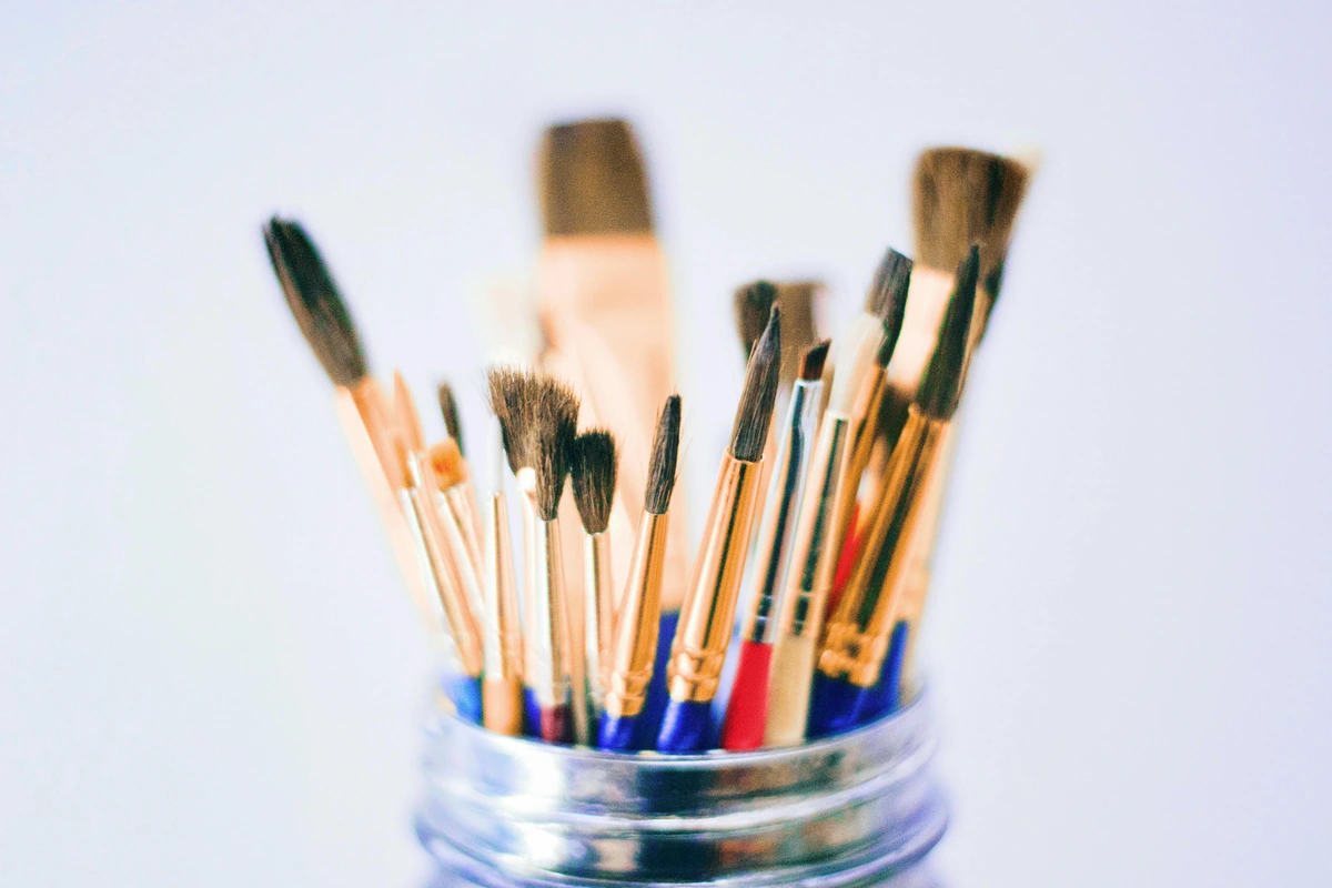
- Synthetic Brushes: These are the modern workhorses, typically made from high-quality nylon or polyester filaments. They're engineered to mimic the best qualities of natural hair while offering superior durability and ease of care.
- Durable: They stand up to rigorous cleaning, heavy paint, and enthusiastic use, making them long-lasting companions in your studio. This means less money spent on replacements!
- Shape Retention: Synthetics excel at holding a crisp edge or a fine point, even when laden with paint, which is fantastic for precision work, clean lines, and maintaining control. This is incredibly helpful when you're still developing your motor skills.
- Easy to Clean: Oil paint, with its sticky nature, can be a challenge, but synthetics release paint relatively easily, making cleanup much less of a chore. Trust me, easy cleanup is a huge motivator for continued painting!
- Versatile: They're chameleons, capable of handling both thin, fluid washes and thicker, more impasto applications of paint. You can really push and pull paint with them.
- Affordable: Generally, good quality synthetics are more cost-effective than their natural hair counterparts, allowing you to invest in a wider range of shapes and sizes without breaking the bank.
- Natural Hair Brushes: These have been the traditional choice for centuries, each type offering unique characteristics derived from the animal hair it's made from.
- Hog Bristle: The classic for oils! These come from hogs (pigs) and are characterized by their stiffness, coarseness, and resilience. Hog bristle brushes are ideal for thick impasto painting, creating visible, expressive brushstrokes, and pushing heavy paint around with authority. Their natural 'flags' (split ends) help them hold a significant amount of paint, giving a wonderfully rich application.
- Sable: Renowned for its extreme softness, fine tip, and springy nature (typically from the kolinsky sable, a type of weasel). Sable brushes are prized for their ability to hold a lot of liquid (making them exceptional for watercolor, but less common for oils unless for very fine detail, delicate blending, or precise glazing). They create incredibly smooth, fluid strokes.
- Squirrel/Goat/Ox Hair: These are softer natural hairs, less common for general oil painting due to their lack of snap compared to hog or sable. However, they are occasionally used in specialized blending brushes (like mop brushes) where a very soft, subtle touch is desired to smooth transitions without disturbing underlying layers. Think fluffy clouds!
- Paint Absorption: Natural hair brushes, especially hog, have tiny scales along their shafts (like human hair cuticles) that help them hold and carry more paint than synthetics, contributing to a different "feel" and paint delivery. This can be a subtle but significant difference for experienced artists.
- Texture: They inherently create different textural effects and brushwork compared to the smoother glide of synthetics. If you want truly expressive, visible brushstrokes, hog bristle is your friend.
- Care: The trade-off for their unique qualities is that natural hair brushes generally require more meticulous cleaning, conditioning, and careful shaping to prevent damage and maintain their longevity. They are an investment in time and money, and require a bit more dedication to maintain.
My advice? Start with synthetics. Master them. Understand what you like and what kind of marks you enjoy making. They truly shine for beginners because their consistent performance minimizes variables, allowing you to focus purely on your technique and developing your painter's eye without fighting your tools. Then, and only then, consider investing in specific natural hair brushes if you find your synthetics aren't achieving the specific textures or paint handling you desire. It's a journey, not a race. You'll quickly develop a personal preference for how a brush feels and performs, and that's when you can start to strategically expand your collection.
Brush Sets vs. Individual Brushes: What to Buy?
For beginners, a curated brush set from a reputable brand is often a good starting point. These sets usually contain a versatile mix of shapes and sizes, giving you a broad introduction without overwhelming you with choice. However, as you advance, you'll quickly discover your preferred brush shapes and sizes, and you'll want to buy individual brushes to replace worn-out favorites or to acquire specialized tools. Don't be afraid to mix and match! My own collection is a delightful mishmash of beloved individual brushes and the occasional set I couldn't resist – each one holding its own story and purpose. For a comprehensive look, our guide to the best oil painting brushes for artists is an invaluable resource, helping you discern quality and purpose in your brush choices.
The Anatomy of a Brush: More Than Just Bristles
A paintbrush is more than just bristles on a stick. Understanding its parts helps with care and choosing the right tool. It's like understanding the components of a well-engineered machine – each part serves a crucial function.
- Bristles/Hair: The business end! These can be natural (hog, sable) or synthetic (nylon, polyester). The quality and type of bristles are what largely determine the marks you can make and how much paint the brush holds.
- Ferrule: The metal band that crimps the bristles to the handle. A good quality ferrule will be seamless and securely attached, preventing hair loss and water/solvent seepage. A loose ferrule is a sign of a cheap brush and a fast track to frustration.
- Crimp: The part of the ferrule that attaches to the handle. This connection needs to be solid to prevent wobbling or the head coming off entirely.
- Handle: Can be short (for close-up, detail work) or long (for easel painting, allowing you to step back and assess your work from a distance). Handles are often made of wood, sometimes plastic, and their balance can greatly impact your comfort during long painting sessions.
A well-made brush feels balanced in your hand, a true extension of your artistic intent. The bristles should snap back into shape when bent, demonstrating good 'spring' and resilience, and there should be no wiggle between the ferrule and the handle – a sign of solid construction. These small details can make a huge difference in your painting experience and the longevity of your tools, directly impacting your control and the marks you can make. I can’t tell you how many times a good quality brush has saved me from a hair-shedding meltdown, preventing those frustrating moments when stray hairs embed themselves in your wet masterpiece! A poorly made brush, on the other hand, can quickly become a source of immense frustration, shedding bristles into your wet paint or losing its shape after just a few uses. Invest in quality here, and your future self will thank you for the smooth, enjoyable painting sessions it enables.
Keeping Your Brushes Happy: Care and Storage
Look, I'm not going to lie, brush care can feel like a chore, but it's essential for extending the life of your tools and ensuring they perform well. After each painting session, you need to clean your brushes thoroughly. Neglecting this step is a fast track to ruined brushes and a lot of unnecessary expense. Here's a quick overview of how I tackle it, making it as painless as possible:
- Wipe Excess Paint: First, wipe off as much excess paint as possible from your brush onto a paper towel or rag. Seriously, get as much off as you can before it touches any solvent or water.
- Solvent Rinse (for Traditional Oils): If you're using traditional oils, swirl the brush in your solvent jar. I often use two jars: one "dirty" for the initial rinse, and one "cleaner" for a second pass. Change your solvent when it gets too murky!
- Brush Cleaner Solution (Optional but Recommended): For heavily laden brushes, or if you want an extra-thorough clean, a dedicated brush cleaner solution (a liquid designed to dissolve stubborn oil paint) can be a godsend before moving to soap and water.
- Soap and Water Wash: Once most of the paint is out, wash the bristles thoroughly with brush soap (often a solid cake of gentle soap with conditioning properties) and warm water. Work the lather through the bristles until all traces of paint are removed. This is the critical step!
- Rinse and Reshape: Rinse the brush well under warm water, then gently reshape the bristles to their original form.
- Proper Storage: How you store your brushes matters just as much as how you clean them. Leaving them bristles-down in a jar will bend the hairs and ruin their shape permanently. Storing them bristles-up (after they're completely dry!) is better, or even better, laying them flat in a drawer or a roll-up brush case. Some artists use special brush boxes that hold them securely. The key is to protect the delicate bristles and the integrity of the ferrule. For a deep dive into keeping your tools in top shape, check out our guide on cleaning and caring for your paint brushes. It's an investment that pays off in less frustration and more beautiful paintings that truly capture your vision.
Understanding Brush Shapes: Your Artistic Toolkit
Before we dive into shapes, let's talk about size. Brush sizes are typically indicated by numbers (e.g., #2, #6, #12), with higher numbers generally meaning larger brushes. Don't get too hung up on specific numbers when you start; what matters is having a range. A tiny detail brush won't help you block in a vast sky, and a giant flat brush won't let you paint a cat's delicate whisker. Having a small, medium, and large brush in a couple of key shapes will give you the versatility you need for most tasks. It’s about matching the tool to the task, not having every possible option.
You truly don't need twenty brushes to start. In fact, a handful of solid, well-chosen brushes will serve you far better than a massive, low-quality set. Understanding their basic functions will save you a lot of guesswork and frustration.
For a beginner oil painter, I'd suggest starting with:
- A Medium Flat or Bright: (~#6 or #8) These are your workhorses for broad, controlled strokes, blocking in larger areas of color, and creating crisp edges. Flats excel at graphic, architectural elements and can be used on their wide side for expansive sweeps or their narrow edge for crisp lines. Brights are similar but with shorter, often stiffer bristles, giving you more control for thick paint (impasto) and precise blending in tight spaces. I find flats indispensable for geometric compositions and strong, confident marks.
- A Medium Round: (~#4 or #6) The classic versatile brush for details, lines, outlines, and controlled washes. Its pointed tip allows for precision when needed, while the belly (the wider part) can hold a good amount of paint for smoother curves and more fluid applications. This is your go-to for most general painting tasks, from rendering a delicate flower petal to creating a flowing line.
- A Medium Filbert: (~#6 or #8) My personal favorite, the love child of the flat and the round. It has a flat body with an oval/domed tip, making it incredibly versatile for soft edges, smooth blending, and creating a variety of expressive marks. It's a fantastic all-rounder, perfect for blending skies, painting organic shapes like leaves or clouds, or rendering the subtle curves of a figure.
- A Small Round or Liner/Rigger: (~#0, #1, or #2) For truly fine details, signing your artwork, or creating very delicate lines like branches, hair, or distant rigging. These brushes typically hold a good amount of thinned paint, allowing for long, continuous strokes. Don't try to paint a whole sky with this (you'll be there forever!), but it's essential for those finishing touches and intricate elements that bring a painting to life.
These few brushes will allow you to explore a vast array of techniques and subject matter. It's about learning to make your tools work for you, rather than being overwhelmed by too many options. Start here, and you'll quickly discover which shapes you gravitate towards most, refining your personal toolkit as you grow. Remember, the brush is an extension of your hand – the more comfortable you are with it, the more fluid your expression will become.
Don't get too attached to the brushes in a kit. They are often the first thing you'll want to upgrade, and honestly, that’s okay. Think of them as your training wheels. Once you figure out what you like, you can invest in some of the best oil painting brushes for artists. For now, focus on technique, not perfection in your tools. It’s better to learn how to achieve diverse effects with a few good tools than to struggle with a pile of subpar ones. I've often found myself making more progress with a limited, high-quality set than with an overwhelming array of mediocre ones.
Brush Shape | Description | Primary Use for Beginners | Why It Matters |
|---|---|---|---|
| Flat | Square-ended, medium to long bristles. | Broad, bold strokes; crisp, straight lines; blocking in large areas quickly; creating geometric shapes. | Offers strong, defined edges and is efficient for covering large surfaces. |
| Bright | Similar to a flat, but with shorter, often stiffer bristles. | Shorter, more controlled strokes; applying thick, textured paint (impasto); blending; working in tight spaces. | Excellent for controlled, textured applications and building up paint. |
| Round | Pointed tip, full belly, typically longer bristles. | Details, fine lines, outlines; controlled washes; signing your artwork; expressive, fluid marks. | Versatile for both precise lines and broader, more organic strokes. |
| Filbert | Flat with an oval/domed tip. A blend of flat and round. | Incredibly versatile! Soft edges; smooth blending; creating a variety of natural, organic marks (petals, leaves, figures). | Combines the control of a flat with the softer touch of a round, perfect for blending. |
| Fan | Flat, splayed bristles resembling a fan. Often thin. | Soft blending, especially for transitions in skies or skin; creating subtle textures like foliage, grass, or hair; feathering edges. | Creates delicate, broken marks ideal for atmospheric effects and organic textures. |
| Liner/Rigger | Very long, thin bristles with a fine point. Often holds a good amount of liquid paint. | Extremely fine, continuous lines; delicate details (branches, eyelashes); lettering; long, flowing, unbroken strokes. | Essential for precision and very delicate, flowing lines. |
| Angle Shader | Flat with angled bristles. | Creating sharp, clean lines and edges; working precisely in corners; blending along curves; precise color application for gradients. | Offers unique control for angular shapes and precise transitions. |
| Mop | Large, very soft, round or oval shape, often natural hair (but synthetics exist). | Gentle, seamless blending; softening edges without disturbing underlying paint too much; applying thin washes of glaze for subtle color shifts. | Ideal for creating soft, atmospheric blends without harsh lines. |
While your kit brushes are a fantastic starting point, as you progress, you might find yourself drawn to other specialized brushes. An angle shader is brilliant for precise edges and curves, and a mop brush can be a godsend for soft blending and glazing. Don't feel pressured to buy them all at once! This is a journey of discovery. When you're ready for an upgrade or to expand your collection, our guide to the best oil painting brushes for artists is an invaluable resource. Remember, each brush is a distinct voice in your artistic choir, and you'll learn when to use each for maximum impact.
Specialized Brush Effects: Beyond the Basic Stroke
Beyond simply knowing the basic brush shapes, truly unlocking their potential comes from understanding that each brush is a versatile tool, capable of producing a surprising variety of effects far beyond its primary function. With a little experimentation, you can coax an incredible range of marks from even a limited set of tools. This is where your creativity truly shines, transforming a simple brush into an expressive instrument! I often challenge myself to see how many different marks, textures, and lines I can make with just one brush.
- Dry Brush Texture: Using a flat or round brush with very little paint, applied with a light, scrubbing motion, will create broken, textured marks. The brush skips over the "tooth" of the canvas, leaving fragmented strokes that are excellent for simulating rough surfaces, grass, hair, or weathered wood. It’s a fantastic way to add a touch of realism or gritty abstraction.
- Scumbling with a Filbert: While typically used for soft blending, a filbert (or even a fan brush) with a small amount of semi-opaque paint can be used to lightly "scumble" over a dry layer. This creates a hazy, soft-focus effect, allowing the underlying color to subtly show through, perfect for atmospheric effects or softening transitions. It’s like a whisper of color, not a shout.
- Impasto with a Bright: The stiff, short bristles of a bright brush are perfect for applying thick, unctuous layers of paint. You can dab, push, and drag the paint to create expressive, sculptural marks where the paint physically stands out from the canvas. This is where the paint itself becomes part of the form, offering a wonderfully tactile quality. For more on this, explore what is impasto painting.
- Whispers with a Liner: A liner or rigger brush, designed for long, continuous lines, can also create incredibly delicate, hair-thin marks with a light touch and thinned paint. Ideal for fine details like eyelashes, tree branches, or distant rigging. This is where precision meets delicacy.
- Creating Edges: Use the flat edge of a bright or flat brush for crisp, clean lines. For softer edges, you can use the side of a filbert or lightly feather with a fan brush. The control you have over your edges can define the focal point and realism of your painting. Sharp edges demand attention, while soft edges recede.
Don't be afraid to try holding your brush differently—not just by the handle, but further up on the ferrule for more control, or at the very end of the handle for a looser, more gestural approach. The brush is an extension of your hand, and every subtle shift in grip or pressure changes its voice. Experimentation is key; you'll stumble upon your own unique techniques this way.
Surfaces & Supports: Your Canvas for Creation
Most beginner kits will throw in a small canvas panel or two. These are great for your first few attempts, giving you an immediate surface to play on without overthinking the technicalities. They're usually cotton canvas primed with acrylic gesso, which is perfectly fine for getting started and learning the ropes. However, the world of painting surfaces (often called supports in art speak) is vast and exciting, offering a spectrum of textures, absorbencies, and rigidities! Choosing the right surface can dramatically impact your painting experience and the longevity of your artwork. It's like selecting the right kind of paper for a specific drawing; the surface truly affects the outcome. Let's explore the various options you'll encounter and why they matter, and why I believe this choice is as fundamental as selecting your paints and brushes.
- Stretched Canvases: These feature cotton or linen fabric tightly stretched over a wooden frame (called stretcher bars).
- Cotton: The most common and affordable. It's versatile but can be less durable than linen over time. I started with cotton, and it's a perfectly acceptable entry point for learning.
- Linen: More expensive but incredibly strong, durable, and boasts a beautiful, tight, consistent weave. Favored by many professionals for its archival quality and smooth painting surface. Both come in various depths (e.g., standard, gallery wrap). For more on this, check out canvas showdown: linen vs cotton for artists.
- Canvas Panels/Boards: Cheaper, rigid alternatives, often made of canvas glued to cardboard, MDF (Medium-Density Fiberboard), or hardboard. Excellent for studies, practice, and smaller, less permanent works. They're very portable and ideal for quick exercises or plein air painting when you need a firm surface.
- Wood Panels: Offering a distinct, rigid feel compared to the springiness of canvas, wood panels (like birch plywood, tempered hardboard, or solid wood panels) are adored by many artists, especially for detailed work where a smooth, stable surface is paramount. However, they need thorough preparation and proper priming—often multiple coats of gesso, sometimes lightly sanded between layers—to prevent the oil from damaging the wood over time. This extra prep pays off in an incredibly durable, non-flexible support that truly showcases fine brushwork. For more, see what is the best canvas for oil painting.
- Metal Panels (Copper, Aluminum): Increasingly popular, especially with conservators, due to their incredible archival stability. They offer a super smooth, non-absorbent surface that can be wonderful for fine detail and luminosity, though they require specific etching or priming to ensure paint adhesion and prevent potential chemical reactions. This is a more advanced option, but one to dream about when you're ready for true archival experimentation!
- Oil Painting Paper: Not just any paper will do! This is specially prepared, heavy paper that is either pre-primed or designed to be primed to prevent the oil from bleeding through or causing the paper to become brittle over time. It's a fantastic, affordable, and extremely portable option for quick studies, color mixing exercises, sketching out compositions, or just plain experimenting without the commitment of a canvas. While generally not considered archival for long-term display, it's wonderful for learning and honing your skills. I use it constantly for my initial ideas.
Regardless of your chosen surface, proper sizing and priming are absolutely crucial for oil painting, especially if you're working on raw canvas or wood.
- Sizing: This is the first protective layer applied to a raw, unprimed canvas or wood panel. Historically, animal glue (like rabbit skin glue) was used, but modern artists often use an acrylic polymer emulsion (like GAC 100). The sizing seals the fibers or pores of the support, preventing the oil from the paint from penetrating and eventually rotting the canvas fibers (a process known as 'oil rot') or discoloring the wood. It creates a necessary barrier before priming.
- Priming: Applied over the sizing, priming creates an even, slightly absorbent barrier that both protects the support further and provides a better 'tooth' (more on that below!) for the paint to adhere to. It also ensures your colors appear more vibrant. Most store-bought canvases are already pre-primed with acrylic gesso, which is perfectly fine for getting started. However, the world of gesso is surprisingly vast, offering a spectrum of options that can profoundly impact your painting experience and the final look of your artwork! Think of gesso not just as a barrier, but as the foundational tone and texture of your painting's personality.
Supports: Flexible vs. Rigid – Why It Matters
Supports: Flexible vs. Rigid – Why It Matters
As you dive deeper into painting, you'll hear artists talk about "supports." This simply refers to the material your painting is done on. Understanding the difference between flexible and rigid supports is key for the longevity of your artwork. It's a crucial decision that can impact how your painting looks decades from now.
- Flexible Supports (e.g., Stretched Canvas, Oil Painting Paper): These materials can expand and contract with humidity and temperature changes. While widely used and loved for their portability and ease of stretching, they can be more prone to damage from impacts or changes in tension. If the canvas slackens, your paint layers might crack. Proper stretching and framing are essential for their long-term stability. Think of it like a drum skin; if it's too loose, the sound suffers.
- Rigid Supports (e.g., Canvas Panels, Wood Panels, MDF): These offer an incredibly stable and unyielding surface. They don't flex, making them less susceptible to damage from environmental shifts or accidental bumps. Many artists prefer rigid supports for very detailed work or or for impasto techniques, where a stable surface is paramount. They are generally considered more archival and durable in the very long run, often favored by conservators for their inherent stability.
Each type of support offers a different painting experience and comes with its own considerations for preservation. Experimentation is key to finding what truly resonates with your working style, and what best suits the kind of marks and textures you want to create.
Types of Priming for Oil Painting
Once your surface is adequately sized (if needed), the next crucial step is priming. Different primers offer varying degrees of absorbency, tooth, and drying times, all of which will affect how your paint behaves and the final look of your piece. It's a subtle but powerful way to customize your painting surface to match your artistic vision.
- Acrylic Gesso: The most common and versatile type of primer, suitable for both oil and acrylic paints. It's flexible, non-absorbent (meaning paint sits on top beautifully), and dries remarkably quickly. You can apply multiple, thin coats, sanding lightly with fine-grit sandpaper (around 220-400 grit) between layers to achieve an incredibly smooth, almost glass-like surface, or leave it with more texture for a toothier feel. The 'tooth' refers to the subtle roughness of the surface, which allows the paint to grab and adhere, influencing brushstroke visibility and overall texture. This control over your ground's texture is a game-changer! I’ve spent countless hours sanding gesso, and it always pays off in a smoother painting experience, especially when I'm aiming for delicate glazes.
- Oil-Modified Alkyd Primer: A relatively newer option, these primers combine the quick-drying benefits of alkyd resins with an oil base. They offer a smooth, uniform surface, dry faster than traditional oil primers, and provide a ground that's specifically formulated for oil paints. They are less absorbent than acrylic gesso, allowing the paint to really sit on the surface, offering a wonderful 'slip' and allowing for more luminous effects. I find these particularly good when I want my paint to retain its vibrancy without sinking into the surface.
- Clear Gesso: An acrylic gesso that dries transparent, allowing the natural color or grain of your canvas or wood panel to show through. Great for artists who want to incorporate the natural surface into their artwork, or for sketching out a composition directly on the raw canvas. It's a fantastic way to add an organic touch to your initial layers.
- Colored Gesso: Available in various hues, a colored ground (often a neutral gray or warm earth tone) can significantly impact your painting's mood and color harmony. It helps unify your palette and can make colors pop, acting as a mid-tone that you can build both lighter and darker values from. This is a subtle but powerful technique that I often employ to set the emotional tone of a piece from the very first stroke.
- Oil-Primed Gesso: A traditional primer specifically formulated for oil paints. It creates a less absorbent surface than acrylic gesso, allowing the paint to sit on top and offering a different 'feel' when painting. It also typically requires more drying time, which is something to consider if you're impatient. This traditional option is favored by many for its unique feel and how it allows the oils to truly glow on the surface.
Experimenting with these different grounds can drastically change your painting experience. If you get really into it, learning how to apply gesso to canvas yourself is a game-changer, giving you ultimate control over the texture and absorbency. For more on this, dive into what is gesso in painting, and for the DIY enthusiasts, we even have a guide on how to make your own gesso: a DIY guide for artists. We also break down the gesso vs. primer: what's the difference for artists. If you're looking for an even deeper dive into overall canvas preparation, our how to prepare a canvas for oil painting article covers all the nuances you could ever want. It's truly empowering to understand your foundation.
Canvas Texture: How It Affects Your Strokes
Beyond the material and priming, the texture or grain of your canvas plays a huge role in how your paint behaves, how it looks when dry, and how your finished piece appears. The 'tooth' of the canvas – its slight roughness – allows the paint to adhere and creates unique textural effects. It's a fundamental decision that impacts everything from brushstroke visibility to the final mood of your artwork. You'll encounter canvases ranging from:
- Very Fine Grain: Smooth, almost like paper. Ideal for highly detailed work, smooth blending, and portraits where you want a delicate, subtle finish. It allows for minimal visible brushstrokes, creating a more refined, almost photographic look.
- Medium Grain: The most common and versatile choice. Good for a wide range of styles, offering a balance between detail and texture. It provides enough tooth for paint to grab without being too intrusive, making it a great all-rounder for most subjects.
- Coarse Grain (Rough): Very textured, with a prominent weave. Perfect for impasto, expressive brushstrokes, and abstract work where the canvas texture becomes part of the art. It beautifully holds thick paint and creates a dynamic surface, adding an inherent textural richness and allowing the paint to really sing.
The texture grabs the paint differently, creating varied effects. Think about the kind of marks you want to make; a smooth surface will allow for delicate blending and crisp lines, while a rough one will resist precise detail but beautifully hold thick paint and create a more rugged, energetic appearance. Curious about which canvas is right for you? Our guide to what is the best canvas for oil painting can help, and for a deep dive, check out canvas showdown: linen vs cotton for artists.
The Anatomy of a Canvas: Stretcher Bars and How They Matter
For stretched canvases, the unsung heroes underneath are the wooden frames called stretcher bars. These aren't just arbitrary pieces of wood; their quality is absolutely essential to prevent warping, twisting, bowing, and ultimately, to ensure your canvas stays taut and stable over time. I've seen too many beautiful paintings ruined by cheap stretcher bars that warped like a pretzel, making the painting impossible to hang flush against a wall. It’s a subtle detail, but one that can dramatically impact the longevity and presentation of your art.
Cheap, unseasoned wood can warp significantly as it responds to humidity and temperature changes, causing your painting surface to become uneven and potentially leading to cracking in your paint layers. This is why it's so important to look for stretcher bars made from kiln-dried pine, basswood, or even aluminum for the best stability. Kiln-drying removes moisture, making the wood less prone to warping, which is a crucial step in ensuring a stable support. If you're interested in truly mastering your surface, learning how to stretch a canvas for painting gives you unparalleled control over this foundational element.
Some beginner kits might include very basic stretcher bars, which are fine for initial practice. However, if you're serious about creating lasting artwork, investing in better quality stretcher bars or even learning how to stretch a canvas for painting yourself gives you ultimate control over the tension and archival quality of your painting surface. It's a foundational element often overlooked, but absolutely critical for the long-term integrity of your masterpiece. Think of it as the skeleton of your painting; you want a strong one that won't warp or fail you years down the line. I've seen too many promising paintings sag because of cheap stretcher bars.
The Impact of Stretcher Bars: Preventing Warping and Sagging
Beyond just preventing immediate warping, quality stretcher bars play a vital role in the long-term preservation of your artwork. A well-constructed stretcher frame provides consistent tension across the canvas, which is crucial for the paint film. I can't stress enough how important this often-overlooked detail is for the longevity of your masterpieces.
- Consistent Tension: Oil paint, as it dries and cures, becomes less flexible. If the canvas surface is constantly shifting or sagging due to poor stretcher bars, it can put undue stress on the paint layers, leading to hairline cracks, paint loss, or even delamination over decades. It's like the difference between a house built on solid ground and one on shifting sand.
- Keyable vs. Non-Keyable: Many professional stretcher bars are "keyable," meaning they come with small wooden wedges (keys) that can be tapped into the corners. This allows you to re-tension a slackening canvas over time, maintaining its tautness and preventing sagging due to humidity or age. Beginner kits rarely include this feature, but it's a worthwhile upgrade for archival work, allowing you to maintain perfect tension over the years.
- Corner Bracing: Larger canvases often benefit from cross-bracing in the middle to prevent bowing or twisting. Again, this is a feature you'll typically find on higher-quality, larger stretcher frames, providing crucial structural integrity.
Investing in quality stretcher bars for your finished pieces is an investment in the future of your art. It ensures your painting remains a flat, stable, and visually pleasing object for generations to come. Don't let cheap materials undermine your artistic efforts.
Beyond canvases and brushes, your kit will almost certainly include a palette—either a simple wooden one or a disposable paper pad—and usually a basic palette knife. The palette is your indispensable workspace for mixing colors, where raw pigments transform into harmonious hues and exciting new tones. For me, the palette is almost as important as the canvas itself – it's the bridge between raw material and artistic vision. Choosing the right palette material can subtly enhance your mixing process and simplify cleanup.
Palette Material | Pros | Cons | Best For |
|---|---|---|---|
| Wooden Palettes | Traditional, lightweight, develops beautiful patina. | Can absorb oil (needs oiling), harder to clean if paint dries. | Holding while standing, classic feel, studio work. |
| Glass Palettes | Super easy to clean, non-absorbent, true color mixing. | Heavy, fragile, less portable. | Studio work, precise color matching, easy cleanup. |
| Disposable Paper Pads | Incredibly convenient, no cleanup, portable. | Can be wasteful, less sturdy, only for temporary use. | Travel, quick studies, messy sessions, beginners. |
| Ceramic/Porcelain Plates | Affordable, non-absorbent, very easy to clean. | Heavy, less portable, white surface can alter color perception. | Home studio, budget-friendly, easy cleanup. |
| Plastic Palettes | Lightweight, portable, inexpensive, often with wells. | Can stain, less smooth for mixing, less durable. | Grab-and-go sessions, very casual use. |
| Plexiglass/Acrylic Sheets | Lighter and shatterproof than glass, easy to clean. | Can scratch more easily than glass. | Portable studio, combines benefits of glass with durability. |
| White Melamine Boards | Inexpensive, smooth, non-absorbent, large surface. | Stark white can trick eye (tone with gray paper recommended). | Budget-friendly large mixing surface, studio work. |
| Old Ceramic Tiles | Robust, heavy, stable, incredibly easy to clean. | Can be heavy, limited in size. | Repurposed budget option, stable studio surface. |
- Classic Wooden Palettes: These are beautiful, traditional, and feel very 'artist-like'. They absorb some oil over time and develop a lovely patina. The key is to oil them regularly (e.g., with linseed oil) to prevent paint from soaking into the wood and to clean them properly; otherwise, paint can dry and stain them irrevocably. They're often lightweight and ergonomically shaped for holding while standing. I have a sentimental attachment to my old wooden palette, despite its quirks.
- Glass Palettes: My personal favorite! Super easy to clean—just scrape off dried paint with a razor blade or palette knife. The smooth, non-absorbent surface is perfect for true color mixing without any color absorption, and you can place them over a piece of colored paper (like a neutral gray) to help judge colors accurately. They can be heavy but are fantastic for studio work. The clarity of glass is unmatched for seeing true color.
- Disposable Paper Pads: Incredibly convenient for travel, messy sessions, or when you simply don't want to deal with cleanup. Just tear off a sheet and toss it when you're done. Great for beginners who are still experimenting or for quick studies. Perfect for a burst of spontaneous creativity without the cleanup anxiety.
- Ceramic or Porcelain Plates: Affordable, non-absorbent, and very easy to clean (like glass). You might even have one in your kitchen right now! They can be a bit heavy and less portable, but perfect for a home studio setup. The white surface can sometimes trick your eye, making colors appear darker than they are, which is why a toned surface (like gray paper under glass) is often preferred. This is a hack I discovered early on.
- Plastic Palettes: Lightweight and often come with wells for paint. They can stain over time with oil paint and may not be as smooth for mixing as glass or ceramic, but they are very portable and inexpensive. Good for grab-and-go sessions.
The best one, truly, is the one you'll actually use and consistently keep clean! After all, a clean palette is a happy palette, and a happy palette makes for happier painting. I've found that neglecting palette cleanup quickly sours my mood and hinders my creative flow. For specific tips on maintenance, check out how to clean an oil painting palette.
Alternative Palette Materials: Beyond the Obvious
While the classic wood, glass, and paper palettes are popular, artists are ingenious when it comes to finding surfaces for mixing paint. Sometimes the perfect palette is hiding in plain sight, or can be repurposed from everyday items! I've even seen artists use old dinner plates, which works perfectly fine in a pinch.
While the classic wood, glass, and paper palettes are popular, artists are ingenious when it comes to finding surfaces for mixing. Sometimes the perfect palette is hiding in plain sight! I've even seen artists use old dinner plates, which works perfectly fine in a pinch.
- Plexiglass/Acrylic Sheets: Similar to glass but much lighter and shatterproof, making them excellent for portable setups or if you're prone to accidental drops (like me!). They clean just as easily as glass with a razor blade, offering the same benefits as glass without the fragility.
- White Melamine Boards: Inexpensive, smooth, non-absorbent, and readily available from hardware stores. They are easy to wipe clean and offer a large mixing surface. The stark white can sometimes throw off your color perception, so toning it with a neutral gray (either under the surface if it's clear, or directly on it) can be helpful. This is a great budget-friendly option.
- Old Ceramic Tiles: Scraps of large ceramic tiles can make surprisingly good, robust palettes. They're heavy, stable, and incredibly easy to clean. Just make sure the surface is smooth and non-porous. A repurposed tile can be a very sustainable choice.
- Disposable Metal Trays (e.g., aluminum pie plates): For extremely messy sessions or when you want zero cleanup, a cheap aluminum tray can be a surprisingly effective, albeit temporary, mixing surface. Perfect for quick studies or when you're on the go.
The key, no matter the material, is a surface that is non-absorbent, smooth enough for easy mixing, and easy to clean. My personal preference remains glass or plexiglass over a neutral gray paper, as it gives the most accurate representation of color without any color absorption from the palette itself. It’s all about finding what works best for your process.
A palette knife is a surprisingly versatile and essential tool, not just for mixing colors on your palette but also for applying paint directly to the canvas, creating thick, expressive textures (known as impasto). It’s also incredibly useful for scraping off excess paint from your palette, cleaning your working surface, or even removing paint from your canvas if you've made a happy accident you want to erase. Don't underestimate its power; it can open up entirely new, often more dynamic and sculptural, ways of painting! I’ve found some of my most exciting textures come from abandoning the brush and embracing the knife, allowing the paint to truly speak for itself and creating a raw, immediate quality to the artwork.
Types of Palette Knives and Their Uses
Palette knives come in a dazzling array of shapes and sizes, each designed for slightly different purposes. For a beginner, you'll mostly encounter two main categories: mixing knives and painting knives. Knowing the difference can save you a lot of fumbling around with the wrong tool.
Knife Type | Blade Shape (Common) | Primary Uses for Beginners |
|---|---|---|
| Mixing Knife | Trowel-shaped, longer, flexible, rounded/pointed tip. | Scooping paint, thorough color blending on palette, scraping excess paint, applying gesso/mediums. |
| Painting Knife (Tear Drop) | Shorter, flexible, rounded teardrop shape. | Soft blending, creating organic shapes, subtle impasto, feathering edges. |
| Painting Knife (Diamond/Square) | Shorter, stiff, distinct geometric shape. | Bold textured strokes, sharp edges/lines, geometric forms, heavy impasto. |
| Painting Knife (Pointed) | Shorter, stiff, very pointed tip. | Fine details within impasto, scratching (sgraffito), controlled textural marks. |
- Mixing Knives (or Trowel-shaped): These typically have a longer, often more flexible blade with a rounded or pointed tip. They are fantastic for:
- Scooping paint from tubes without contaminating colors. This keeps your tubes clean and your colors pure.
- Blending colors thoroughly and cleanly on your palette. A palette knife achieves a much smoother, more consistent blend than a brush.
- Scraping off dried or excess paint from your palette, making cleanup a breeze.
- Applying smooth, thin layers of gesso or modeling paste for textural grounds.
- Painting Knives (or Spatula-shaped): These often have shorter, stiffer blades that come in various geometric shapes (diamond, square, pointed, teardrop). They are specifically designed for applying paint directly to the canvas, creating:
- Bold, textured strokes that add energy and movement.
- Sharp, clean edges (with a straight-edged knife) for architectural elements or graphic lines.
- Soft, blended areas (with a rounded knife) where you want a smoother transition of color.
- Impasto effects, where the paint stands proud of the surface, creating a sculptural, three-dimensional quality.
- Sgraffito, scratching into wet paint to reveal layers underneath, adding dynamic lines and contrasting colors. This is a personal favorite for adding unexpected details.
Experiment with how you hold it and the pressure you apply. You can use the flat of the blade for broad sweeps of color, the edge for sharp lines, or dab with the tip for stippled textures. It’s an expressive tool that often forces you to loosen up and embrace a more spontaneous approach, which I find incredibly liberating. To truly master this tool and unlock its full potential, check out what is a palette knife and how to use it. It's a journey from precision to expressive freedom.
Specific Palette Knife Techniques: Opening Up New Textures
The palette knife isn't just for mixing; it's a powerful and often underestimated painting tool that can add incredible texture and dynamism to your work. Don't be shy – dive in and explore these techniques! I promise, once you get the hang of it, you'll wonder how you ever painted without it.
- Broad Strokes and Blocking In: Use the flat of a larger painting knife to quickly block in large areas of color. This creates a distinct, broad, and often textured application that can be a fantastic underpainting or a strong foundational layer for later detail. It’s a great way to cover a lot of ground quickly.
- Sharp Edges and Lines: The straight edge of a flat or diamond-shaped painting knife is perfect for creating crisp, clean lines – ideal for architectural elements, geometric shapes, or defining strong compositional lines. This creates a striking contrast to softer brushwork.
- Feathering and Soft Blends: Believe it or not, a palette knife can create soft blends too! With a rounded-tip knife (like a teardrop shape) and a light touch, you can gently drag one color into another, creating subtle transitions, especially effective for skies or smooth surfaces. It's a surprisingly delicate tool when used correctly.
- Stippling and Dabbing: Use the tip or corner of your knife to dab or tap paint onto the surface. This creates a stippled, broken texture that's wonderful for foliage, rough surfaces, or adding sparkle to water. This adds a lively, organic quality to your work.
- Layering and Scraper Effects: Apply one color, let it partially dry, then scrape another color over it with a palette knife. This can reveal glimpses of the underlying color, creating a rich, layered effect. You can also use the sharp edge to scrape back into wet paint (sgraffito), exposing the canvas or an underpainting layer. This technique can add incredible depth and history to your painting.
The palette knife often forces you to loosen up, to be less precious with your strokes, and to embrace the happy accidents that can lead to truly unique and expressive textures in your painting. It's a fantastic tool for breaking out of a tight, overly rendered style, and one I consistently return to for its raw, immediate impact.
Some larger kits might even include a tabletop easel, which is a fantastic bonus. An easel is simply a support for your canvas, holding it upright so you can step back and assess your work – a crucial step for maintaining perspective and avoiding distortions. While a kit's easel might be basic, it's a great start. Easels come in several main types, each designed for different needs and painting styles. Choosing the right one can significantly impact your comfort and the scale of work you can undertake.
Easel Type | Description | Pros | Cons | Best For |
|---|---|---|---|---|
| Tabletop Easel | Compact, sits on a table. | Portable, space-saving, ideal for small canvases/seated work. | Limited canvas size, can lack stability for larger works. | Small home studios, students, travel, painting seated. |
| H-frame Easel | Sturdy, heavy-duty, freestanding with H-shaped base. | Exceptional stability, holds large canvases, durable. | Heavy, less portable, takes up more space. | Professional studios, large-scale works, long-term use. |
| A-frame Easel | Freestanding with three legs forming an 'A' shape. | Good stability for medium canvases, more compact than H-frame. | Less stable than H-frame for very large canvases, can tip if bumped. | Medium studios, versatile for various canvas sizes. |
| Plein Air Easel | Lightweight, collapsible, often with integrated storage. | Highly portable, designed for outdoor use, resistant to elements. | Can be less stable than studio easels, limited canvas size. | Outdoor painting (en plein air), travel, sketching on location. |
| Field Easel | Similar to plein air in portability, often lighter construction. | Very portable, good for quick sketches or lighter work on location. | Less robust and stable than plein air, less integrated storage. | Casual outdoor sketching, light travel. |
- Tabletop Easels: Compact, lightweight, and portable, these sit on a table and are perfect for small to medium canvases. They're a fantastic solution for home studios with limited space, or for artists who prefer to paint seated at a desk.
- Studio Easels: These are larger, much sturdier, freestanding easels.
- H-frame Easels: Known for their exceptional stability and heavy-duty construction, ideal for large canvases and serious studio work. They are generally less portable.
- A-frame Easels: More compact than H-frames, with three legs forming an 'A' shape. They offer good stability for medium-sized canvases and are slightly more portable than H-frames.
- Plein Air (Outdoor) Easels: Lightweight, collapsible easels designed specifically for painting outdoors (
en plein air). They often come with integrated storage compartments for supplies and are built to withstand the elements. If you dream of capturing landscapes in the wild, this is definitely your future upgrade! - Field Easels: Similar to plein air easels in portability, but sometimes less robust. Good for quick sketching or lighter work on location.
Regardless of type, an easel helps you maintain good posture and perspective, preventing you from constantly leaning over your work, which can distort your perception of the painting. It’s an investment in your comfort, your long-term health, and ultimately, your art. For more on choosing the right support, check out our guide on what is an easel and what types are there, and if you're thinking about a more permanent setup, our best studio easels for professional artists is a great resource. Or, if the open air calls to you, explore the best portable easels for artists and the best portable easels for plein air painting. And if you're really just starting, there are also excellent best easels for beginners options, or guides for the best easels for painting at home. I remember the immense relief of finally getting a proper easel after hunching over a kitchen table for months – it was a game-changer for my back and my art!
Easel Materials and Construction: Beyond Just Holding the Canvas
Just like with brushes and paints, easels come with a surprising array of materials and construction features that impact their stability, durability, and portability. Understanding these differences can help you make a more informed choice as you progress in your artistic journey, ensuring your easel is a reliable partner, not a wobbly distraction.
Just like with brushes and paints, easels come with a surprising array of materials and construction features that impact their stability, durability, and portability. Understanding these differences can help you make a more informed choice as you progress.
- Wood Easels: The classic choice, often made from beech, oak, or pine. Wooden easels offer a traditional aesthetic and can be very sturdy, especially H-frame designs. However, they can be heavy and susceptible to warping or cracking if not properly cared for or if exposed to extreme humidity changes. The quality of the joinery is crucial for stability.
- Aluminum Easels: Commonly found in field and plein air easels, aluminum is prized for its lightweight nature and resistance to rust, making it ideal for outdoor use. While very portable, some lighter aluminum easels can be less stable than their wooden counterparts, especially with larger canvases or in windy conditions.
- Steel Easels: Less common, but some heavy-duty studio easels use steel for maximum stability and a sleek, industrial look. These are exceptionally durable but also the heaviest and least portable.
- Adjustability: Look for easels with easy-to-use adjustment mechanisms for height and tilt. Ratchet systems, hand-crank mechanisms, or simple wing nuts all offer different levels of ease and precision for positioning your canvas.
- Canvas Tray: The part of the easel that supports the bottom of your canvas. A wider, sturdier tray with a lip will securely hold your artwork. Some easels have a deeper tray that can also function as a small shelf for brushes or paint tubes.
Ultimately, the best easel material and construction will depend on your specific needs: studio work versus outdoor painting, canvas size, and your budget. But remembering that an easel is an integral part of your painting process, not just a stand, can help you choose wisely. It's the silent partner in your creative journey, providing the stable foundation upon which your vision comes to life.

Setting Up Your Studio: More Than Just an Easel
Your easel is just one piece of the puzzle, a crucial one, but still just a piece. A truly functional, efficient, and inspiring workspace goes far beyond it. It includes excellent lighting (natural light is king, but good artificial light is a close second!), smart and efficient storage for all your paints, brushes, and tools, and perhaps even a dedicated cleaning station. Think about the flow and accessibility of your space – you want to be able to reach for what you need without interrupting that delicate creative momentum. My own studio started in a cramped corner, but even then, intentional organization made all the difference, transforming a small space into a creative sanctuary. It's about cultivating an environment where inspiration can strike and be acted upon without unnecessary friction.
Organizing Your Studio Space: Making Sense of the Artistic Chaos
A well-organized studio, no matter its size, can dramatically enhance your creative flow and reduce frustration. It's not about being perfectly tidy all the time (my studio is definitely a 'creative chaos' zone during intense painting sessions!), but about having a system. It's about knowing where everything should go, even if it's not always there, so you can easily find what you need and get back to making art.
A well-organized studio, no matter its size, can dramatically enhance your creative flow and reduce frustration. It's not about being perfectly tidy all the time (my studio is definitely a 'creative chaos' zone during intense painting sessions!), but about having a system. It's about knowing where everything should go, even if it's not always there.
- Vertical Storage: Shelves, wall-mounted racks, or pegboards are your best friends. Getting things off your work surfaces frees up valuable space and makes supplies easier to see and access. Think about tiered spice racks for paint tubes! This is a trick I learned that instantly doubled my usable space.
- Dedicated Zones: Try to create distinct areas, even if small. A "wet zone" for painting, a "dry zone" for drawing or critiques, and a "cleaning zone" for brushes and solvents. This helps contain mess and keeps hazardous materials separate, which is crucial for safety and efficiency.
- Clear Containers: Store brushes bristles-up in jars, or flat in shallow drawers. Keep tubes of paint organized by color or brand in clear bins or drawers so you can quickly find what you need without rummaging. I use clear containers religiously; no more hunting for that specific shade of blue!
- Mobile Storage: A rolling cart (like a kitchen utility cart) is incredibly versatile. You can load it with frequently used paints, mediums, and tools and wheel it right up to your easel, then tuck it away when not in use. It's like having a portable assistant, always there with what you need.
A tidy workspace (or at least a system for tidiness!) allows your mental space to be more open for creativity. It means less time searching for that elusive tube of Payne's Gray and more time actually painting, which is what we all want, right? I've definitely lost hours to the 'where did I put that?' dilemma, and it's a momentum killer. A bit of upfront organization saves endless frustration later.
Lighting Your Creative Space: Natural and Artificial
Lighting is one of the most underestimated elements of a functional studio. How you perceive color, value, and form is entirely dependent on your light source. Natural light, ideally from a north-facing window (in the Northern Hemisphere) for its consistent, cool quality, is the gold standard for painting. It allows you to see colors most accurately. However, not everyone has ideal natural light, and I certainly don't! If you rely on artificial light, aim for:
Natural light, ideally from a north-facing window (in the Northern Hemisphere) for its consistent, cool quality, is the gold standard for painting. It allows you to see colors most accurately. However, not everyone has ideal natural light, and I certainly don't! If you rely on artificial light, aim for:
- Full-Spectrum or "Daylight" Bulbs: These mimic natural light and have a high Color Rendering Index (CRI) of 90 or above, ensuring colors appear true. This is non-negotiable for accurate color mixing. A high CRI means the light source reveals the true colors of objects compared to natural light. Lower CRI lights can make colors look dull or shifted, leading to inaccurate color choices in your painting that you might only notice in different lighting conditions – a common frustration for beginners. I've been there, thinking a color was perfect in my studio, only to see it look completely off in natural light.
- Consistent Color Temperature: Measured in Kelvin (K), this describes the 'warmth' or 'coolness' of light. Aim for a consistent temperature (e.g., 5000K-6500K for daylight emulation) across all your light sources. Avoid mixing warm (yellowish) and cool (bluish) bulbs, as this can severely distort your perception of color and lead to inaccurate hues in your finished work. Aim for one dominant, consistent light source.
- Side Lighting: Positioning your light source to the side of your easel creates helpful shadows that reveal form and texture in your painting. Frontal lighting can flatten your work, making it harder to judge volume.
Ergonomics are Key: Don't underestimate the power of a comfortable setup. Investing in an adjustable stool or chair can save your back and neck during long painting sessions. Your easel should ideally hold your canvas at a height that allows you to paint without hunching over or straining. Step back often, even from a tabletop easel, to maintain perspective and avoid getting too close to your work. I know it sounds simple, but physically stepping away helps reset your eye, revealing compositional issues or color imbalances you might miss up close. A well-organized space, even a small corner, can make a huge difference to your painting experience. It’s about creating an environment that sparks joy, not just holds your canvas – a true sanctuary for your artistic soul.
Safety First: Ventilation and Studio Practices
Oil painting, while deeply rewarding, involves solvents and certain pigments that absolutely require caution. Ignoring safety protocols isn't bravery; it's simply irresponsible and can lead to health issues down the line. Proper ventilation is, in my opinion, non-negotiable for a healthy studio environment. This means:
Oil painting, while deeply rewarding, involves solvents and certain pigments that absolutely require caution. Ignoring safety protocols isn't bravery; it's simply irresponsible and can lead to health issues down the line. Proper ventilation is, in my opinion, non-negotiable. This means:
- Open Windows: Always, always paint in a room with at least one, preferably two, open windows to create effective cross-ventilation. Even in winter, a crack is better than nothing. This is the simplest and most effective step.
- Fan Assistance: Use a fan to actively draw fumes away from you and out of the room. Position it strategically to create airflow without blowing dust onto your wet canvas. Just be mindful of where that air is going!
- Consider Odorless Alternatives: As mentioned, odorless mineral spirits (OMS) significantly reduce the smell of fumes, making painting a much more pleasant experience. However, "odorless" does not mean "harmless" – the chemicals are still present, so good ventilation is still absolutely advised! Think of it like smoking; just because you can't smell it, doesn't mean it's not affecting you.
- Gloves: Disposable nitrile or latex gloves are your best friends. They protect your hands from paint pigments (some of which can be toxic or irritating) and solvents, which can be absorbed through the skin. Seriously, just wear the gloves.
- No Eating or Drinking: Avoid eating, drinking, or smoking in your immediate painting area. You don't want to accidentally ingest paint or solvent. Common sense, but easily overlooked when you're deeply engrossed in your art.
- Pigment Awareness: Be aware that certain pigments (like genuine Cadmiums, Cobalts, or Lead White) can be toxic. Read the labels on your paint tubes. If you're using these, take extra precautions with gloves and avoid creating dust when working with dry pigments (though this is less common for tube oils). Always know what you're working with.
- Disposal: Never, ever pour solvents or paint-infused water down the drain. This pollutes water systems. Collect dirty solvent in a dedicated, sealed container for proper disposal at a hazardous waste facility. Store solvent-soaked rags in a fire-safe, airtight metal container (specifically designed for this, often called an 'oily waste can') to prevent spontaneous combustion, which is a very real fire risk. This is not a joke; spontaneous combustion of oil-soaked rags happens.
These practices aren't about fear; they're about respect for your materials, your environment, and your own long-term health, ensuring a long, healthy, and vibrant artistic journey. Your body will thank you.
The Dedicated Cleaning Station: This is something I wish someone had told me early on. Designate a specific spot, ideally away from your painting area, for cleaning your brushes and palette. This usually involves your solvent jar(s), paper towels (lots of them!), and brush soap. Keeping this area separate helps contain the mess and ensures you don't accidentally get solvent on your clean painting area. A small, portable cart or a corner of a utility sink can work wonders. For comprehensive guides, check out how to clean an oil painting palette and cleaning and caring for your paint brushes. It's a small habit that yields huge returns, extending the life of your precious tools and keeping your creative workflow smooth and satisfying.

Beyond the Box: Reviewing the Best All-in-One Beginner Oil Painting Kits
Okay, let's get down to brass tacks. Now that we've unpacked the individual components, it's time to talk about the kits themselves. Based on my experience and what I see out there, I've identified four common archetypes of beginner oil painting kits. These aren't just abstract categories; they represent real products you'll encounter online and in art stores, each with its own promise and pitfalls. My goal here, especially for those of you searching for direct product recommendations (I know you're out there!), is to help you cut through the marketing jargon and identify which kit offers the best value, quality, and completeness for your artistic aspirations, helping you avoid that common pitfall of buying something that will only frustrate you. I've personally navigated this minefield, and I want to spare you the heartache and wasted money that comes with choosing the wrong starter set.
1. The 'Quality Start' Kit (e.g., Winsor & Newton Winton Studio Set or Gamblin 1980 Introductory Set)
This type of kit is all about the paint, and I mean really about the paint. It prioritizes the core medium over a mountain of flashy, often low-quality, accessories. You won't find a flimsy easel or a hundred questionable brushes here. Instead, it'll have a curated selection of 8-10 tubes of high-quality student paint, maybe one or two decent workhorse brushes, and that's usually it. These kits are almost always from reputable brands known for their consistency, reliable pigments, and strong commitment to artists, like Winsor & Newton's Winton line, Gamblin's 1980 series, or even Sennelier's Etude line. The idea here is to give you a genuine introduction to good materials, focusing on the core experience of oil painting, allowing you to truly understand how quality pigments behave and interact. It's the 'less is more' approach, and it's one I deeply respect.

- Pros: The paints are reliable, the colors are consistent, and you're starting with a brand you can truly grow with. It's a no-fluff, genuine introduction to good materials.
- Cons: You have to buy almost everything else separately—surfaces, more brushes, solvents, a palette, and mediums. This can feel like an extra hurdle for a brand-new beginner.
- Best for: The serious beginner who knows they want to take oil painting seriously and would rather buy fewer, better things from the outset, gradually building their studio.
2. The 'All-in-One Studio' Kit (e.g., A MEEDEN Deluxe Art Set or U.S. Art Supply Complete Studio)
This is the big box that promises the world—often 100+ pieces! It typically includes a lightweight aluminum or wooden easel, a huge array of paints, a plethora of brushes, palette knives, canvases, and more. It's designed to make you feel like a 'real artist' the moment you unbox it, and I admit, the sheer volume can be exciting. However, this is where quantity often trumps quality.
- Pros: The perceived value is incredible. It’s a one-stop shop that provides everything you think you need to get started. Great for instant gratification or as an impressive gift.
- Cons: Oh, where to begin? The quality of individual items in these kits can be startlingly low across the board. The paints may be chalky, have a poor pigment load (meaning less actual color and more filler), and can be frustrating to mix, apply, and even clean. The brushes might shed hairs into your paint like it's a competitive sport, lose their shape almost immediately, and generally make fine, controlled work impossible. Even the easel, while a nice inclusion, can be flimsy, prone to wobbling, and ultimately unstable, making painting more of a battle against your tools than a joy. You almost always pay for quantity over quality here, and that can lead to significant beginner frustration and a false impression of how difficult oil painting actually is.
- Best for: A total beginner who is simply curious to see if they like painting and wants to explore many different components without a huge initial investment, or as a gift for a very young, aspiring artist where the sheer volume of items sparks initial excitement (but be prepared for quick upgrades!).
3. The 'Budget Essentials' Kit (e.g., Royal & Langnickel Essentials or Mont Marte Discovery Set)
This is the most common type of kit you'll see at general craft stores. It typically comes in a nice wooden box (often more impressive than the contents), containing a small selection of student-grade paints, a few basic brushes, and maybe a small canvas panel or two. It feels complete but is often a step up in quality from the 'All-in-One Studio' kits, offering a slightly more curated, though still entry-level, experience. It's the safe middle ground, but still one to approach with informed caution.
- Pros: It's affordable, self-contained, and easy to store. It provides a decent enough starting point to see if you enjoy oil painting without a significant financial commitment.
- Cons: The quality is a mixed bag, I've found. While generally a step up from the cheapest 'studio' kits, the paints and brushes are still very much beginner-grade and you'll likely outgrow them quickly as your skills and preferences develop. The wooden box, ironically, might be the nicest and most lasting thing in the entire kit. You'll know it's time to upgrade when you start fighting with your materials more than you're focusing on your art—when colors seem dull, brushes won't hold a point, or paint just feels...stubborn.
- Best for: Someone who is just dipping their toes in and isn't sure if they'll stick with oil painting, or for a casual hobbyist who isn't looking to invest heavily yet.
4. The 'Serious Beginner Upgrade' Kit (e.g., Rembrandt Starter Set or Sennelier l'Etude Wood Box Set)
Moving into a slightly higher price point, these kits are often curated by more established art brands to offer a small selection of very high-quality student or even introductory artist-grade paints, paired with a few better brushes and perhaps a sturdy wooden palette. They're designed for the beginner ready to commit a bit more, offering a taste of what professional-grade materials can truly do. This is where you start to feel the difference in your hands and on your canvas.

- Pros: Superior paint quality (better pigment load, consistency, and lightfastness), durable brushes, and a more professional feel. You're getting tools that will last longer and perform better.
- Cons: Significantly more expensive than basic kits. Still might require buying additional surfaces, mediums, or solvents separately, though some high-end sets include them.
- Best for: The dedicated beginner who has a bit more budget (or who has perhaps tried a cheaper kit and is ready for something better), values quality, and wants a smoother, less frustrating transition into more serious art-making. These kits minimize the battle with subpar materials and truly allow you to experience the joy and potential of good materials, fostering artistic growth rather than hindering it. Think of it as investing in your passion, making the learning curve less steep.
Comparison at a Glance
Kit Type | Main Advantage | Main Disadvantage | Key Inclusions (Typical) | Best For... | Target Beginner |
|---|---|---|---|---|---|
| 'Quality Start' | High-quality core materials (paint), reputable brand. | Requires many separate purchases, no easel. | 8-10 student-grade paint tubes, 1-2 basic brushes. | The serious, discerning beginner who values quality over quantity. | Focused & Committed |
| 'All-in-One Studio' | Huge quantity of items, appears complete, often includes easel. | Very low quality components, high frustration potential. | 20+ paint tubes (small), many brushes, flimsy easel, small canvases. | The curious experimenter or young artist, great for gifts. | Explorative & Casual |
| 'Budget Essentials' | Affordable, self-contained, often in a nice box. | Inconsistent quality, contents quickly outgrown. | 6-12 paint tubes, few brushes, small palette, small canvas. | The casual, uncertain hobbyist, or for travel/small projects. | Hesitant & Practical |
| 'Serious Beginner Upgrade' | Superior paint quality, better brushes, genuine artistic experience. | Higher price point, still may require some separate purchases. | 10-15 higher-grade student/intro artist paints, 3-5 quality brushes, wooden palette. | The dedicated beginner with a higher budget, aiming for sustained artistic growth. | Dedicated & Invested |
Ultimately, the 'best' kit is the one that aligns with your commitment level and budget. If you're genuinely curious and think you'll stick with oil painting, investing a little more upfront in a 'Quality Start' or 'Serious Beginner Upgrade' kit from a reputable brand will save you a lot of frustration (and money on eventual upgrades) in the long run. If you're just dipping your toes in, a 'Budget Essentials' kit is a perfectly fine gateway, but be prepared to upgrade components as you progress. Avoid the 'All-in-One Studio' kits unless the sheer novelty of quantity is your primary goal. Remember, the tools should aid your creativity, not hinder it. Your artistic journey is unique, and your tools should support that path, not create unnecessary obstacles.
The Unsung Heroes: Essential Supplies Often Missing from Your Kit
Here’s the big secret, the one that often catches beginners off guard: no oil painting kit, no matter how 'complete' it claims to be, is truly complete. They almost all leave out some of the most fundamental items you absolutely need for traditional oil painting: mediums and solvents, plus a host of other practical bits and bobs. I've seen the look of utter confusion on a new artist's face when they realize their beautiful new kit doesn't include anything to thin their paint or clean their brushes – it's like buying a car without gas and a steering wheel! This section will reveal those often-overlooked essentials that bridge the gap between having a kit and actually being able to paint effectively and safely.
Understanding Mediums: Changing Your Paint's Personality
Oil paint mediums are like secret ingredients; they don't add color, but they dramatically change how your paint handles, dries, and appears. They can thin your paint, increase its transparency, speed up or slow down drying time, or add gloss or texture. Ignoring them is like trying to bake without knowing about flour or sugar! Understanding them unlocks a whole new level of control over your painting process and effects, allowing you to truly manipulate the medium to achieve your artistic vision. I often think of mediums as the paint's personality modifiers; they can make a shy color bold or a bold color translucent.
For instance, Linseed Oil (the most common oil binder and medium) increases flow and transparency, making your paint smoother and more luminous – perfect for delicate glazing or achieving those buttery, blended transitions. It's the classic choice, and a staple in my studio for when I want to extend working time and boost luminosity. Stand Oil, a thicker, polymerized linseed oil, also increases flow and creates a beautiful, enamel-like gloss, but dries even slower than regular linseed, allowing for maximum working time and leveling out brushstrokes. It's fantastic for highly refined surfaces where brushstrokes need to disappear.
Then you have the Alkyd Mediums (like Winsor & Newton's Liquin, Gamblin's Galkyd, or various gels), which are, for impatient artists like myself, an absolute game-changer! They are essentially synthetic resin-based mediums that dramatically speed up drying time (often allowing layers to be touch-dry in 24 hours, a miracle in oil painting terms!). Beyond just speed, they also increase flow, transparency, and often add flexibility to the paint film, making it more durable. Popular alkyd mediums include Liquin Original (general purpose, semi-gloss), Liquin Fine Detail (thinner, for fine lines), and Liquin Impasto (thicker, for texture). You can use them to create thin, quick-drying layers for an underpainting (perfect for working through compositional ideas rapidly) or even for impasto work that you want to dry faster than traditional oils. For a beginner, an alkyd medium can significantly reduce the "waiting time" frustration, allowing for more continuous work sessions, which is crucial for maintaining momentum.
Each medium offers a different personality to your paint, allowing you to tailor it to your specific technique and vision. Beyond these, you'll encounter drying oils like Poppy Oil (less yellowing than linseed, slower drying, often used for whites and pale colors) or Walnut Oil (similar to linseed but often yellows less and dries a bit faster), and even solvent-free gel mediums for those seeking a less fume-intensive experience. Some artists even use cold wax medium to add texture, opacity, and a matte finish, creating wonderfully tactile surfaces. For a comprehensive look at the dazzling array of options, see our what are painting mediums: a beginner's guide. And for a broader perspective on all your initial art material needs, you might find our essential oil painting supplies for beginners incredibly helpful. This is where you really start to feel like you're in control of your medium!
The Golden Rule: Fat Over Lean (And Why It Matters So Much!)
This isn't just a suggestion; it's a fundamental, non-negotiable principle of oil painting that prevents your artwork from cracking, delaminating, and ultimately degrading over time. Ignoring it is a recipe for heartbreak, literally watching your paint film deteriorate over the years. Here's the simplified breakdown:
- 'Lean' Paint: This refers to paint that has little to no added oil medium. It's often thinned with pure solvent (like odorless mineral spirits). Lean paint dries faster and creates a more rigid, less flexible paint film. Think of it as the foundation.
- 'Fat' Paint: This refers to paint with a higher oil content, achieved by mixing it with oil-based mediums like linseed oil, stand oil, or alkyd mediums. Fat paint dries slower and creates a more flexible, elastic paint film. Think of it as the more adaptable upper layers.
The Golden Rule: Always apply 'fatter' layers of paint over 'leaner' layers. Why is this so crucial? Because slower-drying, more flexible (fat) layers need to go on top of faster-drying, less flexible (lean) layers. If a lean, rigid layer is applied over a fat, still-drying, flexible layer, the top layer will dry and harden first. As the underlying fat layer continues to cure and shrink (which it will do slowly over months or years), the rigid top layer has no flexibility to accommodate this movement, leading to inevitable cracking, wrinkling, or even peeling. Think of it like building a house – you want a strong, stable, relatively inflexible foundation (lean) for everything on top, which can be more flexible (fat).
In practice, this means your initial layers (your underpainting or initial block-in) should be as 'lean' as possible – typically paint thinned with only solvent, or with very minimal oil medium. As you build up subsequent layers and add more detail and texture, you gradually increase the oil content, making them 'fatter.' For example, your first layer might be paint thinned heavily with Gamsol (very lean). Your next layer might be paint with a tiny bit of Gamsol and a drop of linseed oil. Your final, thickest, most luscious layers might be pure paint straight from the tube or paint mixed with a generous amount of linseed oil or an alkyd medium. Sticking to this rule is paramount for the longevity and archival quality of your artwork. Your future self (and any potential collectors!) will definitely thank you. It's a delicate dance, but one that ensures your painting remains vibrant and intact for generations.
Common Oil Painting Mediums | Primary Effect | When to Use It |
|---|---|---|
| Linseed Oil | Increases flow, transparency, gloss; slows drying time. | Glazing, smooth blending, adding luminosity. The classic choice. |
| Stand Oil | Increases flow, high gloss, levels brushstrokes; very slow drying. | Achieving a smooth, enamel-like finish, fine detail work without brushstrokes. |
| Liquin (or Alkyd Mediums) | Speeds up drying, increases flow and transparency, adds flexibility. | If you're impatient! Layering quickly, impasto without waiting ages. |
| Galkyd (or other alkyd resins) | Similar to Liquin, offers a range of drying times and finishes. | Versatile options for different effects, from fluid washes to impasto. |
| Walnut Oil | Similar to linseed oil, but tends to yellow less; slightly faster drying. | Lighter colors, impasto, or if you prefer a less yellowing oil. |
| Venetian Turpentine | Increases gloss, flow, and transparency; creates a rich, enamel-like finish. | Old master glazing techniques, achieving jewel-like depth. Use sparingly, it's potent. |
Solvents: For Thinning and Cleaning Your Oil Paints
Traditional oil paints don't clean up with water. This is a crucial distinction, and frankly, often the biggest shock for beginners! You absolutely need a solvent. Solvents serve two main purposes: to thin your paint (making it more fluid for underpaintings or washes, especially important for 'lean' layers) and to clean your brushes. I remember opening my beautiful new kit, making a glorious mess, and then realizing I had no way to clean up. It's like selling a car with no gas. We've all been there, trust me, scrambling for something—anything—to get the paint off our brushes (and usually our hands, faces, and pets). This is why solvents are an 'unsung hero' your kit often omits. Don't let this catch you off guard – plan ahead!
You'll encounter a few main types of solvents:
- Gum Turpentine: The traditional choice, derived from pine trees. It has a strong, distinct odor and requires excellent ventilation. While effective, its fumes can be irritating for some artists and those sensitive to strong smells. This is what the Old Masters used, but modern studios often opt for less pungent options. I rarely use this myself anymore due to the smell.
- Mineral Spirits: A petroleum-based solvent. Generally less odorous than gum turpentine, but still requires good ventilation. It's often more economical and widely available. A good general-purpose solvent for cleaning and thinning.
- Odorless Mineral Spirits (OMS) / Turpenoid / Gamsol: These are highly refined versions of mineral spirits with most of the aromatic hydrocarbons (the smelly bits) removed. They are the most popular choice for studio work as they significantly reduce fumes, making painting a much more pleasant experience for many. Brands like Gamsol (from Gamblin) and Turpenoid are well-known for their high refinement. However, and this is crucial, "odorless" doesn't mean "harmless" – good ventilation is still advised! The chemicals are still present, just without the strong smell. This is the solvent I personally prefer for its reduced impact on my studio air, making long painting sessions much more comfortable.
A word of caution: All traditional solvents, even odorless ones, require good ventilation. If that sounds like a hassle, or if you have pets, kids, or limited space, I cannot recommend highly enough looking into water-mixable oils or non-toxic alternatives. Your health and comfort in the studio are paramount.
Non-Toxic Alternatives: A Healthier Approach to Oil Painting
For many artists, the health concerns and strong odors associated with traditional solvents and certain pigments can be a major barrier. Luckily, the art world has evolved, offering fantastic non-toxic alternatives that allow you to enjoy oil painting without compromise. This is an area I’m particularly passionate about, as it opens up oil painting to so many more people and makes the studio a more pleasant place to be.
- Water-Mixable Oil Paints: This is, in my humble opinion, one of the biggest game-changers for beginners. These paints are specially formulated to mix and clean up with plain soap and water, eliminating the need for any harsh solvents. They handle, blend, and dry just like traditional oils, making them incredibly accessible. Our guide to the best water-soluble oil paints is a must-read if this appeals to you! I can't recommend them highly enough for a comfortable studio experience, especially if you have limited ventilation.
- Solvent-Free Gel Mediums: These mediums allow you to thin and manipulate your oil paint without any solvent whatsoever. They often contain alkyd resins that speed up drying and improve flow, providing a buttery consistency without the fumes. They offer a wonderful tactile experience without the olfactory assault, making impasto work a joy.
- Artist-Grade Vegetable Oils: While not as common for cleaning, some artists use refined vegetable oils (like safflower or walnut oil) for thinning paint, especially for the later, "fatter" layers, adhering to the "fat over lean" principle without introducing solvents. Note: Always use artist-grade, alkali-refined oils, not cooking oils. You don't want to inadvertently turn your painting into a salad dressing, or worse, compromise its archival quality!
Embracing non-toxic alternatives can transform your studio into a safer, more pleasant environment, allowing you to focus purely on the joy of creation. It's a fantastic option for those with sensitivities, small children, pets, or limited ventilation. Seriously, give them a try – your nose and your health will thank you.
You'll also need paper towels (lots of them), a jar for your solvent (if using traditional oils), and a way to how to clean an oil painting palette. And don't forget a dedicated container for oily rags, even with non-toxic alternatives – safety first, always! These small, often-overlooked items are just as crucial as your paints and brushes for a smooth and safe painting experience.

My Personal Take: Is Buying a Kit Worth It? (Spoiler: Yes, but Choose Wisely)
So, after all that talk about pigment loads and brush shapes, what’s the verdict? I think for most beginners, yes, a kit is absolutely worth it. And I say this as someone who has accumulated more random art supplies than I care to admit over the years.
The biggest benefit? It removes the paralysis of choice. Walking into a well-stocked art store—or even browsing online—and trying to build a complete oil painting setup from scratch is incredibly intimidating. There are a million options, and the fear of buying the 'wrong' thing can stop you before you even begin. I remember once buying a single tube of a color I thought I needed, only to realize I had no medium, no solvent, and no idea what kind of brush to use it with. It sat there, accusingly, for months, a monument to my indecision. A kit, even a basic one, gets a brush in your hand faster. It's an instant invitation to play, experiment, and get messy without the pre-game stress, a true launchpad for creativity.
However, it's not about any kit. It's about choosing the right kit. As I've hinted throughout, the goal isn't just to start, but to start with materials that won't actively frustrate you or hold back your learning. If you choose wisely, your first kit isn't just a collection of supplies; it's a launchpad for your creative journey.
My advice is to aim for the middle ground. Don't be seduced by the 134-piece behemoth, but also don't feel you have to scrimp too much. A 'Budget Essentials' or even a 'Quality Start' kit from a reputable brand like Winsor & Newton (Winton line), Gamblin (1980 line), or Grumbacher (Academy line) is often the sweet spot. You get decent starting materials without a lot of landfill-bound filler, and you'll find the experience much more rewarding. It’s an investment in your artistic joy, not just a purchase of supplies. Remember, a good foundation with quality tools will allow you to focus on the art, not the frustration of fighting with your materials. This approach truly sets you up for success and minimizes those early frustrations that can derail a budding passion.
Think of your first kit as a sampler platter. You'll quickly discover you hate that one flat brush, you love the feeling of a palette knife, and you always run out of Ultramarine Blue. And that is the real start of your artistic journey. It’s a journey I’m still on, as you can see from my own timeline. Embrace the experimentation, because that's where true learning happens.
Getting Started: Your First Oil Painting Session
Okay, you’ve got your kit (and hopefully those solvents and paper towels, or just a cup of water if you went the water-mixable route!). Now what? The first session can feel overwhelming, like standing at the edge of a vast ocean. But it doesn't have to be. Think of it as an adventure, not a test. Here’s a basic workflow I often recommend, along with a crucial bit about mindset:
Choosing Your Subject: Where to Begin Your Artistic Adventure
One of the most common questions I get from aspiring artists is, "What should I paint?" The blank canvas can feel daunting, like an empty stage demanding a masterpiece. My honest advice? Start simple, start with what you see, and start with what genuinely interests you.
- Simple Still Life: This is the classic beginner exercise for a reason. Grab an apple, a mug, a simple vase, or even a crumpled piece of cloth. Arrange it under consistent lighting (natural light from a window is perfect). This allows you to focus on form, light, shadow, and color mixing without the pressure of a complex scene or a moving subject. You can observe directly, which is invaluable.
- Paint from Photos (Your Own!): Avoid using other artists' photos. Instead, go through your own phone or camera roll. Do you have a photo of a beautiful sunset, a pet sleeping, a flower in your garden, or an interesting architectural detail? These personal connections can ignite your passion. Printing it in black and white can help you focus on values before color.
- Color Studies/Texture Studies: Sometimes, the "subject" isn't a recognizable object at all. It might simply be an exploration of how two colors interact, or an experiment with creating different textures using your palette knife or various brushes. These are incredibly freeing and teach you invaluable lessons about your materials.
- Master Copies (Studies): Copying a section or an entire painting by an artist you admire (and clearly labeling it a "study"!) is an age-old method of learning. It's like an apprenticeship through time, allowing you to try and understand how they achieved their effects. Our guide on what is a color study in art can give you some fantastic starting points.
Don't feel pressured to paint grand landscapes or perfect portraits right away. The most important thing is to start. The more you paint, the more your eye will develop, and the more ideas will naturally flow. Remember, sometimes the best inspiration is just playing with color and texture, letting the paint lead the way, as I often do in my own abstract work. Don't wait for perfection, just begin the journey.
The Beginner's Mindset: Embrace the Mess, Enjoy the Process
Before you even squeeze out your first tube of paint, let's talk about mindset. This is perhaps the most important 'tool' you'll bring to your easel. Without the right mindset, even the best kit can feel like a burden, and I've seen too many aspiring artists give up because they set unrealistic expectations for themselves.
- Permission to Play: Your first paintings are for learning, for exploring, and for pure enjoyment. They are not for perfection, and certainly not for selling (yet!). Give yourself full, unadulterated permission to experiment, make 'mud' (it's inevitable and instructional!), and try wild color combinations. I remember a painting I made entirely of mud, and while it wasn't a masterpiece, the lessons I learned about color theory, patience, and not being afraid to fail were invaluable. Your journey will be full of 'happy accidents' and 'glorious messes' – embrace them as part of the process!
- Embrace Mistakes as Opportunities: Every single artist, from the greats to the grizzled veterans, makes 'mistakes.' The beauty of oil paint is its incredibly forgiving nature – you can scrape it off, paint over it (following the fat over lean rule!), or transform an accidental mark into a new, exciting direction. See them as learning opportunities, as pivotal points for discovery, not as failures. My most interesting pieces often started with what I initially perceived as a 'mistake.'
- Patience is a Virtue (and a Necessity!): Oil painting is a slow process, especially with those tantalizingly long drying times. Trying to rush it is a fast track to frustration. Learn to enjoy the journey, the layering, and the slow, satisfying unfolding of an image over time. It's a marathon, not a sprint, and the drying time can actually be a gift, allowing you to step away and return with fresh eyes, seeing your work anew.
- Observe, Don't Judge: Instead of instantly judging your work as "good" or "bad," try to adopt a more detached, analytical approach. Observe what's happening on the canvas: "That blue looks too cool." "This area is getting muddy; perhaps I mixed too many pigments." "I really like how those two colors blend here." This analytical, problem-solving approach is far more productive than self-criticism. Be your own art detective, approaching your work with curiosity rather than judgment. These questions are your best teachers.
- Have Fun (Seriously!): Above all, remember why you started. It's a creative outlet, a profound way to express yourself, and a deeply rewarding pursuit. Keep it joyful! If it stops being fun, take a break, try a new approach, or switch to a different medium for a while. Art should be a source of liberation and personal growth, not another source of stress or pressure.
- Set Up Your Workspace Safely: Find a well-ventilated area (open windows and a fan are ideal). Lay down newspaper, a drop cloth, or a protective sheet to catch drips. Have your solvent jar(s) (if using), paper towels (a whole roll!), and brush soap ready and easily accessible. A separate trash bin for paint-covered towels is a good idea. Safety first, always!
- Arrange Your Palette: Squeeze out small, workable amounts of your chosen colors around the edge of your palette, leaving the center clear for mixing. I always recommend placing white paint in an easily accessible spot, as you'll use tons of it for lightening and mixing. Don't squeeze out too much at once – a little goes a long way, and you can always squeeze out more. I've wasted too much paint by being over-optimistic!
- Thin Your First Layer (Highly Recommended): For your initial sketch, block-in, or underpainting, you must thin your paint. Use a tiny bit of solvent (e.g., odorless mineral spirits) or a lean medium (like a fast-drying alkyd or a very small amount of linseed oil mixed with solvent) to make your paint more fluid and quick-drying. This is your 'lean' layer, setting the foundation. Remember the 'fat over lean' rule at all times! For more on this, check out what is underpainting in painting.
- Start with Big Shapes and Values: Don't get bogged down in intricate details right away. Use a larger brush (like a flat or bright) to block in the main shapes, forms, and approximate values (lights and darks) of your subject. Focus on the overall composition first. It's like sketching out the blueprint before you start adding furniture.
- Gradually Build Layers (Thin to Thick, Lean to Fat): This is the core principle for traditional oil painting. As your painting progresses, you'll gradually increase the thickness of your paint and the richness (oil content) of your mediums. Always work from general to specific, and from thin, transparent washes (your leanest layers) to thick, opaque applications (your fattest layers). This meticulous layering allows for incredible depth, luminosity, and the ability to correct and refine as you go. Think of it like building a house: you start with a strong, stable foundation before adding the more decorative, flexible elements. For specific tips on layering, our guide on mastering glazing techniques in oil painting is invaluable.
- Clean as You Go (Sort Of): Wipe excess paint from your brush onto a paper towel frequently as you switch colors or build layers. Use your solvent jar(s) for rinsing off most of the paint. Remember to switch out dirty solvent when it gets too murky; clear solvent allows you to see the true color of your mix. This intermittent cleaning prevents color contamination and keeps your colors vibrant.
- Take Breaks and Step Back: This is a surprisingly powerful technique. Step back often (several feet away from your easel!) to assess your painting from a distance. Our eyes get tired, and a fresh perspective can reveal compositional issues, color inconsistencies, or areas needing more work that you wouldn't notice up close. It's like hitting the reset button on your vision.
- The Grand Clean Up: This is non-negotiable for preserving your tools. Scrape excess paint from your palette (a palette knife is excellent for this). Swirl brushes in solvent, then wash thoroughly with brush soap and warm water until all traces of paint are removed. Reshape bristles gently and let them dry flat or brush-side up (never bristles-down in a jar, which bends them!). Store solvent-soaked rags safely in a sealed, fire-proof container to prevent spontaneous combustion, which is a very real fire risk. Good cleanup extends the life of your tools, maintains their performance, and ultimately saves you money and frustration! It's a small habit with a huge payoff, ensuring your tools are always ready for your next creative burst.
Basic Oil Painting Techniques for Beginners
Oil painting offers an incredible range of expressive possibilities, from the ethereal glow of glazes to the raw energy of impasto. While you'll undoubtedly discover your own unique style over time, understanding a few fundamental techniques can truly open doors and accelerate your learning, helping you to harness the unique qualities of this rich medium. I remember feeling overwhelmed by the sheer number of options, but by focusing on these core techniques, I found my confidence and my voice, discovering how to manipulate the paint to achieve specific effects.
- Alla Prima (Wet-on-Wet): Meaning 'at first attempt' in Italian, this technique involves completing a painting in a single session while the paint is still wet. It's fast, spontaneous, and great for capturing fleeting moments or developing a loose, direct style. You mix and apply colors directly, blending them on the canvas, often leading to a fresh, immediate feel and vibrant color interactions. Want to try it? Our guide to what is alla prima painting is a great place to start.
- Grisaille: This is a specific type of underpainting done entirely in shades of gray or a single muted color (like sepia or raw umber). It's a fantastic technique for focusing purely on form, light, and shadow, allowing you to resolve these complex elements before you even think about color. Once the grisaille layer is completely dry, glazes of color are applied over it, creating a luminous and realistic effect. It's a foundational skill for classical realism, giving your painting a strong tonal backbone.
- Verdaccio: While similar to grisaille in its monochromatic approach, Verdaccio is a specific underpainting technique that uses earthy greens or greenish-browns. Famously employed in Renaissance figure painting, the cool green tones of a Verdaccio underpainting beautifully complement the warm, rosy skin tones laid over them, creating incredibly realistic and luminous flesh tones. It’s a fascinating historical technique that still yields amazing results for figurative work.
- Wet-on-Dry: The most common approach for layered painting, where each layer of paint is applied over a previous layer that is completely (or mostly) dry. This allows for precise control, crisp edges, and building up complex forms and details over time. It's the patient approach, rewarding careful planning and execution.
- Glazing: This involves applying thin, transparent layers of paint (thinned with a medium, often linseed oil or an alkyd) over a dry, often opaque, underpainting. Each glaze adds incredible depth, luminosity, and subtly shifts the color, creating rich, jewel-like effects that are characteristic of classical oil painting. It’s truly magical to watch colors come alive through these translucent veils! We have a whole guide on mastering glazing techniques in oil painting.
- Impasto: My favorite! This is where you apply paint thickly, often with a brush or a palette knife, so that the brushstrokes or knife marks are clearly visible and create a palpable texture on the surface. It adds a sculptural quality to your work and creates dynamic light and shadow effects. It's wonderfully expressive and tactile, giving the painting a physical presence and an immediate sense of energy. For a deeper dive, explore what is impasto painting.
- Scumbling: This involves applying a thin, opaque, or semi-opaque layer of paint over a dry layer using a stiff, dry brush, often with very little pressure. The goal is to allow the underlying color to show through in places, creating a soft, hazy, broken color effect. It's fantastic for creating atmospheric effects, softening edges, or adding subtle textures like weathered stone or distant foliage. It's like a whisper of color rather than a shout.
- Sgraffito: My personal favorite for adding dynamic texture and revealing hidden layers! This technique involves scratching into wet layers of paint with a palette knife, the back of a brush, or even a specialized sgraffito tool, to reveal the underlying colors or the primed canvas itself. It's a wonderfully expressive way to create lines, patterns, or break up flat areas of color, adding unexpected energy and spontaneity.
- Dry Brush: Just as it sounds, this technique uses a brush with very little paint on it, and often with stiff bristles, to create broken, textured marks. The brush skips over the "tooth" of the canvas or surface, leaving fragmented strokes that can beautifully simulate textures like grass, hair, wood grain, or weathered surfaces. It's excellent for adding a gritty realism or a delicate softness, depending on your touch.
Oil Painting Techniques at a Glance: Your Creative Toolkit
To summarize, here's a quick reference for the core techniques you'll explore as an oil painter:
Technique | Description | Primary Effect/Use | Key Characteristics |
|---|---|---|---|
| Alla Prima (Wet-on-Wet) | Completing a painting in one session while paint is wet. | Spontaneous, fresh, direct color mixing on canvas. | Fast, expressive, often visible brushstrokes. |
| Wet-on-Dry | Applying new paint layers over completely dry previous layers. | Precise control, crisp edges, building complex forms. | Layered depth, luminosity, archival stability. |
| Glazing | Applying thin, transparent layers of paint over dry underpainting. | Rich depth, luminous color shifts, jewel-like effects. | Transparency, subtle color changes, slow build-up. |
| Impasto | Applying paint thickly so brush/knife marks are visible and textured. | Sculptural quality, dynamic light and shadow, tactile surface. | Thick, textured, expressive, physical presence. |
| Scumbling | Lightly scrubbing a thin, opaque/semi-opaque layer over a dry layer. | Hazy, soft-focus, broken color, atmospheric effects. | Translucency, reveals underlying color, softening edges. |
| Sgraffito | Scratching into wet paint to reveal underlying layers or canvas. | Dynamic lines, patterns, textures, revealing hidden colors. | Expressive, spontaneous, textural contrast. |
| Dry Brush | Using a brush with very little paint to create broken, textured marks. | Simulates textures (grass, hair, wood), atmospheric broken color. | Fragmented strokes, skips over surface 'tooth'. |
| Grisaille | Monochromatic underpainting in shades of gray or single muted color. | Establishes values, form, light/shadow before color is applied. | Tonal clarity, strong foundational structure. |
| Verdaccio | Monochromatic underpainting using earthy greens or greenish-browns. | Similar to grisaille, historically used for luminous flesh tones. | Earthy green/brown tones, strong tonal base. |
| Imprimatura | Thin, transparent stain of color applied over entire canvas. | Tones white canvas, unifies color harmony, provides mid-tone. | Transparent, subtle, sets initial mood/lighting. |
Don't try to master everything at once. Pick one that excites you and experiment! The beauty and magic of oil paint is its flexibility; you can always rework, scrape off, or glaze over previous attempts. The more you play, the more you'll find your own artistic voice and the techniques that resonate with you. And if you really want to explore adding depth and physicality to your work, our article on exploring texture: my favorite techniques for adding depth to abstract paintings offers some advanced inspiration. Remember, every stroke is a lesson, every painting a step further on your unique artistic path.
Other Foundational Techniques Worth Exploring
While the core techniques provide a solid starting point, there are several other foundational approaches that can profoundly impact your painting process and results. Understanding these can add further depth and control to your artistic toolkit, allowing for a more nuanced and intentional creative journey.
- Underpainting: This is the crucial first layer (or layers) where you establish your values (lights and darks), basic forms, and composition in a monochromatic (single color) or limited color palette before applying your main, local colors. It's like creating a blueprint for your painting. This helps build a strong foundation, prevents muddy colors later on, and can even create a beautiful luminosity as color glazes are applied over it. It's a foundational skill worth mastering! We have a detailed guide on what is underpainting in painting. I consider it an essential step for complex pieces, providing a roadmap for your final work.
- Imprimatura: Often confused with underpainting, imprimatura (Italian for 'first paint layer') is a thin, transparent, or semi-transparent stain of color applied evenly over the entire primed canvas. It serves to tone the white canvas, provide a mid-tone to work from, and unify the painting's overall color harmony. It's typically applied very thinly and allowed to dry before the underpainting or subsequent layers begin. Think of it as setting the initial mood and lighting of your canvas before you even start drawing, a subtle but powerful way to unify your composition from the very beginning. It's a technique that allows your colors to sing together in harmony.
- Verdaccio: Similar to grisaille, but this underpainting uses earthy greens (like terre verte) or greenish-browns. Historically, it was widely used in Renaissance figure painting, as the cool green tones beautifully complement the warm, rosy skin tones laid over them, creating incredibly realistic and luminous flesh tones. It’s a fascinating historical technique that still yields amazing results.
- Direct Painting (also known as Alla Prima or Premier Coup): While Alla Prima specifically refers to completing a painting in a single wet-on-wet session, Direct Painting, in a broader sense, refers to applying paint directly, often opaquely, without extensive layering or underpainting. It's about capturing a moment with bold, confident strokes and mixing colors on the canvas rather than always on the palette. Many contemporary artists favor this immediate and spontaneous approach. It's the opposite of indirect, layered painting, and can lead to very vibrant, energetic works.
- Washing/Staining: This technique involves thinning oil paint (often with copious amounts of solvent or a very lean medium) to create a transparent, watercolor-like wash that stains the canvas. It's excellent for quickly blocking in large areas of color, establishing atmospheric effects, or laying down an initial color ground before building up thicker layers. It dries quickly and is very "lean," making it perfect for initial layers following the fat-over-lean rule. I use this often for my initial color studies to establish a mood quickly.
FAQ: Your Beginner Oil Painting Kit Questions Answered
When should I varnish my oil painting?
Ah, the crucial final step! Varnishing protects your painting from dust, dirt, and UV damage, and unifies the sheen (making dull spots disappear and colors pop). However, you must wait until your oil painting is completely dry and cured. This can take anywhere from six months to a year, or even longer for very thick impasto layers. Varnishing too early can trap moisture and solvents, causing cracking or other damage down the line. Patience is definitely a virtue here! I know it's hard to wait, but it's absolutely worth it for the longevity of your artwork. Once it's truly dry, a removable varnish (like Damar or Gamvar) is generally recommended, as it can be removed and replaced in the future for cleaning or conservation. This is a non-negotiable step for any piece you want to last. For a detailed step-by-step guide, check out how to varnish an oil painting: a step-by-step guide.

How do I clean my oil paint brushes properly?
This is a critical skill! First, wipe off as much excess paint as possible with a paper towel or rag. Then, swirl the brush in your solvent jar (start with the 'dirty' one, then move to a 'cleaner' one if you have two). Once most of the paint is out, wash the bristles thoroughly with brush soap and warm water, working the lather through until no color comes out. Rinse well, reshape the bristles, and let them dry flat or brush-side down to prevent water from seeping into the ferrule (the metal part).
What is lightfastness and why is it important?
Lightfastness refers to how resistant a pigment is to fading or changing color over time when exposed to light. Think of it like sunscreen for your artwork! Pigments with high lightfastness ratings (often indicated by ASTM ratings like I, II, or III, or by star ratings on the tube) will retain their original color for hundreds of years. Pigments with poor lightfastness will fade, darken, or shift in hue relatively quickly. For beginners, especially if you're not planning to sell your work, student-grade paints with decent (but not always perfect) lightfastness are generally fine. But as you progress, and if you want your art to last, paying attention to lightfastness becomes increasingly important. It’s about creating something that will endure, and for me, knowing my colors will stay true is a huge part of my artistic commitment.
What is the best brand for a beginner oil painting kit?
There's no single 'best' brand, but names like Winsor & Newton (Winton line), Gamblin (1980 line), and Grumbacher (Academy line) are known for producing excellent quality student-grade paints that are reliable and a pleasure to use. For those seeking non-toxic options, Cobra Water Mixable Oils (Royal Talens) or Winsor & Newton Artisan Water Mixable Oil Colour are fantastic choices, offering all the benefits of oils without the need for traditional solvents.
Can I mix different brands of oil paint?
Generally, yes, you absolutely can! Most reputable brands of oil paint are compatible with each other. The binders (usually linseed oil) and pigments are standardized enough that mixing brands shouldn't cause any issues with drying, cracking, or chemical reactions. In fact, many artists mix and match brands to take advantage of specific colors, consistencies, or unique qualities offered by different manufacturers. However, it's always a good practice to stick to artist-grade paints with artist-grade paints, and student-grade with student-grade, primarily because of differences in pigment load and consistency. When in doubt, a small patch test on a scrap surface is never a bad idea!
What's a common mistake beginners make?
Oh, where to begin! As a beginner myself, and having observed countless others, I've seen (and made!) a few recurring blunders that can easily be avoided:
- Painting "Fat Over Lean" Incorrectly: This is probably the biggest one that leads to cracking. Forgetting the fundamental rule (leaner, thinner layers first; fatter, oilier layers on top) is a recipe for long-term paint film failure. It's truly non-negotiable for archival work.
- Not Cleaning Brushes Thoroughly: Allowing paint to dry in the ferrule (the metal part) will quickly ruin your brushes, causing them to splay and shed hairs. It's a chore, yes, but crucial for extending the life of your tools and maintaining their performance.
- Using Too Much Paint: Oil paint is rich and goes a long way. Beginners often squeeze out too much at once, leading to unnecessary waste and muddy mixes on the palette. Start with small dollops – you can always add more!
- Working Too Quickly/Impatiently: Oil paint is a slow medium. Trying to rush drying times or applying new layers over still-wet, incompatible layers will lead to frustration and a compromised painting. Embrace the drying time; it's part of the process and actually gives you time to step away and gain fresh perspective.
- Ignoring Values (Lights & Darks): Beginners often jump straight to color, but a strong painting always has a solid foundation of values. Try painting in grayscale first to train your eye to see light and shadow before color complicates things.
- Painting Too Small: While small canvases are good for quick studies, consistently painting tiny can hinder the development of broader strokes and looseness. Don't be afraid to go a bit bigger to allow for more expansive marks and movements.
The good news is, these are all correctable mistakes. The most important thing is to keep painting, observing, and learning! Every stroke, even a "mistake," is a lesson.
How long do oil paints take to dry?
Ah, the age-old question! This is one of oil painting's most distinctive features. Drying times vary hugely depending on the pigment, the thickness of the paint application, the amount of medium used, and even ambient humidity. Some colors (like Burnt Umber or Raw Sienna) can be touch-dry in a day or two, while others (like Ivory Black or Cadmium Yellow) can take a week or more. Very thick impasto layers can take months or even a year to fully cure. Patience is a virtue in oil painting! I've learned to work on multiple pieces simultaneously to avoid the frustration of waiting, a strategy that keeps my creative flow going.
Factor | Impact on Drying Time | Notes |
|---|---|---|
| Pigment | Some pigments (e.g., earth tones, lead whites) dry faster due to metallic driers. | Others (e.g., cadmiums, ivory black) dry significantly slower. |
| Thickness of Application | Thicker paint takes much, much longer to dry. | Thin layers (washes, glazes) dry faster than impasto. |
| Mediums Used | Alkyd mediums speed up drying. Linseed/stand oils slow it down. | Solvents alone (for lean layers) speed initial drying. |
| Humidity/Temperature | Higher humidity and colder temperatures slow drying. | A well-ventilated, moderately warm studio speeds things up. |
| Surface Absorbency | More absorbent surfaces can draw oil, speeding initial drying. | Less absorbent surfaces will result in slower drying. |
Why are some oil paints so much more expensive than others?
The price difference in oil paints, from student-grade to professional artist-grade, primarily comes down to pigment load and the rarity/cost of the pigments themselves. Artist-grade paints contain a much higher concentration of pure pigment and fewer fillers, resulting in more vibrant, intense colors, better coverage, and superior lightfastness. Some pigments, like true Cadmiums or Cobalts, are inherently more expensive to source and process than synthetic hues or earth tones. You're paying for the purity and concentration of color, the intensity, and the archival quality. While student-grade paints are excellent for learning, their lower pigment load means you might need to use more paint to achieve the same vibrancy, which can sometimes offset the initial cost savings over time. It's a trade-off between upfront cost and performance, and it’s something I always weigh when stocking my own studio.
What's a common mistake beginners make?
Oh, where to begin! As a beginner myself, and having observed countless others, I've seen (and made!) a few recurring blunders:
- Painting "Fat Over Lean" Incorrectly: This is probably the biggest one that leads to cracking. Forgetting the fundamental rule (leaner, thinner layers first; fatter, oilier layers on top) is a recipe for long-term paint film failure.
- Not Cleaning Brushes Thoroughly: Allowing paint to dry in the ferrule (the metal part) will quickly ruin your brushes, causing them to splay and shed hairs. It's a chore, but crucial!
- Using Too Much Paint: Oil paint is rich and goes a long way. Beginners often squeeze out too much, leading to unnecessary waste and muddy mixes.
- Working Too Quickly/Impatiently: Oil paint is a slow medium. Trying to rush drying times or applying new layers over still-wet, incompatible layers will lead to frustration and a compromised painting. Embrace the drying time; it's part of the process!
- Ignoring Values (Lights & Darks): Beginners often jump straight to color. But a strong painting always has a solid foundation of values. Try painting in grayscale first to train your eye!
- Painting Too Small: While small canvases are good for studies, consistently painting tiny can hinder development of broader strokes and looseness. Don't be afraid to go a bit bigger!
The good news is, these are all correctable mistakes. The most important thing is to keep painting, observing, and learning!
How much should I spend on a beginner oil painting kit?
You can find decent kits ranging from $40 to $150. I'd be wary of anything much cheaper, as the quality will likely be very poor. Anything more expensive, and you're probably better off buying individual artist-grade supplies. Remember, this is an investment in your joy and learning, not just a set of tools. Sometimes, spending a little more upfront saves you a lot of frustration (and eventual upgrades) down the line.
Should I get a kit with water-mixable or traditional oils?
If you are worried about fumes, have pets or kids, or don't have a well-ventilated space, I would 100% recommend starting with a water-mixable oil paint kit. They remove a huge barrier to entry and are fantastic quality these days, offering all the benefits of oils without the solvent hassle.
How to choose colors for a limited palette?
Choosing a limited palette is a fantastic exercise that forces you to truly understand color mixing. Here’s a simple formula I often recommend, and it's what I start with when I want to ensure color harmony in a piece:
- A Warm and a Cool Primary for Each:
- Yellows: Cadmium Yellow Light (warm) and Lemon Yellow (cool) – the difference here will profoundly affect your greens.
- Reds: Cadmium Red (warm) and Alizarin Crimson (cool) – essential for a full range of purples and oranges.
- Blues: Ultramarine Blue (warm) and Pthalo Blue (cool) – critical for vibrant greens and deep purples.
- A Good Opaque White: Titanium White is indispensable for lightening colors and creating opaque highlights. You'll go through a lot of it!
- An Earth Tone: Burnt Umber or Yellow Ochre adds warmth, value, and mixes excellent neutrals. These are incredibly versatile for landscapes, portraits, and muting other colors.
With these 7-8 tubes, you can mix an incredible range of colors, including vibrant hues, rich darks, and nuanced grays. This approach forces you to experiment and learn the nuances of how different pigments interact, which is far more educational than simply buying every color under the sun. It’s about skill over sheer quantity! Trust me, it's more rewarding to discover colors through mixing than to just buy them.
The kit I want has a wooden easel. Is it any good?
Tabletop wooden easels (often called H-frame or A-frame easels) included in kits are usually fine for small canvases. They get the canvas upright, which is important. They won't be as sturdy as a standalone studio easel, but for a beginner, they are more than adequate. Just remember, a basic easel is a launchpad, not the final destination. You can always upgrade later as your passion grows! For more detailed advice, check out our guides to the best easels for beginners and the best easels for painting at home.
What is a 'master study' and why should I do one?
A master study involves copying a section or an entire painting by an old master (or any artist you admire). It's an incredible way to learn technique, color mixing, and composition directly from the greats. It’s like an apprenticeship without the time travel! Don't worry about making it perfect; the goal is to learn by doing, trying to understand how the original artist achieved their effects. It's a fantastic, low-pressure way to practice and develop your skills. Just be sure to call it a 'study' and not claim it as your own!
How do I frame an oil painting?
Framing an oil painting can be a bit different than framing a print or photograph, largely because canvases often don't have glass. For stretched canvases, you're generally looking at either a traditional frame with a rebate (the lip that holds the canvas) or a "float frame," which creates a shadow gap around the edge of the canvas, making it appear to float. Canvas panels can be mounted onto a rigid support and then framed like a traditional picture. The key is to choose a frame that complements, rather than competes with, your artwork. And for those pieces on paper, make sure to use archival, acid-free mats and backing. We have a detailed guide on how to frame a canvas painting if you want to dive deeper. Framing is the final presentation of your hard work, so it's worth getting right.
How do I store my wet oil paintings?
Ah, the classic dilemma! Wet oil paintings can take days, weeks, or even months to dry. For smaller pieces, you can use a pizza box, or build a simple drying rack from wooden dowels. For larger works, aim for a dedicated, dust-free space where air can circulate around the canvas, ideally away from direct sunlight, which can cause uneven drying. If you have multiple wet paintings, a wet canvas carrier (which keeps them separated with clips or slots) or even just some pushpins in the corners can keep them from touching. Patience, young padawan, patience.
How do I store my wet oil paintings?
Ah, the classic dilemma of the oil painter! Wet oil paintings can take days, weeks, or even months to dry, and you need a safe place for them during this vulnerable period. For smaller pieces, you can use a simple pizza box, or build a straightforward drying rack from wooden dowels or even use a spare shelf. For larger works, aim for a dedicated, dust-free space where air can circulate freely around the canvas, ideally away from direct sunlight, which can cause uneven drying and potential cracking. If you have multiple wet paintings, a wet canvas carrier (which keeps them separated with clips or slots) or even just some pushpins in the corners can keep them from touching and smudging each other. Patience, young padawan, patience. This is where you learn to work on multiple pieces at once!
How to protect finished oil paintings (beyond varnishing)?
While varnishing is the crucial final step for protection, there are other considerations for ensuring your oil painting lasts for generations. It’s a bit like caring for a vintage car; a little extra attention goes a long way.
- Proper Framing: For stretched canvases, a frame not only enhances the presentation but also provides a layer of physical protection from bumps and dust. For paintings on rigid panels or paper, archival matting and backing in a frame with UV-protective glass or acrylic will prevent dust, insects, and light damage. Our guide on how to frame a canvas painting offers more insight. A well-chosen frame truly elevates a piece.
- Stable Environment: Store and display your paintings in a stable environment, avoiding extreme fluctuations in temperature and humidity. High humidity can cause canvases to sag, and extreme dry conditions can make paint brittle. Avoid direct sunlight, which can accelerate fading (even with lightfast paints over many decades). Think of your home as a mini-museum for your art.
- Careful Handling: Always handle paintings by the stretcher bars or frame, never by the canvas surface. Even when dry, oil paint can be susceptible to scratches or abrasions. Your fingerprints can also leave oils that attract dust over time.
- Cleaning Dust: Periodically, gently dust your painting with a very soft, clean, dry brush or a soft, lint-free cloth. Avoid any cleaning solutions unless you are a trained conservator. When in doubt, leave it to the professionals.
Treating your finished artwork with care is an extension of the creative process itself, ensuring its longevity and enjoyment for years to come. It's a legacy you're building.
What's the difference between oil paint and acrylic paint?
This is a big one! The fundamental difference lies in their binders. Oil paints use an oil (like linseed oil) as their binder, making them slow-drying, blendable for long periods, and requiring solvents for cleanup. Acrylic paints use an acrylic polymer emulsion, making them fast-drying, water-soluble when wet, and permanent when dry. Oils offer unparalleled blendability and luminosity, while acrylics are great for quick layering and bold, opaque applications. Both are fantastic, but they behave very differently, and each has its own unique strengths and challenges. If you're curious about the acrylic world, we have extensive guides on the best acrylic mediums for abstract artists, and how to mix acrylic paint, and even a review of Golden Heavy Body Acrylics. It's worth exploring both to find what resonates with your creative process. For a complete deep dive, check out what is the difference between acrylic and oil paint.
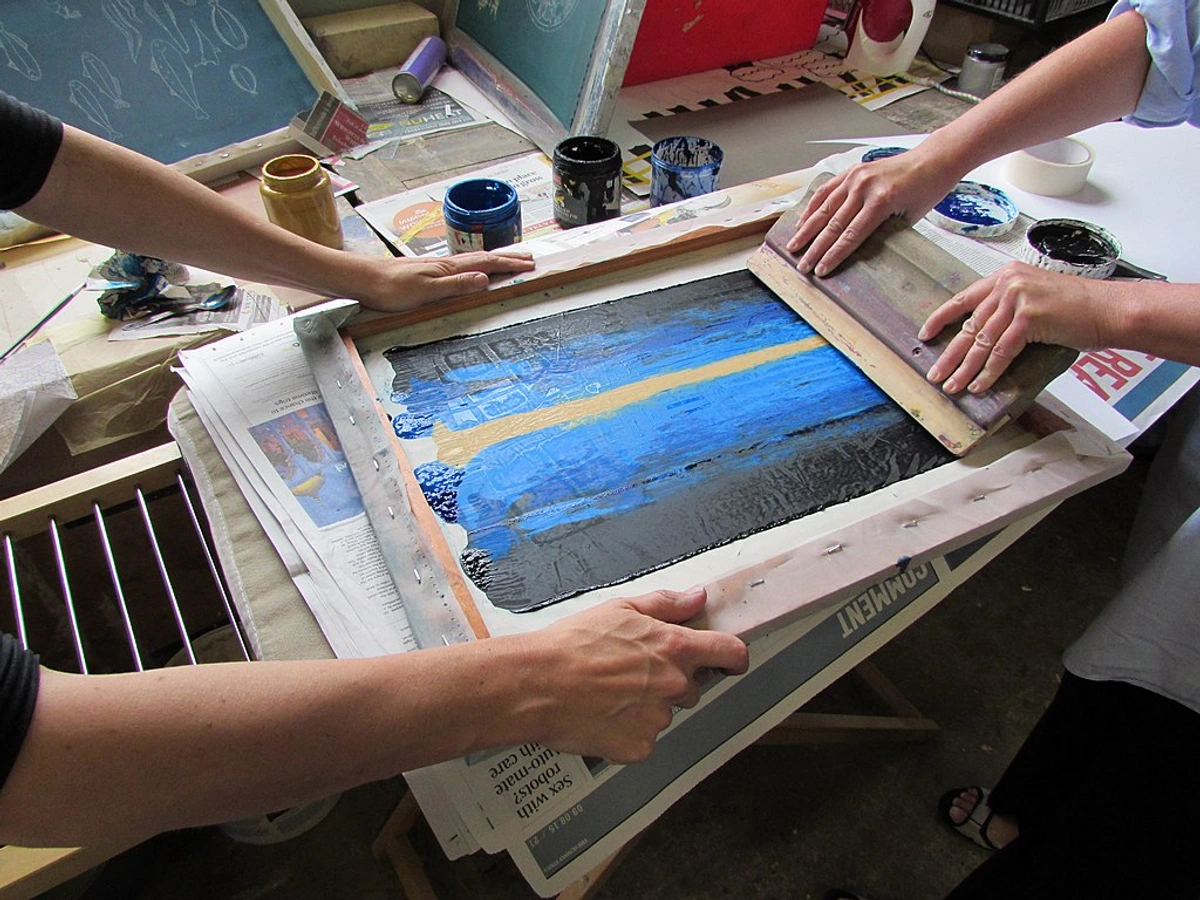



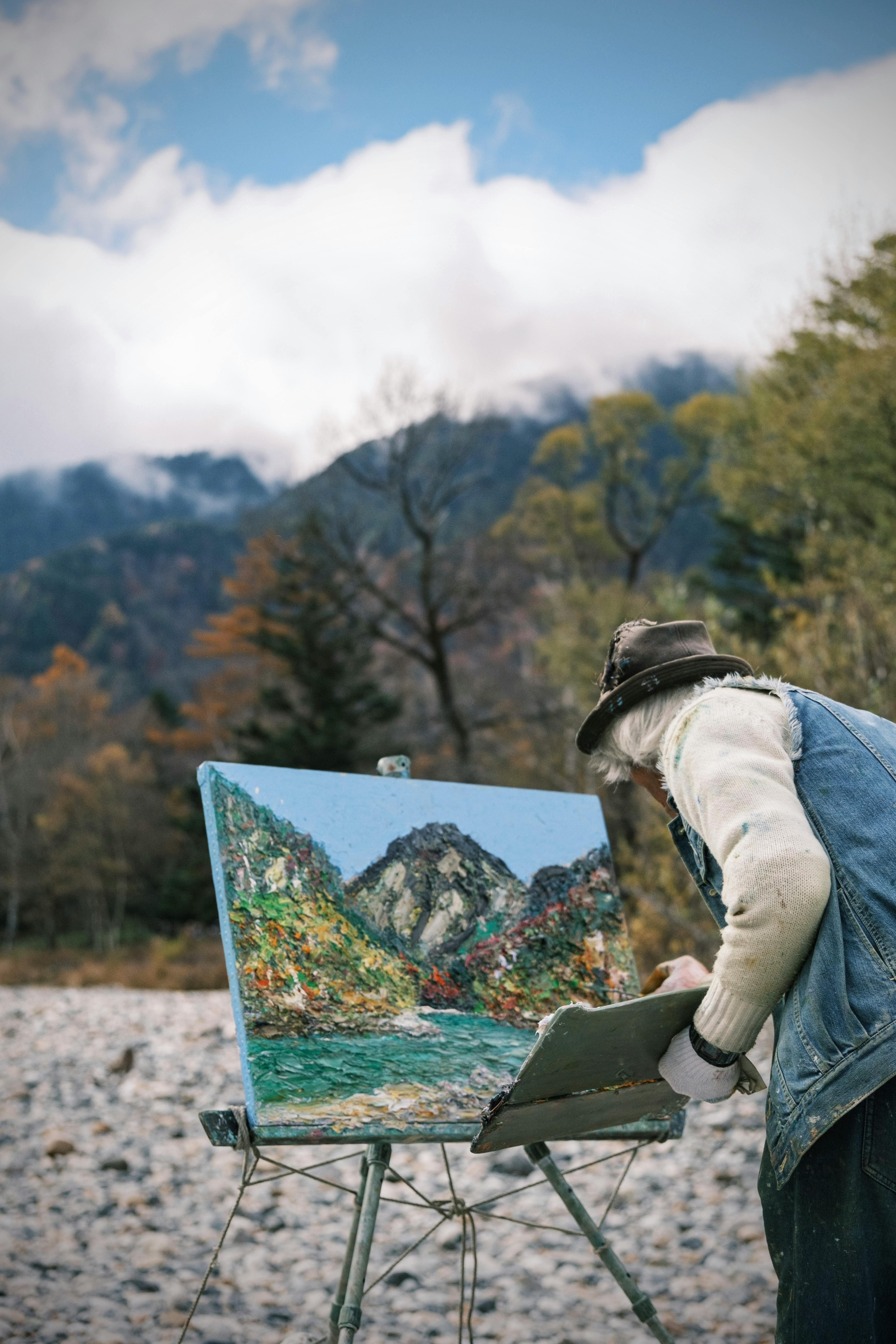


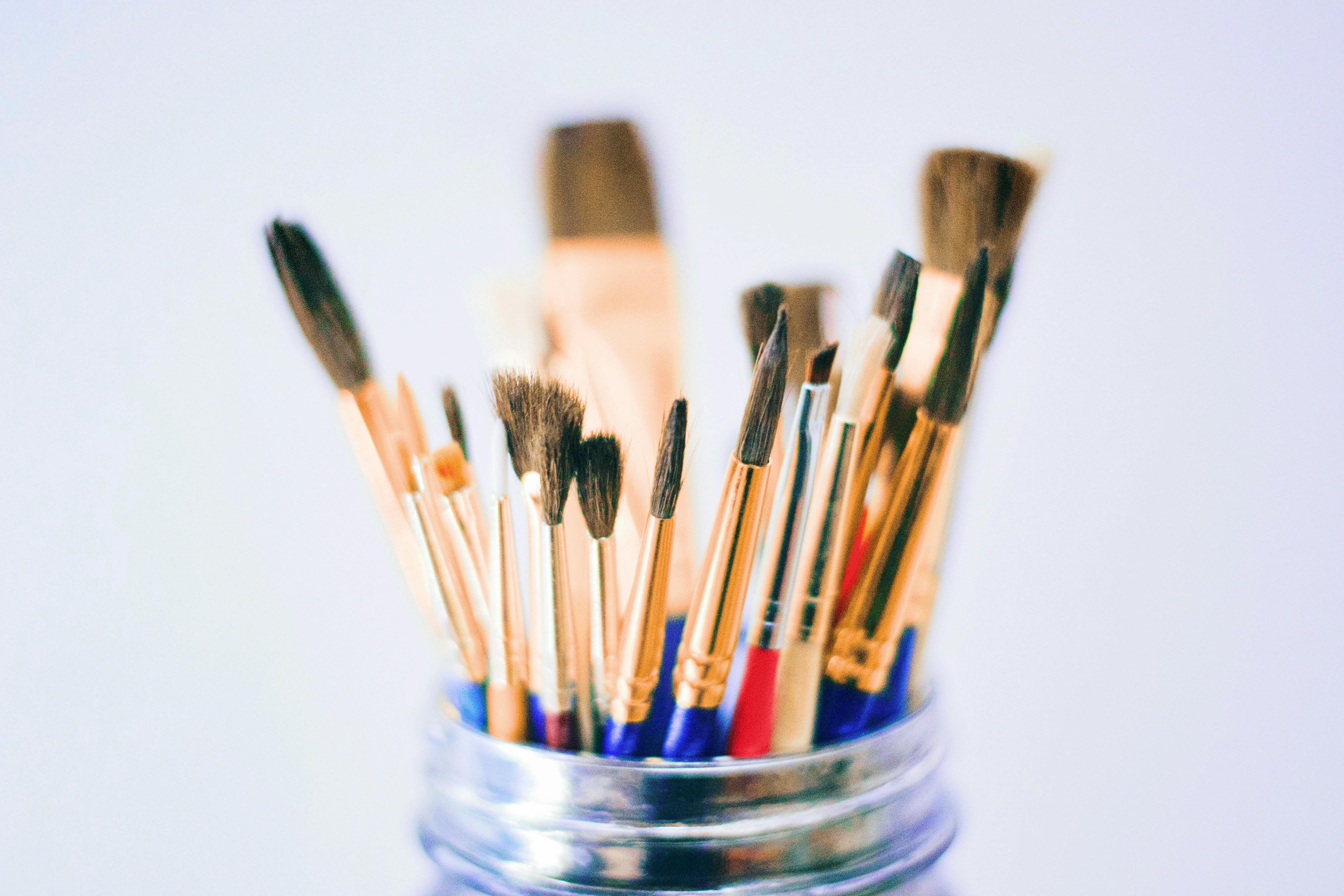





Can I paint oils on paper?
Absolutely! But not just any paper. You need specially prepared oil painting paper that is primed to prevent the oil from seeping through and making the paper brittle over time. It's a fantastic, affordable option for studies, sketches, and quick experiments, offering a different surface feel than canvas. Just make sure the paper explicitly states it's for oils, or that you've primed it yourself with gesso. If you're still exploring surfaces, our article on canvas vs. paper for acrylic painting offers some transferable insights, even if it's for a different medium.
Final Thoughts: Embrace the Journey
The perfect beginner oil painting kit isn't about having the most tubes or the flashiest easel. It’s the one that gets you excited to paint—the one that feels like an invitation, not a chore. It provides a solid, frustration-free foundation, allowing you to focus on the joy of color, texture, and creative expression, rather than wrestling with subpar materials. I truly believe that the right tools can unlock your potential, making the artistic journey smoother and more rewarding.
Choose your kit wisely, guided by your budget and artistic aspirations. Then, grab your odorless mineral spirits (or just a cup of water if you're a smart cookie and chose water-mixables), put on some music, and make a beautiful mess. Remember, every single master began with a single, tentative stroke. This is your beginning. Welcome to the vibrant, rewarding, and sometimes gloriously messy club of oil painters—a club with a long, rich history and an endless future. The journey of artistic exploration is truly one of the most fulfilling, and it's one I'm still on every single day. If you ever feel stuck, need a burst of inspiration, or just want to dive deeper into the world of abstract art and see where my own messy journey has taken me, you can always check out my own timeline of artistic exploration or even consider buying some of my contemporary pieces. It's all part of the grand, beautiful mess of creation, and I genuinely hope your oil painting journey brings you as much joy and fulfillment as mine has brought me. Now go forth, and make some beautiful art! The world is waiting for your unique vision.