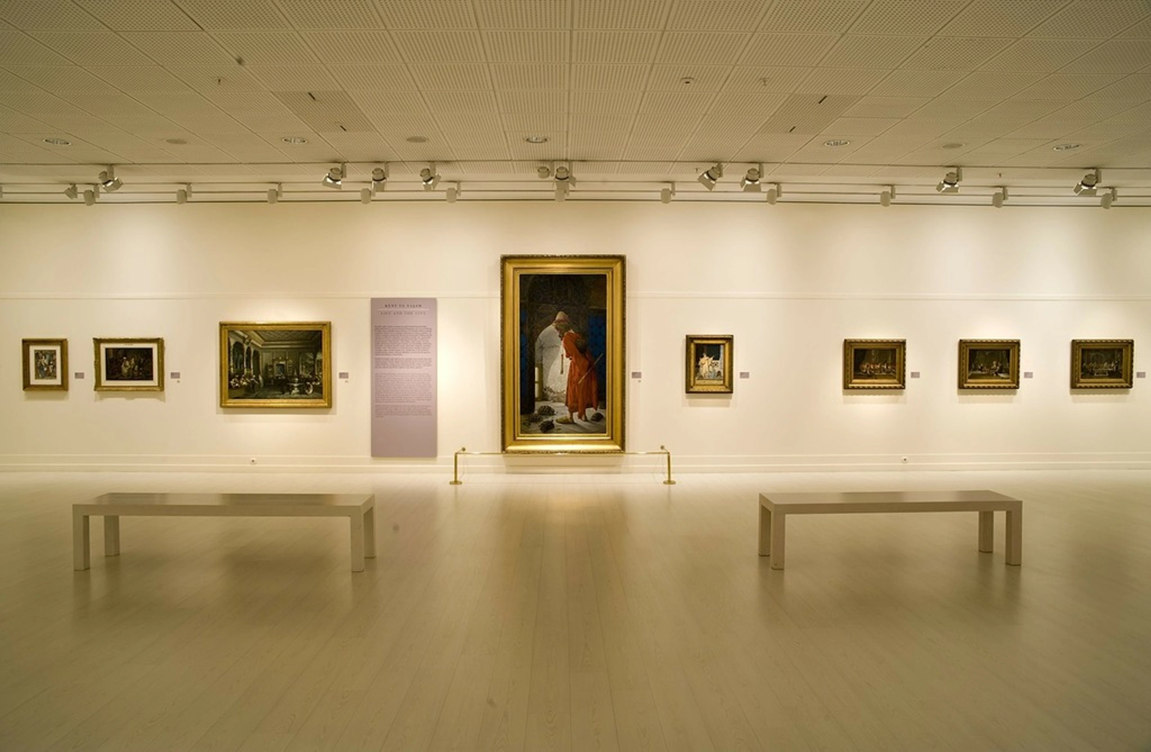
Mastering Eclectic Art: Your Definitive Guide to a Dynamic, Harmonious, & Personal Home
Unlock your home's unique story with this definitive guide to eclectic art curation. Blend diverse styles into a harmonious, deeply personal space, achieve visual equilibrium, and avoid visual fatigue with expert strategies.

Mastering Eclectic Art: Your Definitive Guide to a Dynamic, Harmonious, & Personal Home
Ever look at your walls and feel a quiet sense of disappointment? Not because they're ugly, but because they feel… incomplete? Like a library where all the books are by the same author, or a symphony playing only one note? I know that feeling intimately. My heart used to yearn for spaces that felt deeply lived-in, brimming with stories and unexpected juxtapositions, yet a nagging fear always held me back: the dreaded "messy" or "cluttered" look. My inner maximalist longed for vibrant eclecticism, but my desire for cohesion often led me to play it safe, clinging to the belief that everything needed to be "just so," perfectly aligned to a single aesthetic. Honestly, my walls were pretty, but looking back, they were a tad… uninspired. They whispered, rather than sang.
It took a few decorating mishaps (don't even ask about the time I attempted to force a serene minimalist Japanese print into a shouting match with a flamboyant Rococo mirror – it was a visual cacophony, a genuine misstep on my journey to understanding true artistic harmony; my cat, I swear, gave that corner a wide berth for a week). This overwhelming sensation, where too many competing elements create discord rather than harmony, is what I've come to call visual fatigue. It was in those moments that I realized magic isn't in rigid adherence to a single style. No, the real magic, I discovered, lies in the beautiful, sometimes chaotic, dialogue between different art styles. This 'dialogue' is where contrasting pieces, instead of clashing, converse and enrich each other, revealing new layers of meaning and connection. It's about finding that sweet spot where a vibrant abstract piece can hum in harmony with a classic landscape, creating a narrative that's uniquely you. This, my friend, is what I've come to call visual equilibrium: an arrangement where every piece, no matter how disparate, feels intentionally placed and contributes to an overall sense of balance, depth, and story. And here's a little secret: good lighting, even at this early stage, plays a huge role in creating this sense of harmony, casting everything in a unifying glow.
This journey from stylistic apprehension to confident curation has been incredibly rewarding. If you're gazing at blank walls, a space that feels a little too uniform, or perhaps just a bit uninspired, pull up a chair. I've learned a few things that might just change how you see your home and the art within it. And looking back at my early attempts, some of those 'masterpieces' now make me chuckle – but hey, that's part of the fun, right? In this definitive guide, we'll explore the rich history behind mixing art, deep dive into the principles of harmonious curation, and provide practical, step-by-step strategies to transform your space into a dynamic reflection of your authentic self. You'll learn exactly how to overcome stylistic apprehension and curate with confidence, all while avoiding the dreaded 'hot mess.'
Why Even Bother Mixing Art Styles? The Deep Case for Authentic Expression and Visual Dialogue
Once I truly started loosening up my design approach – abandoning the idea that a room had to be "all mid-century modern" or "pure traditional" – a few profound truths became strikingly clear. Our lives are anything but one-dimensional. We're a rich tapestry of experiences, evolving tastes, and varied interests. So, why should our homes – these deeply personal sanctuaries – be any different? Mixing art styles isn't just a fleeting trend; it's a profound way to inject personality, depth, and a compelling narrative into your space that a single-style approach simply can't achieve. Imagine orchestrating a symphony where each instrument adds a unique, irreplaceable layer to the plot, building towards a cohesive visual equilibrium rather than just a collection of sounds. It fosters creativity, reduces visual monotony, and can genuinely lift your spirits by reflecting the complexity and richness of your inner world, creating a sanctuary that feels deeply personal and inspiring. Beyond mere aesthetics, exposing yourself to diverse artistic expressions can actually stimulate your own creativity and problem-solving skills, broadening your perspective by constantly challenging your visual assumptions. It’s like a daily mental workout for your artistic brain!
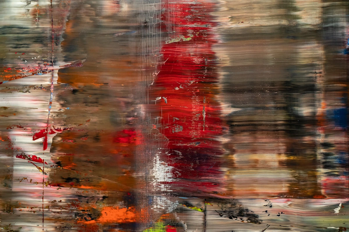
A Rich History of Blending: From Ancient Trade Routes to Global Narratives
Historically, the concept of mixing styles isn't new; it's practically woven into the fabric of art history, evolving alongside cultural exchange and individual taste. From ancient trade routes, such as the Silk Road, which facilitated the exchange of artistic motifs and techniques across continents (think of how Gandharan Buddhist art blended Greco-Roman sculptural styles with Indian iconography), to later colonial encounters producing hybrid styles (like Indo-Saracenic architecture in British India, which fused indigenous Indian, Indo-Islamic, and Gothic Revival elements, or the intriguing blend of European and indigenous forms in Mesoamerican and Southeast Asian art), the "pure" aesthetic has always been more of an ideal than a reality. It's fascinating how different eras and cultures approached this, demonstrating that the appeal of eclectic spaces is deeply rooted in human nature to curate and tell stories through objects.
It’s also worth noting that some movements, like Neoclassicism, initially pushed back against such mixing, advocating for a return to perceived classical purity, championed by figures like Johann Joachim Winckelmann. This emphasis on order, rationality, and the emulation of ancient Greek and Roman forms was a reaction against the perceived extravagance and asymmetry of the Rococo style. This deliberate pursuit of stylistic purity ironically makes later eclecticism even more of a stylistic rebellion against perceived 'decadence' and rigid categorization. Yet, other movements, such as Art Deco, intrinsically embraced global influences from Egyptian motifs to Japanese prints, showcasing a natural eclecticism. You can see how this approach evolved through the evolution of art in interior design.
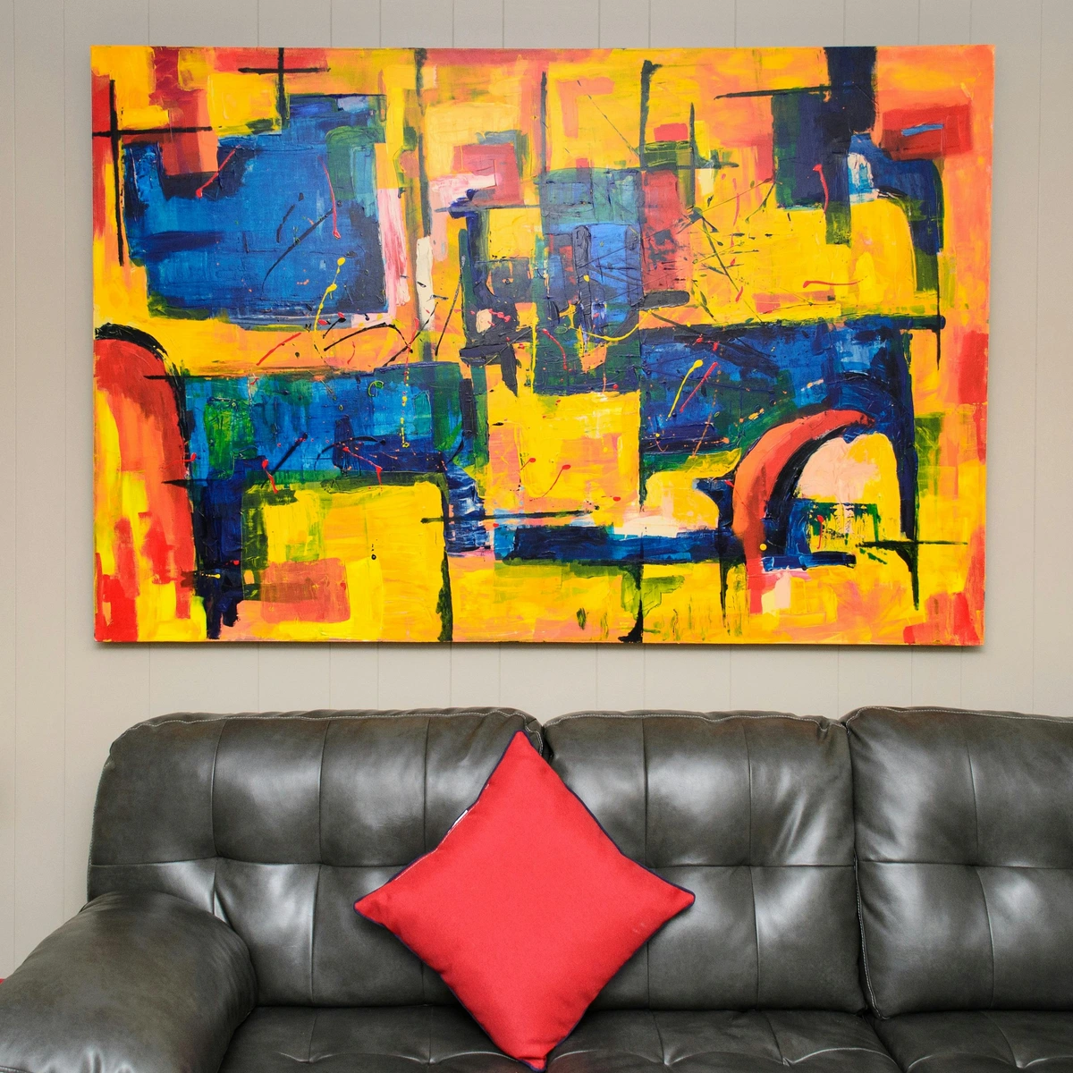
- The Grand Tour & Early European Collections (17th-18th Centuries): This was a pivotal moment. European aristocrats, like the famously eccentric Horace Walpole at Strawberry Hill, the powerful Medici family in Florence, or the remarkable Isabella Stewart Gardner in Boston, embarked on journeys across Europe and beyond. They didn't just accumulate souvenirs; they curated collections. Their displays were a vibrant mélange of ancient Roman sculptures, Renaissance paintings, and artifacts from exotic lands, all side-by-side. Far from being chaotic, these eclectic arrangements spoke volumes about their travels, intellectual curiosity, status, and cosmopolitan worldview, creating a rich tapestry of cultural dialogue. This intentional blending served not just aesthetic purposes, but also acted as a powerful display of knowledge and sophisticated taste. Just as these historical figures curated their spaces to reflect their global experiences, you can imbue your home with a similar sense of personal narrative drawn from your travels and discoveries. To dive deeper into art history, explore the art lovers guide to florence.
- 19th & Early 20th Century Eclecticism: The opulent Bohemian salons of the 19th and early 20th centuries, where figures like Gertrude Stein and Pablo Picasso mingled amidst art, literature, and decor from wildly different cultures, are a prime example. These environments prioritized conversation and intellectual exchange over rigid aesthetic conformity, creating vibrant, stimulating spaces. Even early interior decorators, such as Elsie de Wolfe, championed a departure from rigid period rooms, advocating for comfort and a thoughtful blend of historical and contemporary pieces. Think of Gertrude Stein’s apartment in Paris, a hub of modernist creativity, where a primitive African sculpture might sit alongside a Cubist painting and traditional French furniture, all unified by her discerning eye and the intellectual energy of the space.
- Modern Art Movements & The Globalization of Influence: While movements like Neoclassicism initially resisted stylistic mixing, subsequent movements enthusiastically embraced it. Impressionism, for instance, drew inspiration from Japanese ukiyo-e prints (a key aspect of Japonisme), leading to new perspectives on composition and color. Post-Impressionism further fragmented traditional approaches, often juxtaposing vibrant, subjective palettes with classical subjects, as seen in works like Van Gogh's "Olive Trees with Yellow Sky and Sun." And of course, Modernism, with its emphasis on breaking rules, paved the way for the ultimate freedom in mixing. Think of Picasso's Cubist collages, which inherently combined disparate elements and textures, or Rothko's color fields which, while minimalist, can surprisingly harmonize with a Monet landscape through shared atmospheric qualities – it’s all about finding that unexpected conceptual bridge. The Bauhaus movement, initially advocating for functionalism and a stripped-down aesthetic, paradoxically paved the way for eclecticism by simplifying forms, making them more adaptable to diverse pairings later on. You can even see the inherent eclecticism in movements like Art Nouveau, which beautifully blended natural forms, Japanese prints, and Celtic motifs, creating a distinctive yet diverse aesthetic. The radical juxtapositions of Dadaism and the dreamlike scenarios of Surrealism actively challenged traditional art boundaries, often placing unrelated objects together to spark new meaning. This global exchange of ideas highlights a universal human impulse to connect and reinterpret diverse elements into new forms of expression. The enduring influence of Dadaism on contemporary art is a testament to this.
credit, licence
The Power of Visual Dialogue: Why Contrasting Pieces Tell a Richer Story
This brings me to the profound benefit of the dialogue between different art styles. When you place a vibrant, expressive contemporary abstract piece next to a serene, classical landscape, they don't just sit there silently. They speak to each other. The abstract might highlight the emotional undertones in the landscape, making the quiet scene feel more alive, while the landscape might ground the abstract's wild energy, giving it an unexpected depth. This creates a fascinating dialogue, for instance, between human emotion and nature's enduring presence. This act of placing contrasting elements side-by-side, known as juxtaposition, is incredibly powerful. It can draw attention to details you might otherwise overlook, creating a tension that is resolved by other elements in the room, or simply by the sheer beauty of their unexpected coexistence. This interaction tells a richer, more nuanced story about your tastes, your travels, and your personal history than any single-style approach ever could. It’s like a conversation between different eras and perspectives, all happening on your wall. What story do you want your walls to tell? That's your guiding question for any piece.
And perhaps most importantly for your home, it makes your space feel truly lived-in and authentic. Art is often collected over time, from different places, during various stages of life. It’s incredibly liberating to display a piece you spontaneously picked up on a vibrant trip next to a treasured heirloom, even if their styles couldn't be more different. That’s your history on the wall, not a page ripped from a catalog. It’s an evolving collection, much like a good life story, and isn't that what personalizing your home is truly all about? Eclectic spaces invite curiosity and spark conversations, making your home a dynamic reflection of who you are, enhancing a sense of personal narrative and memory more deeply than single-style spaces.
What Exactly is Eclectic Art? A Harmonious Blend, Not a Hot Mess
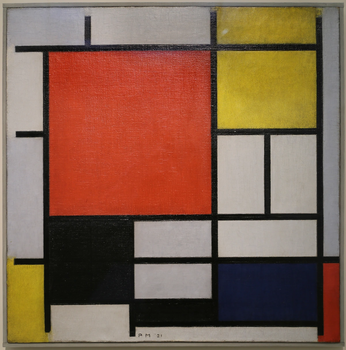
Before we dive deeper, let's get on the same page. When I talk about eclectic art styles, I'm not talking about simply throwing everything you own onto a wall and calling it a day, nor am I suggesting you need a bottomless budget to acquire masterpieces. That, my friend, is often the path to clutter and eventually visual fatigue. Instead, eclecticism in art curation is the intentional blending of diverse artistic styles, periods, and origins into a cohesive, harmonious, and personalized aesthetic. It's a thoughtful approach that values contrast and juxtaposition, using connecting threads like color, theme, or framing to create a unified visual experience. Think of it as a carefully composed playlist with wildly different genres that somehow just works, rather than a random shuffle. It's purposeful, personal, and ultimately, profoundly expressive. It's about creating that delicate visual equilibrium where everything feels like it belongs, even if by unexpected ties, preventing the overwhelm of visual fatigue. Good news: you can achieve this with a mix of high-end finds, local artisan pieces, and even cherished reproductions, proving that eclectic style is more about intention and creative curation than mere expense.
Intentional Eclecticism vs. Accidental Clutter: The Power of Purpose
To truly grasp eclectic art, it's crucial to understand what it isn't. The line between a curated, dynamic space and a chaotic, overwhelming one can sometimes feel blurry, but the difference lies in one key factor: intention. Intentional eclecticism is a deliberate act of selecting and arranging pieces with a clear, albeit personal, vision in mind. It's about curating a visual language that speaks to your unique story, rather than passively accumulating objects. This table sums up how to avoid the dreaded "hot mess" and embrace true eclectic style, helping you achieve a desirable balance in art composition.
Feature  | Intentional Eclecticism | Accidental Clutter |
|---|---|---|
| Purpose | Deliberate blending for a unique, personal narrative. | Random accumulation without a cohesive vision. |
| Harmony | Achieved through unifying elements (color, theme, frame). | Lacks connecting threads; competing elements create discord. |
| Visual Flow | Guides the eye through thoughtfully arranged pieces. | Eye jumps aimlessly; no clear focal points or resting places. |
| Selection Process | Each piece chosen for emotional resonance & potential dialogue. | Impulse buys or displaying everything simply because it's owned. |
| Outcome | Dynamic, balanced, deeply personal, and inspiring. | Overwhelming, stressful, visually fatiguing, and disorganized. |
Finding the Harmony: My Principles for Unifying Diverse Art
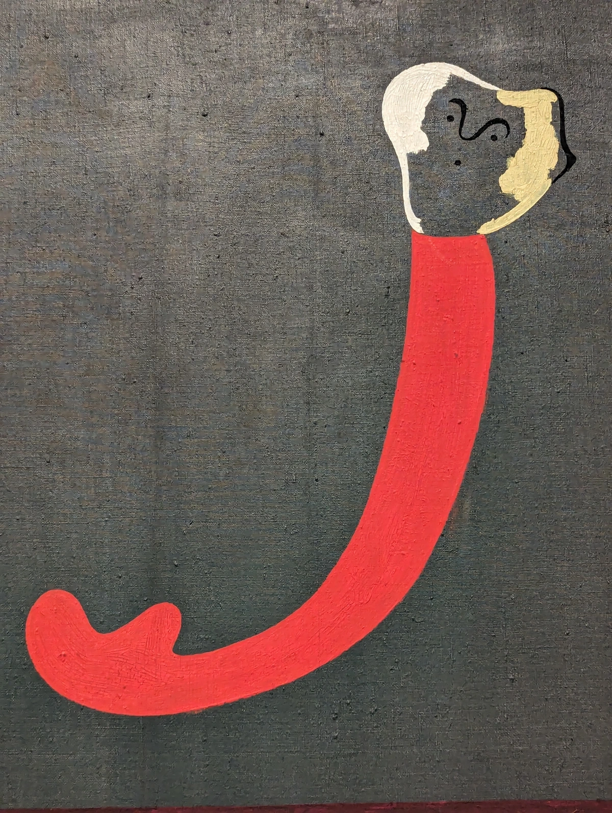
Okay, so you’re convinced of the magic of mixing. But where do you actually start? This is where my own trial-and-error process comes in. I’ve found that the secret isn’t in forcing styles to match, but in discovering those subtle threads that connect them. Think of it as conducting a symphony: different instruments, different notes, but all working together for a harmonious whole. These are the principles I swear by, the silent architects of a balanced, eclectic display, and how I consistently achieve that elusive visual equilibrium without succumbing to visual fatigue. These strategies help you create a truly harmonious gallery wall.
1. Color: The Universal Language of Connection
I swear, color is like the universal translator of the art world. Even if you have a bold, geometric abstract piece and a muted, realistic still life, if they share even one prominent color – a deep teal, a soft ochre, a vibrant crimson – they suddenly sing together. They belong. I once spent an entire afternoon hunting for a specific shade of burnt orange that I'd spotted in a tiny detail of an antique tapestry to tie it into a more modern abstract piece – the obsession is real! It's not about matching everything perfectly, but about finding a visual whisper, a subtle echo that creates an undeniable link. For instance, I once had a striking red abstract painting that felt completely at odds with a vintage botanical print, until I noticed the tiny, almost imperceptible crimson berries in the corner of the botanical. Suddenly, they weren't adversaries, but allies, bound by that shared hue. It was a beautiful 'visual whisper' that tied them together, and it's a principle I still rely on. This is the power of the psychology of color in abstract art.
Your Turn: Look around your favorite room. Can you spot two seemingly unrelated items that share a subtle color? That's your first step towards visual harmony!

2. Framing: The Unsung Hero of Cohesion and Visual Language
This, honestly, is probably my biggest secret weapon. If you have wildly different pieces, giving them a consistent framing style can be an absolute game-changer. Imagine a sleek, thin black frame around a vibrant pop art print, and then the exact same frame around a delicate watercolor. Suddenly, your disparate collection feels cohesive, curated, and intentional. It's like giving your diverse collection a cohesive visual language – they retain their individual character but speak a common aesthetic dialect. The frame acts as a visual 'equals sign,' signaling to the eye that these pieces, despite their differences, belong together, guiding the viewer towards visual equilibrium. For a gallery wall, a mix of thin, identical frames in black, white, or natural wood can work wonders. If you have a very ornate historical piece, pairing it with a simple black frame can modernize it slightly, while a thick, gilded frame can elevate a contemporary abstract, linking it to a more traditional aesthetic. I even wrote a bit about how to decorate a house and framing is always a key consideration there. For more tips on this, check out how to frame a canvas painting.
3. Theme or Subject: Crafting Your Narrative
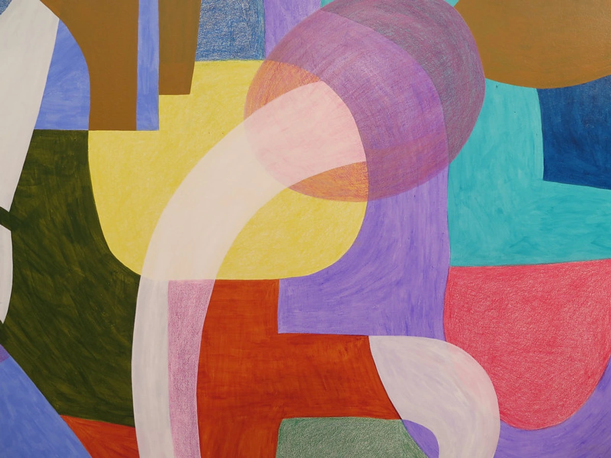
Moving from color and framing, sometimes it’s not about what the art looks like, but what it feels like, or what story it tells. You could pair a contemporary photograph of a bustling Shibuya crossing in Tokyo with an antique Edo-period Japanese woodblock print depicting a lively market scene, or an abstract piece inspired by the ocean's depths with a serene coastal landscape painting. While wildly different in style, they both speak to themes of travel, exploration, or the urban experience. The theme acts as an invisible bridge, fostering a connection despite disparate visual styles. I've found this particularly effective when choosing art for a home office or a study – a blend of contemplative themes can really set the mood. What narrative do you want your walls to tell? That's your guiding star, weaving diverse pieces into a cohesive story.

4. Texture and Medium: A Tactile Connection
Next up is the actual feel of the art, which can be a surprisingly powerful connector. Imagine a deeply impastoed oil painting with visible brushstrokes juxtaposed with a smooth, glossy photograph. The contrast is immediate, but if both pieces evoke a certain raw emotion or if they both play with light to create dramatic shadows, they can coexist beautifully. Or, consider consistent mediums: a series of charcoal drawings, some abstract, some figurative, would work wonders together because the medium itself provides a visual rhythm. The interplay of a deep, textured charcoal abstract alongside a crisp line drawing can add incredible depth. I once hung a highly textured, almost sculptural mixed-media piece that used reclaimed wood next to a sleek, minimalist ceramic plate. The connection wasn't obvious until I noticed how both pieces played with natural, raw materials – the reclaimed wood spoke to the earthiness of the ceramic, creating a compelling dialogue about material purity and form. This is also where incorporating three-dimensional elements like small sculptures or ceramic pieces can truly elevate an eclectic display, adding another layer of tactile interest and depth to your walls. The contrast was deliberate, yet the underlying material language was shared. This is all about how understanding balance in art composition helps create harmony.
5. Scale, Proportion & the Power of Negative Space: Mastering Visual Weight (and Gallery Walls!)
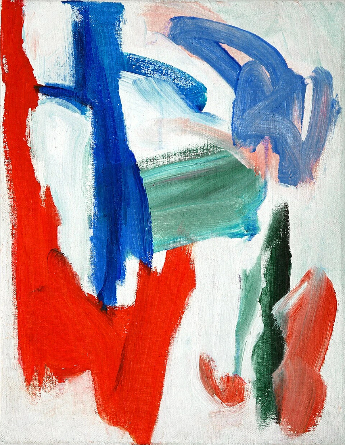
It’s not just about what the art is, but also how much space it commands. A tiny, intricate piece next to a huge, sweeping canvas might sound jarring, but with intention, it creates dynamic energy. This is where understanding visual weight becomes crucial. Think of visual weight as how 'heavy' or 'light' a piece feels to your eye, influenced by factors like color saturation, complexity of detail, density of form, and perceived mass. For instance, a small, densely colored abstract with high contrast might have more visual punch – higher visual weight – than a large, muted landscape. The trick is to balance these elements, creating a rhythm that guides the eye and prevents any single piece from dominating, thus avoiding visual fatigue. Don't be afraid to experiment with negative space around pieces or to cluster smaller works to create a larger visual anchor. For example, a single, dominant large-scale abstract can be perfectly balanced by a gallery cluster of three smaller, varied prints on an adjacent wall, with the empty space between them acting as a crucial pause, allowing each piece to breathe and contribute to the overall visual equilibrium. As a rule of thumb, for art hung above furniture (like a sofa or sideboard), aim for the artwork or grouping to be about two-thirds the width of the furniture below it. This ensures a sense of visual balance and prevents the art from feeling either too small or too overwhelming.
This thoughtful use of blank space is as important as the art itself in making an eclectic arrangement feel intentional and not cluttered. For particularly large pieces, consider maximizing impact by choosing art for high ceilings. And remember, for that perfect spot over the sofa, there's even a guide on choosing art for your living room.
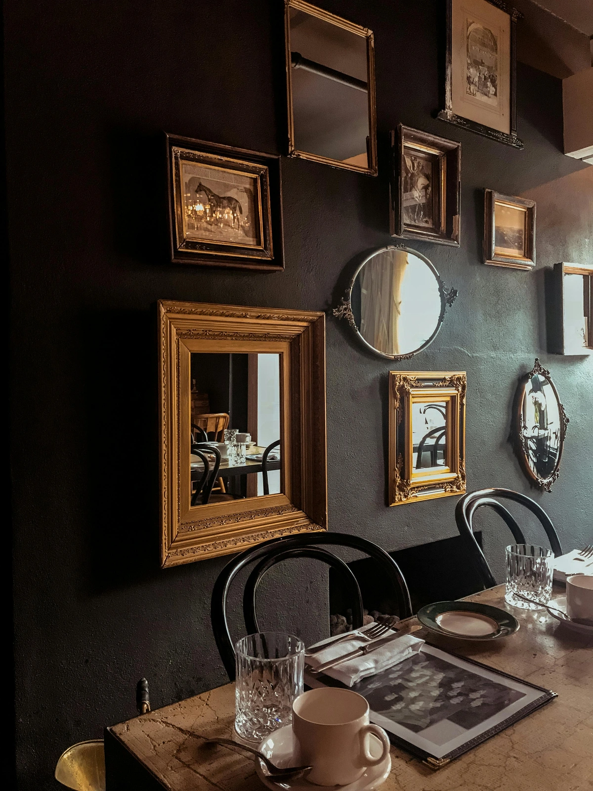
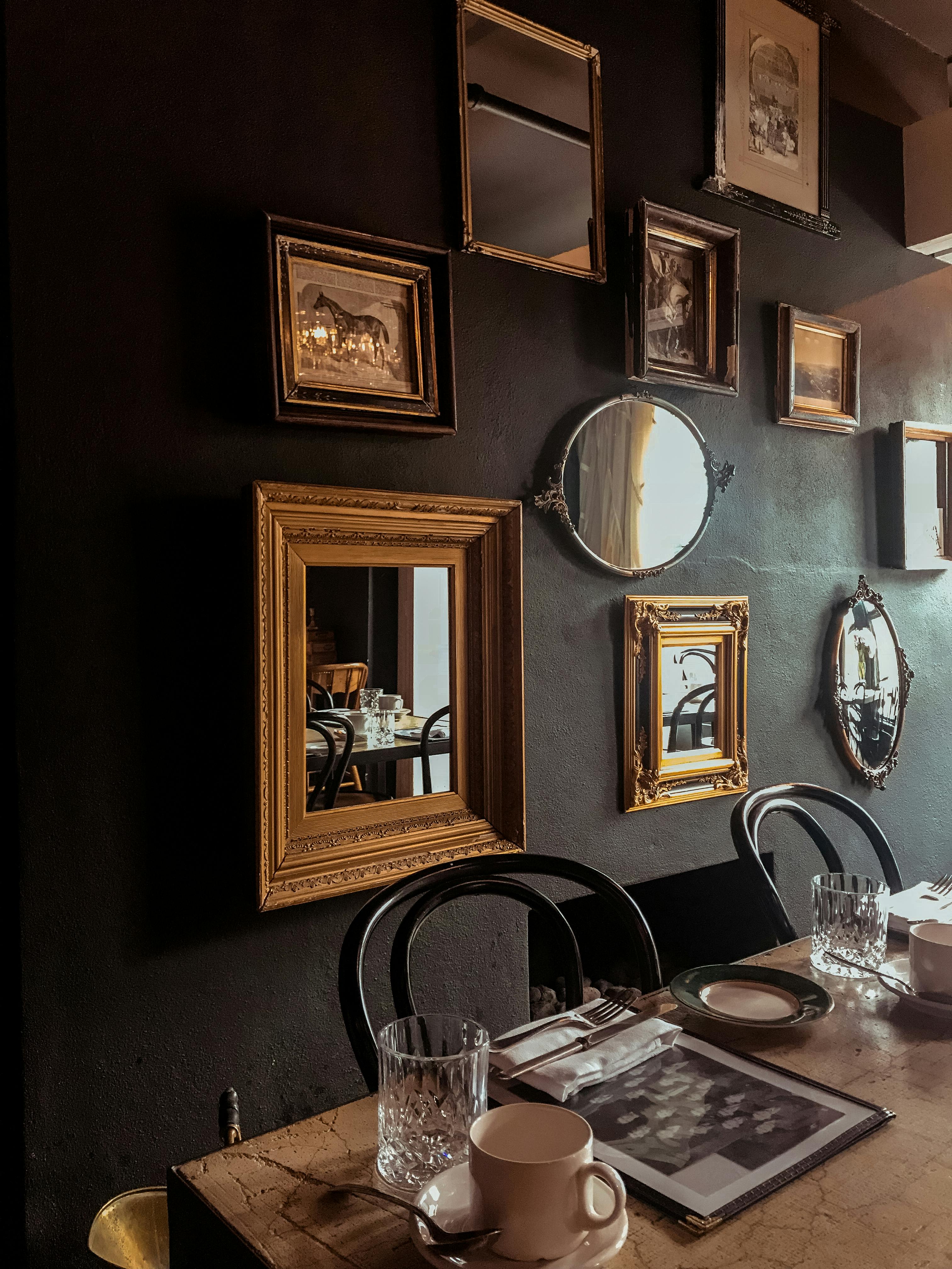
Speaking of clusters, gallery walls are an eclectic curator's best friend. They allow you to bring together a multitude of disparate pieces – photos, prints, canvases, even mirrors – into one cohesive statement. The key? Planning! Lay everything out on the floor first, experiment with different arrangements, and don't be afraid to mix frame styles and sizes. A consistent theme (e.g., all black and white, or a focus on nature) can anchor a diverse collection, but even without a theme, a consistent frame style or color palette within the frames themselves can work wonders. For more ideas on how to arrange, see how to arrange pictures on a wall.
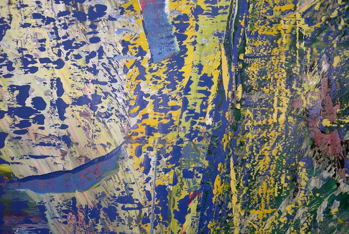
6. Strategic Lighting: The Mood Architect
Finally, good lighting is like the stage director for your art collection. It can highlight key pieces, create a cohesive ambiance, and even unify diverse styles by casting them in the same glow. Think about how a warm, directional spot can transform both a classical portrait and a vibrant abstract expressionist piece, bringing out their textures and colors in a similar way, ensuring they contribute harmoniously to your space's visual equilibrium. Layered lighting – ambient for general illumination, task for functional areas, and accent for highlighting specific artworks (like a focused picture light, track lighting, or even adjustable spotlights) – is crucial for making a mixed collection sing after dark. A well-lit space ensures that your carefully curated dialogue between art pieces is always on full display, enhancing their shared mood, especially important for art in low-light rooms. Want to dive deeper into lighting? Check out how to light art in your home and how to choose the right lighting to enhance your abstract art collection.
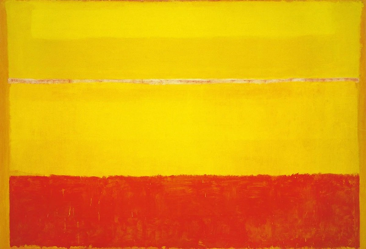
7. Typography & Text-Based Art: The Word as Unifier
Don't underestimate the power of text! Incorporating typography, calligraphic pieces, or art with integrated quotes can add another layer of sophistication and unexpected cohesion to an eclectic collection. A stark, minimalist print featuring a single powerful word can ground a busy gallery wall, or a vibrant piece of street art with bold lettering might echo the energy of an abstract painting. These textual elements can serve as a conceptual bridge, offering an explicit narrative or a shared emotional tone that ties diverse visual styles together. They're particularly effective at injecting a modern, intellectual, or even humorous touch. The consistency might be in the font style, the overall message, or simply the presence of text itself, acting as a unifying thread amidst visual variety. Consider exploring artists who integrate text as a primary visual element, or framed literary quotes that resonate deeply with you. For instance, a vintage print of a philosophical quote in an elegant serif font could beautifully juxtapose a vibrant abstract expressionist piece, both communicating a powerful message, albeit through different visual languages.
My Step-by-Step Approach to Curating Eclectic Art (Because Even I Need a Plan)
Even with all these principles swirling in my head, I still follow a loose blueprint. It truly helps manage the creative chaos! This isn't a rigid dogma, but a flexible framework that has saved me from many a decorating headache. It's about empowering you to trust your own eye and enjoy the process. This approach is particularly useful for spaces like your living room or apartment.
Step | Description | Key Principle Addressed |
|---|---|---|
| 1. Start with Your Gut: Emotional Resonance is Key | Seriously, if you love a piece, that's 90% of the battle. Don't worry about where it fits initially. Bring it home. Live with it for a bit. Its emotional resonance is your compass, the undeniable pull that makes it yours. This personal connection is the foundation of any truly eclectic collection, ensuring your space reflects you, not just a trend. It's the ultimate conceptual bridge. | Emotional Connection, Authenticity |
| 2. Identify Your Anchors: Setting the Stage | Pick 1-2 pieces that you absolutely adore and want to feature prominently. These are your starting points – often the biggest, most colorful, or most sentimental pieces. For me, it's often a large abstract that sets the tone for a room, around which other elements will orbit. They create a focal point, a confident declaration of your style and contribute significantly to the overall visual weight. | Visual Weight, Focal Point |
| 3. Find Connecting Threads: The Subtle Weave | Look closely at your anchor pieces and existing decor. What colors, emotions, subjects, or patterns are present? Then, when looking for new art or placing existing pieces, actively search for those subtle connections. A single shared hue, a similar line quality, or even a parallel mood can be enough to create a "visual whisper" that binds them, guiding you towards visual equilibrium. This is where the magic of "dialogue" happens, and where your understanding of color, theme, and texture comes into play. | Visual Equilibrium, Conceptual Bridge |
| 4. Play with Placement: The Essential Trial Run | Don't hang anything immediately! This is my golden rule. I always start by laying pieces on the floor, leaning them against the wall, and swapping them around. For a more precise trial, use painter's tape to mark out the dimensions of your artworks on the wall. Take photos of different arrangements from various angles – our eyes play tricks, and a photo can offer fresh perspective. This is where you truly see the magic (or the mayhem) before committing. Think critically about scale, proportion, and especially negative space – a tiny piece next to a huge one can look fantastic if done right, but it demands intention. If you buy a new piece and it just doesn't fit, don't panic! It's an opportunity for re-evaluation. Maybe it needs a different wall, a different room entirely, or perhaps your existing collection needs a little shuffle. Art, much like life, is fluid. Don't be afraid to move things around. For specific spaces like a living room, I often revisit what I learned when choosing art for your living room. | Scale & Proportion, Negative Space |
| 5. Step Back and Assess: Trust Your Intuition | Once you have a potential arrangement, walk away for a few hours, or even a day. Come back with fresh eyes. Does it feel harmonious? Does it tell a story? Does anything jar or create visual fatigue? Don't be afraid to rearrange; art, like life, is fluid and an evolving canvas. Trust your intuition – if it feels right, it probably is. This is your space, and your comfort and joy are the ultimate benchmarks for achieving your personal visual equilibrium. | Visual Equilibrium, Intuition |
Sourcing Your Eclectic Treasures: Where to Find Art That Truly Speaks to You
Okay, so we've covered the principles for creating harmony. Now, let's talk about the exciting part: actually finding those incredible pieces! Finding pieces that genuinely resonate with you is half the fun of an eclectic collection. It's not just about traditional galleries anymore; the world is truly your oyster! The thrill of the hunt, for me, is almost as good as the discovery itself.
Common Misconception: Eclectic Art Requires a Bottomless Budget
Let's bust this myth right now. While you can invest in high-end pieces, the beauty of eclectic art lies in its accessibility. It's about clever curation, emotional connection, and thoughtful display, not expense. You can build a stunning, deeply personal collection with a mix of budget-friendly finds and a few cherished splurges. The "treasure hunt" aspect is where the real value lies, allowing you to create a space rich in personality without breaking the bank. Forget the idea that art collecting is only for the elite; eclectic style actively democratizes art, making it achievable for everyone. You might even find incredible pieces at local artisan markets.
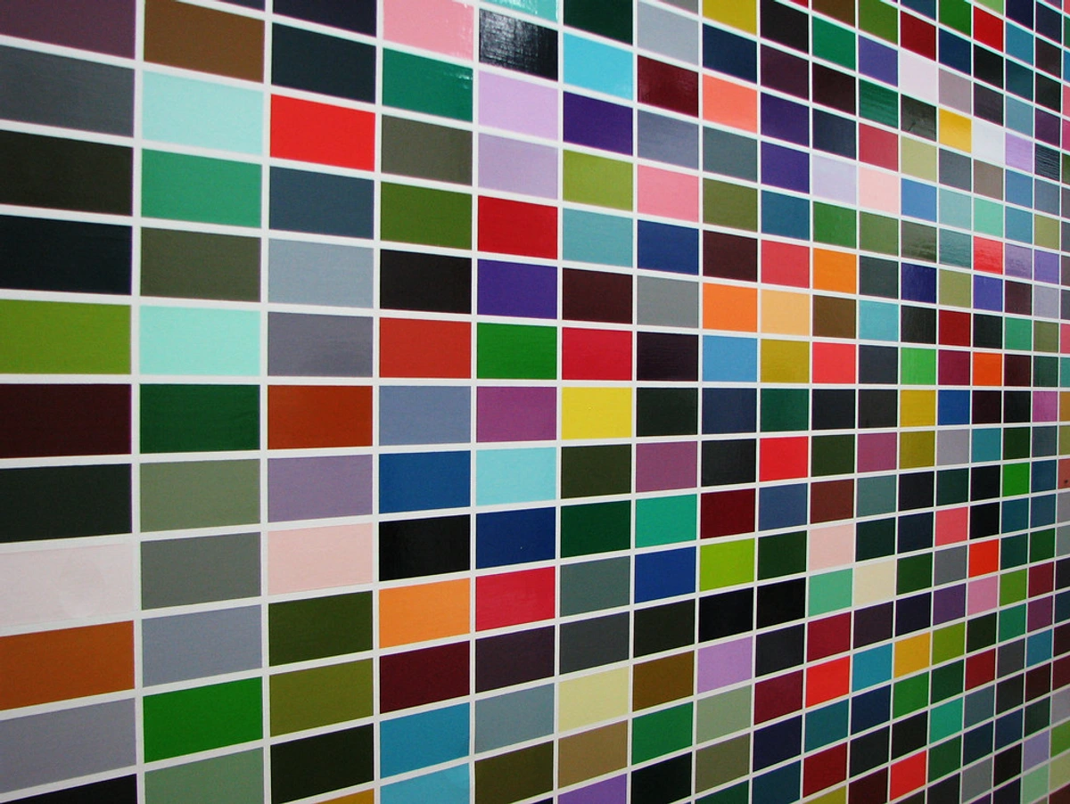
- Local Artists & Artisan Markets: These are fantastic places to discover unique, often affordable pieces, allowing you to support creators directly and bring home art with a genuine backstory. You're also directly supporting your local economy and arts scene! Think about the vibrant street art you might find in cities like Lisbon or São Paulo. You can even explore local artist cooperatives and community art centers for hidden gems. Tip: Don't be afraid to ask the artist about their inspiration or process – that personal connection adds immense value to your collection's narrative, and understanding the 'why' can help you find those subtle conceptual bridges later on. Look for authenticity, even if it's not a 'perfect' piece. You might even find an interesting, unique frame here, or a handcrafted decorative object that can elevate your display. You can even discover a community for buying art local artists to learn more!
- Vintage Shops, Antique Stores & Estate Sales: From delicate watercolors to quirky ceramic figurines, these spots offer art with history and character. You might find a forgotten treasure that perfectly contrasts your modern pieces, or even a compelling piece of "found art" (everyday objects presented as art, challenging traditional definitions of what constitutes art) or "outsider art" (raw, uninhibited works created by self-taught artists that offer an unvarnished authenticity and often defy conventional categories, bringing a unique, often unfiltered perspective). Estate sales, in particular, can offer entire collections at once, revealing unexpected connections. Tip: Beyond just liking a piece, always check its condition (is the canvas torn? Is the frame damaged? Is it a print or an original?), and consider if it has potential for easy restoration or if its 'worn' look adds to its charm. Look for quality in the medium, even if the style isn't immediately your go-to. For older pieces, try to glean information about their provenance – where they came from and who owned them – it adds to their story and value. Keep an eye out for interesting frames, signatures, or even labels on the back that could hint at its origin or value. Sometimes, a beautiful frame alone is worth the purchase, even if the art inside isn't perfect! You might even stumble upon an old still life painting that catches your eye, or discover a piece with "good bones" that a fresh frame could transform. You might also find unique pieces that align with decorating with abstract art in industrial chic interiors.
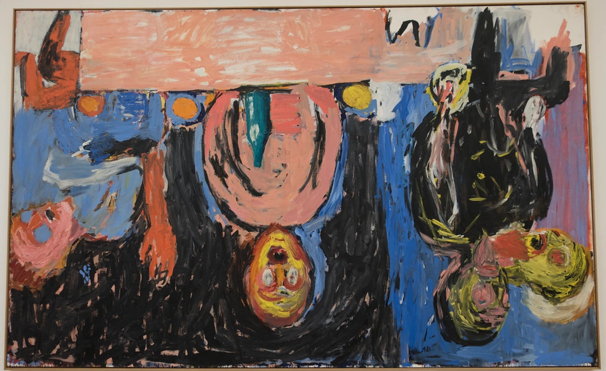
- Online Marketplaces & Indie Art Sites: Sites like Etsy, Saatchi Art, Artsy, Artsicle, Minted, Society6, or even specific artist websites (like this one!) offer a vast array of styles, from contemporary abstract to illustrative works. Just be prepared to spend some time browsing – it's an adventure in itself! Tip: Read reviews, check artist portfolios, and don't hesitate to message the artist with questions about the artwork's scale, colors, or materials. Pay attention to how colors are represented on screen versus in person, and always verify return policies. Remember, not all digital representations are perfectly accurate, and some artists like myself prefer to sell directly for that personal connection to your collection. You can even buy my own work right here, knowing you're getting it directly from the source.
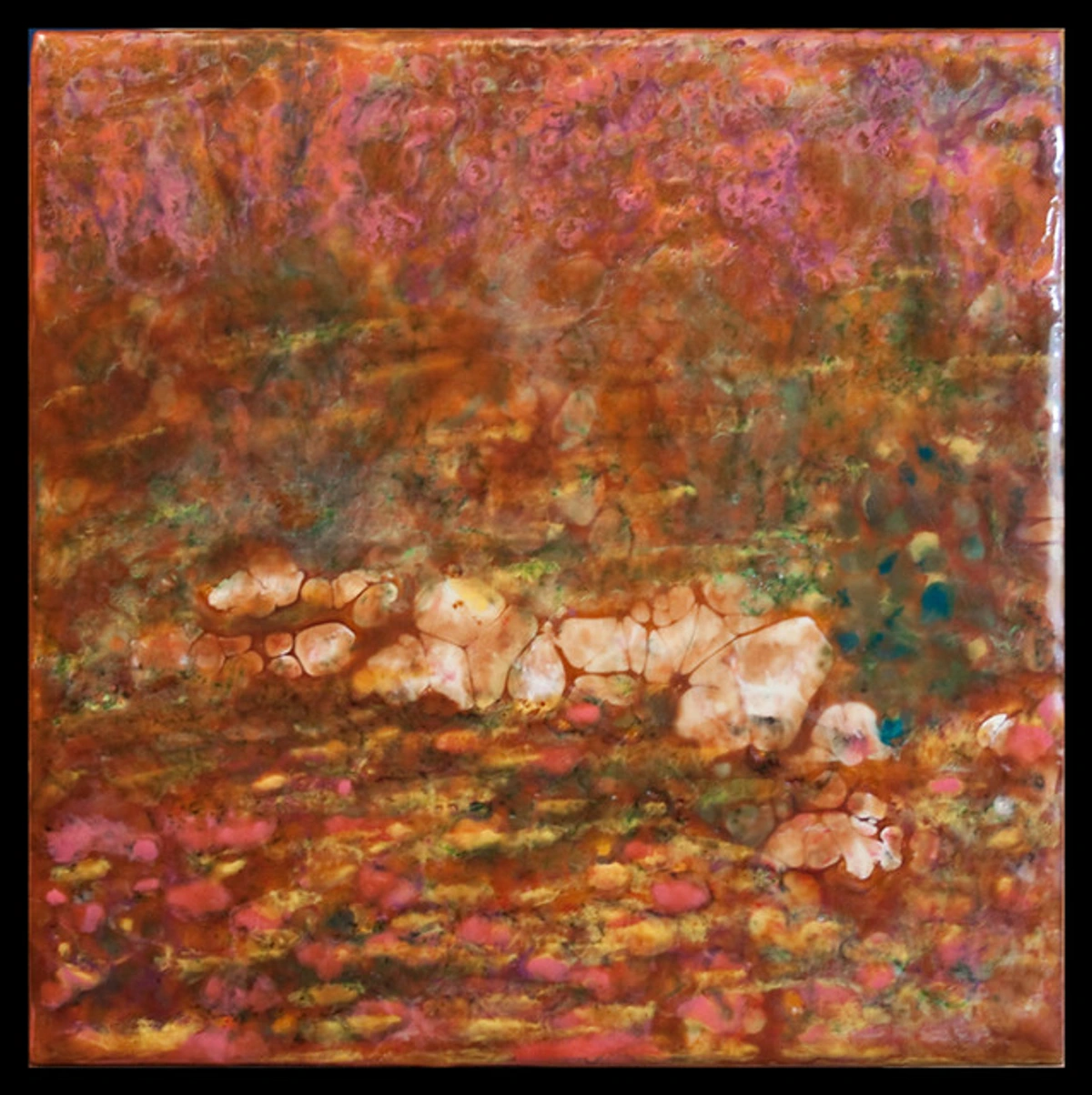
- Art Auctions (Online & In-Person): Don't be intimidated! Smaller local auctions or online platforms can be a goldmine for unique pieces, often at surprising prices, providing opportunities to acquire historical or lesser-known works. Tip: Set a budget and stick to it. It’s easy to get caught up in the bidding excitement. Research pieces beforehand if possible, focusing on provenance, authenticity, and condition reports. Remember, what you save on the hammer price might be spent on restoration or re-framing. For valuable older pieces, consider professional art conservation if needed.
- Travel & Souvenirs: The most meaningful pieces often come from journeys. A vibrant textile from a market abroad, a small painting from a local artisan – these become tangible memories woven into your home's narrative. *Tip: Consider how it will travel home with you! And remember the story behind it – that's often its greatest value. These pieces are often the easiest to connect through theme (your travels) or emotional resonance, creating a unique visual storytelling techniques in narrative art. For more examples, see buying art in India.
- Museum Shops & Print Archives: High-quality prints of classical or modern masterpieces can be excellent additions, providing a nod to art history that can beautifully juxtapose with contemporary finds. These are fantastic for starting an eclectic collection on a budget, offering artistic depth without the original's price tag. Tip: These are great for filling gaps in a gallery wall or introducing a classic element without the high cost of an original. Look for limited editions or authenticated prints for added value, and consider prints by famous romanticism artists to introduce a historical touch.
Remember, the goal isn't to buy everything at once, but to curate over time. Each piece should feel like a discovery, contributing to your home's evolving story. This patient approach is what allows for the organic development of true eclectic style, preventing visual fatigue by letting your collection breathe and grow with you. It’s a journey of continuous discovery and connection.
Navigating Complex Pairings: Taming the Visual Wild West (Without the Chaos)
So, you've embraced the thrill of the hunt and started collecting. But what about those truly audacious pairings, like a vibrant street art piece alongside a delicate botanical print? Or perhaps, as I painfully learned, forcing a minimalist Japanese print into a shouting match with a flamboyant Rococo mirror? It sounds impossible, a recipe for visual fatigue – that overwhelming sensation when too many competing elements create discord rather than harmony. But trust me, it can be done. This is where the real fun – and the real skill – of eclectic curation comes in, especially when aiming for art for maximalist interiors where bold choices are celebrated. Here’s how to bridge those seemingly insurmountable stylistic divides and avoid visual clutter, always striving for visual equilibrium:
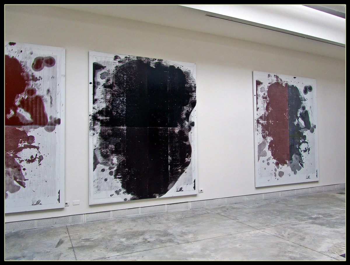
Strategies for Harmony in Unexpected Combinations
- Introduce a Neutral Buffer Piece: A minimalist print, a textured fabric art piece, or even a mirror placed between two wildly different styles can act as a visual palate cleanser, allowing the eye to adjust and creating a harmonious flow between contrasting works. Think of it as a quiet intermediary, like placing a simple black and white abstract painting between a busy Renaissance portrait and a vibrant Pop Art piece. It gives both breathing room, softening the clash and allowing balance to emerge. For example, a crisp, clean photo of a single architectural detail (a window frame, a subtle shadow pattern) or a plain, textured textile can work wonders. A small, neutral-toned abstract print can also serve this purpose beautifully.
- Utilize a Unifying Wall Color: A strong, consistent wall color can anchor even the most disparate pieces, making them feel part of the same intentional collection. A deep, saturated hue can act as a cohesive backdrop, pulling together diverse elements and minimizing visual chaos, allowing the art to pop. Conversely, a calming neutral provides a stable ground, letting the art be the primary focus without visual competition. This is a foundational principle for avoiding visual fatigue, as it provides a stable ground for your eclectic display.
- Create a Dialogue Through Unexpected Commonality (The Conceptual Bridge): This is where juxtaposition really shines. As challenging as it sounds, that Renaissance portrait and graffiti tag could be united if both depict a rebellious spirit, or both feature an unexpected splash of a specific color. It's all about creative problem-solving and finding that unexpected dialogue. A conceptual bridge is that underlying idea, emotion, or subtle visual element that connects seemingly unrelated artworks. For instance, two pieces might subtly evoke a sense of longing, or both might incorporate a unique curved line, or even both draw inspiration from historical mythology, albeit in vastly different styles. For example, if you're trying to pair a very dark, moody, almost melancholic piece with a brightly colored, cheerful artwork, the 'conceptual bridge' could be a shared exploration of human emotion, or the subtle presence of a common hue that both pieces, despite their contrasting moods, happen to share. Or, take a piece of vibrant, raw folk art and try to integrate it with a sleek, minimalist contemporary abstract. Perhaps both pieces celebrate simplicity of form, or a specific, striking primary color that can be echoed elsewhere. The trick is to find that unexpected commonality, even if it's just a subtle whisper. Perhaps a piece by a famous romanticism artists could find a bridge with a modern abstract through a shared sense of drama or yearning for the unknown, creating a shared conceptual space that transcends their visual differences. It’s about being a visual detective and unearthing shared DNA! This is your key to truly mixing any styles together, as long as you're intentional.
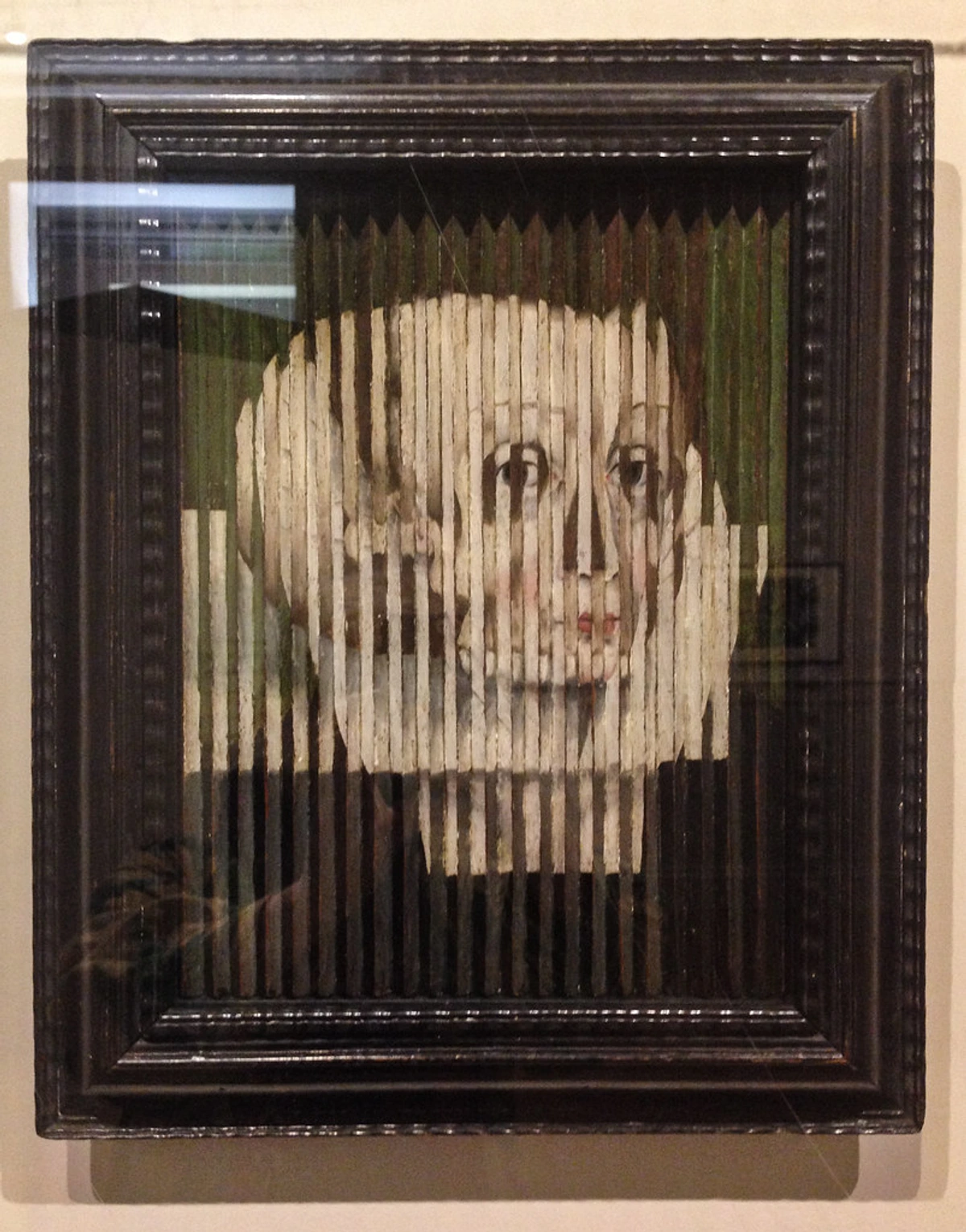
- The Power of Three: Creating Balanced Clusters: While not a hard-and-fast rule, I often find that when trying to integrate two very different styles, introducing a third, slightly more neutral piece (perhaps one that echoes a color or shape from both) can act as the crucial bridge. For instance, if you have a bold abstract and a vintage landscape, a third piece like a framed botanical illustration that incorporates a color from the abstract and a natural element from the landscape could be the perfect bridge. This isn't just arbitrary; it's a design principle rooted in the idea of visual triangulation, where three points create a stable and balanced composition. It creates a small, balanced visual triangle, a mini-cluster with its own internal harmony, allowing for a more nuanced conversation between the art, rather than just a shouting match. This balanced cluster then makes sense within the larger eclectic narrative, preventing any single piece from feeling isolated or out of place.
This approach helps maintain a personal narrative over fleeting trends. While it's easy to get caught up in what's 'in,' the true art of mixing styles lies in displaying pieces that genuinely resonate with your life story and evolving tastes, rather than chasing the latest look. This personal connection helps prevent visual fatigue, as each piece holds a deeper meaning for you, transcending its individual style, and contributing to the overall decorating with abstract art in eclectic interiors effect.
Common Pitfalls to Avoid in Eclectic Curation
To ensure your eclectic display sings, rather than screams, be mindful of these common missteps. Trust me, I've made them all!
Mistake | Description & Solution |
|---|---|
| Ignoring Scale and Proportion | Hanging a tiny piece dwarfed by a huge wall, or vice versa, without intentional grouping. Solution: Play with groupings (gallery walls work wonders for smaller pieces) and consider the "visual weight" of each piece, not just its physical size. Use negative space strategically to give individual pieces room to breathe. Ensure art size relates to furniture: ideally, for art hung above furniture (like a sofa or sideboard), aim for the artwork or grouping to be about two-thirds the width of the furniture below it. This ensures a sense of visual balance and prevents the art from feeling either too small or too overwhelming. |
| Lack of a Unifying Element | Simply throwing different styles together without any connecting thread (color, theme, frame, mood). Solution: Actively seek out those "visual whispers" or conceptual bridges between pieces. Even a subtle shared hue or an overarching theme (like "nature" expressed in different styles) can make a huge difference. |
| Over-Cluttering & Neglecting Negative Space | Too many pieces crammed onto a wall or into a space, leading to visual fatigue where the eye has nowhere to rest. This often makes a space feel messy rather than curated. Solution: Edit mercilessly. Not every piece you own needs to be displayed at once. Rotate your collection seasonally or as your tastes evolve. Embrace negative space as an integral part of your composition – blank spots allow the eye to rest and appreciate the individual pieces more fully. For art in small spaces, this is especially crucial; fewer, impactful pieces are better than many overwhelming ones. Remember, a curated eclectic space is about thoughtful intention, not just accumulation. |
| Inconsistent Lighting | Poorly lit art or uneven lighting that makes some pieces stand out too much while others are in shadow. Solution: Invest in layered lighting, including accent lighting for key pieces. Ensure light temperature is consistent or intentionally varied to enhance the mood. |
| Chasing Trends Blindly | Filling your home with pieces that are currently fashionable but don't genuinely resonate with you. Solution: Prioritize emotional connection and personal narrative. An eclectic collection should tell your story, not a magazine's. Authenticity always triumphs over fleeting trends. |

FAQs from My (Imaginary) Coffee Chat: Navigating Your Eclectic Journey
Navigating the world of eclectic art can bring up a lot of questions. Here are some I've pondered myself, and heard from friends. These are the kinds of queries you might type into a search engine, looking for concrete, actionable advice.
Can I really mix any styles together? (Taming the Extremes)
Honestly? Probably. The question isn't if you can, but how you do it, and what story you want to tell. As we explored above, even the most seemingly disparate styles can find a conceptual bridge – a shared emotion, a subtle color echo, or an unexpected theme. While a highly ornate Baroque painting next to a stark, minimalist sculpture might initially feel like a clash, creative problem-solving and a willingness to experiment can yield surprisingly compelling results. Think of how movements like Dadaism and Surrealism deliberately juxtaposed unrelated objects to create new meaning; this ethos of unexpected combinations can be your guiding principle. The most interesting spaces are often those that take calculated risks. The key is always intention and finding that unifying element. For example, you might juxtapose an emotional expressionist piece by Edvard Munch with a vibrant abstract, finding connection in their shared raw emotion. Or, pair a complex, detailed Renaissance portrait with a bold, abstract expressionist work by finding a shared dramatic intensity or a specific color nuance present in both. It's about letting the conversation unfold, and trusting that your discerning eye can uncover those hidden connections.
How many different styles are too many? (Avoiding Visual Fatigue)
I'm not a fan of hard rules here, but generally, if a space starts to feel visually overwhelming or scattered – like a visual shouting match rather than a conversation – you've likely reached visual fatigue. This means your eye doesn't have a place to rest, and the overall impression is one of chaos, rather than curated dynamism. My personal sweet spot is usually 2-3 dominant styles, with perhaps a few unexpected accents. However, it's less about the number and more about the balance and the thoughtful use of negative space. You can technically have five styles if they all have subtle connecting threads and adequate negative space. The key is always to ensure there's still a sense of intentionality and visual equilibrium, not just a random collection. Remember, less can often be more impactful, even when mixing, especially when consciously utilizing negative space. To avoid overwhelming the eye, consider creating "mini-collections" or smaller clusters within a larger space, each with its own internal harmony, contributing to the overall eclectic feel. For art in small spaces, this principle of thoughtful editing and leveraging negative space becomes even more critical.
Is there a specific type of art that's easier to mix?
I've personally found that abstract art is incredibly versatile. Because it often focuses on universal elements like color, shape, and emotion rather than literal representation, it can surprisingly bridge gaps between very different styles. A dynamic abstract piece can pull colors from a traditional landscape, add a modern edge to a vintage setting, or echo forms in a figurative work. It's truly like the chameleon of the art world! Its non-representational nature allows it to harmonize with almost anything, creating a modern counterpoint or a vibrant burst of energy without clashing. Through my own artistic explorations, I've discovered this versatility, and you can see how my style has evolved over my artist's journey.
Beyond abstracts, photography is also very versatile due to its diverse subjects and styles, from black and white street scenes to vibrant landscapes. Pieces with strong graphic qualities, bold lines, or repetitive patterns can also act as powerful unifiers, creating a visual rhythm across different styles. Ultimately, any art that speaks to you can be mixed, but abstract and graphic pieces often offer a more direct route to finding those conceptual bridges.
What about digital art or NFTs in an eclectic collection?
Digital art and NFTs represent a fascinating, albeit still evolving, frontier in the art world. While the long-term investment value and stability of NFTs, particularly as speculative assets, remain subjects of considerable debate (and frankly, my own skepticism about their enduring artistic merit compared to tangible works often runs deep), purely as a form of artistic expression, digital pieces can certainly find a place in an eclectic collection. The key, as always, is personal resonance and thoughtful integration. If a digital artwork speaks to you, consider how its colors, themes, or even its unique medium (displayed on a high-resolution screen) might complement your physical pieces. Perhaps a minimalist digital animation could offer a modern counterpoint to a classical sculpture, or a vibrant crypto art piece could echo the color palette of an abstract painting. When integrating digital art, also consider the practical aspects: screen calibration for accurate color display, the longevity and energy consumption of display devices, and how it physically fits into your space (e.g., a high-quality print of a digital piece can bridge the physical-digital gap beautifully). Approach them with the same curatorial eye you'd apply to any other medium: look for genuine artistic merit, connection, and intentionality, rather than solely focusing on speculative value. For me, the enduring power of art lies in its physical presence – the tangible texture, the unique brushstrokes, the way light interacts with a physical surface. While digital mediums and NFTs offer fascinating new avenues, they often lack the deep, sensory connection that resonates with me and that I believe contributes to a truly 'lived-in' and soulful home. My personal preference leans towards art with a physical presence and a long-term artistic intent, finding greater depth and longevity in tangible creations, often preferring the tactile qualities of mixed media. However, the choice, as always, is ultimately yours. Just be mindful of the significant environmental footprint often associated with some blockchain technologies and the volatility of the digital asset market when making your choices. If you choose digital, consider more sustainable display options like high-quality prints if the environmental impact is a concern.






How do I integrate sentimental pieces that don't "fit" my aesthetic?
This is a common dilemma, and one I grapple with often! Some pieces carry immense personal meaning – a child's drawing, a gift from a loved one, a souvenir from a pivotal trip – even if they don't perfectly align with your chosen aesthetic. The key here is to prioritize emotional connection while still aiming for visual equilibrium. Consider these strategies:
- Give it its own moment: Sometimes a sentimental piece doesn't need to be part of a larger grouping. A small, cherished item on a bedside table, a framed drawing on a dedicated shelf, or a single piece on a quiet wall can highlight its importance without forcing it into a stylistic battle. This also creates crucial negative space around it.
- Frame it intentionally: As discussed, framing can unify. A simple, elegant frame (even if the art itself is informal) can elevate a sentimental piece and help it integrate into a more sophisticated setting. Maybe choose a frame that matches others in the room to create a subtle bridge. This can often be a form of "framing as restoration," giving an old piece new life.
- Create a "sentiment corner": Designate a specific area – a small wall, a shelf unit, a corner – as your personal museum of memories. Here, you can group pieces that are connected by story rather than strict style, using consistent lighting or a shared display method (e.g., all white frames, or a common shelf material) to bring cohesion to the collection. The narrative is the unifying element.
- Embrace its eccentricity: Sometimes, the most beloved pieces are precisely the ones that stand out. If you truly love it, and it tells a part of your story, let it be an intentional, quirky accent. Authenticity often triumphs over perfect aesthetic alignment in a truly lived-in home. After all, your home is an evolving canvas of your life, reflecting all its beautiful imperfections.
How does eclecticism work in small spaces?
Eclectic art is absolutely fantastic for small spaces because it prioritizes personality over rigid adherence to a single theme, which can often feel stifling in a compact area. The trick is mindful curation to avoid visual fatigue. Focus on scale – choose pieces that aren't overly dominant, or if you opt for a large statement piece, balance it with ample negative space on other walls. Gallery walls, when thoughtfully composed with varied sizes and unifying frames, can also work well, drawing the eye vertically. Remember, every piece counts more in a small space, so each selection should truly resonate with you. The goal is to create depth and interest without overwhelming the viewer, making your small space feel layered and rich, rather than cluttered. Consider small clusters rather than sprawling arrangements, and leverage mirrors to expand the perceived space, creating a dynamic visual interplay without adding physical bulk.

How do I start an eclectic collection from scratch?
Starting is often the hardest part! My advice? Begin with pieces that truly speak to you emotionally, regardless of style or origin. Don't worry about 'matching' anything yet. Pick up a unique print from a local market, a cherished photo you want to frame, or even start with a piece of contemporary abstract art that catches your eye. Once you have a few emotionally resonant pieces, you can then begin to look for those connecting threads – a shared color, a subtle theme, or even just a similar mood. Your collection will grow organically over time, reflecting your evolving tastes and experiences. There’s no rush to fill every wall; enjoy the journey of discovery, and let your intuition guide you.
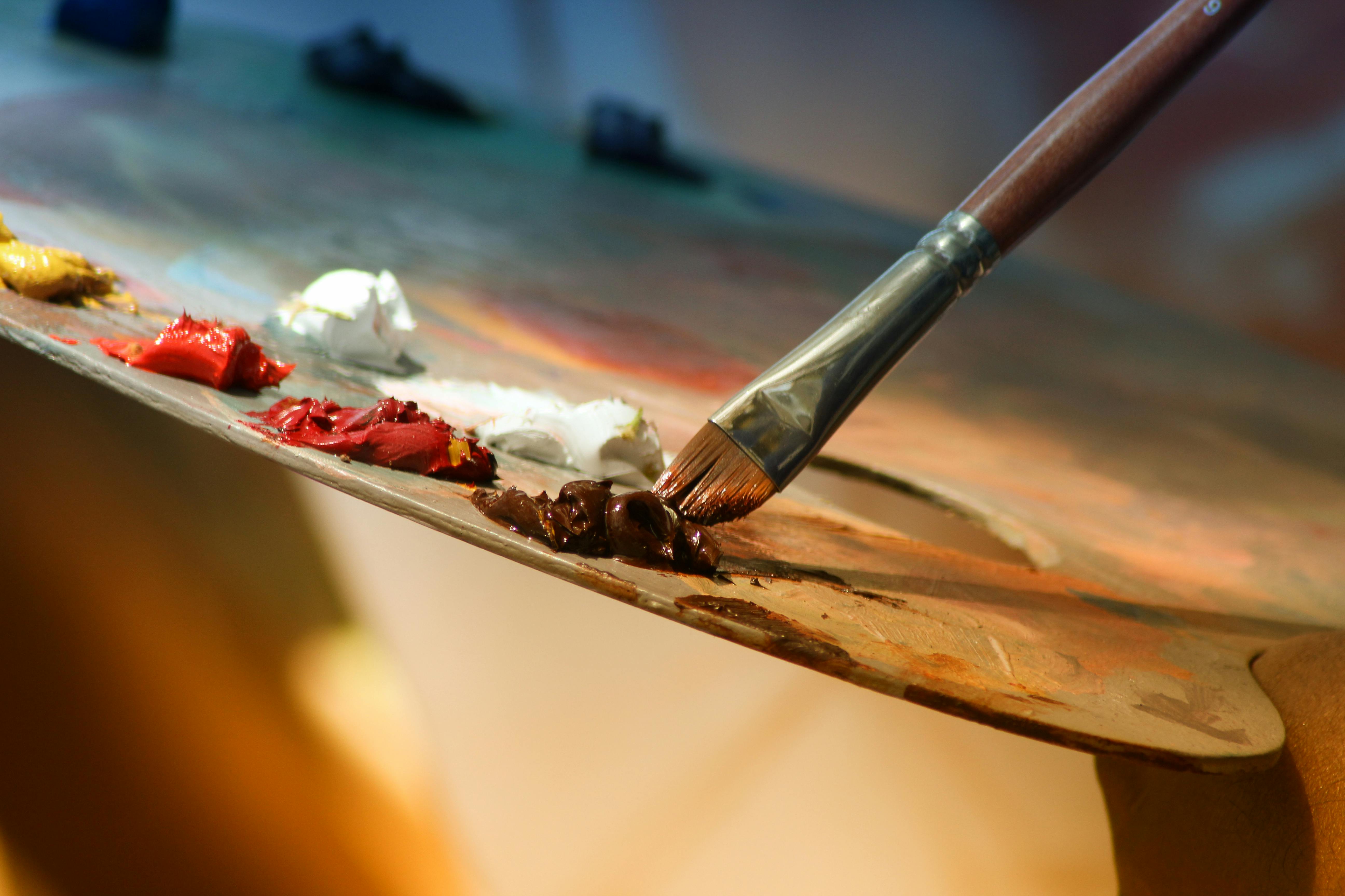
What's the difference between eclectic art curation and eclectic interior design?
Ah, a fantastic question! While they're closely related and often overlap, there's a subtle but important distinction. Eclectic interior design refers to blending various styles, periods, and origins within all elements of a room – furniture, textiles, decor objects, and yes, art. It's about creating a rich, layered environment where, for example, a Victorian armchair sits comfortably next to a mid-century modern coffee table, unified by color or texture. Eclectic art curation, on the other hand, specifically focuses on the thoughtful selection and arrangement of artworks from diverse styles and periods, often to be displayed within any given interior design style (though it shines brightest in eclectic interiors!). The principles we've discussed – color, theme, framing, visual weight – are primarily applied to the art itself, and then considered in relation to the surrounding decor. Think of it this way: a minimalist room can still have an eclectic art collection. However, a truly eclectic interior design will almost certainly feature an eclectic art collection as a natural extension of its varied aesthetic. Ultimately, both aim for a harmonious blend that tells a unique story, but art curation zeroes in on the visual dialogue between the pieces on your walls, while interior design expands that dialogue to the entire room.
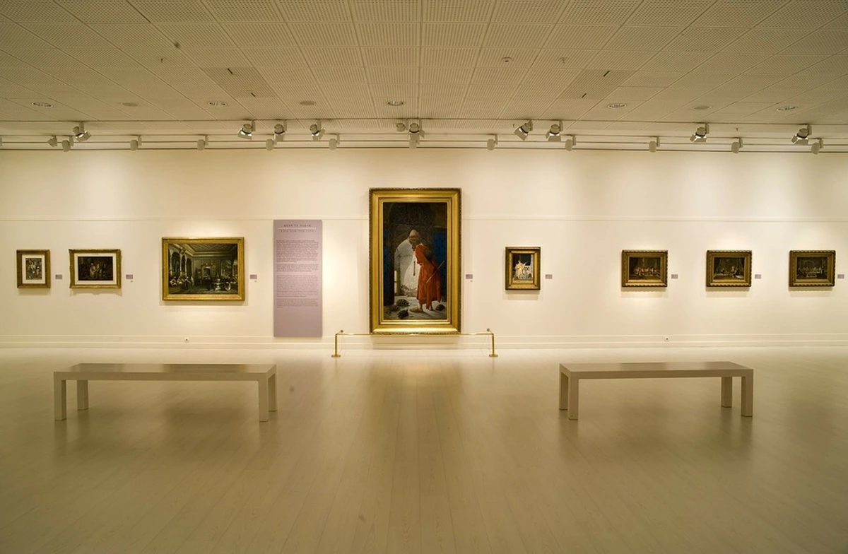
How do eclectic art pieces interact with furniture and decor?
Think of it as a grand conversation where everything has a role, but no one element shouts over the others. Eclectic art doesn't live in a vacuum; it dialogues with your furniture, textiles, and decorative objects. This extends to three-dimensional art too! A sleek modern sculpture might introduce a geometric line that echoes in a piece of abstract wall art, or an antique ceramic vase could inform the color palette of a nearby painting. If your furniture is minimalist (perhaps in a minimalist interior), your art can provide the vibrant personality. If your decor is already quite maximalist (as discussed for eclectic interiors), art can either amplify that (through color, texture) or provide a visual pause (through simpler forms, neutral tones). The key is to look for overall visual equilibrium and conceptual bridges. For example, a vintage rug's color palette can inform your art choices, or a modern sculpture might introduce a geometric line that echoes in a piece of abstract art. The texture and material of your art can also dialogue with furniture upholstery, wood grains, or metallic accents, creating a rich sensory experience. It's a symbiotic relationship, each element enhancing the story the other tells.
What is 'found art' or 'outsider art' and how does it fit into an eclectic collection?
Found art (or objet trouvé) refers to everyday objects presented as art, often with little or no modification. Think of Marcel Duchamp's urinal (his "Fountain"), or a beautifully weathered piece of driftwood, an old architectural sign, or a vintage tool thoughtfully displayed. Outsider art (or art brut) describes works created by self-taught artists, often outside the conventional art world and academic training, such as the intricate narratives of Henry Darger or the compelling folk art of Grandma Moses. Both offer a raw, uninhibited authenticity that can provide incredible depth and unexpected juxtapositions in an eclectic collection. A piece of found art can act as a tactile counterpoint to a slick contemporary print, while an outsider art piece, with its unfiltered expression, might spark a profound dialogue with a more formally trained abstract painting. They challenge our perceptions of what 'art' is and where it comes from, enriching your collection with unique stories and unconventional beauty. They inject a sense of discovery and a rejection of academic rigidity, making your collection feel more personal and less prescriptive. The key is, as always, emotional resonance – if it speaks to you, it belongs.
Should I restore or revamp inherited art to fit my eclectic style?
This is a fantastic question, especially if you have inherited pieces that don't quite align with your current aesthetic. My take? Absolutely, but with careful consideration. Sometimes, all an older piece needs is a new frame to transform its character. A heavy, ornate painting might feel dated in its original gilded frame, but placed in a sleek, modern black or natural wood frame, it can take on a surprisingly fresh, contemporary appeal. This is a simple, non-invasive way to bridge stylistic gaps, often referred to as "framing as restoration." For more extensive revamping, like altering a painting itself, I'd proceed with caution, especially if the piece holds significant historical or monetary value. Always consult a professional conservator before attempting any major changes. However, for less valuable or purely sentimental pieces, experimenting with minor repairs or even a subtle repainting can breathe new life into them, allowing them to truly integrate into your evolving eclectic narrative. Sometimes, embracing the 'worn' or 'unfitted' look of an inherited piece, rather than altering it, can also lend itself to the