The Art of Intentionality: Make Your Art Prints Look Incredibly Expensive
Unlock museum-quality art at home! Discover expert strategies on archival prints, smart framing, custom matting, perfect placement, and strategic lighting to transform your collection. Curate your space with intention.

The Art of Intentionality: How to Make Your Art Prints Look Incredibly Expensive (Without Breaking the Bank)
Let me be honest with you. For a long time, I was that art snob, the kind who believed true art demanded a hefty price tag and a unique origin. My bank account, bless its digital heart, eventually staged a very firm, very necessary intervention. "Zen," it gently reminded me, "you can't afford a new original every month, but your walls still deserve to sing!" It was a moment of humbling clarity.
So, I pivoted. My mission became a kind of design alchemy: how can I take that $30 print I adore and make it look like it cost $3,000? While it might seem like 'smoke and mirrors,' it's truly about intentionality and thoughtful presentation. It's about giving the art the respect it deserves, curating your space, and creating focal points that genuinely elevate your home. It’s about understanding that a print isn’t merely a reproduction; it’s an art form in itself, deserving of careful display and often an artistic statement in its own right. And trust me, I've gotten pretty good at this game. You can too. This isn't just about pinching pennies; it's about unlocking the true potential of accessible art, transforming it into something truly priceless. The journey from art snobbery to smart collector taught me that the true magic isn't just in the original brushstroke, but in the intentionality behind how that art is brought into our lives and spaces. Now, let’s dive into what truly makes a print command attention.
The Unseen Foundation: Unlocking Value Through Print Quality
Look, I’ve tried to polish a… well, you get the idea. A truly high-quality print is the bedrock of perceived value. All the framing magic in the world works best when you start with a decent foundation. It’s the first, non-negotiable step in creating that sophisticated, expensive look. Without it, you’re just putting lipstick on a pig (and I’ve been there, trust me, it’s not a good look for the pig or the print). This isn't just about technical specifications; it's about the innate human response to quality. We instinctively assign higher value to things that feel well-made, carefully crafted, and visually rich. Historically, the fidelity and rarity of an artwork's reproduction directly impacted its perceived worth, a truth that echoes even in our digital age. But before we dive into presentation, let's talk about what makes a print inherently valuable – its foundation.
Print Type Matters: From Ancient Woodcuts to Archival Inkjet
Not all prints are created equal, and understanding their lineage adds a layer of appreciation. From the earliest forms of printmaking, artists have sought to replicate and distribute their work, democratizing access to art long before the digital age. Techniques like woodcuts and etchings were revolutionary, allowing images and ideas to spread beyond aristocratic circles, profoundly impacting artistic movements and even challenging censorship. Each historical method carries its own artistic intent and texture. I remember seeing a Dürer woodcut once, and the sheer detail and texture from such an old technique were breathtaking – it made me realize the power of the medium itself. The bold lines of a woodcut, for example, can still inspire the stark graphics of a contemporary digital piece, while the delicate detail of an etching might inform a modern line drawing. It’s about understanding the artistic DNA behind the print. It's also crucial to distinguish between an artist's print, where the artist created the image specifically for the print medium (like Dürer's woodcuts, Picasso's linocuts, or Warhol's silkscreens), and a reproductive print, which is simply a copy of an existing painting or artwork. Artist's prints generally hold higher artistic and collector's value. For a deeper dive, check out The Definitive Guide to Archival Printmaking Techniques.
Technique  | Principle | Key Artists & Impact | Aesthetic | Contemporary Echoes |
|---|---|---|---|---|
| Woodcut | Relief printing: Image is carved into a block of wood, with non-image areas cut away. Ink is applied to the raised surface. | Albrecht Dürer (15th c.) made art accessible beyond nobility. Hokusai (19th c.) perfected multi-color Japanese woodblock prints, influencing Impressionism. | Bold lines, strong contrasts, often a tactile, raw quality. | Graphic design, linocut art, bold illustrations. |
| Intaglio | Incised printing: Image is incised into a metal plate (copper, zinc) using various tools or acid. Ink sits in the grooves. | Engraving: Direct cutting. Etching: Acid corrosion (e.g., Rembrandt). Allows for fine detail and rich tonal range. | Delicate lines, intricate detail, velvety darks. | Fine line tattooing, detailed digital illustrations. |
| Lithography | Planographic printing: Image drawn on a stone or metal plate with a greasy crayon. Based on oil & water repulsion. | Alois Senefelder (18th c.) invented it. Henri de Toulouse-Lautrec (19th c.) popularized for posters, democratizing art advertising. | Painterly quality, subtle gradations, vibrant colors. | Modern posters, advertising, digital painting. |
| Offset Lithography | Modern industrial version of lithography, image transferred from plate to rubber blanket, then to paper. | Dominant commercial printing method. Allows high-volume, high-quality mass production of posters, books, and prints. | Sharp, consistent, high-fidelity reproduction. | Virtually all mass-produced prints, books, magazines. |
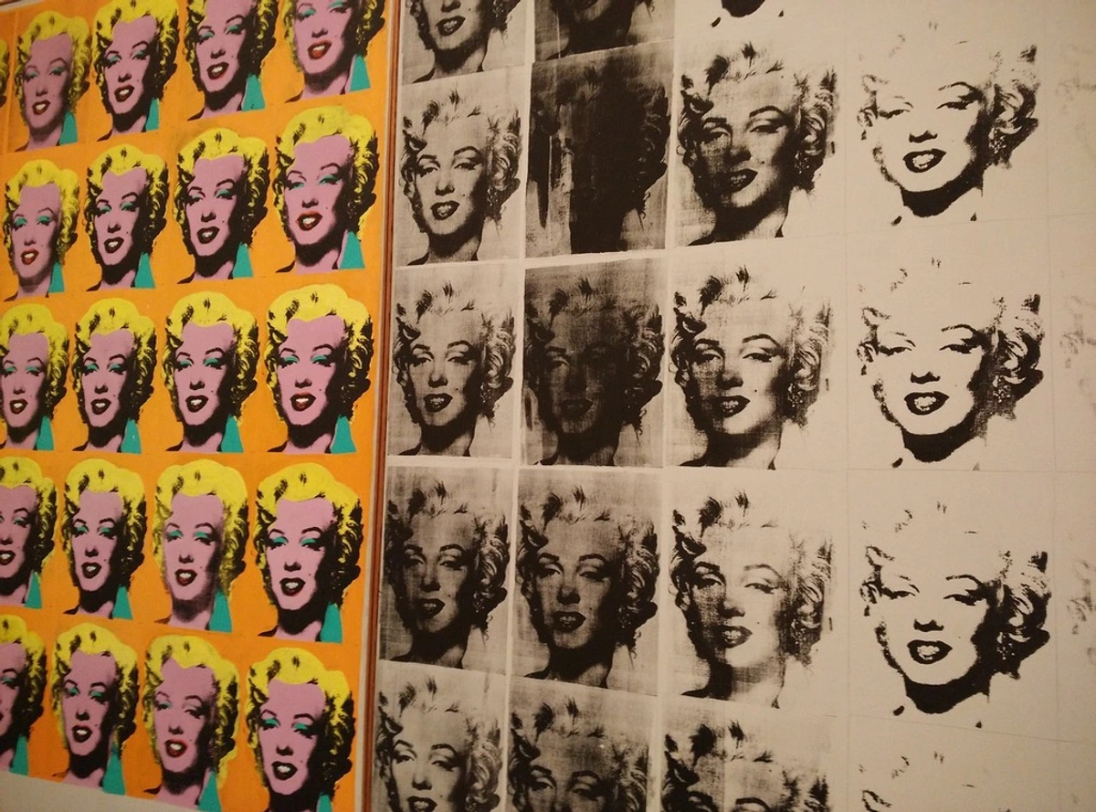
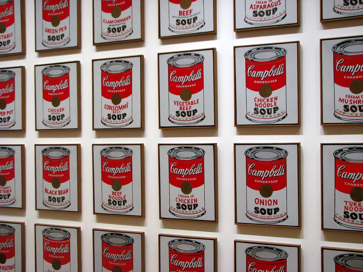
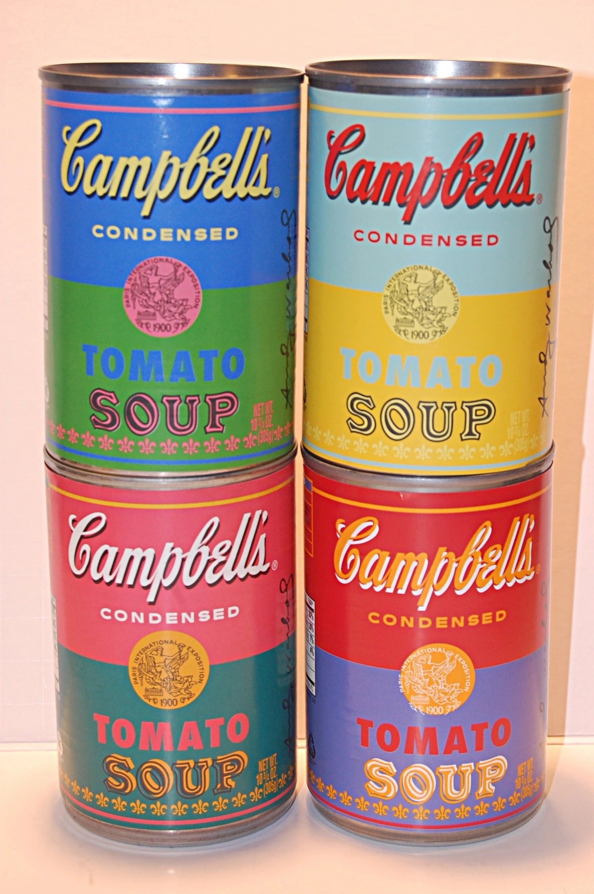
| Screen Printing (Serigraphy) | Stenciling: Ink is forced through a mesh screen onto a substrate, except where a stencil blocks it. | Andy Warhol (20th c.) revolutionized fine art with silkscreen, making pop art accessible and questioning originality. | Bold colors, strong graphic lines, flat areas of color. Can have a slight texture. | T-shirt design, concert posters, fine art prints, street art. |
While these historical techniques laid the groundwork, the landscape of printmaking has exploded with innovation in the digital age. Today, fine art reproduction also encompasses advanced digital methods, ensuring longevity and stunning fidelity. Here are some common types, including new frontiers in printing on various surfaces:
Technique | Principle | Key Applications & Impact | Aesthetic | Surface Variety |
|---|---|---|---|---|
| Giclée Printing | High-quality inkjet: Fine art reproduction using pigment-based inks and archival substrates. | Favored for fine art reproductions, photography, digital art. Widely accessible, museum-quality. | Exceptional detail, vast color gamut, smooth tonal transitions. | Paper, canvas, sometimes specialized fabric. |
| Dye-Sublimation | Heat transfer: Dyes are infused into a substrate (often metal or fabric) using heat and pressure, turning into a gas. | Metal prints (aluminum), fabric banners, custom textiles. Durable, vibrant, scratch-resistant. | Luminous, high-gloss finish, incredible depth and color vibrancy. | Metal (aluminum), fabric, ceramics. |
| UV Printing | Direct-to-substrate: UV-curable inks are printed directly onto various materials (wood, acrylic, glass) and cured instantly with UV light. | Art on unconventional surfaces, signage, custom decor. Extremely versatile and durable. | Raised texture possible, matte or glossy finish, excellent outdoor durability. | Wood, acrylic, glass, metal, stone. |
| Photographic Prints (C-Prints/Lambda) | Light exposure: Traditional photographic paper exposed to light, then chemically processed. | High-end photo reproductions, often for galleries or collectors. | Continuous tone, rich colors, distinct photographic feel. | Photographic paper (glossy, matte, lustre). |
The Magic of Giclée: Not Your Average Inkjet
If you're aiming for that 'expensive' look, you'll often hear about giclée prints. I know the term sounds fancy, almost intimidating, but it just refers to a high-quality inkjet print. The word 'giclée' itself is French for "to spray" – a direct reference to the printer nozzle. So, what truly sets a giclée apart from your average home printer output? It's all in the details and the deliberate choice of materials, a meticulous process that ensures longevity and fidelity:
- Archival Pigment-Based Inks: This is a huge differentiator. Unlike cheaper dye-based inks (often found in home printers) that can fade significantly in a matter of years (think of them like food coloring that stains but can wash out, or a cheap T-shirt that loses its vibrancy after a few washes), giclée prints use pigment-based inks. These pigments are more stable, less reactive, and offer superior lightfastness, meaning they resist fading for 100+ years under proper display conditions. This is critical for longevity and color integrity. Your colors will remain vibrant, true, and rich for generations. Different brands and formulations of pigment inks also offer varying levels of longevity and color gamut, with some premium options surpassing others.
- Archival Substrates: The paper or canvas used is also archival, meaning it's acid-free and lignin-free. Acids and lignins are natural compounds that cause yellowing, brittleness, and degradation over time. Archival substrates ensure your print's foundation remains stable and pristine.
- High-Resolution & Color Accuracy: Giclée printers boast incredibly high resolution, a vast color gamut (meaning a wide range of reproducible colors), and microscopic ink droplet sizes. This allows for phenomenal detail, smooth tonal transitions, and color fidelity that precisely captures the nuances of the original artwork. It's not just a copy; it's a meticulously crafted reproduction where the artist's vision is faithfully translated. When I work with a printer, we spend hours ensuring the ICC profiles are perfectly calibrated – this is crucial for getting the colors from my digital files to match the final print. Without good color management, even the best printer won't give you the desired result.
You can dive deeper into what makes these prints so special in our article, What is a Giclée Print or Understanding Giclée Prints for Collectors. When you choose a giclée, you'sre not just buying a picture; you're investing in a piece that holds its visual integrity for generations. Some giclées even get a special varnish or coating to enhance their finish or add texture, further elevating their appearance and protection.
Paper Quality: The Unsung Tactile Hero of Sophistication
Once you've chosen your print medium, the canvas it lives on – the paper – plays an equally vital role in its perceived value and tactile appeal. This is where a lot of prints fall short, instantly giving away their budget origins. I've lost count of the times I've held a beautiful print on flimsy, almost glossy cardstock and felt that immediate deflation. It's like trying to serve gourmet food on a paper plate! I remember holding up two prints side-by-side once: one on thin, generic paper, the other on a substantial cotton rag. The difference in how they felt in my hands was immediate and profoundly impacted my perception of the artwork's value. The cotton rag felt almost velvety, with a reassuring weight that immediately told my brain: "this is important." It was an 'aha!' moment for me.
Look for prints on thick, archival-quality paper with a bit of texture. A heavy, fine art paper feels substantial in your hand and under glass, instantly conveying quality. We're talking papers often ranging from 250 GSM to 350 GSM – that's grams per square meter, a measure of paper's weight and thickness. Think about the difference between a flimsy magazine page (around 90-120 GSM) and a weighty, luxurious art book page (200+ GSM) – that's the feeling you're after. A higher GSM means a more robust, luxurious feel, less likely to ripple or buckle within a frame, and a better surface for ink absorption. Some specialized fine art papers can even go beyond 400 GSM, offering an almost board-like rigidity and a truly luxurious heft, though these might require slightly more robust framing techniques.
Different paper types and their textures can dramatically influence the print's perceived value and the way light interacts with the image:
Paper Type | Characteristics | Best For | Visual/Tactile Effect |
|---|---|---|---|
| Cotton Rag | Made from 100% cotton fibers. Exceptionally durable, stable, and acid-free. Often very soft, with a subtle texture or smooth finish. | Fine art reproductions, photography, any piece where longevity is paramount. | Luxurious, supple feel; rich, deep colors; often a subtle, natural 'velvet' or smooth texture, or a gently pronounced surface tooth. |
| Alpha-Cellulose | Wood pulp purified to remove acids and lignins. A more affordable archival option than cotton rag. | High-quality prints where budget is a consideration but archival standards are still desired. | Good print fidelity, often smooth or slightly textured, excellent color reproduction. Can have a naturally brighter or warmer tone depending on the pulp. |
| Cold-Press | Textured surface (often described as having a 'tooth'). Can range from fine to pronounced texture, similar to watercolor paper. | Watercolors, broad-stroke paintings, illustrations seeking a classic, painterly feel. | Adds depth and character, diffuses light softly; colors can appear slightly muted or richer due to the texture. |
| Hot-Press | Smooth, often slightly glossy surface, with a notable lack of texture. | Fine detail, sharp lines, crisp photography, minimalist designs, digital art. | Enhances sharpness and clarity, allows for vibrant, precise colors without interference from surface texture. |
| Photo Rag | A popular type of cotton rag paper, specifically designed for photographic and fine art reproduction. | Black & white photography, detailed color images, pieces requiring exceptional tonal range. | Ultra-smooth or subtly textured, excellent D-Max (deepest achievable blacks) and color accuracy, often with a neutral white point. |
| Baryta Paper | Traditional photographic paper base, often with a barium sulfate coating, offering deep blacks and a subtle sheen. | High-end black and white photography, rich color saturation, classic photographic aesthetic. | Combines the depth of matte with the richness and subtle reflectivity of gloss, providing a luxurious, timeless feel. |
This isn't just about durability; it's about the entire sensory experience of the art, inviting you to connect with it on a deeper level. The subtle variations in a paper's natural brightness or warmth can also profoundly influence how an artwork's colors are perceived. A naturally warm paper, for instance, can make a portrait feel more inviting, while a bright neutral white offers a clean canvas for punchy modern graphics. Some papers achieve a brighter white with optical brighteners, which can look stunning but might subtly affect long-term archival stability compared to naturally white, unbleached papers, potentially yellowing over extreme durations.
The Finish Line: Matte, Satin, or the Pitfalls of High-Gloss
The surface finish can make or break the illusion. A high-gloss surface, while vibrant, can create distracting glare, show fingerprints easily, and often feels a bit too much like a standard photograph, detracting from the 'fine art' aesthetic. It can make a print feel less considered, more commercial. When light softly diffuses across a matte or satin surface, it creates an elegant understated glow that screams 'museum piece.' A subtle texture adds depth and warmth, inviting the eye to linger. It feels less commercial, more considered.
Finish Type | Characteristics | Aesthetic Impact | Best For | What to Avoid |
|---|---|---|---|---|
| Matte | Non-reflective, absorbs light. | Sophisticated, gallery-like, understated elegance. Creates depth. | Painterly prints, abstract art, black & white photography, any piece desiring a soft, diffused look. | Can make some very dark or vibrant colors appear slightly less saturated. |
| Satin / Semi-Gloss | A very subtle sheen, a middle ground between matte and gloss. | Offers more vibrancy than matte without harsh glare. Elegant and versatile. | Photography, prints with a mix of light and dark tones, modern illustrations. | Can still show some reflections in direct, strong light. |
| Eggshell | Slightly less sheen than satin, with a delicate, almost imperceptible texture. | Soft, warm, very subtle luster. Feels luxurious and high-quality. | Any print that benefits from a natural, warm feel; traditional or contemporary. | Not ideal if absolute maximum color pop or stark contrast is desired. |
| High-Gloss | Highly reflective, shiny surface. | Intense color saturation, sharp detail, high contrast. | Posters, commercial prints, some vibrant digital art. | Distracting glare, fingerprints, often looks less 'fine art' and more 'standard photograph'. |
Conservation-Grade Materials: Protecting Your Investment from Day One
While we'll talk more about frames, remember that preservation starts with the print itself. Ensuring all materials touching your print are acid-free is crucial. Why? Because acids in paper and board cause them to break down over time, leading to yellowing, embrittlement, and direct damage to your print – much like how old newspaper becomes brittle and discolored. This means the backing board (the material directly behind it within the frame) and the mat board. Acid-free materials prevent this degradation, actively safeguarding against deterioration.
For truly valuable or sentimental pieces, seek out museum-quality or conservation-grade mat board and backing. These are typically made from 100% cotton fibers, are pH neutral or buffered, and have passed rigorous photographic activity tests (PAT). The key difference? Conservation-grade goes beyond simply being acid-free; it's designed to actively protect the artwork from environmental acids and has greater longevity and stability. These are materials tested and approved by museum conservators. This attention to detail isn't just about extending the life of your art; it subtly signals a higher standard of care and quality from the very beginning, ensuring a happy ever after for your treasured pieces and making them more attractive to future collectors or inheritors.
The Allure of Limited Editions and Certificates of Authenticity
If you truly want to boost the perceived value and collectibility of your prints, seek out limited-edition prints. These are prints produced in a finite, predetermined number, often decided upon by the artist. A pencil signature from the artist and an edition number (e.g., 14/100) instantly add layers of authenticity and value. It tells a story: this isn't just a print, it's this specific print, personally approved by the artist within a defined series. This contributes significantly to its provenance – the documented history of ownership, which adds immense value in the art world. Edition sizes can vary wildly, but generally, smaller editions (e.g., 50 or 100 copies) are considered more valuable than larger ones. While prints generally don't appreciate like original paintings (and I'm very skeptical of promises of 'art as investment' for most accessible prints), a truly sought-after limited edition by an emerging or established artist can increase in value over time, especially if the artist's career flourishes.
There's also a stark difference between an artist's signature and a publisher's or gallery's signature. Always prioritize the artist's direct involvement for maximum perceived value. Then there are other special types of editions that add to the allure and scarcity:
Edition Type | Description | Collectibility Impact |
|---|---|---|
| Limited Edition | Finite, predetermined number of prints, often signed and numbered by the artist. | Highest perceived value; scarcity drives demand. |
| Open Edition | Unlimited number of prints, can be reproduced indefinitely. | Generally lower perceived value; readily available. |
| Artist's Proof (AP) | Traditionally, 10-15% of the edition, reserved for the artist. Often marked 'AP' or 'E.A.' (Épreuve d'Artiste). | Highly sought after for direct connection to artist; can be more valuable than regular edition. |
| Hors Commerce (HC) | French for "before trade," historically used as samples for galleries. Marked 'H.C.'. | Rarer than main edition, sometimes equally or more valuable due to scarcity. |
| Printer's Proof (PP) | Reserved for the master printer. Marked 'PP' or 'P.P.'. | Similar to APs in scarcity and connection to creation process; often highly collectible. |
If you have a signed, limited-edition piece, ensure your mat window is cut specifically to show off that precious signature and edition number. It's a detail that screams 'collector's item.' Furthermore, always look for a Certificate of Authenticity (COA). This document, often signed by the artist or gallery, verifies the print's origin, edition number, materials, and creation date, adding crucial provenance and perceived value. It’s your print’s birth certificate, confirming its legitimacy and place in art history.
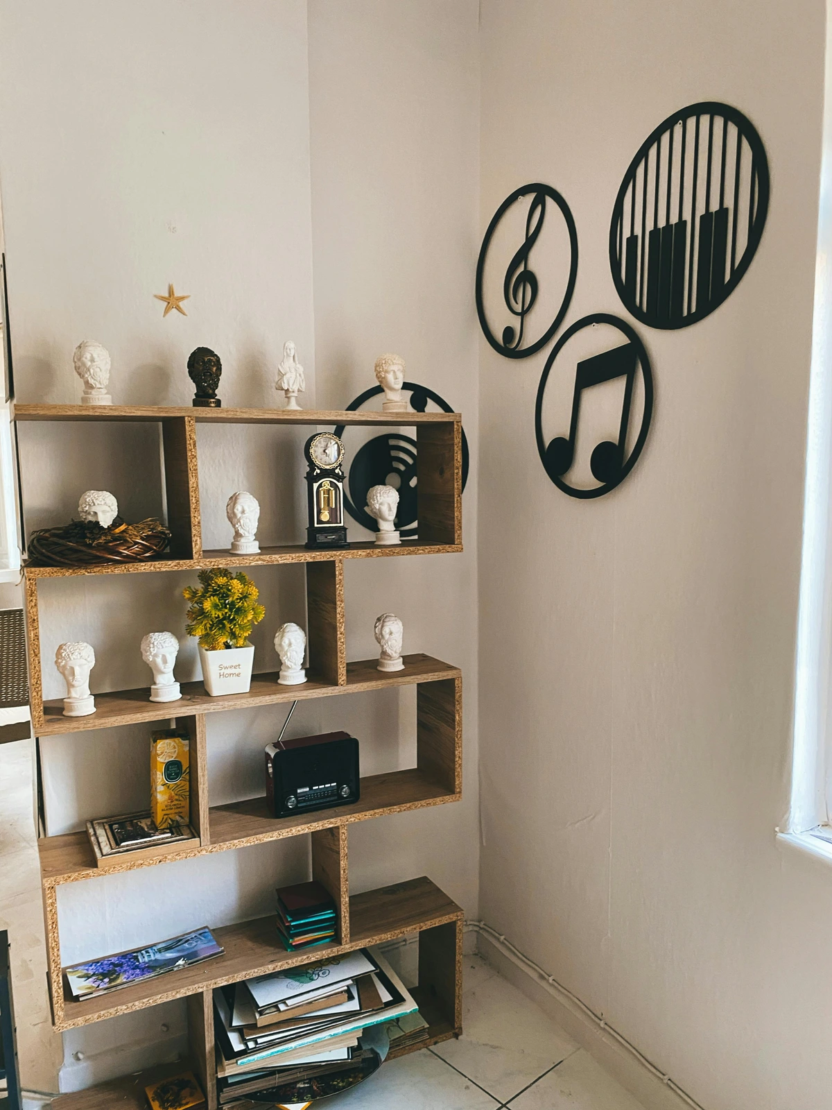
The Frame: Your Art's First (and Most Impactful) Impression
Once you have a print that is a testament to quality, the next crucial step is its housing – the frame that will introduce it to your space. If there's one secret I could whisper in your ear, one piece of advice that will change your art presentation forever, it's this: the frame is everything. Seriously, it's the single biggest, most impactful change you can make. The frame is to the print what a perfectly tailored suit is to a person—it changes the entire presentation. A flimsy, plastic frame screams 'bargain bin' from across the room. A solid, well-chosen frame, on the other hand, whispers 'gallery-quality' with quiet confidence. It sets the stage, drawing the eye in and defining the art's perceived boundaries and value.
Custom vs. Off-the-Shelf: Navigating the Investment
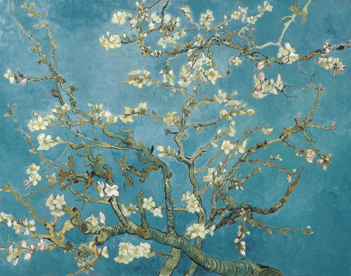
Let's be real, custom framing can be pricey. I know what you’re thinking: sometimes it costs many times more than the print itself! For a while, that stopped me cold. I even resisted it, thinking it was an unnecessary extravagance. But then I spoke with a framing expert who completely changed my perspective – seriously, my mind was blown. You can read some of his wisdom in our Q&A with an expert art framer. He explained that custom framing isn't just about the wood and glass; it's about preservation, perfect proportions, and choosing materials like conservation-grade, UV-protective glass that shield your art from harmful UV rays and environmental damage. Why is UV protection so important? UV rays cause colors to fade irreversibly over time, and they can also degrade the paper fibers, making the print brittle and yellow. Think of how sunlight damages old photographs or fabrics left in a window – the same happens to your art. For a piece you truly love, one that will be the focal point of a room and stay with you for years, it's an investment that pays dividends in longevity and perceived value. It’s a commitment to the artwork, elevating it beyond a mere decoration to a cherished heirloom.
credit, licence
So, when is custom framing truly indispensable?
- Irreplaceable or Valuable Art: Originals, rare limited editions, or highly sentimental pieces warrant the superior protection and bespoke fit of custom framing.
- Unusual Sizes or Shapes: If your print has non-standard dimensions, an off-the-shelf frame simply won't work without unsightly gaps or excessive cropping.
- Complex Mounting Requirements: Floated art, multi-opening mats, or intricate shadow box displays are best handled by professionals.
- Specific Aesthetic Vision: Sometimes, you have a very particular look in mind that only a custom design can achieve.
But here’s the true alchemy: you don't have to go custom for every single piece. The real trick, the secret sauce, is to make off-the-shelf frames look custom. And I still can't believe how well this works!
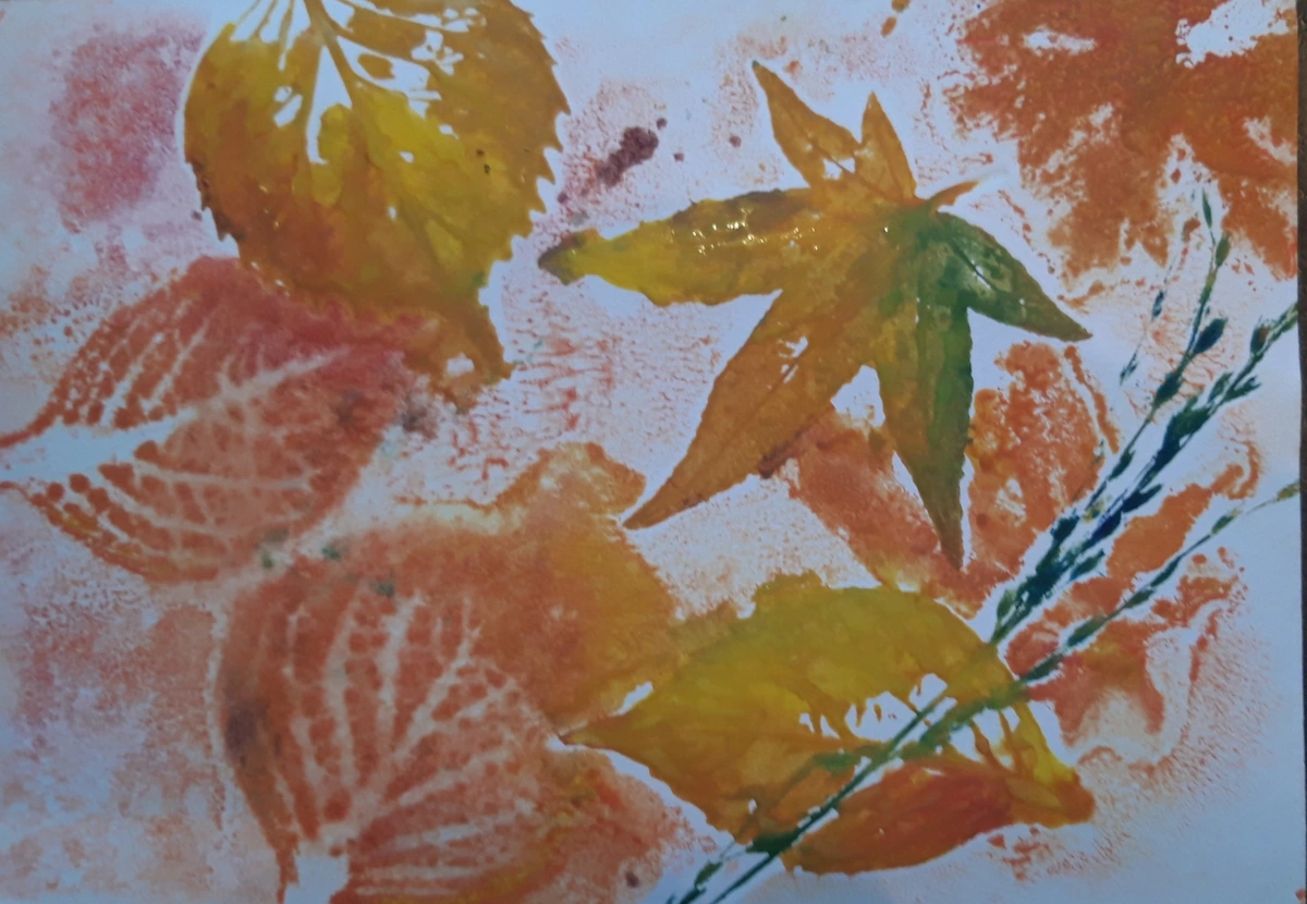
Making Affordable Frames Look High-End: My Top Hacks
credit, licence
- Choose Real Materials, Always: This is non-negotiable. Opt for frames made of solid wood or metal. Avoid plastic or MDF with a 'wood-look' laminate at all costs. The satisfying heft, the subtle variations in wood grain, the cool touch of brushed aluminum or antique bronze – these physical qualities make a subconscious difference in how the piece is perceived. It feels substantial because it is substantial. When I pick a frame, I'm thinking about the tactile experience as much as the visual. Different woods like warm oak, rich walnut, or stark black-stained ash each bring their own personality, as do metals like cool, brushed silver or an antique gold finish. Even the depth and width of the frame (frame profile) contribute to its perceived weight and importance, anchoring the artwork. For something truly unique, consider a floating frame for canvas art.Think about frame profiles too – these often get overlooked but are crucial for the overall aesthetic:
Frame Profile | Aesthetic | Best For | What to Avoid |
|---|---|---|---|
| Minimalist (Thin, Flat) | Sleek, understated, modern. Creates a clean border. | Contemporary abstract art, modern photography, minimalist designs. | Heavy, traditional, or very ornate pieces unless aiming for extreme contrast. |
| Minimalist (Wide, Flat) | Bold, modern, dramatic. Creates a strong, clean border and significant negative space. | Large-scale photography, abstract expressionism, contemporary graphic art, to make a small piece feel grand. | Delicate, intricate art that might be overwhelmed; very busy compositions. |
| Scoop / Reverse Bevel | Adds depth by angling inward towards the art, drawing the eye. | Enhances traditional landscapes, portraits, or to give depth to modern pieces. | Not as impactful for very thin prints or where a stark, flat look is desired. |
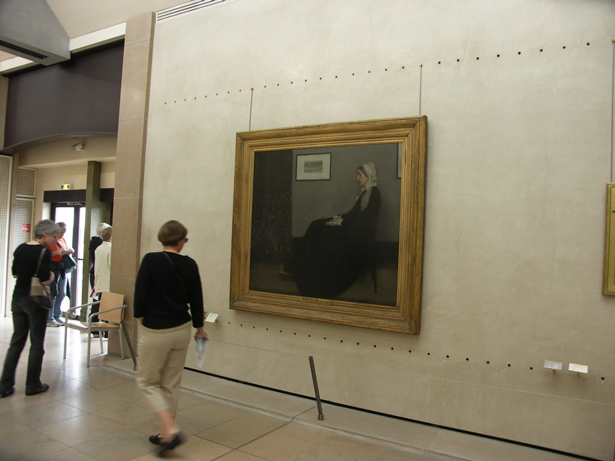
| Ornate (Gilded, Carved) | Grand, luxurious, classical, statement-making. | Classical prints, traditional portraits, or to add unexpected grandeur to minimalist abstracts (with caution!). | Modern, casual, or rustic interiors unless used intentionally for eclectic contrast. |
| Natural Wood (Wide, Flat) | Warm, organic, rustic, Scandinavian, Japandi. | Nature prints, minimalist art, textured pieces, interiors with earthy tones. | Highly formal or ultra-modern aesthetics if not carefully chosen. |
| Bargeboard | A simple, flat profile, typically wider than it is deep, often with a slight curve or bevel. | Scandinavian, Japandi, or rustic interiors; for canvas prints or slightly recessed paper art. | Overly ornate or delicate art styles; where a very deep profile is needed. |
| Floating Frame | Creates a visual gap between the artwork and the frame, making the canvas appear to "float." | Canvas prints (especially abstract or contemporary), pieces where the edge of the art is important. | Framed paper prints (requires different mounting), very traditional or ornate art styles. |
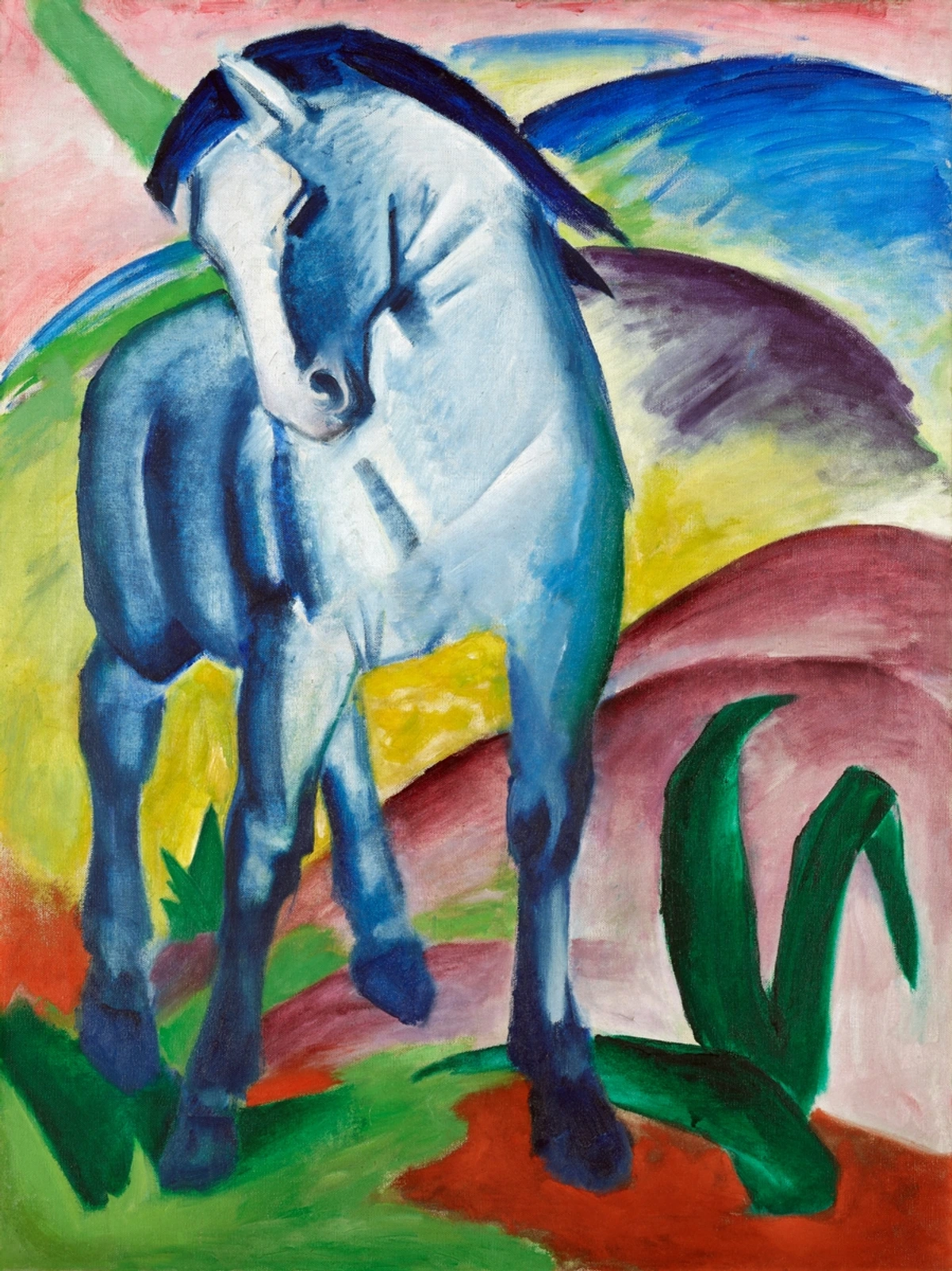
- Think Cohesively for Impact: If you're creating a gallery wall design, using the same style or color of frame, even from an affordable place like IKEA (and yes, I’ve done it, successfully!), creates a powerful, unified statement. This visual consistency elevates the entire collection, making disparate prints feel like a curated set, a deliberate installation. My mood board for my living room often starts with frame styles! For a collection of varied artworks, consider using all black, all white, or all natural wood frames for cohesion. Different framing styles can also complement different art movements – a simple black frame for a bold abstract, or a more ornate gilded frame for a classical portrait. You can learn more about arranging art in our guide how to arrange pictures on a wall.
- Size Up (Significantly) with a Mat: Never, ever just cram a print into a frame of the exact same size. This screams amateur. Instead, buy a frame that is much larger than your print. This leads us to the most important accompanying element of all: the mat.
- Upgrade the Glass (or Acrylic): Many inexpensive frames come with flimsy plexiglass or basic glass that can scratch easily or lack optical clarity. Head to a local frame shop and have them cut a piece of real glass, or even UV-protective glass, to fit your budget frame. It’s surprisingly affordable and makes a huge difference in clarity and feel. For ultimate protection, consider anti-reflective, museum-quality UV-protective glass – it's a splurge, but the way it makes the art pop without glare is truly stunning, making the glass almost invisible. This simple switch instantly elevates the whole package. (More on glass vs. acrylic in the FAQ!)
DIY Framing & Frame Reinforcement: Making the Most of Off-the-Shelf Options
Even if you're not going full custom, there are ways to elevate an affordable, off-the-shelf frame. I've found that sometimes, a cheap frame just needs a little extra love to look the part. For flimsy wood or MDF frames, you can discreetly reinforce the corners with small metal brackets or wood glue before assembly to give them more heft and stability. For frames that come with generic, thin backing, replace it with a thicker, acid-free foam core board. And, as mentioned, getting a custom-cut mat is the single biggest upgrade you can make to an otherwise standard frame, transforming it from basic to bespoke in an instant.
The Mat: The Unsung Hero of Presentation (It's Not Optional, Trust Me)
What's the one thing that instantly elevates a print from "nice picture" to "serious art"? It's the mat (or passe-partout, if you’re feeling fancy). And I'm going to say it again: it is not optional. Ever. I once had a small, lovely botanical print that looked utterly forgettable in a simple frame. But add a generous, thick mat, and suddenly it was transformed into a delicate, treasured specimen, commanding attention. A good mat can do more for a print than almost anything else. It's the visual equivalent of a deep breath before a grand statement.
Why is it so crucial? Because it provides visual 'breathing room' for the artwork, allowing the viewer's eye to rest and appreciate the details without feeling crowded. Imagine a singer without pauses; it’s just noise. A mat introduces that crucial quiet space. It draws the eye inward and gives the piece a sense of importance and deliberation. Suddenly, it's not just a picture on the wall; it's an exhibited piece of art, commanding attention and respect through the thoughtful use of negative space. And here’s a pro tip: the window of the mat is the display area (what you see), while the print itself has its own print size. Always measure the display area you want to show, not just the print.
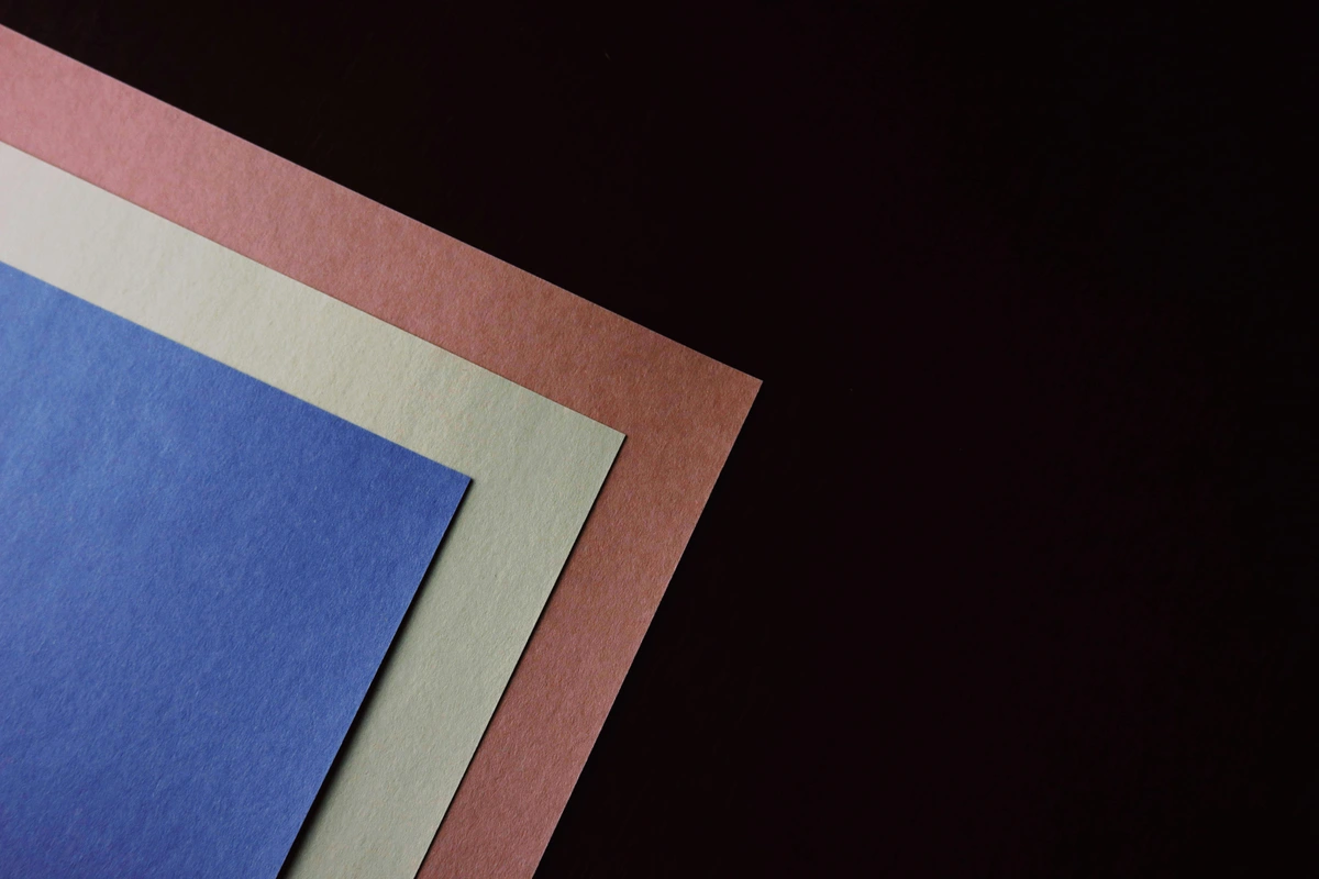
Here’s why the mat makes all the difference, and how to get it right:
Mat Feature | Why It Looks Expensive | Pro Tip |
|---|---|---|
| Generous Sizing | A wide mat (think 3-5 inches or even more for larger pieces) signals luxury and confidence. It implies the artwork is valuable enough to warrant such space, allowing the art to float majestically within the frame. Standard, flimsy mats found in cheap frames just don't offer this visual quietude. For truly balanced proportions, consider researching the Golden Ratio in matting, where the bottom margin is slightly wider (approx. 1.618 times) than the top and sides. This simple principle, often used in classical art and design, creates a classical, visually pleasing effect, making the art feel 'grounded' and preventing it from appearing to slide down within the frame. | Buy a frame much larger than your print and have a custom mat cut. This is the cheapest way to get a truly custom, high-end look. When measuring, always measure the visible art area you want to show, not just the print size. |
| Color Choice | Crisp white or off-white is classic, timeless, and almost always works. It creates a neutral boundary that lets the art speak for itself. For a bolder, more modern statement, try a black mat for high contrast, particularly effective with black and white photography or minimalist art. For something truly sophisticated, choose a subtle colored mat that picks up a nuanced hue from within the artwork itself – perhaps a deep emerald green for a dramatic portrait with green undertones, or a muted terracotta for a serene landscape. Consider 'conservation white' (typically acid-free and buffered, with a slightly warmer, more natural tone) vs. 'bright white' (often pure white, using optical brighteners, crisp but can feel sterile). | Don't be afraid to experiment, but when in doubt, white or off-white is your safest, most elegant bet. For museum-quality, opt for 100% cotton rag mat board – it's acid-free, lignin-free, and thicker, offering superior protection and resilience against environmental pollutants. |
| Beveled Edge | The subtle 45-degree angle on the inner edge of the mat creates a delicate shadow line that adds depth and a professional finish. It's a hallmark of quality framing, a small detail that makes a huge visual impact, drawing the eye directly to the art itself. This little detail truly separates the amateurs from the pros. | This is a standard feature on custom-cut mats and instantly elevates the presentation. Ensure your custom mat cutter offers this standard service. |
| Mounting | How the print is attached behind the mat is crucial for its longevity and presentation. Proper archival mounting ensures the print doesn't buckle or shift, and can be removed without damage, a crucial aspect of preservation. | Use archival-quality linen tape hinges (T-hinges or V-hinges) to attach your print to the backing board, allowing it to expand and contract naturally without stress. Avoid dry mounting for any valuable or sentimental pieces, as it's an irreversible process that glues the art permanently to a board (often with heat), potentially damaging inks and paper, causing ripples, and destroying its future value and making restoration incredibly difficult. For very small, lightweight prints, archival glue dots can also be used, but always ensure they are removable and acid-free. |

Setting the Scene: Size, Placement, and the Power of Light
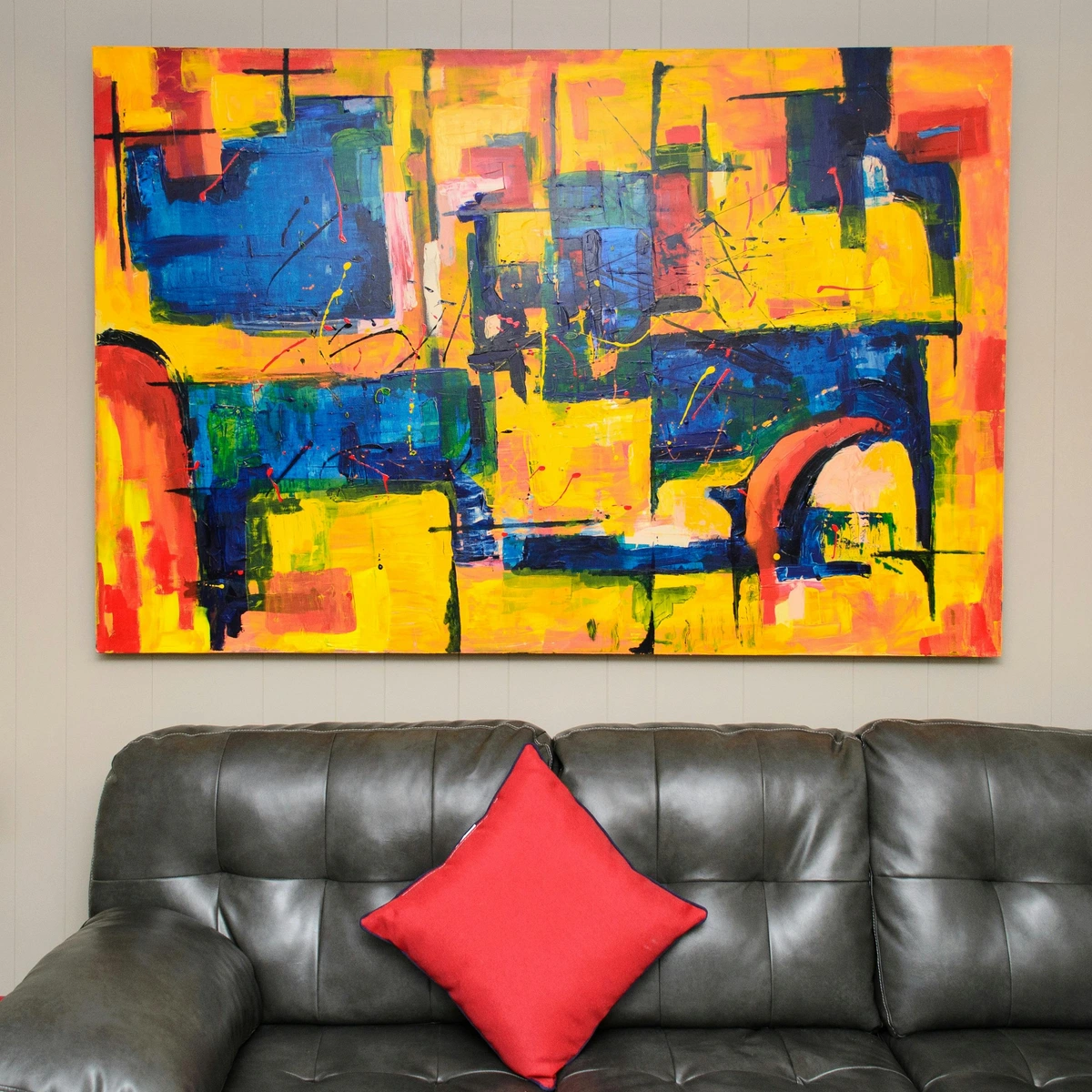
You've painstakingly chosen the perfect print, frame, and mat, but even the most beautifully presented print can look lost and insignificant if it's just stuck randomly on a vast, empty wall. This is where your inner curator truly shines. The final pieces of the puzzle—scale, thoughtful placement, and strategic lighting—are what truly integrate your art into your space, transforming it from mere decoration to a focal point that commands attention and tells a story. I once hung a stunning abstract print above my sofa, only to realize later it looked like a postage stamp on a billboard. Learning these rules changed everything for me. It transformed my space, and honestly, my relationship with art itself.
Masterful Placement: Where and How to Hang
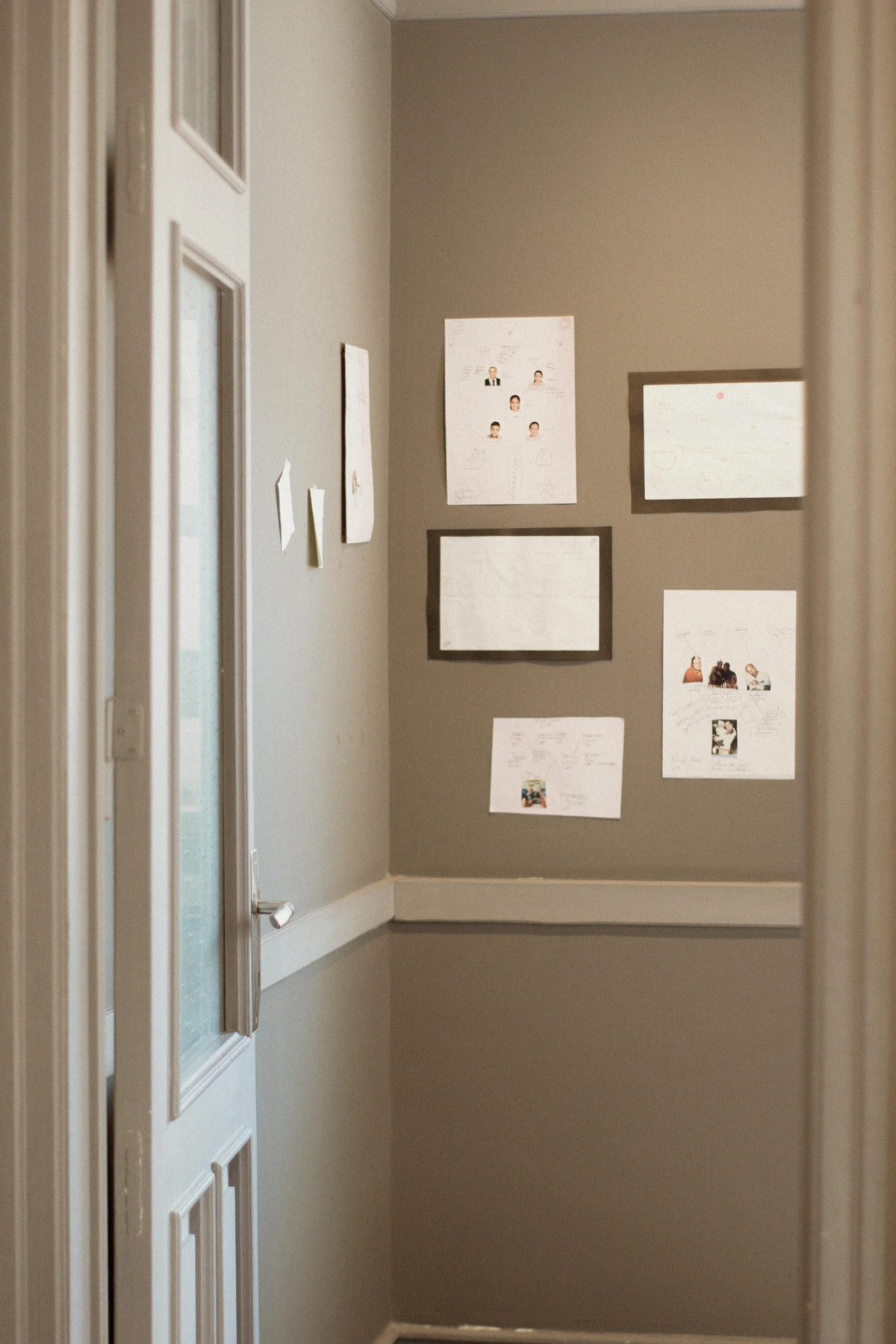
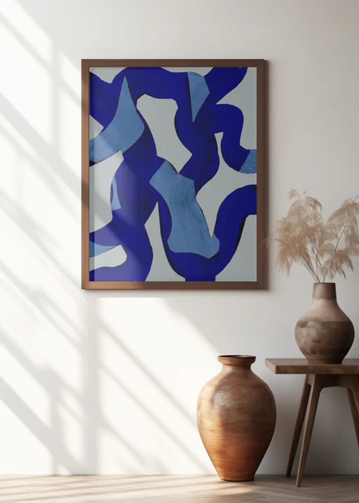
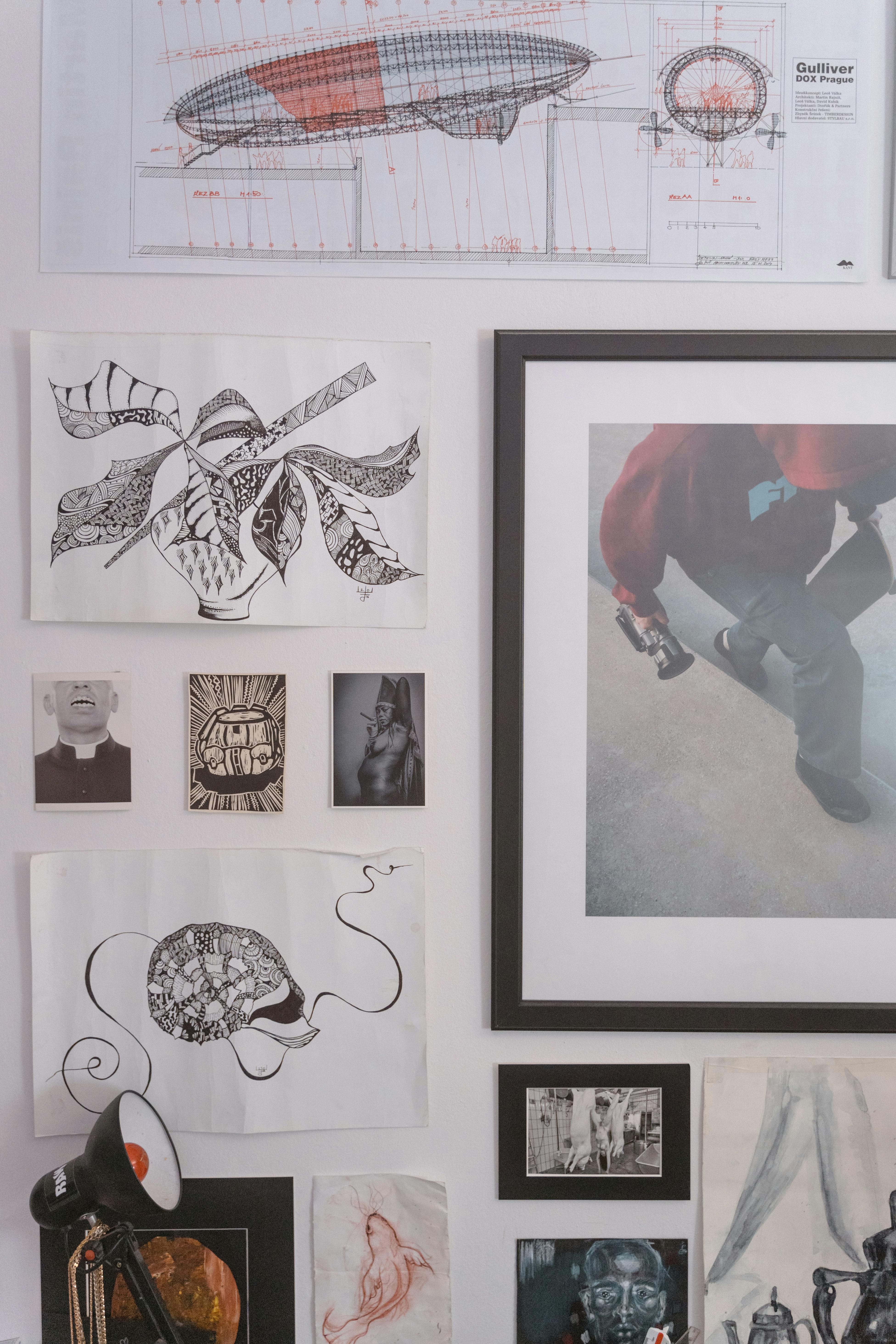
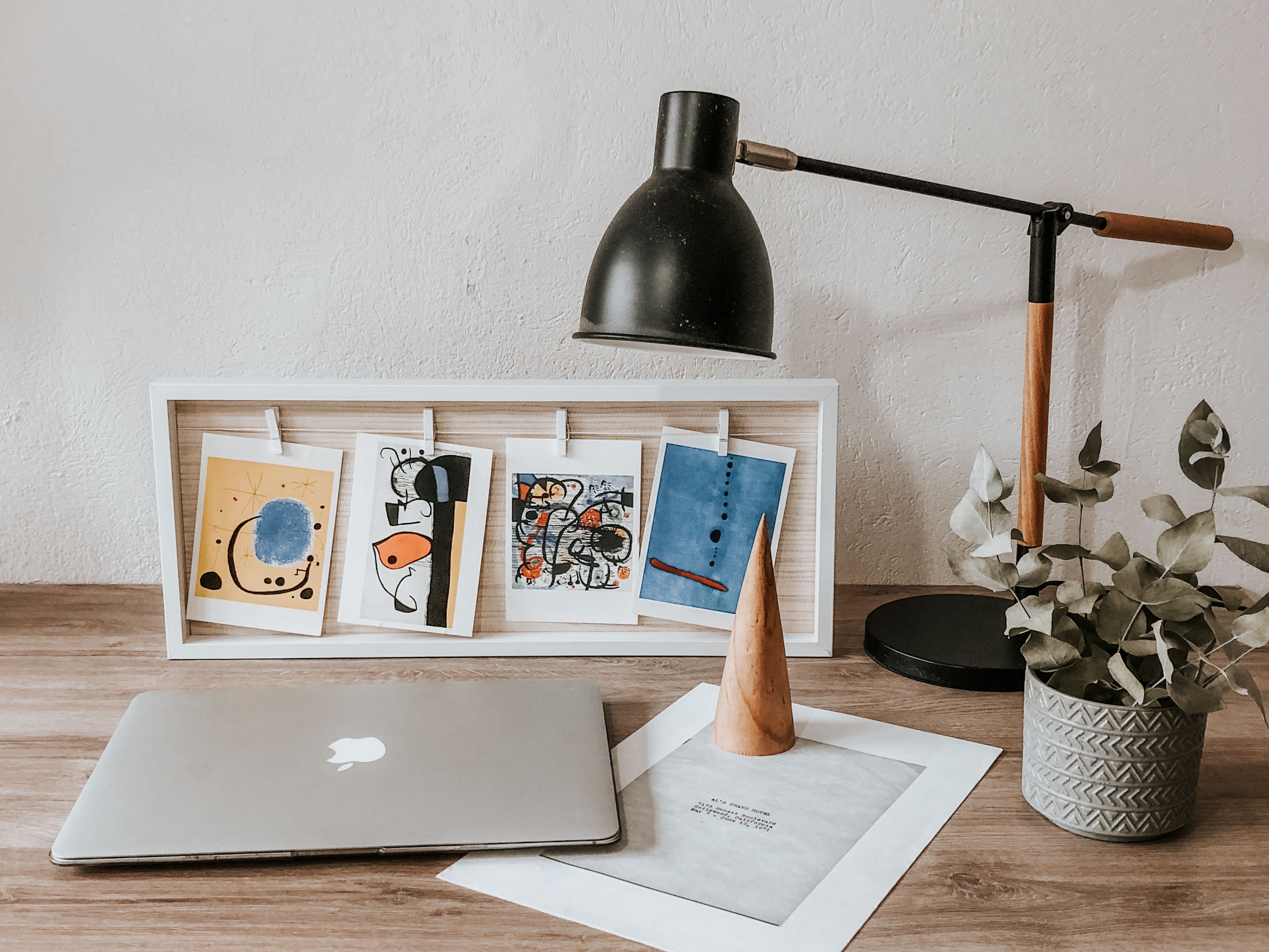
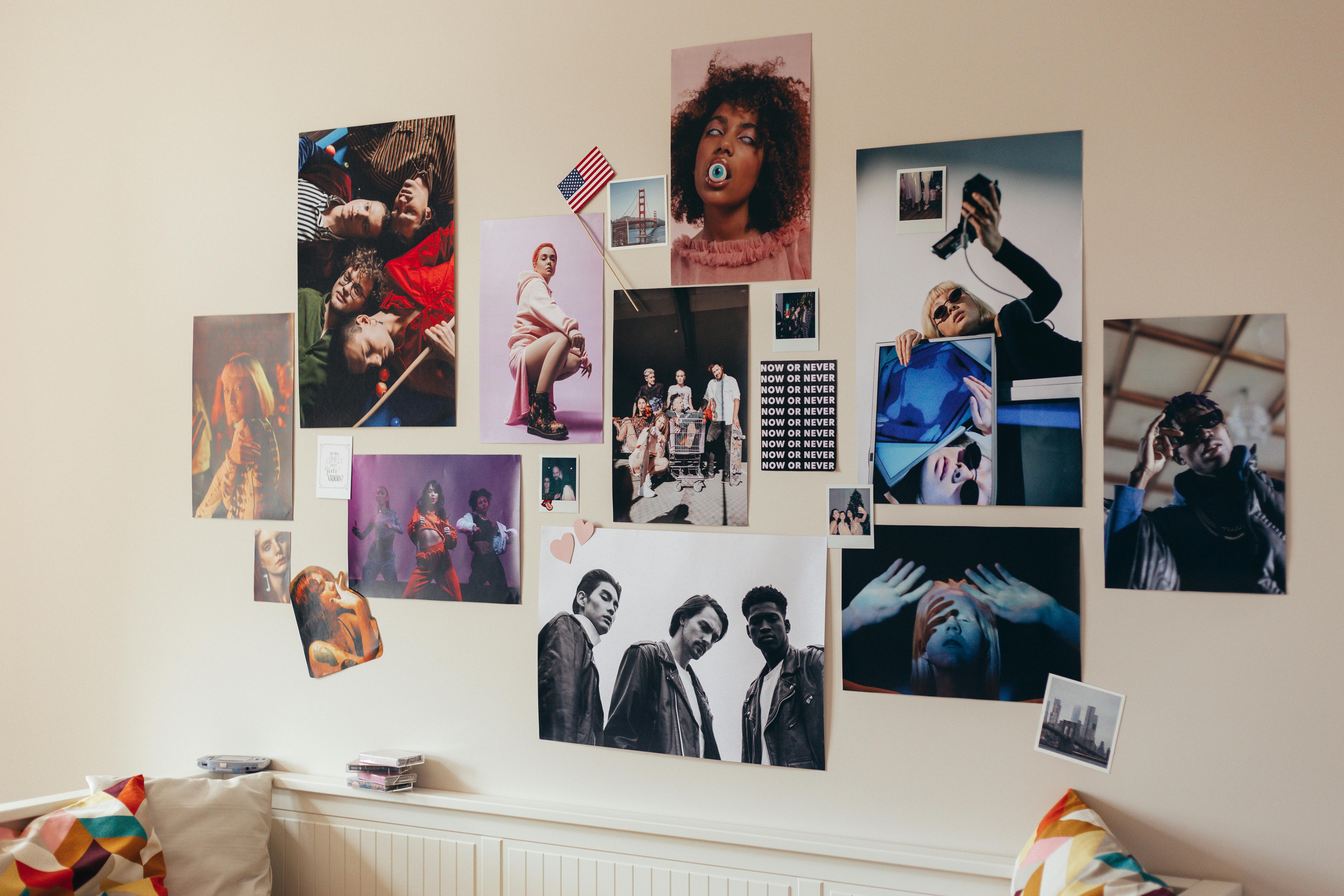
- Go Big or Group Up: A common mistake I see all the time is choosing art that's simply too small for the wall it's on. A tiny print above a huge sofa looks timid, almost apologetic. If you have a smaller print you love, don't hang it alone. Instead, group it with others to create a larger visual mass, thereby creating a more impactful focal point that commands attention. This is the whole idea behind a gallery wall, a technique I adore. For an in-depth guide on how to make multiple pieces sing together, check out our articles on how to arrange pictures on a wall or how to create a gallery wall for a maximalist interior. Consider different gallery wall arrangements: a formal grid for a clean look, a more eclectic salon-style for varied pieces, or a linear arrangement for hallways.
- The Magical 57-Inch Rule: This is a game-changer. Hang your art so that the center of the piece (or the center of the entire gallery wall grouping) is 57 inches from the floor. Why 57 inches? It's the average human eye level, and it’s the standard height used in museums and galleries worldwide. It just feels right, intuitively placing the art where it can be most comfortably viewed without having to crane your neck. I remember when I first applied this rule – suddenly my living room felt like a proper gallery, not just a collection of randomly hung frames. It makes a surprising difference!
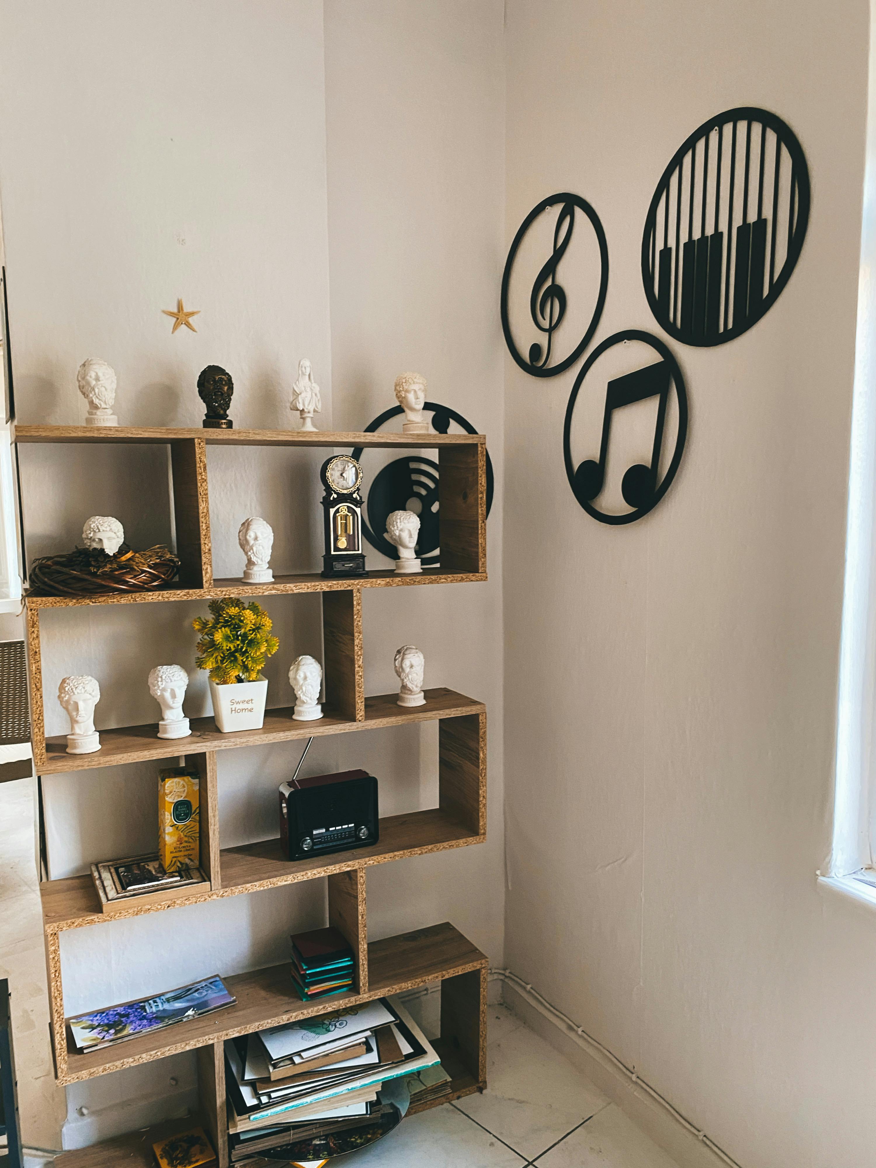
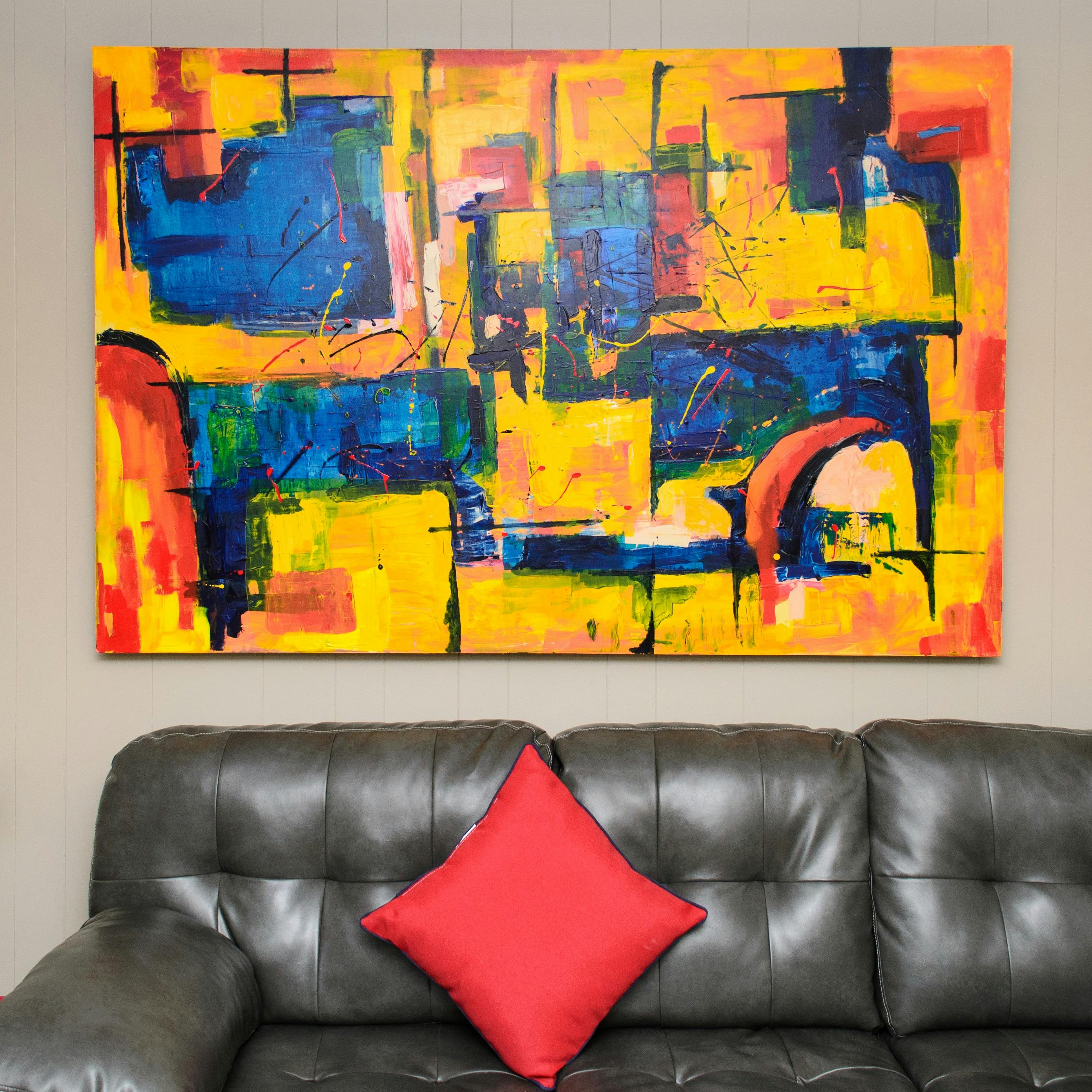
- Consider the Furniture: When hanging art above a sofa, console table, or even a bed, leave about 6-8 inches of space between the bottom of the frame and the top of the furniture. This makes them feel connected and harmonious, rather than like two separate, floating objects vying for attention. As a general guideline, the art or art grouping should be approximately two-thirds the width of the furniture it hangs above to achieve optimal balance. For a more detailed guide, see Art Above the Sofa: A Guide to Perfect Placement and Scale. And don't forget other creative displays, like art on bookshelves, which we discuss in how to choose art for a bookshelf.
Hanging Art in Challenging Spaces
Some spaces feel like an art-hanging puzzle, but with a few tricks, they can become stunning showcases.
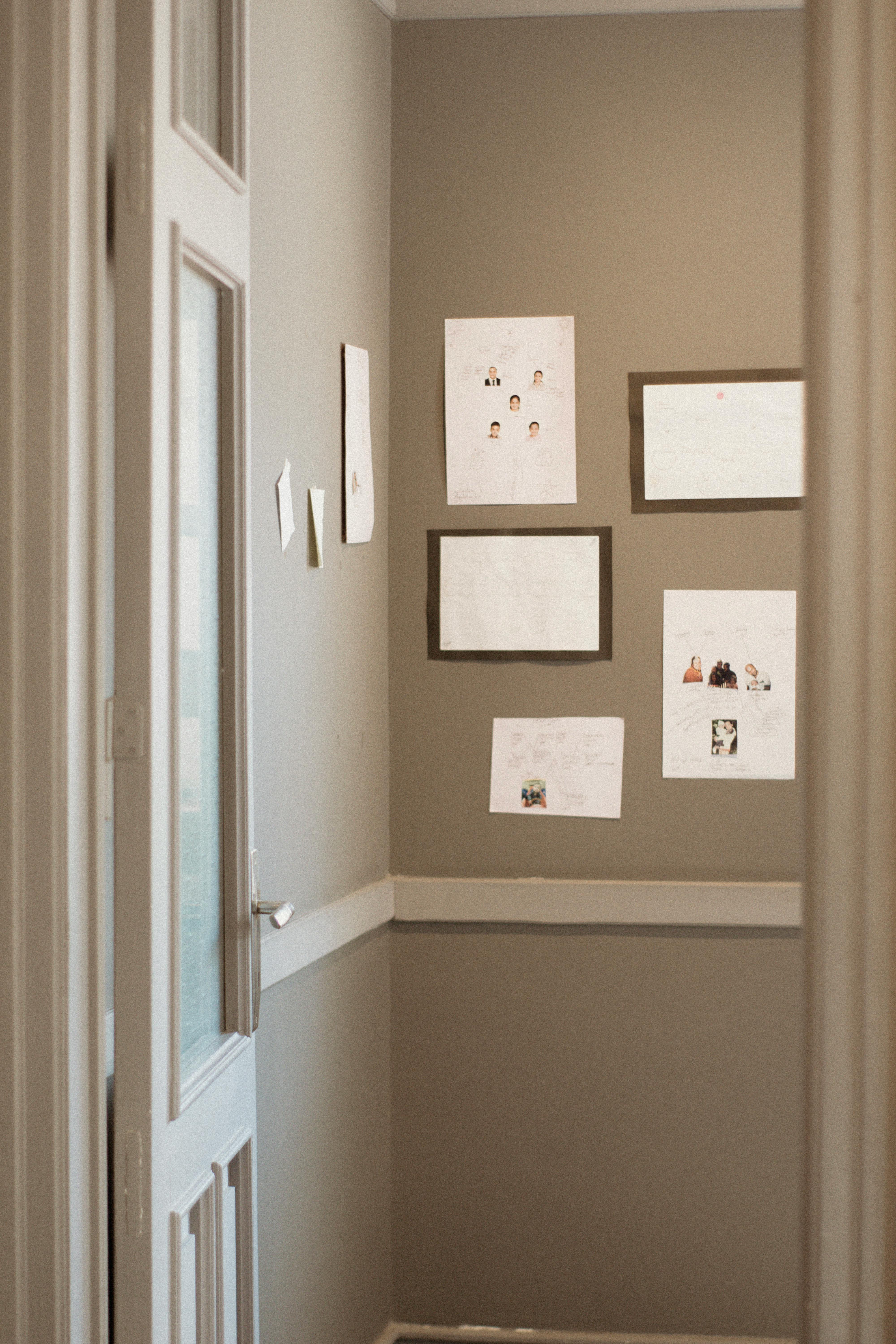
- Stairwells & Hallways: For stairwells, follow the 57-inch rule for the center of each piece relative to the stairs below it, creating a diagonal flow that mirrors the staircase. Alternatively, for a gallery effect, arrange pieces along a horizontal imaginary line that follows the angle of the stairs. In narrow hallways, opt for a linear arrangement, perhaps with smaller pieces or a consistent theme to avoid overwhelming the space. Our guides on how to choose art for a staircase, maximizing impact choosing art for stairwells and hallways, and decorating hallways and staircases with art offer specific strategies.
- Above Fireplaces: Treat the fireplace as a natural focal point. The art should be roughly two-thirds the width of the mantel, and leave enough space (6-12 inches) between the mantel and the bottom of the frame to avoid looking cramped. A single, bold piece or a symmetrical pairing often works best here.
The Subtle Power of Lighting: Illuminate Your Masterpiece
Even the most exquisite framing and matting can be undone by poor lighting. Think of lighting as the spotlight on a stage, making your artwork the star. Thoughtful illumination dramatically influences how your art is perceived, adding depth, highlighting texture, and bringing colors to life. It’s the final flourish that elevates a good display to a truly luxurious one. I once had a striking abstract print that looked rather flat in a dimly lit corner; a simple picture light transformed it into a vibrant portal, drawing the eye instantly.
- Picture Lights: These are designed specifically to illuminate art, often mounted directly on the frame or wall above. They create a focused, even wash of light that really makes the artwork pop, giving it that museum-exhibit glow. Just be sure to pick a light that complements the frame style – no clunky fixtures on a delicate frame! When positioning, try to angle the light to avoid creating distracting "hot spots" or uneven illumination on the artwork's surface.
- Track Lighting: Adjustable track lights allow you to direct spotlights precisely onto your art, creating dramatic highlights and shadows that emphasize texture and form. This is particularly effective for abstract or textured prints, where light can play a huge role in perception. For guidance on different lighting scenarios, consider choosing art for low-light rooms or the art of display: how to light and position abstract art for maximum impact.
- Color Temperature and CRI: When choosing bulbs, consider their Kelvin (K) temperature. This measures the 'warmth' or 'coolness' of the light. For art, a neutral white often works best, as it doesn't distort colors. Also, look for a high Color Rendering Index (CRI), ideally 90 or above. This measures how accurately a light source reveals the true colors of an object compared to natural light. A higher CRI means your art's colors will appear more vibrant, true-to-life, and as the artist intended, without dullness or artificial tints. High CRI lighting is crucial for your art to appear at its best. And always opt for LEDs; they emit minimal heat, preventing damage to sensitive prints. Avoid placing light directly behind your art, as this can create distracting silhouettes or glare.The interplay between the artwork's colors and the light's color temperature is fascinating. Warm white light (2700K-3000K) can enhance portraits or pieces with rich reds and yellows, creating a cozy atmosphere. Neutral white (3500K-4000K) is generally the most versatile, faithfully rendering a wide spectrum of colors, while cool white (5000K+) can make blues and greens pop but might make warmer tones appear sterile. Ultimately, the existing ambient light in your room should be considered; intense ambient light might require less dramatic accent lighting on the artwork itself. The goal is to make the art pop, not to create glare or cause deterioration.
Kelvin (K) Temperature | Effect | Use Case for Art |
|---|---|---|
| 2700K - 3000K (Warm White) | Soft, inviting, slightly yellowish glow, similar to incandescent bulbs. | Creating a cozy, intimate atmosphere; complements warm-toned art or traditional interiors, enhances reds, oranges, and yellows. |
| 3500K - 4000K (Neutral White) | Clean, balanced, closer to natural daylight, neither too warm nor too cool. | Most versatile for art; reveals true colors without distortion; suitable for various art styles, ideal for vibrant, multi-colored contemporary art. |
| 5000K+ (Cool White / Daylight) | Crisp, bluish-white light. | Can make blues and greens pop; sometimes used in modern galleries for a stark look. Use with caution as it can feel sterile or alter warmer tones. |
A CRI of 90+ is generally recommended for accurate color representation.
- Ambient Light Considerations & Protection: While natural light is beautiful, avoid direct sunlight as it can fade colors and damage prints over time. For pieces in bright rooms, UV-protective glass (as mentioned earlier) is a non-negotiable safeguard. The goal is to make the art pop, not to create glare or cause deterioration. A well-lit print looks far more expensive than one hidden in shadow.
What to Avoid: Common Pitfalls that Diminish Value
Even with the best intentions, some choices can inadvertently detract from your print's sophisticated look.
- Flimsy Hardware: Cheap sawtooth hangers or inadequate picture wire can cause your art to hang crookedly or, worse, fall. Invest in quality hooks, wire, and D-rings. Also, avoid using incorrect wall anchors (e.g., drywall anchors for heavy art without locating a stud).
- Overly Trendy Frames: While fun for ephemeral decor, frames that are extremely fashionable right now might quickly date your art. Opt for classic, timeless profiles for pieces you want to look expensive for years to come. Save the trendy frames for smaller, less significant pieces you don't mind changing out frequently.
- Clashing Aesthetics: An ornate Victorian frame on a minimalist abstract print can look jarring, unless done with extreme intentionality and skill. Ensure your frame and mat complement the artwork's style. For example, a delicate, intricate botanical print might look overwhelmed by a thick, rustic wooden frame, while a bold, modern abstract could be diminished by a thin, ornate gold frame unless it's a very deliberate artistic statement. Consider how different styles of art pair with various interiors, whether it's decorating with art in modern farmhouse interiors or choosing art for a minimalist home.
- Poorly Hung or Crooked Art: There’s nothing that screams 'amateur' more than a piece of art that’s clearly off-kilter. Always use a level!
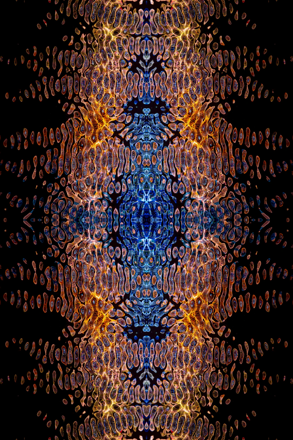
The Enduring Value: Care, Collectibility, and the Philosophy of Art Ownership
Making your prints look expensive isn't just about the initial presentation; it's about a holistic approach to collecting and displaying art. It shows a commitment to the piece that transcends its monetary cost. It's about respecting the art itself.
Long-Term Care: Preserving Your Aesthetic and Investment
Once your print is beautifully framed and hung, ongoing care ensures its longevity and maintains its 'expensive' appearance. Beyond UV-protective glass, consider the environment. Avoid hanging valuable prints in areas with:
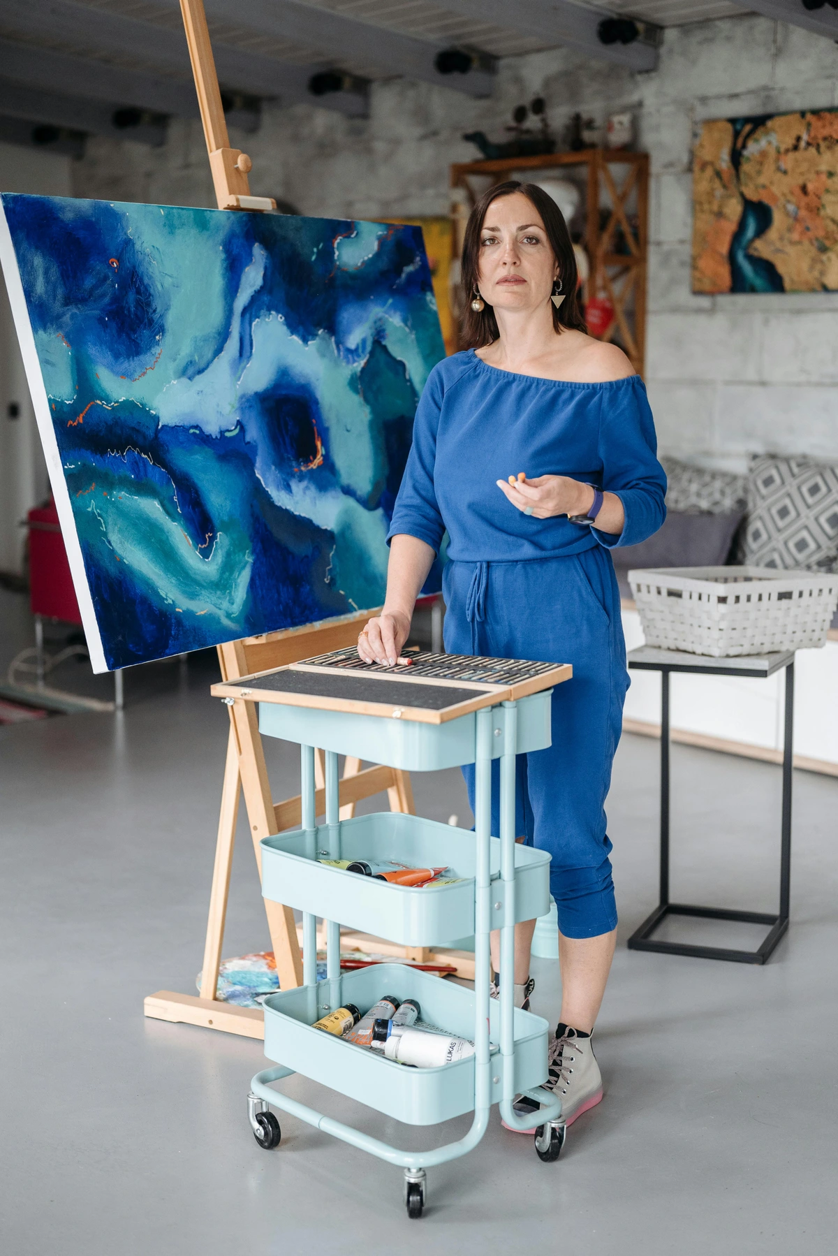
- Extreme Temperature Fluctuations: Rapid changes can cause materials to expand and contract, leading to warping or buckling.
- High Humidity: Moisture can promote mold growth, cause paper to buckle, and degrade materials. (Steer clear of bathrooms unless specifically designed for art like in our guide for choosing art for a bathroom).
- Direct Sunlight: Even with UV glass, prolonged exposure can still lead to degradation over decades.
- Pollution & Dust: While framing helps, a dusty environment will accumulate on the frame and glass, requiring more cleaning. Avoid spraying aerosol products like air fresheners, hairspray, or pesticides near your art, as chemicals can settle and cause damage.
For cleaning framed art, use a soft, dry microfiber cloth to gently dust the frame and glass. If smudges persist on glass (never on acrylic with harsh cleaners!), a very small amount of diluted gentle glass cleaner applied to the cloth (not directly to the frame) can be used, ensuring no liquid seeps under the frame. Directly touching the print's surface, even if framed, should be avoided as oils from fingers can leave residues. If you ever need to store prints, use acid-free archival sleeves and flat files or archival boxes, away from direct light and moisture, ideally in a climate-controlled environment. This meticulous care reinforces the idea that what you own is valuable, irrespective of its original price tag. For more in-depth advice, check out art storage solutions for collectors.
Art Restoration and Conservation: When to Call a Pro
Sometimes, despite your best efforts, prints can suffer damage. Common culprits include water damage, tears, creases, insect damage, or foxing (those small brown spots caused by mold or impurities in the paper). Understanding basic conservation principles can make a huge difference in preserving your art. For example, always handle prints by their edges, preferably with clean cotton gloves, to avoid transferring oils from your skin. If a print develops significant damage, discoloration, or signs of mold, it's crucial to consult a professional art conservator. Do not attempt DIY repairs, as these can often cause irreversible damage. A conservator can assess the print, stabilize it, and in some cases, even reverse damage, ensuring its longevity and maintaining its aesthetic and market value. They are the true heroes behind the scenes, ensuring our artistic heritage continues.
Storing & Transporting Unframed Prints Safely
For prints that aren't yet framed or need to be moved, proper handling is key. Always store unframed prints flat in acid-free archival sleeves or between sheets of acid-free tissue paper and rigid archival boards. If rolling is absolutely necessary for transport, use a large-diameter acid-free tube and roll the print with the image facing out to prevent the ink from cracking. Avoid rubber bands or anything that can crease or stick to the print. This seemingly small detail speaks volumes about your respect for the artwork.
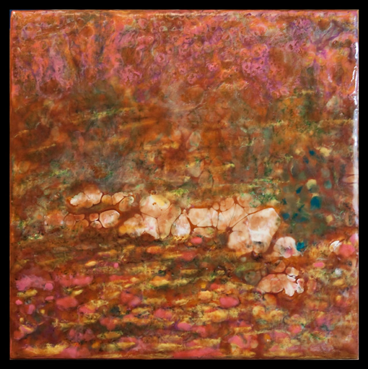
Prints vs. Originals: Bridging the Perceived Gap (and Avoiding Fakes)
There's often a perceived hierarchy between an original painting and a print. An original is unique; a print is a reproduction. But here's the thing: many iconic artworks exist primarily as prints (think Dürer's woodcuts, Hokusai's ukiyo-e prints, Munch's lithographs of "The Scream," Picasso's linocuts, or Warhol's silkscreens). These are not merely copies; they are often the artist's primary medium, where the intent was to create a series of multiples, a means of democratic artistic distribution, or a distinct artistic exploration. The value often lies in the artistic statement, the edition's rarity, and the quality of execution. By presenting your prints with the same care and respect you'd give an original masterpiece, you effectively bridge this perceived gap. It's about respecting the artist's vision, regardless of whether it's one-of-a-kind or one of a limited series.
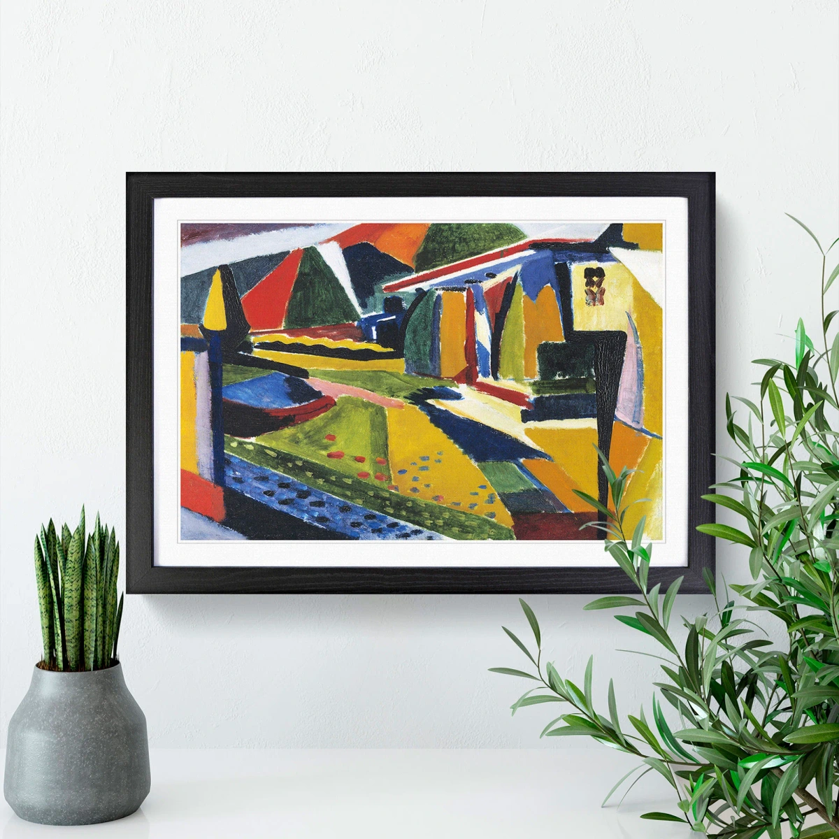
We also need to be very clear about the distinction between a high-quality reproduction and a 'fake.' A reputable print seller will always be transparent about the nature of the artwork – a reproduction (especially a limited edition giclée) is a celebration of the original, an intentional offering for wider appreciation, not a deceptive imitation. Always question vague descriptions or unusually low prices for "original" works by established artists. Understand the provenance and the reputation of the seller. While some aspects of the digital art world explore concepts like NFTs (Non-Fungible Tokens) and blockchain for digital ownership and provenance, for the purpose of creating tangible, visually impactful prints that look expensive, our focus remains firmly on the physical mediums and presentation methods that have stood the test of time and proven their aesthetic and archival value.
Digital Art and the Printed Medium: New Frontiers, Same Principles
As digital art becomes increasingly prevalent, its translation into physical prints presents new opportunities. The same principles apply: a stunning digital creation, when expertly printed on archival paper with a giclée process and framed with a generous mat, instantly elevates its status. For example, a digital painter who creates intricate, vibrant abstract pieces might work with a specialized printer to produce limited-edition giclée prints on a textured cotton rag paper with a satin varnish, capturing every nuance of their digital brushstrokes. The key here is ensuring the digital file itself is of high resolution and properly color-calibrated for print (understanding ICC profiles and color management). This often requires working closely with a printer who specializes in fine art reproduction to ensure the artist's vision translates faithfully. The medium changes, but the magic of presentation remains constant. It’s about honoring the artist's vision, no matter its origin. And, of course, some digital art is specifically created for digital display only and is not intended for printing – the artist's intent always matters.
The Philosophy of Art Ownership: Curating Your Identity, Not Just Your Walls
Ultimately, making a print look expensive isn't just about aesthetics; it's about intentionality and what the art brings to your life. Art influences mood, sparks conversation, and reflects your personal identity and taste. By carefully selecting and thoughtfully presenting pieces, you're not just decorating walls – you're curating an environment that tells your story and inspires your own creativity. This deep, personal connection to your chosen art, regardless of its cost, makes it truly invaluable. It becomes a reflection of you. Your chosen art pieces, whether original or prints, become extensions of your personality, influencing the mood and conversation of your home. They can transform a mere dwelling into a vibrant, inspiring sanctuary. For more on creating your ideal space, explore guides like how to decorate a house or room-specific advice such as choosing art for home office productivity or maximizing impact choosing art for high ceilings.

credit, licence
I’ve spent years curating my own collection, mixing originals with high-quality prints, and it’s become a living diary of my aesthetic journey. Each piece, regardless of price, feels cherished because of the thought I’ve put into its presentation. It’s a joy I want you to experience.
And if you're looking for unique, high-quality prints to start or expand your collection, you can always browse the collection I have available to /buy.
Your Toolkit for Transformation: A Quick Checklist for Elevated Prints
Ready to elevate your art? To help you distill all this information into action, here’s your ultimate checklist of essentials, and why each one is non-negotiable for that high-end look:
Item | Why You Need It |
|---|---|
| High-Quality Print | The indispensable foundation. Think giclée on archival paper for lasting beauty and fidelity. |
| Solid Wood or Metal Frame | Non-negotiable for substance, perceived quality, and long-term durability. Ditch the plastic! |
| Custom-Cut, Wide Mat | The ultimate visual upgrade. Provides elegant breathing room, draws the eye inward, and instantly screams 'gallery'. |
| UV-Protective Glass (or Acrylic) | Shields your art from fading, protects against environmental damage, and boosts optical clarity. |
| Acid-Free Backing Board & Linen Tape Hinges | Essential for long-term preservation, preventing print degradation, and allowing for safe removal. |
| Measuring Tape | Crucial for accurate mat sizing, frame selection, and achieving perfect, balanced placement. |
| Level | Ensures your art is hung perfectly straight – a small detail that makes a huge, professional impact. |
| Quality Picture Hooks & D-Rings/Wire | For secure, professional hanging that allows for easy leveling and adjustment, ensuring your art isn't going anywhere. |
FAQ: Your Burning Questions Answered (Because I've Asked Them Too)
I know what you're thinking, because I've thought it too. Now, let's tackle some of the nagging questions that have probably popped into your head about making art prints look expensive:
Glass or Acrylic/Plexiglass: Which is Best for My Art?
Ah, the classic debate. For most prints in a home environment, standard glass is often perfectly fine, but it really depends on your priorities:
Material | Pros | Cons |
|---|---|---|
| Glass | * Clarity & Substance: Looks clearer, feels more substantial, and offers a crisp, unyielding barrier. High-end options include anti-reflective and museum-grade glass that are almost invisible. \ * Scratch Resistance: Much harder to scratch than acrylic. \ * Cleaning: Can be easily cleaned with standard glass cleaner and a microfiber cloth. | * Weight: Heavier, making very large pieces difficult to handle and hang (a concern for very large pieces or plaster walls; see how to hang art on lath and plaster walls). \ * Fragility: Can shatter (a concern for high-traffic areas, children's rooms, earthquake zones, or art destined for shipping). \ * Glare: Can exhibit significant glare without specialized coatings. |
| Acrylic (Plexiglass) | * Lightweight: Much lighter than glass, making large pieces easier to handle and safer to hang. Ideal for shipping art, reducing weight and breakage risk. \ * Shatter-Resistant: Ideal for kid's rooms, earthquake zones, or art destined for shipping. \ * UV Protection: Often comes with built-in UV protection as a standard feature. Newer generations offer enhanced scratch resistance and optical clarity. \ * Cleaning: Requires specialized acrylic cleaners or mild soap and water with a soft cloth; avoid ammonia-based cleaners. | * Scratch-Prone: Scratches much more easily than glass (handle with extreme care during cleaning!). \ * Static Cling: Can have a slight static cling that attracts dust. \ * Optical Clarity: Can sometimes appear less optically clear or have a slight 'plastic' feel if not high-quality, though modern acrylic is excellent. |
For very large pieces where weight is a concern, or for art in a high-traffic area (like a kid's room or bustling hallway), acrylic is a pragmatic and excellent choice, especially if it's a good quality, non-glare, UV-protective option. It's also significantly safer for shipping. But for standard sizes in a quieter room, I often lean towards glass for that substantial feel and optical clarity. It's a personal preference, but always prioritize UV protection if the piece is exposed to any natural light.










What about hanging methods? Wire, sawtooth hanger, D-rings, or Command Strips?
This is where stability meets aesthetics. For a professional look and feel, a wire system with proper picture hooks is my preferred method, especially for heavier or larger pieces. It allows the frame to pivot slightly, making leveling surprisingly easy, and creates that subtle forward tilt you often see in galleries. For anything truly substantial, especially if you want that secure, gallery-worthy installation, a D-ring and hook system is my go-to. It's a more permanent, heavy-duty solution, often bolted directly into wall studs or appropriate drywall anchors.
When using anchors, it's crucial to match the anchor type to your wall material and the weight of your artwork. For drywall, toggle bolts or molly bolts are excellent for heavier pieces, while simple plastic expansion anchors suffice for lighter ones. For plaster walls, specialized plaster anchors or locating studs are essential. Always ensure your hardware rating exceeds the weight of your framed art.

Sawtooth hangers are fine for smaller, very lightweight frames, but they can make leveling tricky and feel less secure – I generally avoid them for anything I want to look 'expensive' or that holds significant sentimental value. And while I use Command Strips for lightweight prints in places I might rearrange often (my mood changes, after all!), for a truly substantial, 'expensive-looking' piece, the long-term security and polished presentation of a traditional hook and wire or D-ring system are superior. It’s all about commitment and making sure your art isn't going anywhere!
Unframed vs. Framed Prints: When is unframed acceptable?
While this entire article champions the power of framing, there are times when an unframed print is perfectly acceptable, or even preferred. Some collectors prefer to purchase prints unframed so they can personally choose custom framing that matches their unique aesthetic or specific installation plans later. Unframed prints are also easier and less costly to ship, reducing the risk of damage. For very large, rolled prints or fine art posters, they might be stored unframed until a specific display opportunity arises. However, for everyday display in your home where you want to evoke a sense of value and permanence, a well-chosen frame and mat are almost always the best option. It all comes down to intent – are you collecting for future display, or creating an immediate, impactful statement?


Conclusion: The Art of Intentionality (and a Million Dollars' Worth of Joy)
Ultimately, making a print look expensive isn't just about aesthetics; it's about intentionality. It's about showing that you cared enough to present the art thoughtfully, meticulously, and with an eye for detail. It’s the difference between just putting something on the wall and truly designing a space—transforming it into a personal gallery. This approach empowers you to bring museum-quality aesthetics into your own home without the museum-sized budget. It's about taking pride in your choices and creating an environment that nurtures your soul.
By focusing on the core pillars – a high-quality print, a thoughtfully chosen frame, a generous, custom-cut mat, and strategic lighting – you craft an experience for the viewer that elevates the artwork far beyond its initial cost. It’s the magic of presentation, a silent testament to the value you place on beauty and expression. It's a statement that says, "This art matters to me, and so it should matter to you."
And trust me, when you get it right, that $30 print will bring you a million dollars' worth of joy, pride, and sophistication. It will spark conversations, reflect your personality, and simply make you happy every time you glance at it. So, go on, pick a print, get a glorious mat, and hang it with intention. I promise you won't regret it; your walls (and your wallet) will thank you. Now go make some magic! If you're ready to start your own collection with art that speaks to you, explore the pieces I have available to /buy.
credit, licence
