
Maximize Abstract Art: Your Ultimate Framing Guide
Master abstract art framing! Explore styles, materials, and integrate art into any room. Learn expert tips for display, preservation, and making your art sing.

The Ultimate Guide to Framing Abstract Art: Elevating Your Pieces & Spaces
If you've ever found yourself staring at a magnificent abstract painting, utterly captivated, then glanced at its frame and thought, "This feels... off," you've landed in the right place. I used to think framing was the last, almost administrative, step – a necessary but slightly tedious formality after the exhilarating hunt for a piece of art that truly speaks to you. My perspective dramatically shifted the day I witnessed a breathtakingly chaotic, vibrant abstract painting completely suffocated by a heavy, overly ornate gold frame. It was a jarring visual discord, a truly uncomfortable experience that stuck with me. Abstract art, for the uninitiated, doesn't attempt to represent an external reality; instead, it uses shapes, colors, forms, and gestural marks to achieve its effect – and that's precisely why its framing needs are so unique. That particular piece, full of untamed spirit, was confined to a gilded cage, its very essence crushed. It was like trying to have a profound conversation while someone shouts over you. All of this to say: the frame is not boring. It's everything.
That's when it truly clicked for me: a frame isn't just a boundary; it's the artwork's first conversation with the room. It acts as the crucial bridge between the vibrant, often boundless, world inside the canvas and the serene or dynamic environment of your home. Get it right, and you elevate both the art and the space. Get it wrong, and you introduce a visual misstep you’ll feel every single time you walk past. Look, my own discipline on these details has sometimes been a work in progress, but the impact of getting it right is undeniable. This isn’t about adhering to rigid, unyielding rules, but about developing an intuitive sense – learning to truly listen to the art, understand your room's vibe, and trust your own gut feeling. After all, choosing a frame is, in essence, the final artistic decision you get to make for a piece, your unique collaboration with the artist, an opportunity to bring your personal vision into the presentation. Even I, with years of experience, still rely heavily on that intuition, because sometimes, the art just tells you what it needs. In this ultimate guide, we'll explore how to decode your abstract art's language, select the perfect frame style and material, and integrate it seamlessly into your home's aesthetic, ensuring your abstract art doesn't just hang on the wall, but truly sings.
A Brief History: How Framing Evolved with Abstract Art
It might seem like a modern problem, but the way we frame art has a surprisingly rich history, one that closely parallels the evolution of art itself. Before abstract art burst onto the scene in the early 20th century, frames were often elaborate, gilded, and seen as integral to the artwork's value and narrative. Think of those heavy, ornate frames around classical portraits – they were designed to reflect the status of the subject and the grandeur of the art, serving as both protection and an extension of the piece's perceived importance.
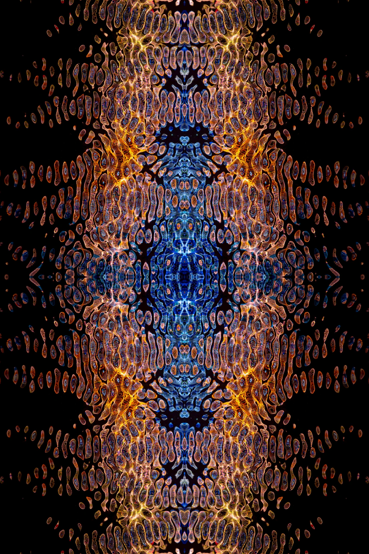
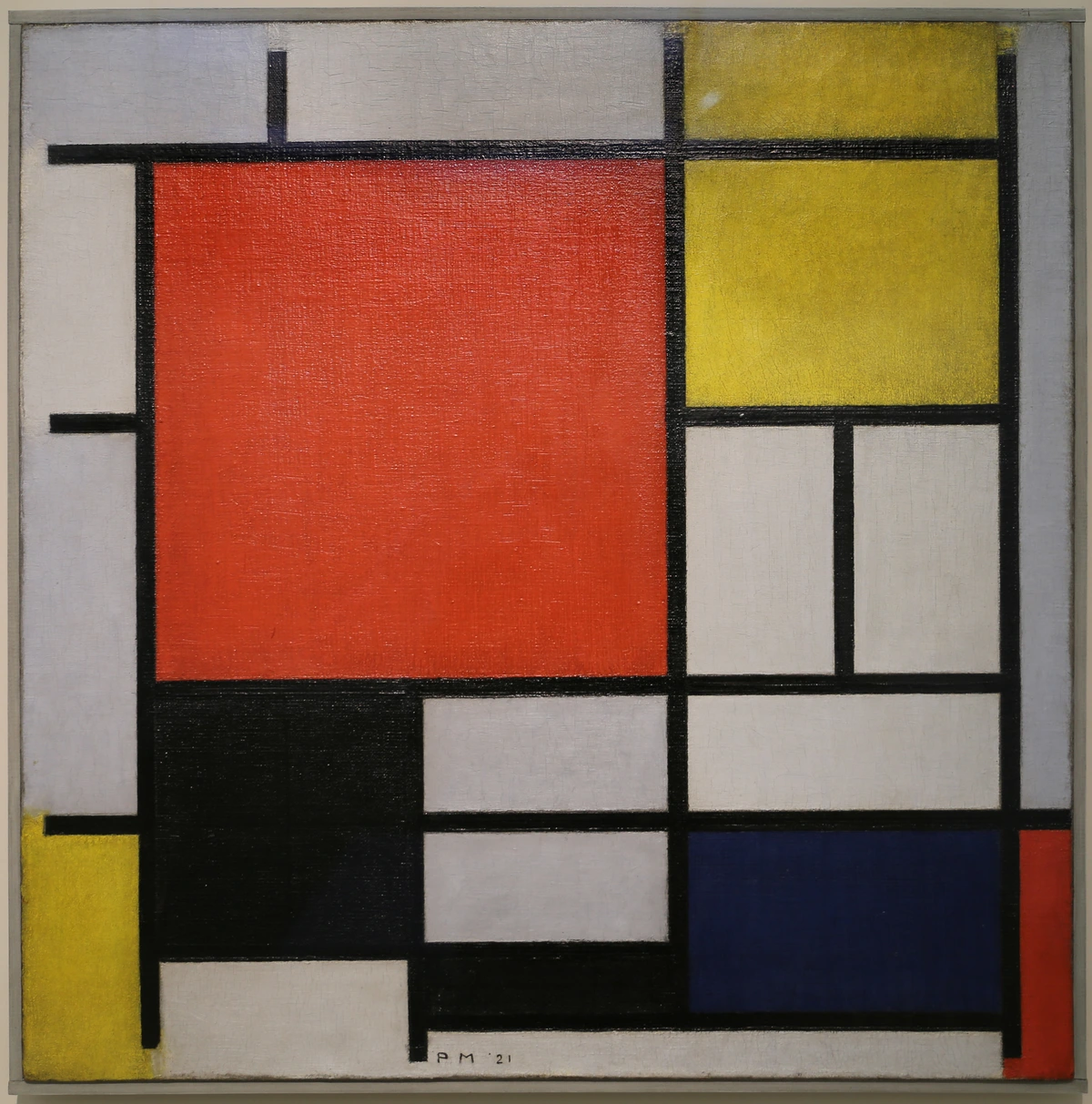
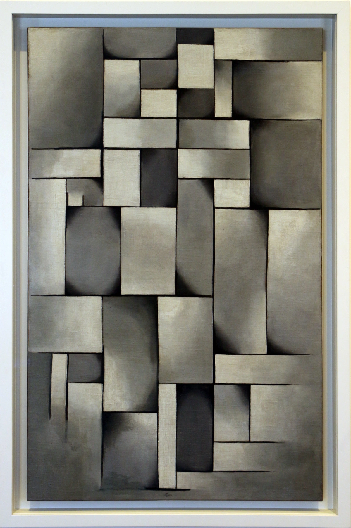
But as artists began to break free from strict representation, exploring pure form and color, the traditional frame felt increasingly out of place. This shift wasn't just aesthetic; it was a radical philosophical departure that demanded a new kind of presentation. Pioneers of abstract art, especially movements like Bauhaus and De Stijl, championed minimalism and functionality. Artists like Piet Mondrian often used simple, unornamented frames that extended the planar geometry of his paintings, making the frame an integral part of the composition itself, a continuation of his precise, geometric vision. This minimalist approach was a radical departure from the opulent frames of earlier eras, and it directly supported the art's focus on essential forms and colors. Wassily Kandinsky, one of the fathers of abstract art, often opted for very simple, narrow frames that allowed the viewer's eye to focus solely on the dynamic interplay of colors and forms within the canvas, preventing any external distraction. For him, the frame was a respectful boundary, not a competing element. This led to a preference for simple, clean-lined frames, often in neutral colors like black, white, or natural wood, or even no frame at all. Such frames become extensions of the art's own clean lines, rather than external ornamentation.
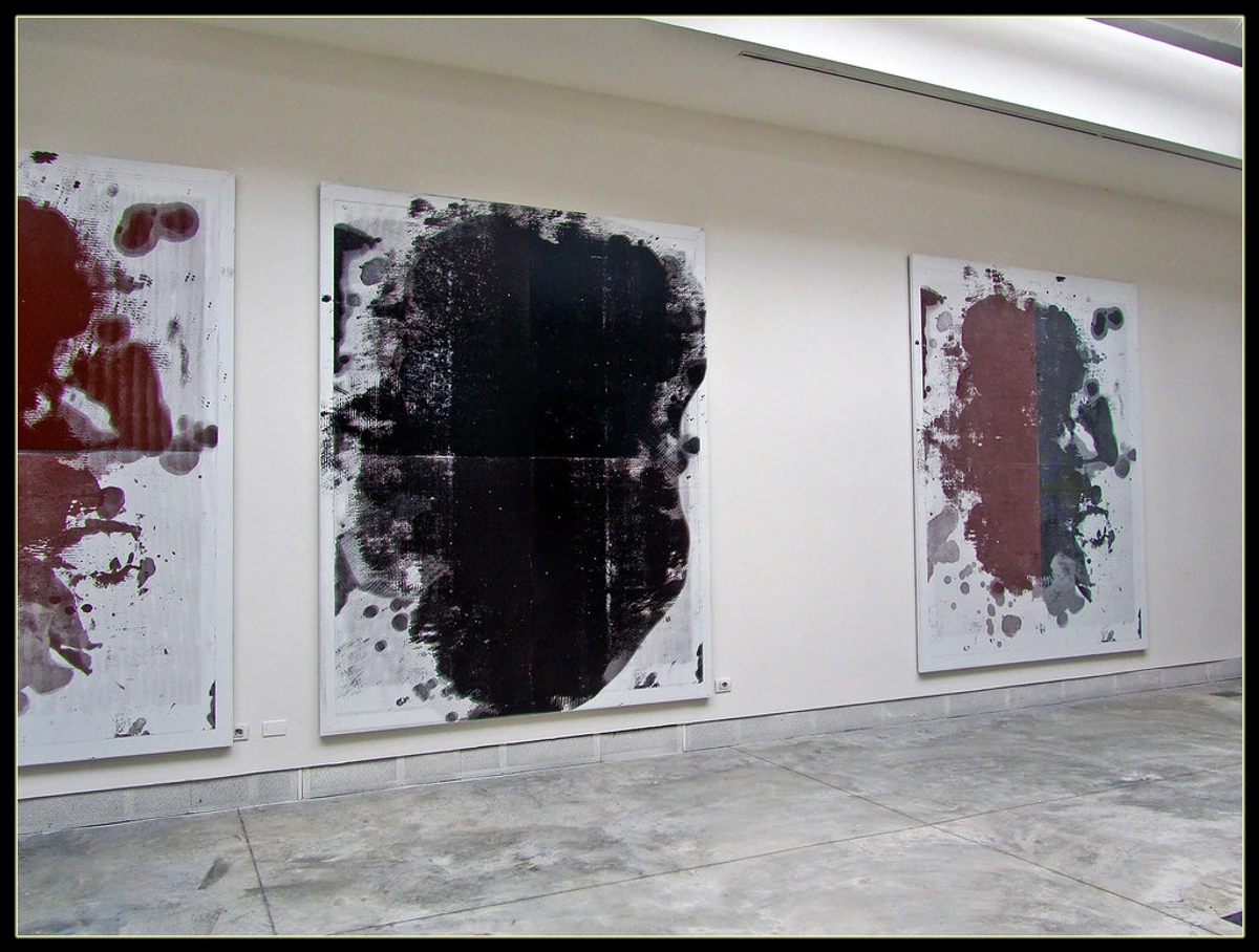
Post-war abstract expressionists, with their raw, energetic canvases, often favored gallery-wrapped pieces or floater frames to emphasize the raw canvas and the "object-ness" of the painting itself. Artists like Jackson Pollock, Mark Rothko, and Willem de Kooning frequently chose to leave their monumental works unframed or in simple floater frames, ensuring the art's expansive energy wasn't contained, allowing it to confront the viewer directly, without a fussy intermediary. This evolution shows us that the "right" frame isn't static; it's a dynamic response to the art, the era, and the intention.
First, Listen to the Art: Decoding Its Inner Language
Before you even begin contemplating wood types or metal finishes, take a deliberate, unhurried look at the artwork itself. Pour yourself a coffee, sit quietly in front of it, and truly decode its language. What's its predominant mood? Is it an energetic, loud explosion of color, or is it a serene, quiet whisper? Is it intricate with a myriad of tiny details, or is it bold, minimalist, and direct? This initial connection is crucial; it’s about understanding the art's soul before you even think about its clothes. The biggest mistake you can make is trying to impose your will on the art; your goal is to support it, not transform it.

What's the Energy and Movement of Your Abstract Piece?
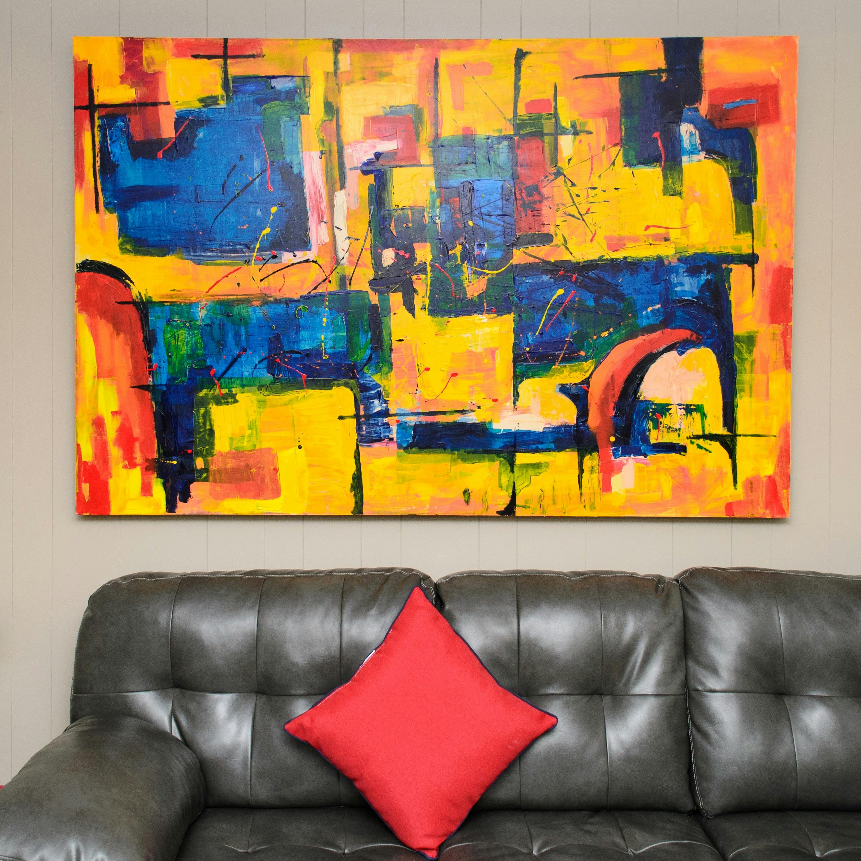
A piece brimming with gestural energy—think big, sweeping brushstrokes, spontaneous splatters, or dynamic lines—often thrives within a frame that can contain that raw power without competing with it. I've found that a simple, clean frame acts like a visual deep breath, offering the eye a momentary pause before it plunges back into the glorious chaos. Why does this work? It minimizes visual noise. Visual noise, in this context, is anything in the frame's design (e.g., busy patterns, excessive carvings, conflicting textures, or overly bright colors) that shouts for attention alongside the artwork, like two people trying to talk over each other. A clean frame steps back, allowing the artwork's voice to be heard clearly, grounding its effervescence without suffocating it. I once saw a frantic, expressive abstract almost disappear behind a wildly patterned frame, and it was a stark reminder of this principle.

- For delicate, energetic pieces with fine lines or subtle marks, an almost invisible, ultra-thin frame or a wide mat works best, giving them ample room to 'breathe.'
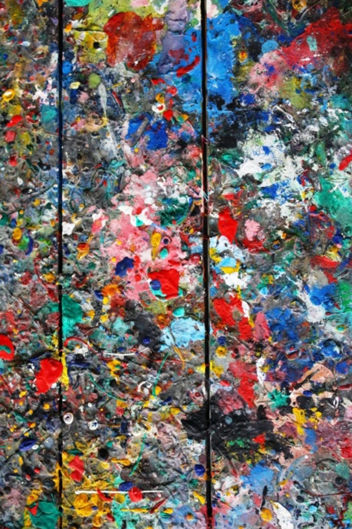
- For explosive, thick impasto, a deep floater frame can contain the energy without flattening it, allowing the texture to be seen as a three-dimensional element.
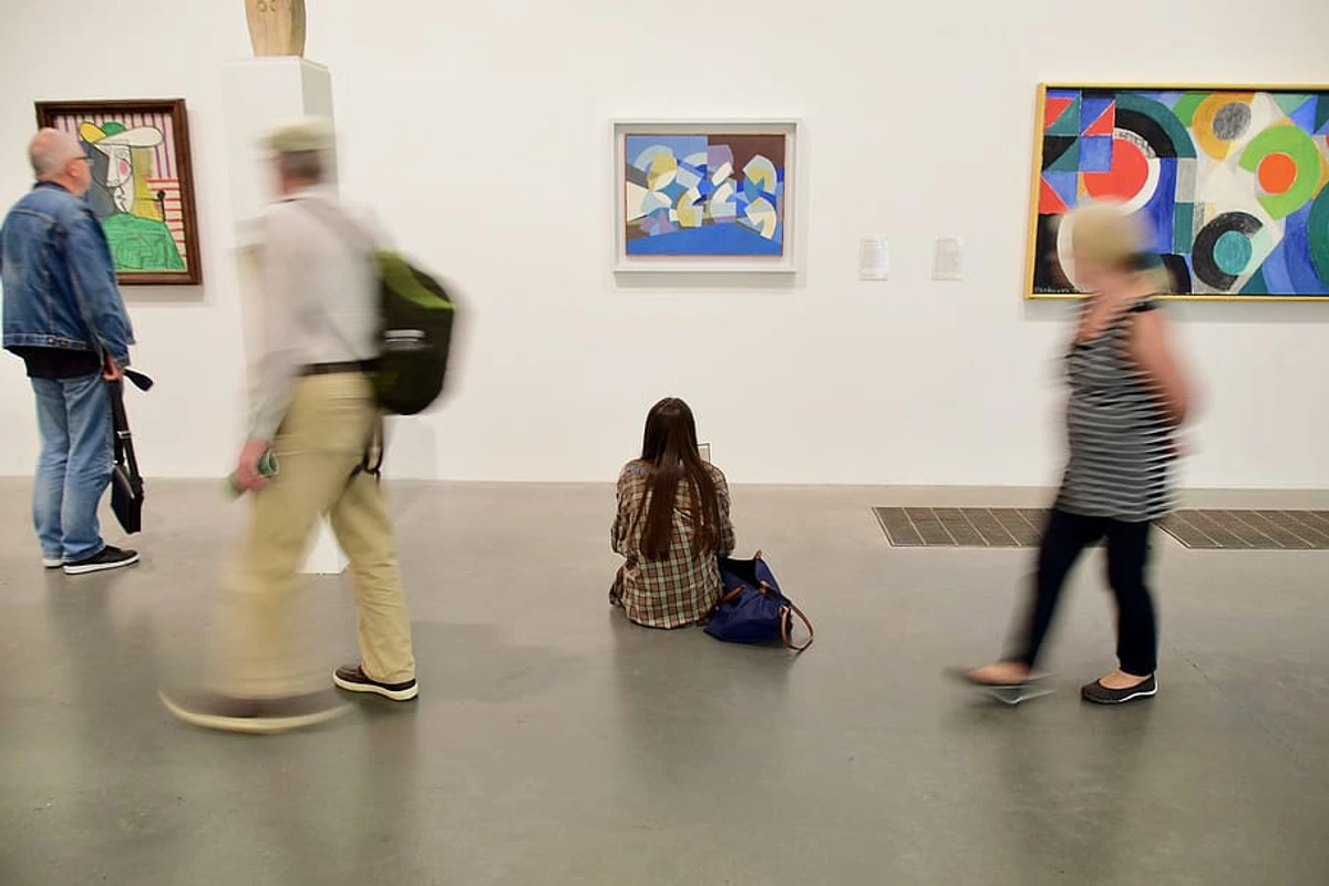
How Does Your Abstract Art Use Color?
What are the dominant hues? Are there subtle accent colors that could be subtly pulled out and echoed? Your frame can either harmoniously reflect a color from within the artwork, creating a cohesive dialogue, or it can introduce a contrasting color for a dramatic, intentional pop. It’s a fascinating, intricate dance between the two, a conversation you get to orchestrate. I once framed a piece that had a tiny, almost hidden splash of deep violet, and echoing that with a thin violet inner mat was a "eureka!" moment – it suddenly tied the whole composition together, giving it an unexpected depth. To truly master this, delving into how artists use color can provide invaluable insights, as can the psychology of color in abstract art.

The Power of Texture and Medium: Is Your Art an Object?
Is it a flat, smooth print, a heavily impastoed acrylic on canvas with thick peaks and valleys, or a mixed media piece boasting multiple layers and varying textures? The inherent physicality and "object-ness" of the artwork should profoundly influence your frame choice. Think of it like this: some abstract art, with its built-up layers and palpable surface, exists almost as a sculpture, a three-dimensional item with presence, not just a flat image. This object-ness – the quality of the art being a physical thing in space – is a crucial consideration. A piece with tangible depth, like a heavily textured canvas or a mixed-media collage with protrusions, demands to be respected in three dimensions. A traditional frame with glass can flatten and diminish this inherent quality, effectively putting your sculpture in a two-dimensional straitjacket.
For example, a canvas with significant texture often looks incredible in a floater frame that allows its edges to breathe and emphasizes its three-dimensionality, treating it almost as a sculptural object. Why? Because a conventional frame would hide those precious edges, diminishing its "object-ness." Conversely:
- A flat digital print on fine art paper almost always demands a mat to provide breathing room and separation from the glass.
- Textile or fiber abstract art might benefit from a float mount within a shadow box to preserve its delicate texture and prevent compression.
- Mixed media pieces with very pronounced 3D elements will thrive in a deep shadow box frame that offers both protection and the necessary space to showcase their depth, often using spacers to prevent elements from pressing against the glass. I've seen delicate fabric pieces beautifully preserved and highlighted this way, transforming them into true focal points.
You can learn more about the role of texture in abstract art here.
Line and Form: The Underlying Structure of Abstract Expression
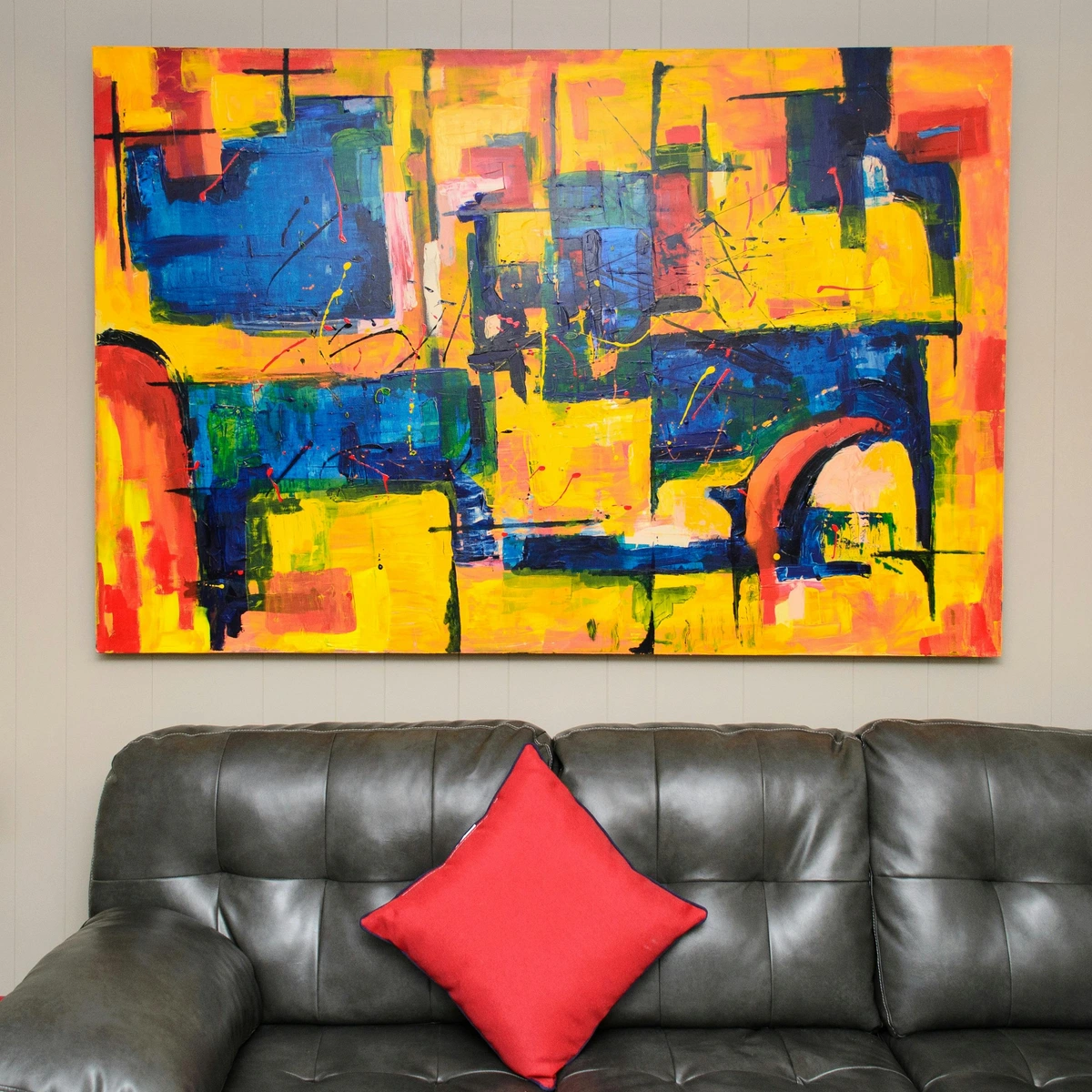
Abstract art, at its core, is a language of lines and forms. Is your piece dominated by sharp, crisp geometric lines that suggest order and structure, or does it flow with organic, fluid curves that evoke nature and spontaneity? A frame with clean, angular lines can beautifully echo a geometric abstract, enhancing its sense of precision. Conversely, a very soft, organic abstract might find an interesting counterpoint in a minimalist metal frame, or a harmonious embrace in a natural, softly-grained wood.

Jagged, angular lines might find a compelling echo in a sleek, brushed aluminum frame, reinforcing that sharp modern edge. Fluid, organic curves, on the other hand, often sing in harmony with a natural, softly-grained wood frame, or even a subtle, matte white profile that doesn't interrupt their flow. It's about finding that visual conversation, either complementing the art's inherent structure or creating an intentional, thought-provoking tension. Understanding elements of art: line and what is design in art can really deepen this perspective.
Understanding Visual Weight: Art, Frame, and Balance
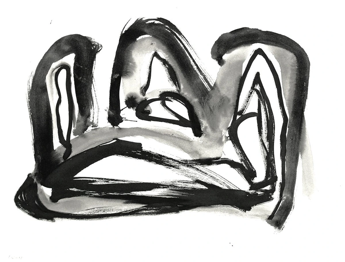
Before we dive into the room, let's talk about visual weight, because it's a concept I find incredibly useful when thinking about balance. Visual weight refers to the perceived heaviness or lightness of an object or area within a composition. In framing, it's about the balance between your abstract piece and its frame. Think of it like a seesaw: you want the art and the frame to feel balanced, even if one side is a bold declaration and the other a subtle whisper. It's like balancing a robust espresso machine with a delicate teacup on a shelf – each needs the right visual support around it to feel stable and integrated. The biggest mistake here is letting a frame overpower or diminish the art's inherent presence.
- Heavy Artwork: Does your abstract piece feature a large, dense focal point (e.g., a heavy impastoed area, dark, saturated colors, complex composition, or bold geometric shapes)? A heavier, more grounded artwork can often carry a more substantial frame, mirroring its gravitas. The frame can act as a solid anchor, preventing the artwork from feeling "too much" for the wall. A simple yet robust frame, even in a neutral color, can provide the necessary counter-balance without competing. It's like a strong, silent partner. Think of it like a visual seesaw: a canvas dense with thick impasto and deep, saturated colors is a heavy weight on one side. It needs a frame that feels equally grounded—perhaps a robust floater frame or a wider, deep-profile gallery frame—to prevent the artwork from feeling top-heavy or overwhelming its presentation. Conversely, trying to frame a piece with the visual heft of Franz Kline's bold, black brushstrokes in a flimsy, narrow frame would be a disservice, diminishing its inherent power.
- Light Artwork: Is its composition light and airy (e.g., delicate lines, expansive negative space, soft washes, or translucent layers)? Conversely, a delicate piece might be completely overwhelmed and visually "dragged down" by anything too robust. It will need a thin, almost invisible frame to allow its lightness to sing, or perhaps a wide, neutral mat to create ample breathing room. Imagine trying to frame a feather in a lead box; it just won't work. Conversely, a delicate, airy piece with lots of white space is a light feather, needing a subtle, slender frame to avoid being crushed. For instance, a delicate Agnes Martin minimalist grid painting would be crushed by an ornate, heavy frame, but would thrive with a wide, white mat and a thin natural wood frame.
The frame's own visual weight (its thickness, material, and color) should always be in conversation with the artwork's intrinsic weight. It’s a delicate dance of counter-balance or harmonious echo.

Framing Specific Abstract Art Styles: Tailored Approaches
Just as different abstract styles speak different languages, they often benefit from distinct framing approaches. Thinking about the inherent characteristics of your piece can guide your decision. Here's a look at how to approach some key styles:
Gestural/Abstract Expressionism
Think of the raw, untamed energy of Jackson Pollock's drips, Willem de Kooning's powerful brushstrokes, or Franz Kline's bold black gestures. These pieces are about immediacy, emotion, and the artist's hand. The frame's job here is to contain that immense energy without competing with it. A simple floater frame for a canvas allows the raw edges and the "object-ness" to remain visible, respecting the work's three-dimensionality, much like a discreet stage for a powerful performer. For works on paper, a clean gallery frame with a wide, neutral mat provides breathing room without distraction. Avoid anything ornate that would contradict the art's raw power.
Geometric Abstraction
For the precision of Piet Mondrian's grids, Kazimir Malevich's suprematist squares, or the architectural forms of El Lissitzky, the frame should echo the art's inherent structure. Thin, angular metal frames in black, silver, or white are perfect, reinforcing the sense of order and intentionality. Sleek, flat wood profiles also work beautifully. A thin, contrasting inner fillet (a small decorative molding) can add a subtle pop without overwhelming the clean lines. The goal is to enhance the art's exactitude, not soften it. I once framed a geometric print with a barely-there black metal frame, and it made the lines snap into focus like never before.
Color Field Painting
These are the expansive fields of color from artists like Mark Rothko, Helen Frankenthaler, or Barnett Newman, designed to immerse the viewer in pure color. The framing approach should be minimalist to avoid breaking this immersive effect. A simple floater frame or a very thin gallery frame is ideal, or often, no frame at all (gallery wrap) to allow the color to feel boundless. Mats are rarely used, as they would interrupt the expansive color field. The frame should be a whisper, not a shout, letting the color envelop the viewer.
Minimalist Abstract
Art that emphasizes few elements, muted palettes, or a profound focus on form, texture, or negative space – think Agnes Martin's subtle grids or early Sol LeWitt works. For these, extreme simplicity is paramount. An ultra-thin, clean frame in black, white, or natural wood, or a very wide mat with a subtle frame, supports the art's understated elegance. A busy frame would immediately contradict the minimalist intent. Sometimes, however, a bold, contrasting frame can provide a witty, intentional tension, creating an unexpected dialogue between the art and its presentation. Imagine a stark white abstract in a vivid red frame – it's a confident, playful statement.
Mixed Media/Collage
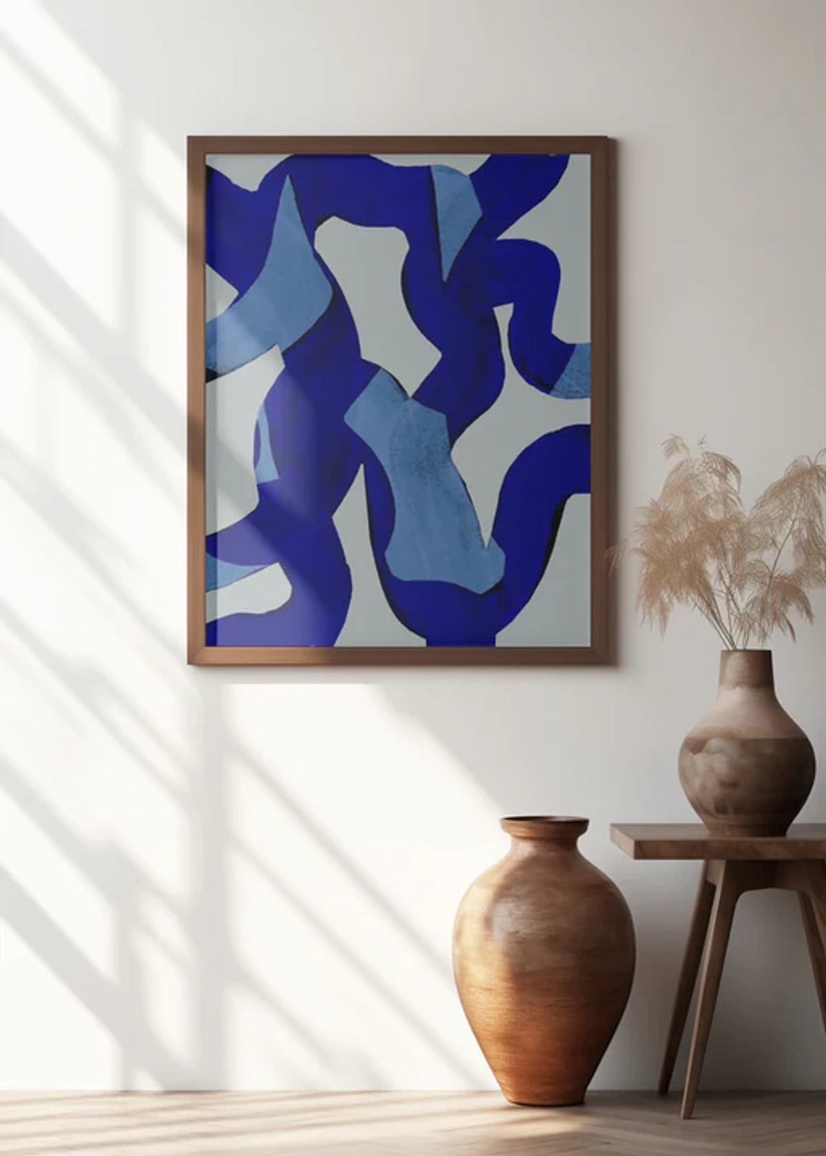
Pieces with multiple materials, varying textures, and often three-dimensional elements, like those by Robert Rauschenberg or contemporary artists combining paint, paper, and found objects. These demand protection and space. A shadow box frame is essential for works on paper or board with pronounced 3D elements, offering the necessary depth and preventing delicate surfaces from being crushed. I've often seen conservators use clear acrylic spacers inside these frames to ensure no element touches the glazing. For mixed media on canvas, a deep floater frame can work, allowing the layers and textures to be appreciated from the side while providing support and protection. The frame needs to accommodate the artwork's physicality without flattening its impact.
Framing for Different Mediums: Prints, Photography, and Canvas
Abstract art comes in many forms, and each medium has its own unique framing considerations. Understanding these distinctions is crucial for both aesthetic presentation and long-term preservation.
Original Canvas Paintings (Acrylic, Oil, Mixed Media on Canvas)
For original paintings on stretched canvas, especially those with thick impasto or painted edges, floater frames are almost always the gold standard. They allow the canvas to appear to "float" within the frame, emphasizing its three-dimensionality and respecting the artist's intention for the edges. Alternatively, a gallery wrap (where the canvas is stretched and stapled on the back, with the painting extending around the sides) can be a powerful, frameless option, particularly for large-scale, energetic works where the art's boundless energy is paramount. If the canvas is thin or un-stretched, it might be mounted to a board and then framed in a traditional or box frame, often with a mat.

Works on Paper (Prints, Watercolors, Drawings, Abstract Photography)
Prints (such as giclée prints, lithographs, screenprints), watercolors, drawings, and abstract photographs typically require framing under glass, often with a mat. This protects the delicate surface from dust, environmental damage, and contact with the glass itself. Always use acid-free mats and backing boards for archival preservation. A wide mat creates a generous visual buffer, giving the artwork breathing room and enhancing its presence. For abstract photography, a simple, clean frame in black, white, or natural wood often works best, allowing the photographic composition and colors to dominate. If the edges of the paper are special (e.g., deckled edges), a float mount within a shadow box can be stunning, showcasing the full sheet of paper.
Digital Abstract Art Displays
While the long-term investment value of blockchain and NFTs remains a topic of discussion, their visual presentation still benefits from careful consideration. For digital abstract art (e.g., digital animations or high-resolution screen displays) displayed physically, thoughtful presentation is key. Framing here might involve sleek, minimalist bezels around a high-quality screen, or integrating the screen seamlessly into a wall with a custom surround that mimics a traditional frame. The "frame" becomes the device itself, so choose screens with excellent color accuracy and a minimal, elegant aesthetic to let the digital art truly shine. Imagine a digital piece glowing subtly within a brushed metal custom frame, blending technology with timeless display principles.
The Room as Your Canvas: Integrating Art and Space
Now for the equally vital piece of the puzzle: the room itself. The frame shouldn't exist in isolation; it needs to feel utterly at home with your furniture, lighting, existing artworks, and the overall decor. If your living room is a sanctuary filled with warm woods, plush textiles, and soft, diffused lighting, a stark, cold, polished metal frame, no matter how good it looks with the art in isolation, might feel jarringly out of place. This is where the frame truly earns its title as the unsung hero, the ultimate connector. Ignoring the room's aesthetic is a major misstep, creating a visual disconnect that undermines your entire design. It's like inviting a perfectly dressed guest to a party, only for them to stick out like a sore thumb because they're in a tuxedo at a casual BBQ.
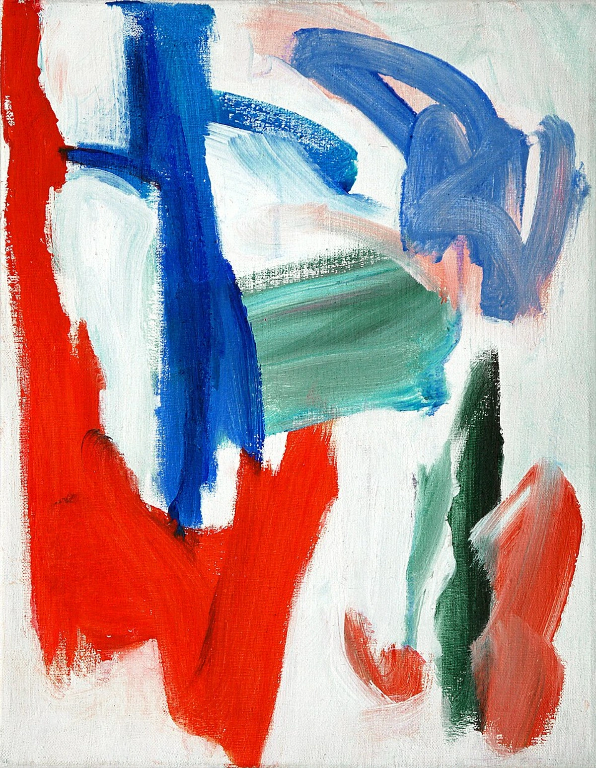
I always envision the frame as the welcoming handshake between the art and the room. For example, in a space where you have black metal light fixtures or sleek black window frames, a thin black metal frame on your artwork can effortlessly tie the entire visual narrative of the space together. It's not about being "matchy-matchy" – that's a common fear I hear, and one I actively try to avoid in my own space. Instead, think in terms of subtle visual rhymes: echoing materials, finishes, or even underlying tones rather than direct, exact color replication. If your floors are a warm oak, a frame in a complementary wood tone will feel organically cohesive. If your hardware is brushed brass, a delicate brass frame will sing in harmony. It’s all about creating a subtle, sophisticated dialogue, where every element contributes to a unified aesthetic, making your home feel effortlessly curated. It’s a fascinating process, isn’t it? Almost as intricate as the art itself. Sometimes I wonder if I spend as much time thinking about the perfect frame as I do actually painting!

Material Matters: What Frame Materials Connect Best with Your Environment?
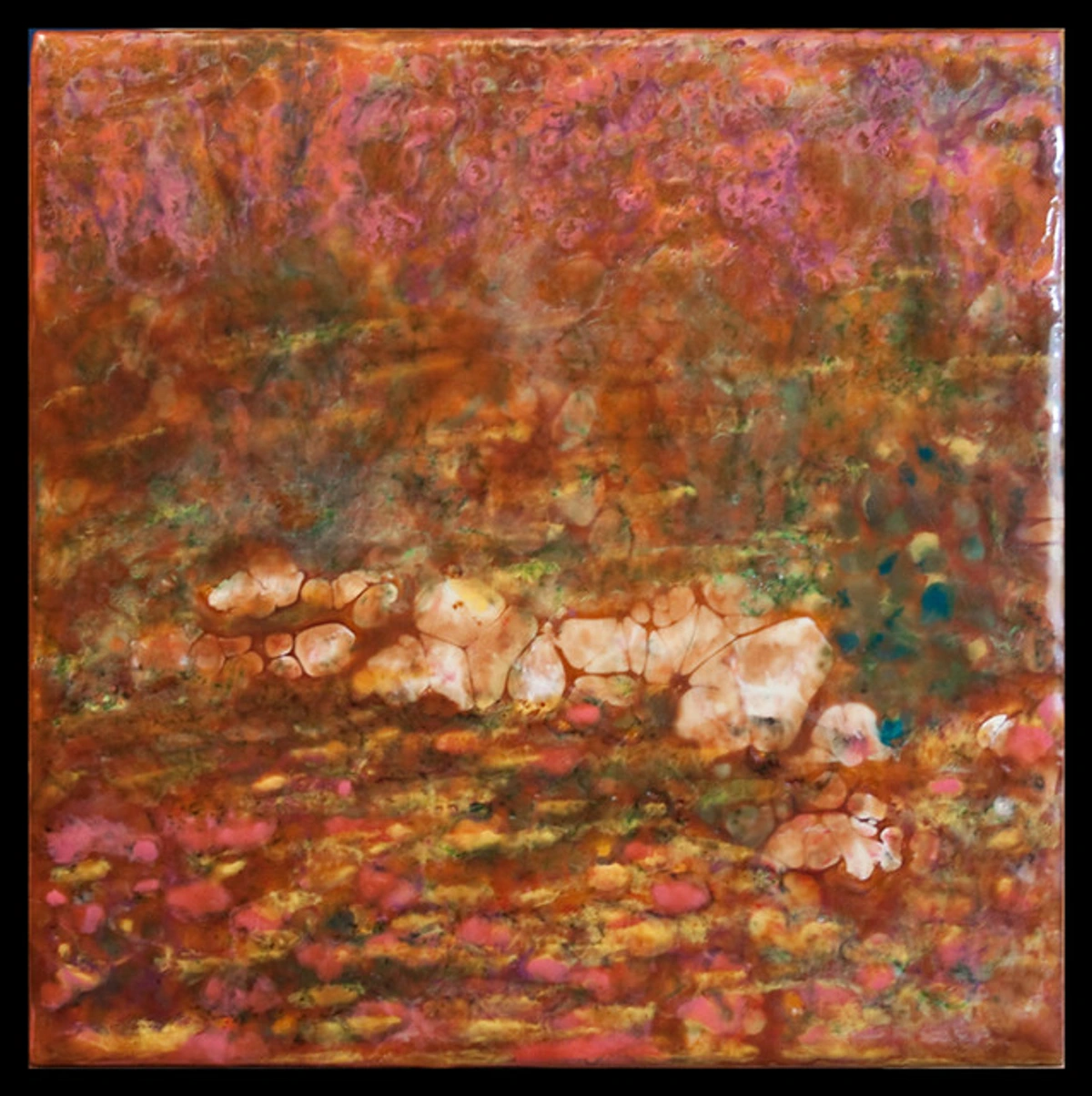
The material of your frame is the tactile link between the art and the surrounding textures of your room. It's also profoundly influenced by the room's lighting – a matte finish might absorb light, creating a softer presence, while a glossy or metallic finish will reflect it, adding sparkle. And for those of us who care deeply about our planet (and who doesn't?), exploring frames made from reclaimed wood or recycled materials is an aesthetic win with an ethical bonus.
- Wood Frames: These frames inherently bring warmth, a natural, and organic feel to any space. A light maple or ash can feel incredibly contemporary and even Scandinavian, while a darker walnut or mahogany can infuse a touch of mid-century modern sophistication or traditional elegance. They are absolutely perfect for warming up a minimalist space or complementing modern farmhouse interiors. They also pair beautifully with wood furniture. I often find myself drawn to natural woods for their grounding effect, especially with very energetic abstract pieces.
- Metal Frames: Offering a sleek, often industrial, and distinctly modern aesthetic, metal frames can be truly striking. Thin black or charcoal metal is my personal go-to for a sharp, graphic feel that truly makes colors pop. Gold or brass can introduce a touch of understated elegance without veering into overly ornate territory, and silver or chrome feels cool, crisp, and high-tech. These work beautifully in spaces with an industrial vibe.
The Color Question: Choosing Your Frame's Palette for the Edges
This is often where people get nervous, but I promise you, it's actually one of the most creatively liberating aspects. You essentially have three main artistic paths:
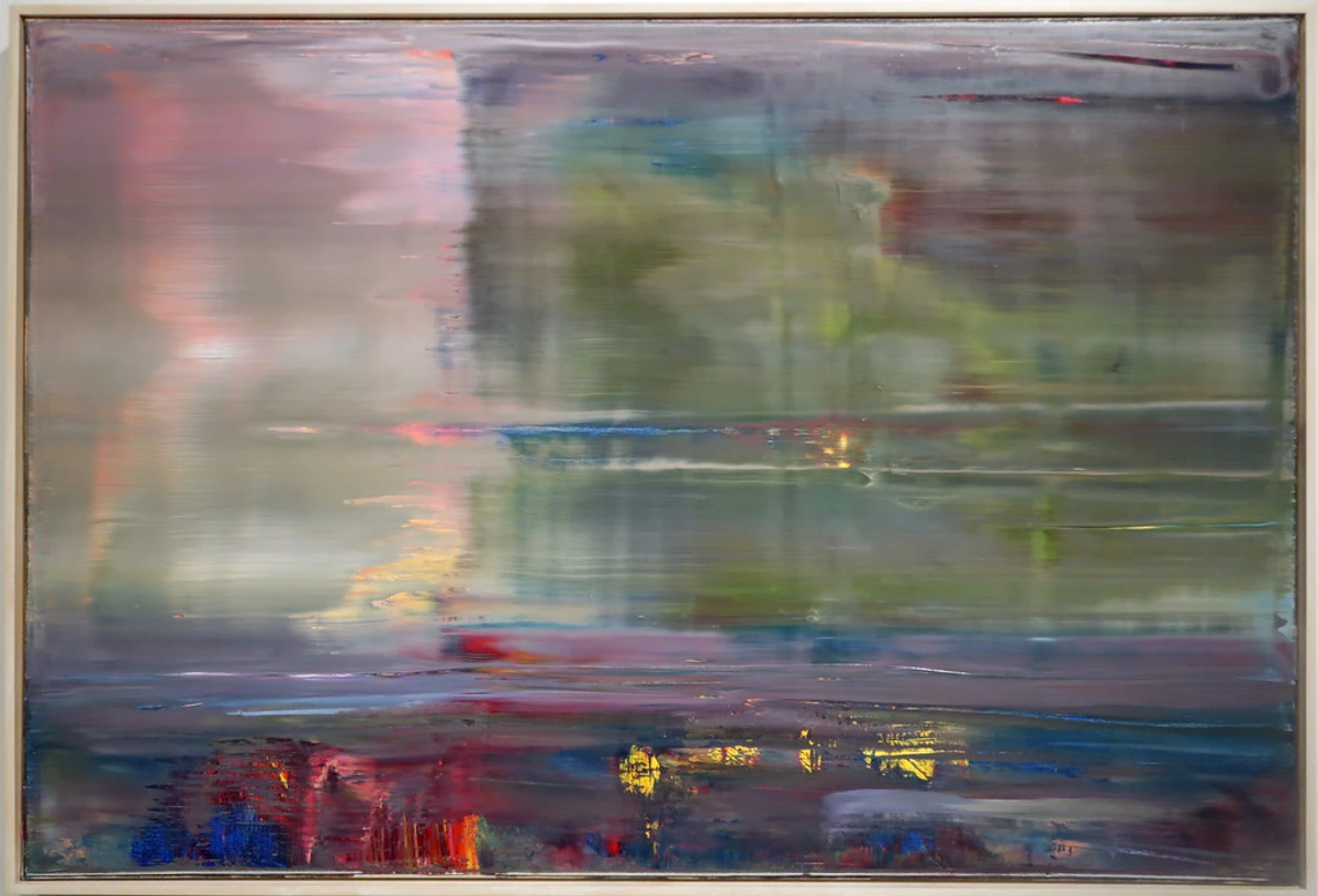
- Neutral Ground: This is arguably the safest, and frequently the most effective, choice. Think classic white, stark black, understated grey, or the warmth of natural wood. This approach is particularly effective for very colorful, energetic abstract pieces, where the frame's job is simply to contain and anchor without adding more visual information. It’s also excellent for monochromatic or minimalist abstract art where you want the focus to remain purely on the artwork's subtle variations or stark forms without a competing color.
- White frames against a white wall can make the art appear to float and truly pop.
- Black frames provide a strong, decisive graphic border that anchors the piece.
- Natural wood offers organic warmth and timeless appeal.
- Complementary Harmony: My favorite approach for a truly cohesive look. Carefully pick a subtle, secondary color from within the artwork itself and use that for your frame. For example, if your abstract piece features a dominant blue with hints of a muted sage green, a thin frame in that sage green can create an incredibly sophisticated echo. This creates a beautifully deliberate, intentional pairing that subtly screams, "I’ve truly thought about this." It's a sophisticated echo that ties everything together. I once framed a vibrant abstract with a thin, almost invisible, matte-finish frame that picked up the faintest trace of deep turquoise from the painting, and it just sang. For highly complex, multi-colored abstracts, I often find myself thinking of a 'visual anchor.' You might select the least dominant, yet still present, neutral tone within the artwork (e.g., a faint off-white or deep charcoal) and use that for a thin frame or mat. It’s about creating a subtle, sophisticated tether, not a shouty match.
- Dramatic Contrast: For the bold and adventurous! Choose a color that isn't present in the artwork at all but provides a compelling counterpoint. A wildly energetic, colorful abstract piece might look absolutely incredible with a simple, matte black frame that grounds its effervescence. Conversely, a minimalist, monochromatic abstract could be electrified by a vibrant, unexpected frame color (e.g., a stark white abstract in a bright yellow frame). This approach is less about matching and more about creating an intentional, thought-provoking tension. Understanding the psychology of color in abstract art is a fascinating field that can profoundly inform these decisions.
Framing for Specific Room Styles: Making Your Abstract Art Feel at Home
The most successful framing choices are those that recognize the unique character of the room. Here's how to think about it for different aesthetics, ensuring your abstract art becomes an integral part of your design narrative:

- Minimalist Interiors:
- Focus: Clean lines, neutral colors (black, white, natural wood), understated profiles.
- Best Frames: Floater frames or simple gallery frames shine here, letting the art be the undisputed focal point. I find that a thin black metal frame can really make an abstract pop against a clean white wall, drawing the eye without being loud.
- Tip: Think about how the frame might even become an extension of the wall, enhancing the sense of space and calm.
- Bohemian/Eclectic Spaces:
- Focus: Texture, global influences, a curated, collected feel. This is where your personality gets to shine!
- Best Frames: Consider a rustic wooden frame, a frame with a subtle carved detail, or even a mixed-material frame. Don't be afraid to mix and match frame styles within a gallery wall – just ensure there’s a unifying element like a consistent color palette across the frames (e.g., all black, or a mix of wood tones), or a cohesive theme among the artworks themselves.
- Tip: This style thrives on delightful juxtapositions. If you're looking for more tips on bohemian interiors, check out our guide.
- Mid-Century Modern Interiors:
- Focus: Clean lines, warm woods (teak, walnut), minimalist forms, often with a retro flair.
- Best Frames: Floater frames in warm wood tones, or simple black/brass frames work beautifully. Thin, flat profiles are key. Avoid anything too ornate.
- Tip: Echo the wood tones or metallic accents already present in your furniture for a cohesive mid-century aesthetic.
- Industrial Interiors:
- Focus: Raw materials (exposed brick, concrete, metal), utilitarian aesthetic, often monochromatic or muted colors.
- Best Frames: Thin black or charcoal metal frames, or even raw, untreated wood. Floater frames for canvas pieces with raw edges can amplify the industrial vibe, maintaining a sense of raw authenticity.
- Tip: Lean into the utilitarian aesthetic by choosing simple, strong frames that complement the material palette of the room. A raw concrete wall with a vibrant abstract in a simple steel frame? Perfection.
- Modern Maximalist Rooms:
- Focus: Rich colors, bold patterns, intriguing objects. Your frame needs to hold its own!
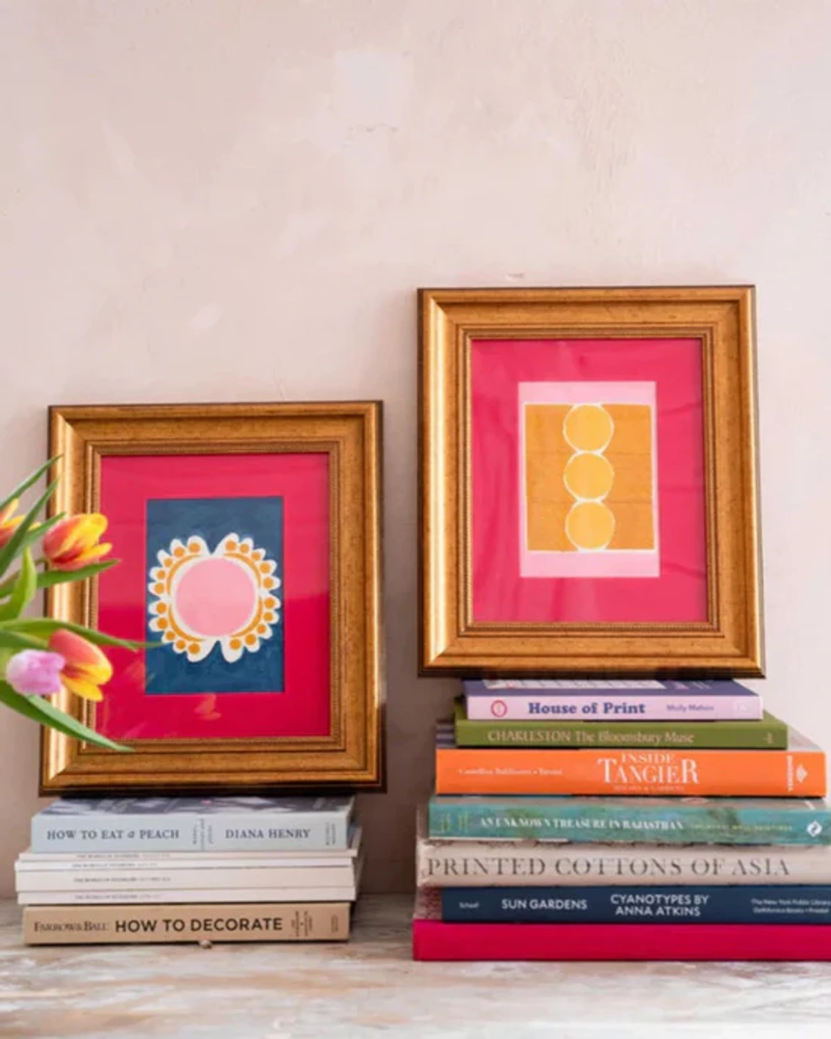
- Best Frames: A bold, perhaps even slightly ornate frame (as discussed earlier) can work beautifully, creating a dramatic interplay without being busy. Or, paradoxically, a very simple frame in a vibrant color can provide a calm anchor within a maximalist scheme.
- Tip: You could also choose a frame in a vibrant color that either complements or contrasts with the room's dominant palette, adding another layer of visual interest and a sense of playful confidence.
- Traditional/Classic Settings:
- Focus: Respectful dialogue between old and new. While abstract art itself is modern, a traditional room can be a fantastic backdrop for unexpected juxtapositions.
- Best Frames: Dark, rich wood frames (like walnut or mahogany) with classic profiles can ground abstract pieces beautifully. Consider a thin metallic frame in gold or brass to add elegance without overwhelming the classic aesthetic. I often find a subtle gold fillet in a classic frame can bridge the gap between a modern abstract and antique furniture seamlessly.
- Tip: The goal here is integration, not disruption. The right frame makes the abstract piece feel like a carefully chosen, timeless addition.
The Role of Light in Your Abstract Art's Presentation
The wall color and lighting in your room play silent but powerful roles in how your framed art is perceived. A common mistake is to pick a frame in isolation without considering these factors. I once hung a stunning, highly textured abstract in a room with a single overhead spotlight, and it cast such harsh shadows that half the subtlety was lost. It was a painful lesson in understanding light's power.
Wall Color and Frame Dialogue
- Wall Color: A frame can either disappear, pop, or harmonize with your wall. A black frame against a white wall creates high contrast and makes the art pop. A white frame against a white wall can make the art appear to float. A natural wood frame on a warm-toned wall can create a seamless, organic flow. Experiment with samples if you can!
- Imagine a vibrant abstract on a deep dark teal wall; a thin gold frame can create a luxurious jewel-box effect, while a natural oak frame would add warmth and contrast. Against a warm grey wall, a crisp white frame can make the art pop, or a matte black frame can provide a strong, contemporary anchor.
Lighting Type and Its Impact
- Natural Light: This changes throughout the day, influencing how colors in both art and frame appear. North-facing rooms often have cooler, consistent light, while south-facing rooms get warmer, more intense light. Think about how sunlight might hit a glossy frame at certain times, creating distracting glare.
- Artificial Lighting: The color temperature of your artificial lights (warm LED, cool fluorescent, daylight bulbs) will also affect perception. If your room has cool-toned lighting, a frame with a touch of warmth (like natural oak or a subtle gold) can balance it beautifully. For textured pieces, multiple light sources or adjustable track lighting can help minimize shadows and highlight the nuances of the surface. Also consider how the frame's finish (matte vs. glossy) interacts with light – a matte finish might absorb light for a softer presence, while a glossy or metallic finish will reflect it, adding sparkle. It's a delicate dance to get just right.
The Framing Toolkit: Styles, Materials, and Mats
Hearing the art's inner language is step one. Now, let's turn our attention to the physical elements – the actual toolkit – that will bring it into dialogue with your space: the frame's style, the necessity of mats, its material, and the all-important color story. I often think of this stage as matchmaking – finding the perfect partner for your art, a partner that will also gracefully introduce the art to its new home.

Frame Styles: The Main Contenders for Abstract Art
When it comes to abstract art, simplicity is almost always your steadfast ally. However, as I've learned, knowing when and how to break the rules is part of the fun. Sometimes, you want to dress your minimalist abstract in a metaphorical ball gown, and that's perfectly okay! A common mistake is overpowering the artwork with a frame that's too heavy or ornate; always remember the frame's job is to support, not dominate. While we discussed specific styles earlier, here’s a quick overview of the most common frame types and their general applications for abstract art.
Frame Style  | Best For | Vibe | Why It Works | Common Mistake to Avoid | Budgetary Tip |
|---|---|---|---|---|---|
| Floater Frame | Canvases, especially with thick texture or painted edges; emphasizes the art's "object-ness." | Modern, professional, gallery-style. | Creates a deliberate gap (typically 1/4 inch) between the art and the frame, making the canvas appear to "float" within it. It respects the painting as a three-dimensional object, perfect for how to frame a canvas painting. | Choosing a floater frame that is too shallow for a very deep canvas, which diminishes the floating effect. | If you're handy, building your own can save significantly. |
| Simple Gallery Frame | Works on paper, prints, and thinner canvases; often paired with a mat. | Clean, classic, minimalist. | A thin (1/2 to 1 inch) profile in a neutral color (black, white, natural wood) that serves as an unobtrusive boundary. It's the proverbial little black dress of framing – always elegant, never distracting. | Picking a frame color that clashes with the artwork's dominant tones or the room's existing palette. | High-quality ready-made frames in these styles are often budget-friendly. |
| Box Frame (Shadow Box) | Prints, photography, and mixed media works on paper or shallow objects. | Contemporary, deep, architectural, protected. | The artwork is set back from the glass, creating a compelling sense of depth and allowing for thicker art or small 3D elements. It adds gravitas and protection, ideal for delicate mixed media pieces. Learn more about the role of shadow boxes in displaying art. | Not using spacers for 3D elements, which can cause the art to press against the glass over time. | Look for deeper ready-made frames, or repurpose a simple box frame with a custom-cut backboard. |
| Gallery Wrap | Canvases with artwork extending around the edges, sometimes painted. | Pure, uninhibited, bold. | The art makes its own powerful statement. Best when edges are intentionally finished, or the artist's intent is raw immediacy. Allows the art to appear boundless. | Leaving raw, unfinished canvas edges visible if they detract from the artwork's aesthetic. | The most budget-friendly option, as no frame is purchased. Ensure edges are well-painted. |
| Traditional/Ornate Frame | Minimalist or monochromatic abstract pieces seeking high contrast; very clean, simple geometric works. | Unexpected, eclectic, bold statement. | A surprising choice that creates a fascinating tension between old-world opulence and modern abstraction. It's a confident, often humorous, juxtaposition that truly catches the eye. Imagine a stark, purely white geometric abstraction, almost like a sculpture, set within a heavily carved, dark mahogany frame. The contrast is simply stunning, turning both into something entirely new and quite witty. | Pairing an overly busy ornate frame with an already complex or colorful abstract, leading to visual chaos. | Thrift stores and antique shops can yield unique ornate frames at a fraction of custom prices. |
The Role of Mats in Abstract Framing
A brief, but crucial, interlude on these often-overlooked components. For abstract art, the rules are delightfully fluid.

- For Canvas Art: You often don't need a mat. A mat (the cardboard border that sits between the art and the frame) is traditionally used to separate the art from the glass and to provide visual breathing room. However, with abstract canvases, the artist often intends for the image to feel immediate, boundless, filling its container, with the edges often being an integral part of the artwork's 'object-ness'.
- For Works on Paper or Prints: A mat can still be incredibly effective. I've found that a wider mat often works better for abstract pieces, granting them ample space to command attention and preventing the frame from visually "crowding" the art. This generous negative space created by a wide mat acts as an extension of the artwork's own quiet areas, letting the abstract forms breathe and feel more substantial. For ready-made frames, investing in a custom-cut mat can elevate an inexpensive frame to look far more bespoke. Consider double mats for added depth, or beveled cuts which create a subtle shadow line, drawing the eye inward. The width of your mat isn't just about breathing room; a very wide mat can transform a small abstract into a monumental statement, giving it gravitas and commanding more wall space. It's a clever trick, almost like giving a small piece a much larger stage. A common mistake here is choosing a mat that is too narrow, which can make the artwork feel cramped and diminish its impact.
Choosing the Right Glass for Preservation and Presentation
This is an essential investment in the longevity and daily enjoyment of your art. Prioritizing price over protection is a false economy – you risk faded colors and frustrating viewing experiences. Plus, let's be honest, nothing ruins the experience of a beautiful artwork more than a glare that obscures half of it! This is where thoughtful glass choice comes in. A common mistake I've seen is neglecting UV protection, only to watch vibrant colors subtly dull over the years, a truly heartbreaking sight.
- UV Protection: Always consider UV protection (99% is ideal) to shield your vibrant colors from fading over time. It's an investment in longevity, protecting your art for decades, much like sunscreen for your artwork, ensuring your masterpiece retains its original brilliance for generations. While standard glass is the cheapest, it offers no UV protection and often comes with distracting reflections. UV-protective glass (often called conservation glass) is a crucial mid-range investment, blocking harmful rays that cause fading.
- Anti-Reflective Properties: If your art will be hung in a brightly lit room or opposite a window, anti-reflective properties (also known as museum glass) are a game-changer. There's genuinely nothing more frustrating than not being able to fully appreciate your art due to distracting glare. I remember a stunning piece I once owned that was almost impossible to see clearly mid-day, until I finally upgraded the glass – it was like pulling back a veil, making the art truly visible from any angle! For the ultimate viewing experience, anti-reflective (museum) glass minimizes glare to near invisibility, allowing you to see the art clearly from any angle, though it's the premium option.
- Acrylic Alternatives: While glass offers superior clarity, high-quality acrylic (plexiglass) can be a lighter, more shatter-resistant, and often more affordable option, especially for larger pieces. Just ensure it still offers UV protection and ideally, anti-reflective qualities. It's particularly useful for art in public spaces or children's rooms where safety is a concern. The main mistake here is opting for cheap, low-grade acrylic that scratches easily or yellows over time.
For a deep dive from an expert's perspective on all things framing, this Q&A with an expert art framer is a fantastic resource.
Advanced Considerations for Framing Abstract Art
To truly become an authority in framing your abstract art, and to move beyond good into great presentation, keep these nuanced points in mind. This is where the magic really happens, transforming a simple border into a thoughtful, integrated extension of the artwork. Incorrect sizing (too big makes art look lost, too small feels cramped) is also a crucial mistake to avoid, especially for prints with small margins – measure meticulously! This is also where understanding conservation framing becomes paramount – choosing materials and methods that protect and preserve the artwork's integrity for the long term.
Negative Space: How the Frame Interacts with the Unpainted
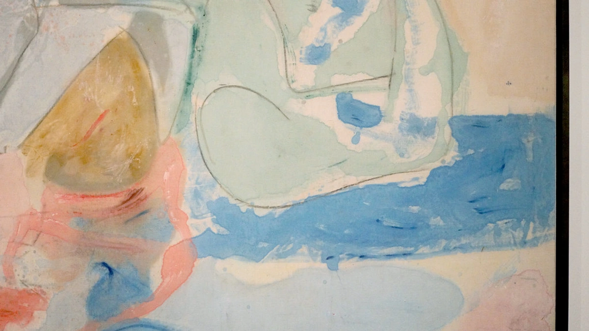
Abstract art often utilizes negative space (the empty areas around and between forms) as a crucial compositional element, just as much as the painted elements themselves. It's the quiet breathing room that allows the other elements to truly shine. Just like the 'white space' that designers strategically use around text or images on a page to improve readability and focus, negative space in art (and its frame) is crucial.
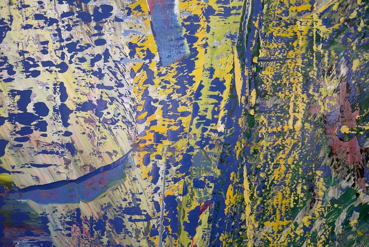
- Breathing Room: Consider how the frame interacts with this. A wide mat or a thick frame can provide additional visual negative space, acting as an extension of the artwork's own quiet areas. This can be particularly effective for abstract pieces that rely on a sense of openness or sparsity, giving them more presence and allowing them to command attention without feeling overwhelmed by a smaller frame. A generous mat, for instance, adds a deliberate amount of negative space around a small, intricate abstract, allowing it to expand visually and breathe.
- Containment: Conversely, a very tight, thin frame on a piece with minimal negative space can create a sense of intense energy or controlled chaos, pushing the viewer's eye directly into the painted action. It’s about being deliberate with that empty area, ensuring it serves the art's overall message.
Framing for Specific Artwork Scales
The sheer size of your abstract artwork also profoundly impacts your frame choice, extending beyond just visual weight. A small piece and a monumental one have very different needs. And trust me, trying to put a flimsy frame on a huge canvas is a structural disaster waiting to happen.
- Small Abstracts (under 12x12 inches): These can easily get lost. A wider mat is often a fantastic strategy to give a small abstract piece more presence and importance, making it feel more substantial on a wall. A delicate, thin frame around a generous mat works wonders. For canvases, even a shallow frame depth can define the piece better than a flat frame. I love transforming a tiny gem into a noticeable statement with a really wide mat.
- Medium Abstracts (12x12 to 30x40 inches): This is the most versatile size. Almost any frame style can work here, provided it complements the art and room. Pay extra attention to visual weight and proportionality to avoid the frame looking flimsy or overwhelming.
- Large Abstracts (over 30x40 inches): Monumental works demand confidence. A robust frame is often necessary to provide structural support and to ensure the frame doesn't appear inadequate for the scale of the art. Floater frames are particularly popular here for canvases, as they maintain the grand presence of the artwork without adding visual bulk. For canvases, especially, frame depth is crucial. A deep floater frame for a large, textured canvas provides not just visual stability but also structural support, preventing warping and adding a sense of monumentality. Sometimes, no frame (gallery wrap) is the boldest statement for a truly massive piece.
The Artist's Intent and Preservation: Investing in Longevity
Respecting the artist's original intent is a key consideration. If the artist specifically intended for a work to be unframed (like many raw-edged canvases), or to be presented in a particular way, that should always be a guiding principle. If you're unsure, a simple, unobtrusive frame often serves best. For living artists, a quick inquiry can often clarify their preferred presentation. For historical pieces, art historical research or consultation with a specialist might be necessary through museum archives, artist foundations, or reputable art historians. This is where you might uncover fascinating insights, like an artist intentionally using an unconventional material that requires very specific conservation.
Beyond just aesthetics, good framing is about preservation. For works on paper (watercolors, pastels, charcoal, prints), archival mounting methods are crucial. This means using acid-free mats, backing boards, and hinges to prevent the paper from yellowing or degrading over time. This, combined with UV-protective glass, ensures your art remains vibrant for generations. For those truly valuable or delicate pieces, engaging a professional art conservator or framer isn't just a recommendation; it's a profound act of stewardship, ensuring the artwork's integrity for generations to come. I always think of it as a responsibility we hold to the artist and to future appreciators of the work. This commitment to gallery-quality framing not only protects your investment but also enhances its perceived value to collectors.
Sustainability in Framing: An Ethical Choice
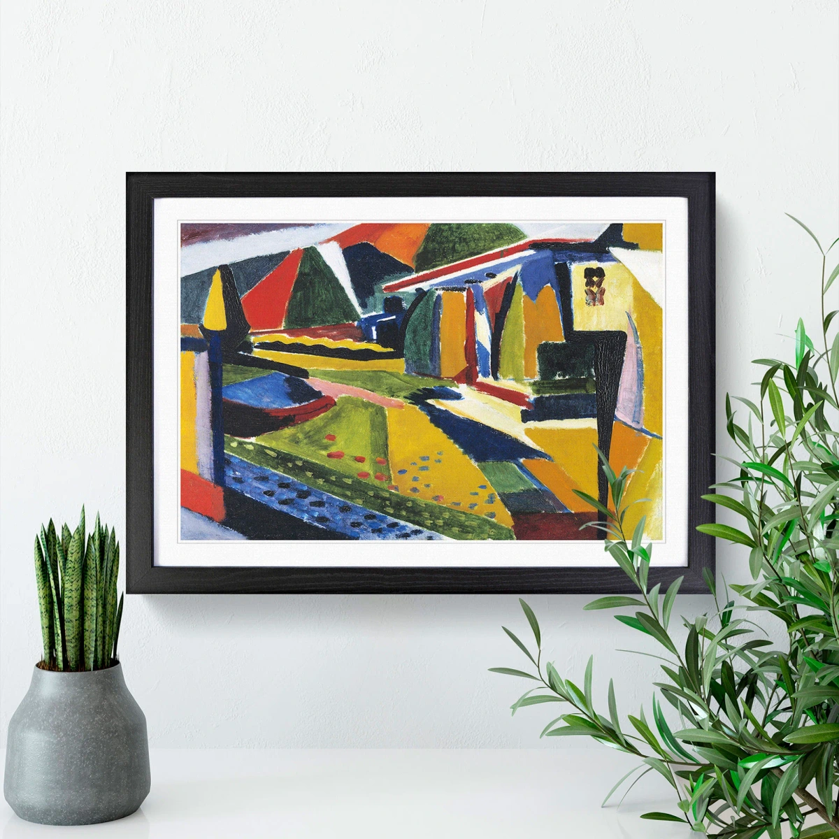
As artists and collectors, we have a responsibility to consider the environmental impact of our choices. When selecting frames, look for options that prioritize sustainability:
- Reclaimed or Recycled Materials: Frames made from reclaimed wood or recycled metals reduce demand for virgin resources.
- Sustainable Wood Sources: If new wood is used, ensure it comes from sustainably managed forests (e.g., FSC-certified wood).
- Eco-Friendly Finishes: Opt for frames with water-based stains and finishes, which typically have fewer VOCs (volatile organic compounds) and are less harmful to the environment and indoor air quality. It's a small change that can make a big difference, and it allows me to feel good about every aspect of a piece, from creation to display.
Framing Multiple Abstract Pieces Together
Creating a cohesive gallery wall with abstract art is a wonderful way to express personality, but it requires thoughtful framing. The goal is unity amidst diversity.
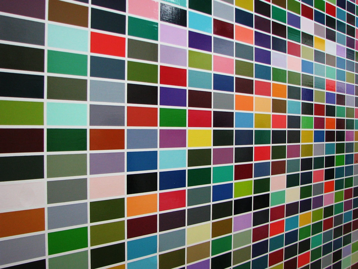
- Unifying Elements: Choose a consistent frame material (e.g., all natural wood, all thin black metal) or a consistent frame color, even if the styles vary. This creates a visual thread that ties disparate pieces together. Using consistent mat colors can also unify a varied collection of works on paper.
- Varying Sizes and Orientations: Don't be afraid to mix landscape and portrait orientations, or different sizes. The frame provides the structure.
Framing for Commercial Spaces and Institutions
When framing for commercial spaces, offices, or institutional collections, the considerations extend beyond personal aesthetic to encompass durability, security, and specific exhibition standards. Acrylic is often preferred over glass for safety in public areas, and robust, easily cleanable frame materials are essential. Security hardware is paramount to prevent theft or damage. Moreover, institutions often have strict conservation standards that dictate materials and methods to ensure the long-term preservation of the artwork. Consulting with professional institutional art handlers and conservators is not just a recommendation but a necessity in these contexts. I've seen a difference in how a piece is handled and displayed between a private home and a public gallery, and the attention to detail for public viewing is immense.
Framing Abstract Art for Children's Rooms
For a child's room, framing needs to prioritize safety and durability. Opt for acrylic (plexiglass) instead of traditional glass to prevent shattering hazards. Choose sturdy frames, ideally with rounded edges, that are securely mounted to the wall with appropriate hardware to prevent them from falling. While aesthetics still matter, practicality and a child-safe environment are paramount. A playful, vibrant frame can complement a child's abstract artwork or a print, but always with safety in mind. Imagine framing your child's first finger painting in a bright, shatterproof frame; it celebrates their creativity while keeping them safe.
Step-by-Step Guide to Framing Your Abstract Art
Feeling ready to take the plunge? Here’s a streamlined approach to help you confidently frame your abstract art, ensuring it looks its best in your space:
- Listen to Your Art (Deeply!): Before anything else, spend unhurried time with the piece. What's its energy? Its dominant colors, textures, lines? Is it delicate or robust? This initial connection will inform every subsequent decision – it’s the foundation of great framing.
- Assess the Medium: Is it a canvas, a print on paper, an abstract photograph, or a mixed-media piece? This dictates whether you need glass and a mat, or if a floater frame is more appropriate. A common mistake here is trying to frame a thick canvas with glass, which is usually unnecessary and sometimes damaging.
- Consider the Room's Vibe: Take stock of your room's materials, colors, and overall aesthetic. Think about what frame materials (wood, metal) and colors (neutral, complementary, contrasting) will create a harmonious dialogue or an intentional tension with your existing decor. Remember the "visual rhymes."
- Choose a Frame Style: Based on steps 1-3, select a frame style (floater, gallery, shadow box, or even a traditional frame) that supports the artwork's character and fits the room's style. Refer to our Frame Styles table for guidance.
- Decide on Matting (If Applicable): For works on paper, choose an acid-free mat. Consider a wider mat to give abstract pieces more presence. Think about single vs. double mats and beveled cuts for depth. (Canvas art usually doesn't need a mat). Always ensure your mat is cut precisely – a crooked mat is a cardinal sin in framing!
- Select Glass/Acrylic: Prioritize UV protection to prevent fading. Opt for anti-reflective (museum) glass if glare is a concern. For safety or large pieces, high-quality acrylic is a great alternative. This is a crucial step for long-term preservation.
- Measure Meticulously: Measure your artwork and the chosen frame/mat dimensions precisely. Incorrect sizing is a common pitfall! Don't forget frame depth for textured canvases. I've learned the hard way that a millimeter off can ruin the whole effect.
- Professional vs. DIY: Decide if you'll tackle the framing yourself (especially with ready-made frames and custom mats) or enlist a professional framer for complex, valuable, or custom pieces. For truly unique or valuable pieces, I almost always lean towards a professional.
- Hang and Enjoy: Securely hang your framed art, considering wall color and lighting. Step back and admire how your thoughtful choices have elevated both the artwork and your space!
Framing Challenges & Solutions for Abstract Art
Even with the best intentions, abstract art can present unique framing puzzles. Here are some common challenges I've encountered and my go-to solutions:
- Challenge: Very Thick Impasto or Sculptural Elements.
- Solution: A deep floater frame is your best friend here. It allows the artwork to breathe and for the textured edges to be seen without being crushed by glass or a traditional frame rabbet. For pieces that are truly sculptural, a shadow box is essential to provide adequate depth and protection, often incorporating hidden spacers to support the art securely without pressing on it.
- Challenge: Artwork on Thin, Delicate Paper.
- Solution: These pieces benefit greatly from proper archival hinging (using acid-free tape or Japanese paper hinges) to a rigid, acid-free backing board. A wide, acid-free mat is crucial to keep the paper from touching the glass, and it adds visual weight. Sometimes a float mount (where the art appears to float above the backing board, showcasing its deckled edges, for instance) in a shadow box can be stunning for delicate edges. This is where conservation framing techniques are paramount.
- Challenge: Unusual Shapes or Non-Standard Sizes.
- Solution: This is where custom framing truly shines. While more expensive, a bespoke frame will perfectly complement the unique dimensions of your art. Alternatively, for a budget-friendly approach, consider a standard-sized frame with a custom-cut mat that creates the perfect window for your unusually shaped piece. You could even use two pieces of archival foam core with a custom cut-out for a floating effect within a larger ready-made frame. I’ve even seen artists build their own unique frame shapes out of wood or metal to perfectly match the art's geometry.
- Challenge: Budget Constraints.
- Solution: Look for high-quality ready-made frames in neutral colors and simple profiles. Often, these can be significantly elevated by investing in a custom-cut, acid-free mat. Thrift stores and antique shops can also be treasure troves for unique, ornate frames that can be repurposed or repainted, offering character on a dime. Consider DIY floater frames using simple wood strips and a little patience! My rule of thumb: spend your budget on the mat and glass if you have to compromise on the frame itself.
- Challenge: Conflicting Room Styles.
- Solution: If your abstract art clashes with your room's existing decor, use the frame as the visual bridge. For example, a sleek modern abstract in a traditional room could be framed in a classic dark wood with a simple gold fillet to nod to the room's elegance while letting the art maintain its contemporary edge. Or, a rustic frame could warm up a minimalist piece in an industrial space. It's about finding that common language.
Glossary of Essential Framing Terms for Abstract Art
Navigating the world of framing can sometimes feel like learning a new language. Here’s a quick guide to some key terms you’ll encounter:
Term | Definition | Relevance to Abstract Art |
|---|---|---|
| Acid-Free | Materials (like mats, backing boards) that have a neutral pH level. | Crucial for conservation framing to prevent artwork on paper from yellowing or degrading over time. Essential for preserving the long-term value of prints, watercolors, and drawings. |
| Anti-Reflective Glass | Glass specially treated to minimize glare and reflections, often referred to as museum glass. | Enhances viewing experience by making the artwork clearly visible from any angle, especially important for subtle abstracts or brightly lit spaces. |
| Archival Hinging | The method of attaching artwork to a mat or backing board using reversible, acid-free materials (e.g., Japanese paper hinges with wheat paste or acid-free linen tape). | Ensures artwork on paper is securely mounted without causing damage or altering its long-term stability. |
| Beveled Cut | An angled cut on the inside edge of a mat board opening. | Creates a subtle shadow line that directs the viewer's eye into the artwork, adding a touch of sophistication. |
| Conservation Framing | Framing techniques and materials specifically chosen to protect and preserve the artwork from environmental damage and deterioration. | Paramount for any valuable or sentimental abstract piece, ensuring its longevity and maintaining its condition for future generations. |
| Fillet (or Slip) | A small, decorative molding often used inside the main frame or between a mat and the artwork. | Can add a subtle accent color or metallic element, creating an extra layer of visual interest or separation, especially for minimalist abstracts. |
| Float Mount | A method where the artwork is mounted on top of the backing board, making it appear to float, often used for works with interesting edges. | Ideal for showcasing deckled edges of handmade paper or maintaining the full sheet of an abstract print within a shadow box. |
| Floater Frame | A frame style that creates a gap between the canvas and the frame, making the artwork appear to "float." | Perfect for canvases, especially those with thick texture or painted edges, emphasizing the artwork's "object-ness" and three-dimensionality. |
| Gallery Wrap | A method of stretching canvas where the artwork extends around the sides, often stapled at the back, allowing for frameless display. | A popular, modern choice for abstract canvases, allowing the art to appear boundless and immediate. |
| Mat (Matte Board/Mount Board) | A board placed between the artwork and the frame's glass, serving as a border and creating breathing room. | Essential for works on paper to protect against humidity and provide visual space. A wide mat can enhance the presence of smaller abstract pieces. |
| Negative Space | The empty areas around and between forms in a composition; unpainted or unoccupied areas. | Crucial for balance and focus in abstract art; the frame and mat can extend or contain this space to influence perception. |
| Object-ness | The inherent quality of an artwork being a physical, three-dimensional entity in space, rather than just a flat image. | Crucial consideration for abstract pieces with texture, layers, or sculptural elements; influences choices like floater frames or shadow boxes. |
| Profile | The cross-sectional shape and dimensions of a frame molding. | Dictates the visual weight and style of the frame; a thin, flat profile suits minimalist art, while a deep profile works for textured canvases. |
| Rabbet | The L-shaped groove on the inside edge of a frame where the artwork, mat, and glass sit. | Essential structural component of a frame, determining how easily the artwork fits and is held securely. |
| Shadow Box Frame | A deep frame designed to create space between the artwork and the glass, allowing for three-dimensional objects or layered art. | Ideal for mixed media, collages, or textile abstract art, providing depth, protection, and a clear view of intricate elements. |
| UV Protection | Glass or acrylic with a special coating that blocks harmful ultraviolet rays. | Essential for preventing colors in artwork from fading due to light exposure, crucial for long-term preservation. |
| Visual Noise | Any element in the frame's design (e.g., busy patterns, excessive carvings) that competes visually with the artwork rather than supporting it. | Avoiding visual noise is key for abstract art, allowing the artwork's forms and colors to speak clearly. |
| Visual Weight | The perceived heaviness or lightness of an object or area within a composition. | In framing, it's the balance between the art and the frame; a heavy artwork needs a frame with adequate visual weight to anchor it. |
Frequently Asked Questions About Framing Abstract Art
Choosing the right frame can bring up a lot of questions. Here are some of the most common ones I hear, with concise answers drawing from our comprehensive guide:
Q: Should abstract art always be framed simply?
A: Not always, but often. Simplicity tends to let abstract forms and colors speak for themselves. However, a traditional or ornate frame can create a fascinating, intentional contrast for very minimalist or monochromatic abstract pieces, turning the frame itself into a statement. The goal is always to support the artwork, not overpower it, and sometimes bold contrast achieves this.
Q: Do I need a mat for abstract canvas art?
A: Almost never. Most abstract canvas art is meant to be displayed without a mat, emphasizing its "object-ness" and allowing the edges to be part of the artwork. Mats are primarily for works on paper or prints to provide breathing room and separation from glass.
Q: What is a floater frame best used for?
A: Floater frames are ideal for canvases, especially those with thick textures, painted edges, or deep stretchers. They create a small gap around the artwork, making the canvas appear to "float" within the frame, emphasizing its three-dimensionality and sculptural qualities. It's a modern, professional choice that respects the artwork as an object.

Q: Can I mix different frame styles in a gallery wall with abstract art?
A: Absolutely! This can create a wonderfully eclectic feel. The key is to ensure there’s a unifying element, such as a consistent frame material (e.g., all natural wood, all thin black metal) or a consistent color palette across the frames (e.g., all black, or a mix of wood tones), or a cohesive theme among the artworks themselves. Avoid too much visual chaos; aim for unity in diversity.
Q: How important is the room's decor when choosing an abstract art frame?
A: Extremely important! The frame acts as a bridge between the art and the room. It should feel like an integrated part of your interior design, echoing materials, finishes, or tones from your furniture, lighting, or existing decor. A mismatched frame can create visual discord, even if it looks good with the art in isolation. It's the visual handshake that connects everything.
Q: How does framing affect the resale value or investment potential of abstract art?
A: Proper, archival framing (using acid-free materials and UV-protective glass) is crucial for preserving the artwork's condition, which directly impacts its long-term value. A well-chosen frame also enhances presentation, making the piece more appealing to collectors. Conversely, poor framing can actually devalue a piece by causing damage or creating an unprofessional look. It's an investment in the art's future, a testament to your stewardship.












Q: Can the frame itself be an artistic statement for abstract art?

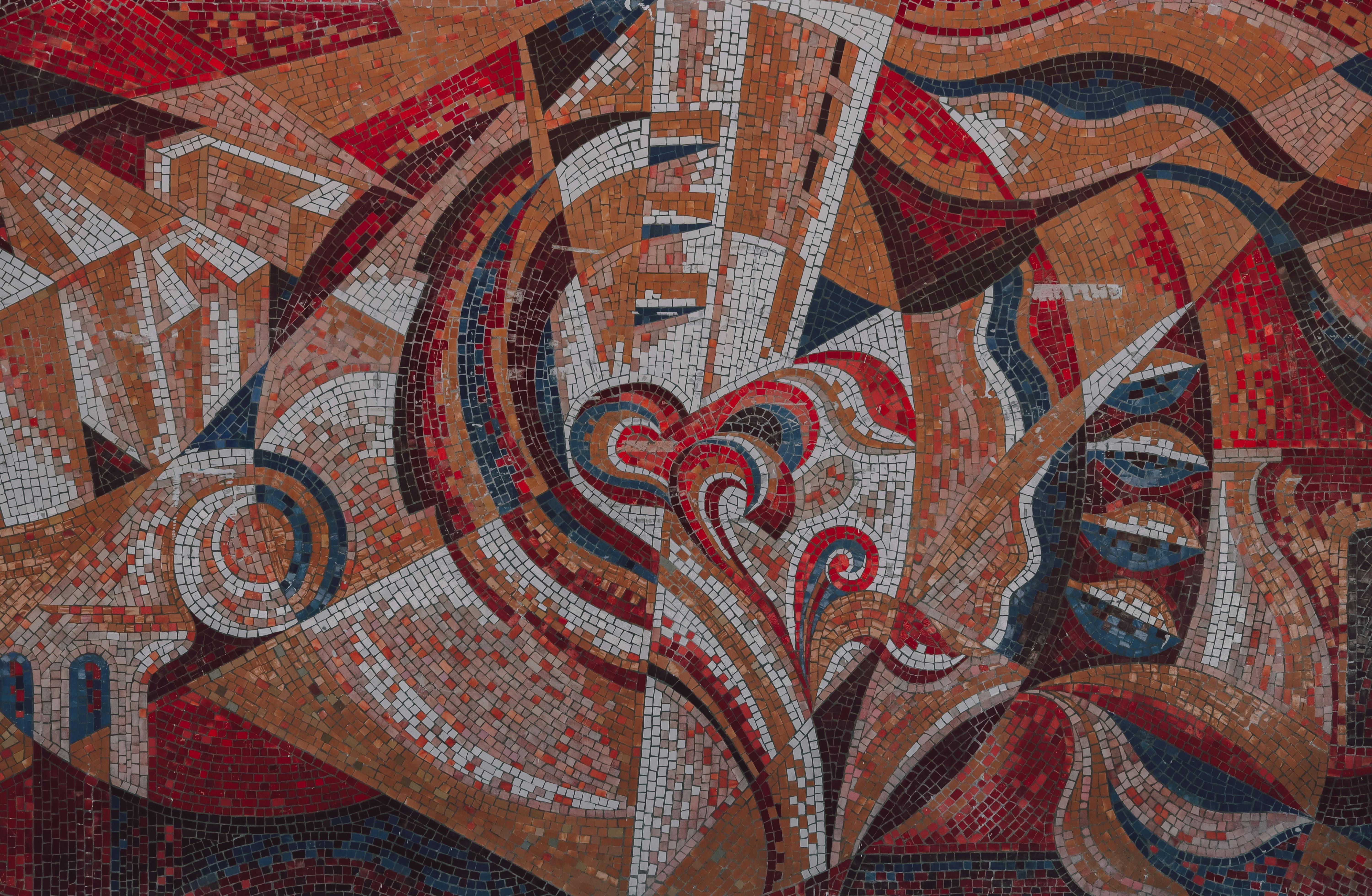
A: Definitely! While often serving as a subtle support, the frame can become an active participant in the artwork's narrative. Imagine a raw, industrial abstract piece housed in a frame crafted from reclaimed, distressed metal, or a vibrant, playful abstract encased in a custom-built frame with sculptural elements that echo the art's forms. This approach turns the frame into a 'meta-artwork,' a deliberate extension of the artist's original vision, or even a new layer of interpretation by the collector. It’s an exciting way to push the boundaries of presentation, making the frame an integral conceptual part of the piece.
Q: What's the best way to choose the right size frame for my artwork?
A: The frame's profile and the mat's width (if used) significantly affect the overall perceived size of your artwork. For smaller pieces, a wide mat can make them feel more substantial. For larger works, ensure the frame's visual weight is proportionate – a flimsy frame will make a large piece look less important. Always measure your artwork meticulously and consider the overall wall space you have. A frame that's too small will cramp the art; too large, and the art can look lost.
Conclusion: Your Final Artistic Touch
Choosing the right frame for your abstract art is far from a mere afterthought; it is, quite literally, your final artistic decision. It’s the decisive brushstroke you add to the artist's canvas, a silent, yet powerful, collaboration that shapes how the artwork is perceived, not just in isolation, but within the living, breathing context of your home. It’s about listening to the art, understanding its dialogue with your space, and making a choice that truly elevates both. I hope this guide has given you the confidence to trust your eye, to embrace the exciting challenge of finding that perfect partner for your pieces, and to recognize that good framing is an art form in itself.
Key Takeaways:
- Listen to the Art First: Its energy, color, texture, and lines should dictate your initial choices.
- Consider the Room: The frame is a bridge; it must harmonize with your interior design.
- Material and Color Matter: These elements create a visual dialogue with both the art and the space.
- Protect Your Investment: Archival materials, UV protection, and anti-reflective glass are essential.
- Don't Be Afraid to Experiment: While simplicity often works, intentional contrast can be incredibly powerful.
Go forth, experiment, and remember that when it comes to framing, your intuition, informed by these insights, is your most valuable tool. Every choice you make contributes to a richer, more meaningful dialogue between the art, your space, and you. And if you're looking for new pieces, remember to explore our collection, or discover more about the artist's journey here. I'd also love to see your framing triumphs – share them and tag us on social media! What will your next masterpiece look like, framed to perfection?
Further Reading: